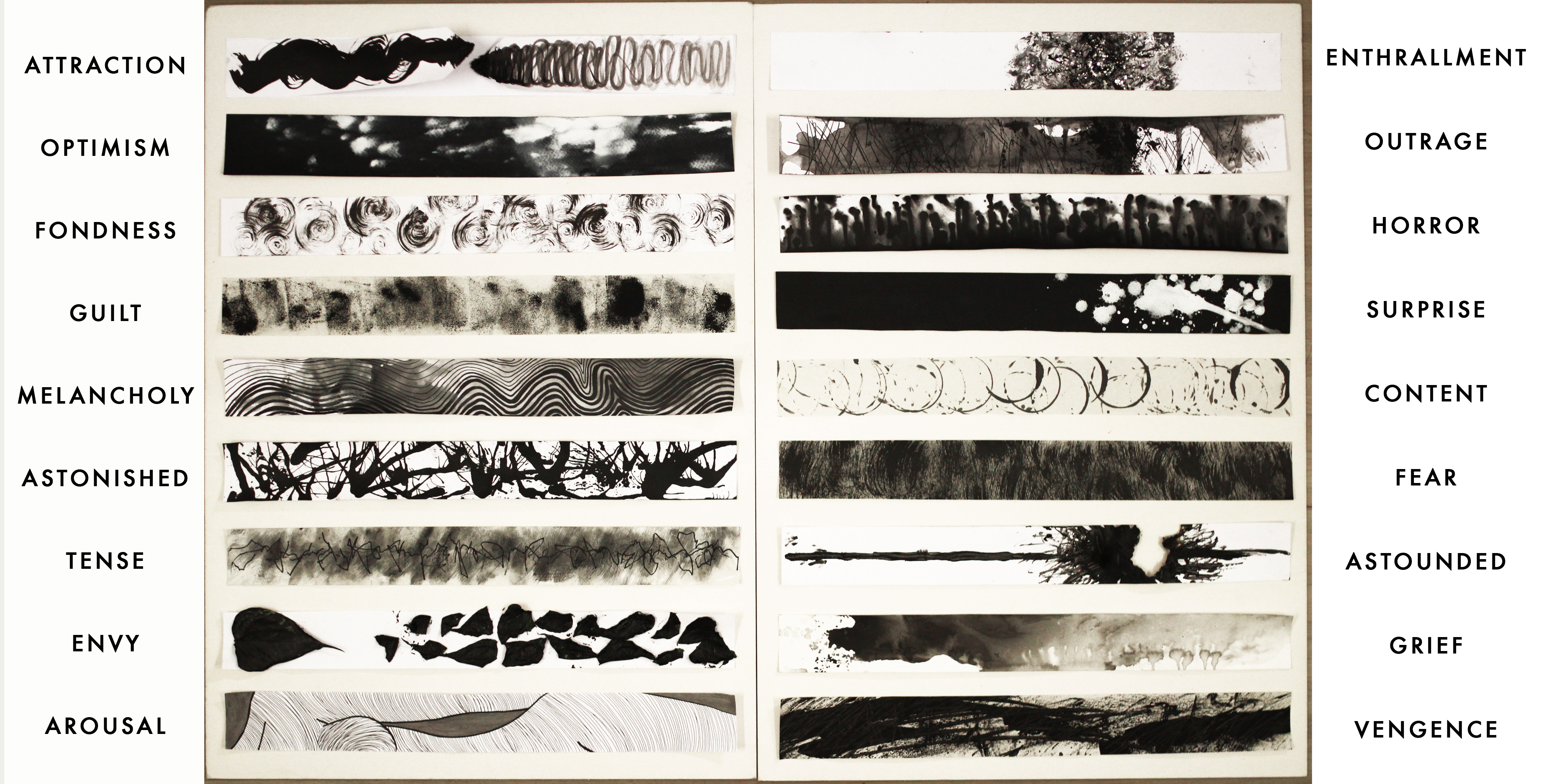
- Attraction
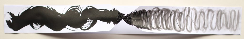
Definition:
“The action or power of evoking interest in or liking for someone or something.”
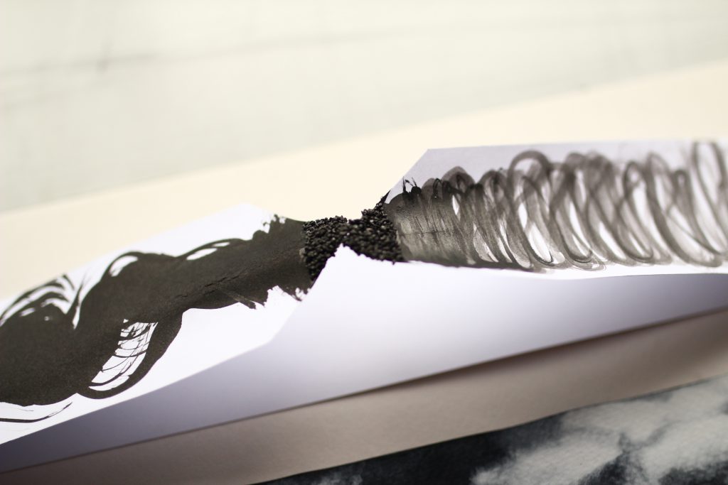
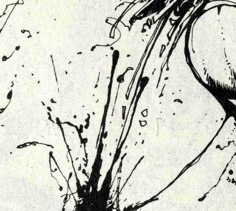
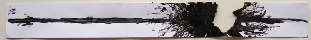
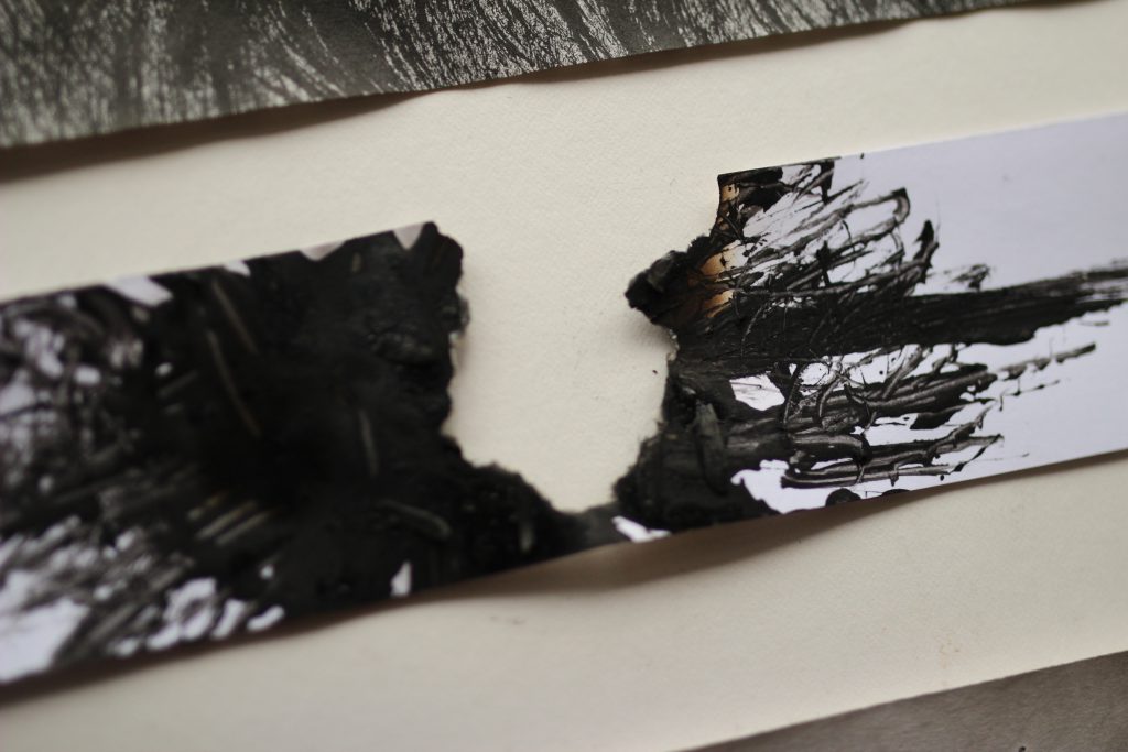
As they say – opposite attracts. To me, attraction is when two opposite individuals find a connection between them.
I wanted to do something that stipulates two seemingly opposite individuals that converge to a middle point. I used thick rounded brush stokes for the line on the left, and smaller squiggly brush strokes for the line on the right. They meet together at a physical point (I cut the both strips to have a tip that meets). For me, the feeling of attraction is kind of a electric buzz that feels comfortable – hence I glued black sand onto both tips to simulate that feeling.
References:
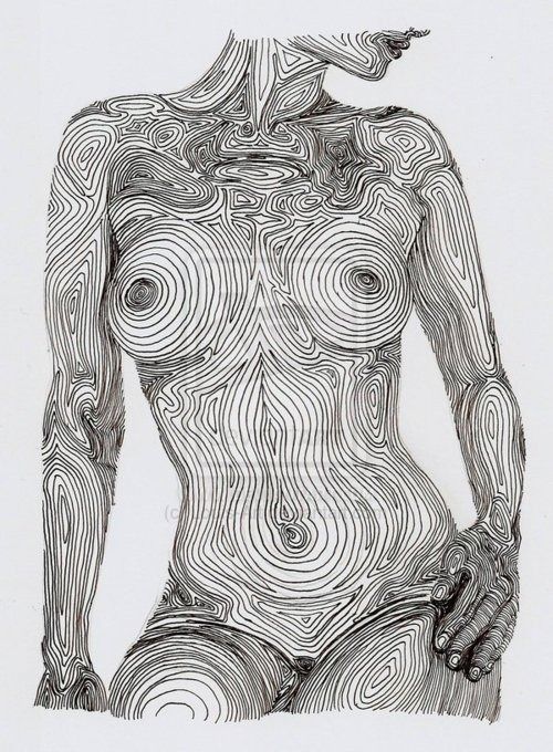
2. Arousal
Definition:
“To cause (someone) to be active, attentive, or excited, to stimulate sexual desire in.”
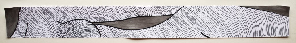
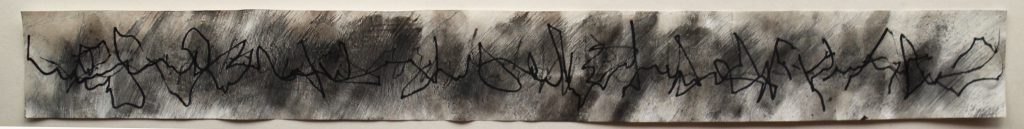
There’s no doubt that the curves of a woman can ultimately cause some arousal. I once read in a book about a man describing how he felt aroused by the moonlight illuminating the curves and crevasses of a lady’s body and that was my inspiration for expressing this emotion. Using marker lines, I highlighted the contours of the lady’s body such that it leads ones’ eyes down her body, exploring it as you would in real life.
References:
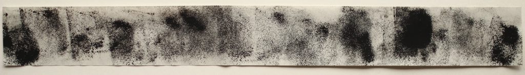
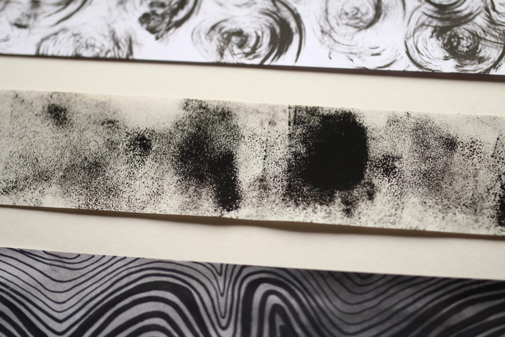
3. Fondness
Definition:
“affection or liking for someone or something.”
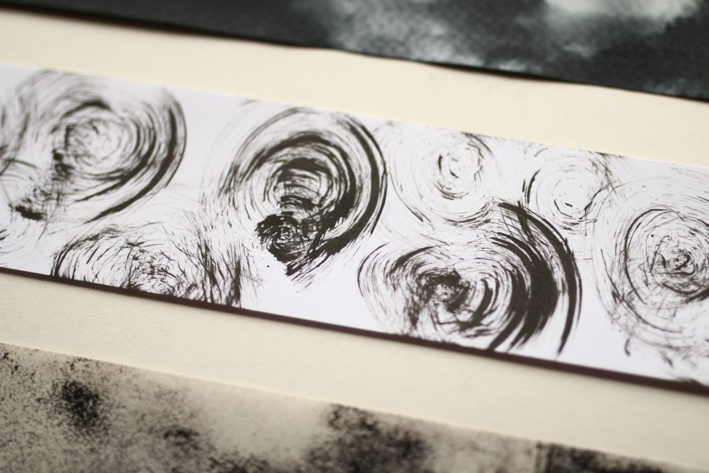
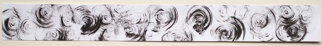
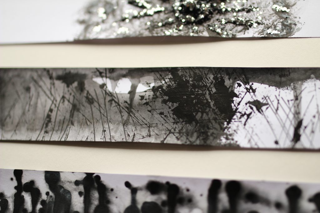
I feel very bubbly inside when I am fond of something. When I experimented with mark making with sponges, I really liked the results of swirling the sponge with ink on paper. The print came out to be swishy and enclosed, which is how I would imagine warm waves to feel like. That to me feels the most similar to fondness. (See process below)
References:
4. Content
Definition:
“perfect happiness; great contentment.”
I associate contentment with water, and that’s because people tend to feel life’s contentment when they are surrounded with water (e.g. on a beach vacation, floating in a swimming pool). I used a can with ink to create these symmetrical circular shapes that all links together in a semi-uniformed manner, which I think represents contentment the most.
References:
5. Enthrallment
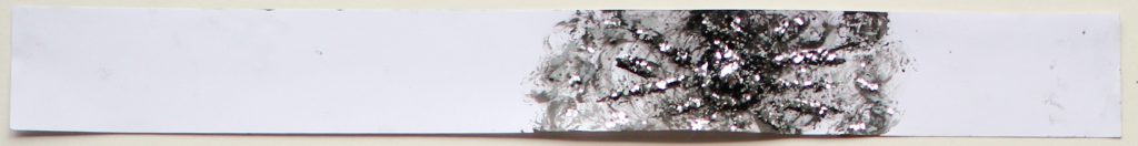
Definition:
“a feeling of great liking for something wonderful and unusual.”
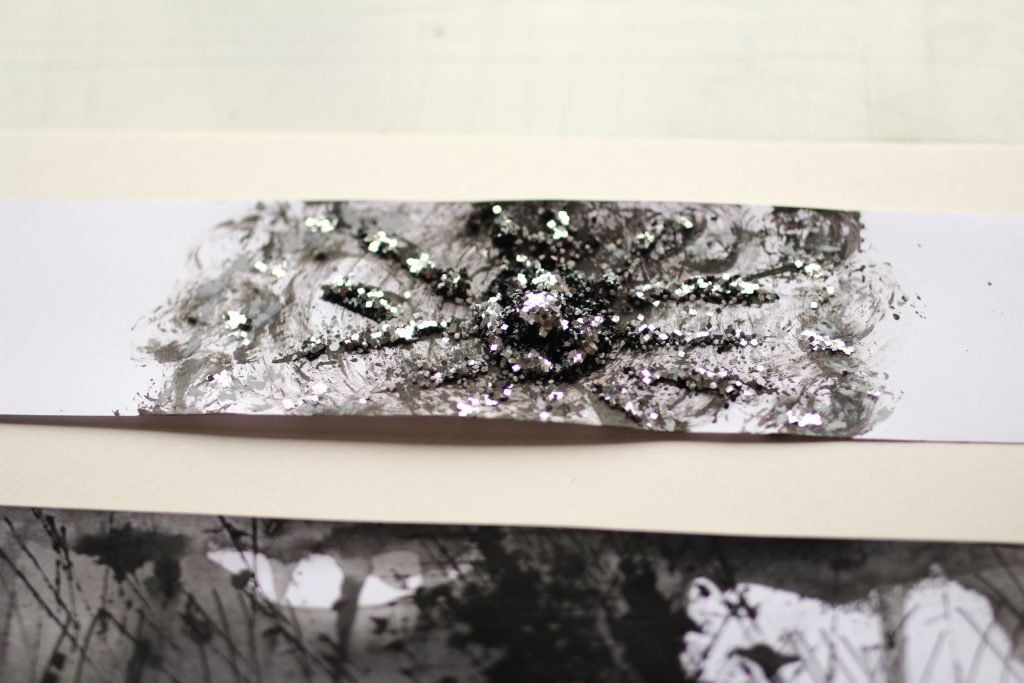
I imagine enthrallment to be an emotion that a child would feel when they discover something new. The innocence of a child will probably see the new item as something magical, somewhat like a dandelion that sparkles. That’s why I wanted to create a twinkly dandelion print with sun-like rays that sparkles. I used sand and ink to create dotted textures and swirling motions to get the circular spirals. I used sand and acrylic paint to get texturised sun rays and then sprinkled glitter all around to get the print to shimmer.
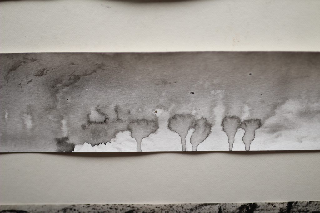
6. Optimism
Definition:
“a disposition or tendency to look on the more favourable side of events or conditions and to expect the most favourable outcome.”
I believe that being optimistic means to look on the bright side even in the worst situations.
I created this mark using water, white paint and black paper. Firstly, I filled a container with minimal water (so that it makes a base for the paint) and I dripped the white paint in to create organic flowy textures. Finally I dunked the black paper in to grab the white paint and this made it mix with the water as well. The results were really organic and it looks like light bursting forth from the black background. That to me is optimism.
I also like how that towards the right side of the mark there’s a gathering of white paint. This is the light bursting forth from the darkness and the other white splotches are the manifestation of the light, that continues to seep through the black until it will finally overtake all the darkness.
References:
7. Surprise
Definition:
“an unexpected or astonishing event, fact, etc.”
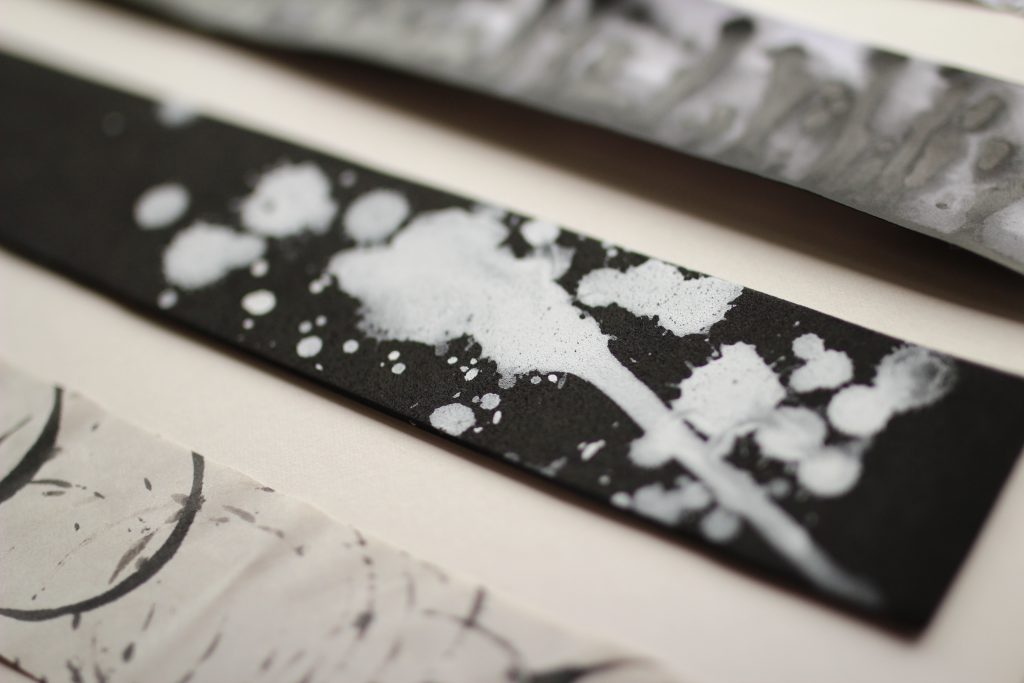
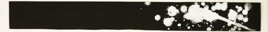
I imagine the emotion of surprise in the concept of a surprise party, where one is kept in the dark (the background). The white splatters represents the emotion of shock and the feeling of joy, and it reminds me of the pop of a champagne bottle, which comes with a sudden jut (the bold straight line on the bottom right corner) followed by splashes of the liquid. The splatters are located on the right corner of the piece to also represent that perpetrators of the surprise often hide in the corner of the room. I did this strip using black foam paper (to get the splatter effect) and then splashing diluted white acrylic paint in the corner.
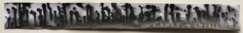
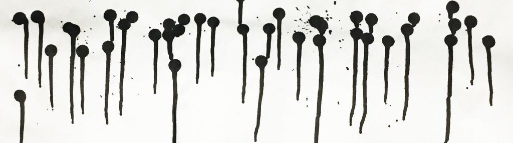
8. Astonishment
Definition:
“overpowering wonder or surprise; amazement.”
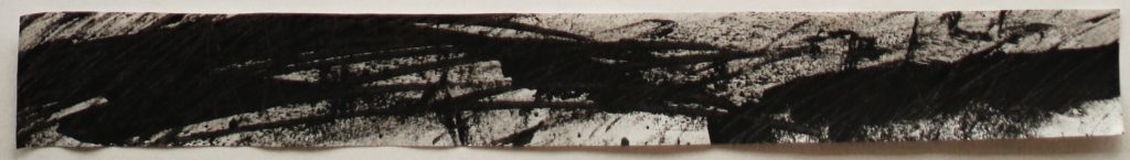
Using splatters and splashes to represent jolts of surprise, I filled the entire paper with it because I wanted it to be overwhelming – much like how I view the emotion of astonishment to be like. To me, astonishment is getting surprised so much so that it triggers all the nerves in one’s body to become jumpy, much like the lines I created using ink and blowing it throughout the paper with a straw.
References:
9. Astound
Definition:
References:

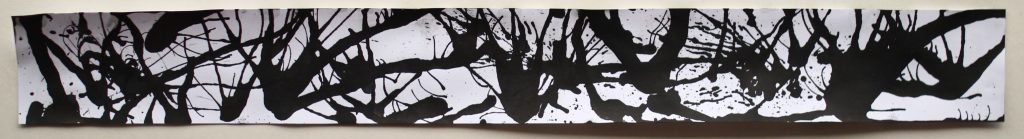
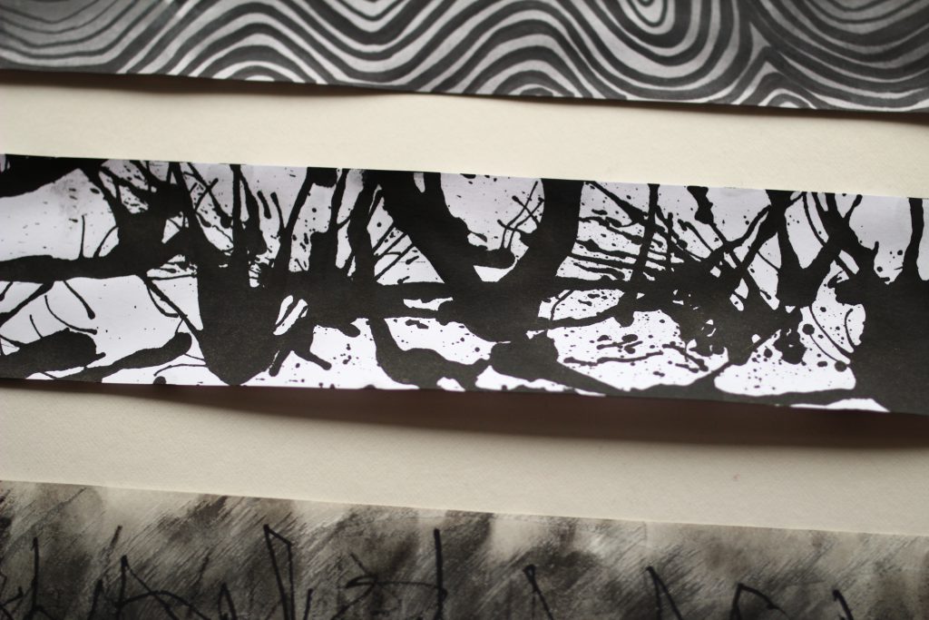
10. Outrage
Definition:
“an extremely strong reaction of anger, shock, or indignation.”
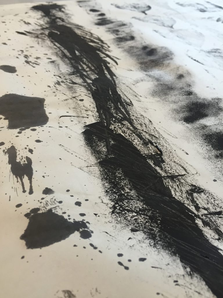
I personally depict an outage by stabbing and slashing motions. For that, I used acrylic paint and a palette knife.
Using ink and water, I wanted to make a organic drippy background because I often get so angry that tears will emerge. That’s how extreme the reaction would be for an outrage to occur. The darkness kind of abruptly stops towards the end because once an outrage has been dealt with, the feeling of wanting to express it will stop as well.
References:

11. Vengeance
Definition:
“seeking to harm someone in return for a perceived injury.”
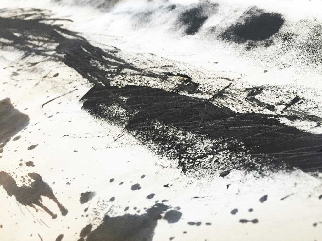
Vengeance is a violent way of seeking revenge and I perceive it to be angry aggressive stabbing stroke marks. By using large aggressive marks of a palette knife, the marks seems the violence was committed confidently. There’s no hesitation or any chance to turn back and undo these marks because the indentation is stained on the paper (due to the forcefulness of the actions). – See process below.
References:
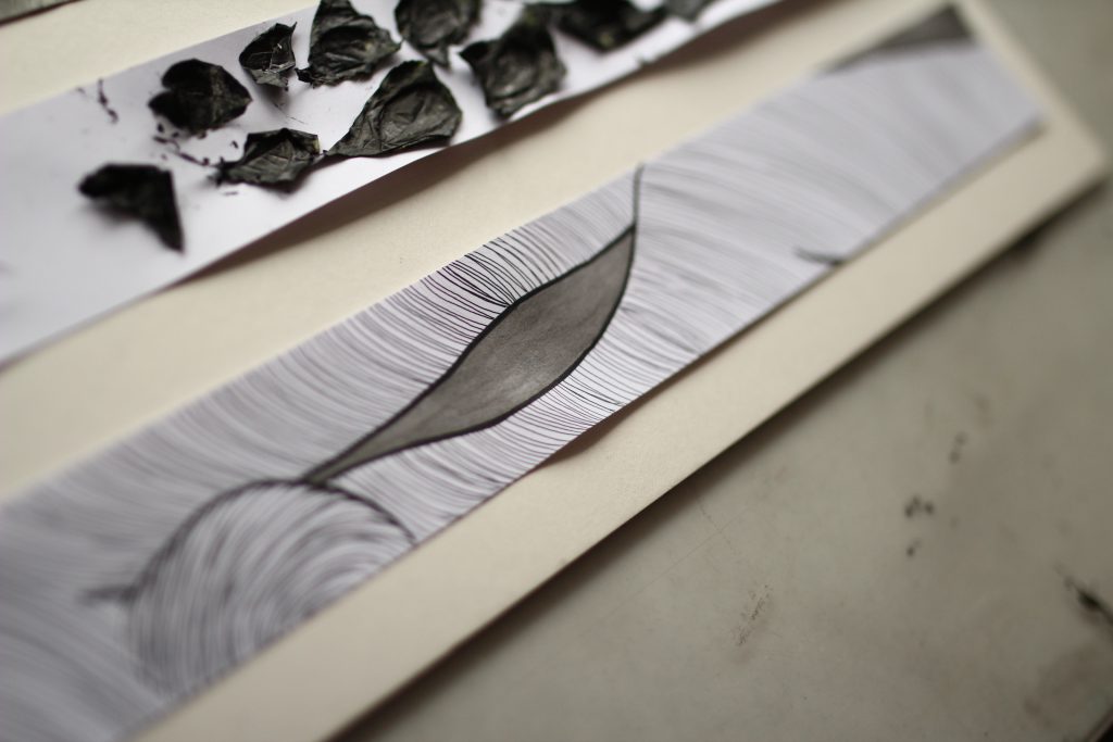
12. Envy
Definition:
“a feeling of discontented or resentful longing aroused by someone else’s possessions, qualities, or luck.”
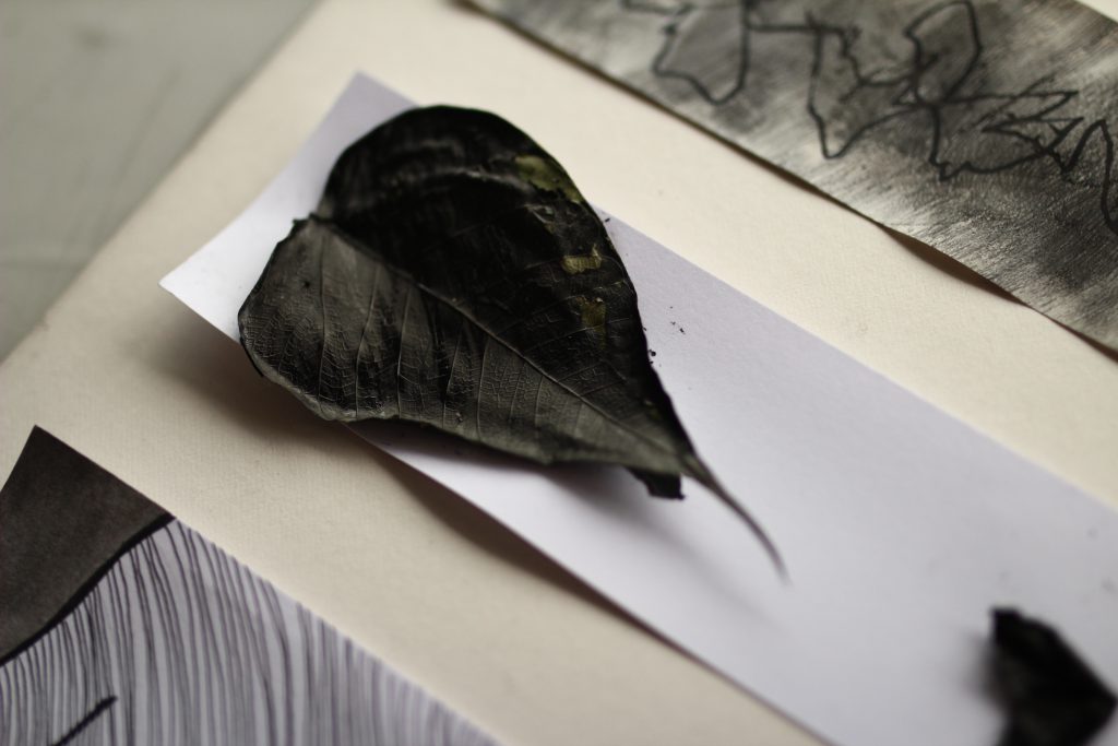
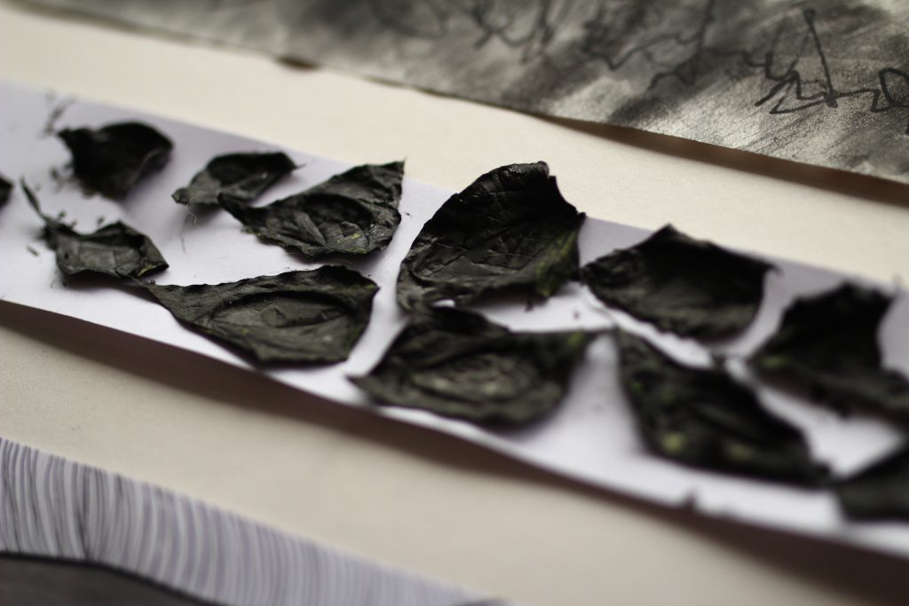
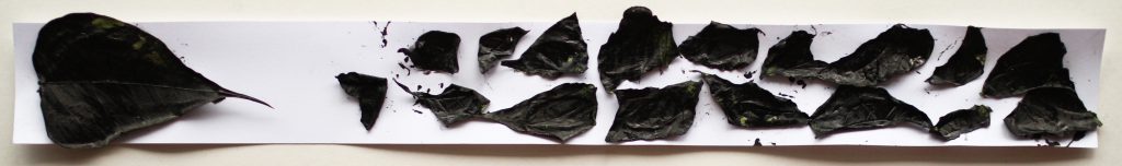
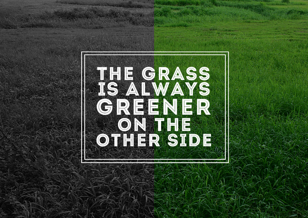
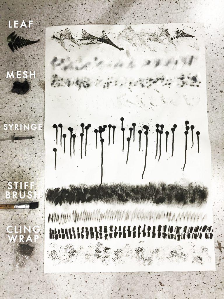
I view envy with the concept of ‘The grass is always greener on the other side’. That is why I chose some leaves to depict that idea. Placing one whole leaf on one side pointing to the other side with a bunch of leaves pointing back, I hope it stipulates that the lone leaf envies the group dynamic and the bunch of leaves long for wholeness. Hence, the idea of the grass is always greener on the other side. Also, the leaves are coated in black paint (that can be peeled off) to represent that envy is beyond surface deep. Usually no one really voices out that they are envious of another, it is rather kept to themselves. But when the layer of black is peeled off, you can see the “green” with envy that’s underneath.
13. Guilt
Definition:
“the state of ill-will and bad feeling.”
The emotion of guilt to me is a feeling of a constant shroud of darkness following you. It never fully goes away even though it does fade sometimes. Your heart feels heavy and it creeps up on you on some moments more than others. This mark I made using sponges replicates that feeling with some constant shades and some purposefully heavily inked on places.
References:
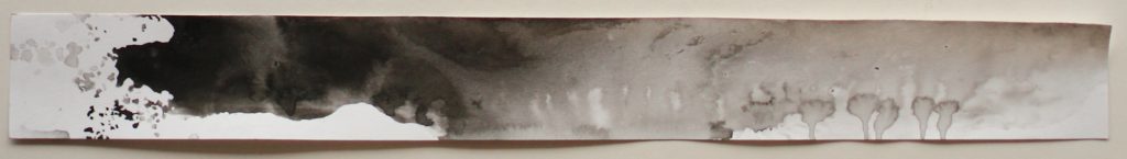
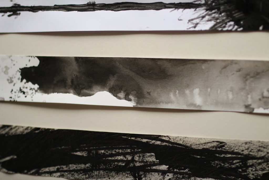
14. Melancholy
Definition:
“a feeling of pensive sadness, typically with no obvious cause.

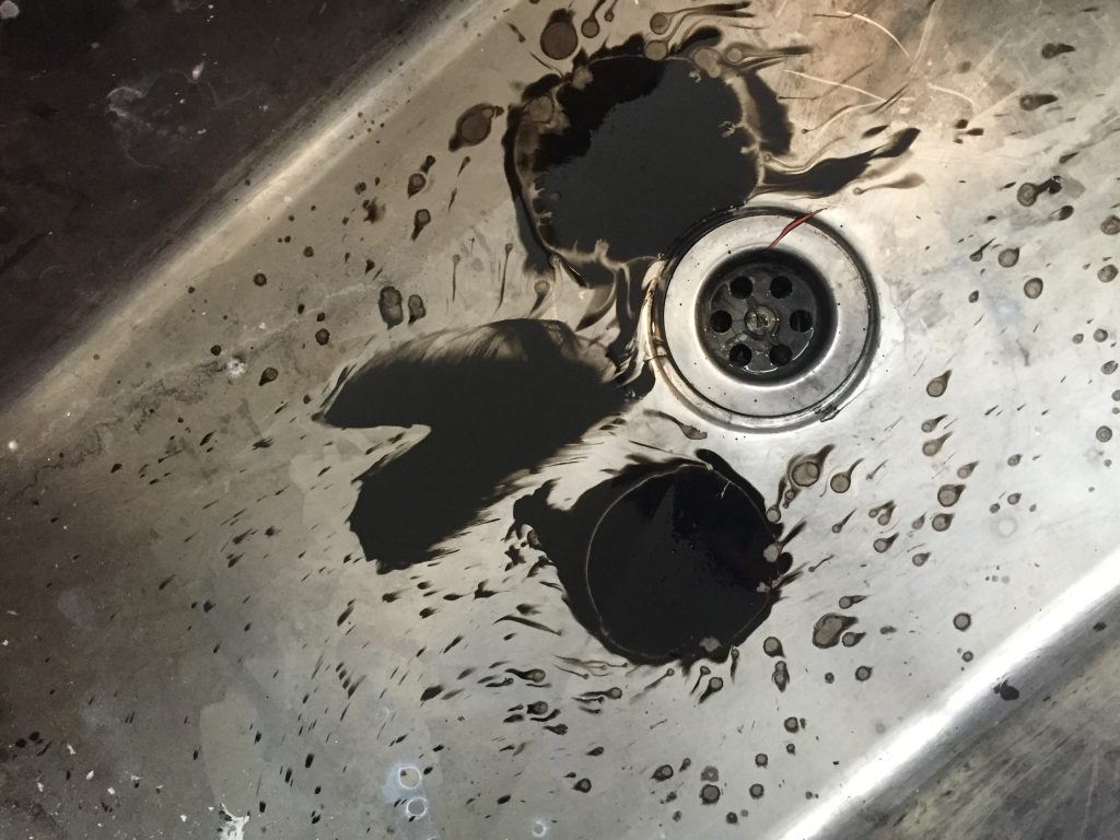
A constant lull of sad buzzing lines was what I envision melancholy to be. I drew thicker lines with a marker at the bottom to present a visual weight so that the feeling is viewed to be heavy and weighed down. Even so, the lines were a little too clean for the idea of melancholy to be conveyed. Hence, I used ink and water to shroud the lines with blurry splotches that to me symbolises the lack of cause to the pensive sadness.
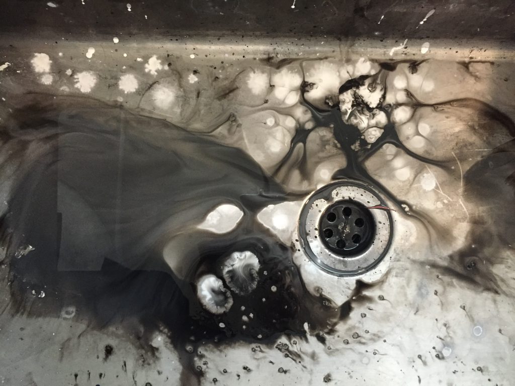
Using ink thats poured into the sink which made for very visually appealing patterns but unfortunately the paper couldn’t absorb all of it.
References:
15. Grief
Definition:
16. Fear

Definition:
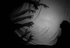
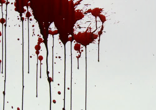
17. Horror
Definition:
Very simply put, I wanted the idea of dripping blood. I used a syringe to drop the ink on to the paper and quickly tilting the paper to get organic drip marks. The results were way too clean so I decided to smudge and blend it out with black ink with water. The results was very fulfilling because of the blurriness of the drips and it shows the horror spreading itself deeper into the paper.
Reference:
18. Tense
Definition:
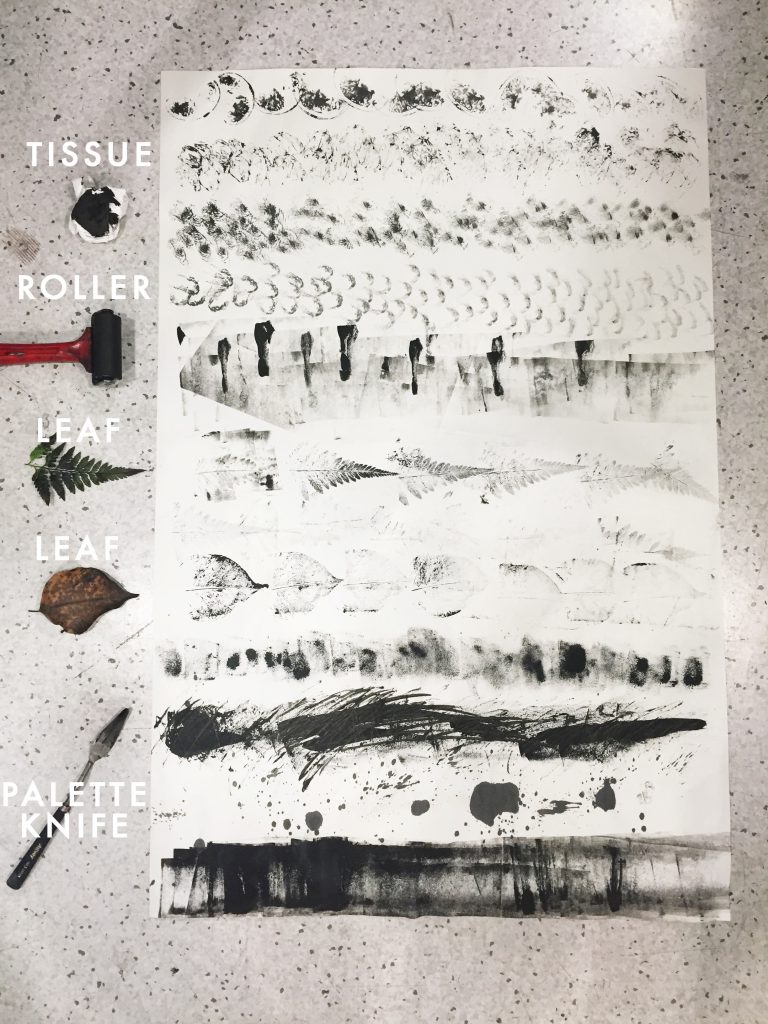
 I continued my experimentations once again and I also managed to secure another emotion. That is ‘Vengeance’ done with a palette knife. Using it to spear the paint in a very sharp and abrupt motion, it created some jarring stripes. Then I used the tip of it to slash the paper in a very angry manner (pretty sure I was angry with myself at this point for I was running out of ideas). This created a very angry emotion which I knew immediately would showcase Vengeance.
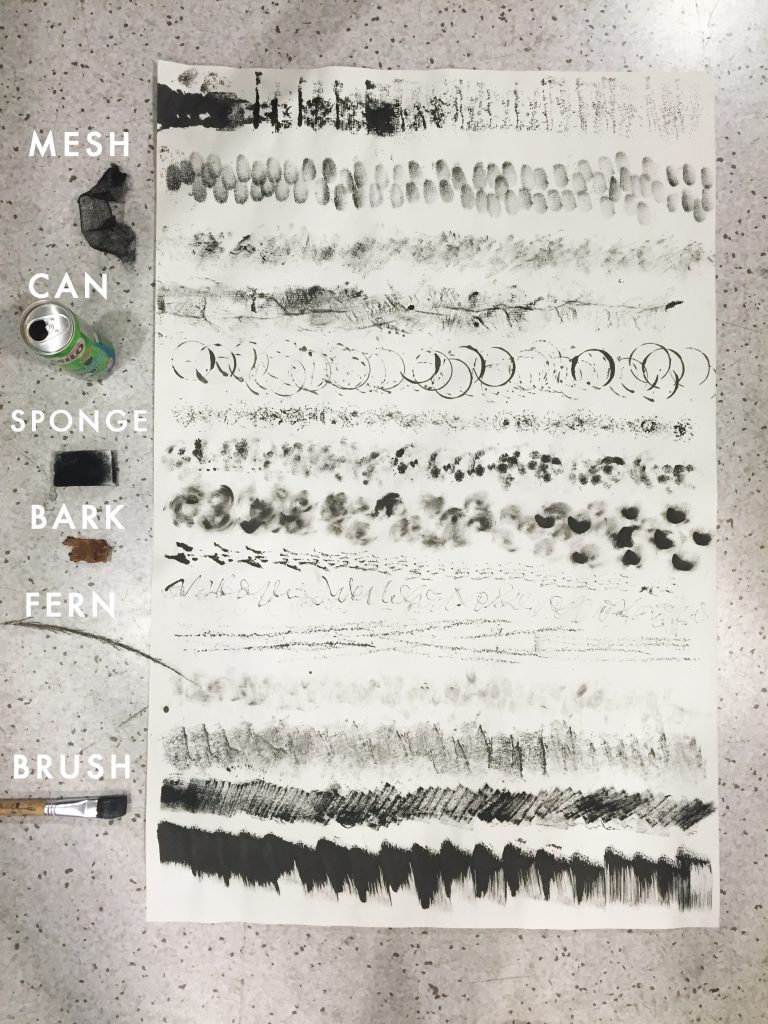
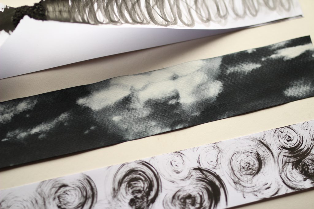
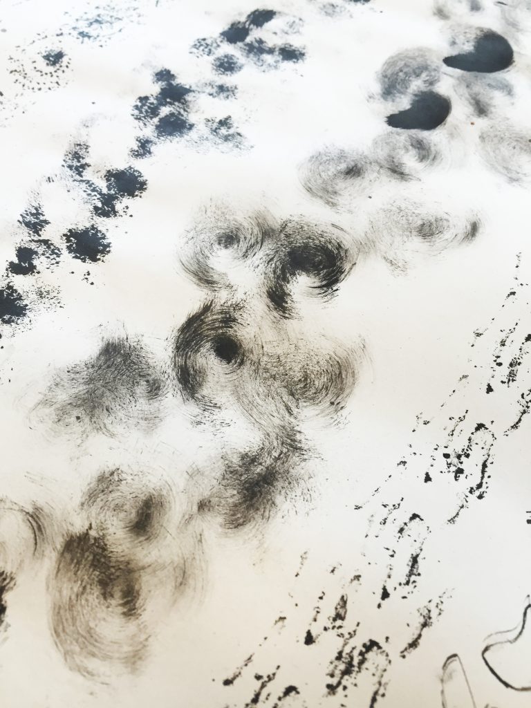 I experimented more with circular happy mark making techniques on this piece. Which I am very pleased with because I could see more happy emotions secured. For example, the milo can created some very distinguished warm circular shapes which reminded me of the feeling of contentment. Using the sponge in different ways (such as twisting it on paper) also gave me the inspiration for the soft spiral circles to represent fondness.