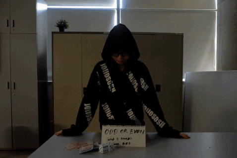
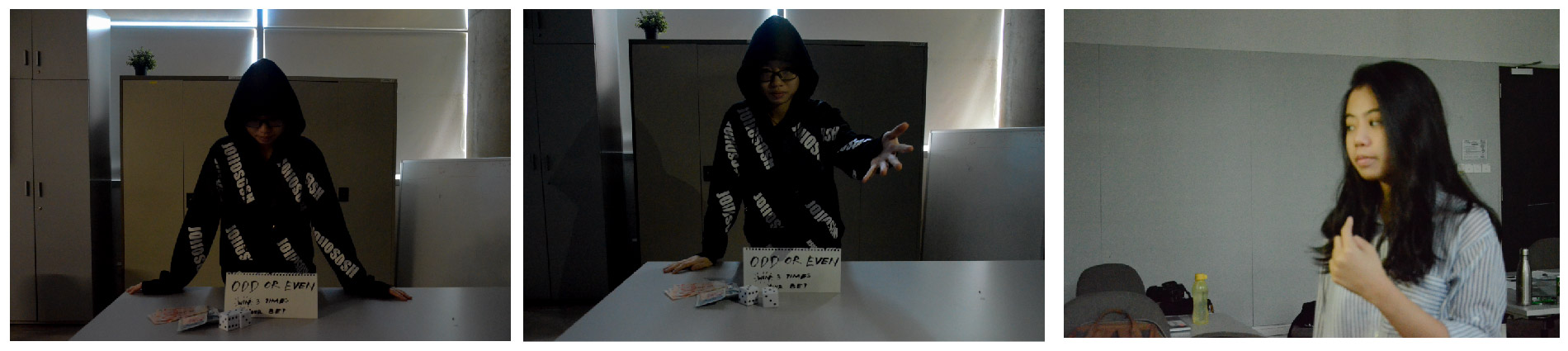
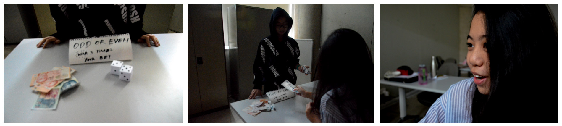
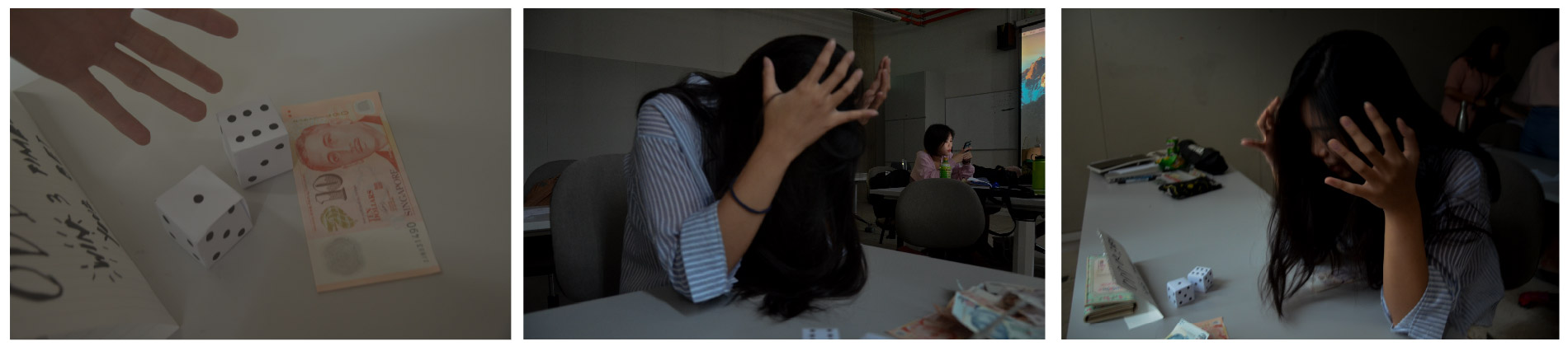
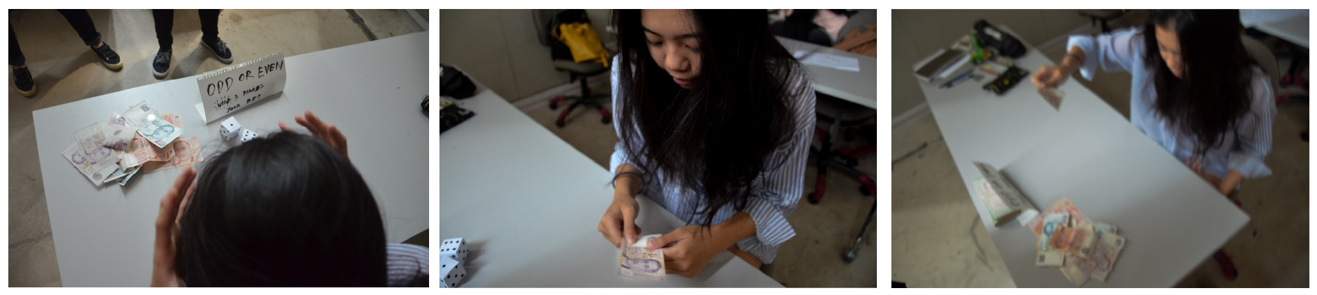
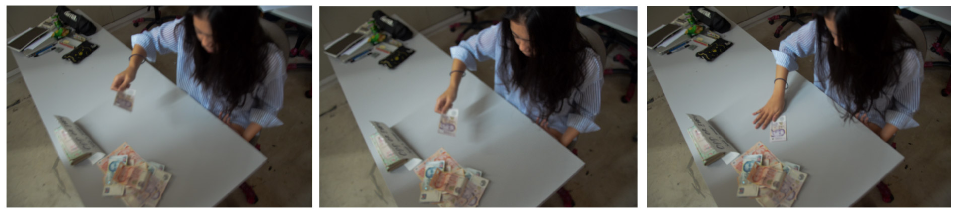
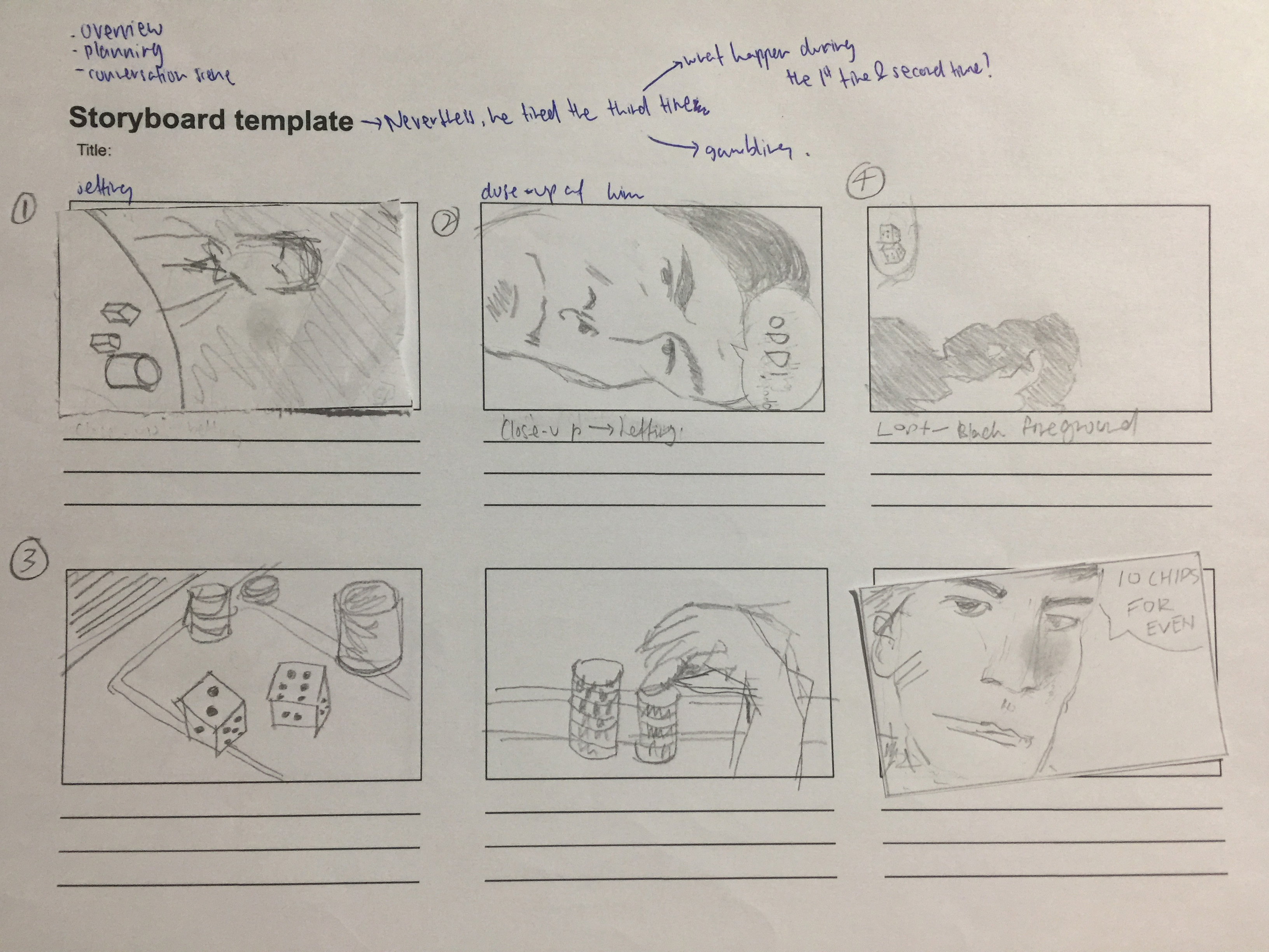
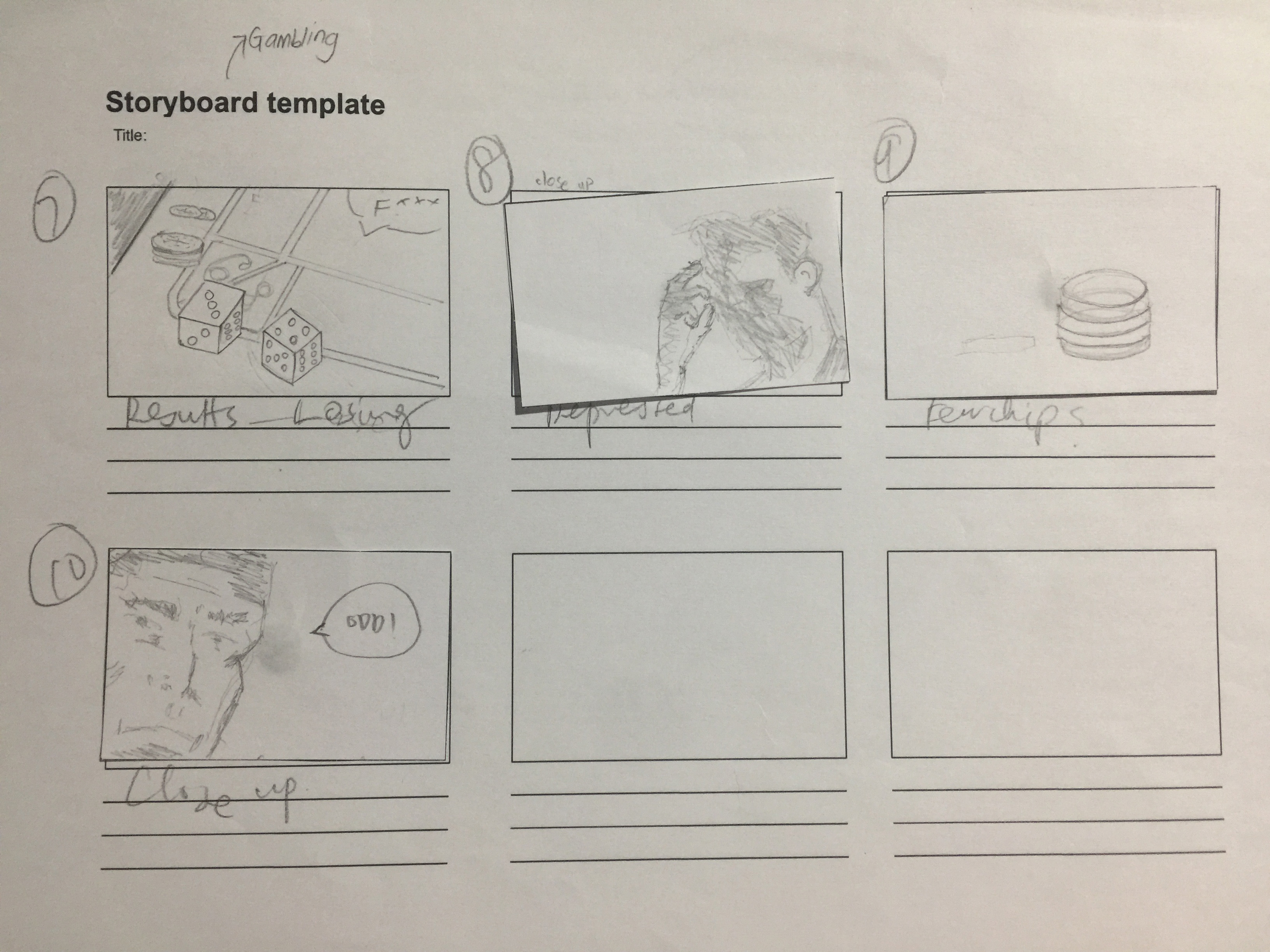
My group consist of Alina, Ying Hui, Syadza & Me, and our story is about gambling addiction. We picked the setting to be in a classroom as it best suits the gambling atmosphere; dark, having tables and chairs. However some of the images shown above have our classmates in it and other stuff messing around. During the shot, we took quite a few action by action frame to depict dramatic and tension in the story.
The difficulty that we, as a group face, was the blurry image as we did not know how to adjust the setting of the camera, which explains why some of the images are blur.
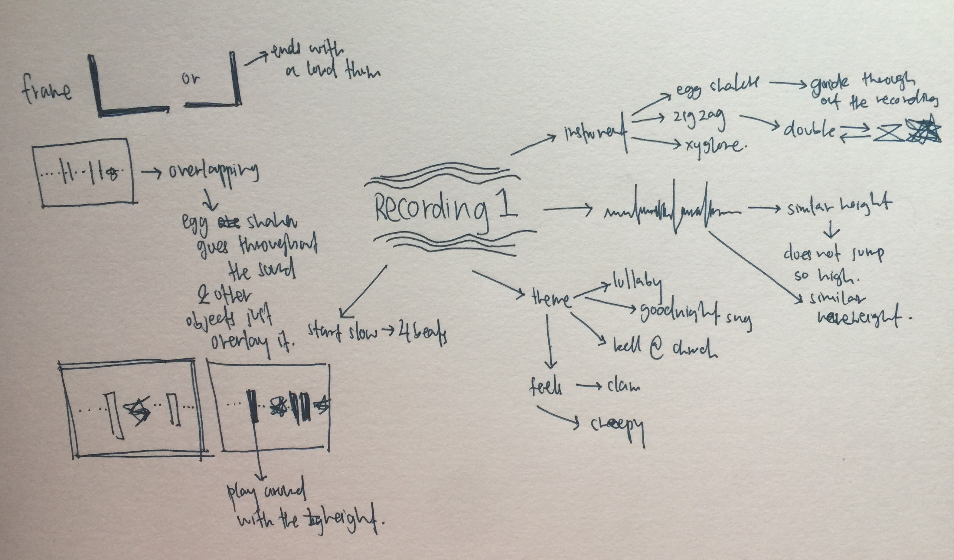
For the first assignment on 間 MA’s OBSCURE CITY of VOIDS, we had to create a mood box using the sounds that we created. So my group mates are Bala & Qis. Me and Bala did on the same recording and Qis did on the 2nd recording.
Instruments used
Dominant: Xylophone
Sub-dominant: Egg Shaker
Sub-ordinate: Zig Zag Block
At first I was difficult for me to visualise how the mood box can relate to the sound recording. With the help from mind mapping, I started to get ideations on how to execute the mood box.
Mindmap & sketches Try out: Using planes of different sizes and trying it out different method by creating loops or broken plane
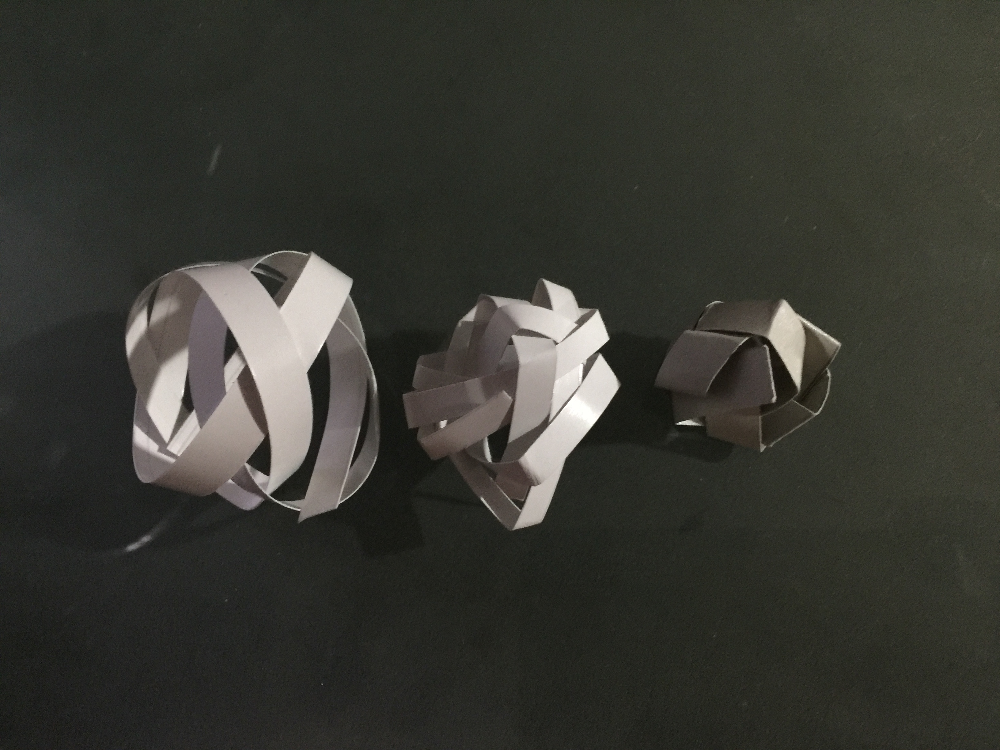
When I listened to the sound recording, it sounded like a lullaby, which is why I thought of using black. However I did not want everything to be black so I added white in the center of the box.
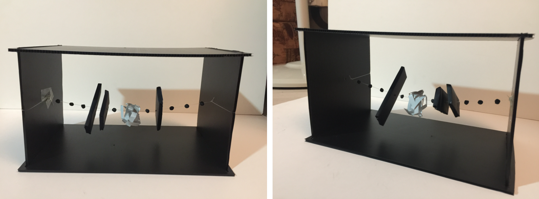
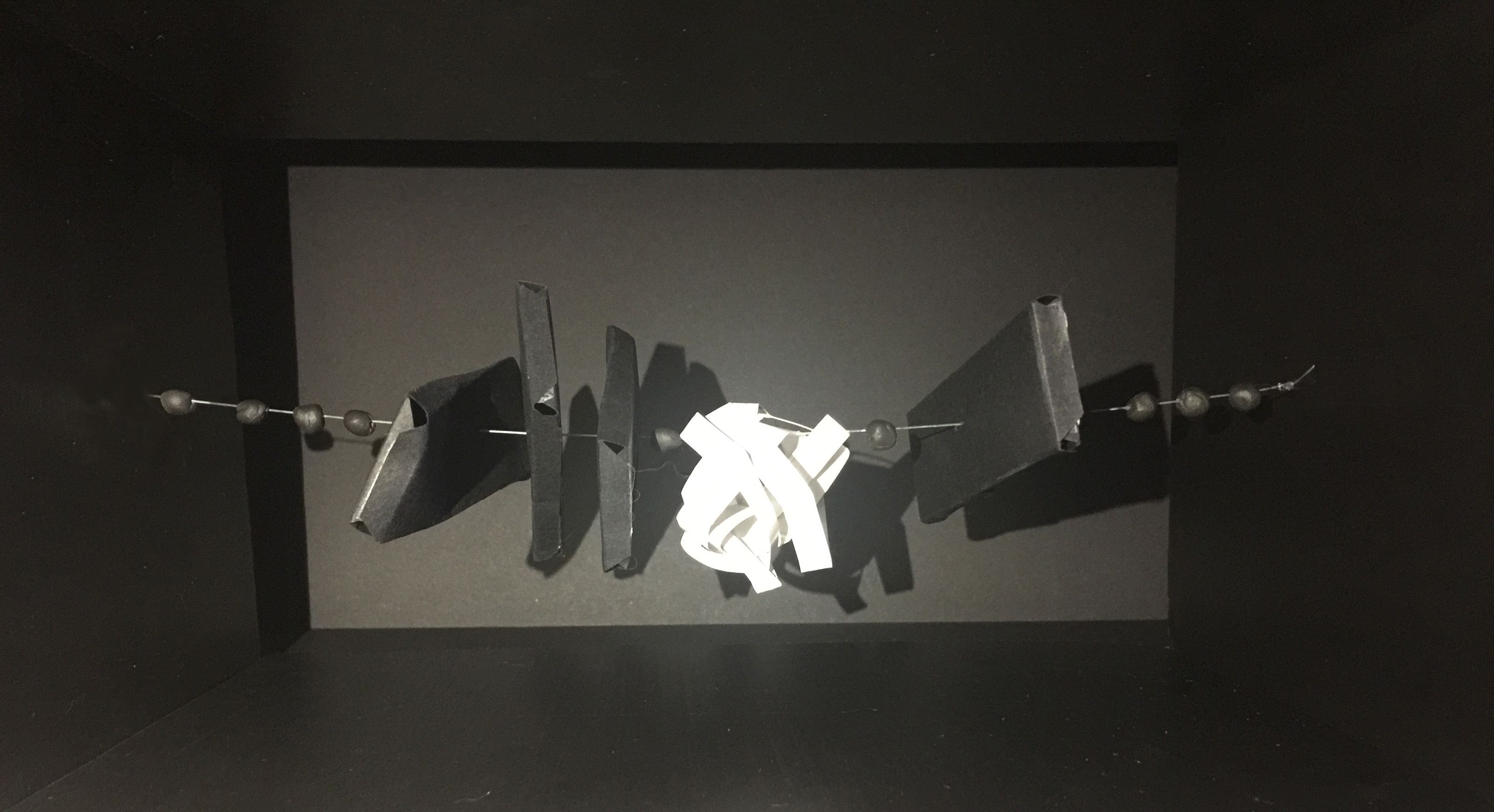
The small round dots represents the egg shaker, as throughout the recording the egg shaker is a guide for the xylophone and zig zag block.
The black rectangle represents the xylophone. It has different sizes as the xylophone also has different sizes.
The white sphere in the centre represent the zig zag block. To me, the the zig zag block’s sound is like a loop, going back to each other. Hence I interpret it in a sphere. And it is created by a broken plane as it is inspired by the zig zag block’s texture.
All the element are in a straight line as the sound wave height does not change drastically.
Feedback given: The number of element in my mood box should be the same counting as the recording.
Meanings: Red is the colour associates with of fire, danger, and blood on one hand; and love, sexuality and passion on the other. It is a bold, energetic and lively color that can symbolize passion, strength, confidence and power.
Tips for use: Red often communicates strength, confidence, and power and is a highly visible color.
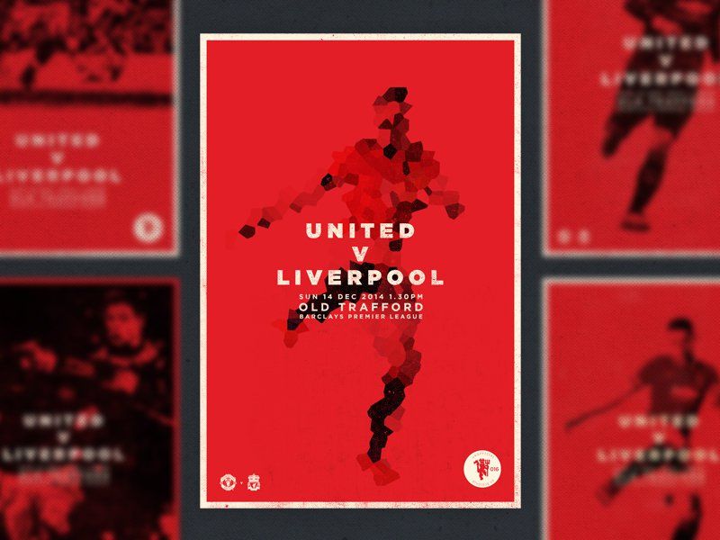
MATCHDAY! is a poster about Manchester United
This is an example of how red is used in the poster to show the power and strength of Manchester United. To me, red is the colour that is too attractive. With the use of red, from far, a person can notice it. In most of my design, I tend not to use red a lot as I feel that it might be overpowering my design, unless it is intentional.
Orange – Fresh, Youthful, Creative & Adventurous
Meanings: Orange communicates activity and energy. And of course it’s hard not to go past orange as the color of, oranges, and all their vitamin c byproducts, which immediately makes orange feel fresh and healthy. Orange can therefore tap into associations of youthfulness, creativity and adventure. And it can be associated with the harvest or autumn season.
Tips for use: As orange is associated with fun and vibrancy is well suited to youthful, energetic brands and designs and best avoided for luxury, traditional or serious brands.
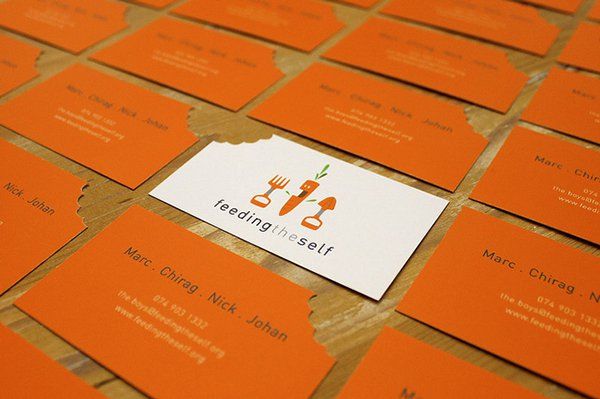
Feeding the Self
An example of how orange is used in Feeding the Self, that teaches African youths to be self-sustainable with veggie and herb gardens. Here, orange conveys youthfulness, as well as the fresh and healthy feeling associated with gardens.
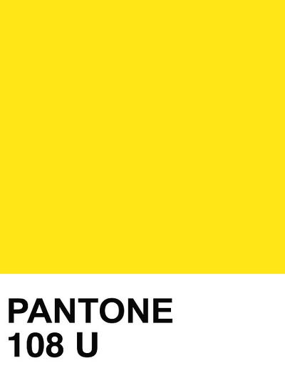
Yellow – Optimistic, Cheerful, Playful & Happy
Meanings: Yellow isthe color of sunshine which puts a smile on the dial. It is the most visible color from a distance (which is why it’s used for street signs) and communicates cheerfulness, friendliness, joy and energy. However, yellow is also a cautionary color used in life vests, police cordoning tape and hazardous areas.
Tips for use: Pure/bright yellow does a great job of attracting attention, but can be visually disturbing or even hard to see (for instance, white text against a bright yellow background or vice versa) if not used with care.
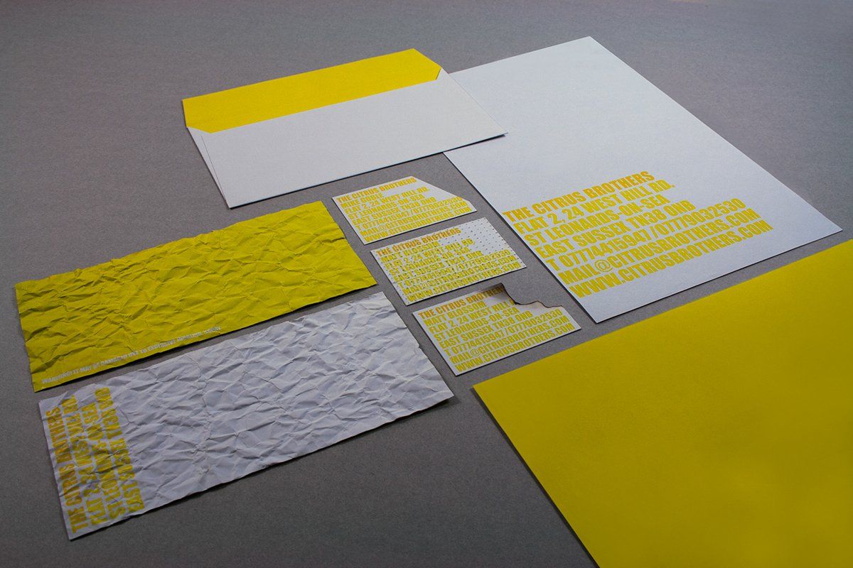
The Citrus Brothers by Griselda Marti
Image above is a branding stationery for the illusionist group The Citrus Brothers. The yellow, like the illusionists, is cheerful, entertaining and smile-inducin.
Green – Natural, Vitality, Prestige & Wealth
Meanings: Green has two very common meanings; one being nature and the environment, and the other being finance and wealth. When it comes to nature, green represents plant life and growth and is consequently used to convey being ‘green’ in the environmental, sustainable, organic, natural sense of the word. And of course green is, as the saying goes, ‘the color of money’ (US money, that is) and therefore associated with wealth and stability
Tips for use: Pick your shade of green carefully as brighter, lighter greens indicate growth, vitality and renewal; while darker, richer greens represent prestige, wealth and abundance.
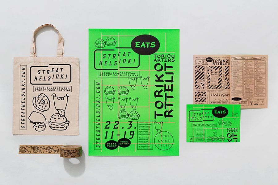
Streat HelsinkiStreat Helsinki by Kokoro & Moi
This is a branding by Kokoro & Moi. It uses green to promote street food festival, the fluorescent green communicates both the neon lights of Asia’s night markets as well as the fresh and experimental food being served up.
Blue – Communicative, Trustworthy, Calming & Depressed
Meanings: Blue is the most universally preferred color, perhaps for its very versatile qualities. It is a favorite color for companies that wish to convey reliability, trustworthiness and communication (such as Facebook and Twitter). It is also appreciated for it’s calming and harmonious qualities being associated with the sea and sky. However, being associated with the emotional feeling of being ‘blue’ it is also used to express sadness or depression.
Tips for use:Blue shows corporate and dependable, to calming and tranquil, to feeling down in the dumps. Hence choose your shade wisely to avoid a popular color in the market segment
Wo Hing General StoreWo Hing General Store by Manual Creative
The brand identity for Wo Hing General Store draws on a rich visual language that combines vibrant blue with light blue. It pays homage to the bright lights of Asia while portraying a calmer space and atmosphere.
Purple – Royalty, Majesty, Spiritual & Mysterious
Meanings: Purple traditionally associated with royalty, majesty or nobility as well as having a spiritual or mysterious quality. Darker shades often represent luxury or opulence while lighter lavender shades are quite feminine, sentimental and even nostalgic.
Tips for use:Purple is best used for targeting a female audience as research suggests that while women list purple as a top-tier color, it doesn’t even rank for men. Overall, purple is not a common color for branding and in fact Cadbury is the only purple brand in the Forbes list of the 100 most valuable brands from 2014.
Bella CasaBella Casa by Jack Muldowny
The business card for Louisville interior design company Bella Casa pays homage to the city’s Victorian homes and French influence. These feminine, nostalgic and sentimental attributes are visually communicated through the choice of purple.
Pink – Feminine, Sentimental, Romantic & Exciting
Meanings: Pink has long been (stereotypically) associated with females and is often viewed as being ‘girly.’ However, like all colors, pink is quite diverse and the level of intensity can impact its meaning. Pale pink, often marketed as the official color of little girls, represents sweetness while dusty pink can be more sentimental and light pink more romantic. At the other end of the scale, hot pink indicates youthfulness, energy, fun and excitement.
Tips for use: Identify the mood and feeling you want to muster and choose your pink accordingly.
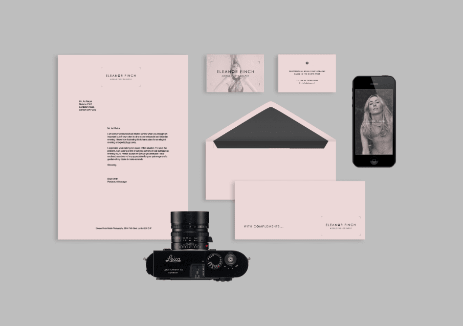
Eleanor FinchEleanor Finch by Studio Lane
Sam Lane specifically chose light, rosy pink for photographer Eleanor Finch’s business cards in order to target a primarily female audience. However, the black imagery and simple type keeps this modern without being ‘girly.’
Black – Sophisticated, Formal, Luxurious & Sorrowful
Meanings: Black is serious colour. It represents power, luxury, sophistication and exclusivity on one hand; and death, evil and mystery on the other. From formality to mourning to power, black is bold, classic and not to be fooled with.
Tips for use:Contrast a bright color against black; use gold foil for touch of luxe; or combine it with white for a bold and simple statement.
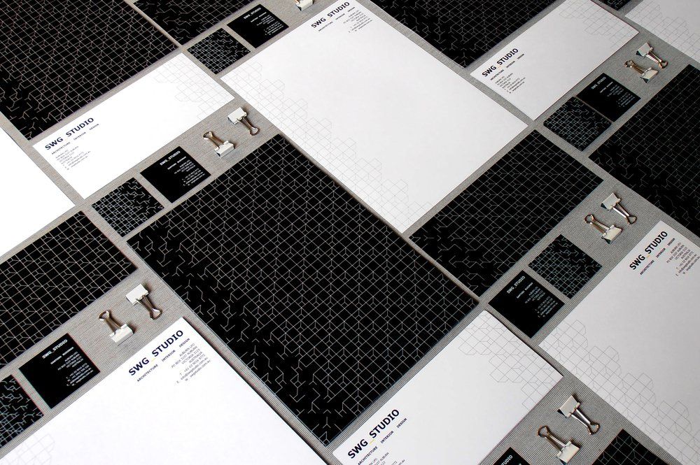
SWG StudioSWG_Studio by SWG_Studio
SWG_Studio revitalized their corporate branding with predominantly black stationery with geometric interlocking lines and shapes. The overall look is formal, professional and serious.
White – Purity, Simplicity, Innocence & Minimalism
Meanings: White represents simplicity, purity, innocence and perfection. A brand that has used white to convey its brand message to perfection it would be Apple – white represents the simplicity of the products in both their form and function. White also comes with a starkness or sterility about it, which is often used be designers to convey a minimalist aesthetic and clean, modern quality.
Tips for use: It is difficult to inject personality into a brand when using white, so making sure the brand personality is about simplicity, purity, and transparency.
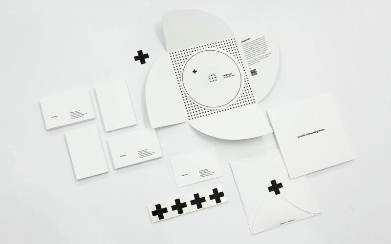
Thomas Wightman by Thomas Wightman
Designer Thomas Wightman created this identity system to portray his personal design style. Nearly all white, with a black + symbol for his first initial, the branding is simple, straightforward and minimalist.
Multicolor – Variety
Meanings: Diverse color generally indicates variety – be it representative of people, countries, or offerings.
Tips for use: Pay attention to the choice of colours, how it will work together both printed and digitally as the end result may vary with different screens and different printers.
Hello RubyHello Ruby by Kokoro & Moi
Kokoro & Moi love producing brightly colored visual identities and Hello Rubyis no exception. It celebrates all the realms of computing through the big imagination of a small girl. Bold and playful colors express optimism, curiosity and variety – just some of the many attributes of computing.
In conclusion, I though that pink, white and multicolours would suit my personality the best. Pink because it has been my favourite colour since I was a kid, and I like Barbie dolls & princess. As I grow up, I tend to appreciate white colours like the pureness of it and the innocence. And it looks clean to my eyes. And lastly, multicolour is because it can help to attracts someone's attention and, I feel like, the play of colours would definitely enhance my visual language.
So to start off on this project, I did a research on colour theory and how colour can be use in a design.
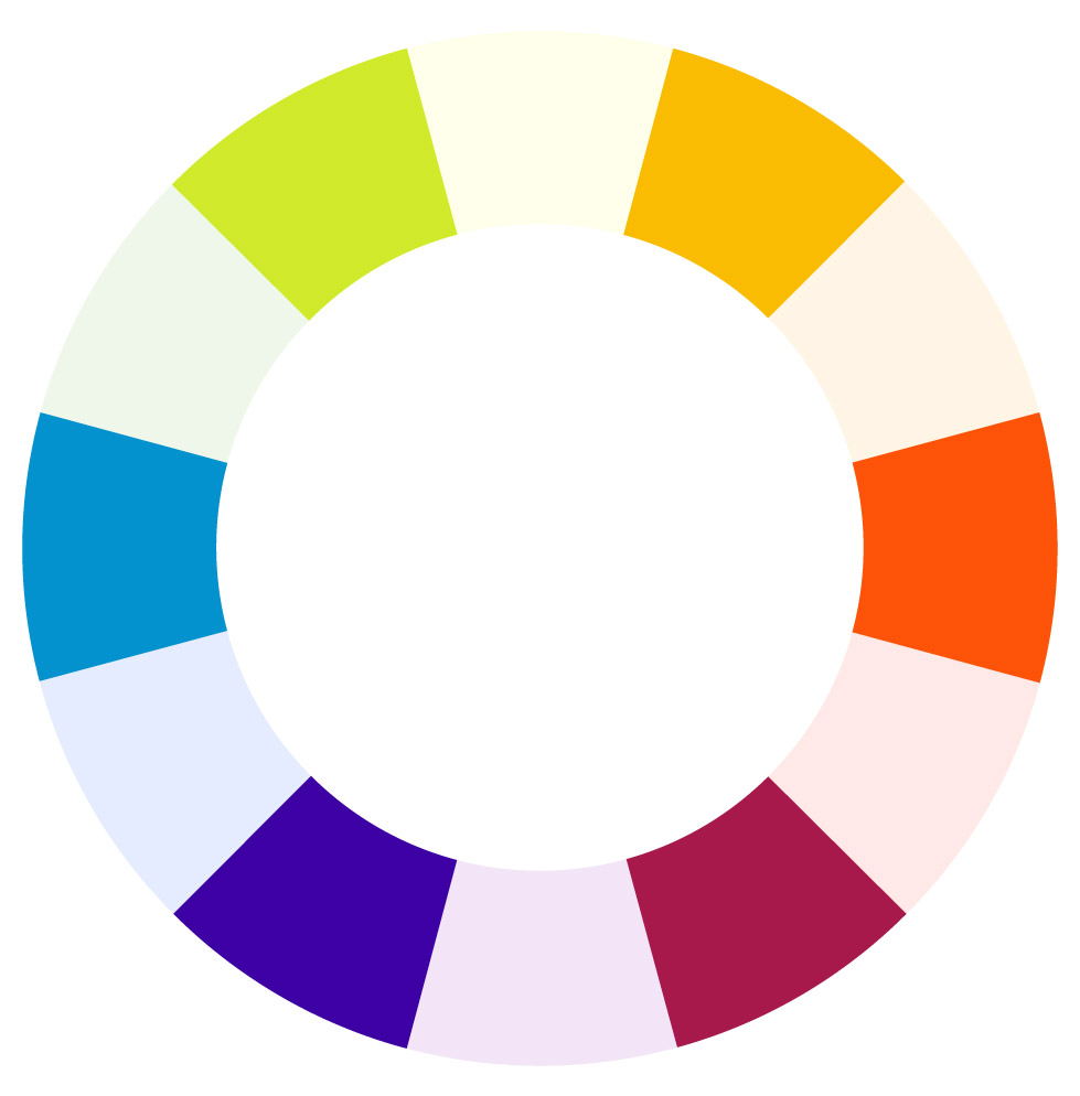
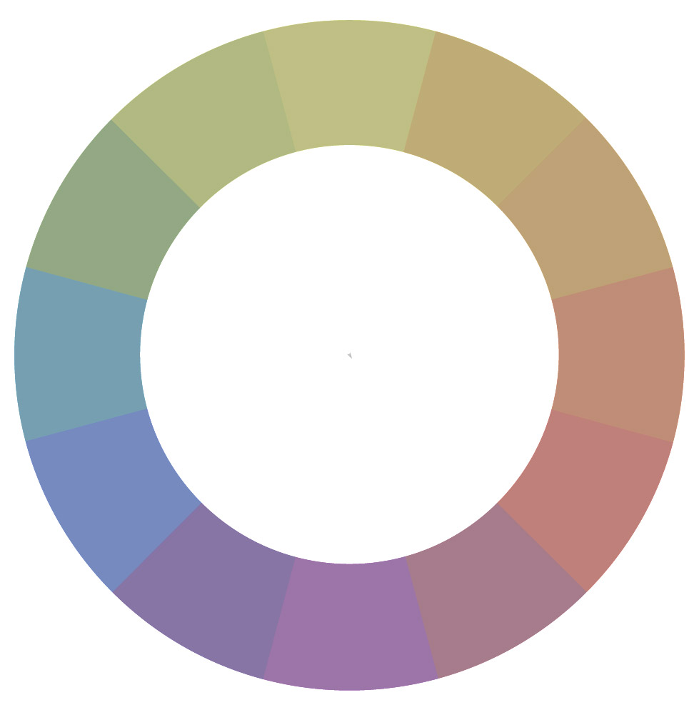
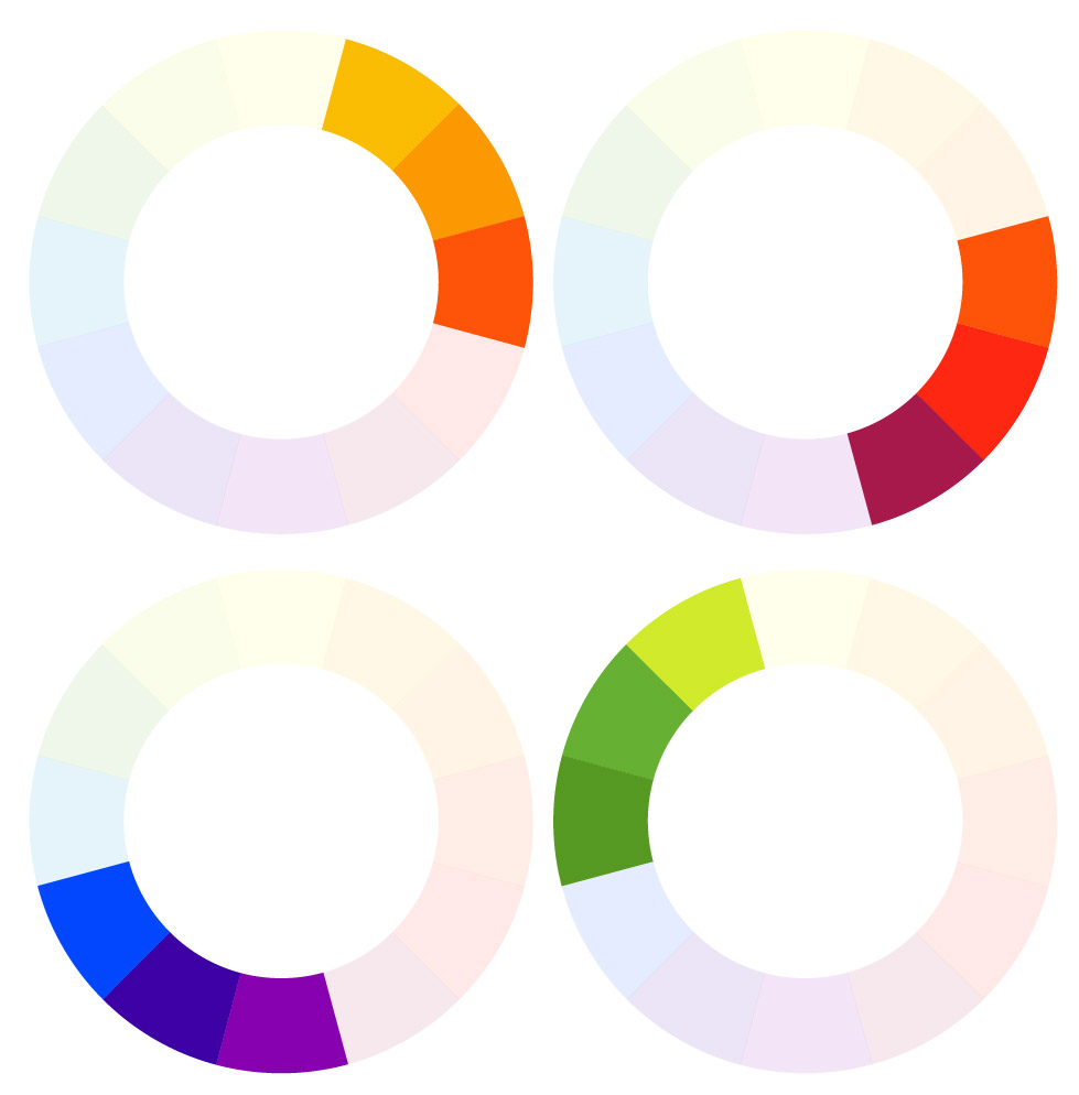
Firstly, to understand colour theory, I need to know about colour wheel and some of the colour terms.
Primary colours: red, yellow and blueSecondary colours: orange, green and violetTertiary colors: red-orange, yellow-orange, yellow-green & etc
Colour Terms
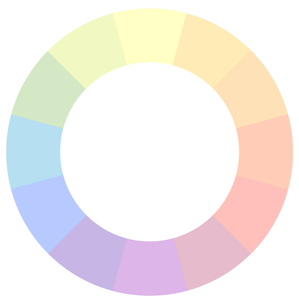
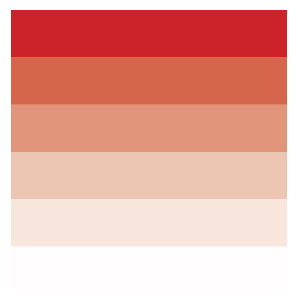
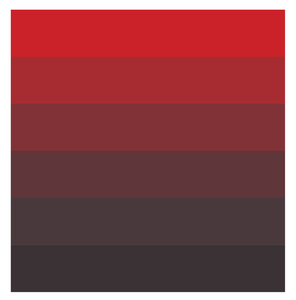
Hue: synonymous with “colour” or the name of a specific color; traditionally refers to one of the 12 colours on the colour wheelShade: a hue darkened with blackTone: a hue dulled with greyTint: a hue lightened with whiteSaturation: refers to the intensity or purity of a colourValue: refers to the lightness or darkness of a colour
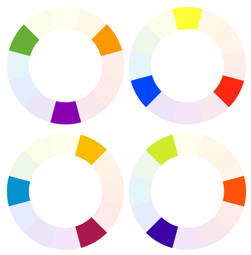
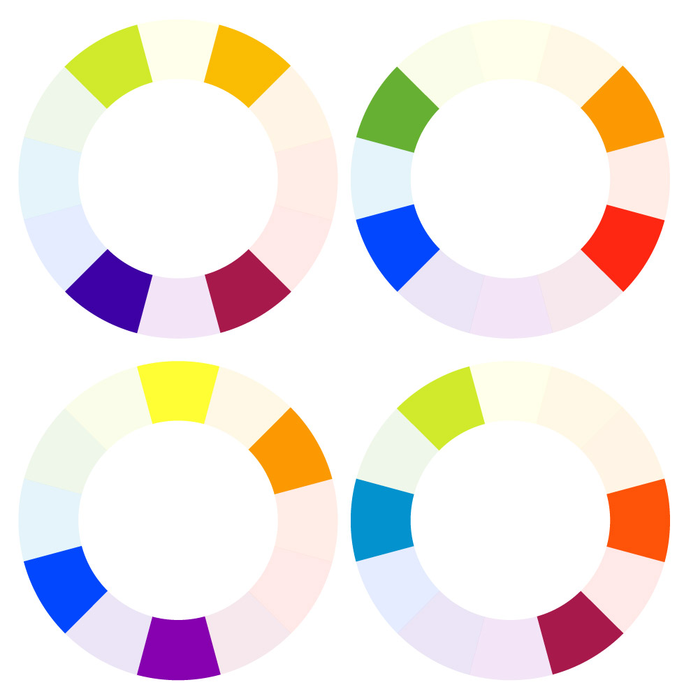
Color Harmony
Monochromatic: various shades, tones, or tints of one color; for instance, a range of blues varying from light to dark.Analogous: hues that are side by side on the color wheel; this type of scheme is versatile and easy to apply to design projects Complementary: opposites on the color wheel, complementary colors are high-contrast and high-intensity, but can be difficult to apply in a balanced, harmonious wayTriadic: any three colors that are evenly spaced on the color wheelSplit-Complementary: any color on the color wheel plus the two that flank its complement; this scheme still has strong visual contrast, but is less jarring than a complementary color combinationTetradic/Double-Complementary: two complementary pairs; this scheme is very eye-catching, but may be even harder to apply than one pair of complementary colors, since more colors are more difficult to balance.
So before I start on the new assignment, I went to search on the definition of 間 MA’s OBSCURE CITY of VOIDS.
So after a bit of research, I can roughly guess what this project is about. To my understanding, it is about creating or designing a building or architecture with the use of voids. Or an installation as in the previous lesson we did some sounds and our homework was to interpret the rhythm and express it.
However, I feel that this project is somehow related to gestalt and the use of negative space. To my understanding, gestalt is about the overall view rather than a part of it. And there is also a combination of meaning in it – smaller part has a different meaning than the overall view.
Other than that, I also did a research on Modular structure.
Based on Wikipedia, Modular design, or “modularity in design”, is a design approach that subdivides a system into smaller parts called modules or skids, that can be independently created and then used in different systems.
Other sources states that Modular Architecture refers to the design of any system composed of separate components that can be connected together. The beauty of modular architecture is that you can replace or add any one component (module) without affecting the rest of the system.
Some examples of Modular design:
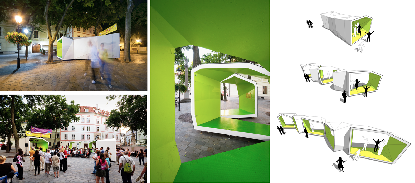
Plugin Tower
What I like from this modular design that, it can be added on and expand the building by just repeating the basic form. (source)
Alberto Sanchez’ Modular ROOTS Planter Rethinks the Traditional Trellis
Similarly to the first example, this modular design for plants can be extend to the gardener’s preferences. (source)
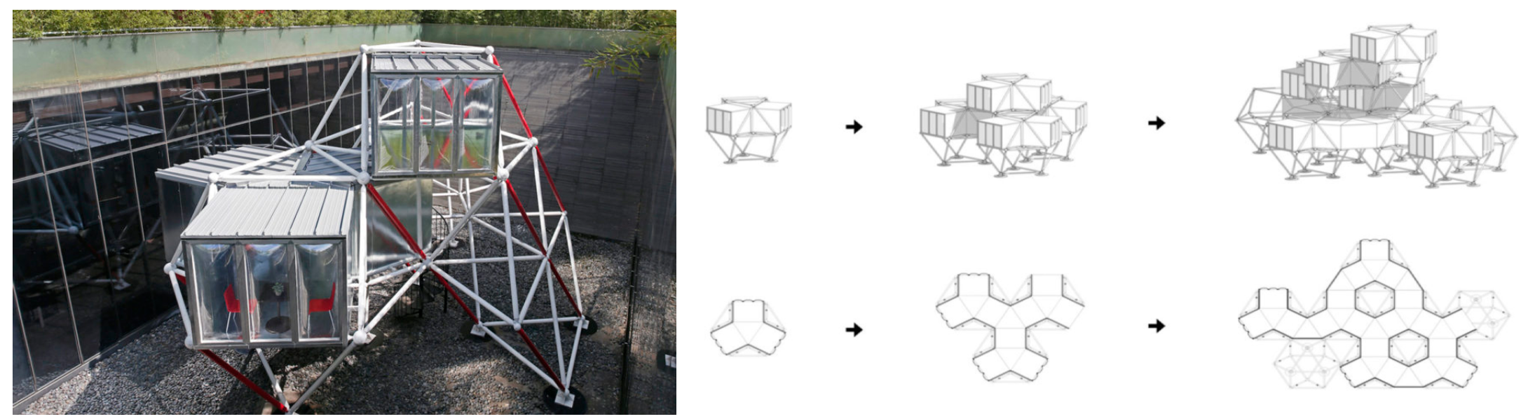
BA_LIK / Vallo Sadovsky Architects
Among the 3 examples, this is my favourite modular design. As firstly, it has a minimal design. Secondly each component of the design can be extended and separated for different purposes.
To conclude modular design, from my understand, is a part that can be added on by repeating the same part. Other than that, different purpose can be inserted when the parts are separated or compact together.
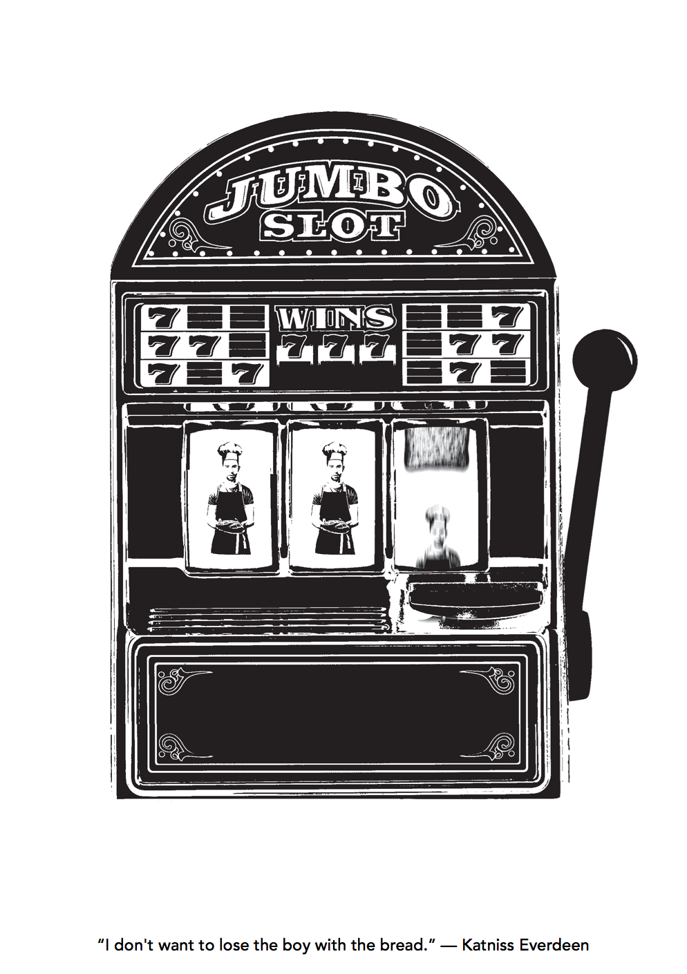
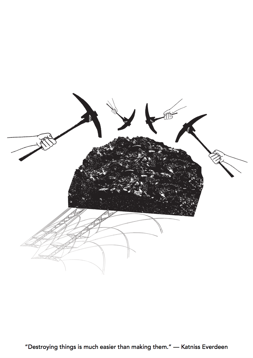
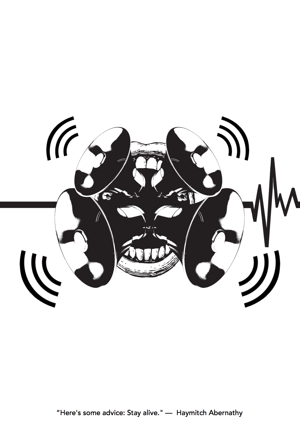
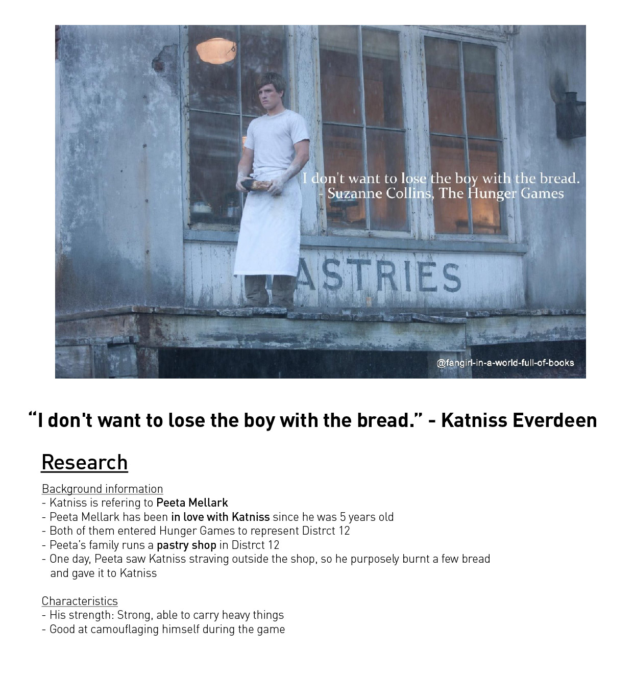
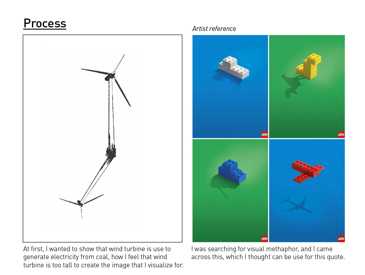
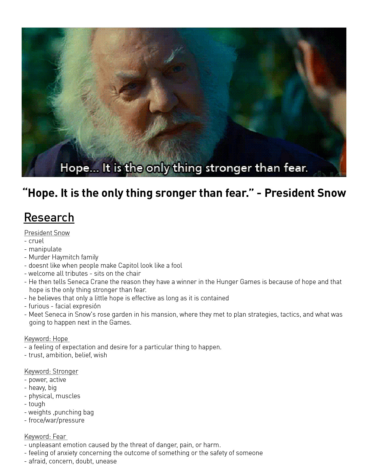
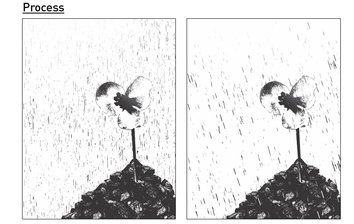
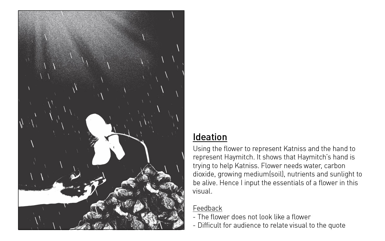
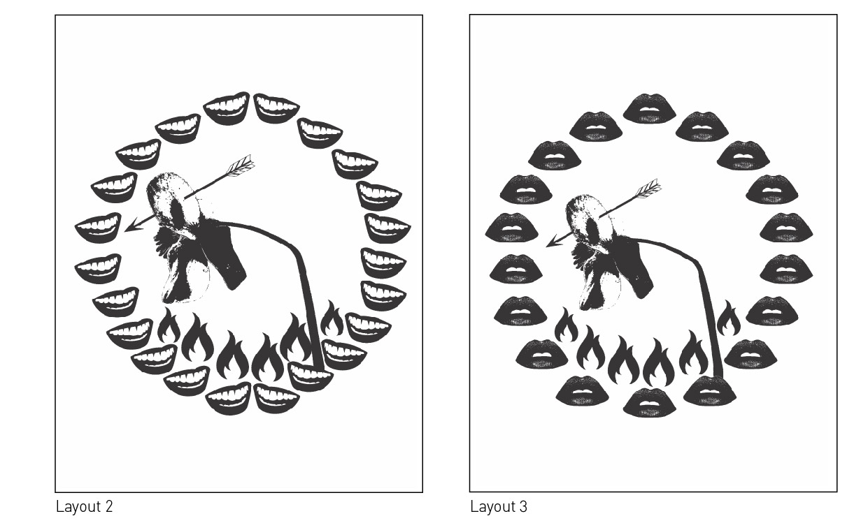
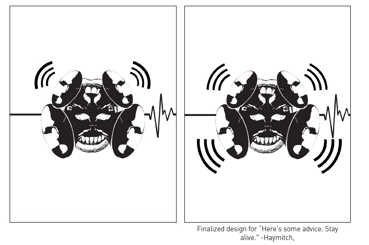
So all my 4 designs are based on 1 movie which is The Hunger Games (2012). At first I had so many quotes to choose from because I read the book and watched all the series of Hunger Games. But as weeks pass by, I decided to change some of my quotes because some quotes are difficult to execute it visually. So here are my 4 finalise design:
During the first stage of designing, when I was creating the match stick, the fire looks like a woman’s hair. Hence that’s where my idea came from. To create the girl on fire, I place a face of a girl on the fire. The opposite of losing is winning, that’s where I got the idea of jumbo slot. And the last slot shows the movement of it to show that there is a 50/50 chance of Katniss losing the boy with the bread. The boy is dressed as a baker, as in the movie, his family has a pastry shop.
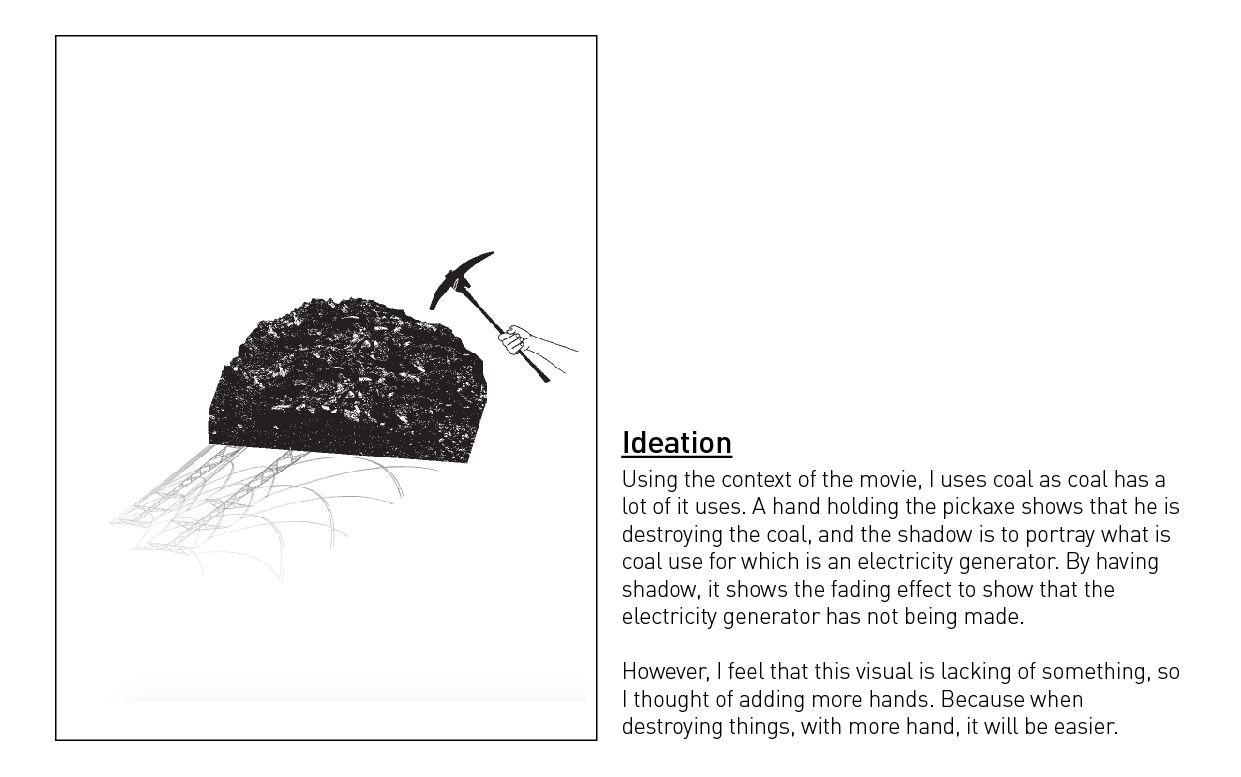
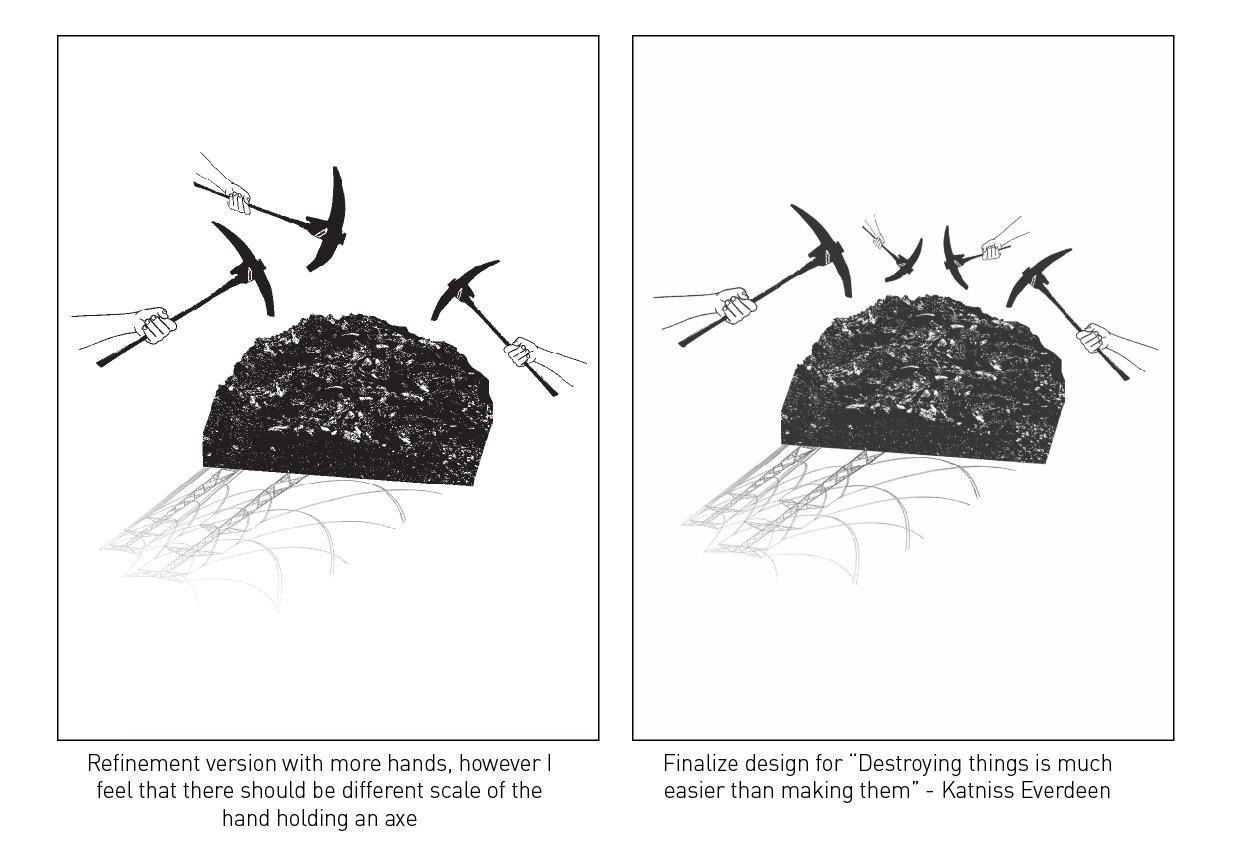
To relate back to the context of the movie, I use coal as in the movie, District 12 is a coal mining district. The hands show that they are destroying the coals. And the electric wires represent the uses and outcome of coal. I wanted the electric wires to look like a shadow instead of placing it at the background.
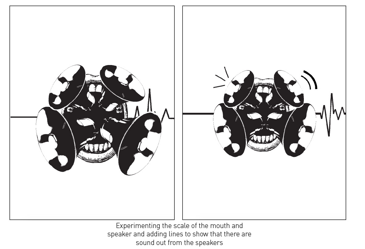
This was the most difficult to design as I did quite a lot of version for this. The mouth and horn speakers shows that it is giving advice. And the heart rate shows from dead to alive.
Reflection
Overall, I feel that all 4 designs portrays who am I. (something I learnt about myself that can be used for my next project) Like I always make my composition in the centre and I tend to make my designs look neat and simple, which is who I am – I’m a simple person, who does not like complicated things and I do things neatly most of the time.
Among all 4 designs, I think the last 2 design is not up to my expectation. I feel that I can make it better.
The silkscreen session was fun! But it’s just a bit troublesome and things might get messy along the way, which is not me. (as I mention I do things neatly) I don’t mind doing silkscreen a few more times, but I won’t do it forever.
Overall, this project is quite different from mark-making. It is like a leap. And to choose either 1 of it, I’ll prefer mark-making. Maybe because it is something close and personal to me.
This project require lots of problem solving, which is challenging but I like it! Because it challenges my mind not to be lazy and to think of something out of the box. I will definitely hold onto this characteristic throughout my journey as a art student and future designer.
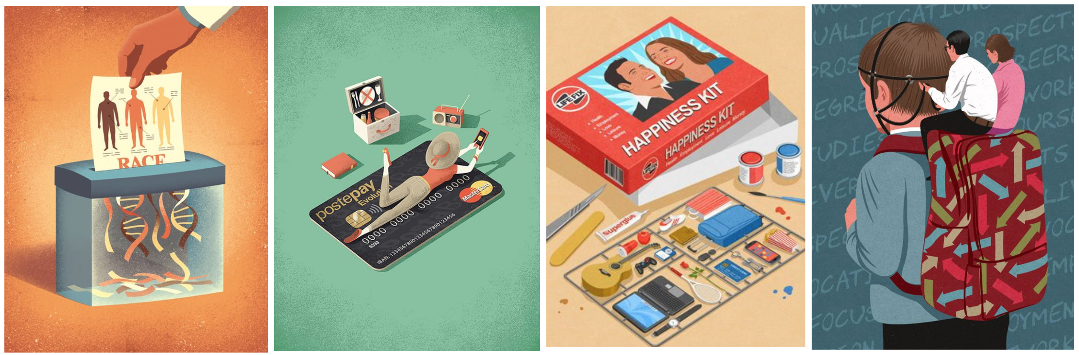
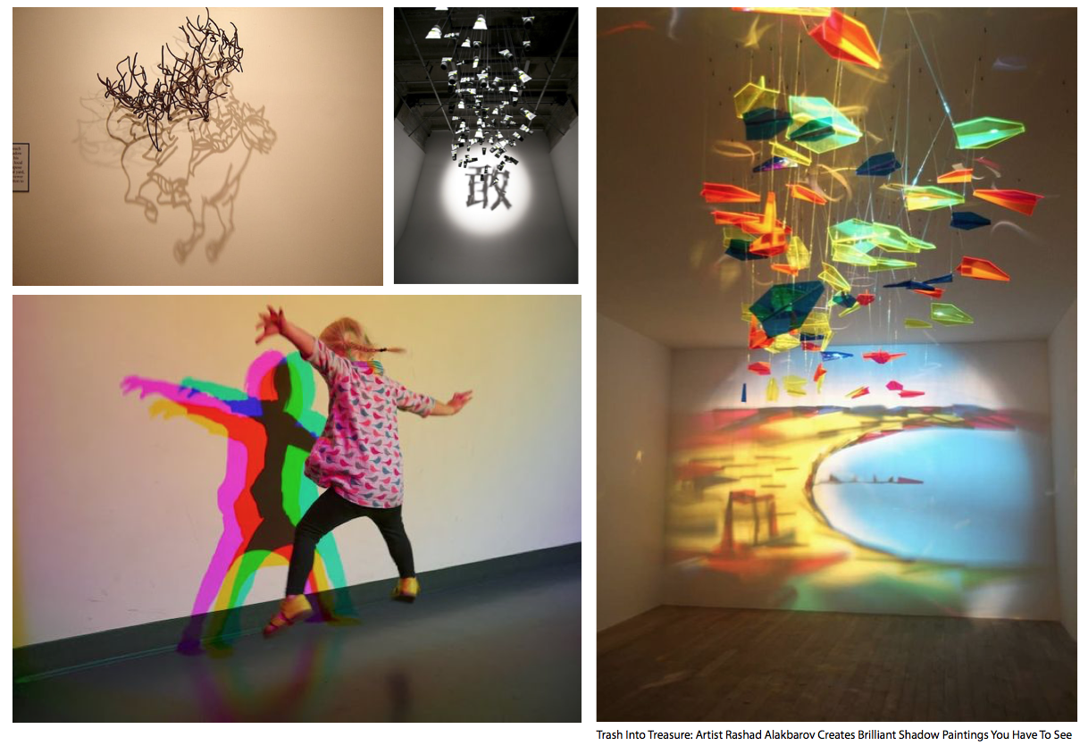
And if I have the time and idea, I would like to create some other designs with the use of colours but in vector style. Because as I was researching about visual metaphor, I was so inspired that I wanted to try and create some of it.
Example of Visual Metaphor that I want to do in the future
For this pair work, my pair was Hui En! (I was so excited to pair with her. YAY!)
Memories
Both of us share similar memories about our class. So we wanted to portray that in our 3D model.
Mindmap of memories as a class
The keyword from the mind map are togetherness, discovery and future.
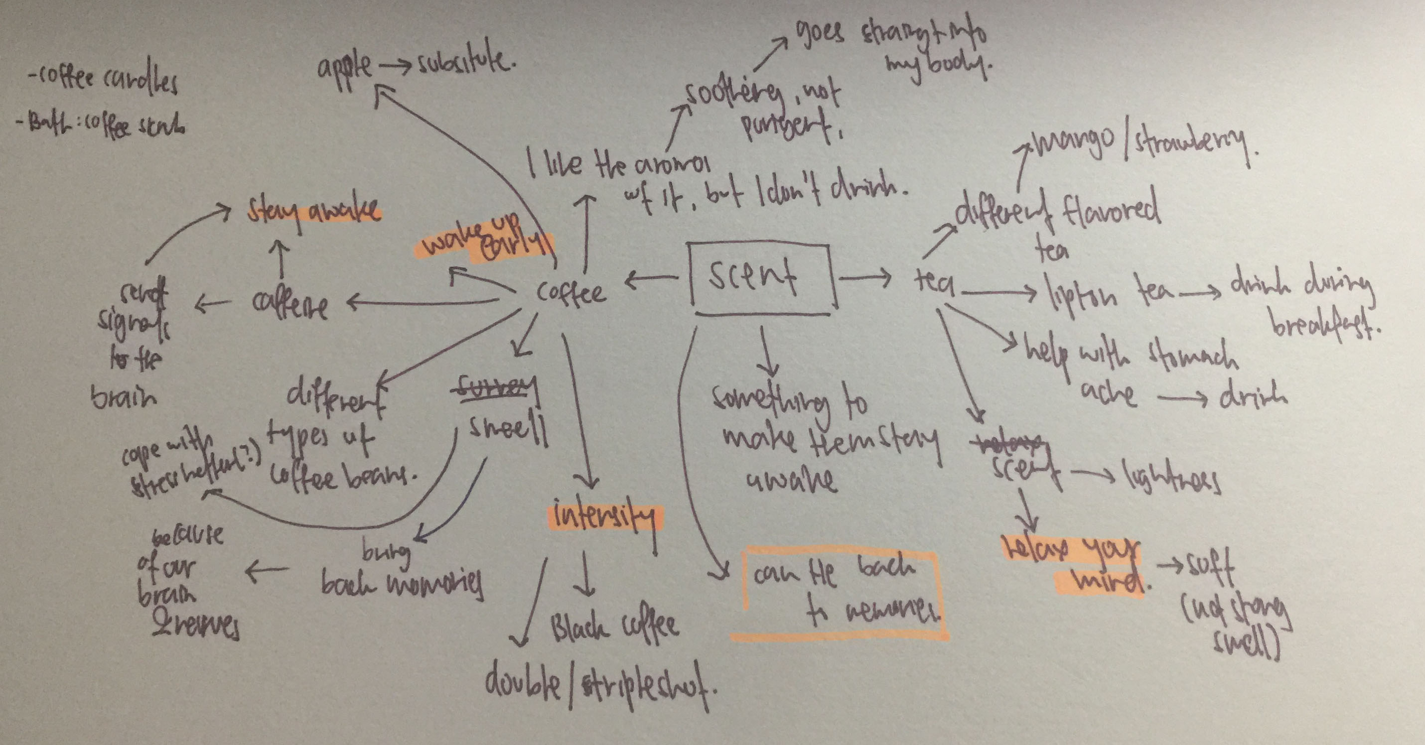
Scent
The scent the we are going for is tea and coffee, as it makes us stay awake in class or at night (during submission weeks). So me and Hui En went to survey our class – Do you prefer tea or coffee?. And the answer was 50% coffee, 50% tea.
So we went to research more on the scent of coffee and tea.
Mindmap of scent
From my research (image above), coffee scent has different intensity level and tea scent helps to relax a person’s mind.
Coffee scent are smell when its brewing and there are range of colours to it – brown, dark brown to black. And tea are normally served in glass cups.
From Huien’s research, tea and coffee can be associated with each other. This can be linked to our memories as a class, like having outfit-of-the-day together and also lunch. Huien also mention that although each individual is different, we can still mingle around and look out for each other.
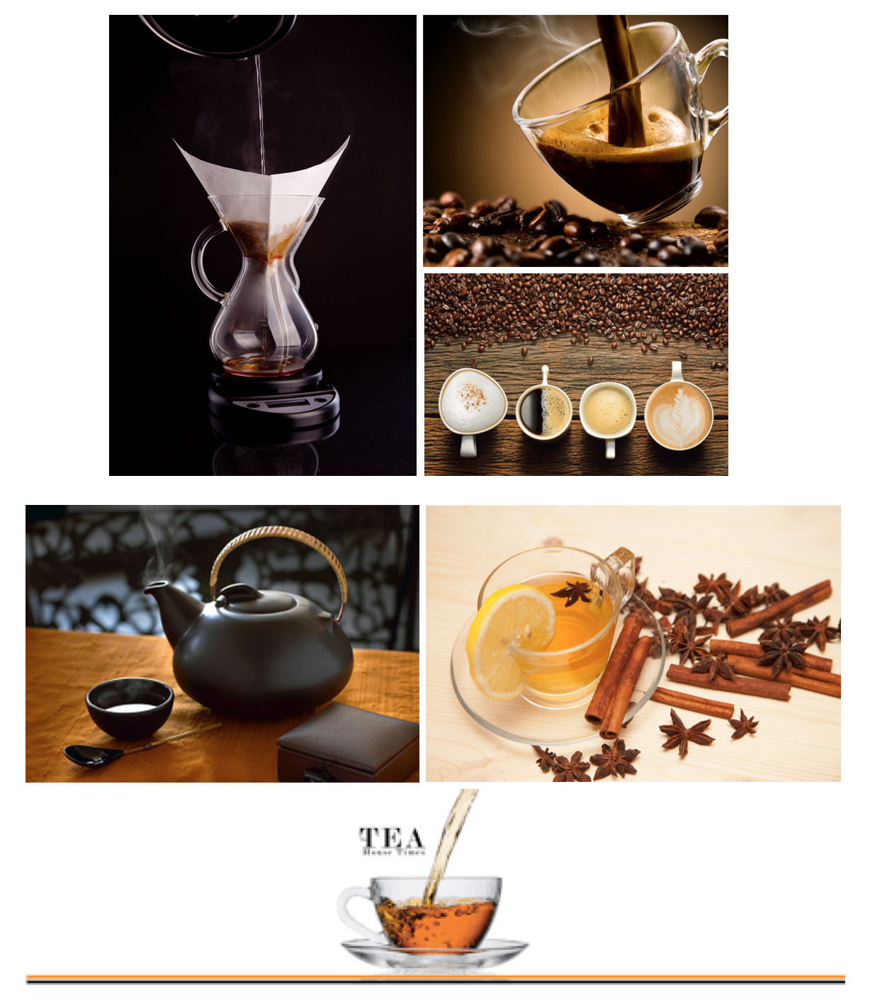
Planar
Examples of planar
For the planer part, we wanted to do something that is going up to represent soar, take flight and going up. As that is what will happen to each of us (G6) when we separated into our majors.
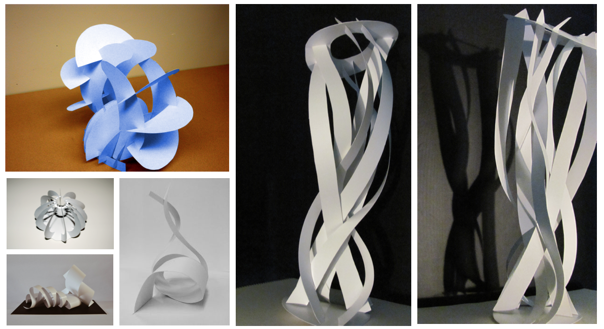
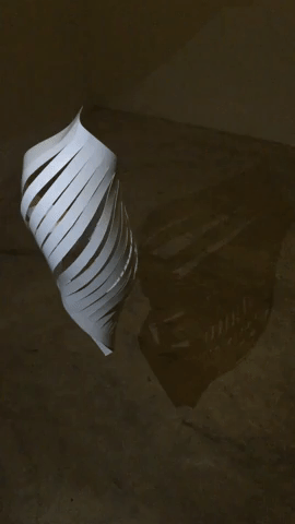
Light & Shadow
Example of lighting & shadows
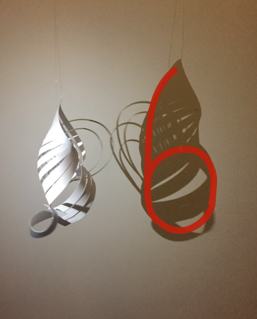
At first when we discussed about our ideation, Huien mention that she wanted to do something different. So we decided to play with lighting and shadow. Instead of having the number 6 (representation of G6) in our model, we thought of having the 6 cast on shadows. Why the number 6? Because 6 symbolise completeness, high ideals and luck which brings back to our memory as a class.
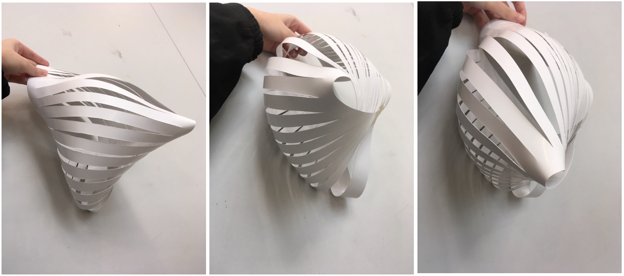
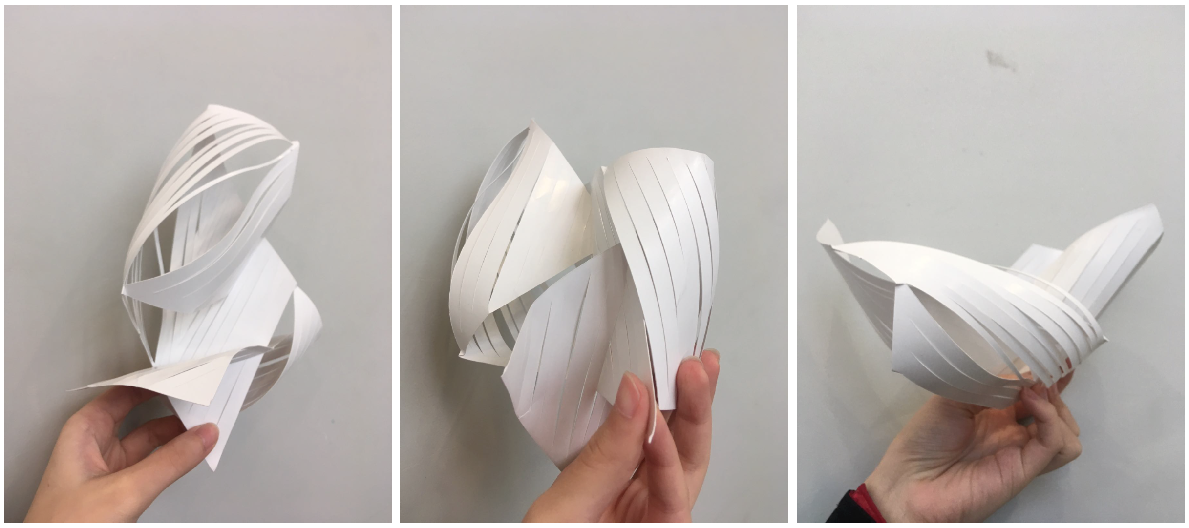
Material – Paper
Example of paper sculpture
We thought of using papers because
Easy to make planar
Paper is flat hence we can experiment and explore it to create into 3D
Process
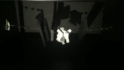
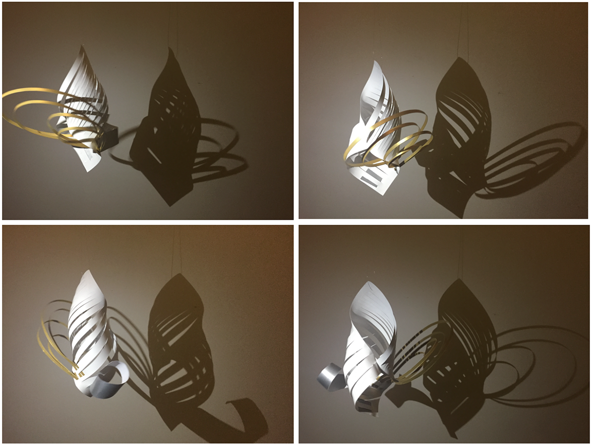
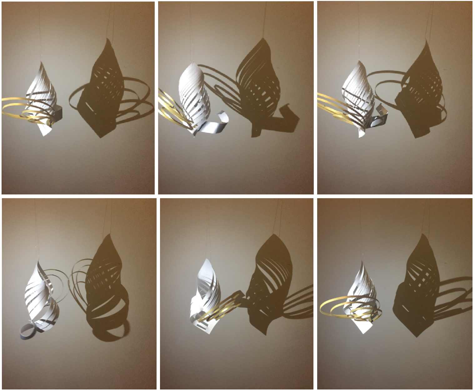
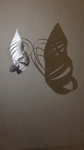
Testing the shadow with our selected paper sculptor
Although Huien injured her finger, she insist of doing some paper cuttrying out the shadow, but it did not create the number 6
Out of all the shadows, this was the most successful in creating the number 6Thank you Huien for being the model :)
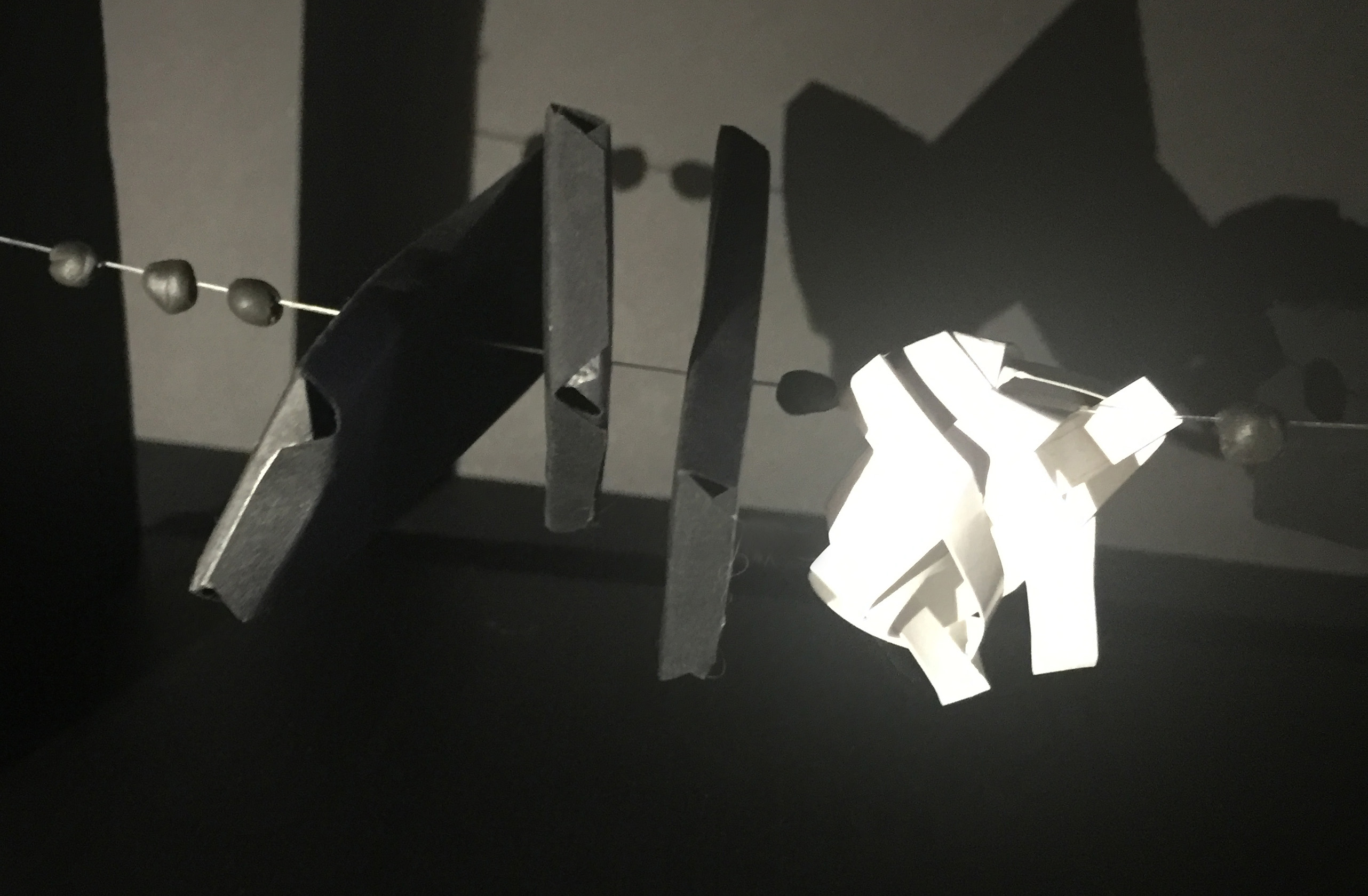
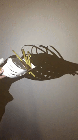
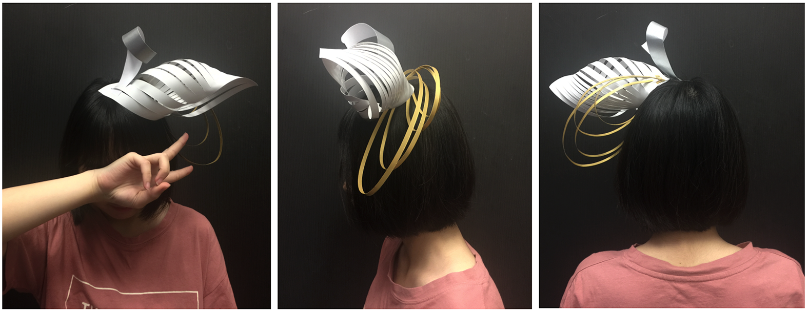
Shell (white paper) represent love and protection. Our shell spirals upwards. This is to show that we believe in each individual, in our class, to continue to improve and strive for the best (which represents the spirals going upwards).
Number 6 represent completeness and high ideals, which then refer back to our class. Some weeks we would wear outfit-of-the-day together and go lunch together.
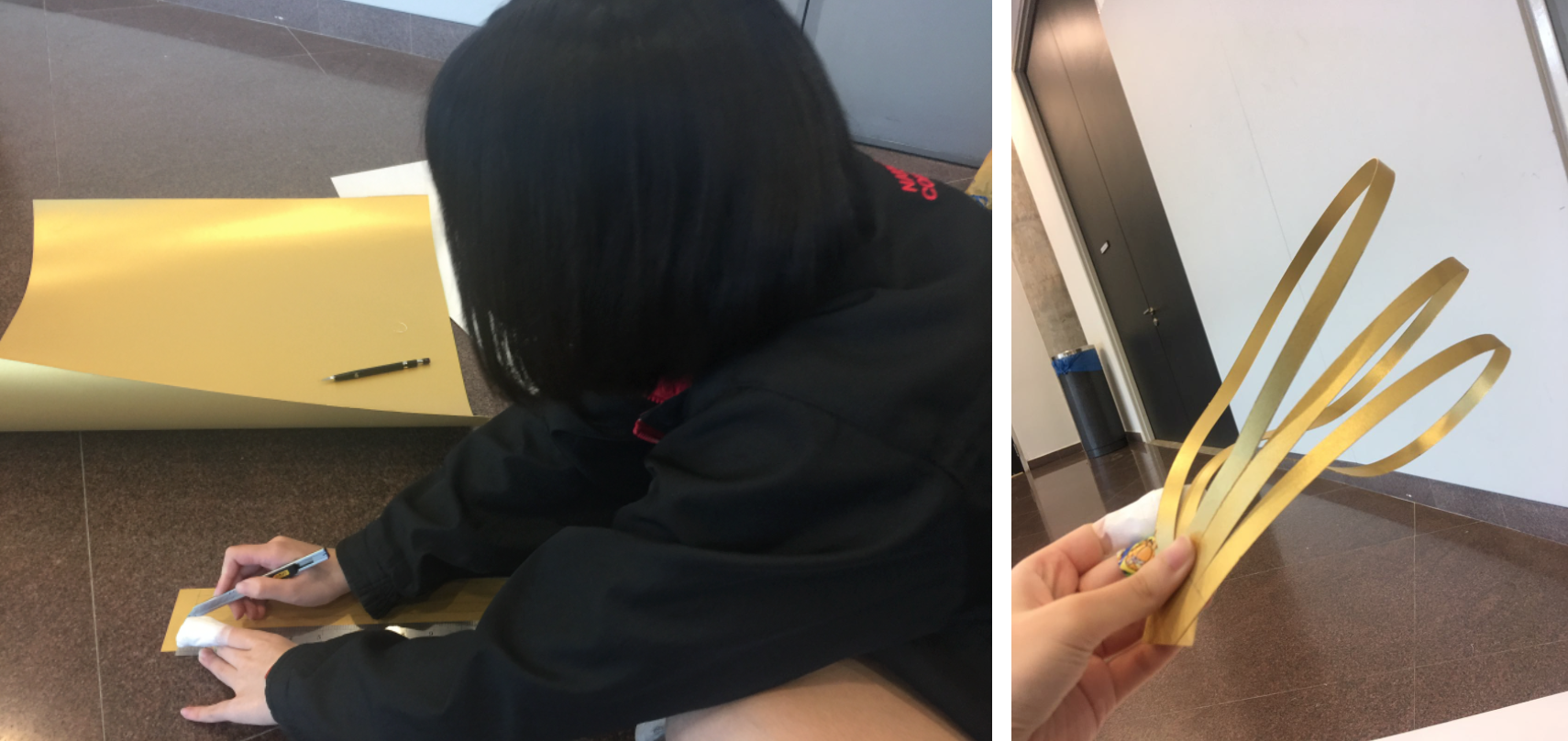
Gold is use for coffee. It is in loops to show that coffee has different intensity. Sliver is use for tea as the tea scent lingers for a while and it will then diffuse into the air.
Reflection
I like the concept of using lighting and shadow, however it was not executed well especially when it is being wear. That’s why we could not cast the shadows during the runway.
The scent that brings back pleasant memory is this snake brand cooling powder. At first, I did not like it because of the after effect of the powder, which is the heat.
When did I start liking it?
It was during my camp, when we are told that we won’t be showering and we started to panic and get anxious. By the way, we are a group of girls going camp at Pulau Ubin. So my instructor told us to get this powder to replace our shower.
I could not find a picture of us during camp, but here are the girls I went camp with
This powder brings back the memories I had during camp. One of it was I was the leader in charge of my team (we were groups in 4), and I was a bit ‘naughty’ that I broke a quite a few camp rules such as secretly wasting camp food then allowing my teammates to eat outside food. And we got punished for that.
Pencil box/pencil leads bring back to my unpleasant memories. Pencil box have been with me since I start schooling, and I constantly changed my pencil as I grow up.
But pencil is one of the important things in my pencil box. Since young, I like to use pencil and scribble on papers. However what annoys me is when the pencil lead smudges on my hand. Especially during art lesson, where I drew half way using pencil, and I realise that my drawing paper has pencil smudges on it. And I really hate it when this happens because I am the clean and neat type of student.
Me being extra careful so that my hand won’t touch my work
Mnemonics device
At first when I heard about Mnemonics device I was like, “Huh? What is that?”. But after researching about it, I realise that I have been using a lot of Mnemonics devices, especially during school days.
Here are the types of Mnemonics devices that I used in Secondary school:
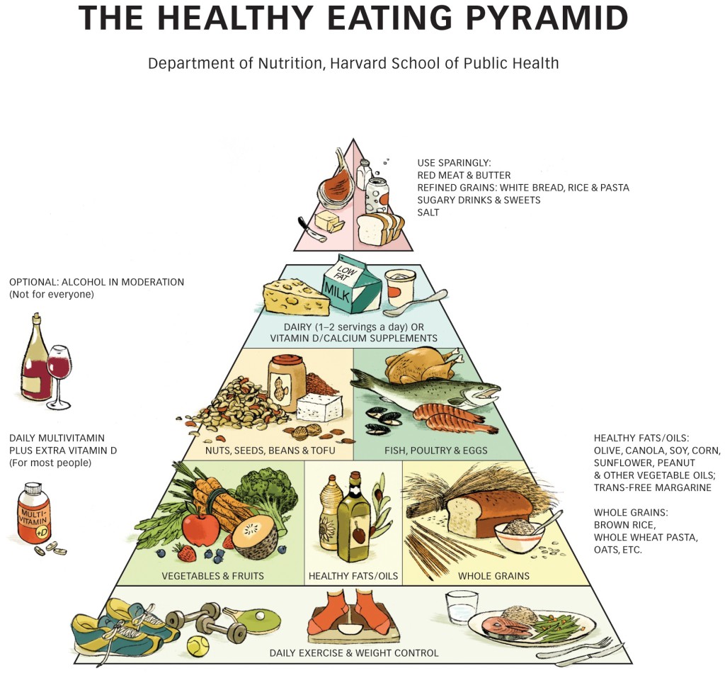
Model Mnemonics – Food pyramid & animal chain. With model mnemonic, it makes it easier for someone like me (who needs to study visually) to understand a certain topic.
Animal chain
Note Organization Mnemonics – which are notes from the teacher or I will create a mind map for myself so that I can better understand the topic.
Image Mnemonics – when I’m tried of writing words on my mind map, I will then use images or draw some icons/symbol to represent its meaning.
Other examples that my teachers thought me are:
I used to not know which direction vertical and horizontal goes, so my teacher told me that vertical has the letter V, so it goes down.
Another thing that confuse me was the word: decrease and increase. So my teacher told me that DBS banking represent decrease because Decreasing: Big (to) Small. So this is the use of acronyms.
Another theory is to make a new habit, you have to do it continuously do it for 21 days. When I heard this for the first time, I tried it out and it really work. So when I want to create a new habit, I will stick to this theory. But I’m not sure whether this links to Mnemonic device.
Another tips for memorizing, from my teacher, was he told us to revise or recall whatever we have learnt within 24hours. This was something that I have been sticking with ever since secondary school.
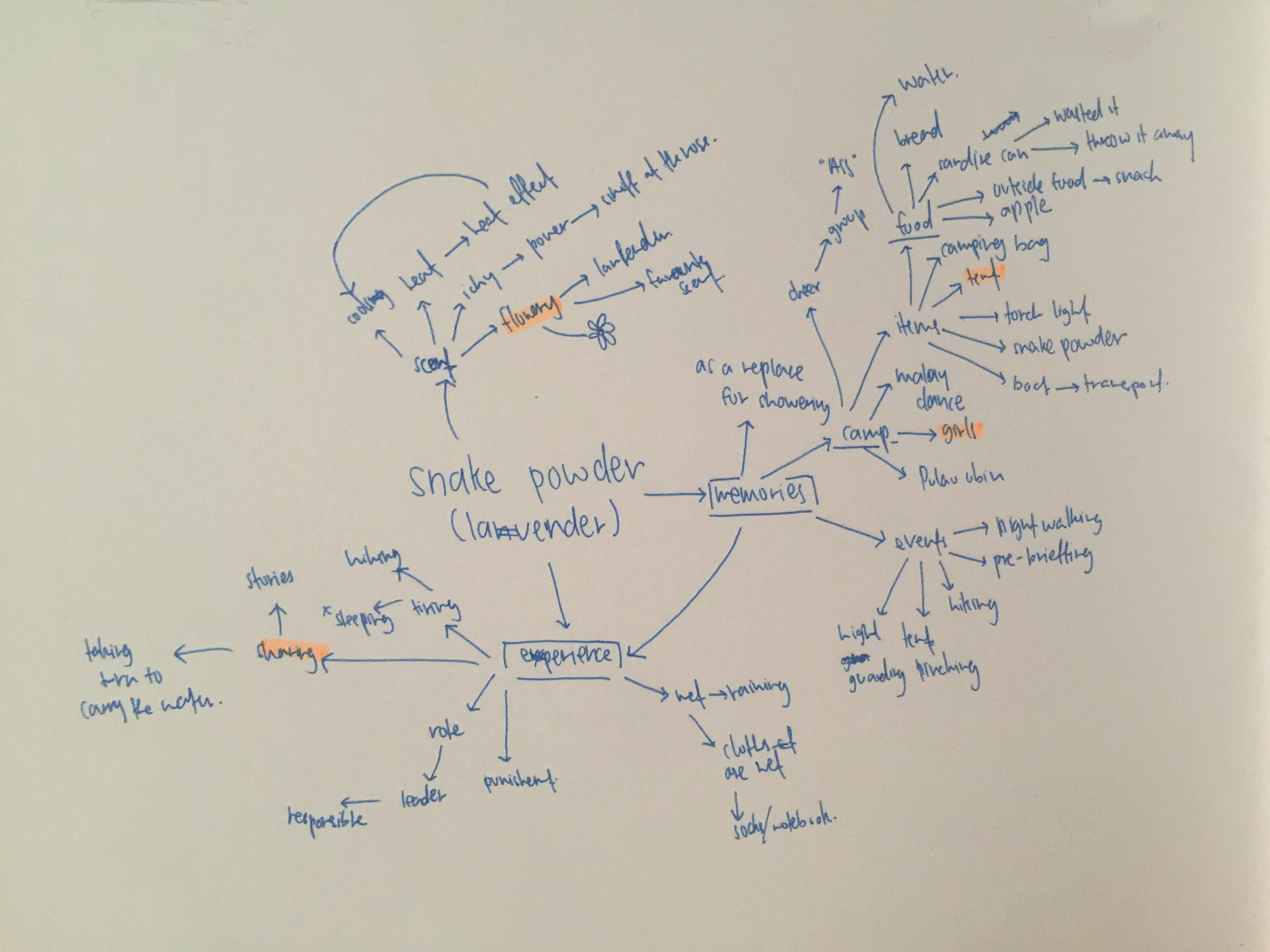
Mindmap
Good memories
For good memories, the keywords are flower, girls & sharing.
Bad memories
For bad memories, the keywords is smudge.
Experimentation
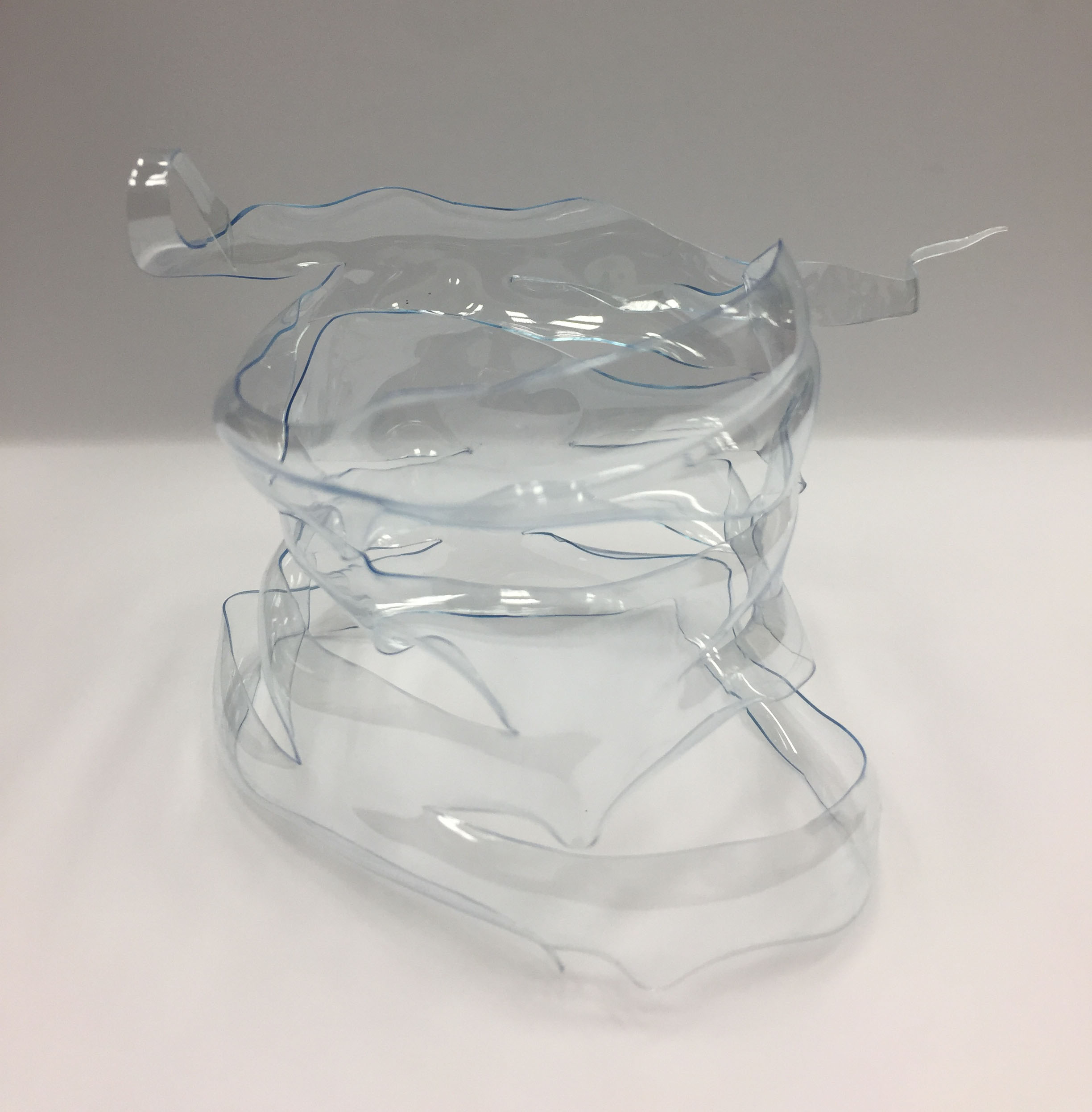
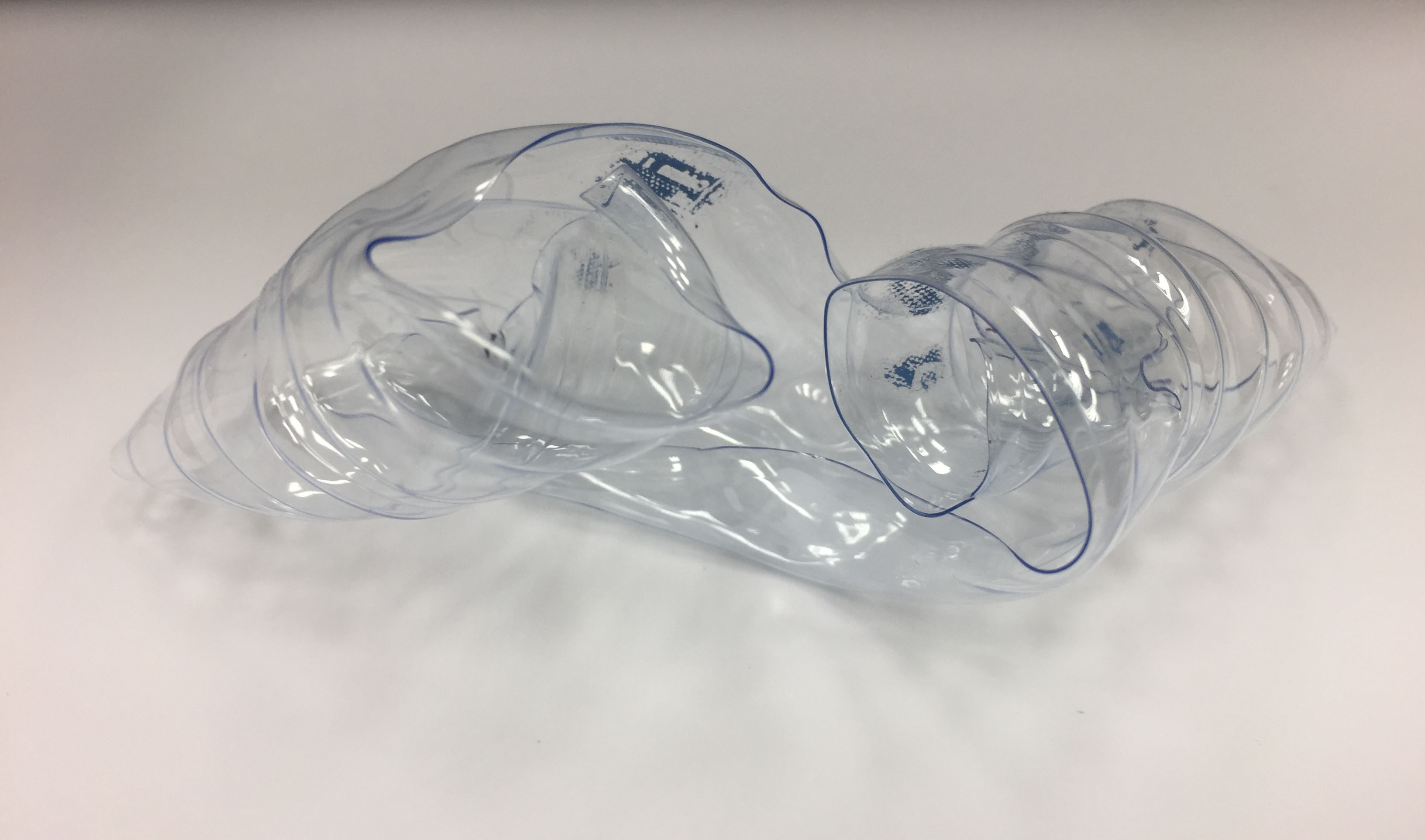
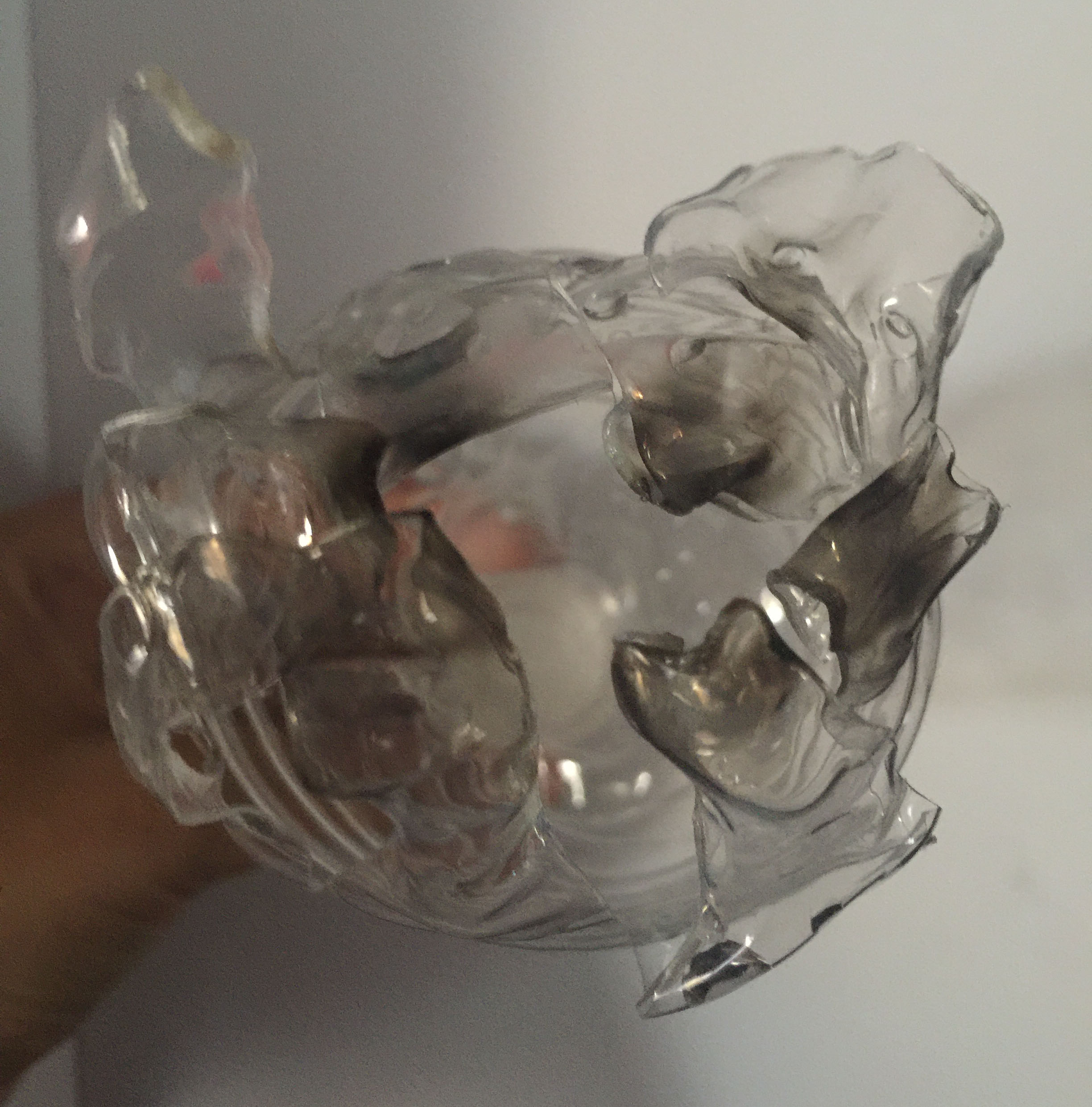
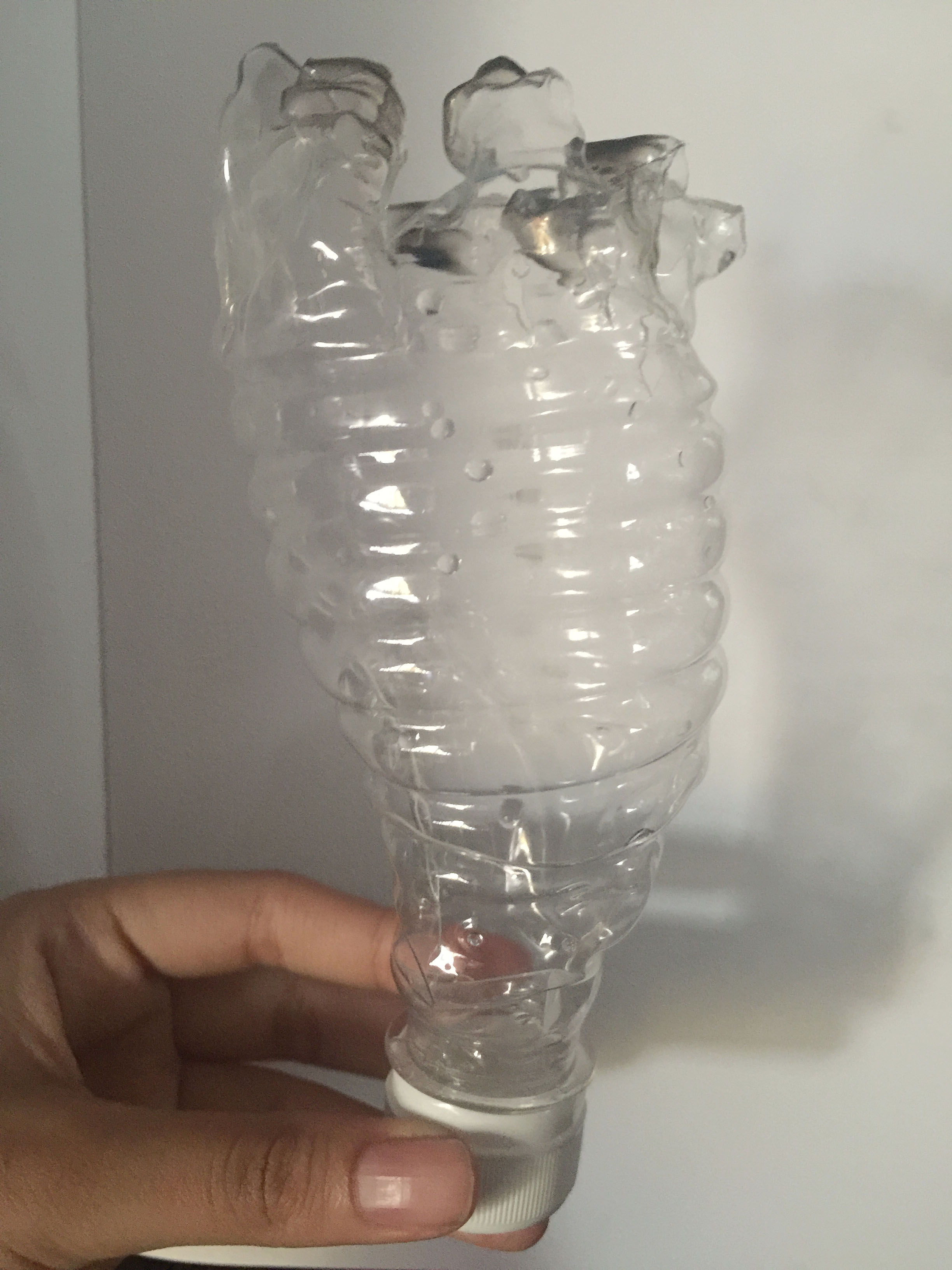
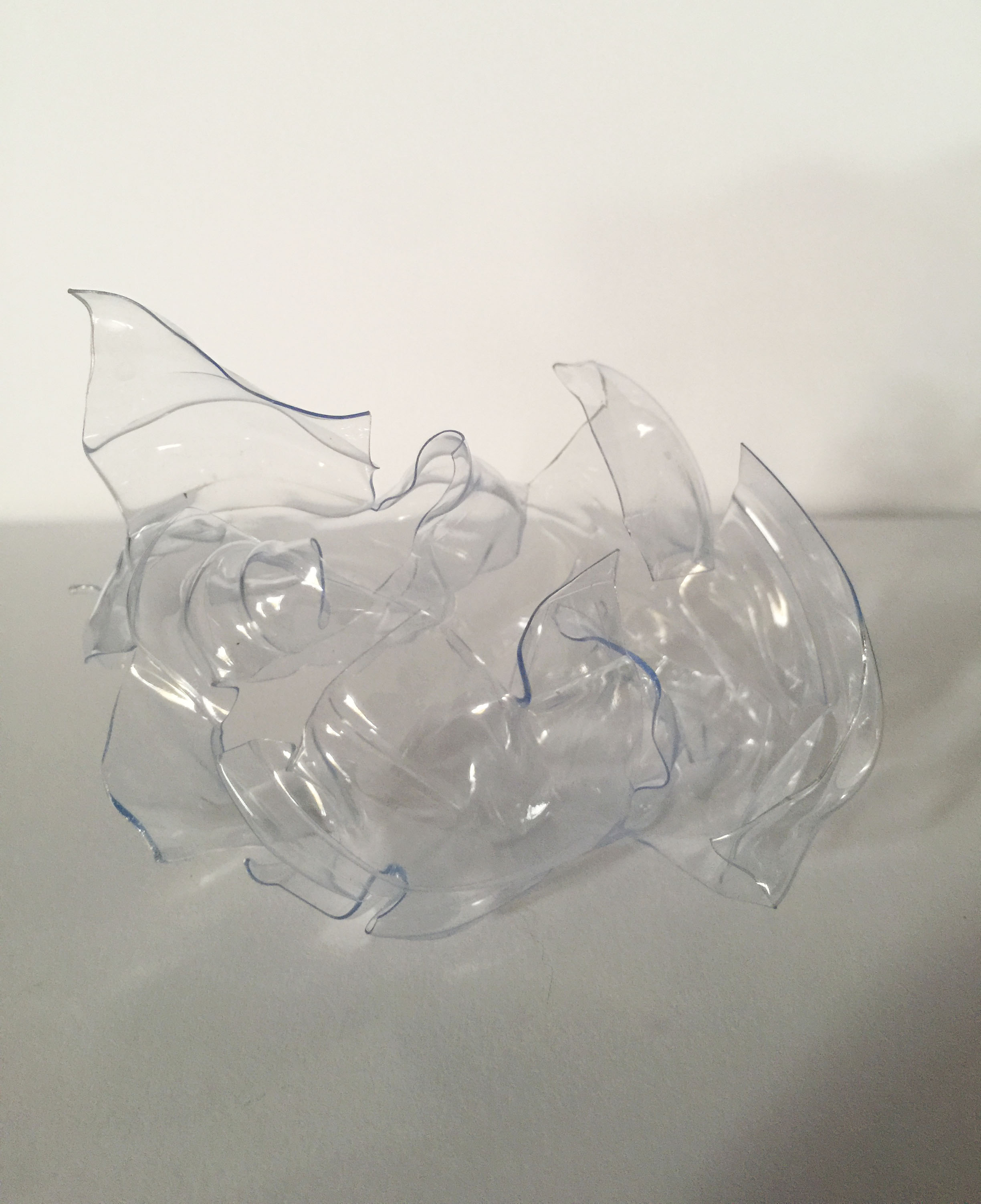
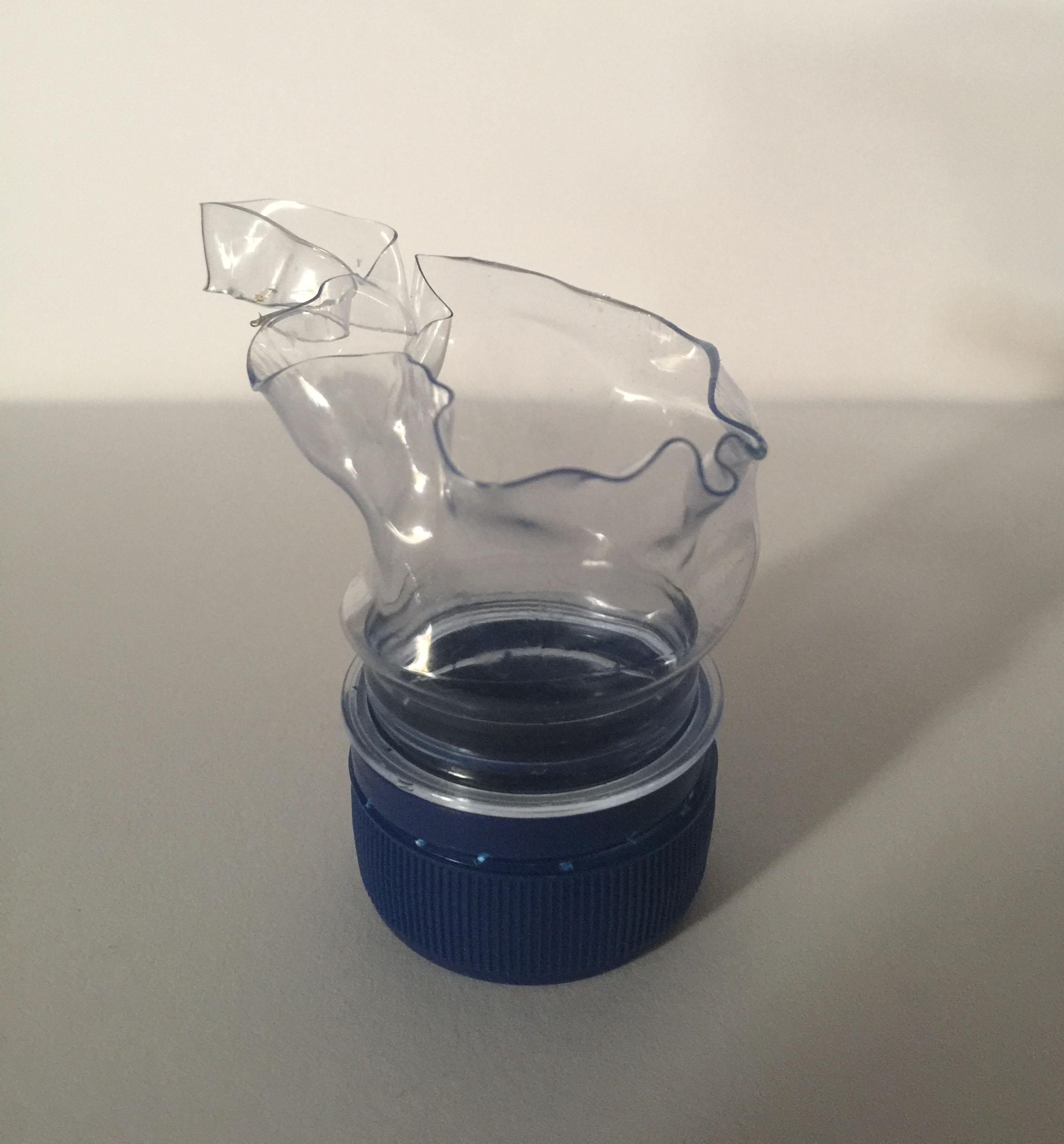
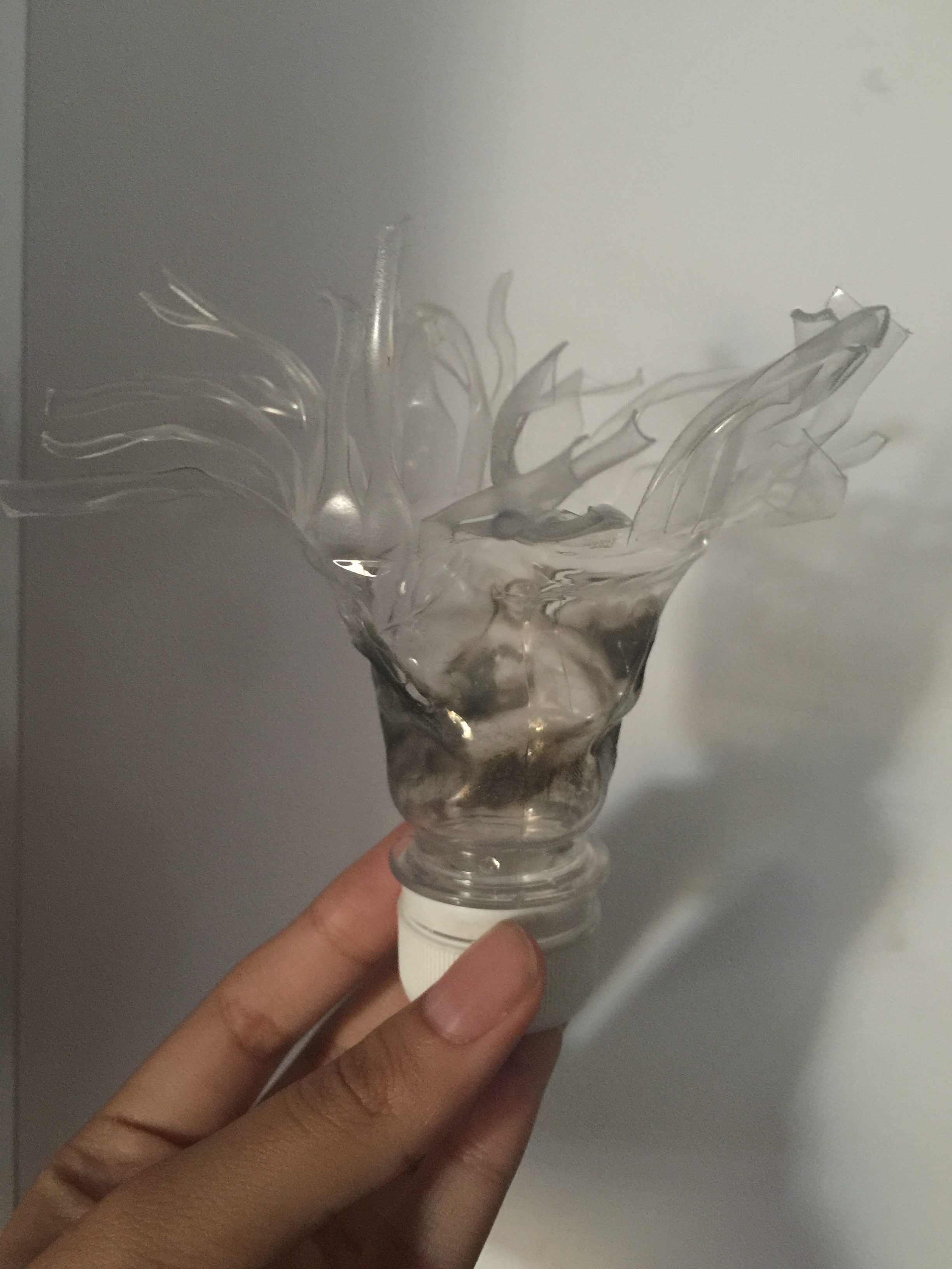
The base of the bottle can be represented as flowerThis was done by Ying Hui, I like how the lines and cut out are formedA curled up to represent friendship (for good memories)I tried to create a flower but it looks like the flower has not bloom. I added in yellow wax for experimentationI wanted to create the smudge effect that reminds me of the bad memoriesFront view of the image aboveSmudge effec, I like how it goes from translucent to transparent (top to bottom)
So I did a few different variations of the same concept. One of it looks like a Super Tree in Garden By the Bay, so I make the leaves thicker. Then the others I try to make the difference in tone, like going from transparent to dark.