Interactive Storytelling – L1 201

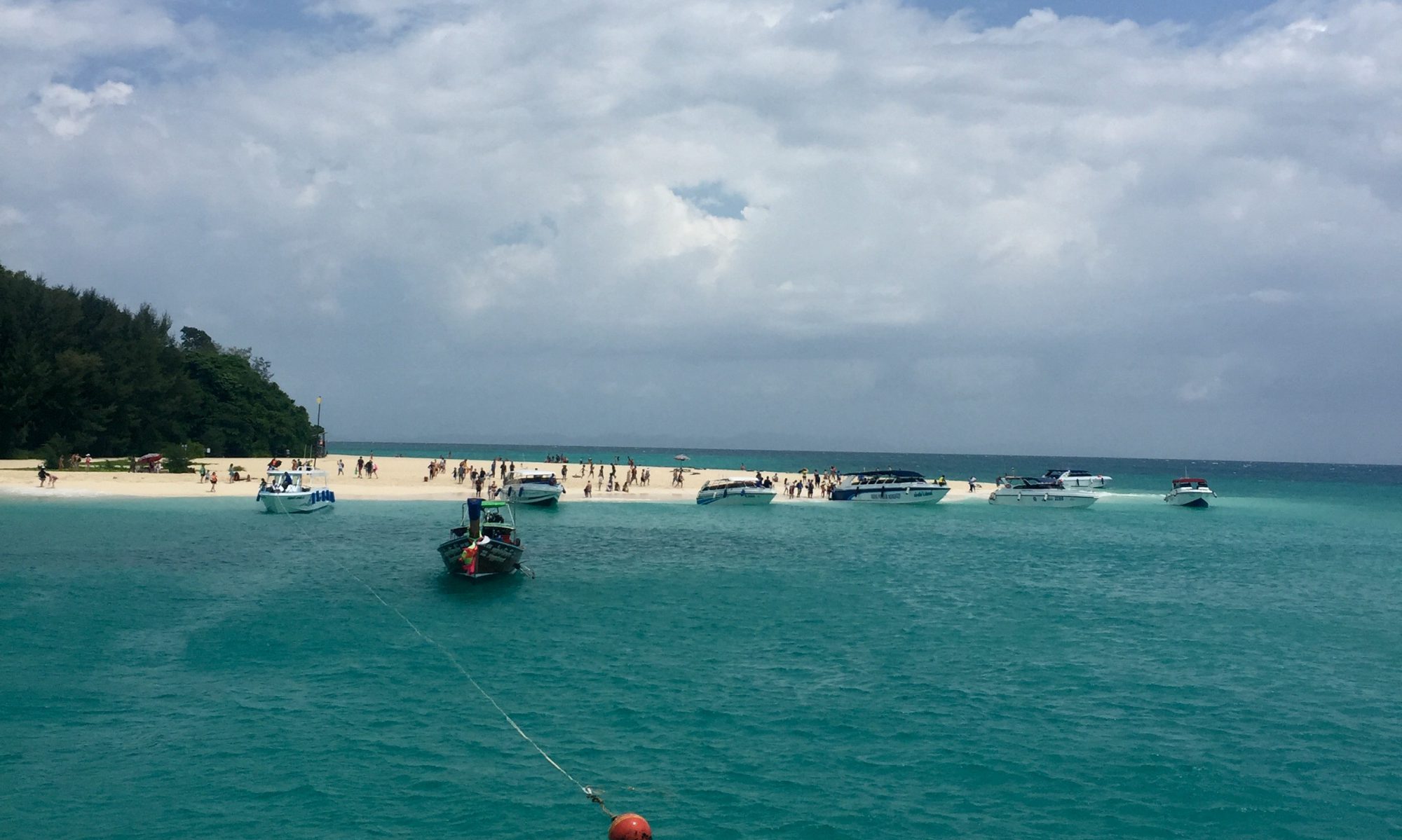
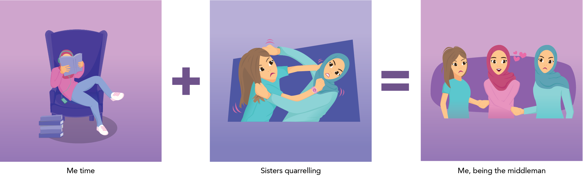
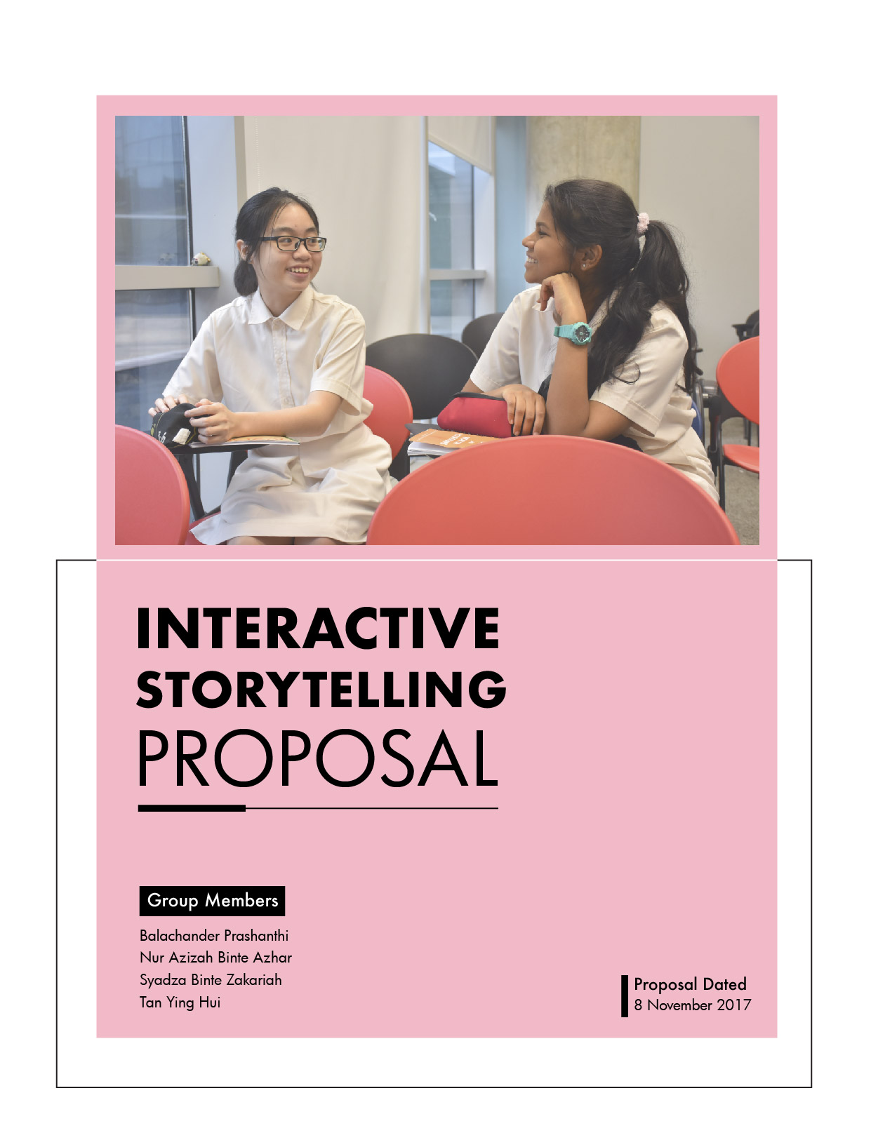
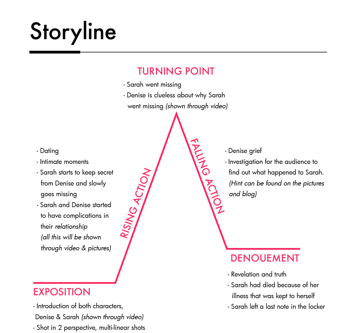
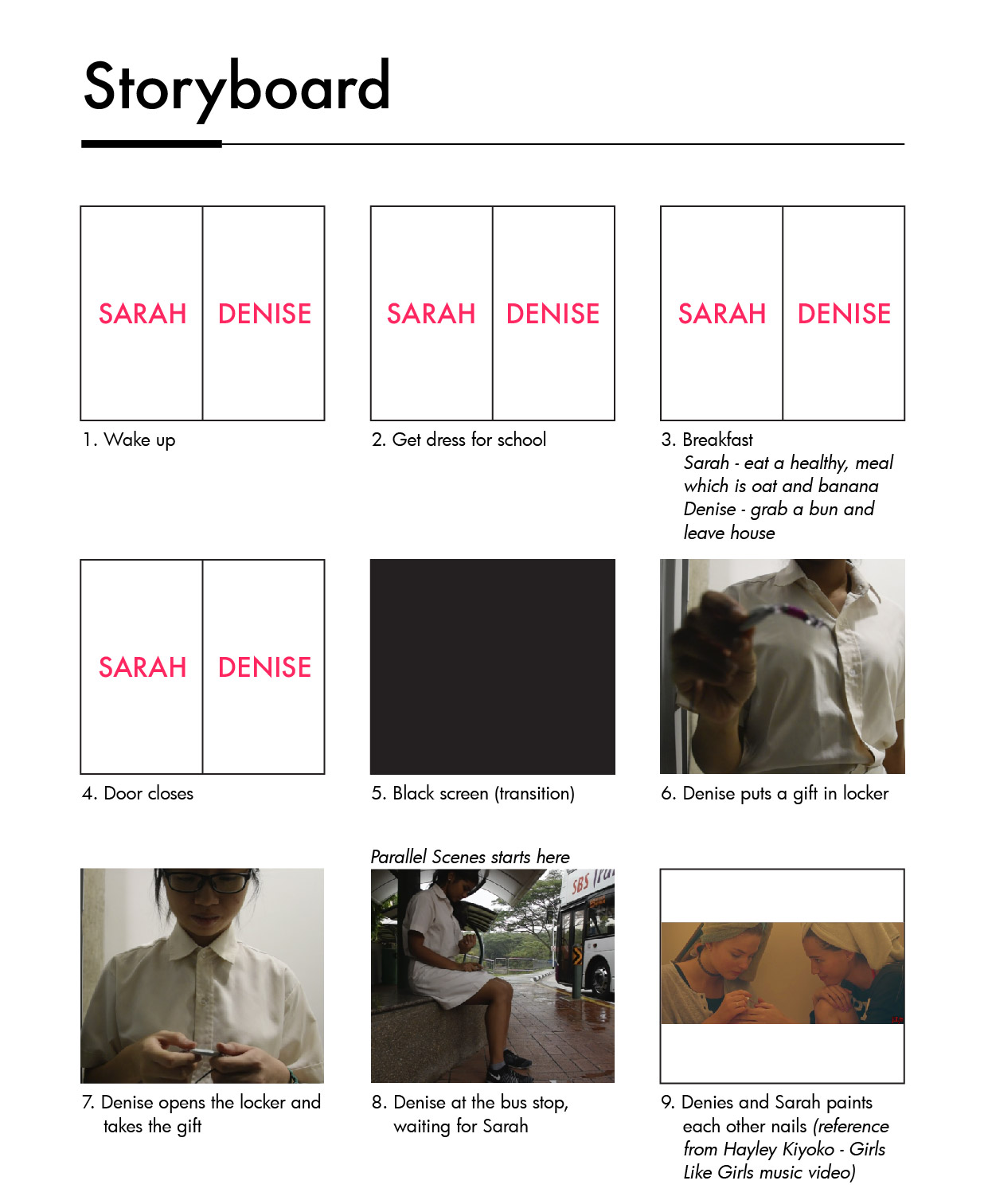
Hello! So previously my teammates (Bala, Syadza & Ying Hui) and I proposed a lesbian love story (image below).


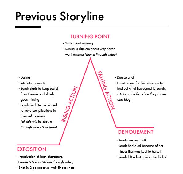
However during our consultation with Ruyi, she said that there were too many things going on in the story, such as Sarah went missing and Denise found out that Sarah died because of an illness.  So she suggested that we just focus on a lesbian love story. And one of the reference is a movie titled, ‘Blue is the warmest colour’.

Background story of Blue is the warmest colour

Adèle is a high school student who is beginning to explore herself as a woman. She dates men but finds no satisfaction with them sexually, and is rejected by a female friend who she does desire. She dreams of something more. She meets Emma who is a free spirited girl whom Adèle’s friends reject due to her sexuality, and by association most begin to reject Adèle. Her relationship with Emma grows into more than just friends as she is the only person with whom she can express herself openly. Together, Adèle and Emma explore social acceptance, sexuality, and the emotional spectrum of their maturing relationship.
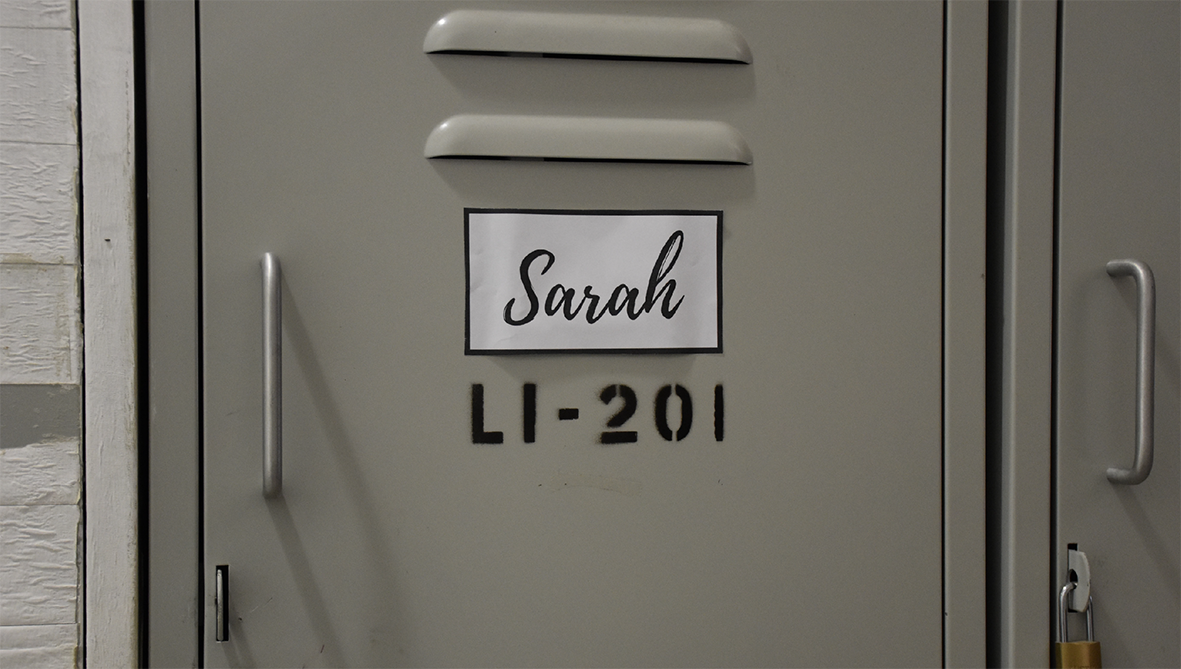
L1 201

Title of our project because Sarah’s (main character) locker is L1 201.

With the reference from ‘Blue is the warmest colour’, we created a similar storyline to it. However we change the some parts of the movie to fit into a junior collage context.

Character development of Sarah & Denise
Story development

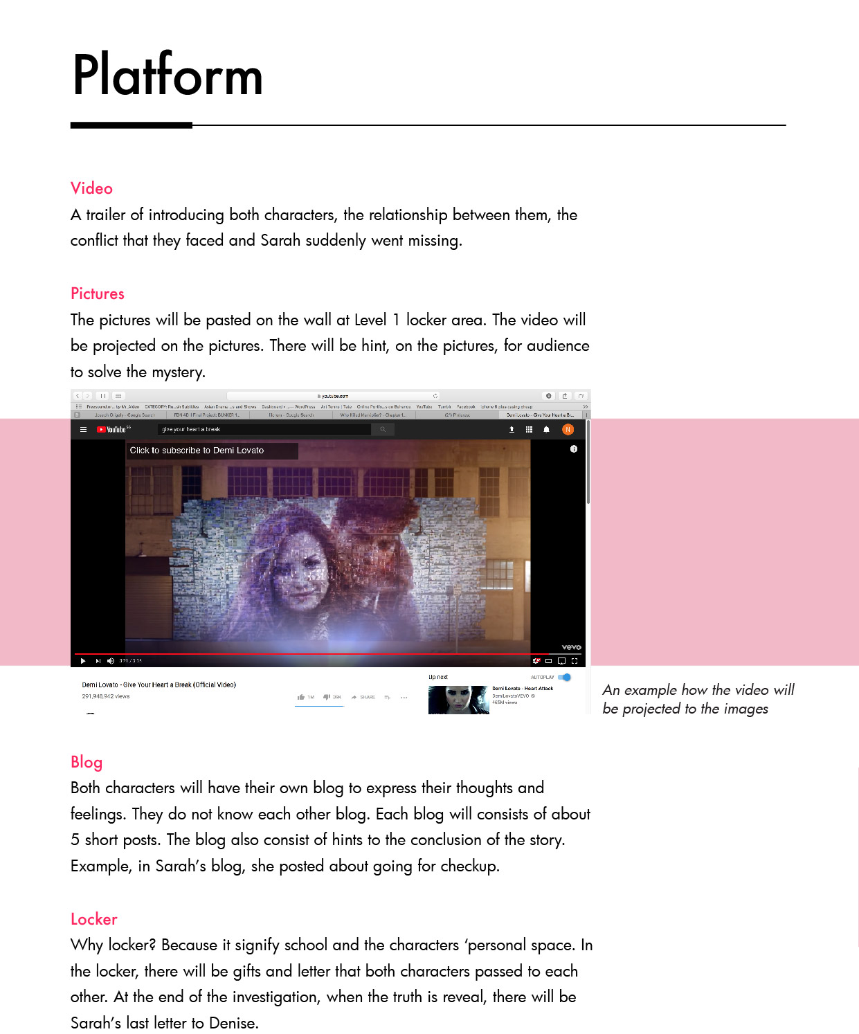
Platform: Blog > Video > Locker

Blog – https://sarahslittlesecrett.tumblr.com

Password: 123

Sarah’s blog has a password to show that she is an introvert that keep her personal stories private. And this blog is something personal to her. In her blog, she will post short stories about her relationship with Denise. One of the post is:

We had a really bad fight today. She told me to relax when I told her that we should finish a tutorial before we go out. She told me I’m too uptight, and I think she’s too lax. We could’ve just argued along the lines of me being too uptight - which to be honest, is true to an extent - I can be pretty uptight - but of course she had to bring up the whole keeping us a secret thing. She doesn’t get how everyone can’t be like her dad - he gives her control over a lot of her life because he feels so bad about her mom passing away. My parents would flip, not just because she’s a girl, but because she’d be a distraction on top of it.

Through this blog, it gives the audience a rough idea about what our story is.

Previously, my teammates and I wanted to have 2 blogs; one for Sarah and the other is for Denise. And through 2 different blogs, we can see the differences in both characters. But we decided to cancel out Denise’s blog, as we wanted to show the story from Sarah’s perspective.

Video and Pictures

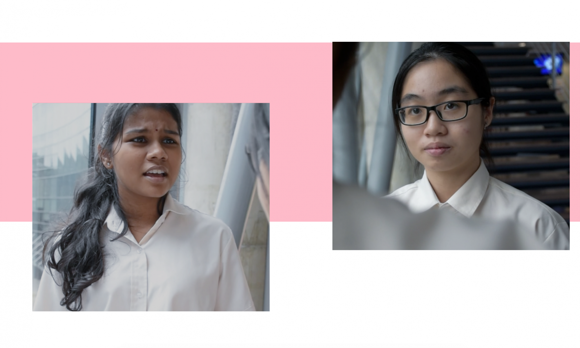
Character: Ying Hui as Sarah. Bala as Denise.

Voice narration is Sarah, to show her perspective towards her love to Denise. And the narration is Sarah’s last letter to Denise.

In the video, it only shows the good scenes of both Sarah and Denise being together. We only showed the good scenes or memories of them, it’s because when a person remembers a relationship, she will tend to remember the good bits. That’s what Bala says.

The pictures and video play similar roles. Both of it contains the good memories of their relationship.

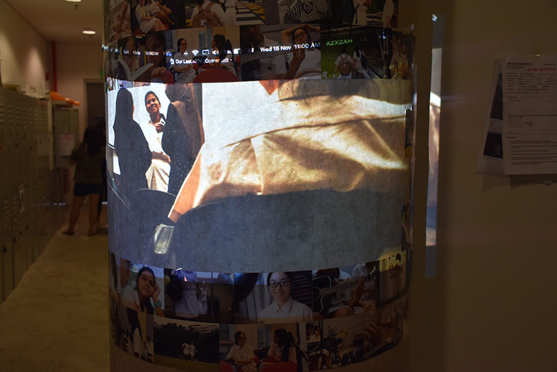
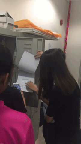
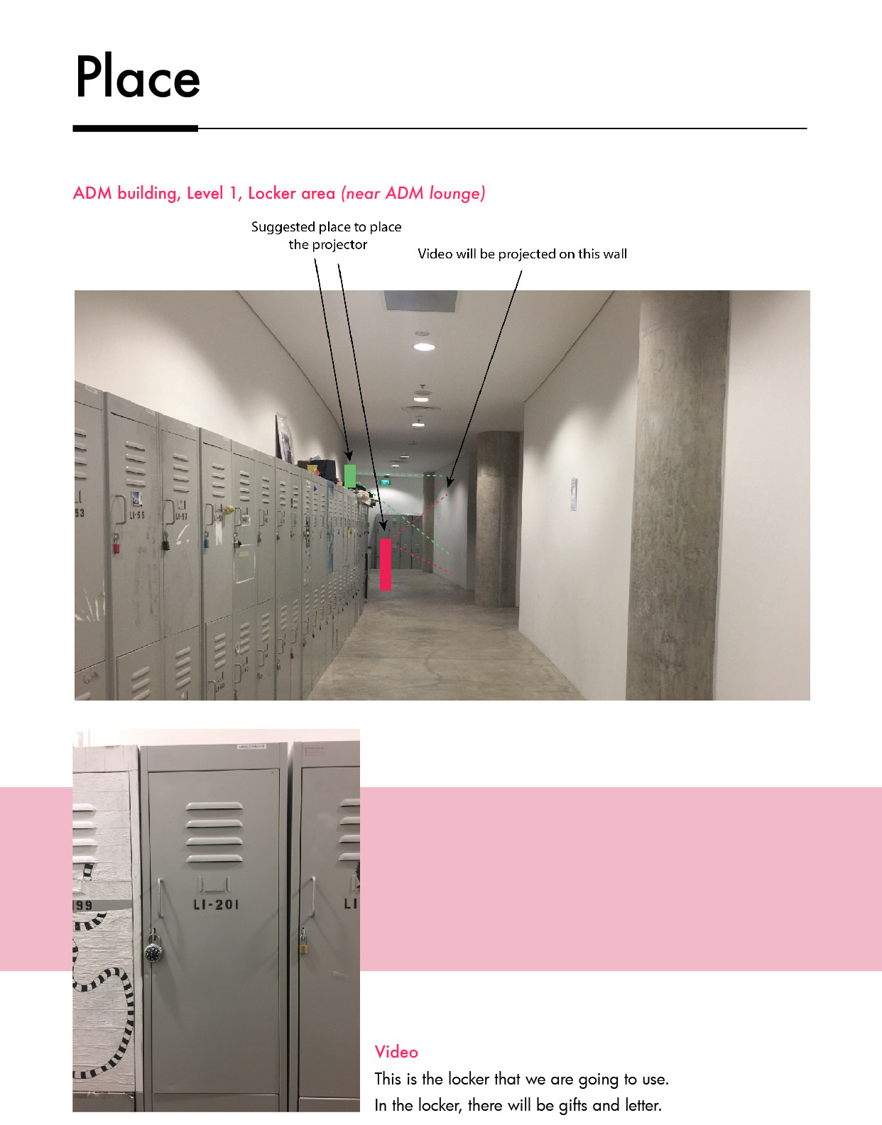
Why we choose to project the video at the pillar?

Initial Idea

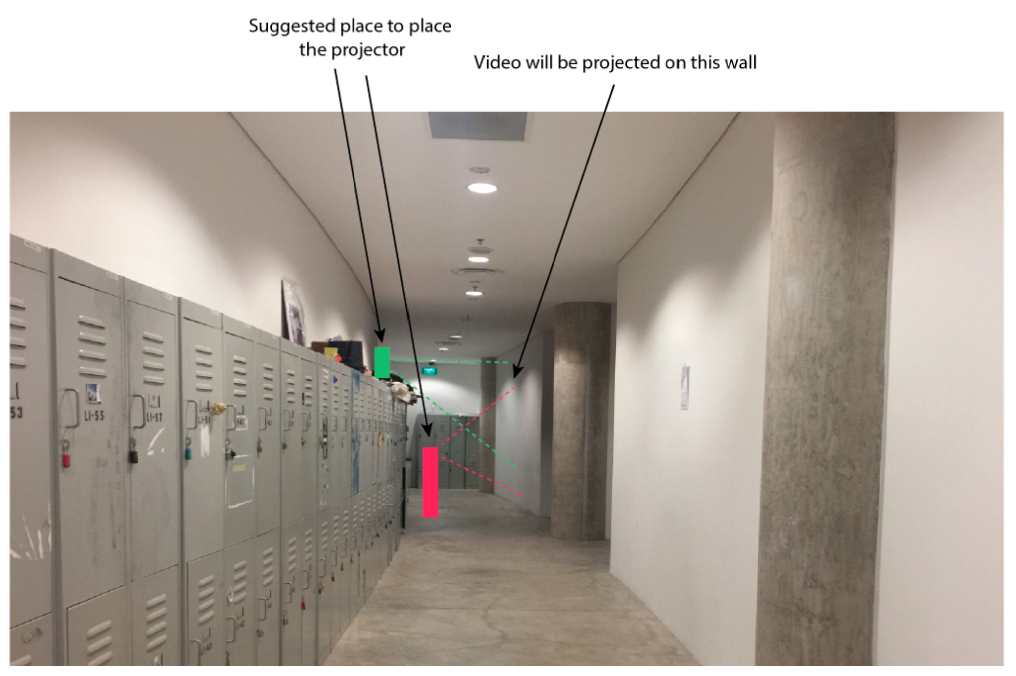
Initially, our main idea was to project the video on the wall. However it doesn’t have any significant of projecting it at the wall, according to the original idea.

Experimenting the projection of video

So Ying Hui suggested a few places, such projecting it in the locker, opposite the locker, on the floor and more. So we tried and we felt that projecting it at the pillar was the best option. Firstly, it’s like a direction to go to the locker. Secondly, it gives an interesting shape – concave. Lastly, it shows that the 2 characters are splitting ways when the audience stands at the side.

After we confirm on where to project the video, we faced another challenge. When we placed the pictures on the video, it did not turned out like what we expected.

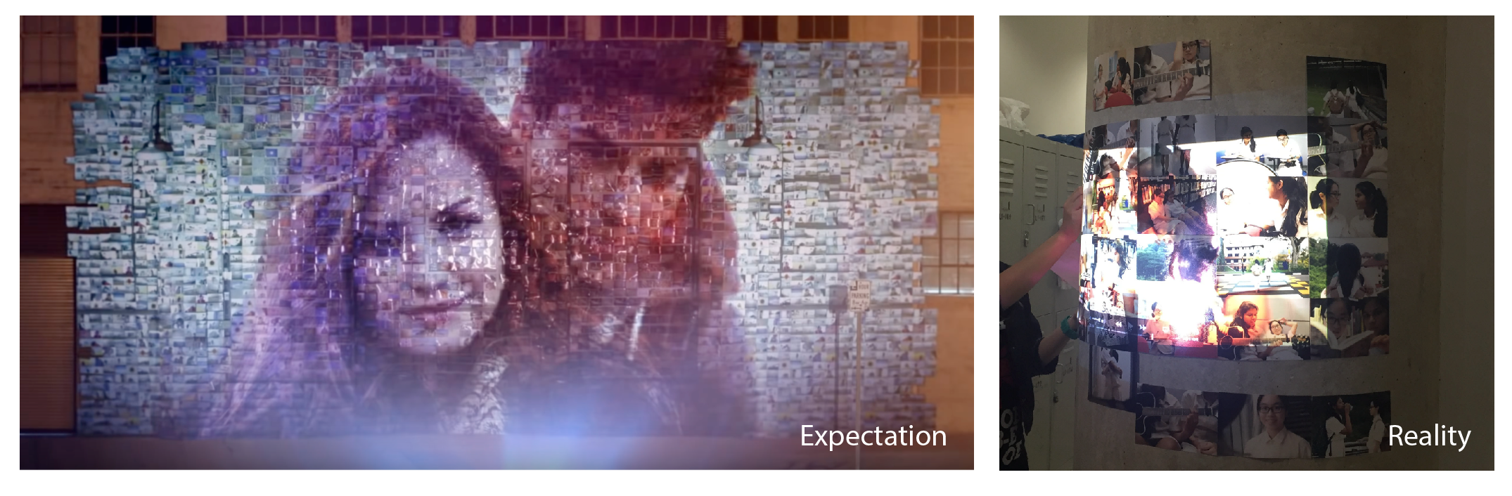
The video couldn’t be seen clearly when it is projected on the pictures. Hence, we kept trying and change the position of the pictures and decided to place the image outside of the video frame.
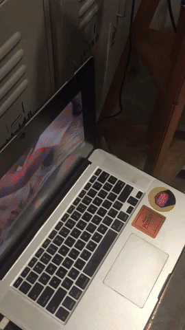
Process image

Locker

Sarah’s locker

Sarah’s locker is divided into 2 parts: Her belongings and gifts.

Under her belongings, there will be sketchbooks, watercolour palette, brushes, textbooks e.g. math, english etc and pictures. This is to give the audience a hint of Sarah’s characteristic as she is neat, studious, smart and artistic. 

Under the gifts, there are Jar of love letters, a box which contains their memories together, museum pamphlet and sketchbook with Denise portrait. On the page with Denise portrait, there’s a dried rose to represent love. 

User Experience


Feedback

Here are some feedbacks I gathered from my classmates:

  • How can the lesbian love story link back to the society?
  • What is the message of this story?

Honestly my teammates and I did not thought through about how this story can being linked back to the society, or how can this installation can affect the audience through the message that my group wants to bring across. As we too focus on how to execute this lesbian love story. The message of this story is Love is fleeting. But it was a bit unsuccessful in bringing the message across to the audience.

  • Where is the letter?

In the proposal , my group mention that there will be a letter in the locker. The letter is Sarah’s last letter to Denise. However after discussing among ourselves, we did some changes to the story and decided to have the letter narrate in the video. Hence this is the reason why there is no letter in the locker.

  • Lesbian is forbidden in my religious. Why did I choose to do a lesbian love story with my group?

I get this question a lot from my classmate. So here how it goes: 

At first, my group wanted to do on a love story but we were a group of girls. Hence Bala suggested a lesbian love story. At first I was 50-50 about doing a lesbian story because it is against mine and Syadza’s religion. However I knew that I was going to be the backstage person when doing this, and at that point we could not think of another story as Bala wanted to use locker as our installation space. Hence, it is like having a space and thinking how to fit a story into the space which was not a good idea, because it constraint us and we could not explore other story, platform and space.

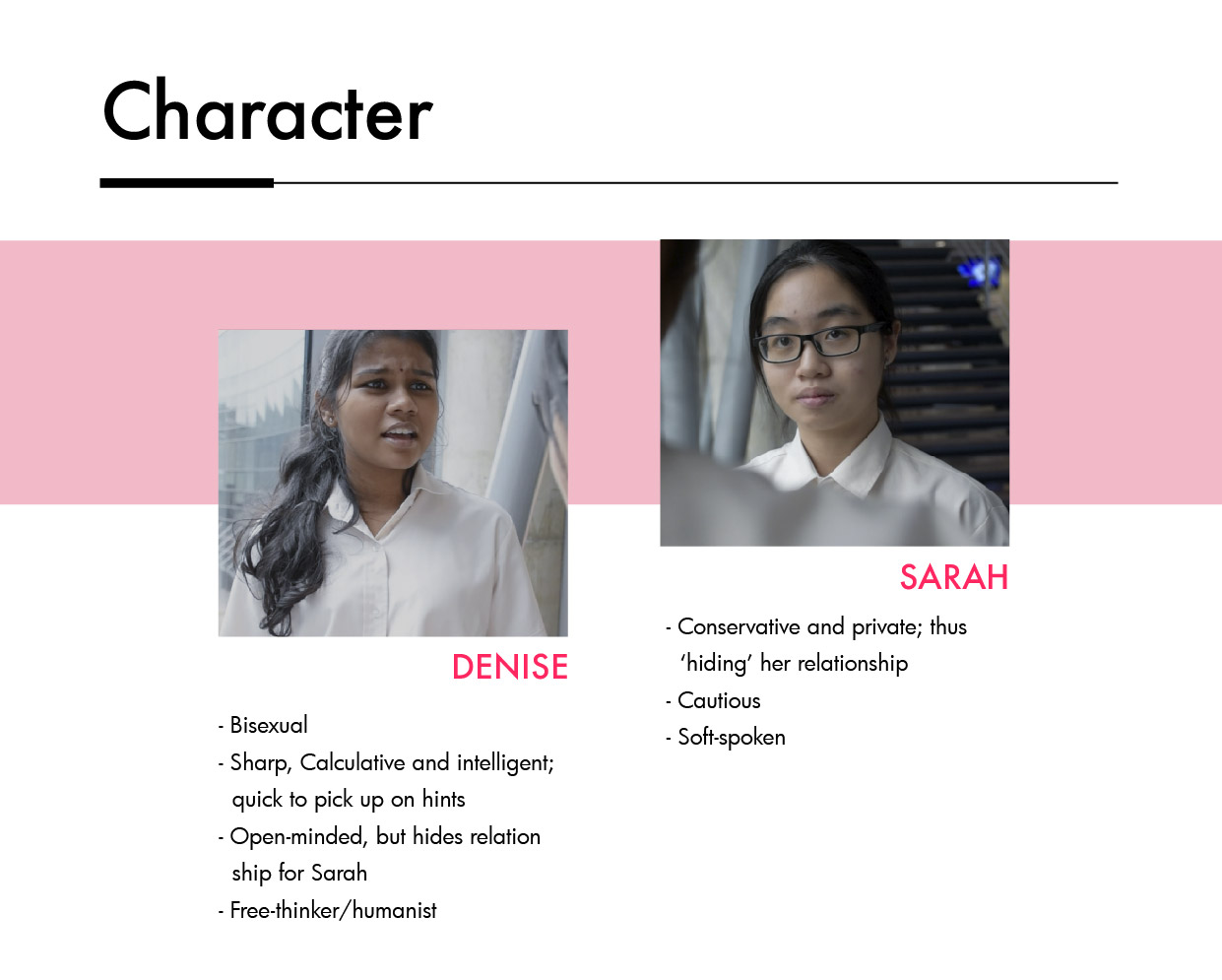
  • Why is Denise not an indian name cause the character played by Bala? Name of character and the visual of character does not suits each other.

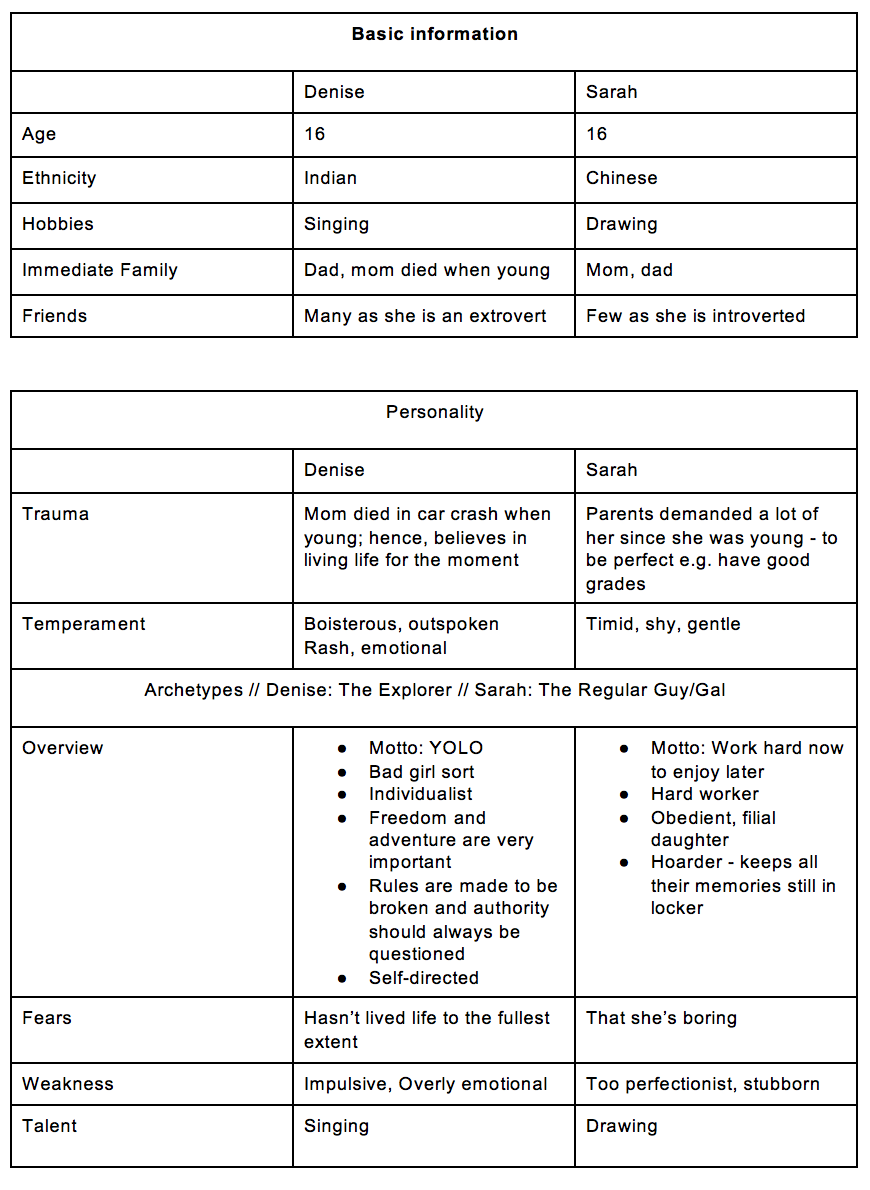
My group did not pay much attention to the little detail, as what one of my classmate mention above. But we had a reason behind the choice of character’s name, as we wanted the character’s name to portray their background and characteristic. So Denise is someone who is dominant, aggressive and have the mindset that ‘You only live once’. And her characteristic is based on her childhood, as her mom died when she was young. Sarah is someone who is introvert, shy and gentle. With her name, it shows that she comes from a high standard family where her parents demand a lot of her since she was young, such as high education.

Ego In Different Setting – Middle Me

In my previous post, I did a draft of few of my illustrations. And the challenges I faced were:

  1. Facial expression
  2. Incorporate 3 colours in 1 frame
  3. Flat and plain illustrations – Spot illustrations

So here’s my final outcome!

The overarching story is about Me, being the the middle child. And the title is Middle me, as I feel that middle child get the best of both worlds. Example, we don’t that much attention from our parents but at the same time we grow up independently and we have more freedom as compared to our siblings.

My concept for the illustration is simple and direct. So when the audience see my visuals and text, they are able to understand and both the text and visual should be related.

Why the choice of colours? Anything that is Pink represent me. Example me in pink shirt and sister trying out my pink dress and. My sisters are in turquoise is to contrast with me in pink. And in the equation 2, my parents are in dark turquoise as they are not as important as my sisters in that frame. Some of the  things that are not important are suppose to be blended into the background. Example equation 2, the sofa is slightly blended into the background.

Another thing about my equation is that there are 2 background colours. Each of represent good and bad respectively. This is to show that although being a middle child is bad, like you don’t get much attention, but that can be a good thing as you gain more freedom (see equation 2).

Breakdown of each equation

Equation 1: Shopaholic me + 2 sisters = Sharing new stuff

I really love going shopping and I will always buy clothes and shoes for myself. But then I have sisters who have similar clothes and shoe size as me. Hence whenever I buy new things, they will get excited and start trying on them.

For the ‘2 sisters’ frame, my facial expression is different from them as middle child tend to do things differently than other siblings.

However the ‘sharing new stuff’ frame wasn’t a success, as I wanted to show both my sisters trying out my new stuff and me looking angry at them. By having both my sisters trying out my new stuff, it feels a bit cramped. Hence I decided to do 1 sister trying out my pink dress.

Rejected illustration

Equation 2: Unnoticeable me + Sisters get more attention from parents = Independent me

I’m someone who doesn’t get notice by people maybe because I’m an introvert. Hence I always tell myself that I’m always blended into the background and no one notice me. For the ‘sisters get more attention from parents’ and ‘independent me’ is very direct. I can really watch a movie or go shopping alone (unlike my sisters).

Equation 3: Hardworking me + Unclean dishes = Sisters get away from not doing house chores

I can say that I am a hardworking person. I tend to have different classes in  a week so that I don’t only learn design. And my schedule is mostly packed because of extra class, going out with friends and wedding bells. I inserted a small schedule in the ‘hardworking me’ frame. The ‘unclean dishes’ frame is direct. And ‘sisters get away from not doing house chores ‘ is obviously them playing with the phone while I’m busy cleaning the house. So it’s like me literally me being a maid in the house. Nah, I’m just exaggerating.

Equation 4: Me time + Sisters quarrelling = Me, being the middleman

During my free time, I like to read and listen to music, especially when I’m home alone. Every sisters will always quarrel with each other, I do quarrel with my sisters at times. Pulling each other hair was one of the direct way to show quarrelling. One of my sister is wearing a pink watch. Remember I said anything that is pink is mine? So basically they are quarrelling about my watch as they want to use it.

And I ended of my last frame as ‘me, being the middleman’, which relates back to the title, Middle me. This is also for the audience to think what character I play in my family which is the middle child.

Feedback given

  • Background colour was not overpowering which is not too bright for the audience eyes
  • ‘Sharing new stuff’ can be improved
  • Consistency through all frame by the use of colours
  • Clear depiction of each equation
  • Most favourite frame is ‘Shopaholic me’ & ‘Unnoticeable me’
  • Clean and cute illustration style
  • Someone suggest that more colours can be explored to enhance the picture
  • Fendi suggested that I should be in turquoise and my sisters should be in pink. As turquoise is more brighter than pink. So i tried, and here’s the outcome.

It works well by having the turquoise  on me and pink on my sisters. However, I still prefer myself to be pink as pink represents me very well.

Reflection 

Overall, I’m satisfied with the outcome of Middle me! So pink, so me, so my style. In my first post on this project, I mention that one of  my objective was to to inject my own style in it. OBJECTIVE MARKED!

As halfway I was doing my illustrations, I realised that I injected too much of my style in it. So i continued doing it my own way.

Bad thing about me, or might be a good thing: I spent too much time on the little details such as the folding on the hijab and shirt. This is because I wanted to show a bit of 3D instead of a flat cloth. But on the presentation day, people don’t really look into the little details such as the shadow of the fingers and toes. So I’m not sure wether the small details worked out well or not.

Some of the details

New things that I have learnt in this project:

1.  Art direction is important so that the visuals will be consistent throughout all.

2. Spot illustrations – something that I will keep using in my future projects


Ego In Different Setting – Process 2

In my previous post, I mention about how I get to Me being a middle child, using my friend’s Caught in the Middle book as reference and also some artist references. And now I’m going to start with my development for my illustrations.

Firstly, I start with the easiest frame; Shopaholic me.

At first, on the top left frame, I wanted to use pink to represent me (pink shirt) then purple for the background – analogous colours. To make the shopping bags stand out I use a contrasting colour as it it the focal point. Hence I also play around with the colours. I kind of like the turquoise background (bottom left), however I would not suit my overall concept with is the use of pink and purple.

Secondly, unnoticeable me.

Originally, I started with the polka dots. However I didn’t like it and changed it to stripes which can be a representation to see the next frame beside it. When I was doing this, I tried out illustrating different facial expression and I did not like it. The facial expression on the left looks to cartoonish which was not the concept that I was going for. The concept that I was going for was a bit of realism which is also why I use humans instead of replacing myself as an object. Hence for my first draft, I left out all the facial expression.

Thirdly, hardworking me.

From the original frame till the selected frame, I added in more hands to exaggerate ‘hardworking me’.  As in my ‘shopaholic me’, I exaggerate it by having a lot of shopping bags. This is to have a consistent art direction. And obviously the turquoise background just don’t work because it overpowering the subject and its too bright for the eyes.

Fourth, me cleaning after my sisters.

At the original frame, I feel that my sisters’ clothes are blended into the background as I wanted to only use pink and purple. However Mimi suggested to incorporate another colour in it which was turquoise.

After when she suggested that, I faced another difficulty.

For this equation, I feel like the colours does not flow from one frame to the other frame. And I reallyyyyy like the ‘unclean dishes’ frame where the purple contrast with the turquoise. So Mimi suggested to have all the three colours – Pink, purple and turquoise – in every frame. I tried this and I will post it in my next post.

So here are some of the illustrations that doesn’t need more attention than the ones above. Not in any sequence/equation.

Another challenge was that some frames, I find it flat and plain. Example is the ‘sisters quarrelling’ frame. So Mimi suggested that I research on spot illustrations, which is something new to me. So spot illustrations is having a small part to distinguished the background and subject. With spot illustrations, it helps to emphasis the message clearly.

Examples of spot illustrations

Ego In Different Setting – Process 1

I’M BACKKK, after a week full of submissions. I thought that I couldn’t make it through the submission week, but I did! 

Ok, back to my last project in 2D: Ego In Different Setting.

At first when I get the project brief, I was clueless on what I want to do for this project. But the one thing that I wanted was to have my style injected to this project. Like when people see the outcome of this project, they will know that “this is Azizah’s style”. That was one of my objective for this project.

So to start of with this project, I did a mind map based on myself in 3 different types of environment: Around friends, family and being alone. And I realise that I have a lot of roles in my family; middle child, daughter, maid (because I always clean the house) and humpty dumpty (as I’m the clumsy one in the family). So I decided to do on middle child, as I was inspired by my friend’s work about her being a middle child. Below is a gist of her book on middle child.

After reading her book, I had a better understanding about what I wanted to do for this project – Me being a middle child and sisterhood.


Mindmap in a family environment + sketches of my equation
Detailed sketches for each frame

Equation 1: Shopaholic me + 2 sisters = They wearing my new clothes

Equation 2: Me blended into the background + Sisters get attention from my parents = Independent and freedom

Equation 3: Hardworking me + Messy room = Me cleaning up after my sisters

Equation 4:  Me + sisters quarrelling = Resolve the conflict

Feedback given: have a constant art direction throughout as some frame has a lot of things going on, and some are just simple and direct.

Hence I did some artist research so that I can visualise how my outcome will roughly look like.

Based on this project called Tanakan for RBK, I like the minimalist, clean and simple where the subject is in the centre (which is similar to my style as I mention in the previous project that I like having my subject in the center). And I also like the use of contrasting colours.

Marly Gallardo is one of my favourite illustrator. Throughout her illustrations, she  uses split complimentary colours, hence most of her works look coherent because of the use of colours. *Me bookmarking this part* Another thing I like about her work is because of the use of PINK. Because for this project I thought of using Pink as the main colour as pink represents me and my sisterhood.

Another artist that I would like to reference is Petra Eriksoon. I like her style of illustration and colour use such as the gestalt on the portrait.

Ok, I think this is sufficient for just one post. The next post will be on my progress and the difficulties I faced while exciting my work. (: