Mobile phone dock with speakers: Part 2

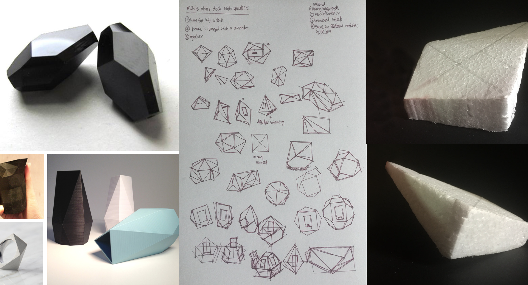
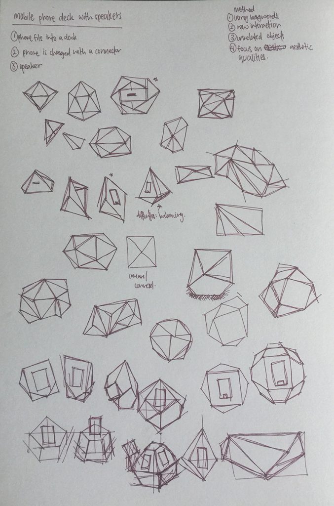
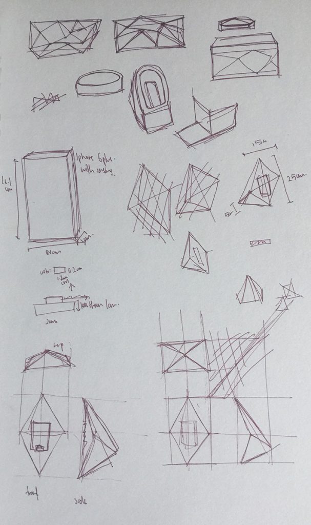
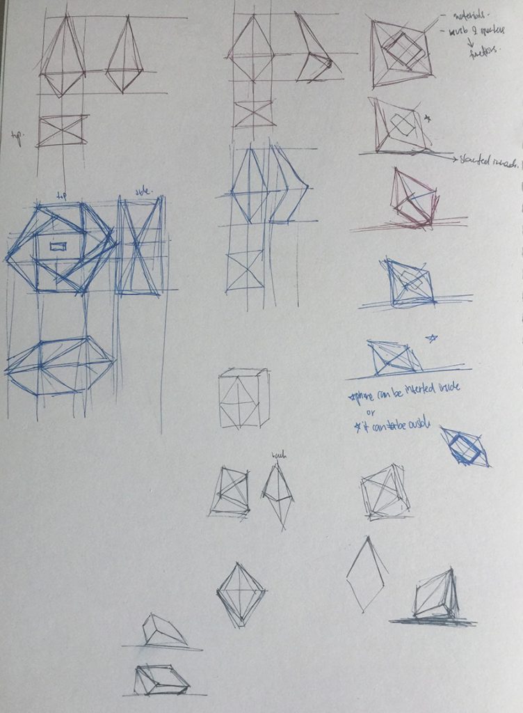
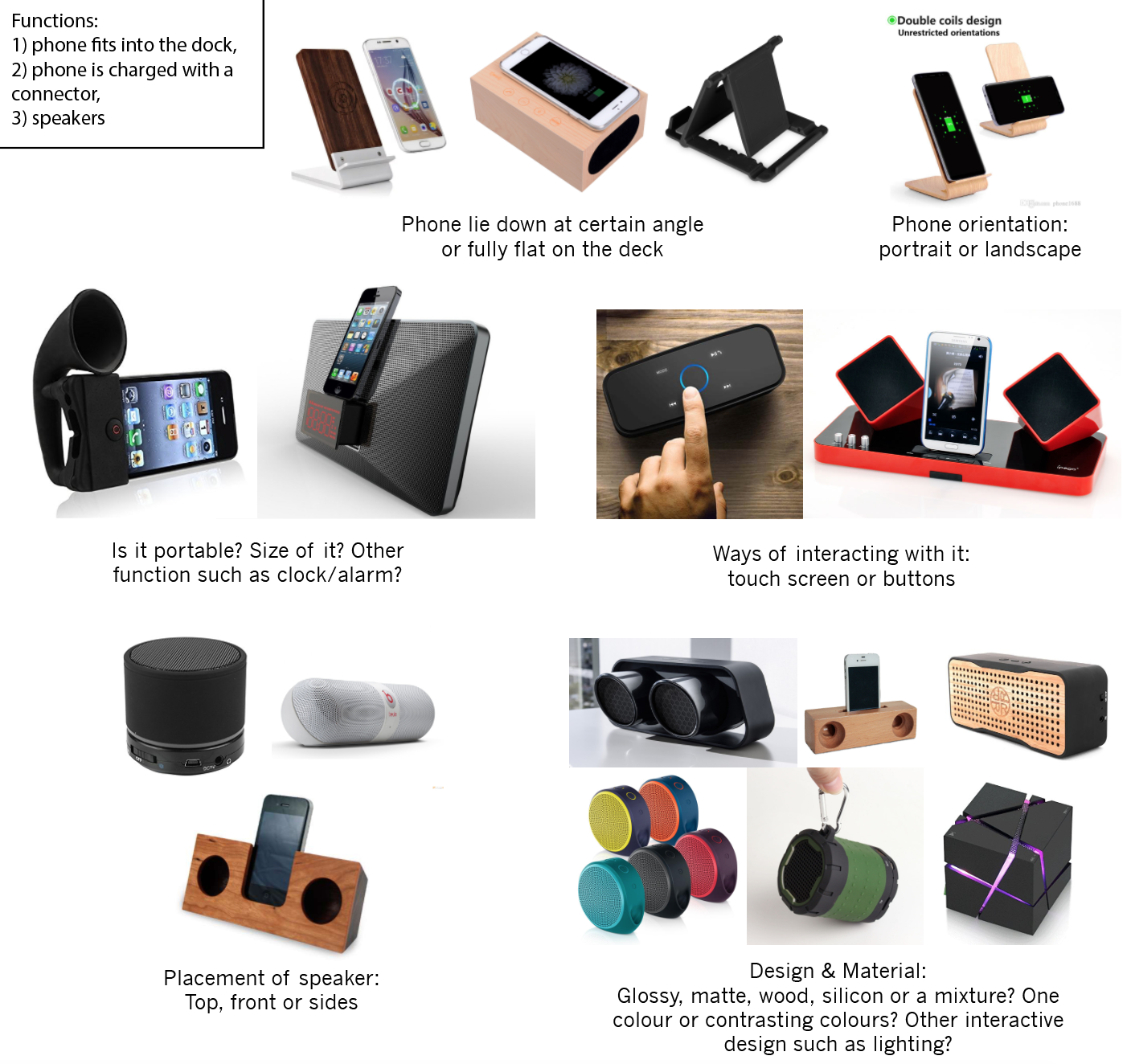
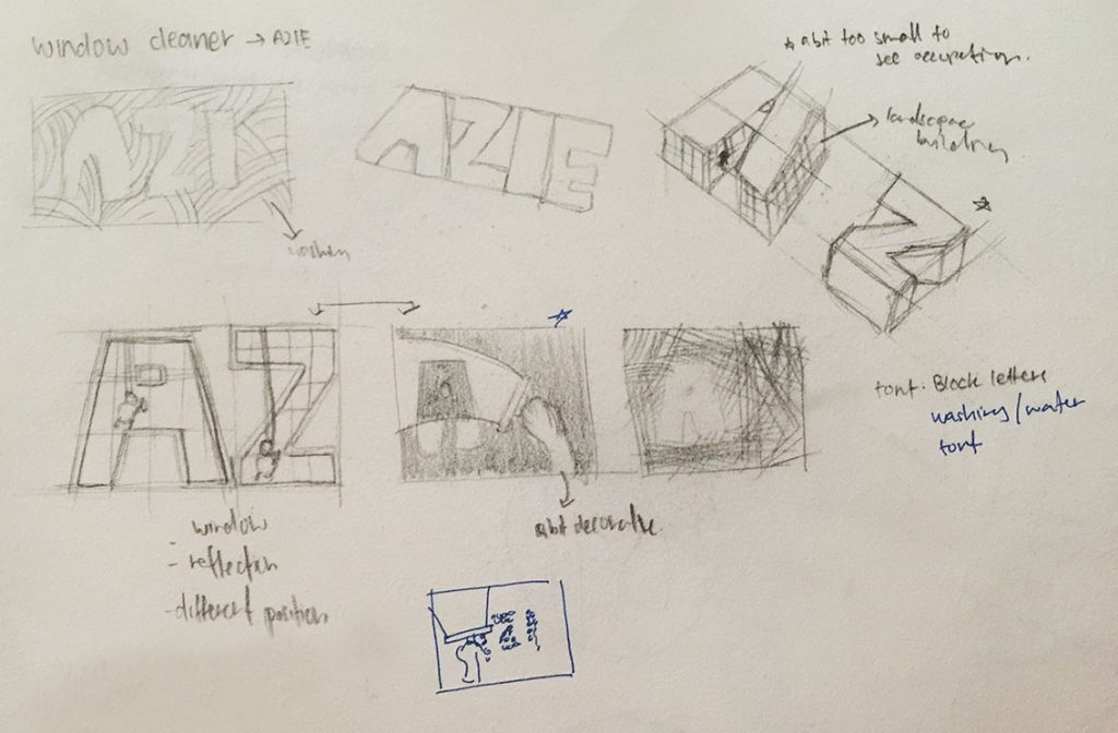
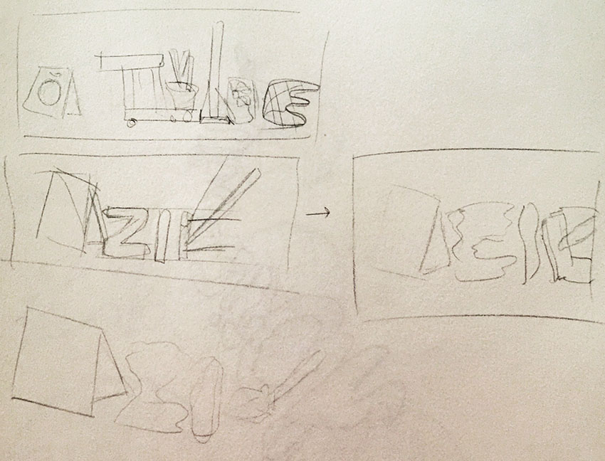
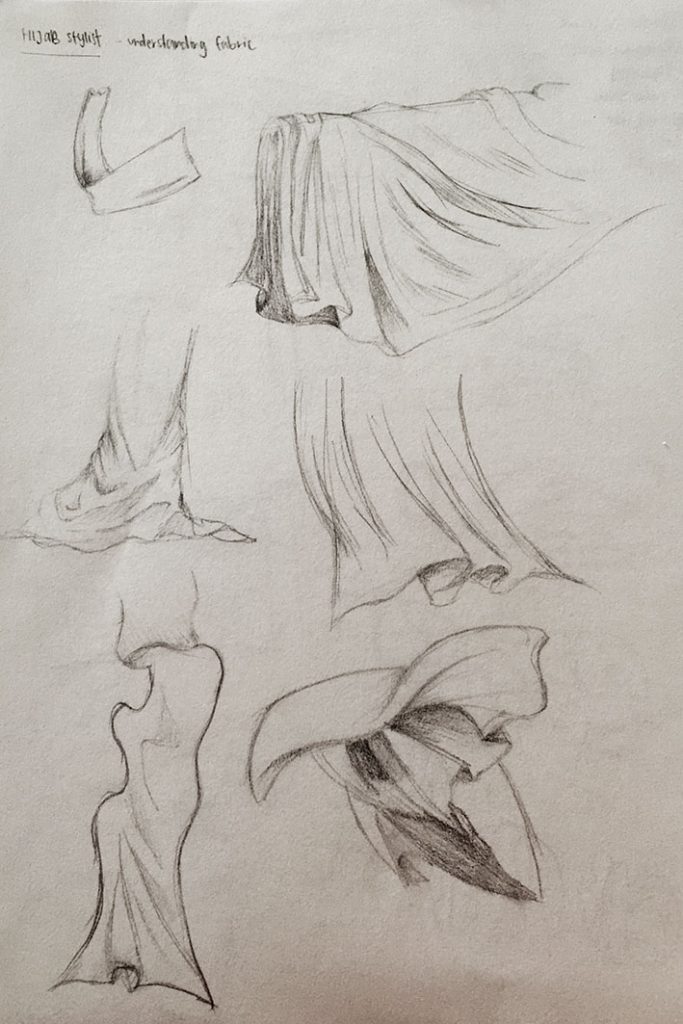
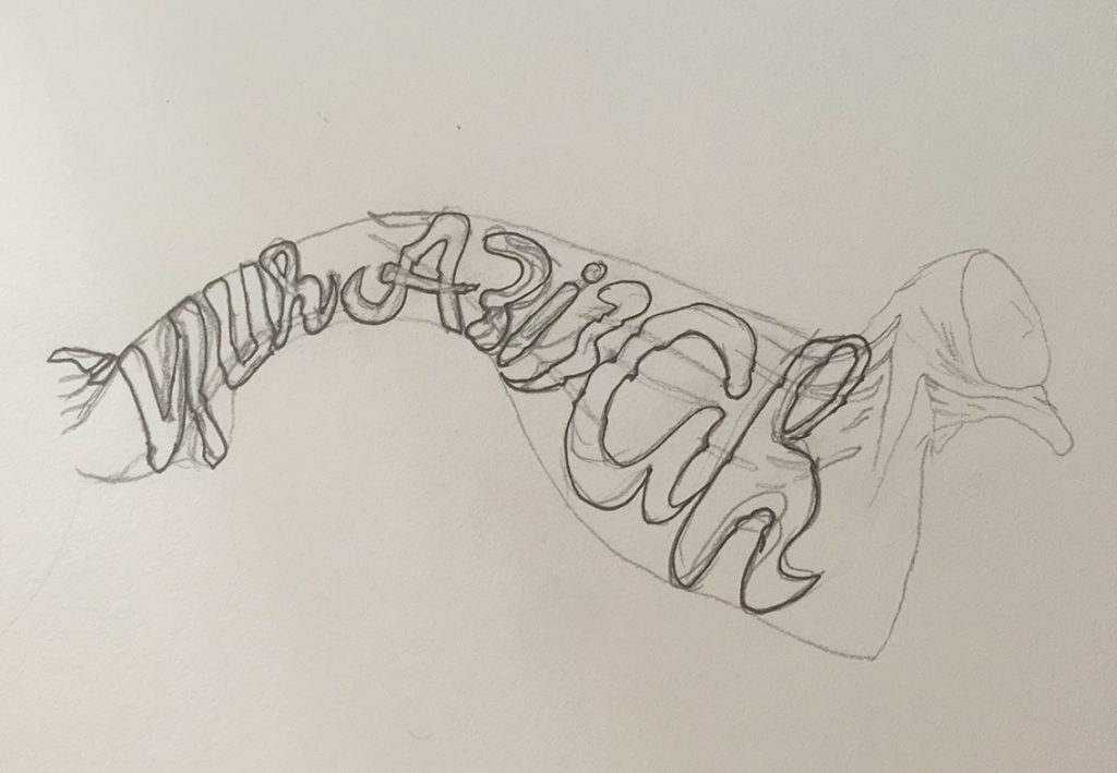
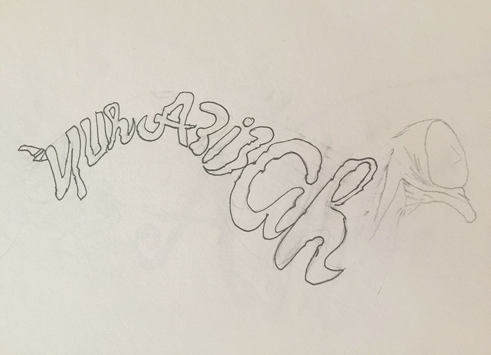
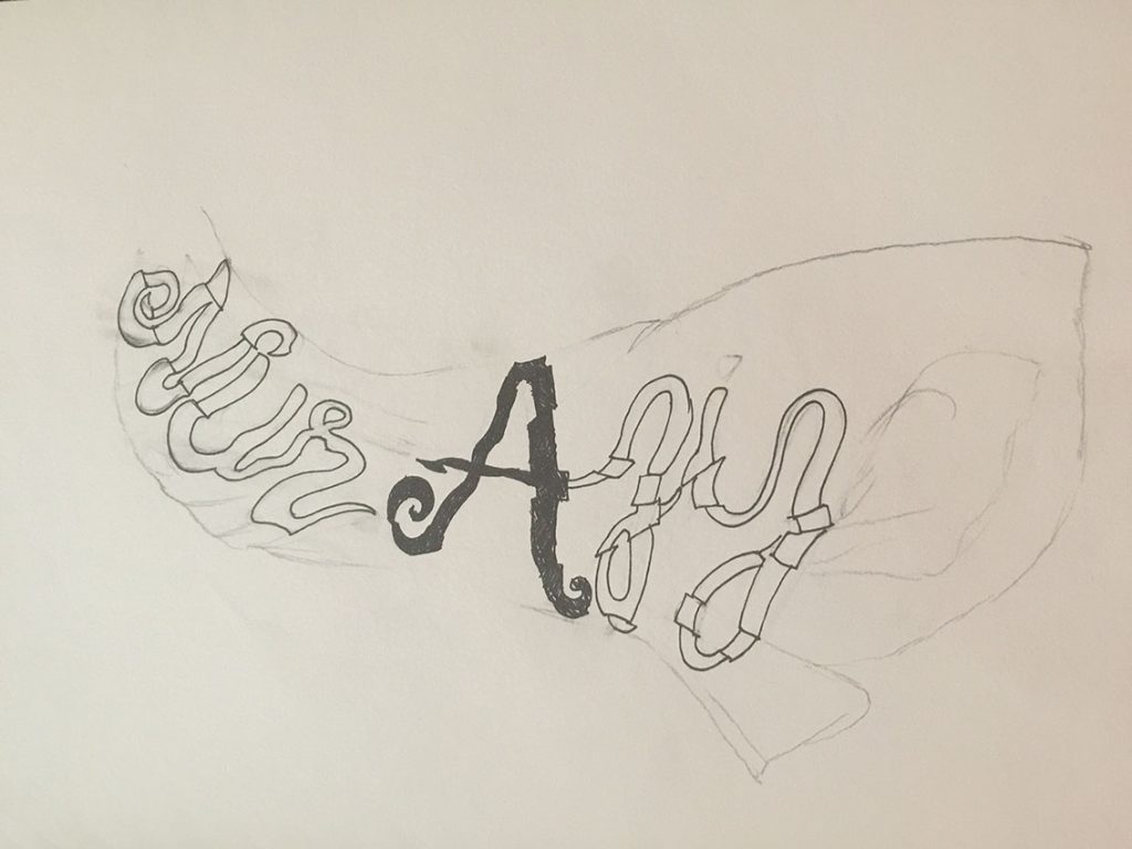
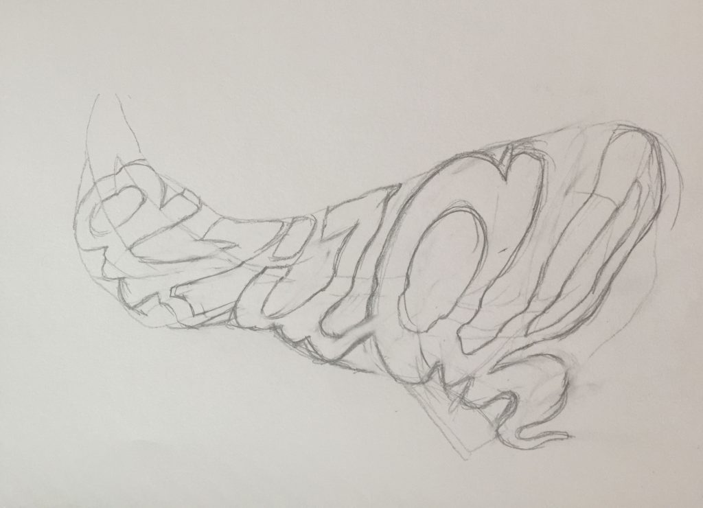
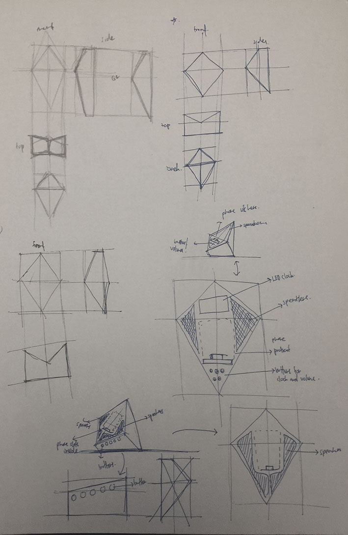
Hello! In my previous post, I mention about my findings about existing mobile phone dock with speaker. And here are some of my detailed ideation sketches.

ideation sketches

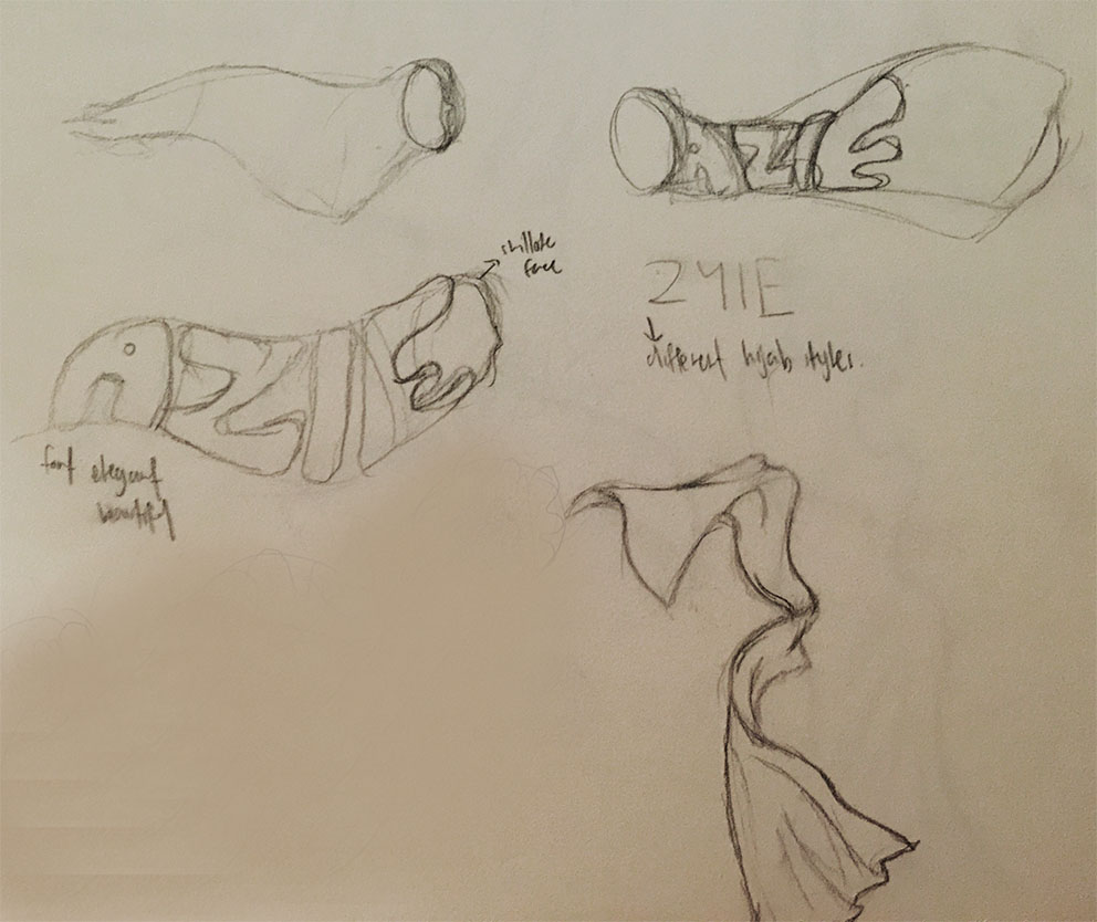
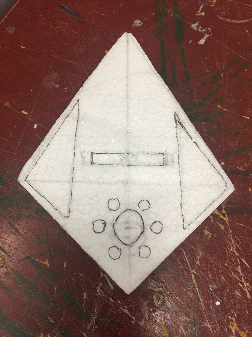
And from my drawing process above, I realised that I drawing the detailed parts is easier to draw on orthographic view than perspective view. Hence throughout my sketches, I drew the detailed parts on orthographic view.

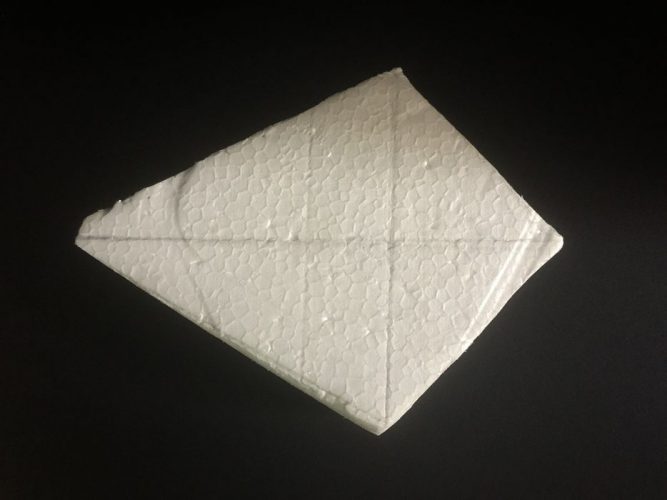
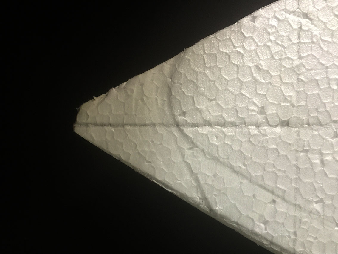
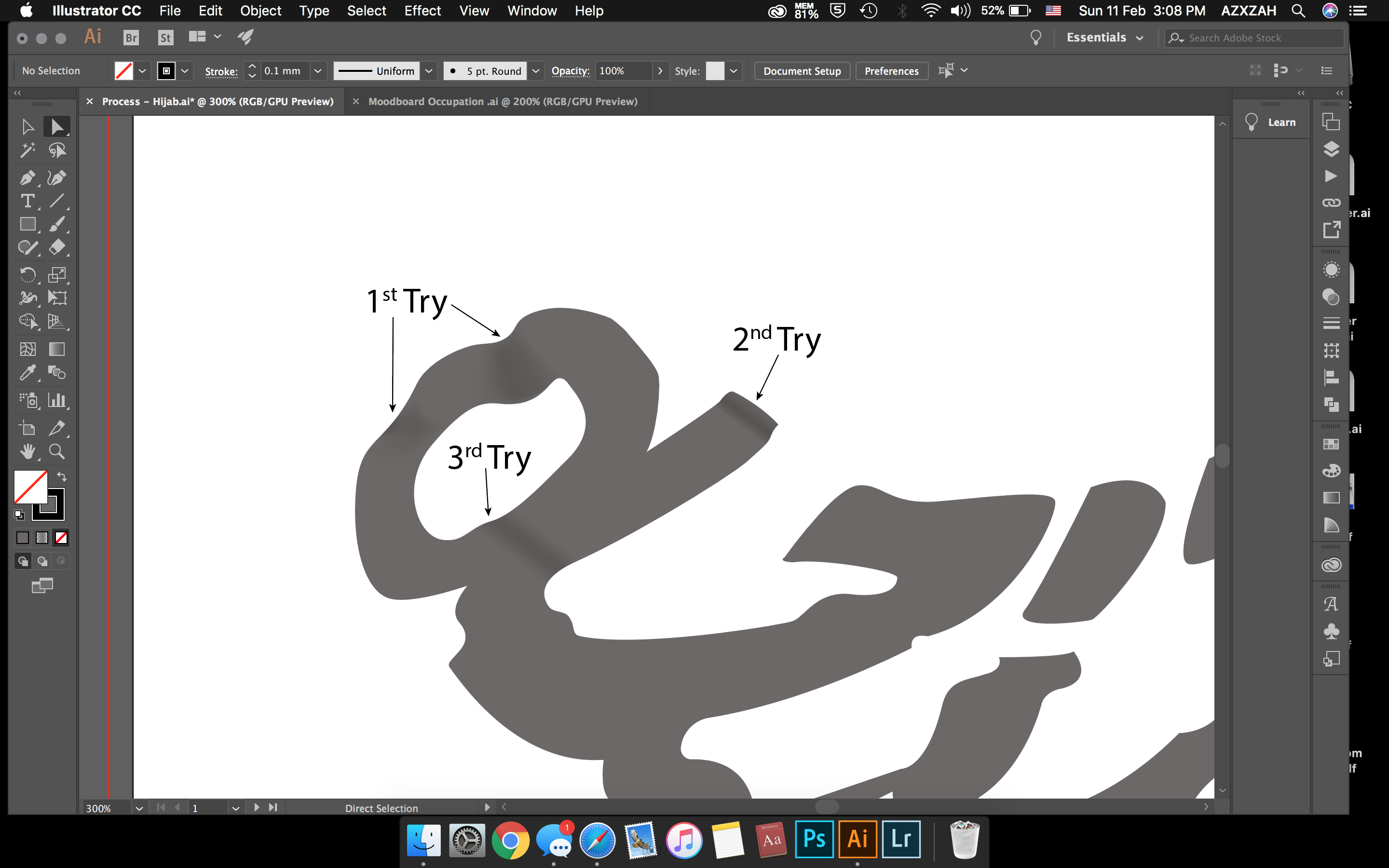
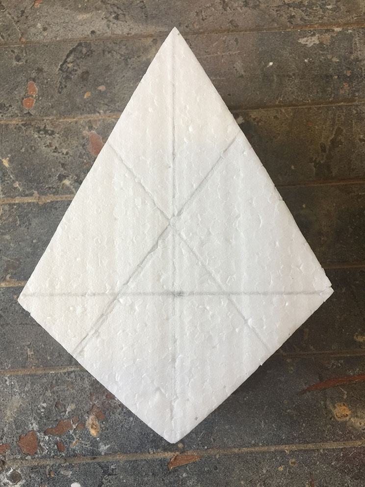
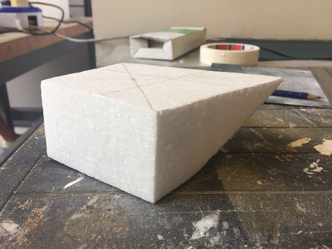
In my previous post, I also mention about the process of creating the form and the difficult part was making the form stand on a certain angle. Hence, I tried doing it again.
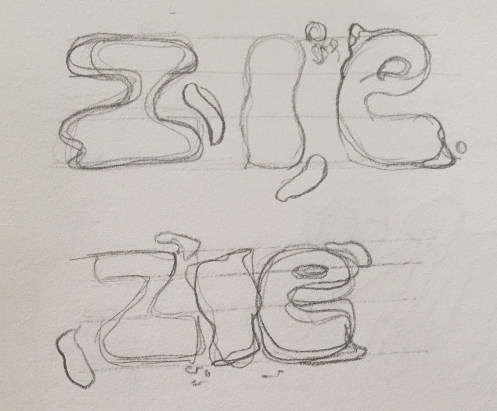
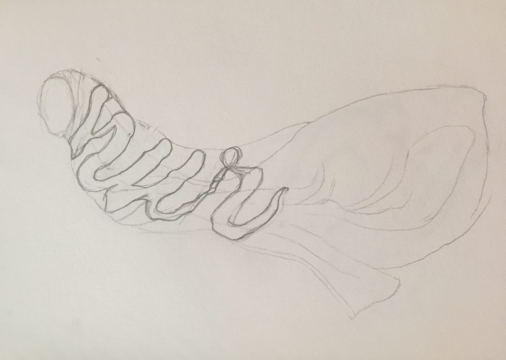
Process
Shape of the speaker from front view
Guideline of the side of the speaker
Started to shave it bit by bit
Sand it to make it smooth, however it is still not at the angle that I wanted
So I kept sanding the tip bit by bit to create the angle

Guidelines to help me not to over sand it

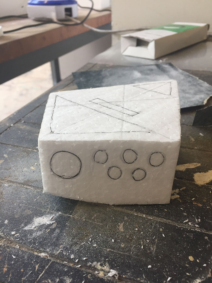
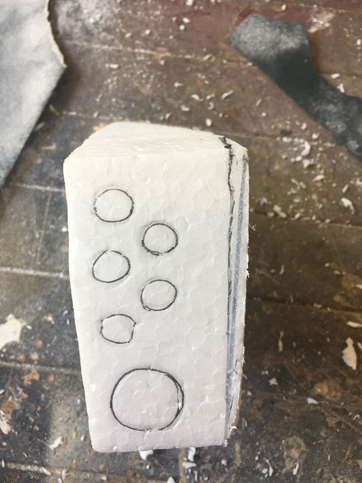
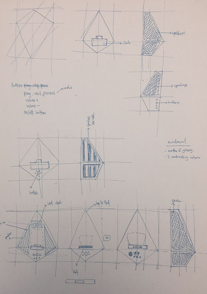
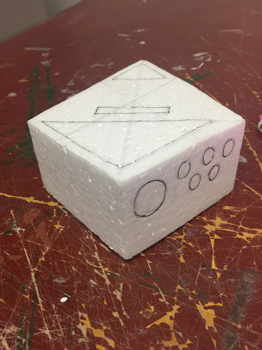
So I had two design that I wanted (image below). And I decided to go for design 1 as it is easier for user to interact with the buttons (the circles). Another reason why I did not choose design 2 is because, if i were make a concave at the outline of the speaker, the tip of the speaker might broke easily as it is thin.
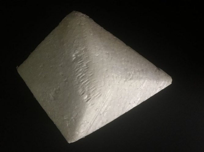
Design 1
Design 2
Outcome

With colour 

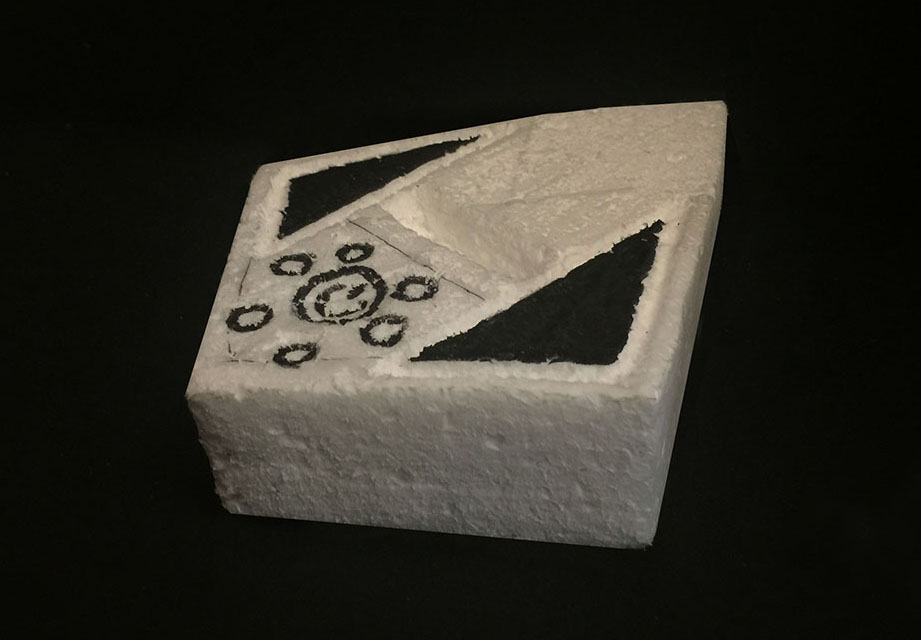
After a few failures at creating the form and let it stand at a certain angle, I manage to create it as close as what i visualise in my mind!

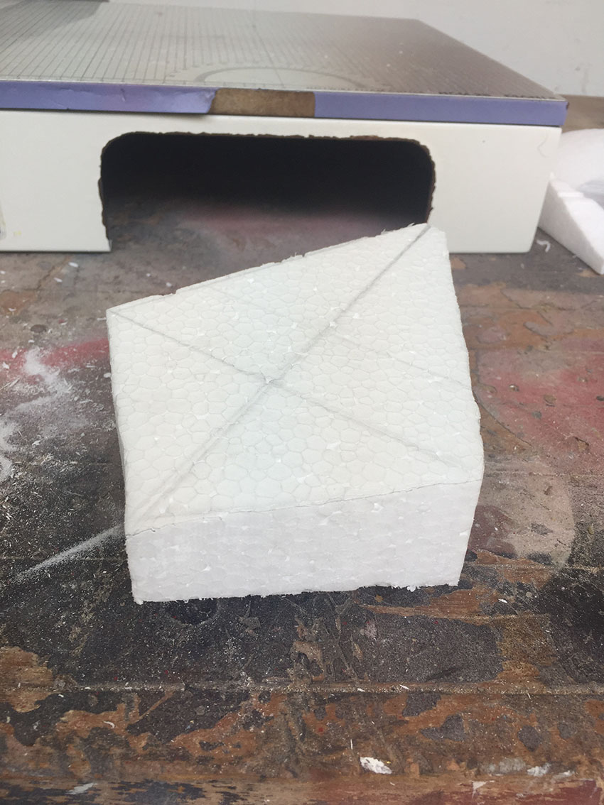
Take-away from this assignment:
  1. Once I have the orthographic view correct, it is much easier to fill in the details.
  2. A faster way to sand the foam, but I need more hand-on practice.
  3. There is no shortcut to create the outcome, as I had to keep on trying and trying to get what I visualise for.

Mobile phone dock with speakers: Part 1

Hello! Here’s my part 1 process of the mobile phone dock with speaker assignment.

Before I started sketching my ideation , I recap on week 3 lectures where we learnt different method of ideation sketching. Out of all the methods, I decided to go with focusing on the aesthetic qualities. Hence I decided to focus on polygon shapes to create the visual of the mobile phone dock.

Moodboard
Ideation

One of the difficulties I face during sketching was drawing the orthographic view, as I can visualise in my mind how I wanted it to be but I could not draw it. Hence I did variations of perspective drawing on the selected sketch.

Foam Model-making
Front view
Back view
Side view

I forgot to take process photos as I was too focus on creating it and to make it stand in itself. Hence, above images are the outcome photos.

Steps:

Firstly, it started form a cuboid foam. Then I cut out the front view which was the diamond shape, using the foam cutter. Then I cut the sides. This was the difficult part as it is supposed to be at an angle for both side. Hence I kept cutting using the foam cutter, and everything gets destroyed and I had to redo it.

I also forgotten about how the back of my foam suppose to be like. Hence, it lead me to being unable to make the foam stand on itself. To create the back part, I started shaving bit by bit using the foam cutter, not pen knife. Then when the foam looks like it was roughly there, I start sanding it. At first I used a small 5cm by 5cm sandpaper to sand it. Then Parimala suggested that I lay a big sandpaper on the table and put the foam on it and start sanding, which makes things much easier and faster too.

TADAAA! My foam was able to stand on itself
Tip of the foam gets cut off when sanding

When I was sanding the edges, using the a small sandpaper, the tip of the foam always get cut off. This was one of the issues that I was not able to resolve during class. Hence I  did some research, by watching youtube videos, to solve the issue. And the answer was to try other tools sand or cut it.


For next lesson, we are suppose to do more detail sketches, such as where the phone sits, the material and more. So before I start sketching, I did more research of a phone deck and speaker. And here are my findings:


That’s all for today’s post! Hopefully the next post will be a more refine version of my mobile phone deck with speaker!

Exquisite Glitch

Original Image: IMG_1
IMG_1_1
IMG_1_2
IMG_1_3: Done by Me
IMG_1_4
  • Describe how this process of collective image creation and decomposition creates a glitch transformation.

If this was not a collective image creation, I would have an outcome of how I wanted to create my image to a glitch. But having other people and taking turns to create a glitch transformation, the outcome of it is unexpected.

And by taking turns to create a glitch transformation, I think that the person before plays an influential role as it will influence and affect the next person’s thoughts.

  • How is each transformation creating a new form of its precursor?

It is an unknown out come and there is no control in creating the glitch transformation.

Here are some editing I did for my friends’ selfie:

Research Critique 2: Third Space, Third Person

  • What is the third space to you?

My understanding of a third space is that we are in different places physically and we become one virtually, example through the Facebook live.

'transformative social space into the online medium' (Randall Parker, 2017) 
  • How do we collapse boundaries in the third space?
'telematic work, which aimed to bring together artists that were separated by physical and geographical boundaries.' (Maria Chatzichristodoulo’s Cyberformance)

As mention above, one of the ways to collapse the boundaries in a third space is using telematics. For our micro project, Minjee and I were at the same geographical boundaries but we were at different places, separated by the physical boundaries. And through telematics work which is the Facebook Live, we were able to collapse the physical boundary and become one.

Minjee & I becoming one in a third space
  • How do we create closeness and intimacy in the third space despite being in different locations?
Projection of half of our faces using the split screen

Firstly, it is through the life size projection of our faces. By using the split screen, we created a third person by projecting half of our faces, like we chatting with the viewer face to face.


Copying each other hand gestures

Secondly, is copying each other movements as it was our first time doing a project together. Hence by copying each other, we break down the awkwardness between us. This also creates a certain level of comfortableness between us.


  • How did you virtually touch, hold objects, create a “third” body using different gestures despite being in different locations?
Our drawings

We created a third person by combing both of us, with the use of split screen. One of the things that we did was drawings. It is like a 2 separate drawings that become 1. From the viewers point of view, they will see that all the things are done by one person.

Image Making Through Type: Cleaner

My initial occupation was Window Cleaner. However, I find that window cleaner is a bit too limited as there are not much things related to it and it is difficult to explore and execute.

Visual research on window cleaner
Sketches on Window Cleaner

Hence I decided to change to cleaner, which has wider range of equipments used and different types of cleaner. Example: washing the toilet, mopping, vacuuming and many more.

Visual research on Cleaner
Typography Style

From the visual research and typography style I gathered, I wanted to try gestalt and distorting the fonts into liquid form.

Process
Fonts that I intend to use, something bold and rounded
Process 1; creating my own bubbly & rounded font
Process 1.1
Process 1.2; trying out gestalt but then the last letter is suppose to be E
Process 1.3; trying to make the gestalt seen

From the process above, it is suppose to be a cleaner cleaning the tiles creating gestalt to form my name; A-Z-I-E. However, it looks a bit difficult for the audience to see the alphabets of the name and its occupation as it may look like a housewife too.

Hence, I looked back at my visual reference to think of a new concept. And it strikes me to create my name using the equipments for cleaning. Similarly to the in-class assignment we did, where we had to find object that can be seen as an alphabets.

In-class assignment
Sketches of using cleaning equipment to create my name
Process 2

The image above shows a typical scene we see in shopping mall where that is a wet floor and the cleaner will try to clean it. So from left to right, the caution sign represent an A, the cleaner trolley represent a Z, mop represent I and the wet floor is E. I kind of like the concept of the wet floor with the caution sign and I was not quite sure if viewer will be able to see the letter Z and the whole word.

Sketches of the font
Process 2.1
Process 2.2; Try doing spot illustration
Process 2.3; added water droplets
Process 2.4

The reason why I took out the caution sign in process 2.4, was because the viewer might see my name is Z-I-E instead of A-Z-I-E. However, I didn’t really like the outcome of process 2.4 because of the lack of colours and the lack of evidence that it is a cleaner.

Image Making Through Type: Hijab Stylist

Visual reference of how hijabs can be used differently

Hijab means a veil worn by some Muslim women in the presence of anyone outside of their immediate family. And stylist means a designer of fashionable styles of clothing. Hence Hijab Stylist is someone who design and create variety of hijab styles.

As I was researching about hijab stylist, hijab photography and many more, something caught my attention, which was the flow of the hijab. That sparks me an ideation to crate a flowing typography for this occupation. Hence I decided to do more research on the flow of hijab and any kind of cloth, to understand how it flow naturally.

Typography style
First try out with the name; Zyie
Second try with the name; Azizah

After researching on the typography style, I went to experiment and explore on the variations of flowing typography using a normal paper. One of the things I discovered was using a longer name is easier to create the flowing typography. At first, I wanted to use ‘Zyie’ for this, but then I changed it to ‘Azizah’, which is much more longer.

By trying out on paper, I allows me to understand better on how flowing typography works.

References how cloth flows
Some drawings to understand how it flows
Photograph of my shawl
Process
Sketch 1; I did not manage to execute the typography style that I reference to.
Sketch 2.1
Sketch 2.2; I manage to understand how the flow and folds where going about
Sketch 3; Trying other fabric that has larger folds as compared to sketch 2
Sketch 4.1
Sketch 4.2

After outlining on Illustrator
Trying out different shades

After outlining my name on Illustrator, I felt that my name was too flat and I was worried that viewers might not understand that my name should flow and have foldings like a cloth. Hence I tried out different methods of creating the darker shades (image above with 1st try, 2nd try and 3rd try) to show that some parts of my name is folded. I tried using gradient mesh for 1st and 2nd try but it was difficult to create the folding part. Hence I use an easier method, with is the gradient tool (3rd try), which turn out quite nice.

Added the shades to forma flowing and folded kind of typography


Tried on my other name. Right: No shading. Left: With shading
Exploring different shades of pink

Why pink? It is because women are the one who wears hijab and pink represents feminine. To complete the whole image of a hijab stylist, I added a silhouette of  a woman face. With that, it shows that the lady is wearing a hijab that flows through the air.

Image Making Through Type: Archer

Why did I decided to do Archer? Because of my role model who is Katniss Everdeen (a frictional character), and also because of the movie The Hunger Games. In the movie, Katniss Everdeen is a skilled archer. She can hunt and shoot perfectly at the animals’ eye.

My role model; Katniss Everdeen
And this is me, who can’t even aim properly and plays for fun
Visual research

I researched on the equipments needed for archery, the point system, targets and colours of the targets. To me archery requires good posture, skills, aiming and arm power. Before realising the arrow from the bow, an archer has to have steady and firm posture, then using the arm power to pull back the string of the bow while maintaining to aim at the yellow dot on the target.

Style reference

For this occupation, I thought of distorting the alphabets to manipulation the archery to represent archer. The font that I am going for is rounded, thick font as it will be easier to distort it and also to represent the target shape which is circle.

Process
Exploring different font for my nickname
Sketches 1

At the start, I thought of having each of my alphabet as a target broad or using arrows to create each alphabets. Then I explored more on Illustrator to see what other designs I can come out with.

In Illustrator, I have yet to distort the font as I wanted to experiment and explore more. So I played around with the colours of the target and how the target board would look like after a few rounds of game by having holes and arrows on it.

Sketch 2
Inserted guiding lines to create perspective
I cropped the target board so that the focus would be on the arrows instead of the target board.

While I was exploring and experimenting on Illustrator, an idea just came to me and I did a quick sketch of it. It is about an archer who is very bad at aiming at the target. Hence all the arrows are at the edge of the board and outside the board, lying on the floor. And the arrows on the floor creates my nickname, Zyie.

I did not like this ideation very much. So I incorporated some element from Process 1 (few images above) as I like the concept of making use of the target board.

Sketch 3: Distort the font

I really like this ideation, where the alphabets are distorted to make a circle. Feedback given was that the arrow looks like a lollipop stick.

More exploration by having the target board in an alphabet
Trying out different arrows

So the chosen concept is having the target board with the distorted font and the arrow should hit in the centre as that has the most point

Image Making Through Type: Chocolatier

New semester, new project! 

Visual reference of a chocolatier

When I received the brief, the first occupation that came to my mind was CHOCOLATIER, as I really love chocolates. So I went to research more on it and being chocolatier is tougher than I thought. As it requires a lot of skills on on making the small details, making it look appetizing and delicious. There are also different technique in making chocolates such as tempering, moulding and sculpting.

Some examples of Illustration style

The Illustration style that I’m going towards is isometric vector, as this is one of the styles that I really wanted to explore on.

Process
Process 1

Firstly, I had an idea of using my name to make a chocolate bar to represent chocolatier. So I experimented on the isometric alphabets and it look kind of success for my first to alphabets, A & Z.

Process 2

Secondly, I illustrated the chocolate bar and add in the alphabet:A, Z, I and E which is my nickname. Then I added a blue packaging and a bite at the corner of the chocolate. During this process, the challenging part was doing the perspective and making sure that all lines are parallel. Hence, to overcome that, I created my own guide line the alphabet, as shown in the letter E.

Difficulty faced in Process 2
Process 3

However, I was not satisfied with the outcome form process 2, so I continued to brainstorm by going back to my research. Then I thought of doing one of the technique in making chocolate which is moulding (image above). And I changed my name from A-Z-I-E to A-Z-I-Z-A-H, as moulding templates are norming long and rectangular. After I did this, I asked myself would my viewer understand if I were to put this image to represent chocolatier. And my reply was no.

So I put myself in my viewers’ shoe to understand how my visual are seen to their eyes. And that is when I decided to come out with something simple and straightforward.

I looked back at my previous processes as I thought there were some potential to develop it. So I took the chocolate bar idea and make it a box of chocolate! That’s when I thought of my concept for the chocolate box; appealing, appetizing and high class. I took reference from Awfully Chocolate as their chocolates look very chocolaty and appetizing. And I also took reference from Godiva Chocolatier as they have decorative chocolates and gold packaging.


Process 4.1: Decorative alphabets

Above are some of decorative alphabets I was inspired from Godiva’s chocolate. Then I input it inside a box (image below).

Process 4.2: Chocolates inside the box
Process 4.3: Exploring packaging design