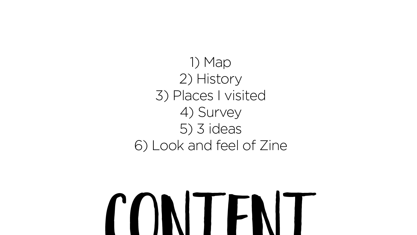
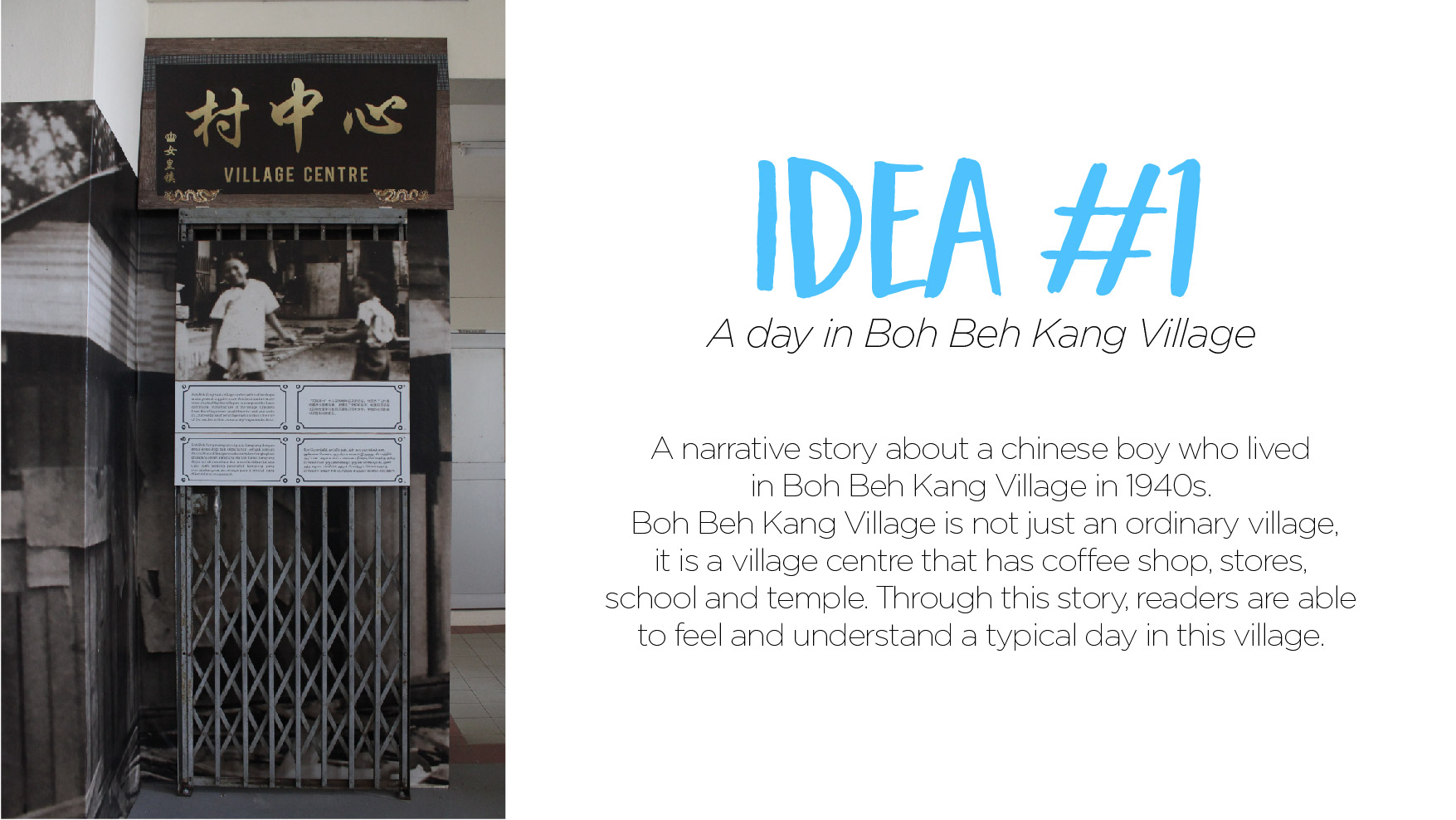
Locale – Queenstown

Content

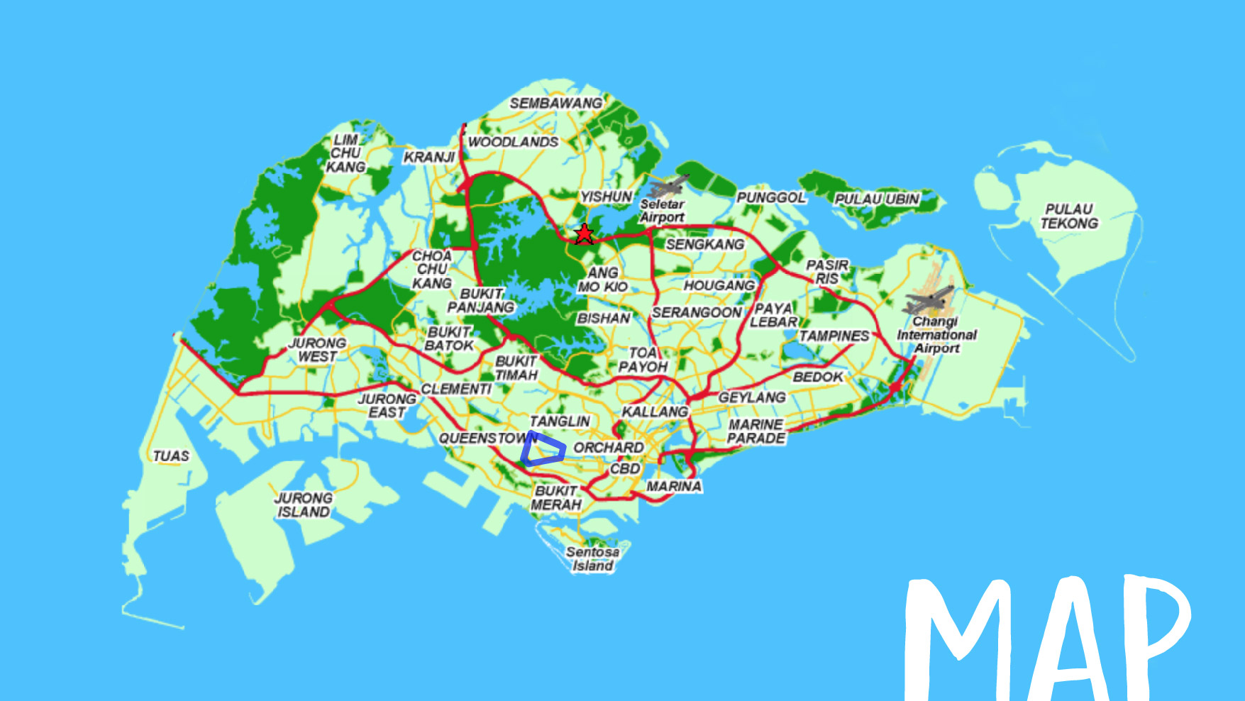
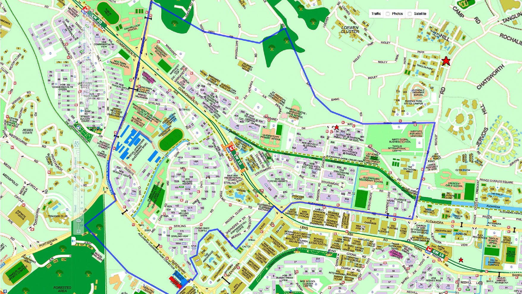
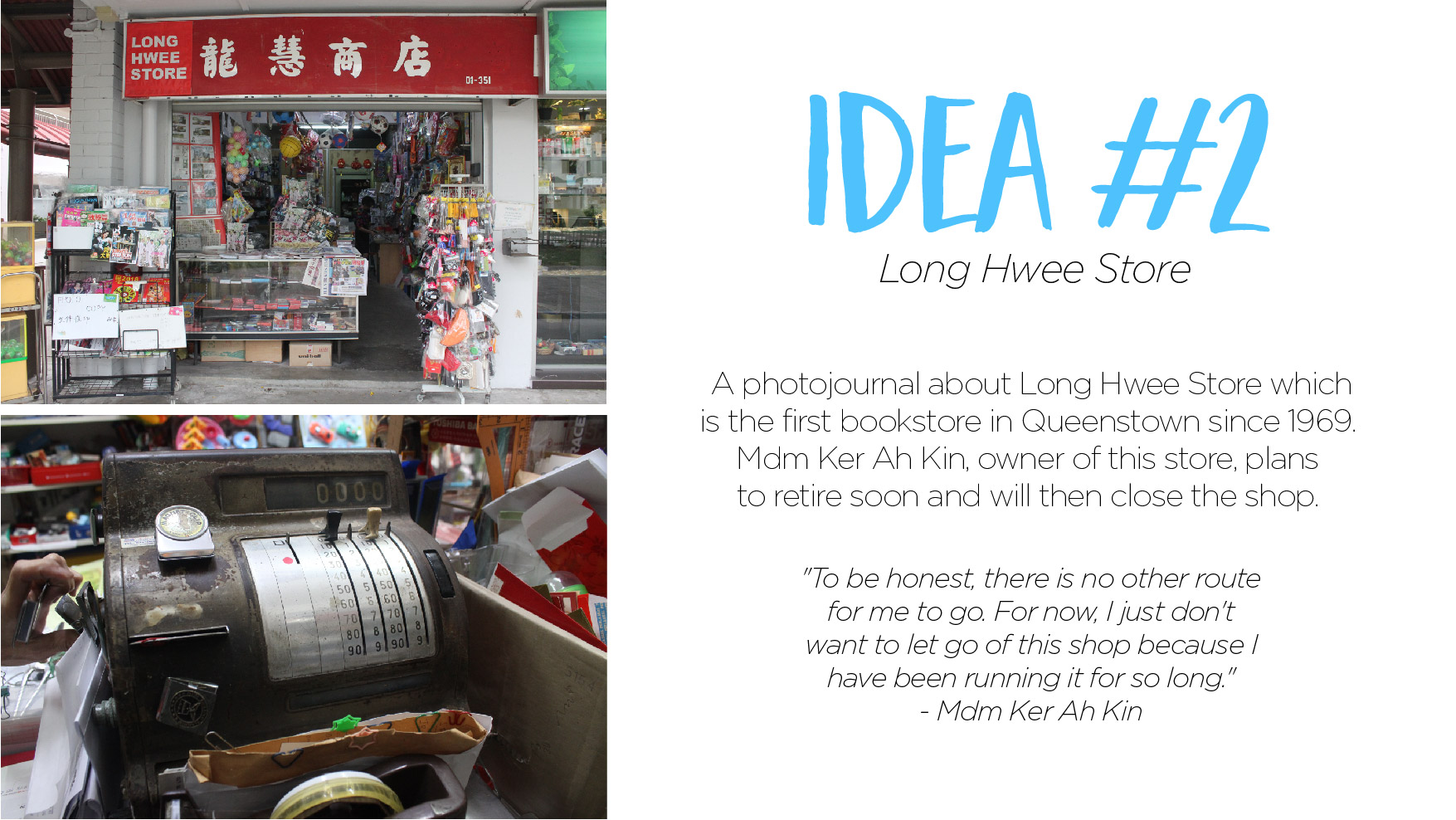
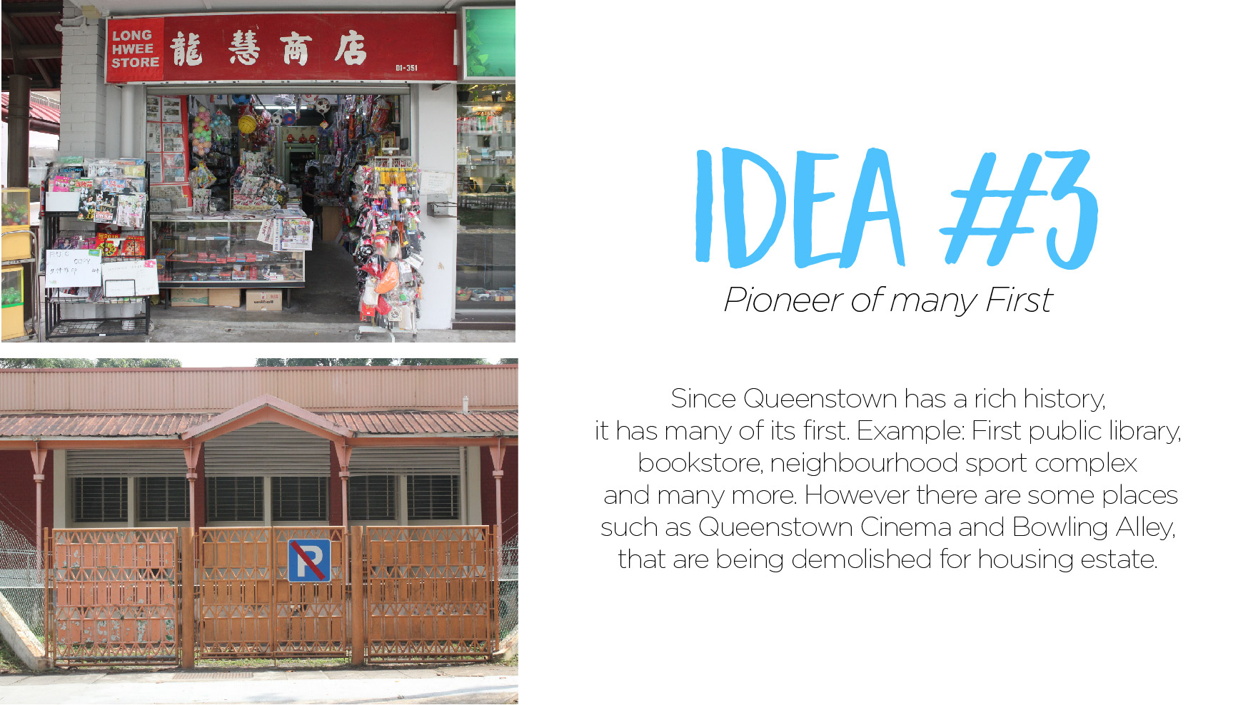
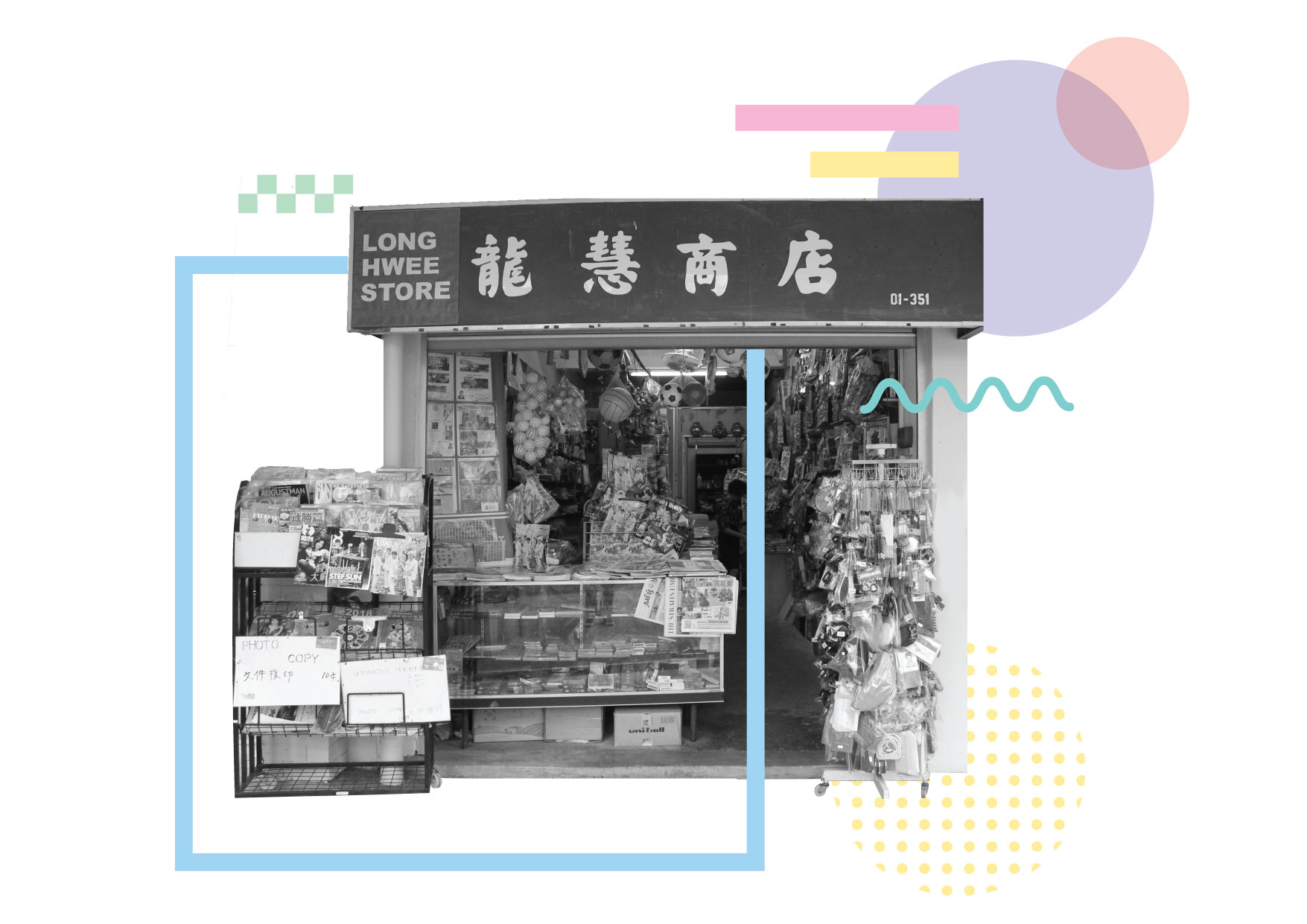
Hello! For my zine, I wanted to write about the first bookstore in Queenstown which is Long Wee Store. Currently Mdm Ker Ah Kin is managing the store alone as her husband has passed away.

Here are 2 different contents that I thought of, after talking to Mdm Ker Ah Kin: 

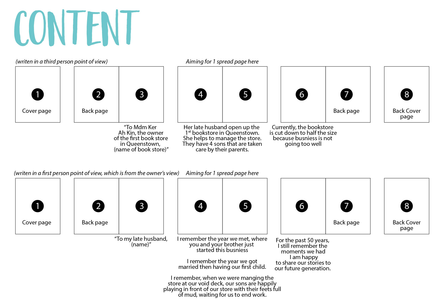
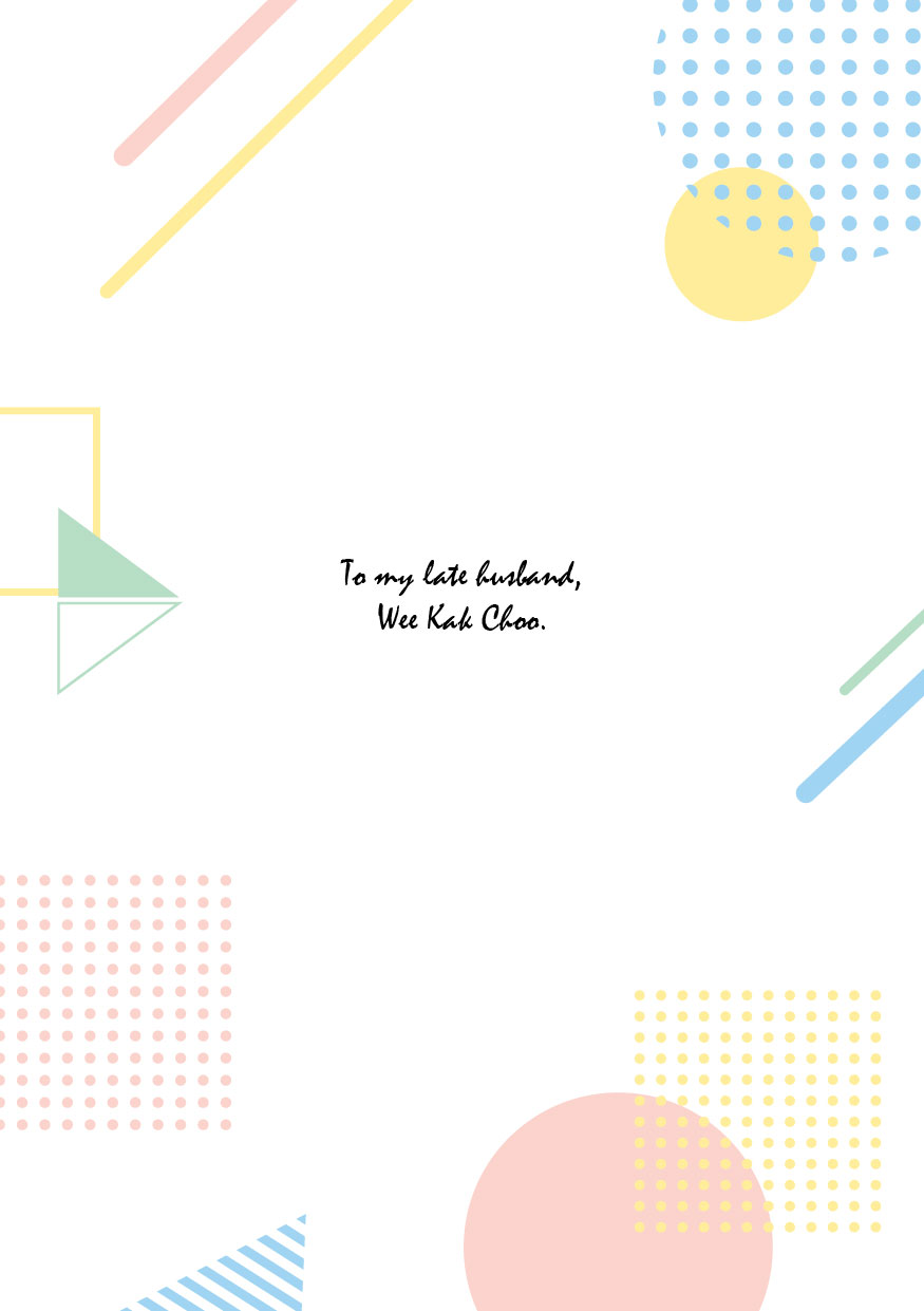
I am going for the content that is from a first person’s perspective, which is Mdm Ker Ah Kin. Perviously, her late husband managed the store and Mdm Ker Ah Kin was there to help out. So my intention is to write something personal, from Mdm Ker Ah Kin to her late husband.

Look and feel

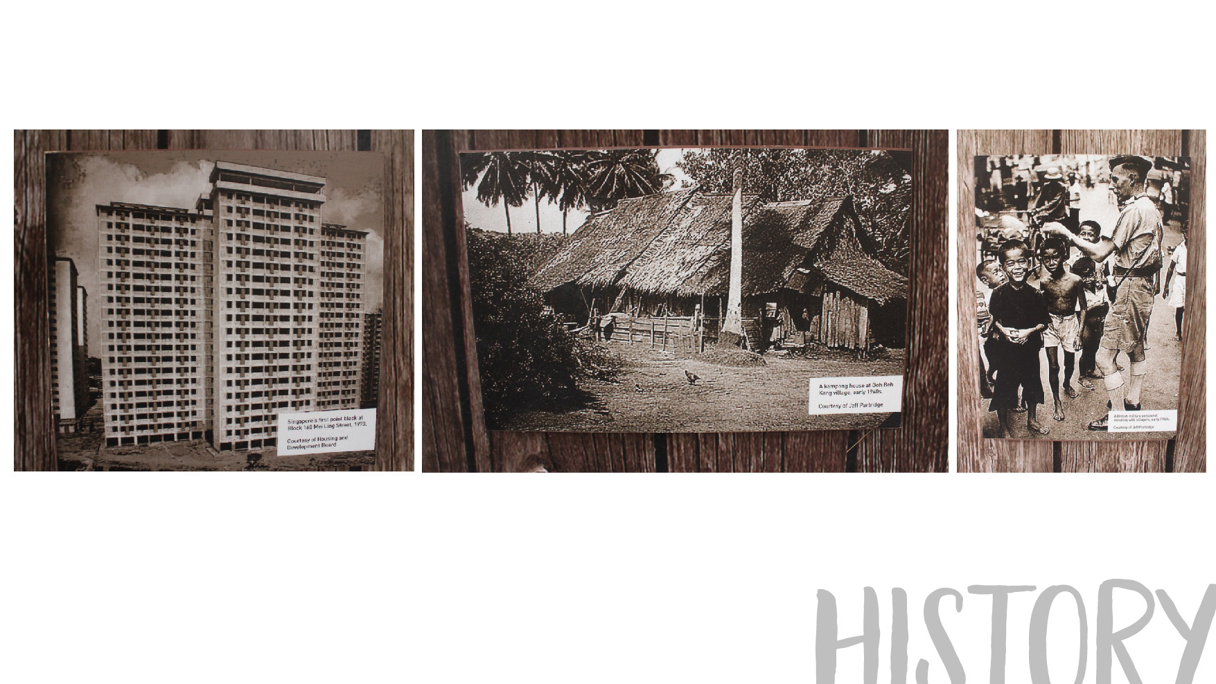
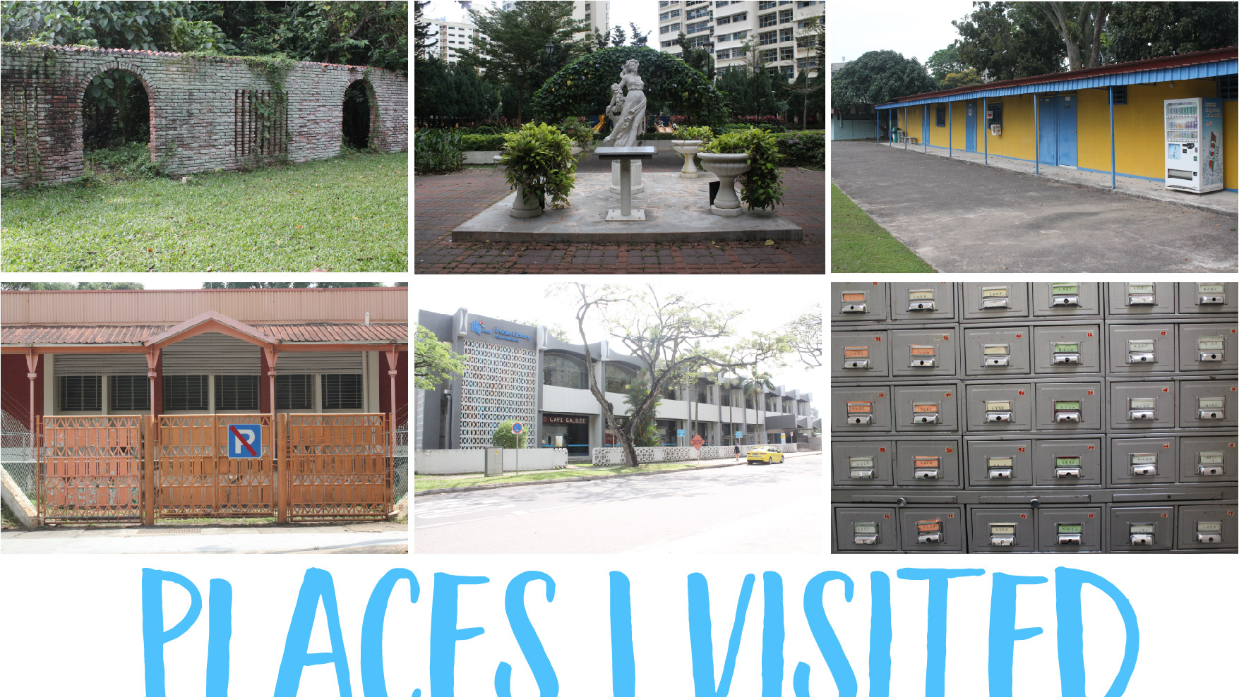
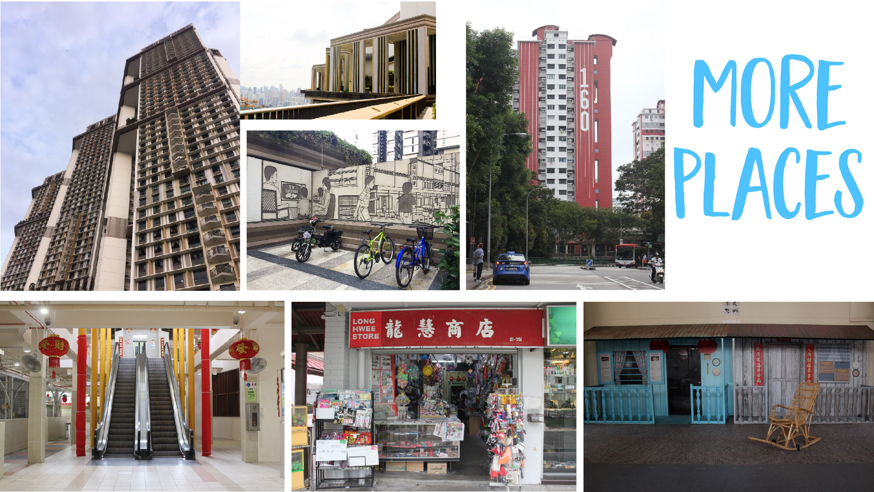
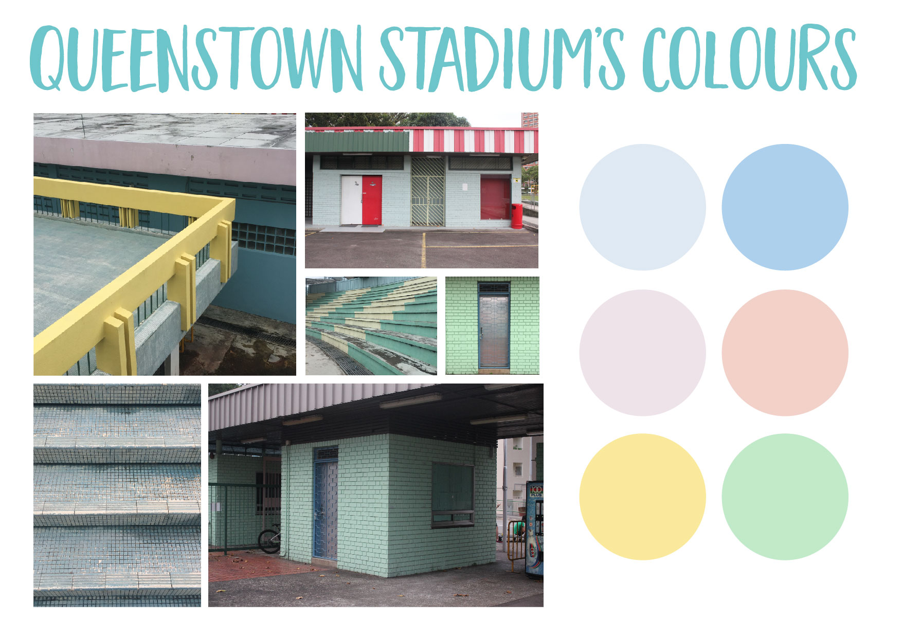
So perviously during my presentation, I mention that wanted to have my zine colours to be mainly red and blue as it was inspired by the Chinese design. However I felt that the colours does not suit the content. Hence I went back to Queenstown to observe more things, and here are my findings:

  • I discovered that Queenstown Stadium has this pastel colour palette, which suits Mdm Ker Ah Kin’s personality as she is soft spoken and she always smiles and greet her customers.

  • Patterns from all over Queenstown, which I thought can be break down to simple shapes.

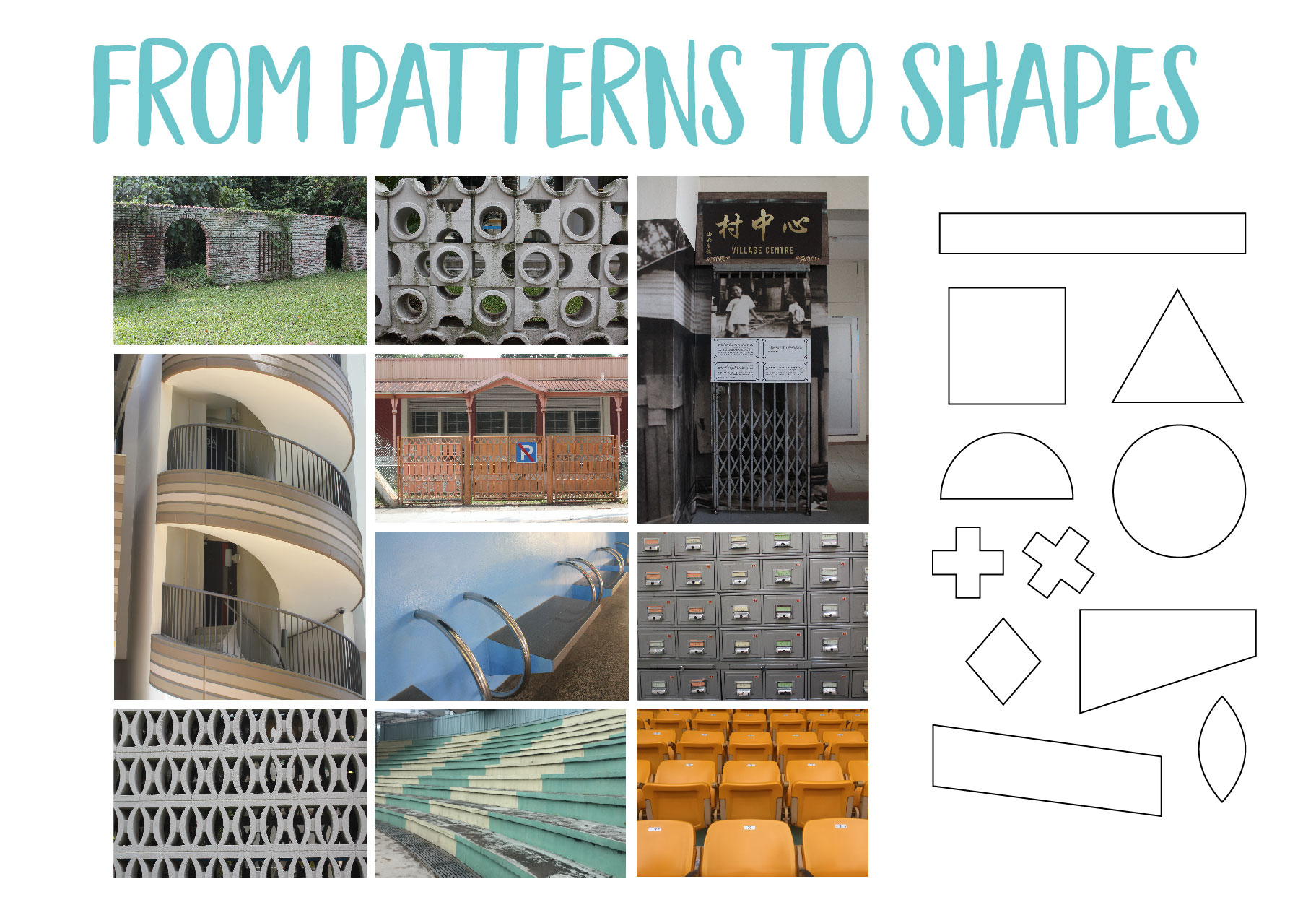
Hence, with my findings above, I thought of using pastel colours to represent Mdm Ker and also uses shapes to create memphis design.

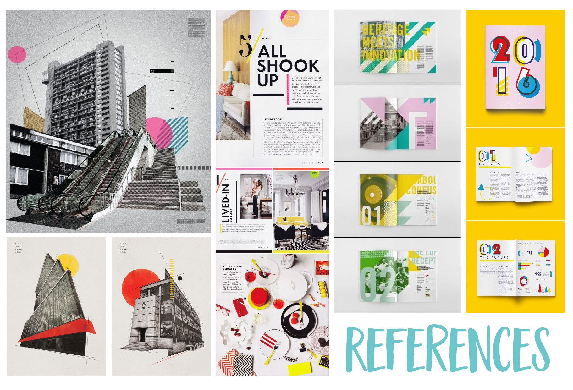
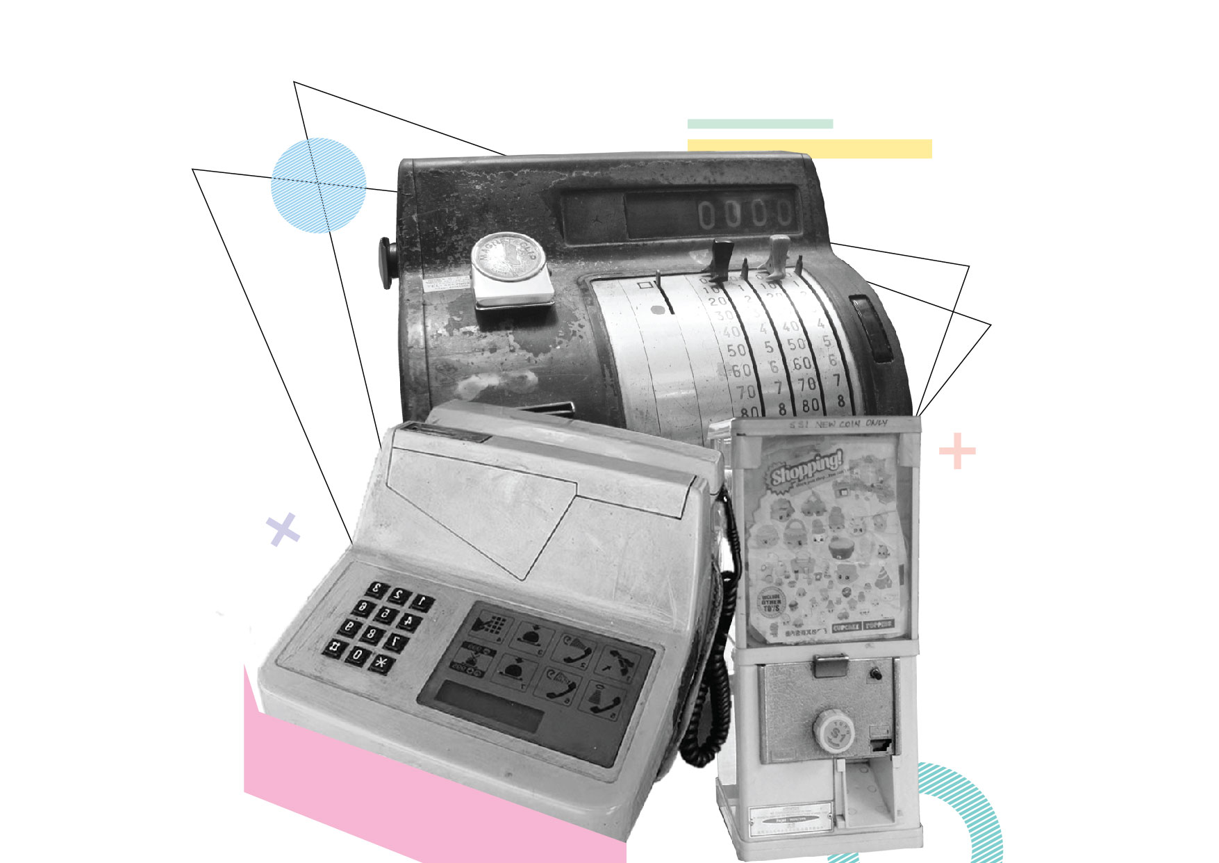
Below are my references for Zine. On the left are references on how I can uses memphis design in black and white images as I wanted to keep the image true to itself and I want my zine to have the nostalgic feel. On the right are references on how I can use colours and shapes to create the layout.


Experimental design
1st Draft
2nd Draft:  Using pastel colours. However I felt that there was too many thing going on in 1 page.
3rd draft: I split the memphis design into 2 pages. Left: Front back cover. Right: Page 1
Experimenting how to memphis design can fit into my images
More experimentation
Still experimenting on how the cover page can look like.

My next step is to take more pictures, as I asked Mdm Ker Ah Kin to bring some of her old photos. And also with the feedback given, I will try to prepare a few pages of mock up for consultation.

Thank you!


Research Critique 3

Group members: Fizah, Azizah, Naomi and Qistina

Medium: Stop-motion

About: Destroying the original quality of a living thing. By using a flower to represent human and it is placed in a soil where it is comfortable in. Then using different actions, such as stabbing, cutting and stepping on it, to create deterioration to the flower. Aside from the objects, we verbally abuse the flower in a poetic way and it gets harsher as we took turns to say each line.

At the start of our stop motion, we make each frame goes by sequence then half way through the video, the sequence gets messed up creating glitch, which means error to us.

  • How does your project embrace problems, inconsistencies and accidents?

When we were compiling each images into a stop motion video, some of the images gets messed up as they were not in sequence. Hence we decided to embrace it which lead to some of the images not sequence.

'But the way to not be stuck is to focus on glitch as a form of surprise and as a way of glitching people’s expectations.' – Randall Packer, Conversation with Jon Cates (2014) Hyperallergic

To us, glitch means error and mistake. Hence by having those error and mistakes in our video, it distort the audience way of viewing it.

  • How is the medium in your work transformed from its original state through the act the deterioration and destruction?

By using stop motion, we are able to rearrange the sequence of the images which makes the audience to familiarize then unfamiliar with the linear narrative of the video. However, we kept the last frame to the flower being buried into the soil as an ending to show the original state has being destroyed.

'Glitch studies attempts to balance nonsense and knowledge. It searches for the unfamiliar while at the same time it tries to de-familiarize the familiar.' – Menkman, R. (2009) “Glitch Studies Manifesto'

The actions that we did to the flower, such as stabbing, cutting and burying on it, shows the process of deterioration of the flower. By having those actions, it gives the audience some hint about which action comes first although the video is not in sequence.

With the voice added into our video, it gives an impact that the flower is going through a negative state. However, we did in a poetic way to show that even in a nice way of saying something it can be vulnerable to a living thing.

  • How is glitch and destruction an act of artistic expression?

From our micro-project, it a metaphorical destruction as we use object to represent human. We did not set any rules on how we wanted to destroy the flowers, and how we arranged the sequence of each images. Instead, we just go with the flow which lead our video to have traces of our error and mistake.

“I manipulate, bend and break any medium towards the point where it becomes something new. This is what I call glitch art.' - Menkman, R. (2009) “Glitch Studies Manifesto'


Micro Project 6 – Group 234

Our Facebook page

Group member: Jingyi, Amanda, Felicia and Azizah

Compilation of our A Day in the Life of Super-Participation, 24 hour edition:

We did this project on 7 March, Wednesday during recess week and our initial plan was to post every 1hour.

Most of the things we shared are related to school such as doing work, having presentation and lunch in school. Overall, we concluded that this project reflects us as tired art students and there are works to be done during recess week.

  • Do we try to create a persona or image of ourselves through the things that we share via social media?

Yes, as mention above, it shows us as tired art student. And as discussed in class, we are able to capture the character or trait of a person. Here are what we think of each other:

Azizah – someone who does not do last minute work.

Jingyi – A social person who has a balance of social, study and sport.

Felica – Secretive and mysterious as she doesn’t post her selfie.

Amanda – Hardworking, tired student who always try to be on time.

Research: Bags across time, cultures and geographies

Topic 1: Bags across time, cultures and geographies

Why were there bags in the 15 – 18 century?

They were necessary for carrying money and other personal items, since clothes hadn’t yet been fitted out with pockets. The introduction of pockets started towards the end of the 16th century meant that the men’s bags slowly disappeared in the course of the 17th century. From then on, bags belonged almost exclusively to the women’s domain.

1600 – 1700 A.D. – A Bag for Every Purpose

Velvet pouch with silver balls, the Netherlands, 1st half of 17th century – Purpose to carry money for women
A beadwork purse with inscription ‘Remember the Pore 1630’, England, 1630 – designed for wedding bags or for carrying a Bible.

1700 – 1800 A.D. – Hiding and Showing Off

Abiti Antichi Chatelaine in argento –  small utensils, such as perfumed ball and scissors can be attached to it

1900 – 2000 A.D. – New Forms

Women have bags for every occasion at any time of the day.

Leather evening bag with enamelled adornment, France, ca. 1915
Magazine clutch ‘Jours de France’, Hong Kong, 1970’s


Insight: Bag size used to be small in the past, now it is bigger as more woman are employed.

How bag can give signal:

“If the Queen places her handbag on the table at dinner, it signals that she wants the event to end in the next five minutes.’

China’s handbag history

Different kinds of texture

Embroidery
Beaded bag
Linen bag


References:

Tassen Museum: Museum of Bags and Purses

A Timeline of the Most Coveted It Bags Through the Years

How Queen Elizabeth Uses Her Purse As a Secret Code

Good Orient – Fine Asian good

Locale – Queenstown


Queenstown named after Queen Elizabeth, in commemoration of her coronation in 1953

Ridout tea garden

It used to be known as Queenstown Japanese Garden and brick wall was the only thing that lasted and belonged to the Japanese Garden.

Forfar Heights

Is a HDB estate and it has an English-theme-garden. It was known as Chap Si Lau in 1990s and it was once Singapore tallest public residential building with 14th story.

Queenstown Stadium

Opened on 15 August 1970 and it was Singapore’s first neighbourhood sport complex. Queenstown Stadium was a location for National Day Parade, Sports Competition in 1970 and many more.

Queenstown Polyclinic and Library

They are beside each other and both of them are the first community and social institute in Singapore.  However, this polyclinic is closed down and they have a new polyclinic at Stirling Road, which is within Queenstown. And the library still remains at its place.

SkyVille @ Dawson

A 46-storey high with roof garden, that enables you to see a paranomic view of Singapore. It has murals reflecting the past of Dawson road. Not a normal HDB flat, as it promotes social interactions and has a few sky garden to allow all ages to interaction with each other.

Blk 160

Located at Mei Ling Street. The first point blocks constructed by the Housing and Development Board (HDB) and it was a success, with leads the HDB to build more point blocks across the country.

Mei Ling Wet Market

As I was walking, I found out this place and took a look inside the building and the stores are mostly closed because I was there at 4pm

Long Hwee Store

Currently the store 49 years old. When I came to the store, the owner greeted with me with a huge smile and told me that this first bookstore in Queenstown. Currently, it sells toys, stationary, chinese books not many antique things except the cashier machine (image below)

Objects found

– A trishaw with a huge speaker on it.

– Antique cashier machine from the Long Hwee Store.

– A lot of construction building, especially near the MRT station.

– And wires that we don’t see as it is buried in the ground.


Look and feel of Zine

Colours are mainly red and blue. Inspired by Chinese design, as Queenstown was a town for Chinese people and feel of the zine should be old and nostalgic.