TREASURE


Updating Portfolio…

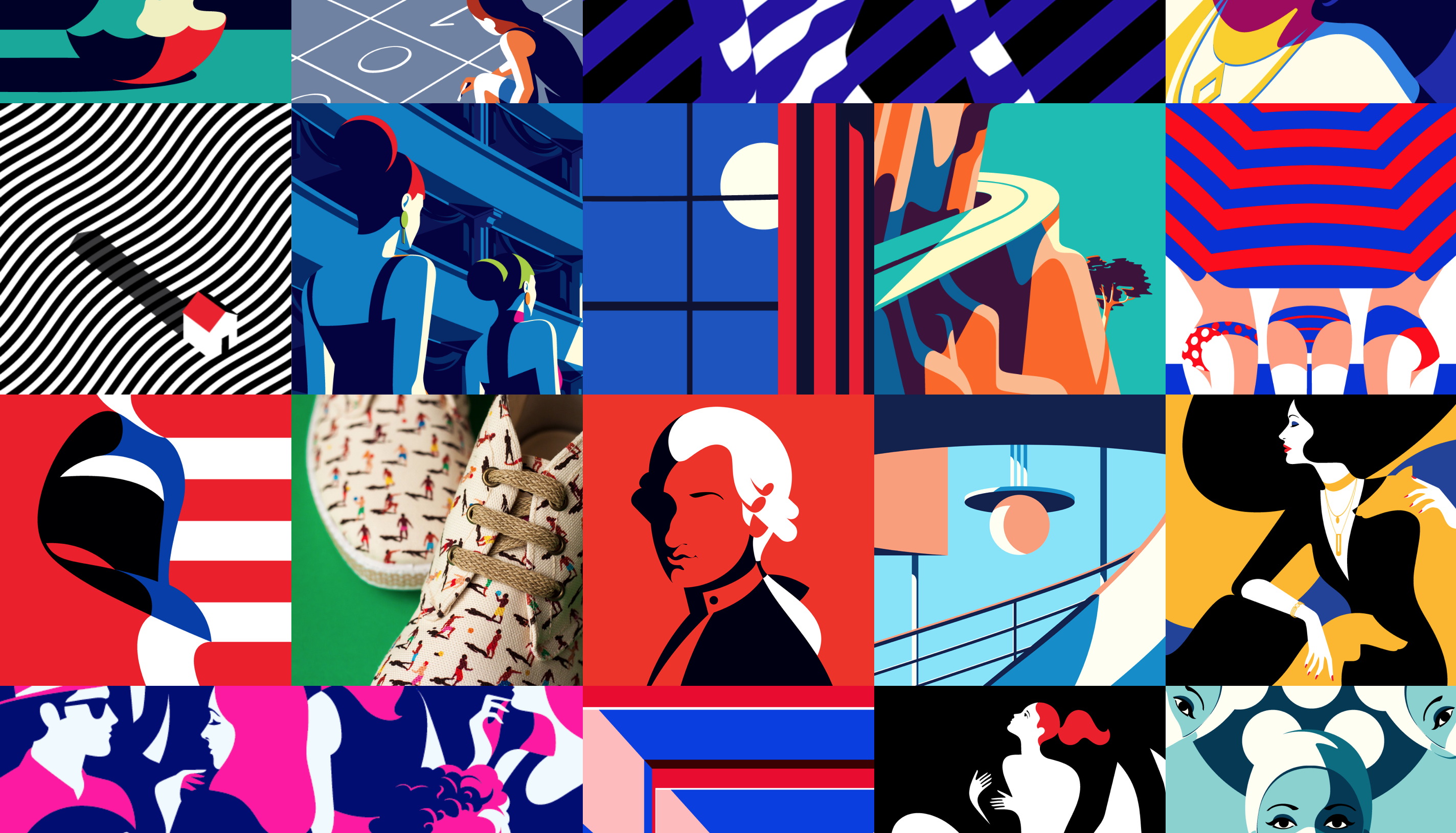
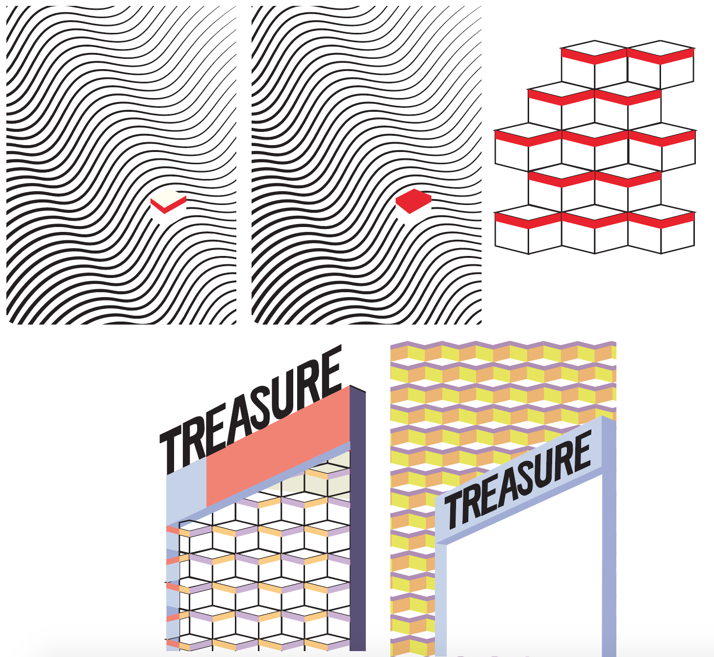
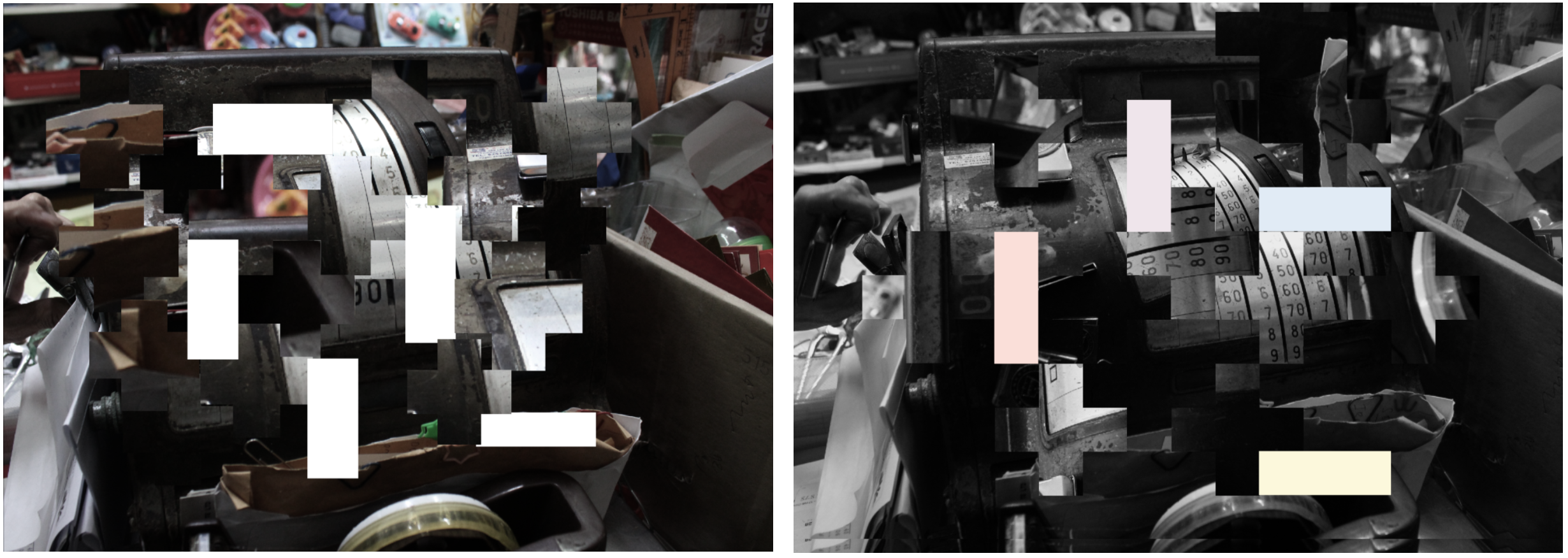
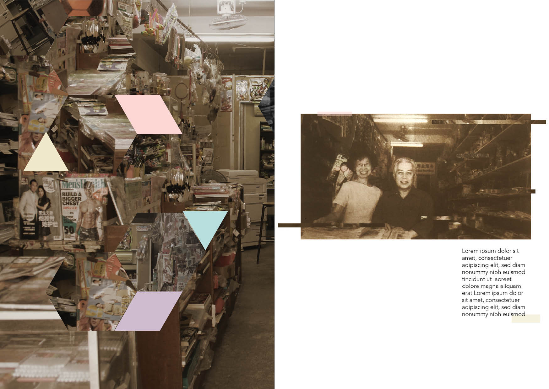
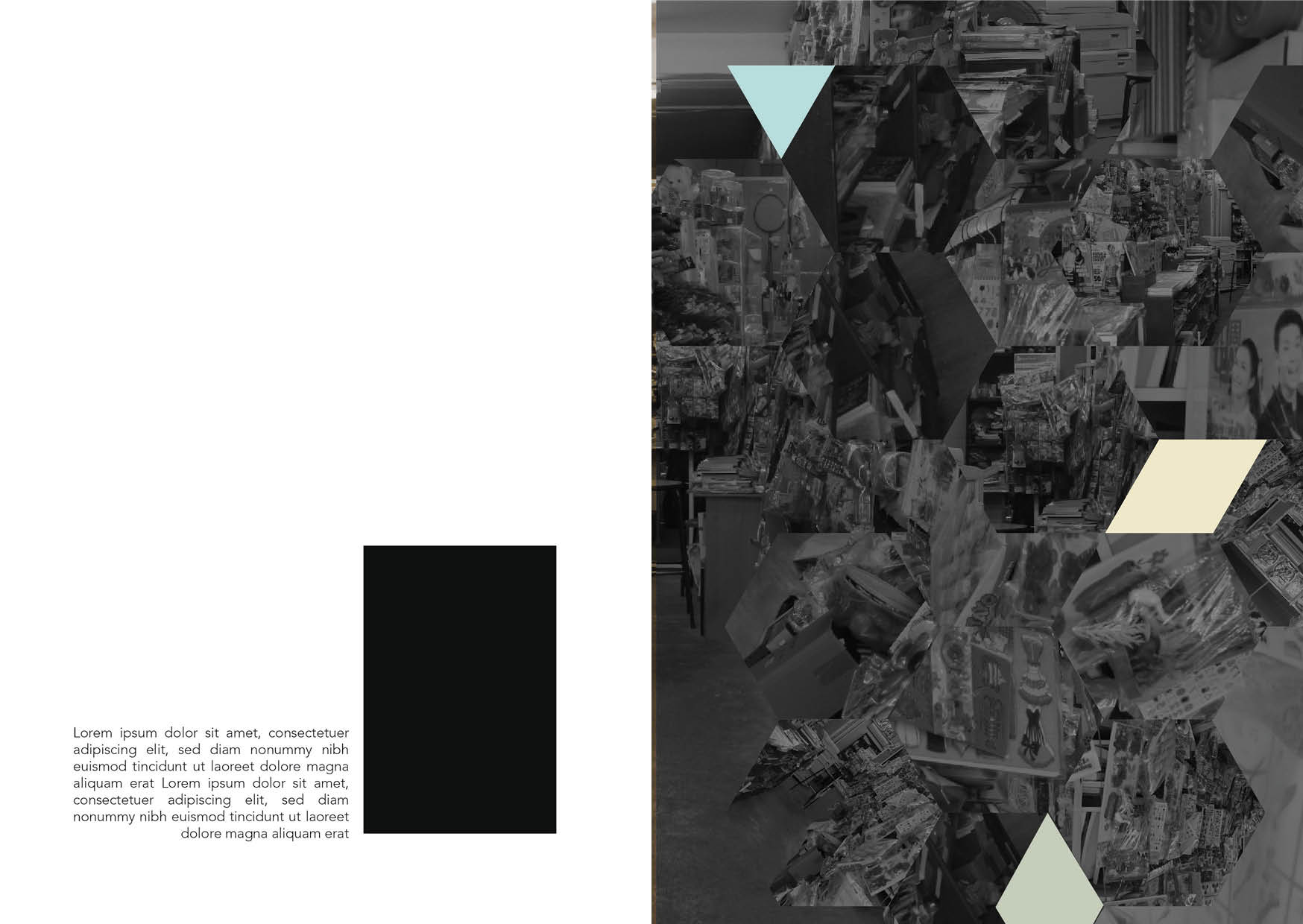
One of the changes I did from my previous post is that I added texture on it. As previously, it look too flat. I also did minimal edit such as the change of colours and added lines on the back front cover page.
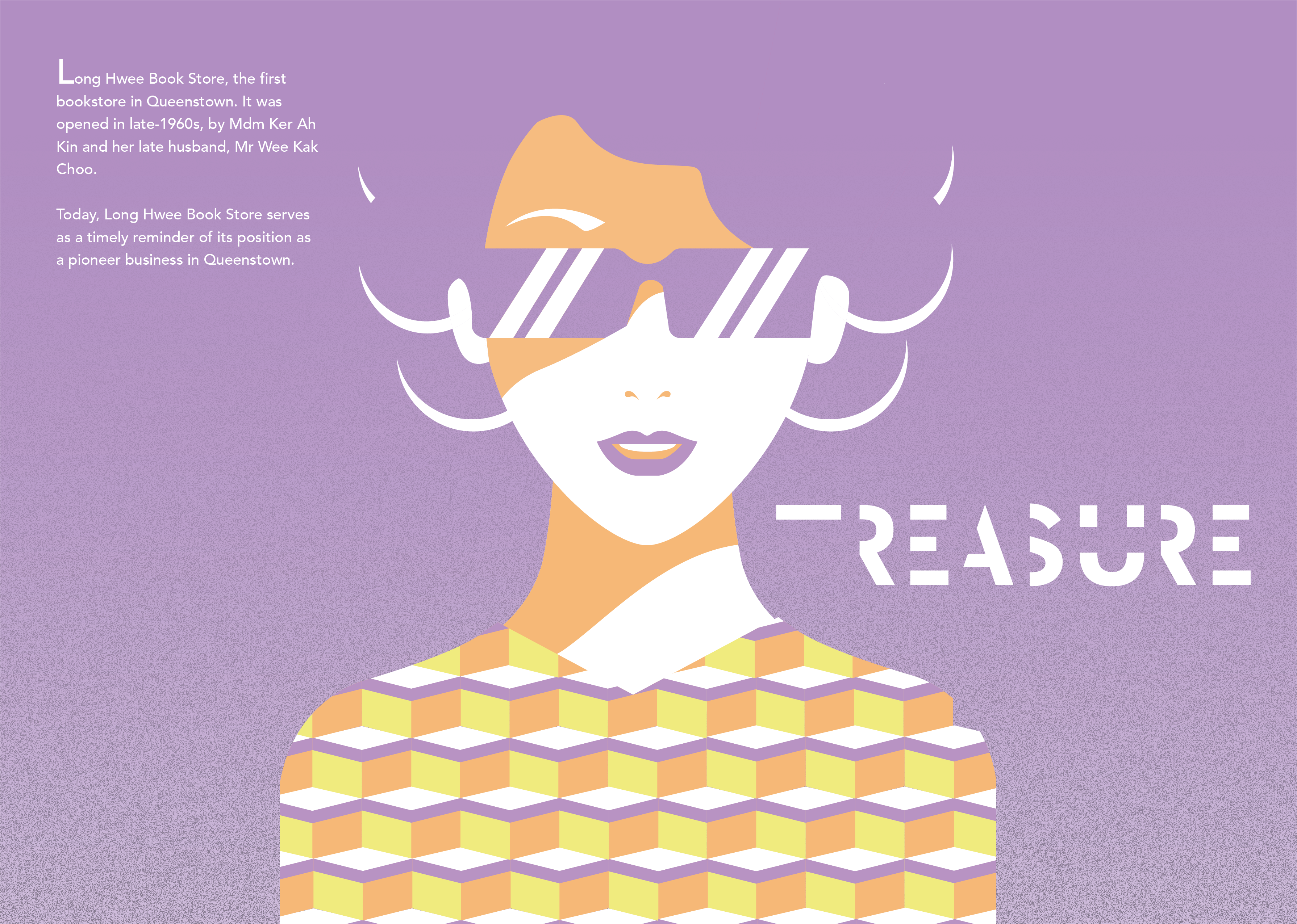
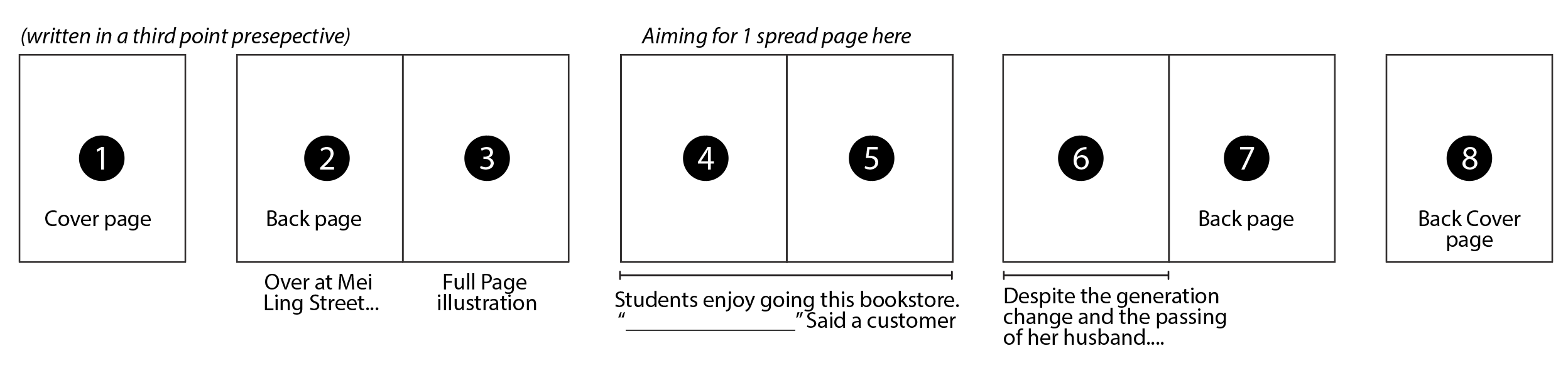
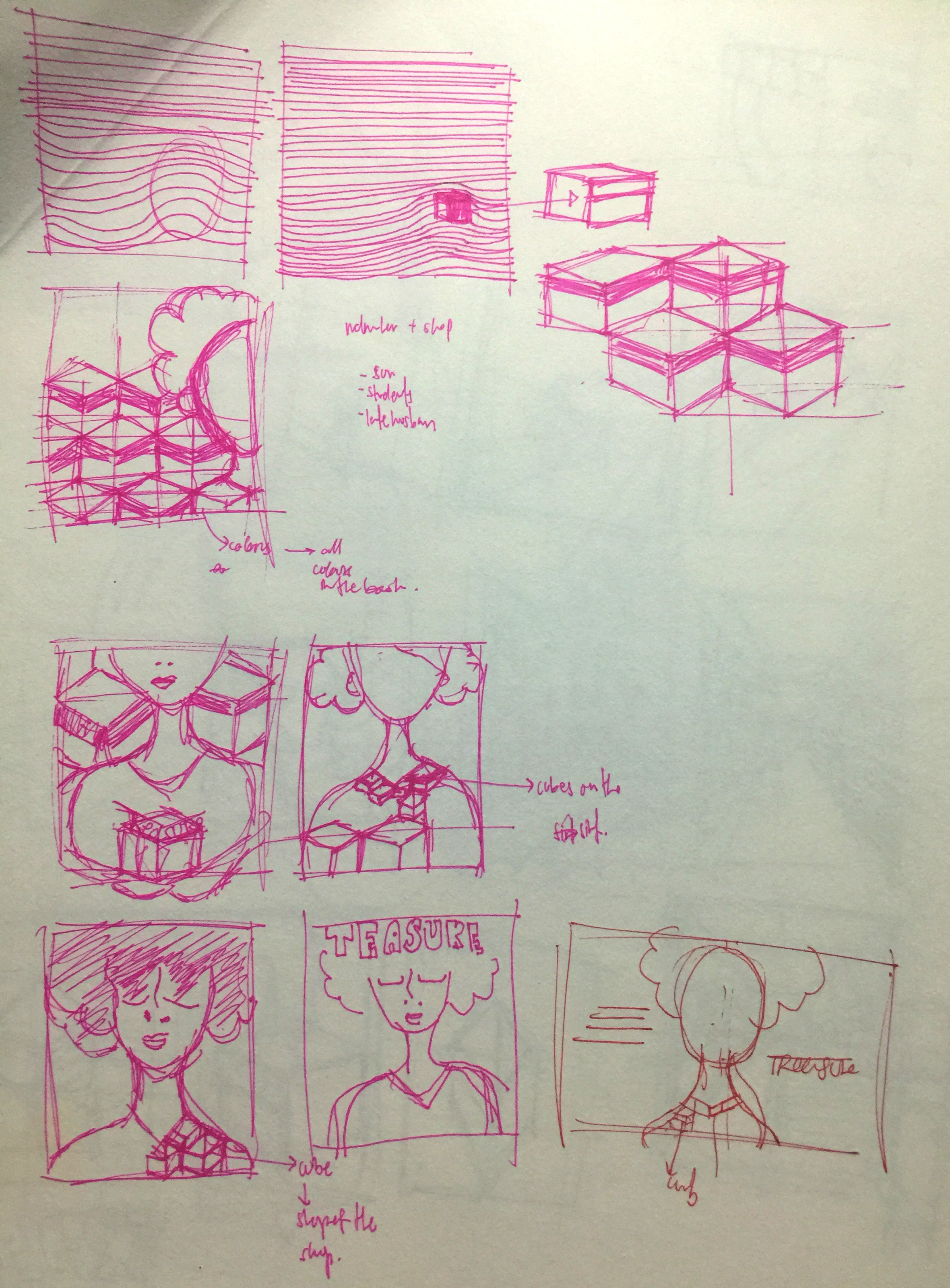
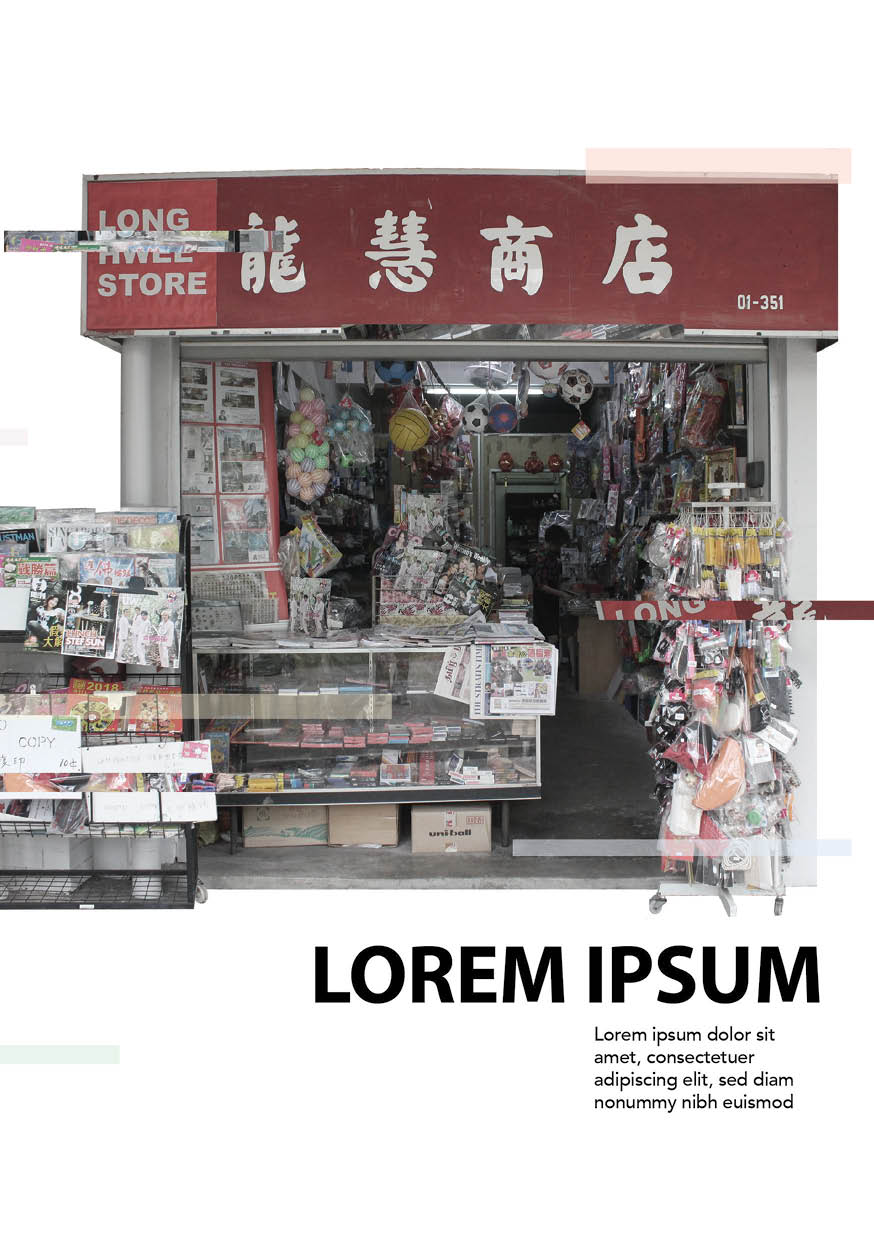
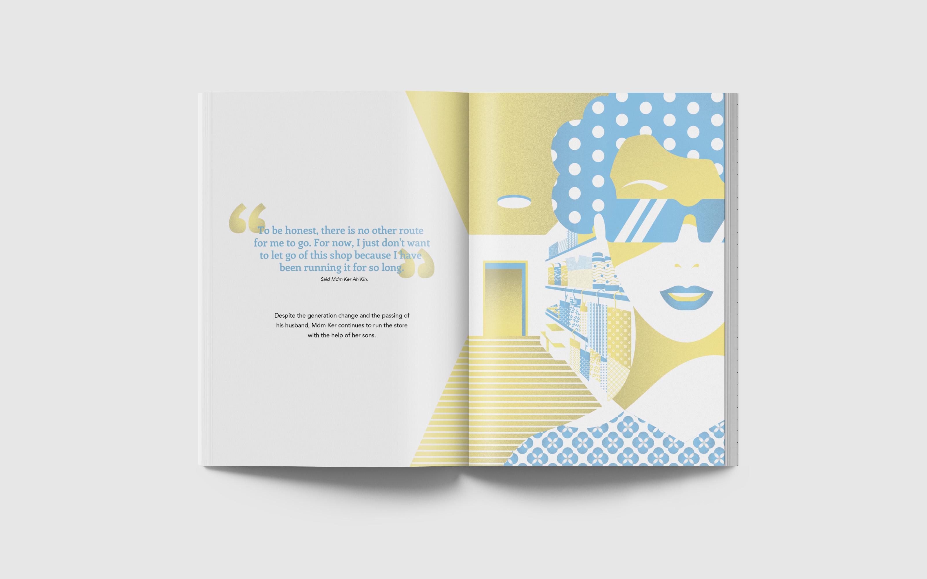
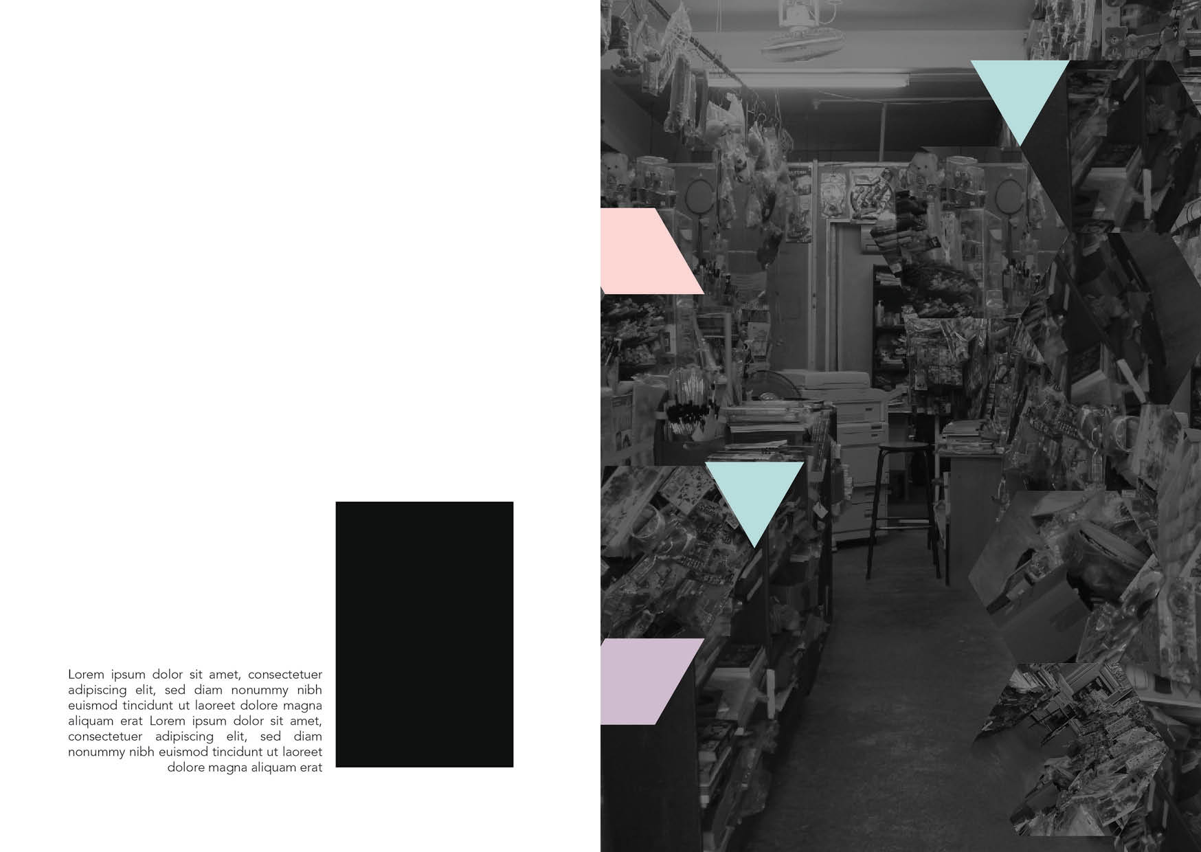
Title of my Zine is Treasure. As this shop is one of Mdm Ker's treasure that contains memories of her husband, family and many more. And even though the shop is not doing well anymore, Mdm Ker does not want to stop running the shop.
I am pleased with the outcome although I had less than a week to do this. However, if I had more time, I would want to try on different papers. As what one of my classmate suggested that I could try using glossy paper to vibrant out the pastel colours.
And through this short period process, I am amazed at myself that I could do something similar to Malika Favre’s illustrations style. This makes me want to practice more on her style and move away from my original illustration style that focuses more on the details.
 Lastly, I would like to say thank you to Mdm Ker, for helping me in this project and give me a new perspective in Queenstown. With your help, my zine would not come through!
From my previous post, I was not satisfied with the mock ups. Hence I decided to change to something that I can inject my personality in to. So I decided to do illustrations instead of image manipulation, as I can do a lot of things in illustrations and explore different style.
So at this point of time, I had less than a week to complete my zine. Hence I did not want to take a lot of time illustrating the details. So I followed Malika Favre’s illustration style, that are flat and uses negative space. Something different then my usual illustration style, but I was very excited to try this!
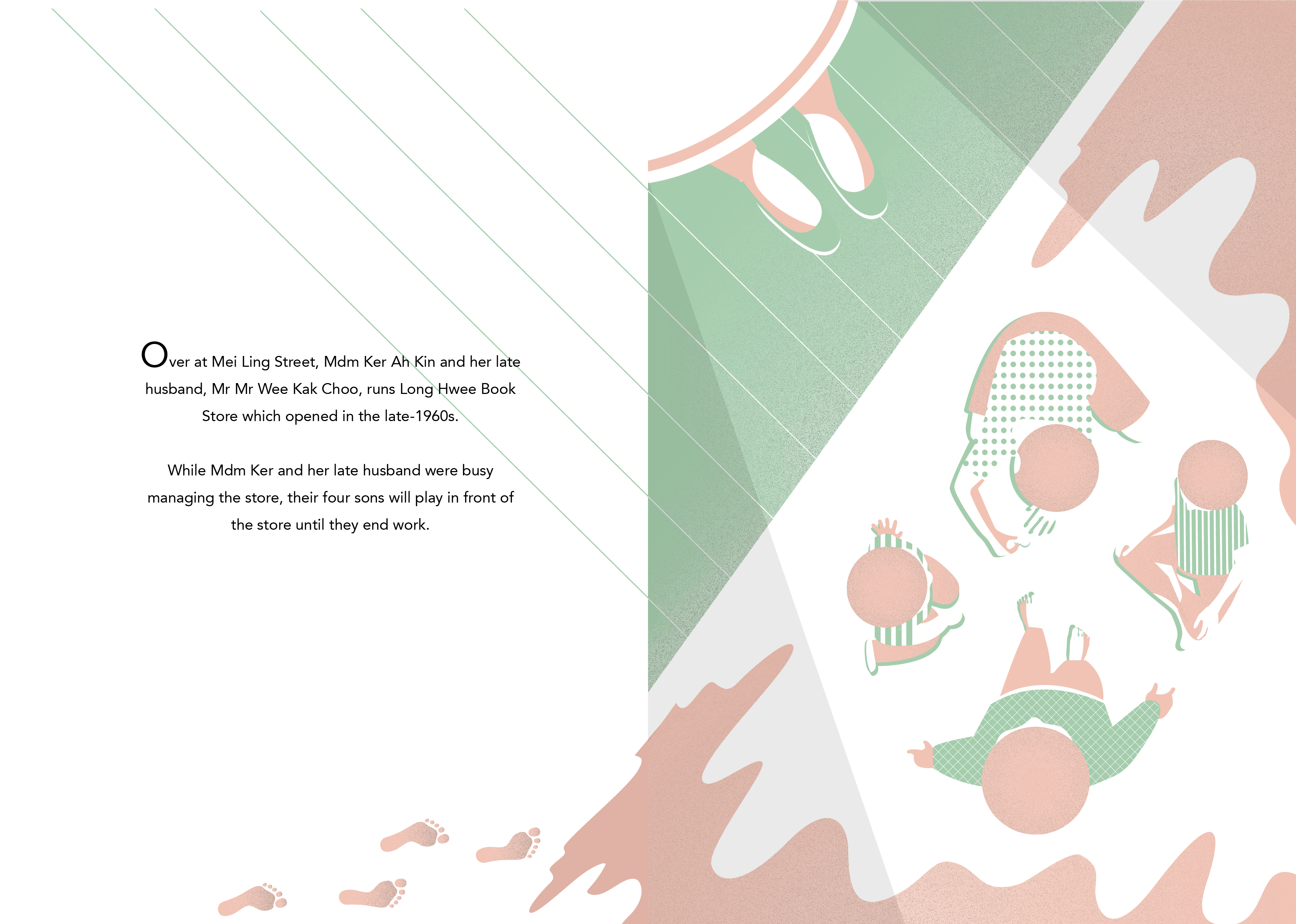
Other than changing the design direction, I also changed the narrative of my Zine. So I decided to go with a simple narrative. Starting from the history of the shop, to it blooming then to the current state of the shop.


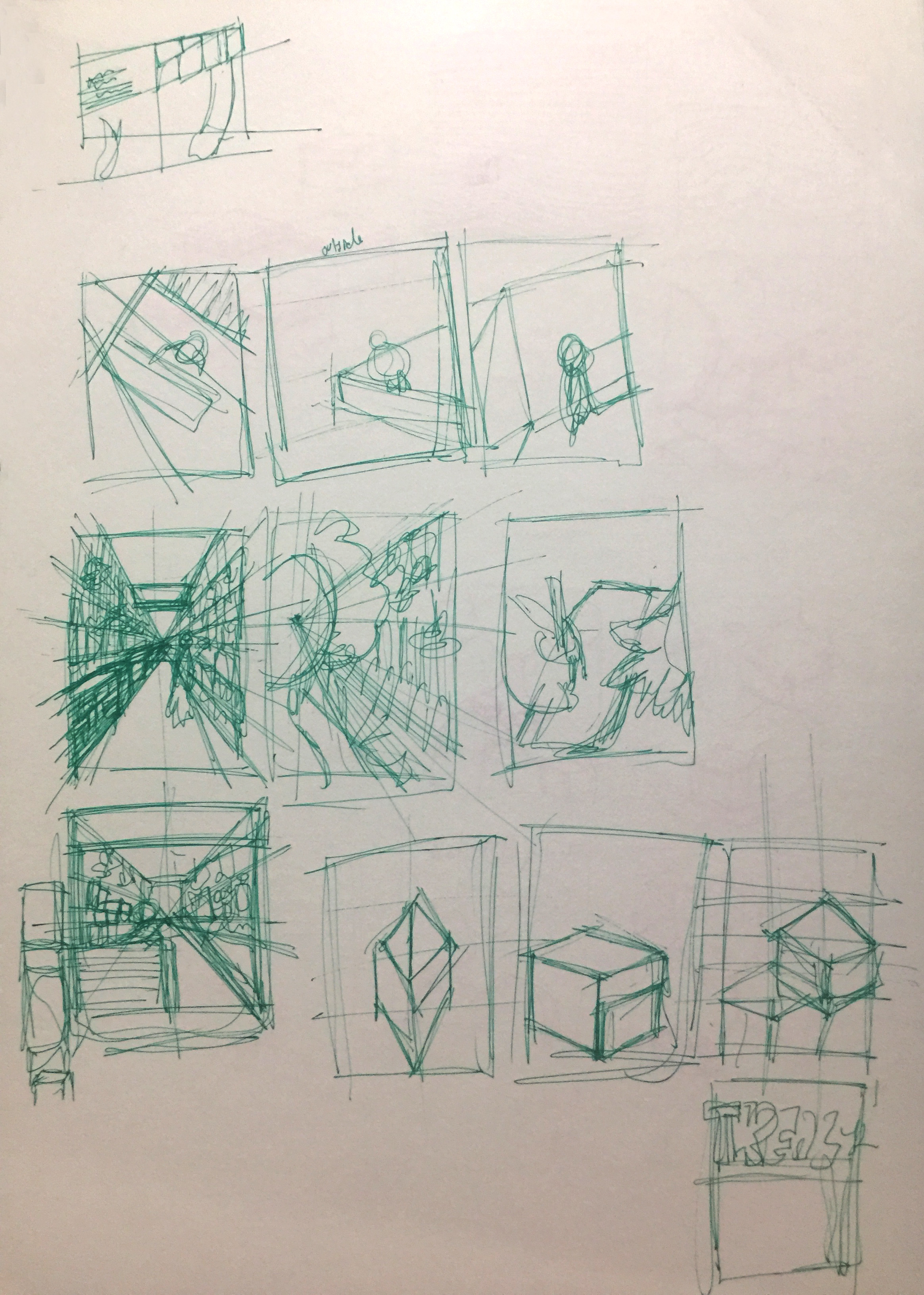
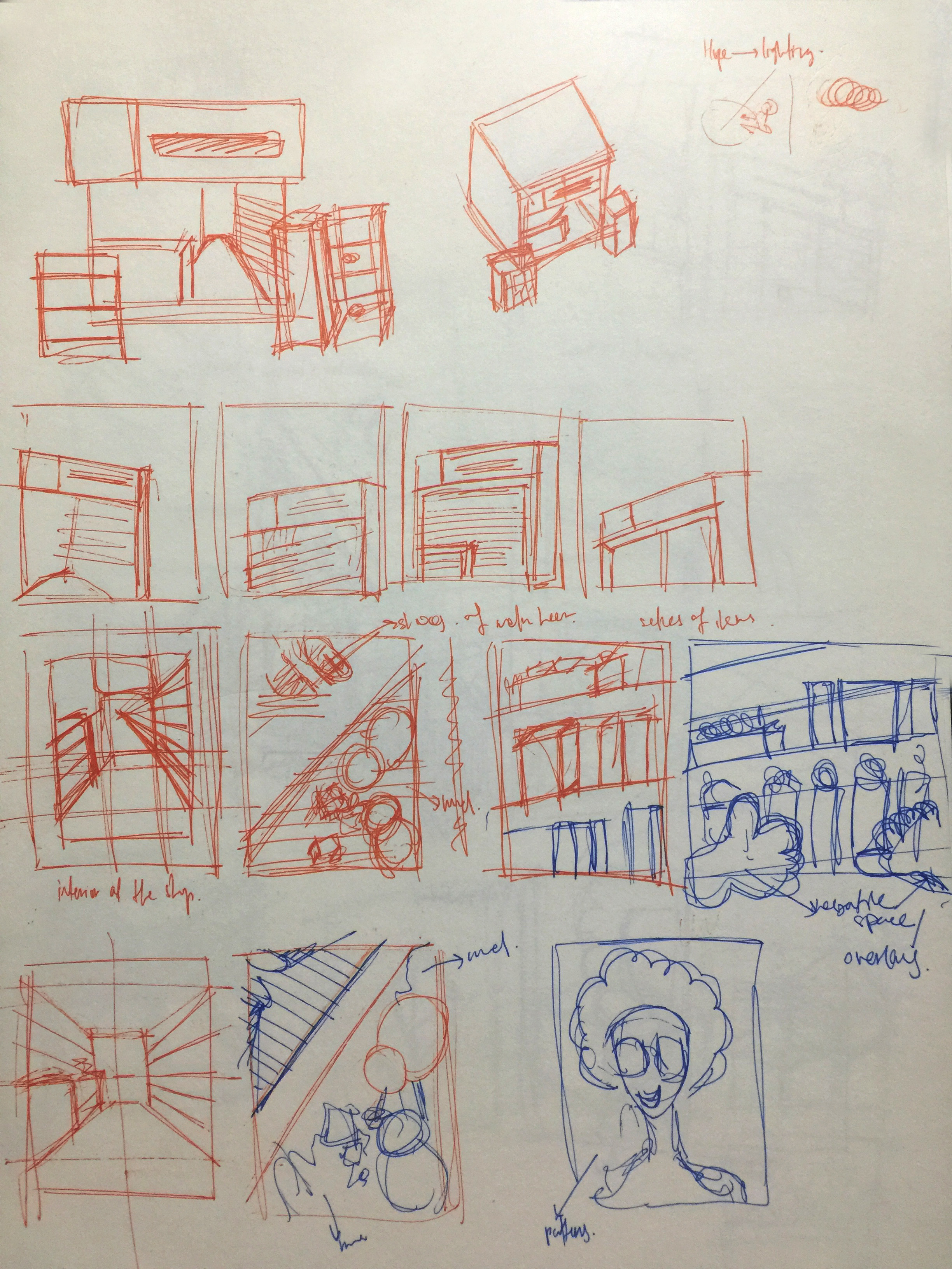
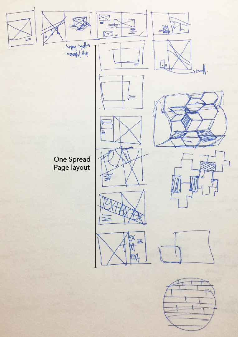
At the start, I drew it out according to my sketches. The I tried to manipulate and create pattern using it. However, it was not to my liking, different from Malika Favre’s style and does not show the place (Queenstown).


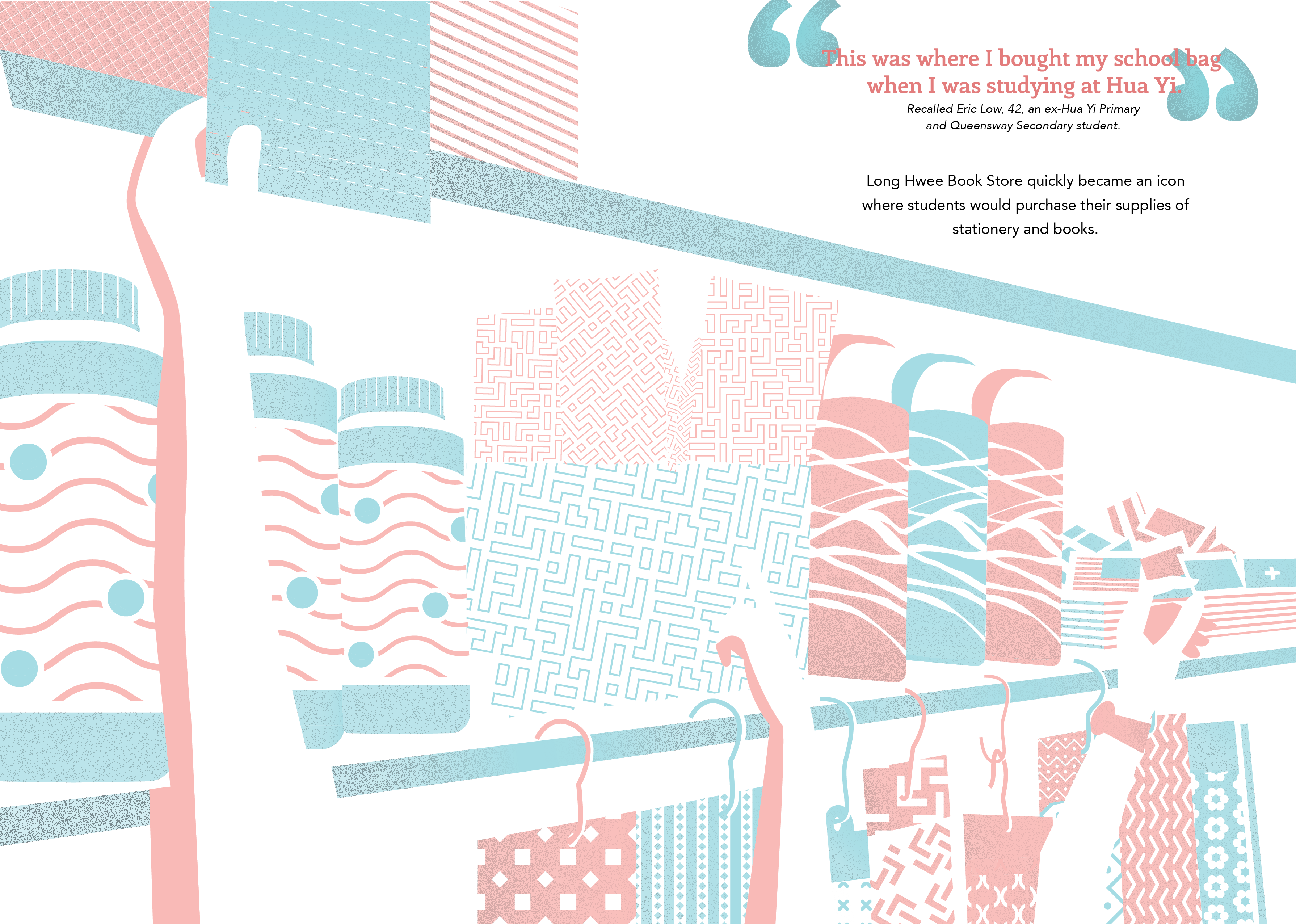
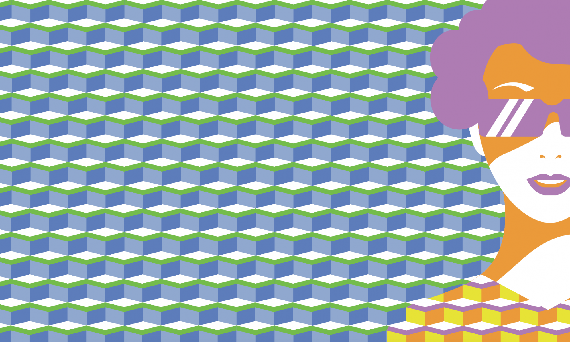
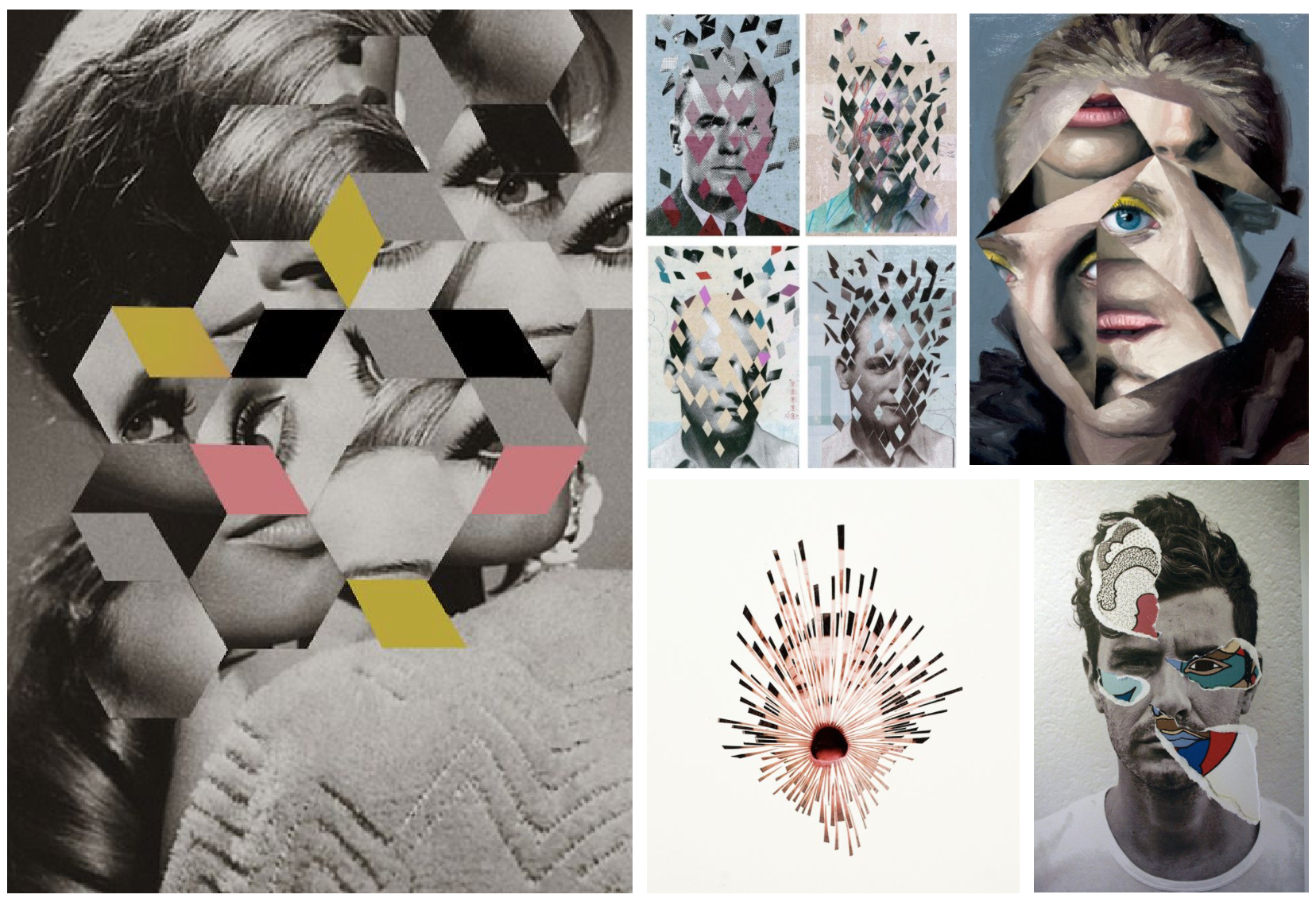
So I looked through the Naive book, that Mimi recommended me, and I found something very close to what i have discovered in Queenstown (Image on the left). That Image uses contrasting colours and patterns on it. Hence, I decided to put in the patterns that I discovered in Queenstown, and used pastel colours in my Zine. So in my edited version, I kept my illustration to the simplest form and tone down the colours. I added patterns on the clothes as patterns was something I discovered in Queenstown.

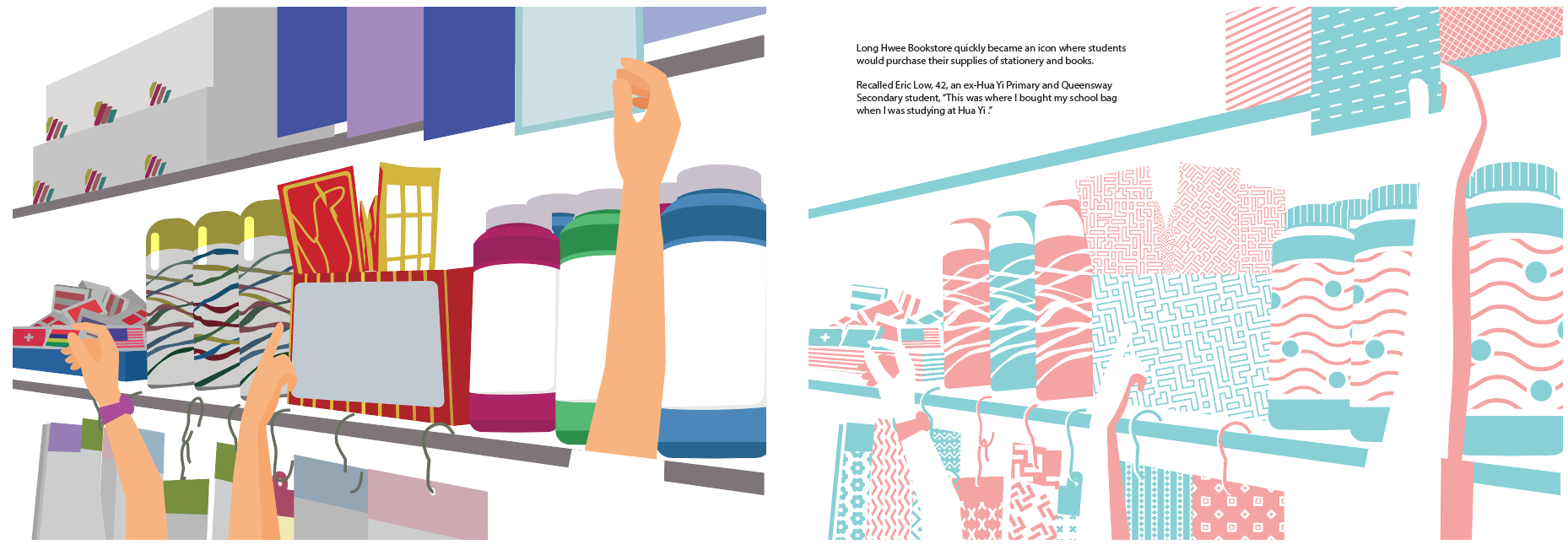

Colour was one of the challenges I faced. Because I wanted to use pastel colour and pastel colours would not stand out on a white paper. Hence, through the process of of making the zine, I kept changing the colours so that each illustrations will flow smoothly throughout all the spread.
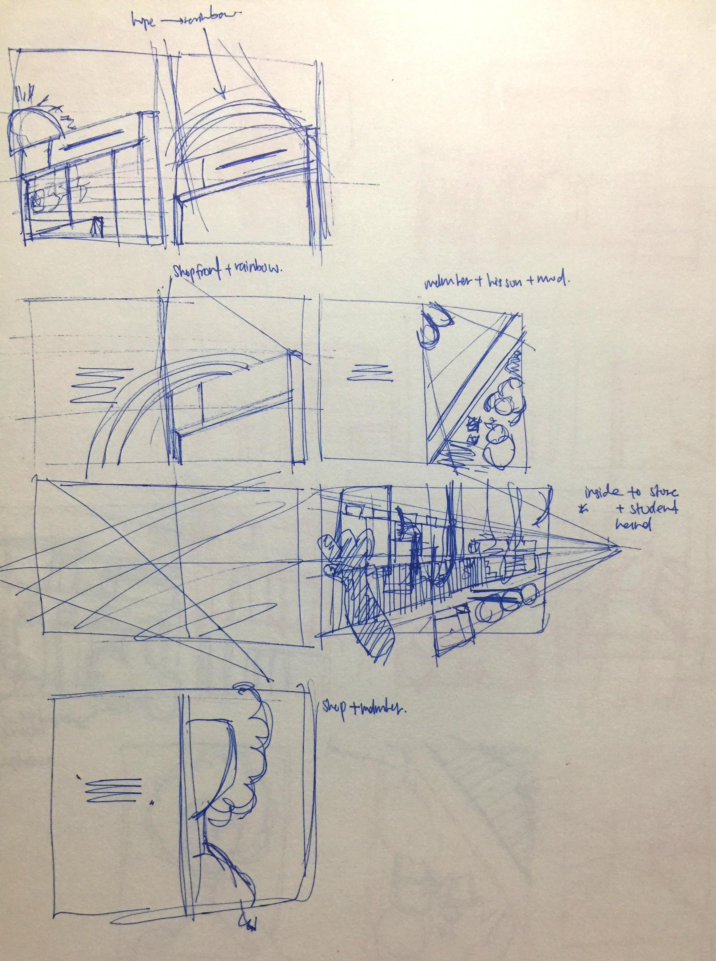
Coverpage was also the most challenging part of the zine, as a cover page should give a summary or a hint of the zine and it should also be able to capture the readers attention. So I started out by illustrating the the shop and its shop front. I added in the wavy lines in the background as Queenstown was a hill perviously. I kind of like the cube shape of shop, so I started to explore more it want manipulate it in the shop.
Out of all the illustrations I have in this Zine, I like the illustration of the aunty the most. So I added in the cube patterns into the aunty shirt. So the cube represents the shop and the aunty is the main character of my Zine. Then I play around with the colours.

That’s all for process post! Next will be the final outcome of the zine!

From previous post, I realise that the design direction and the content of the zine does not fit each other. As the illustrations of the shapes are colourful and the content of has a nostalgic feel. Hence, I decided to think of a new design direction.
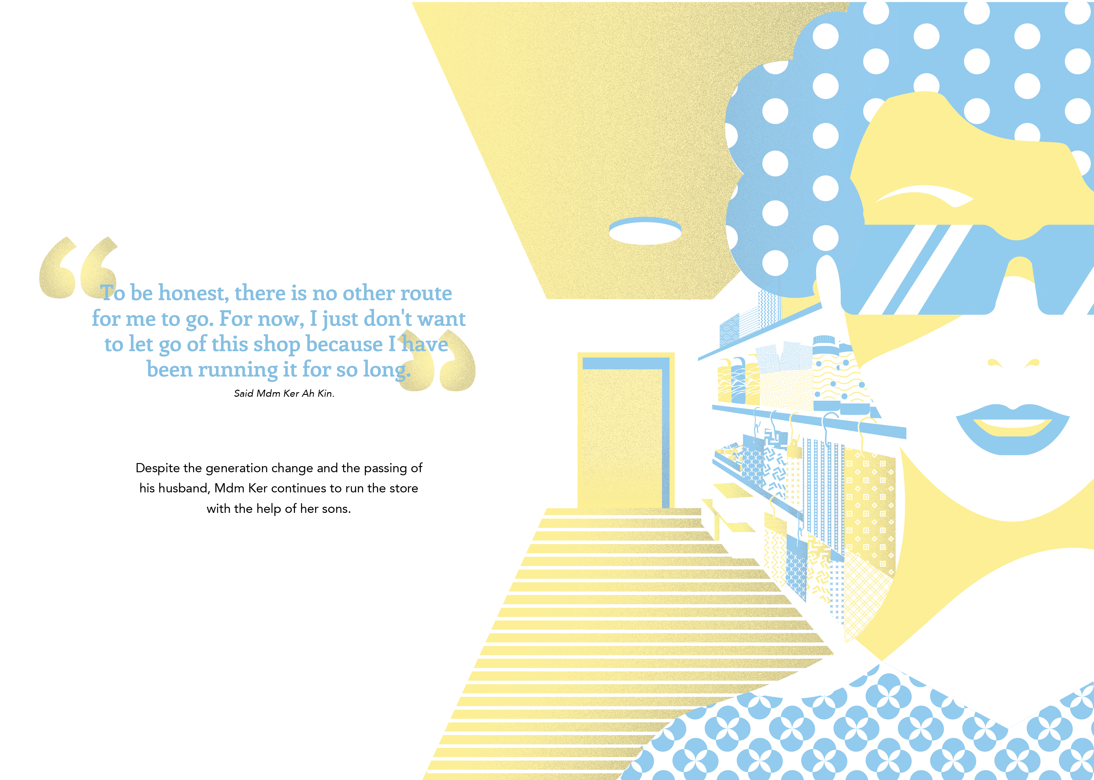
For this new design direction, the context will be about Mdm Ker Ah Kin’s perspective on her shop. When I met her for the first time, she mention that the business was not going too well because of the change of generation. Hence I though of a transition concept from how the shop started to where it is now. 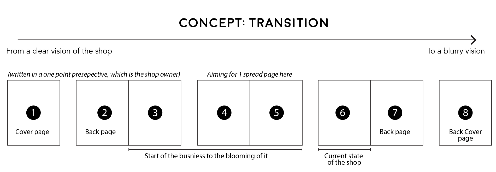


I was not satisfied with the outcome of both mock ups. So I decided to change the whole concept. See my next post!
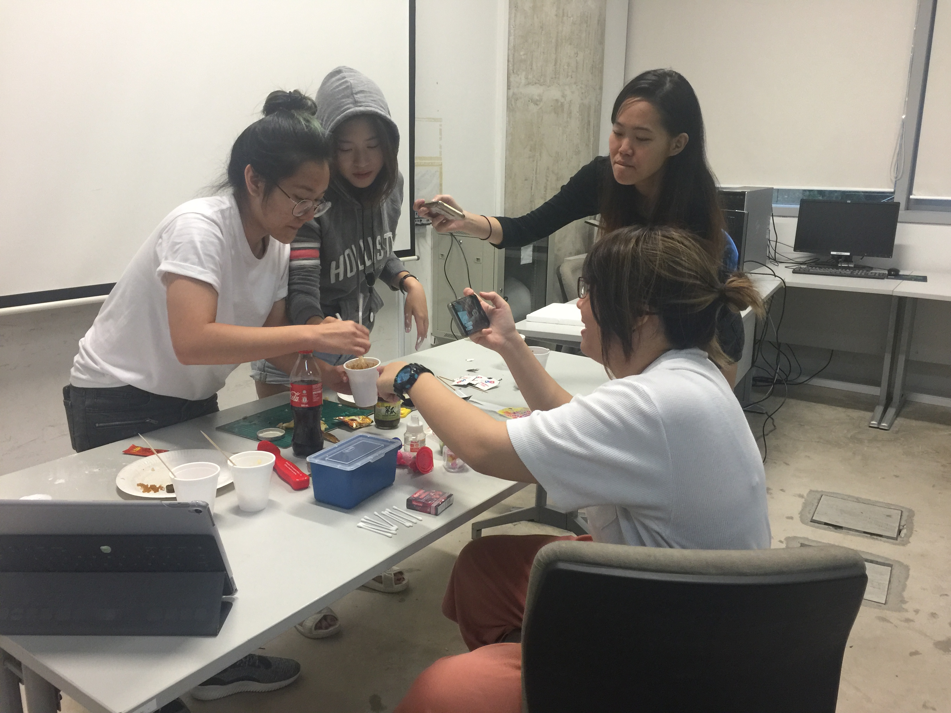
Hello! On behalf of my group members (Celine, Hazel, Tanya and Karen), here are our presentation slides, Facebook Page and Youtube video.
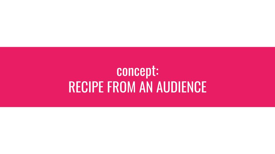

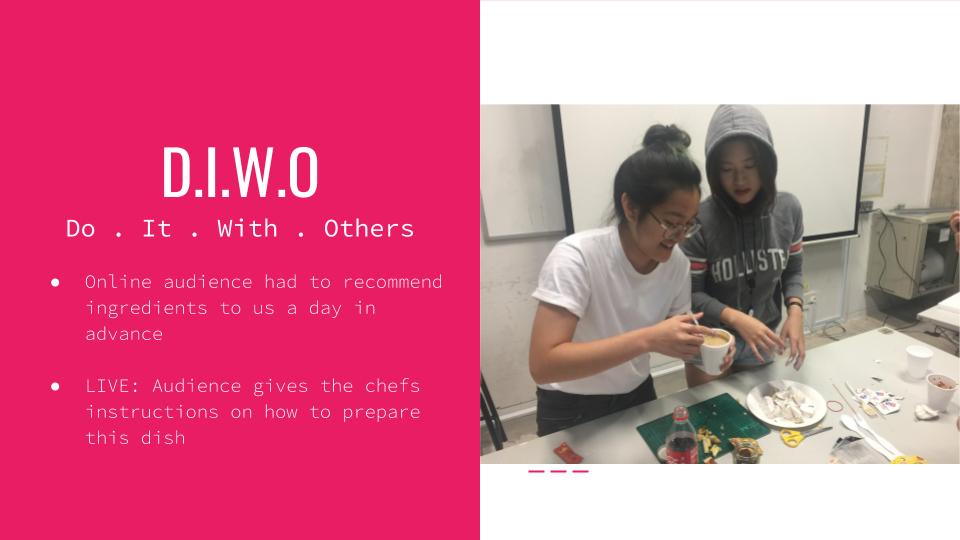


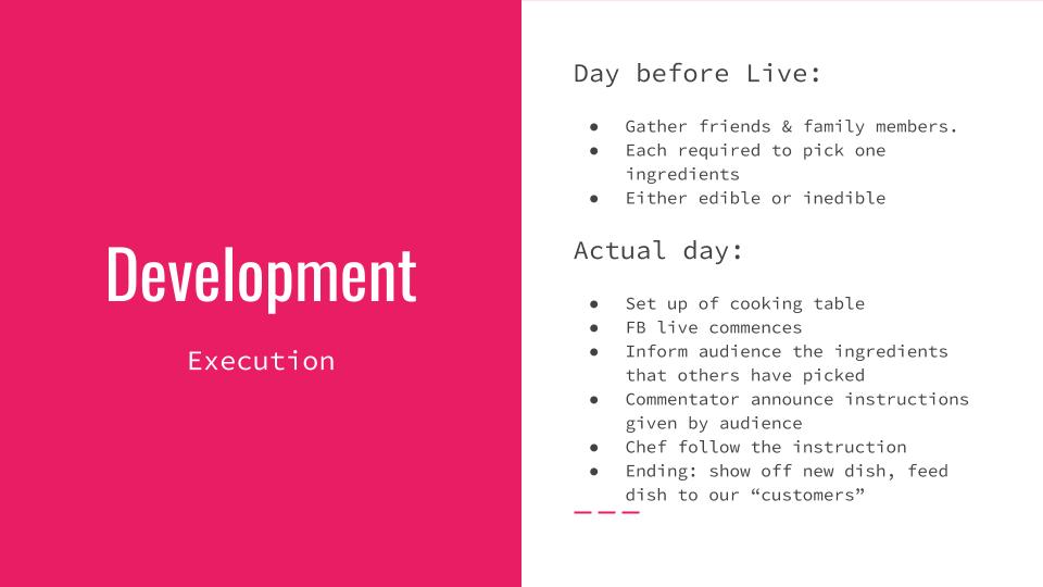
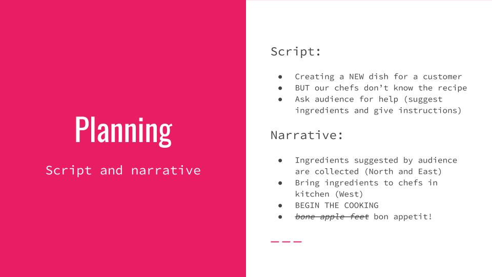
Inspired by our artist reference, The Futuristic Cookbook, my group and I decided to create a delicious-non-edible-meal with the help of our audiences.
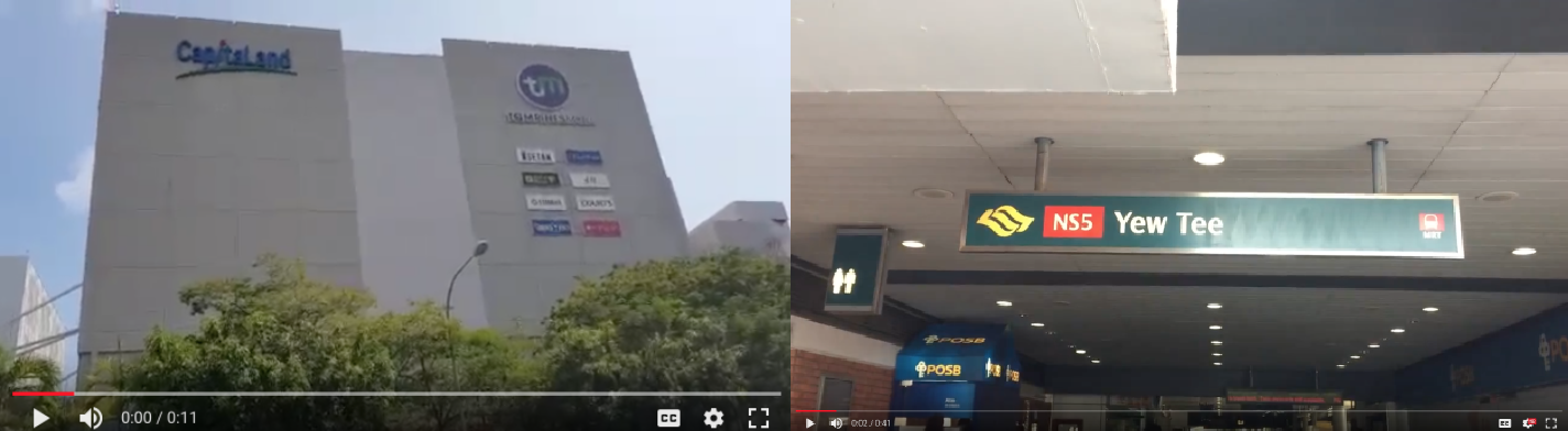
We asked our audiences what edible and non-edible ingredients would they like to see in our dish. Some of the ingredients suggested by them are condoms, coke, my little pony and pear. Then we went to different location, North and East of Singapore to get the ingredients.
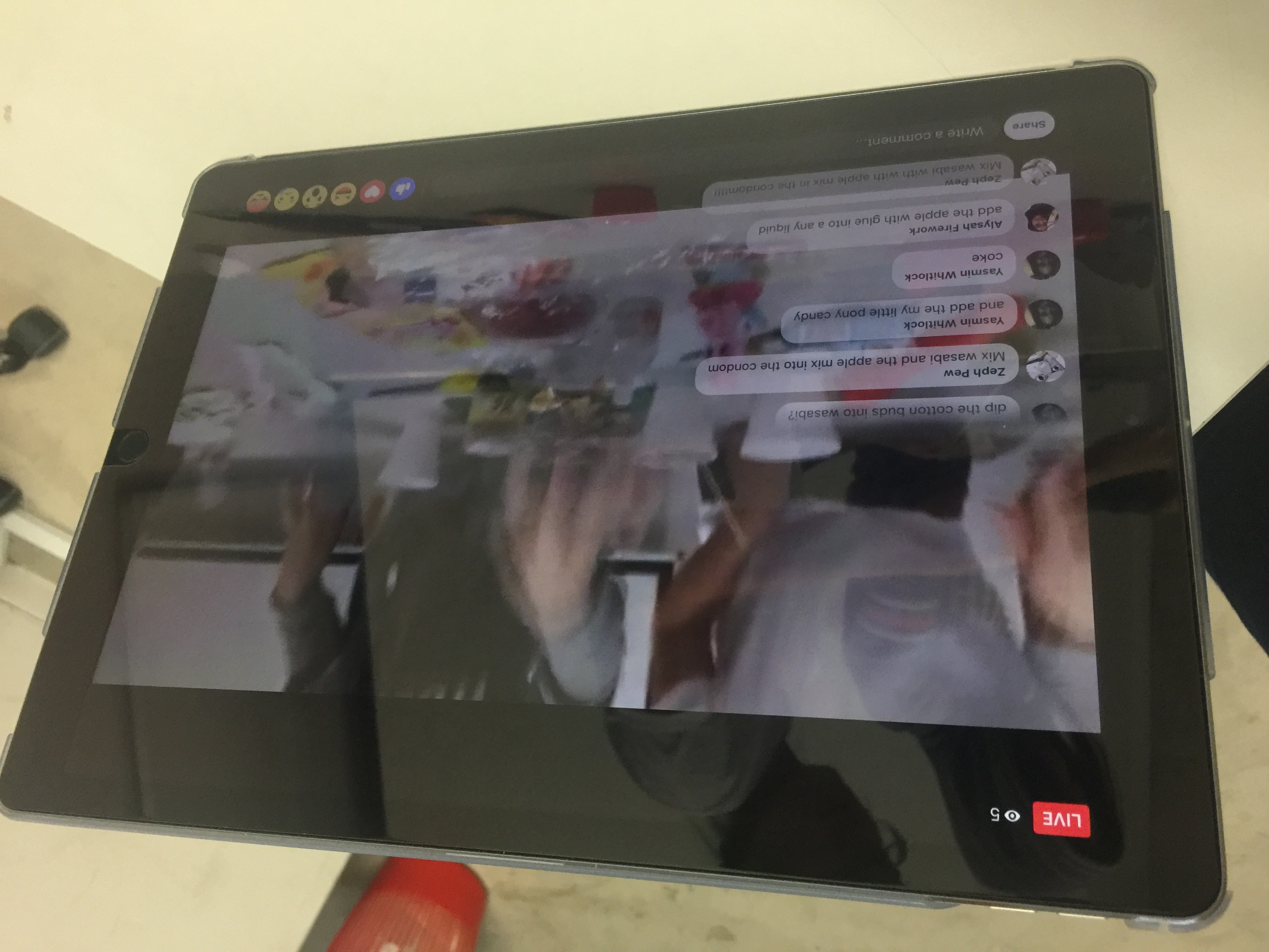
During the live, the chefs will only follow the instructions given my the audiences and create a new dish with the ingredients that we have.
At first, we though of having 2 actors arguing with each other in a void deck. One of them will be given instructions on what to say and what to do by one of our group member. The other one is free to do whatever she likes. The player task is to calm both of them down.
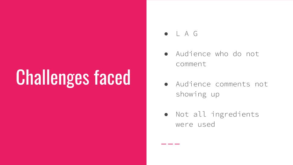
However it seems lacking in terms of motivation for the player to complete the task.
So I went to reflect on our first ideation, and try to come out with something before discussing again with my members. Since this project is called Glitch Singapore, I thought of injected some local aspect into this project which is the use of tissue paper in Hawker Centre. One of the function of the tissue paper is to chop the table. So I thought of making something out of the tissue paper at the Hawker Centre then make it live. The challenging part about this idea was to think and create something meaningful that relates back to local, with the use of tissue paper in a Hawker Centre
Another idea is based on my childhood experience. It is about a school boy who just finished school, he has some errand to do but he has to reach home within 30 minutes as his strict mum is waiting for him. Some of the errands will be:
So before the game start the audience can arrange which errands they want to do first. We did not go with this idea because it a close conclusion, nothing unexpected and the third space is missing.
The last idea that I thought of was a BINGO game among the resident. The player will be given a bingo paper and it will happened in a specific neighbourhood, example only in Jurong West neighbourhood. So before the game start, the player will select on of the option. Example: A runner who is wearing ________. Options given are:
To complete this, there’s an answer in the Bingo set itself. This game requires crowdsourcing in a way, however there is also a close conclusion.
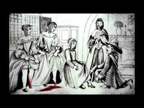
So when me and group members meet up to discuss again, I told them that I wanted to inject some localise aspect in it. Then they had already have an idea about original fairytales that are actually not very princessy but they are dark and disturbing. An example is the Cinderella story, where the step sister cut her toes to fit into the glass slippers.
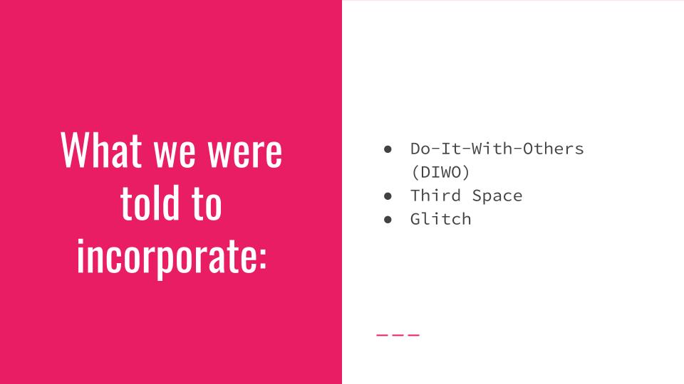
So I suggested that maybe we could use Singapore’s myth, example is the Redhill or The Sister Island. Then picked out certain element of it and create our narrative. However the ideas that we throw in while discussing, only focuses on the narrative without inserting Glitch, Third space and DIWO.
That’s when we decided to rethink about having a simple narrative, with an unexpected outcome, that can happened in a few different locations at a same time.
Hence, we decided to have a cook show, playing with food, with reference from The Futuristic Cookbook.

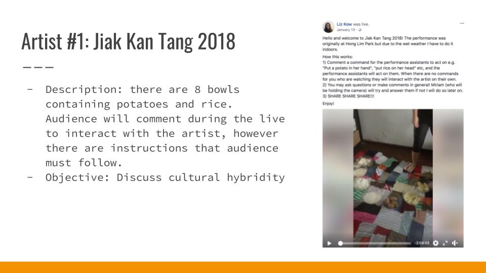
Jian Kan Tang 2018: The objective is performance art is to discuss cultural hybridity, through the use of rice and potatoes, the former embodies Asian culture and the later western culture. During the performance, there are 8 bowls containing potatoes and rice. Audience has to follow a set of instructions given by the artist in the page. Some of the instructions were no undress of the artist, no consumption of food, not abusing the artist. This performance art was suppose to happened in a physical place, but due to the weather, the performance was held in the Facebook live. So audience will comment during the live to interact with the artist.
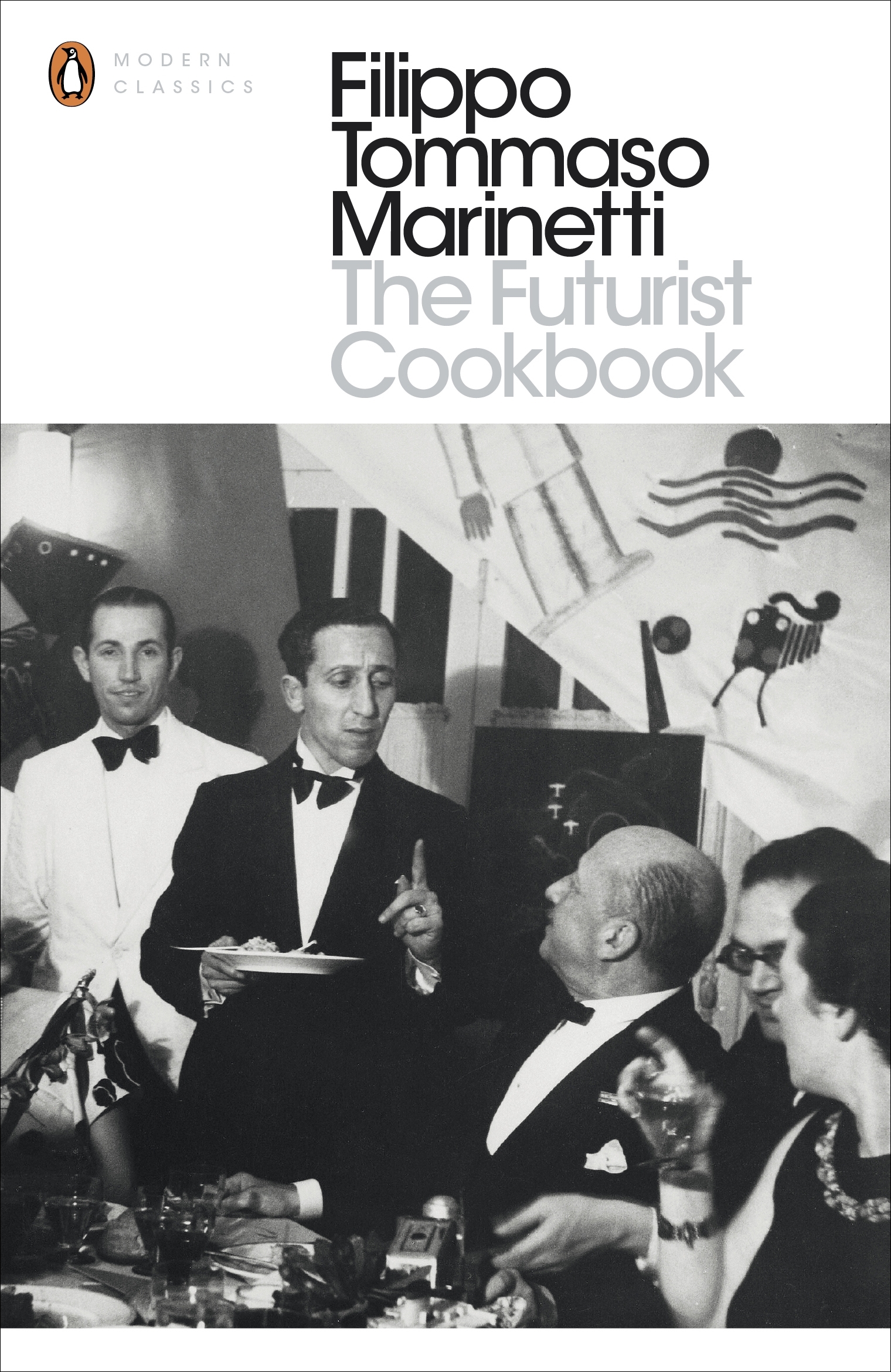
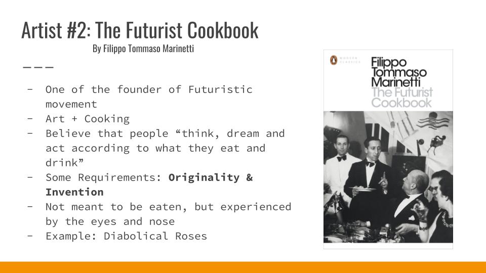
The Futurist Cookbook by Filippo Tommaso Marinetti. He is an Italian poet and where one of the founder of Futuristic movement. In short, this book about art and cooking. And the believed that people “think, dream and act according to what they eat and drink”. There were 11 requirements of created a Futurist recipe. Some of it are
Futuristic food is not meant to be eaten, but experienced by the eyes and nose. Example of a recipe is to deep-fried the red rose heads in full bloom, and it is called Diabolical Rose.
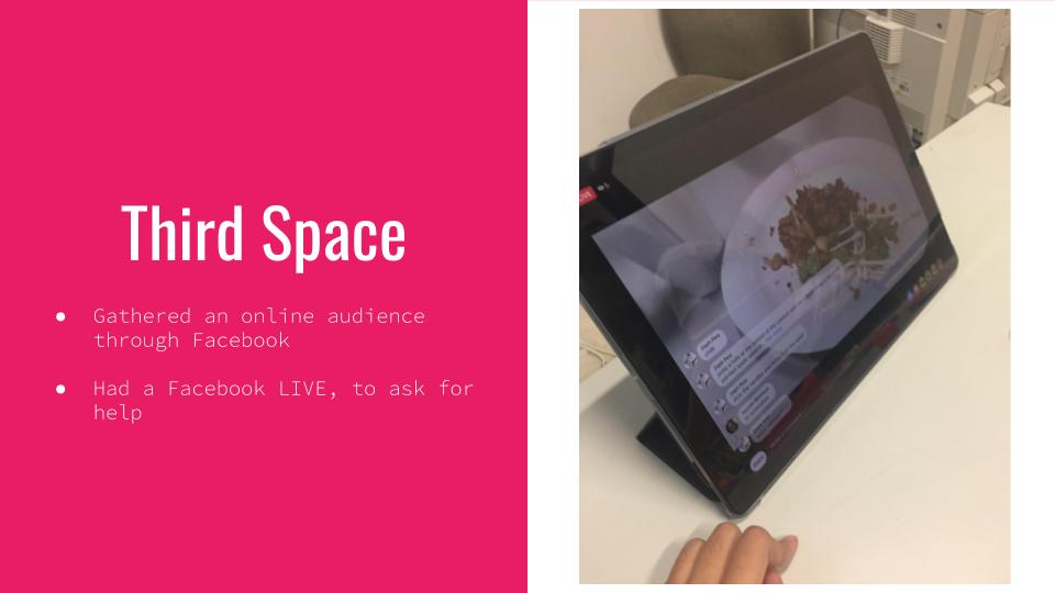
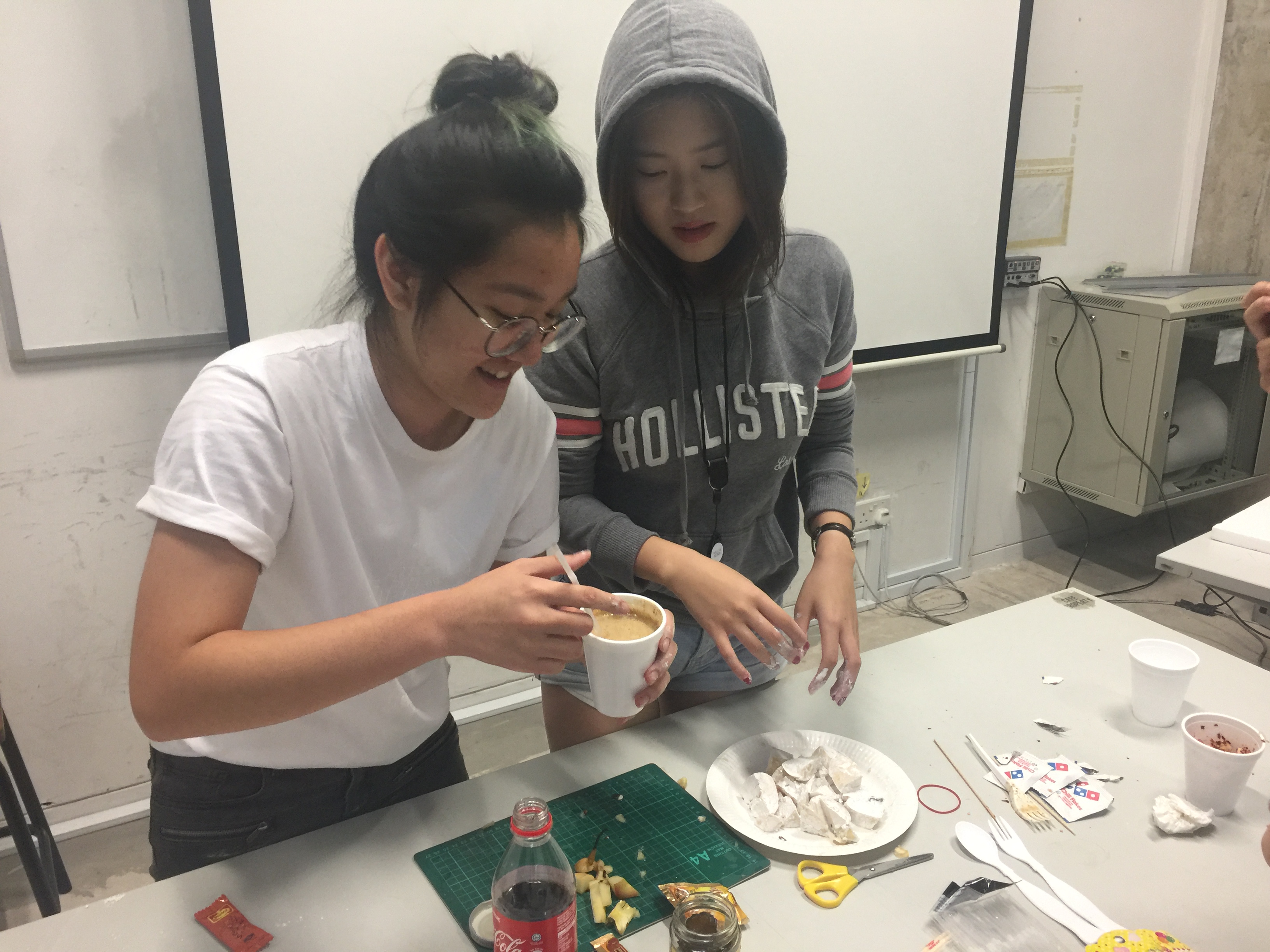
Firstly, we ask the audience what ingredients would they want to put in our dish, it can edible and inedible. Then we went to different location to get the ingredients.
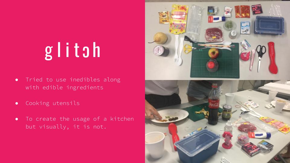
So some of the ingredients brought are: Coke, coffee, condom, container, earbud, rubber band, my little pony, pear and many more.
Before going on live, we post a description of our project with a short narrative and a picture of our ingredients on our Facebook page. We didn’t not useknife and cutting board, as we intentionally want to replace it penknife and cutting mat that we always use in school.

During the live, audience will give instructions to the chefs and the chefs will make the dish according to the instructions.

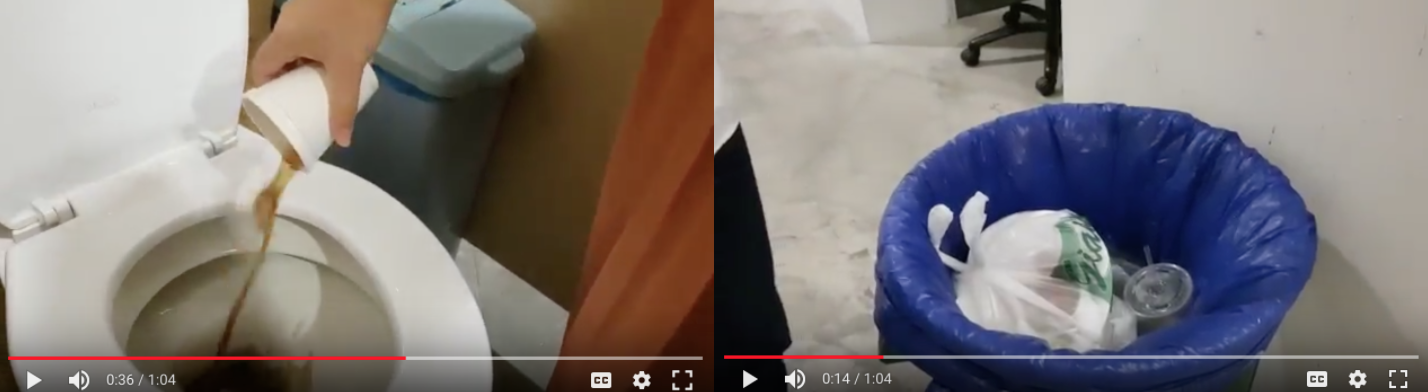
Lastly, to end this, we serve our dishes our customers.
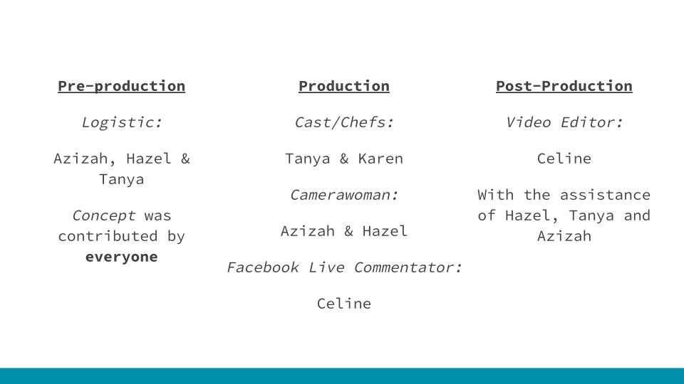
Pre-production:
Getting edible ingredients from the audience: Hazel, Tanya and Karen.
Getting inedible ingredients from the audience: Celine and Azizah
Facebook page: created by Celine, titled by everyone and visuals by Azizah
Production:
Cast/chefs: Tanya and Karen
Facebook Live Commentator: Celine
Assistances & Camerawoman for documentation: Hazel and Azizah
Post-Production:
Video Editor: Celine, with the assistance of Hazel, Tanya and Azizah.
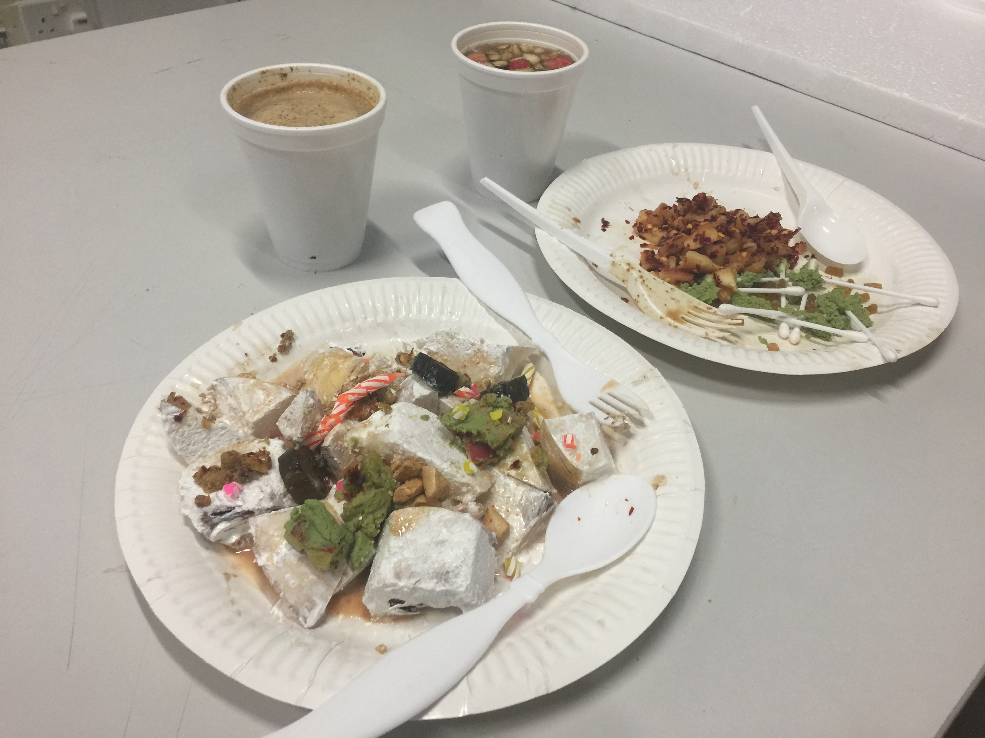
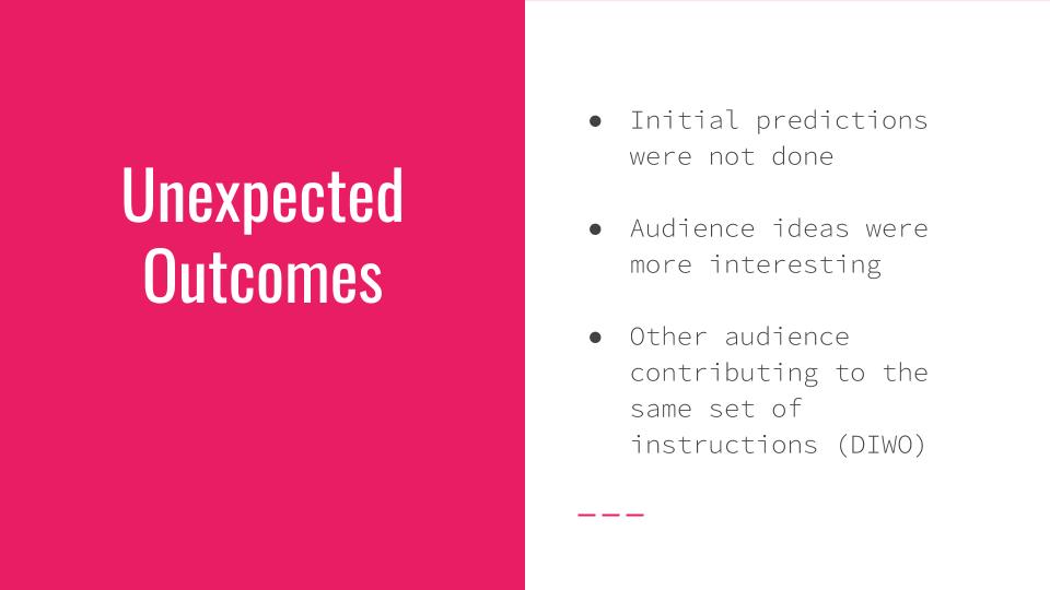
Firstly, the outcome itself was unexpected as we didn’t know that we could create 2 dishes with 2 drinks with the ingredients we had.
The process of doing it was also surprisingly different of what we, as a group, thought of. As we did not thought of using condoms as an icing. Here are some of the comments from the audience:
We also didn’t expect the first round to be successful, as we thought that we might need to do another round of it.
One of our audience for this project is my mum. Her view of this project is different from the audience, as she did not comment at all. So I asked her and she said that she did not understand what we were doing. And she was also shocked that I took some of the ingredients from home. So from this, I learnt that some people have different perspective towards this project. As most audience of my age will find this exciting, but audience like my mum, would not find this interesting.
I did not have any problems working with my team member. As we were able to work together and divide the work equally. Although, sometimes a person’s work does not meet the group standard, we as a group will try and figure it out together.
In this final project, I was able to apply what I have learnt during the lectures, discussions and micro-projects to combine it and create something new. I think that the micro-projects really helps a lot in this project, as through the class’ micro-project we are able to learn and pick up new pointers.
References:
25 Dark And Disturbing Original Versions Of Children’s Fairy Tales
The Futurist Cookbook: 11 Rules for a Perfect Meal and an Anti-Pasta Manifesto circa 1932
The Futurist Cookbook (1930) Tried to Turn Italian Cuisine into Modern Art
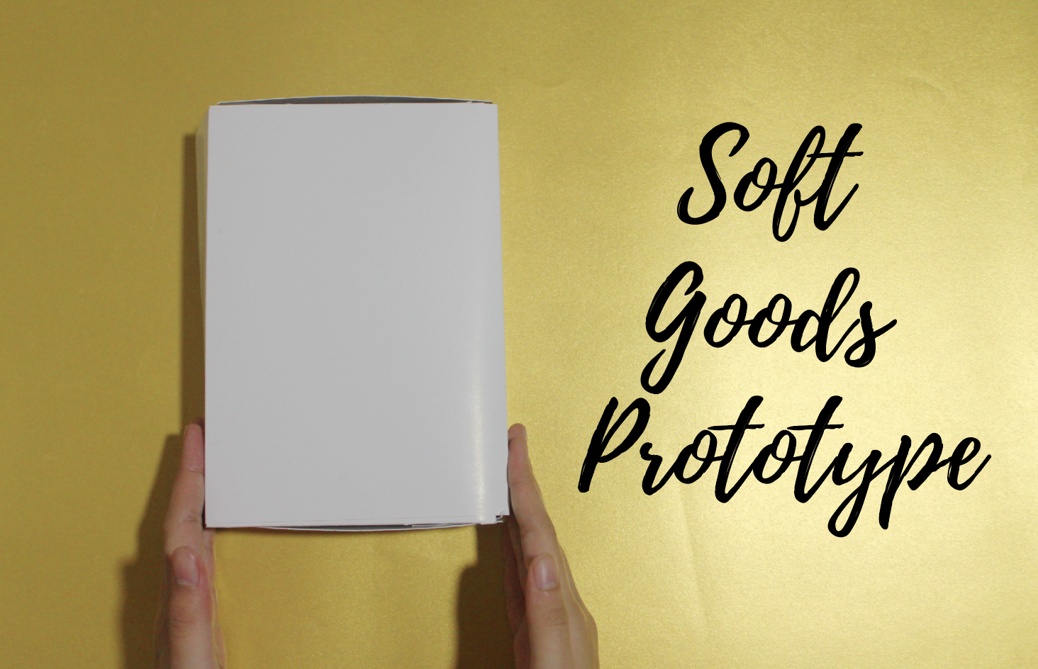
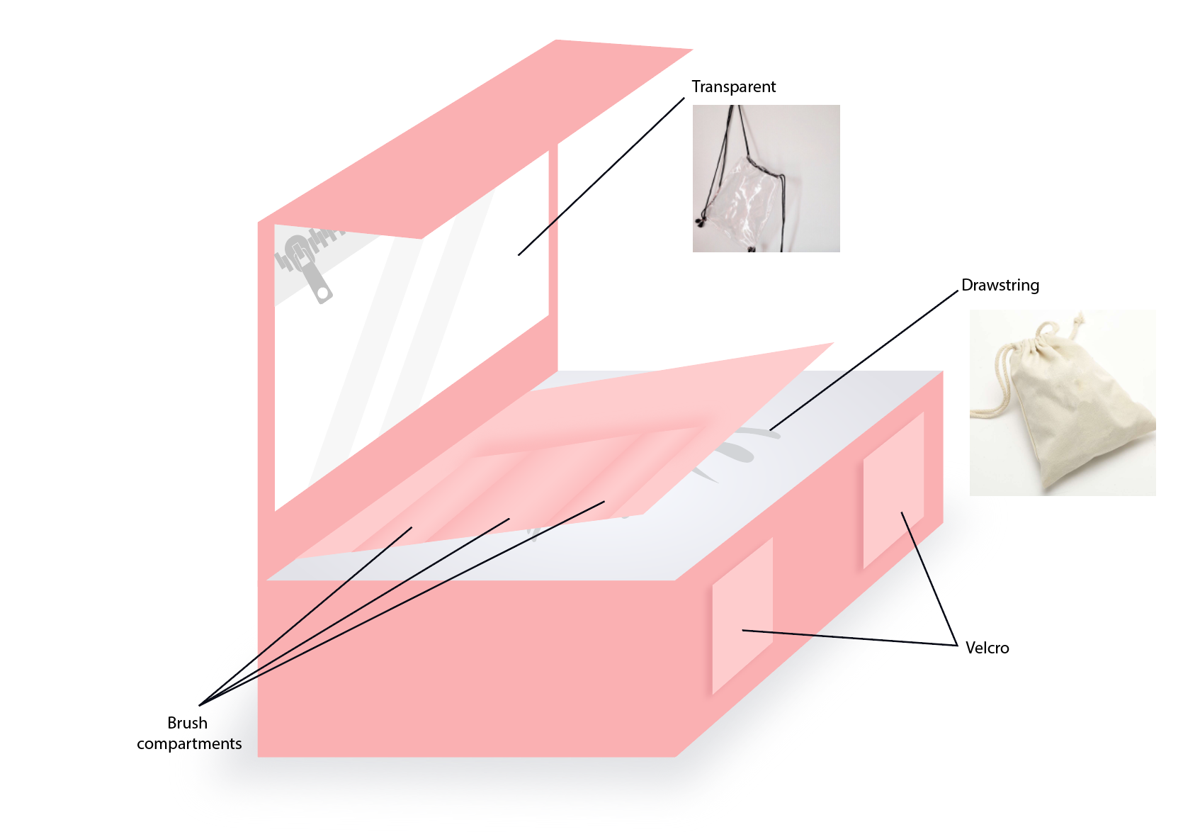
For the second assignment, we are task to do a soft goods prototype using paper. So the first thing that I thought of is a make-up bag. Reasons why I decided to go with this:
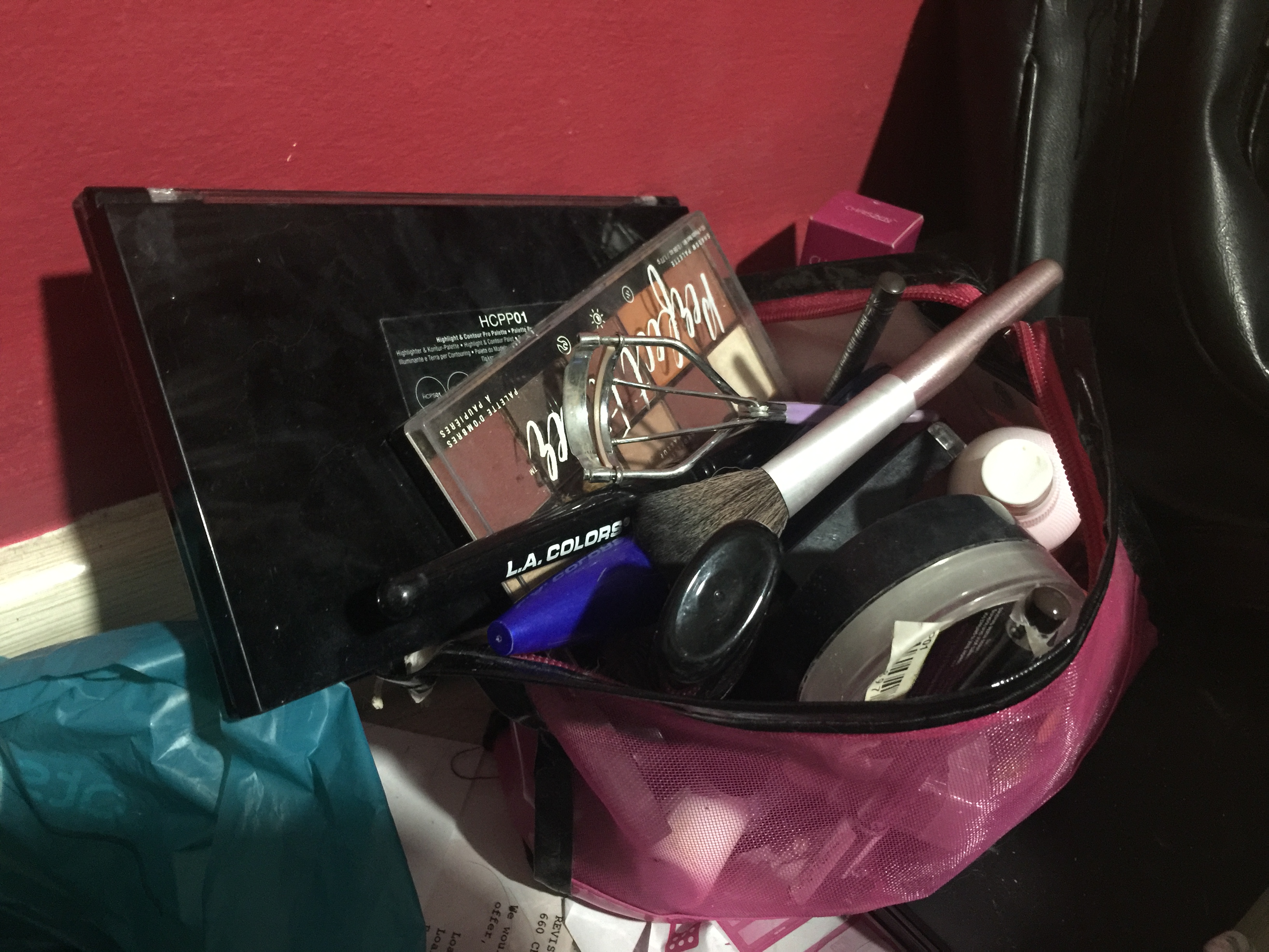
My current make up bag does not have lots of compartment
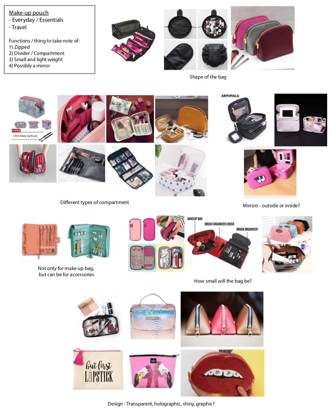
Above are existing make up bag/pouches. There are variations type of make up bags, hence I decided to go for something that is more personalize, something that I need in a make up bag.
Functions/some things to take note while sketching:


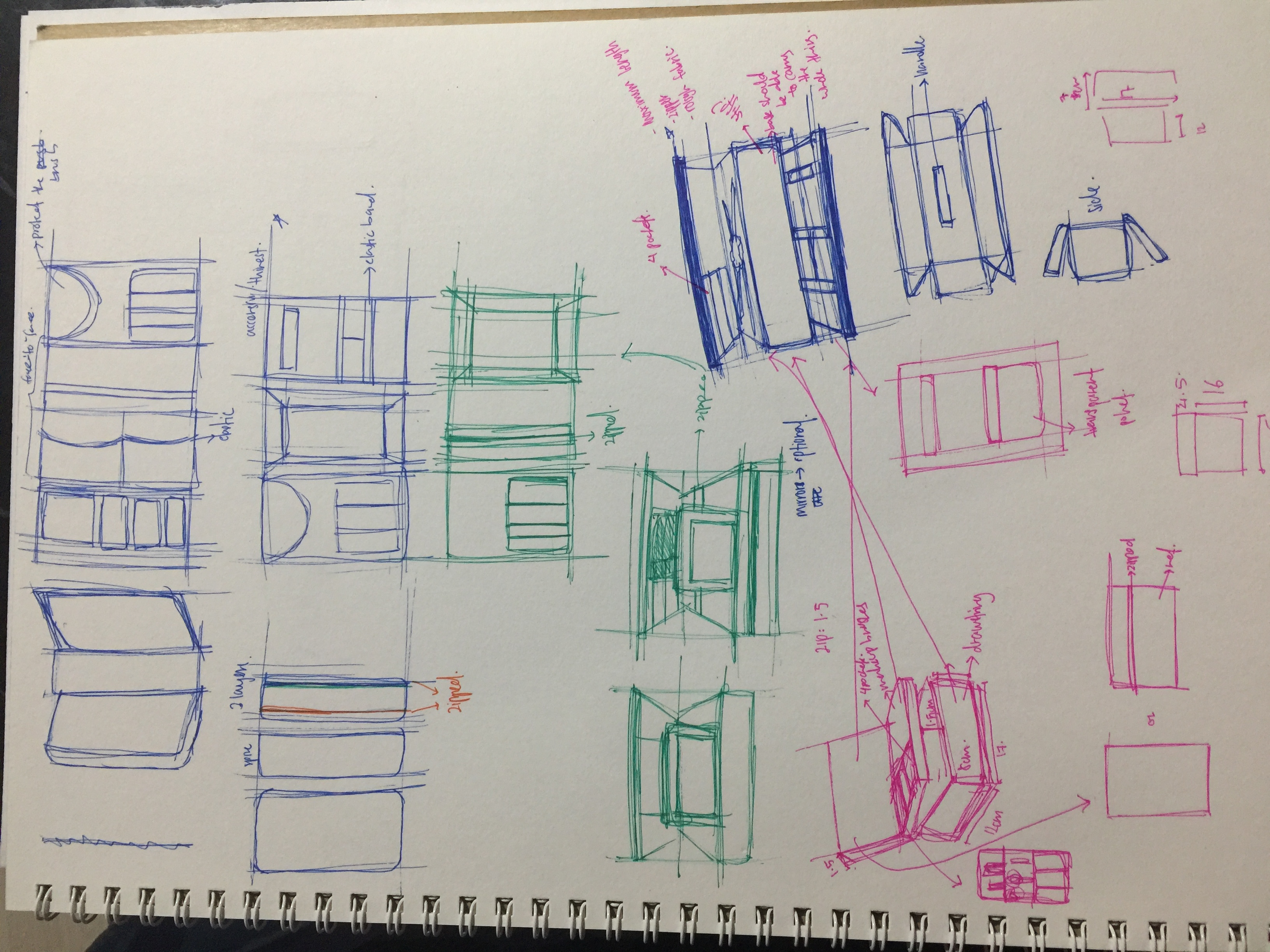
From previous assignment, I find it quite easy and fast to draw the details in orthographic view. Hence, did the same way for this assignment.
Most of my sketches are in rectangular shape. I explore variation of compartments, wether to have it in portrait or landscape. At the start of my sketches, I explore mostly on 1 and 2 tiers of the bag. Then, when ideas started to strike me, I started sketching 3 tiers of the bag, which allows more things to be put inside it.
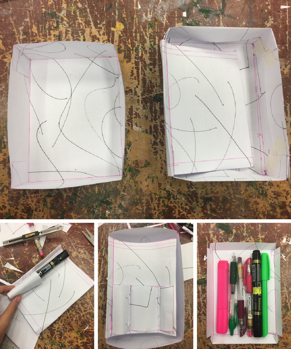
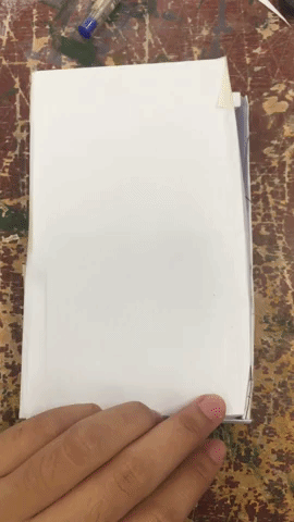
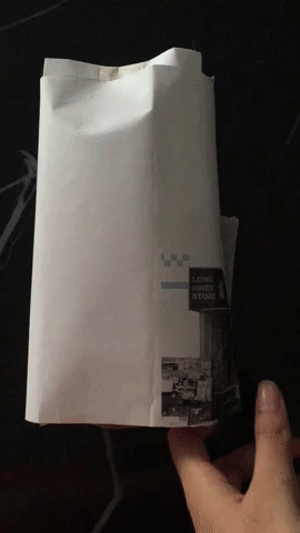
I start by doing the base (image at the top). I had 2 different sizes of the base so that I can work between those 2 and roughly know what is the size that I want to achieve. Then I did the brush compartment (image at bottom left and bottom center). While doing, the compartment, I use my stationary as a guide for my brushes and other make-up items. Then I did the last compartment (image on the bottom right), with my stationary in it to see wether the size fits. Lastly, I combine all the different parts together.
However, I felt that it was too bulky and I decided to cut down its size.
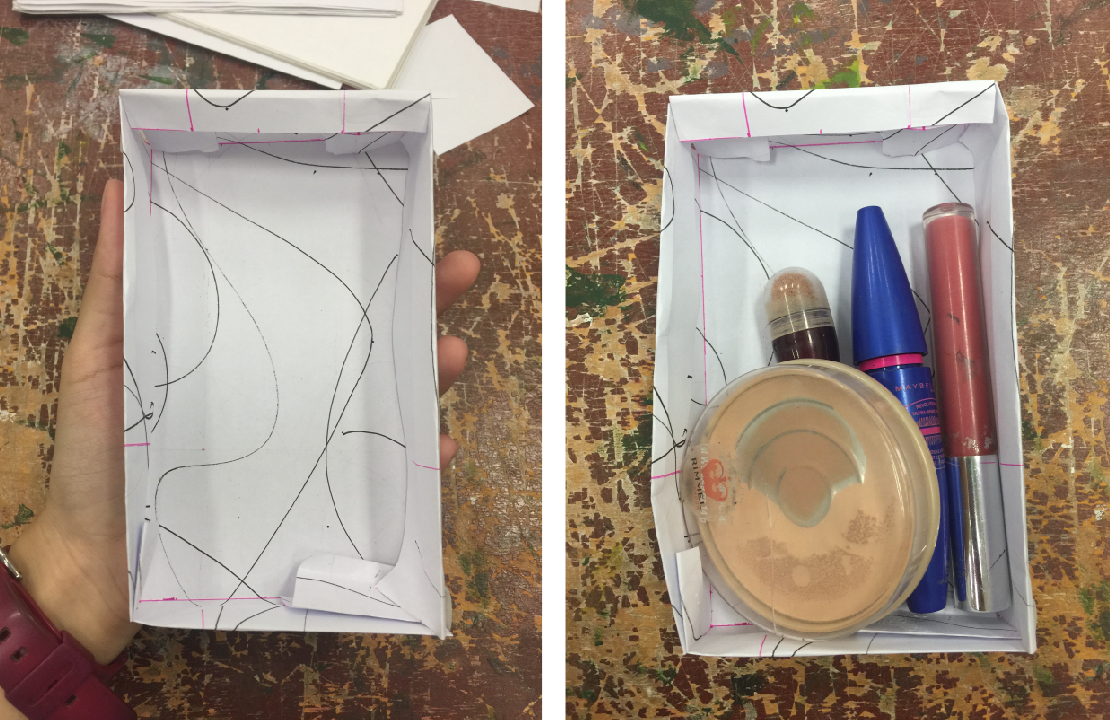
The focus of this process is to get the correct size. Hence, while I was doing this, I kept going back and forth from the box to my hand. Other then depending on my hand size, I also put in some of my makeup.
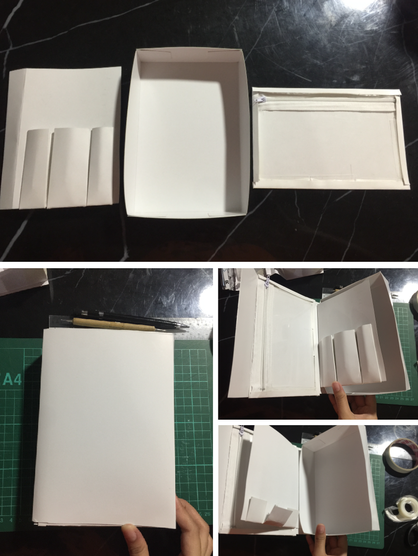
After finalising my prototype using paper, I move to art card and development my prototype. There are differences when using art card. One of it is the increase in size. Hence I had to change the steps of making my prototype. Previously, I started with the base. But now, I start with the brush compartment, then the base and the zipped compartment. Another difficulty I face was, I kept using tapes to combine all the parts together. However, some parts did not stick together and glue gun is the solution to this problem.
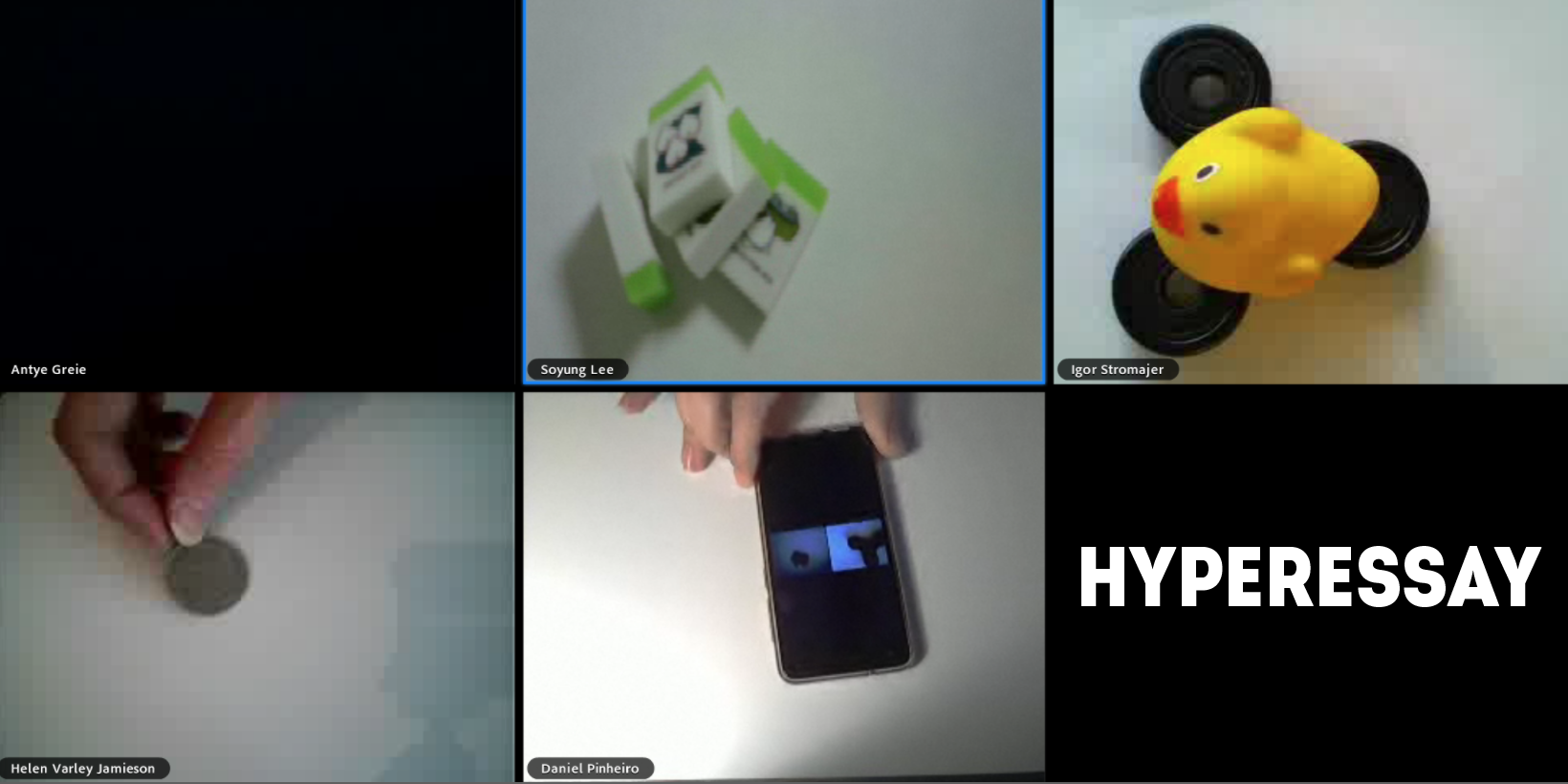
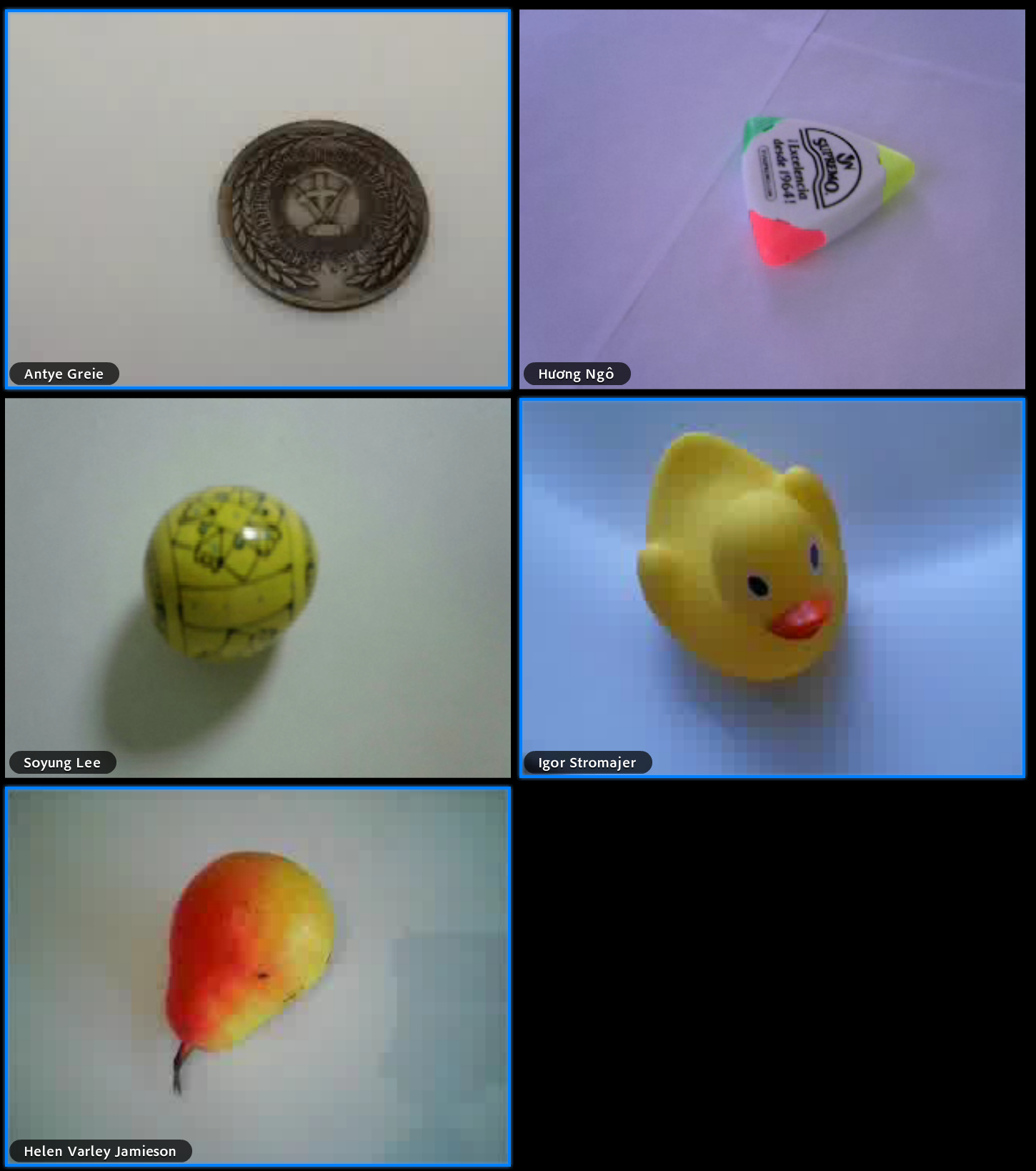
Through Maria X’s keynote and examples shown, I realize that there was a trend in Telematics Performance from 1970s to 2000s .
All of the Telematics performances are interactive and liveliness, as it include audience to be part of the performances. 2 ways that audience can be part of the performance. Firstly, is they themselves become the performer. Secondly, chatting in the chat room. Example in Adobe Connect, where we see artist performing and yet we can converse to one another.

A trend that I notice is the life-size projection. Ever since the Hole in space, by Kit Galloway & Sherrie Rabinowits, in 1980, becomes a popular telematics work, many future telematic work incorporate this life-size projection. Through the life-size projection, it creates new form of communication and interactivity between people from another part of the world. This collapse the geographical boundaries. Another example is Paul Semon, Telematic Dreaming and Telematic Vision, 1993. In both of his works, he uses a life-size projection of the object and the audience, making it look real in virtual space. This creates a one-to-one performance, where both audience can observe and react to each other movements and create a closer bond among themselves.
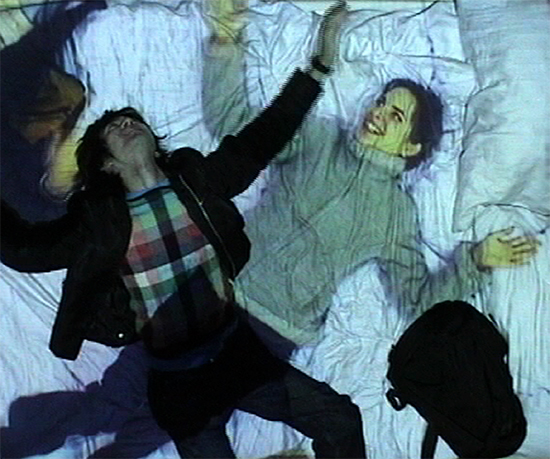
“The ability to access outside of the user own space and time is created by another real sense of touch, but it is enhance by context of the bed.” - Paul Sermon
Another thing that I notice is the use of spaces and props. Going towards the 1990s, the use of props became one of the important things that contributed to a work, as space was already part of telematics performance. An example would be Paul Semon, Telematic Dreaming, 1993. In this work, he uses intimate environment, which move the audience from a public space to a private space with the use of props, which is the bed. Another example, would be Annie Abrahams, Entanglement, 2018. In her work, she and the artists used objects, voice and phrases to communicate the idea of her telematic performances.
Hence, through this symposium, my definition of props has changed. Previously, I thought that props has to be a physical object that contributes to the work. Now, props mean that it can be anything (not only physical object) that contributes to my work such as sound, words and movements.
Personally, I prefer Annie Abrahams’ performance than Jon Cates’ performance because her performance was neat and easy to see all the artist performing.
At first I could not understand the idea behind her performance. After rewatching it again, it gives me a better understand of what she and the artists are trying to convey.

They start the performance with a blank screen, and everyone was saying excellent. When a person says something, his/her screen will light up and have a blue border (image above). Its shows that there is an inconsistency.
I like how Annie gives freedom to her fellow artists to perform this work. Like she did not constraint and force them to say a particular phrase or show a particular objects. Living in the 21st century, I think that we would want our freedom, the choice to speak up for ourselves.
Another thing is that, I like is how Annie is open to new people. In her other performances, she welcomed new artist to collaborate with her despite not meeting each other physically in a place. This shows the power of third space, where artist can collaborate and enhance their network circle.


For this micro-project, my alter ego is Vivy Yusof. She is a Malyasian entrepreneur and the co-founder of FashionValet and The dUCk Group.
She blogs and vlogs. She’s interested in fashion and her likes to post about her family and business which shows how much she loves them.
Why I chose to be her? Because I have been watching her videos and keeping in track with what she up to. And she is someone I aspire to be (maybe not too cause I am not as rich as her).
So my for this micro-project, I tried to copy her vlog; What’s In My Bag + The Whenever Planner | Vivy Yusof.
Here are some of the things I observe:
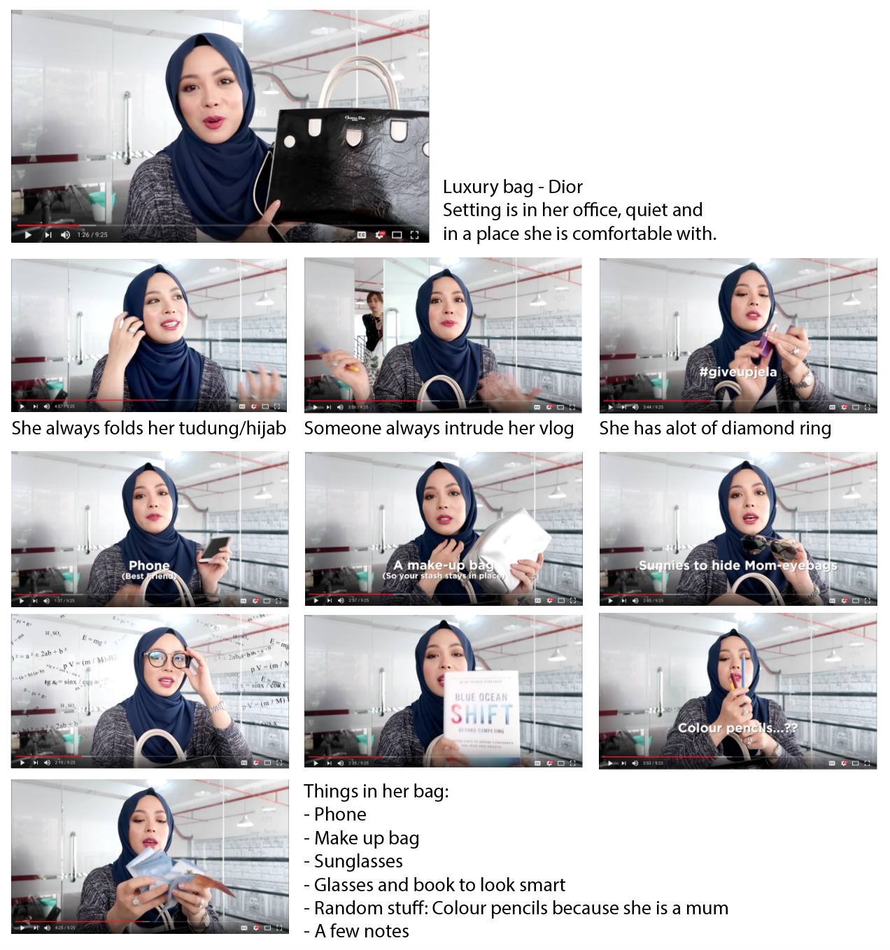
All her vlogs has no effects at all, but she uses hashtags and text with a few cut and edit scene. She uses lots of hand gestures and folding of her tudung/hijab. She speaks fluent english because she studied Law in London. And her Malaysia Ringgit shows where she came from.
So in this 1 minute video, I picked up some of the items mention in her vlog.

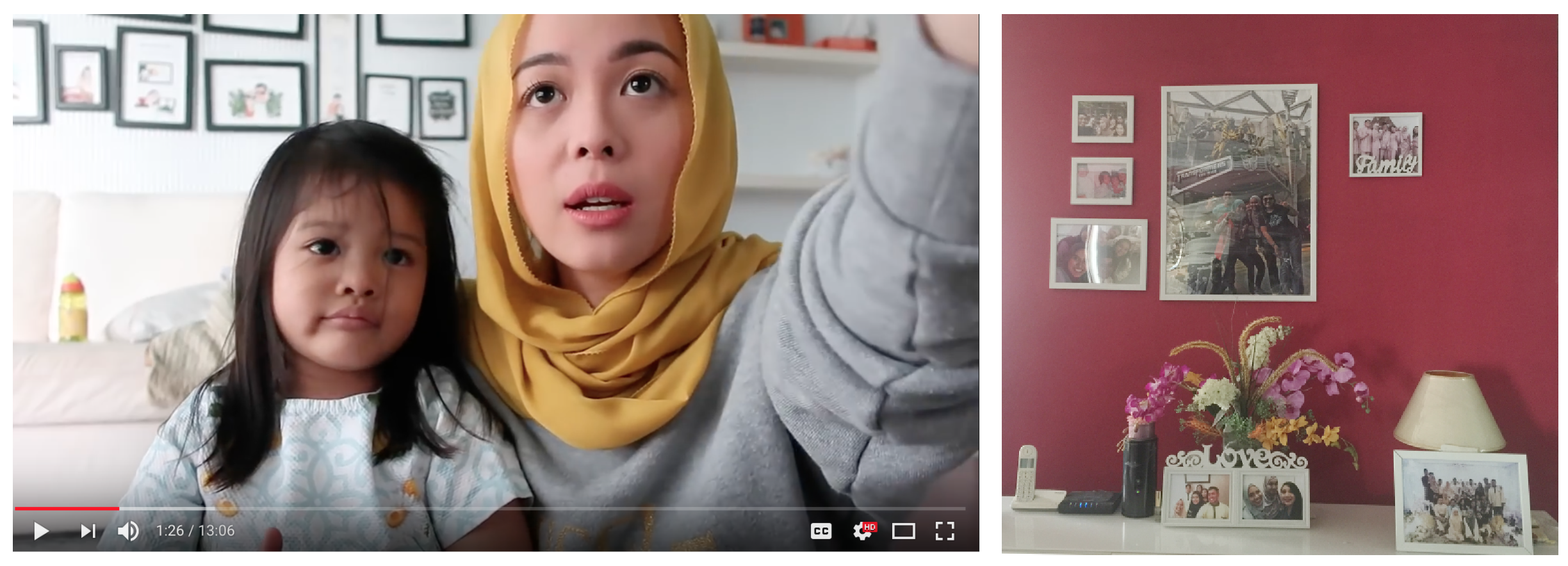
Since I don’t have an office, I switched my location to my house, which is similar to her other vlogs that has this family frame in the background.
How can the video selfie be used to alter identity?
To me, video selfie shows what is needed to be shown and it conceal all the other stuff. So I needed to portray someone who’s likes luxury stuff and is in her comfort zone. So I used a LV bag, which is not mine and I said that is mine (so its like lying), to show luxury and I was in my pyjamas pants, that couldn’t be seen in this video.
How might video be used to conceal identity?
Video can be used to fake oneself, like the way we speaks and our body language can be changed to fit our alter ego. For me, it was difficult to use her tone of voice as she always speaks to the camera and he is used to it, but for me, it is a no no.
How do the objects that surround you contribute to your sense of identity?
Objects around me are able to give hints to the audience about who am I. As a vlogger, I think that objects around them are plays an important role in portraying themselves. Example in my alter ego’s background, she is in her office which shows that she has her own business and her item she carry shows that she is a mum and she’s Malaysian. For my video, the background has family frame to show that family is important to me.


