
Hello!
This is my last post of Forrest Gump.
So all my 4 designs are based on 1 movie which is The Hunger Games (2012). At first I had so many quotes to choose from because I read the book and watched all the series of Hunger Games. But as weeks pass by, I decided to change some of my quotes because some quotes are difficult to execute it visually. So here are my 4 finalise design:

During the first stage of designing, when I was creating the match stick, the fire looks like a woman’s hair. Hence that’s where my idea came from. To create the girl on fire, I place a face of a girl on the fire. 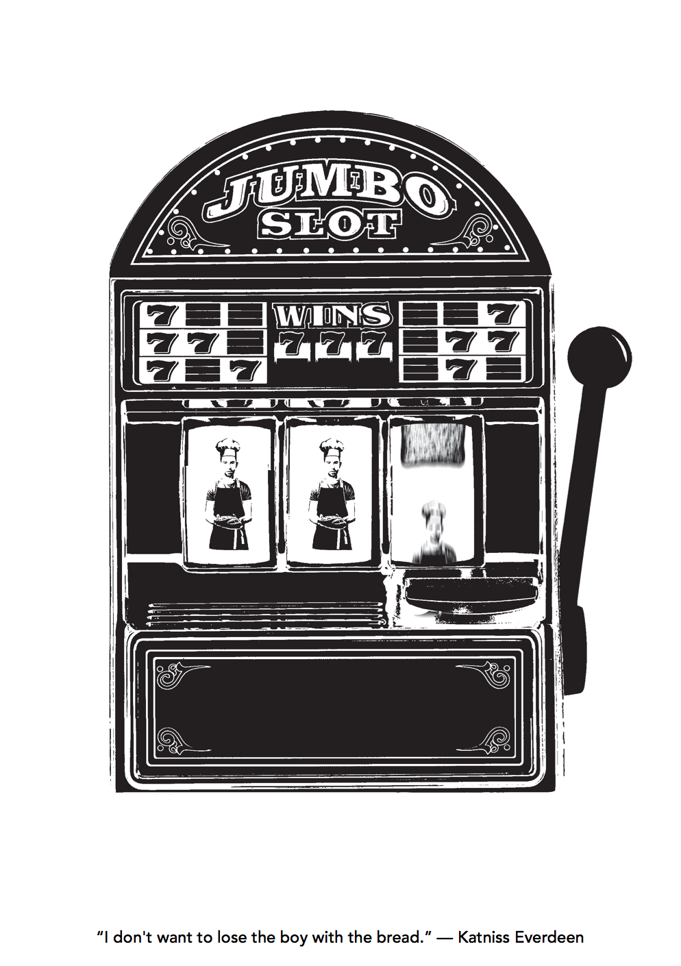
The opposite of losing is winning, that’s where I got the idea of jumbo slot. And the last slot shows the movement of it to show that there is a 50/50 chance of Katniss losing the boy with the bread. The boy is dressed as a baker, as in the movie, his family has a pastry shop.
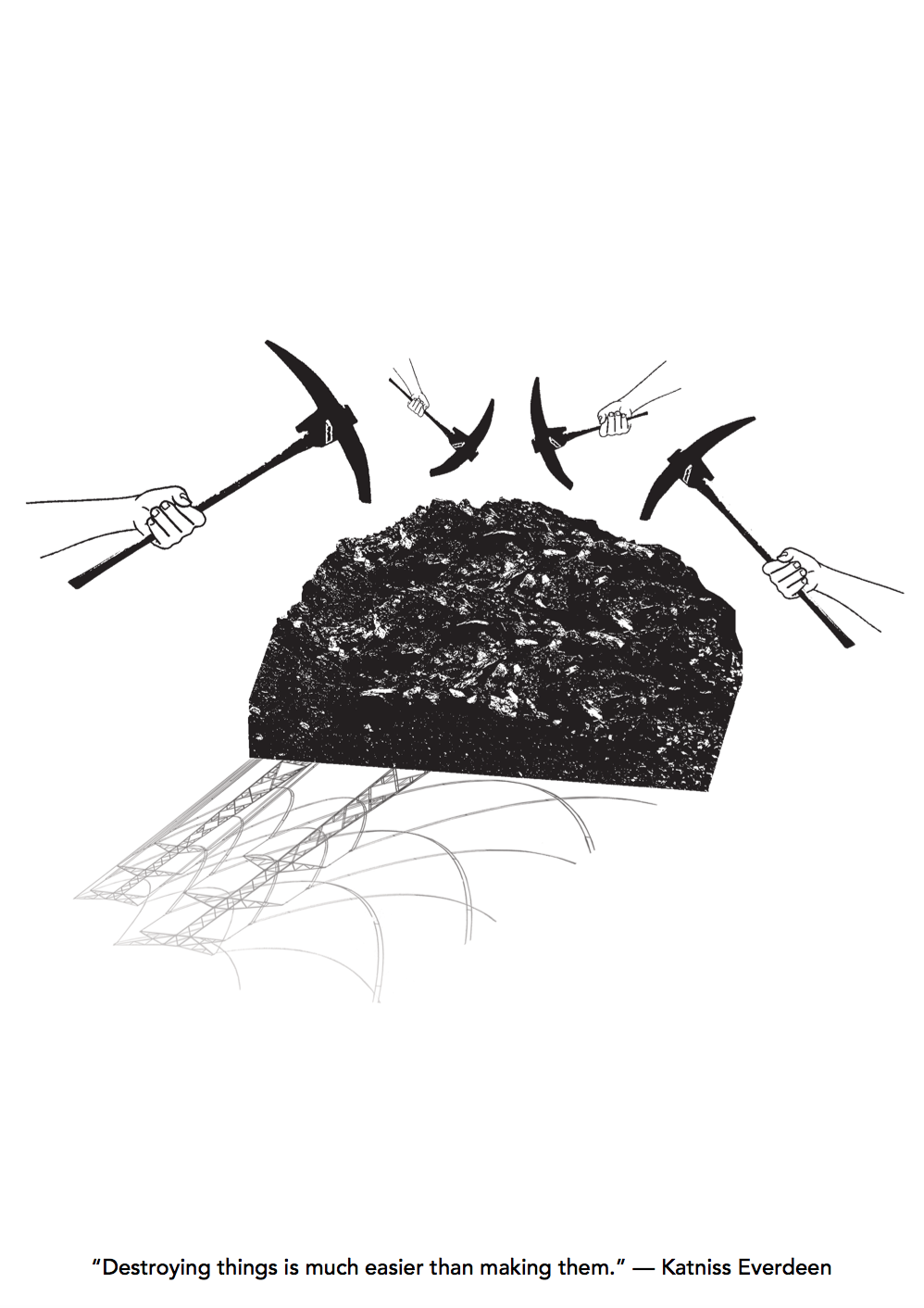
To relate back to the context of the movie, I use coal as in the movie, District 12 is a coal mining district. The hands show that they are destroying the coals. And the electric wires represent the uses and outcome of coal. I wanted the electric wires to look like a shadow instead of placing it at the background. 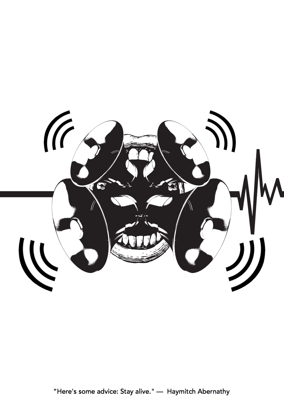
This was the most difficult to design as I did quite a lot of version for this. The mouth and horn speakers shows that it is giving advice. And the heart rate shows from dead to alive.
Reflection
Overall, I feel that all 4 designs portrays who am I. (something I learnt about myself that can be used for my next project) Like I always make my composition in the centre and I tend to make my designs look neat and simple, which is who I am – I’m a simple person, who does not like complicated things and I do things neatly most of the time.
Among all 4 designs, I think the last 2 design is not up to my expectation. I feel that I can make it better.
The silkscreen session was fun! But it’s just a bit troublesome and things might get messy along the way, which is not me. (as I mention I do things neatly) I don’t mind doing silkscreen a few more times, but I won’t do it forever.
Overall, this project is quite different from mark-making. It is like a leap. And to choose either 1 of it, I’ll prefer mark-making. Maybe because it is something close and personal to me.
This project require lots of problem solving, which is challenging but I like it! Because it challenges my mind not to be lazy and to think of something out of the box. I will definitely hold onto this characteristic throughout my journey as a art student and future designer.
And if I have the time and idea, I would like to create some other designs with the use of colours but in vector style. Because as I was researching about visual metaphor, I was so inspired that I wanted to try and create some of it.