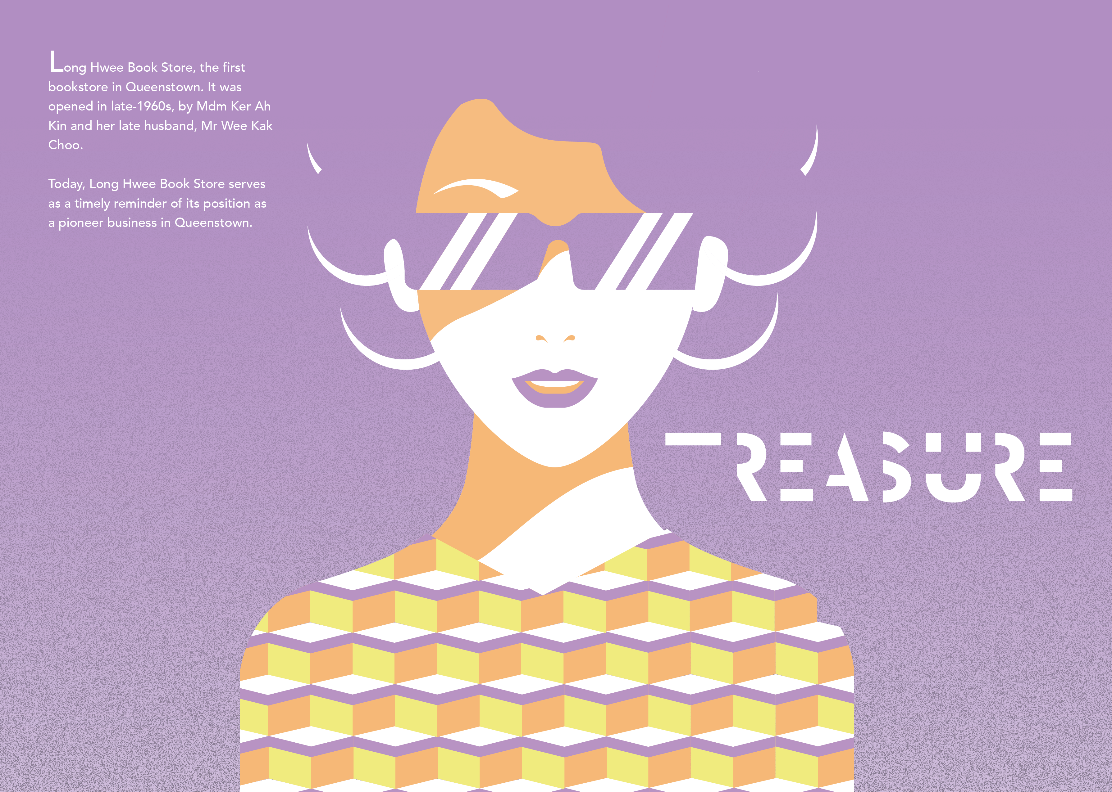
TREASURE

Updating Portfolio…

One of the changes I did from my previous post is that I added texture on it. As previously, it look too flat. I also did minimal edit such as the change of colours and added lines on the back front cover page.
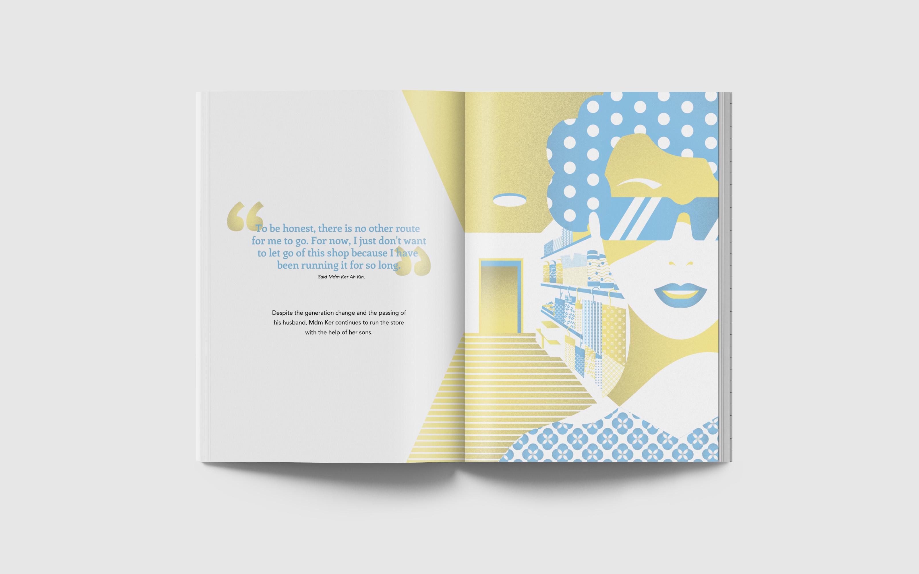
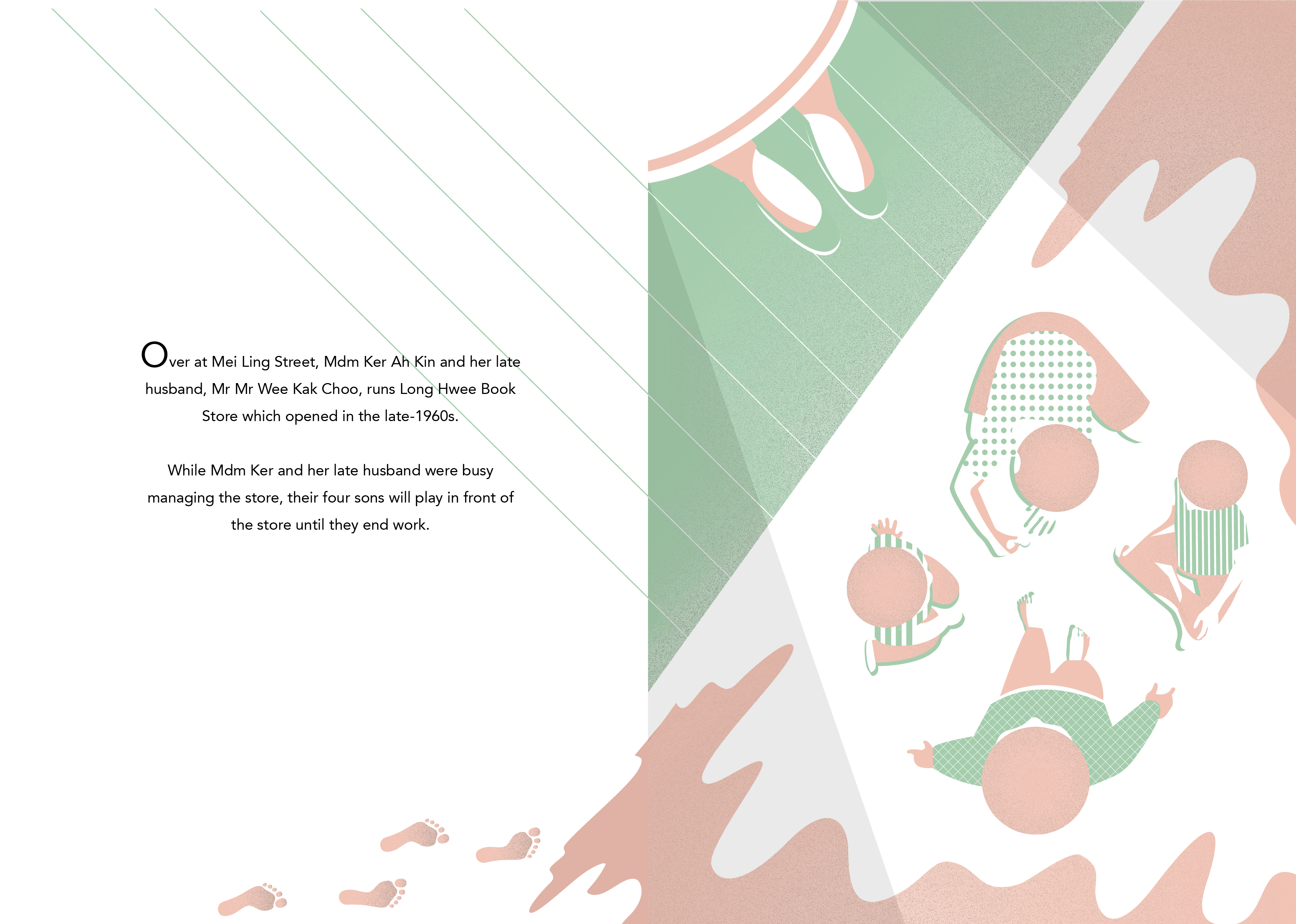
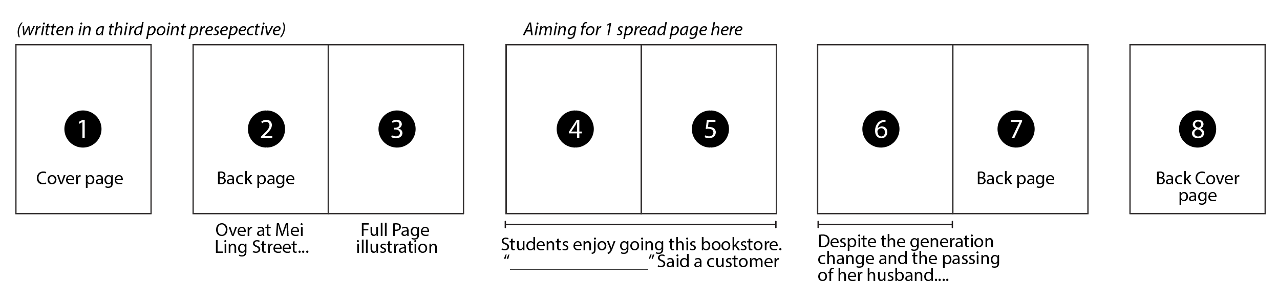
Title of my Zine is Treasure. As this shop is one of Mdm Ker's treasure that contains memories of her husband, family and many more. And even though the shop is not doing well anymore, Mdm Ker does not want to stop running the shop.
I am pleased with the outcome although I had less than a week to do this. However, if I had more time, I would want to try on different papers. As what one of my classmate suggested that I could try using glossy paper to vibrant out the pastel colours.
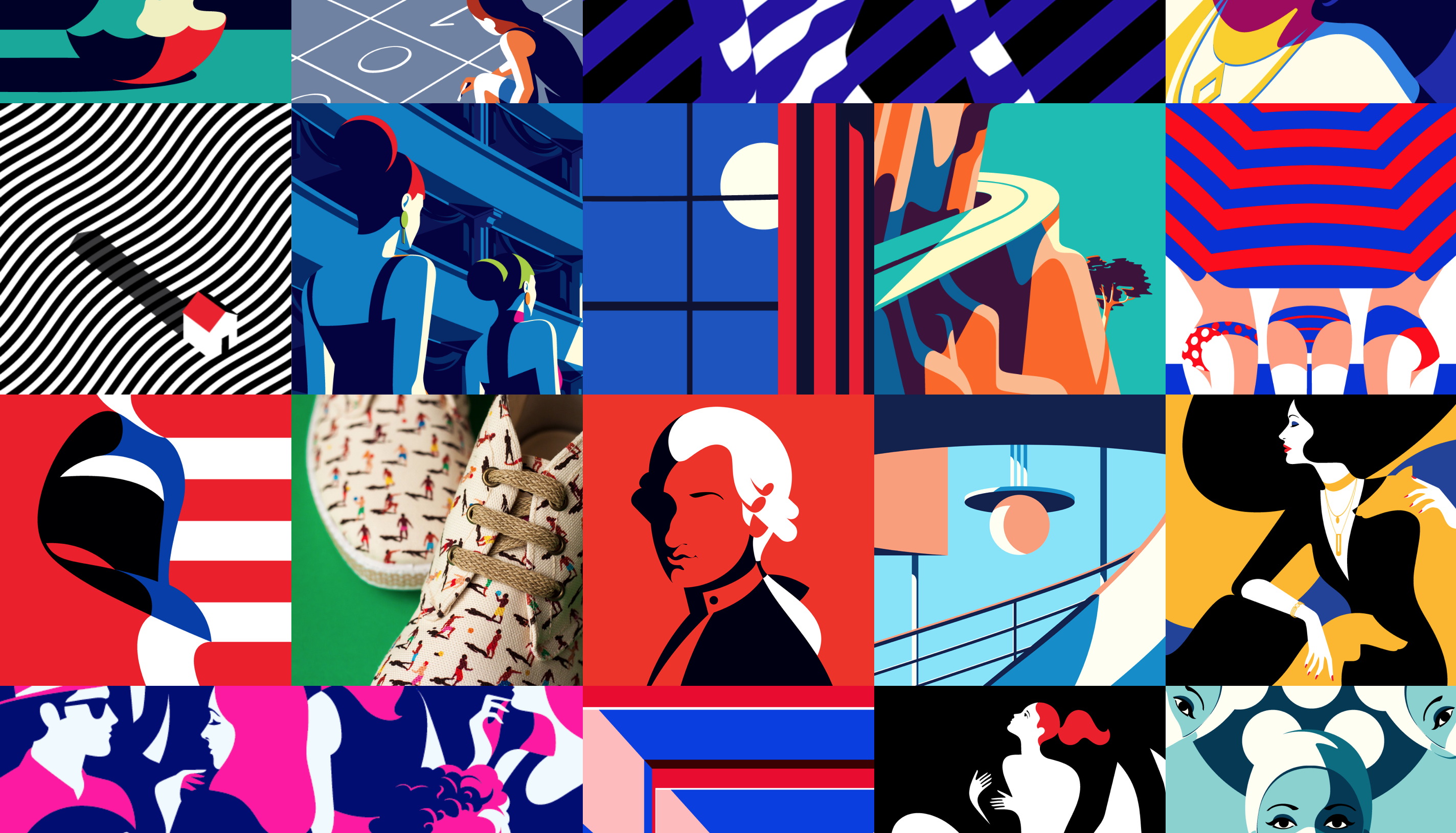
And through this short period process, I am amazed at myself that I could do something similar to Malika Favre’s illustrations style. This makes me want to practice more on her style and move away from my original illustration style that focuses more on the details.
 Lastly, I would like to say thank you to Mdm Ker, for helping me in this project and give me a new perspective in Queenstown. With your help, my zine would not come through!
From my previous post, I was not satisfied with the mock ups. Hence I decided to change to something that I can inject my personality in to. So I decided to do illustrations instead of image manipulation, as I can do a lot of things in illustrations and explore different style.
So at this point of time, I had less than a week to complete my zine. Hence I did not want to take a lot of time illustrating the details. So I followed Malika Favre’s illustration style, that are flat and uses negative space. Something different then my usual illustration style, but I was very excited to try this!
Other than changing the design direction, I also changed the narrative of my Zine. So I decided to go with a simple narrative. Starting from the history of the shop, to it blooming then to the current state of the shop.


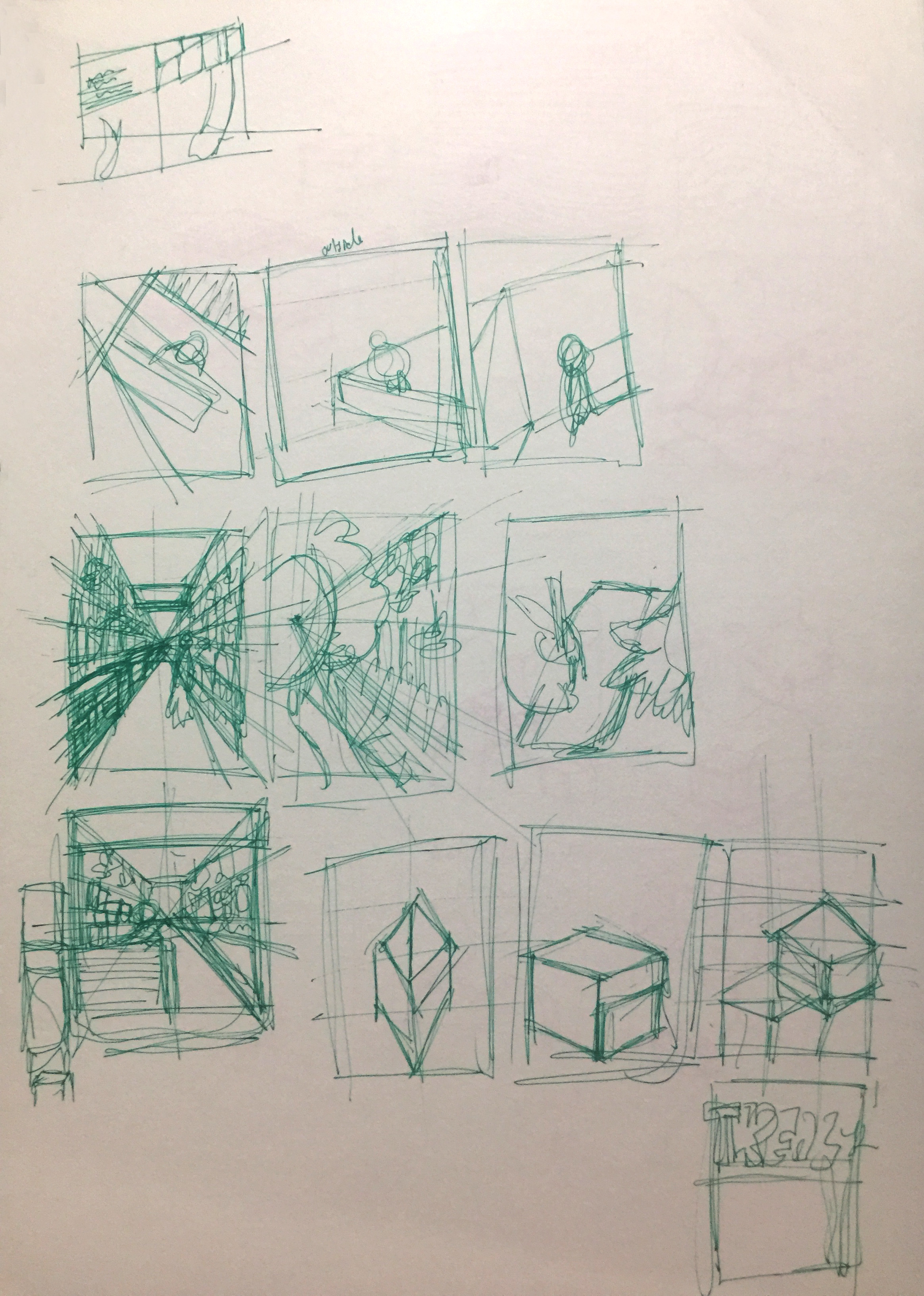
At the start, I drew it out according to my sketches. The I tried to manipulate and create pattern using it. However, it was not to my liking, different from Malika Favre’s style and does not show the place (Queenstown).


So I looked through the Naive book, that Mimi recommended me, and I found something very close to what i have discovered in Queenstown (Image on the left). That Image uses contrasting colours and patterns on it. Hence, I decided to put in the patterns that I discovered in Queenstown, and used pastel colours in my Zine. So in my edited version, I kept my illustration to the simplest form and tone down the colours. I added patterns on the clothes as patterns was something I discovered in Queenstown.

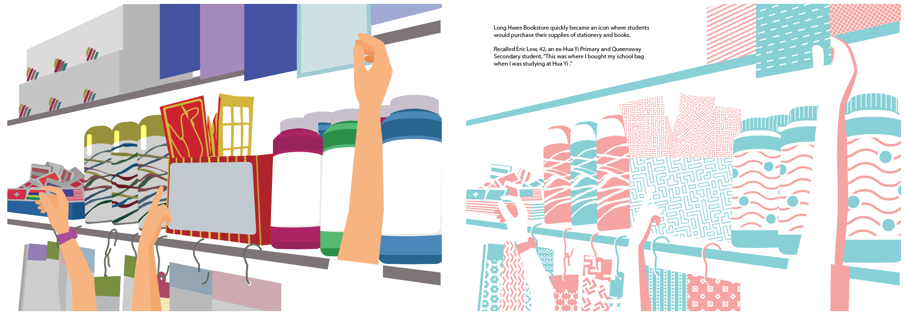

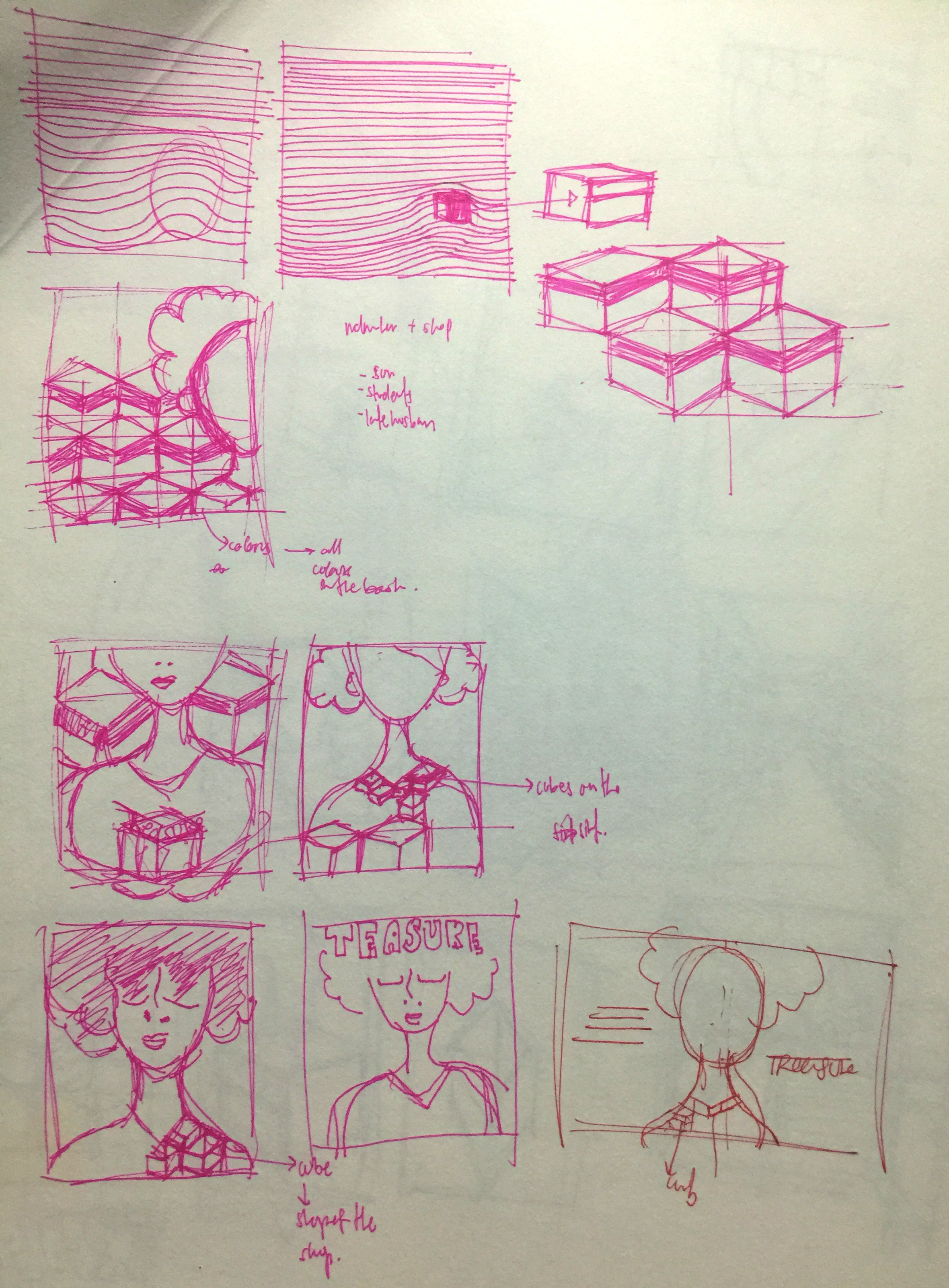
Colour was one of the challenges I faced. Because I wanted to use pastel colour and pastel colours would not stand out on a white paper. Hence, through the process of of making the zine, I kept changing the colours so that each illustrations will flow smoothly throughout all the spread.
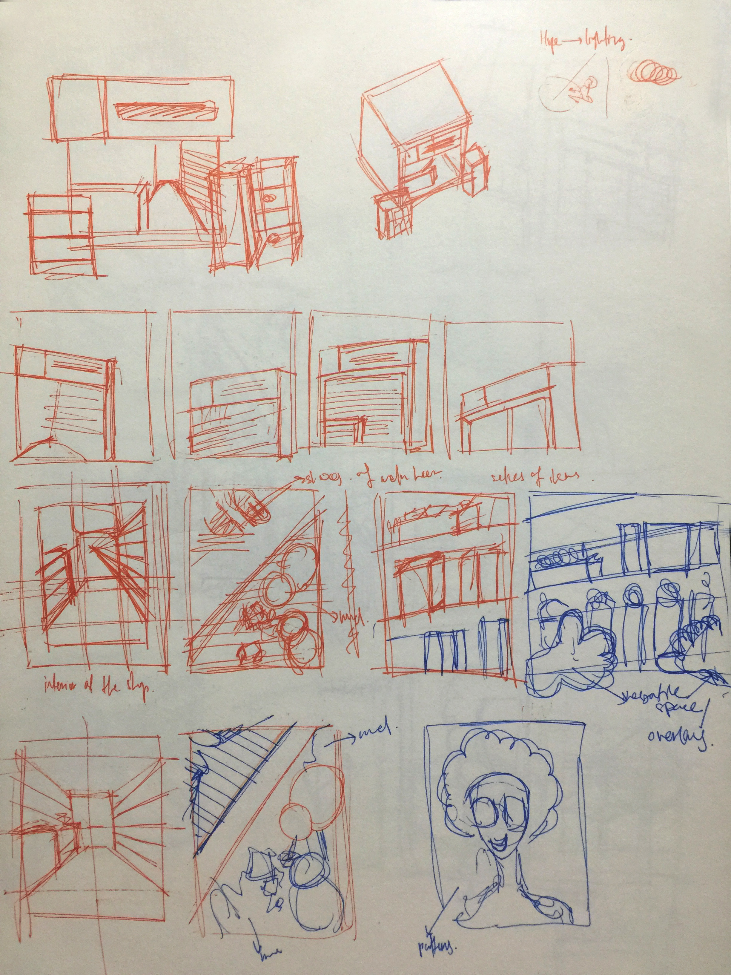
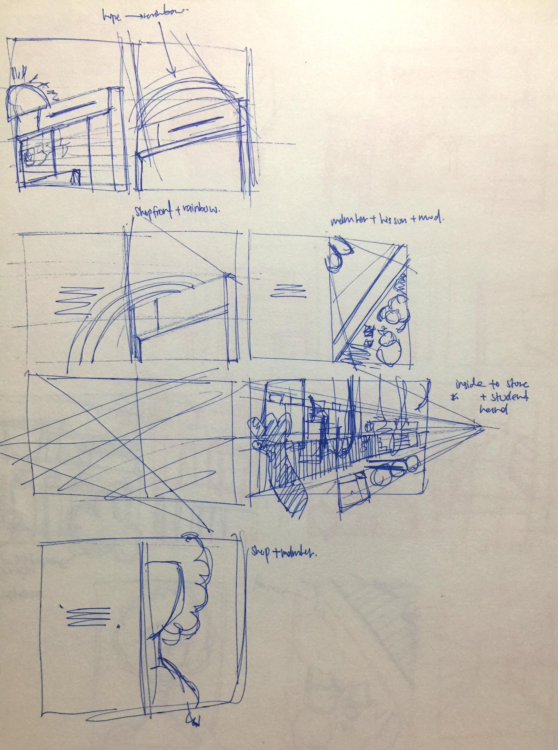
Coverpage was also the most challenging part of the zine, as a cover page should give a summary or a hint of the zine and it should also be able to capture the readers attention. So I started out by illustrating the the shop and its shop front. I added in the wavy lines in the background as Queenstown was a hill perviously. I kind of like the cube shape of shop, so I started to explore more it want manipulate it in the shop.
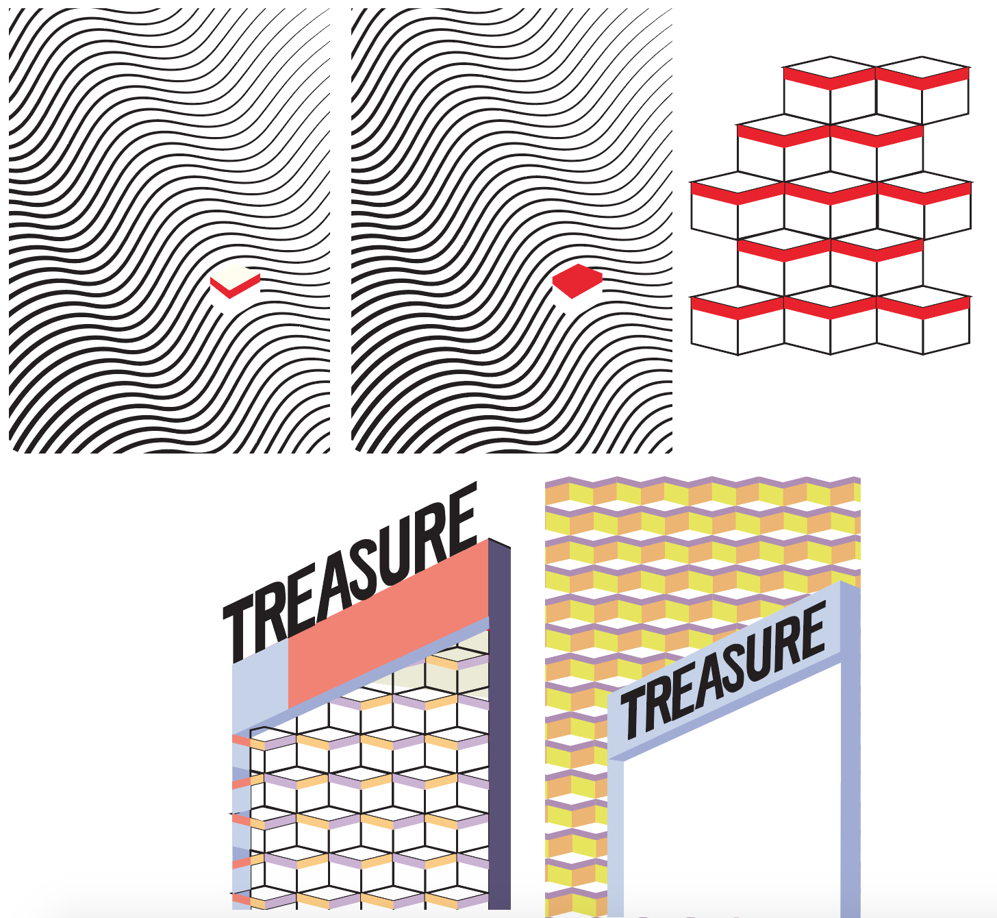
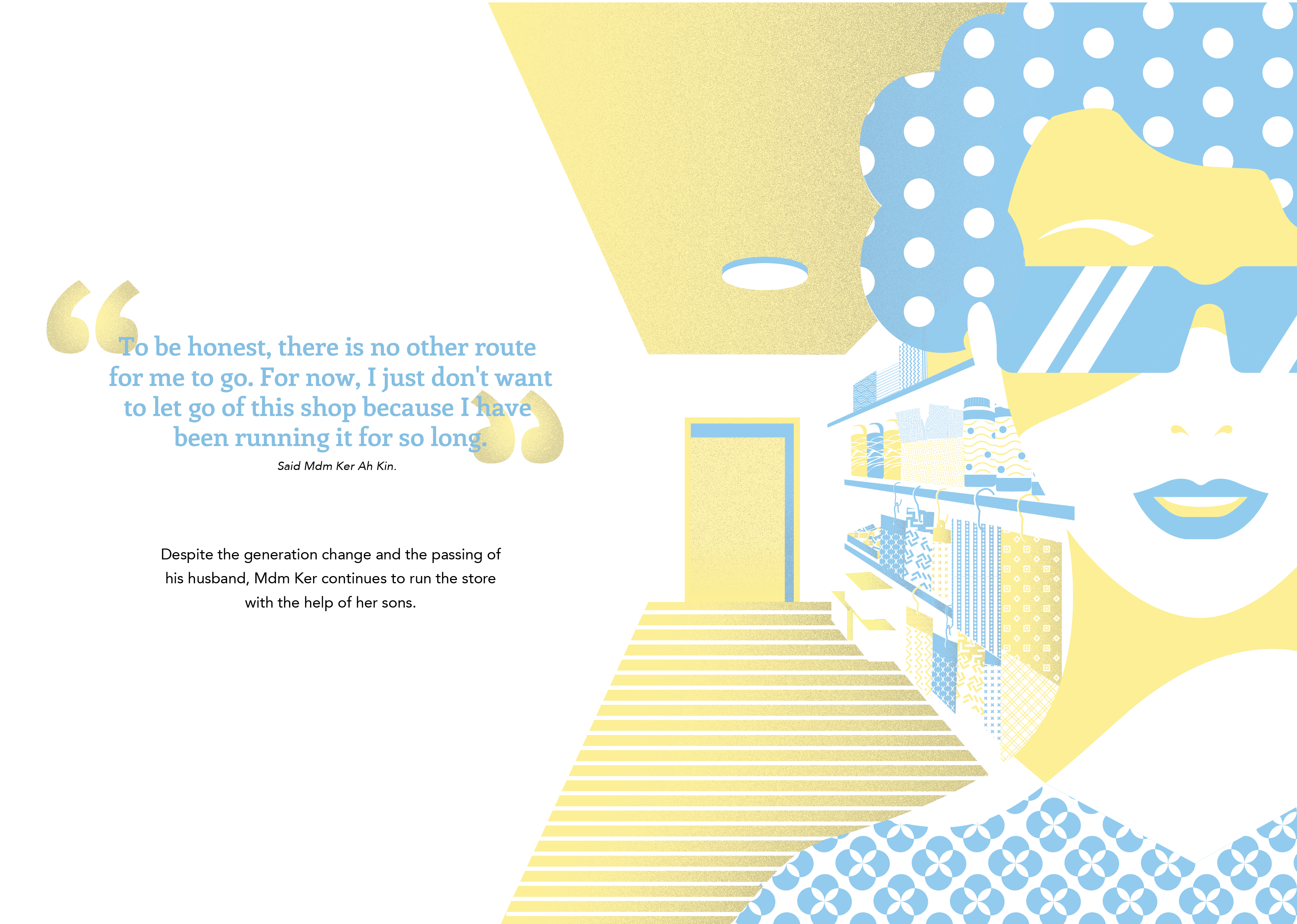
Out of all the illustrations I have in this Zine, I like the illustration of the aunty the most. So I added in the cube patterns into the aunty shirt. So the cube represents the shop and the aunty is the main character of my Zine. Then I play around with the colours.

That’s all for process post! Next will be the final outcome of the zine!

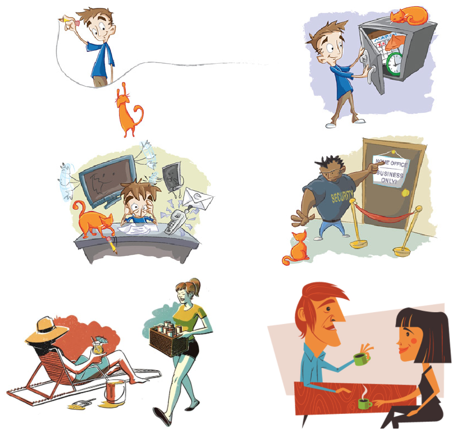
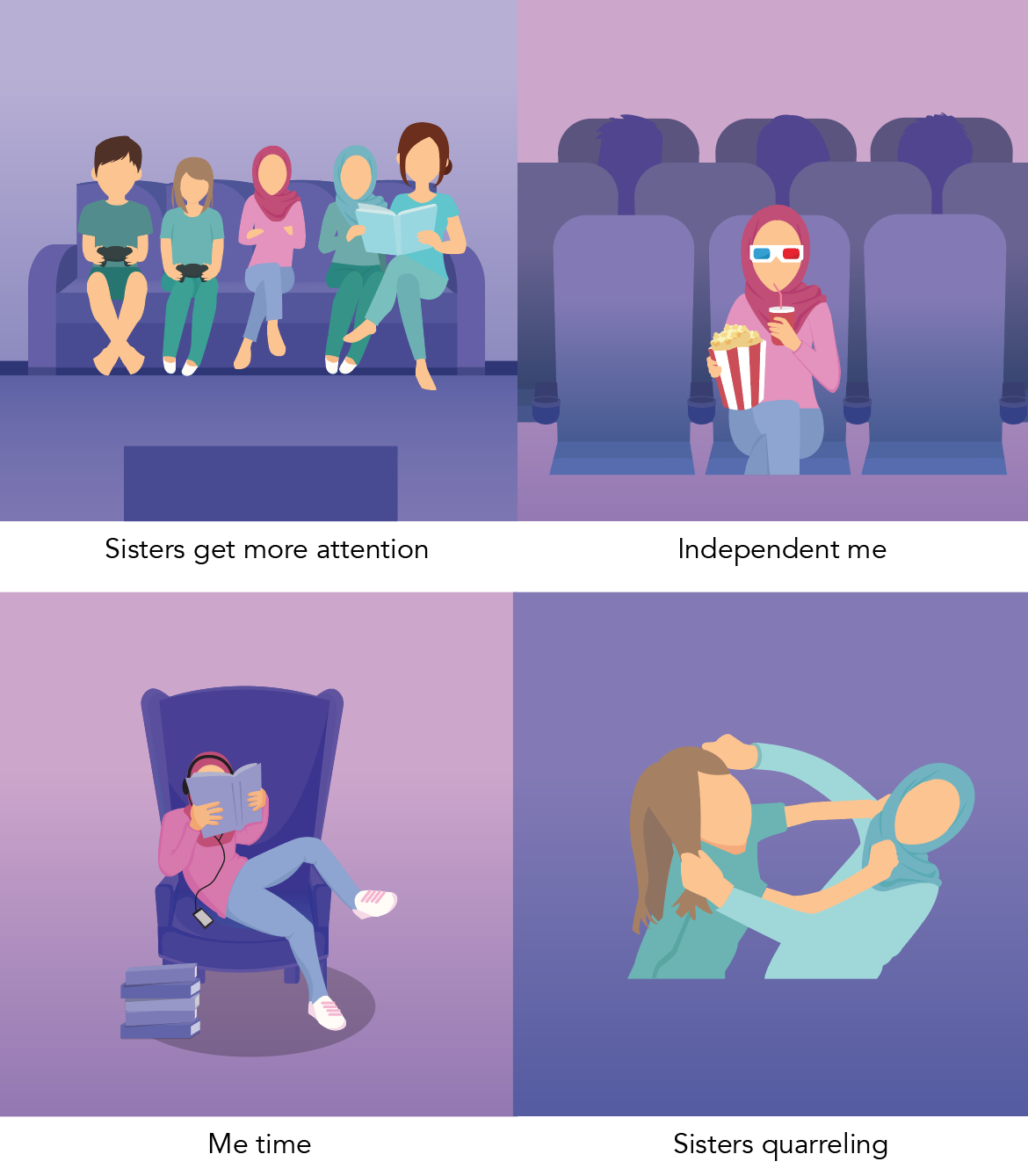
In my previous post, I mention about how I get to Me being a middle child, using my friend’s Caught in the Middle book as reference and also some artist references. And now I’m going to start with my development for my illustrations.
Firstly, I start with the easiest frame; Shopaholic me.
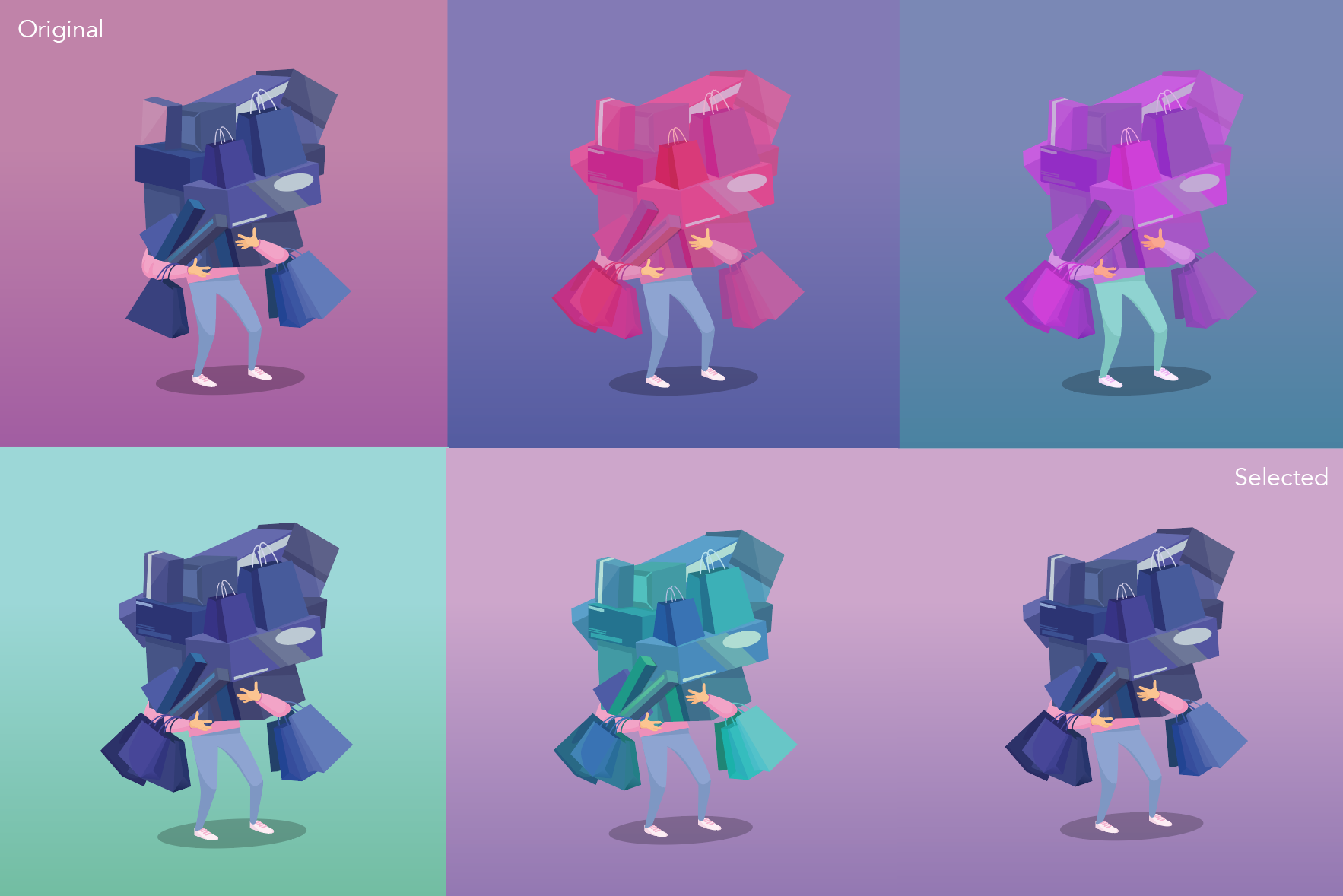
At first, on the top left frame, I wanted to use pink to represent me (pink shirt) then purple for the background – analogous colours. To make the shopping bags stand out I use a contrasting colour as it it the focal point. Hence I also play around with the colours. I kind of like the turquoise background (bottom left), however I would not suit my overall concept with is the use of pink and purple.
Secondly, unnoticeable me.
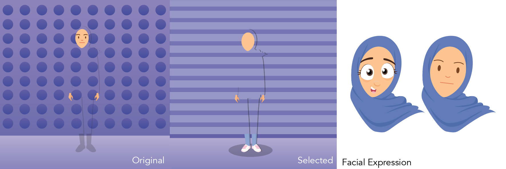
Originally, I started with the polka dots. However I didn’t like it and changed it to stripes which can be a representation to see the next frame beside it. When I was doing this, I tried out illustrating different facial expression and I did not like it. The facial expression on the left looks to cartoonish which was not the concept that I was going for. The concept that I was going for was a bit of realism which is also why I use humans instead of replacing myself as an object. Hence for my first draft, I left out all the facial expression.
Thirdly, hardworking me.
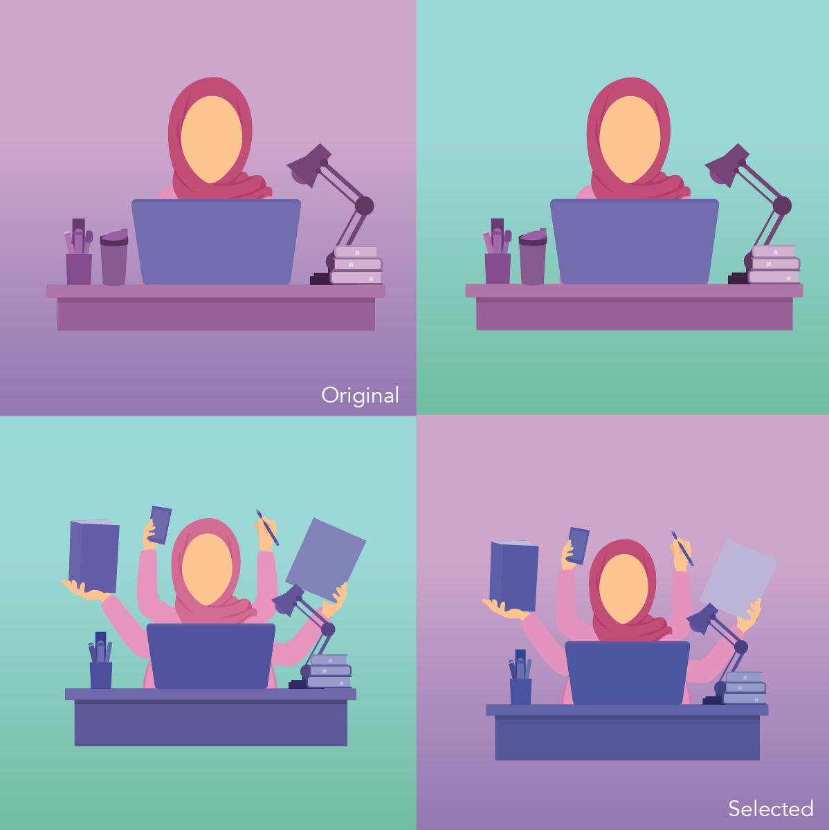
From the original frame till the selected frame, I added in more hands to exaggerate ‘hardworking me’. As in my ‘shopaholic me’, I exaggerate it by having a lot of shopping bags. This is to have a consistent art direction. And obviously the turquoise background just don’t work because it overpowering the subject and its too bright for the eyes.
Fourth, me cleaning after my sisters.

At the original frame, I feel that my sisters’ clothes are blended into the background as I wanted to only use pink and purple. However Mimi suggested to incorporate another colour in it which was turquoise.
After when she suggested that, I faced another difficulty.

For this equation, I feel like the colours does not flow from one frame to the other frame. And I reallyyyyy like the ‘unclean dishes’ frame where the purple contrast with the turquoise. So Mimi suggested to have all the three colours – Pink, purple and turquoise – in every frame. I tried this and I will post it in my next post.
So here are some of the illustrations that doesn’t need more attention than the ones above. Not in any sequence/equation.
Another challenge was that some frames, I find it flat and plain. Example is the ‘sisters quarrelling’ frame. So Mimi suggested that I research on spot illustrations, which is something new to me. So spot illustrations is having a small part to distinguished the background and subject. With spot illustrations, it helps to emphasis the message clearly.