
In my previous post, I did a draft of few of my illustrations. And the challenges I faced were:
- Facial expression
- Incorporate 3 colours in 1 frame
- Flat and plain illustrations – Spot illustrations
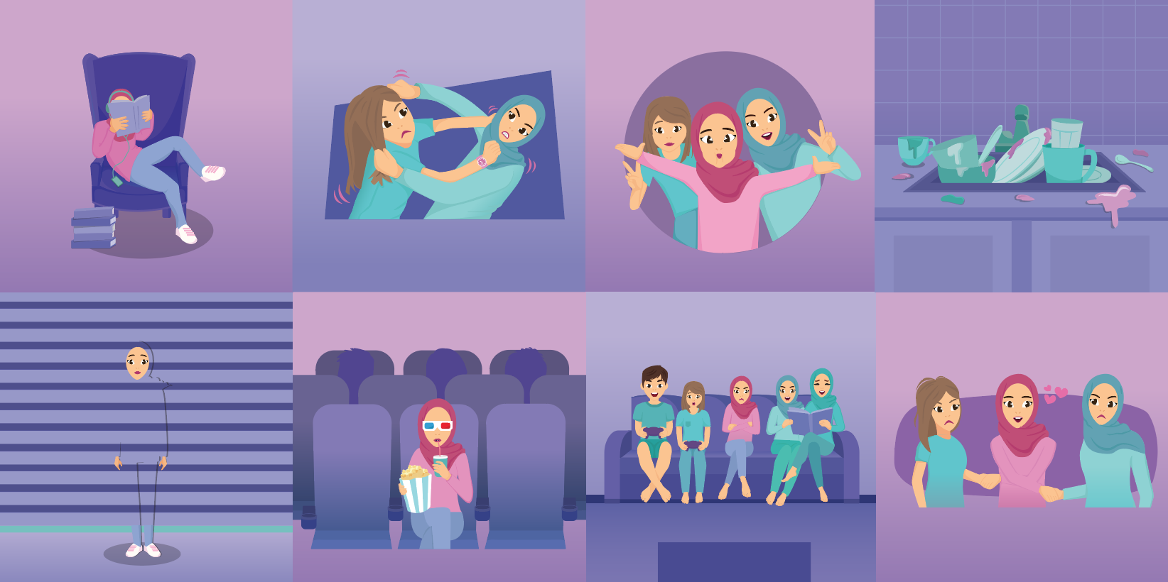
So here’s my final outcome!
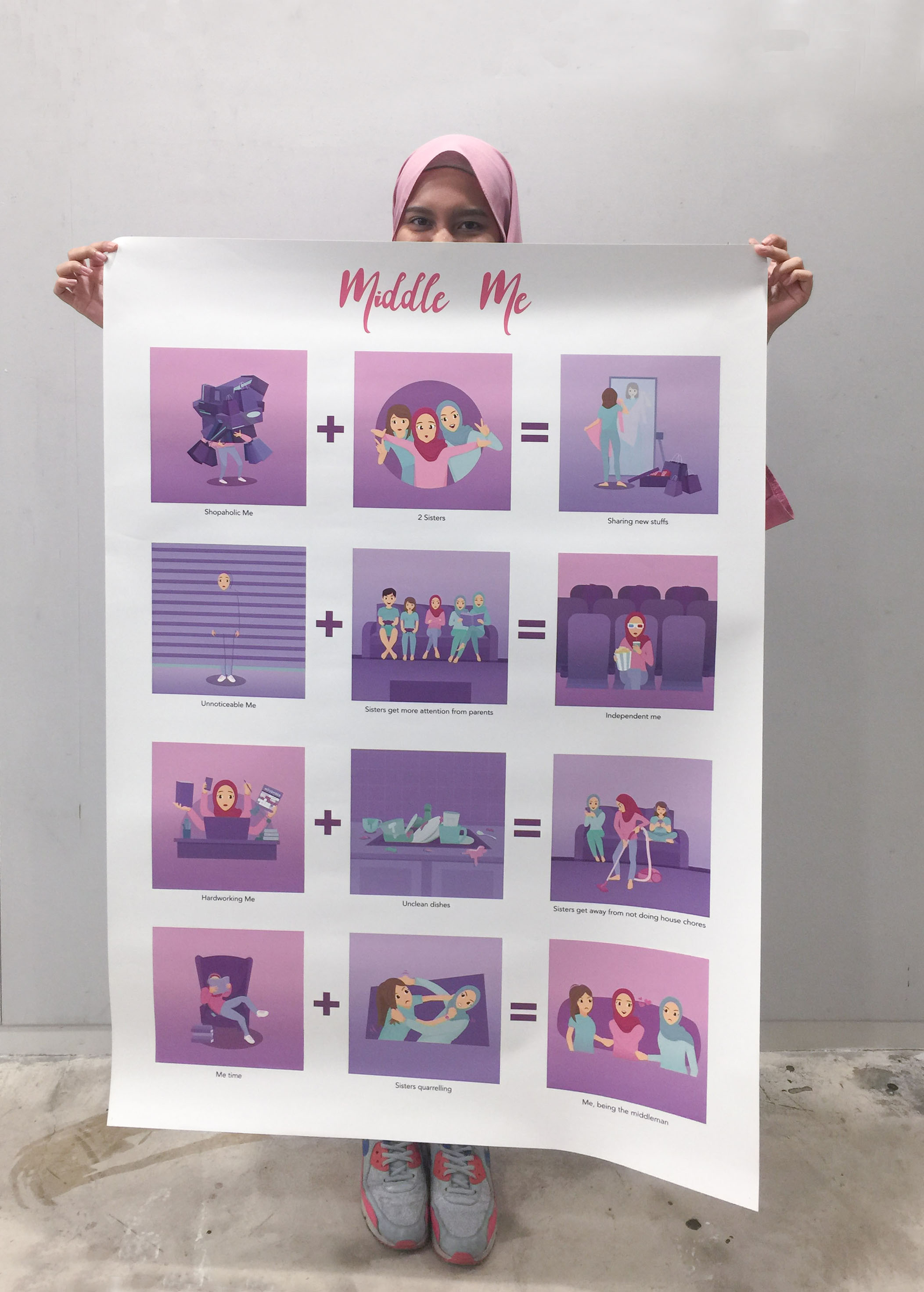
The overarching story is about Me, being the the middle child. And the title is Middle me, as I feel that middle child get the best of both worlds. Example, we don’t that much attention from our parents but at the same time we grow up independently and we have more freedom as compared to our siblings.
My concept for the illustration is simple and direct. So when the audience see my visuals and text, they are able to understand and both the text and visual should be related.
Why the choice of colours? Anything that is Pink represent me. Example me in pink shirt and sister trying out my pink dress and. My sisters are in turquoise is to contrast with me in pink. And in the equation 2, my parents are in dark turquoise as they are not as important as my sisters in that frame. Some of the things that are not important are suppose to be blended into the background. Example equation 2, the sofa is slightly blended into the background.
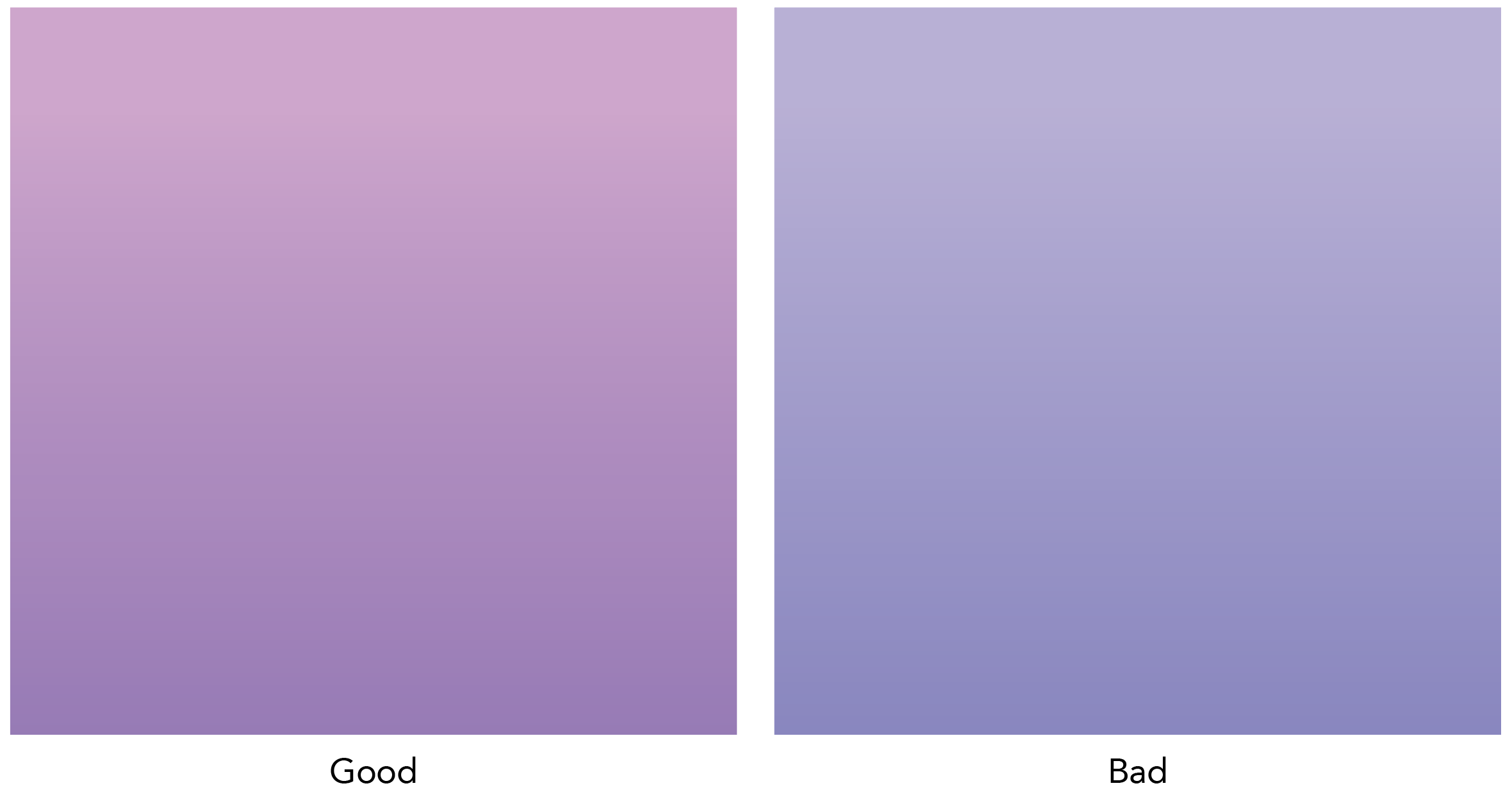
Another thing about my equation is that there are 2 background colours. Each of represent good and bad respectively. This is to show that although being a middle child is bad, like you don’t get much attention, but that can be a good thing as you gain more freedom (see equation 2).
Breakdown of each equation
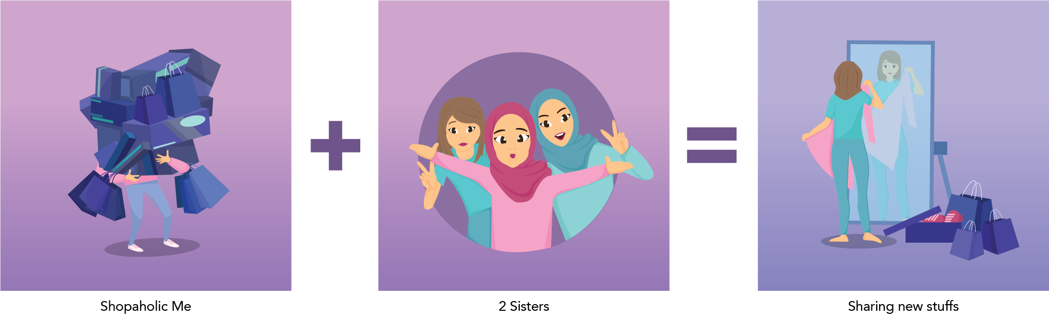
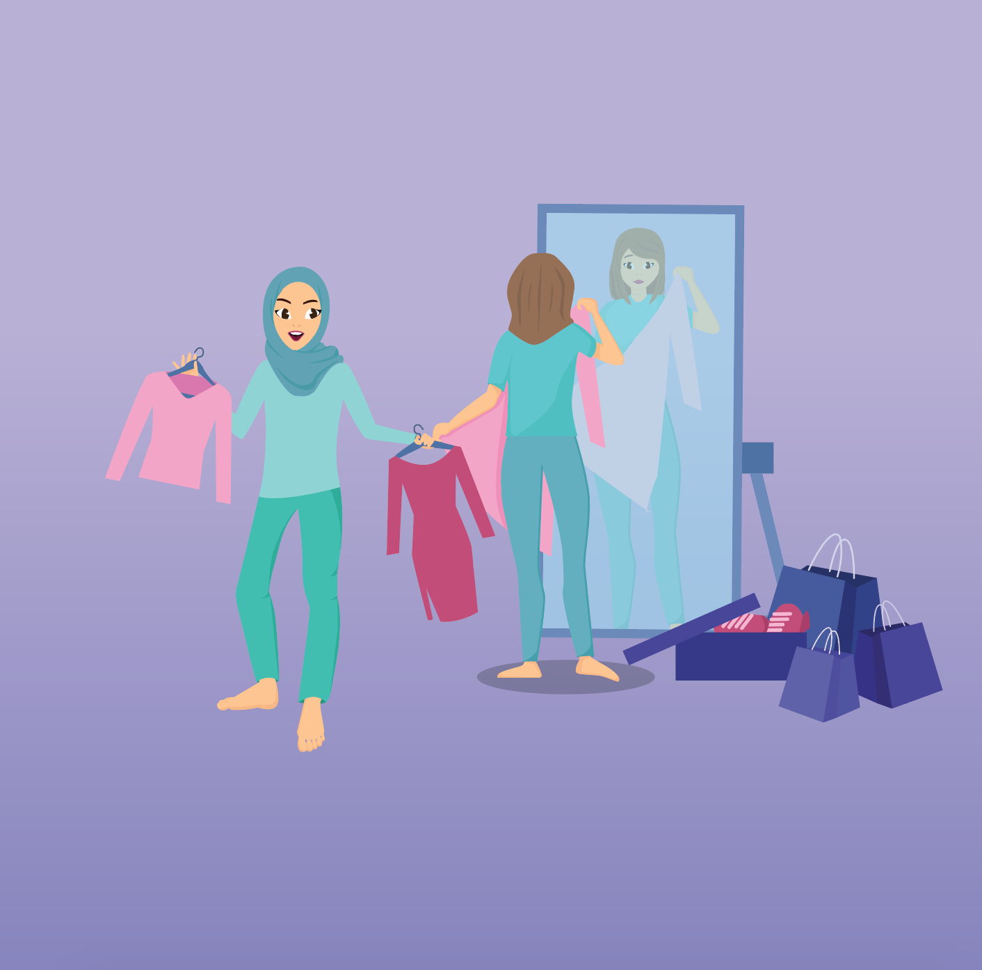
Equation 1: Shopaholic me + 2 sisters = Sharing new stuff
I really love going shopping and I will always buy clothes and shoes for myself. But then I have sisters who have similar clothes and shoe size as me. Hence whenever I buy new things, they will get excited and start trying on them.
For the ‘2 sisters’ frame, my facial expression is different from them as middle child tend to do things differently than other siblings.
However the ‘sharing new stuff’ frame wasn’t a success, as I wanted to show both my sisters trying out my new stuff and me looking angry at them. By having both my sisters trying out my new stuff, it feels a bit cramped. Hence I decided to do 1 sister trying out my pink dress.

Equation 2: Unnoticeable me + Sisters get more attention from parents = Independent me
I’m someone who doesn’t get notice by people maybe because I’m an introvert. Hence I always tell myself that I’m always blended into the background and no one notice me. For the ‘sisters get more attention from parents’ and ‘independent me’ is very direct. I can really watch a movie or go shopping alone (unlike my sisters).
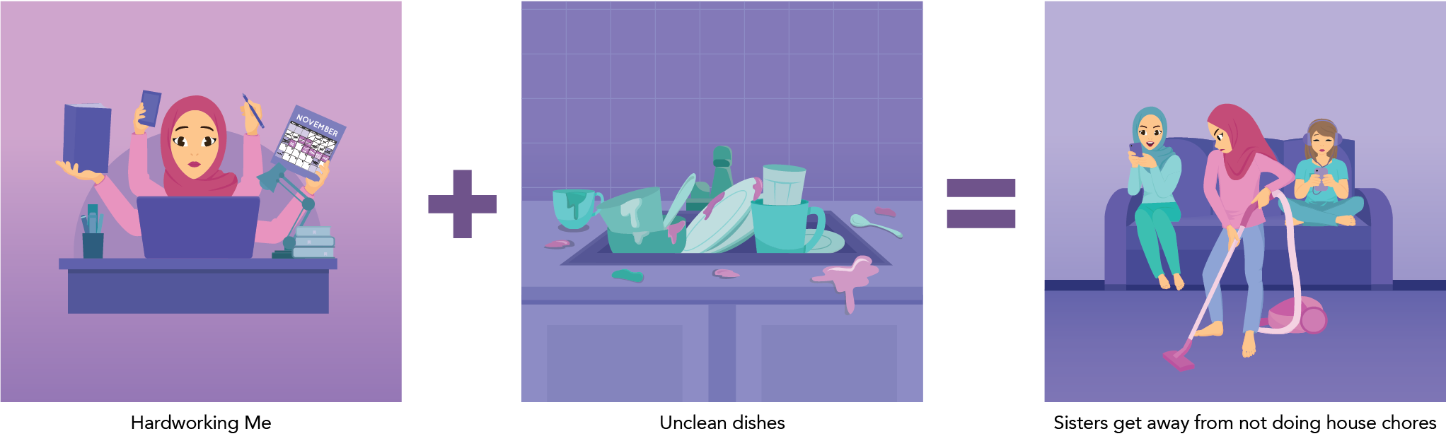
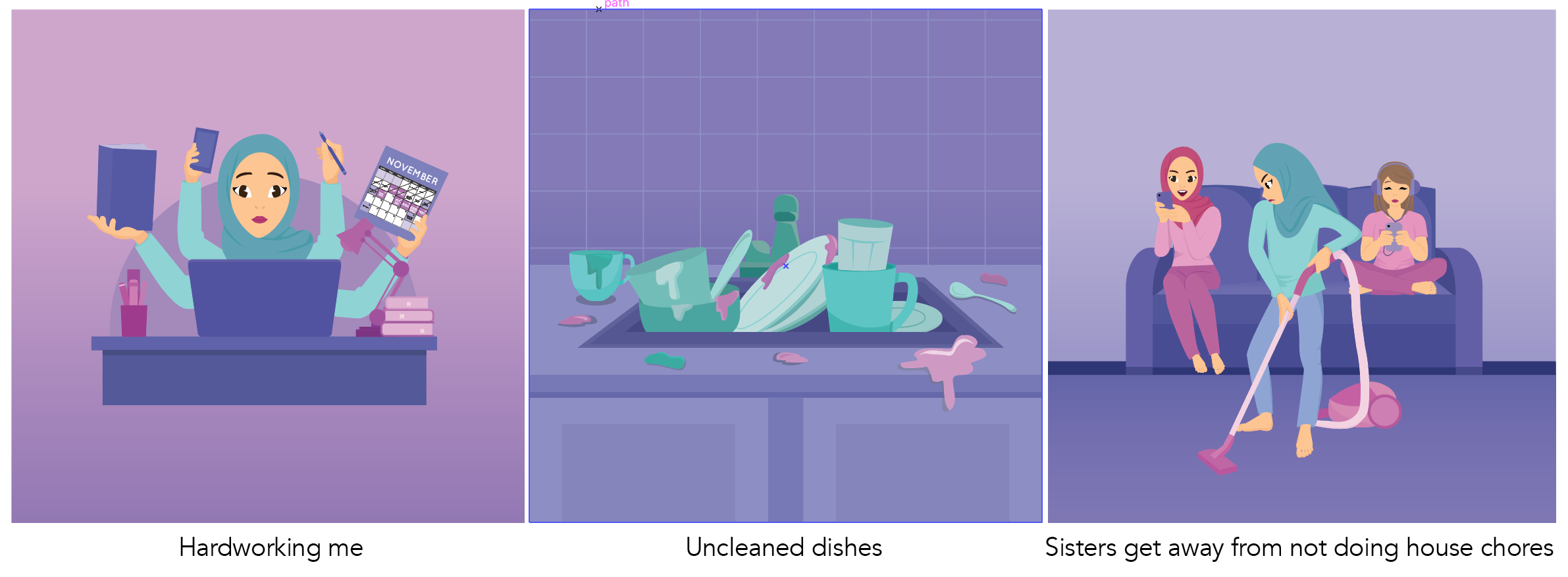
Equation 3: Hardworking me + Unclean dishes = Sisters get away from not doing house chores
I can say that I am a hardworking person. I tend to have different classes in a week so that I don’t only learn design. And my schedule is mostly packed because of extra class, going out with friends and wedding bells. I inserted a small schedule in the ‘hardworking me’ frame. The ‘unclean dishes’ frame is direct. And ‘sisters get away from not doing house chores ‘ is obviously them playing with the phone while I’m busy cleaning the house. So it’s like me literally me being a maid in the house. Nah, I’m just exaggerating.
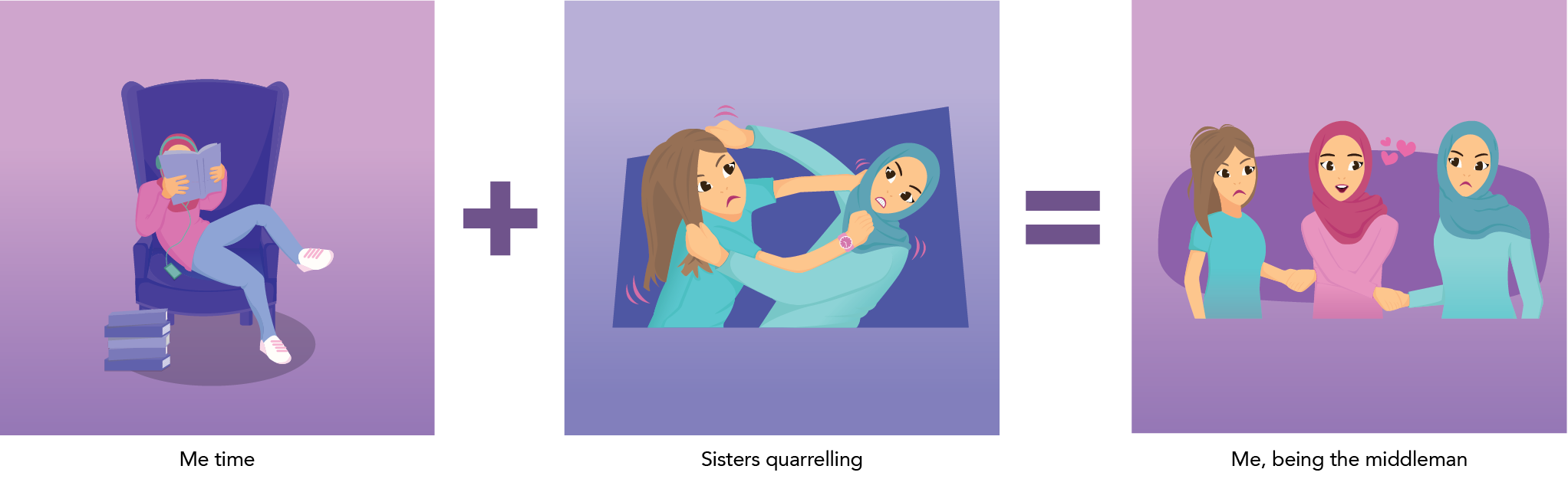
Equation 4: Me time + Sisters quarrelling = Me, being the middleman
During my free time, I like to read and listen to music, especially when I’m home alone. Every sisters will always quarrel with each other, I do quarrel with my sisters at times. Pulling each other hair was one of the direct way to show quarrelling. One of my sister is wearing a pink watch. Remember I said anything that is pink is mine? So basically they are quarrelling about my watch as they want to use it.
And I ended of my last frame as ‘me, being the middleman’, which relates back to the title, Middle me. This is also for the audience to think what character I play in my family which is the middle child.
Feedback given
- Background colour was not overpowering which is not too bright for the audience eyes
- ‘Sharing new stuff’ can be improved
- Consistency through all frame by the use of colours
- Clear depiction of each equation
- Most favourite frame is ‘Shopaholic me’ & ‘Unnoticeable me’
- Clean and cute illustration style
- Someone suggest that more colours can be explored to enhance the picture
- Fendi suggested that I should be in turquoise and my sisters should be in pink. As turquoise is more brighter than pink. So i tried, and here’s the outcome.
It works well by having the turquoise on me and pink on my sisters. However, I still prefer myself to be pink as pink represents me very well.
Reflection
Overall, I’m satisfied with the outcome of Middle me! So pink, so me, so my style. In my first post on this project, I mention that one of my objective was to to inject my own style in it. OBJECTIVE MARKED!
As halfway I was doing my illustrations, I realised that I injected too much of my style in it. So i continued doing it my own way.
Bad thing about me, or might be a good thing: I spent too much time on the little details such as the folding on the hijab and shirt. This is because I wanted to show a bit of 3D instead of a flat cloth. But on the presentation day, people don’t really look into the little details such as the shadow of the fingers and toes. So I’m not sure wether the small details worked out well or not.

New things that I have learnt in this project:
1. Art direction is important so that the visuals will be consistent throughout all.
2. Spot illustrations – something that I will keep using in my future projects