Ego In Different Setting – Process 2

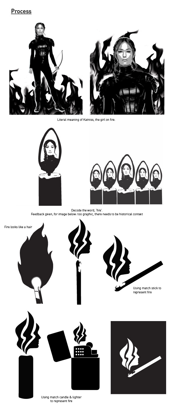
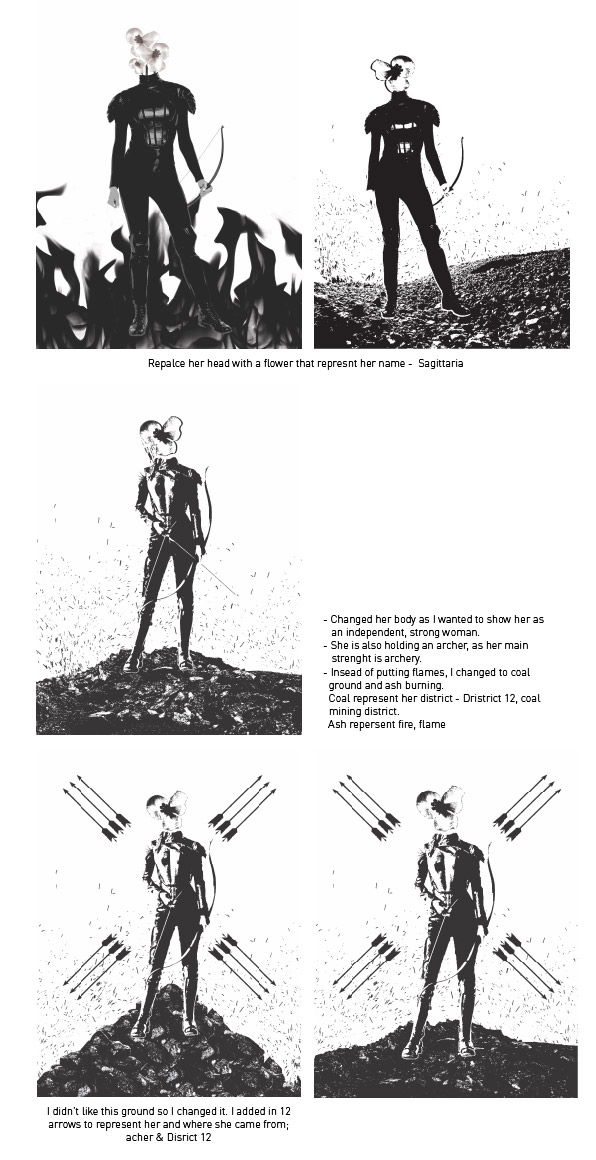
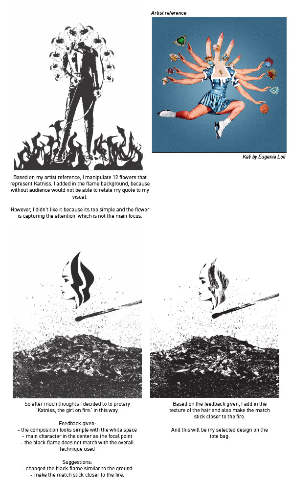
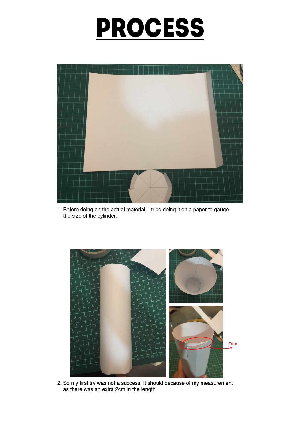
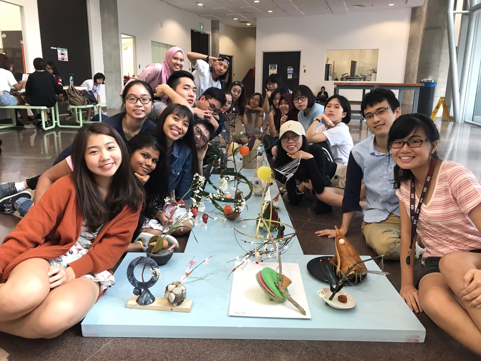
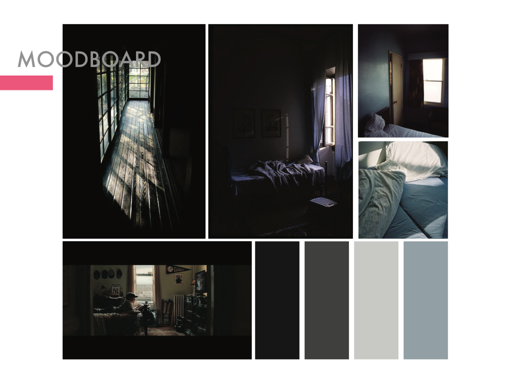
In my previous post, I mention about how I get to Me being a middle child, using my friend’s Caught in the Middle book as reference and also some artist references. And now I’m going to start with my development for my illustrations.

Firstly, I start with the easiest frame; Shopaholic me.

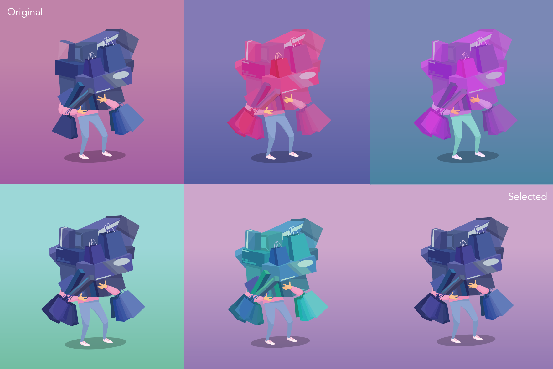
At first, on the top left frame, I wanted to use pink to represent me (pink shirt) then purple for the background – analogous colours. To make the shopping bags stand out I use a contrasting colour as it it the focal point. Hence I also play around with the colours. I kind of like the turquoise background (bottom left), however I would not suit my overall concept with is the use of pink and purple.

Secondly, unnoticeable me.

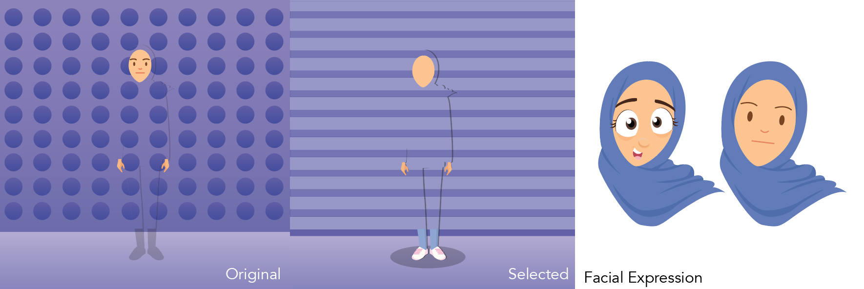
Originally, I started with the polka dots. However I didn’t like it and changed it to stripes which can be a representation to see the next frame beside it. When I was doing this, I tried out illustrating different facial expression and I did not like it. The facial expression on the left looks to cartoonish which was not the concept that I was going for. The concept that I was going for was a bit of realism which is also why I use humans instead of replacing myself as an object. Hence for my first draft, I left out all the facial expression.

Thirdly, hardworking me.

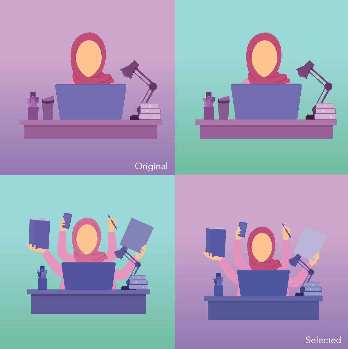
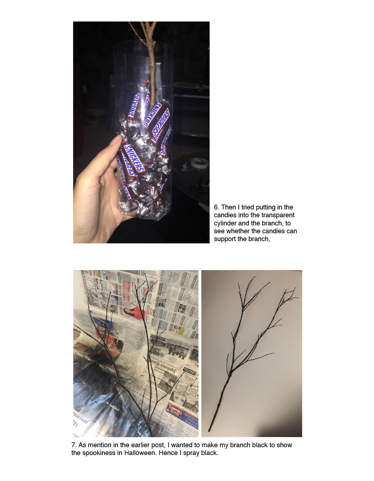
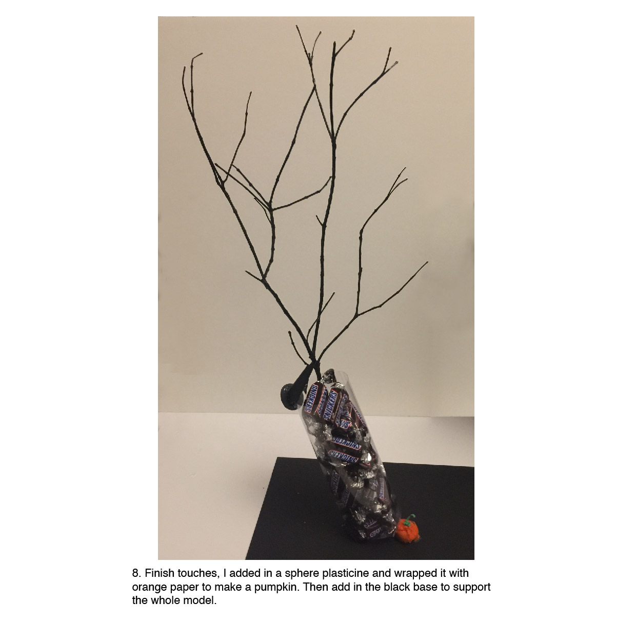
From the original frame till the selected frame, I added in more hands to exaggerate ‘hardworking me’.  As in my ‘shopaholic me’, I exaggerate it by having a lot of shopping bags. This is to have a consistent art direction. And obviously the turquoise background just don’t work because it overpowering the subject and its too bright for the eyes.

Fourth, me cleaning after my sisters.

At the original frame, I feel that my sisters’ clothes are blended into the background as I wanted to only use pink and purple. However Mimi suggested to incorporate another colour in it which was turquoise.

After when she suggested that, I faced another difficulty.

For this equation, I feel like the colours does not flow from one frame to the other frame. And I reallyyyyy like the ‘unclean dishes’ frame where the purple contrast with the turquoise. So Mimi suggested to have all the three colours – Pink, purple and turquoise – in every frame. I tried this and I will post it in my next post.

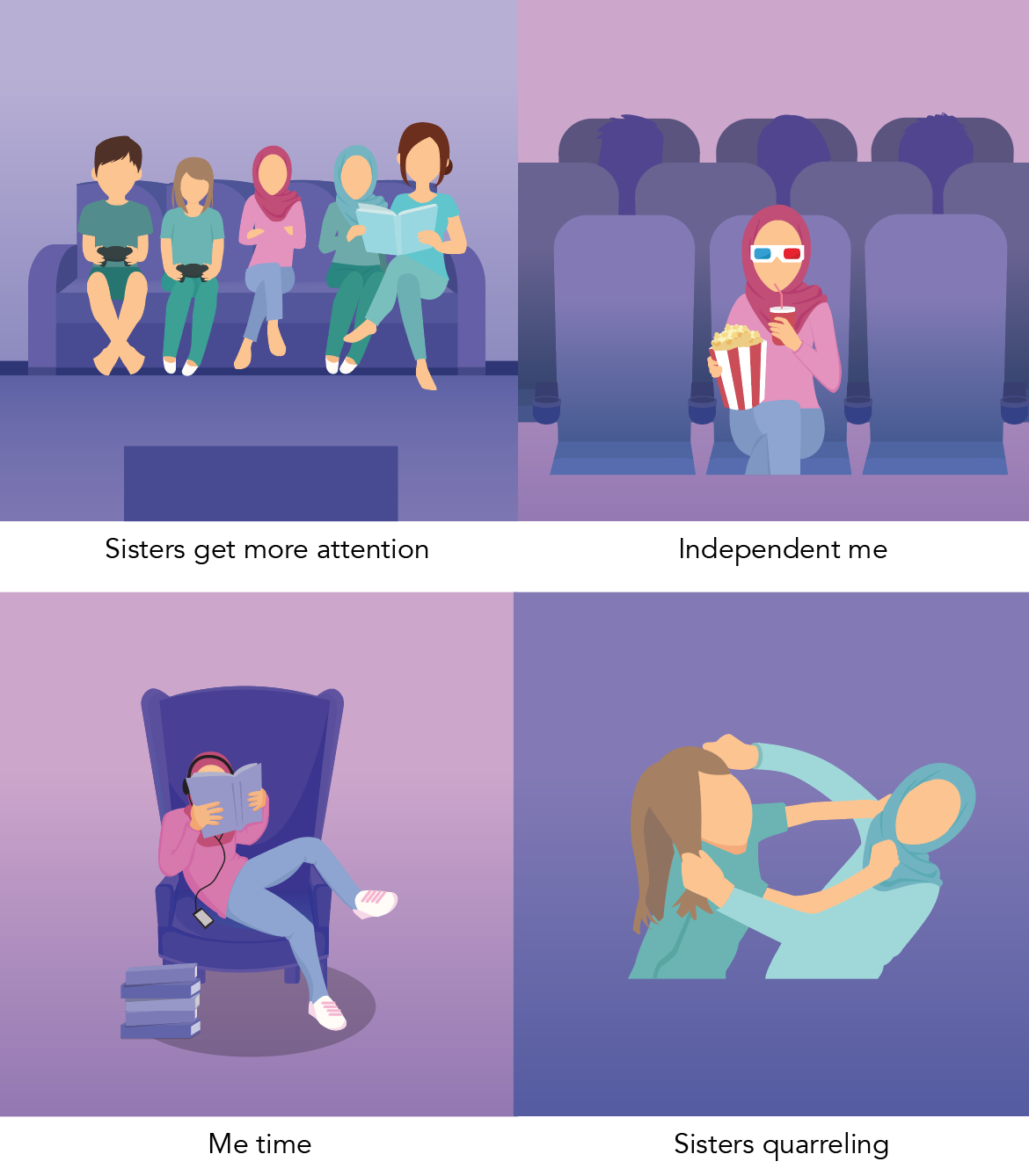
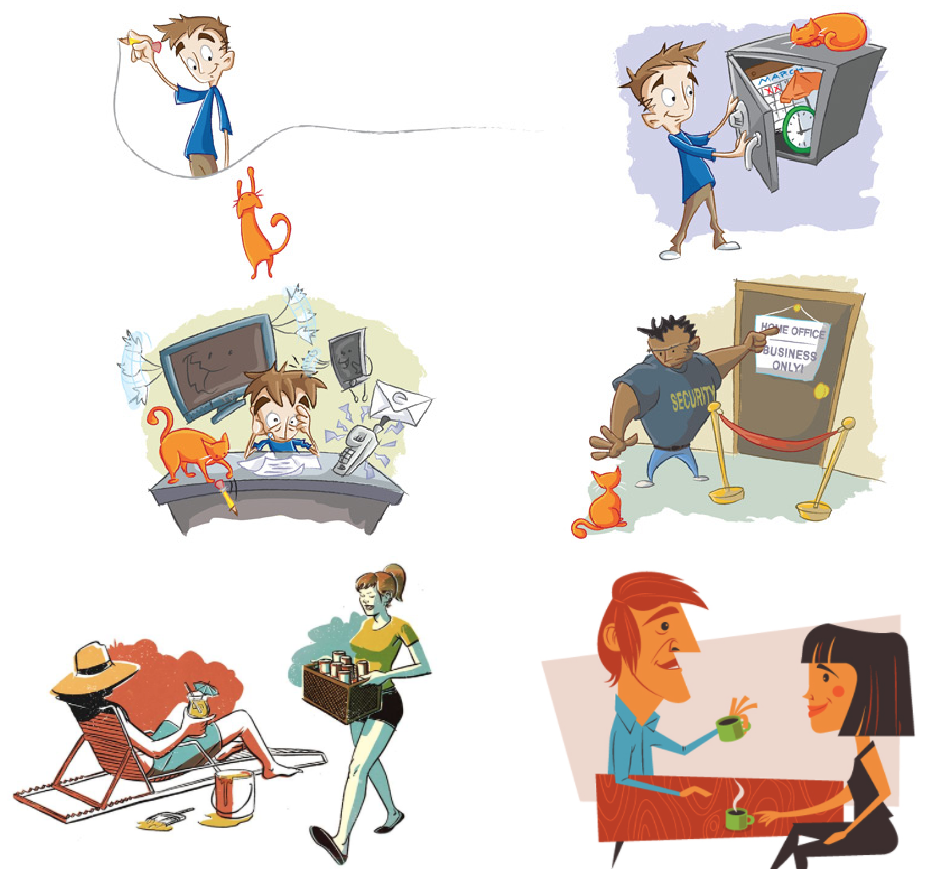
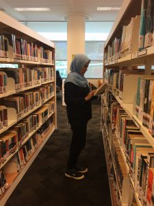
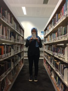
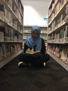
So here are some of the illustrations that doesn’t need more attention than the ones above. Not in any sequence/equation.

Another challenge was that some frames, I find it flat and plain. Example is the ‘sisters quarrelling’ frame. So Mimi suggested that I research on spot illustrations, which is something new to me. So spot illustrations is having a small part to distinguished the background and subject. With spot illustrations, it helps to emphasis the message clearly.
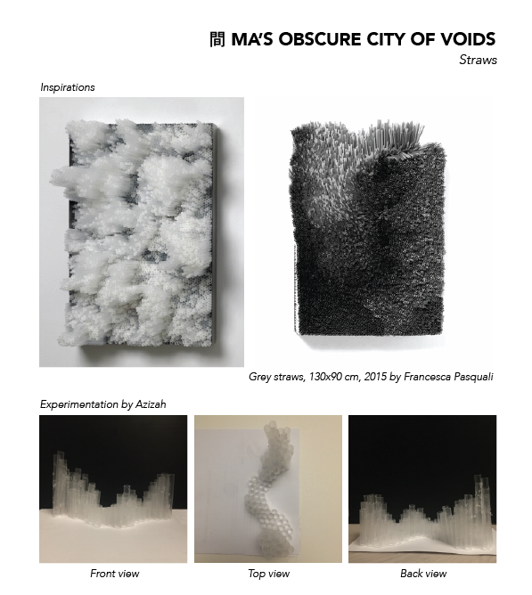
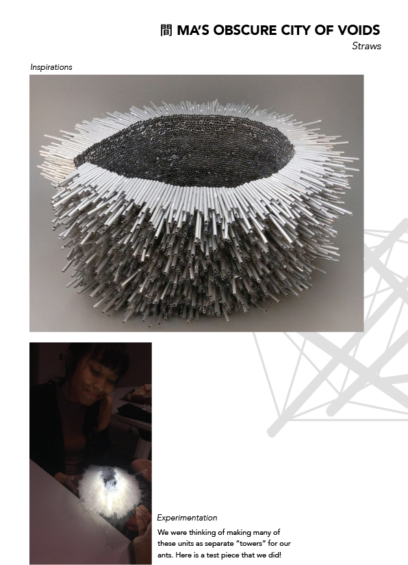
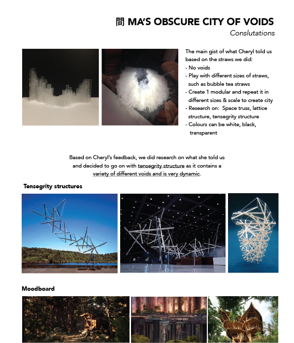
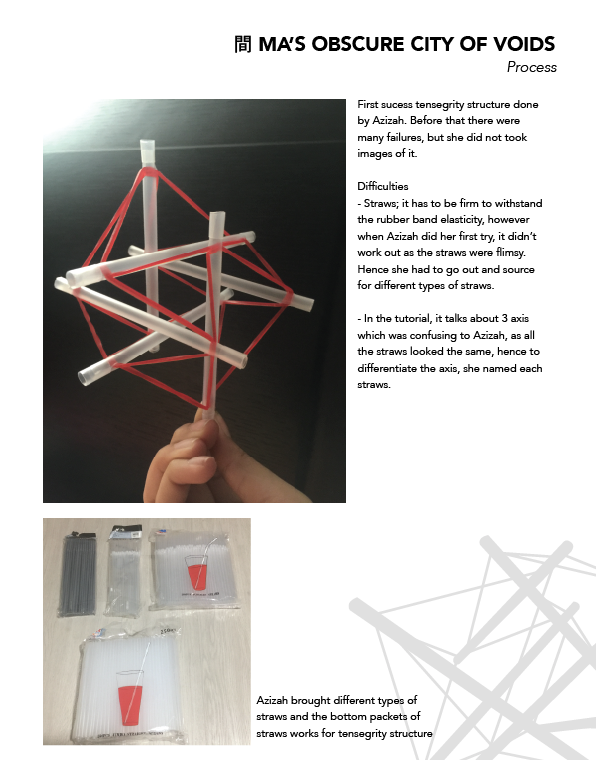
Examples of spot illustrations

Gaia’s Ikebana + Halloween

So I had a branch, which I picked up somewhere when I was on the way home. When I try putting the branch into my models, I feel like it does not fit into my models. Hence I decided to make another model.

Model 1 & 2
Model 3

So for Model 3, I decided to make a vase(cylinder) for the branch to sit in. The cylinder is the dominant, the cone is sub-dominant and the sphere is sub-ordinate.

When I was doing the Model 3, I also thought of representational object for the cylinder, cone and sphere. So the cylinder will be a transparent vase where there will be candies in it. Cone with be the witch hat and sphere will be a small pumpkin.

Final Outcome
Lighted version

In my previous post, I mention I wanted to add light to my final model. TA-DAAA! So here it is! I like how the yellow light shows the spookiness of the branches.

Refection

Overall I was not satisfied with my work as I feel that I could do better;

  • pay more attention to the compositions of curvilinear volumes – to create interesting composition with the theory that I learnt
  • decorate a bit more for my model such as hanging the cones on the branches
  • research more on  Ikebana – so that I would understand and know where & how to put my branches
  • workmanship – in my previous assignment, I mention that I would want to improve on my workmanship. However, I don’t think I have achieve that.

However, my classmate works inspired me the most! They came up with interesting composition, concept and ideation. My personal favourite will be Xuan Wei’s work (winter season), where she uses Randolph as her concept and the choice of material that she use makes me feel cool (not sure what is the material, but its like a cloth). And also the composition that she did and the use of void *thumbs up*.  Another favourite of mine would be Qistina’s spring ikebana.

Picture Story – Curating Self Presentation


Task 1 – Story

I am always in a search of new books to read, whether it will be in the library, book stores or even movies trailers. Most of the time, I will spend time reading at home or while travelling. But I rarely go to the library as I would rather buy a book than borrowing it. By buying it, I can keep it and collect all the books that I have read over the years. And I would like to have a shelf full with books, just like in the library.

I am someone who have difficulties expressing myself verbally. Maybe I just could not find the exact words to express myself or I just do not open up to people easily, which makes me hard to express myself. Through reading I more than just understand the character, I will always find a little part of myself relating back to the character.

It always astonished me how an author can make me feel; sadness, happiness, excitement, anxiousness. They can also write about a story that reminisces on my youth or perhaps my long lost love. Some authors can write about a world that I have never dreamed of. Possibly a fantasy world. When I am are stuck somewhere, trying to find my path out from the dark clouds, words from authors who have experienced a similar situation, can lead me to the brighter road. This are the reasons why I am always engross in reading.

Task 2 – Story

This room is significant to my two younger sisters and me. To us, it contains most of our memories and secrets between us and the four walls. In that room is where we chat, laugh, quarrel and cry together. There are so many memories build in that room over the pass few years.

Being the eldest sister, I get to take up the most space and sets rule for my younger sisters. As shown in the image, I do most of the things and how it is arranged.

This room shows the different type of personality that each of us has. I am the bookworm and artistic type of person, while my sisters are the sporty and messy type.

Our bedroom is always dim, as we wake up early in the morning for school and reach home in the evening. So we rarely allow light to enter the room. We also keep the lighting dim, as it is easier for us to take naps and rest during the day; making our room relaxing.

Reflection

Throughout the process of this assignment, I have learnt that angle, composition and lighting play a part in creating a mood in an image.

For angle, perspective can be one of it. Like how I want the book shelves in my images to be. Do I want to the one point perspective for book shelf so that my subject can be the main focus? Or do I want the book shelf to be part of the focal point? These are some of the question I ask myself when I am visualizing how I want the image to be.

Secondly, composition, its where I want to put my subject in the image. Do I put it in the middle of the image or put it at the right of the image? For composition, I realize that I tend to use rule of third most of the time while taking random pictures.

Lastly, lighting. In my images, I tend to use lots of flat lighting; maybe it is because I took my images in the library. But in the future, I would like to try using one point lighting to show some dramatic effect.

Task 1: Process

Here are some of the pictures taken by my younger sister, who does not have any photography background. Images are taken at Jurong East Library. All the images are raw, not edited.


Difficulties 

  1. My photographer – because she does not have any photography background hence, some image are imbalance or unproportional. To overcome this, I had to do a lot of research and find more references so that she would understand how I want the image to look like. During the shoot, I also did take some shoots to show her how the images should turn out like.
  2. The different lighting in the library – There were 2 types of lighting in the library, one is yellowish and the other is white. Hence, me and my photographer had to explore the library first before finding a spot to shot.

Task 1: Artist Reference

Photographer – Nguan

Link: http://nguan.tv/singapore.htm

Series: Singapore

This images are taking under his series named “Singapore”. In this series, he uses cool colours to depict Singapore. As a singaporean, I find it astonishing that he did not capture the busy and hectic lifestyle in Singapore. Instead he chose to capture Singapore in a different view, which focuses on the subject that tells the story with the help of the emotions and background.

The cool colours, in his images, make it not striking to my eyes. I feel relax and calm when I look at those images. The images also allows me to think about the story that the photographer is trying to convey.

In conclusion, I would like image to look calm, peaceful and relaxing. And the way I should interact with the book is that I am engross and focus in reading it. The outcome of the image should be in cool colours, not contrasting to the audience’s eyes.