So to start off on this project, I did a research on colour theory and how colour can be use in a design.
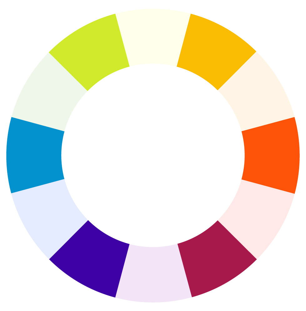
Firstly, to understand colour theory, I need to know about colour wheel and some of the colour terms.
Primary colours: red, yellow and blueSecondary colours: orange, green and violetTertiary colors: red-orange, yellow-orange, yellow-green & etc
Colour Terms
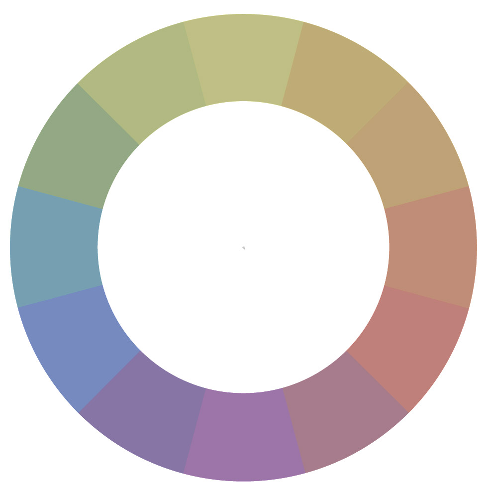
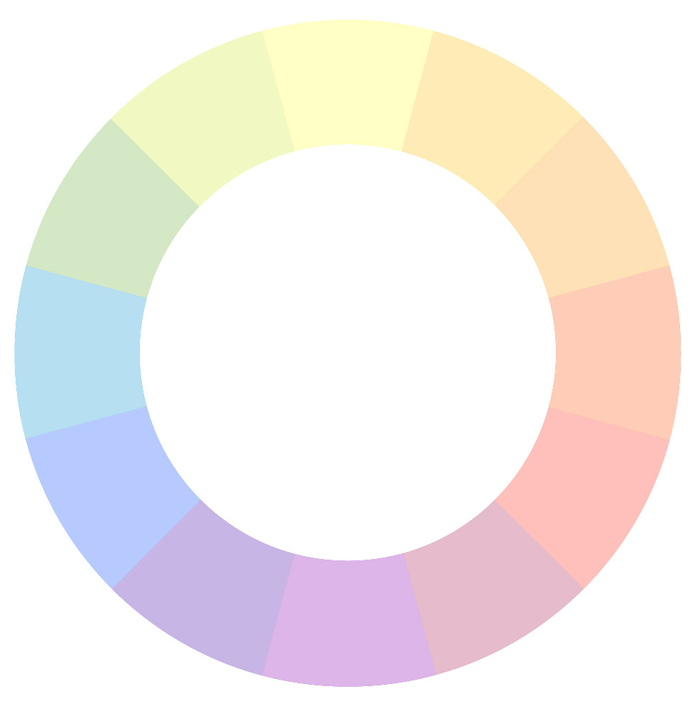
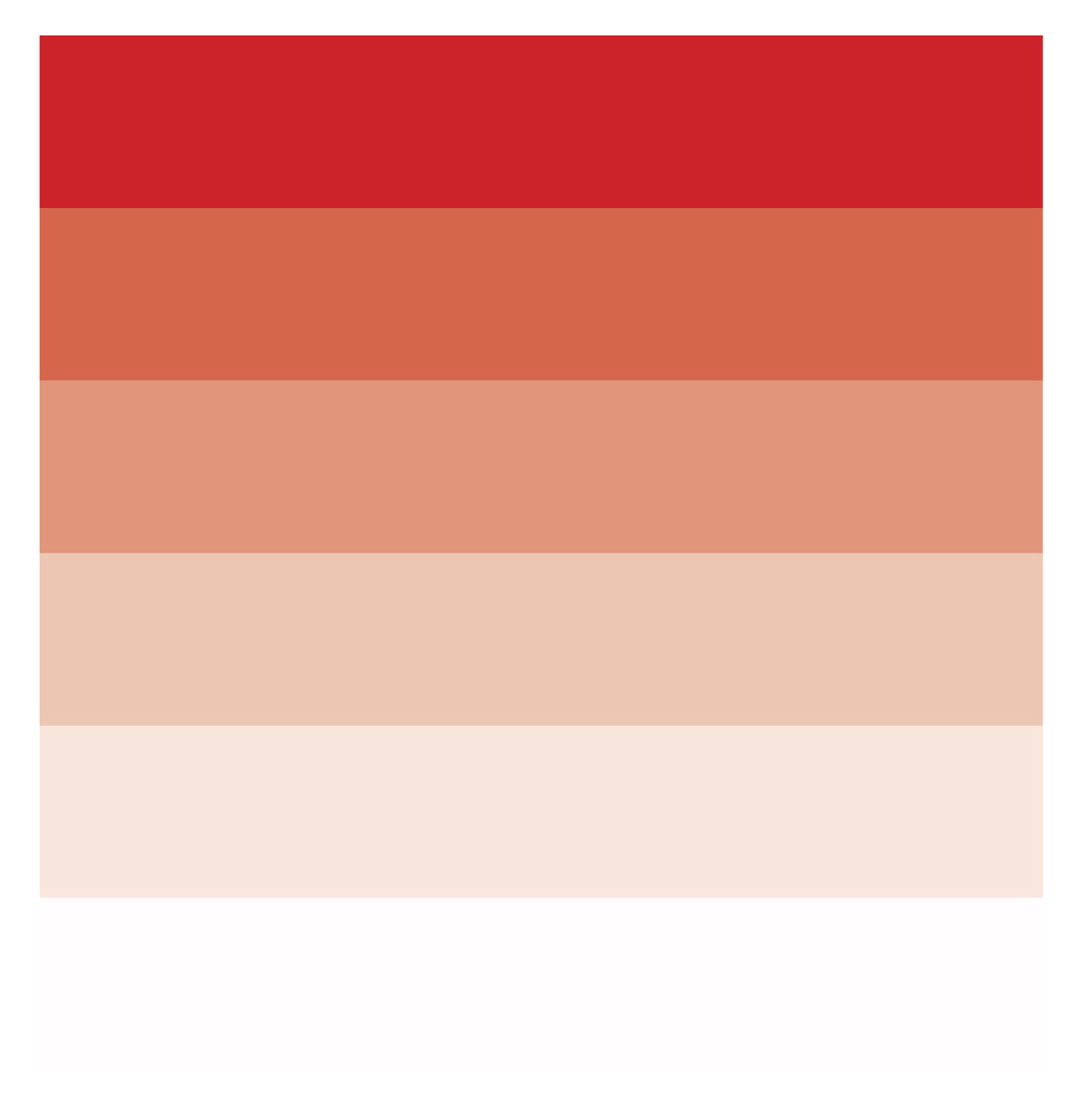
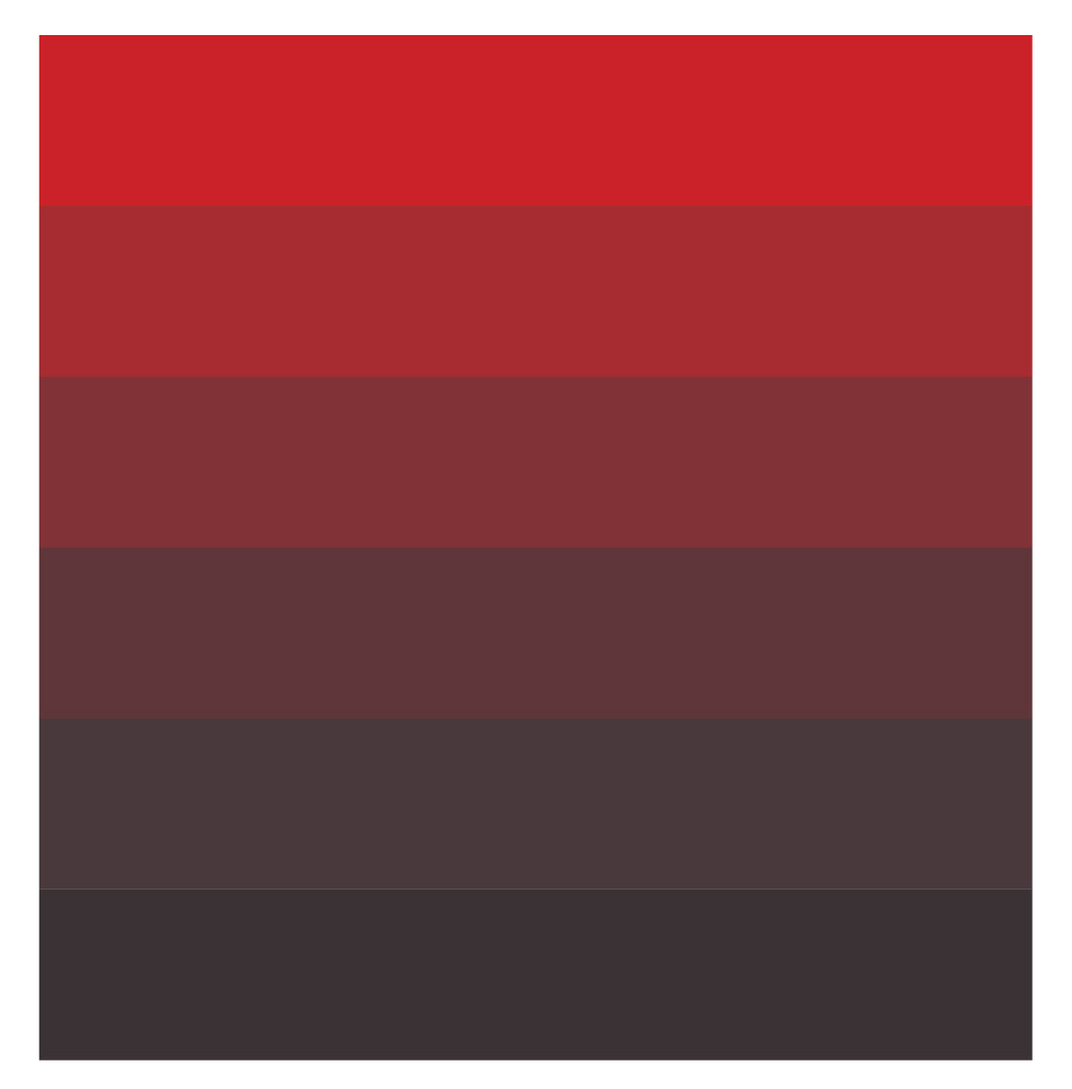
Hue: synonymous with “colour” or the name of a specific color; traditionally refers to one of the 12 colours on the colour wheelShade: a hue darkened with blackTone: a hue dulled with greyTint: a hue lightened with whiteSaturation: refers to the intensity or purity of a colourValue: refers to the lightness or darkness of a colour
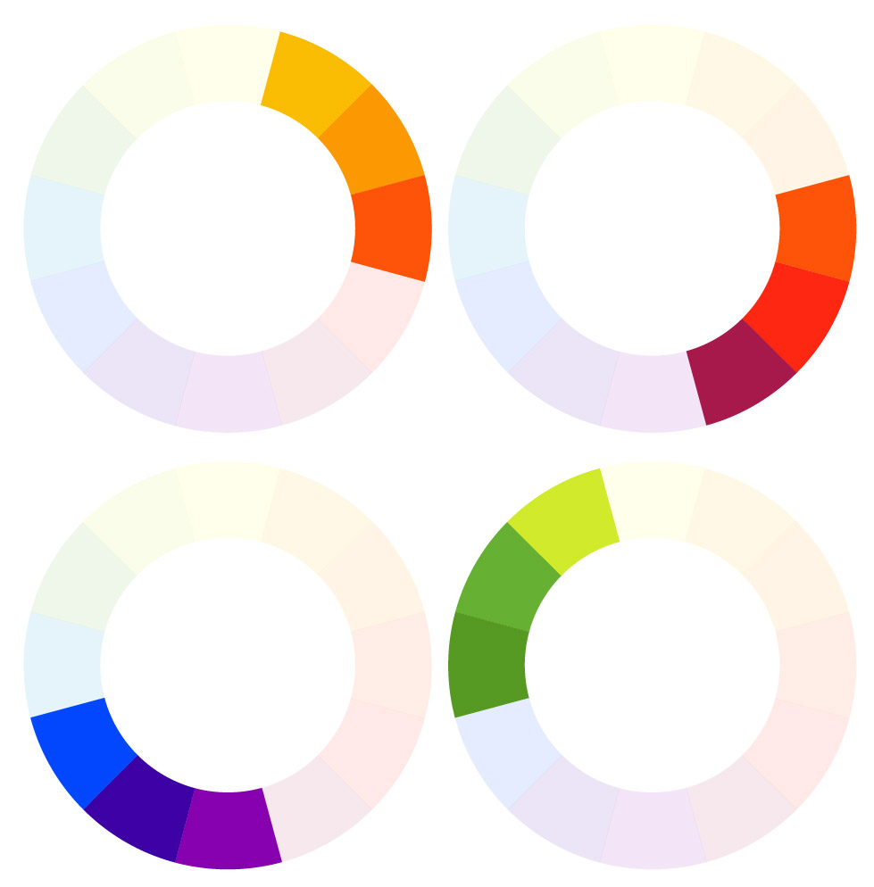
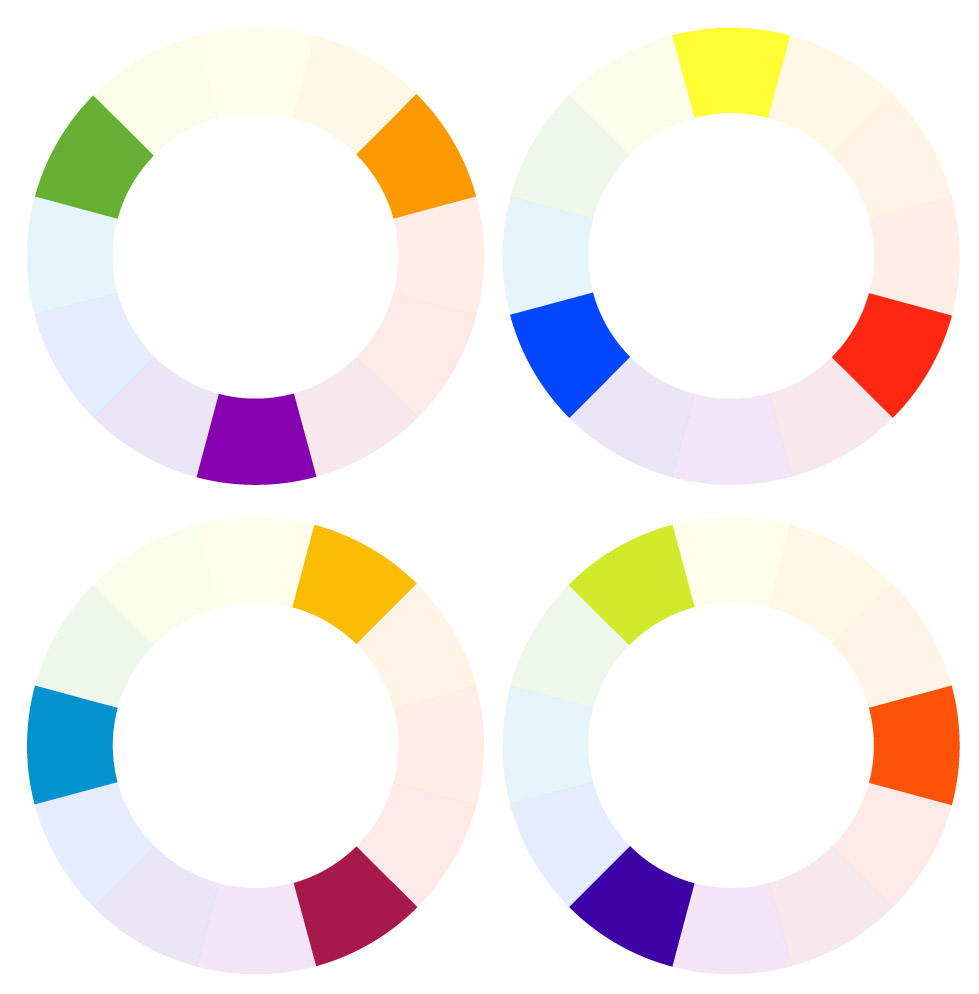
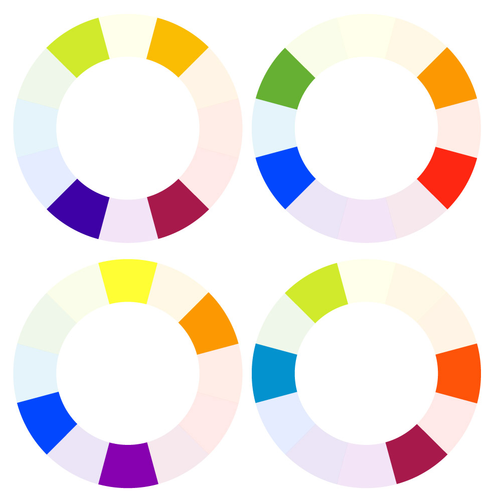
Color Harmony
Monochromatic: various shades, tones, or tints of one color; for instance, a range of blues varying from light to dark.Analogous: hues that are side by side on the color wheel; this type of scheme is versatile and easy to apply to design projects Complementary: opposites on the color wheel, complementary colors are high-contrast and high-intensity, but can be difficult to apply in a balanced, harmonious wayTriadic: any three colors that are evenly spaced on the color wheelSplit-Complementary: any color on the color wheel plus the two that flank its complement; this scheme still has strong visual contrast, but is less jarring than a complementary color combinationTetradic/Double-Complementary: two complementary pairs; this scheme is very eye-catching, but may be even harder to apply than one pair of complementary colors, since more colors are more difficult to balance.