Equations
Fot project Ego, we needed to come up with 4 equations about ourselves, a situation, and how we change because of it. With this, i decided to use the theme of self-identity. Below is a list of equations in which i had comem up with when i was brainstrorming:
- Me, girl + two brothers = tomboy
- Me, sloppy + first week of school = fashion queen
- me , creative + accounting = anxiety
- Me, straight + surrounded by pretty girls = questioning myself
However, i could not visualize how these equations would turn out on the panels. In the end, the equations that i settled for were:
- Me, living a normal life + look into my wardrobe = become different people (self identity: multiple identitites)
- Good child + social pressures = rebellion (self identitiy: non-conformist)
- Introvert + another introvert = chatty me (extroverted)
- Single + dissappointing boys = independant woman
Illustration style
When i got the brief to the project, i immediately thought of comics due to the delivarables benig in forms of equations and squares. As such, i decided that i had wanted to create work that was similar to comic style. Initially I drew inspiration from Roy Litchenstein, him being one of my favourite artists. I liked his use of colours However, after seeing examples online, I knew that I was not going to be able to do the Ben-Day dots, as I opted for the traditional method. With this, I branched out to other artists, solely focusing on comic artists. I wanted my work to look like a comic because I find that it is able to tell a story through the use of visuals effectively, and has an element of sequential storytelling. Using less words, this also helps to ensure that the visuals are able to convey the message, which is what I like about comics.

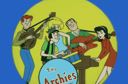
After consultation, Ms Mimi suggested that I should follow the aesthetic style of retro comic books. With this, I decided to reference the work of Dan Parent. I really liked his comic style because if it’s simplicity as compared to other comic artists, and also because I grew up reading Archie, and I also wanted a retro theme to my work because of the charm that it had. As such, I decided to incorporate his illustration style in my final project. As I am not very proficient in digital drawing or painting, my only option was watercolour. The way i apply watercolour is to get very strong pgments so that the colour is vibrant, and am able to get them as flat as i could get.


Colours

In terms of colours, i wanted it to already play a part in my work as a whole. I was inspired by the sunset in which are all warm colours, which i feel represent me best because i am bright, bold, and loves the drama. I liked the analogous colour scheme, As such, the colours that would set the tone for my work was red, yellow, orange and pink.
For my work, I wanted the colour harmonies to also play a meaning from the first column to the last column. I also waned to change the meaning of the colour that is associated with it, from negative to positive (refer to table below). With this, the first column was to be monochromatic to symbolize mundaneness or “normal” me. However, for the 2nd and 3rd column, I had the choice of doing analogous, complimentary and split complimentary, or analogous. With this, I tested it out on the computer first.
| Colour |
Positive Connotation |
Negative Connotation |
| Yellow |
optimism, self-esteem, confidence |
boredom |
| Orange |
passion, abundance, fun, childish |
deprivation, frustration, frivolity, immaturity |
| Red |
excitement, physical courage |
a tense situation |
| Pink |
femininity, love, sexuality |
emotional, claustrophobia |
|
|
|
Me, living a normal life + wardrobe = become different people (self identity: multiple identities)
This was the first panel that i worked on. It is a story about how i am able to live only one life, but through clothes and dressing up, i get to be different people and characters. That would be a fun experience for me because i would be able to be fashionable as well.


This was before i started to explore Dan Parent’s illustration and colour harmonies. I did not look like the way it all looked different from each other, and did no have a consistent illustration style. After consultation, i decided to plan out my colours better. For me, this was going to be the yellow sequence because i wanted to portray boredom, and change the meaning to confidence and somersetting that was fun.


As you can see, i had played around with the option of complimentary and analogous in the 2nd row, and split complimentary and a wider analogous range in the third row. I liked the outcome of both, but i still had to decide which colours i wanted to start painting with. All i knew was that my entire work had to look cohesive as a whole. After doing a comparison with other colour drafts I did, i had settled for a warm analogous for this panel. i liked the way t turned out:


Here, the meaning of the colour yellow from being a yucky, boring colour becomes a vibrant and energetic one.
Good child + social pressures = rebellion (self identitity: non-conformist)
For the colour orange, i thought that i should tackle this with a childish subject. This is a story about when i was younger, i would always listen to my parents. as i grew older, people started to keep telling me what to do, like going to university, getting married, having a child, getting a house and getting money. The last panel depict my reaction to all the social pressures i faced with. for the monochrome, i experimented what it would look like if it were a yellow monochrome. of course, it looked muddy, so i decided to go for the orange monochrome. it looked better and delivered the message of the story better.


At this point, i knew that i was going to have to go for a warm colour analogous colour scheme. Above is my experimentation of what hues and tones were going to go where, so that i knew what i was going to paint. But if course, as i was doiing traditional medium, colour mixing was one of the most difficult parts of the wok because i could not get the specific colour that i wanted. As seen from above, the last panel was supposed to be reddish-pink on reddish-orange background, however the traditional outcome came out a little but different. Below is the final product:


Here, the meaning of the colour orange from being immature and childish becomes aggressive and rebellious.
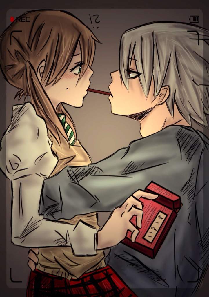
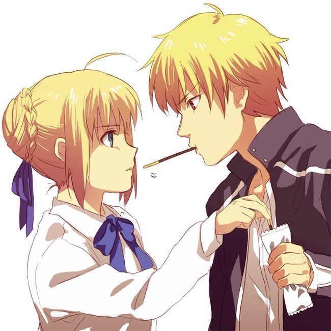
Introvert + another introvert = chatty me (extroverted)
This is a story about how i met my best friend. we were at a social gathering and he was being shy, so i decided to stop being shy myself and introduced myself to him. till this day, he is my best friend. Here, i wanted to use the colour red to symbolize the tense situation. Below is are my colour schemes:


 For this, i also experimented with complimentary and split complimentary colour harmonies. it felt like it could work in theory, but when i put it on digital it did not work at all because of the contrast. it was also difficult for me for the last panel especially, because at the time i did not know how to compose the picture.


after getting inspiration from the Archie comics on how to frame two people and a dialogue the colour harmony for the last panel was still difficult even when i opted for the analogous route. the colours were supposed to be good in theory but somehow was not showing in the digital. Because of this, i decided to mix the watercolours to try and get close to the digital, but also come up with a colour that would be of cohesive tone and hue:


with this the red transforms its meaning from being a colour to represent a tense situation to a colour that is passionate and excited. (did you spot archie andrew in the first panel? :p)
Single + disappointing boys = independent woman
This is a story of my life almost daily. In fact, this was inspired by me being caught as a third wheel between my best friend and his boyfriend (THANKS A LOT GUYS ). This is lso a story of my experience with almost every guy i encounter who tries to flirt with me; they end up to all be the same, disappointing. and so, at the end of the day, i become an indpendant woman who dont need no man (and punches cupids). For this, i used pink, the colour of love. to syMBOLZE THEIR LOVE NOT MY LOVE:


for these panels, i did not have much difficulties because i had been doing this for the past 9 panels. when it came to this, i tested the colours digitally and liked how it came out.


when i mixed the watercolour colours, i wanted the character of myself to have a little bit more warmer pink to set myself aside from the other characters and background. As such, the pink in the first panel was to symbolize love, but at the last panel it now shows a sense of authority as it now has been accompanied with the blue.
FINAL

i legit had fun with this assigment because im a lover of comics and colours. all in all, i was satisfied with my work and managed to make my own title with the Archie Comics typeface.
Some Takeaways:
I learnt about the bezold theory and did not even know i’ve been applying it to my work my whole life. for me, ive always thought bout it as simple outlining and defining my work, but now i’m more aware of the fact that it does give an illusion of making my colours darker when i surround my colours with black lines, or lighter with white lines.


Colour mixing is so difficult but so rewarding. personally i have always gone into colouring my work blindly, choosing colours that would work well in theory, and mixing pure colours from paint tubes and seeing where it goes. i think thats the fun in it; creating colours you’ve never seen before. also, god bless copic markers, i should really start investing in them.
Thank you for reading!