

For my process, I had researched the different graphic design eras that could fit the occupation of choice to serve as a guideline. After that, I had then also tried to use objects as the letters themselves, and wanted them to be able to be linked together and tell a story of the occupation. I also wanted my work to flow through time: from the ancient times to the future, in which i have had multiple exciting lives and occupations throughout my life, which is why all of the occupations are mostly surreal and shady.
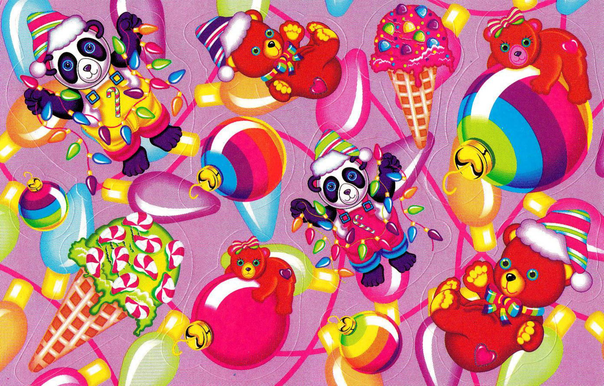
I also had initially wanted to follow the style of Wolfgang Weingart, however after developing my work, I felt that it would be better if i were to use Illustrator for this assignment, trying to emulate the style of Petra Eriksson, an illustrator for Refinery 29. For me, I liked the smooth style of her work as sharp edges are smoothed out, as well as having one big main focus in the composition through the use of bright luminous colours. Below are some of her works:


WITCH
I felt that the era that suited the Witch occupation the best was that the Art Noveau era, due to the organic shapes of the design, which i associated with whimsical qualities of the occupation. With this I researched about the different imagery found in the witchcrafting world, and as I wanted to make myself an evil witch, i decided to go into the slightly more satanic route.
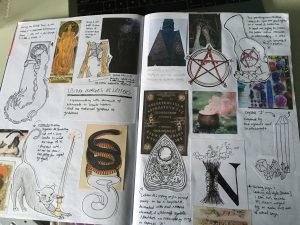
Whilst i had all the witchcraft imagery, i still did not know how to tie all of the imagery together. With this, i decided to start doing a composition inspired by oujia boards:

I did not particularly like this composition because I felt that it was too vague, as it could be confused with a ghost whisperer rather than a witch. The coulour choices were also not all that great because it did not look evil enough even though there was blood splatter. I then decided to take a look at another inspiration, the witch’s altar, after which i sketched more compositions:


Here, I liked how the final composition was going to look like so i started to do it on illustraror. It started out simple, without any colour direction as i needed to gain the main elements to spell JAN.


I felt that this turned out nicely, however felt that the colour choices would not fit the overall set of my other works, and that this still did not look evil enough. With that, i tried out more warm colour combination that would work together with my other compositions:

finally, I chose to use this work for colour reference as i felt that this would suit the best:


With this, i finally felt that my composition looked evil enough to convey my evil witch occupation.
Burlesque Performer
What liked about the burlesque performer is the glamor, feathers, and shiny things, which is why i felt that the art deco era was best suited for this occupation. I started sketching out different elements of the burlesque occupation, using the fonts as guidelines. After trying to link all the different elements that i had draw out together into a single composition, I decided to have a focus on just one subject in the overall composition:


I liked the composition of the burlesque performer, so i decided to go on with it:


I then decided to use the setting of a burlesque stage for the background of my composition, and used colours from one of Petra Eriksson’s works as a guide:


With this, I felt that the colours belonged more to the burlesque performer occupation.
Killer Housewife
What i had wanted for the housewife occupation was not only the 50s mid century modern housewife, but also a killer mid century modern housewife. What i liked about this occupation was the juxtoposition of a killing machine and a loving housewife.


i liked shape of the objects that created JAN, being the axe, a skirt, and towel, which i felt painted a killer and a housewife at the same time. i also tried to make the floor a chessboard pattern to try and date the era i was inspired by:
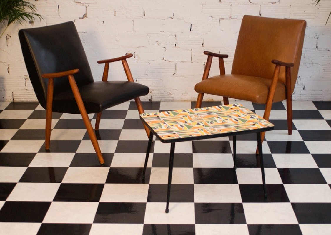


Whilst i like the composition and colours of the composition above, i felt that it was still too plain to me and there was not an exciting use of the colours. With that i tried a different approach:


To me, the above composition feels more interesting through the use of colours.
Sith Lord
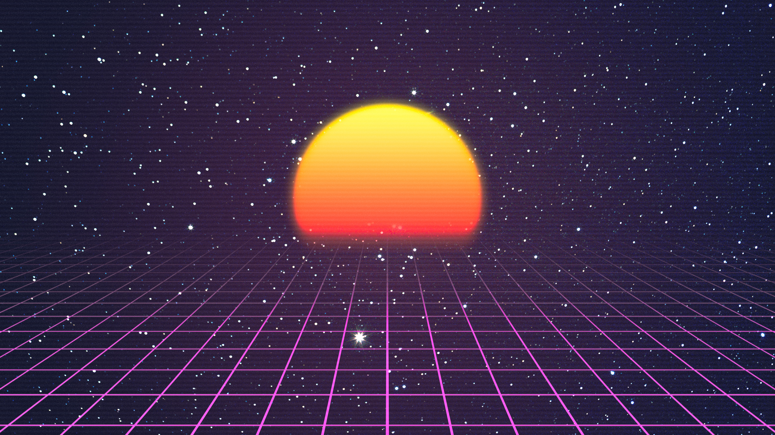
I was inspired by the 80s and vaporwave aesthetic, which i felt suited this futuristic occupation. Initially, i had wanted to make this occupation the intergalactic princess, but after some development and consideration, i felt that being a Sith Lord (major antagonists of the Star Wars Films) was more appropriate. I felt that intergalactic princess was too vague and i had no point of reference, and after using star wars as inspiration for this composition, i felt that it suited better as i had more defining objects i could work with, such as lightsabers:


After not knowing what to do, i decided to use a scene from one of the Star Wars movies as a point of inspiration:


i tried a different approach, which made more sense to me. this was also when i decided to change my occupation to the Sith lord:


I liked the composition above, so i decided to use this, and then decided on the colours:

wanted to stay with the quintessential colours of evil characters (black, red, and white) but i found the combination of the colours jarring and awkward, so i used petra eriksson’s work and the vaporwave aesthetic as guideline:


With this, i really liked how the final of this composition turned out, and was still able to portray an evil futuristic Sith lord.
Thank you for reading!


