Video Reflection: How to Identify Fonts || Typography

First few seconds in and there is already comic sans slander I can’t take it anymore–


COMIC SANS

IS

THE BEST FONT

IN

THE WORLD!

we stan an overused and irregular legend! even though it is ugly i still love the typeface ironically


okay i’ve gotten my point across now on to the review:


I think I’m pretty good at identifying Futura now, after having done so much research on it for my presentation. I identify it through the capital A, lowercase j, and the very round ‘a’ ‘b’ ‘d’ ‘g’ ‘o’ ‘p’ and ‘q’s. You know, after my presentation on Futura, I can never unsee it.


Oh hey that’s Futura.”

“What’s that font? Futura? Lovely!”

“You know what would be a good font for these slides? Futura.”


Even though it is another legendary overused font, Futura has a more distinguished baggage of being a typeface icon of the 20th century, which is why people don’t hate it as much as comic sans.


For a beginner like me, i’m starting to distinguish typefaces using it’s broad categories, like Serif and Sans Serif, and it’s sub-categories like Black Letter, Geometric, Humanist, etc.


For specific names of typefaces, I still have difficulties, especially for those  that look similar to each other, like Didot and Bodoni.  However, I think through this exercise it really helps in training my eyes to be more sensitive in distinguishing typefaces.


Video Reflection: TED Talk || Typography

Wow! After watching this TED talk, it fund it super relevant not only to typography, but to almost all aspects of life. The main message of not compromising is very philosophical and really helps to turn perspectives around. For me, one of the examples that stood out is when the speaker starts to talk about the period on technological infancy in the mid 80s. The issue now was about the size of the fonts, and the way it was being designed using vector technology. For serif fonts, a lot of vector points were being used to create the elegant fonts, which resulted in the sans serif being more economical.


However, the speaker goes on to say that when he designed a serif without the curve, instead using polygonal, it became a design solution for a non-existing problem because the engineers had already solved that issue the week before using code, which meant that now they could have as my different types of font on the computer with no problem. While this meant that the speaker’s solution of the polygonal serif font might seem not needed anymore, he still did not throw it away, because later in the future when Microsoft contacted him, there was a new series of problems where they needed a core set of fonts to fact up to the problems of reading and writing, which was the coarse resolution display.


I could go on to talk about his story, but to me the main ideology behind this is that he never gave up, never compromised. Does creating a design solution to an issue that was already solved mean that his work was for no use? Does the limitations of technology/medium that he created at the time a compromise or simply just working around the constraints? I feel that working in constraints shouldn’t stop us as designers, rather challenge us to create more things out of the box.


To me, I’ve always believed in the age old saying that “a good craftsman never blames his tools”, which encourages me to find creative solutions to problems that were never that big in the first place, if you thought about it in a different angle, or maybe change your priorities when tackling a project. One of my favourite lines from this video is:


“Satisfaction in doing something that cannot be perfect, but still can be done to the best of your ability.”


It brings me back to a time when both my O-Level Arts and Malay Language teacher told me the same type of advice because i was more concerned about grades rather than learning, and was so afraid to fail. I was stressing out because i was also really bad at the subjects. I think that now, i have a new perception towards failing; Though it might not look pretty in my graduation script, I don’t think that it should matter now that i’m studying something creative. Instead, i should focus on my qualitative contribution as nothing is ever perfect and there is always room from improvement, and as long as you know that you’ve done the best that you could, that’s good enough.

Art Nouveau || History of Design

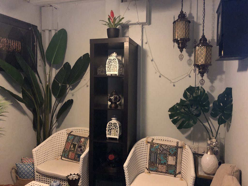
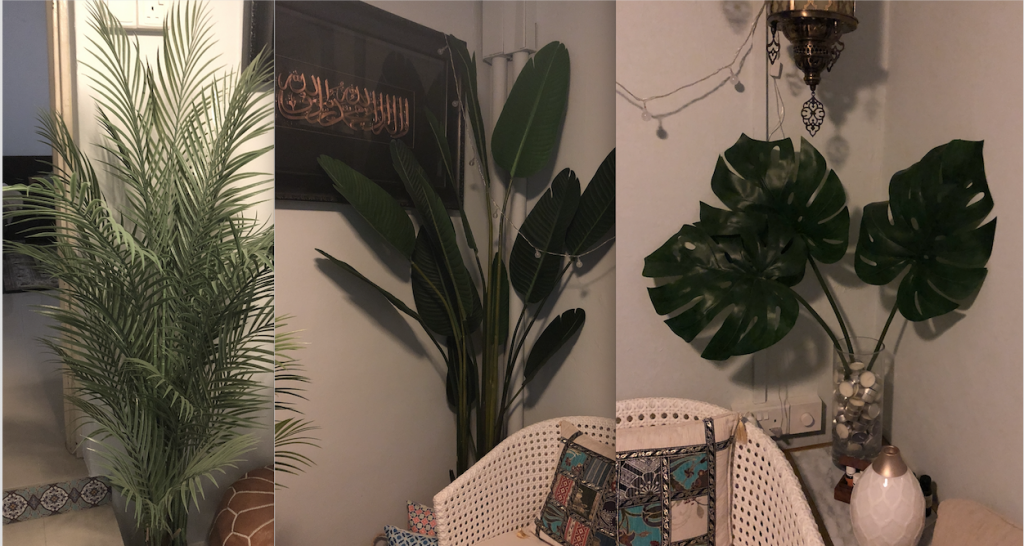
I really like Art Nouveau (it took me 4 tries to get the spelling right) because of it’s very ethereal, goddess-like, very calm and ideal perception of life. Though, i’ve never been one to aim to become an arts and crafts designer myself, sometimes when I calm down and go into a fantasy world, I do think of dragons and magic and beautiful women too :’) I went home for the weekend, and in my house, we have lots of plants. My mom LOVES them: both fake and real plants. She kind of has this Moroccan aesthetic thing going on, which is very tropical but still decorative at the same time:


Did somebody mention Morocco?
Tropical plants


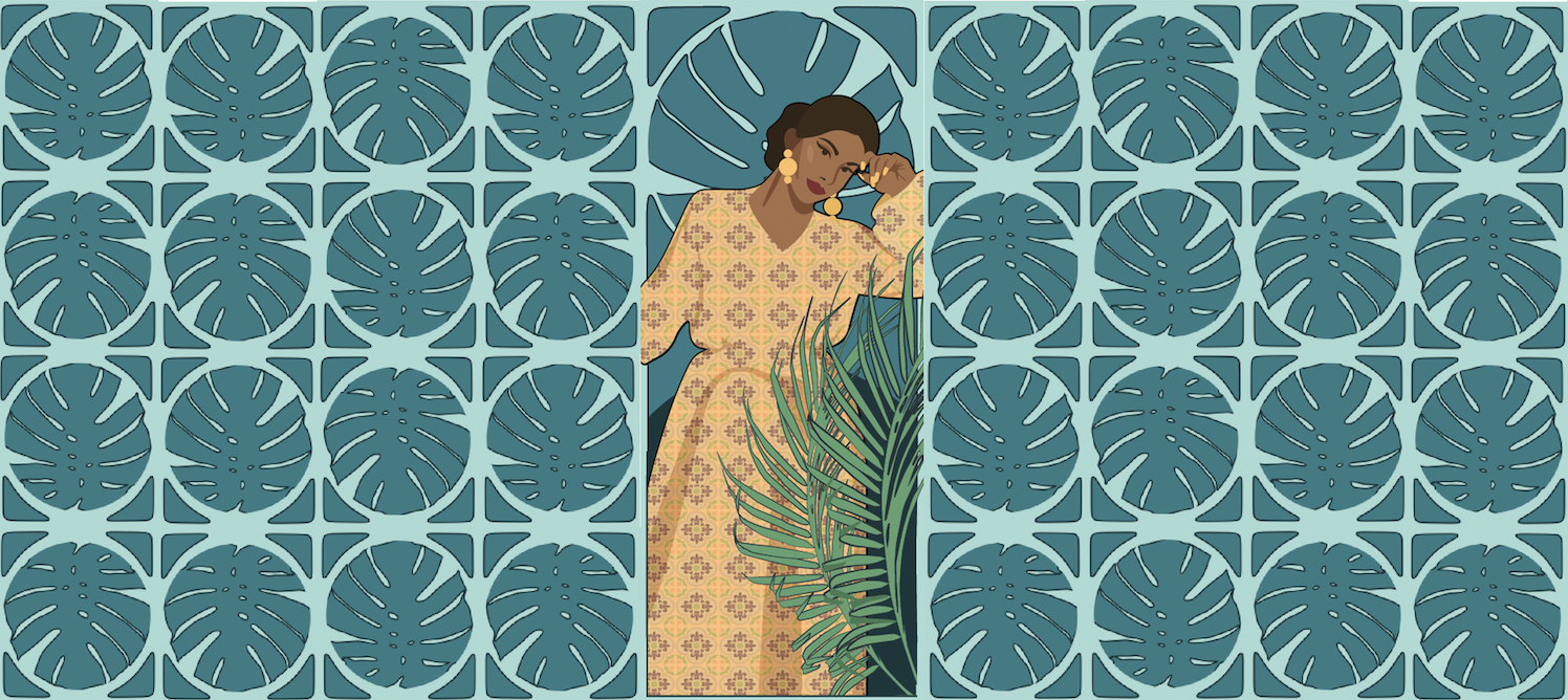
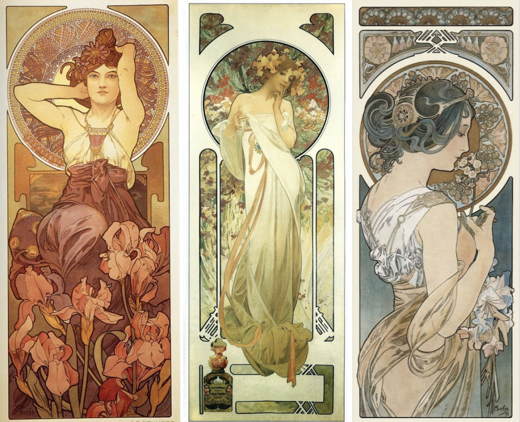
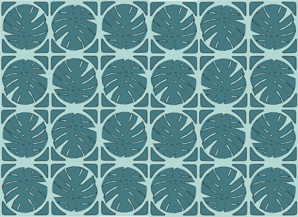
I used the Philodendron plant as the centre of my abstract pattern because it is the most iconic tropical plant. Also, i used a bluish turquoise kind of colour because of the Moroccan aesthetic. I kind of kept it simple (even though that’s not very art nouveau of me) because i kind of wanted to get the round corners in to create an organic square shape, which is one of the characteristics I find in late Art Nouveau styles, mostly inspired by the likes of:


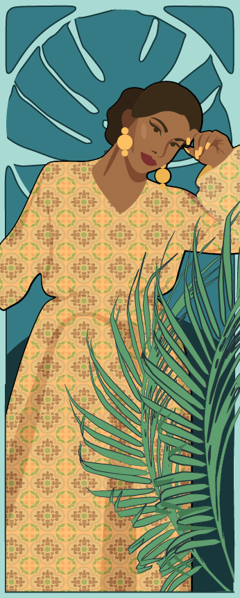
My tropical take on Art Nouveau:


Also because I was in the mood for it:


Even though it should be more detailed and done with more care, I found it fun to do this tropical take on the Art Nouveau style!


Art Nouveau in Singapore culture? More likely than you think!!

For me, learning about the arts and crafts movement was um….interesting. I feel like we’ve been doing this for the longest time though coughcough

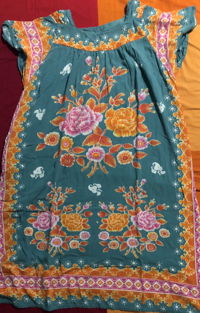
my batik pajamas
Related image
more batik for your soul
i wonder why William Morris’s design are put on a pedestal, looks like something my grandma would wear HMMMMMMMMMMM

but other than the normal everyday things that i own in my house, the Art Nouveau and Arts and Crafts movement is still prevalent in Singapore’s design landscape, example the gate at the Singapore Botanic Gardens.


In conclusion, Art Nouveau and the Arts and Crafts Movement are not dead! but please keep that far away from me, it’s so gaudy and i’ll use it only when i want no one to see me! or maybe if i’m feeling more southeast asian than normal. or pretending to be a witch in lord of the rings.

Ideate || Design Thinking

For our ideation, we separated the ideas into two:

  1. Environmentally Packaging
  2. A fun experience

After presentation, we have decided to put our focus more on environmentally friendly packaging as a way of empowerment. We will also try to keep creating a fun experience, because things have to be fun in order for people to want them!


below is the video 🙂


Haiku Handout || Typography


I could write Haikus all day if you wanted me to; i’m so good at it. The Haiku above is:


Typography Class

My brain is not working now

ERROR 404


This haiku captures the fact that i had a morning class, and i hadn’t had coffee yet, and only managed to get a cup when typography class in the afternoon started. For the poster, i was inspired by this Bohemian Rhapsody code below:


I felt that the non-linear way of writing the song lyrics was genius because i could still get it even though the actual song lyrics were not used, and the sentence structure was all jumbled up. To make this i went onto the OSS Typography class website, right clicked, and pressed on “view page source”:


It gave me a wall of code to play with. I wanted to go a little bit technological with my design because of the ERROR 404 at the end. The code that i wrote in the poster makes no sense, i actually wish i could make sense.

Expressive Words Opposing Pairs || Typography


For this short artwork i was inspired my insatiable need to keep everything in order and in check all the time. i use the word insatiable because i ALWAYS. NEED. ORDER. Well, i try to, anyway. I also put them in grids because that’s how I organise things as well; be it in a daily planner or my numerous cabinets to keep specific categories of things.  This is why i chose black, because its is a very basic tone and shows a no nonsense kind of attitude. This is how i choose to dress myself too; All my clothes are a monotonous black and white tone. Order is what I want to be.


As for the chaos part, I tapped into the part of my head where i was more diva-like, all fun fun fun! and a little loony. I chose the brightest pink I could find because it really speaks volumes about how much of a bimbo diva crazy woman that i actually am (in the inside)! Also because it contrasts with the black i used for the order part.


Also, did you notice a fine grey outline of the word CHAOS in the bottom half of the white boxes? It was a way for me to show how the word CHAOS had a life and personality on it’s own, not wanting to be boxed in. That’s why the letter C went to the last line; it wanted to be with it’s other crazy friends instead of being all alone together with the borings. I didn’t want to make the grey lines too thick or else it would have been too convoluted. I used only one typeface for this: Helvetica. This is because i wanted to show the duality of an individual person, made possible just by how they chose to dress themselves (like meeeeeeeeeeeee)


From the feedback, I understand how it would have been better if the word ORDER was not part of the grid, instead stood by itself inside the box I created. It also would have been clearer if i made the grid lines thinner than what it is.


Reading and Video Review: Dadaism || History of Design

I’ve been interested in Dadaism and it’s aesthetic because of how edgy, purposeful, and funny it is. I first learned about Dadaism when I was exploring surrealism and post-modernism, and what other art movements would come up next in my time and in the future. Dadaism was not made to be pleasing or beautiful, which to me is a very bold and courageous move outside of my comfort zone.


From one of the books I’ve read, 101 Things to learn in Art School by Kit White, she writes that “24: All Art is Political”. To me, the Dadaism movement really exemplifies this as all the choices in the mediums and subjects all return to the fact that art created during the time was a reflection of the negative reactions to the First World War in the 1910s. Often times, we hear that Dadaism is about being anti-war. But the one below might be difficult to understand it as such:


The one work that I feel is very iconic of the Dadaism movement is Fountain by Marcel Duchamp, 1917. I think the fantastic thing about this was that he forced people into questioning what art meant. Using a readymade object of a urinal and presenting it in a gallery is very controversial and risky of him especially at a more conservative time, and there were more rigid rules about who and what could qualify as art.


“How is this a piece about anti-war?” One might ask. Me too, until I started learning that Dadaism was also about mocking the materialistic and nationalistic attitudes of people during the war years. To be honest, I would be pretty annoyed too if everything I saw was propaganda and support for the government who was responsible of screwing the people over in the first place. This artwork represented the amount of spite I’d have on the “pretentiousness” of people who felt that they were of higher class just because they could “get” abstract art (how bourgeois of you to be able to understand a urinal sitting on a pedestal, care to tell me more about it?). What I understood from “Fountain” was that Dadaism is a form of dark comedy and should be enjoyed as such.


I guess you could say he was just taking a piss *ba dum tsssss*


glasses on floor of sf moma mistaken for art (7)glasses on floor of sf moma mistaken for art (2)glasses on floor of sf moma mistaken for art (4)glasses on floor of sf moma mistaken for art (5)All pictures by @TJCruda

If I could point to one contemporary example of Dadaism, it would be that kid who put his glasses on the floor at the MoMA and people looking at it as if it was an artwork. This form of “Neo-Dadaism” really magnifies the lengths people would go to put a line between art and life, but in reality, the boundary is very thin. I feel like the same audience wouldn’t have acted as such if those glasses were next to a trash bin right outside the MoMA though. I wouldn’t go so far as to calling that kid a Dadaist, but he definitely did act like one in the moment.


Regarding the video, I did not understand anything. However, I feel that even if you could speak the language, you still would not be able to understand it because of how “loony” it is. There actually is a level of coordination and choreography, so to an extent, it is not that random. However, after having read an explanation of the video, I found it interesting that….I still could not understand. To me, I think this is the cause of me having never experienced the horrors of war myself. I feel like I can understand the sentiment, and it would have made a huge difference if I was a woman living in 1927 and watching this performance.

What I did understand, however, is that the performance was a huge success, and the halls were so overcrowded that many could not find a seat to watch it at all. It was something that people of the time really identified with and really enjoyed, which further goes in line with blurring the lines of the art and life. It was a type of “art for the people”.

When I first started the video, I think the one thing that kind of stood out was that most of  the names being said belonged to men. Why were there so many men? Was it because men were the ones who suffered the most in times of war because of facing their enemies head to head in the time of battle? While that may not have been the main point of the video, I felt that it was an interesting observation as to why many Dada practitioners were men.


Sources:

https://www.theartstory.org/movement-dada-artworks.htm#pnt_4

http://www.cabaretvoltaire.ch/en/history.html

Guy Puts His Glasses on the Museum Floor and People Thought It Was Art
 

Visual Research || Visual Communication 1

One Glitchy Gal

The reason why I chose glitchy event posters was because i wanted to represent the anti-art aspect that i’m going for. I think that as technology gets more integrated in our lives, “breaking down of technology” is different from the organised, clean, and “perfect” role it has in our lives. For me, I want to go for an off-tone, visual overload, cultural symbolism kind of ‘mess’. Also i think that there’s a comedic value to it.


I really like the poster above because at first glance, it communicates culture.  This is because of the use of symmetry and imagery of “Hindu gods”. To me it gives a very asian centric design, and the first emotion that i got from this was “exhilaration” even though i don’t know what this event this poster is for.


For me, i found the poster captivating as the use of colours is very bright and modern (digital), but then it is juxtaposed with a traditional-like asian design. I feel that it would attract attention because of the level of detail in the poster as well. Being a circular shape-driven poster, having the text right in the centre and in white, making it pop out from the other colours, help to facilitate the reader to look at the main information that the poster is trying to convey. I find this to a a very attention grabbing poster. I find it interesting how it still looks contemporary without being modern/minimal.


This poster is even more glitchy than the one above, and i feel that it communicates a futuristic, dystopian, and hyperactive kind of narrative. The first emotion i got from this was that i felt a bit more dangerous and risky.


For me, i found the poster captivating because it is very flashy and edgy because of the use of bright digital colours, glitches and pixels on the black background. It also looks rough and grungy because there are specks of pixels all around. The portrait in the center uses a yellow colour as highlight, which is nowhere present in other parts of the poster. However i feel like the poster did not facilitate my reading well because they were white and condensed, which kind of blended in with the other white and condensed elements of the poster. Though i feel like that may be the intention? because it then makes you really look through the poster to find the information (though, i wont be attempting anything like that…)


Other posters i find interesting:

All in all i think both posters can sum up what kind of poster i want to create for the NDW 2019: where culture and technology collide. I feel that i can show off Singapore’s multiculturalism, as well as becoming a more integrated country. In terms of representing sustainability, I think that there could be an idea coming from the whole concept of the “breaking down of technology” itself, but i’ll have to look again and decide whether i really want to show sustainability.


Define || Design Thinking

How might we..:

  • How might we create a social experience while keeping convenience in mind?
  • How might we make packaging important?
  • How might we redefine the time they don’t have?
  • How do we empower individuals to care about the environment?


Here, we also had new insights:

  • Not just throwing away food, but a whole new expeiurence
  • Ordering food & environment, empowering people
  • Not giving them a choice to recycle, making people think it was as if they made the environmentally conscious decision to recycle

Empathy 2 || Design Thinking

Here, we re-did the interviews and asked better questions, and really tried to immerse ourselves by interviewing people during lunchtime. From here, we also tried doing the empathy map and characterisation, which helped us get better insights and create a proper POV.