
The main idea for my menu was a visual violation, and i think i got that aspect done really well. But i still used grids okay! i used converting to text because i find that easier.
Welcome to the 4th Dimension

The main idea for my menu was a visual violation, and i think i got that aspect done really well. But i still used grids okay! i used converting to text because i find that easier.

I don’t really care about the awards he’s won. It’s great that he’s being recognised for his respectable contribution and works, but for me as a budding designer, i’m not really concerned with getting awards. I feel like it’s just an ego boost for no reason. Congrats to Lubalin though! To do this review, I will be looking at one artwork and try to make sense out of it through the articles that i’ve read.
Theory of meaning, and how meaning is communicated:
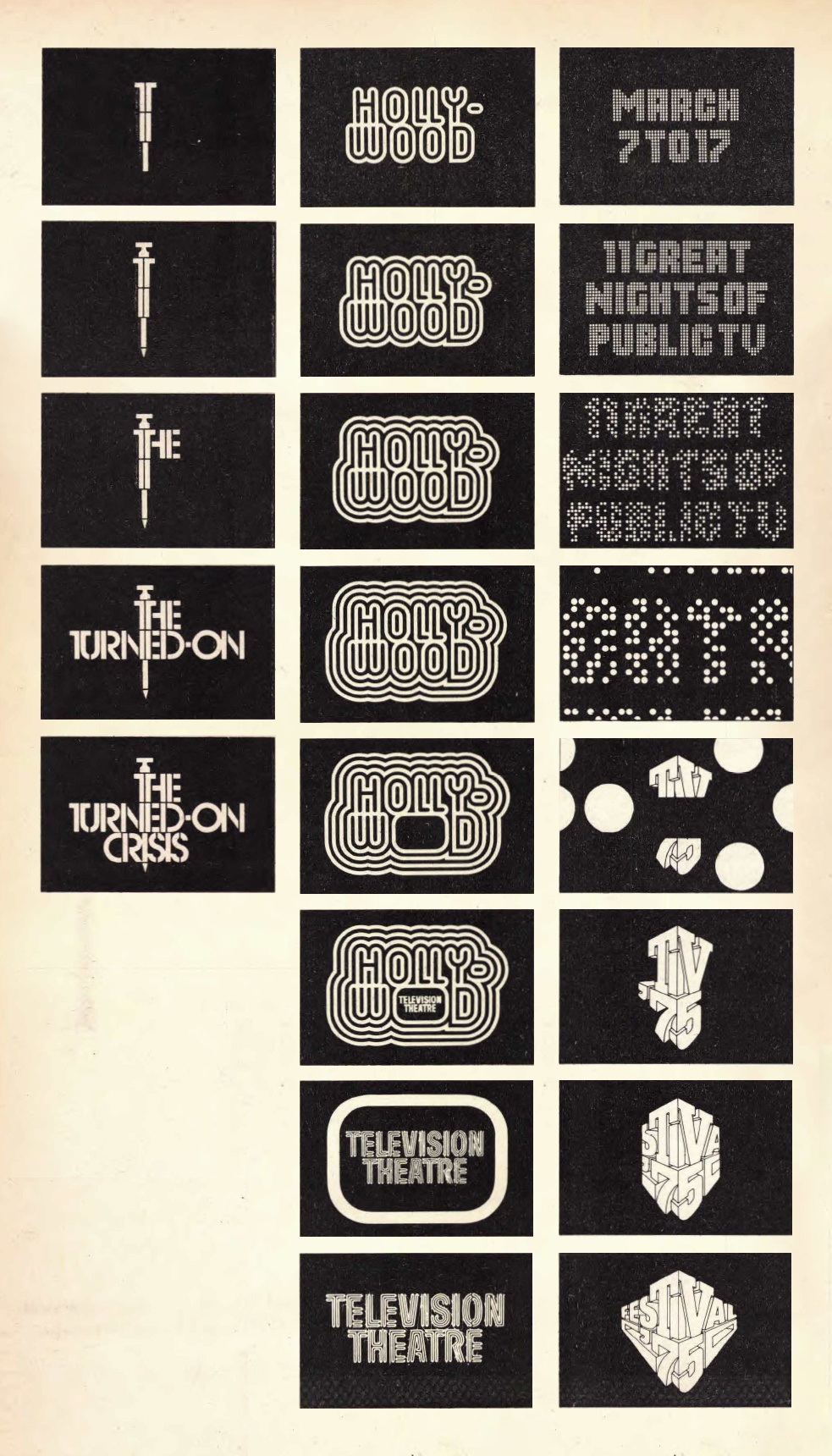
This section of the article talks about Lubalin’s ideology of how an idea is moved, which starts and ends in Typography. He sees ‘typography’ as a designing of letters rather than putting characters down in the page.
In the above example, the animation frames show the movement of the custom typefaces he created, and how it reflects what the “show” is about. For instance, the Hollywood typeface is reminiscent of neon lights, broadway, and showbiz!

I really enjoyed the video of Erik Spiekermann’s talk! He is very blunt and sassy, which is something I always appreciate. For me, I find his branding work quire important in the digital age, especially when designing for websites or apps that have varying specs and requirements.
Some of the quotes that i find interesting are:
Here, his typeface looks better, but the ones that were not designed by him look bad because the screen is too sharp.
I think the fact that he called out the screen for being too sharp and the typeface not being suitable is compelling, because i’ve never actually noticed how the specs could influence how the typeface would turn out on web.
For me, again, this is another observation that i’ve never noticed. Only now then I know, For example, the first RBMA app design looks very neutral and lacks proper identity, other than the logo (which I agree, desperately needs a redesign because it doesn’t work on a small scale). It has a very generic typeface, and the app looks mechanical and boring.


After the injection of some colour (orange) it makes the app look a bit more vibrant, but importantly the colour becomes the branding as it is now associated with the app. The introduction of hierarchy, typeface, size and contrast also makes the app more fun to read and better to look at, because of the variation.
This allows for the design firm to do whatever they want. The example of the 10 different posters for the RBMA world tour is very fun because it allows for the posters to be very localised to the place that they’re touring, and the logo is just secondary.


This is different from the Volkswagen branding, which is blue and features my favourite font, Futura, which doesn’t allow for this type of risk taking in designing.
I also realised this too in the beginning of the semester. Doing sketches on Adobe Illustrator us very useless because it slows down my process. For me, i sketch more on paper now before digitalising my work because I find that . can make layout and colour decisions faster and better, because i can visualise the image that i want without technical disruptions. I also work in black and white first because while i work on the layout, i’m subconsciously dreaming about the ideal colour situation that i want. I feel that technology should compliment the design process, not replace it.

Massimo Vignelli’s use of the very neutral and boring Helveteica is a very modernist thing to do: Straight to the Point
However, despite the blandness of Helvetica, the American Airlines logo he designed remained unchanged for 50 years. Why? I could only point out some aspects that made sense to me:
In another world where Helvetica is not boring…
For me, even though Helvetica is a super boring font, the use of colour value adds to the designs, making it appear more fun and approachable while remaining neutral.
But again, I still don’t understand why it has to remain neutral in a brand identity though. Maybe because in this new generation of millennials, businesses and organisations have to try and become people; have to stand for something, be it advocating for the LGBT or endorsing a celebrity athlete like Colin Kaepernick:

for the above poster, i find it interesting that there is a use of serif here even though the Nike branding is you know…. FUTURA.
okay not to stray too far off from graphic design, having Kaepernick’s face right there, huge and in yo face, is a very bold choice, a very risky move to take in the political climate in the USA. And then right below his chin is the Nike logo and slogan. (BAM!) If this isn’t brand identity in the 21st century I don’t know what is!!

From the video, I learned that the Bauhaus was the flashpoint of “modern design”. The principles of form following function and simplicity influences most of today’s designs.
It was interesting for me to learnt that the Bauhaus was created in the 1990s, during a very tense period with new technology popping out, which transformed the way people did business and how artists and designers operated.
In terms of Graphic Design, it has moved from the victorian, ornamental design to m a cleaner modern design movement, which we still use today.

Modernism as defined by the reading and the dictionary is the reducing to it’s most expressive form. However, the author goes on to write that there is never really just a single truth, as modernism is not applicable for every single situation.
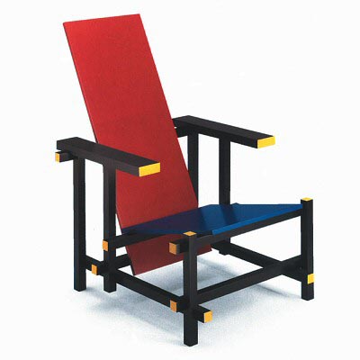
For me, i’ve also agree that there “is certain arrogance in the idea that one can develop a universal methodology that works in every problem”. It sounds very inquisition-y to me hehe. For instance, reduction and simplicity may not be able to solve all problems. Like, for instance, the De Stijl Chair.
However, there are some parts of modernism that i also believe in. And one of it is the aspect of accomplishing the intended task. For me, i feel that this is where designing with a purpose comes in, which brings me back to my Design Thinking class. Could that be an aspect of Modernism being magnified so that we can study design problems in depth? V interesting.
Another one is not to imitate reality. For me, i can agree to this to a certain extent. Because i am also tired of seeing designers trying to create images of things that are close to reality, which at the end of the day is very pointless because it is not interesting and doesn’t. In the article, it says “Life is erotic; Modernism doesn’t carry that.” That is true in the article’s definition of modernism, which basically says that modernism is “all work no play makes jack a dull boy”. Basic shapes can only last for a period before the graphics become very exhausted and played out.
However, for me, while i agree that you’re not trying to imitate reality here, making the familiar unfamiliar is what makes your designs unique in a way. For example, the Japanese design movement Wabi Sabi works with object we are familiar with and embraces it’s imperfection. It’s very minimalist, but very organic.

This, compared to the De Stijl chair, feels more homely and human like, instead of having a “fake human” design.
Being a digital age baby and post-post modernism (?) adult, I find that the philosophy behind modernism is still very strong and timeless: to design with a purpose, to accomplish the task at hand. But I think it’s time to start looking at more human-like elements in our designs.
Readings:
Bierut, Michael. Looking Closer. Allworth, 1997
P43-49 Some thoughts on modernism: Past Present and Future by Milton Glaser, Ivan Chermayeff and Rudolf deHarak
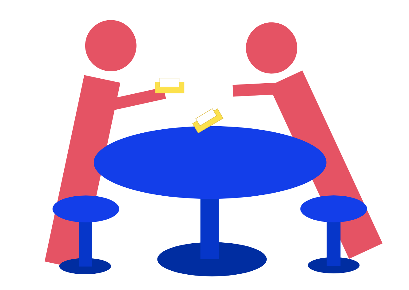

Have you ever seen a crime scene in Singaporean public hawker centres? Tissue packets strewn across the tables, their innocent plastic bodies displayed to show it’s owner’s power during the busy lunch period?
Something unique to Singapore eating spaces is the use of tissue packets to reserve seats during lunch time, as a way to assert your dominance to other people that THIS IS YOUR SPOT. Here I drew a Chope War. Chope means ‘Reserve’ in colloquial Singlish, and in this image there are two people fighting over the table.
Blue for the table because it is the usual colour for hawker centre tables next to white.
Red for angry people fighting against each other
Yellow for the innocent tissue packets being used as weapons of mass reservation.

Disgusting!!

Love and Admiration….


