Applied Illustration [Research & Process] || Illustration for Designers

Concept

For this assignment, I was inspired by American Horror Story: Apocalypse, where the main character had been adopted by a group of satanists when he was a baby, and when he grew up they realised that he was “The Chosen One” and his real father is Satan.

Related image

The show tells the story of the difficulties they had when raising him (murdering animals & people, conjuring satan, causing the apocalypse, etc). So I wondered “you know, all these problems could have been avoided if someone helped these satan worshippers parent,” 

Which is how i came up with the idea of a Mother & Baby Fair: Baby’s First Ritual.

Deliverables & Target Audience

Mother & Baby Fair: Baby’s First Ritual is an invitation only event for young Satan worshipping mothers out there. Some of the incredible things you will receive are:

I will be designing for two groups of satan worshipping people: 1) Mothers 2) Children (infants & toddlers)

  • For mothers: Invitation card, lanyard, & swag bag
  • For children: Onesie & activity book

Initial Stages

From the previous assignment, I felt that coming up with thumbnails and creating a mood board helped me a lot.

15 Thumbnails

While i didn’t use most of these illustrations, I think that’s okay because some of the concepts were used for later illustrations.

Moodboard

Initially, I wanted to do a black and red colour scheme for the illustration to SCREAM satanism. However, later during the illustrating process, I found that it was better to go with a softer version of this mood board, which in turn sets a more ironic tone for my illustrations (will be explained as we go along.)

Style-spirations

Witch Mom, Elif Varol Ergen #goth
Elif Varol 
I got The Devil! Which Tarot Card Will Describe Your Day?
Medieval drawings

From my other two illustration assignments, I had a lot of fun exploring line art and how it told stories from different eras. This time, i wanted to use line art to make my work look more like illuminated manuscripts more. I chose this particular design aesthetic because whenever satanism is shown in movies and TV, it’s always some ancient thing from the medieval times.

Process

Invitation Card: An attractive pamphlet that will encourage young Satanic Mothers with young children to attend the event. 


Character Inspiration.

I had to include that wholesome mother and child element to represent my audience. I used examples from 50s illustration.


Composition: Symmetrical compositions in both horror shows(American Horror Story & The Shining)

After watching more horror movies, i cam top realise that a central and symmetrical composition is always being used to assert the characters in the show. So, for the invitation card, i decided that i should also use a symmetrical composition.

Composition of invitation cards: Tarot Cards

i was also inspired by tarot cards, which in a way, are satanic. It is also because i felt that the layout of the frame and the main graphic could work in my favour.

More Satanic elements: Style of fire (top) and design elements to make the tarot card symmetrical (bottom).
Draft 1 Initially, i wanted to try working in black and white, however it looked way too satanic at this point and there was no comedy in it. Also i had no idea where to put the shadows here. 
After that failed draft, I took the under lighting inspiration from the Sixth Sense movie, because this lighting gave off a more scary vibe.
Draft 2
Draft 2 Detail

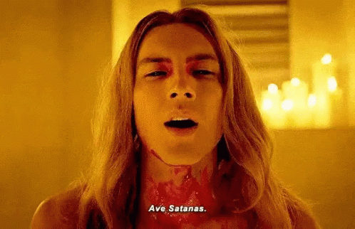
In draft 2, I established the visual hierarchy. Also i wanted a repeating element in my designs. I went with “Ave Satanas” in blackletter (Hail Satan in latin.)  It was not meant to be read easily, rather, act as a symbol that “hey, this thing is satanic okay.” In this draft i also established that the theme of the design elements were going to be the “fires of hell”, which can be seen in the background of the banner in the the draft 2 illustration.

Colour Choices:

Colour Inspiration: Elif Varol
Colour Inspirations

Initially, i wanted to use red and black. i also wanted to limit myself to the number of colours i used.

colour variations
colour variations
Final (or so i thought…)

I thought this was going to be my final, but then i still did not like this very much. It was too satanic and the ironic quality of the event was lost, and this looked more like a poster i would see at a bar or a club. At this point i hadn’t figured out my colours yet, but i just moved on to the next design first.

Tote Bag: To carry things around during the event and as a souvenir. 


From my thumbnails

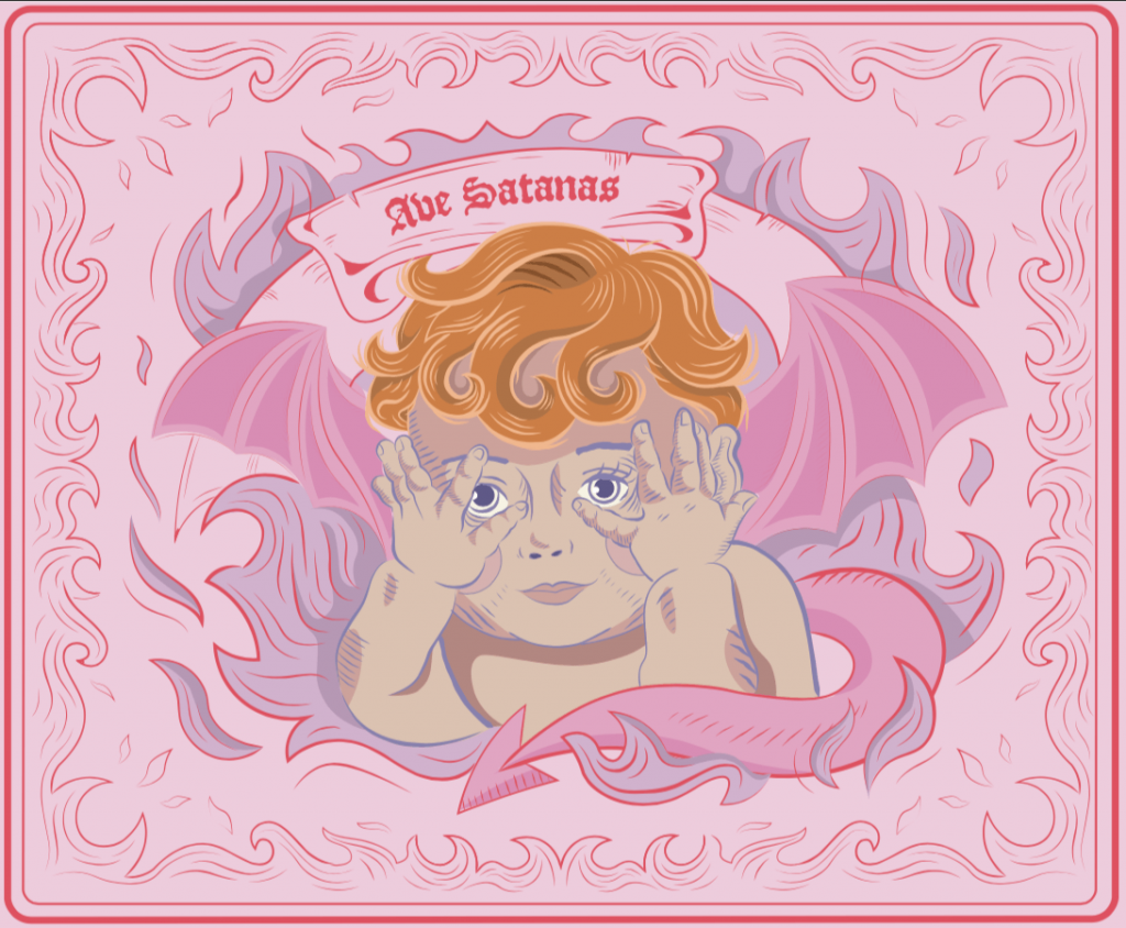
For the tote bag, the design inspiration came from one of my thumbnails, which was a design which was inspired by one of the paintings of cute babies from the 50s. I liked the fact that this baby’s hands were on it’s face and the main focus was on his piercing little eyes, which gave me the horror element of this illustration.

Imagery of Cherubs

To put the baby into a more satanic context, I decided to use this imagery of cherubs, which were supposed to be this delicate and cute angels. But then since mine was the fallen angel, i was inspired by depictions of Lucifer.

Character inspiration

These are depictions of Lucifer from the horror show I watched and a renaissance painting of Lucifer crying. From here I used design elements of using red curls in the hair.

While i was drawing the curls in the hair, i realised that i could make it look like 666, as a form of subtle satanism.

Image result for vintage frames
The fire pattern  i used in the design were starting to look like vintage frames, which i liked because there was that element of irony which i wanted: the vintage frame was supposed to be elegant and graceful, but for my illustration, it was going to be made out of the flames of hell.

Above, I coloured it in using the colour scheme that i wanted. However, i still felt that something was off, because it really didn’t say anything about the softness of wholesome motherhood.  So i did research on a softer approach to satanism, something that was more mother and child friendly:

perfection.

I decided to then flip the whole colour scheme that i wanted on it’s head and make it a pastel hell fantasy :D. Below, i was happy with how the colours helped to bring out the ironic quality of my event out:

Final

It worked so good that i decided that i needed to change the colours of my invitation card as well:

recolouring the invitation card

Button Badges: Form of identification during the event and to keep as a souvenir. 

For this button badge, I  was inspired by pentagrams, and how they always have a goat in the middle. The Baphomet. Since I had already established my design elements and colour schemes, the illustration for this and the final came easier to me.

Image result for pentagram
pentagram as an identification
Character Inspirations

I googled cute goat because it was an event for a mother and baby, so of course it had to be cute.

Final

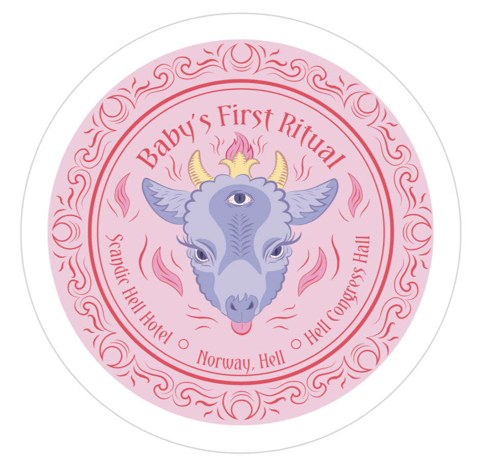
Before the final, i had one version where the goat did not have the middle eye. But after consultation, As it was also going to be a souvenir, i decided that i needed to also put event details in the button badge.

Baby Onesie: A souvenir gift for the little oneImage result for satan onesie

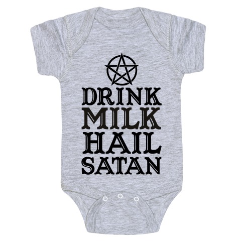
Some quotes for the onesie:

  • “The Chosen One”
  • “Cute as Hell”
  • “Spawn of Satan”

I decided to go with Spawn of Satan, and was inspired by the satan stork concept i had drawn in my thumbnail sketch. In the horror show that i watched, the father of the antichrist was literally satan, so i decided to make satan a dad in my final illustration.

From my thumbnails
Image result for baby riding stork
Picture of baby riding a stork.
How pop culture depicts Satan

I used the stereotypical look of what satan looked like in pop culture.

Also i gave hum a tie to make him look more fatherly. :,)


Final thoughts:

I enjoyed this assignment because i got to experiment with juxtaposing wholesome and not so wholesome things to make something that  works :,)


Varoom Research & Process || Illustration for Designers

For this project, I chose the topic of Obsession. The obsession for this project is:

Obsessed with Nostalgia

Exploration on the anatomy of 80s nostalgia in pop culture:

Annoyance is a great motivator. Currently, i’m seeing an obsession with the 80s aesthetic and romanticisation of the era in contemporary pop culture, and people my age (who did not grow up in the 80s) are also wishing that they could grow up in this period.

It is annoying for me, when people my age say that they wished they could live in that era, because i’m pretty sure if they were to travel back in time to the 80s, they’d wanna come back to 2019 as soon as possible. It’s like people are obsessing about the 80s but forgetting the crisis and problems happening during the era.Through this illustration, I want to take a critical stance on this nostalgic romanticisation of the 80s. 

Key Points covered in article and video essay:

  • 30 Year Cycle (this refers to the romanticisation of eras by the present generations, for examaple, the 80s romanticised the 50s, the 50s romanticised the 20s.)
  • Anatomy of Nostalgia
    • Restorative Nostalgia: Recapture and reiterate the past, more to documentation
    • Reflective Nostalgia: More escapist, longing to things that are lost to time. Emphasis on the simple and stability of life.
    • Deconstructive Nostalgia: Critical of the past, highlights issues prevalent during the period
  • Nowadays…
    • 80s nostalgia Is very popular
    • It’s affirming & comforting
    • Is a mirror to the present: looking back to the past for the hope for the future
    • “It is a reflection of the past as we want it to have been seen, as in the present”

Target Audience

I’m addressing to people who are into the 80s craze right now. Which is my generation and younger (Millenials and Gen Z). Who never really grew up in the 80s, and are getting a romanticised version of the era. Where the 80s nostalgia affects them in fashion, music, and film, design. People who look to the past for a sense of comfort & escapism, look for hope for a better future.

I also think this is a good opportunity to talk about the AIDS concern, because recently Singaporean HIV positive people are also going through this (because of a cyber attack which outed HIV patients.) I want to take a stance on how Singaporeans are just following trends without realising that they are repeating the wrong side of history.

User Character Profile

(((((don’t mind me just using characters from Back To The Future because it’s an 80s theme..)))))


Illustration Ideas:

  • A reflective & deconstructive illustration of the 80s
  • The illustration will seemingly be about the reflective nostalgia of the 80s
  • To criticise the reflection of nostalgia, I will be highlighting the 80s AIDs crisis

Illustration Process

Thumbnails

My thumbnails. Found this technique to be very useful.

The common theme of my thumbnails is of a young person enjoying the cultural products of the 80s, dancing around like Cindy Lauper, watching the “80s” shows on TV, while the “older” people are suffering from the crisis and problems of the era.


My fav thumbnail

From my thumbnails, this particular one is my favourite because it’s got a dark humour element. The idea of this concept is…Freddie Mercury on an IV drip, performing his last performance.

The way that I would be showcasing the obsession is by the audience (of millennials) all having their phones up to record the performance, disregarding that he is slowly dying from AIDs.

I chose Freddie Mercury because till this day, he is still very iconic (eg. Bohemian Rhapsody Movie) He is also one of the more famous celebrities who have passed away from the 80s AIDS crisis, which would help me in my critical narrative on nostalgia.

Mood Board

Sketches

Thumbnail 1


Thumbnail 2


Thumbnail 3

Style Choice

Digital Drafts


Colour Choices

Image result for mona lisa


Exploratory Research Part 2 || Visual Communication 2

“Why are your assignments all about sex?” – A question of the universe that cannot be answered.

Gaining Insights

To gain even further insight into my topic of discussion, I created a Google Survey, where I asked different types of questions concerning Pornography. The purpose of the survey was to get a general insight on local Singaporean views on the matter, which would help me narrow down my scope.

Snippet of my google survey

Google Form: tinyurl.com/s3xypr0n

With 32 respondents as of 8th February 2019, the feedback I received were beneficial in this process, as I am able to make a lot of interpretation from the open ended questions I posed. Some surveyors also decided to do the survey in front of me, or come to me to express their opinions on the subject matter. From my observation, I gathered that generally, people were open and engaged in this topic because it hit very close to home for many (like…very, very close), regardless of race, gender or creed.

Before going forward with the survey, I also wanted to to know if a person’s lifestyle and values had anything to do with their consumption of pornography. I asked questions such as sex, gender, sexuality, and religion. Out of the surveyors, only 6 people said they did not watch pornography. All of them were cis-women, 3 Christians, 1 Catholic, 2 Buddhists. Needless to say these numbers don’t mean anything and I wasted my energy asking because majority consumes porn. 

Zooming into my Scope

Initially, my questionnaire was designed around the scope of Mental and Societal impacts of consuming Pornographic content. However, after getting my results, I realised that for the average singaporean (aged 18 – 24), the mental impacts of pornography were not as detrimental as claimed by the sources that I used for my research (which were US based). For instance, some individuals expressed that “Got so serious meh!! It’s not that serious.”

Open ended questions i asked about the mental & societal impacts of pornographic content.

With this, I looked further into my research to see what is a scope that is based more on indisputable fact (rather than something people may or may not relate to.) As such, I now have a new scope:

This project aims to raise awareness on the technological link of pornographic content and sex trafficking of underage children (18 years old and below). 

Design Objective & Target Market

The objective of the design challenge is to empower youths to be more aware on what they are actually supporting when they consume pornographic material. I cannot shame people into not watching porn, and it is kind of inevitable because even those who don’t watch porn were introduced to this concept when they were young. So the next best action is to educate. 

The target audience of this challenge is for people who are born when the internet is prominent in their lives, Millennial & Gen Z, and are always connected to the internet. Other factors include:

  • All genders
  • Mostly heterosexual
  • Porn is a normal thing in their lives
  • Mature, because they know the difference between good and bad (morals)
  • Use pornographic material for mostly pleasure
  • Use the content because it is instant & convenient
  • Have easy access to pornography on their smart portable devices

Defining the problem & Generating “How Might We” Statements

From my survey, I generated a Point of View statement that would help me define my topic.

A pro-porn user WANTS accessible and anonymous pornographic content for pleasure and leisure, BUT does not know that the content comprises of children who have been sexually trafficked, coerced, and threatened to perform.

Some “How Might We” statements to help me kickstart my ideas for my infographic and design challenges:

  • How might we make people care about the reality of the “fantasy” they are consuming?
  • How might we reduce the demand of outrageous content and the cycle of child sex trafficking,? (this refers to pornographic content being more and more extreme as the years go by.) (by educating the younger generation?)

Infographic

Objective: Raising awareness on the technological link between pornographic material and sex trafficking of children.

As this is now my new scope, I believe that my infographic should play the role of introducing my topic gracefully before anything else can happen. As such, I will be conducting research on the statistics for the inseparability of pornographic material and the sex trafficking of children caused by the internet.

Design Challenge 1

Objective: Audience to question their morals by comparing their purpose of using pornographic material versus the reality of the victim’s torture. (Also, why do you feel guilty after masturbating to porn?)

From my research, It has been observed that the majority have a pro or a neutral stance to pornographic material. Many of the respondents indicated that they watched pornographic content compromising of a number of reasons, some being 1) Sexual pleasure 2) Instant gratification 3) Sexual education 4) Temporary Dopamine. While these reasons are normal enough, when posed the question:

“Would you continue to consume pornographic material if you knew that the “actors” were being trafficked/threatened/coerced to act?”

many of the users said they would not because it is unethical. Some also acknowledge that they would still continue to because it is difficult to identify whether the actors are trafficked/threatened/coerced to act.

As such, I want the first design challenge to answer my first “how might we” question, about being caring for the reality of the “fantasy” they are consuming. 

Design Challenge 2

Objective: The audience will learn about how exposure to pornographic material at a young age can have negative effects on a person’s mental health and relationships.

From my survey, there were two categories. One, I asked how old they got introduced to the concept of pornography and how old would be the appropriate age for children to watch porn. The results are:

Whether they discovered pornographic content accidentally or out of curiosity, it was almost evenly split, with only one extra for accidental discovery. From this, it shows that pornographic material is quite inevitable that people will get introduced to it. (The sample also takes into consideration people who don’t consume porn as well.)

My survey also points to technology being the biggest culprit for the widespread of pornographic material. Surveyors indicate that censorship in mainstream tv & media does not work because it is readily available on the internet. (one person made an interesting statement that censorship increases curiosity in people, which they will then go to the internet.) Most of them also indicated that they consume pornographic material using the internet.

However, according to research from Bitdefender, kids under the age of 10 are now accounting for 22% of online porn consumption, among the under 18 age. This is caused by pornographic material being more accessible, anonymous, and affordable than ever before.

As such, I want the second design challenge to answer my second “how might we” question, about reducing the demand for more outrageous content and the cycle of child sex trafficking, through showing the dangers of pornography on a young mind.

info: https://www.irishexaminer.com/lifestyle/features/how-to-educate-our-youth-about-pornography-addiction-and-dangers-439395.html

Conclusion

This contradiction between morals and reality is good news for me because now I can play with this uncertainty people have about pornographic content. Also I hope I made sense :,)

I haven’t gone into the ideation stage yet, so there is no objective for me to ask about aesthetics or design. But with this new information that I have now, I would be able to come up with some ideas, which I will then conduct a second interview to ask for feedback.

Stylised Self Portrait (Process) || Illustration for Designers

For this assignment, I looked deep into my soul to find words and visuals that defined me. I had a whole list of words, and the ones that I felt most represented majority of my being was:

Diva tries to keep appearances despite existential horrors

This just means despite knowing that nothing I do matters in the grand scheme of the universe, I try to pretend that it’s OKAY :DDDD


Ideation & Sketches

To me, the difficult part was trying to express what Existential Horrors looked like, because it is a concept rather than a tangible thing.

I thought “Maybe monsters would do the trick.”

So I decided that I should be represented by a monster/alien because I felt less human the more I thought about the universe and my pointless existence:

Sketch 1

This is supposed to be me. One thing that was important to the sketch of the face for me was the huge eyes. For me, I felt that this represented me always freaking out.

Sketch 2

I wanted to play with the veins to spell “HELP LOL”. I chose this phrase because i’m always saying in when I’m stressed. But for me i felt that this didn’t have the effect i wanted because it didn’t have enough “movement”

Sketch 3

Finally, I decided to go with this sketch. This incorporated a lot of things:

  • Protruding, huge eyes: internally freaking out all the time
  • Huge pupils: like an owl’s eyes, to show that i’m a night owl
  • Open mouth: to show that internally screaming all the time.
  • Sharp, long tongue: because i have a sharp tongue
  • A lot of wrinkles and eye bags, and sunken cheekbones: stress
  • The floating things around my head: my soul is floating away

For the DIVA aspect, I associated it with fashion and makeup, which is used for putting up a front of pretending to have had my shit together when in reality I don’t. It’s like a way to convince myself that i’m okay :DD

Sketch 1

Since I was a monster in the illustration, I thought about how it would be like if i had multiple hands putting on my makeup for me. But i didn’t like this because i felt that since i wanted my work to be in portrait mode, the arms would be cut off the canvas and it would look like other people were putting makeup on me instead.

Sketch 2

For this one, I defined what appearance meant to me: a mask to hide my true feelings (this is the saddest thing i’ve said.)  So the ‘monster’ me is supposed to be very ugly and gory and non-human, as compared to my normal face, which I made into a literal mask.  I calculated the price of all my makeup products to be around $130, which explains the price tag. After looking at this, I realised that it didn’t have that “diva” aspect because a lot of ‘diva’ information was still missing.

Sketch 3

Here I added the visual of the vanity mirror to push the ‘diva’ aspect, adding onto the previous sketch. Here, the elements of the illustration finally made sense and was what I wanted to portray.


In terms of illustration, I wanted to try something different. This time, I wanted to try to include line art in my illustration:

Untitled

drew millward does it again pt.1.

Even though there is SO MUCH detail, i think that was what i liked about this style, because it gave the “organised chaos” vibe, which was what I wanted to represent in my Illustration.


Digitalisation & Colour Drafts

B&W Draft

Here I added the “HELP LOL FUK” as the visual representation of my soul floating away.

Colour Schemes

I’ve always been a fan of bright, clashing, crazy colours, and i felt it best represented the chaos i wanted to show.

Terrible Colour scheme 1 

Initially I was green because I wanted to play into the aspect of alien/monster, and complimented it with my favourite colour, pink. But the colour choice here is bad because it looks too calm for my liking.

Terrible Colour scheme 2

Here i also realised that i have very weak line quality.

Terrible Colour Scheme 3

I decided to turn red because it was the colour of stress. I also included other colours like yellows and electric green because they were also chaotic and stressful colours. So, I decided to work on this colour scheme for the final.

Final Illustration in the next post!


Exploratory Research || Visual Communication 2

What are Some of the current issues confronting our world today?

The concepts that I have chosen to explore are topics that I anticipate that I would have to educate my future children about. Issues that people find difficult to communicate:

Concept 1: The widespread of Fake News.

As fake news is getting more difficult to identify with the human eye, what are some ways to be vigilant in the era of “weaponised misinformation”? As technology evolves in the blink of an eye, humans have to keep up and develop internet survival skills.

Concept 2: Keeping it Halal

Halal is often associated with the food consumed, but what about the process of production? The concept of Thoyyiban (healthy and wholesome) is also forgotten, when Muslims depend too much on the logo, which can also be easily be copied and pasted. Now this begs the question: what makes things Halal?


Concept 3: The reality of Emotional Abuse.

Emotional abuse can have longer lasting and deeper effects than victims of physical abuse. The term, being used loosely, making it difficult to properly categorise someone as the subject of emotional trauma. Victims also have a hard time discerning their situation, as it is difficult to spot the invisible signs.


Concept 4: Is Pornography as harmless as it seems?

Porn has been normalised in society as a harmless personal entertainment. However, the material damages brains, relationships, and has negative effects on the society. There is also a dark open secret in the industry; the inseparability of pornographic material and sex trafficking.

To me, concept 4 is the one I feel for the most.


Why is the issue important?

Pornography is an important issue to me because it is a thriving industry that majorly benefits from exploiting a person’s darker side and people’s lives. While the internet has helped combine acts of kindness and compassion to alleviate human suffering on a global scale, it can also combine millions of selfish acts and create a massive force of harm.

Sex Trafficking:

As many people may know, the porn industry is a sketchy place. It gets even more difficult to tell if the content the “average joe” watches was made legally, or if all of the “actors” are there willingly (in some cases, they are coerced or threatened.) As technology makes getting this type of content easier, the viewers are getting younger. This drives the demand for more outrageous content, contributing to the cycle of sex trafficking, where majority of the victims are women and children.

Negative Effects to Society:

The representation of the lopsided power dynamics in pornographic films shows men as “powerful” and women as “submissive”. This raises concern as porn is the “perfect propaganda piece for the patriarchy”. Research has shown that “exposure to pornography has been shown to make viewers less compassionate towards victims of sexual violence & exploitation”. Other effects also include addiction which leads to broken relationships.


Other effects of porn:

https://fightthenewdrug.org/get-the-facts/#sthash.GFpmtMBa.dpbs


Who do you need to communicate to, and why?

The target audience includes mainly men, ranging from as young as 13 years old to 24, who have easy access to pornographic material on their portable smart devices such as phones, laptops, and tablets. They grow up on social media and are always connected to the internet. 

The topic will also be set in Singapore, as it has been reported by Channel NewsAsia in 2018, there has been an increasing trend of younger people seeking for help for sex and porn addictionSingapore is also a popular transit point and destination hub for trafficking activities, where traffickers exploit Singapore’s attractive economic conditions to lure victims:

There is a need to raise awareness on porn’s unethical secret and it’s negative impact on society to young, impressionable minds, who will grow up to be the future leaders of Singapore. When a large corporation is revealed to have unethical practices, consumers are quick to boycott and support other brands. It is time to advocate against the dark side society’s open secret, to stop the demand for outrageous content, and to promote healthier ways to cope.

Statistics:


How has visual communication contributed to address the cause?

Fight The New Drug, Apparel Merchandise, 2009 -2019.

https://store.fightthenewdrug.org/

Fight The New Drug, is a non-profit & non-religious organisation that advocates for people to make informed decisions about pornography and raising awareness on it’s harmful affects using facts and science.


Porn Kills Love Apparel Merchandise

For me, shirts are a method of campaigning that I feel is effective in showing your solidarity and support for the cause because it the graphics are big, and when people wear it, it attracts your attention because of the simple yet impactful designs and slogans on the merchandise. For example, one of their classic shirts, “Porn Kills Love”, to me sends out a very clear message of what the wearer stands for. In terms of the design, the serif font helps to make the shirt look serious instead of funny (i mean, not many people have the word porn on their shirts to begin with…).


Street Team Kit Flyers
Street Team Kit Stickers, Zine, Posters

Another one that I really like is the “Street Team Kit”, which is a kit designed for advocates to spread the message of the organization. I really like the design of the flyers, as the grunge yet digital aesthetic conveys a dangerous and serious context of online pornographic content. The colours are bright and bold, making it attractive to a younger audience, giving the poster a bit of an edgy vibe. I think that the other forms of campaigning included in the kit, like the shirt, patches, zines, posters and stickers give people multiple options to express their involvement with the cause, and because the design is attractive, it would help spark conversations.


Fight The New Drug, Website Design, 2009 – 2019.

‘https://fightthenewdrug.org/get-the-facts/#sthash.GFpmtMBa.dpbs

A lot of the information I got for my research was from Fight The New Drug’s website. If not for the very well designed website, I would have had a difficult time trying to get information.

Fight The New Drug Website

To me, I like the website design because it makes good use of colour, motion graphics and typeface to make the organization look legitimate and current. The website is also welcoming as it makes use of the photograph of a group of young men and women (donning the organisations’ t-shirts), and the huge font that encourages us to “Join The Movement”. It speaks volumes about who their target audience is.


Fight The New Drug Website

I also liked the organised categorisation of the website into three main topics: how porn affects the Brain, The Heart, and The World. The graphics are vectors that make the website look current and with the times, which is appropriate considering they are fighting against pornographic material on online platforms. To me, I find this very effective because I was able to find information quickly because of the organised website design, and the graphics drawn really complements the titles, giving me a visual cue of what the article is about.


Molly Gochman, Red Sand Project, Time based Installation, 2015.

‘https://www.youtube.com/watch?v=33grM0pFZjg, http://www.takepart.com/article/2015/11/29/red-sand-human-trafficking/

Red Sand Project


Molly Gochman is an activist highlighting Human Trafficking issues. Her work, the Red Sand Project, is peculiar in a way which does not directly address the issues of Human Trafficking on a visual level, but it unexpectedly gets people talking about the topic. It is a conceptual art that encourages viewer participation by getting people to buy packets of red sand and filling the cracks of the pavements and roads with it. The meaning behind the sand in the road cracks is a metaphor to highlight victims of Human Trafficking who “fall through the cracks”.

An interesting art project, very different from the other two I showed previously. It is more of a conceptual art, one that definitely caught my eye by how bold it is. It looks like streams of blood on the ground, which would stop anyone in their tracks and question what is going on. This is interesting to me because it turns the individual into a “participant” by simply making them question about it.

Red Sand Project

One thing I really like what the artist does is that when a person questions her what she is doing, bent down and spreading red sand, she responds by talking to them about her cause about highlighting about the hidden industry of Human Trafficking. In turn, the people become more puzzled because they were not expecting to have this conversation, but there they are, having that conversation. It’s quite funny actually, playing on shock value through visuals, making the spreading of awareness more interesting rather than preachy.

To me I think that this interactive installation art is very engaging as people all over the US have posted their participation to the Red Sand Project. The metaphor in the artwork is very powerful, in a kind of silent protest against the Human Trafficking industry.

Image result for red sand project
Participation in the Red Sand Project all across United States


Dialogue in the Dark || Visual Communication 2

Upon entering, I felt a little bit claustrophobic because it was pitch black. However, I realised that the visually impaired faced this every single day, so I channeled their confidence and soon I found myself walking upright and taking bigger steps. I also became more aware of my surroundings. By the end of the tour, I came to realise that people who are visually impaired have to take effort to memorise routes and actions so that they can operate normally during their daily lives.

Another thing that I realised is that the other senses are heightened. Hearing and touch became my main tool of navigation, moving closer to the guide’s voice and feeling the walls to advance forward. This gave a new experience to things that I was familiar to, such as riding the boat on the Singapore River. What I usually dismiss, such as water splashing onto me and the sounds of water droplets falling from the bridge, I paid more attention to it during the experience because I had nothing else to focus on visually. 

Lastly, I learned that for people with visual impairments, it is very difficult for them to find jobs. While companies are making effort to hire more disadvantaged people, people who cannot see pose a difficult hurdle for many companies, despite being able bodied (excluding eyesight). 

The benefits of roleplaying and going through this experience is that we get to have first hand experience on the intended audience, through tapping into the empathetic side of design. It takes into consideration of the voices that we seldom hear, such as people with impairments and other disabilities.