Anoosha Syed Portfolio Analysis (Foxville Art)

Standard

Use the creative portfolio/branding presence of the person you chose for your creative industry presentation and analyze the following:

1. What are the main platforms that the artist/designer uses to communicate their brand?

  • Instagram, Twitter, LinkedIn, Email, Tumblr

2. How do they utilize each platform effectively?

Instagram – Daily updates about her personal life as an illustrator/character designer on her IG stories.

Twitter – Tweets her daily progress and upcoming illustration projects. Retweets other artists’ artwork to show support and expand connections.

LinkedIn – Shows achievements, educations and experiences attained in her working life. Includes endorsement from others for the skillset that she has attained for the past years.

Tumblr/Vlog – Share tips and advices for other artists on how she comes up with her illustrations. Not stingy with her knowledge and willing to share.

3. What did they do in their biography to communicate themselves effectively?

  • Includes her full name, race and where she is currently based
  • Gives a brief of what she is working as and include achievements for major companies (Disney Jr, DreamWorks TV and Netflix)
  • Indicated that she is “always looking for new projects and creating opportunities”
  • Add links for portfolio website and twitter (platform she’s more active in)
  • Includes the agent’s information

Creative Industry Report: Foxville Art (Anoosha Syed)

Standard

Anoosha Syed

The creator of Foxville Art is none other than one of the astounding children’s book illustrator; Anoosha Syed. Born in Pakistan 26 years ago, she migrated from country to country with her family and ended up in Toronto (Canada) as a freelance illustrator and character designer. As she travels often, she felt that she was too disconnected from her roots as someone of Pakistani blood.

POC Skin Studies, Anoosha Syed

POC Skin Studies, Anoosha Syed

Anoosha aims to illustrate for children’s book with the goal to include people of various race and cultures, and to also allow kids to feel represented as a part of society with no discrimination. I am a strong believer that learning starts from young and we are never born with the personality traits that we have. Which is why I state that racism is something that you are taught, but not something that you are born with. From Anoosha’s illustration, she has a fair share of multi-diverse characters in her books who have an amazing friendship and are always on a great adventure. Anoosha’s illustration aids the storyline of the book well with her in depth studies in painting people of colour, without the need to stick to just a single colour to represent a certain race. She has various studies of shapes, sizes, outfits (of different race), poses and facial expressions to aid her illustrations.

Daring Dreamers Club, Anoosha Syed Illustration

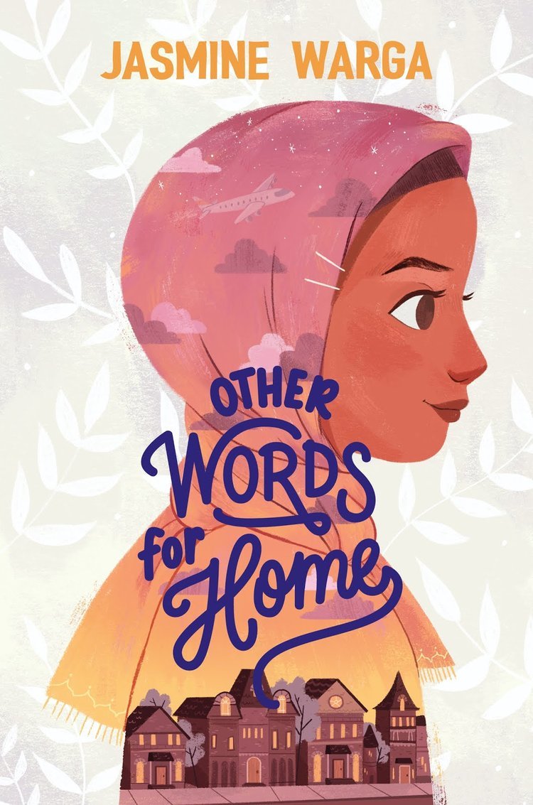
Other Words for Home, Anoosha Syed Illustration

The reason why Anoosha’s artwork inspires me is because the way that she portrays her art feels welcoming with the soft pastel colour palettes that she uses and adorable character design. Despite the soft look of her illustration, she still manages to convey her message (regarding representation across) to her audience. Also, to have a minority in a renowned industry is a huge steppingstone for us people of colour. As content creators, we have our respective voices and whatever we post online or at art exhibits, are of our own voices wanting to be heard.

Process: Golden Retro Festival

Standard

Sketches:

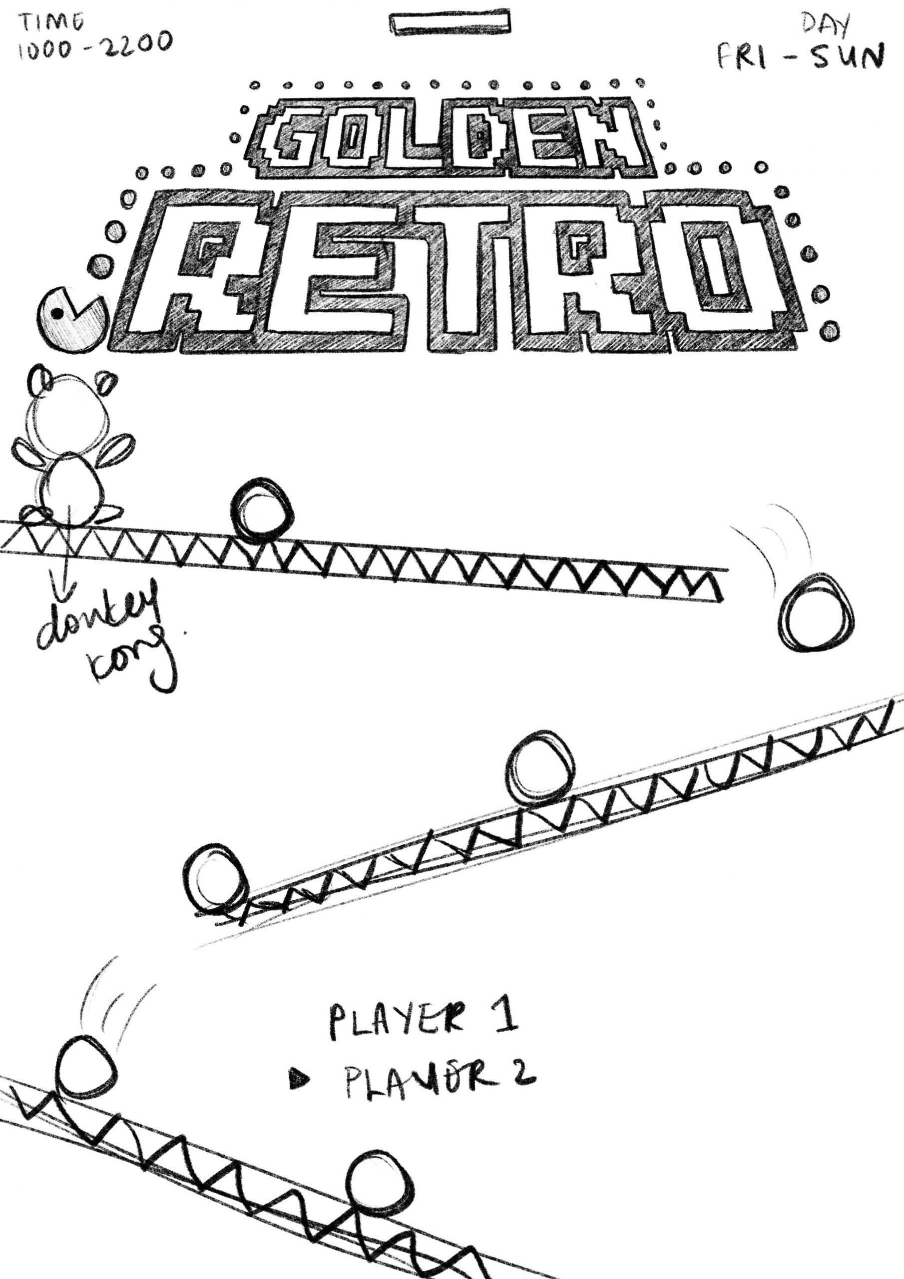
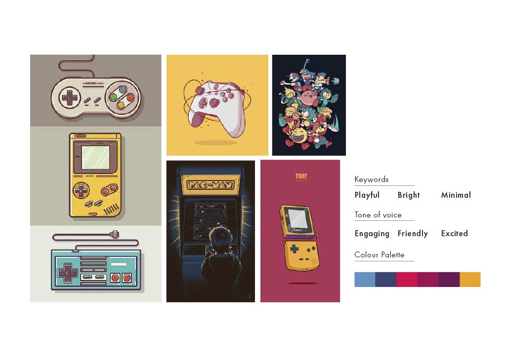
Initially I was looking at something which was more of a lineart work illustration. This particular header follows the same design as Street Fighter. However, I realized that there were too many inconsistencies in the design and its elements.


So I’ve decided to change to something more consistent which is “pixelated” art and illustration. The solid shapes give the designs a bit more balance and neat appearance.


This was the sketch when I first started the project. However, I didn’t like how everything looks out of place and too many actions are going on.

After this sketch, I decided to go with my memory of arcade games and didn’t manage to sketch much. Guilty as charged. 🙁

Final Artwork: Golden Retro Festival

Standard

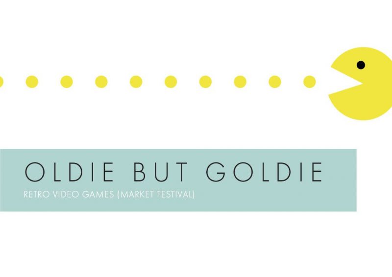
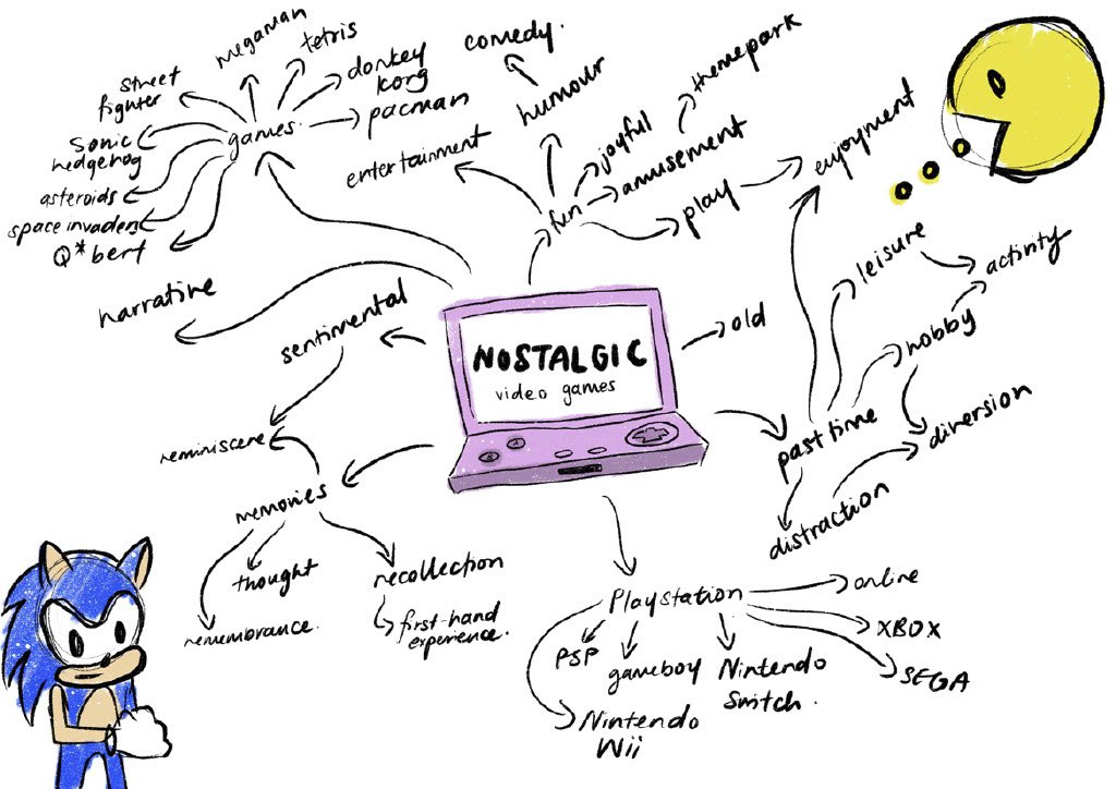
Golden Retro Festival is an event where people of any age are welcome. The theme of this event is 80s retro arcade games such as Super Mario, Pacman, Tetris, Qbert and much more. This event helps both adults and kids unwind from their work/school life over the weekend. The adults gets a trip down memory lane whereas kids get to discover new games in their life! The event hires vendors who sells amazing food and games. We even have some entertainment prepared for you!

Final Artwork consists of:-

  1. A3 Poster
  2. Staff Pass
  3. Coupons/Receipts
  4. Tote Bag


POSTER DESIGN (ADVERTISEMENT)

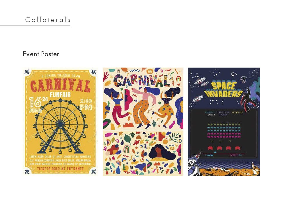
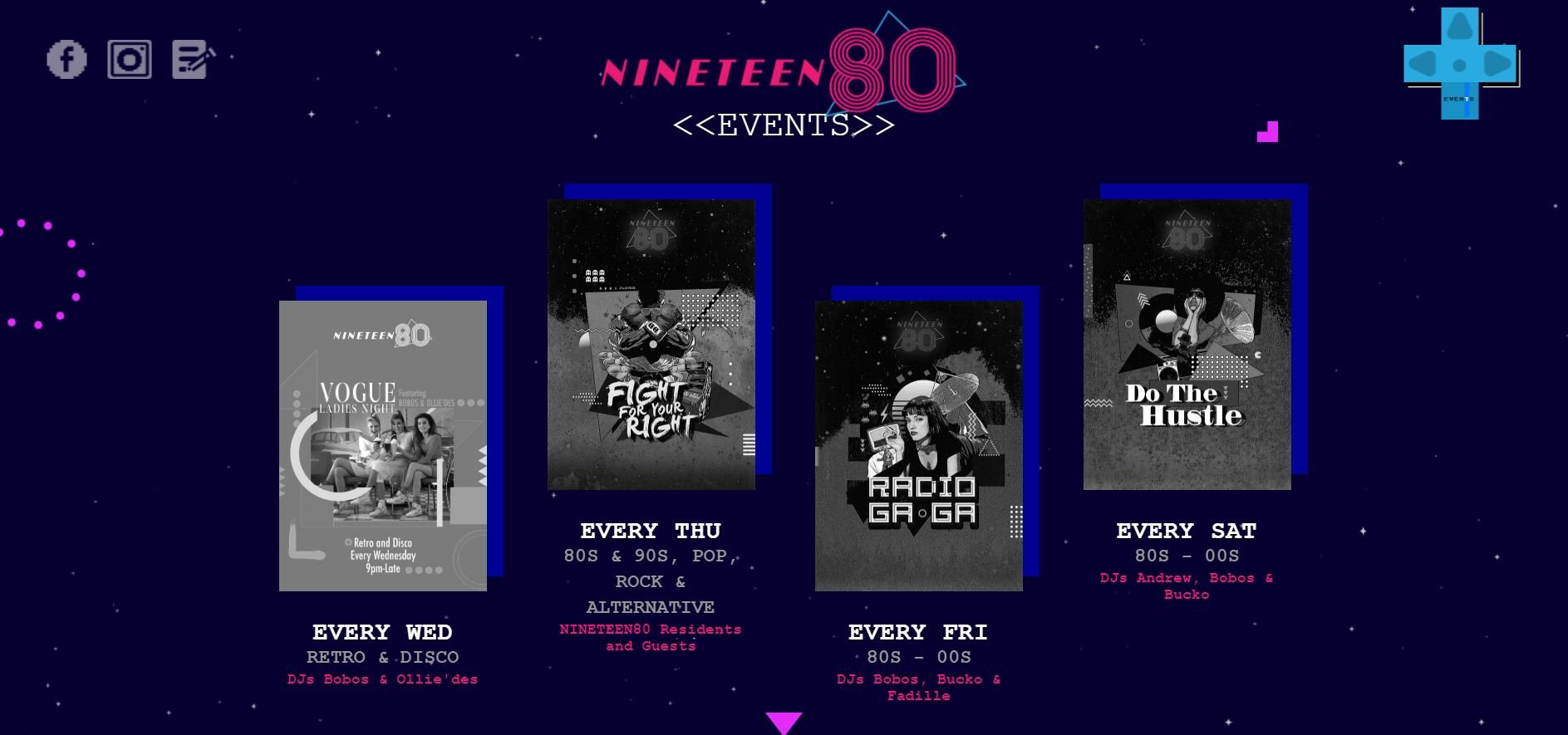
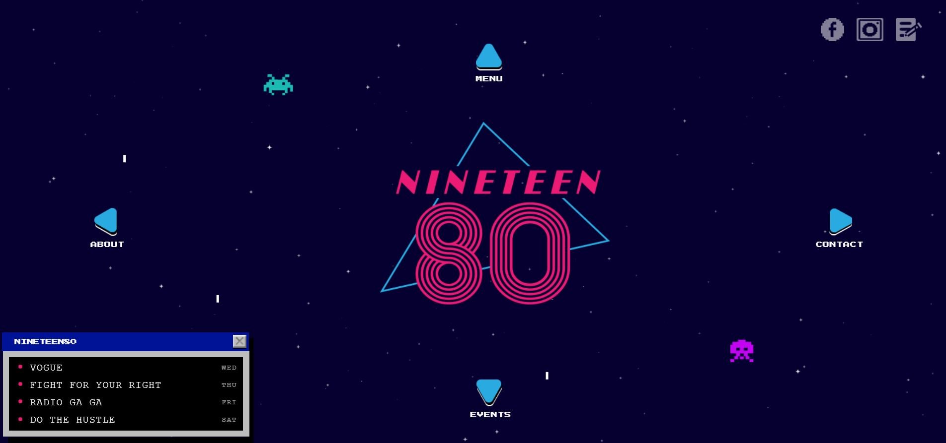
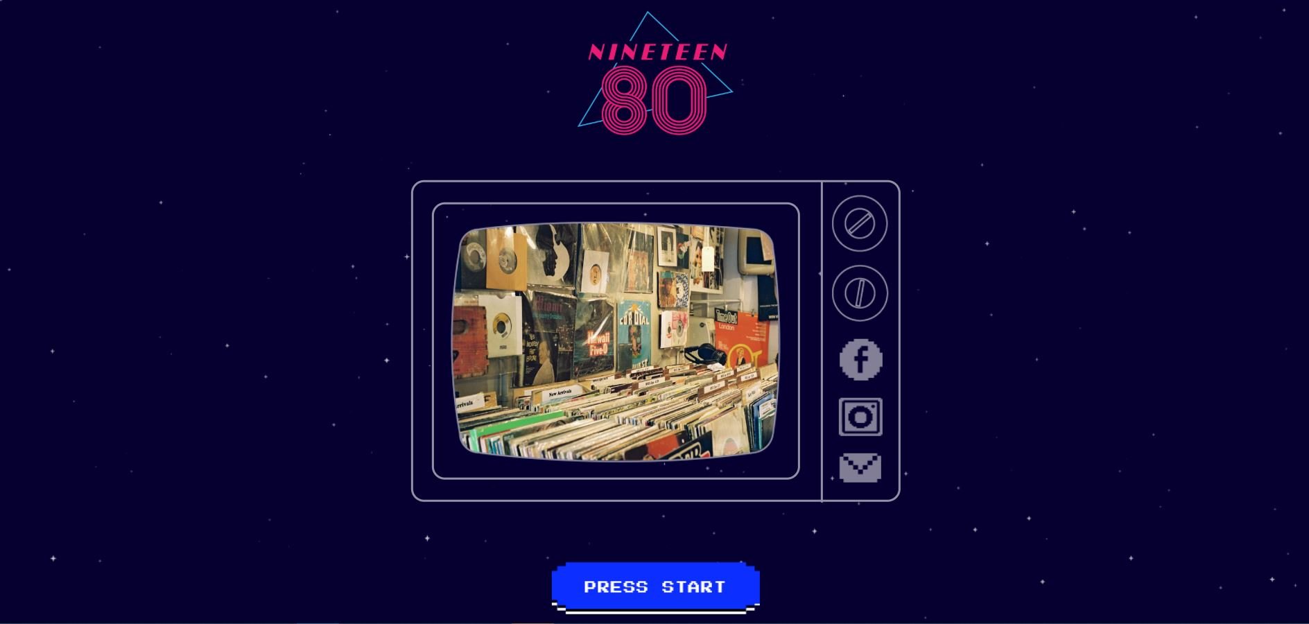
For the A3 poster, I’ve decided to play along the lines of the starting screen to a video game. As this collateral is an advertisement to gather people’s attention, the concept of a starting screen gives the idea that the target audience are about to enter an exciting game themselves.

STAFF PASS

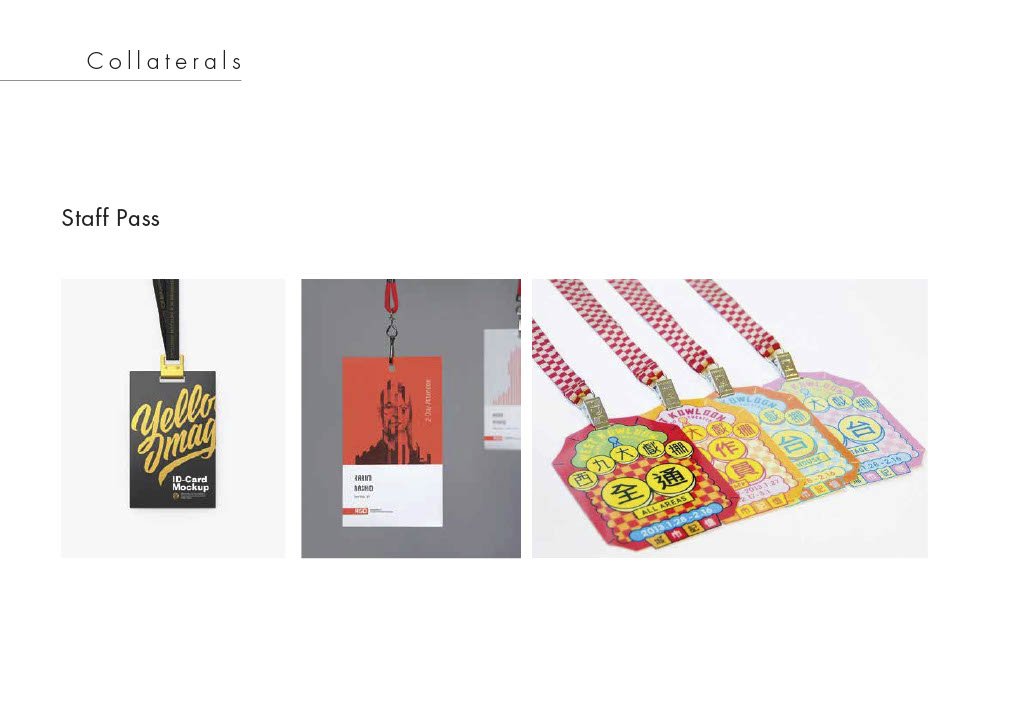
I’ve used the background of iconic games for the staff pass. Even without the characters, the games can be distinguishable at a single glance. I also realized how most backgrounds from retro arcade games make up a good pattern illustration.

COUPON/TICKETS

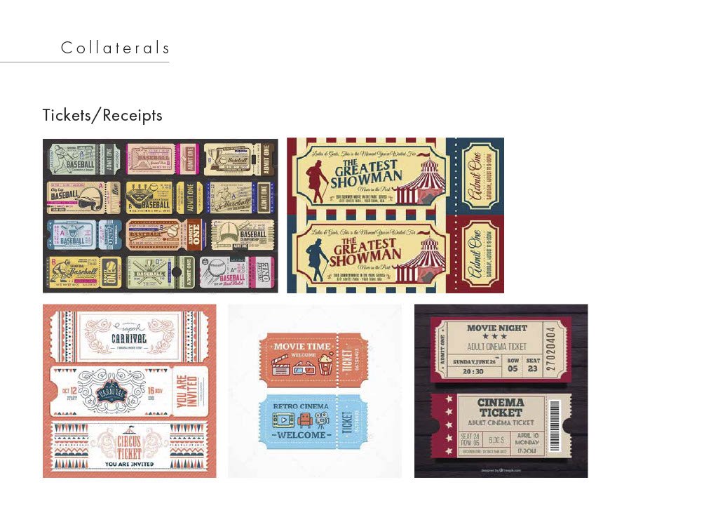
For the tickets, they will get it alongside with the receipt of purchase. With these coupons, they will have to gather a certain amount to get a free gift from the official event booth. It has a similar concept to collecting tickets from playing video games at the arcade and then redeeming a price once a certain amount is collected.

Each coupon can only be redeemed once (barcode).

TOTEBAG (MERCHANDISE)

I’ve decided to infuse both local slang and retro video games together. The term “lepak” means to slack. In another, people come to this festival to relax, destress and enjoy themselves. This is one of the redeemable merchandise customer can get at the official booth.

Reflection:

All in all, I’ve really enjoyed designing for this assignment as it is something way out of my comfort zone. Being someone who plays arcade games a lot when I was younger, doing this project definitely brought me down in memory lane. If given a longer duration, I might even come up with more merchandise designs!

Sketches + Final Artwork

Standard

FINAL SKETCHES:

FIRST TRIAL:

Feedback given:

  • The colours are too “The Simpsons” due to the yellow skin.
  • Try a different colour palette
  • Good play with positioning and scaling but maybe create a larger contrast between each hands. And also between the healthcare workers
  • Include more healthcare workers
  • Try to incorporate the Varoom header with the illustration

FINAL ARTWORK:


Assessment 1: Process + Final Artwork

Standard

Questions:

  1. What do you do when you’re stressed out?
  2. What was the happiest moment in your life?
  3. What is your biggest fear?

Jessie Process:

Updated Sketch:

Final Artwork:

Description: Based on the questions asked, I realized that Jessie retreats and isolates herself whenever she was faced with stress. That is what the globes represents, a safe space for her to stay in until she is ready to go out to the world. As there are numerous globes around, each globe represents a safe space for Jessie. I’ve represented Jessie as a butterfly as it represents her soul. It symbolizes hope, dreams and endurance. As Jessie’s fear is the people judging her and seeing her as who she is not (despite her hard effort to build up her image), she cocoons herself and comes out as a brand new beautiful butterfly as she has built herself to be. The little butterflies represents her family which she holds dear and close to her as she is a family-oriented person.

Zafirah’s Process Sketch:

Final Process Sketch:

Zafirah’s Process:

Zafirah’s Final Artwork:

Description:

My phone is always with me no matter where I go. It is my safe space whenever I am stressed out with assignments. I play a game called Fun Run whenever I take a break from work (procrastination). In the mean time, I also do henna to destress myself. Which explains the chosen medium for my portrait. The tree in the portrait is called “Tree of Life” which represents family and loved ones. Similar to Jessie, I am someone who holds my family dear and close to me. Being around them makes me happy and safe. The smudged part of the tree represents my fear. The fear of losing my loved ones. As the light from my phone shines brightly in my life, the loss of my loved one disappears into the darkness of my life.

Task 4: Cigarette Dispenser (Deliverable 2)

Standard

Purpose of product:

  • A gift to give your smoking friends
  • Cigarette Dispenser (makes it a hassle to dispense cigarette sticks)

3D Model on Maya:

Process (Main Product):

One of the hard part was actually putting a hinge on the cover and connecting it to the main body. Initially, I thought it would be easier to create a slide-in cover but it was quite tedious to make that. Therefore, I watched a video online on how to create a DIY hinge and I was not disappointed with the outcome.

For the visual aspect of the product, I’ve decided to include a sticker/label on it as a way to indicate the purpose of the product.

However, the feedback given was that it was too clustered with information and that it should be minimal. And also, the sentence “smoking hot” doesn’t really link to smoking as it has a more sexual tone to it.
FINAL STICKER:

I’ve decided to include only the ingredients of the cigarette on the design, with an additional of “lung/heart cancer” and “death” to indicate the risk of inhaling something toxic.

FINAL PRODUCT:


FINAL PRODUCT PUT TO USE:

Once again, I am very satisfied with the craftsmanship of the product. The purpose of it could be made better, as a sense to make smokers reduce the amount of cigarettes they light and dispense. The creation of this product has been very fulfilling.