My Precious: Object Stories (Process)

Standard

In this project, we were tasked to create an artifact (precious object) from something that is very valuable or worthless to us.

Most valuable object: Honey Beeswax Lip Balm

Most worthless object: Expired Golf Proficiency Certificate

I’ve decided to use my most worthless object to carry out the project. I’ve made a mind map to show words related to Golf and Certificate.

I’ve come into conclusion to use the words: Greenery, Sand, Wood, Stick and Swing.

Initially, I came up with a project that has a ball swinging in a single direction. However, when I showed it to Peter, he commented that it was just a regular pendulum and there was nothing extraordinary about it. I tried to come up with something else.

As I was brainstorming, I came up with the additional word of “balance”. Hence, I’ve combined balance and swing together to come up with with my final product. You can see it in the link below!

Recording #1

Threads and Planes (3D Project): Process and Final Outcome

Standard

The main scope of our first project was to create a plan using threads. We were tasked to make holes on our plane (paper and then hard plastic) and then sewing in and out with needle and thread to create that plane. I’ve tried to use different color threads so that it won’t be confusing.


Ideation & Process:


Initially, I had this design in mind. I’ve decided to create a squarish plane and combine each side together. I would’ve gone with this design but there were 2 problems as to why I didn’t. Firstly, the plane was forcefully folded and it wasn’t the threads that gave its shape. Secondly, only the inner part of the plane was aesthetically nice. There were no threads found on the back or bottom part of the plane.


This was the finalized design for my final project. I’ve decided to fold some parts of the plane and also using the pull and strength of the thread to create a fold. Initially I wanted to put a “pole” in the middle of the artifact for support and wrap the thread around it (as shown in the image below) but realized that it was not encouraged when Peter checked my work and gave me feedback. I saw this idea from my friend’s instagram and decided to give it a go but failed miserably. Very very miserably.


The process was hard as I had to crack my head and find which angle and folds work best for my artifact. I used a long rectangular plane and the cut it up and fold to make it into a smaller one. I had to make use of both sides to get a balanced look but as I added more threads to my artifact, it became messy, small and overly-tightened.


FINAL OUTCOME:


This was my final artifact for the project. I’ve used different colors. I’ve added some plane by the sides too. However, I’ve come to realize that using threads of many colors has caused the whole thing to look messy. I should’ve used at most 3 different colors to make it look nicer. And some of the thread color I’ve used seemed too bright to be seen from far, especially in the pictures above. All in all, I’m proud of how I was able to tighten the threads to make it look neat and presentable.


In conclusion, this project has greatly taught me the importance of these 3 basic elements: Dots, Lines and Plane. Without even 1 of the element stated, I would’ve not been able to complete the project smoothly. By combining these 3 together, it has created a aesthetically pleasant visual form of art and may create something else if used differently with different amount of emphasis on each element. I this particular project, we mainly focused on lines and planes. All in all, I’ve enjoyed completing this project as it enhances and opens my creativity to different mediums.

Project 1: My Line is Emo (FINAL OUTCOME)

Standard

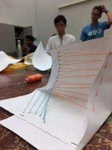
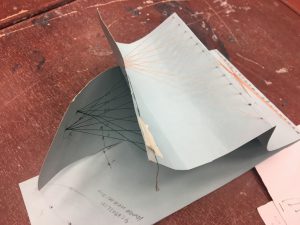
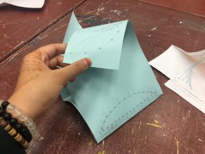
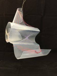
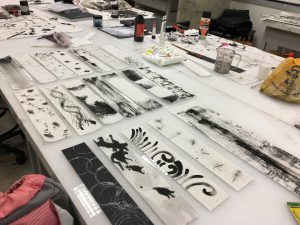
Presentation is finally over. Honestly, I was very nervous about my presentation but I just had to get it over and done with. I will be explaining the emotions for each strip. What it means, why do I see it like that and what medium I’ve used.

My Project 1 mark-making was based on a semi-true story about my life. Well, love life basically. A disclaimer before I start, I won’t tell you which part is true and which part is false. Heh. Okay, moving on.

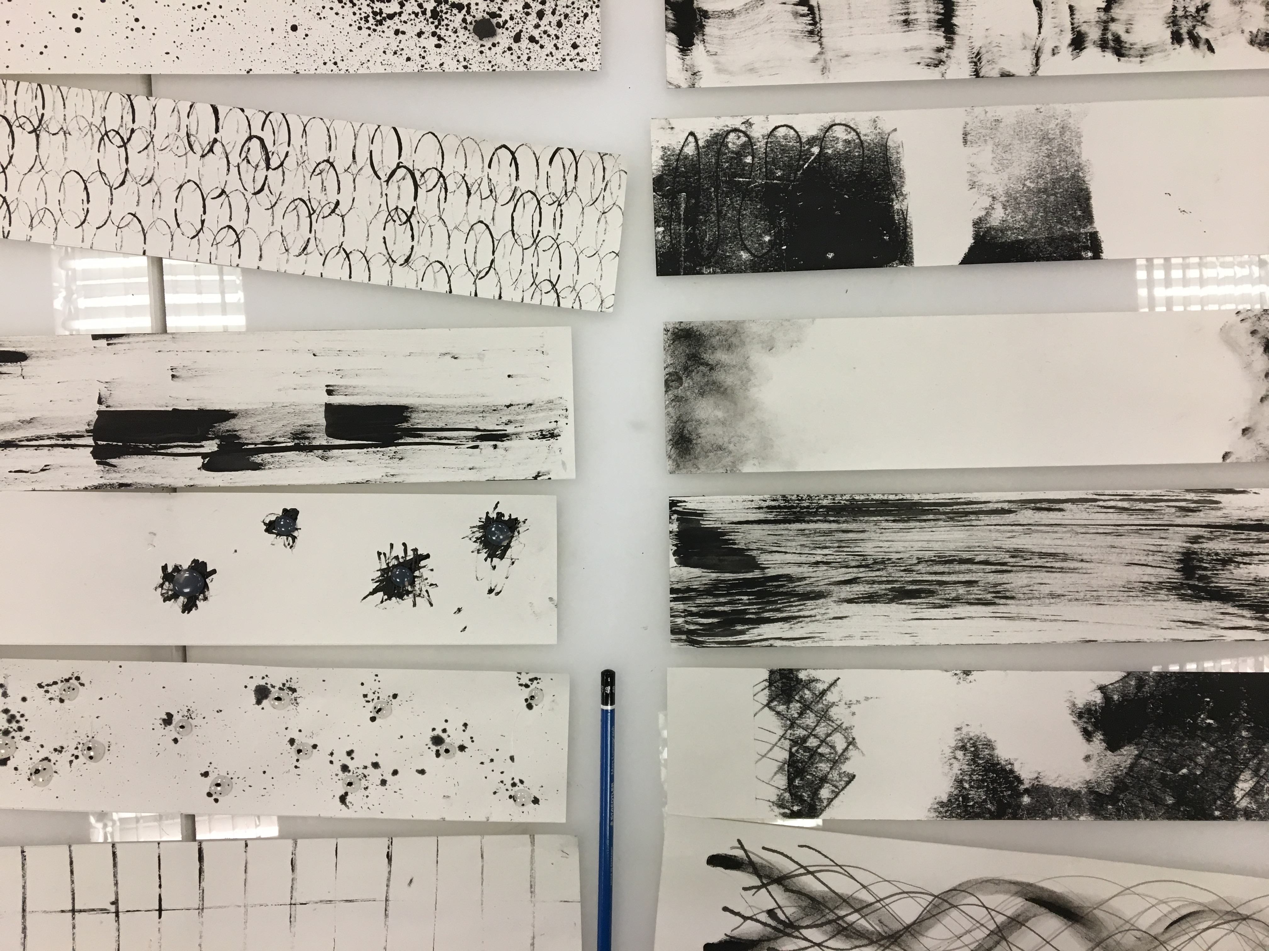
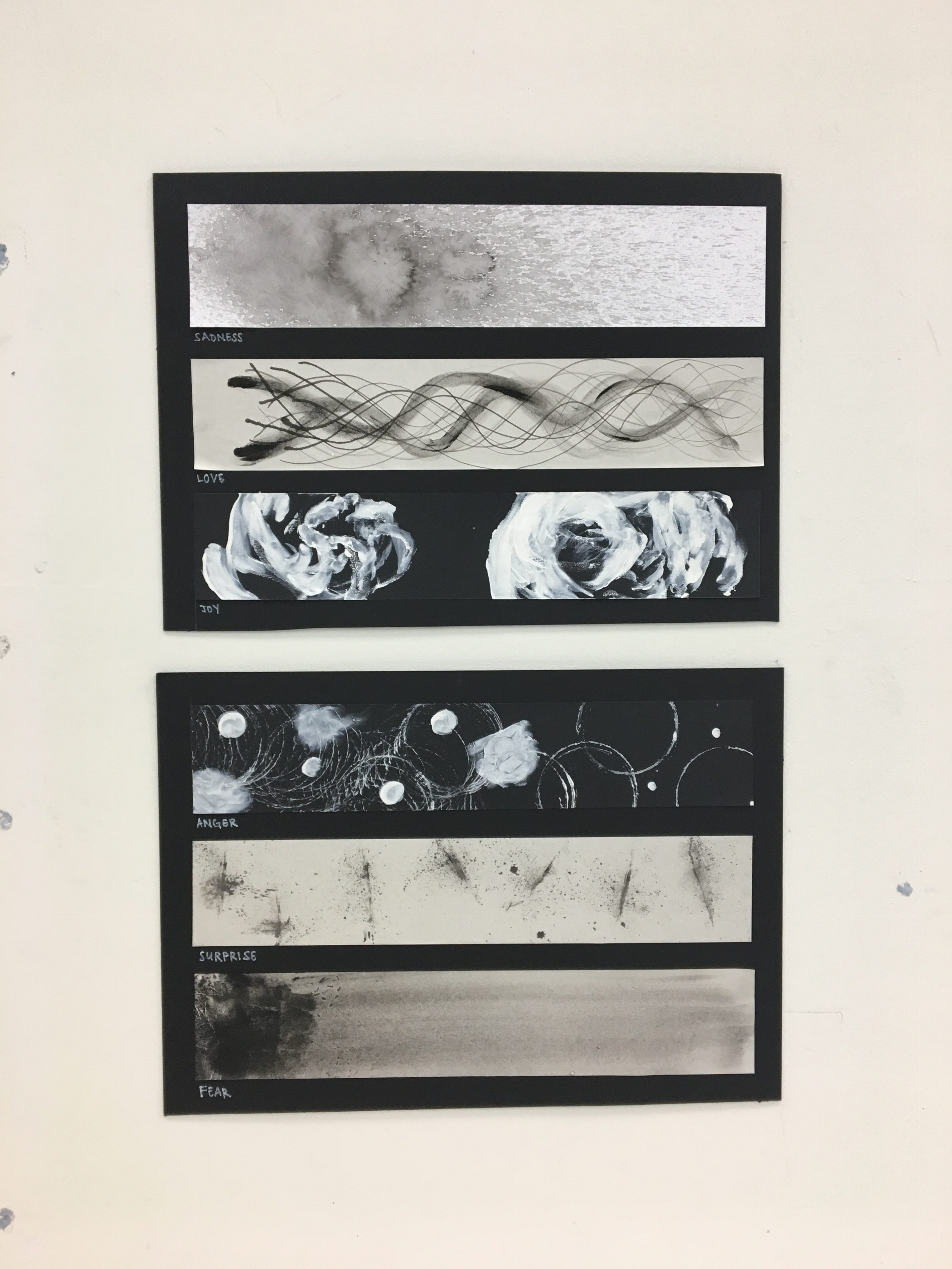
First strip: Sadness

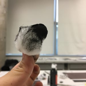
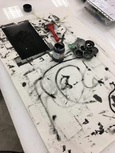
As you look at the mark-making on the first strip, it shows a splatter of diluted ink which focus mostly on the left hand side with a few intense blobs. This represents the sadness I feel when I’m lonely. Which explains the diluted ink. The ink is sprayed using a spraying bottle onto a drawing block which is pure white in colour. This shows that I am a happy person. People have always seen me as someone who’s very cheerful and forever laughing. But they don’t see the splatters of paint (like I’ve been shot by a paint gun) I get on myself whenever I walk past happy couples. I felt sadness as I’ve been in and out of relationships and it’s been a long time since I last felt real love.

Second strip: Love

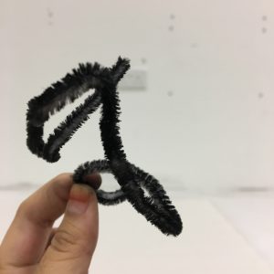
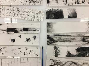
The second strips shows wavy, curly lines. This was the part when I met someone on my social media. I’ve never met him before but I’ve seen the way he texts and communicates. His sweet words and rhythm are that of the lines shown in the second strips. They were smooth, sweet and they swept me off my feet like how when you watch cartoons and they smell something delicious, smell lines appear and they’ll float towards the source of smell. I fell for his sweet talks and melody.

Oh, what have I gotten myself into?

Third strip: Joy

The third strip represents joy. I used a black paper with white paint on it. The black paper represents me, my inner self. After being alone and surrounded by couples almost everywhere, I felt gloomy inside. I wasn’t truly happy then. I wanted someone to guide me, to love me and take care of me. That is where the 2 ray of lights come in. The ray of light on the right represents him. Where as the smaller one on the left represents me. It’s like he lightens up my life. Quote One Direction “Baby you light up my world like nobody else”. I was truly happy then as someone has finally loved me…

Or so I thought.

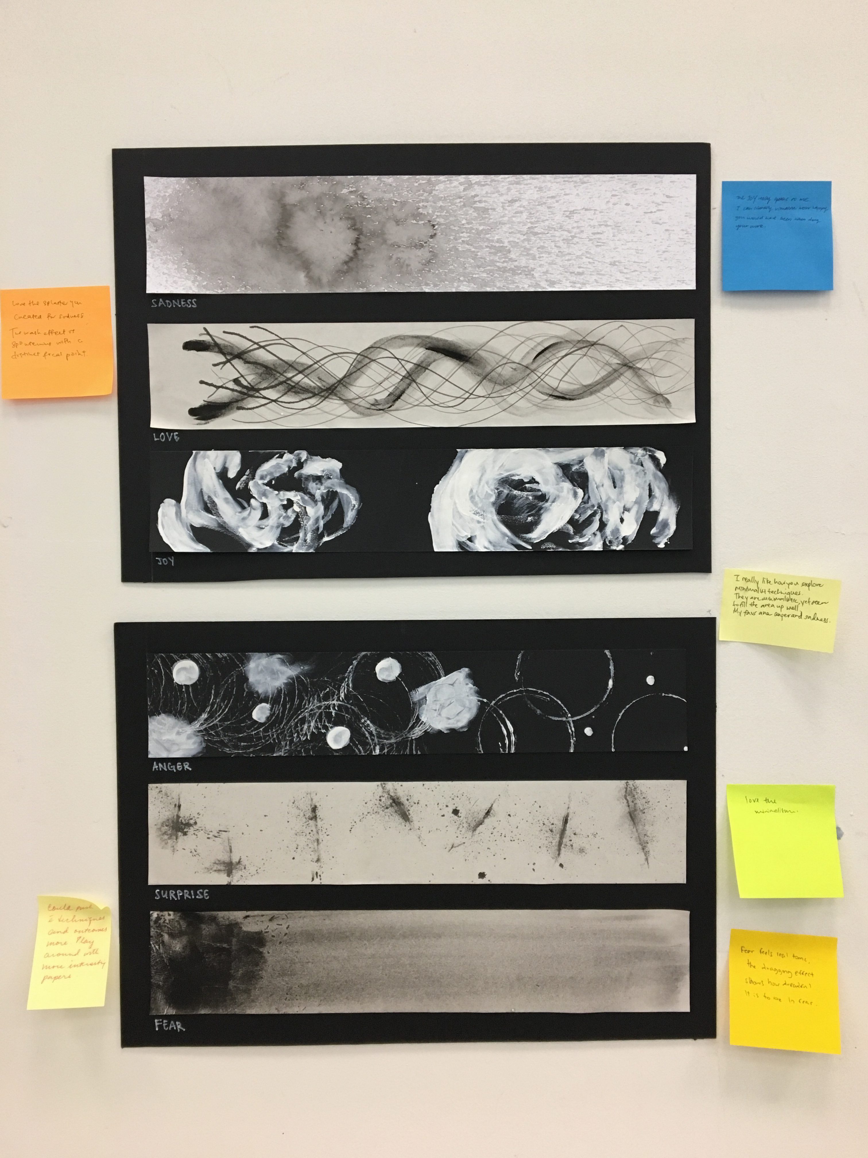
Fourth strip: Frustration

The fourth strip, again is done on black paper. Different from the previous black strip, this strip represents anger. It represents frustration. I found out that the guy I was dating was, simple to say, a flirt. I also found out that he has been commenting on girls’ photographs on instagram with sweet words and also heart-eyed emojis or heart shapes. And he thought I was stupid. I’ve been questioning him over and over again about his actions. Which is represented by the white circles and blobs. I kept asking him the same questions over and over again. Which can also be represented by the repetition in shapes. But it all fell on death ear. He ignored me and tried to change the topic whenever I tried to settle things out with him. It’s like all my words fell into a black hole.

I had enough.

Fifth strip: Surprise

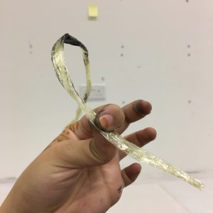
The fifth strip was done on newsprint paper. The marks on the strip was done using rubber bands. I dipped the rubber bands in diluted ink, pulled hard and released it against the paper. This shows a painful kind of surprise. I was surprised as to why I was still with him despite the continuous act of cheating he has done. The different orientation of the marks shows the different kind of cheating he does every week, every day. I used a rubber band as it shows pain. Imagine if someone shoots a rubber band at you. You’ll have a sense of surprise but at the same time, your arm hurts when the rubber band comes in contact with you.

Sixth strip: Fear

Now this is the final strip. Where everything comes to an end and I broke my connections with him. I finally had the guts to leave him. What’s the point of being with someone when all you received from them was pain? But at the same time, I was afraid. I was suppose to be used to these kind of things. Being left and cheated on (this wasn’t the first time that someone has cheated on me). Just as I thought I was suppose to get used to it, it stretches on and leaves a mark, never fading. Everytime someone cheated on me, it leaves a permanent mark that stays with me forever. Which will slowly fade to an all-black.


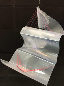
And that concludes my presentation for my Project 1: My Line is Emo.

Some of the feedbacks given by Mimi was that I had to use tools which has meanings in my story. So that it’ll give more impact. As for the mark-making wise, she said that my work has improved from the previous consultation. It’s just that I need to bring out the emotions more into the mark-making process so that it doesn’t seem to minimalistic or simple.

Thank you for taking the time to read my post.

ONWARDS TO PROJECT 2!


Project 1: My Line is Emo (Research)

Standard

Inspired Artists

Trevor Bell

The One from Many 1959 Trevor Bell born 1930 Presented by the artist 2011 http://www.tate.org.uk/art/work/T13394

Extreme Values 1959 Trevor Bell born 1930 Presented by the artist 2011 http://www.tate.org.uk/art/work/T13395

Patrick Heron

by Ida Kar,photograph,1954

Grey and Black Stripes : 1958 1958 Patrick Heron 1920-1999 Presented by Curwen Studio through the Institute of Contemporary Prints 1975 http://www.tate.org.uk/art/work/P06287

Azalea Garden : May 1956 1956 Patrick Heron 1920-1999 Purchased 1980 http://www.tate.org.uk/art/work/T03107

John Latham

P(n)2:3/12 1963 John Latham 1921-2006 Purchased 1971 http://www.tate.org.uk/art/work/T01468

Full Stop 1961 John Latham 1921- 2006 Presented by Nicholas Logsdail and Lisson Gallery, London 2005 http://www.tate.org.uk/art/work/T11968

As you can see throughout the artists and art pieces I’ve selected, they have something in common which is minimalistic and simplicity in their artworks. I’ve decided to strive towards this concept as it is not easy to tell a story based on something so simple but easy to understand. Most of the paintings shown above are very simple and look “accidental” but the meaning behind the paintings are very deep.

For example, the Full Stop 1961 by John Latham shows a single big dot in the middle of the canvas. The edges of the dot seems dispersed and washed out. Some has said that the dot can represents many things. It can either represent a stop to something or a start to something new once something else stops.

Project 1: My Line is Emo (PROCESS)

Standard

Week 2:

When the assignment was handed out to us, we straight away started with the mark making process. I experimented with various tools such as the paint scraper, bandage, and a keyboard brush cleaner. As for the lino cutting, it was tedious process as I could not dig deeply into the lino as it will create a hole. We have to be pretty careful too as to not cut our fingers (which I did, badly). There was blood. Hahaha. But the end product was satisfying. I went with a flowery-vine design for my lino cutting and did 2 different stamping. Both of the stamping have different amount of pressure applied on them, thus having different darkness and intensity of the black ink paint.

Most of the designs I did was of repetitions and consistency. I should explore more and not stick to one kind of mark-making.

Week 4 (Wednesday):

During this week, I continued with my mark-making process. I was focusing on creating as many piece as possible for my final consultation.

Cotton Ball dipped in black ink.

Furry tie dipped in ink and then dragged in a horizontal line on paper

Keyboard brush cleaner. Used both bristles and base of brush

Rafiah strings used. Expanded the string, dipped in paint and dragged.

Messy table and works produced

Due to week 3 being a public holiday, my progress has been pushed back as I was celebrating that particular PH. I came back to the studio on Wednesday night during the consultation week to complete my 18 (maybe even more) pieces. My ideas were not flowing smoothly and I spent most of my time sitting in my seat, stoning. And trying to think of what other tools I can use for my mark-making. I’ve decided to include in the use of my fingers too for mark-making. It was a messy but fun process.

Week 4 (Friday): Consultation week

My group was the first group to consult Mimi regarding our mark-making strips. She has given us her comments and advice. Some of them were things regarding the different use of papers (printing paper, newsprint, black paper) and also different use of paints (acrylic, Chinese ink, white paint) and maybe something semi textured such as burnt paper or torn paper collaged together. She went through my work and told me I could improve by adding 2 or more types of mark-making into a single strip so that the idea is pulled through more as most of my ideas are quite simple.

Sound Arts: Reading Assignment

Standard

What is sound?

Sound is the wavelength and vibrations we hear transmitted from everyday things we see, hear and touch. According to the article, almost all activities in the world has an aural component. There’s 4 different kind of sounds found in the article. Namely sound art, sound scape, sound sculpture and sound design.

How has it been used in society?

Sounds are everywhere around us and we can never avoid sounds. From the alarm we hear in the morning, to the youtube videos we watch right before we head to bed. Sounds are used as a form of entertainment, such as television shows, music and movies. At the same time, sounds are used as a form of an emergency. From sirens to the SOS signal. Lastly, sounds are also used as a form of communication. We talk to people everyday face to face and also through phone call or video call. It’s mostly used as a form of communication to understand each other.

What makes it an art?

The composition of the sound determines whether it’s art. Adding melody and tunes can make the sound an art. For example music, producers and composers compressed, normalized and fill every moment and crevice of the groove with sound. Something that is pleasing to the ear can be an art. Audience must feel an emotion to let that particular sound be an art. If that sound does not spark much feeling in the audience, then it’s not really an art.

How does advancement in audio technology affect our sense?

Aural displays are mostly associated with visual screening to aid us in our journey of looking/listening to Art. They are there to guide us and to not make the audience confused about the art piece. It sparks a tint of excitement when we hear sound art with a visual screening on the wall. We’ve became highly dependent on technology to determine our emotions of a particular piece.


Sound Arts: Interesting Finds

Standard


Christine Sun Kim – Game of Skill 2.0

https://vimeo.com/142659892

Christine Sun Kim was born deaf. She created the Game of Skill 2.0 to show the audience how much effort is needed to do a simple everyday job such as listening.  Audience are to interact with the showcase by moving in the line provided by Christine. As they move along the lines, the handheld device will start to emit sounds (narrative written by Christine, read by an intern at the museum). The sounds will be emitted based on the way they hold the device and also the speed and direction that they are moving.  This is known as “scrubbing”.

I feel that this piece was made to create awareness to the audience. We sometimes take advantage of our 5 daily senses and are never thankful only until it’s gone. This interactive display is good for educational purpose too as it teaches children and even adults to always be grateful for being able to do everyday tasks with ease.

Great Animal Orchestra – Bernie Krause

https://www.youtube.com/watch?v=uXQBnFK-zYc

Bernie Krause has recorded the sound of thousands of animals in nature and place them in a recording. It was a music from nature as Bernie aims to raise awareness of animal extinction on our planet. Most of the sounds he recorded were of animals that is on the verge of extinction. He indicated how most audience would find it boring to just listen to the sounds of nature which is why he added in visuals to make it more interesting. He included different sound wavelength to indicate different animals. Animals who has a higher pitch will be placed on top and more waves would appear where as animals with a lower pitch will be placed at the bottom and lesser wavelengths will appear.

I find this piece very interesting as it shows the importance of listening and how it is better if both our visuals and hearing can be combined together to create a better display and interaction.

Reading Assignment: Rhetoric of the Image Reflection

Standard
  • What are some of the key questions Barthes aims to investigate in the article?

a) Can analogical representation produce true systems of signs and not merely simple agglutinations of symbols?

b) Is it possible to conceive of an analogical ‘code’ (as opposed to digital ones)?

c) How does the meaning get into the image? Where does it end? And if it ends, what is there beyond?

  • What are some of the key terms/ concepts introduced and discussed?

Three Messages:

Linguistic: Images and photographs has different supports such as captions or texts. By using texts with images, it helps the audience to receive a more detailed information as to what the company is advertising. It is a support to the image as some advertisements can be lacking in their photos but with the texts, it has helped the companies get their messages and agendas across.

A coded/non-coded iconic message: Information are gathered from what is seen from the advertisement visually with no texts or words involved. Audience judge the content by being able to identify identifiable objects and then decode the message from there. Able to judge cultural/literal messages too. Literal image is denoted whereas the symbolic image is connoted. Literal images are in a pure state (unedited) and taken by cameras whereas symbolic images are created based from different artists with different styles.

  • Do you agree or disagree with his argument and point of view?

I agree with his argument as it is important how the audience are able to denote/connote the information by just looking at the advertisement without having to refer anything. Audience are also able to denote the advertisement with the help of the additional texts added. Placement of images and texts, colours, shapes and sizes also plays a major part in providing a good user experience to the audience. For example, placement of texts help guide the user to read from a direction they would want. Same goes to colour. A bright colour will mostly likely attract the attention first compared to a dimmer/dull colour. Realness of the photograph plays a big part too. Some people would refer the images to be snapped on cameras instead of it being hand-drawn or done by human as that will be less-detailed compared to capturing a shot on the camera.

  • Provide a brief analysis (200 words) on an advertisement of your choice by using the terms/ concepts proposed by Barthes and discuss the role of text and its relationship with the image in the advertisement. Please include an image the advertisement in your post.

Milo advertisement Philippines

I have chosen this Milo advertisement as an example. In here, you can see the spillage/explosion happening from the cup of Milo, which allows audience to see how this cup of Milo will give them a boost/blast of energy when they drink it. The advertisement has a consistent colour of green (Milo’s colour) which gives it a recognizable feeling when this advertisement is viewed from far. Sans Serif font is used to show a sporty side to the drink. Even the sentence “Get Champion Energy Every Day” shows how the drink is for those who are having an active day ahead and to kick-start it with a cup of Milo to give them all the energy they need. They even added in the lists of the nutrients to show the power of the drink. Lastly, an added bonus, they added in an image of a good-looking man to attract the attention of the users.


Project 1B: Paradox

Standard

In this exercise,  we were told to create 1 original composition based on the theme paradox. The elements included should at least be distinctively local and include an image of us.

Happy Singapore

Ideation : 

I’ve decided to focus on a subject that almost every true blue Singaporean felt/went through when growing up in Singapore, that is education. Another purpose for me to create this piece was also to raise awareness. Suicide amongst kids has been on a rise since the recent years due to the high expectations adults expect from children. Children by the age of K2 are already receiving tuition, in order to prepare them for primary school. A good education means that it will also be good for the economy and also in the eyes of people outside of Singapore. It is somewhat a way to attract foreigners to come and get their education papers in Singapore.

The playground in the picture represents the fun kids are suppose to have when they’re young and not just facing textbooks and notes 24/7. On the playground, you can see me sitting there, pondering with a half smiley face. This shows that as time goes by, the smiley face disappears. As education gets more and more stressful, it shows the true expression and feeling students/children have.

As for the Singapore skyline, it is use to signify how big and beautiful Singapore is. This is how we portray ourselves to foreigners but nobody sees how we are suffering with education every single day. Money are used as background to represent how it’s all about money when you’re in Singapore. Some people have benefits if they come from a wealthy family.

On the high-rise building, kids’ silhouettes can be seen jumping off the buildings one by one. This represents the suicides done by children in Singapore for the past few years. They are seen in  black silhouettes as it shows how empty they are.

Scaling: In this piece, I base the importance of each factor by sizes. The bigger it is, the more important it is. The Singapore Skyline and money are the largest which shows that it has the biggest importance in our society. Whereas the kids are the smallest which shows their importance in society.

What do you enjoy about this assignment?:

I enjoyed layering the images to create an original composition. It may be tedious, but I felt very satisfied when I blend the background, foreground and props of the images. I also gave it a purple hue to give it a gloomy yet happy feels.

Further improvements:

I can make my face bigger and try to make it the main attraction in the piece as it shows a more detailed look of the half-smiley and half-sad face. And I would also like to make the composition look less messy as the main focus is not so obvious. And also proportion and direction wise for the silhouettes of the kids.


Project 1A: Strange Encounter

Standard

For this exercise, we were made to visual an incident whereby we fell asleep in a train and waking up to a whole different universe, filled with creatures we have created from our own ideas.

I have chosen the theme “Phobias” for this exercise.

Clown Nightmare, Bobby

Hole eyes, Flopper

Miss Lady Beard


Background Idea:

My idea of the characters are something that would totally freak you out when you have just woken up. Lack of sleep (fatigue) can cause hallucinations especially when you are both physically and mentally tired. People who have hallucinations tend to see their worst fears/phobias. Cause let’s face it, nobody has ever had such happy hallucinations.

Process:

I googled for a list of phobias that has ever existed around the world and I was shocked to know that basic-everyday things we see/use are considered “phobias” to other people. Some of the examples are beards, telephone dials, balloons, drivings etc. I combined the ideas into 3 different characters. With the clown being the scariest and the man-lady being the least. I’ve asked around a lot and it’s not a surprise to know that a lot of people hate clowns. They’re just creepy. On to the next lower level, I used a deep sea creature, merging together lotus flowers as eyes. I have a horrible fear of both deep sea and trypophobia (fear of holes). Lastly, I’ve merged together phobias which are not know to most of us. Things from our everyday lives (yes, that includes the lady too). All in all, the merging part was fun as I get to unleash my inner creativity to create one of the freakiest/scariest characters ever. I can’t imagine that clown chasing me. Would’ve probably dropped dead by then.

Challenges and improvement points:

Had a hard time googling the images… Not because it was hard to find but because I’m googling images of my own fears. Staring at it for a few hours straight really caused my hair on the back of my neck to stand. In addition, I can try to link the 3 characters together and form a story because as of now, the 3 of them seems totally separated and are just characters on its own. Even the colours are not even. Some are brightly coloured whereas some are of a monotonous colour.