Finally we’re done with our final project for 2D Foundation!
For this final project, we were required to come up with images (made from any medium) and turn it into an equation.
The equation is:
Me + Setting = different me
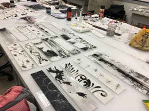
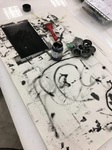
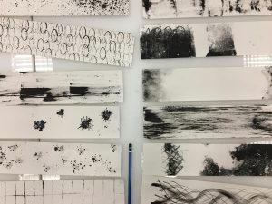
I’ve decided to make use of the skills I have learnt and decided to use digital painting as a choice of my medium. I was contemplating between realism and cartoon for my panels. I have listed down the pros and cons for each type of digital painting and after looking through the points taken down, doing a cartoon-styled drawing was more convenient and time saving for me. The images below are the 2 different kinds of digital drawings I did during my days in Singapore Polytechnic Digital Animation.
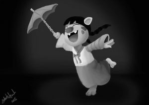
Cartoon Character Design
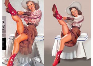
Realistic Drawing
I’ve no specific artist reference when it comes to drawing of my characters. Most of them are of my own imagination and art style. To start of the project, I came up with a few possible equations and showed it to Mimi. She approved of my ideas and gave me tips on how I can enhance and make the ideas better. Changes were made and then carried out.
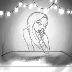
I started out with the sketching of the designs.
Then proceeded to shading and filling in the details

Colour added
My way of drawing digital images always begins from gray scale. I sketch out the outline before adding in the details. The pros of using gray scale first instead of adding in the colour straightaway is that I can change the colours easily without ruining the original image. An overlay of colour were added in and can be changed to fit to our preferences easily.
Now I will proceed to explaining the different colour used for each panel.
Initially, I tried using triad as my main colour harmony but realised that I was pretty much limited as the adobe kuler was fixed to 3 equal parts and the group of colour chose are repeated. I then changed to complimentary and was quite pleased with the colour group as there are more group variety I’ve decided to use complimentary colours for one row and split them up amongst the 3 panels and focused on monochromatic.
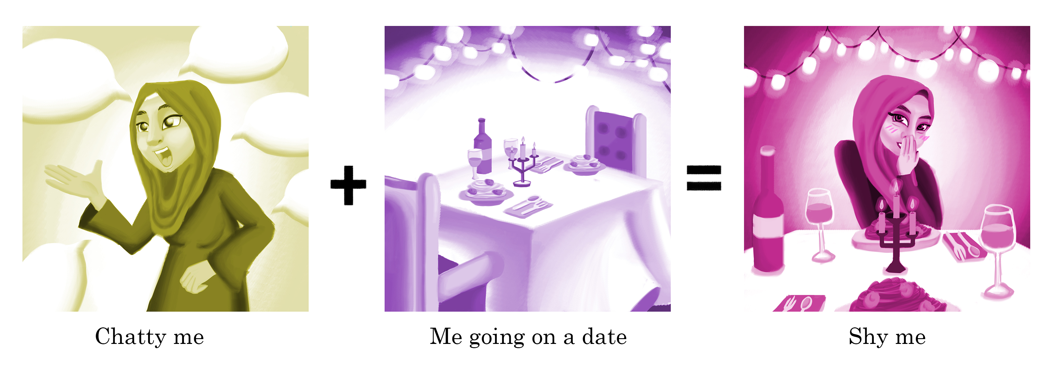
Refer to image above:
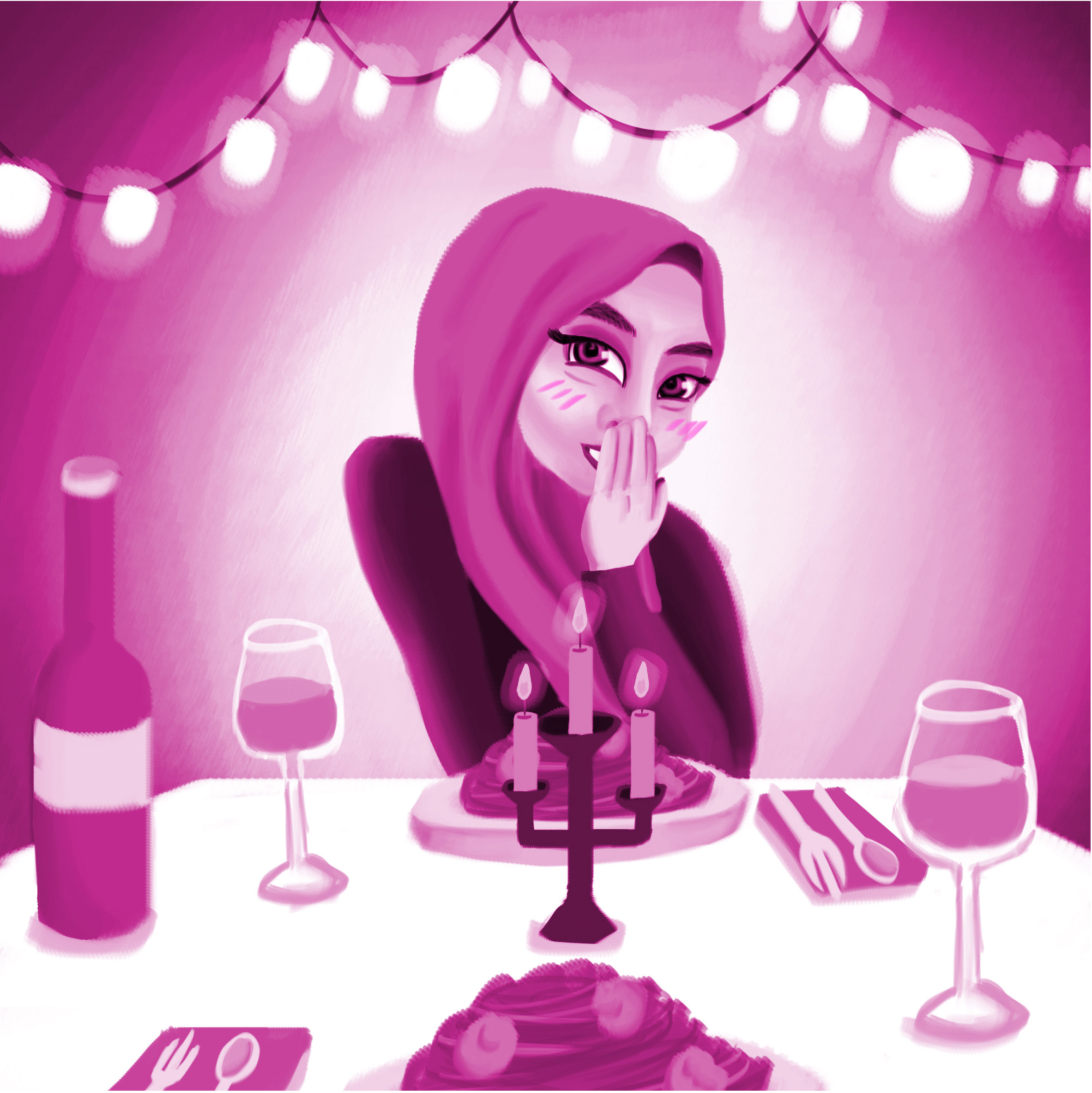
This is chatty me. As most of my friends know, I’m quite talkative and open. But if I am on a date, I am usually quite timid and quiet. I get very shy as I always try to make a good impression of myself to my dates. But if we’ve already passed the awkward and shy stage, I will unleash my makcik mouth and talk non-stop. Maybe that’s why I don’t have a boyfriend.
I’ve used yellow to represent my confidence and boost of happiness in the first panel. Purple represents luxury and high-end which shows the dating place. And pink was used to represent love/shyness.
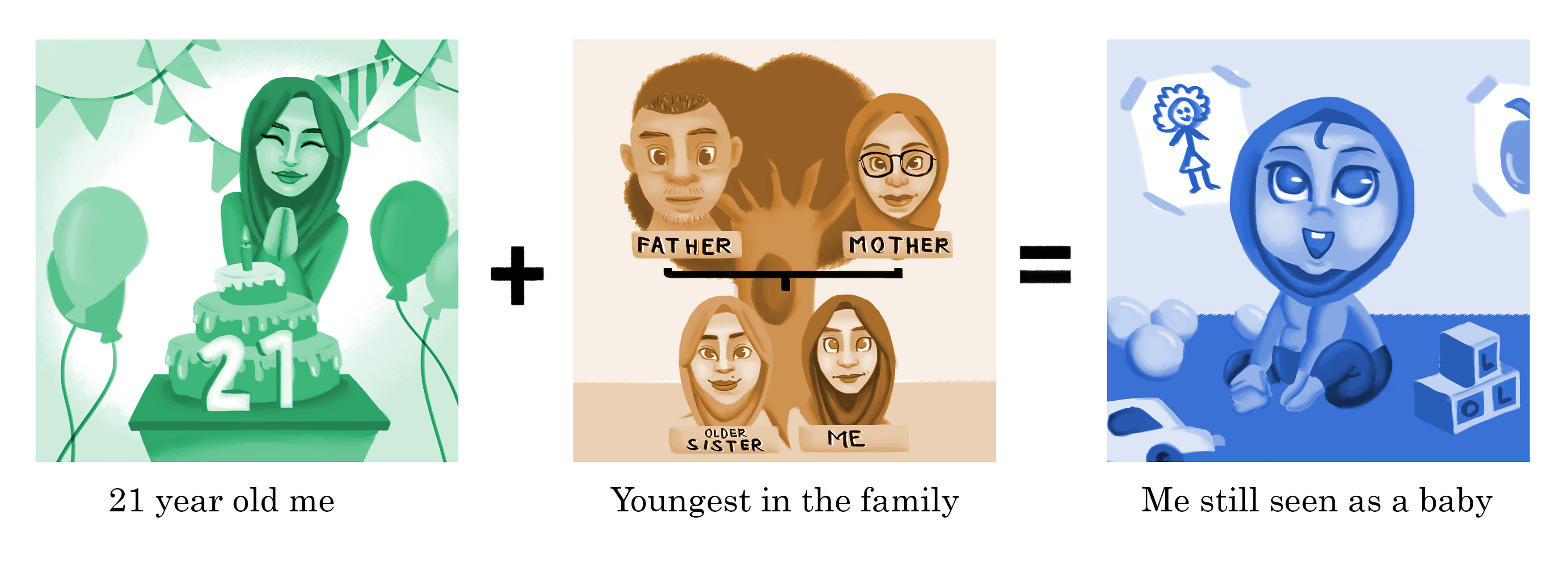
Refer to image above:
Turning 21 years old, I’m already considered a full fledged adult. However, since I am also the youngest in my family, I can still be seen as a baby in my family member’s eyes. Quite restricted to doing things but being pampered like there’s no tomorrow. Heh.
Green represents the refreshness of me turning 21. Brown/orange was used to show the warmth and protection of my family members. Blue was used to represent the baby-ness in me.
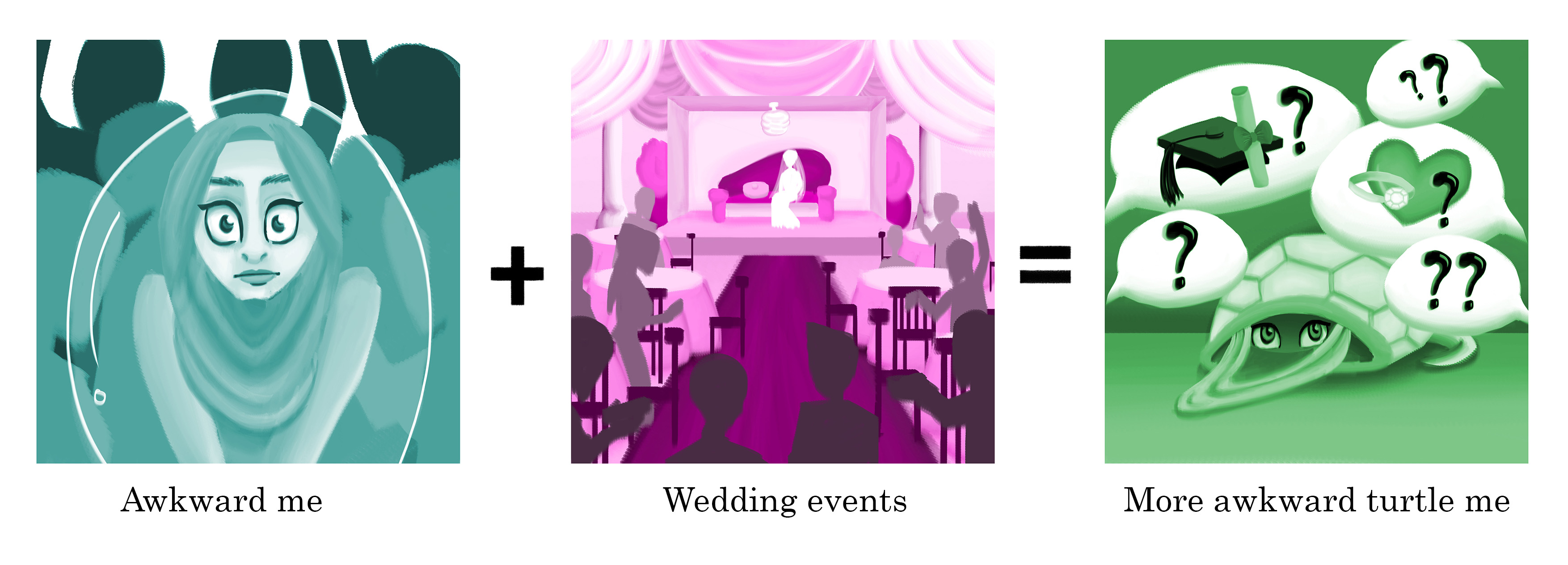
Refer to image above:
I can sometimes be awkward to begin with. I may be an extrovert but I do have my introvert moments too. To be honest, it can be quite a pain to attend a wedding. Not because of the food or whatso but because of the never-seen-before relatives who kept asking personal questions over and over again. Umm, do I know you?
Turquoise is a mixture of green and blue. Blue was used to represent the coldness in me when I attend weddings. Green was used to represent me being enervated. I was drained from talking to people I’ve rarely/never met before. Purple was used to represent weddings as most Malay weddings can be quite posh and atas. Green was used to represent the colour of the turtle. It shows the awkwardness in me too.
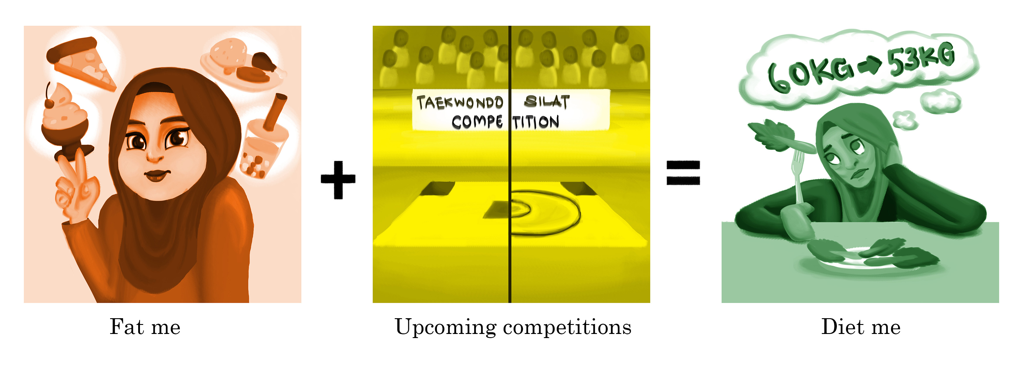
Refer to image above:
Who doesn’t love food? I love eating to be honest. Days when I’m carefree with no work or commitments, I will always be committing myself to food. Due to this, I’ve gained about a good 2-3kg of fats. However, it’s a horrible thing to do especially when I’m competing in an upcoming competition. I have to be between the range of 53-54kg in order to compete for my weight class. In the end, I make myself suffer as I always have to go on a strict diet and limit myself to food which makes me happy. All this for a competition. Why.
The colour red was used in the first image as it enhances the appetite. This represents the food surrounding me and how much I love to eat. I drew myself to be a little fatter too. Yellow was used in the second panel as it shows stress and anxiety. That is the exact feeling that I feel before entering the arena. Green was used to show the disgust of me having to each vegetables and fruits everyday to keep myself in weight.
OVERALL REFLECTION:
I’ve enjoyed myself while doing this project as I can finally put my skills to full use. However, the choosing of colours can be quite tricky as I’ve used different monotonous colour for each panel and it doesn’t look like a whole image equation. Each row looks like they’re more towards individualism compared to a group on its own. Mimi pointed out that the colours used can be too jarring and don’t really compliment each other well. That’s one of the things that I could improve on. Maybe I could use split complimentary colours instead.
To Mimi;
Thank you for being such a great lecturer and adviser during the duration of our 2D Foundation module! 😀