Task 3: Smoker Poster (Deliverable 1)

Standard

Purpose of poster:

  • To raise awareness regarding the negative impact of smoking
  • To attract attention from far
  • To give a brief information of the severity of smoking/second-hand smoking

Sketch:

Draft 1:

For the first draft, I was trying to include family members (in silhouette) to show an image that the smoker is feeding his family members exactly what he is consuming. Specifically, the contents of a cigarettes. However, feedback was given that the poster was not impactful enough to the audience and the silhouettes could not be seen amidst the dark background.

Draft 2:

After the first consultation, I decided to make the poster as scary as possible. In a sense that it triggers the audience at how the severity of smoking is depicted. I’ve decided to include an image of a prayer table, with an image of a dead man covered in a skull of smoke. There are joss sticks replaced with cigarettes, to show how the man actually passed on due to smoking.

Draft 3:


During the second consultation, I also introduced a whole new poster concept. Michael indicated that the new concept was more appealing as compared to the stereotypical dark posters. I have decided to go with the latter design.

Draft 4:

For the final consultation, Michael also gave feedback regarding the placement of the words. It was too centralized and he told me to include a brief description of the poster in it. He told me to make use of all the space in the poster. It was important to play with the white space but to make sure the words are not fused into the visuals.

FINAL POSTER DESIGN:

For the final design, I’ve played with the placement of the joss bowl and placed it in the far corner. The stream of smoke stretches across the poster on the opposite side. By doing so, it has given me sufficient white space to fill in my texts and the poster is more well-balanced and not centralized.

I’ve enjoyed the process of creating this poster. What I’ve learnt through my years in visual communication is that less sometimes can be more. It’s okay if the work has minimal elements in it, as long as it brings out the message of the poster.

Infographic Poster | Second-hand Smoking

Standard

Information to include on poster:

  • The risks of second-hand smoking
  • Who they are affecting
  • Percentage and numbers on the severity of smoking
  • Solutions to smoking (second-hand)

I have used information collected from the survey collected and input in the poster. The colours I have chosen for my poster is orange, a colour used mostly for warning signs (road signs) which indicates the seriousness of the situation.

I have used mostly icons and minimal words to bring out the fast-reading process when looking at the poster. At the top of the poster, I have included a very well-known cigarette design, Marlboro Red. Smokers (or maybe second-hand smokers) would know this cigarette brand at first glance and they would be interested to read the poster.

Final Outcome of the poster:

Feebacks:

  • The header looks too separated from the poster. The poster can be cut into 2 pieces and still look good on its own. The header is not infused with the infographic.
  • Try to play with the skull from the infographic and blend it into the header
  • Some words are hard to be read (red on orange)
  • Infographic may look too stagnant, try to play around with the placement

Despite the constructive feedback given, I felt pretty satisfied with the outcome of the poster. I was really thankful for the information given by family and friends through the survey. It has made it easier for me to get specific information to include in the poster. I agree with how the header looks separated from the body. I felt like I was too much in my comfort zone for this assignment. I will try to explore more with the spacing in the next project. :3

Exploratory Research Part 2 // Visual Communication II

Standard

I’ve conducted a survey amongst friends and family in regards to smoking on a daily basis in Singapore (and also Malaysia, since some of my relatives stay there).

The survey has been directed to 3 different groups of people:

1) Smokers (first-hand)

2) Non-smokers (second-hand)

3) Non-smokers (no contact with direct cigarettes smoke)

Out of the whole survey, I’ve received a response from 49 people. 67.3% of them females, while the remaining 32.7% were males. And out of the 49 people surveyed, 77.6% (38) of them were non-smokers where as 22.4% (11) of them were. In regards to the answers received, I can infer that majority of the smokers were male.

From the remaining 38 people, 57.9% (22) were second-hand smokers whereas the remaining 42.1% (16) do not have any contact with smoke.

For first-hand smokers, I have asked the following questions.

1) Have you experienced any chest/heart pain due to smoking? (Yes/No)

2) How many packs/sticks do you smoke on a daily basis? (eg. 3 sticks, 2 packs)

3) When did you start smoking? (Age)

4) Why did you start smoking?

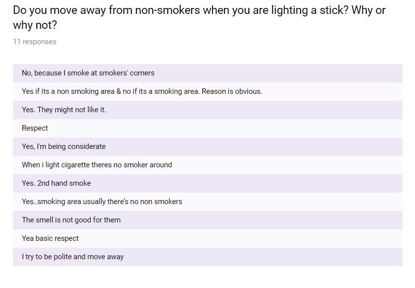
5) Do you move away from non-smokers when you are lighting a stick? Why or why not?

6) What would you like to say to non-smokers?

Answers:

From the answers given, I can see that being a first-hand smoker doesn’t affect any of their health as only 2 people indicated that smoking has caused them pain in the chest. The amount of sticks smoked starts from as little as 1-2 sticks per day, to as much as 20 sticks per day, with an average of 10 sticks per day. The age range for when they started smoking starts from as young as 12 years old, to as old as 21 years old. With 12 years old having the highest number, followed by 18/19 years old. Majority of the response indicated that the reason they started smoking was due to peer pressure/being cool/curiosity. All of the responses also mentioned that they do not smoke in front of others and move away when non-smokers are nearby. Lastly, the message given to non-smokers were mostly to “stay away from cigarettes/smokers” and some with the “that’s your problem” mindset.

For second-hand smokers:

1) Do you move away when someone lights a stick near you? (If no, why?)

2) How often do you inhale second-hand smoke? (eg. Hourly, Daily, Weekly)

3) Who are the ones who smoke around you? (eg. partner, family members, friends, public)

4) Has the second-hand smoke caused you any sickness or illness? (If yes, please state.)

5) What would you like to say to smokers?

Answers:

Majority indicated that they would move away when someone lights a stick near them as they hate the smell of it while some indicated that they stay as to not come across as rude or to not want to be left out amongst friends. Some has even grown immune to the smell. More than 50% of the responses indicated that they are victims to second-hand smoking on a daily basis. About 40% of the answers, weekly. While the remaining 10% were monthly or “depends on situation”. The most shocking answer I received was how 100% of the reason for second-hand smoking was because of their family members. Some indicated partners, some relatives. A few mentioned “public” as they can move away once they smell smoke. Out of 22 responses, 8 people mentioned how smoke has caused them various diseases/illnesses such as asthma, sinus attacks, cough, dizziness, chest pain and nauseousness.

Messages from second-hand smoke victims to smokers:

For those with no contact with cigarette smoke:

1) What are your opinions on smoking and second-hand smoking?

2) What would suggest to reduce/stop excessive smoking?

Answers:

For these group, I’ve decided to ask them for their opinions on smoking as a third-person POV.

Lastly, I ended the survey by asking the respondents whether they are aware that second-hand smoking is more lethal than first-hand smoking.

42 people mentioned that they knew it was more lethal, whereas the remaining 7 didn’t.

Conclusion:

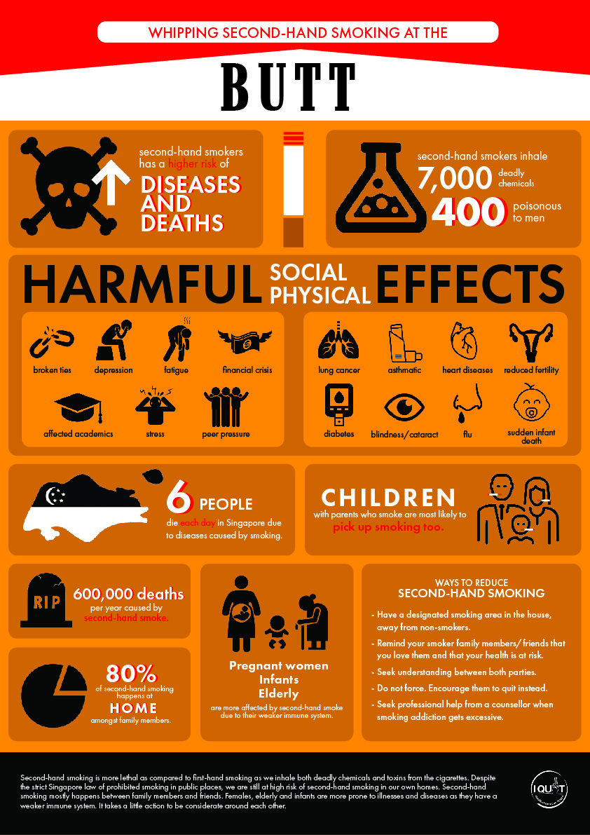
Second-hand smokes happens more around us than we can ever imagine. Most of the smokers are aware of what they are doing to the people around them. Children whose parents smoke are also likely to pick up smoking, as seen in the Student Health Survey where 6 in 10 youth smokers have at least one parent who is also a smoker.

Target Audience:

Youth/Teenagers.

As seen from the statistics received, majority started from as young as a minor, even before they were of a legal age to purchase cigarettes. Most of them started due to peer-pressure and curiosity. Smoking happens mostly when people are influenced by someone else. The main objective is to stop/reduce the act of smoking from the root itself, instead of focusing more on the current smokers who has been smoking for years – as it is majorly hard for them to stop.

Statistics source:

https://www.healthhub.sg/live-healthy/450/environmentaltobaccosmoke

Task 1A Exploratory

Standard

SMOKING:

Second hand smokers are getting a lot more worse than first hands. Some are too ignorant or oblivious to their surroundings. This happens often amongst family members and friends. Statistic shows that secondhand smoke has caused nearly 34,000 heart diseases each year during 2005-2009. Us secondhand smokers have a higher probability of death as compared to smokers themselves. 

IMPORTANCE OF RETAINING CULTURE/HERITAGE:

Newly renovated Wisma Geylang Serai which caters to Malay Muslim community. Retaining and sharing the Malay Culture despite Geylang having more people from other races moving in. 3-Day event with a theme of Past, Present and Future. 

ELDERLY LIVING ALONE:

Number of elderly living alone has tripled since 2000. Some of these elderly were either left alone by their family members, refused to move in with their children or have no one else to rely on. Some of these elderly may face depression due to the lack of interaction with the outside world. We may not know what’s happening at their home with no one keeping an eye on them.

PERIOD (CRAMPS):

-Some have it worst than others. The society tends to think that period cramp is nothing and will deem women as “weak”. It is important to raise awareness on how periods affect us women as an individual.

-Situation:

Having horrible cramps during training. Told coach I couldn’t train. Coach told me, “It’s just cramps.”

What am I focusing on?

SECOND HAND SMOKER.

Causes 7,330 deaths from lung cancer and 33,950 deaths from heart disease each year. Secondhand smoke contains hundreds if chemicals known to be toxic or carcinogenic. It can trigger a heart attack, even for secondhand smokers.

Example:

Related image

Dialogue In The Dark: Reflection

Standard

When I first entered the room, I thought it was all fun and games. But as we moved on further, I started to realize how serious it was to lose your sight. Being someone who relies a lot on sight, I felt suffocated and wanted the tour to end quickly. I kept bumping into the walls and my friends despite given the walking stick to find my way. The amount of “sorrys” heard during the tour was endless. I was getting tired and my eyes felt strained, somehow. Despite all those challenges faced during the tour, the guide taught us how to find our way by using other senses such as touch, hearing and smell. During the river boat ride, we can hear the engine roaring, the water splattering and the breeze in our face as we rode past different locations. I realized how we can still enjoy the things around us using our other senses too. As a sighted person, I realized that we have a major benefit in the world. Since we are the privileged, we should use it to take care of those who aren’t. For example, helping them board the bus, getting the blind around, and simply explaining/describing things to them such as the menu at a food outlet. I swear if the guide wasn’t there to describe our surroundings and guide us through, we would just be walking around in circles and tripping endlessly. 

By having a first-hand experience of something we’re not familiar with can change our perspectives and empathize more with the person who has to live with it everyday. We, as humans who are “perfect” (gift of sight, hearing, health etc), tend to underestimate, neglect and assume the importance of accessibility of those who were not given that privilege. It’s simple for us to think, “What’s so bad about that?” as someone who has ease in living a normal life. It’s the same concept as telling someone with no legs to “just walk”. Creating products/designs for the less-fortunate takes much more effort and research to get to the end product. Through the technique of role-playing, it helps us realize how the simple solutions we thought of as “healthy” humans, could result in so many “what ifs” for the less-fortunate.

As the Malay proverb goes,

“Berat mata memandang, berat lagi bahu memikul”

Translation: As heavy as our eyes see the hardships of other people, it’s even harder/tougher for the one who is going through it.

Sometimes, it may not be solely focused on physical disabilities. It could also be mental disabilities/impairment such as depression, dyslexic, dementia and so forth. We tend to overlook these health issues as it is something not seen on the surface. Though it may be hard to tackle this topic, I feel like it is a need to understand things from their perspective and to create awareness to the rest.

M A N I F E S T O

Standard

When we first started in Art school, we were taught the basics of designing. We were taught a certain method as to how to achieve a certain look.

When we asked the question,

“Can we achieve that by doing it in this method instead?”

We will always be answered with,

Yes you can. BUT, this way is better.”

Why are we restricted as to how we create our OWN work? Why does it matter which software we used or what tools we utilized? If the end-product looks the same, why does it matter? Why can’t we create something at the space of our own comfort?

It was from this mindset that got me thinking that my work is not as superb as my peers as I did not produce it in the same method as them.

It’s time we take pride in our work, no matter how we got to our end-product. We don’t have to be systematic about it.

Cause in the end, it’s how it looks to the eyes of the audience.

HyperEssay: Augmented Shadows (2010)

Standard

Augmented Shadow, 2010 (Joon Y Moon)

Joon Y. Moon is a programmer cum designer. Having worked as motion graphic designer, he has managed to create interactive media art which includes a story line with both sounds and visual appeals. He has taken part in both individual and group exhibitions, and has won a few awards.

Some of his solo exhibitions are “Sensitivity Tangibility Tangible Sensitivity” in Seoul, Korea and “Inter-Scenery” in NYC, US.

Augmented Shadow is a 3-D interactive artwork. In this artwork, the cubes represents different objects such as houses, trees and for the main cube, light. By moving the cubes around, the silhouettes of the objects follows specifically. The placement, angle and shadows of the houses change according to where the main light was placed. The main idea of the artwork is that the main cube, which represents the light, is the activator of the whole artwork. Nature are attracted/needs the light to work. Therefore, wherever the light moves, it activates an action from the other objects.

For example, when the light moves around, trees starts to grow around it, as one of the source of survival for trees is sunlight. Humans starts to walk towards it and take parts of the light with them and bring it back to their home. As the houses (filled with light) moves around, trees will start growing around them too. Lastly, when trees are moved around, birds will start to fly around and everywhere. When the houses are dark, birds do not fly towards it. Instead, they fly away from it. But if the houses are lit, the birds start to fly towards it as they are attracted to the light.

There are a few techniques we can apply to this artwork.

Interactivity

In order for this artwork to work, interactions from the public is needed. Similar to Magnet TV by Nam June Paik (note: another Korean artist based in America), the art lies in the ability to change or interact with the artwork and have it respond instantly and differently to different interactions.

This form of interactivity has 3 different stages. Input, System (data) and Output. The reaction that happens due to the input and comes out from the output is know as feedback. From this artwork, we can apply the Automata theory too as it’s a form of using machines to imitate living things. From here, we can see how different forms of living things are represented in a form of cube and projected on the screen.

This form of interaction Cybernetics (Greek word: Kubernetes) is defined as a relationship between a man and a machine. Audiences are considered as “steersman”, who are able to control a machine which is bigger and more powerful than they are. It is a simple 2-way interaction between human and machines. As an audience to this particular artwork, it creates an Entropy (measure of disorder) impact as we are unsure of what to expect when interacting with it. It brings us different possibilities of outcomes and our only way to find the outcomes is by exploring and interacting with the artwork. Audience are needed to move the cubes around the image projected on the table. The placements and timing the cubes are placed plays a major role as to what is shown to the audience. A few seconds late and a different result will occur. This can be related to Ascott’s Thesis which stated that “Interactive art must free itself from the modernist ideal of the perfect object”. The reason that this particular artwork is highly interactive is that there are thousands of possible outputs when the cubes are moved around. The outputs are not stagnant and depends solely on the audience. In short, the imperfections of the artwork is considered as an essence which adds on to the interactivity success of it as well.

Hypermedia

Hypermedia is also included in this artwork. As seen above, the artwork works in a repetitive story line. The difference it makes is where the cubes are placed and what timing it is moved around. Similarly to the artwork Deep Contact (1984), the output depends on what was interacted with. For Deep Contact, a different output happens when different fingers are touched, which reveals different story line.

Immersion

Configuration of artworks:

Augmented Shadow 2010

Videoplace 1970

Similarly to Videoplace (1970), both artworks played around with onscreen silhouttes which activates the movement of it. Whatever happens on the screen is due to the silhouette or shadow casted on the screen. Both of the artwork uses projection, light and video camera as well. It gives off an artificial life (augmented reality) to the audience and they are free to do whatever they are pleased with. Joon Y. Moon even mentioned that audience “can influence on the system by playing with the blocks or observe the changes of the shadows as if kids were playing with an ant farm.

To generalize Augmented Shadows, it is used as an educational platform to educate audience on the ecosystem of the world. How we rely strongly on (sun)light as one of our main source to live. We co-exists with other living things in the world and our actions affects whatever that is happening around us. It can also be a platform to educate audience regarding the global warming that is happening around us now.

In conclusion, I feel that art has gotten more developed as time goes on. As technologies advances, so does art. Artists has catered more to the public and some depend solely on the audience in order for their artworks to work. It has become a form of communication (or linkage) between artists and the general public. Despite including machines or technologies into modern art, it does not lose its essence of it being an interactive artwork. We must take the imperfections of the artwork as a form of artwork too.

Sources:

https://oss.adm.ntu.edu.sg/17s2-ap9044-sem-1/wp-content/uploads/sites/2276/2018/01/ascott-behavioral-art.pdf

https://joonmoon.net/Augmented-Shadow

HyperEssay: Artist and Artwork Selection

Standard

Artist Name: Joon. Y Moon

He is a programmer cum designer. Having worked as motion graphic designer, Joon has managed to create interactive media art which includes a story line with both sounds and visual appeals. He has taken part in both individual and group exhibitions, and has won a few awards.

Some of his solo exhibitions are “Sensitivity Tangibility Tangible Sensitivity” in Seoul, Korea and “Inter-Scenery” in NYC, US.

Artwork Chosen: Augmented Shadows

This particular artwork has a combination of Interactivity, Hypermedia and Immersive media. It allows users to interact with the artwork and it reacts by visualizing an augmented reality of nature. From that, the artwork responds differently to where the audience places the cubes on the table. This artwork has a specific repeated interactive storytelling. It shows how the ecosystem around us affects and coexists in our everyday lives. A chain reaction is formed when interacted differently.

In this artwork, the cubes represents different objects such as houses, trees and for the main cube, light. By moving the cubes around, the silhouettes of the objects follows specifically. The placement, angle and shadows of the houses change according to where the lights are placed. The main idea of the artwork is that the main cube, which represents the light, is the activator of the whole artwork. Nature are attracted/needs the light to work. Therefore, wherever the light moves, it activates an action from the other objects.

For example, when the light moves around, trees starts to grow around it as one of the source of survival for trees is sunlight. Humans starts to walk towards it and take parts of the light with them and brings it back to their home. As the houses (filled with light) moves around, trees will start growing around them too. Lastly, when trees are moved around, birds will start to fly around and everywhere.

This is how the sequence of the artwork works:

Website link: https://joonmoon.net/Augmented-Shadow

Locale – Bugis: Process

Standard

In this project, we were required to make a zine about a place we were allocated to. For me, I was allocated to – BUGIS.

As we all know, Bugis is mostly known as a famous shopping place AND for the food cafes. But I find that it’s too cliche to talk about the modern stuff of Bugis. Instead, I decided to make my zine more about the history of it. Not much people know that Bugis is actually a race in Indonesia and Singapore.

My initial idea was to follow the concept of old newspapers to show that it is of history content.

Old Malaysian Newspaper

However, when shown for consultation, comments were given that it was not graphic enough. I was told to rethink about my idea and try to focus more on flat design concept.

While brainstorming, I decided to start with having a fixed color palette as to make it very contrasting.

I came up with these designs.

Page 1

Comments: The borders are not of Malay/Indonesian design. And try to make an interesting heading instead of the name “Bugis” only.

Page 2 and 3

Comments: All the buildings are fighting for attention and the composition looks very cluttered and cramped together. Instead of focusing on 3D/Perspective imaging, try to focus on flat front view designs of the buildings.

Page 4 and 5

Comments: The sudden separation between the 2 pages seem awkward. Try to combine both pages together and have a fix color scheme. The ocean doesn’t have to be blue and the continents doesn’t have to be green, you can play around with colors.

Page 6

Comments: It doesn’t show that Buginese people lived by the Kallang River. Do they live in the building above? Try to add in a kampung to the image to show that they lived in kampungs on the river.

Page 8

Upon further improvement, I heed the advice and comments given and tried to further improve my composition. I’ve never really tried flat graphic designs before but I gave it a try. Here are the current improvements!

I added in the words “Niga Tau” which translates to “Who are” in Buginese language. I then changed the borders to something more floral and malay-like which is the famous fan/flower windows found in most modern kampungs.

Urban Landscape in Flat Design – Ramcreativ

For this particular design, I decided to focus on a front perspective view of buildings with the name “Bugis” in it and make it as cartoonized as possible, while showing only the prominent elements for the buildings. Bugis Junction with the ship, Bugis Street with its red top cover and cross tiles and Bugis+ with the black and white building and the red-green-yellow building which was once known as Iluma. I decided to follow the trendy flat design found of front perspective view.

Final!

From the previous design I did of this composition, I’ve decided to combine both elements together and create it into a single A4 page. I included both countries and created a route from Singapore to Indonesia and vice versa (as they are constantly travelling). I then added in texts descriptions about the Buginese people. Comments given was that it was too loud since it was placed in the middle and too large till the rest of my elements were drowning behind it. And the words on the countries were blending in with the other fonts which made it too confusing when reading.

Thus, I decided to use the country colours and fill in the continents (coincidence that both of the countries uses the same colour, phew!) I also reduced the description about the Buginese people and placed it on the bottom left to make it less obvious.

While presenting, comments were given that the description was too blocky and squarish as compared the the free-shaped route drawn to show the movement of the Buginese people. If I were to make the blocky words more freestyled/shaped, it could be better.

For this piece, I decided to show that the Buginese people lived by the Kallang River and in sea kampungs. I used a 2-colour palette to show this composition. Using a front view of the kampung, I placed it above a yellow sea. In the white sky, I added in green clouds and also a original-yellow sun.

For the back page, I made it as simple as possible with minimal wordings, “For it was also them who made Singapore what it is today”. This is to reiterate that Buginese people were one of the first few to contribute to the upbringing of Singapore but they are so underrated. I added in the fan and the ever-so-popular Indonesian/Malay Sanggul (head-dress) and combined them together to form one icon.

All in all, I really enjoyed this project. It allowed me to experiment on things that I was not comfortable with in the beginning. It was a challenge for me which I gladly took up as I am more of a 3D-kind of person as compared to flat designs. I am quite pleased with the end product and it was a $6.40 well-spent, hehe.