Task 3: Smoker Poster (Deliverable 1)

Standard

Purpose of poster:

  • To raise awareness regarding the negative impact of smoking
  • To attract attention from far
  • To give a brief information of the severity of smoking/second-hand smoking

Sketch:

Draft 1:

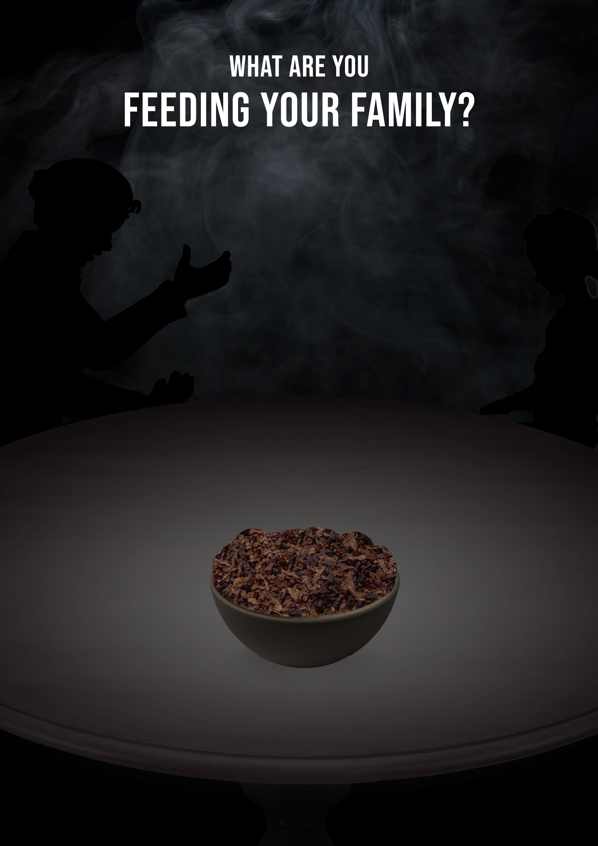
For the first draft, I was trying to include family members (in silhouette) to show an image that the smoker is feeding his family members exactly what he is consuming. Specifically, the contents of a cigarettes. However, feedback was given that the poster was not impactful enough to the audience and the silhouettes could not be seen amidst the dark background.

Draft 2:

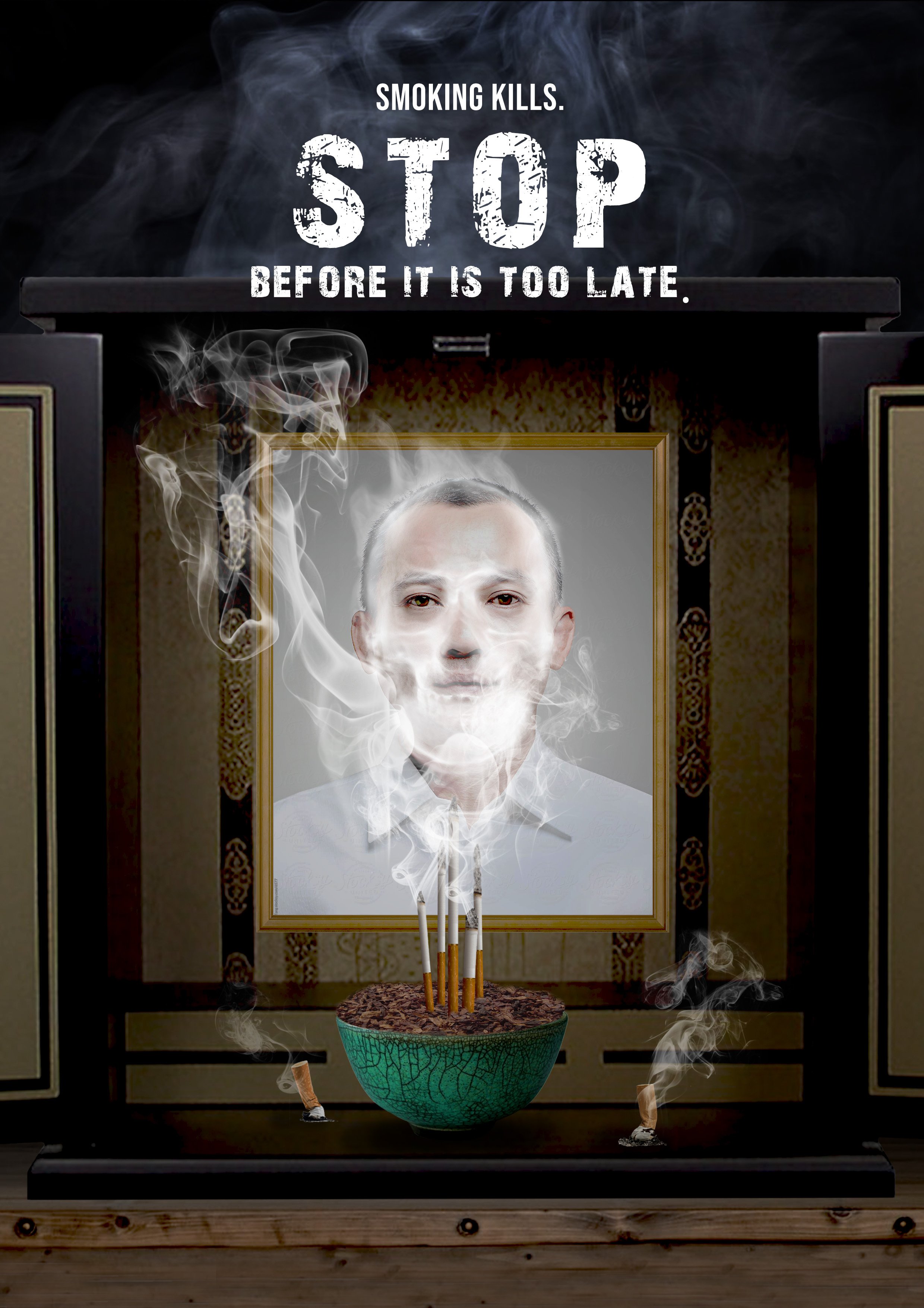
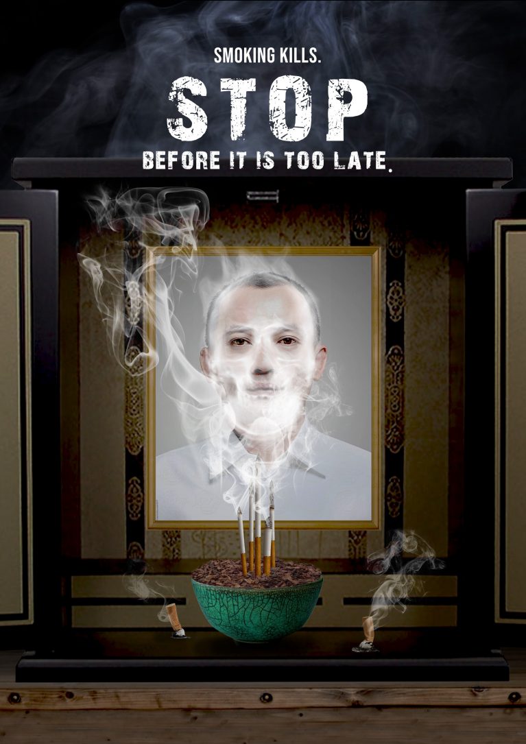
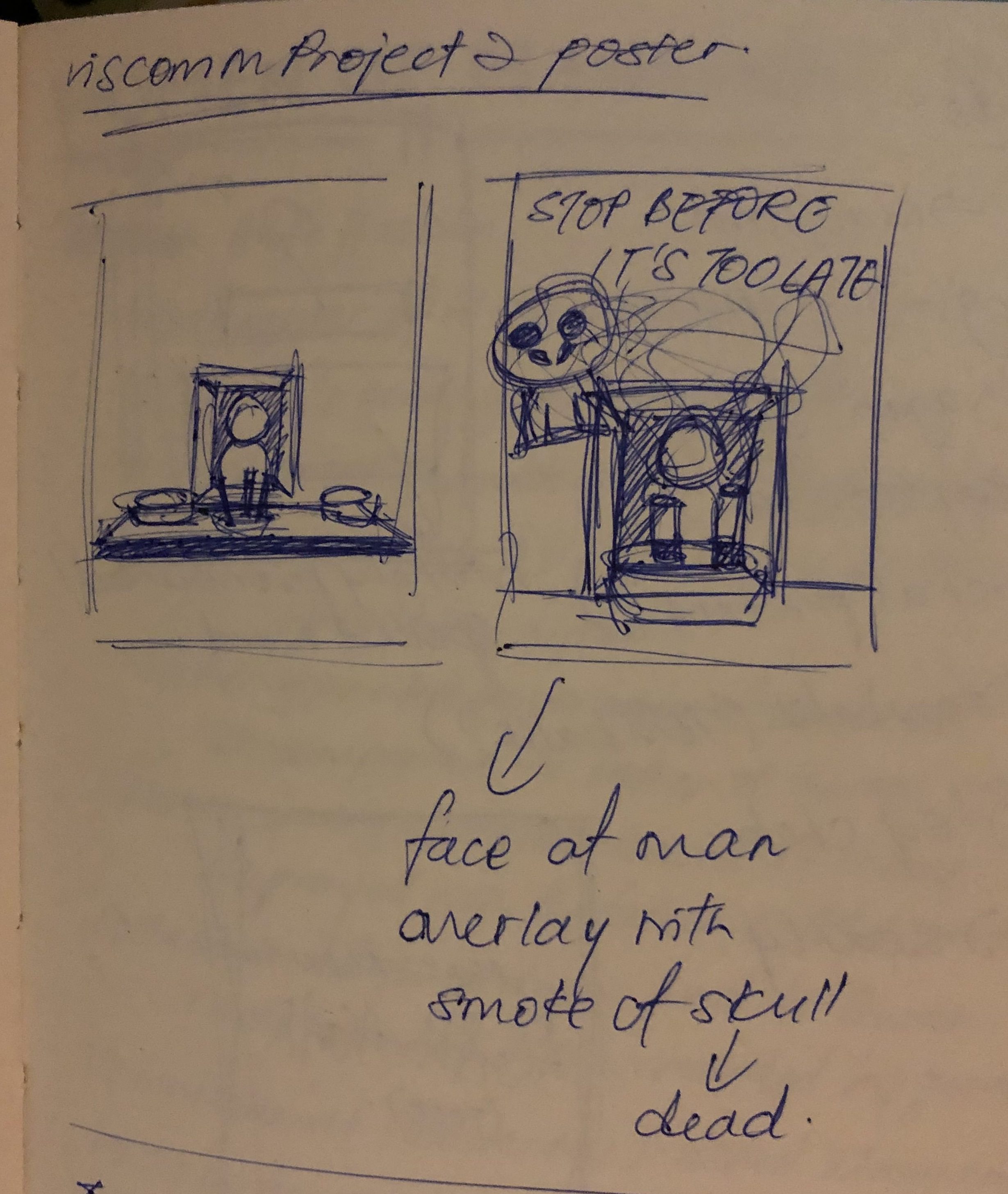
After the first consultation, I decided to make the poster as scary as possible. In a sense that it triggers the audience at how the severity of smoking is depicted. I’ve decided to include an image of a prayer table, with an image of a dead man covered in a skull of smoke. There are joss sticks replaced with cigarettes, to show how the man actually passed on due to smoking.
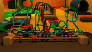
Draft 3:


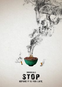
During the second consultation, I also introduced a whole new poster concept. Michael indicated that the new concept was more appealing as compared to the stereotypical dark posters. I have decided to go with the latter design.
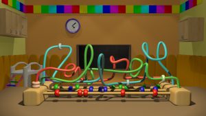
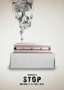
Draft 4:

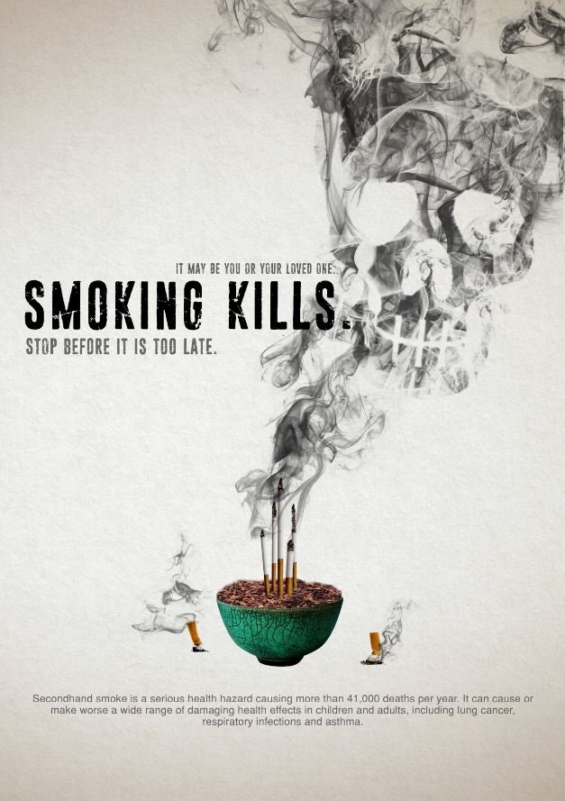
For the final consultation, Michael also gave feedback regarding the placement of the words. It was too centralized and he told me to include a brief description of the poster in it. He told me to make use of all the space in the poster. It was important to play with the white space but to make sure the words are not fused into the visuals.

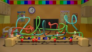
FINAL POSTER DESIGN:

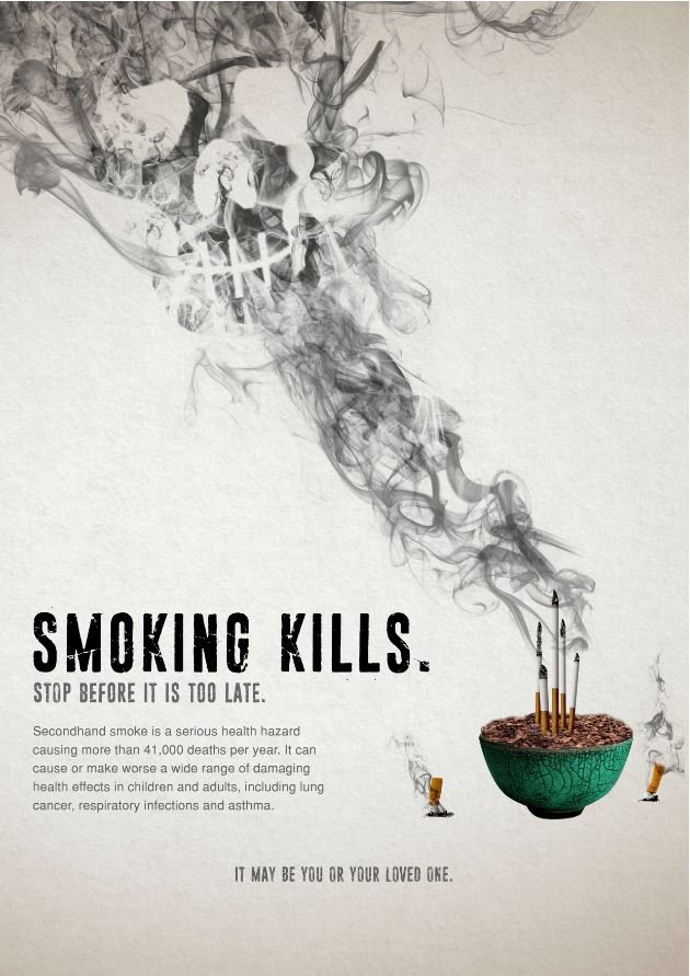
For the final design, I’ve played with the placement of the joss bowl and placed it in the far corner. The stream of smoke stretches across the poster on the opposite side. By doing so, it has given me sufficient white space to fill in my texts and the poster is more well-balanced and not centralized.

I’ve enjoyed the process of creating this poster. What I’ve learnt through my years in visual communication is that less sometimes can be more. It’s okay if the work has minimal elements in it, as long as it brings out the message of the poster.

Project 1 – 80%-100% FINAL

Standard

ICE SCULPTOR (80%)

I managed to find the proper ice texture. The object was made with a blinn (shiny and reflective) material. I changed the attributes of it, playing around with the refractive index so that the ice will be transparent but at the same time, refracting the background and lights. I added in bump map, which sole purpose is to create realistic texture but it is actually a flat image pasted on top of the blinn material.

I changed the background to something with more detail so that the refraction can be seen clearly in the ice.


PRESCHOOL TEACHER (80%)


I’ve decided to submit this 80% piece and then focus on improving the typography later on. I made use of the colourful scheme to make it look like a preschool classroom. Preschool are mostly filled with babies and toddlers. Their toys are mostly for educational purposes. I’ve decided to use this particular toy as there’s more freedom to create free-form shapes using the metal rods.


JAZZ MUSICIAN

I’ve decided to go with the outdoor scene as it looks more realistic. People would see this outside the club before proceeding inside. I changed the letter “Z” to a saxophone and the letter “I” to a microphone. I made the rest of the letters cursive to give it an informal and casual feeling. I feel that it’s quite easy to see that I am a jazz musician/singer due to the saxophone and microphone. And also the mini light bulbs surrounding the signboard.


ENGINEER (CIRCUIT BOARD)

This is the final outcome. I’ve combined various electrical components to create my name. I’ve used resistors and a crocodile-teeth wire for the letter “Z”, wires for the letter “A” and finally, an LED light board for “F”. I’ve decided to use my nickname “Zaf” instead of my full name. I thought of changing the wires for the letter “A” to a blue-coloured wire but decided it didn’t compliment the colours of the other 2 components as both of them are red in colour. I decided to use 2 different tones of red for the letter “A” to create a contrast. Props such as soldering iron and battery are placed around the name to show that I was working on the circuit board.

This project has allowed me to explore various ways of creating names in a unique manner. I have to say that I really enjoyed myself doing this project. Totally worth staying up till 5am everyday to complete this work *smiley face* I’ve decided to use Maya 2016 as the main medium for this particular project. I am still finding ways to improve myself. I have a feeling I’ll be more of a 3D graphic designer rather than a 2D for most of my work but I will try to explore different mediums more and step out from my comfort zone.

Project 1 – PROCESS

Standard

ICE SCULPTOR

For this particular piece, the main problem I had was to get the right amount of texture and composition to bring out the best from it. I started out with having a basic font and played around until I got the right texture.

The top image has a specific spotlight pointing directly at it. Thus, the bright shine omitted from the reflection of the ice. Where as the bottom image has a more realistic feel to it. I have decided to go with the bottom texture. But after consulting, I received comments that the font used was too simple and to play around with the placement of the letters. Upon further exploration and modeling, I came up with the piece below.

The first image was horrible. I forgot what the settings were for the ice texture. Thus, the outcome. Light was pointed towards it which makes it almost invisible. I removed the spotlight and replaced it with an ambient light instead. Thus, the result in the second image. The ice texture didn’t come out that much too. I realized that there was something wrong with the settings and attributes of the texture applied. I went back to Youtube to find the tutorial and realized I left out one major step which made made such major difference. The third image came out but I realized the background didn’t bring out much of the ice texture. I decided to edit the background further and the final outcome will be revealed in another post.


PRESCHOOL TEACHER

For this concept, I decided to make it as bright and colourful as possible but still maintaining my name to be legible.

However, after consultation for this piece, comments were given that the background and foreground had too much contrast. It was illegible in beginning and suggestions were given to make the background more subtle/darker while making the name brighter and center of attraction.

I modelled the background from scratch and decided to give it a more preschool classroom feel rather than the play-tent kind of background.

I decided the walls in the top image was a bit tad too plain so I added in some educational posters to make the classroom look more like a preschool classroom.

After showing this to my friends, they said they liked it but I could do something about the fonts. The ending of my name was a little bit hard for them to read. I used cursive fonts but the lowercase alphabets are all of different sizes. This makes it hard to read and differentiate which one of the letters are of upper case or lower case. One of my friends told me to refer to font proportion online and see the difference between an uppercase and lowercase.

https://c1.staticflickr.com/9/8707/28400030326_6314874581_o.png

I should change it but I’ll submit the 80% first. Hehe.


JAZZ MUSICIAN

When I hear the word “Jazz”, the first thing that came to my mind was a dark and gloomy place filled with good music and one of the important factor, NEON LIGHTS. I decided to make use of the neon lights to make a Jazz signage and portray that I am somewhat the jazz musician for the night.

I used the letter “Z” in my name and edit it to look like a saxophone as it’s the major instrument in Jazz. After consultation, I was told that the “afirah” was too fixed and constant. I could make further improvement and make it look more cursive.

I came up with 2 different backgrounds. One of the signage was hung outside the jazz club whereas the other one was hung against a brick wall in the club.

I’m contemplating whether to post the signage outside the club or the one against the brick wall for my final project.


ENGINEER (CIRCUIT BOARD)

I had a history of being a Design and Technology student. So I thought I could infuse my knowledge and my design together for this particular composition.

I started out with the basic empty circuit board as the base.

I started adding in components to create my name. I’ve decided to create my nickname “Zaf” as it is shorter than “Zafirah”. I added in resistors, wires and LED lights to create my name. The soldering iron at the top and battery are placed there for props. I’ll be posting my final outcome on another post!