Task 4: Cigarette Dispenser (Deliverable 2)

Standard

Purpose of product:

  • A gift to give your smoking friends
  • Cigarette Dispenser (makes it a hassle to dispense cigarette sticks)

3D Model on Maya:

Process (Main Product):

One of the hard part was actually putting a hinge on the cover and connecting it to the main body. Initially, I thought it would be easier to create a slide-in cover but it was quite tedious to make that. Therefore, I watched a video online on how to create a DIY hinge and I was not disappointed with the outcome.

For the visual aspect of the product, I’ve decided to include a sticker/label on it as a way to indicate the purpose of the product.

However, the feedback given was that it was too clustered with information and that it should be minimal. And also, the sentence “smoking hot” doesn’t really link to smoking as it has a more sexual tone to it.

FINAL STICKER:

I’ve decided to include only the ingredients of the cigarette on the design, with an additional of “lung/heart cancer” and “death” to indicate the risk of inhaling something toxic.

FINAL PRODUCT:


FINAL PRODUCT PUT TO USE:

Once again, I am very satisfied with the craftsmanship of the product. The purpose of it could be made better, as a sense to make smokers reduce the amount of cigarettes they light and dispense. The creation of this product has been very fulfilling.

Infographic Poster | Second-hand Smoking

Standard

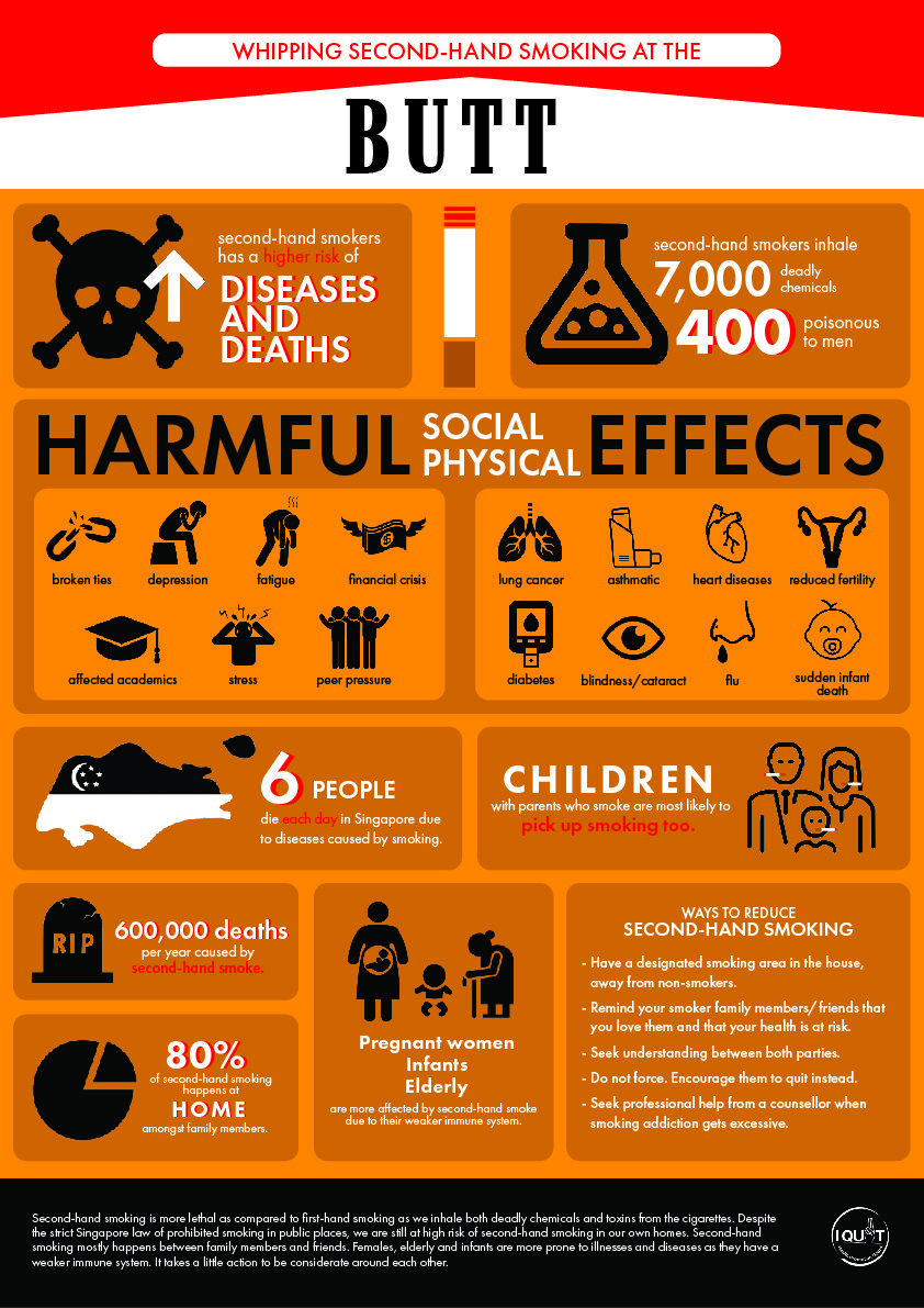
Information to include on poster:

  • The risks of second-hand smoking
  • Who they are affecting
  • Percentage and numbers on the severity of smoking
  • Solutions to smoking (second-hand)

I have used information collected from the survey collected and input in the poster. The colours I have chosen for my poster is orange, a colour used mostly for warning signs (road signs) which indicates the seriousness of the situation.

I have used mostly icons and minimal words to bring out the fast-reading process when looking at the poster. At the top of the poster, I have included a very well-known cigarette design, Marlboro Red. Smokers (or maybe second-hand smokers) would know this cigarette brand at first glance and they would be interested to read the poster.

Final Outcome of the poster:

Feebacks:

  • The header looks too separated from the poster. The poster can be cut into 2 pieces and still look good on its own. The header is not infused with the infographic.
  • Try to play with the skull from the infographic and blend it into the header
  • Some words are hard to be read (red on orange)
  • Infographic may look too stagnant, try to play around with the placement

Despite the constructive feedback given, I felt pretty satisfied with the outcome of the poster. I was really thankful for the information given by family and friends through the survey. It has made it easier for me to get specific information to include in the poster. I agree with how the header looks separated from the body. I felt like I was too much in my comfort zone for this assignment. I will try to explore more with the spacing in the next project. :3