
Indonesian/Malay-themed front page.

So many buildings called “Bugis”. Who are they?

Buginese lived by the Kallang River.

The came to Singapore through the Java Sea.

Let’s thank them too, shall we?

Indonesian/Malay-themed front page.
So many buildings called “Bugis”. Who are they?
Buginese lived by the Kallang River.
The came to Singapore through the Java Sea.
Let’s thank them too, shall we?

In this project, we were required to make a zine about a place we were allocated to. For me, I was allocated to – BUGIS.
As we all know, Bugis is mostly known as a famous shopping place AND for the food cafes. But I find that it’s too cliche to talk about the modern stuff of Bugis. Instead, I decided to make my zine more about the history of it. Not much people know that Bugis is actually a race in Indonesia and Singapore.
My initial idea was to follow the concept of old newspapers to show that it is of history content.

Old Malaysian Newspaper

However, when shown for consultation, comments were given that it was not graphic enough. I was told to rethink about my idea and try to focus more on flat design concept.
While brainstorming, I decided to start with having a fixed color palette as to make it very contrasting.
I came up with these designs.

Page 1
Comments: The borders are not of Malay/Indonesian design. And try to make an interesting heading instead of the name “Bugis” only.

Page 2 and 3
Comments: All the buildings are fighting for attention and the composition looks very cluttered and cramped together. Instead of focusing on 3D/Perspective imaging, try to focus on flat front view designs of the buildings.

Page 4 and 5
Comments: The sudden separation between the 2 pages seem awkward. Try to combine both pages together and have a fix color scheme. The ocean doesn’t have to be blue and the continents doesn’t have to be green, you can play around with colors.

Page 6
Comments: It doesn’t show that Buginese people lived by the Kallang River. Do they live in the building above? Try to add in a kampung to the image to show that they lived in kampungs on the river.
Page 8
—
Upon further improvement, I heed the advice and comments given and tried to further improve my composition. I’ve never really tried flat graphic designs before but I gave it a try. Here are the current improvements!

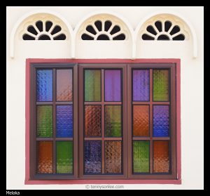
I added in the words “Niga Tau” which translates to “Who are” in Buginese language. I then changed the borders to something more floral and malay-like which is the famous fan/flower windows found in most modern kampungs.
—


Urban Landscape in Flat Design – Ramcreativ
For this particular design, I decided to focus on a front perspective view of buildings with the name “Bugis” in it and make it as cartoonized as possible, while showing only the prominent elements for the buildings. Bugis Junction with the ship, Bugis Street with its red top cover and cross tiles and Bugis+ with the black and white building and the red-green-yellow building which was once known as Iluma. I decided to follow the trendy flat design found of front perspective view.
—

Final!
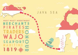
From the previous design I did of this composition, I’ve decided to combine both elements together and create it into a single A4 page. I included both countries and created a route from Singapore to Indonesia and vice versa (as they are constantly travelling). I then added in texts descriptions about the Buginese people. Comments given was that it was too loud since it was placed in the middle and too large till the rest of my elements were drowning behind it. And the words on the countries were blending in with the other fonts which made it too confusing when reading.
Thus, I decided to use the country colours and fill in the continents (coincidence that both of the countries uses the same colour, phew!) I also reduced the description about the Buginese people and placed it on the bottom left to make it less obvious.
While presenting, comments were given that the description was too blocky and squarish as compared the the free-shaped route drawn to show the movement of the Buginese people. If I were to make the blocky words more freestyled/shaped, it could be better.
—

For this piece, I decided to show that the Buginese people lived by the Kallang River and in sea kampungs. I used a 2-colour palette to show this composition. Using a front view of the kampung, I placed it above a yellow sea. In the white sky, I added in green clouds and also a original-yellow sun.
—
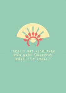
For the back page, I made it as simple as possible with minimal wordings, “For it was also them who made Singapore what it is today”. This is to reiterate that Buginese people were one of the first few to contribute to the upbringing of Singapore but they are so underrated. I added in the fan and the ever-so-popular Indonesian/Malay Sanggul (head-dress) and combined them together to form one icon.
—
All in all, I really enjoyed this project. It allowed me to experiment on things that I was not comfortable with in the beginning. It was a challenge for me which I gladly took up as I am more of a 3D-kind of person as compared to flat designs. I am quite pleased with the end product and it was a $6.40 well-spent, hehe.

Our group consists of Jannah, Nisa and I.
Our theme was Sounds of Asia. But after the presentation, we realized that it was actually sounds of Singapore since we are focusing on the 4 main ethnicity here; Malay, Indian, Chinese and Caucasians. Jannah and Nisa came out with the concept and we each added on to improve it.
The main objective of our project was to guide our viewers to the times during early Singapore days where trading was at its peak. Since Singapore was located in the middle of Southeast Asia, it was the most convenient for people from other countries to come and trade things with other people or with us. Hence, we’ve decided to use this installation to have an educational purpose to educate Singaporean on the history of trading as most of us are clueless about this topic.
We’ve decided to build the installation at the ADM pond. Since water is surrounding the installation, we’ve decided to make use of it. Hence, we’ve used ships from different races to be played on the screens within our artifact. Why ships? Back then, cars and aeroplanes were not as commonly used compared to ships and boat. Ships were considered the mostly convenient way of travelling as they can carry a huge load. The only downside is that it’ll take weeks or months to reach their destination. The main purpose of the screen was to make it as immersive as possible for our audience when they are viewing it. The room will be dark and the only light source will be coming from the screen itself.
Nisa has created a short stop-motion on how the animation will most likely look and sound like.
Link: Sounds of Singapore
She has used music from the 4 different race to enhance the video. Some of the musical instruments used can be found below.

European instrument

Chinese instrument

Malay instruments

Indian instruments
When Nisa created the sound, I focused more on creating and modeling the visual outcome of our final installation. I’ve used the Maya 2017 software to create this setting. It was then rendered on Arnold.
For the final piece, we’ve decided to use the concept of the Orang Laut type of old jetty. Hence, why the jetty looks very Malay instead of it being a general and neutral rooftop. Trading started since the Orang Laut days. The rooftop was made to look very traditional and giving off the kampong vibes. Fences can be seen to be surrounding it as in the old days, these were used to make the bridge or jetty strong and it was also used as a barricade to prevent people from falling into the see.

Moving inside, bowls can be seen hanging from the ceiling.These bowls are hung to be interacted with. How do we know which are interactive and which are not? The bowls that are hung to a reachable length are the ones that needs to be interacted with. There are 4 main ones which are of reachable length. These 4 bowls are off the 4 different cultures and race in Singapore as mentioned earlier.
There will be a motion sensor attached to the bowl so that it will activate the music and the “museum guide” will start explaining what the touched bowl represents and also the story of their trading back in the past.


As you can see in the image below, there seems to be a button located in the middle of the walkway. Our idea was to use it to allow audience to come and press it as natural human instinct are always attracted to buttons. Hence, some will be curious and press it. The button uses a 555 timer which can only be activated once for a certain amount of time. This prevents people from pressing it excessively. The main purpose of the button was to activate the whole set display and wow-ing the audience.

However, after getting comments back from Michael and the class, it seems like it was better to use motion sensor instead of a button as people would not be attracted to an empty room (before the lights are turned on). Adding on to the things we could improve, Michael suggested that we could make the exhibition slanted and hidden so that people would be more curious and enter the place. Because for now, our installation is too bare open and people would just take a peek inside and walk off when it is not interesting.
All in all, I’ve enjoyed doing this project as I can finally put my skills to a test. It was enjoyable as we learn about our history along the way while we were researching. And also, we get to experiment and visualize easily how we want our end product to be with the help of this software.