ICE SCULPTOR
For this particular piece, the main problem I had was to get the right amount of texture and composition to bring out the best from it. I started out with having a basic font and played around until I got the right texture.
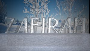
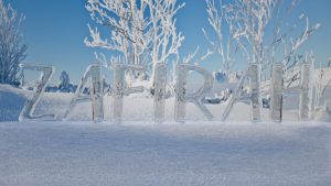
The top image has a specific spotlight pointing directly at it. Thus, the bright shine omitted from the reflection of the ice. Where as the bottom image has a more realistic feel to it. I have decided to go with the bottom texture. But after consulting, I received comments that the font used was too simple and to play around with the placement of the letters. Upon further exploration and modeling, I came up with the piece below.
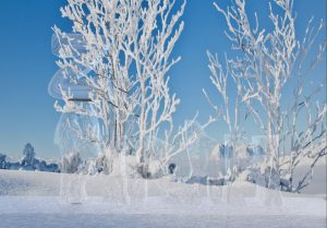
The first image was horrible. I forgot what the settings were for the ice texture. Thus, the outcome. Light was pointed towards it which makes it almost invisible. I removed the spotlight and replaced it with an ambient light instead. Thus, the result in the second image. The ice texture didn’t come out that much too. I realized that there was something wrong with the settings and attributes of the texture applied. I went back to Youtube to find the tutorial and realized I left out one major step which made made such major difference. The third image came out but I realized the background didn’t bring out much of the ice texture. I decided to edit the background further and the final outcome will be revealed in another post.
PRESCHOOL TEACHER
For this concept, I decided to make it as bright and colourful as possible but still maintaining my name to be legible.
However, after consultation for this piece, comments were given that the background and foreground had too much contrast. It was illegible in beginning and suggestions were given to make the background more subtle/darker while making the name brighter and center of attraction.
I modelled the background from scratch and decided to give it a more preschool classroom feel rather than the play-tent kind of background.
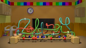
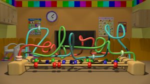
I decided the walls in the top image was a bit tad too plain so I added in some educational posters to make the classroom look more like a preschool classroom.
After showing this to my friends, they said they liked it but I could do something about the fonts. The ending of my name was a little bit hard for them to read. I used cursive fonts but the lowercase alphabets are all of different sizes. This makes it hard to read and differentiate which one of the letters are of upper case or lower case. One of my friends told me to refer to font proportion online and see the difference between an uppercase and lowercase.
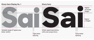
https://c1.staticflickr.com/9/8707/28400030326_6314874581_o.png
I should change it but I’ll submit the 80% first. Hehe.
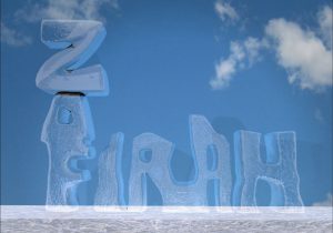
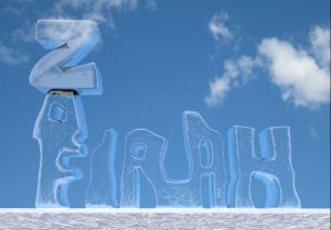
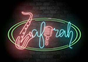
JAZZ MUSICIAN
When I hear the word “Jazz”, the first thing that came to my mind was a dark and gloomy place filled with good music and one of the important factor, NEON LIGHTS. I decided to make use of the neon lights to make a Jazz signage and portray that I am somewhat the jazz musician for the night.
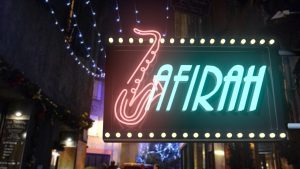
I used the letter “Z” in my name and edit it to look like a saxophone as it’s the major instrument in Jazz. After consultation, I was told that the “afirah” was too fixed and constant. I could make further improvement and make it look more cursive.
I came up with 2 different backgrounds. One of the signage was hung outside the jazz club whereas the other one was hung against a brick wall in the club.
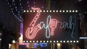
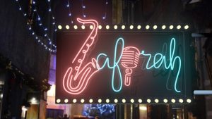
I’m contemplating whether to post the signage outside the club or the one against the brick wall for my final project.
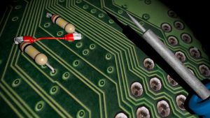
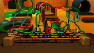
ENGINEER (CIRCUIT BOARD)
I had a history of being a Design and Technology student. So I thought I could infuse my knowledge and my design together for this particular composition.
I started out with the basic empty circuit board as the base.
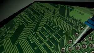
I started adding in components to create my name. I’ve decided to create my nickname “Zaf” as it is shorter than “Zafirah”. I added in resistors, wires and LED lights to create my name. The soldering iron at the top and battery are placed there for props. I’ll be posting my final outcome on another post!