Project 1 – RESEARCH

Standard

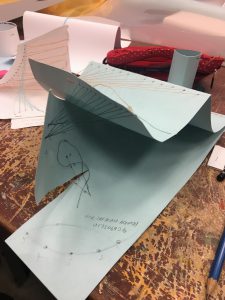
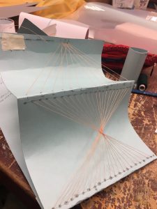
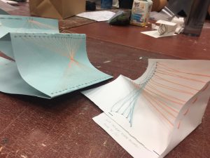
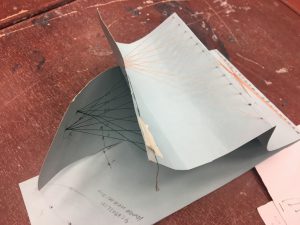
In this project, we’re required to focus on different various typography of our own and infuse it to an occupation. I’ve decided to choose the 4 different occupations.

PRESCHOOL TEACHER

JAZZ MUSICIAN

ICE SCULPTOR

ENGINEER (PRINTED CIRCUIT BOARD)

I’ve made some research and found trends amongst the different occupations.


PRESCHOOL TEACHER:


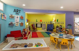
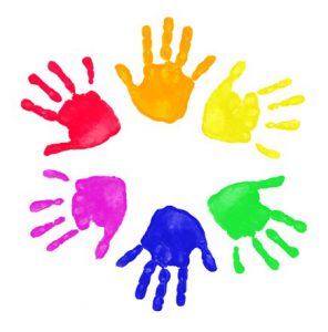
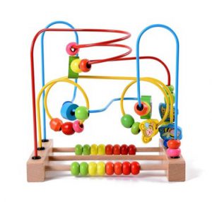
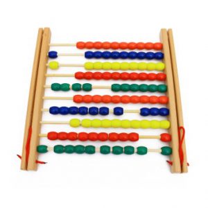
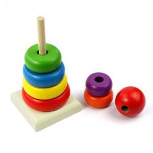
As you can mostly see, most of the things in a preschool classroom are mostly brightly-coloured and are of soft edges since babies/toddlers can’t be around sharp objects and toys. Since a preschool is mostly for babies and toddlers, their toys are mostly of educational purpose that trains their mind and movement.


JAZZ MUSICIAN:


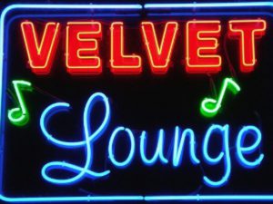
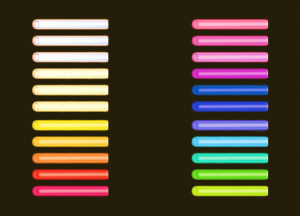
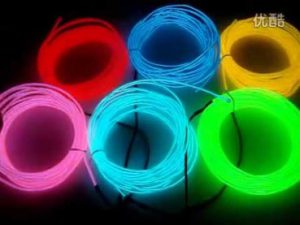
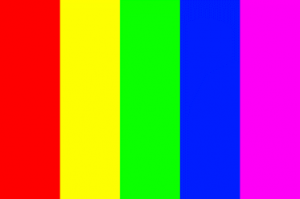
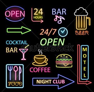
Most of the neon lights have a glow to them which makes it noticeable that it is a neon light and not just a regular light stick. The brighter it is, the stronger the neon light will be. Most of the fonts used in this are sans serif, smooth and informal. If there’s more than one word in the signage, multiple fonts are used so that it does not look too dull. As for the colours, they are mostly of primary colours such as blue, red, green, yellow, orange, purple and pink (this is an exception). Most fonts for Jazz clubs use blue colour and are of cursive San serif font for their signage.
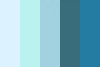
 

ICE SCULPTOR:


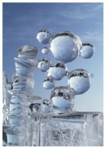
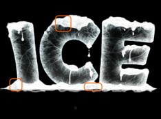
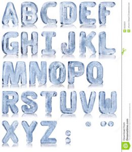
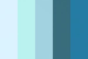
The colours used are mostly of cool tones, mainly of the blue shade. There’s different type of ice too. Some are transparent whereas some are frosted. The placement of elements for each ice sculpture are different too. Some are placed side by side whereby some are stacked on top of each other. The fonts used are mostly thick and bulky as thin ice chips away too easily. It will be a tedious job to find the proper texture for this but I will try my best.


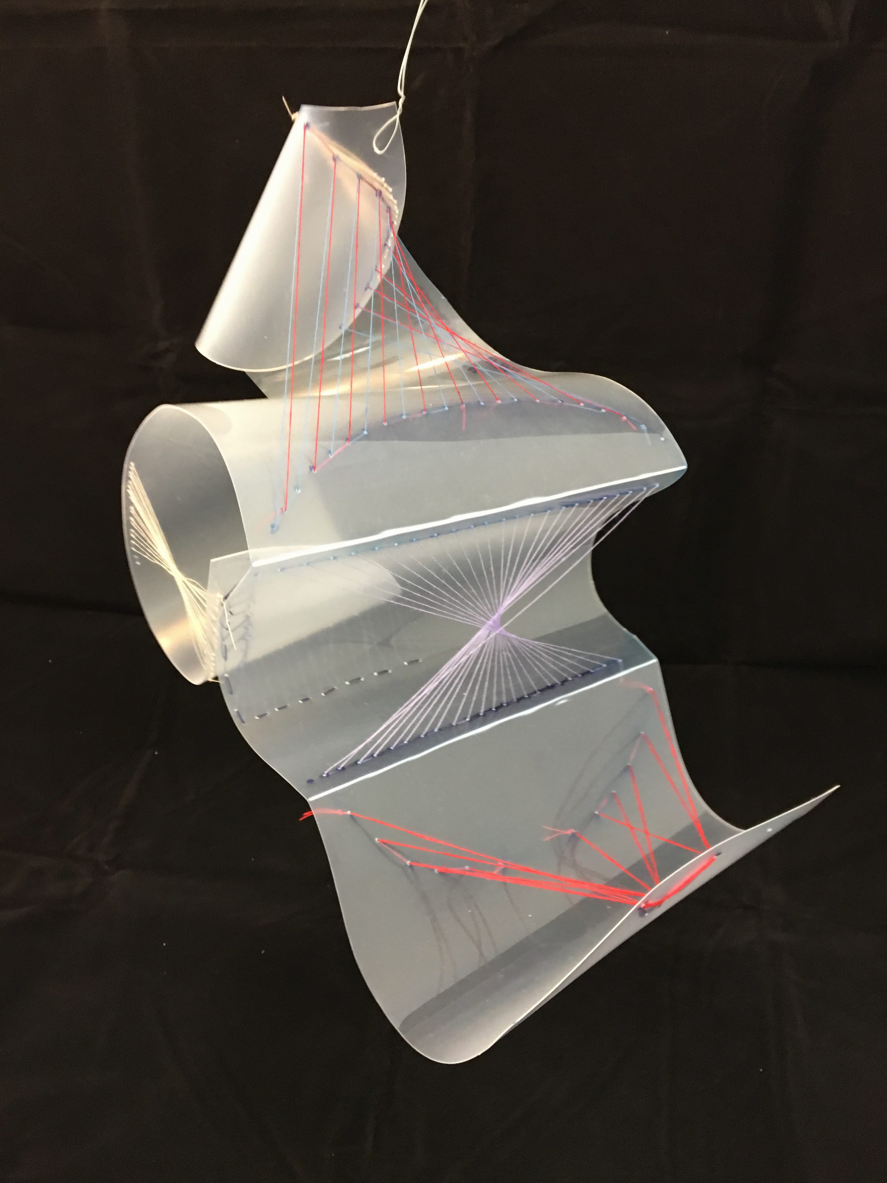
ENGINEER (PRINTED CIRCUIT BOARD):


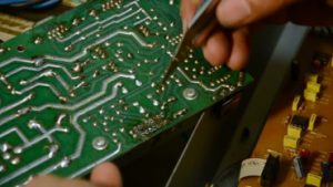
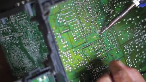
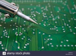
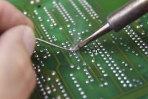
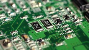
Soldering is very important in an engineer’s life. It is what keeps everything together in a electrical component. Electrical appliances such as phones and laptops require this important . I’m planning to use the different components such diodes, capacitors and resistors to add on to the typography. The main font will mostly be connections of wires and solderings. The colour used is mostly of green and metallic grey.


Let’s hope what I have in mind will be executed nicely!

Threads and Planes (3D Project): Process and Final Outcome

Standard

The main scope of our first project was to create a plan using threads. We were tasked to make holes on our plane (paper and then hard plastic) and then sewing in and out with needle and thread to create that plane. I’ve tried to use different color threads so that it won’t be confusing.


Ideation & Process:


Initially, I had this design in mind. I’ve decided to create a squarish plane and combine each side together. I would’ve gone with this design but there were 2 problems as to why I didn’t. Firstly, the plane was forcefully folded and it wasn’t the threads that gave its shape. Secondly, only the inner part of the plane was aesthetically nice. There were no threads found on the back or bottom part of the plane.


This was the finalized design for my final project. I’ve decided to fold some parts of the plane and also using the pull and strength of the thread to create a fold. Initially I wanted to put a “pole” in the middle of the artifact for support and wrap the thread around it (as shown in the image below) but realized that it was not encouraged when Peter checked my work and gave me feedback. I saw this idea from my friend’s instagram and decided to give it a go but failed miserably. Very very miserably.


The process was hard as I had to crack my head and find which angle and folds work best for my artifact. I used a long rectangular plane and the cut it up and fold to make it into a smaller one. I had to make use of both sides to get a balanced look but as I added more threads to my artifact, it became messy, small and overly-tightened.


FINAL OUTCOME:


This was my final artifact for the project. I’ve used different colors. I’ve added some plane by the sides too. However, I’ve come to realize that using threads of many colors has caused the whole thing to look messy. I should’ve used at most 3 different colors to make it look nicer. And some of the thread color I’ve used seemed too bright to be seen from far, especially in the pictures above. All in all, I’m proud of how I was able to tighten the threads to make it look neat and presentable.


In conclusion, this project has greatly taught me the importance of these 3 basic elements: Dots, Lines and Plane. Without even 1 of the element stated, I would’ve not been able to complete the project smoothly. By combining these 3 together, it has created a aesthetically pleasant visual form of art and may create something else if used differently with different amount of emphasis on each element. I this particular project, we mainly focused on lines and planes. All in all, I’ve enjoyed completing this project as it enhances and opens my creativity to different mediums.