For this project, we were first instructed to come up with a word list that represents us.
My list consisted of:
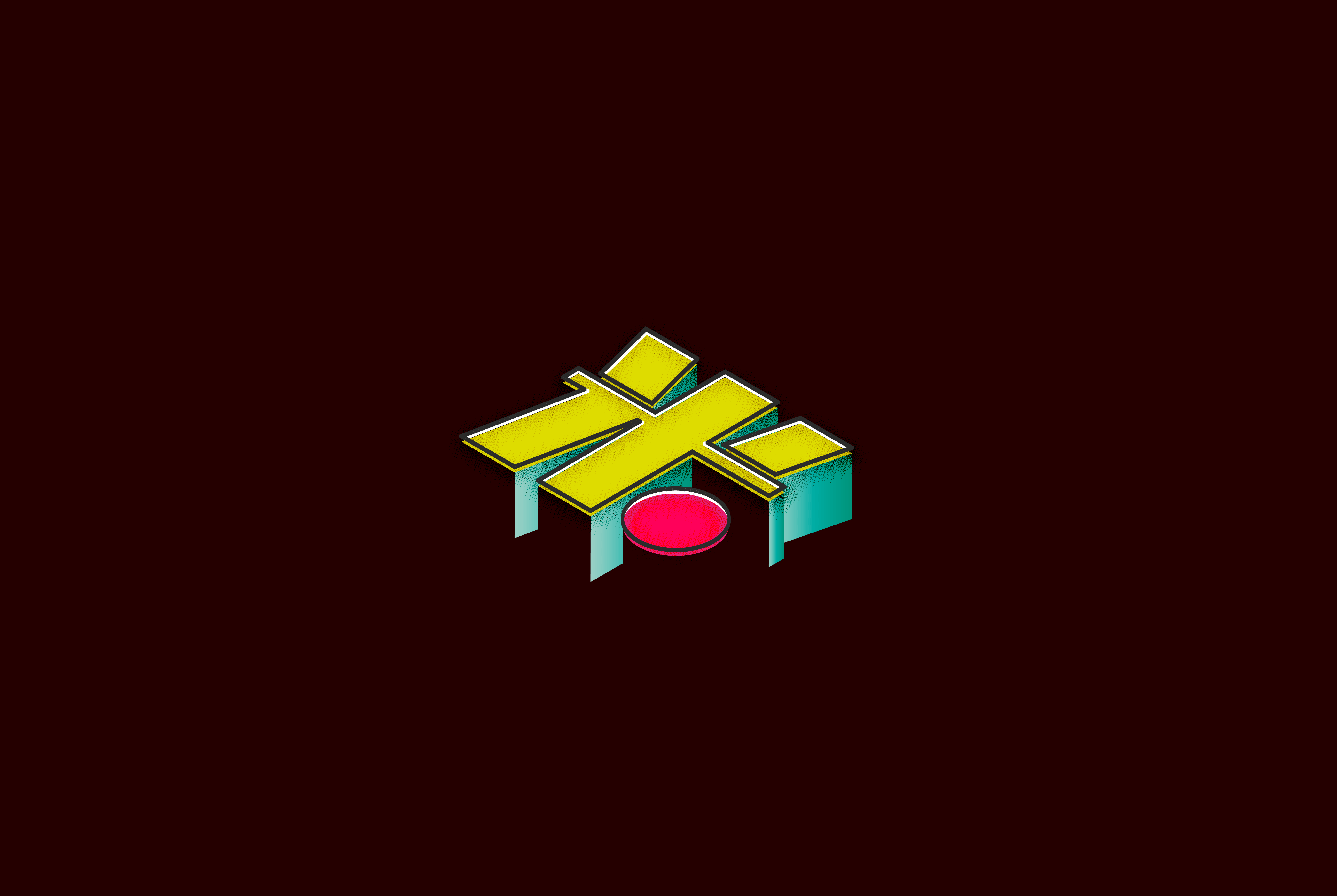
- 米 (mi) – chinese word for rice(to represent my chinese-ness and also cause I can’t live without rice) and a play on the last syllable of my name
- Spiderverse – a movie that i’m recently obsessed with
- Meat – my favourite food
- Oldies – my preference in music
- Seafood – also my favourite food
- Sleep – what I spend all my free time doing
The following pictures are some references I took inspiration from in terms of style and composition:

I liked the comic book look and thought the vintage retro style would help convey my preference for oldies as well.
Self portrait ideas:


I liked the flat colour scheme which only uses a few strong colours while also being stylised without too much realism.
Composition Scene Ideas:

The explosion of various things which was abit cliche so I rejected that first.


Scene portrayal of grocery shopping/picnic/checking out at the cashier as a lot of the items in my list were food related and I thought this was a neat way of tying everything together nicely instead of just making a collage of all my objects.
PROCESS

Left: inspired by the piece by @carlafuentesart – scene of me checking out a basket containing all the food items I love at the supermarket. Right: character design of myself – trashcan and greedy face to portray stuffing myself with junk all the time, and sleeping mask as eyes to show how much I love sleep.

2. Conveyer system w stray dog by me as a companion and embracing me of sorts as a sign of comfort

2. Rats bringing food to my mouth – because I always have food deliveries be it from my friends or self-ordered
3. UFO sucking of food into my nostrils to show me “inhaling” the food. Also caterpillars for eyebrows as my mom is always calling them that as theyre so untidy all the time.

After group critique, these are some of the feedback I received:
- Can try vacuum sucking the food instead
- Kirby sucking
- Try other angles like side angle and landscape orientation instead
- Garbage dumpster instead of trashcan
- Bigger mouth
- Composition can be more hourglass w rats forming curves along the sides
DIGITALISING
I decided on a more neon colour scheme for my character as I felt it would match the more eccentric design. I wasn’t too sure how much I could stray from realism though i.e, in terms of the colour of my hair which definitely isnt neon green although I preferred the neon green version of my eyebrows and lashes in the design, however after emailing Lisa, she also chose the neon green one thankfully hence I went from there.


After emailing her both of the above images, Lisa pointed out that the conveyer belt did not really look like a conveyer belt yet and that the rats took a lot of attention and as I filled up my composition with more objects, I definitely felt it too.


In my email, I also asked Lisa for ideas regarding the background as I had difficulty thinking of what to fill it up with.
She told me about @benisright on instagram who illustrates images like the following:

I really liked his clean and light colour scheme and subtle use of grain and it actually reminded me abit of @junobirch which I previously also referenced. Hence, my final design resulted in this:

DIFFICULTIES
- Colour – I’m terrible at colour matching and even now i’m not too sure if the neon character matches the pastelish background but I couldnt turn everything neon and still have the focus be on my character.
- Perspective – the conveyer isn’t straight and flat and I still wanted it to resemble a tongue a little so placing things on it was problematic in terms of how they were gonna look on a surface that isn’t flat.
- Shading – I have a problem with visualising lighting so shading isn’t something that comes naturally to me, which is also why most of the time i prefer flat colours but I really wanted to try a little shading with this one to help things pop out more.
- Stylising – I’m just not the most creative person