WHAT EXACTLY IS ” PRINCIPLES OF DESIGN”

In a nutshell, the principles of design describe the ways that artists use the elements of art in a work of art.

What that means is that ( my interpretation)  by varying the use of the different principles of design, your final product will be significantly different in the form of its aesthetics, as well as the message/ mood behind the piece of art. Personally, I feel that the elements of design are like our alphabets and the principle of designs are words and sentences that give meaning to our design. It is a form of communication and therefore, it is important to understand the key principles of designs and know how to use them  correctly to achieve your intended outcome.


WHAT ARE THE PRINCIPLES OF DESIGN

 During my research for the principles of designs, the results I got were quite inconsistent with some listing extra principles. However, there are mainly 5 core principles that were emphasized, namely

  • Balance
  • Proportion
  • Rhythm
  • Emphasis
  • Unity

For the definitions that I will be quoting later in the post are adapted from  https://www.getty.edu/education/teachers/building_lessons/principles_design.pdf

I chose the definitions used in this pdf as it is shorter and easier to understand.


BALANCE

Balance is the distribution of the visual weight of objects, colors, texture, and space. If the design was a scale, these elements should be balanced to make a design feel stable. In symmetrical balance, the elements used on one side of the design are similar to those on the other side; in asymmetrical balance, the sides are different but still look balanced. In radial balance, the elements are arranged around a central point and may be similar.

human-reflection-symmetry-body

An example of symmetrical balance


EMPHASIS

Emphasis is the part of the design that catches the viewer’s attention. Usually the artist will make one area stand out by contrasting it with other areas. The area could be different in size, color, texture, shape, etc.
69b68ac74e5c6a2559bef531b6254e95

The designer uses a different colour ( red) to isolate the object he wants to focus on.


PROPORTION

Proportion is the feeling of unity created when all parts (sizes, amounts, or number) relate well with each other. When drawing the human figure, proportion can refer to the size of the head compared to the rest of the body.

5cbcd1c9853478aa3bb44f5e2b6d215a


RHYTHM

Rhythm is created when one or more elements of design are used repeatedly to create a feeling of organized movement. Rhythm creates a mood like music or dancing. To keep rhythm exciting and active, variety is essential.

rhythm-design

Repetition, Alternation and Gradation are ways in which designers can create movement in their designs


UNITY

Lastly, Unity is the feeling of harmony between all parts of the work of art, which creates a sense of completeness.

unity


Pattern is the key underlying structure– is the most fundamental element for a strong sense of unity. Consistency of form and color are also powerful tools that can pull a composition together.


After 4 weeks of research, drawing, cutting and pasting, I am proud to present to you my Final work for submission.


Just to sum up my overall experience, i feel that i have accomplished the designs that i have set out to do and i am satisfied with my work. I wanted my work to showcase my ” usual” drawing style and thus, the mediums i have chosen for the assignment are mainly graphite, charcoal, ink and Chinese ink. On top of that, because i am accustomed to drawing rather than design, i found abstract work to be a challenge and so, i have decided to take a more simplified and minimal approach.

From my designs, you can observe that my designs hardly fill the entire frame. As part of the minimalist approach, i have decided to have the lines interact with the spaces in the individual strips as i believe that the spaces play an integral role of carrying the meaning behind the emotions. Also, this give greater contrast to the subjects which are the lines. i believe that the way you manipulate a single line can be effective enough in expressing the artist’s, rather than having complex shapes or patterns.

As for my execution of ideas, it was a two-pronged approach for me. The first being, immersing myself into that emotion and just create lines out of instinct. These emotions are the ones which you can relate to. i like this approach as it is quite an accurate depiction of the emotion i am working on and you will never know how it turns out till you finished it. I did this for emotions like aggressive, indecisive and awkward.

Another approach being inspirations from the real world. What i mean by that is that i draw similarities between a particular emotion and real world objects that are normally associated with the emotion. I carefully studied the lines that represent the object or the lines that the object possesses and utilize the same concept for my strips. Take psychotic for example. Psychotic remind me of nerves and nervous breakdowns and thus, i tried to incorporate lines in my strip that looks like strands of nerves being pulled. Another case being sensual, where i took the strong curves in women bodies and have them drawn on the strips. I then create a smudge to bring out the contrast and accentuates the curvature of the lines.


And that is how i did my project: simple, minimal and elegant. Or at least i felt that way 🙂 ENJOY!!!


IMG_20150908_105743~2 IMG_20150908_105750~2IMG_20150908_105807~2


IMG_20150908_105728~2


GOODBYE PROJECT 1. IT WAS FUN WHILE IT LASTED!!!

( Time for the next project )

DISCLAIMER!!! I like to pen down whatever thoughts i have when i do my “brainstorming” sessions hence i apologies if my handwriting and organisation of ideas looks a bit unorganized and unrefined.

Hey everyone, welcome to my journal and the entire exploration process for my 1st 2D project entitled, ” A line is a dot that went for a walk”. Hopefully, you guys can get to know more about my work style and thought process. Also, in this post, you will be seeing the “evolution” in the development of my ideas from start to finish. Let’s get started.


1st stage of my journal: GENERATION OF IDEAS AKA THE SKELETON 

After breaking down the emotions into their respective definitions and keywords from my initial research, i then took my own interpretation into some concept work. These process is where the ideas are all bare-bones and very rough sketches. Along with the sketches, i tend to label certain important notes to myself like the thickness of lines, possible type of mediums as well as some other alternative approach.


journal page 2journal page 3journal page 4

journal page 5


2nd stage of my journal: DEVELOPMENT OF IDEAS AKA ADDING MEAT TO THE BONES

At this stage, after having a rough idea of what i am working with, i like to put all the ideas i have and collate them in one page of paper ( like the format of our submission). On top of that, i start to experiment with mediums, slightly. This gives me a good gauge to which medium is suitable for whichever emotions i am drawing. I would say this step really start broadening my perspective and is important for the subsequent development of my ideas. ( After all, a body cant function without MUSCLES, right?)

journal page 6journal page 7


3rd stage of my journal: FURTHER DEVELOPMENT OF IDEAS AKA LAYERING THE SKIN ON TOP

Following stage 2 of my thought process, I did further development of ideas that is similar the previous step, but on a larger scale this time. I went straight to experimenting with the canvas size that i will be using for my submission (A3). During this step, I have came up with few designs that i am confident and comfortable with and hence working on the actual canvas gave me the closest look to the final product. However, most of the works at this stage are basically playing with different strokes, mediums as well as textures. I try to experiment as much as possible so that i see what are the designs i can work with. It is like how a chef prepares the all the ingredient that will be useful, before picking the ones he needs.

IMG-20150908-WA0002IMG-20150908-WA0003

experimentation 1experimentation 2experimentation 5

experimentation 3

experimentation 4


4th stage of my journal: CONSULTATION AKA THE BODY NEEDS SURGERY!

During the consultation period we had in class, i gain valuable feedback for my work. Most of the strips that I thought are decent came out fine so i don’t have to much alteration to my original ideas. As for some others, I had to remove them out because they are not as strong in conveying the emotion and with the help of the teacher, i understood what are the changes to be made and came up with new ideas along the way.

Below are some examples of the strips that were rejected and removed during the “surgical” process.

rejected strips


5th stage of my journal: FINALIZING THE DESIGNS  AKA RECOVERY PROCESS

At this point, i simply repeated stage 2 and 3 till i have came up with the designs that are satisfactory.

we are almost done …  Stay with me !


6th stage of my journal: PUTTING EVERYTHING TOGETHER AKA PIECING THE BODY PARTS

This stage is self explanatory. By this stage i was done with my strips so i had to cut out the frames and mount them altogether. I shall let the pictures tell the story.

cutting the framescutting the frames 2IMG_20150905_172241_462


Final Stage: THE END!!! IT’S ALIVE!

So that wraps up project 1! It was definitely something new for me to be experimenting with lines and to understand more about the abstract world. I would say that i am really proud of my work and I am satisfied with the outcome. Thanks for checking out my journal! Here is to good grades, everyone. CHEERS! 🙂

IMG_20150907_232432


“A line is a dot that went for a walk”

In order to start creating lines that represent these emotions,

i have looked up the definitions of these words

as well as coming up with my own definitions/ perspective on the individual emotions. 

The definitions I have came up with are my guidelines to how i create my lines to bring out the emotions.

I then conducted my research on the various types of lines and

the meaning behind them to find suitable lines that can describe the emotions.

Also, i  look up the works of various artists, studying natural lines that are found in our daily objects and environment.


experimentation 5 (3)

PART 1: Definitions

  • Anxious: feeling or showing worry, nervousness, or unease about something with an uncertain outcome.

own definition:  being worried as something bad is about to happen;  uncertain.

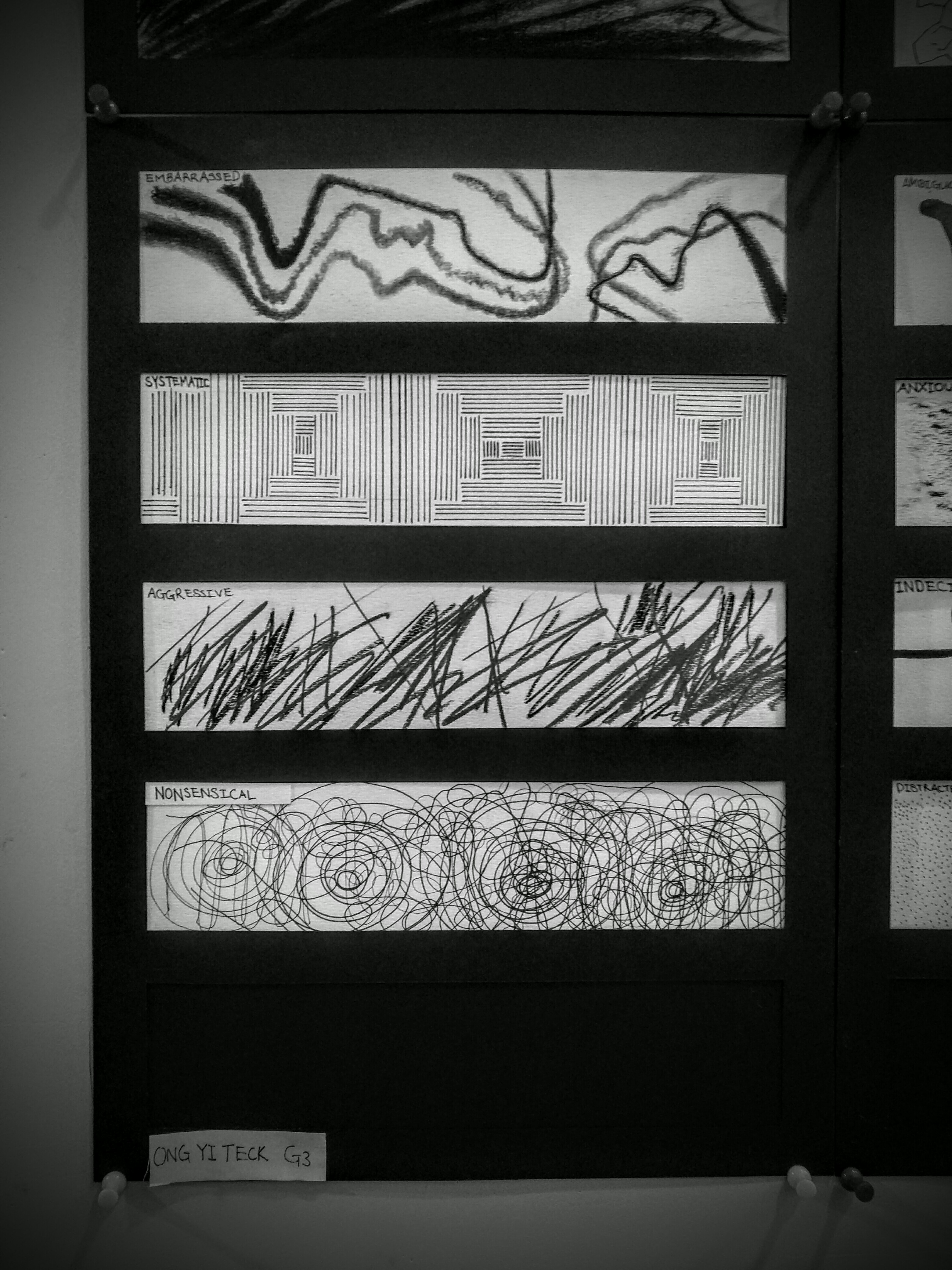
  • Embarrassed:  to feel awkward, self-conscious, or ashamed.

own definition: shying away from what one sets out to do.

  • Bizarre: very strange or unusual.

own definition: things that look alien, does not take particular form/ incorporate too many forms.

  • Exhausted: very tired.

own definition: there is a great drop in energy levels e.g. after a long run/ a long day at work.

  • Fragile: (of an object) easily broken or damaged.

own definition: glass cracking.

  • Systematic: done or acting according to a fixed plan or system; methodical.

own definition: has an order, pattern/ sequential. Firmness/ Rigidity.

  • Lyrical: (of literature, art, or music) expressing the writer’s emotions in an imaginative and beautiful way

own definition: smooth, simple and yet very elegant.

  • Turbulent: characterized by conflict, disorder, or confusion; not stable or calm.

own definition: Storm brewing; huge waves crashing.

  • Nonsensical: having no meaning; making no sense.

own definitions: Scribbling without thinking. messy, almost rubbish.

  • Psychotic: relating to, denoting, or suffering from a psychosis.

own definition: mad, crazy. Nervous breakdown.

  • Ambiguous: open to more than one interpretation; not having one obvious meaning.

own definition: multiple perspectives to view the subject. No definite “right” or “wrong”.

  • Distracted: unable to concentrate because one is preoccupied by something worrying or unpleasant.

own definition: unable to focus.

  • Sensual: of or arousing gratification of the senses and physical, especially sexual, pleasure.

own definition: intimacy between males and females.

  • Sloven: a person who is habitually untidy or careless.

own definition: being messy, sloppy.

  • Spontaneous: performed or occurring as a result of a sudden impulse or inclination and without premeditation or external stimulus.

own definition: outburst of energy/ extremely active.

  • Aggressive: ready or likely to attack or confront; characterized by or resulting from aggression.

own definition: rage, anger, violent.

  • Awkward: causing or feeling uneasy embarrassment or inconvenience.

own definition: uncomfortable, inelegant/ not graceful.

  • Indecisive: not providing a clear and definite result.

own definition: going round and round before coming to conclusion.


IMG_20150907_222631-2

PART 2: Various types of lines and its meaning.

  • Dot – A mark on a point. The defining characteristic of a dot is that it’s a point of focused attention. As dots increase in size we start to see them as shapes ( mainly circle ), but they still retain their fundamental dot-like qualities and characteristics
  • Line – A line is a series of points adjacent to each other. Where a point has no dimension, a line has one dimension (length).
  • Thin lines are fragile. They appear easy to break or knock over. They suggest frailty and convey an elegant quality. They are delicate and give off an ephemeral air.
  • Thick lines on the other hand appear difficult to break. They suggest strength and give emphasis to nearby elements. Thick lines are bold and make a statement.
  • Horizontal lines are parallel to the horizon (hence the name). They look like they’re lying down, at rest, asleep. They suggest calm and quiet, a relaxed comfort.Horizontal lines can’t fall over. They accentuate width. They’re stable and secure. The convey an absence of conflict, a restful peace. Horizontal lines by their connection to the horizon are associated with earth bound things and idea.
  • Vertical lines are perpendicular to the horizon. They are filled with potential energy that could be released if they were to fall over. Vertical lines are strong and rigid. They can suggest stability, especially when thicker. Vertical lines accentuate height and convey a lack of movement, which is usually seen as horizontal.They stretch from the earth to the heavens and are often connected with religious feelings. Their tallness and formality may give the impression of dignity.
  • Diagonal lines are unbalanced. They are filled with restless and uncontrolled energy. They can appear to be either rising or falling and convey action and motion. Their kinetic energy and apparent movement create tension and excitement. Diagonal lines are more dramatic than either horizontal or vertical lines.Diagonal lines can also appear solid and motionless if they are holding something up or at rest against a vertical line or plane.
  • Curved lines are softer than straight lines. They sweep and turn gracefully between end points. They are less definite and predictable than straight lines. They bend, they change direction. Curved lines express fluid movement. They can be calm or dynamic depending on how much they curve. The less active the curve the calmer the feeling.
  • Zigzag lines are a combination of diagonal lines that connect at points. They take on the dynamic and high energy characteristics of diagonal lines. They create excitement and intense movement. They convey confusion and nervousness as they change direction quickly and frequently. They can imply danger and destruction as they break down.


Information adapted from http://vanseodesign.com/web-design/visual-grammar-lines/


By researching on the various types of lines and its characteristics, i then map out the possible lines that compliments the emotions, as follows:

  1. Dot – Distracted
  2. Thin lines – Fragile, Sensual, Lyrical
  3. Thick lines – Turbulent, 
  4. Horizontal lines – Sloven, Anxious
  5. Vertical lines – Systematic
  6. Diagonal lines – Spontaneous
  7. Curved lines –  Sensual, Lyrical, 
  8. Zigzag lines – Awkward, Embarrassed, Indecisive


PART 3: Finding references/ inspiration from the art world and the real world

Lastly, to sum up my research work, i tried searching online for images with interesting lines that actually portray certain emotions, and gotten some inspiration from it.  I have classified my image search into two categories: Art world and Real world.

From the arts, i did some searching on artworks from renown expressionists/ abstract painters that were listed in the lesson outline like Cy Twombly, Sol Lewitt, Ed Moses, Franz Kline etc. And although i did not research extensively ( so as to generate more original ideas by my own), it provided me with insights to how artists invoke emotions through their strokes of paint.

As for the real world, i had certain references in mind that is synonymous or symbolic to the emotions listed. For example, when i see turbulent, i thought of huge powerful waves crashing in the seas. I then looked up images on waves and carefully study the types of lines and its composition that would bring out the turbulence in the waves. likewise for sensual, i interpret it as the curves on women bodies and hence, i took reference from nude models and simplified the lines to its bare-bones, allowing it to bring forth the sensual feel.

Below are some of the reference images i used. ( Disclaimer: i do not own any of these images, all downloaded from google search. Just using it to illustrate my thought process here.)

PhotoGrid_1441637103659 PhotoGrid_1441637145192

PhotoGrid_1441637599022