It’s finally 2016!!! A brand new year, bringing a brand new semester which then brings a new project.Truth to be told, the title of our first project got me PRETTY STOKED at first and gotten my hopes up. That was until i came to realize that it is not what I thought i it was.
TYPOGRAPHIC PORTRAITS…
Is this what we are supposed to do??

NOPE. Apparently not.
As misleading as it sounds, the project is not about creating portraiture with words ( damn it ) but rather, we were tasked to create font types, with little help of supporting imagery, to “portray” the intended meaning…
… SAY WHUUUT??!!
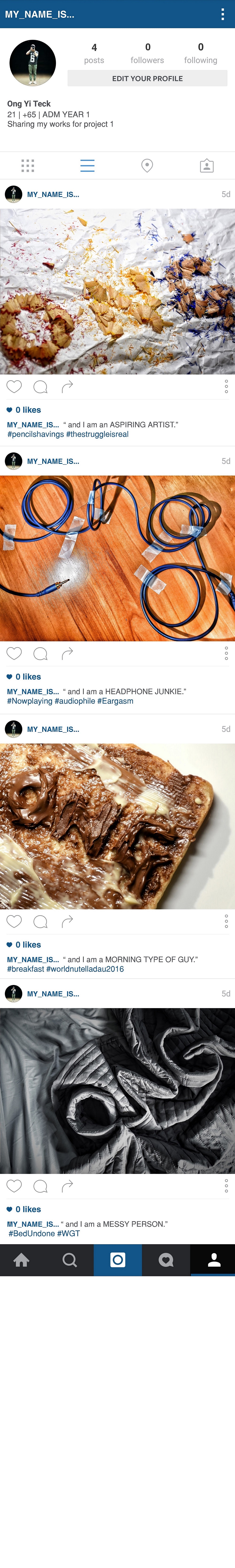
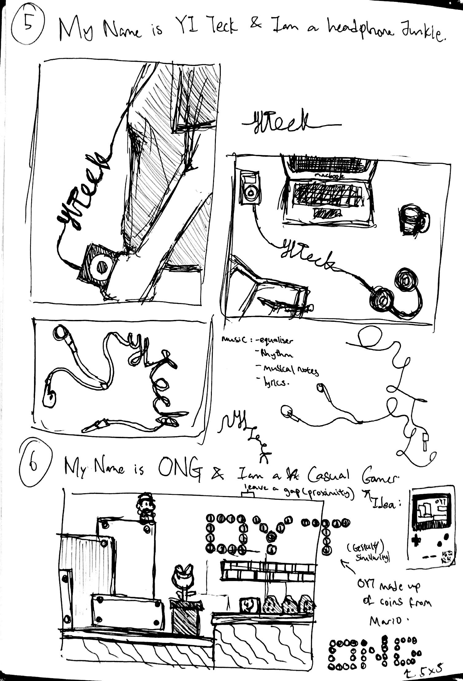
“MY NAME IS…”
We were supposed to decide on a name to be used in our composition and come up with any occupation or affirmation that we would like to work with.
” My name is (___NAME___) and i am ( ____OCCUPATION/AFFIRMATION_____) .”
So my first step to my research is deciding on the name(s) to be used. My full name is Ong Yi Teck but it has 3 syllabus which is a bit cumbersome to work with and i decided not to use it.
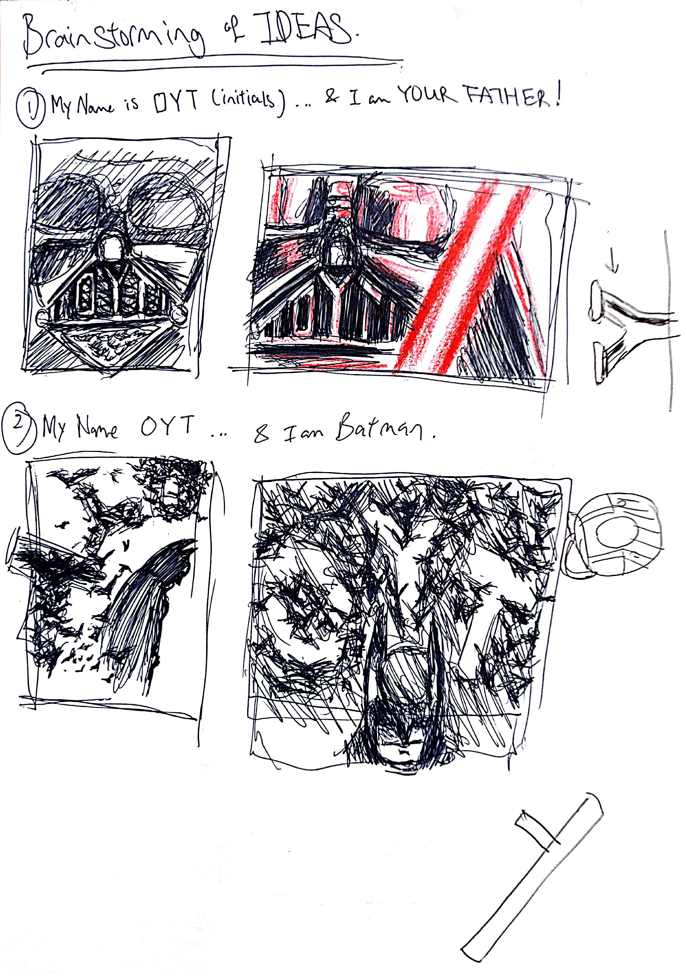
My initial plan was to use my initials, O-Y-T. But along the way, after working with a quite a few designs, I soon realized that the art doesn’t speak to me. It doesn’t capture the essence of my name and i doubt it will leave an impact on the viewers.
Instead, I went with my surname ‘ONG’. It is short and simple. Funny thing is that, during my time in National Service, most of my colleagues are Malays and they had trouble pronouncing my full name. Hence, they addressed me as ‘Ong’ and soon i got used to being called by that name!!!
“… AND I AM …”
After deciding on my name, I then listed out some of my ambitions and hobbies and personalities. At this point, I am not very confident with the list i have because, as much as i want this project to be creative, i wanted it to be an extension of who i am and make it more of a personal work.
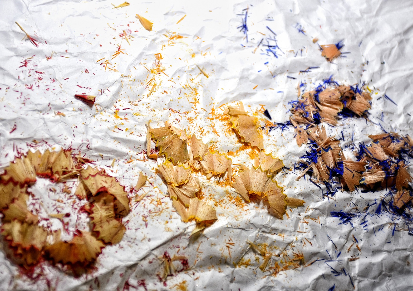
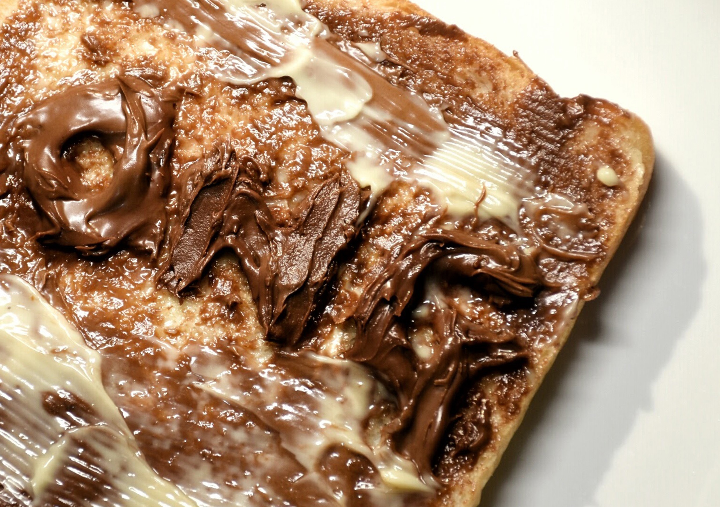
Below are some of my thought research in my sketchbook:


FONTS AND TYPEFACES
We all know that are hundreds and thousands of fonts in this world ( just look at the list available on Microsoft words ) and it can be quite daunting to start the project right away without prior knowledge about fonts. Therefore, to find the suitable typefaces for my works, i did some research about fonts.
Basically, fonts can be divided into 4 main groups or typefaces as we know ( Note that there are other typefaces as well) and they are Sans Serif, Serif, Scripts, and Decorative.
Sans Serif
What you are reading now, everything in this post, is typed in Sans Serif typeface. This typeface includes fonts like Helvetica, Avant Garde, Arial, and Geneva


Serif
Serif font is basically Sans Serif font with small decorative line added to the characters. The ever so popular font Times New Roman is an example of a serif font.


Script
Script typefaces are based upon the varied and often fluid stroke created by handwriting. They are organized into highly regular formal types similar to cursive writing and looser, more casual scripts.


Decorative
Lastly, we have the decorative font, also known as Ornamental or Display fonts. They became popular in the 19th century and were used extensively on posters and advertisements because they considered artistic and grabs your attention.


After studying the typefaces available, I had a better understanding to how i should pick my fonts.