Oh look! It’s already the final lesson of the semester, and probably the last time I would have to do Foundation 2D ( unless I were to become a 2D professor in ADM ).

Time sure flies when you are having fun, or when you are simply drowning in a pool of assignments. Either ways, as much as I have been looking forward to the arrival of this day, a tiny part of me is secretly crying, knowing that I have to bid farewell to it for good. There were so much fond memories during the entire journey amidst all the terrible experiences and sleepless night that made my freshmen year a blast. Every new project had certainly taught me something new and gave me a fresh perspective on the definition of art. In the end, it was all worthwhile.

In this final project, zine, I wanted to create a visual journal that captures all the highlights of my first year, the adventures I had in self-discovery as a newbie and a collection of works that I am proud of.


FCBC

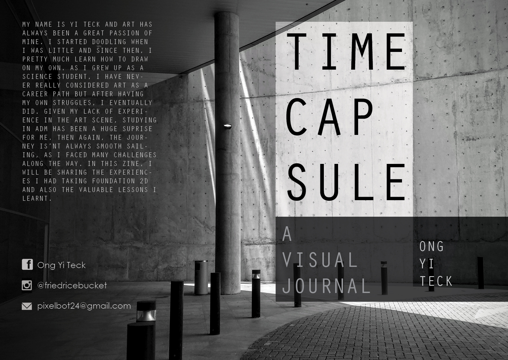
For my front and back cover, I have chosen a photo of the ADM’s entrance that I took during the first week of school. I felt like this  photo depicts the beginning of journey in ADM as it is the first thing I see whenever I go to school and it reminds me of the decision of choosing ADM (even though it wasn’t much of a choice). The sun beam signifies a hopeful start to this new chapter of my life.

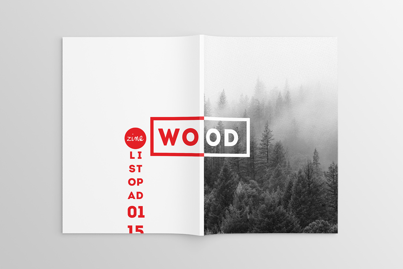
As for the design for the covers, as well as the rest of my zine, I followed a 3 column grid layout for a clean and organized look. Time capsule is the title of my zine as I wanted to seal the best of my 2D lessons all into this booklet and whenever I were to look back at it in future, I can relive all those moments again. I placed a large title on the upper half of the page inside a white translucent text box, followed by a medium sized text for ” A visual journal” within a grey box and then directing the viewer’s eyes to the right of the page with a smaller text of my name. This is to shift their attention to the edge of the page where they can flip to the next page.

All in all, I was going for a clean look and an achromatic color scheme that reflects my personality and style before entering ADM.

FCBC2

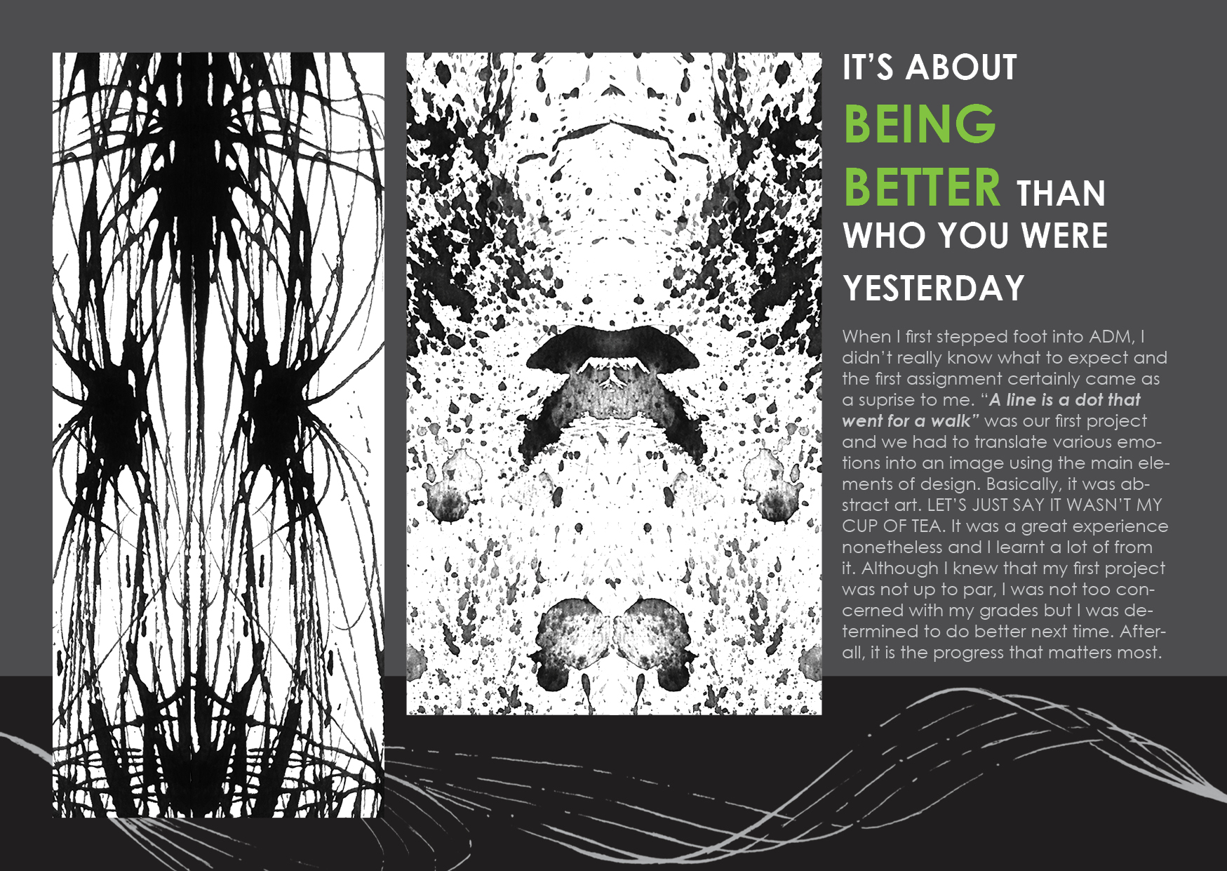
“IT’S ABOUT BEING BETTER THAN YOU WERE YESTERDAY …”

My first spread is dedicated to the first project we had, a line is a dot that went for a walk. As mentioned earlier, my layout revolves around the 3 column margins to give it a neat and structured aesthetic. The treatment I gave to my artworks from the project is to rotate it 90 degrees such that it is vertical and then mirror the image to enhance the overall design of the spread. I sized the two main drawings and the text in a hierarchical form from left to direction to transition the viewers through the pages. I also added the 3rd artwork that had cursive and continuous lines stretching from one and to another at the bottom. This generates a movement that directs the viewers’attention as well.

I came up with this title because I felt that there is nothing more important in art than seeking self-betterment. Sure there are times when you would feel envious or even jealous at your friends’ works and doubting the qualities of your own work. But that shouldn’t be the case because you are never going to be them. We are all creative individuals with our own styles and I feel that we should be focusing on how to improve upon on our own styles rather than to be concerned with others. And as long as you see yourself improving day by day, regardless of how small or big the improvements are, you will eventually get there. Believe it.

FCBC3


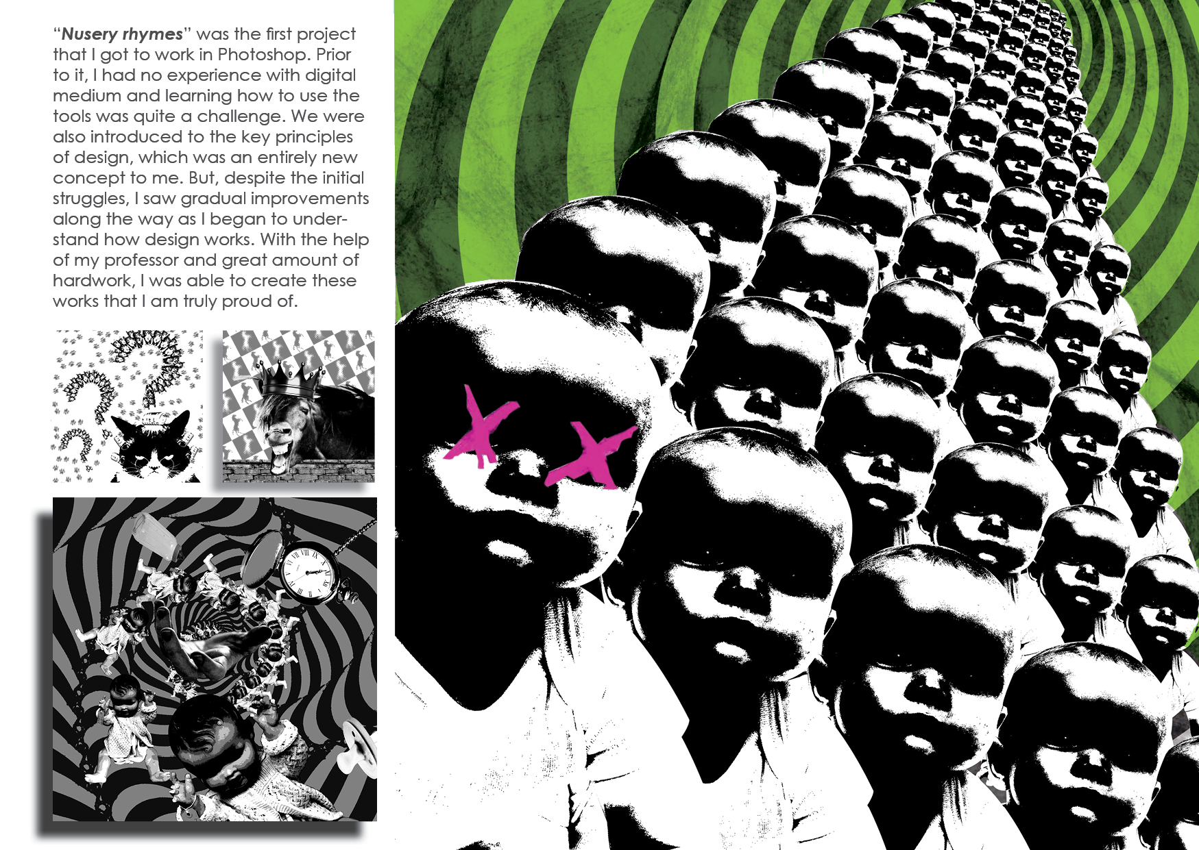
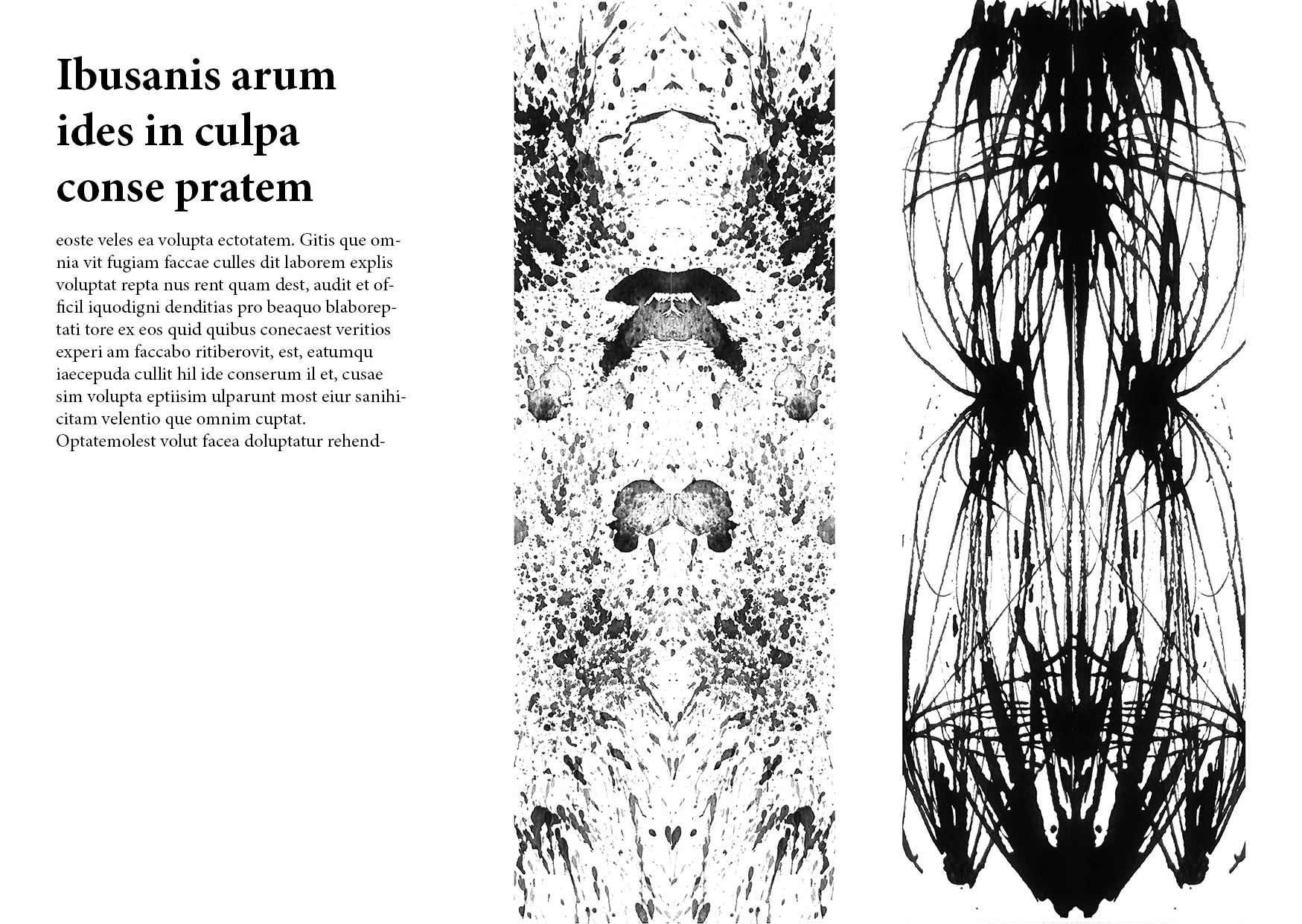
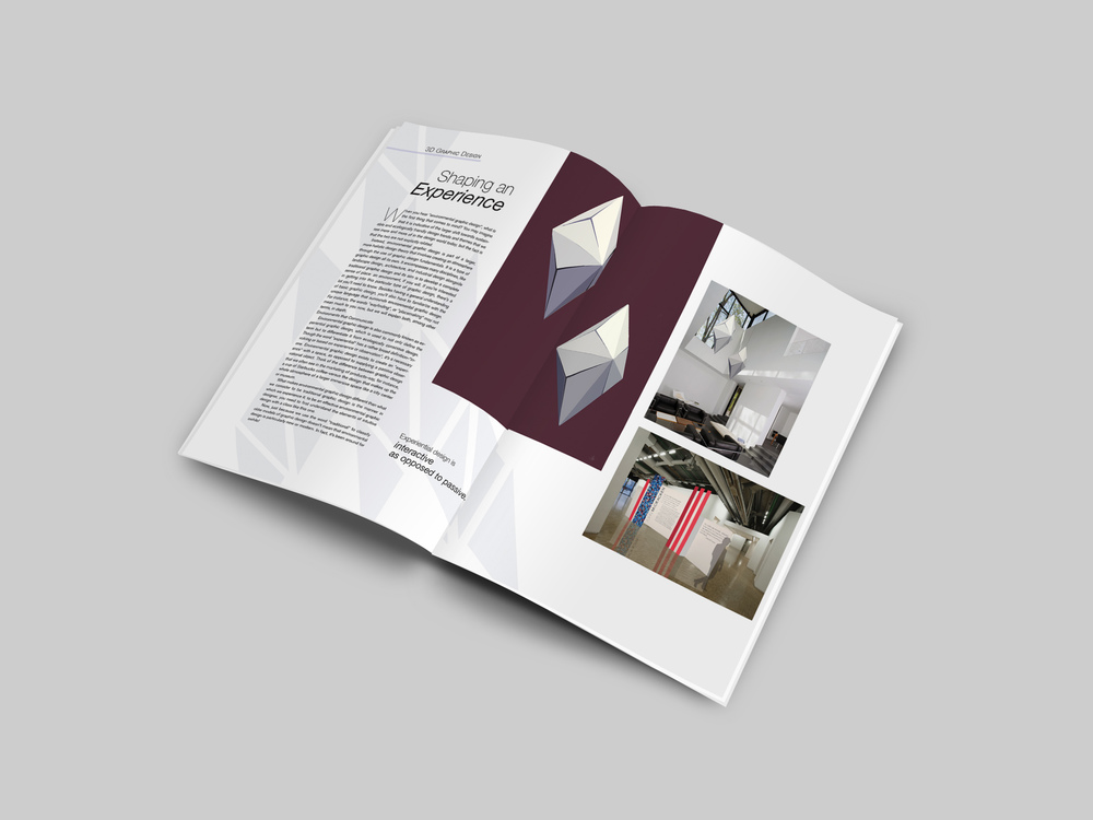
Following the same theme of self improvement, my next spread is to showcase my improvements in the use of Photoshop.  Never had I used Photoshop prior to this project and it is the first time I learnt about the principles of designs. I chose to include 4 main artworks on this spread to showcase my development with Photoshop. I stretched my favorite piece of work to fit two-thirds of the spreadsheet to have it enlarged so that people can appreciate the details of it. Then, I organized the remaining 3 artworks to fit the grids and they are of different sizes to show hierarchy as well as a natural flow from the 1st design to the last design.

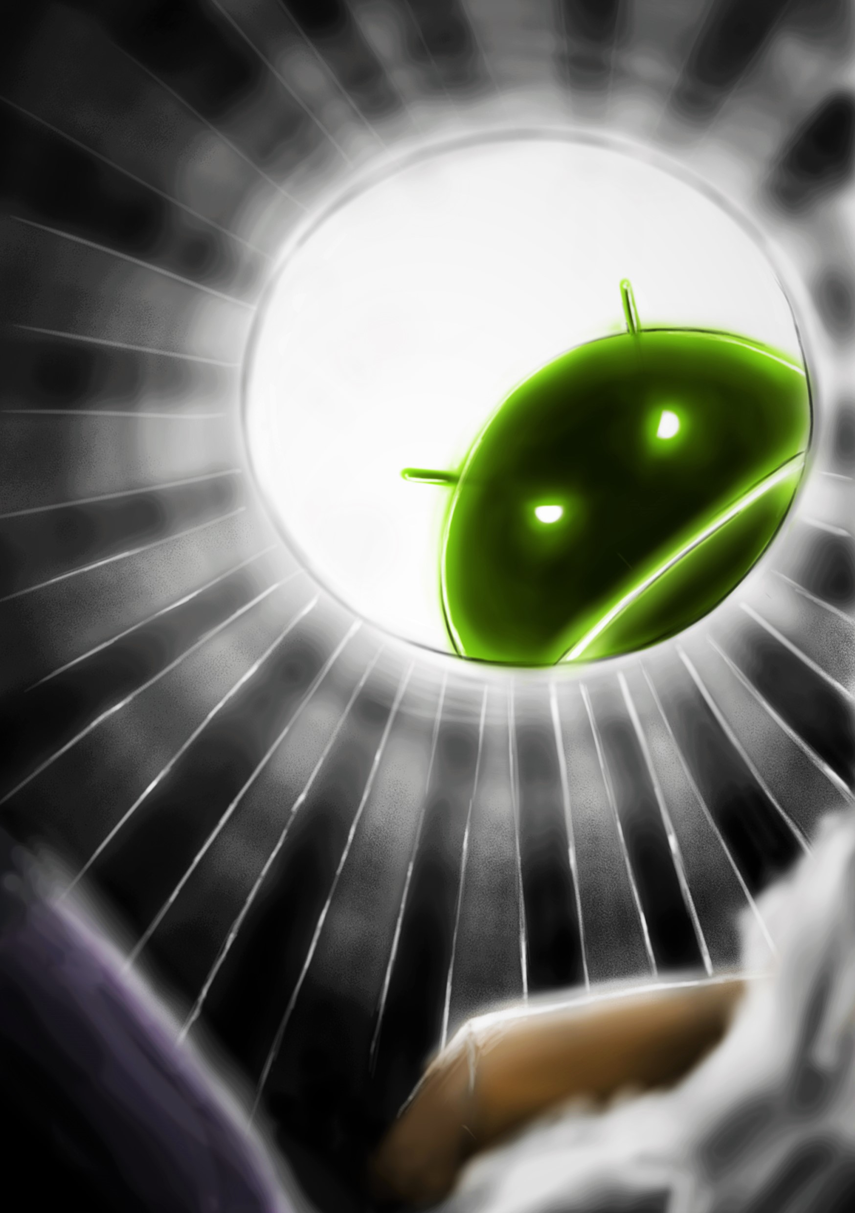
As all of the artworks for this project were done in black and white, I have decided to add colors to spice things up a little or it will be very boring to look at. Then again, the layout is rather tight on this spread for me to experiment with fancy designs and colors and so I decided that I would color in the background of the larger artwork instead. I picked the color green because i felt that it gives a creepy vibe when multiplied with the textured background. After doing so, I then got the inspiration from one of the album covers of the band, GREEN DAY because of how similar it looked, which i later added two pink colored crosses on one of the babies’ eyes. Surprisingly, i feel that the outcome turned out pretty well because of the complimentary color scheme.

FCBC4

”STAY TRUE TO YOURSELF AND EMBRACE YOUR OWN STYLE…”

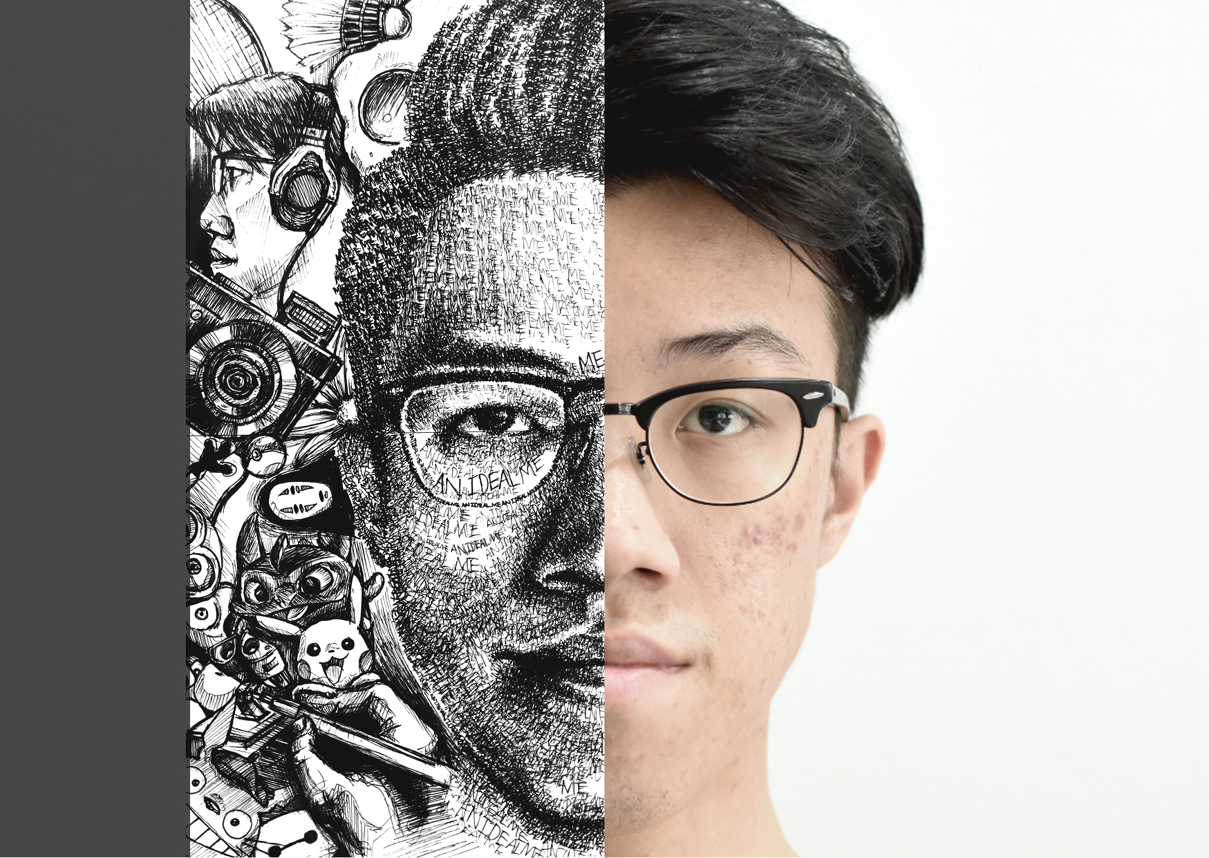
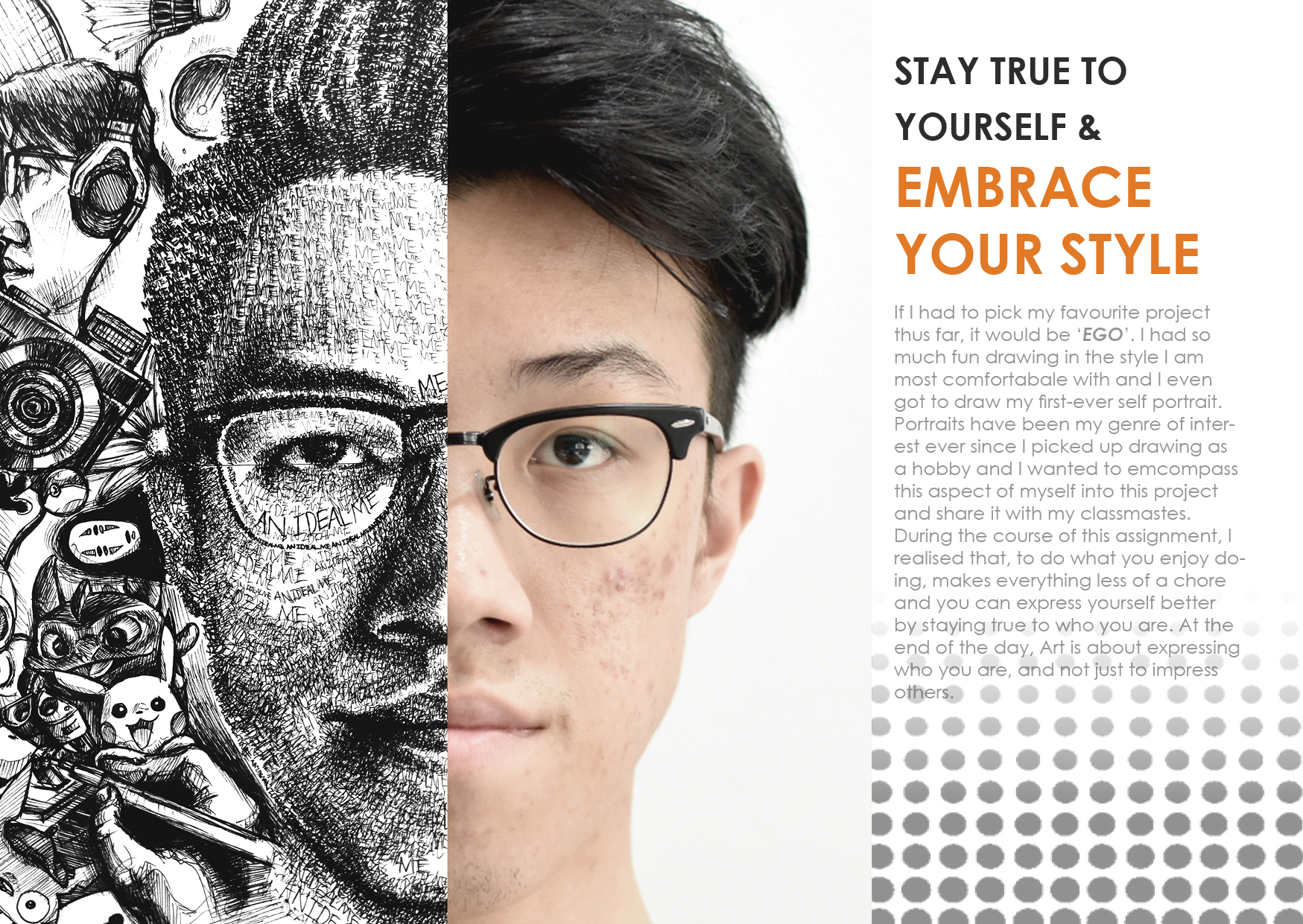
For the third spread of this zine, the theme revolves around being your self and learning to appreciate your own works. You will never know how different your works are from your peers in terms of the styling and approach until critique sessions. What surprises me the most was that everyone had a unique perspective to the project even though we were all working on the same exact project with the same exact brief. Furthermore each and everyone of us portrayed our own perspectives in completely different style and the results were all stunning in their own ways. That was what inspired me for this spread. I believe that we should all embrace our uniqueness and let our works be an extension of ourselves. Furthermore, when you get to do the things you enjoy, even assignments can turn out to be less of a chore. This was exactly the feeling I had when i did a portrait of myself for my last project in semester 1, something that I felt comfortable doing. And it turned out to be my favorite assignment so far.

For this spread, I have juxtapose half of the original art work with the other half of my face as a way of adding a personal touch, and bringing out the meaning of staying true to yourself. The right column is where the text is and i picked orange color for the title as it represents hope and optimism. To finish things of, i added some polka-dot texture to break the monotonous aesthetic.

FCBC5

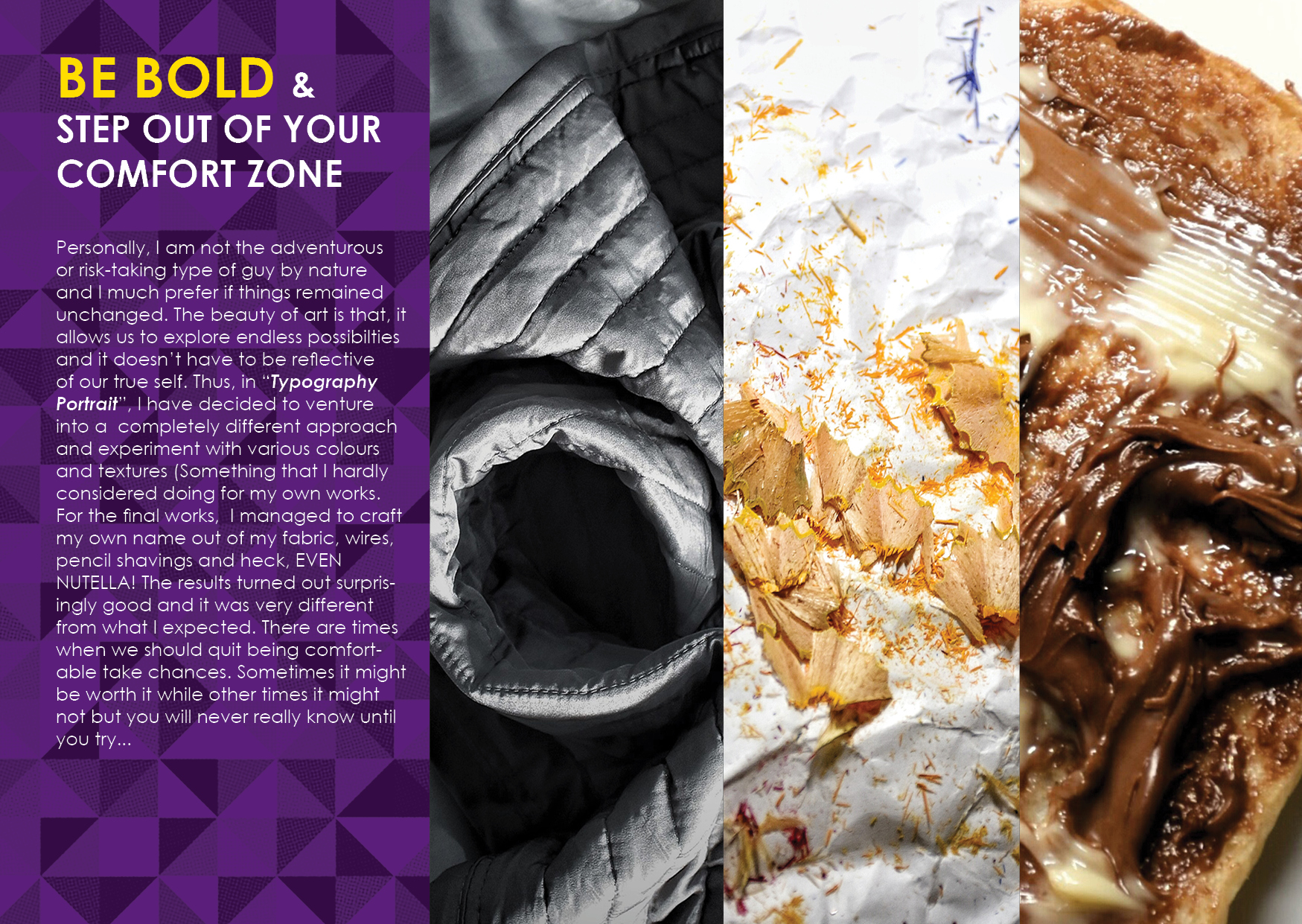
” BE BOLD AND STEP OUT OF YOUR COMFORT ZONE…”

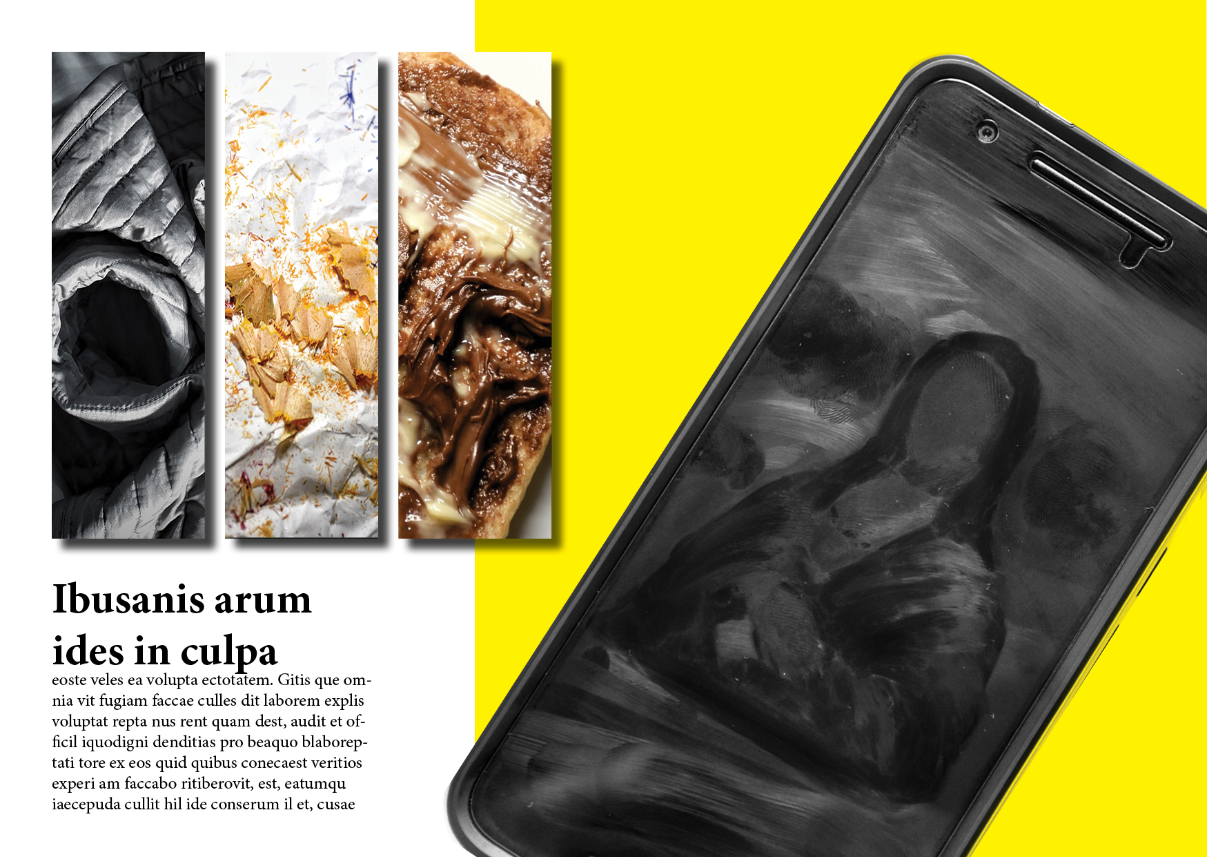
One of the things I’ve learnt in ADM is to be adventurous and dare to take risks in our designs. I have always been a reserved and playing-it-safe kind of person and it shows in my art style as well. Before school, my works were all done in achromatic color scheme and they were mostly done in the same style. But, coming to ADM gave me the opportunity to explore the various possibilities and I am proud of myself for attempting something new for each project, even though they lacked coherence. Hence, I would encourage everyone else to give it a shot at doing something drastically different from the norm. As seen from my above spread, my submissions for the typography portraits project revolves around playing with various textures and materials. It certainly created a different kind of look to final outcome and I am generally pleased with the results. So, be daring in trying out new things and who knows, you might stumble upon something that fits you.

Anyways, I chose to have a purple background, couples with a vibrant yellow header as the complimentary colors do pop a lot and it represents a bold characteristic. To further enhance the image of a bold design, I layered tessellations of triangles to it. For the main image, i stacked the three different artworks form the project side by side such that it forms the word ‘ONG’. With this approach I am able to showcase the various works plus adding a fresh new perspective of the project.

FCBC6

” MOST OF ALL, LEARN TO ENJOY EVERY SECOND OF THE PROCESS…”

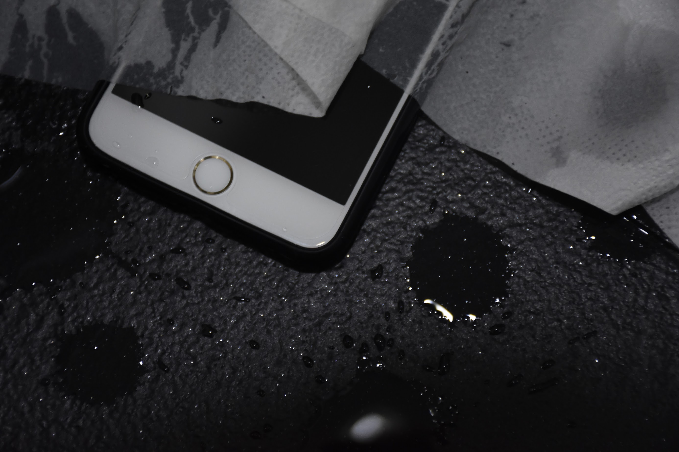
Lastly, my favorite spread in the entire zine, is the one where i talked about learning to have fun while working. As I am typing this very last post for my foundation 2D OSS journal, I am reminiscing all the great times I had throughout the year. I truly enjoyed learning all the new stuffs that i am not taught before, creating new works to push my abilities to new limits and to be working with my peers and professors. I included this last spread to remind us all the importance of enjoying while working and to make the best out of every opportunity given to us.

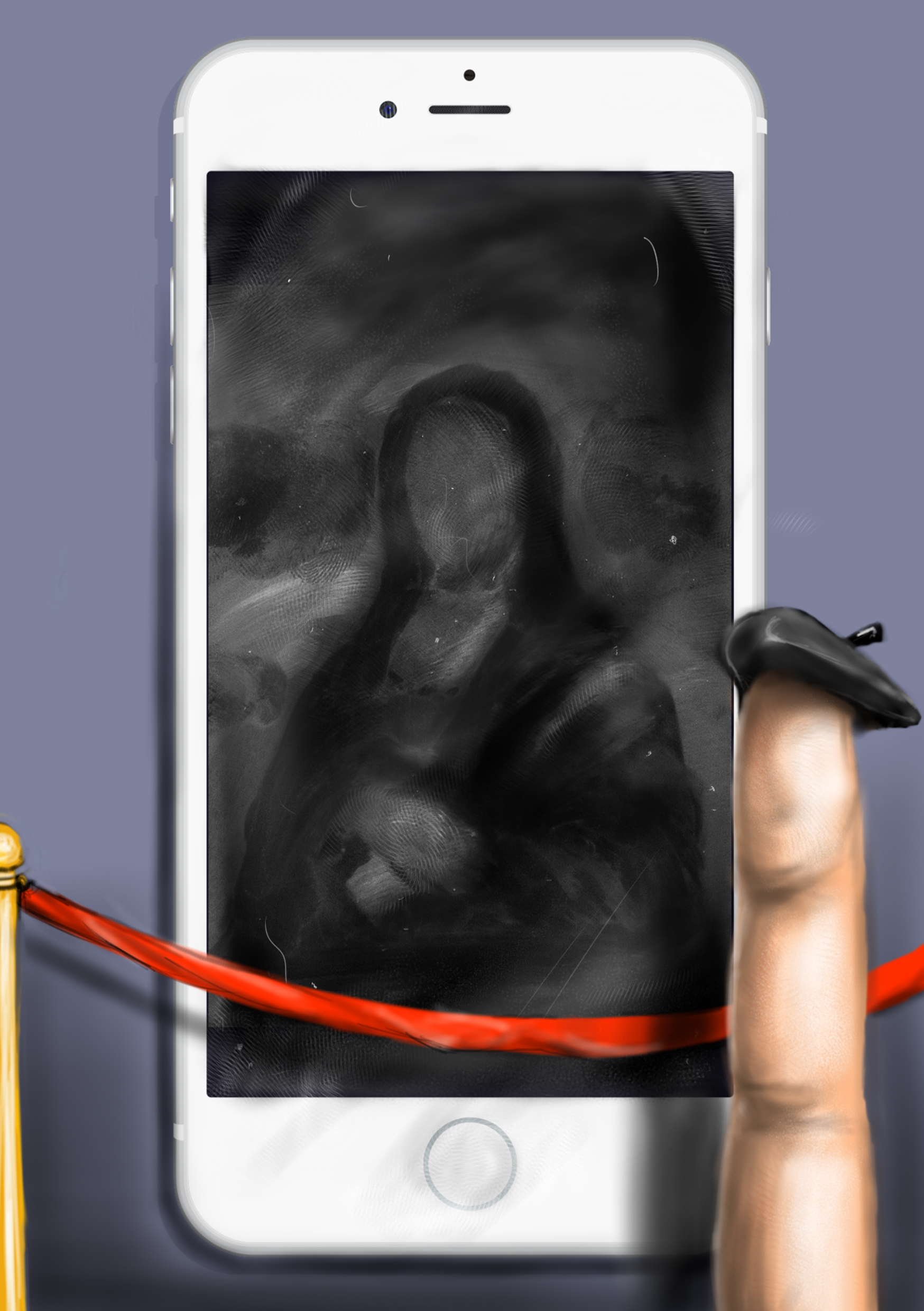
To express the kind of joyous emotion, I picked a bright yellow color for the background and compliment it with a blue text. The yellow gives of a positive cheerful vibe. As i chose the finger printed Mona Lisa that i created for the last project to be the main image, I have decided to add fingerprints on top of the background as well to create a sense of coherence. I repeated the fingerprints to resemble footprints, creating movement from the left page to the right. Each fingerprint is like a particular phase in the foundation year, as it slowly makes its way to the end.


Time flies really quickly in ADM because we are constantly fighting against deadlines and therefore, we should learn to cherish all these precious moments. At the end of the day, it has been a fruitful journey and I will miss the awesome time i had doing this project. Before I end this, i would like to sincerely thank our tutor, Shirley for all the teachings and guidance for the past one year. I have truly benefited a lot from the lessons and consultations and i hope to apply all these knowledge in the remaining 3 years I have in ADM. Also, huge shout out to the awesome classmates of mine for all the fun and laughter. Wishing you guys nothing but the best in your future endeavors.

Alright, shall end this post here. Signing out for the last time, cheers 🙂


After my initial process… I GOT STUCK, LIKE LEGIT .

Truth to be told, there was no sketches done for the final project because of TWO reasons:

  1. I had no idea of what exactly I wanted to showcase.
  2. I spent most of time the tinkering and trying to make sense out of InDesign software. It killed me.

Either ways, it has not been a smooth sailing process in coming up with my zine but then again, when was 2D ever smooth sailing? Therefore, i am going to share with you the initial spreads that I came up with and my thought process. All of these images are screenshots from earlier versions of my Zine.

PROJECT 3

This was my initial front and back cover (which is now a spread inside the zine itself). Getting the inspiration from an online zine I saw, I wanted to create something minimal yet attention-grabbing and i thought by having half a face present on the front page might do the trick. And to complete it, I then juxtapose it with the ego project i did as a back cover.

PROJECT 34

I played with the type of layouts and experimenting with rotation of an element, adding drop shadows and adding colors for the background. I thought it looked pretty okay at first but I realized that it lacked coherence and it seems too cluttered for my liking. In the end, I decided to split this spread into two separate spreads.


PROJECT 33

This was the only spread that remained largely unchanged in terms of its layout. However, after consultation with Shirley, I decided to take her advice and change the fonts used for my text into something more modern and less formal.


PROJECT 32

The idea for this spread is to transform the artworks from the first ever project into something more dramatic and interesting. After much exploration, I decided to rotate the individual strips to vertical orientation and have it mirrored such that it intrigues the viewers more. As you can probably see by now, the initial spreads were all pretty bare-boned and boring looking because i did not know how to incorporate colors correctly then.

That’s basically my process in a glance. Do read my final post for the final zine and my thoughts about it.


So… Zine. Never heard of it but i was told that … IT COULD BE ANYTHING!!!

 Well, with no idea in mind, I turned to Pinterest, Behance and Google for ideas. My initial intention was to create something minimal with photographs that I took throughout the entire year but then i realized that I wanted to showcase the works I did for 2D in the form of a process book. Given the complete different aesthetic in my projects, I then decided to come out with my own layout. Nevertheless, I drew many inspirations from the online resources. Here are some that caught my attention.


7e14cc35384561.56f47aef7f7f2

This was the inspiration for my initial front and back covers. Love the minimal look to it.


506bcf33811022.56b915ada0b40

I was captivated by the layout and color scheme of this spread.

6951f435021603.56e6fd76ed265

There were many spreads that I saw with a full image taking the entire page and I wanted to go for a similar look as it grabs viewers attention.

e65eac35384561.56f47aef7c898 (1)

I am intrigued by the clever use of shapes and icons, as well as manipulation of types to create something so bizarre and interesting. But I felt that it doesn’t fit in with my style and so I did not mimic the designs of this.


728cf314521947.562858a44c4a8

Really cool idea to have a translucent layer in front of the front cover to create some sort of a mysterious feel to the zine.


zine+spread+2

Love this spread for its clean layout. The choice of colors, types and background textures works very well and I was hoping to achieve something similar.


image (2)


After the encounter with the humanoid, the  sun had already gone down and it started pouring heavily. After giving much thought about it, as the leader of the group, you decided that it would be wise to spend the night out in the woods instead. You instructed everyone to follow your lead and you began searching for nearby shelter to camp. And soon, you stumble upon this secret tunnel and…


timeline


All the sounds (except for the sound of the thunder) were recorded thru my phone in stereo and edited using Audacity. There are a total of 20 layers comprising of various white noises to substitute the sound of rain, bird chirping sounds, leave rustling and foot steps. Have a listen at the final product and hope you will enjoy it!


Truth to be told, there wasn’t as much exploration in this project as I was pretty much able to visualize the designs that i wanted right from the start, after i have made my 6 choices of point of views. Nevertheless, here are some of my thought process in my journal.

IMG_20160321_215728 IMG_20160321_215747 IMG_20160321_215759 IMG_20160321_215809 IMG_20160321_215832 IMG_20160321_215841

   THE FINAL PRODUCT   

Project 2 has finally come to an end and it has been quite an interesting and fun journey to say the least (WAY BETTER THAN TYPOGRAPHY) Unlike the first project which took the form of a sequence of photographs, this project is done entirely on my Samsung tablet and every element is drawn digitally. I am very satisfied with how the project turned out and I am especially proud of myself for trying this medium for the very first time. Anyways…

May i present you…

… the device that revolutionized the smartphone industry…

… and changed our lives forever…

… the one and ONLY…

… The iPhone. 


An iPhone from the point of view of greasy fingers

art finger

is a canvas.

This idea was inspired by the experience that I have whenever i use my phone. Every time i end a phone call, i would notice that my phone is all greasy and dirty, and sometimes i would use my fingers to wipe the screen which only make things worse. In the world of technology, all the glass surfaces that are prone to the smudges are termed ”fingerprint magnets” (Yes, it is legit). Hence, this gave me the idea of portraying our oily fingers as the artists to their magnificent paintings on the phone screen. At the background is the iPhone as the frame for the masterpiece, a smudged up version of Mona Lisa. I chose Mona Lisa because of how iconic it is in the art scene and i thought it might be a great challenge to recreate it in an alternate style. So, this was how it turned out to be!


An iPhone from the point of view of an ant

ant

is an IMAX theater.

This concept basically shows how an ant would perceive an iPhone: A cinematic experience like none other. The idea of using an ant as a subject was given to me by one of the classmates and I thought it is quite an interesting perspective since our phones are not very big objects to begin with, it might be fun to have it viewed from an even microscopic scale. In the art, i depict a scene at the typical cinema and there is an ant on the seat, with its snacks and beverage. To make it even more convincing of a “Cinematic experience”, i added the traditional 3D glasses. Fun fact: Unlike conventional movie theaters where the light is coming from the projector at the back, i added highlights to the front instead to showing the light coming from the iPhone.


An iPhone from the point of view of a powerbank

cable (2)

is a casualty.

I really like this artwork, particularly for its minimal look and also how it is reflective of our daily lives. As a hardcore smartphone user, i am always on my phone, 24/7 and I’m continuously checking out my social networks, watching YouTube videos and playing games that my phone can never get me through a full day of use without a charge. And somehow, it seems like cannot live without our phones, not even for a short while. Therefore, i tend to carry a battery bank with me wherever i go. This inspired me to do an artwork from the perspective of my lifesaver, the power bank. I find the relationship to be similar to that of a blood bag donating blood to a casualty. The casualty is suffering blood deficiency (battery flat) and thus the blood bag (power bank) is needed to rescue him before it is too late!


An iPhone from the point of view of Android

android

is trash.

Well this, needs no introduction. iPhone and Android has been sworn enemies ever since their existence and the debate of which platform is superior over the other is still on-going. Android fanboys would certainly think that the iPhone is trash. Therefore, i did this illustration, not as a android fanboy but from a tech enthusiast. Hope that I did not offend anyone in the process. Anyways, i drew the  image from the perspective of apple which was Dumped into a metal trash can and right at the end of the opening stood a sinister looking Android figure. I guess this is pretty straightforward: trash. Yup,  just trash.


An iPhone from the point of view of a cat

cat

is the road to fame.

Have you ever wondered how on earth do cats gain more popularity than us? It is so strange to me that a simple photo of a cat with a grumpy expression because of its a certain genetic condition, could get him 1.3 million followers on Instagram! SAY WHAT?! Cat videos these days have become part of an online culture that it is hard to ignore and this led to the idea that the iPhone is a tool that grants all cats a path to be famous. If you imagine how grumpy would have reacted upon seeing his own photos going viral online, this drawing would probably be it…


An iPhone from the point of view of water

drowning case

is drowning.

The End

Project 2: Point Of View

Say goodbye to typography and hello to perspectives! Time for me to get started on the next assignment which is on point of views. In a nutshell, the project requires us to see things from different angles and come up with graphical representations of it.


First things first, let’s decide on the subject matter. iPhone. Yep, I have decided to go with an iPhone as my subject because, hey, why not? People are so engrossed with their smartphones these days that they hardly separate themselves from their mobile devices at all; be it children, teenagers, adults or elderly ( okay, maybe not so much the elderly), everyone loves their smartphones. I chose iPhone over smartphones in general because of how iconic it is and I feel that an image of an iPhone could deliver the idea most effectively.

so yeah, an iPhone… …


Here is the list of 18 perspectives of an iPhone.

  1. An iPhone from the point of view of parents is a pacifier
  2. An iPhone from the point of view of an Elderly is an alien
  3. An iPhone from the point of view of a kid is an arcade
  4. An iPhone from the point of view of a teenager is the soulmate
  5. An iPhone from the point of view of Steve Jobs is an Empire
  6. An iPhone from the point of view of a charging cable is a patient
  7. An iPhone from the point of view of water is a case of drowning
  8. An iPhone from the point of view of a dumbphone is an alien invasion
  9. An iPhone from the point of view of datelines is a prohibited sign
  10. An iPhone from the point of view of an iPad is a midget
  11. An iPhone from the point of view of a narcissist is the best friend
  12. An iPhone form the point of view greasy fingers is a canvas
  13. An iPhone from the point of view of an ant is an IMAX theatre
  14. An iPhone from the point of view of a cat is the road to fame
  15. An iPhone from the point of view of your wallet is robber
  16. An iPhone from the point of view of the environment is pollution
  17. An iPhone from the point of view of an Android fanboy is garbage
  18. An iPhone from the point of view of history is a legend


STAY TUNED FOR UPDATES !!!

In this wretched piece of wasteland, there is hardly anything that calls for celebration. It seems like survivors here have lost too much to feel buoyant over anything; nothing worth commemorating except grieving for their loved ones who have been killed by the humanoids…

That being said, humans are social creatures after all and it is innate that we have social events, gatherings etc and we can’t survive in solitary. The leaders of the scavengers were very well aware of the benefits and the utility for group cohesion and hence, the clan would organize a campfire that is held every Sunday to celebrate the end of yet another week. During the campfire itself, everyone would gather and have conversations with one another, singing and dancing around the fire and toasts for all the achievements that have happened over the week.

It was simple, nothing too extravagant but it kept everyone sane, motivated and most importantly, united as one.

Law. The one thing that brings order to chaos. The one thing that resolve disputes with reason, fairness and not violence. We need law in this community, more than ever. Surviving in this post-apocalyptic world hasn’t been easy. However, the greatest challenge by far is maintaining peace within the scavengers; their worst enemies are not the humanoids but themselves. And to prevent any clashes among the members in the community, The Code was put in place.

The code is a set of rules or a pledge, if you will, that everyone has to uphold upon acceptance into the scavengers. They will receive the clan’s tattoo on their right arm as a form of identity but more importantly, a way to vouch for their commitment, loyalty and integrity. There are a few key rules that govern the scavengers and ensure things are in order.

  1. All members are to stick with the group at all times unless ordered otherwise by the leader or due to unforeseen circumstances.  Anyone seen leaving the group without permission will be sent to the cell for a week.
  2. No one is to leave camp after sun set and everybody has to be accounted for by then. As there were previous encounters of the humanoids in the vicinity during the dark hours, the clan has taken this precautionary measure to safeguard his members.
  3. Strictly no changing of factions. Whatever job you are assigned to since the day 1, you are to stick with it.
  4. Any form of violence towards a fellow member is strictly against the Order and he/she will be sent to the cell for a month as a punishment. Repeated offenders will eventually face exile and leave the clan for good.

So far, everyone has abide to the code faithfully and the Scavengers are living in peace.


After cracking my brain for 2 weeks straight without any inspiration or ideas for the project, I finally came up with the 4 compositions, the overall approach and the style of my works, miraculously and timely enough. So, here are the final works for submission and i have included the final layout for the entire project right below.


My name is…

1.1

… and i am an ASPIRING ARTIST


My name is …

2.1

…and i am a MESSY PERSON.


My name is…

3.1

… and i am a HEADPHONE JUNKIE


My name is …

4.1

… and i am a MORNING TYPE OF GUY


May i present to you …

… the final product …

… the layout I’ve chosen …

MY INSTAGRAM FEED!!!

( It is entirely fictitious though ) 


INSTAGRAM POST FINAL 1.1