Final Catridge design (hopefully)

Form changes:

1. Overall form: triangular cap, circular bottom.

Ideally, the neck point is where the user will hold the tube. Change in shape helps the tube to rest nicely on user’s finger.

2. The funnel

Old design: funnel opening occupies half of the cap. I designed this to signal that the other half is closed and airtight, then I realise actually no need for user to know that.

Changes: Extend funnel so that the opening is big. User easily drops in liquid. Design is such that liquid will run down the wall nicely into to designated compartment.

3. The guiding fixture.

Making use of the live hinge on the cap, I created a protruded part so that the tube will always end up in the desired orientation.

Form studies

Exploration of forms:

  1. Straight edge treatment

    front/side view


    perspective view

    My favourite is number 2 where the top compartment is hidden.

  2. CURVE EDGE TREATMENT

    front/side view
    front/side view


    perspective view

    My favourite is number 7 as it feels most balanced.

  3. ELLIPSE FOOTPRINT (INSTEAD OF CIRCLE)

    front/side view

    perspective view

In this series, there’s more of the product facing the user, but I dont quite like the form as of now.

Please help to comment on the formal qualities and suggest a few that I would explore further with detailings.

Exploration of detail treatment:

Here are some of material treatment I will explore:

  1. CONTRAST IN TRANSPARENCY

    Components are shown partially here. Looks interesting. Great contrast between top and bottom part.

    For mine, colour could be both space grey, but the difference is in opacity levels.

    2.GREY/WHITE. METAL/CERAMIC

    I think this has some medical/sterile sort of feeling but can still be quite stylised and interesting with one BOLD detail to catch attention.

    3. ONE BOLD DETAIL FOR INTEREST


    Could be a fixture/button that stands out complete from the grey/whitish. It would have one important function: either the joining of top and bottom piece OR the test result interface.

Existing concepts

1. SciO – Consumer physics.

images from link

It is the world’s first affordable molecular sensor that fits in the palm of your hand. SCiO is a tiny spectrometer and allows you to get instant relevant information about the chemical make-up of materials around you, sent directly to your smartphone.

2. Nitrate (NO3) counter – SOEKS

images from link

3. Kuaiso: smart chopstick – Baidu

https://www.techinasia.com/baidu-smart-chopsticks-detect-dodgy-cooking-oil

images from link

VIDEO CAN BE FOUND HERE

The smart chopsticks, called Kuaisou, can test food for safety issues. It’s limited to sampling the oil to detect dangerously substandard cooking oil – one of all too many food safety issues plaguing China – but it’s still an interesting and practical tool

3. Food origins tracking device – Nguyen Thi Hong Minh

link: this-62-year-old-vietnamese-entrepreneur-is-using-foodtech-to-eat-safer

An electronic traceability system for Vietnam’s farmers and consumers 

How it works is farmers and the processors, the middle men who buy from producers, log information such as product origins and how it was processed into TraceVerified’s software. The data, which is compiled into TraceVerified’s first product “TraceReport,” is accessible via QR codes on product packaging — which consumers scan using a mobile app.

Vietnam’s water pollution crisis showed how little transparency exists 

TraceReport will help farmers build product credibility over time 

4.Quick-test kit – Vietnam government

kit 15types pour-water testing

Aesthetics study

aestheticsartboard-5_1

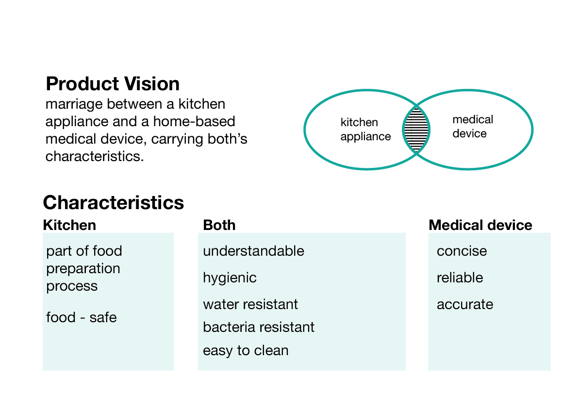
From previous posts, I am currently situating my product as an amalgamation between a kitchen appliance and a medical device.

On one hand, it has to be fitting in the kitchen and integrated into part of the cooking process, so as to achieve convenience and efficiency. On the other hand, it has to work like a medical device that accurately detects the presence of dangerous substances in food.

As such, the product would have characteristics from both of its origins. I also realize many of the characteristics are shared by kitchen appliance and a medical device, although they could vary slightly in terms of importance. These characteristics should be communicated through the conceptual design, form of the device, its materials and finishes…etc

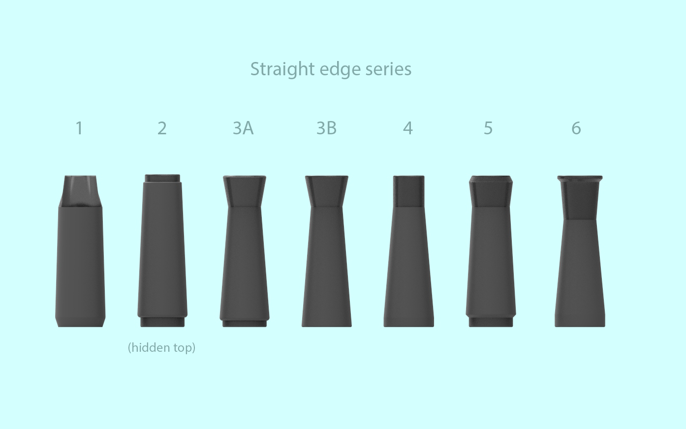
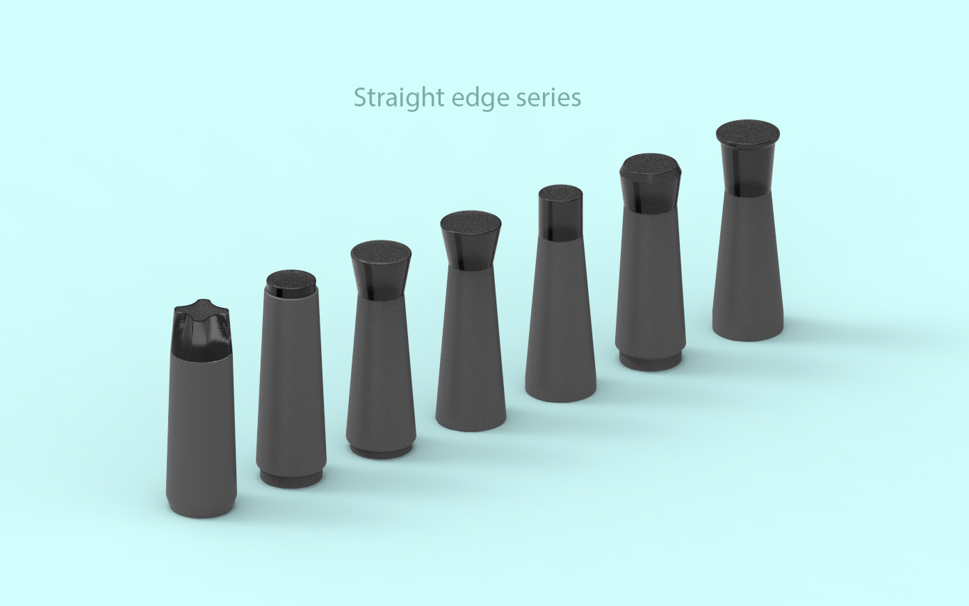
Therefore, I went on to study the characteristics of current products that is conveyed through its form and choice of material.

Aesthetics Study on existing kitchen products

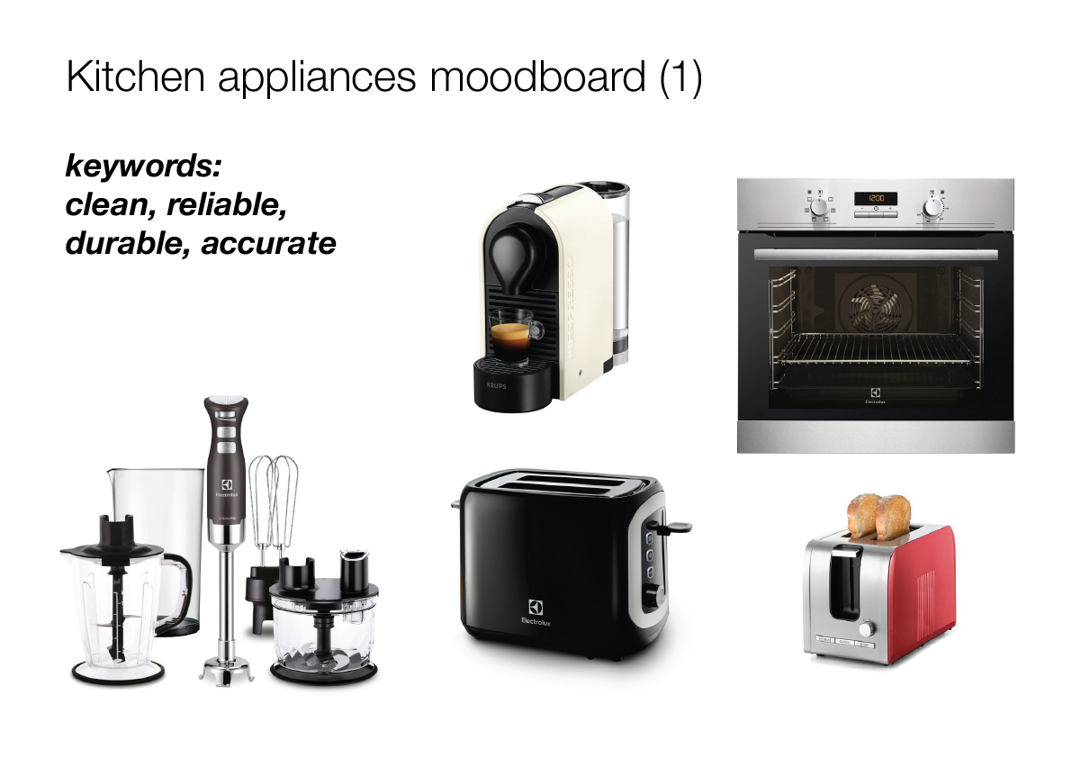
Group 1: this group of kitchen appliance uses industrial aesthetics to convey robustness and hygiene. The use of stainless steel is for food safety and it also conveys sterility, power and accuracy.

The forms are mostly geometric and is highly functional.

This appeals to those with very high regard for hygiene and perhaps have higher income, since they are more expensive than group 2

aestheticsartboard-1

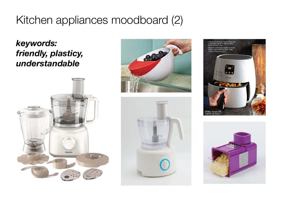
Group 2: this group uses a variety of plastic with varying strength and appearance. In this group, more expensive plastics like HDPP and ABS are safe for food and can withstand high temperature.

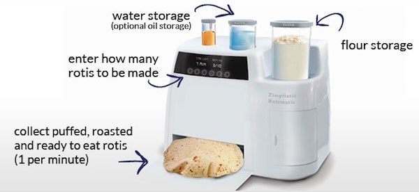
The use of plastics allows for different finishes and colors, which gives this group a more lively and friendly character than group 1. This group seems to be more understandable and relatable with simple functions and simpler forms. Forms can be more organic because injection molding process gives more design freedom.

I feel that this group would speak for the majority and it is affordable for more users, making it more utilitarian.

aestheticsartboard-2

Group 3: this group goes for uniqueness and styles, as it usually has unique form, texture, and colors. Many of these are not mass-manufacturing friendly, hence resulting in high cost of products. Some of them are also trend-specific, for example, the retro trend is visible from Smeg’s series with rounded tapered form.

This tends to a bespoke direction which speaks to very specific users who have a strong preference of what they like. They could also be kitchen/cooking enthusiasts who do not mind spending money for a highly differentiated product.

I think this direction is not what we are looking for

aestheticsartboard-3

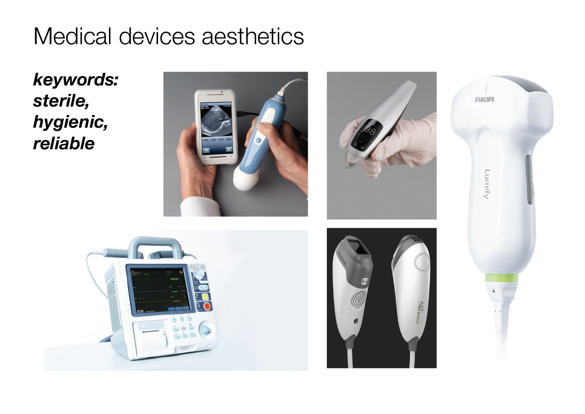
Aesthetics Study on medical devices

After researching a few medical devices, I realise that information mapping and communication is a vital part.

Most of the time, patients are heavily dependent on those device to do the checking job for them. They do not possess the knowledge of how these devices work. As such, they rely entirely on the device to communicate their health status.

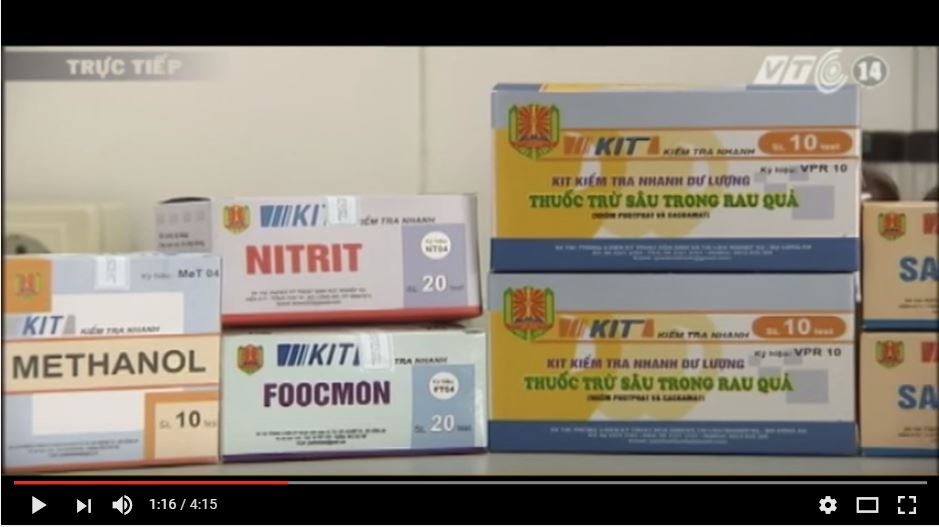
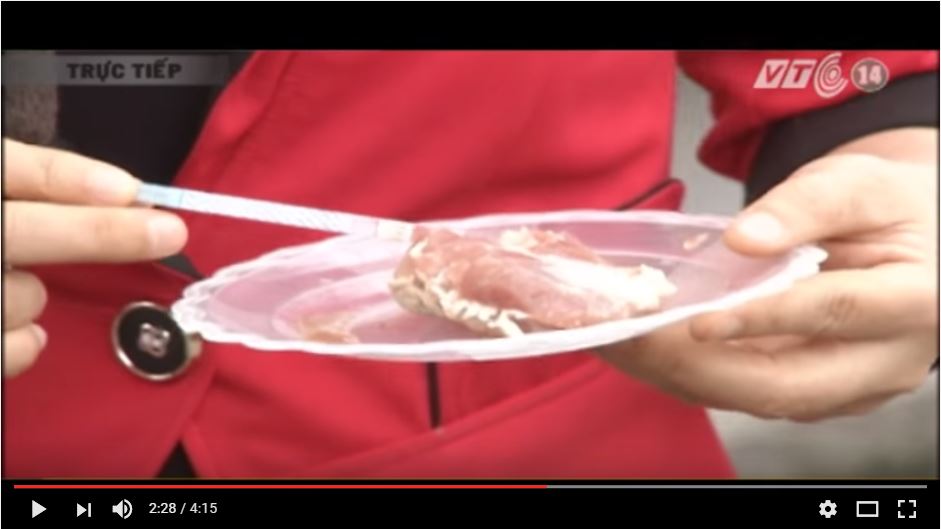
This scenario is the same as what happens in my project. Consumers do not know the chemistry knowledge in any of the tests. They rely entirely on the device to tell them whether the food is safe.

In such scenario, communication has to be simple and on point. In the devices below, we see that only one statistic is shown to the patient, which is what he needs to know. The critical information is displayed in large font and clearly distinguished from others. The interfaces are simplified, unnecessary functions are removed to reduce clusters of information and hence minimize failure.

aestheticsartboard-5

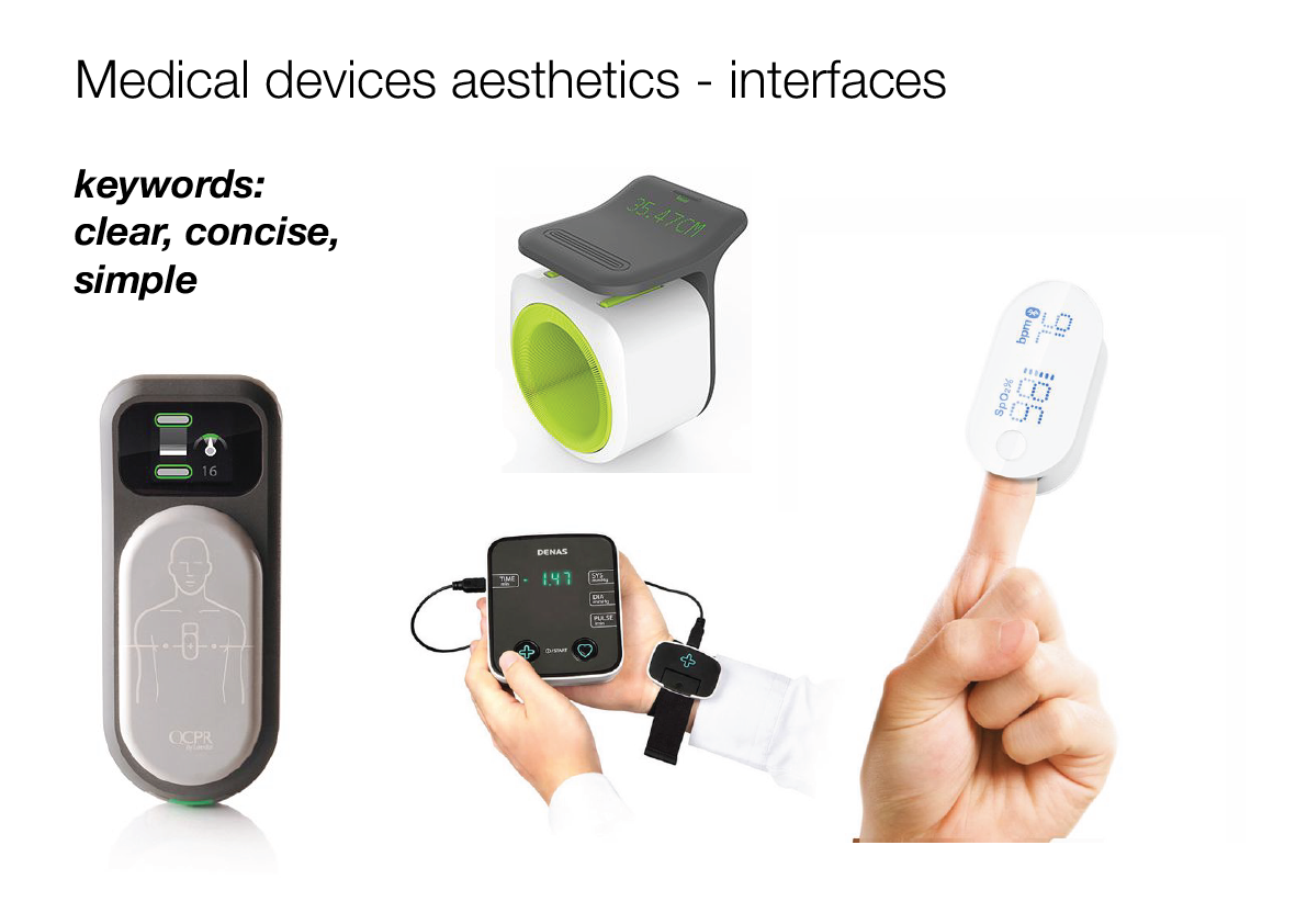
Most medical devices stick with grays, muted colors and white is always the dominant color. This is to convey sterility and reliability. Also, strong colors may induce anxiety, which is not desired in the medical context. Many personal devices are handheld.

Many personal devices are handheld and quite compact. Recently, many devices have been connected to smartphones, providing an extra interface where more information can be communicated.

aestheticsartboard-4

Food journey and the kitchen setting

When to check for adulteration?

After changing my idea from an on-the-go detector to a home-based device that is a part of the cooking process, I did a quick study of the different stages that food goes through in the kitchen.

I realize that the later adulteration is detected in this journey, the more effort is wasted on all the steps before realizing it should not be eaten.

As such, I have decided that my product would be integrated to the kitchen within the first few stages of cooking. Those stages are unpacking food purchased from the market, washing the food and storing them. Storage is optional because some people would cook the food immediately while some may fridge it for later use.

Within this few stages, there are a few opportunities for intervention which I will discuss in a later post.

Where is my device placed in the kitchen?

Kitchen work triangle concept

work_triangle

image from link

The kitchen work triangle is a concept used to determine efficient kitchen layouts. The primary tasks in a home kitchen are carried out between the cook top, the sink and the refrigerator. These three points and the imaginary lines between them, make up what kitchen experts call the work triangle. The idea is that when these three elements are in close (but not too close) proximity to one other, the kitchen will be easy and efficient to use, cutting down on wasted steps.

Based on this concept, I imagine my device would be placed somewhere in between the sink and the refrigerator because it is to be used within the unpacking, food washing and storing.

work-triangle


Product Inspirations (1)

1. Rotimatic – designed by Zimplistic

image from link

This product is an automatic roti making kitchenware. It simplifies and automates each step of traditional roti making process by using computer algorithms.

This product offers an on-demand approach as compared to the traditional batch making approach. Roti is made one at a time. A precise number of units are produced as needed. Small quantity suits household size.

Learning points:
  • The compartments: my device can utilize the same compartment for both testing and storing of food items bought from the market, integrating testing into food preparation process.rotimatic
    image from link
  • Convenience: automated process with little involvement, leading to efficiency. It only takes about a minute to churn out one roti. This suits households with a busy lifestyle. Detachable parts allow easy washing and maintenance.
  • Cleanliness: use white color, high-density ABS (food-safe plastic), non-sticky surfaces, transparent plastic. These visual quality allows visibility to see through the ingredients and emphasizes the absence of contaminants.
  • Simplicity: Simple interfaces, the possibilities of action is reduced to minimize human mistakes and hence avoid system failure.

2. Ultra Clean Washer (Pen) – Electrolux

electrolux-ultra-clean-washer-1

image from link


This device works as an addition accurate stain removal process before the clothes are dropped into the washing machine. It uses technology that combines water and ultrasound to effectively remove stains on garments. The pen is docked on the washing machine. It only works when needs arise. It works for small to medium stain area.dock

Learning points:
  • handheld device for spot checking could be part of the system, this integration has to add value to the larger system.
  • device use very simple interface with minimal steps.
  • handheld device allows for agility and mobility.

3. Cleanwave sanitizing wand – Verilux

uv

image from link

image from link

The CleanWave Sanitizing Wand uses the same advanced UV-C light technology used to sanitize hospital equipment for over 30 years. User simply scans the surface area with the UV-C light on. The product promises to kill up to 99.9%** of germs, allergens and odor causing bacteria on hard surfaces.

This product is handheld and runs on rechargeable battery. Some product features include:

  • Simple one-button operation and easy-to-read digital display
  • Safety shut-off feature guards against unwanted exposure to eyes or skin
  • Built-in timer allows for precise exposure times
Learning points:
  • this product works in a similar fashion with project, but it goes a step further by actually killing / removing the unwanted bacteria.
  • handheld devices should be ergonomically designed ( this product doesn’t look comfortable in the video)
  • probably applicable as a adulterant scanners for those that are detectable using light.

Research Documentation | Summary of phase 1

[EDITING IN PROGRESS]

This post includes research information that was presented at the 2nd presentation and other pieces that were left out due to time constraint. Simple explanations are included with links to separate posts on each matter.

ossslide-1ossslide-2ossslide-3ossslide-4

Survey result: consumer base.

Introduction: 

In this activity, 120 short surveys were conducted at various locations (survey questions can be found here)

The only criterion for selection is that participant has to be the person in charged of purchasing groceries for the household. Participants were selected at random with no preference of age, gender or appearance.

Result from these surveys is compiled here

Q1 – Q2 : What is your sex and age?

ossslide-5

Q3/4/5: Do you have a smartphone / use 3G / use the Internet frequently ( >12hrs/week) (Y/N)

ossslide-5-copy

Q6: How often do you buy and cook different kinds of groceries?

ossslide-7

Q7: Where do you usually get your groceries from?

ossslide-6

Q8: Rate 3 most important factors in selecting vendors to buy from.

ossnot-using-copy-2

Q9: Rate 3 most important factors in deciding which food to buy for the day.

ossnot-using-copy-3

Q10 / 11: How are you aware / is your knowledge of the food adulteration problem? (self-assessment)

ossslide-9

Q12: Where do you get your information on adulteration from?

ossnot-using-copy

Q13: What do you think are most challenging to tackle food adulteration (choose 3)?

not-using

Literature research: Adulterants severity scoring according to food type

ossslide-8

Interviews:

ossslide-11

Observation & Shadowing

ossslide-12 ossslide-13

Conclusion

ossslide-14 ossslide-15 ossslide-16 ossslide-17