Research Documentation | Summary of phase 1

[EDITING IN PROGRESS]

This post includes research information that was presented at the 2nd presentation and other pieces that were left out due to time constraint. Simple explanations are included with links to separate posts on each matter.

ossslide-1ossslide-2ossslide-3ossslide-4

Survey result: consumer base.

Introduction: 

In this activity, 120 short surveys were conducted at various locations (survey questions can be found here)

The only criterion for selection is that participant has to be the person in charged of purchasing groceries for the household. Participants were selected at random with no preference of age, gender or appearance.

Result from these surveys is compiled here

Q1 – Q2 : What is your sex and age?

ossslide-5

Q3/4/5: Do you have a smartphone / use 3G / use the Internet frequently ( >12hrs/week) (Y/N)

ossslide-5-copy

Q6: How often do you buy and cook different kinds of groceries?

ossslide-7

Q7: Where do you usually get your groceries from?

ossslide-6

Q8: Rate 3 most important factors in selecting vendors to buy from.

ossnot-using-copy-2

Q9: Rate 3 most important factors in deciding which food to buy for the day.

ossnot-using-copy-3

Q10 / 11: How are you aware / is your knowledge of the food adulteration problem? (self-assessment)

ossslide-9

Q12: Where do you get your information on adulteration from?

ossnot-using-copy

Q13: What do you think are most challenging to tackle food adulteration (choose 3)?

not-using

Literature research: Adulterants severity scoring according to food type

ossslide-8

Interviews:

ossslide-11

Observation & Shadowing

ossslide-12 ossslide-13

Conclusion

ossslide-14 ossslide-15 ossslide-16 ossslide-17

Field trip 1 + Interview #1

A. Field Trip 

Location: Jurong Point, Golden Village, cinema Hall 2.

Time: 7:10pm – 9:20pm

Movie: Miss Peregrine’s Home for Peculiar Children

B. Interview #1

All interview is available @

Participant: Male, 24. Software Engineer.

  1. When is your most recently watched movie? Which movie?
    Miss Peregrine’s Home for Peculiar Children. 1hr ago.
  2. Do you have any cinema preference and why?
    No, I prefer watching movies in my own room at my own comfort. I would just go to a nearby cinema if I have to.
  3. What are the factors that you think are important for a cinema?
    Environment-wise, I think it should be quiet enough with little distraction. You go to a cinema to watch a movie, so, of course, good visuals and audio is a must. It should make you feel immersed in the movie. I will try to get seats that are not too close or too far from the screen.

    While I usually go to the cinema with friends, I still feel like movie watching is a 1 person experience because you don’t really talk to others when the movie is screening. It is not very interactive in that sense. I think most interactions happen afterward when we discuss the movie we just watched.

  4. What do you usually do after watching a movie?
    Normally I do not decide to watch a movie on the spot. Most of the time movie watching is planned before the outing and normally it will be the last thing we do if we go out in the evening. Occasionally we will have a meal afterward if the timing is right.

  5. Do you stay back for after credits?
    Only for Marvel movies. Otherwise, I will just leave. But it also depends on the friends I am going with. If they stay I will stay. I think it is not critical to stay back because if you need any information you can always find it online.
  6. How do you feel (emotionally and physically) after watching a movie?
    I feel like I have sat for too long. But it is ok in general. I think movie watching is relaxing and if I am physically tired I would not even go to the cinema in the first place. So, even if the movie is 2hr or more, I dont really feel exhausted unless the movie is extremely boring.

    Emotionally, depending on the movie, I usually have some feelings linger at the end. Sometimes I would also think about the parts I dont understand or parts I find impressive. I think this also signals the quality of the movie. If you don’t feel anything after watching, it is probably sucky and there’s nothing to remember.

  7. How do you feel about the exit hall post movie?
    I’m actually quite indifferent about the exit. I don’t really like or hate walking through it. But at the end, I felt a bit lost and I needed to do some walking to relocate and know where I was. I rarely get into that situation in Jurong Point because I am familiar with this mall.
  8. Have you ever gotten into a situation that you have to catch last Public transport after a movie? How did you feel about it?
    The last time I watched a late night movie, before buying tickets I had already known I would miss the last bus and had to walk home so it was ok. I did not really rush or anything. Did not feel anxious at all.
  9. If you can change something about the exit hall, what would you like to change?
    It would be great if the exit is shorter and ideally I would like it to lead back to the cinema lobby because it is easier to navigate. The current exit is also quite boring for me, it does not feel like a part of a shopping mall.

    I think it would be nice to make it such that you can discuss movies with your friends better. In that way, it would be ok even if it is a long and boring walk.
  10. What do you usually do in the exit hall?
    I always talk to my friends about the movie. I rarely use my phone. As for walking I actually just follow the people in front. I don’t really pay attention to signages.
  11. How do you feel about the following ideas to improve the exit hall?

    a. Navigation to be displayed on walls
    I think this has to be very concise and somehow repeated after each turns of the corridor or something like that. I feel that if not careful there would be too much information and noone will read it.

    I think this idea depends on viewers’ familiarity with the place. If they are already familiar with that particular shopping mall, they can self-navigate and it does not really add value to them. I guess it works for people who are new or do not often go to the place. It also depends on how your signages are designed. For example, if you just tell me this exit leads to Carpark B, I would not be able to tell where that is anyway.

    b. After credits / new movie trailers screened on walls
    I do not think this is a good idea. If you screen a video, it might obstruct the flow of people exiting the cinema hall because some will watch and some won’t. This also kind of removes the choice whether they want to watch it because it will be screened to their eyes anyway. I think I would prefer a slightly more relaxing environment right after a movie, not too much of moving visuals. I think some music or background sounds are ok.

    c. Simple rating system for viewers to express their feeling about the movie

    I think this is better because interaction time is short and it does not require much effort. I think the challenge is giving people a motivation to participate in this rating thing, make it accessible to those who want to do it and not obtrusive to those who do not. I think it can be fun too.

    Overall, I think the exit hall needs to be more interesting but not bombarded with visuals or information.

Week 1 | Research Questions + Planning

A. Research Questions

1. Primers – movie watching in general

Their most recent movie experience? (When/which movie?/which cinema/around what time)

Any cinema preferences and why? (asking in terms of service/experience/ is there a cinema they always go to?)

What do they usually do after watching a movie?

How do they feel emotionally and physically after watching the movies?

2. Exit hallway

What are their expectations of an exit? (IMPORTANT)

What do they like / do not like about the exit (IMPORTANT)

What do you do in the exit hall? (e.g waiting for friends, toilet, discussing the movies?)

How long do they spend in the exit hallway?

3. Observations to take note

Social activities happening in the exit hall (e.g waiting for friends, toilet, discussing the movies?)

Traffic Flow / How are cinema exit halls connected?

Spatial Elements of the exit hall

B. Planning

WEEK 1:

  1. Field trip: mapping the exit hall of at least 3 cinemas, noting traffic flow, spatial conditions, what people do, how long do they stay there
  2. Interviews: aim to get 10 – 12 respondents in total by next week. Document their answers in table form, highlighting common keywords.
  3. Literature research: find out possible technologies to employ and any other related projects.

WEEK 2:

  1. Reflect on Week 1 findings and IDEATE different idea, select strongest 1 or 2 ideas to work on.
  2. Design new questions based on specific ideas
  3. Quick mock-up/ sketches of the ideas to ask people during phase 2 interviews (down to 5-6 participants)
  4. Collect responses from new questions

WEEK 3:

  1. Fine tune design solution based on responses from week 2
  2. Create a specific narrative to test, more elaborate mockup in terms of visual/audio
  3. Test in ADM Fire exit corridor

3 Ideas for Semester Project

  1. Cinema Exit – the overlooked part of a cinema experience.

grand entrance & movie hall vs. narrow, scary exits.

[ image of exit to be added ]

images from http://jodulu.blogspot.sg/

I feel that the last touchpoint of going to the cinema is currently ignored and there are many things that can be improved. In Singapore, usually at the end of a movie session at a cinema, you follow a path behind the exit door of the theater.

My personal observation is that most people do not know where they will end up at the end of the exit path, which is normally a fire exit of the mall. This creates a bit of anxiety and annoyance if you end up at a much further destination than you wish. This is even worse at late night movies where you need to rush to catch the final trains/buses home. One idea is a smart and concise navigation helper that only display specific information users need.

The exit way is also a great opportunity to offer a little surprise for moviegoers even after credits. I am thinking that it is a media that extend the movie and its characters beyond its ending point – like a digital meet and greet or interactive after credits…

  1. Table reservation at food court

img_0616

From our food court field trip, our group realizes that many people leave their belongings at the table as a form of reservation. This method creates an opportunity for thieves and anxiety for the user who leaves their belongings. Secondly, I also observe that while table-sharing with strangers is a common practice at food courts and hawkers in Singapore. However, the process seems to be a little awkward, sometimes slightly intimidating.

I would like to come up with a system that makes table reservation a pleasant and graceful experience for customers, making it less competitive or awkward with others during peak hours.

  1. Location-based game for bus traveler while waiting for bus

img_7701

detective-grimoire-1-free-online-adventure-game-map

image from http://www.topdetectivegames.com

While there are already many applications to reduce bus waiting time by giving commuters information on bus arrival and departure schedule, many still spend time waiting at bus stop. This could be habitual or a failure of the existing apps to eliminate the need of waiting. Either way, bus waiting still exists and is a boring experience, especially with a long wait.

Perhaps a location based game can be design to entertain commuters at bus stops and interchanges, help to alleviate the boredom of waiting for bus and bus riding.

I’m thinking of something along the crime education direction, detectives-style game. Information on actual missing pets, belongings, persons….etc that need public attention can be used.

3 examples of thoughtful UX design

Personal criteria of thoughtful UX

Personally, I believe thoughtful user experience design entails firstly the understanding of not only the users’ need but also the context where such need presents. The solution also has to consider the emotional, social and environmental impacts of its installation because users’ values are not only about completing goals but also how he feels or looks to others when doing it. Lastly, thoughtful user experience designed product should enquire minimum effort and the solution should be simple, elegant and easy to understand.

With that in mind, here is my list of 3 examples for thoughtful UX design products/service.

1.Disney Magic Band (currently available at Disney Land in Orlando, USA)

images & reference article from https://www.wired.com/2015/03/disney-magicband/

A wristband equipped with a context-aware technology available to all visitor to Disney Land in Orlando, replacing their tickets, cash, ride passes….etc. Inside each is a RFID chip and a radio like those in a 2.4-GHz cordless phone. It connects you to a powerful system of sensors in the park. Once you connect with a touchpoint, a certain action is performed by the system.

I believe this is a good example of a total experience design, which is a journey and not a single product touch point.

Even before arriving at the park, the Magic band is shipped to park goers’ home with their names engraved, creating anticipation and excitement. At the park, it works magic by cueing actions from the park in accordance to park goer’s location and activities. It was well designed to the detail that if something goes wrong, signal reader glows blue—never red. Red lights are forbidden at Disney, as they imply something bad happened. Nothing bad can happen at Disney World.

(An illustration of the passes, cards, and maps that the system replaces)

Also, it is a thoughtful UX design because the product is Invisible, which is extremely important in its use context – a theme park. Disney Land believes your goals is to enjoy yourself and make good memories with your loved ones. As such, the Magic band is designed to work seamlessly without needing user’s attention so that they can enjoy something else. The network and interaction between Magic band and functional systems that run Disney land help to remove frictions to a certain experience, making it easier and more natural. You no longer need to rush for a ride or miss anything important as planning is done ahead. You also no longer need to bring cash or credit cards and be anxious over their safe keeping.

Lastly, a great aspect of this product is that it works not only for customers but also for different stakeholders, who are all users of the system. The concept allows fast transactions, less work to be done by Disney employees. The cast members also have more time and information to have more personable interaction with guests. Disney as a company also has better resource management with things planned in advance.

In fact, it’s called the paradox of choice: You make people happier not by giving them more options but by stripping away as many as you can. The redesigned Disney World experience constrains choices by dispersing them, beginning long before the trip is under way.

2. Konnekt (student project)

http://awards.ixda.org/entry/2014/konnekt-a-social-game-for-isolated-children-in-the-hospital/

This toy set consists of multiple connectable pieces that can be placed together on glass walls or windows.

image from https://www.kickstarter.com/projects/job/konnekt

This concept demonstrates the understanding of children’s need for play and the hospital environment. This toy set creates the opportunity for play and interaction using the same element for room separation, which are glass doors, windows, and walls. I feel that it was a really nice and appropriate twist. It creates interest at the window and injects some interaction quality in a toy that is otherwise played by a kid alone. This comes from the understanding of nature of play and children’s mentality: it’s more fun to have a play buddy.

image from https://www.kickstarter.com/projects/job/konnekt

The form of the toy set allows unlimited ways of configuration, allowing children to be creative without any restrictions. The material seems to be light and soft, which is both for safe concern and functional concern: it has to be able to stick on the window without dropping off.

However, I feel like that abstract shapes and the colors of the pieces are not exactly appropriate for young children. I also feel that having some narratives in the toy with help children understand the play better.

3.Liftware (available in USA)

images from https://www.liftware.com/

A utensil with stabilizing technology to help people with hand tremors to have a better dining experience. Product comprises of 2 part: rechargeable handle and changeable head for different cutlery: soup spoon, spoon, and fork


Needs recognition:

  • While seeing that eating without difficulty is a major functional need, this product also recognizes the emotional and social needs behind dining. By addressing hand tremors, this product alleviates anxiety and attention on consuming food, hence letting user enjoys the socializing aspect of dining – chatting with others.
  • Secondary functional needs: mobility and maintenance. Rechargeable battery allows the product to be taken to and used in different settings where dining might happen. The dishwasher safe changeable head allows different tools for different functions and easy cleaning after use.
  • Ergonomic: big handle for easy grabbing

Elegant solution:

  • I believe any product that is designed for patients or users with special needs of any degree should not take away their dignity or make them look any different. While this product stands out in its form with a slightly bigger handle, it does not scream out its function or the user’ needs. The stabilizing works quietly and the product itself looks like any other personal utensil.
  • Good choice of color for perception of hygiene, neutrality, and modesty

Reflection | Design for the digital age by Kim Goodwin

 Reading: CH01_Digital_Age_Goodwin

In this chapter, the author defines the role of a designer as the person who “visualize concrete solutions that serve human needs and goals within certain constrains” I find this definition interesting, as it addresses some difficulties of the design professions that I have personally experienced. First, many people seem to confuse between design and art (this is also mentioned by the author), thinking of them both as abstract and subjective. However, with Goodwin’s definition, we get a sense that design is a more logical and rational profession, much like engineering or business, where design decisions are made within constraints to achieve a definable goal. Goodwin also further discusses that design is a deliberate act to make ideas tangible and communicable between different stakeholders, highlighting the important role of the designer as the catalysts for other processes to happen.

The author also introduced the concept of Goal-Directed product and service design, which was an approach developed at design consultancy Cooper. Throughout this chapter, Goodwin outlines his book and briefly explains the components of Goal-Directed design, which are:

Principles: sets of guidelines to create good solutions under specific circumstances.

Patterns: types of solutions that tend to work in certain classes of problems. Those are like building blocks in designer’s vocabulary, ready to be deployed in projects to be more vocabulary

Process: the design process is the focus of this book. It consists of 7 steps: (1) Project Planning to outline project structure, providing visions and aims. (2) Research collects data, builds knowledge and consensus about the subject. (3) Modeling is about making sense of the raw research data, identifying trends and developing personas to design for. (4) Requirement definition : determines what is implied about product functionality and design, using personas’ skills, behaviours, goals, stories (scenarios) (5) Framework Definition: interaction / how functionality is grouped, how critical tasks are achieved, visual / how brand qualities is expressed using visual language, industrial design / form components and hardware (6) Detailed Design (7) Implementation Support

Practices: project management practices are the foundation and support for the effective design process to happen.

Question 1: How do young designers with little experience start creating their patterns / building blocks of their design vocabulary?

Question 2: Which part of the design process does the designer have the most influence over and why?

Reflection | Future World Exhibition

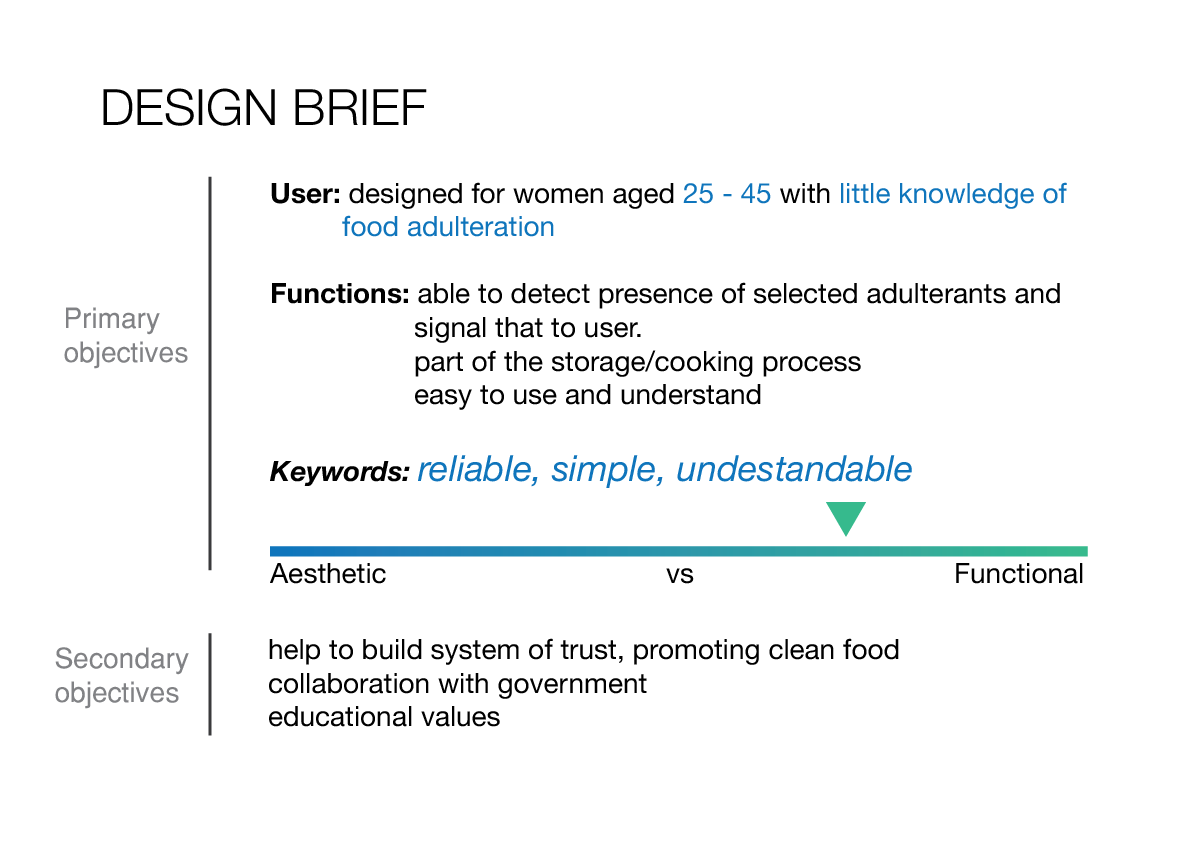
[ I have problem uploading photos so I will add them in later ]

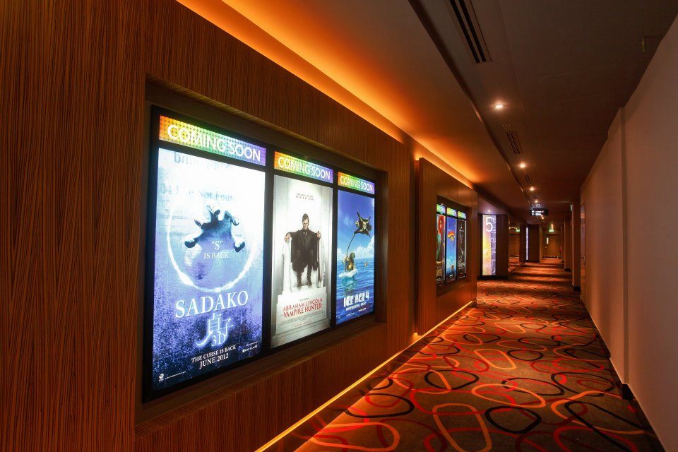
On Monday 18th September, our class went to FUTURE WORLD: Where Art Meets Science Exhibition on a field trip. We were guided by Mr.Katsu from Teamlab, the creator of this exhibition. He shared with us the ideas and the creative process behind those works.

The exhibition was divided into 4 different sections: Nature, Town, Park and Space, each with a specific subject of interest. For examples, we found works featuring flowers and the sea in nature, vehicles and city blocks in town, aquarium in park and the universe in space.

What is experience design and what are the possibilities of responsive environments? 

From this exhibition, I have formed an understanding that experience design is the process of planning and creating an experience for the user as a response of his interactions with the environment or product. In this process, designers try to create a media through which the experience is delivered and they have to make sure users provide the correct input to generate the desired output (which I believe is a highly scientific concept). In this exhibition, users’ behaviors is an important source of information because their actions are exactly the input for the artworks to create responses that alter audience’s experience. A more interactive experience seems to be when input and output are constantly on the exchange as compared to a passive one.

In this exhibition, the input comes from many sources of audience’s actions and the environment responses in many different ways. For examples, a step on the projected image of a flower in the room consisting artworks like Flowers and People will cause the flower to immediate disintegrate, while a ball thrown by the audience in Light Ball Orchestra will create humming sounds and changing the ball colors.

Sometimes it is more immediate and “real-time” interactive, sometimes it is more passive. For examples, in Connecting Train Blocks, a path is instantly connected between the same color blocks that are moved by the audience. This is a more interactive experience as compared to 100 Years Sea Animation Diorama where audience only sits and watch as the sea animation goes on.

My personal favorite work was Crystal Universe in the Space Section. In this work, we walked through a path that feels immersed in this universe of crystals hanging in mid-air and lights were passing through with different patterns, creating a sense of movement. I realize the grid format for light installation was to make programming light patterns possible. Also, the room was built with reflective surfaces, making these crystal multiplies visually in space, creating a real sense of immersion. Honestly, I felt like I was walking mid-air at first, which was a really cool experience. This works also allows the audience to send in their wanted crystals to be animated. However, I found that this part of the work was not well executed as I could not figure out whether my selected crystal was being played or when it will be played.

I think it was also interesting to note that the physical environment in which the activities take place was also tuned to best enhance the experience. For examples, we have flowery perfume in the flower room to better suggest the sensory of being surrounded by flowers. We also have bean bags to lay down and watch the sea animation because it takes a while for that animation to runs. Interestingly, I realize a large part of this exhibition is child-friendly. For examples, the design of artworks like Table Where Little People Live or Create! Hopscotch for Geniuses including features that are directly related to child play. The furniture in those areas was lower to suit children’s height, the activities are simple and there were helpers in some section to guide the children along.

The activities in those children sections, however, seem also highly enjoyable for adults. This intrigues me. How did the creator of these works select the activities that are suitable for both children and adults? How did they see the similarities and differences between a kid and an adult audience?

The artworks in this exhibition showcase different interactive technologies. As discussed by Mr.Katsu, the team consists of mostly engineers and the bulk of artwork creations are actually on constructing and building the work, not on conceptualization. Through the process, they built a database of knowledge that helps them expand and adapt one concept to the next. I am very impressed by how their team of largely engineers and designers can work together so effectively that the technologies are artworks themselves, not just a tool or a subordinate part of the exhibition. I wonder what was the design process and communication framework between their teams?

How might this change the way we think about the world around us and the ways that we communicate with each other?

Through this exhibition, I feel that future technologies can turn any physical thing into a communicable object through which information can be passed in forms afforded by the object’s features and inherent quality. For examples, anything with a surface can afford messages to be displayed or anything with lights can communicate through light patterns.

Also, communication may not only happen between humans but also inter-species, living vs. non-living objects…etc once we find out a way to interpret and create a medium/language that translate between the two. I feel that works such as Flowers and People, Cannot be Controlled but Live Together – A Whole Year per Year, Ever Blossoming Life II – A Whole Year per Year, Dark Flutter of Butterflies Beyond Borders and 100 Years Sea Animation Diorama is precisely about nature communicating with humans. While at this moment the designers and engineers are behind this process, in the future it could be possible that somehow nature can communicate for itself through media that humans create.

In this way, communication is expanded with possibilities of forms, content and audience. We as a user ultimately have more choices to make with regards to who we want to communicate with, using what language and through which form.

Product, service, design concept using place, location and ubiquitous technology

  1. Laser tag game Father.io : the world’s first real-life, massive multiplayer, first person shooter.

shooting

source: www.father.io

This product is very similar to the experimental running game that was discussed in class. Using augmented reality and location-based technologies, Father.io turns your surrounding into battlefields and your phone into first-person shooter interface through which you can fire and shoot other player. Gamers can also record and share their real time games on social media.This game is well developed even in the crowdfunding phase and is already well supported by gamers. “More than 55,000 gamers from across the world have already signed up on the wait list to play Father.IO” says Francesco Ferrazzino, CEO of Proxy42 and lead developer on Father.IO.

Personal thought: while I’m not a gamer myself, I am eager to see if this concept and technology can be applied in other fields. It is interesting to see that this technology allow participation of many people and it requires little to be part of the game. In a way, it sort of lowering social barriers as gamers can join and play in real life with anyone. It would be cool to see some of this being applied in fields like rescue or humanitarian work.

2. Pixel Track 

download

Pixel Track from Berg on Vimeo.

A concept that is highly relevant to Signage – a topic that our class has been discussing for a few weeks.

Pixel Track is a concept to provide a solution to 2 critical issues in signages: changeability requirement and energy consumption of LED display. Studio Berg’s concept combines internet-connected smarts with a display made up of mechanical pixels, each with two sides. When a new message is sent to the display, a computerized track sweeps along the backside and flips the pixels into the proper configuration.The advantage to the design is that once the pixels are flipped, the sign doesn’t require any power to display its message.

Personal thought: what interesting about this concept is that it seems to go in the opposite direction with many connected product concepts these days. Instead of going digital and requires energy to operate (smart watch,smart lock…etc) , it actually stripping off energy consumption and go back to mechanical approach.  I personally feel that this solution is simple, elegant and highly convincing in achieving both changeability and energy efficiency for signages.


Reflection | CH1 from Jonas Löwgren and Erik Stolterman, Thoughtful Interaction Design

In this reading, the authors gave a brief overview of what makes a thoughtful interaction designer, as well as the challenges a designer might face. The discussions mostly concern the field of interaction design. However, as the authors mentioned, the terms are kept general and I feel that many concepts they touched on can be applied to other fields of design as well.

Firstly, this reading has suggested an answer to a question I have always had about the design process: “What is the most important skill of a designer?”. The authors suggest that the most important skill is making judgements. This skill is developed through a constant process of questioning and reflecting on what constitute good designs, formulating personal beliefs and choosing suitable frameworks for particular design situations. As there is never a perfect design and there will always be conflicts to handle as a designer, having a clear design compass and understanding our design capabilities will help tremendously in making difficult design decisions. In this reading, the authors also suggest that good design considers not only for the client and users but also for the environment and society at large. A thoughtful designer is aware of the impact he is making to the world, no matter how small the product seems in relativity.

I remember the advice from my mentor Rahul at TUMCreate : “ the worst thing you can do when designing is to be unsure or regret about a decision you made ”

Secondly, the authors also introduced the concept that digital technology is a “material without qualities”. Digital technology is a fast changing material that designers have not enough time to comprehend and understand how to make the best use of. Also, the constantly changing nature also allows digital technology to keep evolving and creating new qualities and possibilities, without having a fixed inherent quality that designers can confidently rely on. In this way, I believe the role of the designer is to define the form and select qualities of digital technology that best suits the design project, with considerations for the purpose, design situation, user and impact of the product. Also, in this regard, many companies and design houses have been arguing for their views on how to best utilise this digital technology material, especially in emerging fields such as user interface design, user experience design, interaction design…etc. Each of this argument represents a certain design theory or philosophy that influential designers wish for other to adopt. This includes examples such as Jacob Nilsen ‘s 10 Heuristic of UI Design or Google Material Design concept.

google-material

source : https://material.google.com/#

For examples, Google Material Design is a design theory by Google that aims to “create a visual language for our users that synthesizes the classic principles of good design with the innovation and possibility of technology and science”. Their core principles are “Material as metaphors”, “Bold, graphic, intentional” and “motion provides meaning”. This is how the team at Google partly interpret and understand their digital material, as well as how they believe it should be used.

Lastly, I agree fully with the authors that design is a knowledge construction process, both for the designer and the world. In reality, especially in my field of industrial designs, many projects are concepts and many are speculative. Also, as design process usually takes place in situations with many constraints and conflicts from multiple stakeholders, it is likely that a concept never gets materialised. Nonetheless, I believe the process that the design team goes through, be it user study or technical development, builds up the knowledge and capabilities for the team and their clients at large. Hence, subsequent design projects can get increasingly effective, meaningful and relevant to the end user.

New vocabulary to note: thoughtful designer, design as knowledge construction, design situation, interaction design