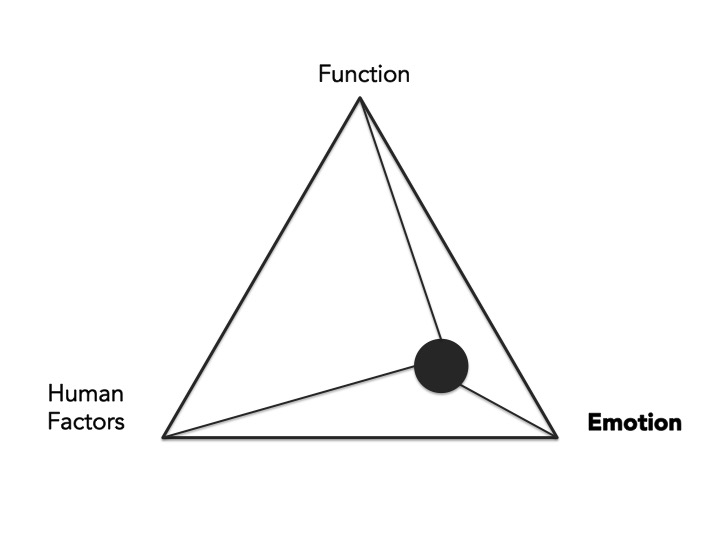
From the previous lecture, we understood how the aesthetics of products are influenced by three major factors: Function, Human, Emotion.
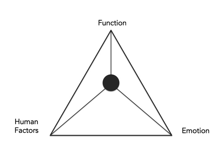
Of which, it is determined by the more dominant factor.
Below are the three products I have categorised according to the three dominant factors which I feel have influenced their aesthetics.

(FromUpNorth)
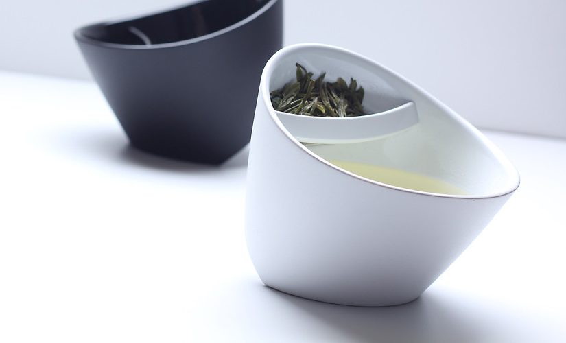
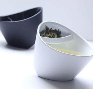
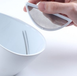
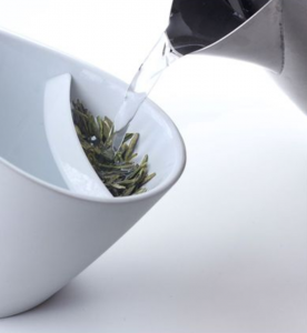
This is a tilting teacup designed by Magisso.
I feel that the product is function-dominant because of the overall simplicity and intuitiveness of its design. The intention of the product is to help tea enthusiasts brew the perfect cup of tea. Users are able to adjust the strength of their tea by tilting the teacup.
The design of the product is very straightforward; even without an instruction booklet, users will be able to understand how the teacup is meant to be used.

I feel that the Lililite, a bed reading lamp designed by Thijs Smeets, really embodies human-dominant aesthetics. Smeets take into consideration the habits and needs of avid readers and transformed them into his design.
Everything an avid reader needs is housed in one design; space for them to place their books, and a physical bookmark that acts as an on/off switch for the book light below.

All in all, I feel that this is a product that was designed with human as its utmost consideration.

Lastly, we have the Heifer Pitcher.
It is a double walled glass pitcher that features the shape of cow udders on the inside. The first word that came into mind when I looked at it was “cute.” The designers behind the Heifer Pitcher intended for it to be a fun way to encourage children to drink their milk, and an object of amusement for adults. Regardless of the liquid in the pitcher, consumers will definitely have a fun time using it.