Typography Lecture 4 — Saul Blass ( The Man with the Golden Arm)
1. The Man with the Golden Arm
” Design is thinking made visual ” — Saul Blass
Personal Thoughts
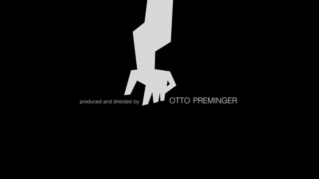
In 1950s, Saul Blass designed the title credits for a Otto Preminger movie that featured a protagonist who was transformed due to his heroin addiction. Blass’s challenge was encapsulating the drama, intensity and gravitas of the movie’s theme and plot within the title credit without making any explicit reference to drugs or addiction – an extremely taboo topic in the 50s. It would even considered be taboo now and would not be something explicitly publicised in pop culture movie screenings. As such, Blass had to simplify and translate his idea into a visual abstraction rather than a literal representation.
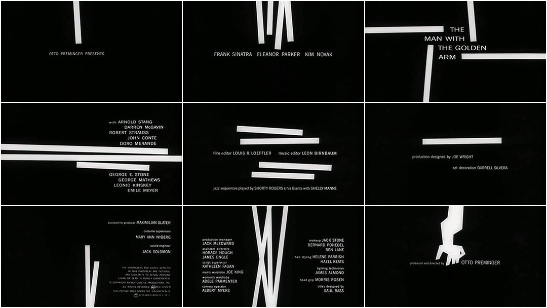
He used geometric, harsh white lines juxtaposed against a pitch black background while playing with the direction and the angle in which they interacted. The tilted lines and sporadic animation coupled with the ominous crescendo of Jazz Music in the background is representative of the psyche of a drug addict – scattered, intense and troubled. Space and lines are used to create visual drama.
The most significant piece in the whole title sequence would be the the distorted looking arm. This image was also the most direct reference to to drug use with the significance of the arm being one of the key places most heroin users will ‘shoot up’. Heroin in its purest form also comes in white which could explain the significance behind the use of harsh white. The white lines could possibly be an extreme abstraction of syringes which is the main medium through which addicts would administer themselves.
In this particular work, typography is kept very minimalistic and is differentiated by uppercase and lowercase fonts. They adhere to the presence of the white blocks and are framed accordingly within or around the blocks each time. This creates a dynamic and spontaneous representation of the text while keeping the font itself constant. There’s also an impression of instability in the way the text or the blocks frame each other and ‘hang’ at a very disconcerting angle or placement within the black.
The Man with the Golden Arm
The text is complemented by the intensifying jazz music which is reminiscent of Tennessee Williams’ A Streetcar named Desire’s (Also a 1950 literary classic) use of the Varsouviana Polka music that signified Blanche’s mental deterioration. The frequency of the Polka increased towards the end of the movie and it appeared whenever Blanche encounters a traumatic experience or emotion. In this context, Saul Blass’ Man with the Golden Arm sequence within the few minutes, effectively throws us into a pool of discomfort and coneys the idea of madness and addiction before even we are directly exposed to the movie’s themes.
In A Street Car named Desire, the score was used within the film itself to complement the narrative and theme following Blanche’s descent into insanity. Blass followed the same concept but was the first in the 50s to revolutionise title sequences by adding motion and animation to it. Before that, all title sequences were mostly static.
A Street Car named Desire
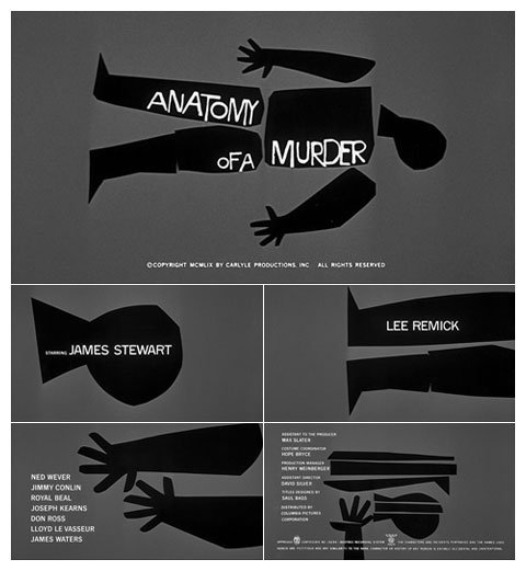
The same concept is seen in his other famous sequence, Anatomy of A Murder, where the central image accompanying the title is that of a dissected body with each part framing certain portion of the title text. Here, geometric and harsh blocks are once again used along w jazz music.
Anatomy of A Murder
Take away from LECTURES
Through these 4 weeks which were rather heavy with content, I was introduced to key figures and names related to Visual Communication Design History that have helped me better understand the depth of the rationale behind many of the design concepts or styles that exist today. Here on, I will be able to also recall some of these names off my head and apply them accordingly to my personal work.
Typography Lecture 3 — Futurism
1. Reflections
In this lecture we learned about the dawn of Modernism. A period sparked by the birth of Cubism which further let to the development of Futurism in Italy, Constructivism in Russia and Precisionism in United States. During period, new philosophies by influential poets and literary figures formed the primordial soup for corresponding Art to emerge. Before this, Typography and Art were widely used in posters and to gain attention with primarily variation in colour, form and with the integration of visuals. However they were still mostly linearised with focus on readability and conveying of a tangible message. With Modernism, these supposed rules fell apart, and artists redefined the arrangement and construction of letters and texts according to their personal beliefs. They were manifestations of the mind, made to stir emotions and induce feelings rather than to serve a material or superficial purpose. In some ways we can say that Typography in this period was imbued with an organic and spontaneous life of its own. Personally I was most drawn to the rebellious and robust philosophy of Futurism.
2. Futurism
Background
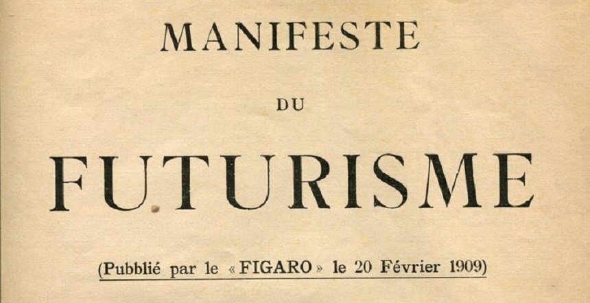
in 1909, Poet F.T. Marinetti issued a Futurist Manifesto which was published in La Figaro (a popular magazine run by youths), igniting the movement. He urged artists to revel in and celebrate ‘the beauty of speed’ and emphasised the veracity of movement. He was inspired by this notion of speed when he avoided a collision and ended up flying into a ditch in his speeding car.
“a roaring racing car that seems to run on shrapnel is more beautiful than the Victory of Samothrace”
Full Translated Manifesto : https://www.societyforasianart.org/sites/default/files/manifesto_futurista.pdf
Works
This love and obsession for speed and movement is evident in his use of texts which fully break away and disregard the conventional rules of typography. He used varying fonts within one page with variations in thickness, colour, strokes.
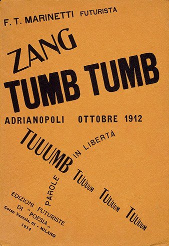
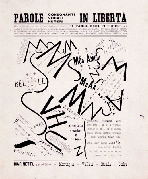
When one looks at his books, there is a deliberate lack of harmony and no form of symmetry – accurately capturing the essence of the idea of Movement he was so passionate about. This erratic and chaotic appearance (lack there of, of rules) became a rule in itself for the Futurists. He scattered mainly nouns about the page and conveyed meaning through arrangement and size. His lines were organic and dynamic and their grids intersected freely on the page.
Personal Thoughts
Marinetti wanted to express a sensation or a feeling, something intangible and intense and this accurately is reflected by his free and unrestrained ideology of Typography. When I see his work, rather than viewing it as a book, my sense of it is more visual and imagery. It is also important to note that Umberto Boccioni was the leading artist of the movement and manifested Marinetti’s philosophy through his sculptures. His main aim was to capture a cinematic sensation of flux in his figures. As a collective, the also fascist futurists were controversial and rebellious. They were known for provocative acts such as proclaiming fascist slogans from the top of the Venice’s St Mark’s bell tower. They even went to the extent of advocating a new cooking style named ‘Cucina Futuristica’ – extremely absurd recipes that involved the use of cologne and other unconventional ‘ingredients’. They measured their success by the level of abuse they received from the masses. However the movement was short lived and ended with Boccionis’ death. Which fittingly (?) occured due to a riding accident. I suppose one could say he brought his passion of Futurism with him to his grave.
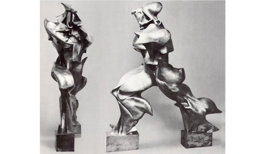
Boccioni, “Unique Forms of Continuity in Space”, 1913
Even though Futurism was short-lived, its aesthetics had a significant impact on the development of other movements like Surrealism and Expressionism which subsequently lead to the birth of Post-Modern Art movements. Their philosophy of centralising Art and Typography around a specific sensation and feeling propelled the exploration of the intangible, temporal and subconscious to the fore front of Art.
Typography Lecture 2 — Jules Chéret
1. Reflection
Industrialisation, mechanisation and interactivity between cultures changed the way letter forms and type were approached. Previously the main function of type was heavily centred around the idea of documentation. However with the rise of industrialisation, people started making a conscious effort to manipulate type in order to draw attention towards a particular product or idea. It was used simultaneously with images via posters, magazines and mass communication traditional media devices. Out of the multiple examples we were shown during the lecture, Chérets posters had the most visual impact on me.
2. Jules Chéret
Background
Chéret began his career in 1858 illustrating opera posters, book covers and advertisements. Just like the Art Nouveau artists of that period, he was heavily influenced by the Japanese Ukiyo-e movement which reflected the idea of indulgence in daily life by exploring controversial subject matter such as the Geisha. After Japan opened up to trade, from being isolationist, there was a sudden influx of these Japan Aesthetics into the western world of Art. The notion of ‘flatness’ in Japanese Art was adopted in Paris and the simultaneous lifting of a ban in Paris, allowed posters to be displayed on the streets, making the streets an ‘open gallery’. As such, commoners and the public had increased access to Art.

Posters
Chéret established his own lithography firm and employed this technique in his highly illustrative posters which often portrayed the sultry and ‘unrestricted’ spirit of a woman. The female figures in his posters were fondly named the ‘Chérettes’ due to their characteristic flamboyance and vibrance in terms of colours and movement.


The use of bright vibrant colours, flatness, wavy lines, tumultuous movement and bold outlines were the key features in all his posters. The woman wore heels, had provocative parts like their thighs and back exposed and asserted a very dominant presence in the compositions (echoing the idea of indulgence world in Ukiyo-e). They celebrated and embraced feminism, subverting the characteristic patriarchy of that time.
Personal Thoughts
Chéret adopted both the ideas of ornamentalism from wood type and also the concept of readable fonts. He however broke from any strict restriction and created his own illustrative style, making space for ‘new’ rules to be enforced again. He disrupted the idea that type had to be static and gave it equal importance as imagery via the use of lithography. The emphasis on free movement and the idea of Ukio-e resulted in emotive and non conforming, unique letter forms. Instead of using a standardised font, artists started exploring making their own custom fonts by illustrating them. His aesthetics also played a key role in the development of Alphonse Mucha.
Typography Lecture 1 — Oracle Bone Script
1. Reflections
In this first introductory lecture, we learned about how letter forms over the centuries, have evolved and changed along with man’s need for different functions, before they were treated as typography or something that is more closely associated with Art as we know it today. In the archaic days, pictographs and petroglyphs (engravings) were created to facilitate documentations with the main and simple function of conveying information. Many of the ‘stylistic’ elements of the form like the stroke were unintentional and rather occured due to the tool with which they were being engraved with (cuneiform, brush stroked serifs on ‘Trajan’s Column’). However over time, with the establishment of function, creating letter forms became a more discrete and unique activity, leading to various modifications and explorations of how they can be presented (with identity and character) as we have them today. We were also presented with many examples of typography being employed in different cultures throughout the centuries. One in particular that we did not delve deep into piqued my interest — Oracle Bone Script. Hence I decided to look up this particular script on my own.
2. Oracle Bone Script
History
The Oracle Bone Script are the oldest form of pictographs that are recognised as the predecessor of modern Chinese Language. They were used by diviners in the Shang Dynasty (questions were inscribed using a metal pin on animal bones and tortoise shells, before being introduced to a hot rod which then caused cracks, allowing the diviner to craft their answers by interpreting these cracks). They believed the divination via pyromancy allowed them to communicate with their ancestors.

Form
The letters found in the Oracle Bone Script, were essentially pictographs and hence they were highly abstracted version of modern Chinese characters — with some being a combination of two characters. Some scholars theorise that this simplification was due to the difficulty of inscribing on the hard bony materials. Here the form of the letter is hence possibly influenced by tools and materials just like mentioned earlier with regards to the ‘serifs’ on Trajan’s Column. From this script, only about 1300 of known 4600 Chinese characters have been deciphered. Below are some examples of Oracle Bone characters.

Personal Thoughts
Being a non-Chinese speaker, I did not need any prior knowledge of the Modern Chinese Language to decipher the rough meaning of these highly visual pictographs. The characters in the Oracle Bone Script were abstracted ‘diagrams’ of ideas and words. These then eventually transitioned into calligraphy and more complex strokes as they appear today. Scholars are still trying to fully decipher these texts, as they potentially contain key information about the history of ancient Chinese Civilisations and the way they lived.
One of the main difficulties is due to the fact that the script was irregular in size and form depending on which dynasty they belonged to. Standardisation only occured during the Qin Dynasty period.
What is interesting to note here is that the similar pictograph like Egyptian Hieroglyphs were fully deciphered, by Jean-François Champollion and Thomas Young after the discovery of the Rosetta Stone. The presence of Hieroglyphs, Demotic Script and Greek on the stone, all conveying the same ‘decree’, allowed them to compare and eventually decipher the Hieroglyphs. The lack of a clear transitional ‘piece’ of artefact has yet to be found with regards to the Oracle Script and Modern Chinese Language, making difficult up till today for scholars to gain full access and depth to understanding these characters.
 Rosetta Stone
This could potentially be due to the fact that countries like China and Japan were isolationistic and trading only within themselves for a very long period of time — this probably did not allow for their language to be appropriated and transpired across regions, which is contrastingly evident in the Egyptian, Greek and Roman scripts.
3. Sources
https://www.britannica.com/topic/Rosetta-Stone
https://www.omniglot.com/chinese/jiaguwen.htm


