Link to Slides :
https://docs.google.com/presentation/d/1UsG7ithPr-FWze0s7Ycpqev4kQQhd34EP6RbQLj3HQc/edit?usp=sharing
when thoughts distill and drop like rain — somedays heavy, somedays light


For this project brief, we were tasked to use typography to illustrate and express four different occupations that we aspire to be — fictional/real.
My concept for this assignment was to create a satirical and ironic piece comprising of four different occupations. I wanted to use the distinctive traits of my personality to highlight and explore seemingly glorified ‘dream’ jobs. Most people would describe or view me as a hedonist — someone who’s main goal in life is too indulge/over indulge in all sorts of ‘pleasure’. With my own personal experience in having lived through such a phase previously, I wanted to use this idea of indulgence to bring out the dark undertones or job hazards that masquerade behind the facade of very prestigious occupations. I also wanted to approach this assignment from an adolescent perspective as many kids are often innocent and when they think of ideal dream jobs, that are unaware of the potential ‘side effects’ and hazards that deeply plague adults with these jobs. This juxtaposition of child-like innocence with a very matured and layered insight into the dark sublayers within my piece, further amplifies the themes of irony and satire.
Priest, Doctor, Dancer, Photographer
I decided to use traditional medium for a more raw yet child-like feel, in line with the overarching theme.
I wanted to use typography as something more visual rather than focusing on the solid form of the letters themselves. Hence I explored the use of upper and lower case forms, and finding objects that have a similar silhouette to that of my chosen letters. I also wanted to explore both the use of positive space of the stroke of the letters themselves, and the negative space within these letters. Below are some artist works that I drew inspiration from.

Sawdust by Rob and Jonathan (Use of silhouette to mimic letter form)

Messy by David McLeoad (combining relevant texture and imagery with the connotation of words)

May by Sabeena Karnik (use of negative space of letter forms)
The concept for my final pieces were centred around the idea of ‘Child’s Play’ and the visual juxtaposition of adolescent innocence with subtle irony. It was also an exploratory piece injected with my own personal hedonistic trait. Hence I wanted the overall pieces to be emotive and tactile. I decided to draw upon inspiration from Abstract Expressionism/Expressionism and various Art Styles to realise this concept visually. Below are some of the techniques or inspiration that I appropriated for my final works.

Yves Klein (use of body and skin to make prints on paper with blue ink)

Keith Haring (use of bold outlines and almost children colouring book like aesthetic)

Man Ray (harsh contrast between light and dark to create a very clinical looking composition)

Mixed Media Art (combining three dimensional items within a two dimensional canvas)
Getting my hands ‘dirty’ to me, was an important process to bridge my initial concept and my final work. It evokes the idea of ‘Child’s Play’ while at the same time captures concept of the stains and scars that are left behind when one is tainted by the dark layers that plague my chosen occupations.


Materials/Medium : Crayon, Calligraphy Ink, Colour Pencil, Candle Wax, Fummage, Tissue Paper
Letters used: A, P, V
Reference: Bishop Hat and Staff

Analysis: For this composition the occupation I wanted to critique was catholic priests. Many religious kids in their adolescence look up to these people as men of God and may aspire to be as ‘pure’ as them. However the Catholic Church, time and time again has been embroiled with repeated cases of child molestation which is the ‘hazard’ and ‘hedonistic’ aspect I wanted to explore here. In 2018 alone, within just the state of Pennsylvania there were 1000 reported cases of child molestations by the Catholic Church. Recently the Pope has also acknowledged the prevalence of the issue. Many blame this perverse sexual urge on the abstinence and celibacy that is enforced upon these religious men. For the letter P I appropriated the use of the staff bishops hold in their hand and used typography for its form. Initially I wanted to use the names of victims however I realised that they were inaccessible due to issues of privacy. Hence I used catholic boys’ names instead as an alternative. I also used a subtle phallic form, representing the top portion of the male sexual organ for the end of the staff. This also then makes the action of the priest gripping this ‘staff’ perverse. For the letter A, I used the form of the bishop hat and replaced it with a condom instead. I wanted my viewers to notice these details on closer inspection but from afar there is a sense of superficial innocence to the piece. I also coloured the thumb and finger to make a V form. Candle wax was dripped on the hand to add a perverse connotation to what his hands may have touched. Under the robes there is another A form in the negative space which I replaced with tissue paper. There is subtle A scratched onto the surface to display the hidden cry for help of child victims. The placement of this under the robes is also symbolic. For the overall look, I used very bold ink lines and colour pencil to give this piece a very children’s colour book page sort of vibe. I wanted the idea of innocence and ignorance to be amplified in every way possible. Hence I used materials that kids will often play with. I also burned the page with a candle as candles are used in most churches and I wanted to use it as an instrument of harm. The burns also act as a permanent stain to emphasise the trauma that many are left with due to many that practice this occupation.

Materials/Medium : Clay, Acrylic Paint, Screen Printing Ink, Palm, Prescription Pill Slab
Letters used: V, A, r
Reference: Valium Pill

Analysis: For this composition I wanted explore the Job of a Psychologist. Psychologists tend to patients with all sorts of mental illnesses and trauma. Subsequently they too are inherently affected by the emotions of their patients and be triggered by these external factors. Hence many Doctors and psychologists my tend to their own coping mechanisms to reconcile with the intense emotions that they have to absorb and break down in order to treat their patients. Another sub layer would be their easy accessibility to prescription drugs. Hence their need to deal with their own emotions and access to drugs may lead many in these profession to addiction issues. Hence the hazard and hedonistic aspect in this job would be ‘addiction’. I decided to go for a very minimalistic and clinical aesthetic for this composition. For the letter V, I used the form of the benzodiazepine Valium, a powder blue pill, traded under the name Roche. I decided to use clay to make a 3D piece as it is more convincing of the tactility of an actual pill. Clay is also something that kids play with a lot, relating it back to my overarching theme. In the middle the letter is A is in the form of a negative white space — this was obtained by painting the palm of my hand with screen printing ink and imprinting it onto the paper. Hand painting once again is something many kids enjoy doing. For the last piece, I cut up a pill slab of my own prescription medication to form a digital looking letter ‘r’ in lower caps. The blue throughout this composition gives the piece a very X-Ray like and hence clinical look. Even tho I was exploring the job of a Psychologist, I labeled it as ‘Doctor’ as adolescents would categorise Doctors, Surgeons, Psychs all under one big umbrella with their limited vocabulary. Doctor is also one of the jobs many kids look up to.

Materials/Medium : Photo Paper, Blue Cellophane Paper, Screen Printing Ink,
Letters used: V, R
Reference: Rorschach Test, V Mag


Analysis: For this composition I wanted to explore the hidden agendas behind many fashion photographers in the industry. I used notorious photographer Terry Richardson as the main subject matter for this piece. He was a photographer that used to shoot editorial pieces for famous magazines. However after many models allegedly accused him of making them perform inappropriate sexual acts on him during their shoot (including performing fellatio and even making them drink their own menstrual blood), most major magazines have since boycotted him. I printed a few pictures of Terry Richardson touching celebrities (during his shoots) in provocative manners and cut them up to form a deconstructed collage. I appropriated the infamous V logo that V magazine uses to frame their main subject matter in all of their cover pages. I placed the ‘innocent’ portions of the cut up pieces within the V frame while placing the incriminating perverse provocative body contact ones behind the blue cellophane paper which I used. This is representative of how as consumers of these famous Photographers we only see the final perfect looking picture and we are usually unaware of the dirt that plagues these practice behind the scenes. For the letter R, I used screen printing ink to mimic my own Rorschach Test – an ink blot test that is used to psychoanalyse people who may have any unstable mental disorder. This imagery further emphasises the sinister and insidious nature in which many Photographers run their operations (especially within the fashion industry). The adolescent sense of playing here, is symbolised via the use of scissors to cut up the pictures and to create the collage and also through the use of a ‘basic’ painting technique — pouring pain on one half of a paper, and then folding it into two.

Materials/Medium : Ribbon, Double Sided Tape as adhesive, Extra Fine Glitter
Letters used: R,P
Reference: Pointe Shoe

Analysis: In this composition I wanted to explore the occupation of being a full time professional Dancer. Dancing, especially ballet is a form of art many young girls and boys look up to. Many parents also send their kids for such classes as it is seen as a very refined and technically proficient ‘sport’. However it involves immense discipline and the dance industry is often shrouded in controversy due to the brutal way in which it operates – only those that are impressive enough are recognised and established individuals in the industry are often unapologetically critical of those who may not be ‘good enough’. This almost regimental discipline was the job hazard I wanted to explore for this piece. From a young age many ballet dancers are already forced to learn how to go on pointe. Hence I used the form of the pointe shoes to create the letter ‘P’. I used glitter as stereotypically it is a material that many young girls would play with or be fascinated by. For the the letter R, I used a ribbon to mimic the lace of the shoes. I also extended it out of the frame, secured with a nail to create the imagery of a noose, hanging the feet. This was the emphasise the idea of how many dancers suffer from injuries and bruises due to broken bones in their feet. Permanent injury is another ‘hazard’. This is hedonistic in the sense because one needs to fully commit and indulge in this art form to succeed.
Red to many would be the most direct colour to represent something that is harmful. Hence I used Blue instead given the idea of how the harm subtly embedded within these occupations are almost invisible to the innocent eye.
For the font, I used blue crayon and intentionally tried to replicate the sporadic form of a child’s writing.
I named the overall piece ‘Child’s Play’ as it reinforces the idea of innocence but at the same time it is contradictory and satirical when juxtaposed with the compositions — which express how these jobs are not just ‘child’s play’.


I have learnt that our work might not have the same effect in the two different genders and might be inefficient when conveying our messages.
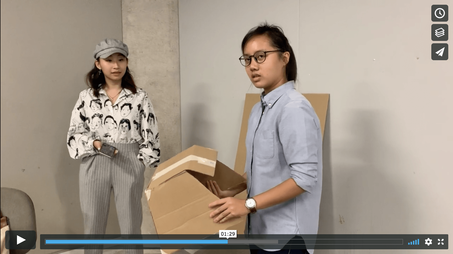
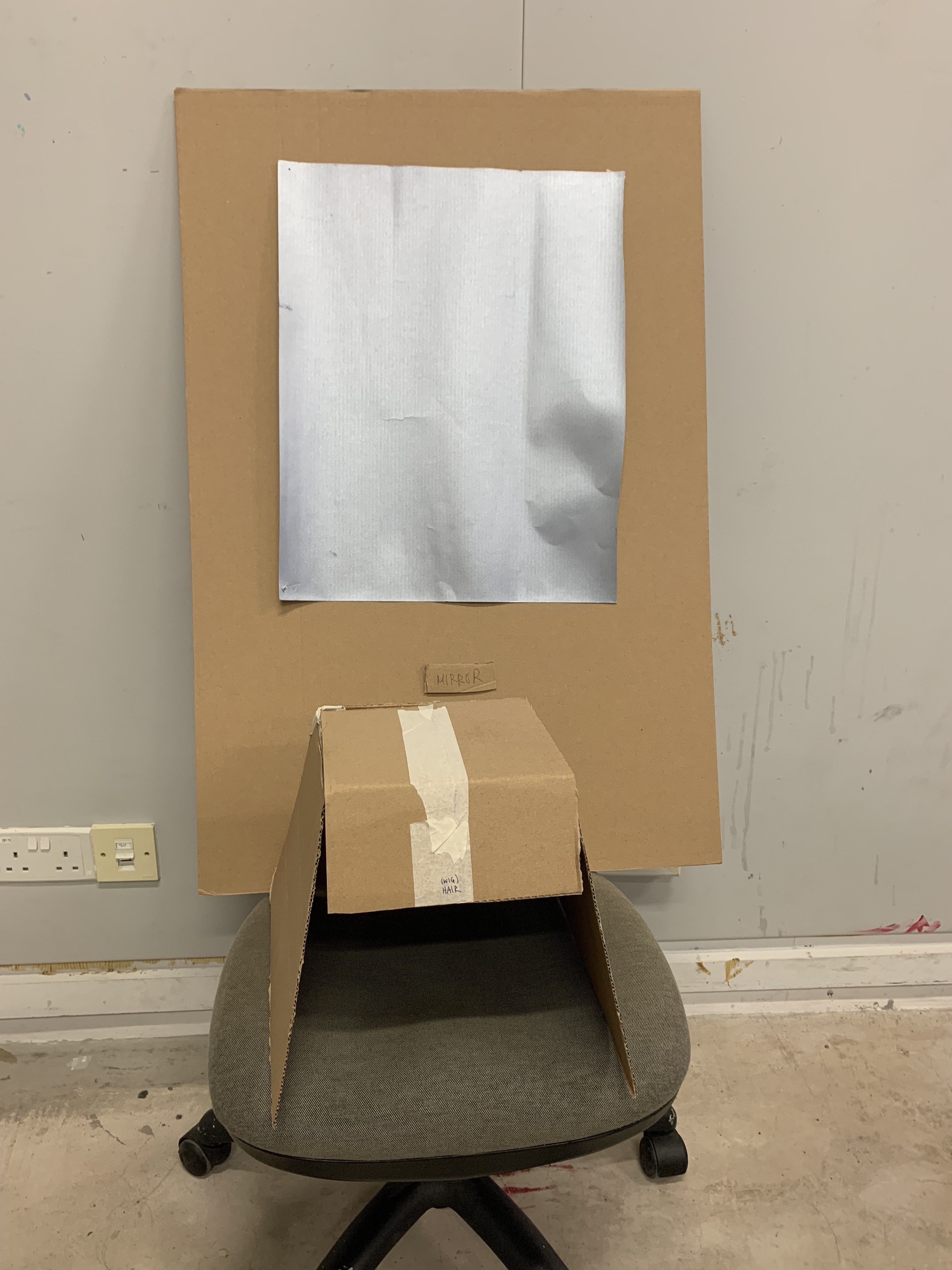
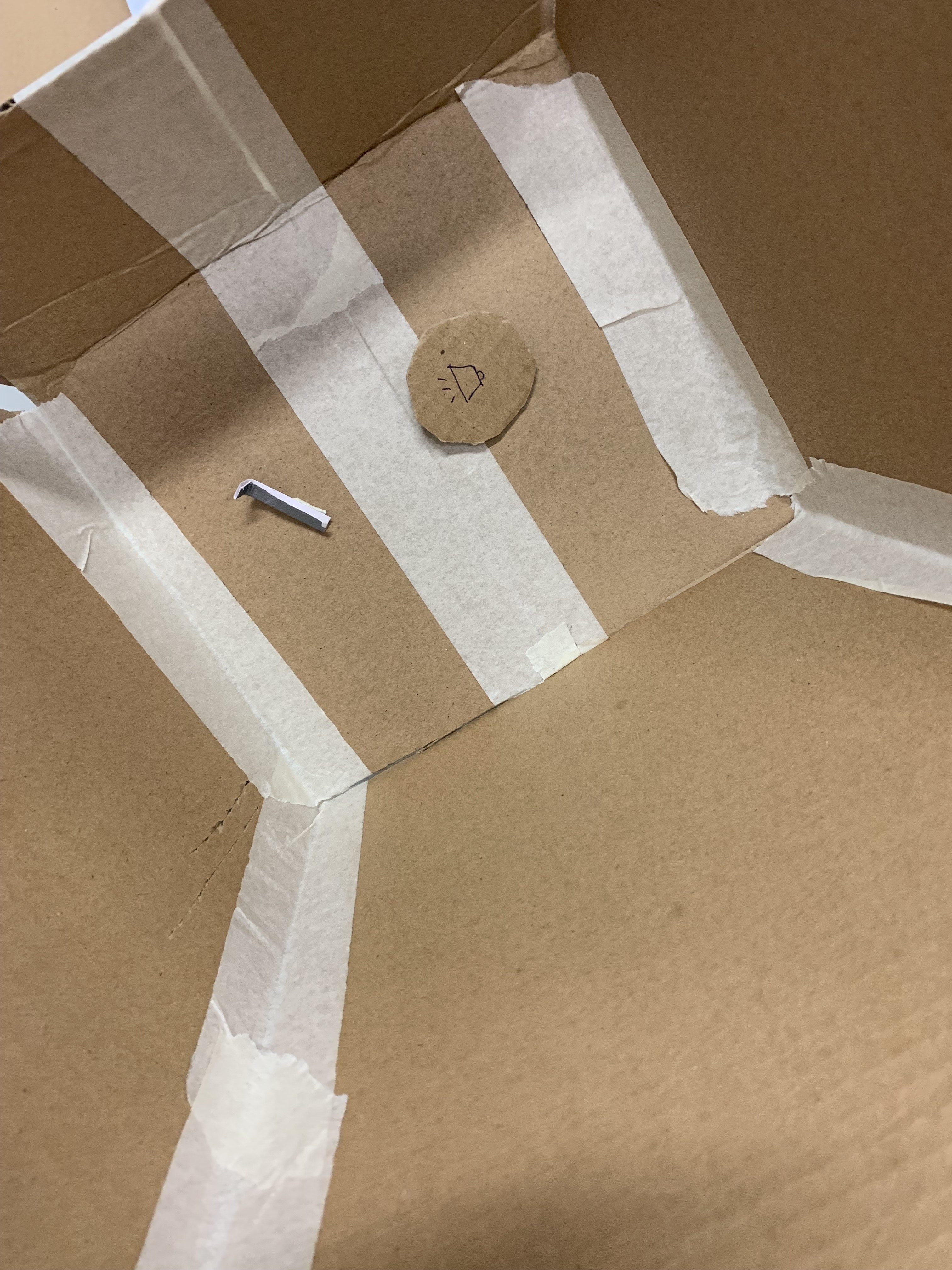
Initially when we told to make a cardboard prototype for the body storming process I was honestly a little sceptical of its necessity. I didn’t see the need to do so till I went through the process of it and understood its importance for our final piece. It was a test run that allowed us to pick up on any potential weak links or loopholes in our object that could affect our interaction on the actual day itself. I learnt that it was crucial to take into account all 5 senses when making our work because as humans we are not trained to isolate them from one another. As such, when approaching our work all 5 senses of our tester were engaged and simultaneously too. If our main form of interaction was to be through hearing or sight then we had to provide a kind of sensory hierarchy within our work itself so as not to confuse our audience. In our instructions we wrote to smell and feel the ‘wig’ before putting it on. However during the interaction we learned that the touching element was unnecessary and confusing. Sometimes it is better to target specific senses that relate to our topic of design noir than to try to engage all senses with the same intensity. We learned that we had to reign our concepts in and distill them down to make it more focused and targetted. I also learned that during the actual interaction itself we would have zero control over our audience and as such the work had to be as self explanatory as possible. We also learned that the impact of our uncomfortable wig may differ according to the gender/sexual orientation of the person wearing it. Though initially I felt like this may be something we had to address, I personally feel that each person has their own ways of feeling discomfort and we do not necessarily have to try to make everyone feel the same thing. In some sense an object that could self adapt itself and be versatile enough to incite discomfort in all kinds of people is stronger than one that only works on certain type of people.
I was surprised that the tester actually able to kinda know what to do and know our intentions of the work.
What surprised me most was the level of discomfort and intrigue displayed by our tester from the moment she interacted with our object. I did not think we were going to get that much of a reaction from our prototype. She was visibly intrigued from the start when she could not stop sniffing the object. And also shocked when the male moaning sounds were emitted when the wig was put on. However she also said she felt confused. Surprisingly she more or less also managed to figure out on her own what he main intent of our work was – body dysphoria and to make people feel uncomfortable in their own skin. Another surprising reaction was her reluctance to disengage with the object completely despite her shock and discomfort. She kept wanting to sniff the pleasant and flowery scent of the YSL fragrance we had doused the wig in. This to me was a potential area we could work on to further strengthen our final interactive piece.
I think we can make our work more catered to the two genders like separately: eg. instead of wig it can be female and male underwear.
After the interaction, during the critique from our peers we understood that the effect may not be constant throughout all orientations. Someone mentioned that if it was a gay person and they heard the moaning sounds, it may be more pleasant as opposed to our initial concept that if a male person wore it, it would question their masculinity. We failed to take into account the diversity of the demographics that exist within our audience and that is something we had to adjust. Though someone suggested designing two separate objects for the Two different genders, I personally feel that making one object that would affect the two separate genders equally would be more effective and powerful. For our final interaction we will be using a full frontal mirror with a modified and maybe more androgynous wig with the focus on the sound and smell. We also understood that the shock element of the moaning was too abrupt and resulted in an ambiguous state for the tester, after it was played. We will have to create a proper and gradual arc – start, a moment of breath before the sound, gradual increase in intensity/discomfort of the sound, and ending of interaction. I would want to incorporate the reluctance our tester displayed in leaving our interaction, into our final piece. However we had to make the journey of the interactivity itself smooth first.
Design Noir according to Anthony Dunne and Fiona Raby, is part of a contemporary yet forward approach towards Design. It is ‘avant grade’ and controversial in the way it challenges the mass production mindset that the industry has etched in the minds of many designers. However it is not just ‘weird’ for the sake of wanting to be recognised as a sub cultural movement – it rides on familiar objects that mass people have a pre existing relation to and harnesses the advancement of technology, to produce relevant objects that critique the current state of society or design. It provides an alternate space for a paradigm of multi realities to exist by rejecting the idea of one physical reality. They argue for the push of this sort of art as it is important for the sustainability and credibility of the creative power we possess as designers. When one has the avenue to mass audience and hence the chance to ‘mass produce’ subversion, they should utilise it to destabilise capitalist mindsets instead of falling back into designing within the restrictions and motivations of the ‘marketplace’. Many creative agencies only employ provocative or controversial projects as a ‘testament’ to their creativity in the form of prototype objects. However within their modus operandi, these ideas are never seriously entertained or tackled. They become a far fetched imagined reality.
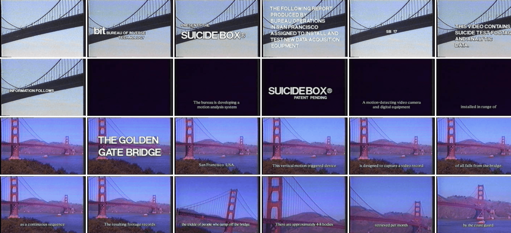
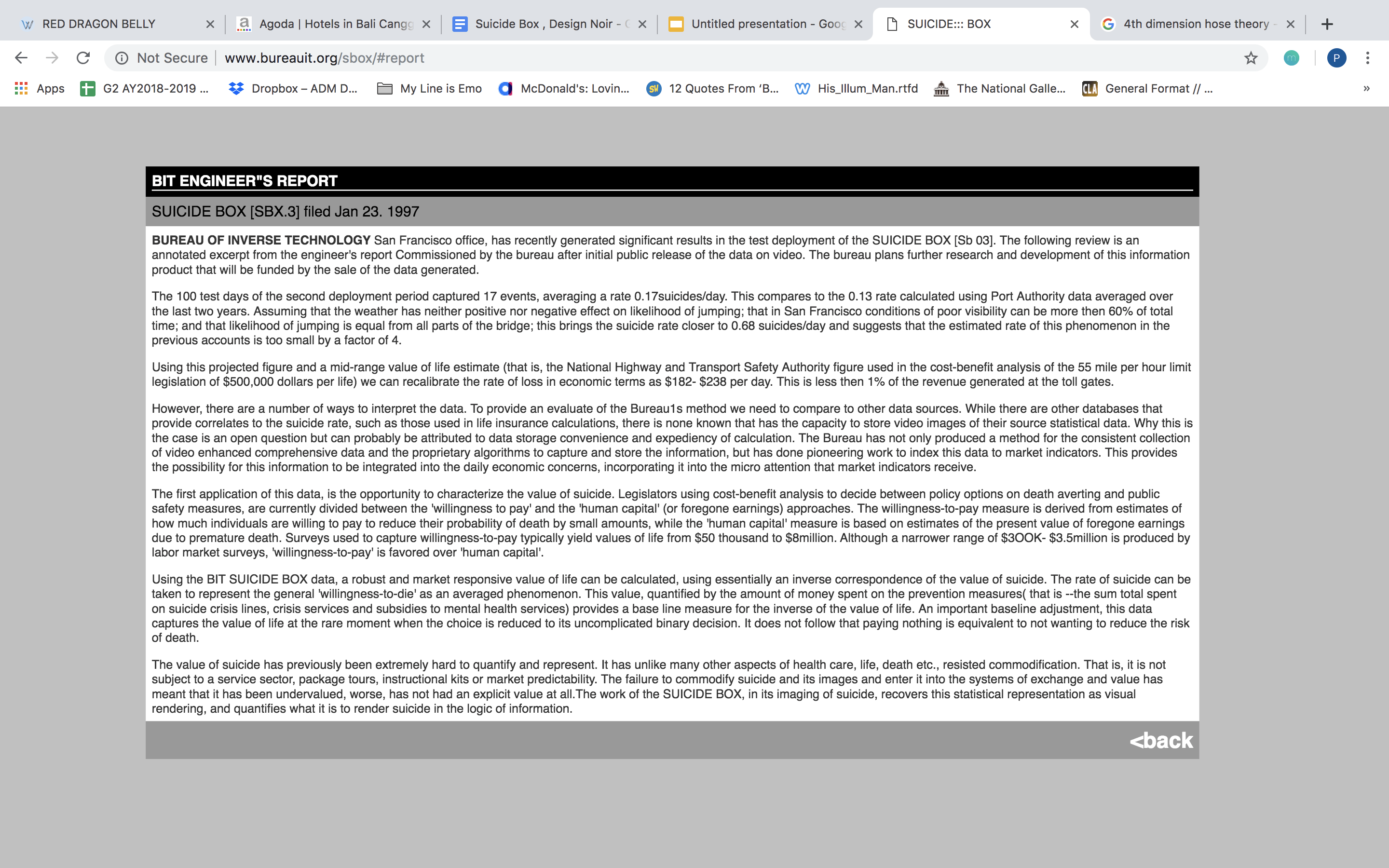
In line with this, Natalie created Bureau of Inverse Technology (BIT) — a self made fictional corporation run by essentially herself. It acted as a front to legitimately conceptualise experimental products that would be taken seriously – not just as explorations by an individual artist. According to Dunne and Raby, it is ‘more sinister’ when an organisation engages in a set of subversive works. Suicide Box is one key ‘product’ that was conceptualised in its time as a critical design work. It involved placing a motion detector and video camera near the Golden Gate Bridge in San Francisco to track vertical movements in its frames – its aim to capture the moment every time someone tried to jump down from the bridge. A ‘engineering report’ was post produced to suggest how Suicide Box could be harnessed to ‘calculate a robust and and market responsive value of life’. This slightly invasive and desensitised approaches towards documenting suicide as an empirical factor (rate of suicide) (see Image 1.), makes it a ‘box’ that measures the rate of suicide over time. It takes the guise of a mass produced form of high technology (motion sensor camera) with underlying dark undertones. It’s function does not change. It works the same way an industry based motion sensor might be used to calculate the number of rain drops falling per hour. However it explores an uncharted and alternate reality that before this was not seen as a viable medium for this particular technology.
This hence falls under critical design to show the industry that technology and everyday products can be employed to greater and deeper use if one were to view it not just as a money making piece of hardware but as some sort of archetypal object. It relates back to how Dunne and Raby in their article argue that it is necessary to pursue and ‘realise’ unpopular design due to the implications popular design have for both us as designers and society in the future. Unpopular Design, unlike Popular Design, rejects the idea of a fixed reality and proposes the blurring of the conceptual and real. It is capable making the conceptual more ‘real’ to consumers while at the same time pushing for the ideology of multi realities that should be explored and reflected through design.
Jess and I both decided to use an object of controversy or something that people would already have an innate sense of discomfort towards.
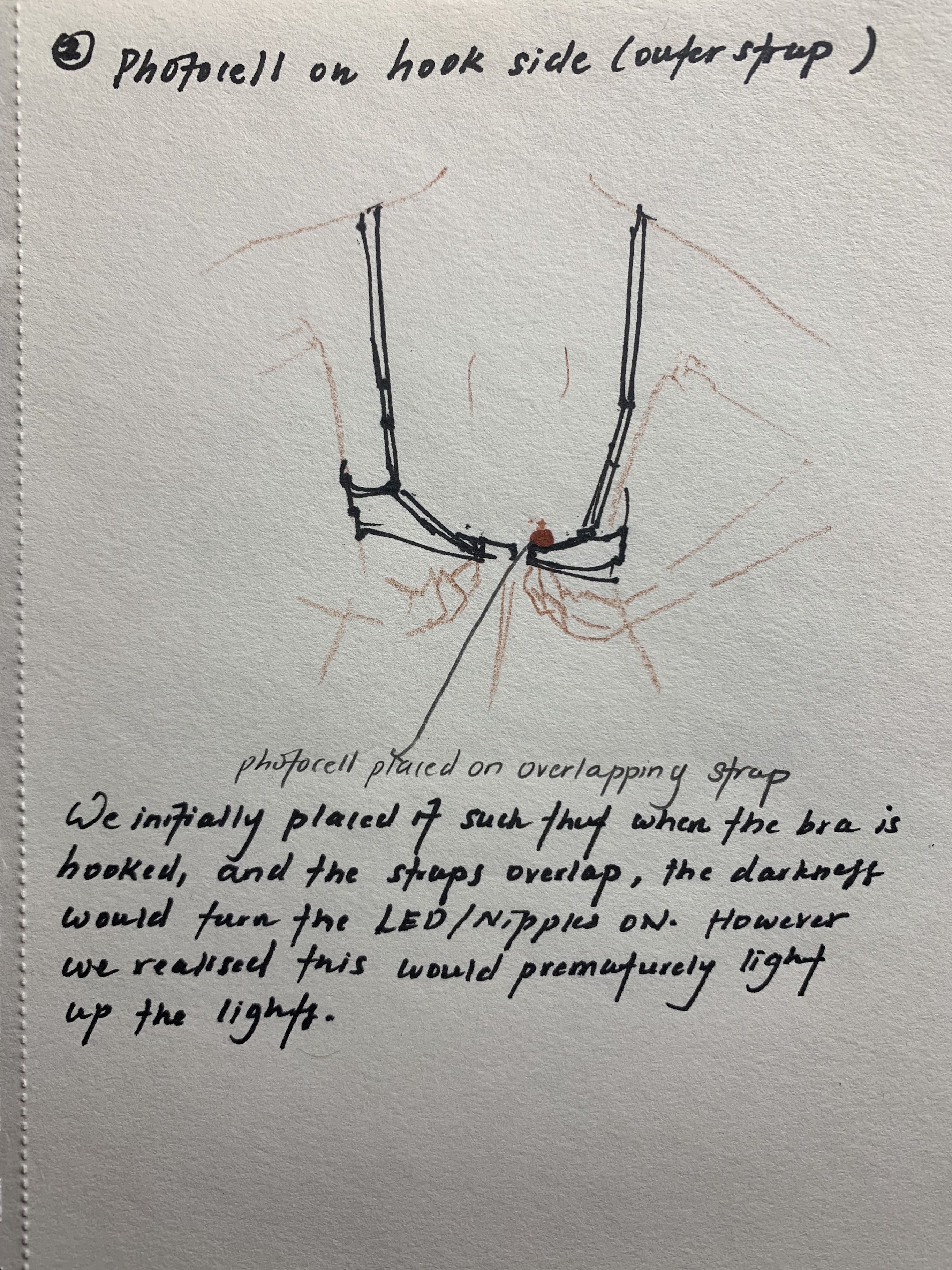
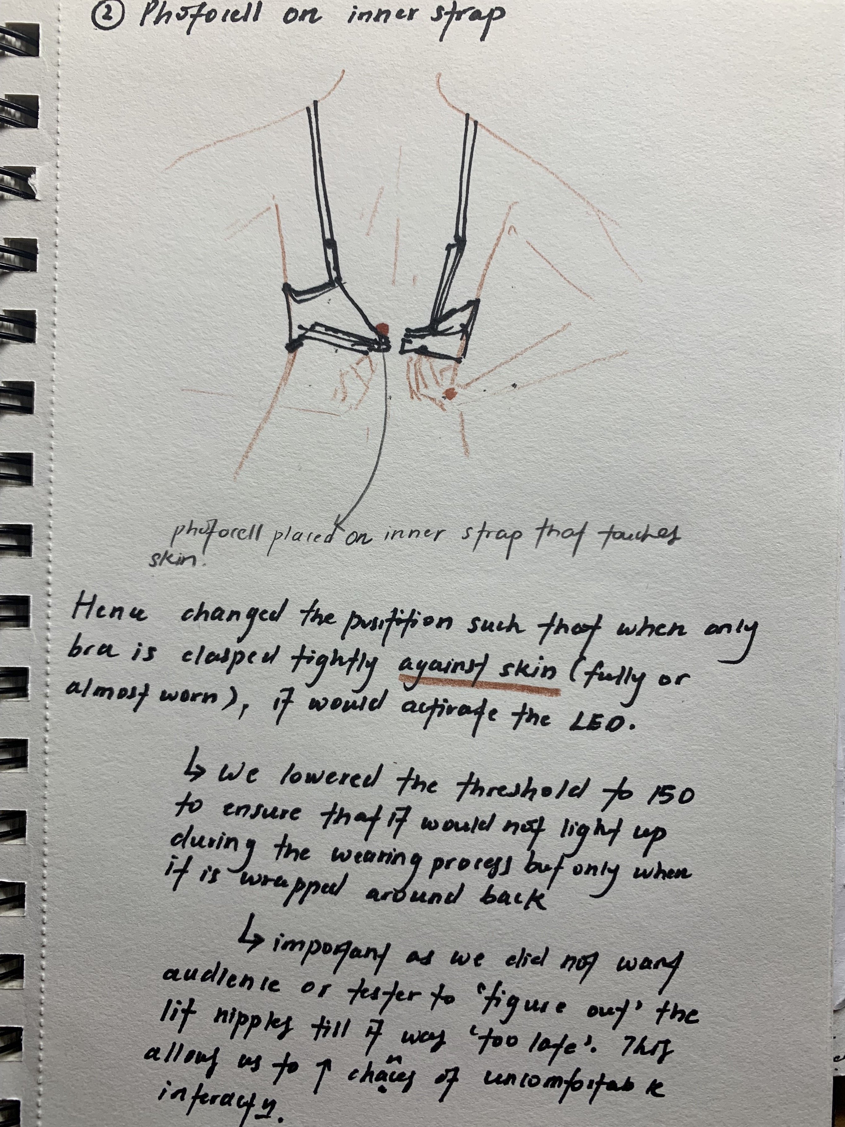
We decided to use a photocell as a very direct and effective method to activate the LED Bulbs. However we had to determine the most effective threshold such that the nipple areas would not prematurely light up or not light at all. We settled on a range on 100 to 300. After a few trials, we decided to use threshold : 150.
As our final prototype required many wires connected to the Arduino Uno and from multiple directions, we decided to sew the wires into in the hem line of the bra itself. We then taped the wire cluster of each component together to prevent entangling. We also pierced the LED Bulbs through the fabric of the bra itself to avoid damaging the bra. We wanted to ensure that the circuits were as well concealed as possible to ‘convince’ our participants of the legitimacy of our wearable prototype.
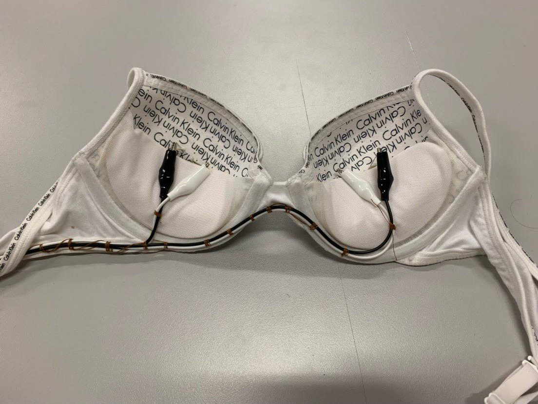
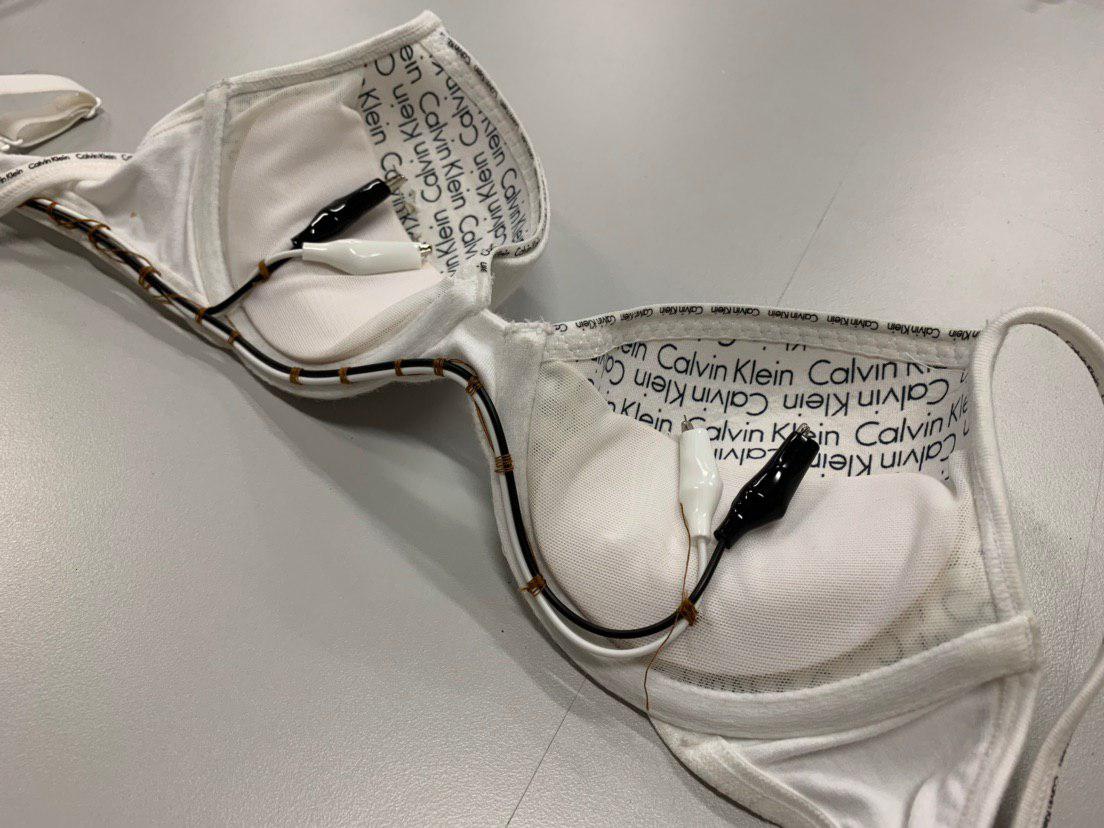
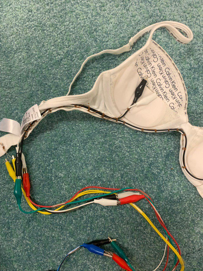
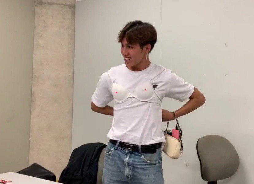
Given the nature of our object as a wearable item, we had to conceal any visible circuits as much as possible and also ensure its portability and ease of usage. Hence instead of using a laptop, we uploaded our file onto Arduino Uno and connected it to a portable charger. We then fit the breadboard and most of the extended circuit into a small Coach bag. During critique, we instructed our testers to sling the bag on their wrists while they wore the bra. The use of this complementary womenswear accessory added to the legitimacy of our prototype.
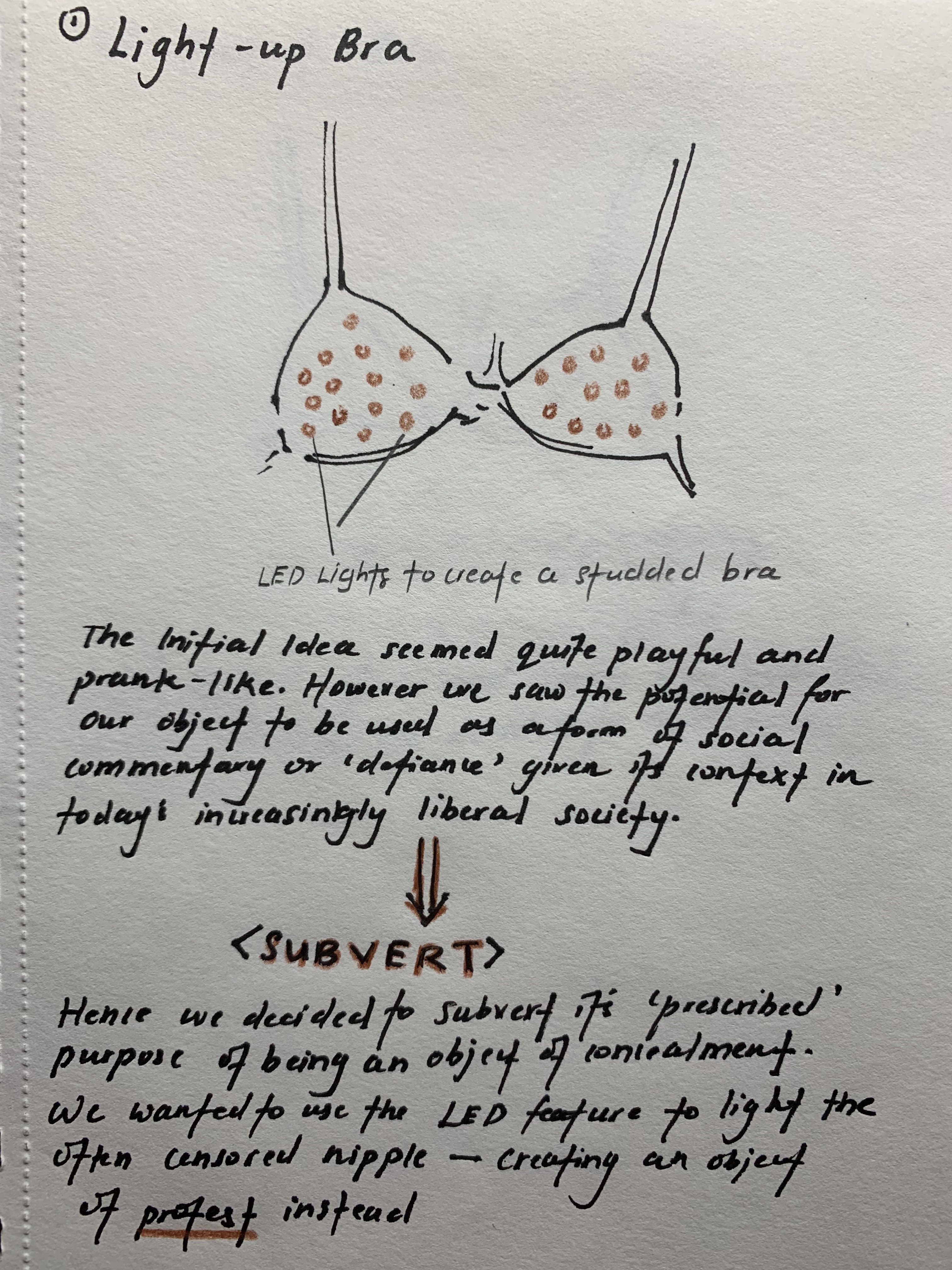
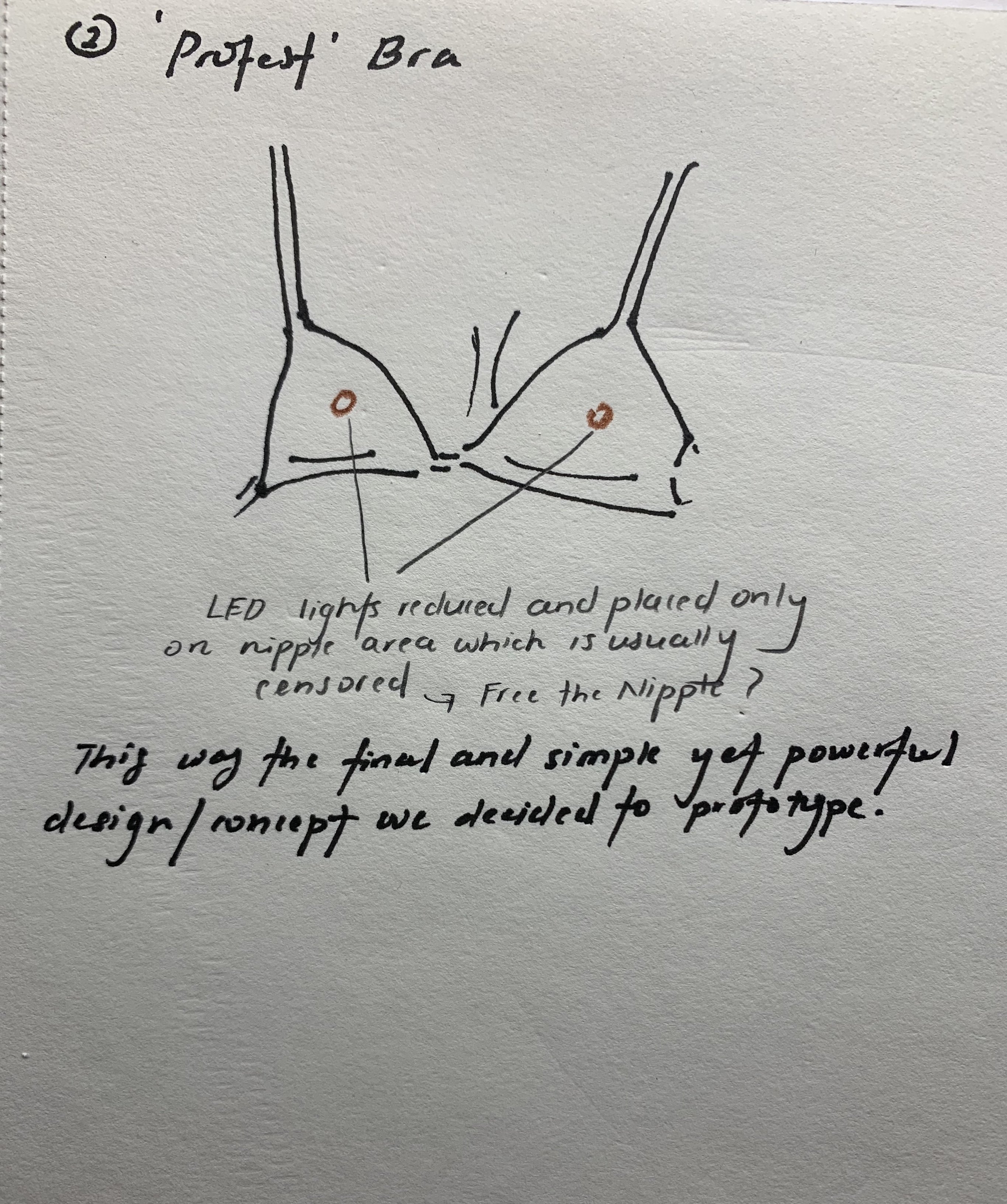
For our disobedient object, Praveen and I wanted to make the participants uncomfortable. The purpose of the bra is to conceal the nipples of a female. We wanted to change this and make it enhance the nipples instead when you put the bra on. The nipple areas will light up when the participants try to put it on, making their “light nipples” really obvious and bright red. it’s is kind of a protest product to “free the nipples” for the females.
Most people would slander someone for exposing their beasts or nipples in public. Movements such as free the nipple has also gained flak due to a certain censorship expected of women. The bra is often used as an object that conceals and supports the feminine torso. To even walk out in daylight in ‘just a bra’ seems preposterous to many in society. Hence by subverting this object into one that draws attention to the most censored area/or area that calls for the need for most censorship; the nipples, it becomes disobedient. It becomes a proud and ‘in your face’ object that screams social protest and defiance. To walk with a lit bra with flashing nipples would be equivalent to Hester Prynne with her Scarlet Letter embossed on her chest. The use of a naturally provocative colour, red, further enhances our subversion. Hence anyone who wears this bra does not conceal but covets and ‘reveals’ instead. It is also disobedient in the sense that one who wears one would be probably labelled as a transgression in society.
Some looked really uncomfortable when the nipples got lit on when they tried to put the bra on. This actually reinforce our purpose of the disobedient object which is to make the participants feels uncomfortable when they put on the bra which was suppose to cover up their nipples and make them feel “more comfortable” with their body.
The interaction is uncomfortable due to two main different forms of interaction. The first is the users’ personal interaction with the object itself – as no ‘warning’ is given and they are only instructed to wear the bra, they won’t know what to expect. As we set the threshold for the photocell to as low as possible, the bulbs only lit up once it is tightly clasped around their chest. In other words, by the time they realise their nipples are lit, it would be too late for them to try to remove it or hesitate putting it on. Hence by eliminating the choice factor this way, we are in a sense forcing them to reach the full interaction. Most people were willing to volunteer as the object looked pretty mundane and normal. But once they picked it up and started wearing it, their choice to stop the interaction was taken away from them till it was ‘over’. This makes it uncomfortable as their freedom of choice is removed. Discomfort also occurs due to the prototype subverting its original purpose of concealment. However we also realised that after clasping the bra for awhile, the users seemed nonchalant and almost intrigued by its ‘flagrance’. Maybe it is due to fact that we all have some sort of inner desire to be hedonistic or to immerse in objects of ‘taboo’ once in awhile.
Another level of uncomfortable interaction came from the audience – user interaction. As the bra lit up, the audience saw it before the user did — the user had to look down to realise their nipples were lit. Hence many of em were taken aback when the rest of the class started laughing or getting excited as they weren’t sure what the commotion was about. Hence this brief moment of ambiguity and where the tester is almost being made into a object of public scrutiny leads to the second level of discomfort from this interaction.
Our circuit actually kept short circuiting which was really annoying because we need to replace the bulbs and see it again. To get over this problem, we tried to add in fuses and connect the bulbs in parallel circuit so that when one bulb blows, the other will not be affected. However, another problem is the portability of the bra. Even though we switched using the laptop as a power supplier to a portable charger, there was still a lot of wires handing around. Hence i think that we could make like an additional pouch onto the bra to keep all the wires and portable charger to make it even more portable.
The first challenge was the brittle nature of the led pins. As we wanted to minimise damage to the fabric, we had to push the pin through the cups and bend it accordingly. However the pins broke and we had to be more gentle. The second main challenge was that our circuit kept short circuiting and causing one of the two led bulbs to overheat and burn. We then decided to add a resistor parallel to the first, to lower the current flowing through. This was a challenge as it took us a few trials to figure this solution – the LED bulbs only burnt after a few times of plugging into power. The last challenge was portability and concealment of the circuit. As we had a significant amount of wires attached to our relatively small and thin object- the bra, we had to figure out how to hide most of the circuit as much as possible. Even though we managed to attain a successful level of portability (details mentioned in previous part of post), we realised that we could have pushed the legitimacy of the object further if we had made an external wearable pouch to hide the remaining wires.


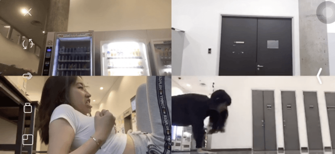
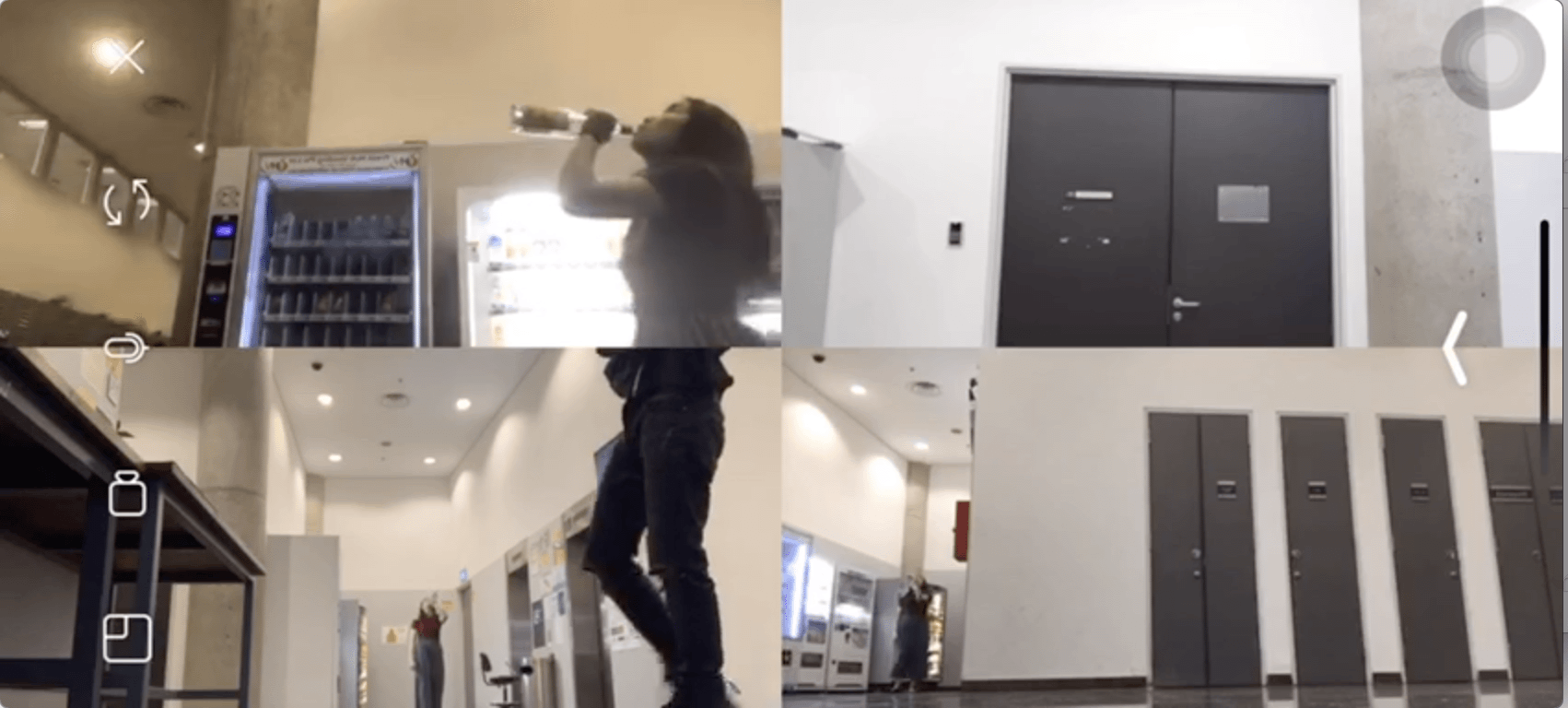
We decided to produce a whimsical take on the stages in life — birth, growing up and marriage, particularly. It is essentially a sped up, comical caricature of birth to adulthood within 30seconds. We also decided to keep it cyclical, in line with the overarching concept of ‘life’. As such, the viewer is guided in an anticlockwise direction as the split frames unravel one by one. This proved to be effective as viewers would only have to dedicate their attention to each frame as the narrative unfolds, as opposed to focusing on all four splits of the screen at once. Taking into account our inherent preference to not multi-task, and our intent to depict a cyclical process of progressive life events, this was the best approach for our group.
Link to Video : https://youtu.be/xBFrMJK8Dho
The video flows anti-clockwise, starting from the bottom right screen.
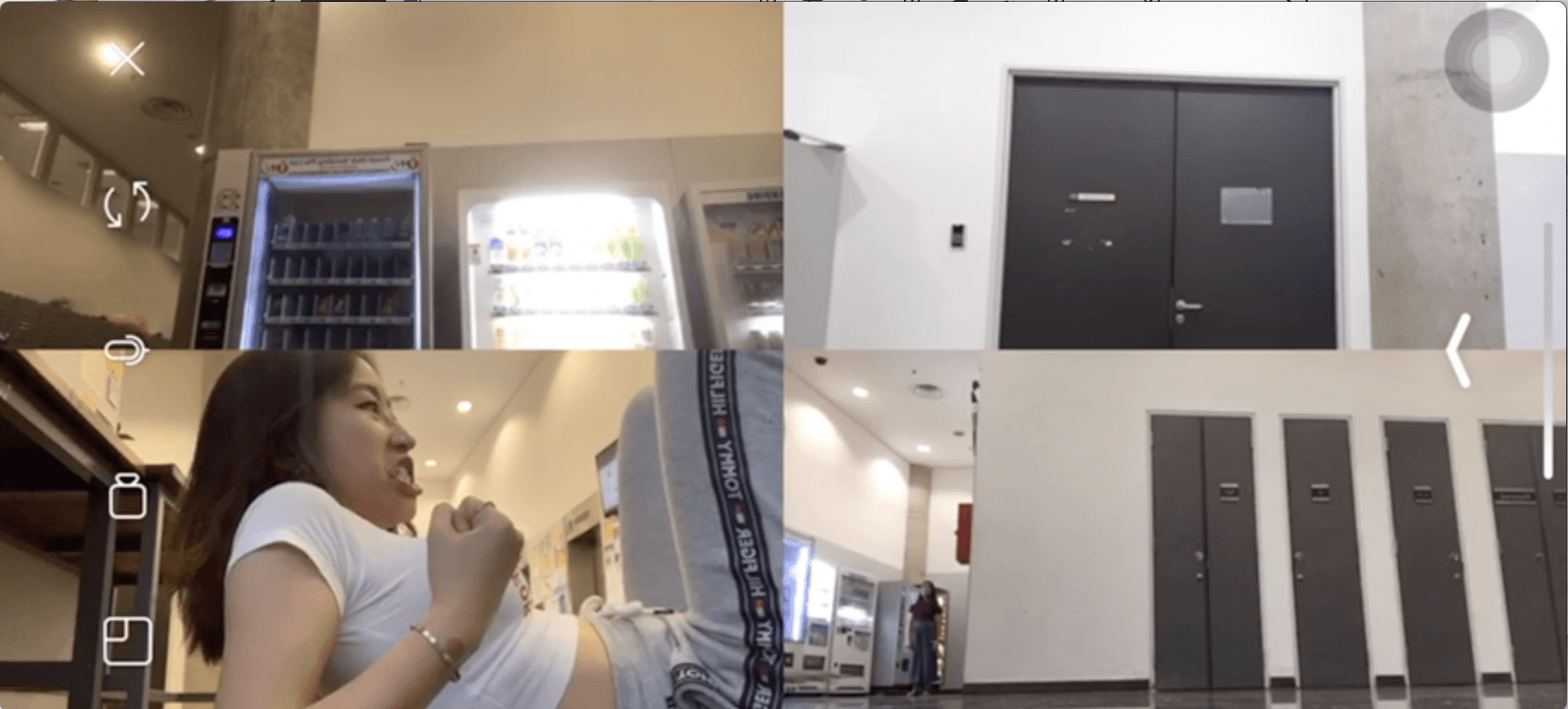
1. It starts with Jess, a pregnant woman in labour, thrusting out a baby. Her facial expression is exaggerated to contribute to the comical aspect.
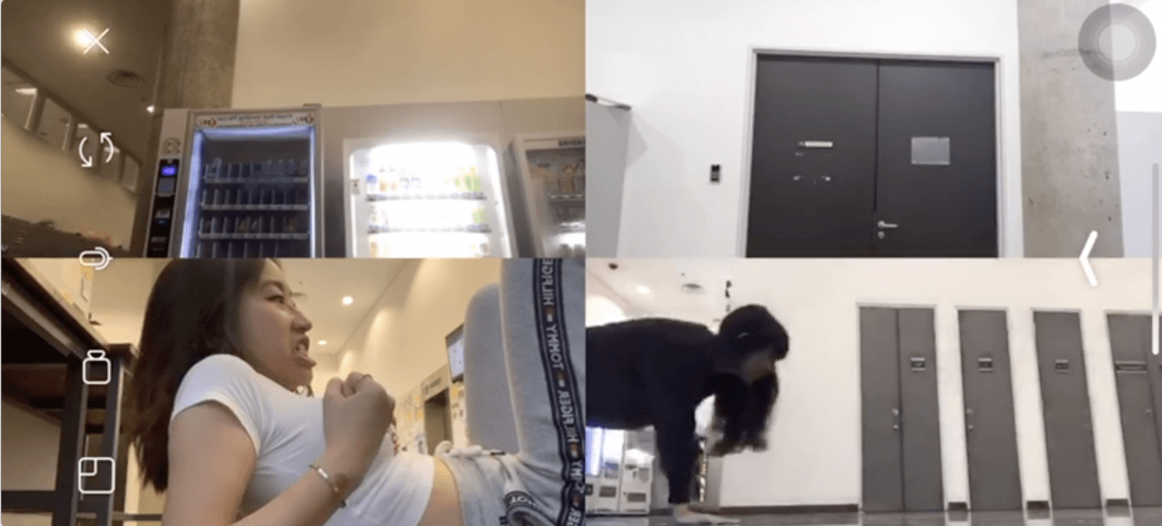
2. Starts crawling out into the second frame to transition from babyhood to early childhood.
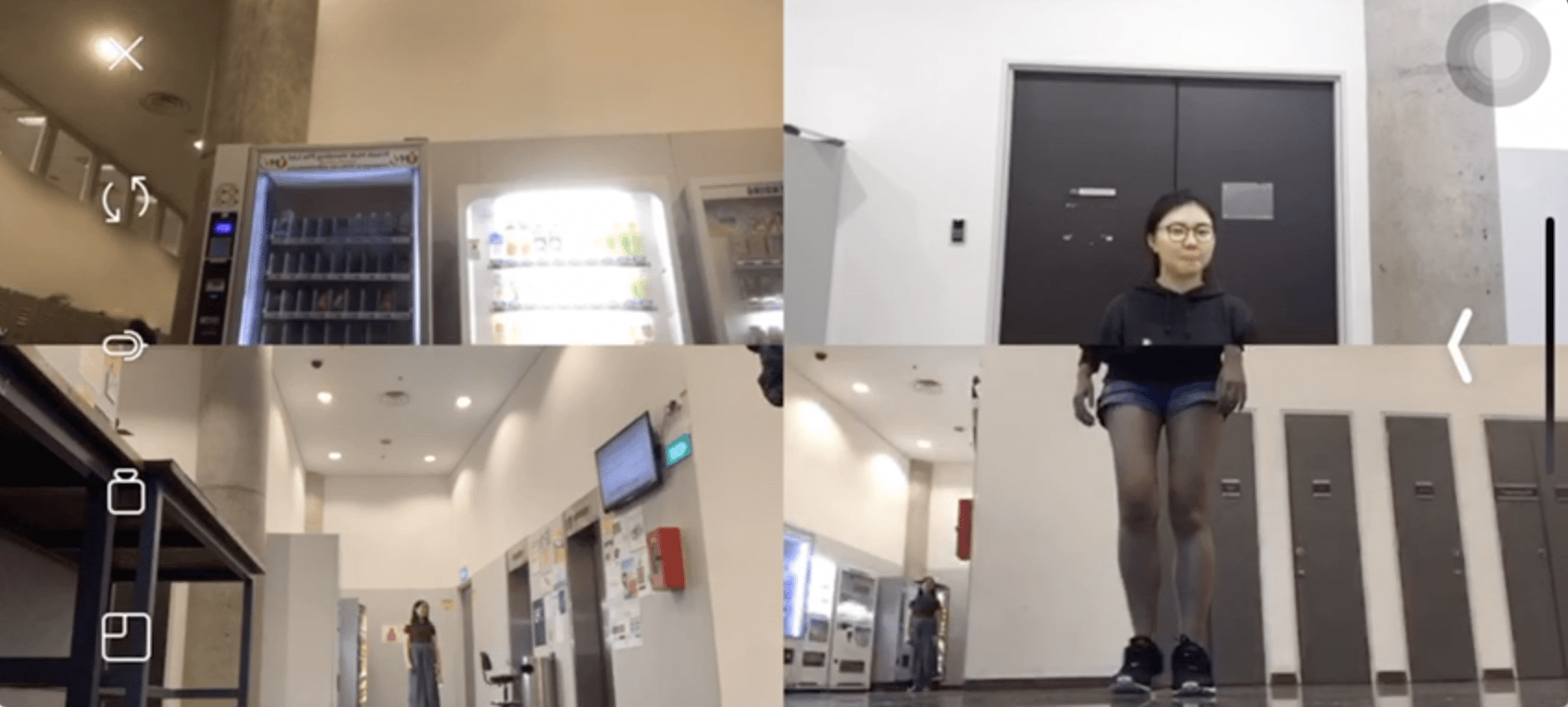
3. She then stands up, and Feriga’s head pops up in the third frame. This is representative of the transition from childhood to teenage hood. The synchronisation between the two frames here create a comical caricature of a cartoon like human figure.
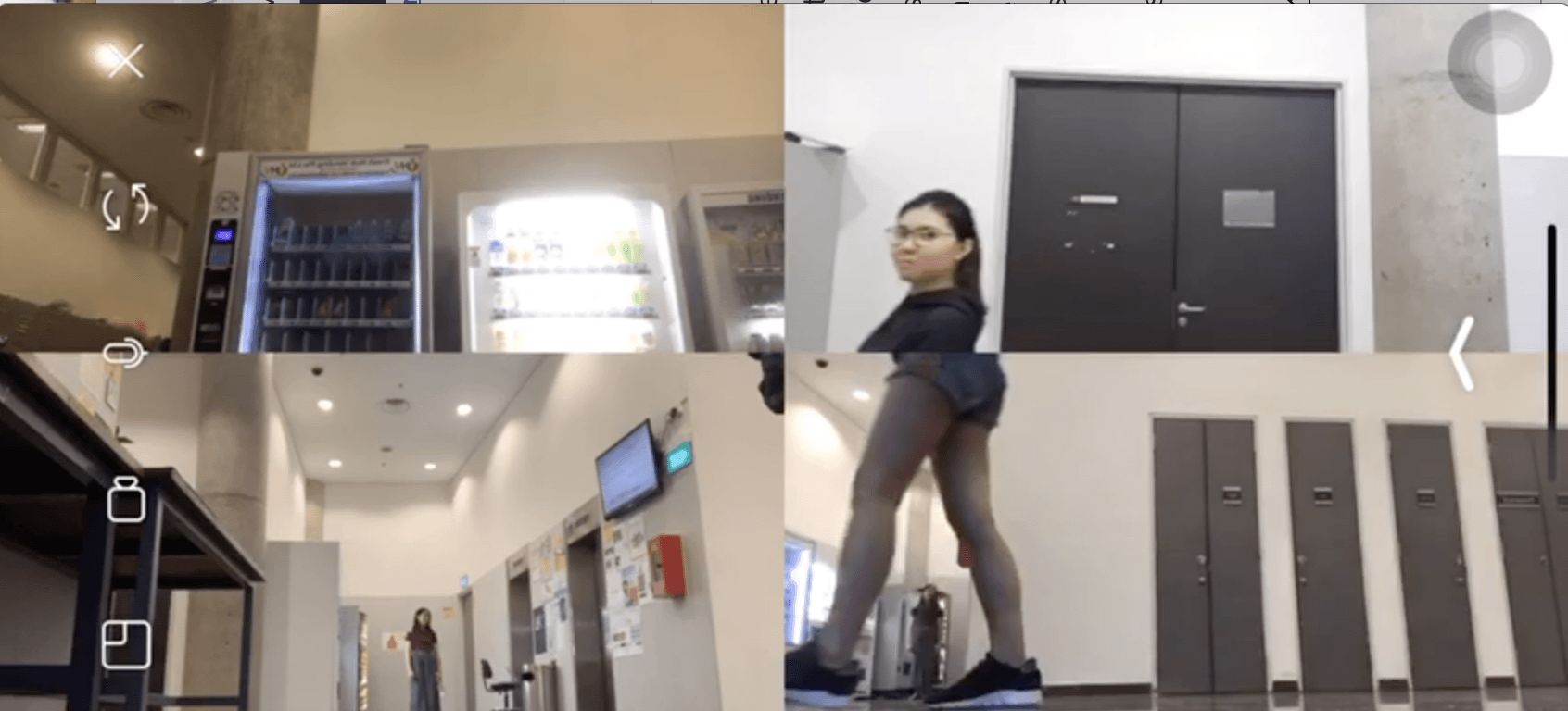
4. They both then walk towards the left, in sync and exit from their frames.
5. LX’s torso and my legs then emerge together as we walk in sync leftwards. This is the transition to adulthood. The mismatch between the two bodies continue the caricature element in the previous frames.
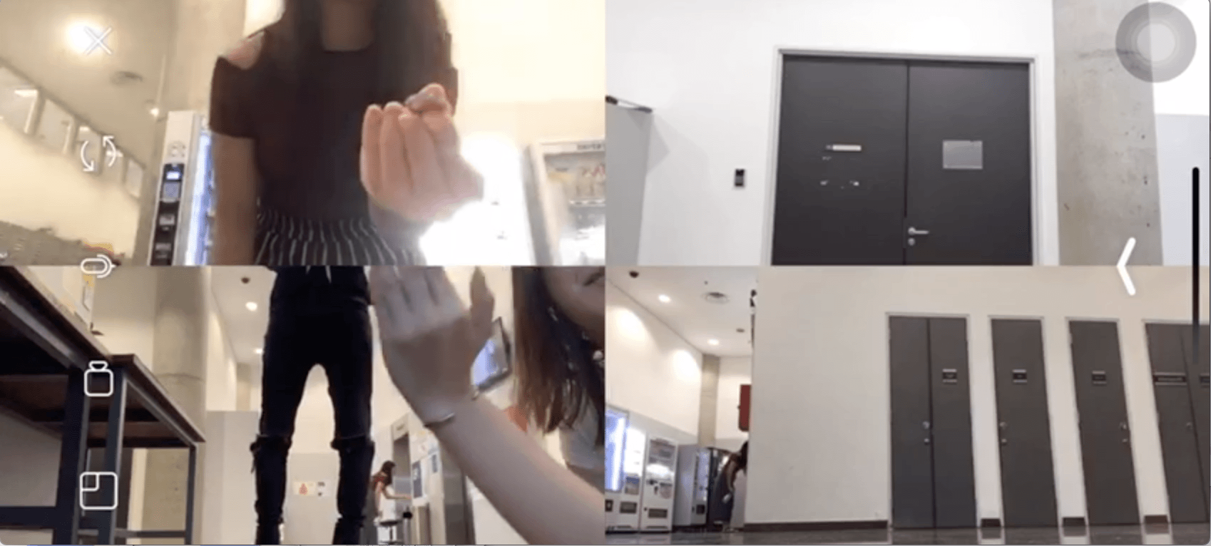
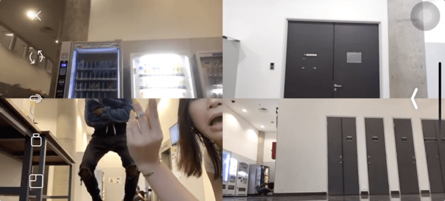
6. LX then drops a ring which falls ‘down’ back into the first frame on Jess’s fingers. Transitioning from adulthood to marriage.
By starting from the first frame, proceeding in a clear consistent visual directional flow, consistency in synchronisation and mismatch of bodies, and ending back at the first frame, we managed to create our intended outcomes. Even though there were parts where the mismatch was not spot on, we were satisfied with the overall result.
We shot this outside B1 lift area. Initially we tried doing it at separate locations but quickly realised due to both technical glitches and the distance, that coordinating with each other within the given time frame was too time consuming. Hence we decided to shoot it at a common area with each of our phones facing a different direction to still achieve the split screen effect. It was important that the screens itself were kept separate to ensure the desired outcome.
The main challenge for this Micro Project was coordination and cooperation. Initially we kept retaking our videos as each person was trying to take their cues from the previous person. However eventually Jess took over to allocate positions and delegated roles clearly while I cued the timing. Even though this was a shared project, it was really important to have a leading figure to manage to overall flow of the work. Conceptualisation was split between all 5 of us. However execution could not have all 5 people shouting out directions or taking directions from their own instincts. Having an overarching ‘director’ was key.
I personally believe that theses two types of control differ in each project. Some allowed for very clear personal control over the content while others allowed for more overall ‘creative control’ in a sense where every creator had an equal amount of control while not diminishing that of another. However the latter results in no sole control of the resulting content.
Personally I feel that Project 1 had allowance for the most creative control. As it was based on a public hashtag on Instagram, arguably everyone had equal creative control as we could essentially post anything we wanted to. There were no external regulators or moderators to alter the content. The creators themselves determine the outcome of the alternate space created under the hashtag #1010adm. This project also had zero barriers to entry — our followers including those not from ADM, could choose to utilise the same hashtag to hack or disrupt the page. However personal control over content is diluted due to the accessibility of this space.
In terms of having the most unpredictable outcome, I would say it was Project 2. In Project 2, me and my team mate Jess, had absolute control over our concept and choice of platform — Grindr. We were our own regulators in a sense where we could choose how and who we wanted to reply or initiate conversations with. However the outcome was highly determined by the other users. It all fell back on the users’ discretion. We did try to influence certain outcomes by nudging or luring them towards a certain direction. However in some cases they went in the completely opposite direction. Most of the messages were also spontaneous and we barely initiated any of them. As such I believe this social experiment had the most unpredictable outcome — which is important given that our intent was to document and collate unbiased results to dissect our chosen concept.
Project 3 illustrates DIWO the most in my opinion. Personally I am someone who loves portraying darker and more ironic content. Comedy is the last type of genre I would intentionally choose to explore. However I had to make this compromise in Project 3 as the rest of my group mates wanted to do something comical. As such in the initial conceptualisation stages itself, I had to put aside my personal creative direction to DIWO. This then forced me to think out of my comfort zone and to also take cues from the rest instead. It required everyone to cooperate in order to produce a smooth transitioning split screen video. However regarding Open Source, I believe Project 1 illustrates that the best. It being the most accessible, as mentioned earlier, literally makes it an open space for anyone to alter or influence.
Overall, the Projects gave me a clearer and first hand understanding of these seemingly obscure and ‘new’ concepts. It also makes us realise that these concepts are mutually exclusive nor do they exist as discrete entities. Their potency, accessibility and fluidity all reflect the demographics of the alternate realities that exist in virtuality.

Exploring Anonymity, Privacy, Pleasure and Threshold. These were the concepts we were able to explore and alter through our Crowd Sourced Art
Before we jumped right into any of the social media platforms on our phones, we took a step back. We wanted to keep the social experiment/art as ‘real’ as possible. We did not want to have to let our audience know we needed participation nor explicitly suggest that it was an art piece. We also did not want to compromise the authenticity of the work and hence decided to utilise a platform that was in line with our vision. This was to try to achieve our intended outcome as best as possible.
We decided to use the popular/notorious Gay Dating App, Grindr as our Social Media platform. The demographics of the platform would allow us to explore the concepts we wanted to with quick interaction, given our 60mins time frame, to start and conclude our experiment. It also would not require us to solicit help from our peers to participate.
We set up a ‘fake’ profile using a picture of Jessical’s friend (with his permission) using the tag line – fun (a slang for sex in the homosexual community) . We also added the visible bio (actually I’m only 15…). Given that the legal age in Singapore for consensual sex is 16, we wanted to test how many people would still approach our profile and solicit sex from an underage teen.

We segregated the responses into those who said yes and agreed or wanted to solicit underage sex knowingly, and those who rejected us with the same knowledge in mind
The above people all seemed shocked about the profile’s supposed underage status and were apprehensive initially. However without any prompting they went ahead still.


These were the users whose threshold we managed to ‘push’. These were the group of people whom initially seemed shocked but with just a little convincing, their mindset seemed to completely change.


These users were very clear about their stance and consistently turned the profile down despite advances.


This particular user acknowledged the legal and moral issue but seemed to justify that since the act of engaging in homosexual sex itself is illegal, doing so with an underage person was acceptable, given the premise of the app’s interface and purpose.


We realised that the reward in this case for users was a prized sexualised object that was just too ‘within reach’ to resist. Most of them were willing to divulge personal information and pictures just because we were dangling a carrot (an illusionary one too) before their eyes. There was also no form of tangible commitment needed. Hence the potential rewards were enticing enough.
The consequence in actuality for soliciting of underage sex is punishable by law. Yet many didn’t seem flinched or bothered by it. Maybe the protection of being a profile behind a screen gives people the power to exercise and indulge indirectly. After all a profile can be deleted. One does not directly feel or bear the consequence unless they are reported.
All users had the choice to say and send what they wanted to us. We did not force or instruct them to do so. In fact we reminded them about the potential consequence of their choices
Though we did not directly control their actions, we intervened and influenced them with our tone such that it appealed to the specific characteristic of the stereotypical user of the app.
As artists we had full control over our piece but no control over the outcome that was essentially still determined by the autonomy of the user in the end.
Being a fake profile, there was the issue of ethical behaviour at the back of our heads as artists. There were moments we did feel a tinge of guilt for ‘baiting’ the users. However in the bigger picture, many fake profiles do exist and were simply utilising a temporary one. We did not disclose the personal info that were shared (pictures, address, linked SM accounts). We also made the choice not to let the users know they were part of a social artwork, but simply deleted the profile after the timeframe.
Anonymity gave us the power to be an alternate persona with its own reality on the platform we used. It allowed us to explore the concepts we wanted to, effectively and in an unbiased manner. However we also needed some pre existing knowledge about the community, to navigate the conversations that were initiated.
Our collective piece served as a social commentary on privacy and anonymity in today’s world where virtual reality is an entity with its own rules. It is a documentation of spontaneous responses that illustrates the above mentioned alternate reality. Most of the things during this interaction would not happen in physical reality. To some extent we have to agree that this might be due to the ‘extreme’ nature of the platform. On other general SM sites like Instagram and Facebook, people do not usually exercise such voracity and boldness.
Space to me is simply an indiscrete state of existence in which its boundaries are either limited by or expanded by our physical/emotional/mental interaction with it.
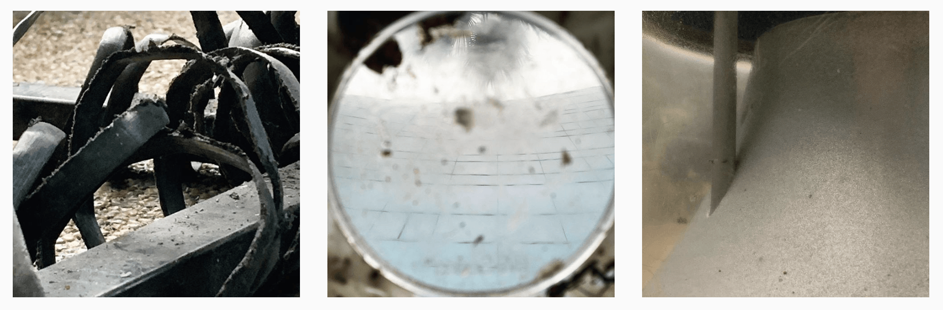
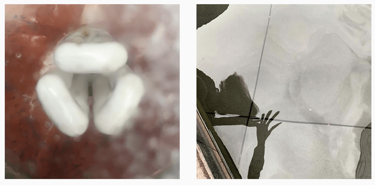
For my physical space, I decided to document and explore overlooked elements in a common public place – the sunken plaza. We often populate and interact in spaces without noticing the details and unique qualities of the inanimate objects that may occupy them.
I wanted to highlight these details through close-up shots. By magnifying their proportions, I imbue them with individuality and a glaring presence — as opposed to how we treat them daily.
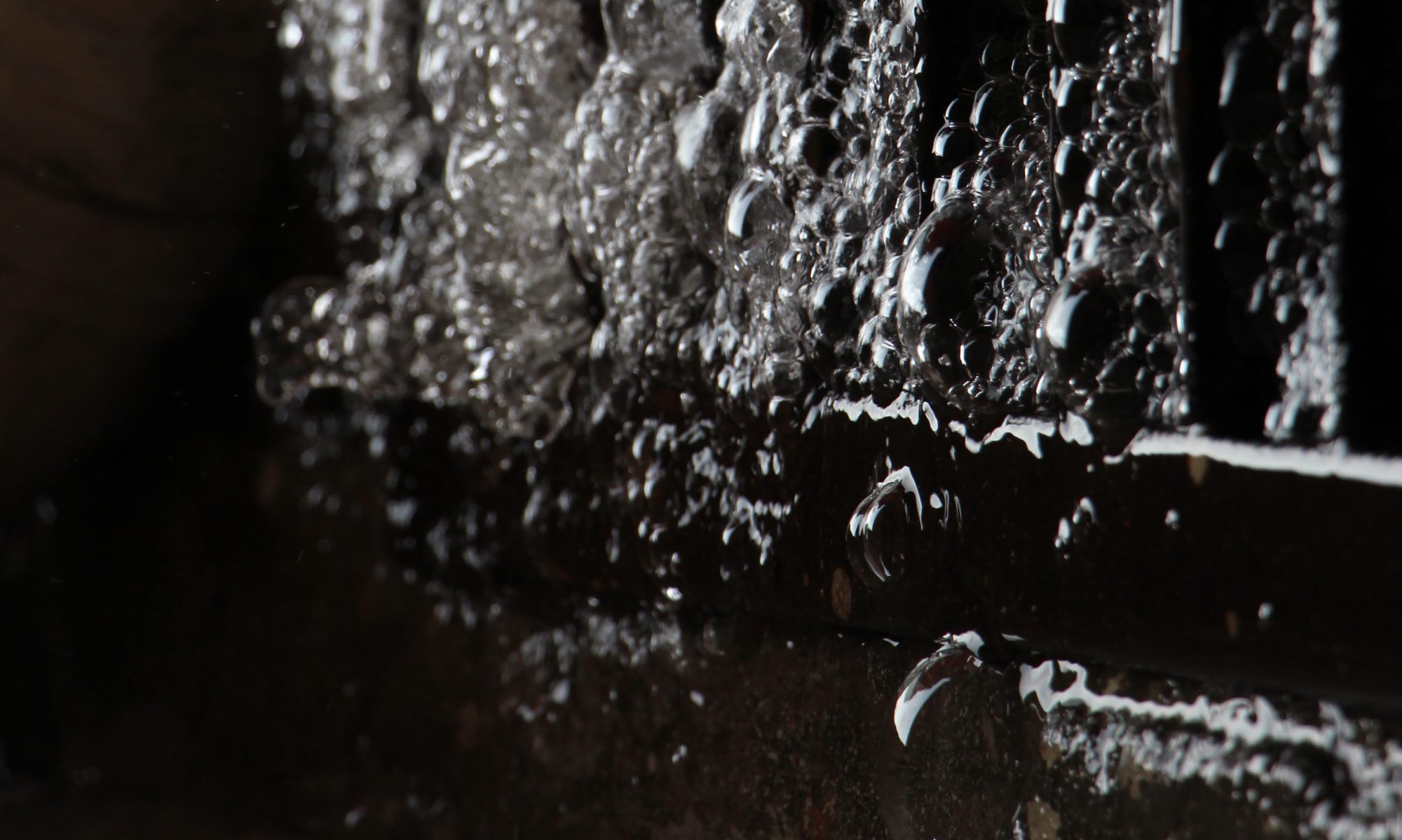
I also wanted to portray the concept of distortion in the space within these physical objects themselves — the warped reflection in the water (Image 5), frosted reflection of lightbulb cover (Image 4) , view of ADM facade through stained plastic cover of socket (Image 2) etc. Hence, depending on the way we treat these objects, they may have the power to alter our visual perception of a greater physical space.
Instead of simply being objects in the physical space, they now have become obscure entities that also lead us into another reality.
We had to use the hashtag #1010adm which in itself propagates a virtual space where all our pictures are uploaded and viewed publicly.
Most of the pictures taken were somewhat recognisable. Hence my initial instinctual response was to create a series that would be visually unrecognisable while still originating from the same physical space (ADM) that everyone had to create their posts from.
This would make other viewers question the fidelity of my images, juxtaposed with the other ones within this virtual space. In some sense it creates a smaller, obscure space within a shared space.
The shared space is accessible to anyone from in and out of ADM. Anyone who decides to intentionally or blindly utilise the same hashtag will be able to influence this alternate space easily. It is a fluid entity that is constantly changing even with the interaction of a single individual.
Process:
1— The first few participants form the beginning and ‘common definition’ of this shared space.
2 — Later participants are then able to view this posts and choose how (and if), they want to react to the already established explorations of spaces in ADM.
3 — There is no defined ending to this process as it is a free floating alternate space. Anyone who uses the #1010adm will be able to turn this shared space into literally anything. The limits are boundless as there are no external moderators. Everyone has the autonomy to include what they want.
From this task, I learned how I could give a physical space new reality by having it manifested and archived in a virtual space – where realities are what individuals determine it to be.
For example, physically my lightbulb is just a bulb. However in the virtual space of #1010adm, it’s obscurity and ambiguity is a cause for question and pondering.
In some sense I’m forcing people to interact directly with these objects they wouldn’t be up close to or notice in physical reality.
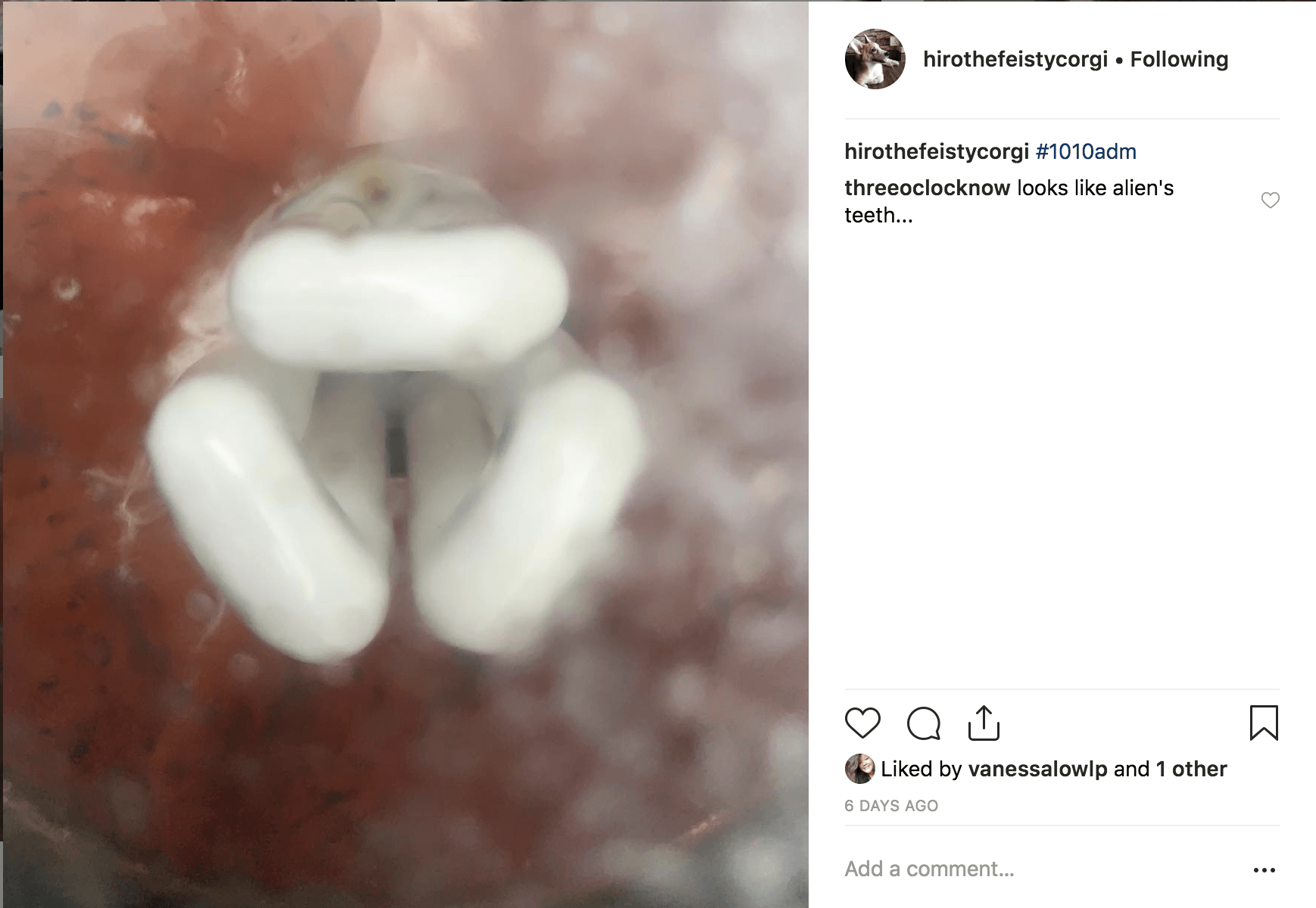
In this image of the lightbulb, one user, not part of the participants in the #1010adm, commented that it ‘looks like alien teeth’.
These are some questions I hope to trigger through this micro project : ‘Was this really taken in ADM’ ‘If so what is it? Where is it from?’ ‘What is ADM?’