Typography Lecture 4 — Saul Blass ( The Man with the Golden Arm)

1. The Man with the Golden Arm

” Design is thinking made visual ”  — Saul Blass

Personal Thoughts

In 1950s, Saul Blass designed the title credits for a Otto Preminger movie that featured a protagonist who was transformed due to his heroin addiction. Blass’s challenge was encapsulating the drama, intensity and gravitas of the movie’s theme and plot within the title credit without making any explicit reference to drugs or addiction – an extremely taboo topic in the 50s. It would even considered be taboo now and would not be something explicitly publicised in pop culture movie screenings. As such, Blass had to simplify and translate his idea into a visual abstraction rather than a literal representation.

He used geometric, harsh white lines juxtaposed against a pitch black background while playing with the direction and the angle in which they interacted. The tilted lines and sporadic animation coupled with the ominous crescendo of Jazz Music in the background is representative of the psyche of a drug addict – scattered, intense and troubled. Space and lines are used to create visual drama.

The most significant piece in the whole title sequence would be the the distorted looking arm. This image was also the most direct reference to to drug use with the significance of the arm being one of the key places most heroin users will ‘shoot up’. Heroin in its purest form also comes in white which could explain the significance behind the use of harsh white. The white lines could possibly be an extreme abstraction of syringes which is the main medium through which addicts would administer themselves.

In this particular work, typography is kept very minimalistic and is differentiated by uppercase and lowercase fonts. They adhere to the presence of the white blocks and are framed accordingly within or around the blocks each time. This creates a dynamic and spontaneous representation of the text while keeping the font itself constant. There’s also an impression of instability in the way the text or the blocks frame each other and ‘hang’ at a very disconcerting angle or placement within the black.

The Man with the Golden Arm

The text is complemented by the intensifying jazz music which is reminiscent of Tennessee Williams’ A Streetcar named Desire’s (Also a 1950 literary classic) use of the Varsouviana Polka music that signified Blanche’s mental deterioration. The frequency of the Polka increased towards the end of the movie and it appeared whenever Blanche encounters a traumatic experience or emotion. In this context, Saul Blass’ Man with the Golden Arm sequence within the few minutes, effectively throws us into a pool of discomfort and coneys the idea of madness and addiction before even we are directly exposed to the movie’s themes.

In A Street Car named Desire, the score was used within the film itself to complement the narrative and theme following Blanche’s descent into insanity. Blass followed the same concept but was the first in the 50s to revolutionise title sequences by adding motion and animation to it. Before that, all title sequences were mostly static.

A Street Car named Desire


The same concept is seen in his other famous sequence, Anatomy of A Murder, where the central image accompanying the title is that of a dissected body with each part framing certain portion of the title text. Here, geometric and harsh blocks are once again used along w jazz music.

Anatomy of A Murder

Take away from LECTURES

Through these 4 weeks which were rather heavy with content, I was introduced to key figures and names related to Visual Communication Design History that have helped me better understand the depth of the rationale behind many of the design concepts or styles that exist today. Here on, I will be able to also recall some of these names off my head and apply them accordingly to my personal work.


Final Project — Limbo

1. Limbo

Description

Limbo is an interactive space and a journey that invokes the idea of recurrence among cancer patients and portrays the inevitability and ambiguity of their eventual delirium and death due to sickness in a clinical way. It comprises of a start, middle and end. Start: where everyone approaches a clinical and minimalistic set up with detailed and specific instructions. They queue up and go step by step, making it methodical and prescribed. This is symbolic of hospital visits. They clean their hands, and wear masks. Middle: When tester wears isolation suit, he or she is stripped of their identity and becomes a patient while everyone else with their mask on become voyeurs (Doctors, nurse, friends, family). When they put on wig and look in the mirror, reflection is fragmented/distorted and flatline emits after a standard heart rate. Shrill sound of flatline forces ‘patient’ to remove ‘liberating wig’ exposing their scars while everyone else is relieved that sound has stopped. Enforces the idea of accepting death. End: eased out by disposing of props in trash can.

2. Inspiration

Statistics 

The following table shows the relatively significant and high recurrence rate.

Source: https://www.cancertherapyadvisor.com/home/tools/fact-sheets/cancer-recurrence-statistics/

Personal Thoughts

I have relatives and close friends who have experienced the loss of someone because of cancer. Psychologically it is a disease that not only affects the victim but their close ones as well. Many of them told me that as much as they were sad when their loved ones passed in the final stages, they were relieved to watch their pain come to an end. The final stages of cancer, coupled with the strong doses of painkillers such as Fentanyl, causes one to hallucinate and lose their identity. They become unrecognisable physically and mentally fragmented. The only pieces left of them lie in the hearts and the minds of their loved ones — Only the audience could see the clear face of the tester/patient — patient was only able to see their reflection through the fragmenting mirror. Hence this was the overall sentiment and ‘vibe’ I wanted our interactive piece to emanate. It was important that not only the tester was involved.

Delirium is the most common sign of medical complications of cancer or cancer treatment affecting the brain and mind. It is a common problem for people with advanced cancer or those at the end of life.” — https://www.cancer.net/coping-with-cancer/physical-emotional-and-social-effects-cancer/managing-physical-side-effects/mental-confusion-or-delirium

3. Ideation Process

1.Degrading Mirror

Body Dysphoria, Using a wig that emits male guttural noises when worn. To induce body dysphoria. We realised that this was too niche of a topic to evoke and many would not be able to relate to it, making it seem contrived.

2.THINNING Mirror

Second idea was to use a mirror that would make whoever who looked into it feel like they’re perpetually sick. Incorporated with a wig that emits heart beat followed by a flatline. We wanted to use a concave mirror for this. However sourcing for one was extremely hard and we felt like we could narrow it down further. We also decided to use a pixie cut wig instead so that it would be more androgynous and inclusive.

3.Distortion Mirror

Final Idea that translated into ‘Limbo’ was a fragmented mirror in which a person’s reflection, looked from any angle would always be fragmented. We used a plain mirror form but altered it and guised it in a vanity table set up. We also expanded the interaction to include a beginning to ease the testers and voyeur audience into the interaction ‘space’ and ‘psyche’. Wig would be triggered upon wearing and would beep for 5 seconds before flatlining for two minutes straight unless removed. We wanted this to be reminiscent of people with cancer who have to visit hospitals time after time for surgery all while constantly preparing for a relapse even after recovery. The wig which is liberating object for them, then becomes a dark object since whenever it is put on, it reminds them of their possible death rather than injecting a sense of hope or life into them. Complemented by the mirror which reflects the delirium cancer patients go through during their final moments.

4. Instructional

Physical Set Up:

Pre-Installation Interaction (Start)

Materials Needed:
Hand Sanitiser
Surgical Mask
Isolation Gown
Instructional Signs

Steps:
1. Buy medical supplies from a walk in medical supply store.
2. Set up a convincing clinical and minimalistic table set up. Orderly and cold. Lay out in a line, equidistant to condition audience’s mind to think of queuing up when admitting to hospital.


3. Sanitiser with signs. (Pump 3X thoroughly) Specify number to bring out the idea of prescriptions and steps. Prepare clear clinical like instructions.

4. Mask (Involves voyeur in interaction, discomfort not only for tester but for audience), apart from discomfort from interaction, tester will also be surrounded by everyone else with masks on.
5. Tester will have to put on an isolation gown before proceeding to interact with the main object. This is to ensure the identity of the tester is stripped away for the duration of interaction.

Installation Interaction (Main)

Materials Needed:
Vanity Mirrors
Photo Frame
Storage Box
Trash Bags
Stand
Mounting Tape
Glue Gun

Steps:
1. Buy items from hardware store or relevant beauty shop. Buy isolation gown from medical supply store.
2. To create Topographic, Fragmented and 3D mirror, buy separate pieces of mirrors. Seal them in a tight plastic bag or protector. Use hammer and hit hard to shatter the glass into small pieces. Lay out pieces.


3. Detach Photo frame backing and lay out first layer of glass pieces to form a flat layer of support. Use glue gun to secure heavy pieces. Layer slowly and build up with different heights to achieve intended areas of concavity or convexity. Use fabric as a filler and support to hold denser areas of layers.
4. Finish with photo frame. Use pliers to secure heavy mirror piece. Glue gun to ensure further support. Mount the back with strong mounting tape and mount on the wall
5. Place Necklace stand directly in front of mirror.
6. Place storage box beside with laptop and circuit beside table. Line with trash bag to conceal circuit. Instruct testers to throw gowns and mask into bin as away of stepping out of interaction space and also to enhance discretion of circuit and appliances.

Arduino and WIg (Main)

Materials:
Wig
Arduino
Photocell
Bread Board
Resistor
Processing App
Speaker
Needle, Thread
Soldering Kit
Thin Wires

Steps:
1. Buy androgynous wig with lining
2. Buy long wires, at least 2.5 metre to give allowance for tallest possible tester. Use thin wires to make set up more sleek.
3. Solder Wire to each end of photocell and set up circuit as shown below.


4. Thread wire ends to photocell legs to secure and prevent breakage. Thread photocell onto lining of wig to hide it.


5. Arduino Code — Use low threshold to prevent wig from emitting sound before intended interaction

6. Processing Code

7. Upload Arduino Code then press run on Processing
8. Leave all items in the storage box and proceed to hide.
9. Place wig on necklace stand


10. Let interaction begin

5. User Tests

Body Storming

(Read Micro Project Post)

Testing Code

6. Final Interaction

Interaction

Feedback

7. Reflection

Observations

All the testers were compelled to remove the wig relatively quickly due to the high pitch sound of the flatline. They were wary of annoying the rest of the audience and were troubled by the sound itself. However upon viewing the interaction I realised that maybe forcing them into this choice of removing the wig, was too easy’.

Improvements

Incorporate a sensor within the wig that heats up upon wearing. However upon removal, it starts beeping and then flatlines. This would be symbolic of burning or heat and hence death/cremation. And it would then cause a conflict where users would have to decide if they wanted to let their scalp be uncomfortable and hot or let the shrilling sound play. This is symbolic of the idea of having a choice to go for chemo or other form of therapies yet still facing the high possibility of recurrence — No matter what they choose it will still lead to a ‘negative’ outcome.


Project 1 : Picture Story – Curating Self

Inspiration 

In this project, I took the chance to take a step back and examine myself by dissecting memories and processing emotions and sensations from all kinds of experiences.  As someone who has constantly believed in the depth and power of fleeting moments while recognising the temporal nature they possess, I have fervently tried to indulge in all shades and hues wherever possible. This desire over time, has resulted in me being permanently altered, both mentally and physically. As such, I decided to explore the theme of Distortion in my life, and the various forms it has taken and the types of changes and marks it has left behind. In terms of conveying this theme through technique, I chose to make intentionally manipulated close-up images in my work.

Component 1 : My BoDY

For the first component, I wanted to introduce myself through my Body as the subject matter. My choices in the past have left scars that I will carry with me for life. I used to cover them up or hide them for fear of letting myself be vulnerable and bare in the eyes’ of others. However, through the following images, I subvert the scrutiny people may impose on me by engaging with my body in a provocatively blunt manner in front of the camera lens.

Image 1

This is a close up shot of myself rubbing a stubbed out cigarette on burn scars on my forearm.  These are permanent scars that pop out of my skin after I stubbed lit cigarettes on myself while I was at a party a few years ago.  It is characteristic of a phase in my life where I was partying frequently and dabbling in pleasures without restrictions. In this image, I wanted to replicate the scene in which I burned myself while at the same time manipulating my forearm to look like a regular rough surface that someone is casually stubbing out their cigarette on. This gives off a sense of indifference, hence downplaying the sensitivity behind these marks, tricking the viewers into dismissing it as an ordinary phenomenon till they take a closer look.

IMage 2

This is a close up shot of my chest tattoo which I got for my closest friends two years ago. Friends and relationships are things I treasure more than anything else and this tattoo was a way for me to always remind myself of the important things in life I could come back to. The intentional distortion/blurring was achieved by placing a convex cap of a lube bottle in front of the lens. The blurring symbolises how my engagement in vices (symbolised through the idea of sex here, hence the lube) marred my judgments in the past  . I wanted this image to  show the struggle I faced being constantly torn between the ‘good’ and ‘bad’ choices I could make and also how despite this dilemma, the important things still cut through this chaos and kept me rooted deep down. Hence my tattoo here looks like a stubborn stain that just wouldn’t budge no matter how many times something has tried to rub it away. As a permanent alteration to my skin, it also was a self-made scar like my burns in Image 1 but in contrast was made with all the important things at the forefront of my mind. It is hence played at the top centre of my final layout to symbolise an overarching precedence over my other scars.

IMAGE 3

This is a close up shot of my left pupil, rolled back and behind a pill prescription zip lock bag pulled tight around my face. The distortion here was achieved through the uneven reflection of light off the creases on the plastic surface. When I was 17, I was diagnosed with PTSD and hence prescribed anti depressants to ‘suppress’ and ‘contain’ my mood. After two years of taking pills, I eventually decided to stop due to the side effects that came along with consuming it. Through this image I wanted to express the unease I felt during those two years. Anti Depressants made me feel like my mind was trapped in a bubble, detached and alienated from everything else around me. Hence I used the plastic to mimic that bubble, intentionally impeding the viewer’s clarity of my face. The eye rolled back is symbolic of the chemical imbalance pills cause in the brain. Though pupils only roll back with drugs like MDMA that causes a drastic increase in Serotonin (chemicals responsible for happiness) in your brain, I chose to exaggerate it in my shot in context of Anti Depressants (that increase Serotonin on a much milder level), to show that legal prescriptions and medicines can affect you as much as illegal shunned upon drugs, beyond the surface. The rolled back eye also prevents the viewer from making direct eye contact with me, making the alienation mutual.


Component 2 : My BLUE Bag

Context : For component two, I barely had to think twice about the object I wanted to show case. As a highly sentimental person, I have always held onto personal items that I grow to have a personal affinity with. Following through from Component 1, I chose an object of mine that was literally by my side almost everyday of those intense and significant years, my Blue Bag. It wasn’t particularly significant when I first got it, just an aesthetic birthday gift. I myself at that point in time wouldn’t have expected it to have grown to possess this much sentimentality. A silent bystander/observer that was always with me literally. At first I treated it like any other bag. However when I started noticing stainsdiscolouration and wear and tear on it which were obvious because the material was fabric and absorbent. It  became an object that has been archiving physical remnants from my day to day experiences. All my moments were encapsulated in the skin of one bag. What makes it even more  significant is the fact that I haven’t washed it a single time, though I’ve slept on it passed out outside bars,  and on rooftops with ashes, dirt etc. Washing it would be choosing to wipe away my past clean. It is symbolic of this constant want to keep my past close even if suffocates or inhibits me because it is a part of me I want to remember.

Theme: To sum up the power of objects in my own words, I personally believe that, Inanimate objects that we keep close, acquire an increasingly domineering presence over time when we involve it in our personal and intimate experiences and constantly imbue it with feelings and attachments. Eventually we take a step back and realise that we’ve created something that feels like it almost has a soul of its own.  

For the series of images in this component, I wanted to express how my Bag has the power to affect me as much as an animate object, by giving it this sense of being alive.

IMAGE 1

This is a close up shot of my bag straps (hands) clasped around my eyes. They act as a blindfold, and symbolise my refusing to let go of the past, preventing me from looking forward. However, I am not struggling or resisting as seen by the absence of straining in my face. This is synonymous with my willingness to let certain aspects of my past to have control over me. The texture of the fabric and the discolouration due to dirt is also captured in this image.

Image 2

This is a mid view shot of the mouth of my bag ‘swallowing’ my head. The bad experiences in my past are a burden I carry and they can be psychologically consuming and suffocating. Unlike in the first image, there is a sense of discomfort and resistance here as seen from the tense contours of my upper body muscles and my tightly clenched fist. This symbolises my constant struggle in trying to break from the grips of my own ghosts. Also in this image, the full form of the bag and the stains and discoloured patches on it are seen. It almost looks like an alien creature that has attached itself onto my head. The intentionally cantered angle through the tilt of the grid wall at the back emphasises the unstable psychological state represented here.

Image 3

This is a close up shot of my upper body of my bag straps (hands) tightened around my wrists like tentacles. The image is rotated to make it seem like my hands are crawling and clawing their way up to my throat.  I wanted to make it seem like the control of my body has been hijacked by the influence of my bag, and hence my past, and also to show how negative experiences can have eventual built up physical repercussions too. The scar seen here is from a collarbone piercing I got, that eventually rejected and fell off leaving an over-healed wound behind. This symbolic of how certain things we have done can be buried deep in our minds but through one way or another they still leave their marks.

Component 3 : SHAW TOWERS OPEN CARPARK

For the third component, I chose Shaw Towers as my sentimental location. It was a place that I chanced upon while exploring Bugis and ever since, it has become my go to location whenever I needed to feel at ease. I decided to specifically focus on the open carpark on the 11th floor because I would head up there for a smoke with my close friends or partner while taking in the view of the skyline, streetlights and rhythmic lines of traffic from above. It became a refuge for me to gather and sort out my thoughts. Another significant aspect of Shaw Towers is the countless signs of age that are rampant throughout. These give the building a quaint atmosphere, making it stand out from most of the tall buildings within its vicinity. This idea of wear and tear is another form of Distortion, in line with my overarching theme. For this particular component I wanted to explore the beauty Distortion can produce by experimenting with close up shots and perspectives.

image 1

This is a close up shot of the neon sign on the main building. I framed it within the curved portion of a traffic light stand to make it look like an image off a convex mirror. The signs of wear and tear are obvious in this image through creases and cracks on the blue facade, the lines of black running down and the clearly untouched windows of the white portion behind. However all these distortions give this building’s facade a rustic beauty that can only be attained through time and it is this timeless quality I wanted to capture in this shot.
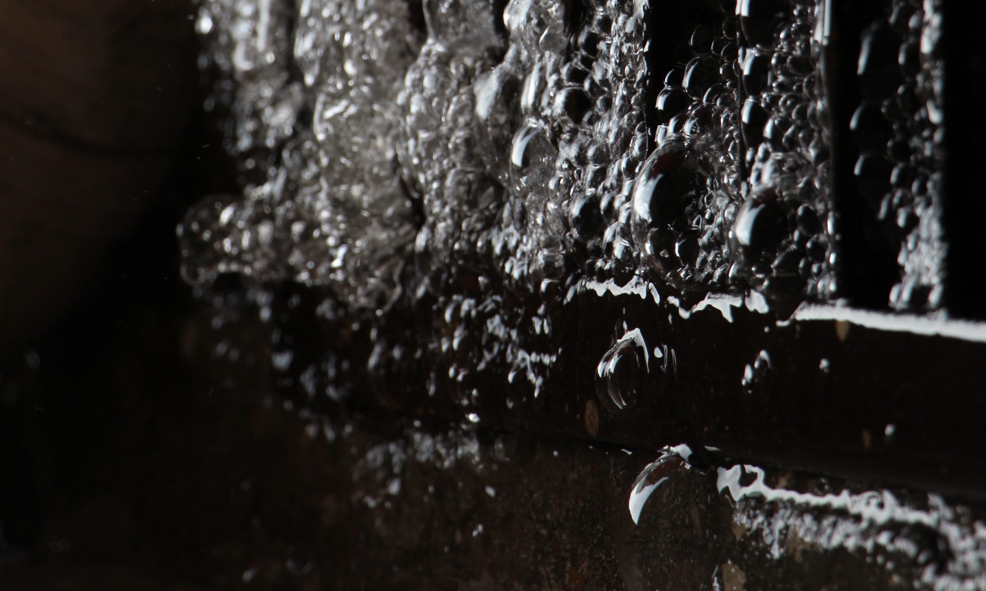
image 2

This is a close up shot of a water pipe attached to a drain in the carpark. When I took this shot, the main water tank had burst on that day, resulting in the excessive flow of water and foaming of bubbles from the pipe. I also rotated the image vertically from its original horizontal orientation to make the water seem like it was flowing upwards to emphasise the idea of distortion through perspective. The context of the destruction of the water tank is also significant because the aesthetic quality of the exaggerated bubbles and water flow would not have been possible if it was intact.

image 3

This image was created by taking a close up shot of part of a refracted glass panel that was attached to a stepped wall (shown below).  I then manipulated the orientation of the image to make the edge of the wall and the glass seem like the corner of a room and a glass ceiling, respectively. The resulting image shows light being refracted through a ceiling and illuminating an enclosed, dark room with grimy and rough walls.


Reflection

Through this project I was also able to creatively explore and indirectly convey vulnerability, by incorporating my body, emotions and intimate experiences together with techniques such as intentional photo manipulation as part of my image making.