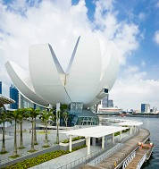
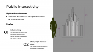

Upon reaching the Art Science Museum, we were greeted by enthusiastic hosts who shared the exhibition with us. Though small, we managed to spend a good amount of time interacting with the installation.
There were a few exhibitions which stood out. Of which, my personal favorite was the first room we entered. The user experience was well thought out. The dark enclosed room accompanied with music and abstract ‘dancing’ visuals provided an experience like being in a personal 3D theatre.
Next on the list is something less abstract and targeted towards children. Having said that, it does not mean grown-ups will not enjoy it. In fact, a substantial number of adults were participating in it. After scanning a personally colored picture template, you get to witness your drawing come to life.
All in all, the Art Science Museum was a pleasantly surprising trip. Before, I will never label myself as a ‘museum person’. Now, with the rise of interactive and engaging museums, I don’t see why not.
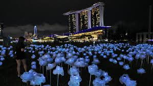
Lee Yun Qin’s design has an impeccable balance of both simplicity and personality. She cleverly incorporated her personal style with the theme of nature. Though her design is simple, she made use of quantity to produce an eye captivating installation. I appreciate her work as it is easily understandable. Using solar bulbs enables the flowers to be independently lit up, using only natural energy source – the sun. My favourite part though is the continuation of the message of sustainability. Individuals can play a part by adopting a MoonFlower in support of the Garden City Fund, a charity that runs sustainable projects in Singapore.
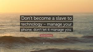
Advancement in technology has certainly improved life and change our necessary survival skills. People once relied heavily on physical copies of maps, cash, printed information, etc. Today, everything is simply a touch away, on one’s phone. Travelling no longer requires stacks of maps, airplane confirmation, and addresses. With just a single click, we can easily access the information we require. However, is it safe to say that the advancement in technology only brings good? I beg to differ. With everything packed into a single device, we are in fact in a state of increasing vulnerability. Losing our phones will instantly diminish our survival skills, leaving us in a state of confusion. By considering the adverse effect and finding a solution, we will be able to enhance what technology can offer us.
By: Dhea, Laura, Viet, Pearlyn


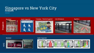
Chipchase shared his research – what do people carry, in which keys, money and phone top the list. However, society now is different from then.
With technological advancement, keys are no longer an essential item. Electronic security systems are increasingly common in new estates. Personally, access into my house is now only a fingerprint away.
Cash is no longer the only option for payment. People now have the option of paying with cards, through phones and internet banking. We can see this shift in payment with Singapore working towards a cashless society.
Phone, however, is definitely staying on the list. In fact, people are increasingly reliant on phones. With everything compacted into that tiny survival kit, phone or rather, the internet, something most cannot live without.
Chipchase shared the importance of understanding the background of one’s target audience. Often, we neglect the basis and intent of designing. Products are usually designed for people yet some designers fail to incorporate thoughtfulness to their work. A good design naturally arises from observations and research of the target group. Customising a design that is convenient and suits the need of the people.
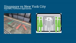
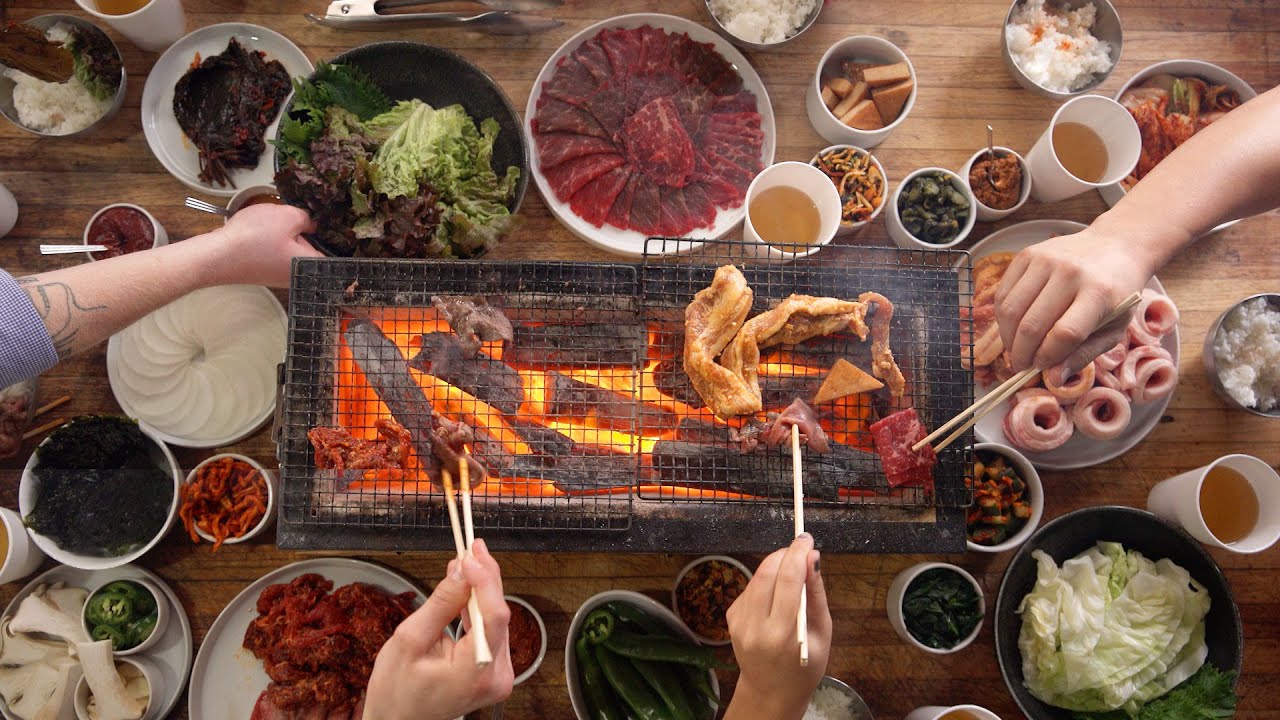
Culture is a major considering factor to great design. Having been to Japan and Korea this summer, I’ve realised the stark difference in their cultures. Take dining in Japan, for example. Meals are usually in the form of individual sets where sharing almost seems to be disrespectful towards the chefs.

However, in Korea, friends are commonly seen sharing a huge portion of food coming from a single pan. In which not sharing is a selfish act.
Questions:
Dhea Mariesta Chanjaya
Jolene Tan
Laura Young
Pearlyn Seah
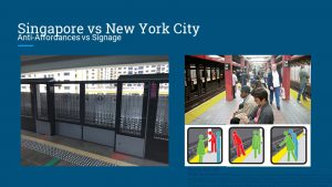
Chapter 1 mentioned that designers often misuse the term “affordance”. Much rather than affordance, the focus should be shifted towards “signifiers”. Signifiers are simple indications to bring awareness of a certain function to the users. However, with too many signifiers, it might lead to confusion and a complicated design. Simplicity of apple products is probably the reason why it is so popular. The single button on the iPhone is simple yet functional. No complex manual is needed to figure how it works. That is why it is important to strike a balance between number of signifiers and simplicity of the design. The author also stated that feedback is key. In which I agree to. Interactions are necessary to engage users. Feedbacks continue the flow of interaction just like responses in a conversation.
Questions:
1) Should we have a signifier for every affordance?
2) If a project requires many signifiers, how does one find a balance between the signifiers and simplicity of the design?
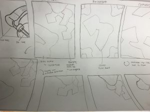
The completion of our first art assignment was a great reminder to one of the takeaways this course has to offer. It reminded me the importance of thinking- planning out the processes which leads to the final piece.
We were tasked to start off by choosing a part of a previous drawing. In which i chose the sides of a headphones as it consisted of curves and straight lines. To create the focus, i tried 3 different ways- isolation, placement and convergence. After deciding on isolation as my mean of creating the focus, i attempted different orientations as well as re-scaling for the group at the corner. After a few drawings, i concluded on the ‘best’ orientation for my final piece.
The entire process was tedious yet fulfilling.