
Final Works
The Concept – Community Spirit
After taking a step back and looking back at my sketches, I realized that my concept is more to the social community instead of the physical place itself. Hence, I ended up using ‘Community Spirit’ as my subject; the sense of togetherness.
Personally, this subject is quite significant to us in this modern day as what was known as ‘Kampung Spirit’ has made what Singapore became today. Although it is evolving, this community spirit is still alive today.
I wanted to show how we are actually keeping this kampung spirit or community spirit alive without us actually realizing it.
I had divided my pieces into three pairs, according to a timeline of generations. My main aim was to compare the same activity or situation but due to the different era, its perspective changed.
The Medium
I was not sure which medium suits my concept the best but in the end, I decided to implement them using illustration on photography, where the location/environment was in a form of an image while the action/activity was illustrated. I had always thought photographs to be connected to memories. Since free-hand drawing was my weakness, I wanted to overcome that by using Photoshop, a software I had been familiar with.
In terms of lighting, I decided to take photos of the kampung during the day to get natural lighting while the void deck at around 7pm, when the artificial lights came on. Also, I tried to have a constant colour for the kampung images (green) and the void deck images (pinkish-peach). Other than the stock image of the coffee shop, I had taken all images myself.
The Final Works
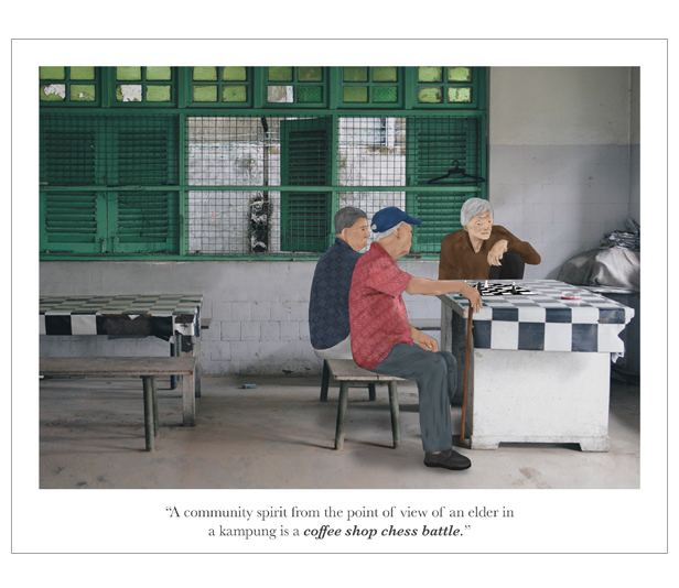
1) Elderly
“Community spirit from the point of view of an elder in a kampung is a coffee shop chess battle.”
“Community spirit from the point of view of an elder in an HDB is a void deck stress reliever.”
In the past, the elders would usually go to coffee shops and meet up with friends to have an intense battle of chess. Today, the game is just a form of stress reliever to pass time as they get away from their home which feel like a prison.
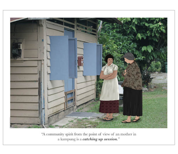
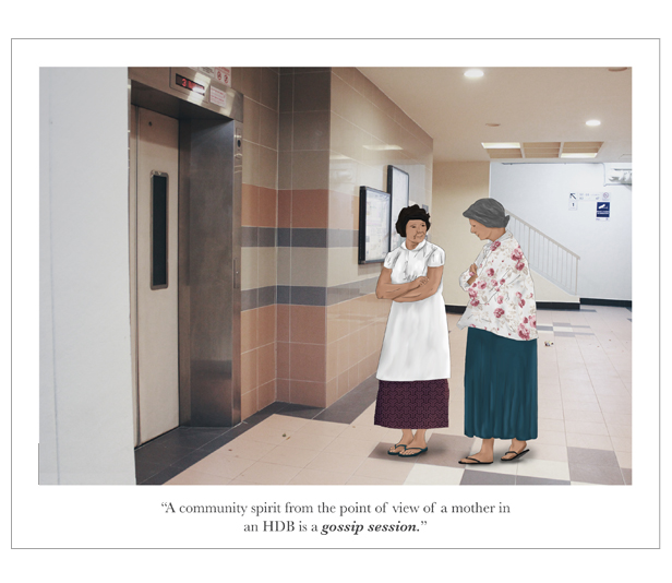
 2) Mothers
“Community spirit from the point of view of a mother in a kampung is a catching up session.”
“Community spirit from the point of view of a mother in an HDB is a gossip session.”
During the kampung days, neighbours would come by to check and look out for each other. They would help each other out. But nowadays, Singaporeans like to complain. So the first thing they say when they bump into each other is to gossip, like ‘eh u know ah that man in the 3rd floor..’ etc.
3) Child
“Community spirit from the point of view of a child in a kampung is a soccer game played together.”
“Community spirit from the point of view of a child in an HDB is an illegal game done together.”
Of course when you talk about a kampung, there was the ample space for people to carry out different activities. One of them was playing soccer. Since the biggest space you can get in a HDB is the void deck, children tend to play there. However, it is considered ‘illegal’ as the prohibited sign is clearly shown on the wall.


Presentation
I arranged my pieces in this manner, as though they were polaroid films hung on strings, because I wanted to create that ‘nostalgic’ and ‘rustic’ feel like I captured these moments and displayed them as memories.

Feedbacks
Some of my classmates suggested to use a handwritten typeface for my text to emphasize more on my polaroid execution. One also asked why I did not try printing them on glossy paper instead. Probably I was too focused on getting the colours out nicely that the thought of glossy print of the polaroids did not cross my mind at all.
The Process
Initial Idea & Sketches
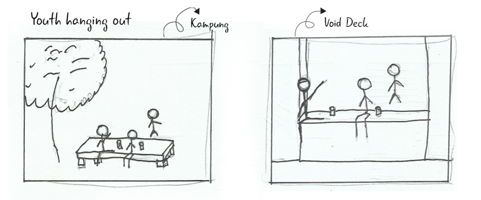
At first, I wanted to emphasize on the point that ‘a void deck is not a void’; they were actually efforts to revive the kampung spirit. The void deck was known as a place for community events, bonding spot, kids play area, walkway to go to another block etc.
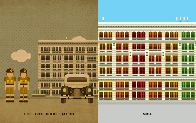
To show how this kampung spirit evolved from the kampung days to modern Singapore, I planned to compare the old Kampung Courtyard and the modern HDB Void Deck. I was very much inspired by the work of Kinetic Singapore titled ‘Monopoly Singapore Then and Now’.

I was also inspired by the blend of nostalgic and meaningful places created by local architect/painter Lee Xin Li. Although his illustrations were in detailed, I thought I could create something of a similar vintage and old feel.

Thus, I made use of both concepts and sketched out my ideas.


Feedbacks
My tutor pointed out that most of my sketches were more to the community itself while others had social issues. She also alerted me of the different generations there were (elder, mothers, youth and kids) so I could create a timeline. Void deck could just be a bridge that connects the past kampung spirit to now.
Medium Exploration
Then, I looked up some more artist references to explore on different mediums I could work on, for example Johan Thörnqvist and Michael Alesich.
 Swedish illustrator Johan Thörnqvist doodled on photographs that he had taken with his phone, creating quirky and surreal illustrations with them.
By overlapping one medium over another, he created a universe for his miniature characters to play in. His drawings were distinguished by simplicity and colour absence, as the major part was designed in black-and-white.
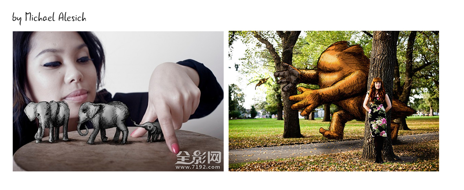

Based in Melbourne, Michael Alesich also combined illustrations with his photographs. The result was his surreal imagination coming to life. With the help of family, friends and models, he captured portraits in many different locations, with the hope to share a slightly different view in his day to day travels.
As compared to Thörnqvist’s works, Alesich applied more colourful and vibrant colours to his pieces, creating a fun and lively environment.
- Illustration on Vector
To start off, I tried to combine illustration with vector but the whole piece looked too ‘staged’ and cartoonish. It did not really evoke a sense of nostalgia that I wanted to depict in the first place. There were also not much details as I what had expected.
- Vector on Image
Hence, I decided to put in an image as the background instead to make the piece slightly realistic and alive.

- Illustration on Image
Lastly, I wanted to see if illustration worked better so I tested it out as well. I thought this complimented my concept better as I got to blend the two mediums together and create something subtle. I also managed to add some details like shadows and highlights.
Composition (Sketches, Images taken, Comparison)
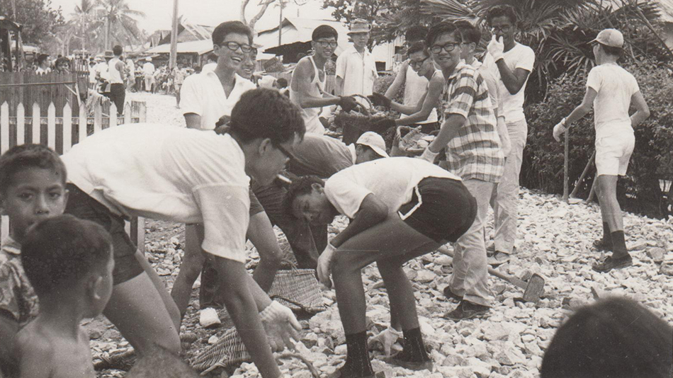
After I had set my mind on the kind of medium I wanted to do, I proceeded with the images to be taken for my background. Firstly, I sketched out the composition of my images so I would have something in mind and would not be wasting time once I arrive at the locations.


Then, I filtered out the images to the closest composition I could get with my sketches.


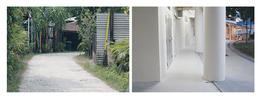
I decided to print out the Kampung images so I could refer to them easily when I proceed to the next location, Void Decks. The following are some of the images I took.

Pre-Final
Lastly, I filtered out the three kampung with three void deck images and edited the colouring to create that rustic look.


Actually, I did not really know how to digital paint the right way so I created the outlines of the characters first with Illustrator and coloured them in using Photoshop. I also added in patterns on their clothes to make them more realistic.


Reflection
This assignment was quite challenging for me because it was too broad for me to decide one. However, through research and consultations, I managed to pull it through. Taking the photographs was my favourite part in this assignment as I had fun finding the right angle and composition of the place to match with its pair. I should have put more thought in the printing process where, as suggested, I could use a typeface font and glossy paper.
If i had managed my time well, I would put in more details for the illustrations and work more on their faces (yes, I am really disappointed with the faces.. it was so difficult to draw them).