
Final Work
The Concept/Theme – Kampung Spirit
Firstly, I have always been interested in the subject matter of Singapore’s community spirit because of our multi-racial citizens. Hence, I decided to dealt more into it and expand my Assignment 2’s works.
However, this time, I would like to address it as ‘Kampung Spirit’.
I came across a quote by Mr. Lee Hsien Loong, “the community spirit present in kampongs should still be maintained for Singapore to do well”. I then turned it into a question, ‘Will the kampung spirit even continue to exist in the future?’. Since the kampung spirit is already diminishing in the 2000s, what will happen to Singapore in 100 years time?
That sparked an idea in me.
Therefore, my purpose for creating the zine is to provide a reminder for Singaporeans in the future about what had made Singapore successful (just in case, who knows 😉 ).
The Final Zine – ‘The Key to Singapore’s Success’
1) Cover Page

Since kampung spirit has been around since the olden days, I decided to create a rustic feel for my zine.
I was looking for a pattern or motif that represents Singapore as a whole and not by its individual cultures (Malay, Indian and Chinese). So I implemented the iconic Singapore Airline’s batik pattern as an integral design element of the zine.

In her distinctive uniform, a sarong kebaya in batik material, the ‘Singapore Girl’ is one of the airline industry’s most recognizable figures. The timeless elegance has graced the Airline’s innumerous global marketing campaigns, constantly winning over travelers around the world.

I thought, this could also be a bridge for the international to learn and understand the uniqueness of kampung spirit that makes us Singaporean.
2) Contents
Moving forward, I also combined the rustic and vintage style of the 1970s with the casual and modern style of the 2000s. My main aim was to prove that this kampung spirit could exist regardless of the different eras.

On the inner page of the front cover, I had placed the quote by Mr. Lee Hsien Loong to emphasize more on the importance of my subject matter. Then, I created a simple page defining Kampung Spirit, in case the reader has no idea what it actually meant.


Next, I tried to minimise the use of words yet strongly convey my intention. I used my previous works to portray that kampung spirit still exists no matter what period and location. As they said, a picture speaks a thousand words. To enhance the understanding, I slipped in a printed transparency film in the middle of the two background images. This also contributed to the interactivity of the zine.

For the next few pages, I added more information on what made up this kampung spirit. One of them was Gotong Royong. I did not want the image to clash with my texts to I overlayed a brown layer on top. I also added in some side notes, as if someone handwritten it on my zine.
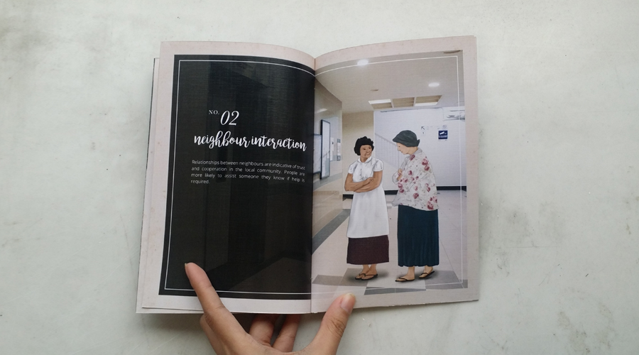
Another factor is the ‘Neighbour Interaction’. To create a uniform and standardised layout, I only overlayed the brown layer on photographs and not illustrations.

Lastly, I typed on a summary of what the zine is all about and further emphasized my subject matter by using a different font and weight.
Choice of Papers & Binding
Since the zine was going to have a rustic look, I had looked into some textured papers to print on. In the end, I settled on a 260gsm Linen Textured White for the cover page and 150gsm Linen Textured White for the content pages.

Since I wanted to side-stitch my zine, I had to take into considerations the thickness of the papers to see whether they can be flipped smoothly.
To imitate an ’embossed’ look for the side of my zine, I printed a long strip of book spine and pasted over the side-stitched pattern.

Challenges
As I implemented the side-stitch binding method, I realized that I had to realign my content as my central guideline was shifted due to the gutter. This took quite a while to recalculate the amount of space I had left.
Feedbacks
One of my classmates suggested to put some graphic on the inner page of the back cover and I did agree on that. It looked empty at the moment. Also, the lecturer pointed out the reason as to why I chose to use the Singapore Airlines motif and added on that the book could also be used by non-Singaporeans as the motif itself was already well-known globally.
The Process
Initial Idea & Sketches
1) ‘I Am..’
I was looking at all of my 2D projects and realized that they had some sort of a ‘journey’ and ‘adventure’ theme. I thought I could do a ‘role-playing’ concept, where I Am.. a:
– A detective
– A boat
– A time traveller
I planned on a casual and fun look using a combination of illustrations and typography.
2) An Ancient Book
Another initial idea I had was to create an ancient book. Revolving around the concept of ‘the discover of a book of secrets’, I wanted to create a guide book for the readers to find out about that secret.
This concept was then developed into my final one.
Artist Reference
Valen Lim Chong Chin
Although I had looked into a number of works as references, I was mainly inspired by the work of a Malaysian graphic designer Valem Lim called ‘Life in Rifle Range Flats’ where he created a documentary publication regarding Rifle Range Flats, infamous buildings in Penang, Malaysia.
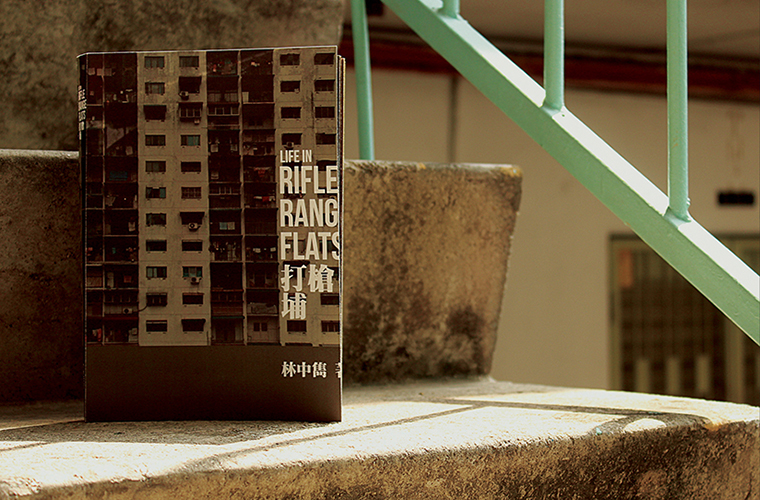
The main concept of his publication was “One Room One Life”. It represented the unique feature of the Rifle Range flats — single room units. At the same time the each of life stories and thinking of every residents are so interesting to be discover.

I love how the book had a rustic, yet modern vibe thanks to the blocked and structured typography style he implemented. He also used dull solid colours to give off a vintage look.


Paper Mock Ups
Initially, I was going to use a 350gsm Hammered Textured Off-White for the cover page and 260gsm Linen Textured White for the contents. However, during the group consultation, Si Qi alerted me on the thickness of the papers which could possibly be difficult to score and fold smoothly.

I took that into consideration and decided to do a test print and try to score them to see if the jagged lines of the folded paper were obvious. In the end, I decided to use thinner papers.
Reflection
I really had fun doing this project. Not only was I aware of the choice of papers and binding to use, I also began to notice that the use of font type, weight, images, graphics (basically the composition, as a whole) played an important part in conveying my intention effectively to the users.
I payed more attention to the composition of each graphic and text, the crease of each scorings and the alignment of the book’s pages to have a professional outcome (as they always said it, first impression counts).