Download Portfolio PDF Here.
Portfolio Page: be.net/furlisure
LinkedIn Page: linkedin.com/in/feliciachuaqy
[Biography]
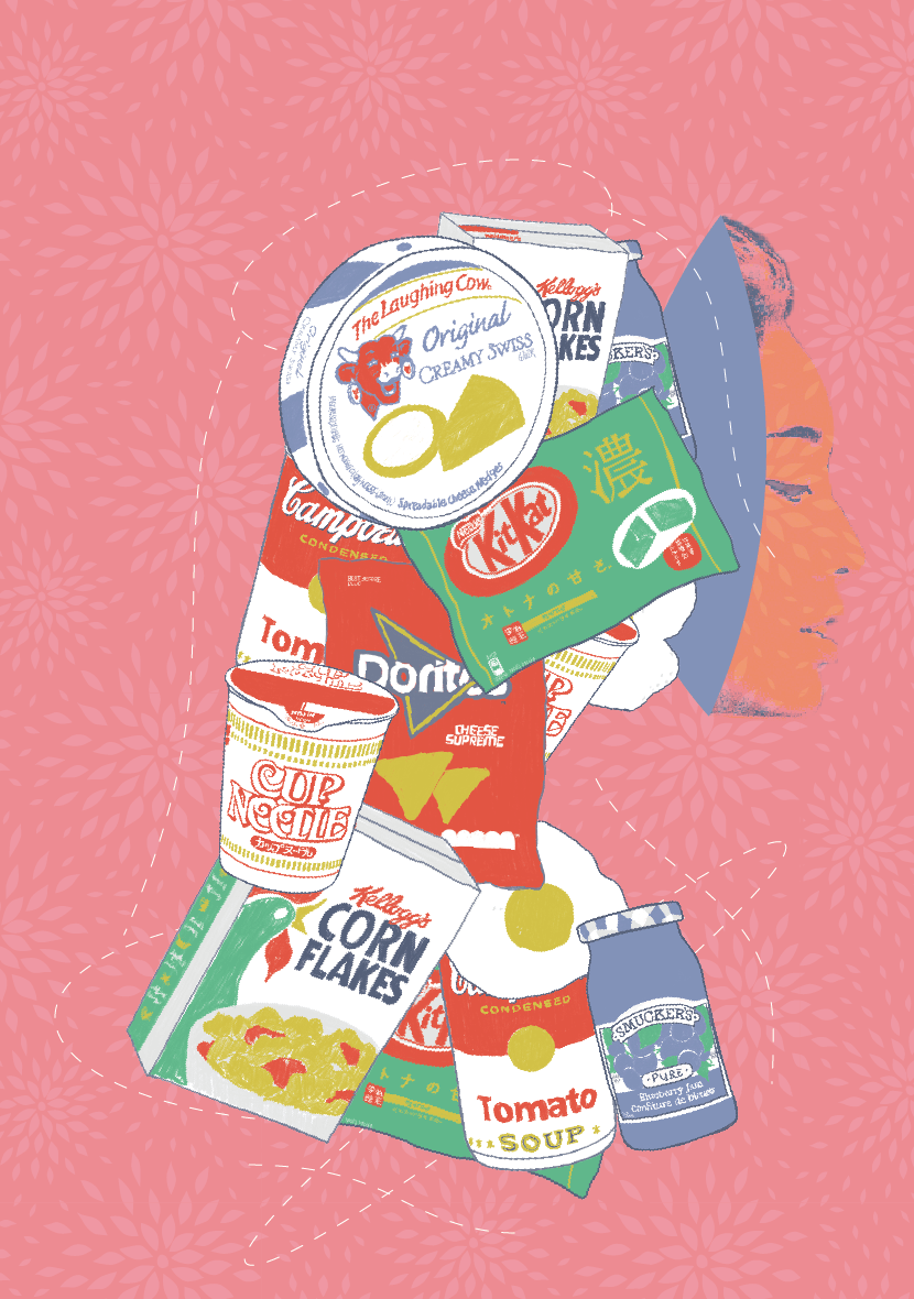
Hello! My name is Felicia, and I am currently pursuing a Visual Communication Major with an interest in User Experience Design (UI/UX). Based in Singapore, I specialise in Visual Identity, Packaging and Brand/Collaterals design. My design philosophy is to curate meaningful work that best represents brands and their ideologies, a human-centred design that understand and address the core problems within a system. My approach lies in shaping contextual narratives for brands and translating them into visual communication through conceptual and typographic details, which are then applied across digital, printed and occasionally spatial mediums.
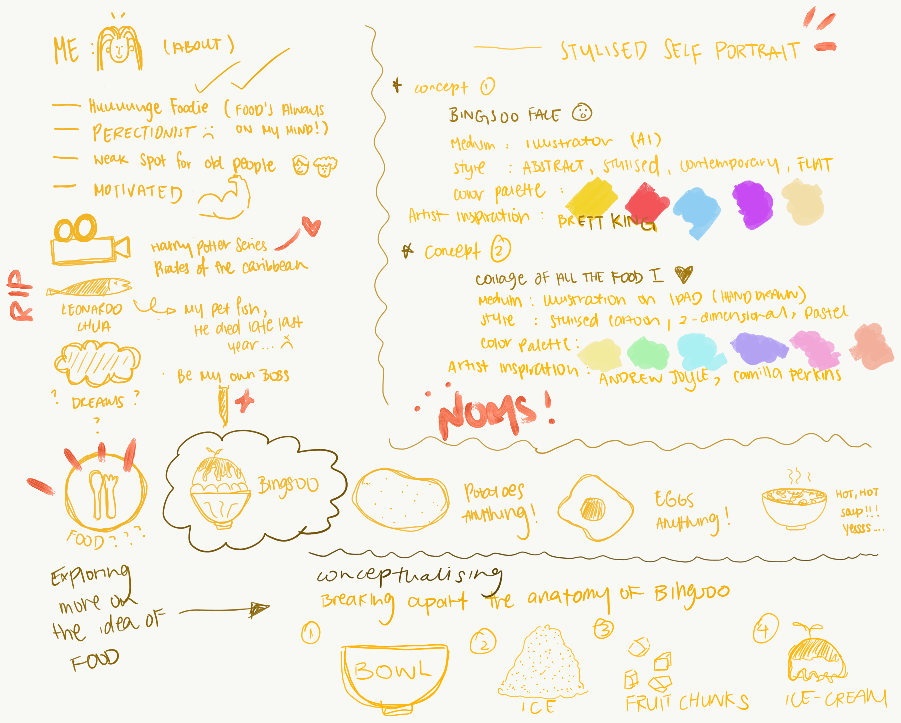
[Share 3 of your best projects from your courses done so far]
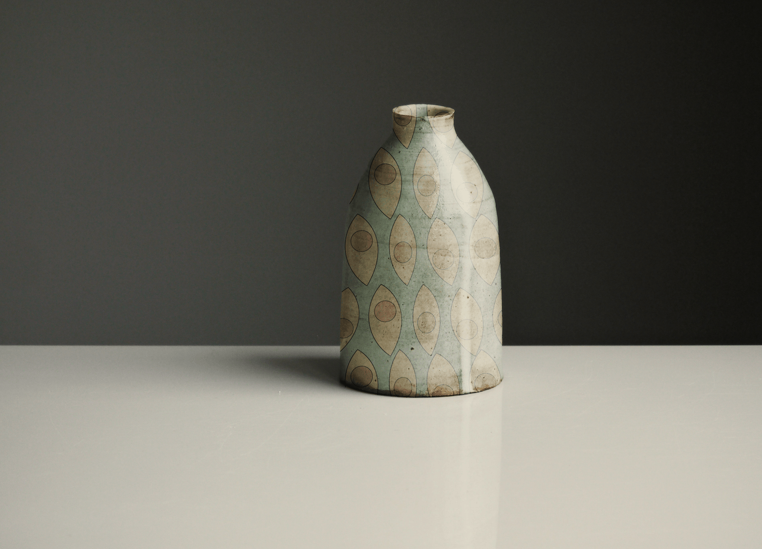
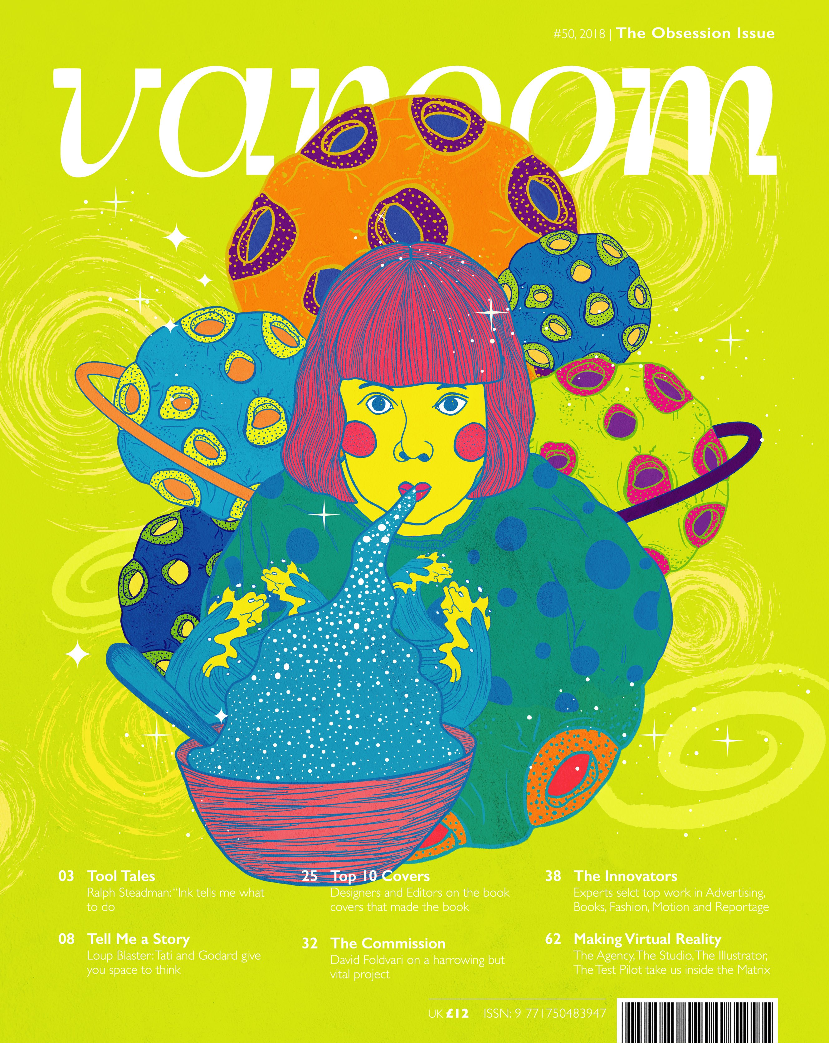
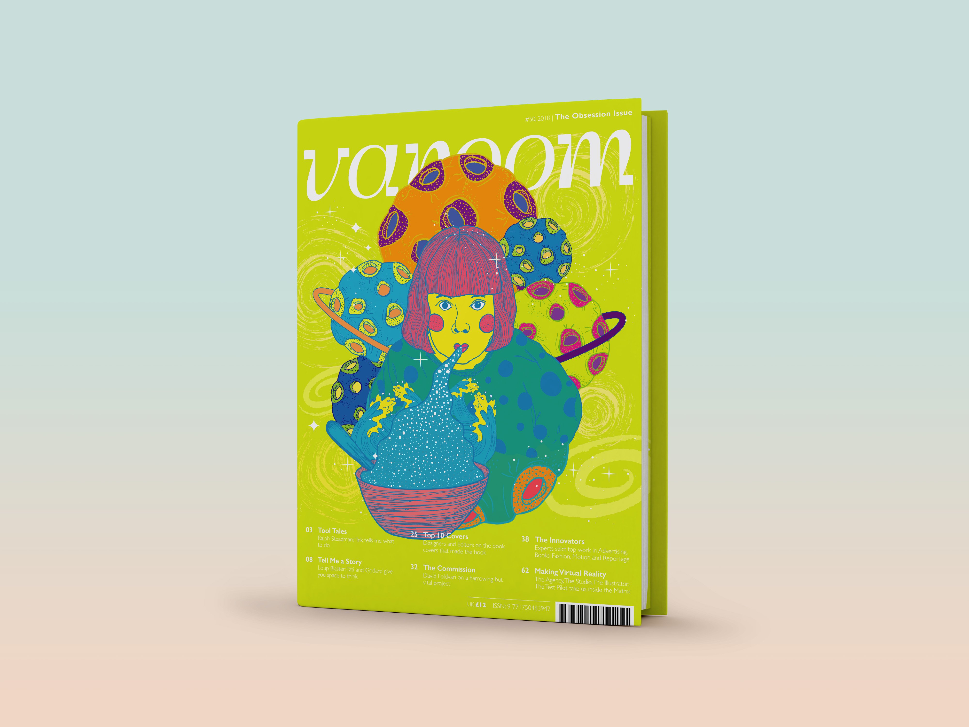
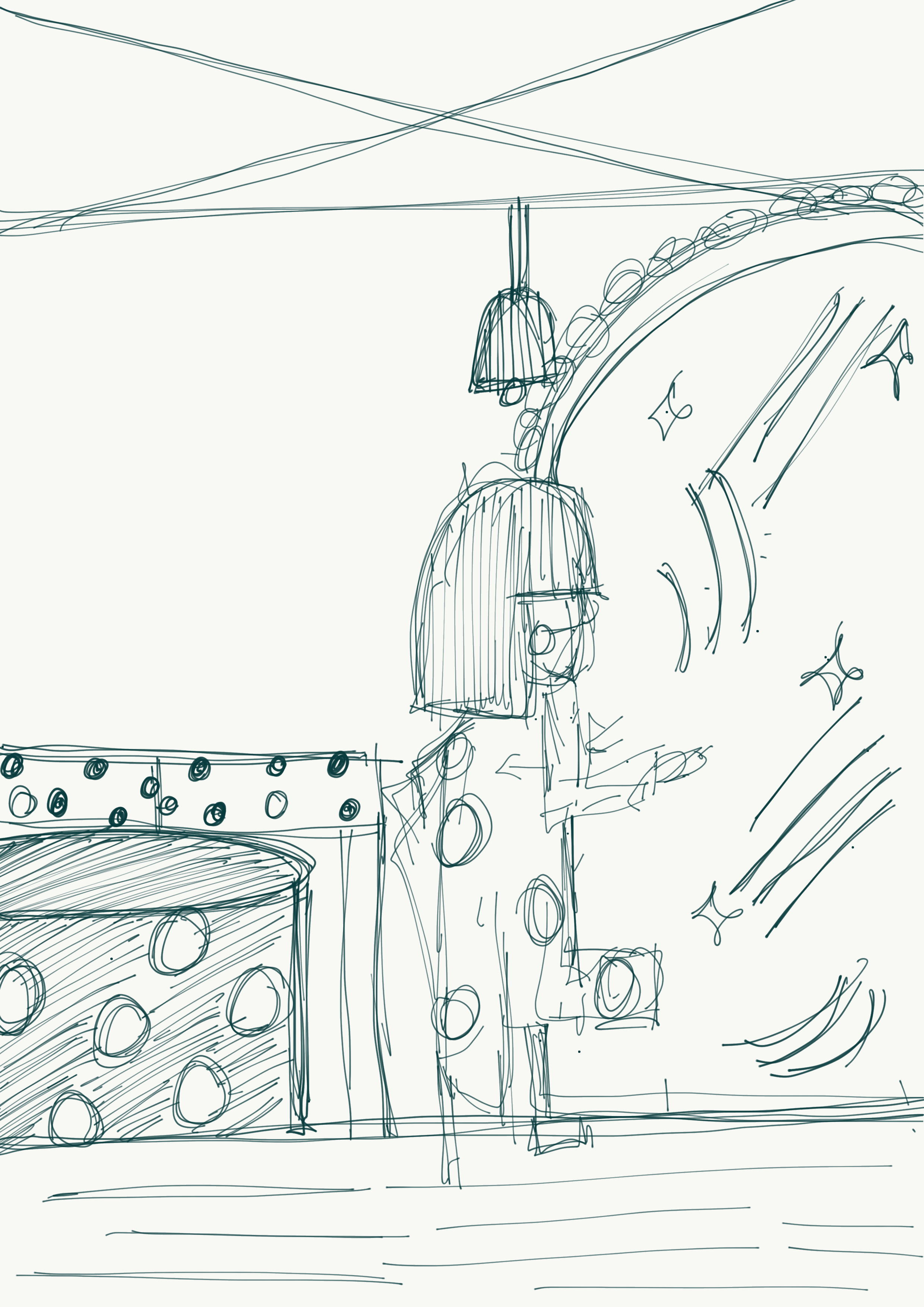
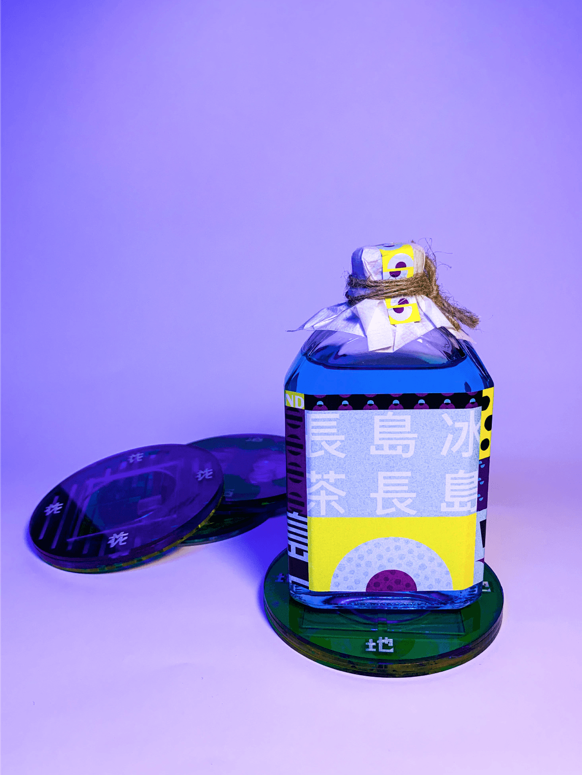
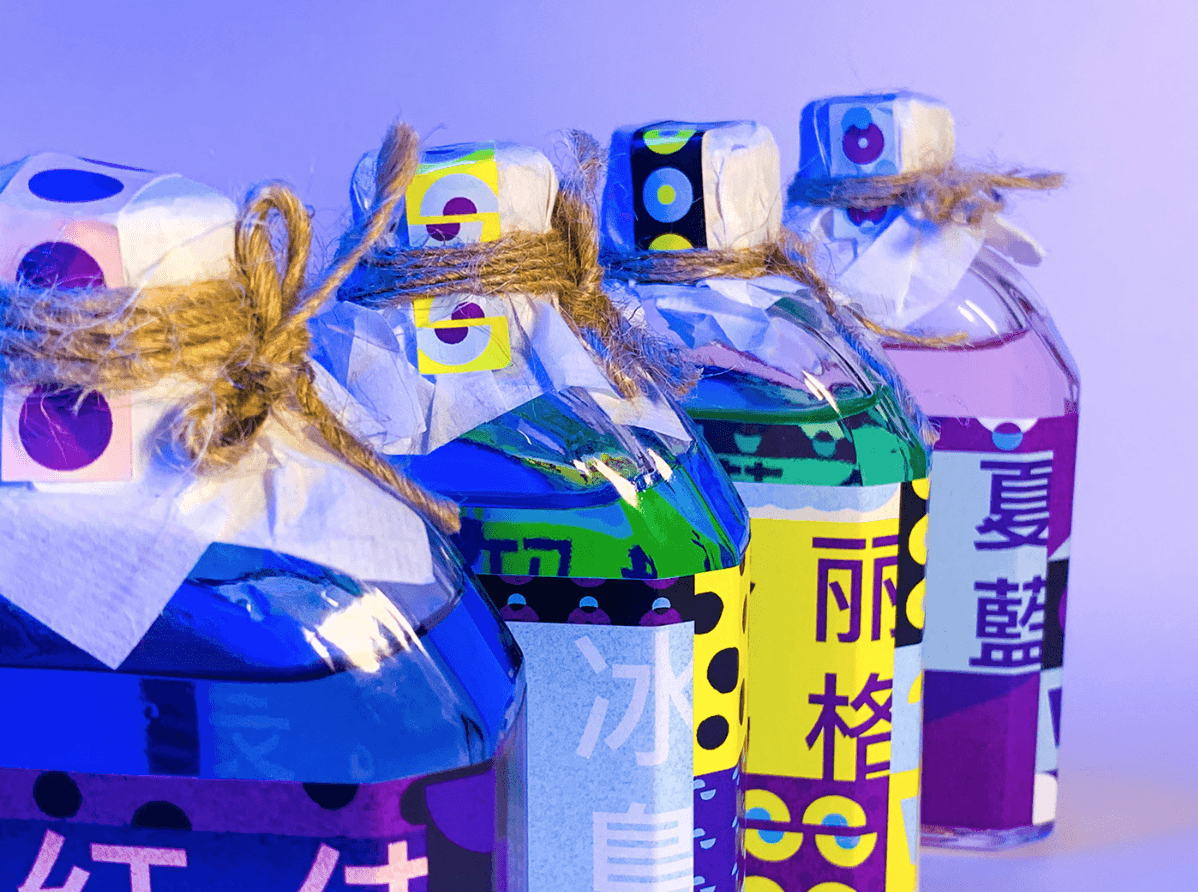
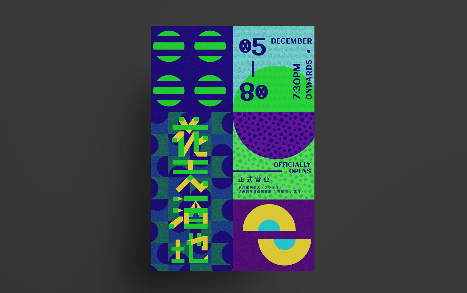
Project 1: 花天酒地 / / Glassbar Concept Store
Purpose: Creative Branding for Visual Communication III
Theme: Bauhaus Art Movement

/ MORE ABOUT
A Modern Take on Bar Experience – With the shift in focus of the demand, bar experiences expand way beyond just a place for consumers to sit down and consume a drink. It has ultimately become a holistic approach that involves the whole purchasing, enjoyment, and consuming process that summarises if a bar worth a second visit. With millennials as the targeted group in the up and rising bar scene, the role of uniqueness is the key to being unforgettable. To enhance the characteristics of clarity and clearness in spirits and wines, our bar aims to re-represent the quality of transparency of alcohols into our bar concept. Once you enter the bar, it will feel like a shift in dimension – an alternate reality or universe. A glasshouse concept that occupies your surrounding with all things made of clear and transparent objects, to enhance the effect of etherealness.
/ BRAND PHILOSOPHY
THE BAR PLACE aspires to provide a glasshouse experience similar to the interior design of an igloo, we want to sell a unique, curated representation of lifestyle to people from all walks of life, especially millennials. We believe that through the use of clear materials, it can represent a non-complicated and stress-free lifestyle which reflects our unique brand identity of a glasshouse concept lounge bar.
/ BRAND IDENTITY
THE BAR PLACE serves to create a community where people can detach from reality momentarily, to shed the burden off your shoulders through our glasshouse ambience that emphasizes on lightweights through the concept of invisibility, giving you an ethereal and out of the world experience. Our products will be curated with transparent objects, which reflects depth when you stack to combine two items together – playing on the idea of invisibility. When stacked together, the visual imagery can form unique illustrations which hammer on the visual illusion of depth through lines. Lines with varying strokes will be a continuous design element used on our collaterals.
/ PACKAGING & PRODUCT DESIGN
The packaging aims at representing the modern beliefs of our bar, such as the laser lights to transience through transparent materials, detachable menus that come in 2 separate layers.
/ GRAPHICS RATIONALE
THE BAR PLACE graphic assets will replicate the rhythmic qualities of music and beats. More so, shapes that encapsulate the ingredients to our cocktail drinks – all represented in lines/outline to align with my concept on dynamism in lines – a reflection of different personalities. Presented in a non-representational way, the lines will draw depth and give the design a 3-dimensional appearance.
/ REFLECTION
This project concept may seem simple, but it has gone through a lot of renditions to get to the final output. As it was my first attempt using shapes to build a design concept, I thought this was quite a refreshing take compared to what I am used to doing. Apart from that, this project also challenged my ability to think critically as an aspiring designer.
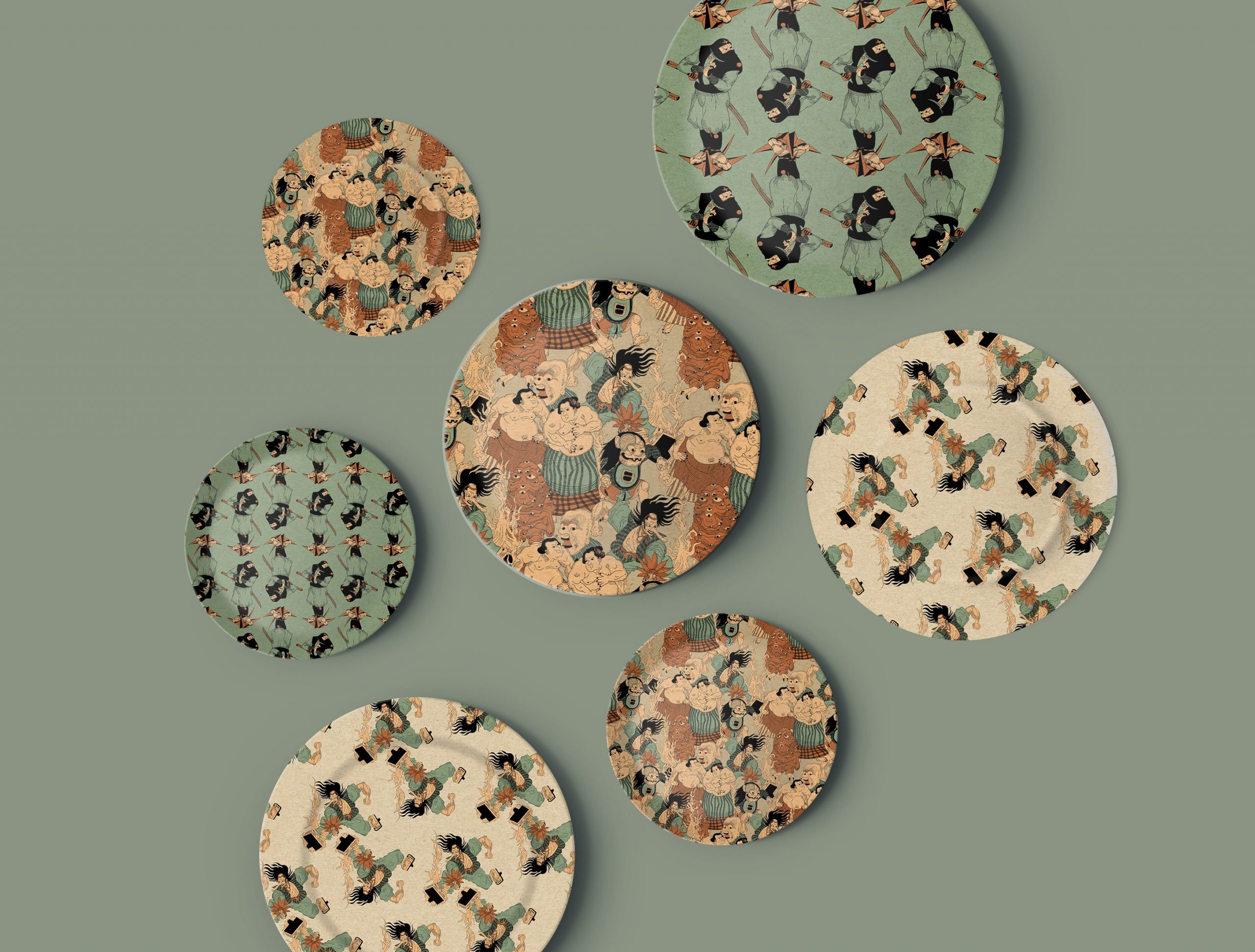
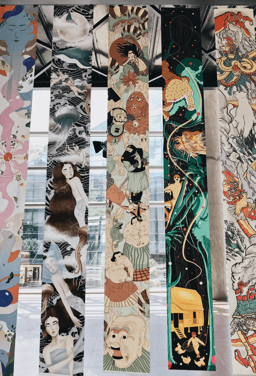
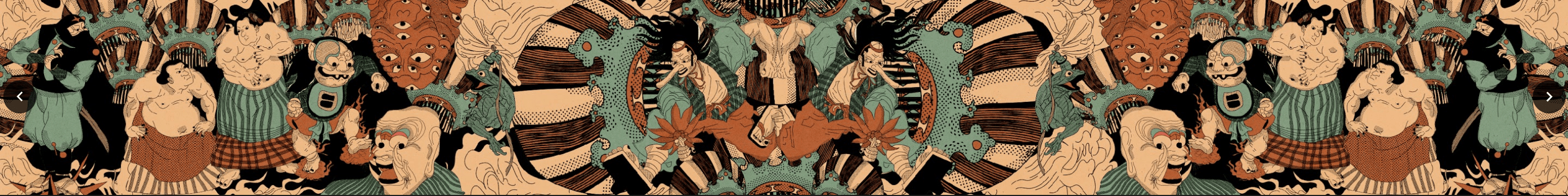
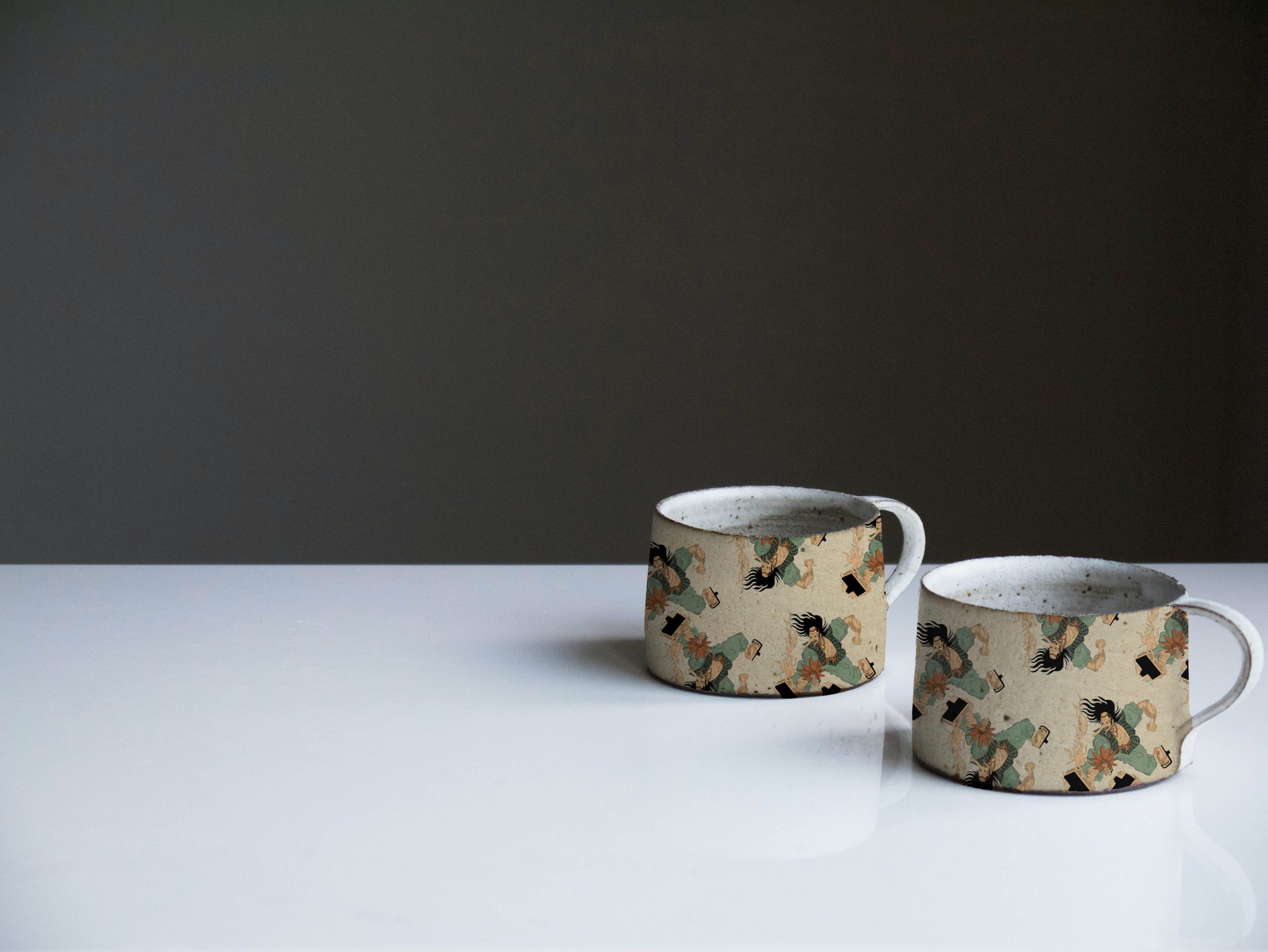
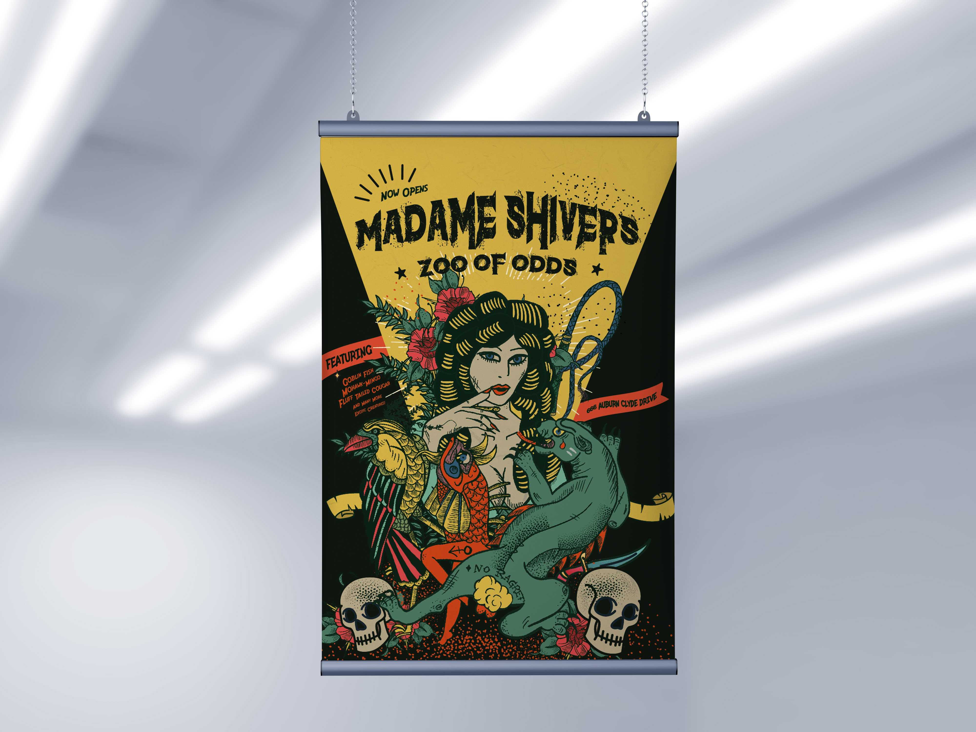
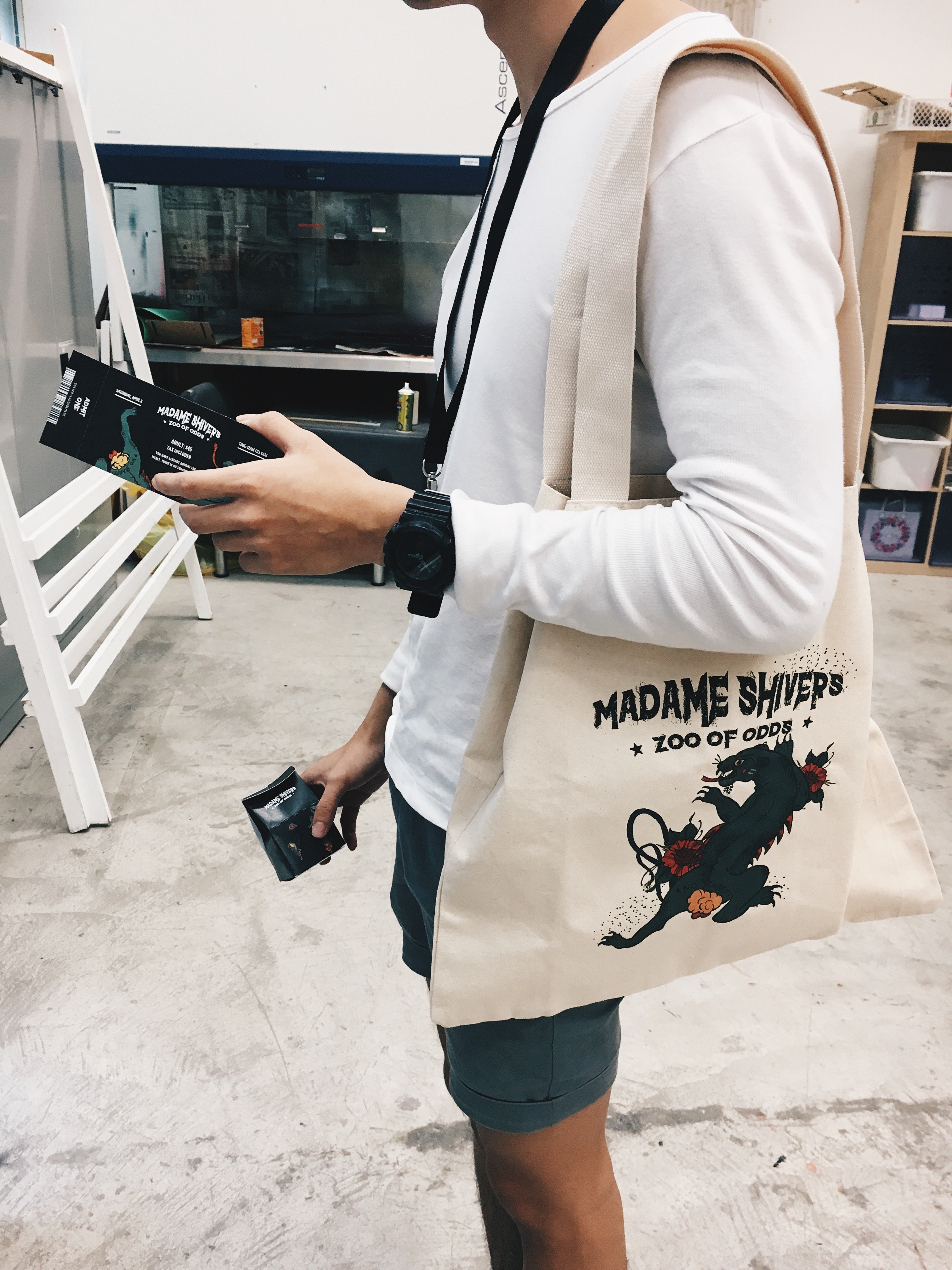
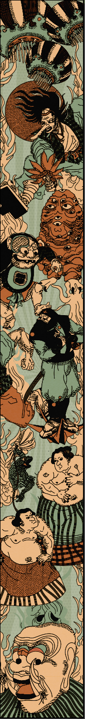
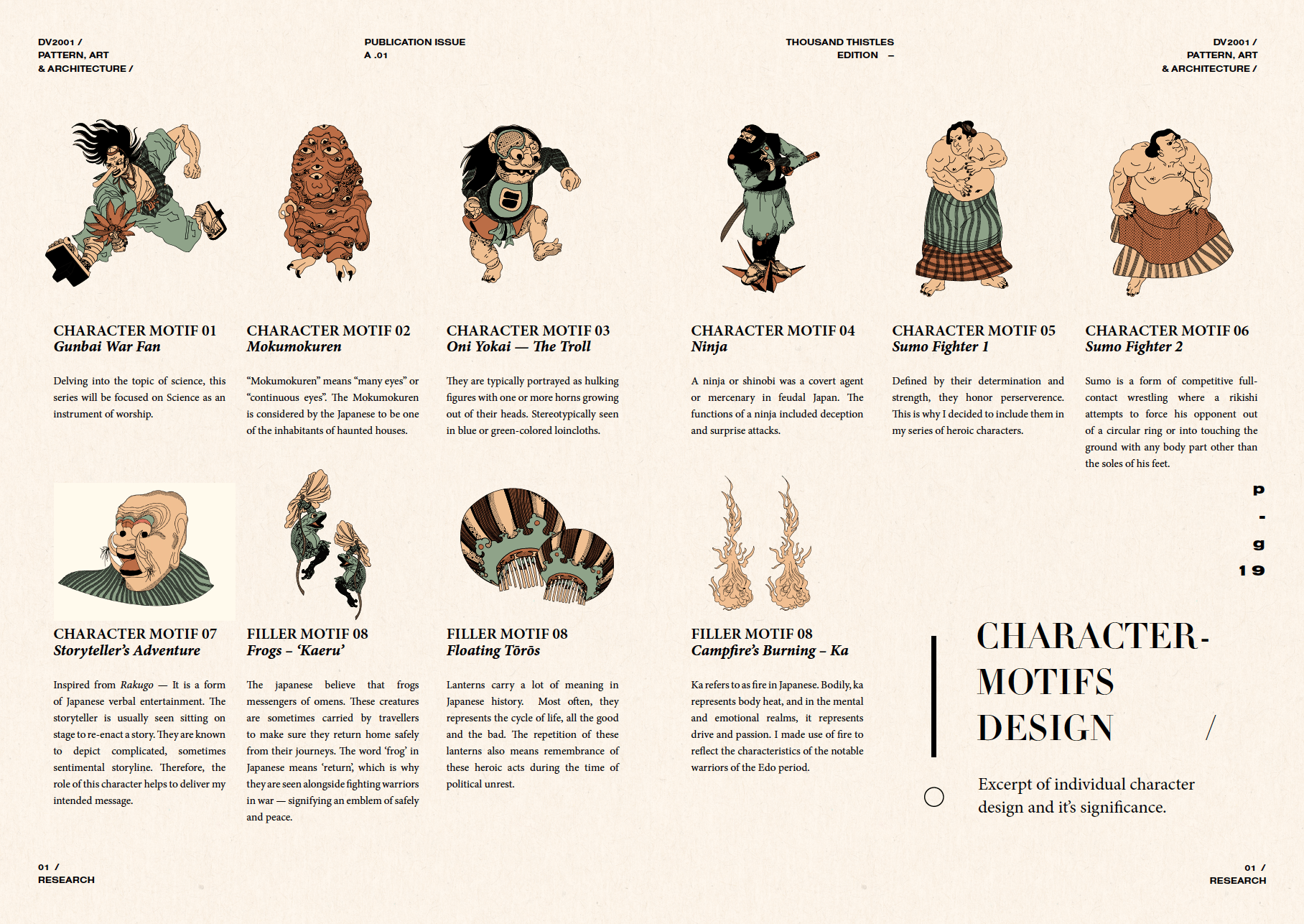
Purpose: Cascading banner 3824 x 480mm
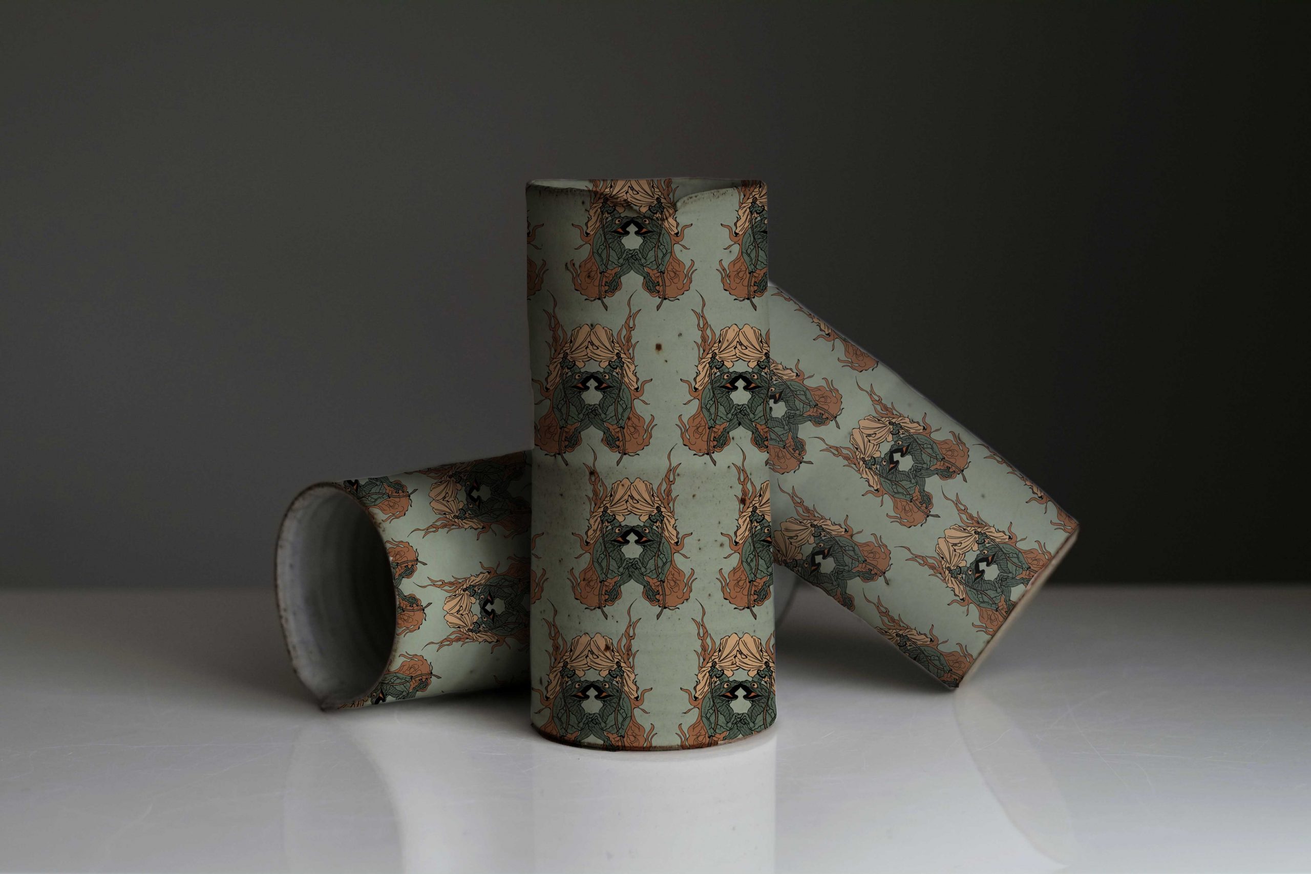
Theme: Japanese Villian Versus Warrior
/ MORE ABOUT
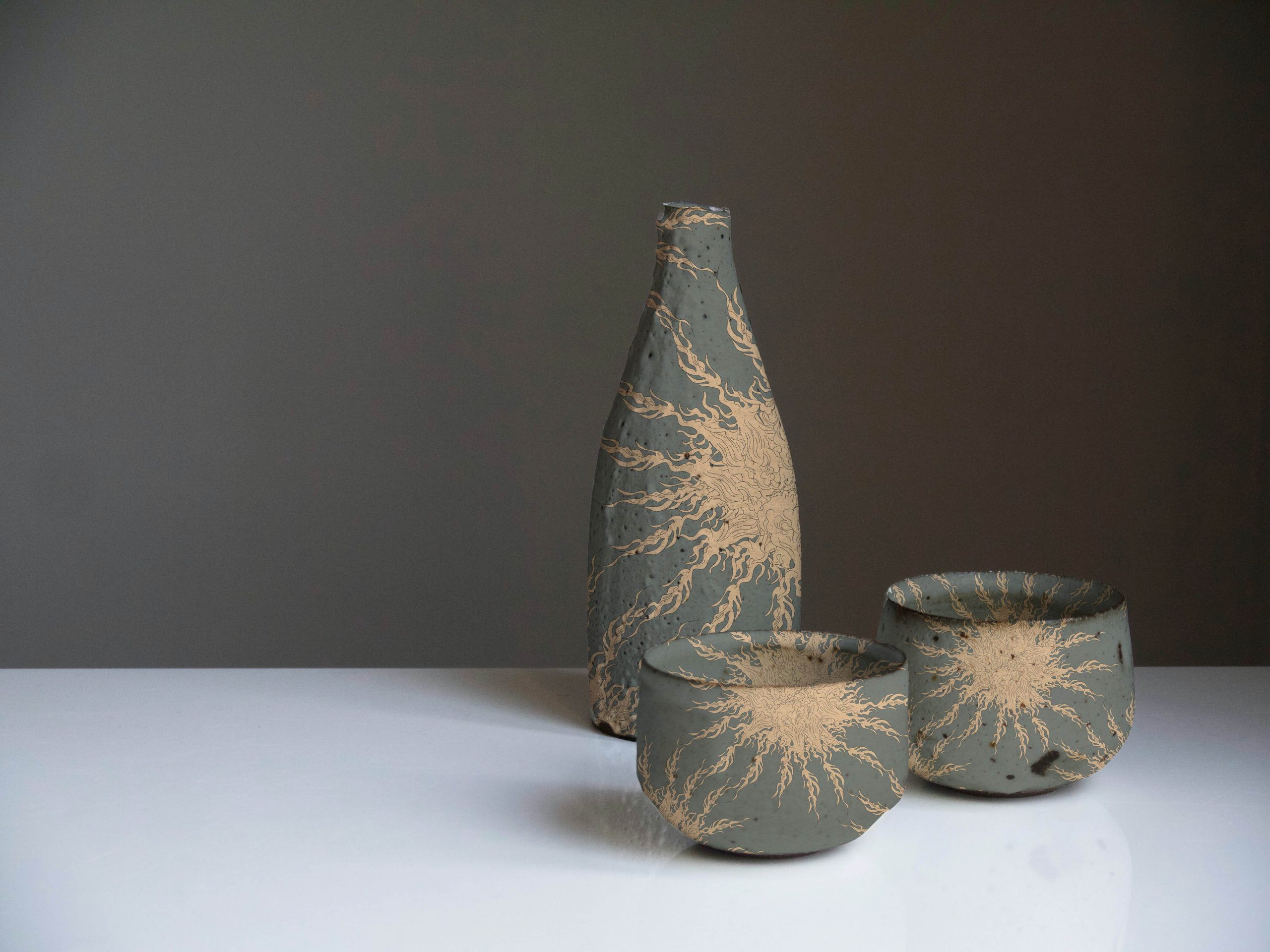
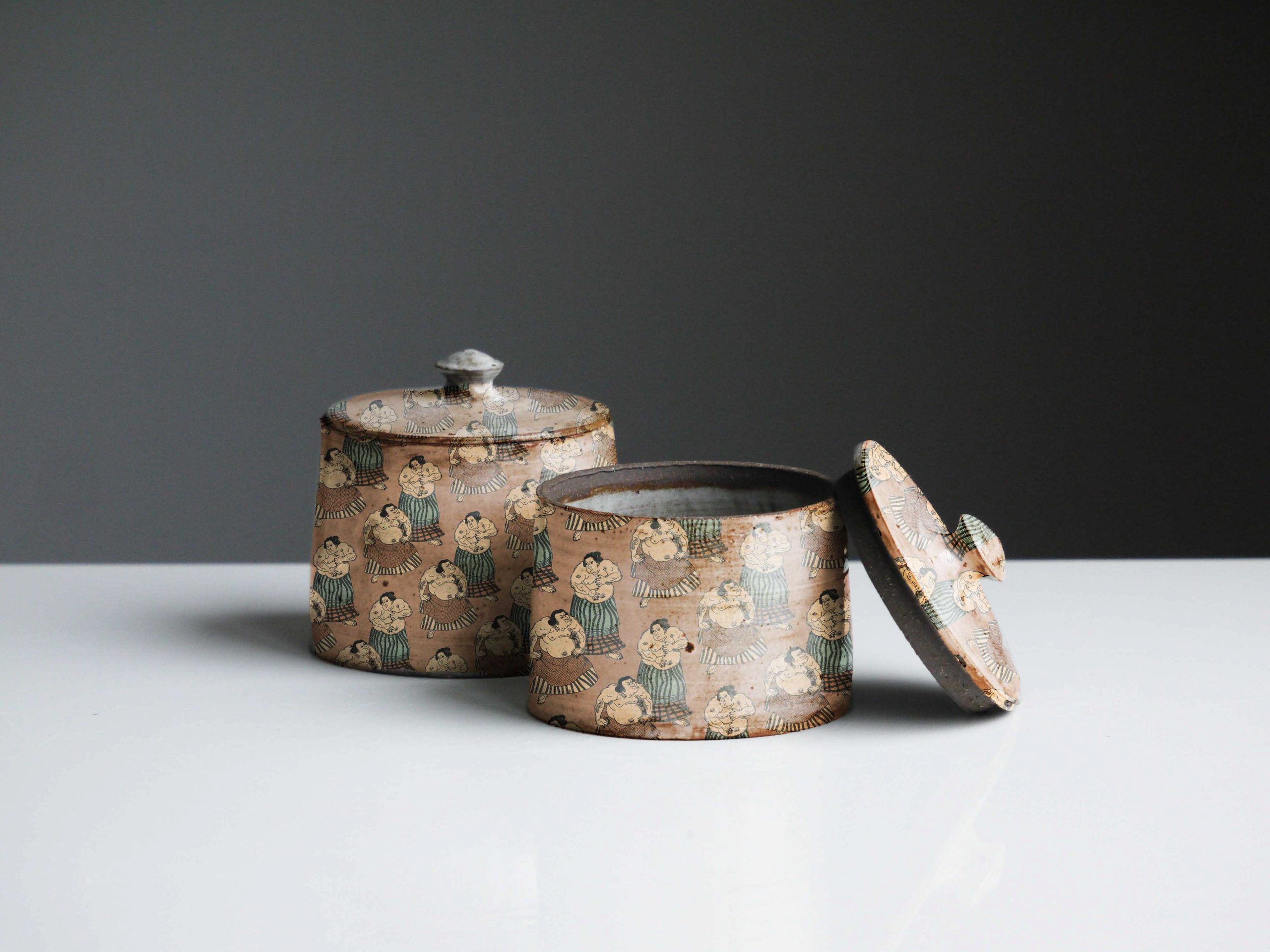
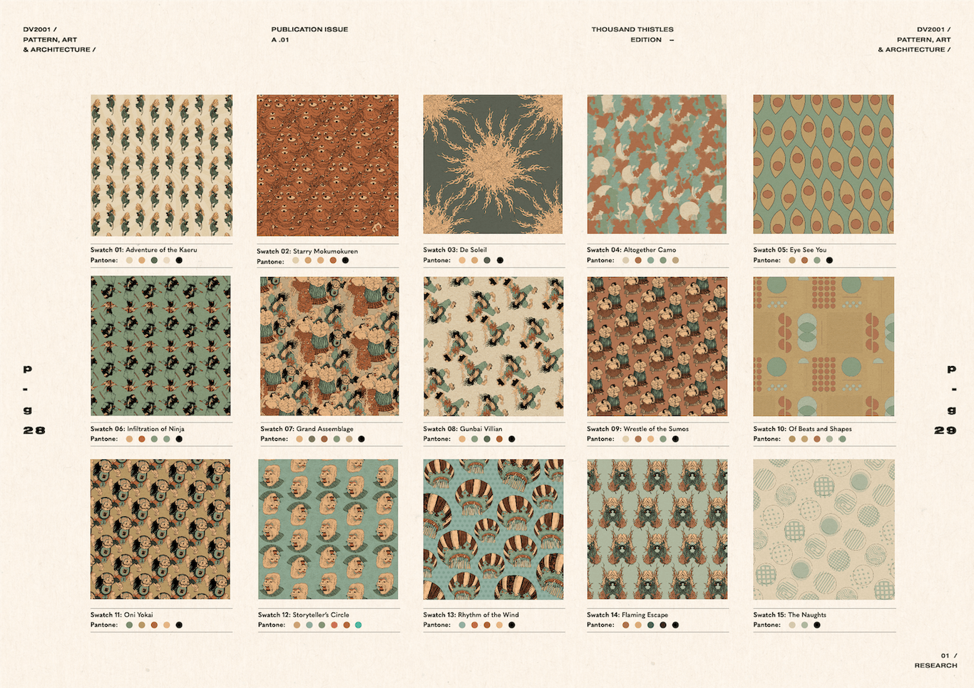
Why Thistle flower: Like its rough exterior, Thistle is the name of a flower that acquaints with aggressiveness, pain, protection and pride. The significance of a Thistle flower is defined as not only the flower but also its weed. Though the weed is commonly associated as a parasitic organism, it is valued to symbolise not just might and brilliance; but also poverty and weakness. Alike to the notable warriors during the Japanese Edo period, their role was to defend their territories against rivals, to fight enemies identified by the government, and battle with hostile tribes and bandits. Overall, these Heroes are respected and worshipped because of their dexterity and heart for their people. This composition focuses on the retelling of Ancient Folklore in a campfire setting, where the fire is used as a repetitive motif that embodies the power of destruction, yet contains generative qualities to illuminate and renew — Just like these warriors.
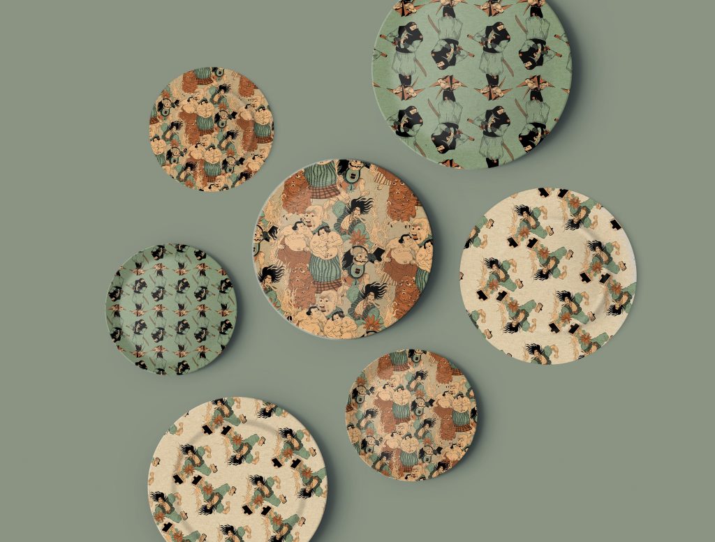
/ PATTERN SWATCHES
These series of pattern swatches are created based on the idea projected on a Japanese concept restaurant. The collaterals envisioned largely includes – Decorative Restaurant Wallpaper, Cutlery Set, Bowls and Plates, and Merchandises that will be made available for in-store purchase. Committing to the earthy tones palette, the interior style should look vintage, almost like an old painting with the richness of brown hues.
/ CHARACTER DESIGN
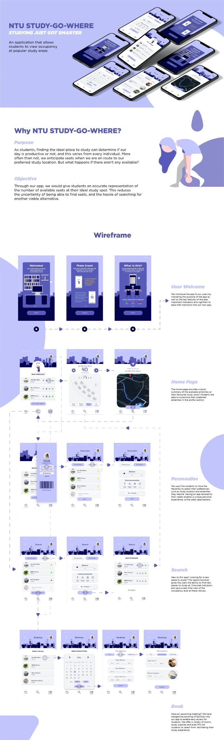
Project 3: UI/UX Interface Design
Purpose: NTU STUDY GO WHERE
Theme: Creating an app to enable NTU Students to source for study seats during off/on-peak periods, within all study areas on campus.
Scan QR Code to view app on mobile:
/ REFLECTION
This project was the first UI/UX assignment that kickstarted my interest in this field. Having only a film & design diploma from polytechnic and a visual comms major in university, this area is still pretty new to me. However, I do see the similarities in terms of creating an intuitive design that is centred around the user, alike to graphic design in some sense. It was a fun and meaningful project at the very end of the day.
[Share your analysis of the creative portfolio/branding presence of the person you chose for your creative industry presentation] [What are the main platforms that the artist/designer uses to communicate their brand?]
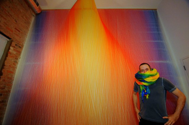
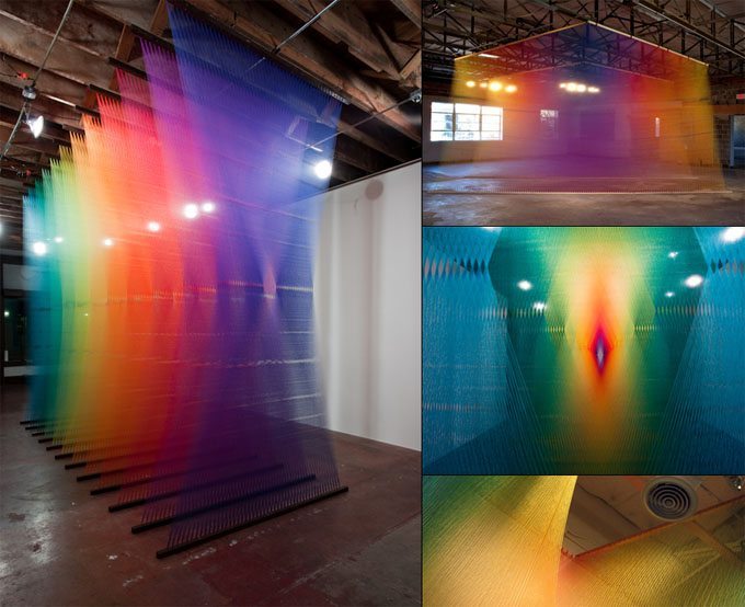
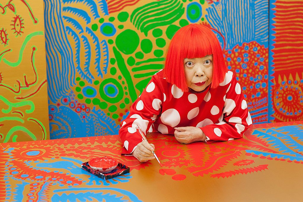
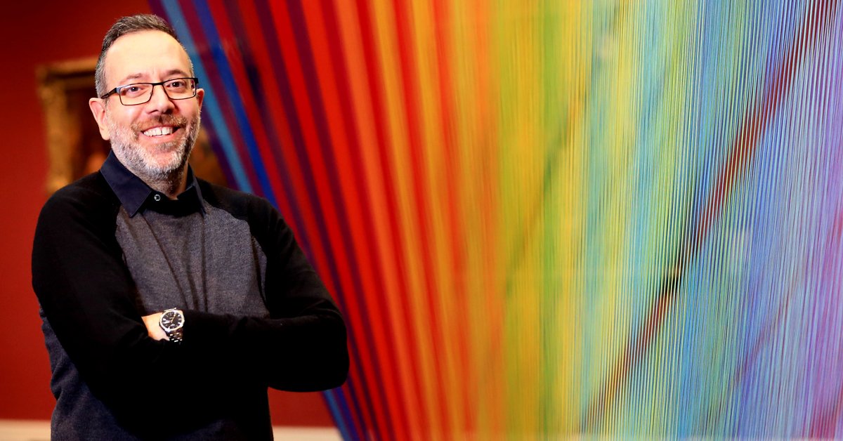
Artist/Designer – Gabriel Dawe
Dawe is a Mexican artist from Texas whose work is based on investigations of the visible spectrum of light. He largely gained renown for his Plexus series of installations of sewing thread.
Dawe’s Website | Dawe’s Instagram | Dawe’s Facebook | Dawe’s Twitter
Dawe’s appearance on Interview for Smithsonian American Art Museum:
Dawe’s appearance on Art & Seek Interview:
Also, see Dawe’s Interview with MyModernMet here.
[How do they utilise each platform effectively?]
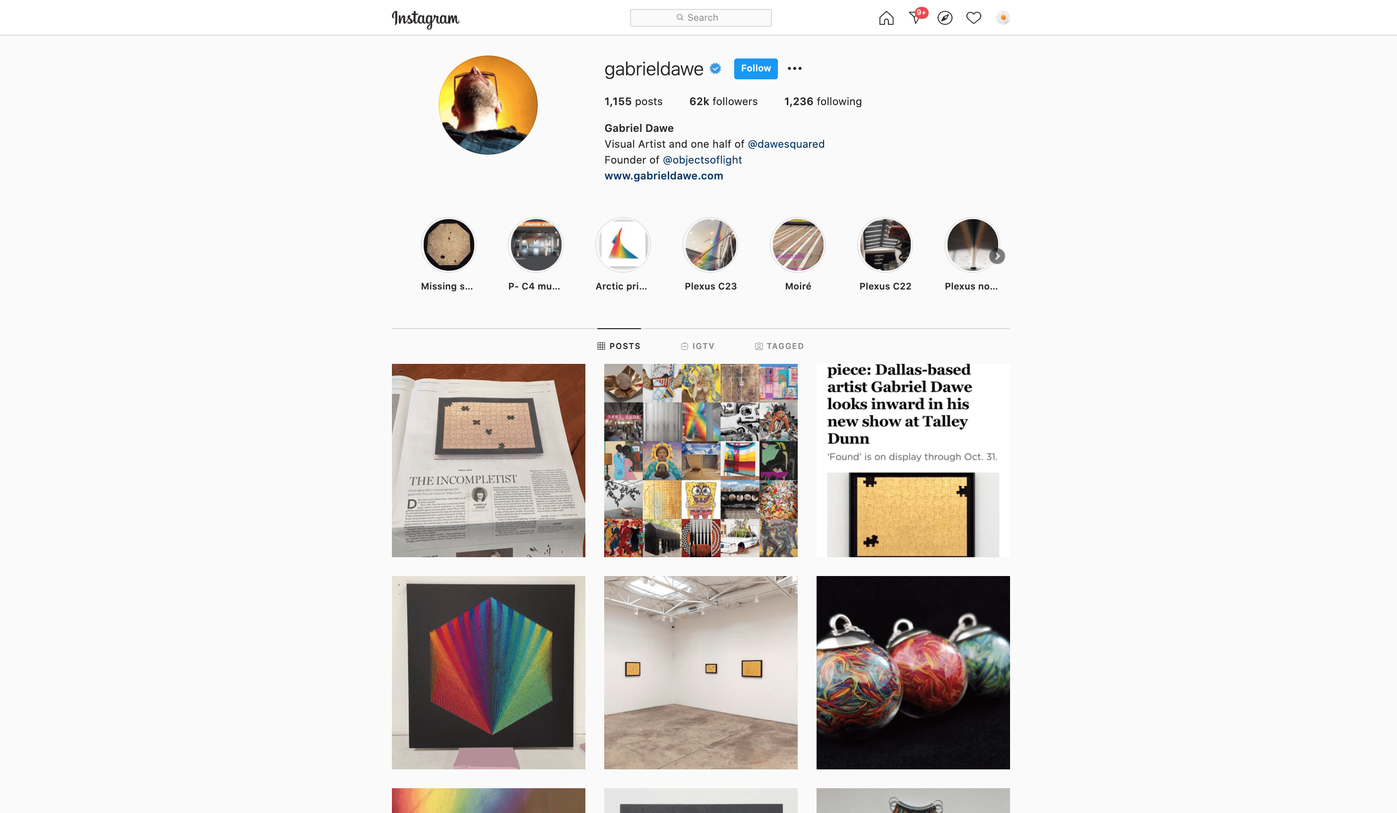
Artists like Gabriel Dawe try to get more followers on the mainstream social platforms in order to stay competitive and relevant in today’s fast and rising tech culture. Gabriel uses Instagram for example to receive people’s feedback and orient public discourse. He would post his work in progress and his final installation on his feed to ensure that the masses are kept up to date with his latest buzz. This is also great for publicity especially when he spends so much time setting up and curating an installation. Dawe uses Instagram to his advantage to reach a global audience, beyond just the city of Texas. Instagram also serves as Dawe’s secondary portfolio page (apart from his main website), as the feed layout provides a concise collection of his artworks in chronological order.
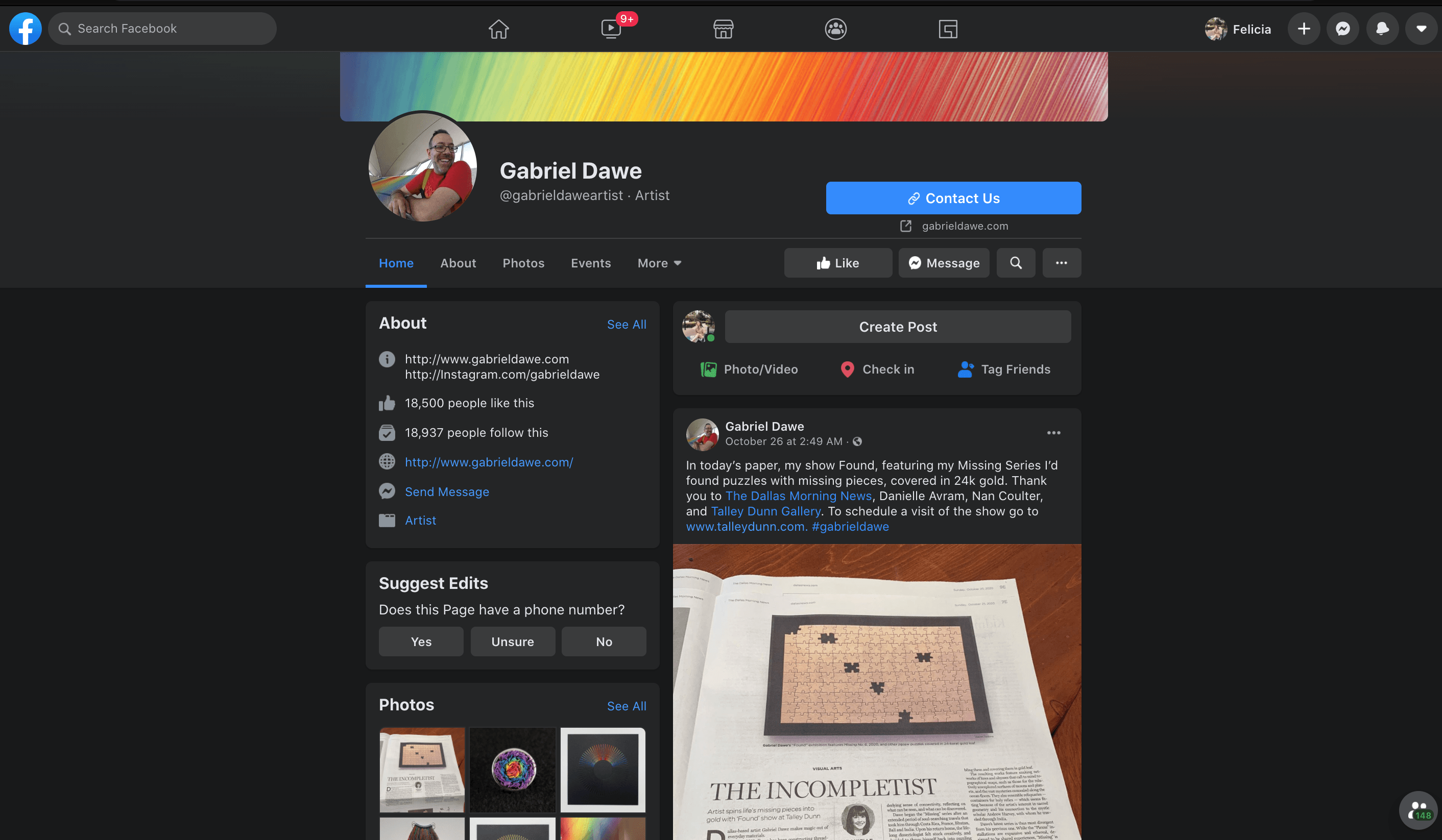
Dawe streamlined all of his updates and latest activity across all of his social media platforms such as Twitter and Facebook to his Instagram so that he doesn’t have to manage his activities separately. This effectively saves him time and yet, at the same time, he is able to update to different masses that reside on different media platforms.
Dawe also accepted several face to face and recorded interviews to increase his publicity. On the Youtube Video attached above, Dawe is seen on an interview with the Smithsonian American Art Museum where they provided snippets of the artist working on-site from start to end so that people understand his thought process behind his installation and how it is accomplished with specific tools and plannings. By doing this, Dawe can potentially increase his exposure to more of the museum-goers and art enthusiasts, a technique to market and sell his art to possible future clients and collaborators.
[What did they do in their biography to communicate themselves effectively?]
/ An abstract of Gabriel Dawe’s biography from his website –
“Originally from Mexico City, Gabriel Dawe creates site-specific installations that explore the connection between fashion and architecture, and how they relate to the human need for shelter in all its shapes and forms. His work is centred in the exploration of textiles, aiming to examine the complicated construction of gender and identity in his native Mexico and attempting to subvert the notions of masculinity and machismo prevalent in the present day. His work has been exhibited in the US, Canada, Belgium, and the UK. After living in Montreal, Canada for 7 years, he moved to Dallas, Texas, where he obtained his MFA at the University of Texas at Dallas. For the final two years of his degree, he was an artist in residence at CentralTrak, the Artist in Residency program at UTD. His work has been featured in numerous publications around the world, including Sculpture magazine, the cover of the 12th edition of Art Fundamentals published by McGraw-Hill, and in author Tristan Manco’s book Raw + Material = Art.”
Alongside with his education background and his featured solo/collaborated exhibitions around the world. Here is an example of the presentation:
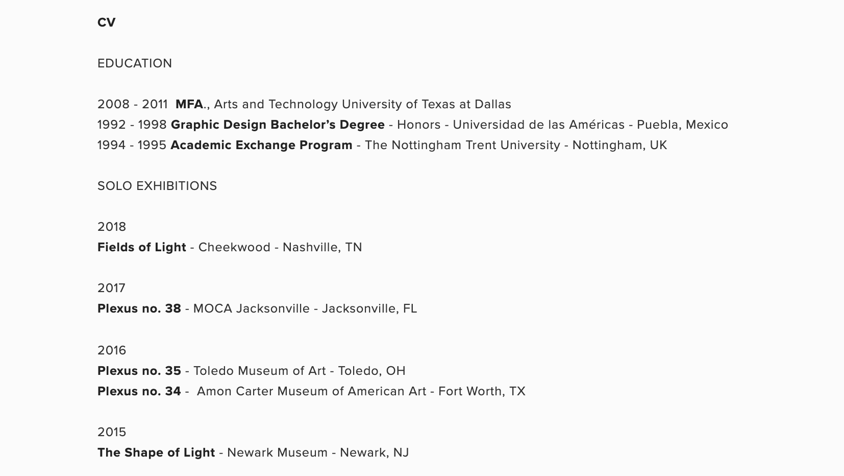
Gabriel Dawe is highly detail-oriented when it comes to the documentation of all of his past and current exhibitions. I feel that by doing so, he is able to successfully showcase his expertise and experience in his area of work, which all in all proves that he is a competent and trustworthy artist no matter where he goes.
Besides that, with all of the details recorded on his biography, people is able to search on google easily if they are interested in a specific installation from a specific site/place. This effectively prevents confusion as he logged down all of the minute details.