Monthly Archives: October 2017

間 MA’s City of Voids: Soundscape & Model

Hello World!

To kickstart the post for City of Voids, our first lesson focused on the idea of making music and translating intangible sounds into tangible 3D Models. As such, here we have our sounds (sound 1 & 2), do give it a listen!

Sound 2:

Sound 1:


Sound 2 is created with these instruments:

Left to right: Finger Cymbals, Egg Shaker, Metallophone

Sound 1 is created with these instruments:

Left to right: Finger Cymbals, Rhythm Sticks, Metallophone


Shots of my 3D Model:


Calculations that made up my Model:

Tone Bar: 8 beats

Finger Cymbal: 1 beat + 3 seconds of echoes = 4 beats of 8

Rhythm Sticks: 2 beats of 8

Tone Bar: Dominant – Long note. It is the recurring beat that repeated itself throughout the entire time, like the skeleton that supports the ongoing melody. The duration of the sound is long since it is heard most of the time. Since the material of the instrument is made of metal and it gives off a metallic sound that reverbs constantly in your ear, I did a see-through wired concept for the sound box. It brings about the idea of airiness and reflects the metal-like “clanking” noise made, hence the material choice.

Finger Cymbals: Sub-Dominant – Long, echoey note. This beat lasts for roughly 5 seconds whenever it was cued to ring. The ringing has a reverberation effect that stretches and fade off. The shape of the metal is shaped into 3 spheres so as to reflect the idea of roundness and echo in the sound produced. This is the image I formed in my head when I think of the sound it created.

Rhythm Sticks: Sub-Ordinate – Short note. The reclining “steps” that spirals diagonally across the cube emphasised on the consistent rhythmic beat from the melody. I imagined it to be the supporting beat on top of the base note (Tone bar), giving the melody and an extra something.


The Direction of Soundwave: 

Yellow: Dominant (Tone bar) | Blue: Sub-Dominant (Finger Cymbals) | Red: Sub-Ordinate (Rhythm Sticks)

Recorded Soundwave Pattern:


Will see you in the next post! Ciaos.

Project EGO: Colours Research

Hello, World!

Finally, we’re on the final project of the semester – Project EGO. In this assignment, we will be venturing into Colour Theory and how they fit in together in order to work in harmony. Here is my research on the Color Theory!

Without further ado, let’s begin!


The Colour Wheel

https://imgur.com/gallery/HAy6MWj


PRIMARY COLOURS

Primary colours are known as source colours, meaning that they cannot be made with mixtures of other colours.

consist of red, yellow and blue


SATURATION

The intensity of a single colour.


VALUE

The relative lightness and darkness of a single hue.


MONOCHROME HARMONY

A play in tonal value and intensity of a single colour, enhancing the style and thematic of the main hue.

MONOCHROMATIC PHOTOGRAPHY WORKS:


http://swipe.swipelife.netdna-cdn.com/wp-content/uploads/2014/11/Monochrome-Photography-Collection-Featured-by-The-Big-Picture-swipelife-2.jpg?aec60b

https://i.pinimg.com/originals/87/02/71/87027129ffe5c8d7a97fe63209cae8b9.jpg

MONOCHROMATIC PAINTINGS:

http://johnmyersart.tumblr.com/

https://www.flickr.com/photos/30666896@N06/3156790785/in/photostream


ANALOGOUS HARMONY

Colours that sit side by side on the Colour Wheel. The colour scheme that is most pleasing to the eyes since the transition of colours are sooooo gradual. (E.G. yellow, orange, green)

ANALOGOUS PHOTOGRAPHY:

Colors involved: Yellow, Orange, Green! Thus making it an analogous scheme.

ANANALOGOUS PAINTING:

https://www.flickr.com/photos/daviesjane47/17339031348/in/dateposted-public/


COMPLIMENTARY

They are colours that lie opposite to one another on the wheel which in turn creates a strong contrast! (E.G. red & green, blue & orange)

COMPLIMENTARY PHOTOGRAPHY WORKS

http://idolza.com/qz/r1130y6/photography-contrast/aa3603/

COMPLIMENTARY PAINTING


SPLIT COMPLIMENTARY

Created by joining a hue with the two hues beside its complement. (E.G. blue with red-orange and yellow-orange)

SPLIT COMPLIMENTARY PAINTING


TRIADIC

 Made up of three hues equally spaced around the colour wheel which creates an energetic set of colours with divergence given how the three hues are spaced so widely apart on the colour wheel.

TRIADIC PHOTOGRAPHY WORK

TRIADIC LOGO:


Here we see how colours work together in order to create a harmonious-looking design and it is a key component to any forms of design. (e.g. logo design, graphic design, illustrations, photography)

Well, I’ll see you in my next post.

Ciaos! 


Forrest Gump: Layout Development

Hello, World!

To refresh your memory, my selected movie is Alice in Wonderland. All of my quotes will be based solely on that film.

Alright, let us begin! (Warning, long post ahead!)


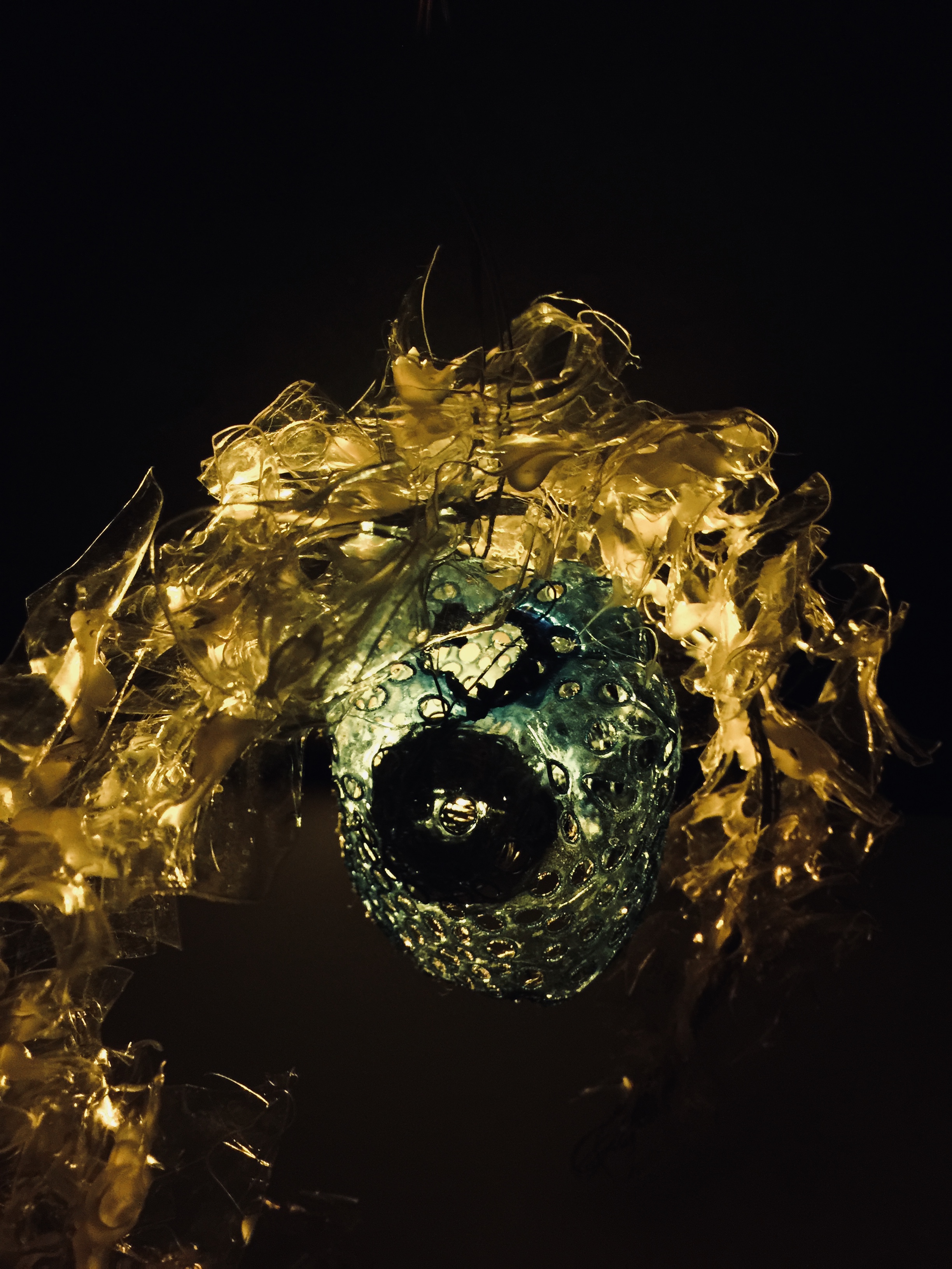
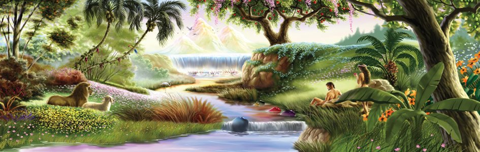
Artist References: DAN HILLER

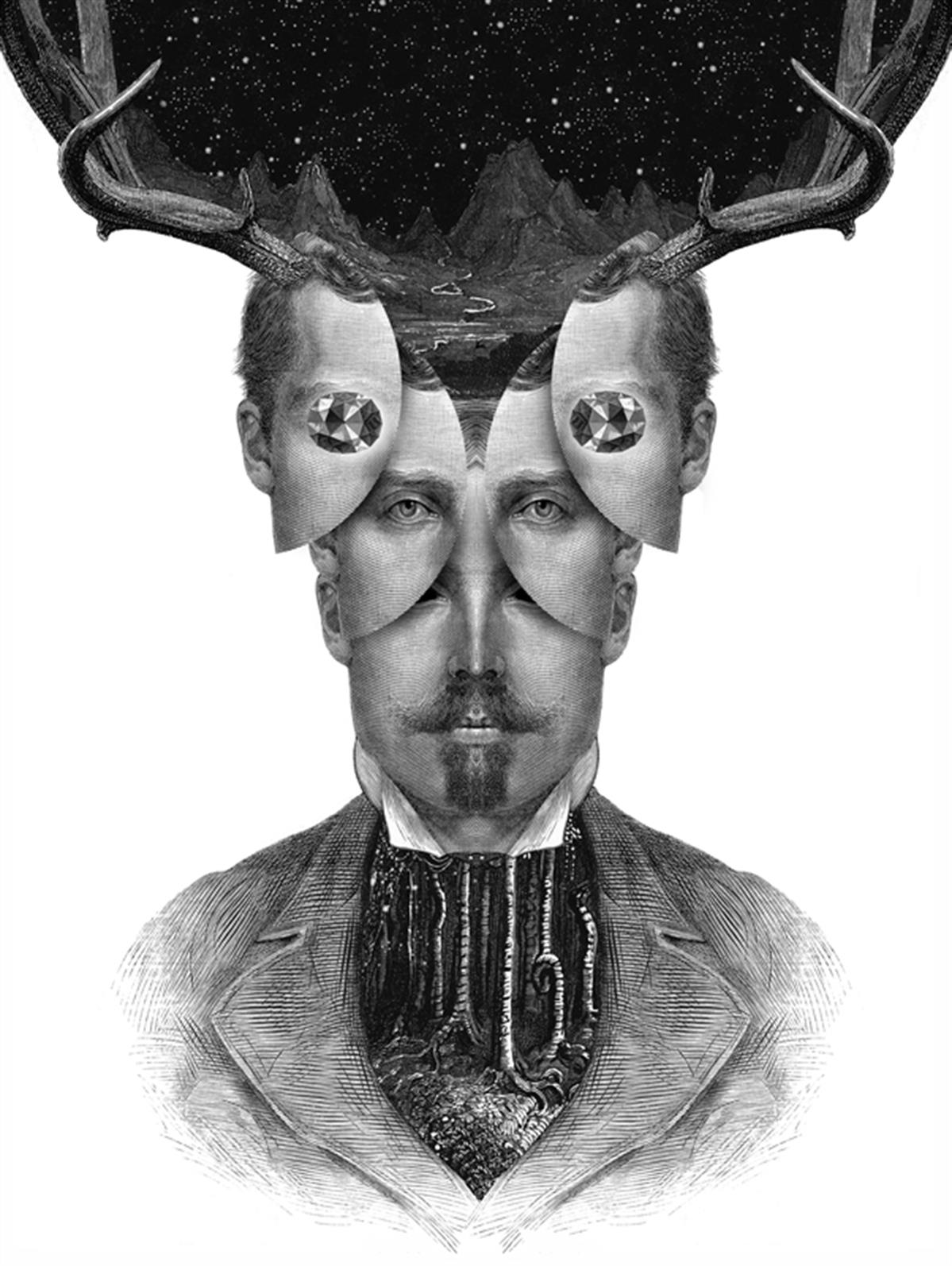
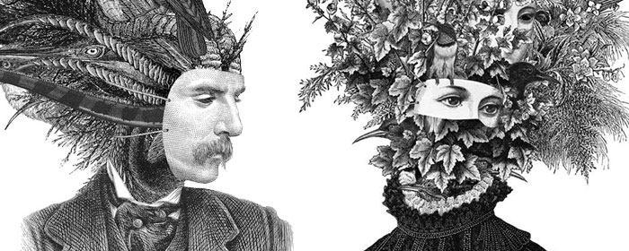
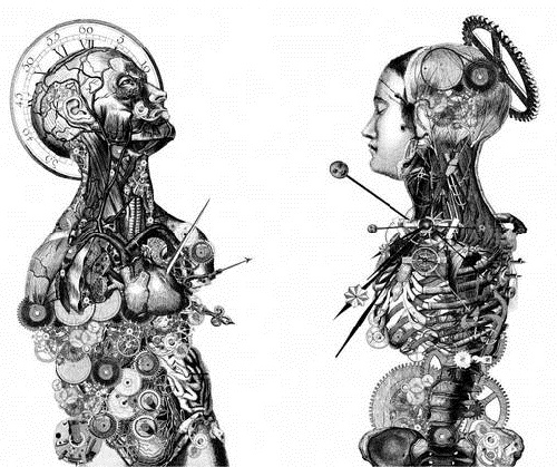
I adore his surrealistic put-together of his graphic choices. The collage looked so natural and intriguing; especially the above concept!! ^ (That hollow eyes though)


Execution:

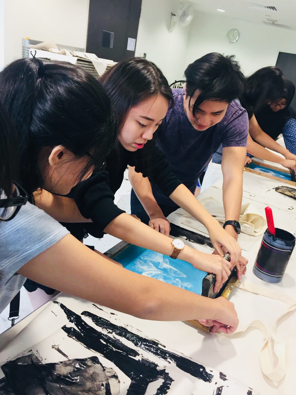
I intend to focus on improvising Design 3 & 5. These are my personal favourite of the lot! Might be using it for silkscreening hehe.
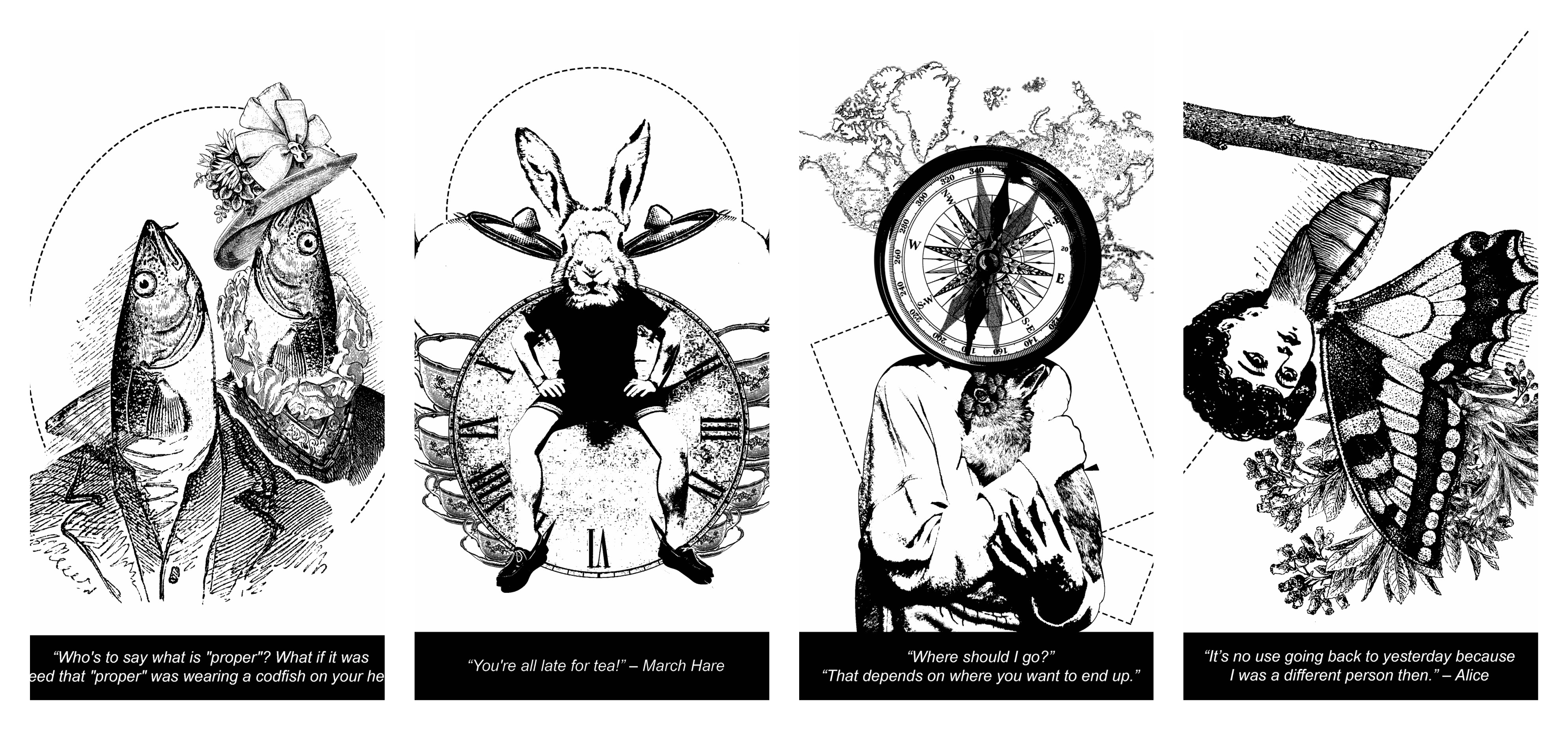
DESIGN 1:

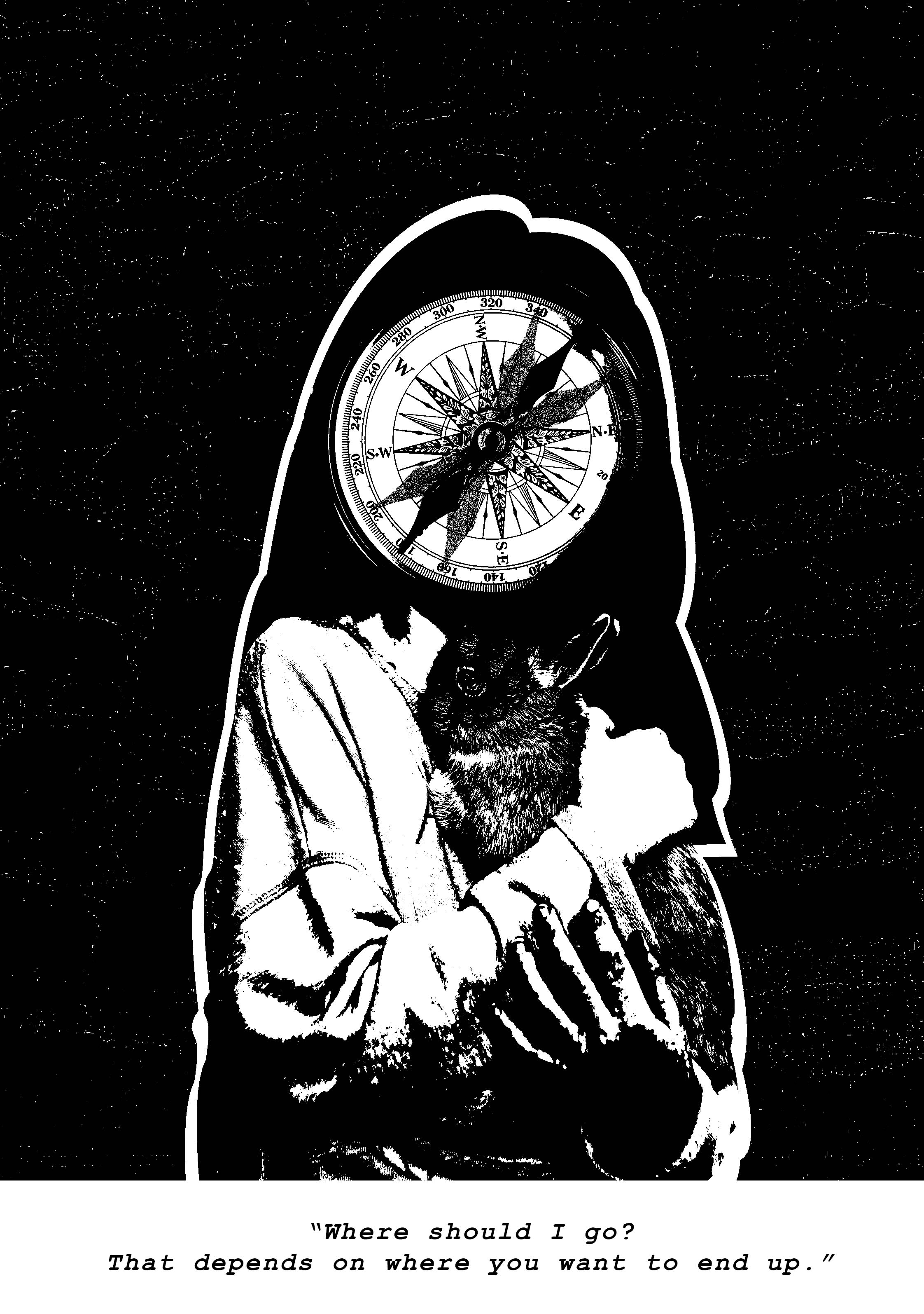
Elements: Compass, Rabbit, Girl, Starry Background

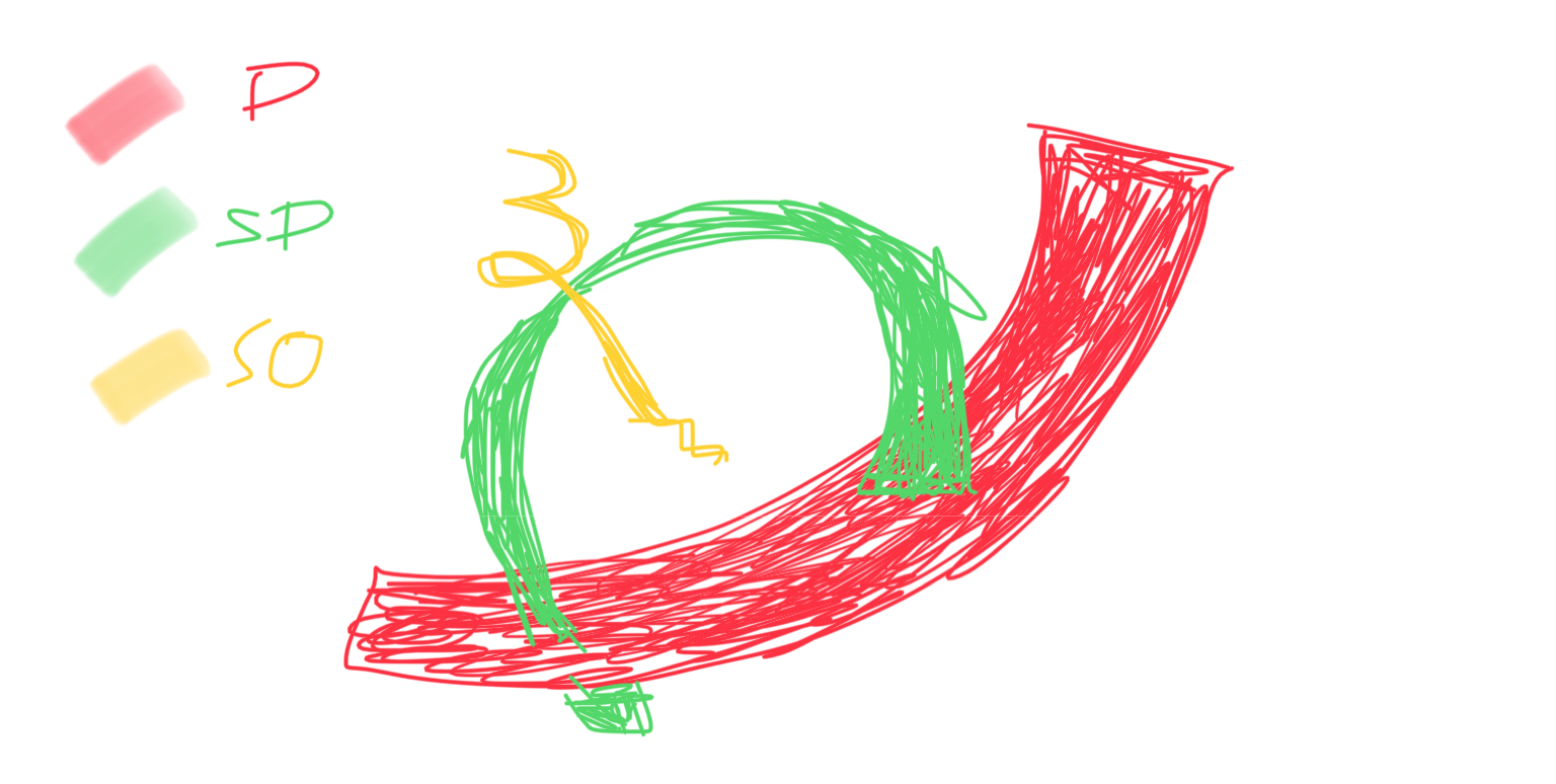
Rationale: In the background, we have a bunch of stars. There is a song that goes “but are we all lost stars, trying to light up the dark”. So the stars literally symbolize a sense of loss. In the foreground, the girl’s face has been replaced with a compass. The purpose of a compass is to lead and guide the lost. However, Alice wasn’t sure of her heading, this explains why there is more than one needle on the face of the compass. This symbolizes confusion. A little girl’s body portrays the character’s innocence and her innate naiveness. While rabbits are most often associated with desires, comfort and stability, it reflects what the character is truly looking for.

Further Improvisation:

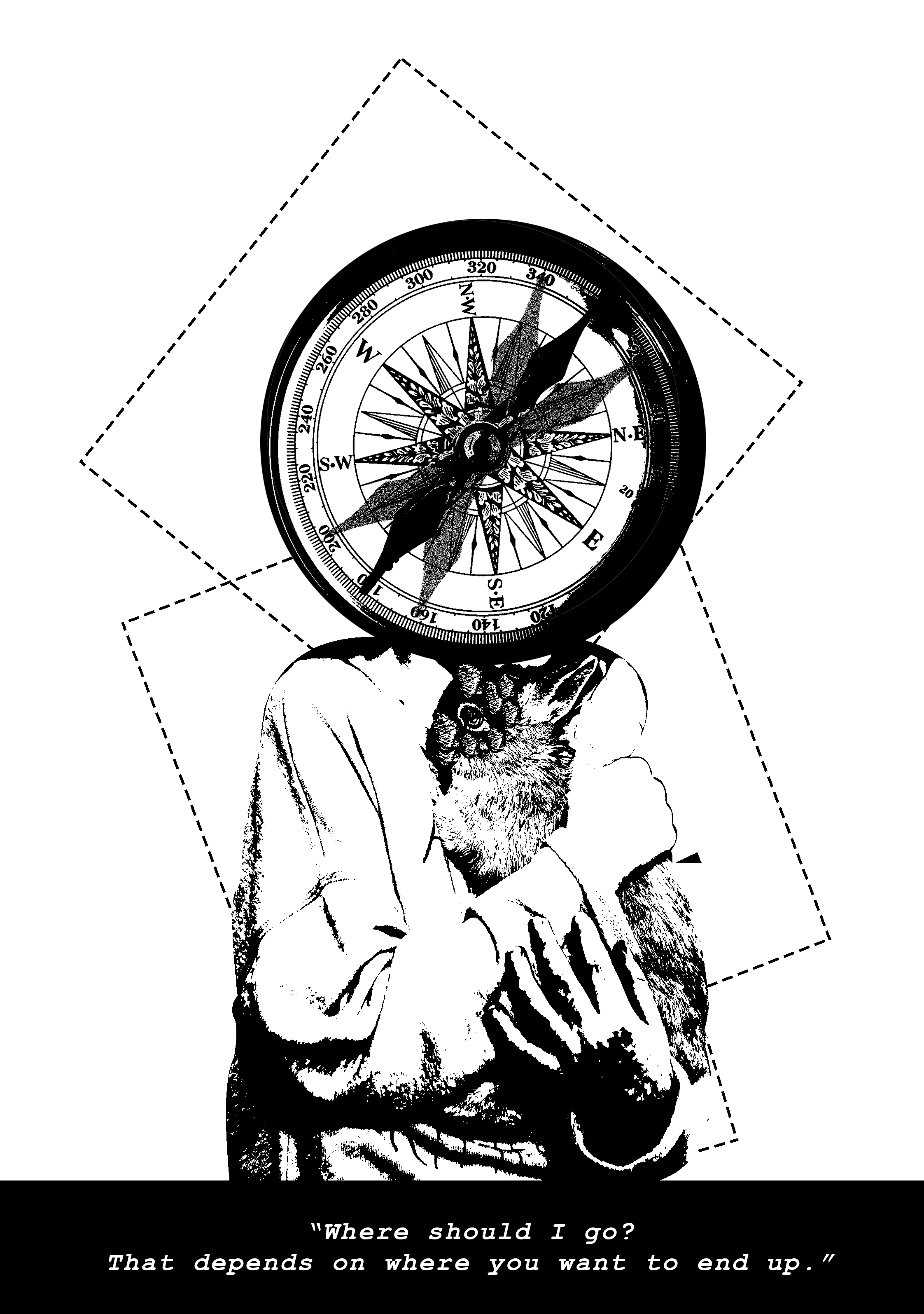
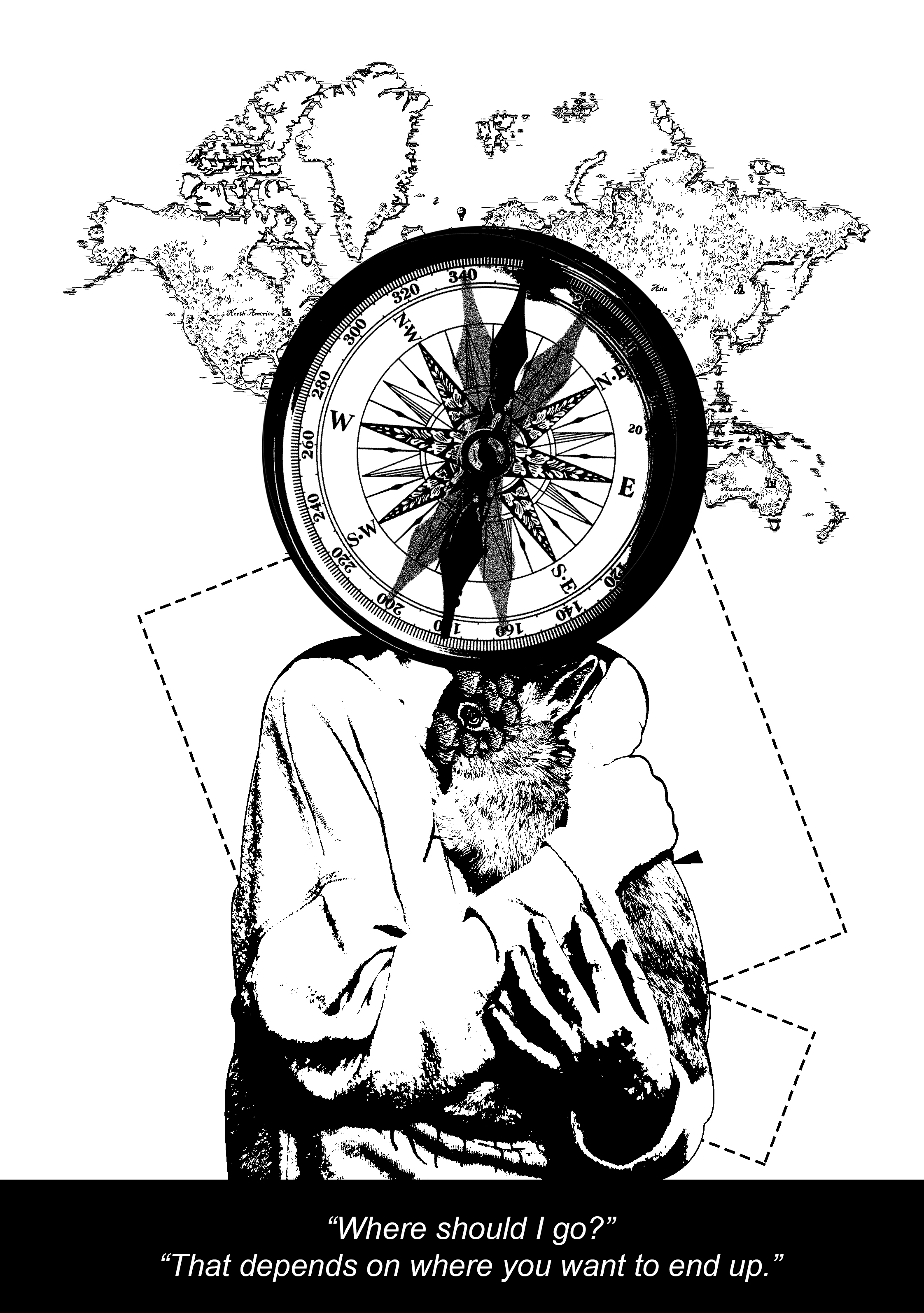
I wanted my design to have more depth (foreground & background). In my opinion, the previous attempt looked unsatisfying. Like its lacking of something you know! However, at this stage, I am looking at having one similar theme/concept for my 4 quote designs, so it ties in nicely together (e.g. dotted line shapes in the background) Since all the quotes are from the same movie anyway. I added a world map to further accentuate the idea of loss.


DESIGN 2:

http://thefashionjumper.com/wp-content/uploads/2016/05/Alice-in-Wonderland-gif-18.gif

Elements: Hare, Boy, Antique Clock, Tortoise, Girl

Rationale: My intention of having 3 clocks in the background is because it adds on to the whimsical effect, as of the movie. Play of negative and positive colours help make the middle clock stand out better. Rabbit and tortoise are 2 contrasting animals, which are often used as examples to illustrate fast or slow movement. A metamorphosis of a boy to a rabbit shows that the March Hare has the ability to think like an actual human. While the representation of a girl’s head on a tortoise represents the guest that was late for the tea party because they were slow (like a tortoise haha).

Feedbacks: Confusing juxtaposition of 2 animals, can do without. Switch the negative clocks to a more symbolic element – e.g. teapot/teacups. Reduce the black areas

Further Improvisation:

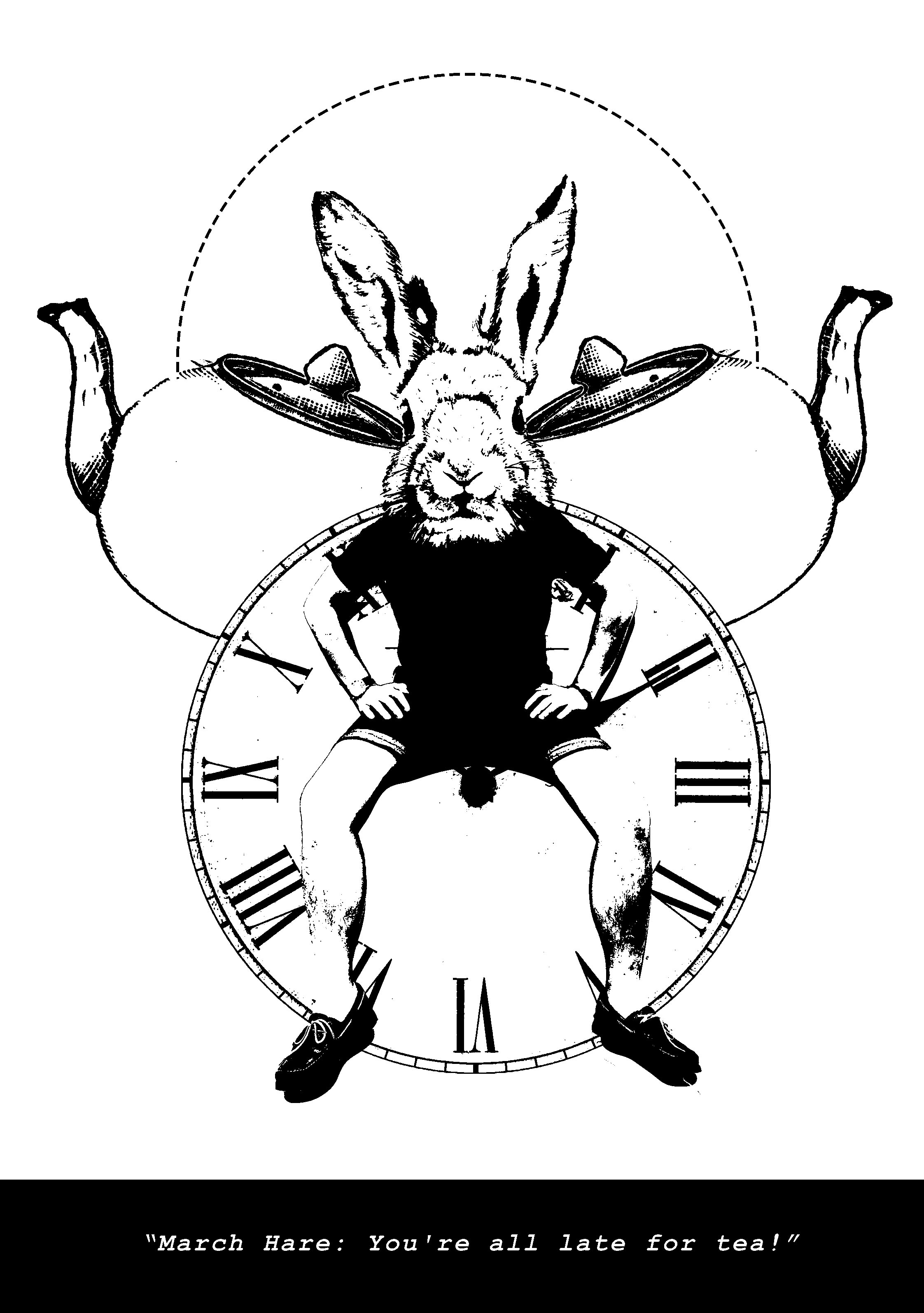
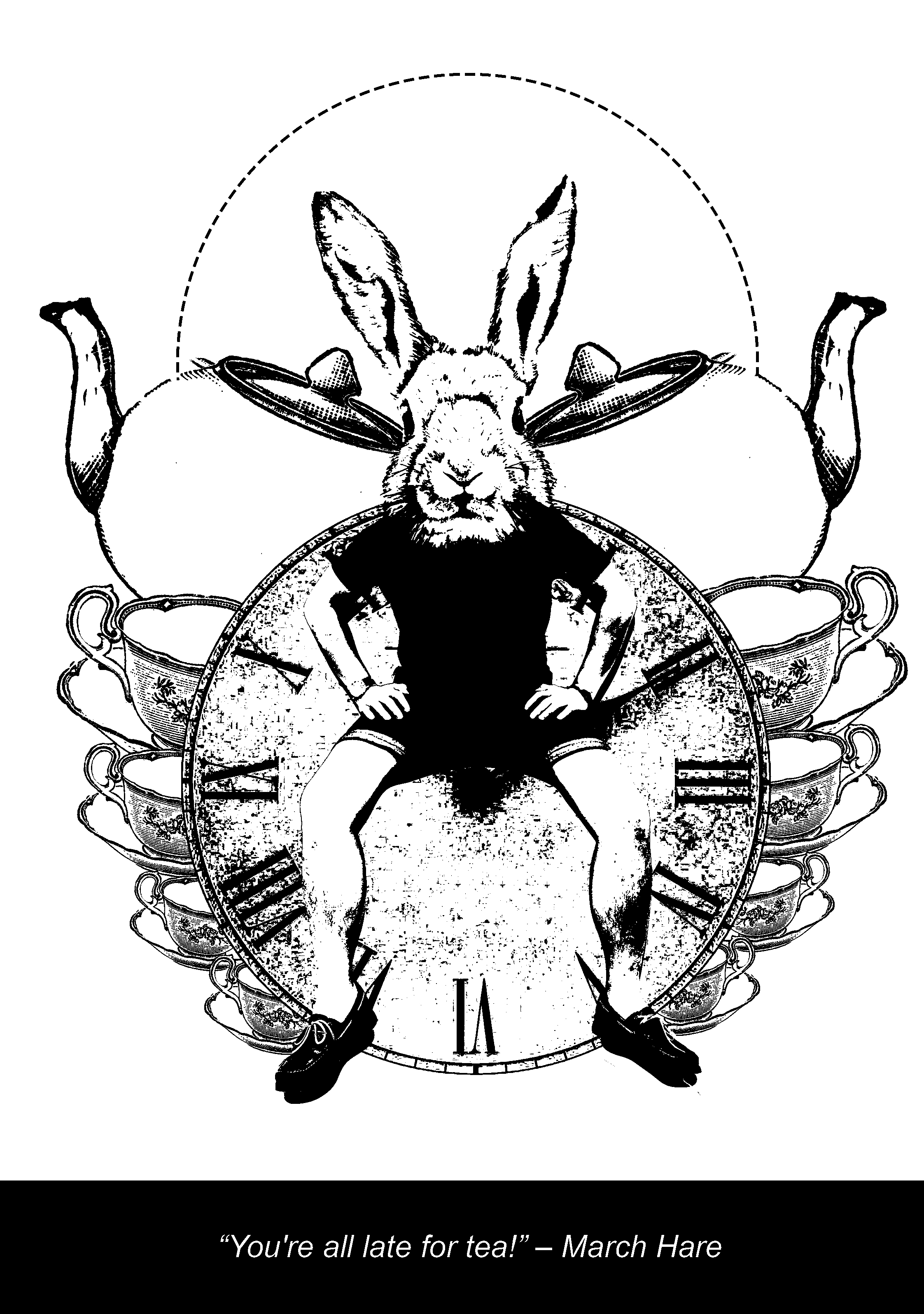
In the second layout, I added in teacups since it looked too plain for my liking. It added on to the idea and flow of symmetry to my design. I have added in the dotted line element for this as well!


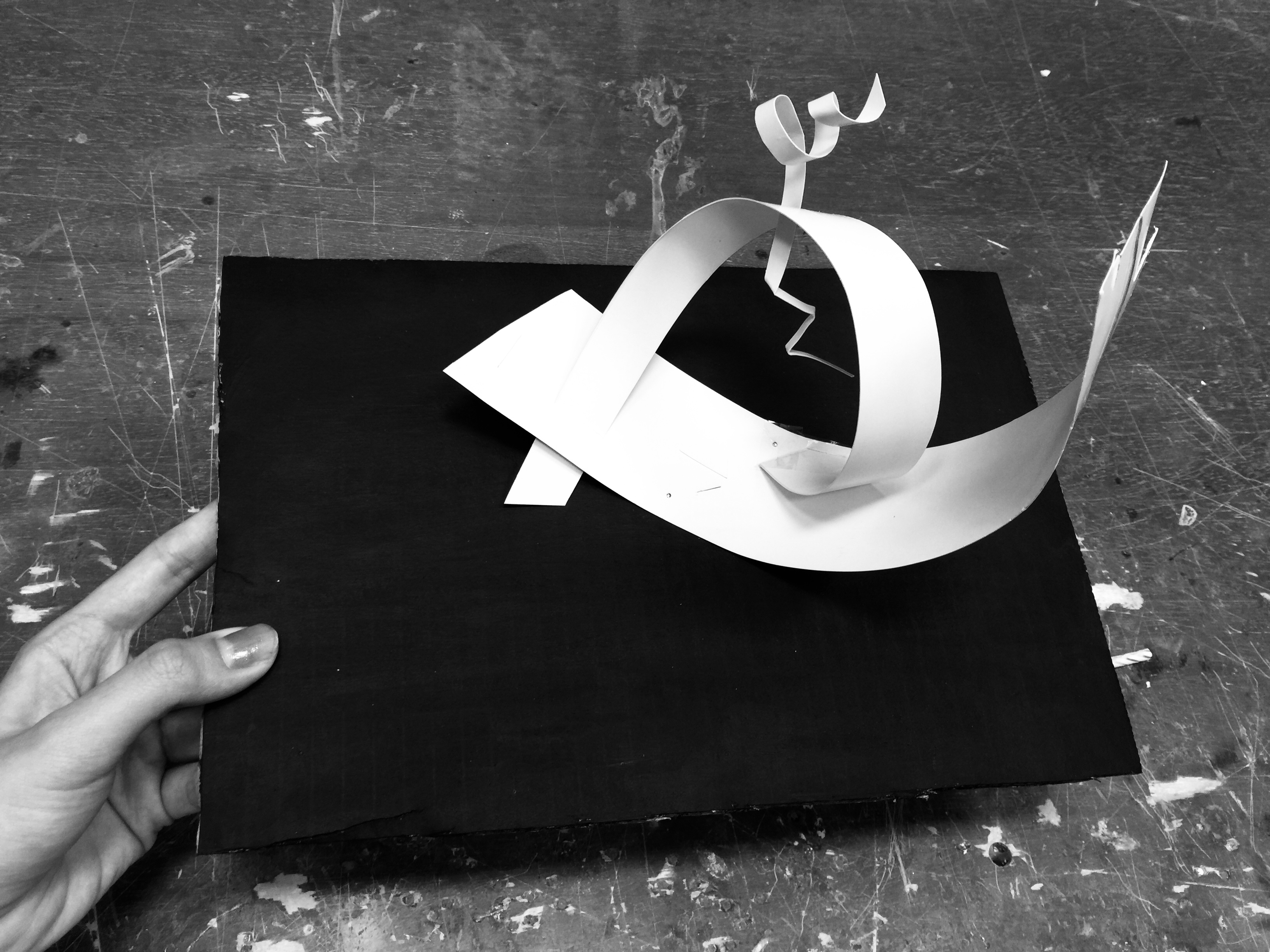
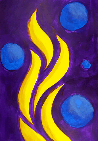
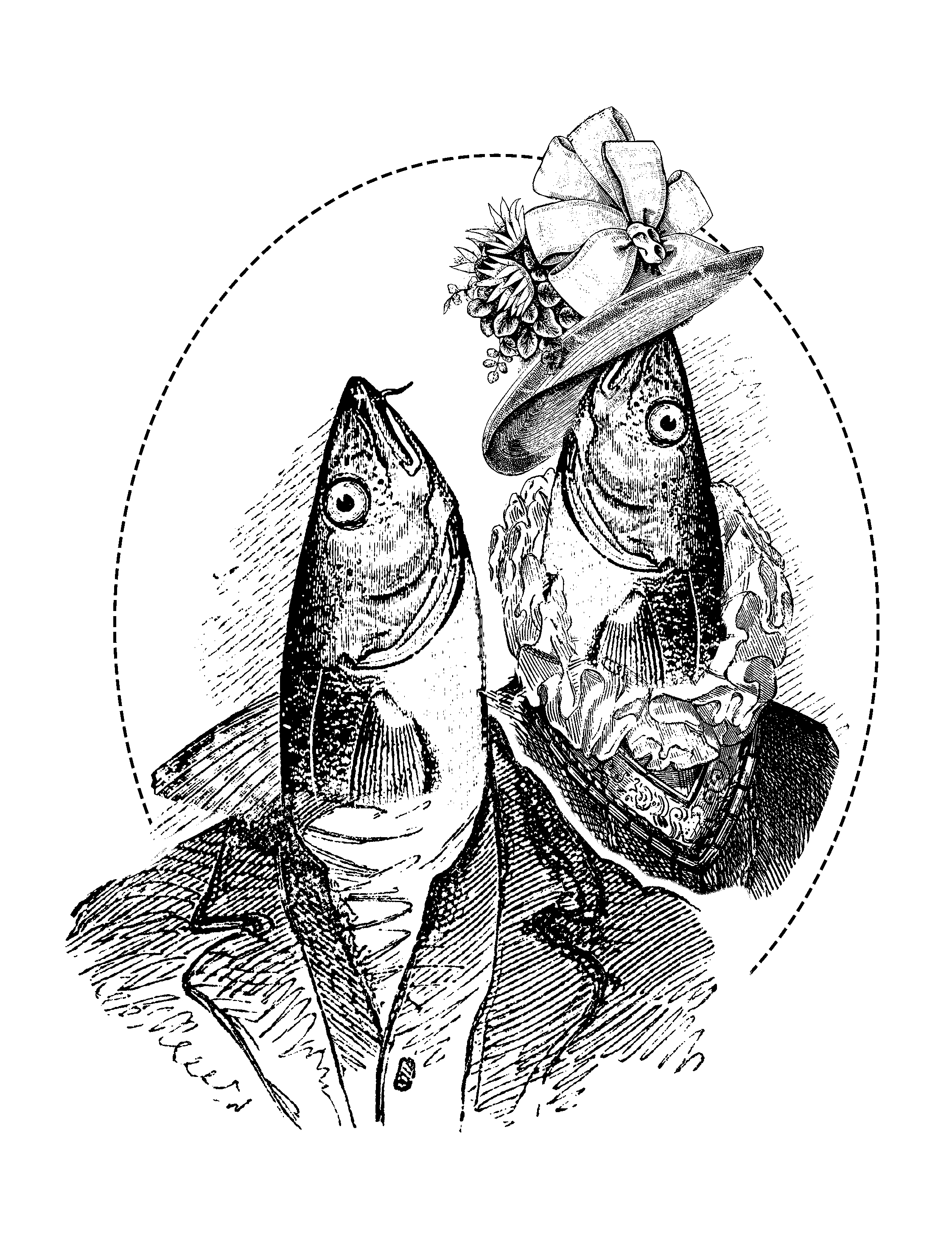
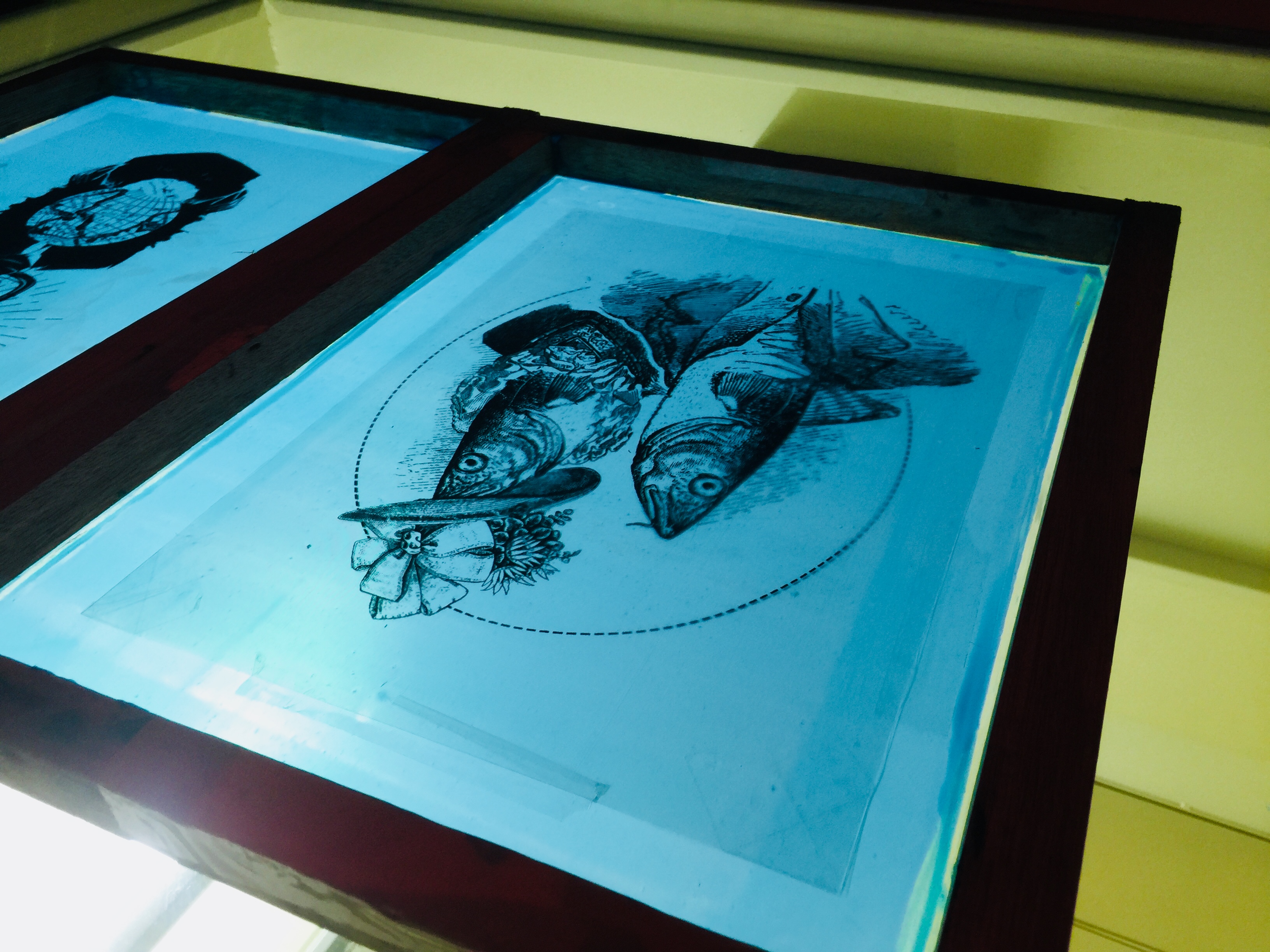
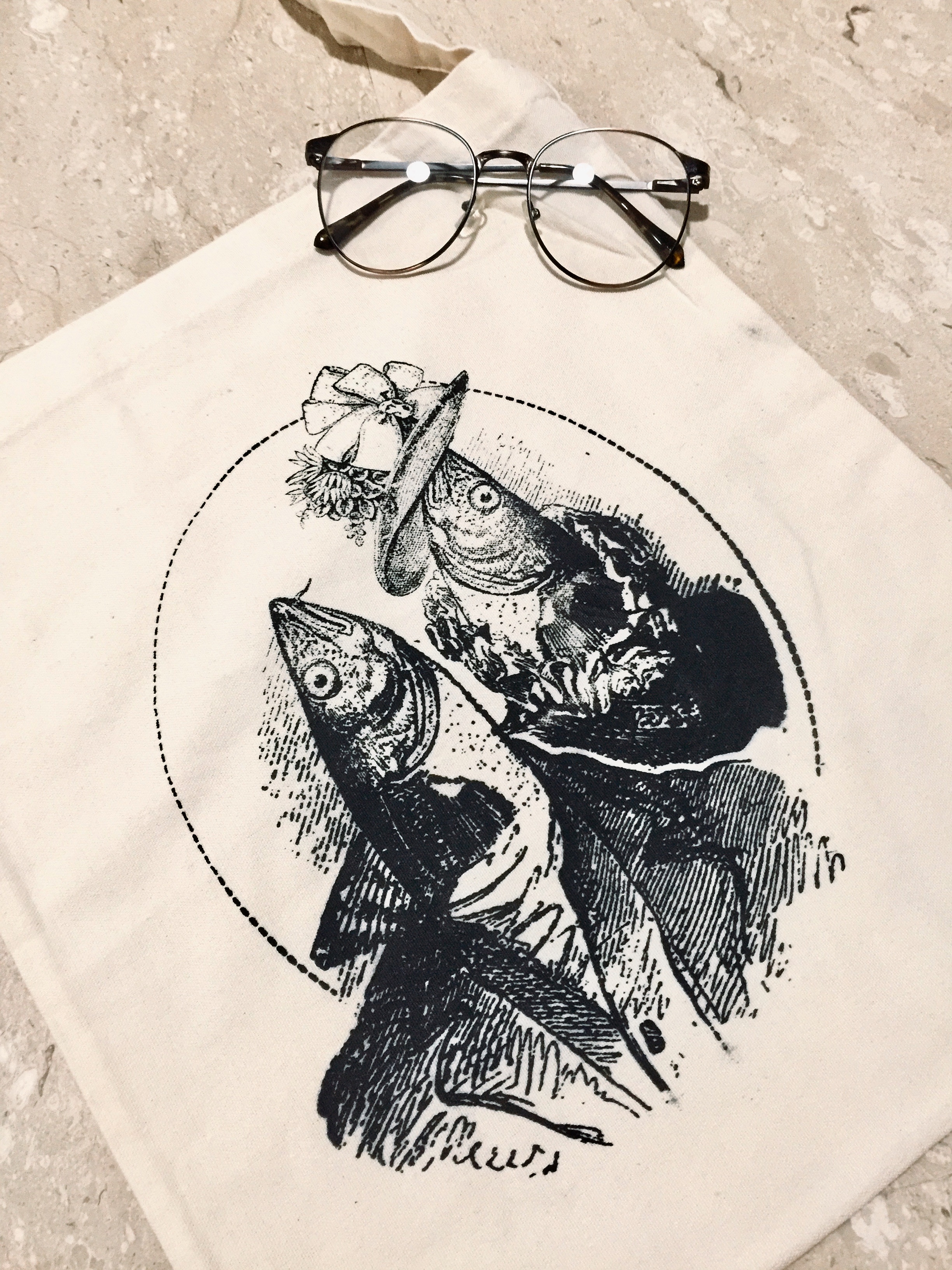
DESIGN 3: (This ma fave)

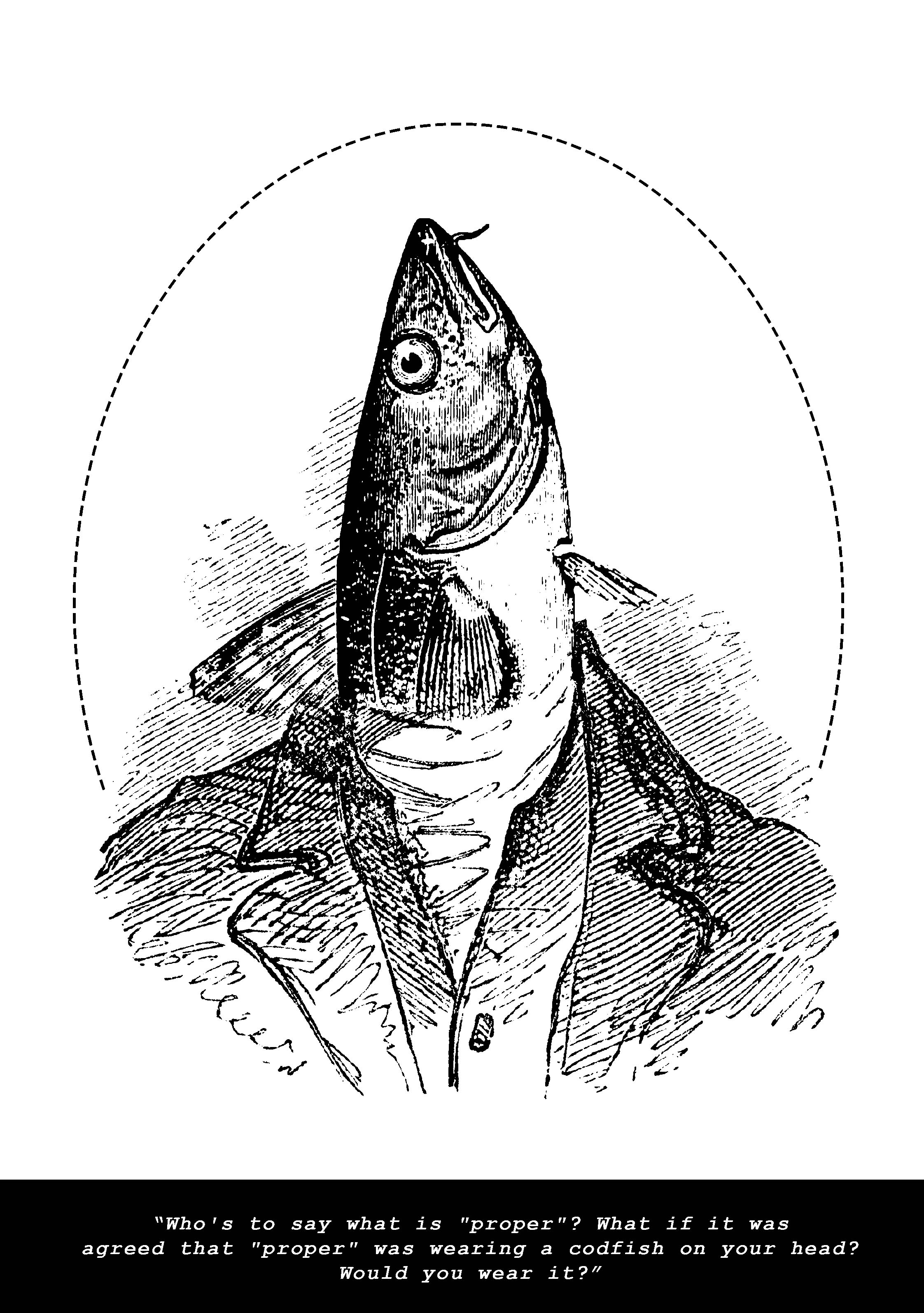
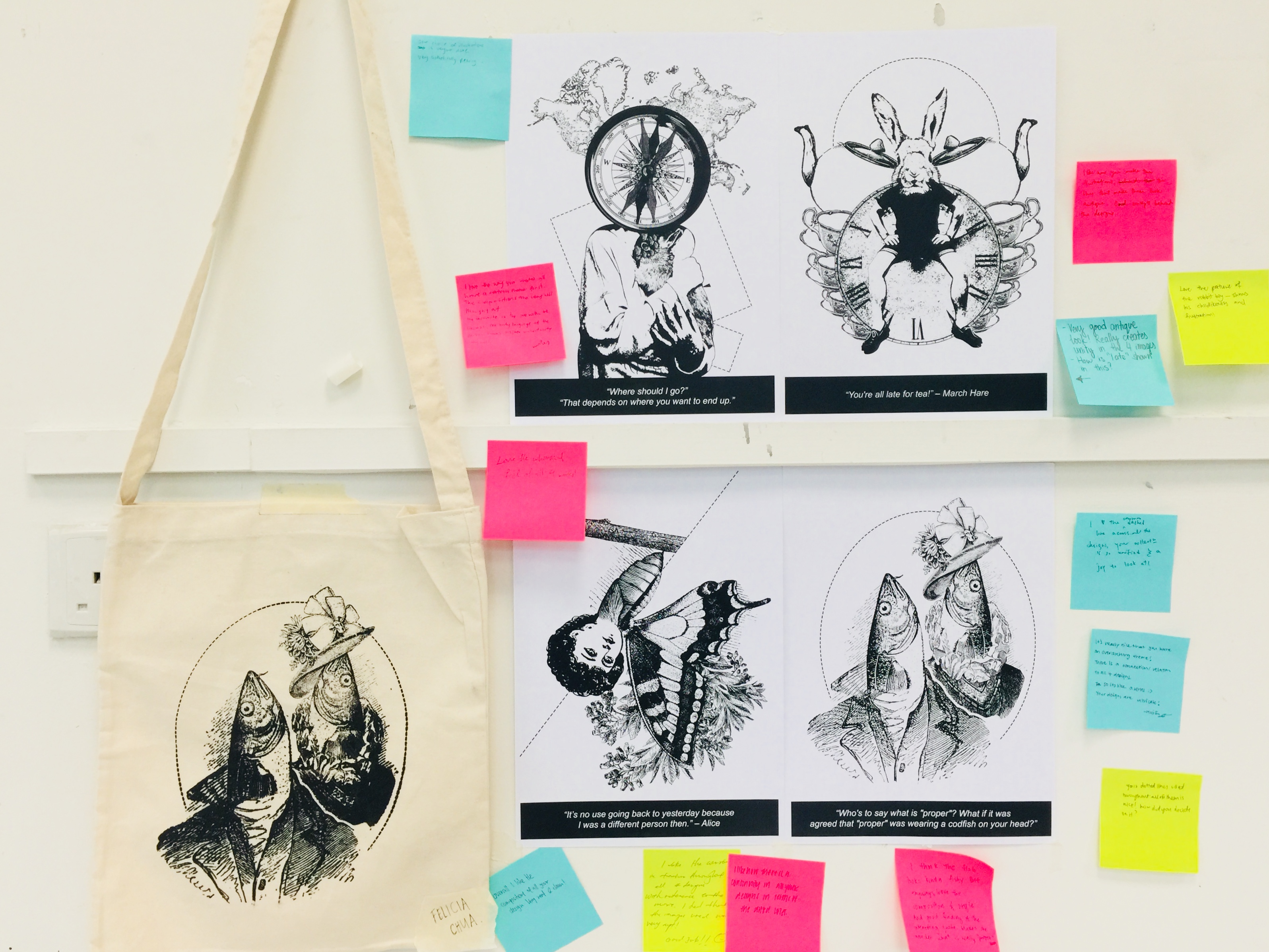
Elements: Cod Fish, Man in Suit

Rationale: The Cod Fish was literally placed in the spot where his head once sat. This shows the lack of thinking and simply blindly following the social norms. Since the setting of the movie was in early 1865, a man in vintage suit would better pull of the meaning as well as origin behind the storyline, while staying true to the movie plot. The dotted circle is a design element that aims to bring focus to the main design in the middle.

Feedback: Design can include a collage of different people wearing different outfits that consist of the Codfish element. e.g. Andy Warhol’s collage style

Further Improvisation: (prefer the first one better because it fits the woodcut aesthetic)

Justification: The quote was said by Alice to her parents, who, with good intentions, forced her to into a wedding proposal with another guy whom she does not favour. She was determined to not follow the standards that society has set (where young girls married young). This statement on “Who’s to say what is proper…” is focused on delivering the idea that her parents are morbid in their beliefs, and their refusal to look past traditional values that imprinted on their ideology. The two fishheads represent Alice’s parents.


DESIGN 4:

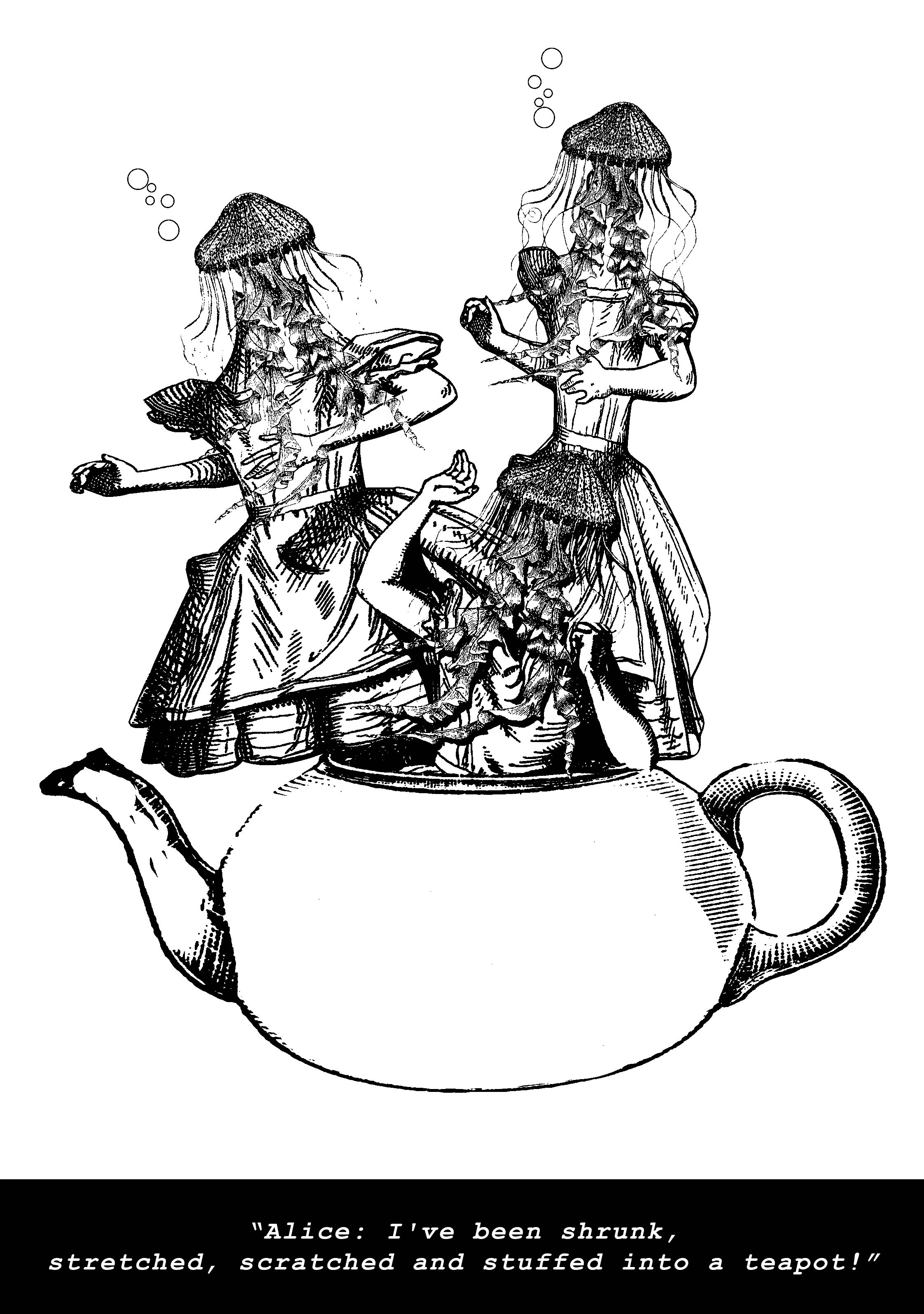
Elements: Teapot, 3 Deformed Bodies, JellyFishes, Bubbles

Rationale: Jellyfishes are soft-bodied, free-swimming aquatic animals. Hence it made sense to use this boneless sea creature as a representation of being flexible. As said “I’ve been shrunk, stretched……teapot!” It shifted form from an animal to a human being, just because its not humanely possible to re-size our bodies. The play of metamorphosis would make the graphic visually interesting. Bubbles represents discomfort/gasping of breath.

Other Variations/Exploration:

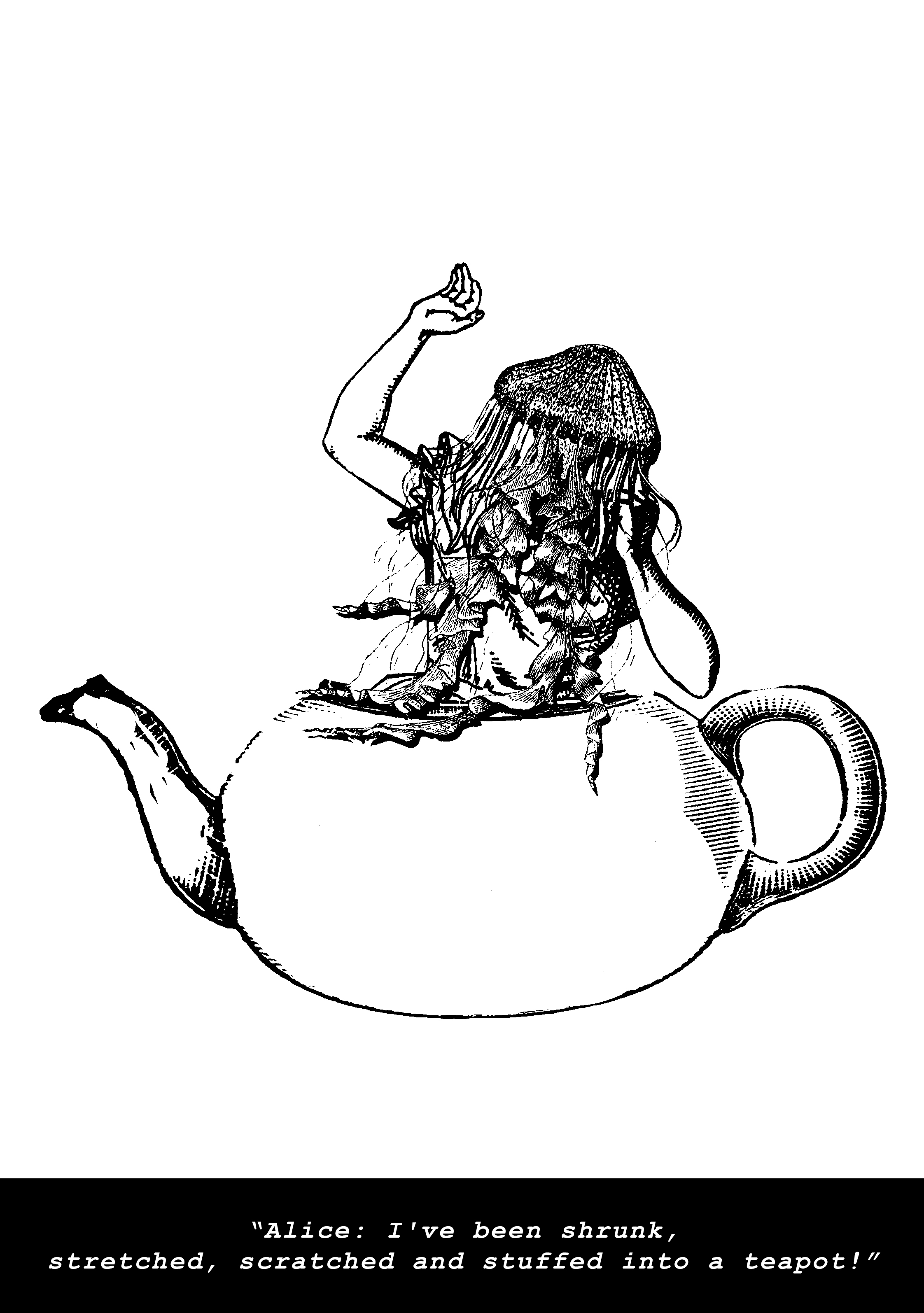
Well, this is not my personal favourite. I might just come up with a fifth design and completely scrape this off my list. We’ll see!
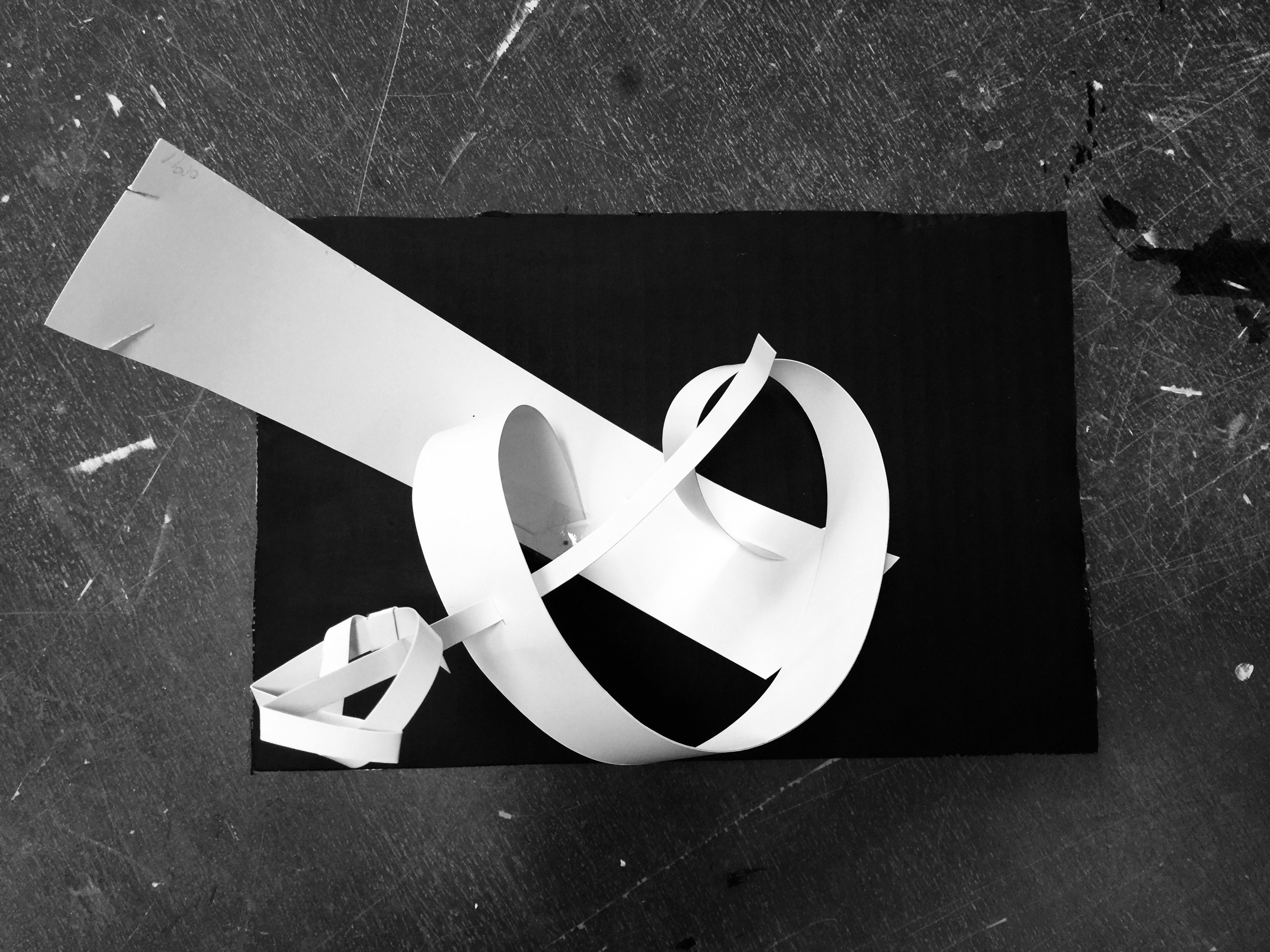
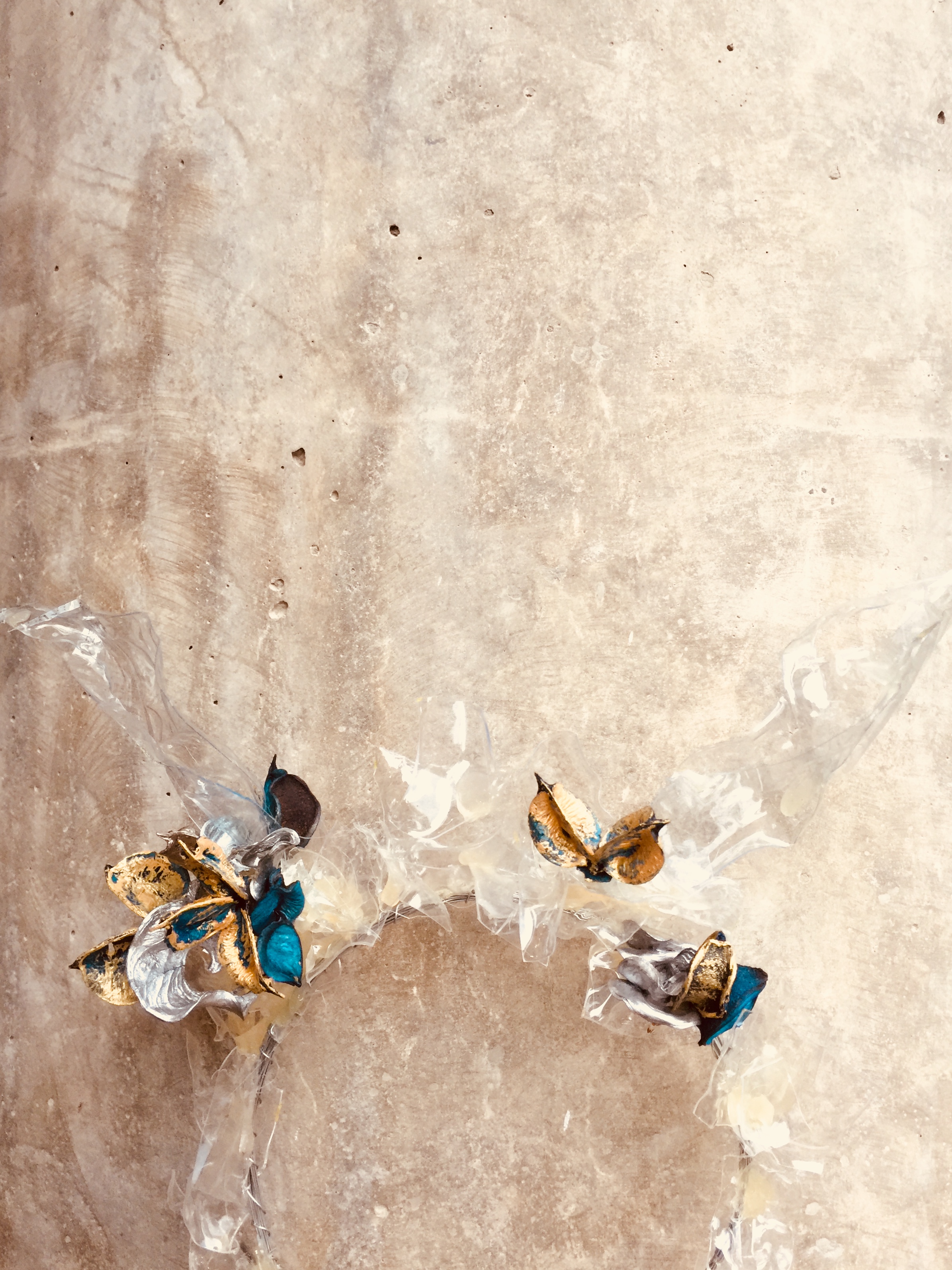
 

Design 5:

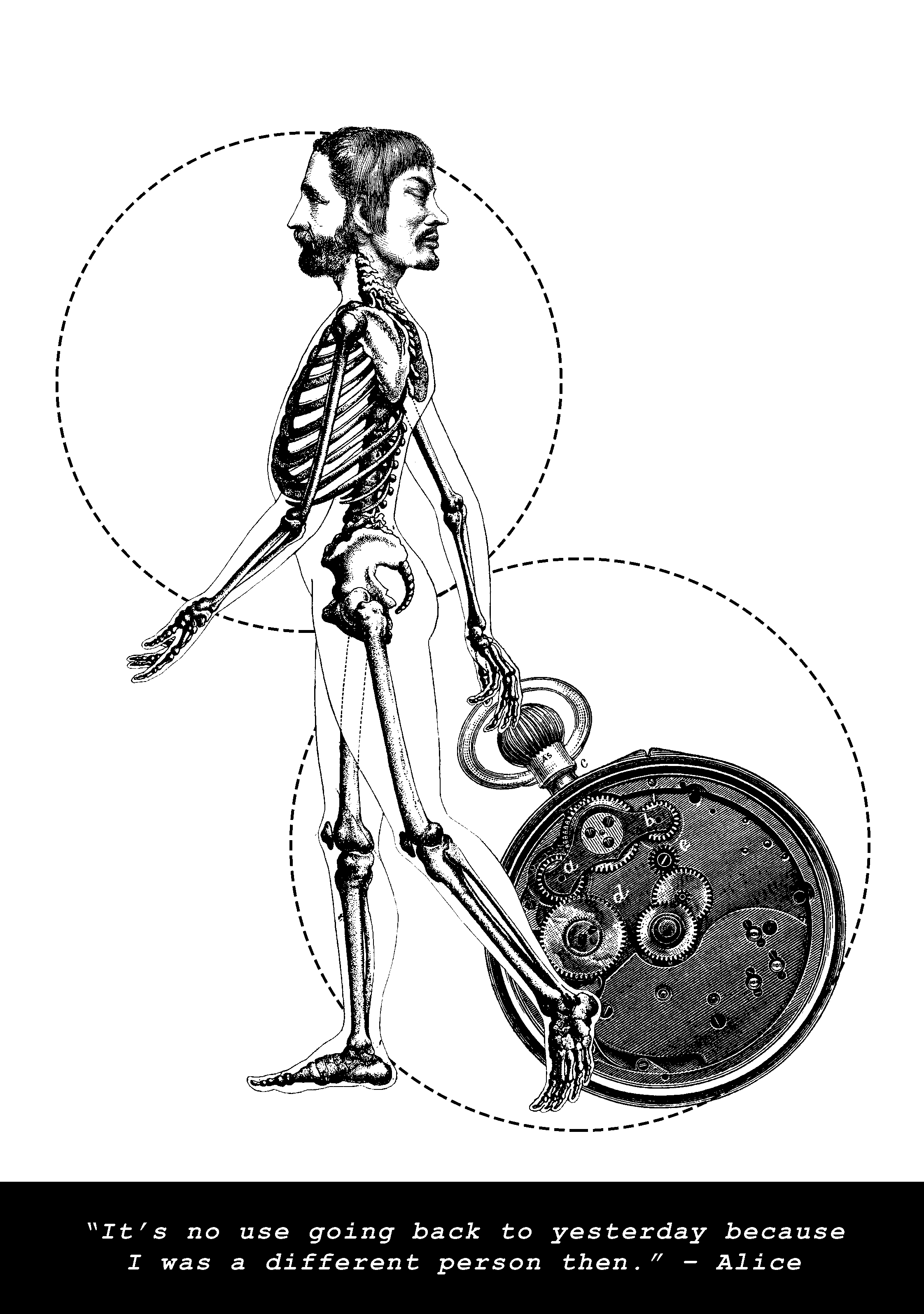
Elements: Skeleton, 2 men, Back of the pocket watch

Justification: With the use of skeleton, I want to portray Alice’s desire to shape her life in a better way such that she is a bettered human as compared to yesterday. A skeleton is often associated with spiritual development, and can demonstrate growth in character. 2 men’s faces placed against a skull to show a literal difference. The appearance of the watch to indicate that time changes things.

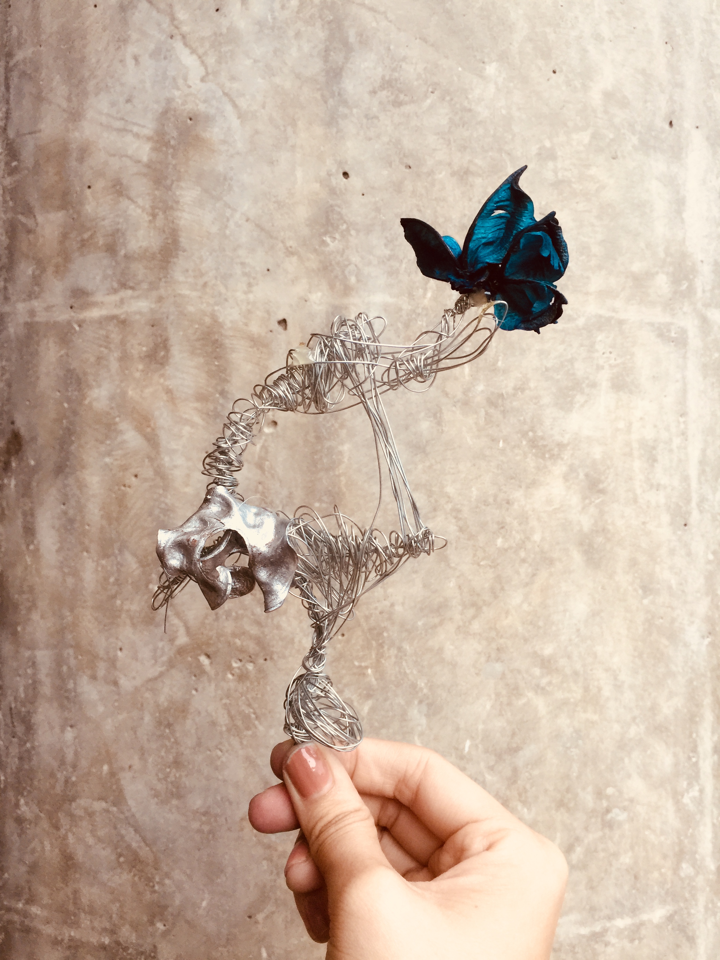
Improvisation: After consulting mimi, I realise I have to better present the idea of “changed person”. Hence, I went to look for a better reference image that could represent my final idea.

Then, I came up with the subsequent layouts! With alot of improvisation inbetween of course. So I decided to scrape the previous layout entirely and redo my design based on the selected quote above.

Here we have it: A development from Layout 1 to 2, 2 being the selected design I will push for my final work.

Layout 1:

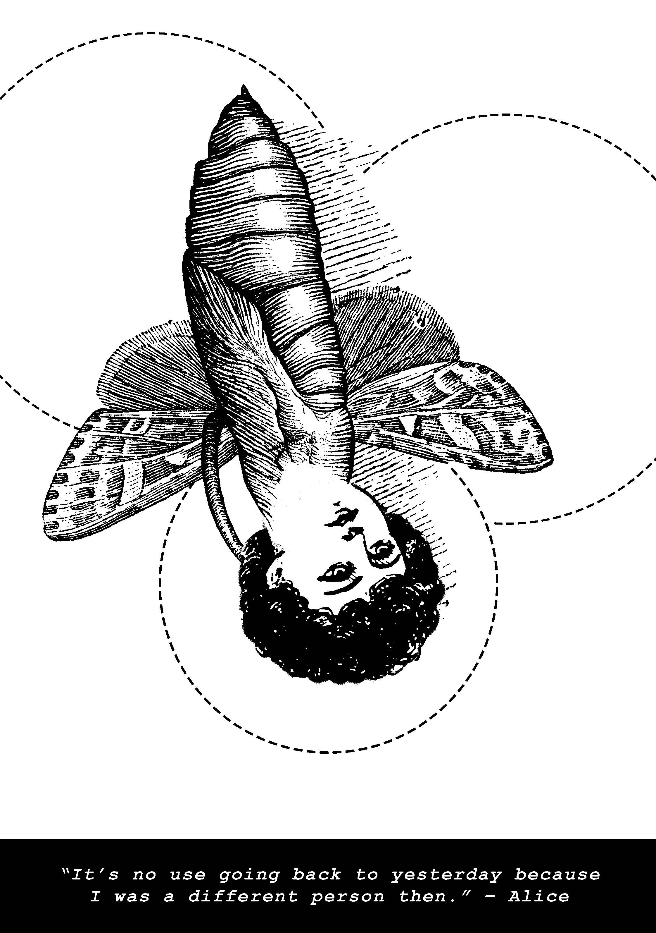
I personally do not favour this layout. I thought the design elements could have been a lot stronger. I aim to create more depth in the next layout design.
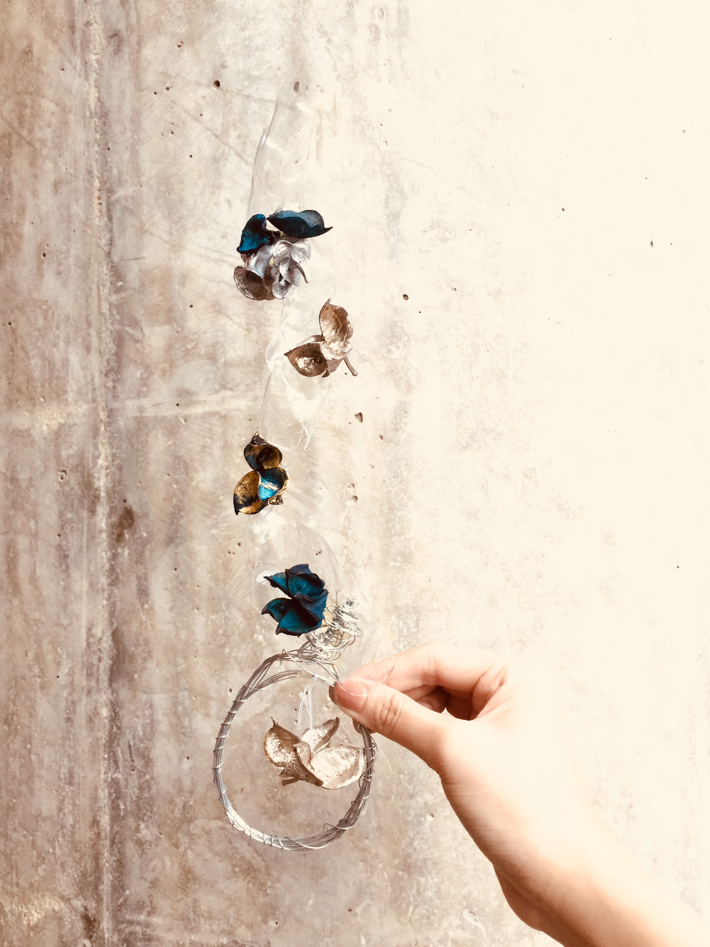
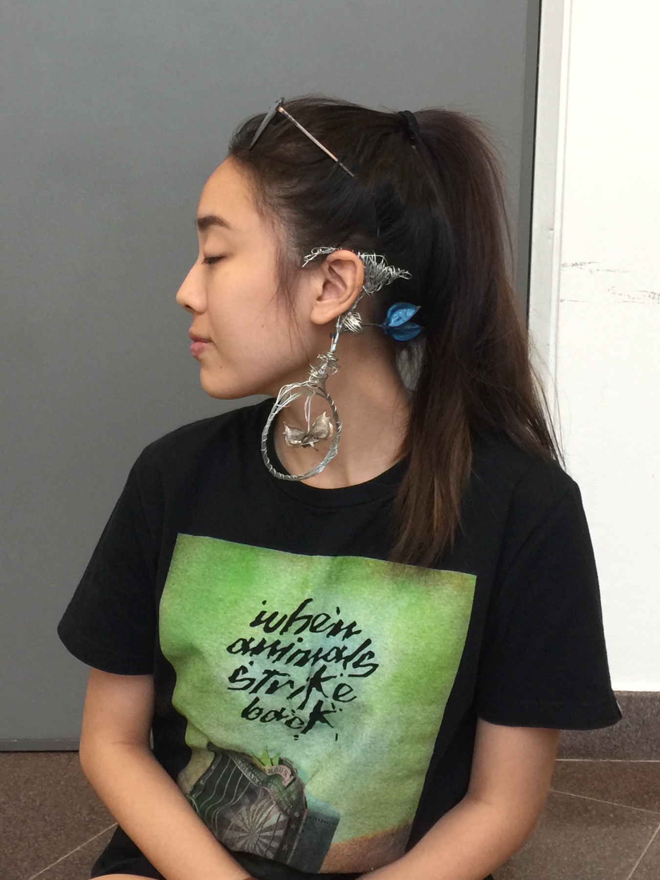
Layout 2:

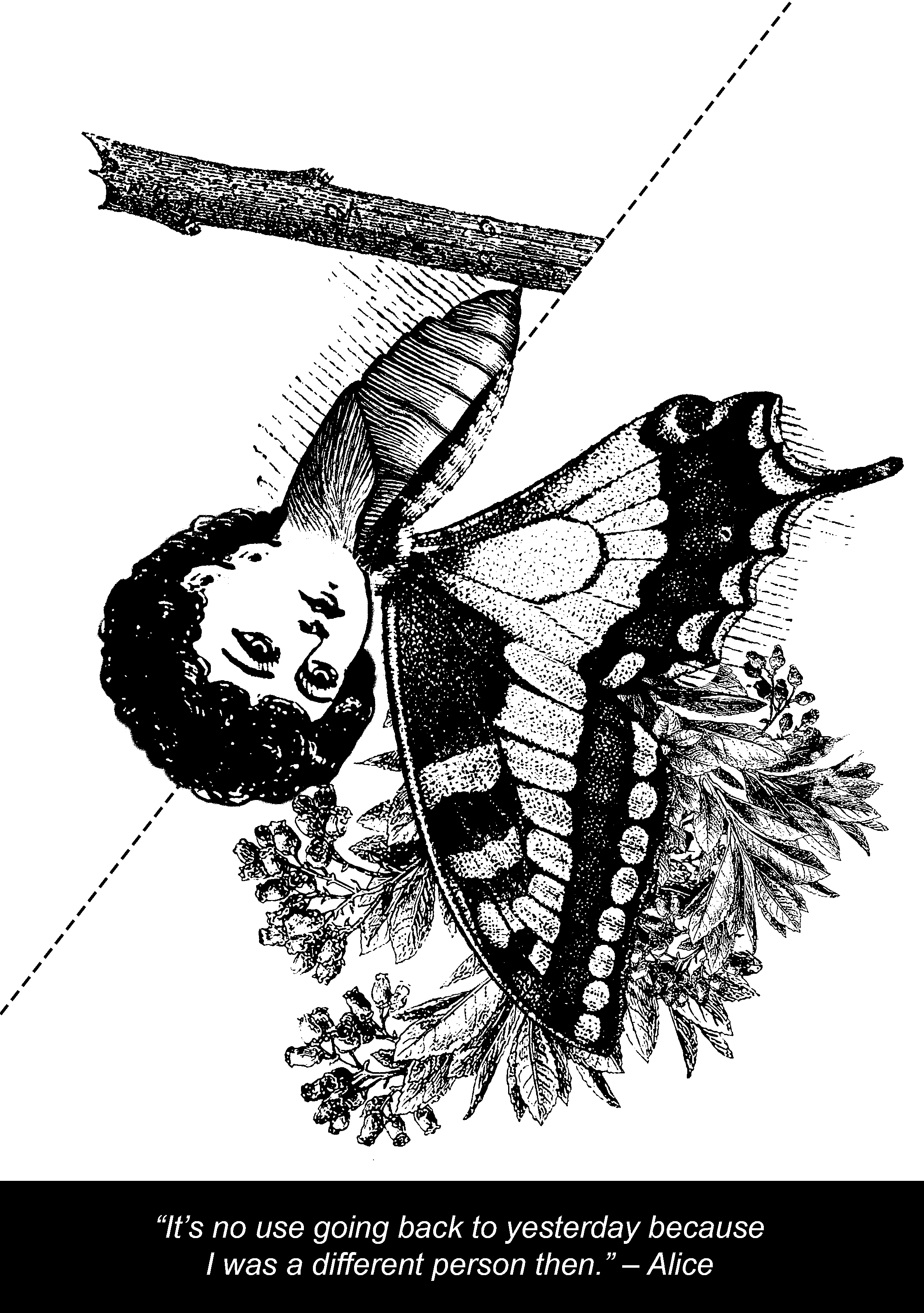
Element: Cocoon, Half a butterfly, Girl’s head, Blooming Flowers

Justification: It is a metamorphosis of two insects at different stages of their growth. One being Cocoon stage, and another being the butterfly stage. The girl is facing towards the direction where the flowers bloom, which indicates that she is looking towards a better tomorrow.
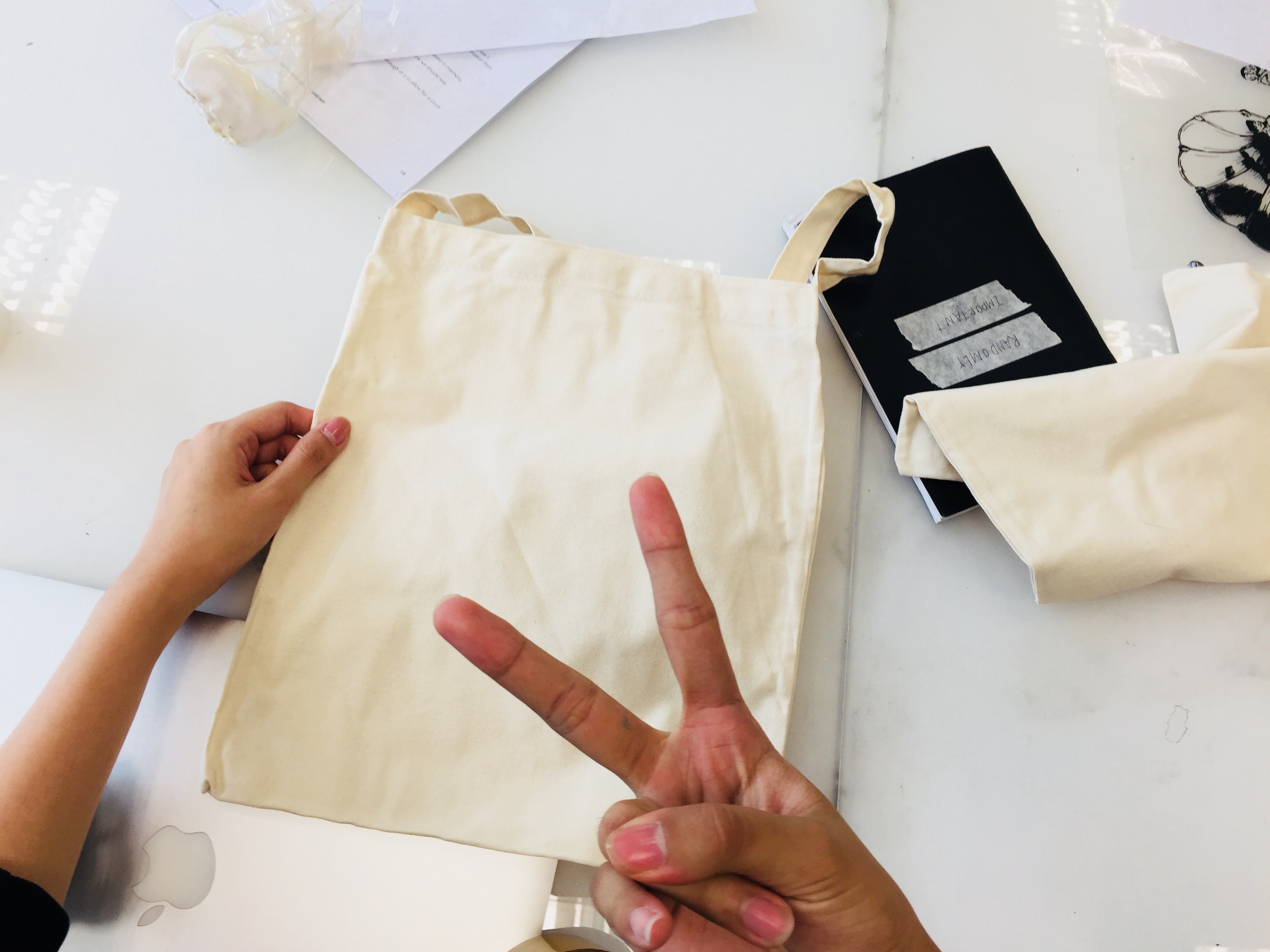
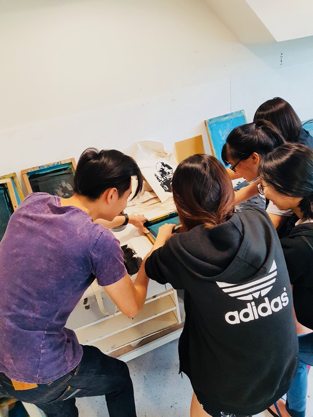
 

Presentation Day!

thank you for all é feedbacks!!! <3


Alright, Ciaos!

Forrest Gump: Silkscreen Process & Finalisation

Hello, World!

Today, I had my very first silkscreen attempt! Was good (only after multiple tries haha). The coating of the blue layer was most challenging in my opinion as it is the very fundamental of the process – THE MAKE OR BREAK

The final design I picked for my tote bag is…

*drum roll please*

My classmates call it The Fishies! Following next will be my final 4 concepts –

*CLICK*


My Thought Process:

Since all these quotes are extracted from one movie itself, I wanted these panels to have an overarching theme that ties in seamlessly together. That means by looking at it from afar, one can easily identify the style that is injected into all the designs and that it would be obvious that it comes from the same designer(like a series). By using lines in the background, it helps them to identify with the other panels. Lines help to direct the eyes and provide visual flow for the viewers, aiding in the communication of my design piece.

Apart from that, I adore woodcut textures. Hence, I painstakingly searched for images that are visually “similar” in texture and style so that they would compliment one another when placed together. This would ensure that none of the elements stick out like a sore thumb when viewing them in whole. This is one of the most challenging problems faced throughout the project execution since there is a pool of image options out there, it would be difficult to settle on one that can give the aesthetic a push.

Contrast & Depth is one thing that I took notice of too. I have to vary between thin and thick strokes, light and dark fill (shadows & highlights). Too much of blacks tones can make your design sink, appearing visually heavy and hard to digest. Too many whites would look as though it lacked dimensions, hence appearing flat. Balancing the contrast of the threshold can be challenging at times, but it all worked out eventually. laughing


& some progress shots that were taken along the way –

Gotten our tote!

Draining out the ink to reveal the underlying print

Scanning our print onto the mesh board

Taping up and around!

& that’s fran & joel!

as well as many others! thanks for the emotional support


& LAST BUT NOT LEAST!!!!! THE FINAL OUTPUT – 

YAY.

Thank you for reading! 😉

Ciaos.

Mnemosyne’s Scent: Final

WELCOME TO: THE GARDEN OF EDEN

This is a project done by Zhenqi and I.  Before anything else, this is both of our Mnemosyne’s prototype:

left scent: diffuser & ex bf’s jacket right scent: softlan & iodine solution


Our idea on Garden of Eden?

https://medium.com/@dropeik.com/the-dangerous-naivete-of-back-to-the-garden-environmentalism-8dec07190b8a

These are the main characteristics that define the Garden of Eden:

  • Etheral 
  • Magical
  • Delicate


Based on our previous prototypes, as well as the overarching theme, we worked towards creating our final 4 statements of accessories.

Our Colour Scheme :

  • SILVER
  • BLUE
  • GOLD
  • TRANSPARENT (Plastic)


1. THE HEADBAND

Incorporating the design concept from my previous prototype, we re-created a headpiece and injected the “ETHEREAL” element into it. By using slightly more exaggerated differences in the length of plastic and the involvement of dried scented flowers that smells like fresh morning spring.

2. EAR CUFF

Our initial idea was to make use of melted plastic as the foundation of the cuff. However, we realised that the metal wires were just as handy and malleable! Hence, we tweaked the wires in several different directions so that it forms a nice flowing arch when placed on the ear of the wearer. In the later part of the development, we stuck on dried flowers into the loops so that we can keep the overall theme in check.

3. BROOCH

This is a fashion accessory that is to be pinned on the chest of the wearer. In this scenario, the wearer will be wearing a “white robe” (or rather curtains lol). This piece is made from melted strips of plastics alongside metal wires at the stem of the product. If you observe closely, the flower on the inside of the metal wires is dangling on a thread. This is adapted from our previous prototype, where the central piece appears to be hanging on a piece of wire.

4. THE BELT

This is the concluding piece of our accessories collection hehe. We wanted to come up with a comprehensive set of apparel, so hence we made a belt too! This will hold the white robe in place together, all in all creating a more aesthetic and put together look for our wearer. We coiled the wires repeatedly and adorned it with more blue/gold/silver flowers! It looked so cute!

up close and personal


ALTOGETHER NOW! 

 A collage of all of our apparel design!


SOME TRY ONS

Awkward. Sorry 🙁

We also made some amendments to the ear cuff along the way! 


Alright, ciaos!


Somebody I Used to Know – Outcome

Rough Overview of Frames:

My Story in 20 Words:

Guy released from prison. Flashbacks of his ex-girlfriend hit him. He misses her. Contemplated. Calls her. She picks up.

What happens next?


Photo Editing Style:

Comparison of BEFORE & AFTER

The original photo looked dull, which is opposite of the effect I have in mind to achieve. Hence, after post-production editing, I edited the all photographs to give it a constant thematic of colour to entice and attract.

Overall, the tinge of blue adds on to the melancholic mood, which relays back to the idea of the storyline. I wanted saturated looking photos, that enables my still photo film to look cinematic.


Video Editing Style:

Trailer

Fast cuts, fast-paced music, ominous background music. These are the characteristics that define a trailer film.

Generally, a trailer of a film takes about 2.5 minutes, and I thought, hey, why not try creating something more exciting, something that challenges me.

Editing a trailer is different from doing a normal story narration where the cuts happen to go at a slower pace.  So instead of telling my story in a mandatory way, I decided on doing a 3.10 minutes movie trailer for my film.  That aside, I wanted my trailer to end off with a cliffhanger – a question left unanswered. This is so that it would intrigue people to “watch the film”. Hence, the film got cut off right when both parties pick up the call, each saying “hello…”. This would allow the viewers to speculate and anticipate. Will they get together? What will he say to her? Does it means she has forgiven him?

WE WILL NEVER KNOW. (Only me hehe)

Also, I added on a 12 seconds duration of blank frame dialogue, whereby there is nothing on screen. The purpose of this is to direct the focus to the emotions of the dialogue without any distractions. This is a different approach altogether.


My Work Space (Timeline)


Editing Technique Applied: 

Non-Linear Narrative Style –  Purpose is to create an interesting way of storytelling instead of having it told chronologically. In my opinion, this would heighten the dramatic tension in between each sequence.


180 Degree Rule: To establish a connection between two shots that take place simultaneously at a different location. Building relationship between 2 people.


Jump Cut:  This kind of edit gives the effect of jumping forward or backwards in time, which is exactly the effect I aim to achieve. In conjunction with the non-linear narrative storyline, it adds dynamic to the storyline, apart from telling the story in chronological order.


Match Cut

Match Cut: Eye to eye, Hand to hand. The film fades away revealing interconnected scenes that have hints of similarity to the previous shot.

Film Transition: Dissolve: Smoothen out transition to prevent awkward looking jump cuts

Fade to black: Flash forward / Fade to white: Flashback


Soundscape:

Notice that there were a few different locations from the video. There’s 1, Carpark, 2, Inside of the Car, 3, Outdoor. I imagined all these locations to give off a certain type of ambient noise which would make the video sounds more believable. Hence, I went around to record ambient noise from the carpark next to my apartment and use it for my film.

Furthermore, in order to create a more believable sound experience, I tried overlapping a series of different sounds with the intention of creating depth to my edit. While taking note that the sound should not be too distracting, and it ought to be evenly spaced out so that it wont be too overwhelming (like all types of sounds coming at you at one go).


Artist Reference:

Mark Woollen, by Daniel Bergeron. Indiewire. No PR/No Release. 2015

Mark Woollen

“The thing that’s unique about Mark,” says Angus Wall, who won an Oscar earlier this year as co-editor of “The Social Network” and who has cut trailers himself, “is that there are formulas for making trailers. And all those formulas have these tricks. And after a certain point, a lot of trailer cutters become a collection of their tricks. But not Mark. I think he considers each film individually and his approach depends on the film. And that’s the reason he’s so good.”

Famous Trailers by Mark:

Schindler’s ListTrafficThe Social NetworkA Serious Man12 Years a Slave, and Little Children

I like how Mark is able to translate 2 hours worth of movie into 2 golden minutes, how he can encapsulate the best of scenarios within a short time frame. I am inspired by the way he cuts off abruptly at certain scenes and then leave a BIG question mark as to what happens eventually. He is able to weave it all together in a compelling way


Behind the scene:

*BIG THANKS* to my amazeballs group members, who are super efficient and super professional!!!


Final Edit: Somebody I used to know

Ciaos!

Somebody I Used to Know – Brainstorming Process

Planning of initial storyboard:

  1. CU of phone screen
  2. CU of Felicia’s facebook profile
  3. MS of the main character, Joel. (Revealing of his face)
  4. ECU of Joel’s eyes in the windscreen
  5. Two shot of Joel and Felicia (with Joel being in foreground and Felicia in the background) – FLASHBACK
  6. ECU of Felicia’s gripping hands to establish tension – FLASHBACK
  7. MCU of Joel being mad – FLASHBACK
  8. MCU of Joel looking guilty
  9. CU of Joel attempting to change gear
  10.  MS of Joel holding on to Felicia’s hand -FLASHBACK
  11. ECU of Felicia’s eyes to show expressions – FLASHBACK
  12. CU of Joel’s hands about to slap – FLASHBACK
  13. MS of Joel
  14. Two shot of Joel and Felicia, mood tense
  15. MCU of Felicia, holding on to her cellphone – FLASHBACK
  16. MS of Police officer leading Joel away
  17. CU of legs
  18. CU of phone. Text from drug dealer. Plot twist at the end


An idea of what happens behind the scene: 

@ ADM Library

@ Tamarind Carpark

@ ADM 

In Hannah’s Car!

The intended effect that we aimed to achieve was an up close and personal shot whereby we can focus on Joel’s emotions through still images. (Since emotions are easier to translate through videos, having a still photo film will be significantly challenging).

Apart from that, we included flashback scenes to our Non-Linear story plot. The flashback scenes will be desaturated to black and white, while the scenes that took place in present time will be coloured. However, in the post-production, I will play with the colours adjustment control in Lightroom to achieve the kind of effect I want.


Take for example:


Before and After. The processed photograph looked a whole lot moodier. This is the constant effect I will have in my final video work.


Story flow


TO BE CONTINUED –


Mnemosyne’s Scent: Ideation + Development

Scents can bring back memories or set the mood. Here we have 2 scents, one pleasant and one unpleasant. Let’s get it started!!

PLEASANT MEMORY: 

https://katiescarlettblog.files.wordpress.com/2016/09/img_1912.jpg

AROMATIC ROOM DIFFUSER laughing

This is my all time go to scent for room diffuser. I swear it makes nap time x10 better. I am in love with how every corner of my room has this floral/woody scent. It makes my room feel soooooo cozy and warm. Since I spend a whole lot of time in my own private space, hence I love having a diffuser around. It just makes things a lot better for me. It puts you in the mood you know! Breathing in this scent reminds me of home, my own comfort zone, this is the reason why I pick the diffuser.

A simple mind map to illustrate my idea

The texture of material: Smooth, Carved, Angular, Rigid

The texture of scent: Top note is actually Spring Daisy scented whilst the Base note is Sandalwood. As for the texture, I’d say it is MELLOW AND SOFT

Colors I associate with it: Transparent, Clear, Light


UNPLEASANT MEMORY:

A JACKET LEFT BEHIND BY MY EX-BF cry

It has stayed in my closet for quite some time already, but arguably, it still more or less has the scent of his cologne (if you inhale deeply). Though it triggers some bad memories every time I attempt to do my Mnemosyneyne assignment, well the rest of the time, it is just another piece of cloth to me, so I have never thought of throwing it away. What a waste!

A simple mind map to illustrate my idea

The texture of material: Soft, Smooth, Cellular, Rainproof

The texture of scent: Manly (mainly the cologne hahaha), Musky

Colors I associate with it: BLUE – because it is the color of melancholia.


PROCESS OF THE MAKING

Collecting variations of bottles in terms of shapes, sizes, and colors.

My photogenic classmate

Then, execution! I started by cutting up transparent bottles into strips/cubes. These are meant for the structure design for PLEASANT SCENT! I chose to use transparent plastic to realise my idea of “Transparent, Clear and Light”. 

Moving on, I went ahead to construct the skeleton of my “Halo”/ Christmas wreath thingy using wires provided in the 3D Room. Yes to saving money on resources! Then, I use the heat gun and melt the individual pieces of plastics so that it shrivels up aesthetically.

Subsequently, I make use of a piece of available blue plastic and started crafting my design for “unpleasant scent”. Like I said, I relate BLUE as the color that represents my emotions whenever I smell the jacket. Thus, I thought the color would best fit in this scenario. Using the tool that burns hole, I started by mimicking holes that signify the texture of the fabric.

As such!

http://seedmagazine.com/portfolio/22_library-of-lungs.html


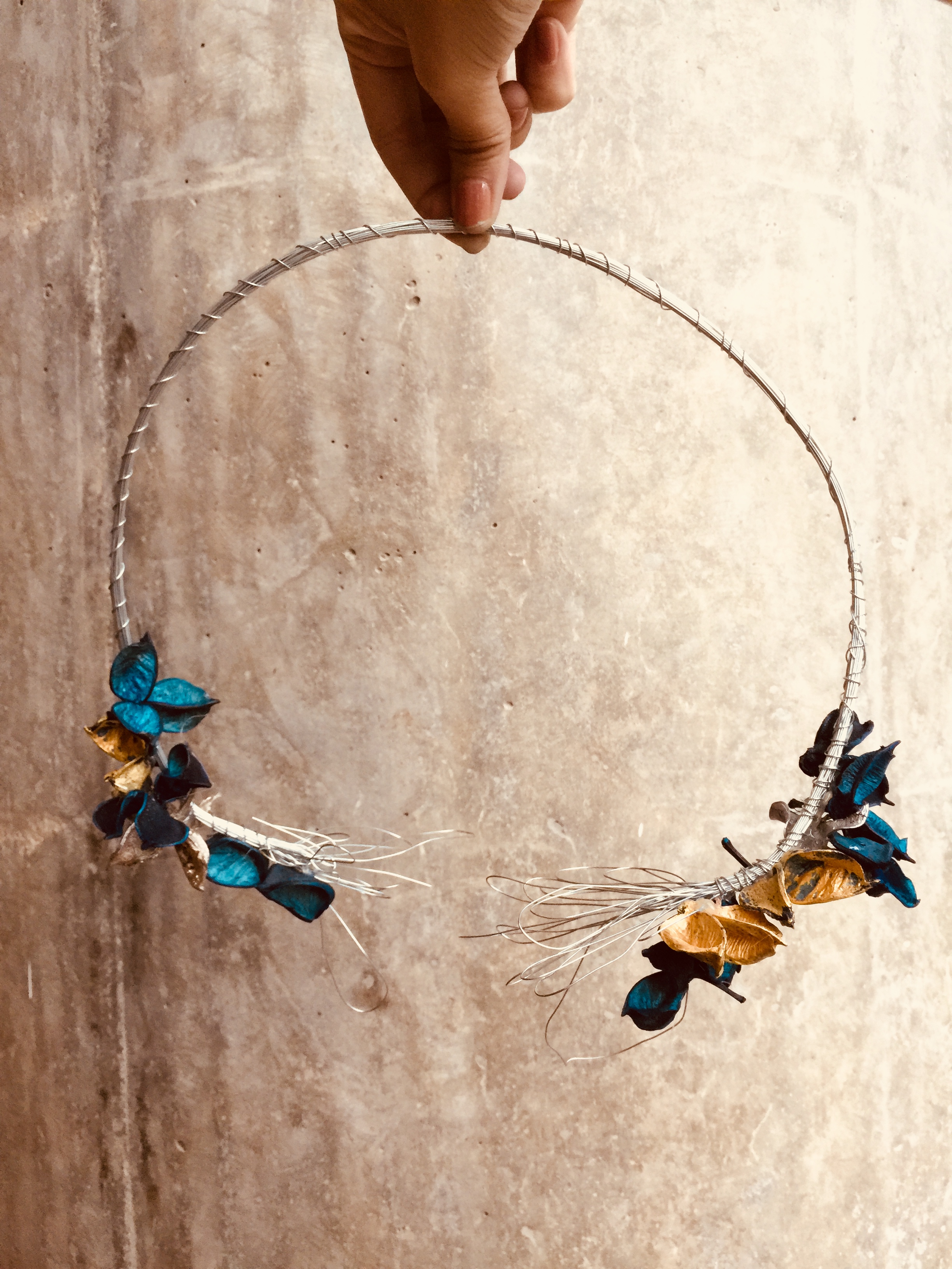
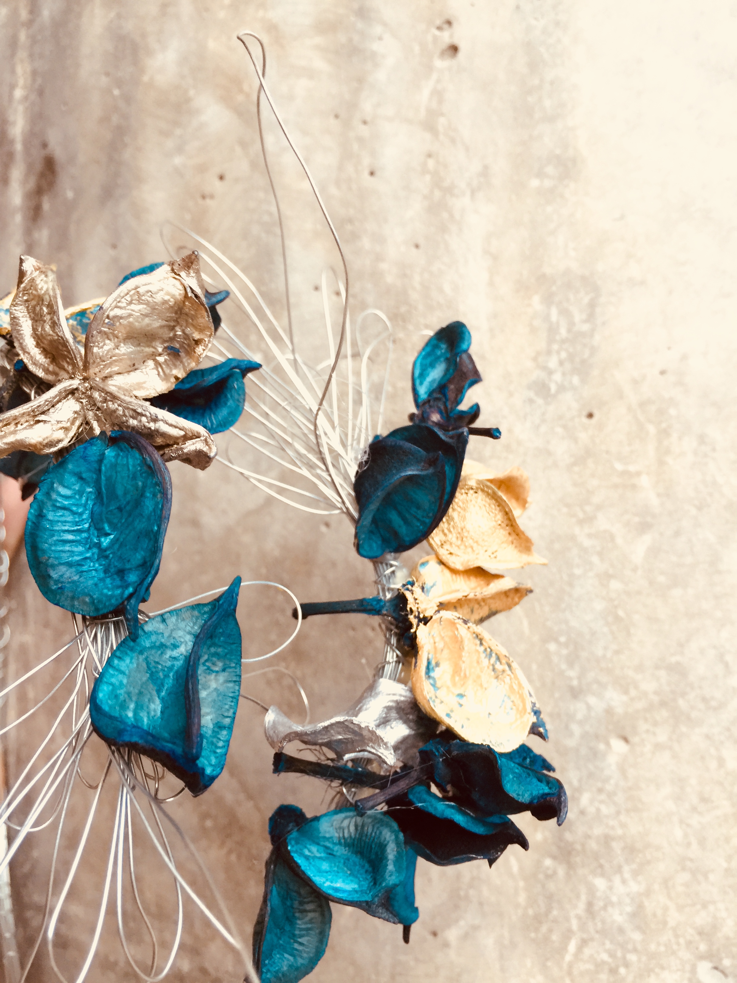
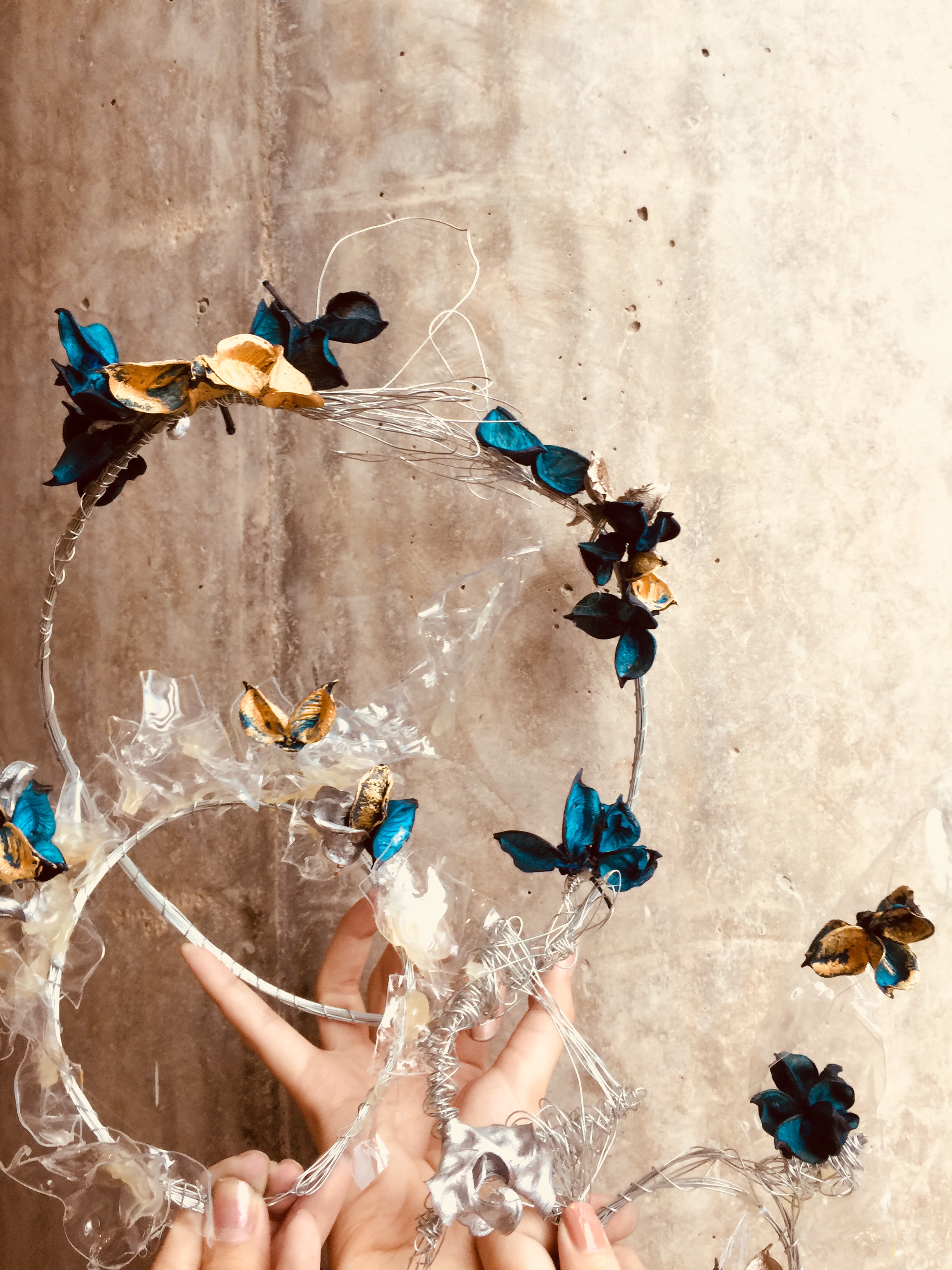
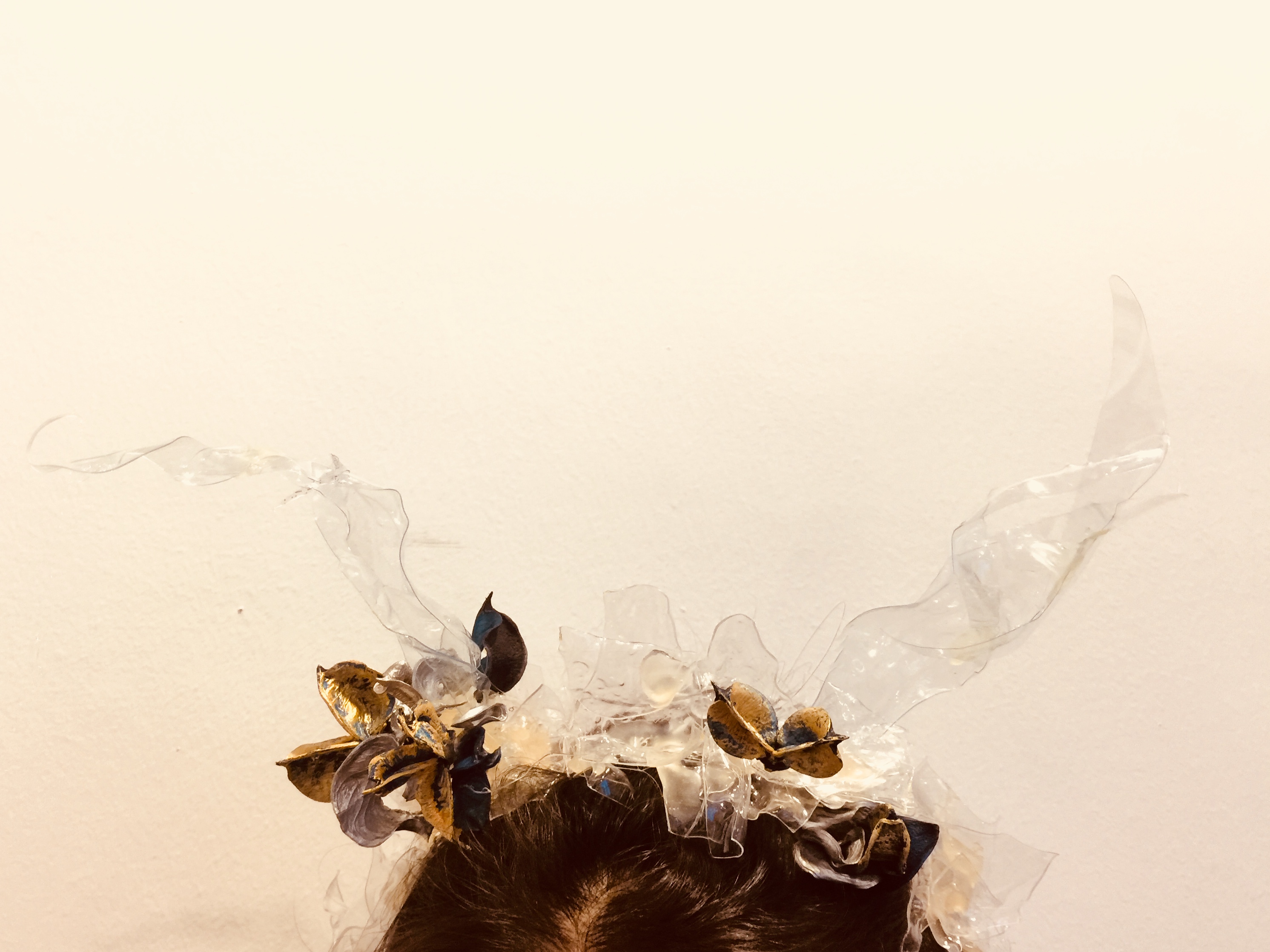
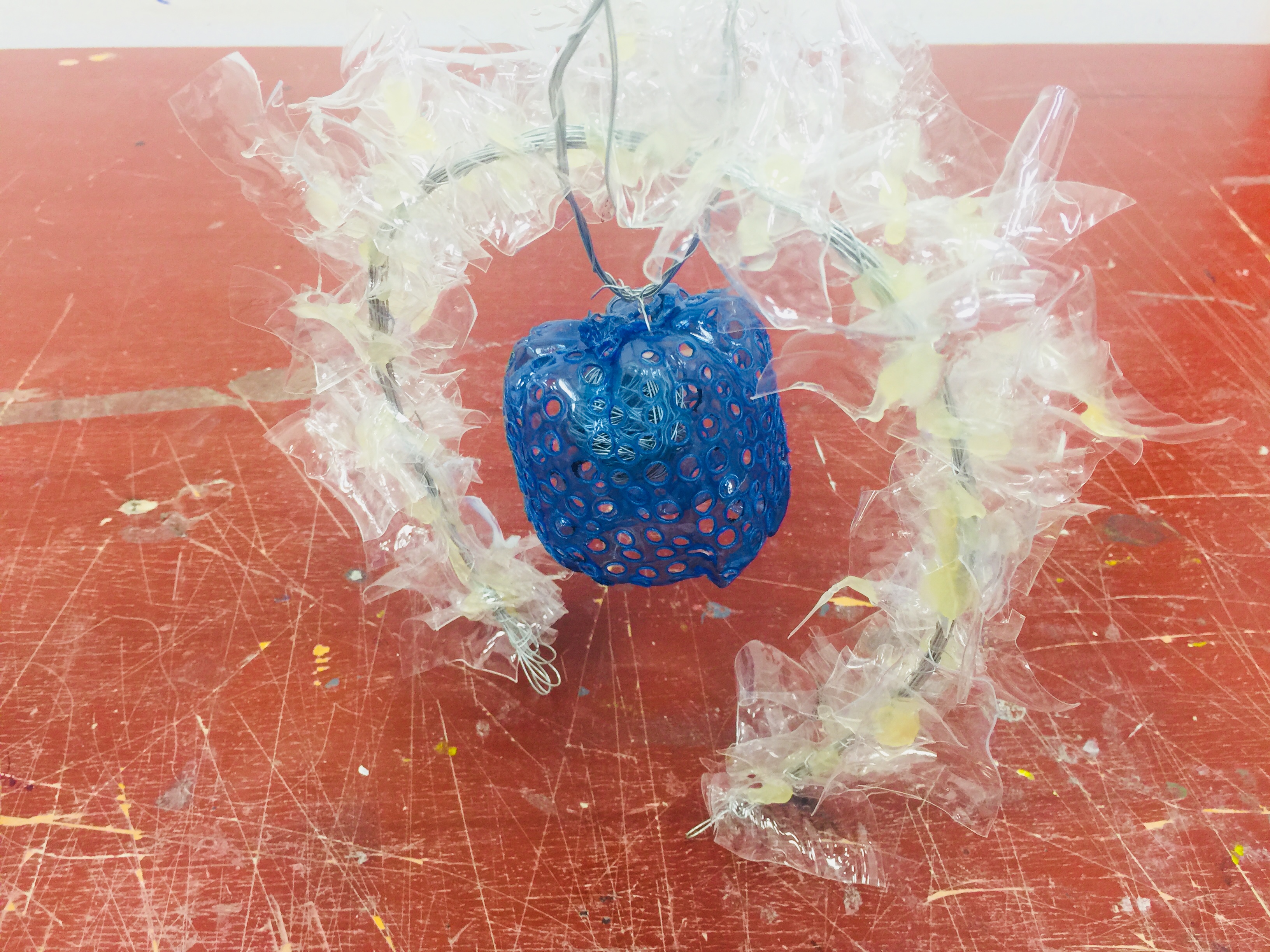
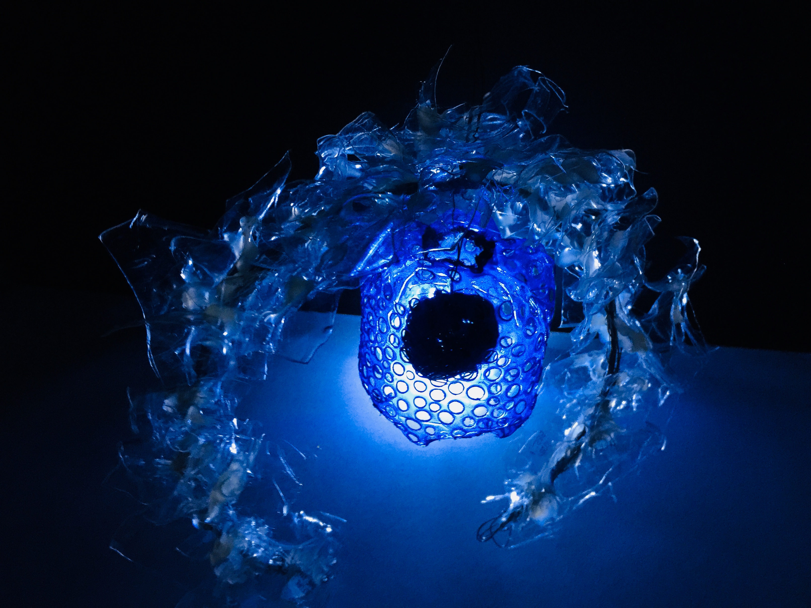
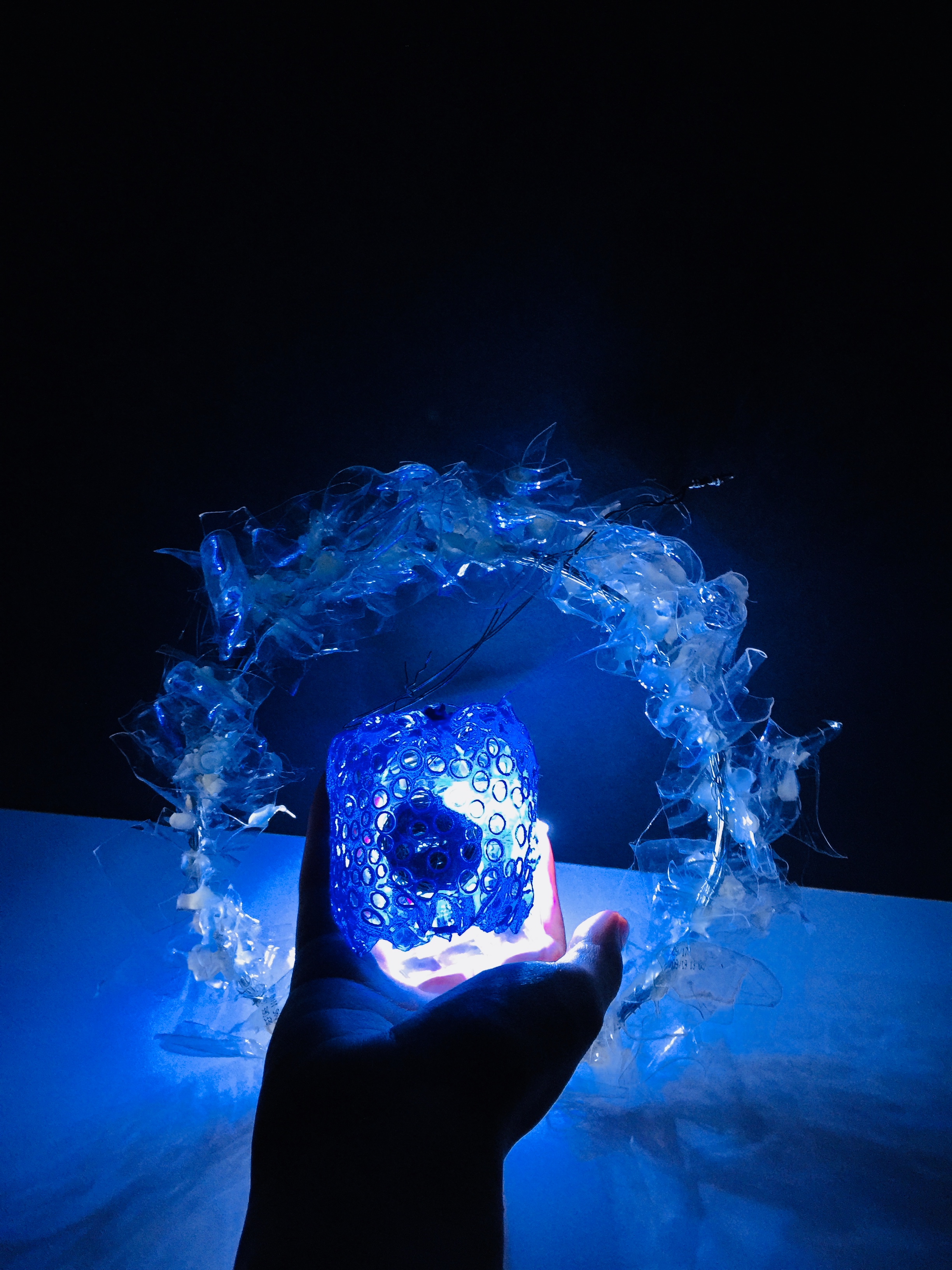
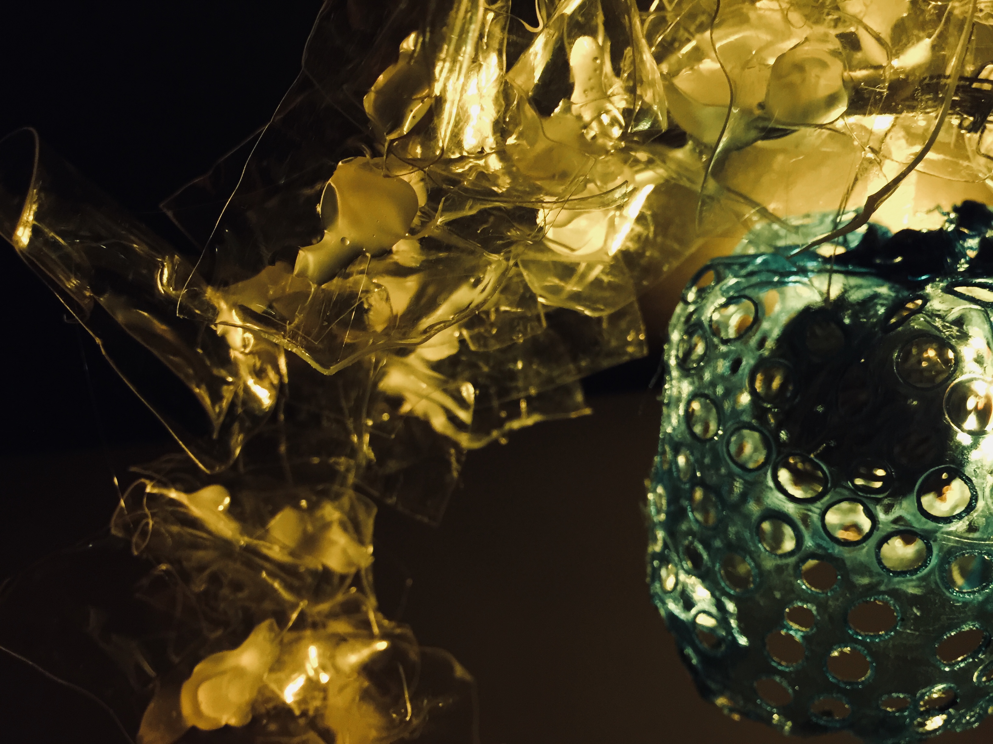
And so, we get our final product!

RATIONALE:

Positive Scent: Choice of color to be transparent white since the idea of transparency indicates lightness and airiness. Just like the characteristics of evaporated scent being diffused into the surrounding air.  The irregular shapes of the white pieces is supposed to indicate a dispersal of scent that reaches all corners of the room, hence the circular arch.

Negative Scent: Blue, prior to what I have mentioned above, is a reflection of my true emotion whenever I pick up a whiff of that familiar colonge (regardless if it is from the jacket or not). The holey texture on the plastic is meant to replicate the texture of a cloth (up close on microscopic view). And the idea of it hanging by a thread is a depiction of my feelings from the old time past (which I will not go into hehe). The little spherical ball inside of the blue plastic structure represents my heart – caged.

Well on a lighter note, positivity always overwhelms the negativity anyway! So this is why the structure of the positive scent goes over and beyond the structure of the negative scent.

FEEDBACKS FROM CHERYL:

The transparent plastic can afford to be A LOT MORE winding in several directions. Thinner metal rod perhaps? 🙂

PHOTOSHOOT OF MY STRUCTURE:

I love how the transparent portion takes in the light and created this cool blue hue.

Figured I could play with the temperature of lighting to create a different mood. What do you think?


Okay, ciaos!

Thanks for reading.


Mnemosyne’s Scent: Research

Hello, World! cool

Some learning points from today’s lesson:

Basics of Planar Construction – 

2D STRAIGHT AXIS: A flat plane

http://rebloggy.com/post/architecture-cinema-norway-1960s-concrete-brutalism-brutalist/108150508051


2D CURVED AXIS: Just a singular curve without other folds

https://pixabay.com/p-254862/?no_redirect


2D BENT AXIS: A folded plane

https://www.albinaco.com/specialty-steel-bending/multi-plane-bending


2D COMPLEX AXIS: Consist of more than 1 axis in a plane


GROUPED PLANE: Consist of more than 1 type of folding method


3D TWISTED PLANE:


3D CURVED PLANE:


My Plane Construction Process –

Phase 1: Selecting the dominant piece to be
placed as the base


Phase 2: Experimenting with the art cards through Piercing
and Wedging
 
Phase 3: Establishing the structure

Phase 4: Exploration of the final bit and pieces
(What it might potentially look like as the
end product)


Rough Sketch Analysis of Plane Model:

REJECTED STRUCTURE:

The feedback was that the SO was still a little too long in comparison to the SD. & the SD is still on the long side in comparison to the D. I hence proceeded to trim down the length of my paper strips and it brought me to my final structure!


THE RECTIFIED CONSTRUCTION:

The overall balance looked a whole lot clearer in this structure. D, SD, and SO can be easily identified with just one look.


More to come in the next post – Creation of Mnemosyne Structure

Toodle-oo~