Category Archives: Foundation 2D 1 – G6

Project EGO: Outcome

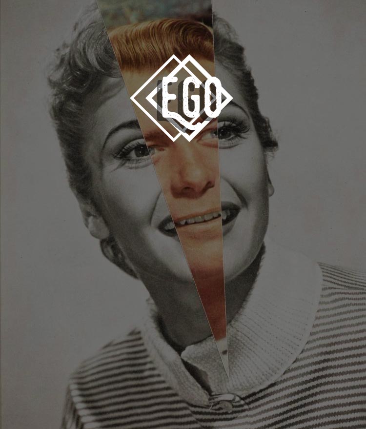
Hi! Welcome to my final project of the sem – EGO.

For the upcoming panels, the chosen medium is Illustrative Digital-Collage, and the theme is Pop Art, with the improvisation of Painterly Technique that I employed in my design. In my opinion, I prefer processed images in comparison to realistic images as they lacked a touch of customisation. 

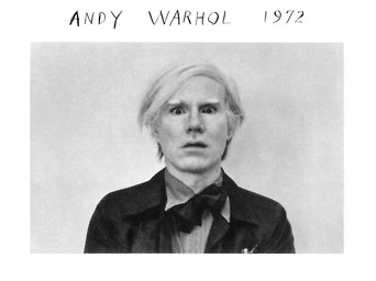
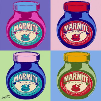
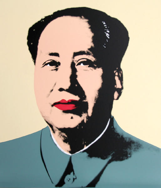
Inspired by the famous Andy Warhol pop art culture, I decided to reference his work and work out a concept that bears similar feel as to his art style.


To kickstart everything, let’s bring on the 4 equations!
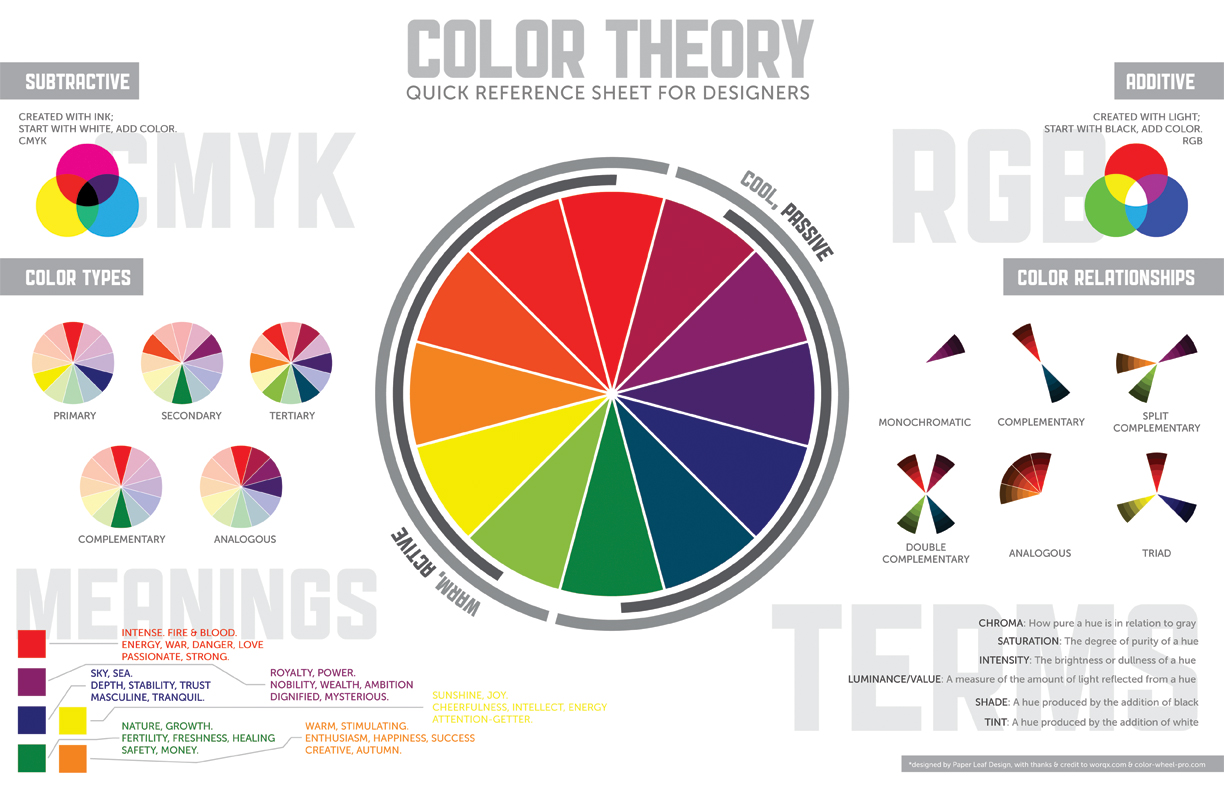
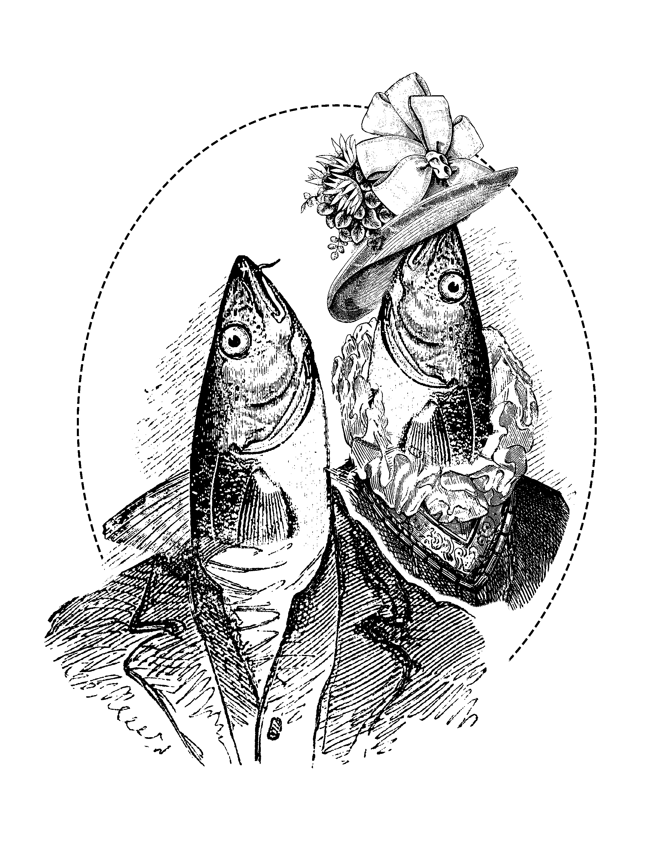
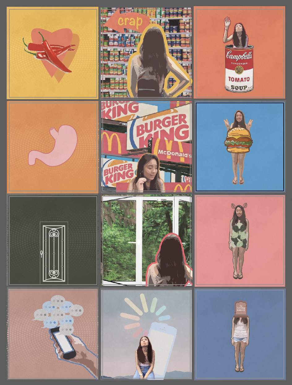
PANEL 1: Analogous

This group of colors is soothing to the eyes and pleasing to look at! They sit side by side on the color wheel.

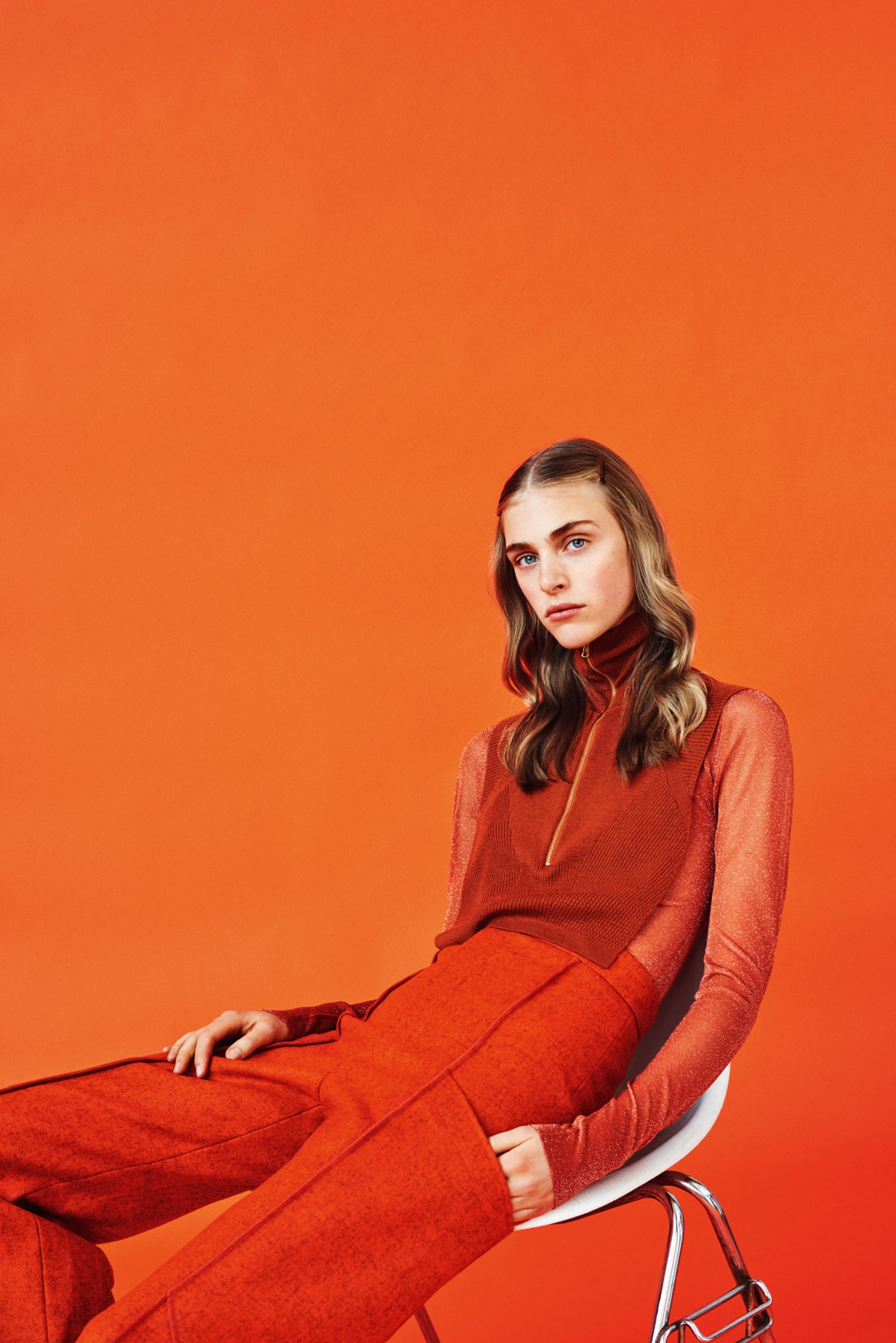
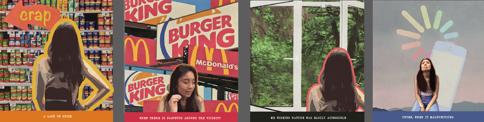
Rationale: In this scenario, it illustrates my love for chilli and how I absolutely cannot do without it in my daily meals. I am not even exaggerating. I would put a few spoonful of chilli padi into my soup, all the time okay. Since there is this pop art concept going on, all of the selected images will have to look like it comes straight out from an illustration/comic book so it ties in together seamlessly. Color plays a huge part in this as well. Instead of the typical loud colors that illustrators generally employ, I decided to go for muted tones – the dusty effect.

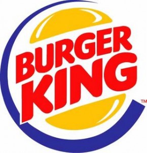
PANEL 2: Tetrad — a combination of four colors

A scheme that includes one primary and two complementary colors

Rationale: Fast Food restaurants are usually my go-to place when I am unsure of what to have for dinner. Mainly because its quick, convenient and it opens for 24 hours (Macs). This sequence represents my enthusiasm and love for burgers, especially when I am on an empty stomach. Similarly, the colors are all muted and the layers are texturized.

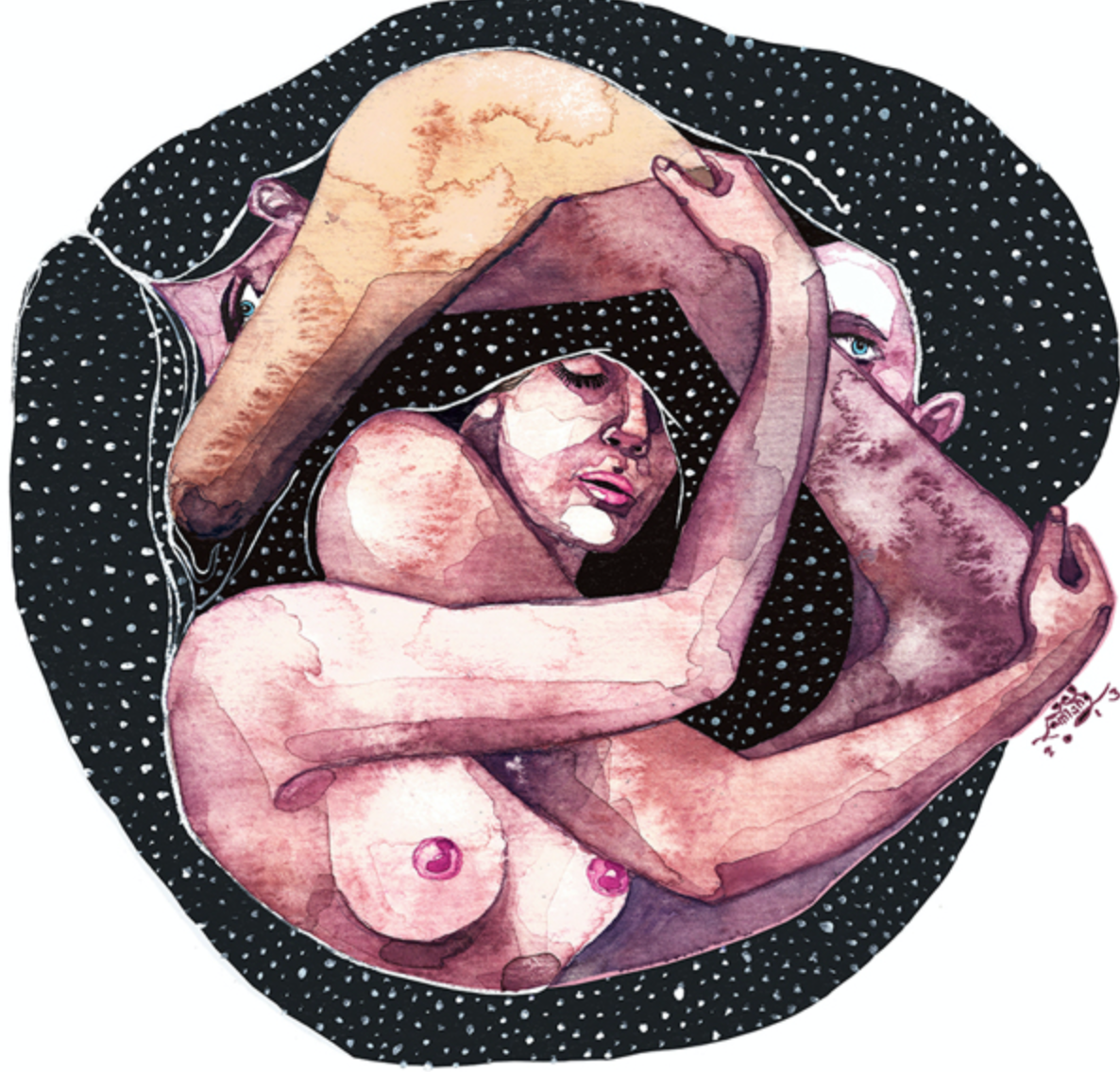
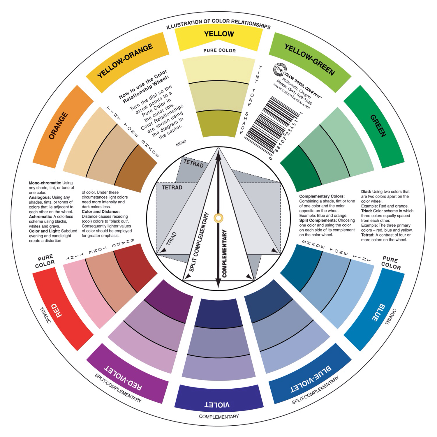
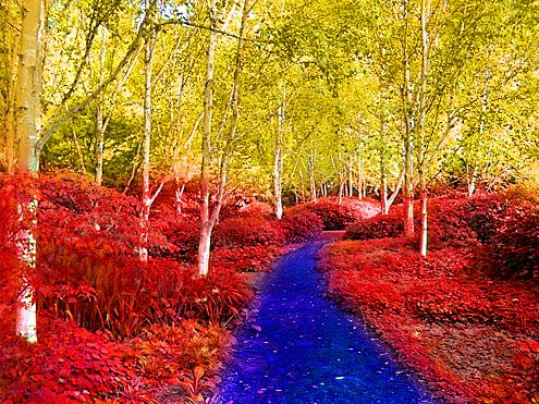
PANEL 3: Complimentary Colors

Opposite colors on the color wheel.

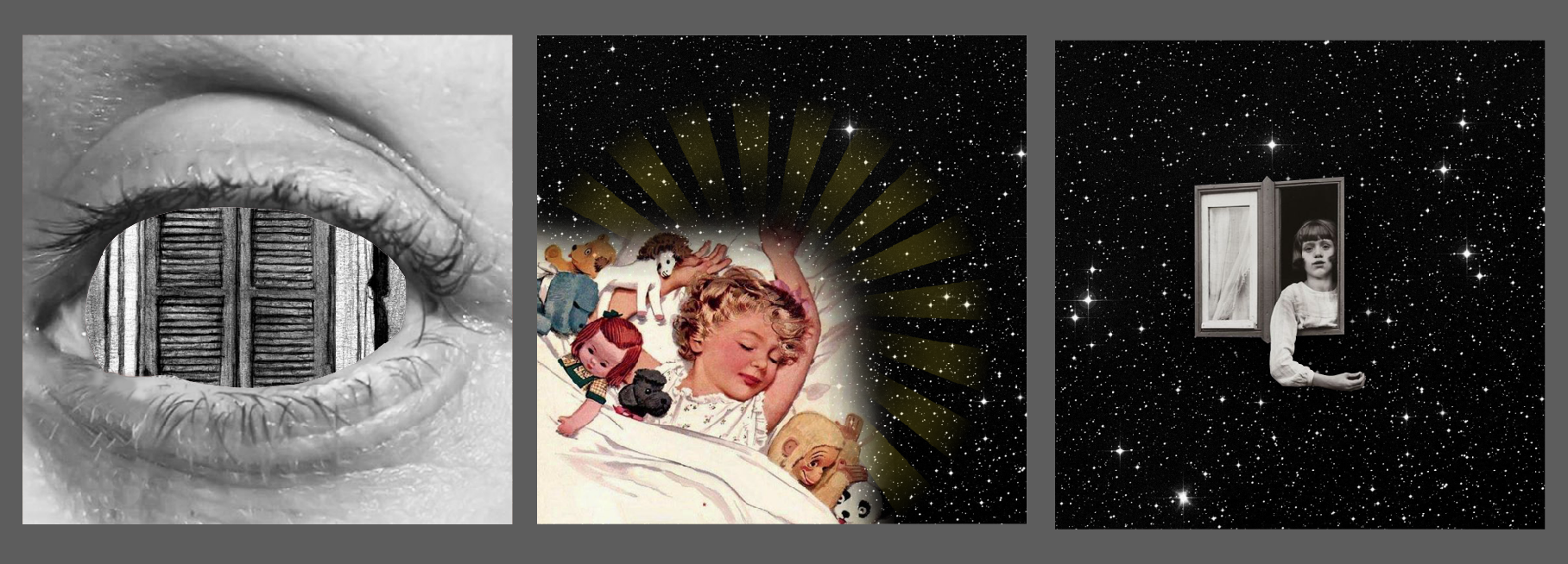
Rationale: Being the only child at home, I often find myself shut away in my room. At times, when I feel like I needed a listening ear, or at the very least, any form of comfort, I seek nature. Nature is my remedy, it takes away my trouble as I immerse the environment – so carefree and light. Most important, time slows down. Any form of urgency, deadlines seem to melt away as I fully surrender to comfort and control to my thoughts. How I wish nature was easily accessible, like having it right in front of my doorstep. In the current era, forested areas are limited and no longer as easily accessible as it used to.

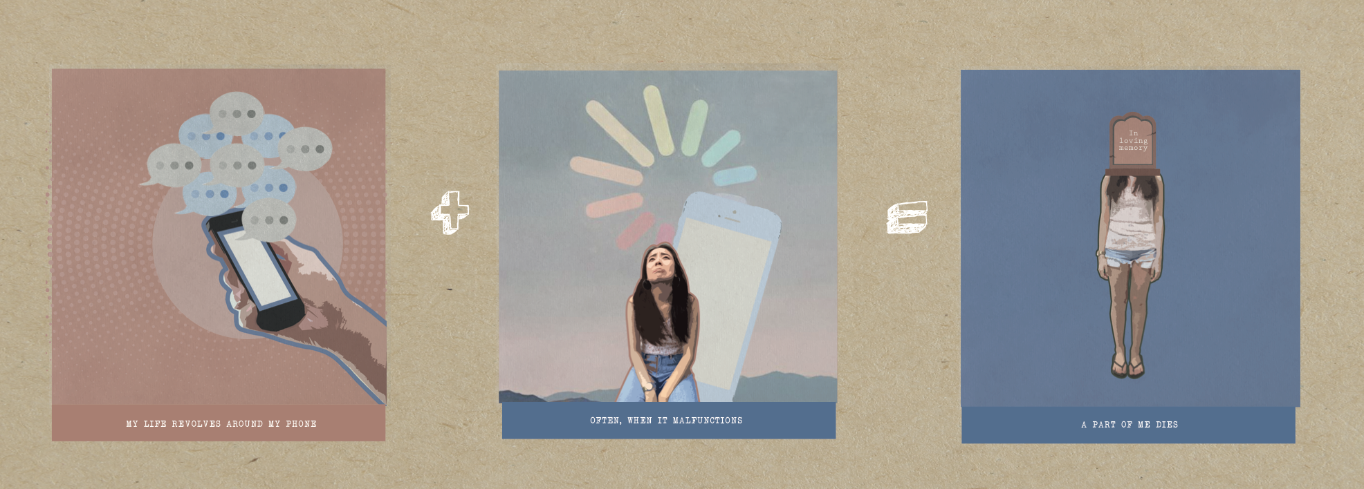
PANEL 4: Complimentary Colors

Using blue and muted orange (dull brown) to create a tranquil impression

Rationale: I am almost always on my phone, whether if its social media or what’s app. I feel like I grew so overly reliant on my phone that I constantly find the need to keep up with what’s happening online. Hence, whenever my (problematic) phone gets buggy or malfunctions, a part of me dies. Like… What am I going to do now??? How can I avoid people whom I do not wish to strike a conversation with?? (I always pretend to be busy on my phone HAHA) This explains why I created this sequence.

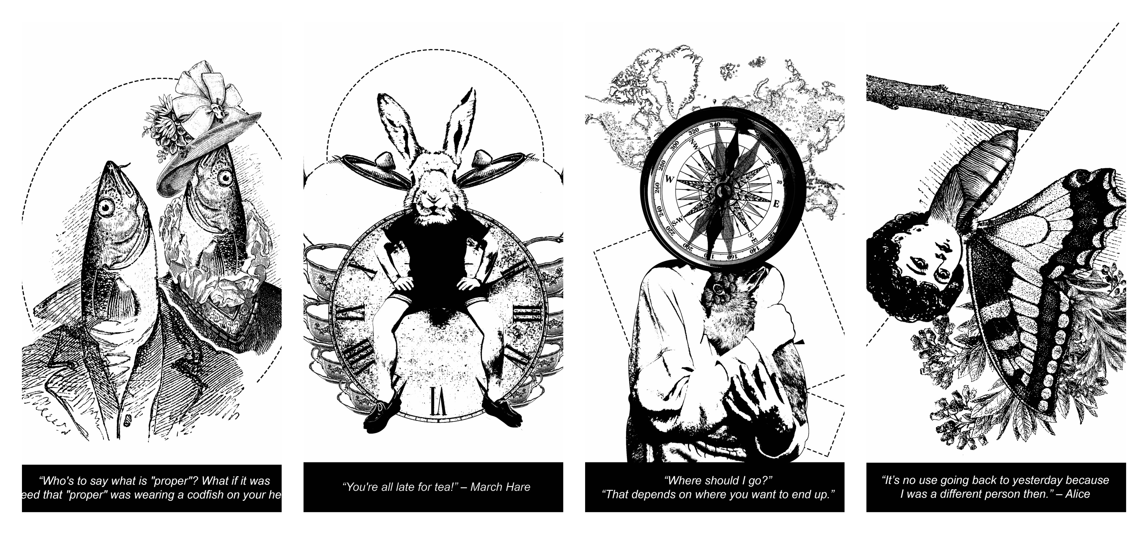
3 Characteristic you’d notice:

  • Muted colours
  • Canvas texture overlay
  • Constant stroke outline on each of the images


Building a Systematic and Consistent Pattern:

All the First panel: Very minimal elements, reduced down to a single vectored image and a color fill background. The main idea is to be straightforward as possible. The first panel will be the simplest among the 3 panels. (so as to balance everything out visually)

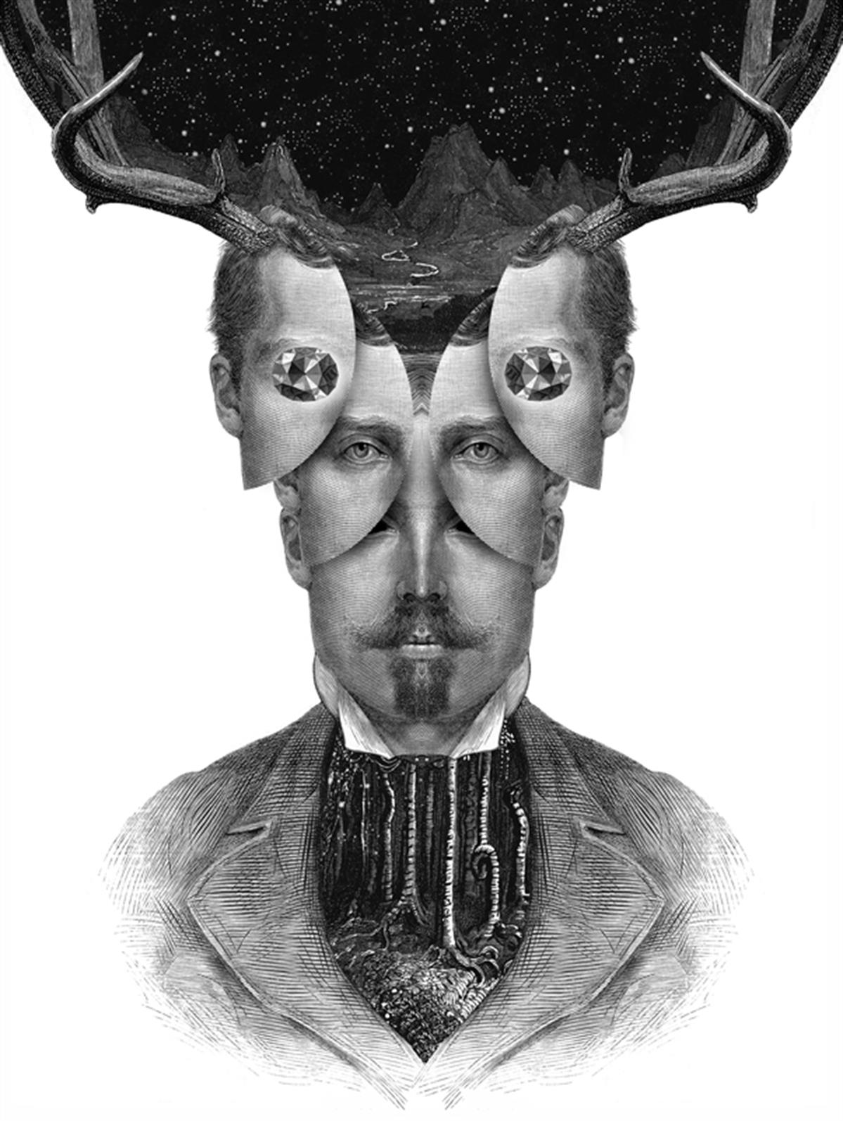
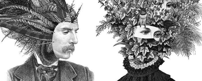
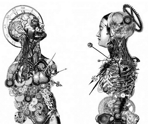
All the Second panel: This panel depicts scenarios/locations. It should look the most complex among the 3 panels. On top of that, a filtered illustration of myself will also appear recurringly across the equation.

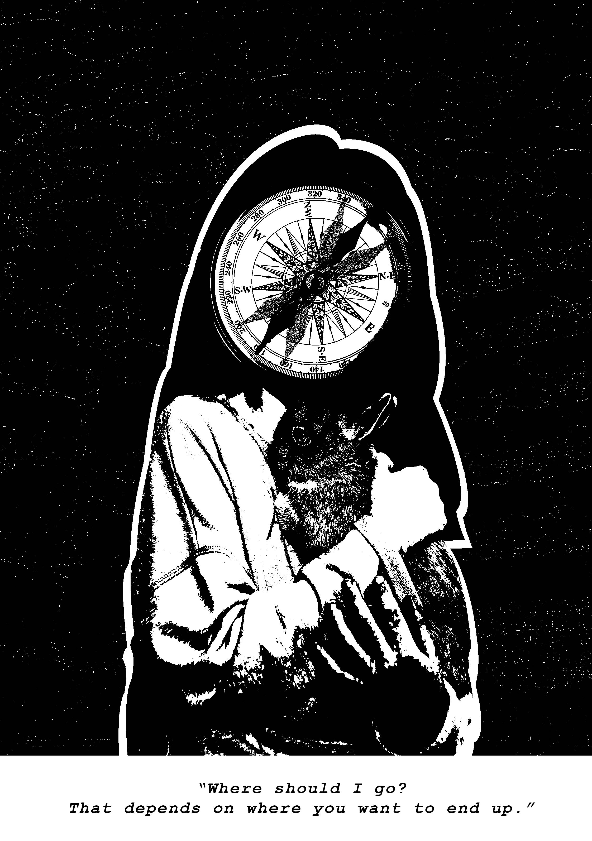
All the Third panel: To balance out the visual weight for each of the equation, my last panel features yet another minimal approach so that there is ample amount of space to support the design. In this last concluding panel to the equation, I decided to inject some humour into this space. By adding an illustration of myself, it provides a more personal touch. (I feel. hehe) In the initial phase, my panels weren’t consistent. After my second consultation with Mimi, she encouraged that it is better if my panels have a uniform style across all given equations. I thought it made sense. (this is how I eventually settled with the design)

DECISION-MAKING:

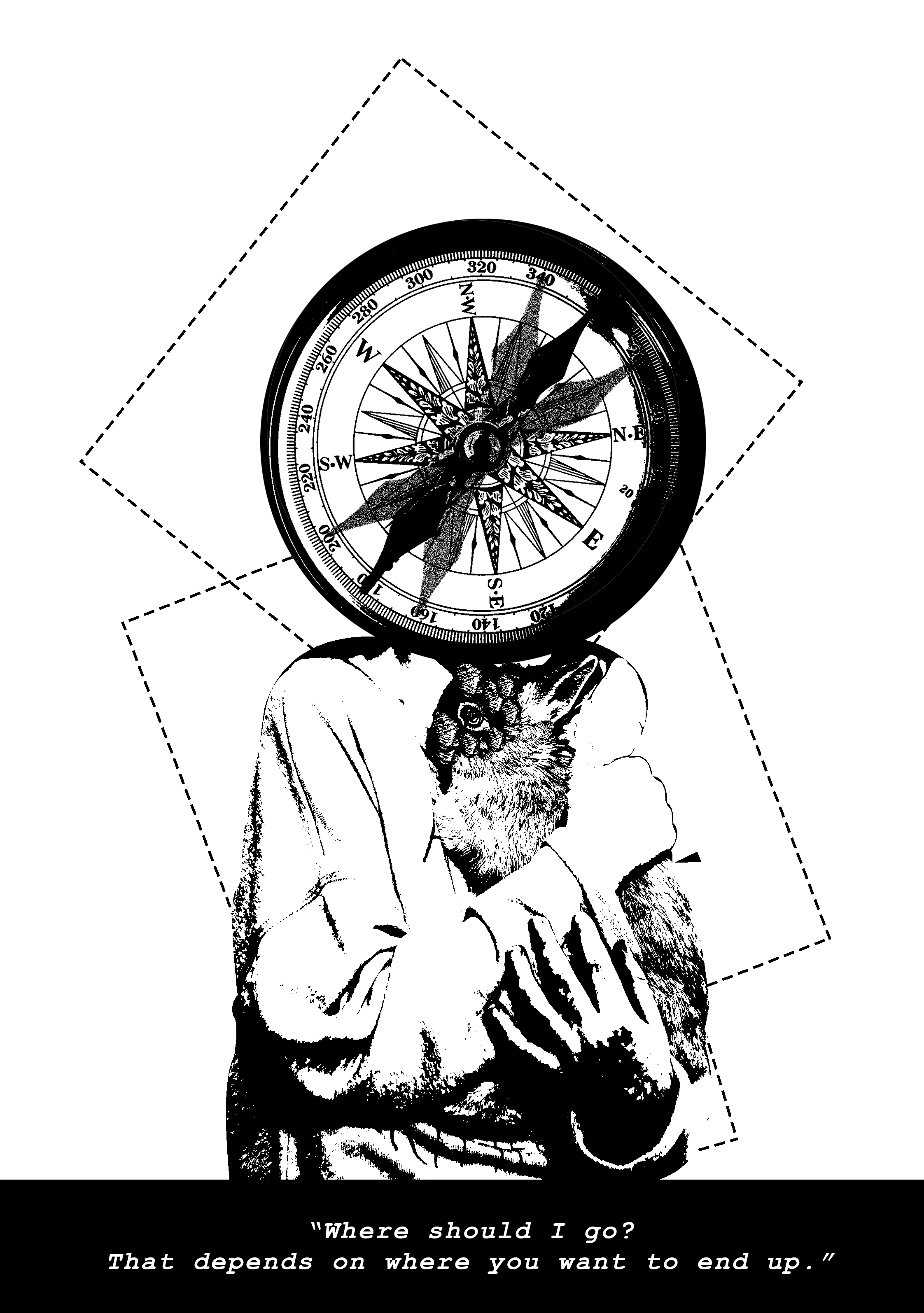
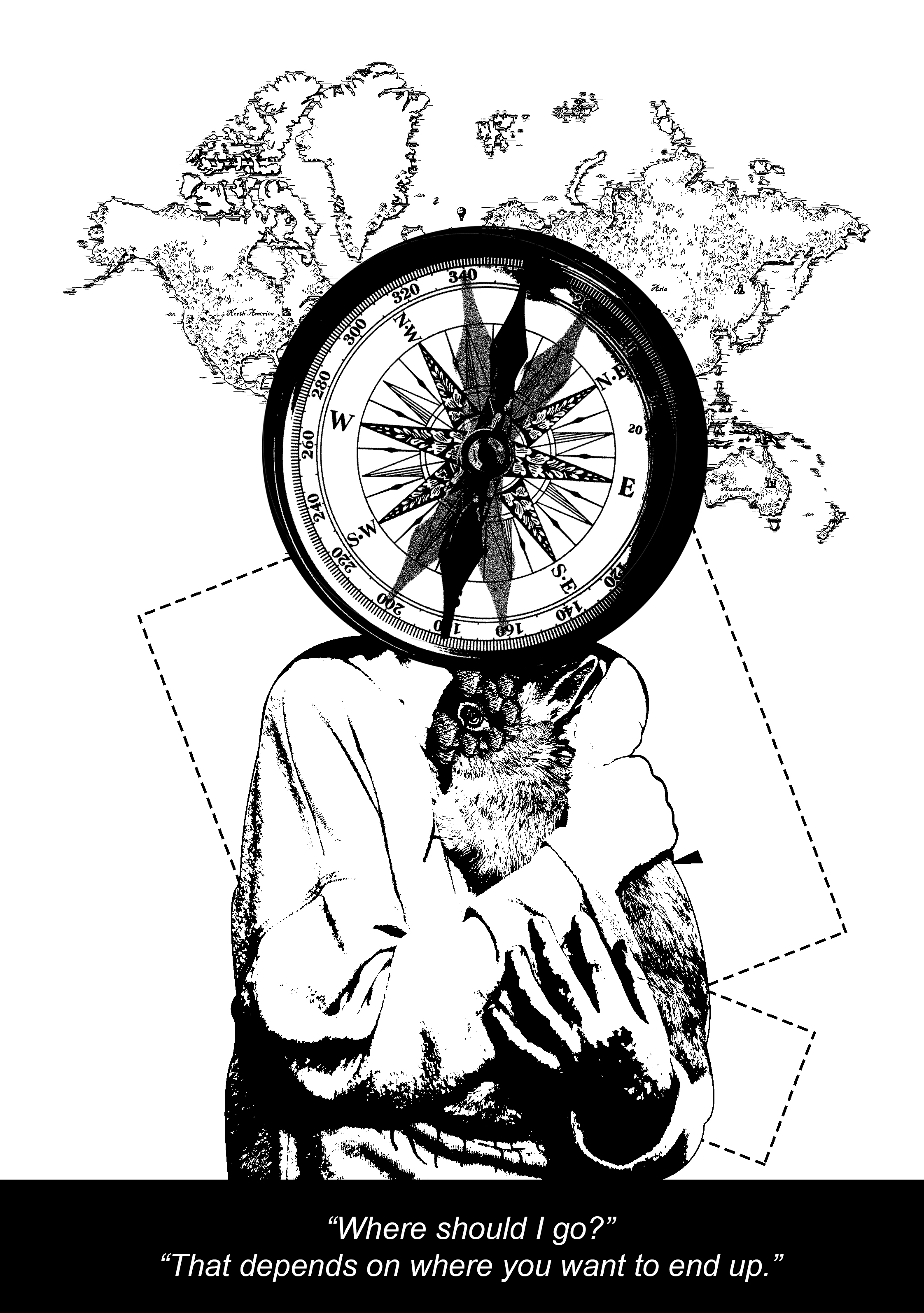
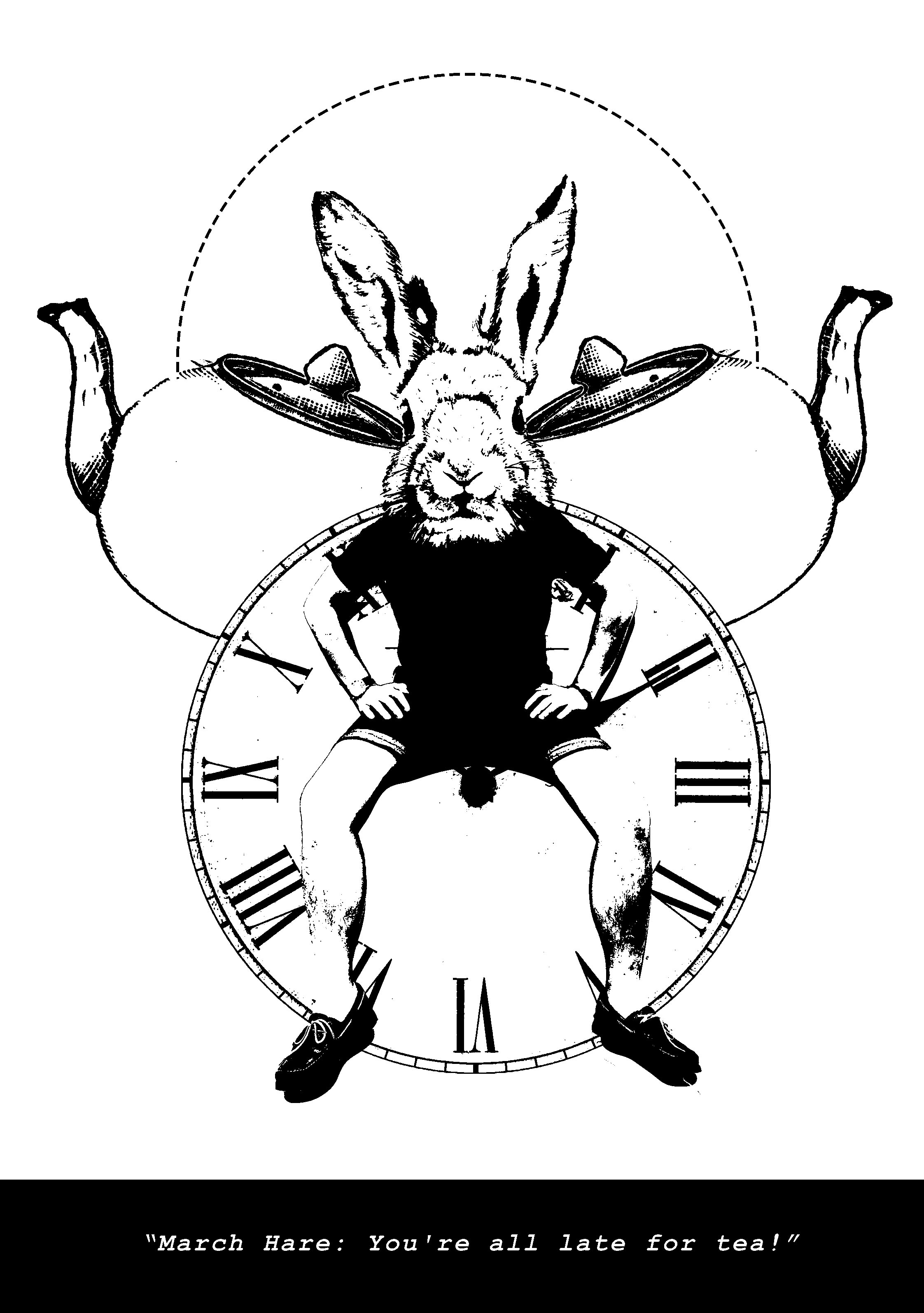
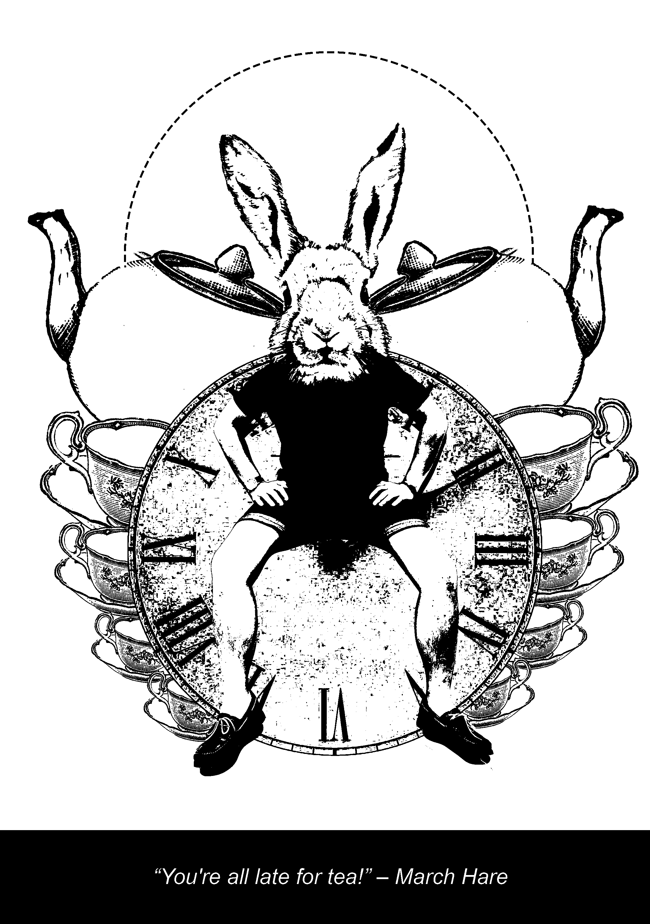
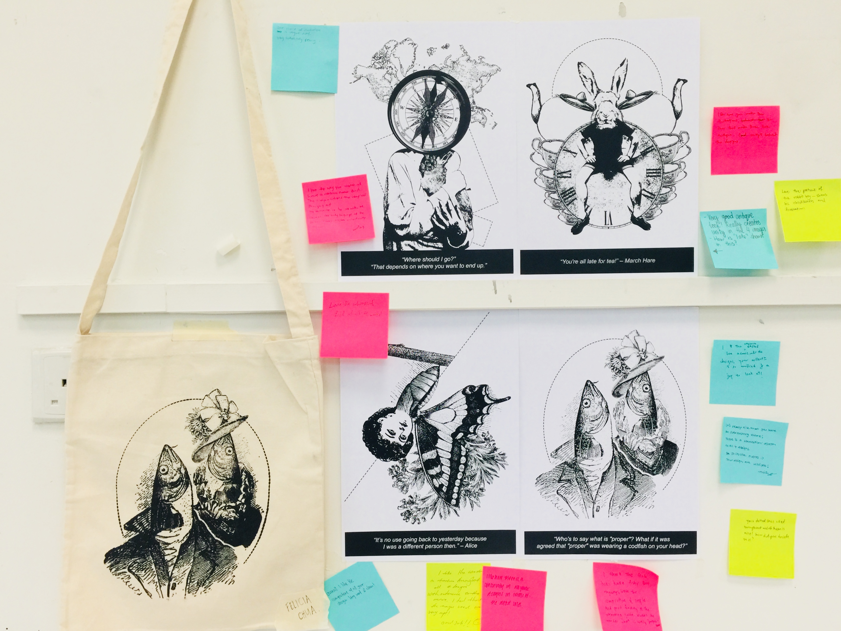
Some consideration in terms of suitability of the frame. In order for a smoother flow, I checked to ensure that my design scheme is consistent throughout all the equations. As for the panels below, I actually prefer the top set better. However, in terms of keeping the theme in check, the second set works a lot better. So that it shall be!

Bettering my concept to suit the theme: initially, the consistency of my panels was not quite right. the first design also appeared to be a little cliche. One of my classmates suggested illustrating a burger as though I am wearing it. Thought that was super cool and went ahead with the execution.

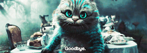
How the photographs are processed: From realistic to painterly (gif)

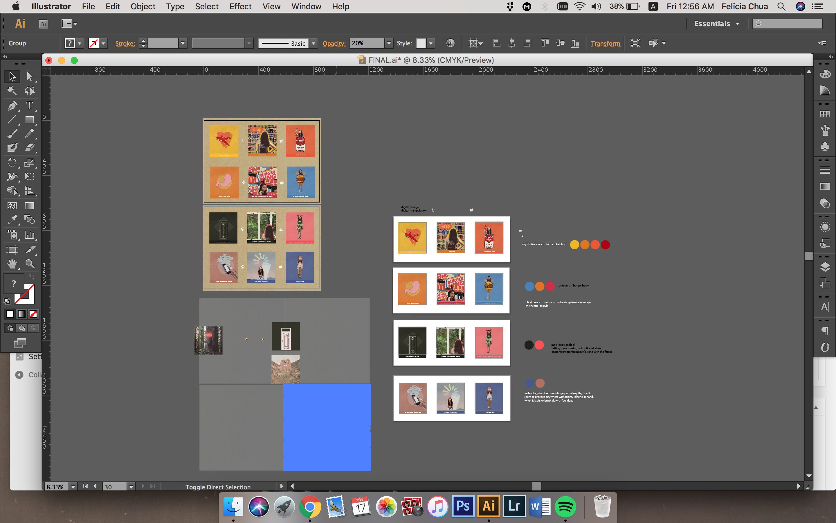
My (very unorganized) working file:

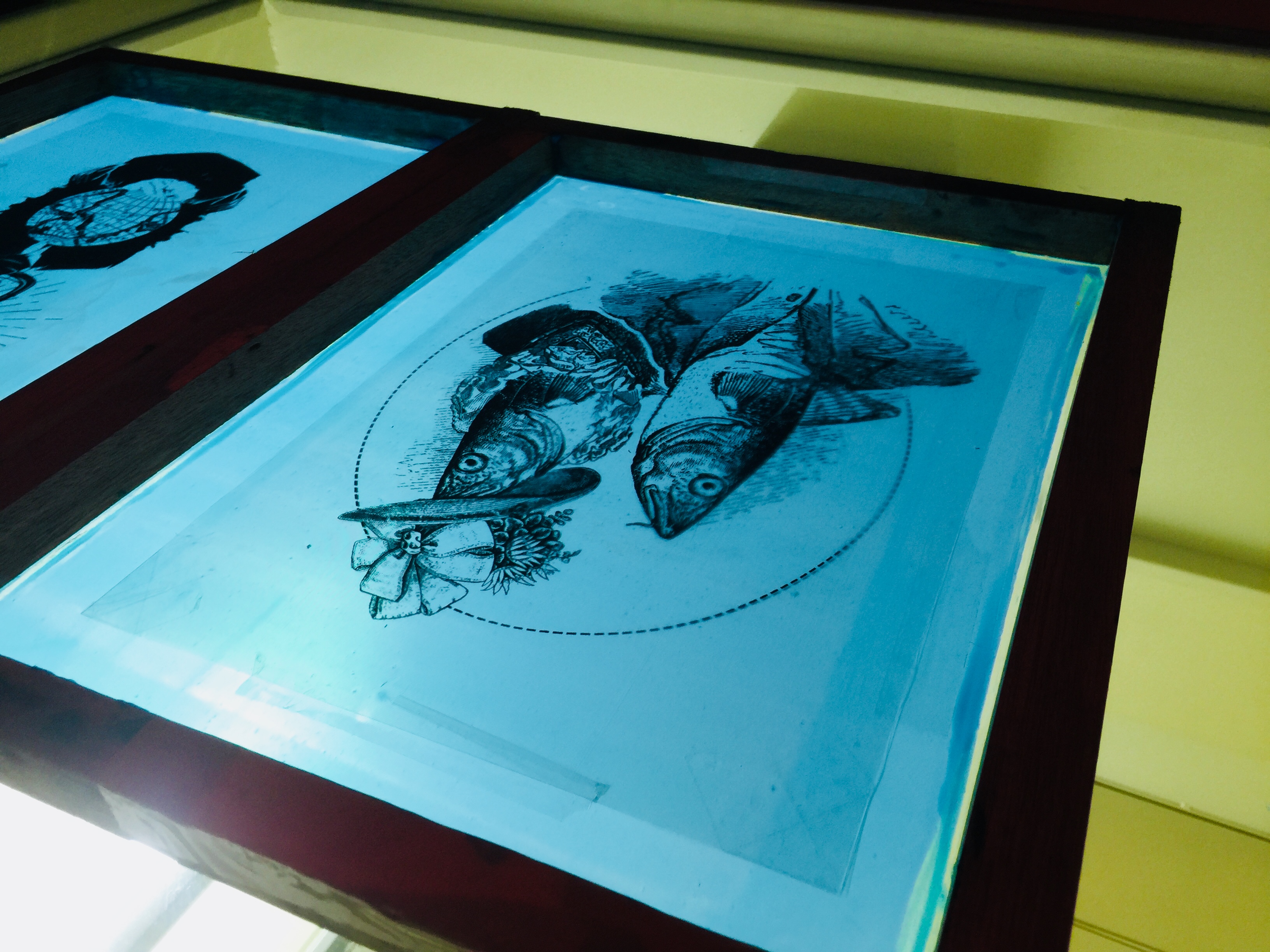
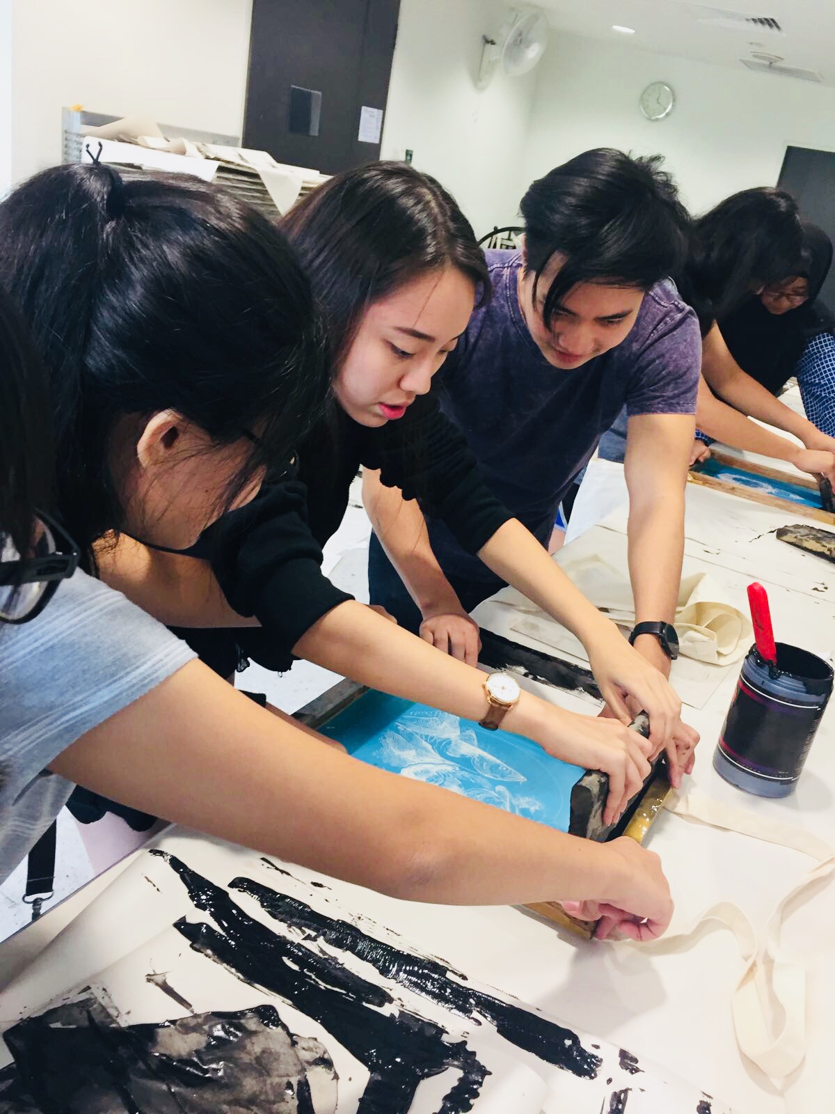
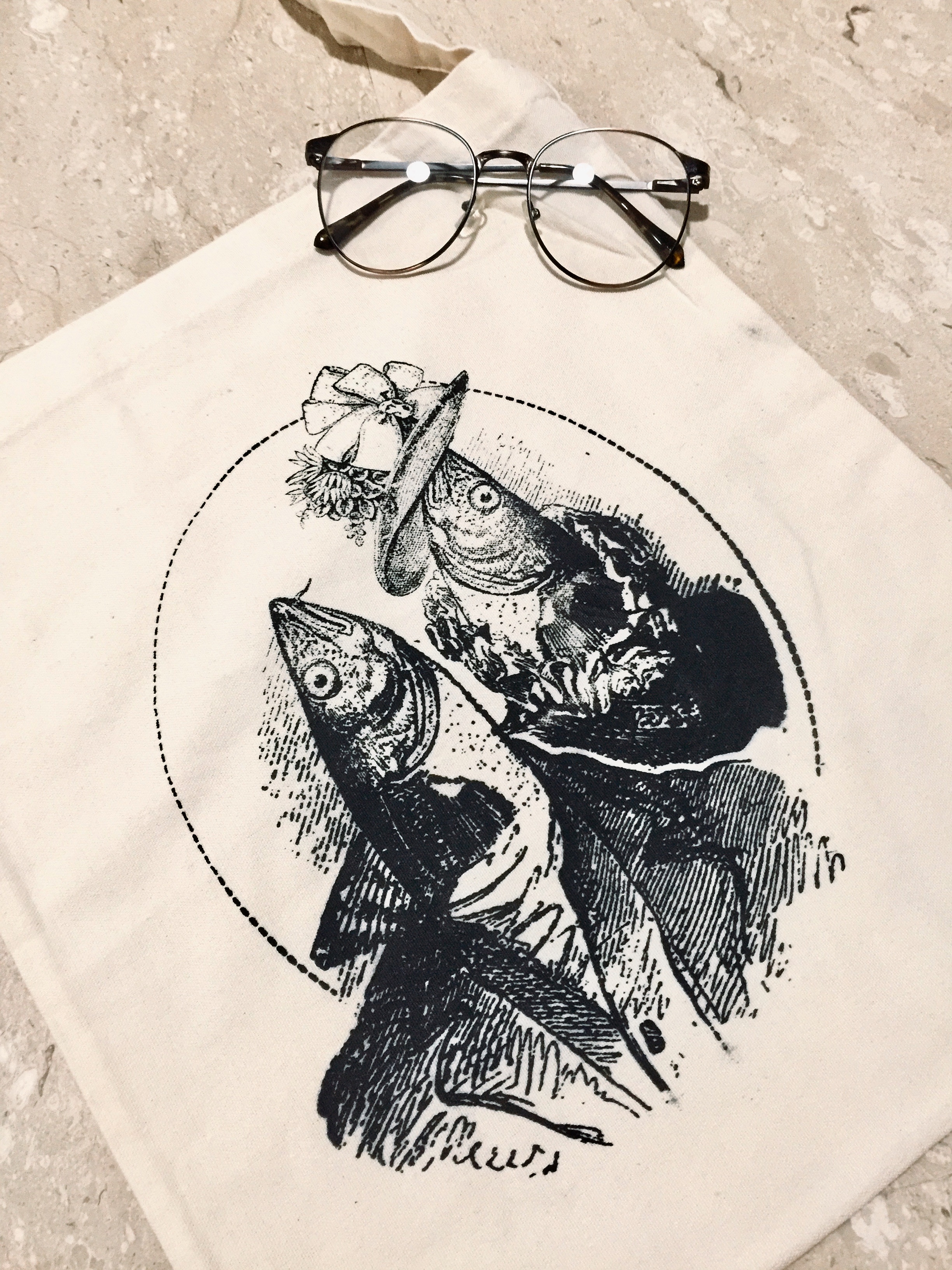
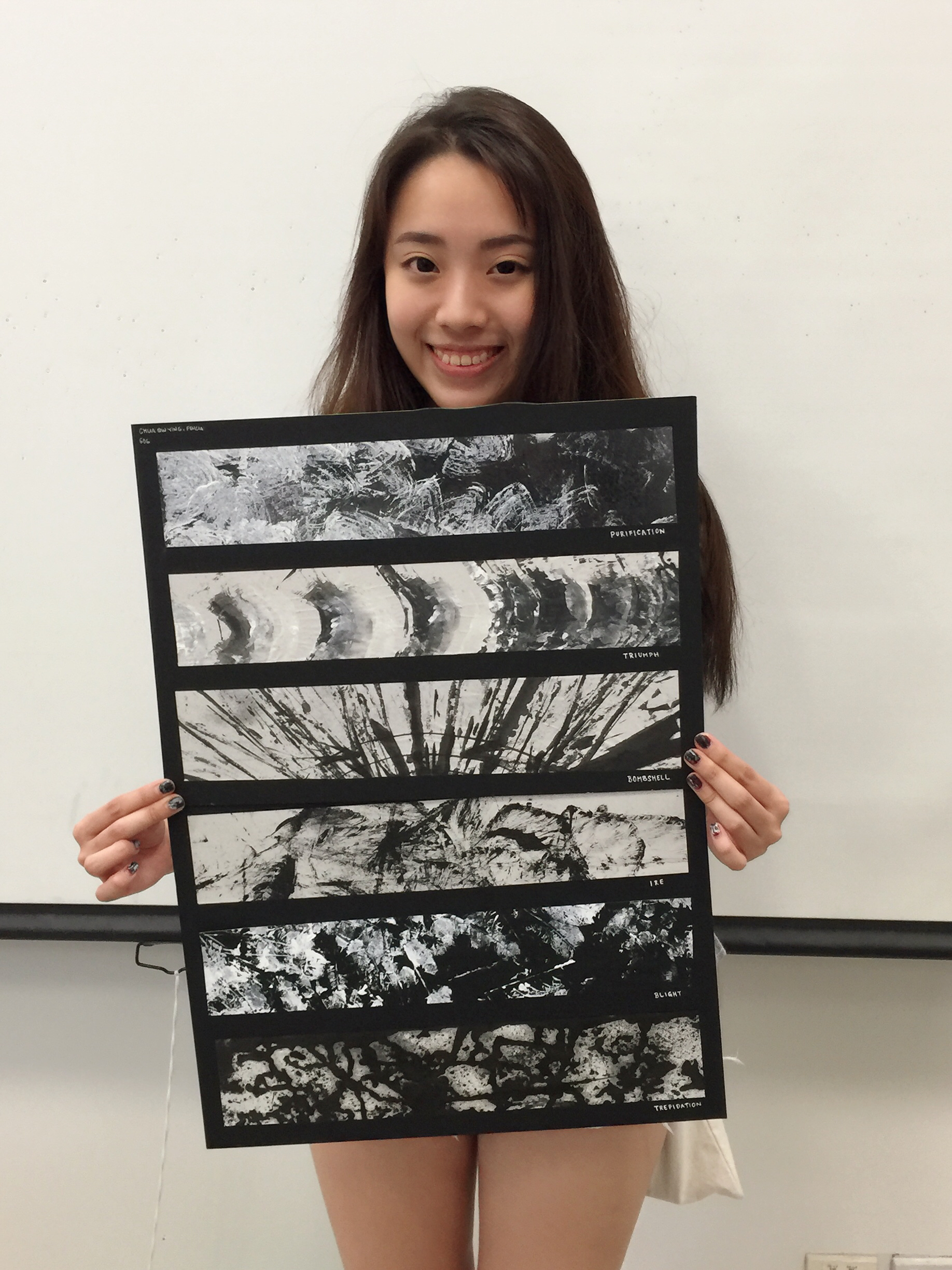
Presentation Day! (The actual color of the artwork will be recorded on this OSS post! )

Oh and I swear Andy is my hamburger soulmate 🙂


 If you have come this far, I’d like to thank you for reading!!!

Will catch you soon! Ciaos.

Project EGO: Layout Development

Hello Errrabadi. It’s week 13!!

This post will feature a series of failed attempts, of wasted nights and aching neck. The very first concept I had in mind revolves around the use of geometric illustrations and bold colours against my design.

Turned out pretty bad because I found myself stuck in the development of my panels. It kinda looked like this >

The colour scheme I had in mind was: Blue Yellow Red (Primary colours).

The second attempt I had was a Vintage/Retro Pinup themed (with surrealistic aspect). I wanted an illustrative style across all of my panels and because of that, it got really hard for me to source for suitable images that fits my theme. I spent hours searching for just the right image that compliments the style of my concept, but halfway through, I found myself losing the momentum. So I decided to put this on the KIV-list!

Monochromatic

Triadic

(…Still contemplating…)

These are my panels so far. As you can tell, I am not satisfied with what I have so far. Hence I went on to do more research and I came across a reallllyyy interesting idea but the execution was seemingly difficult. I shall document it down anyway. The theme for this fully revolves around the use of Pantone Strips to create elements.

Like so: (that’s a hamburger btw)

The colour schemes are analogous & monochromatic.

Since the Ego project focuses on colours, I thought this would be an interesting take. However, as I progressed on, the elements that are possible for creation appears to be really limited. For example, the Pantone strips are very geometric in shape. This means that the element that I want to re-create should be in angular shape as well otherwise the design wouldn’t quite compliment. As much as I adore this concept, I had to be aware of the existing limitations and the amount of time I have on hands. Furthermore, it feels like I have to restrict my creativity just to work this concept 🙁 So this is a no go either.

With that in mind, I decided to restart my canvas and plan for a more feasible concept.

This leads me to my final set of designs! The Illustrative Photo-Collage.


Will talk more about it in my next post – The Final Outcome. Stay tuned!!!

Ciaossss


Project EGO: Artist Inspiration

Hello World,

Today’s blog post will be focused on some of the Artists who have greatly inspired me in process of my findings for my panel of work. These works draw upon psychoanalysis, free-association, dreams, and the unconscious which I found to be amusing.

Contemporary Artists that do amazing Surrealistic Works which I found to be interesting –                Christian Schloe


 I enjoy her take on the surrealistic aspect of her artwork, and how an ordinary looking portrait can instantaneously look “zeng-ed” after the addition of elements.

For the eventual output, I hope to be able to re-create images that carry the essence of contemporary art, like so:

John Stezaker

He is one whose work challenged the predominance of Pop art, similar to the concept I had in mind, I wanted to do a photo collage that features elements from the Vintage Pop culture.

Gel Jamlang

Her drawings can illustrate psychedelic albums and surreal stories and what caught my eyes about her style is the use of watercolour textured renderings for her works. It is really so apt! I love it.

Now, we’ll move on to execution 🙂

Ciaos!

Project EGO: Colours Research

Hello, World!

Finally, we’re on the final project of the semester – Project EGO. In this assignment, we will be venturing into Colour Theory and how they fit in together in order to work in harmony. Here is my research on the Color Theory!

Without further ado, let’s begin!


The Colour Wheel

https://imgur.com/gallery/HAy6MWj


PRIMARY COLOURS

Primary colours are known as source colours, meaning that they cannot be made with mixtures of other colours.

consist of red, yellow and blue


SATURATION

The intensity of a single colour.


VALUE

The relative lightness and darkness of a single hue.


MONOCHROME HARMONY

A play in tonal value and intensity of a single colour, enhancing the style and thematic of the main hue.

MONOCHROMATIC PHOTOGRAPHY WORKS:


http://swipe.swipelife.netdna-cdn.com/wp-content/uploads/2014/11/Monochrome-Photography-Collection-Featured-by-The-Big-Picture-swipelife-2.jpg?aec60b

https://i.pinimg.com/originals/87/02/71/87027129ffe5c8d7a97fe63209cae8b9.jpg

MONOCHROMATIC PAINTINGS:

http://johnmyersart.tumblr.com/

https://www.flickr.com/photos/30666896@N06/3156790785/in/photostream


ANALOGOUS HARMONY

Colours that sit side by side on the Colour Wheel. The colour scheme that is most pleasing to the eyes since the transition of colours are sooooo gradual. (E.G. yellow, orange, green)

ANALOGOUS PHOTOGRAPHY:

Colors involved: Yellow, Orange, Green! Thus making it an analogous scheme.

ANANALOGOUS PAINTING:

https://www.flickr.com/photos/daviesjane47/17339031348/in/dateposted-public/


COMPLIMENTARY

They are colours that lie opposite to one another on the wheel which in turn creates a strong contrast! (E.G. red & green, blue & orange)

COMPLIMENTARY PHOTOGRAPHY WORKS

http://idolza.com/qz/r1130y6/photography-contrast/aa3603/

COMPLIMENTARY PAINTING


SPLIT COMPLIMENTARY

Created by joining a hue with the two hues beside its complement. (E.G. blue with red-orange and yellow-orange)

SPLIT COMPLIMENTARY PAINTING


TRIADIC

 Made up of three hues equally spaced around the colour wheel which creates an energetic set of colours with divergence given how the three hues are spaced so widely apart on the colour wheel.

TRIADIC PHOTOGRAPHY WORK

TRIADIC LOGO:


Here we see how colours work together in order to create a harmonious-looking design and it is a key component to any forms of design. (e.g. logo design, graphic design, illustrations, photography)

Well, I’ll see you in my next post.

Ciaos! 


Forrest Gump: Layout Development

Hello, World!

To refresh your memory, my selected movie is Alice in Wonderland. All of my quotes will be based solely on that film.

Alright, let us begin! (Warning, long post ahead!)


Artist References: DAN HILLER

I adore his surrealistic put-together of his graphic choices. The collage looked so natural and intriguing; especially the above concept!! ^ (That hollow eyes though)


Execution:

I intend to focus on improvising Design 3 & 5. These are my personal favourite of the lot! Might be using it for silkscreening hehe.

DESIGN 1:

Elements: Compass, Rabbit, Girl, Starry Background

Rationale: In the background, we have a bunch of stars. There is a song that goes “but are we all lost stars, trying to light up the dark”. So the stars literally symbolize a sense of loss. In the foreground, the girl’s face has been replaced with a compass. The purpose of a compass is to lead and guide the lost. However, Alice wasn’t sure of her heading, this explains why there is more than one needle on the face of the compass. This symbolizes confusion. A little girl’s body portrays the character’s innocence and her innate naiveness. While rabbits are most often associated with desires, comfort and stability, it reflects what the character is truly looking for.

Further Improvisation:

I wanted my design to have more depth (foreground & background). In my opinion, the previous attempt looked unsatisfying. Like its lacking of something you know! However, at this stage, I am looking at having one similar theme/concept for my 4 quote designs, so it ties in nicely together (e.g. dotted line shapes in the background) Since all the quotes are from the same movie anyway. I added a world map to further accentuate the idea of loss.


DESIGN 2:

http://thefashionjumper.com/wp-content/uploads/2016/05/Alice-in-Wonderland-gif-18.gif

Elements: Hare, Boy, Antique Clock, Tortoise, Girl

Rationale: My intention of having 3 clocks in the background is because it adds on to the whimsical effect, as of the movie. Play of negative and positive colours help make the middle clock stand out better. Rabbit and tortoise are 2 contrasting animals, which are often used as examples to illustrate fast or slow movement. A metamorphosis of a boy to a rabbit shows that the March Hare has the ability to think like an actual human. While the representation of a girl’s head on a tortoise represents the guest that was late for the tea party because they were slow (like a tortoise haha).

Feedbacks: Confusing juxtaposition of 2 animals, can do without. Switch the negative clocks to a more symbolic element – e.g. teapot/teacups. Reduce the black areas

Further Improvisation:

In the second layout, I added in teacups since it looked too plain for my liking. It added on to the idea and flow of symmetry to my design. I have added in the dotted line element for this as well!


DESIGN 3: (This ma fave)

Elements: Cod Fish, Man in Suit

Rationale: The Cod Fish was literally placed in the spot where his head once sat. This shows the lack of thinking and simply blindly following the social norms. Since the setting of the movie was in early 1865, a man in vintage suit would better pull of the meaning as well as origin behind the storyline, while staying true to the movie plot. The dotted circle is a design element that aims to bring focus to the main design in the middle.

Feedback: Design can include a collage of different people wearing different outfits that consist of the Codfish element. e.g. Andy Warhol’s collage style

Further Improvisation: (prefer the first one better because it fits the woodcut aesthetic)

Justification: The quote was said by Alice to her parents, who, with good intentions, forced her to into a wedding proposal with another guy whom she does not favour. She was determined to not follow the standards that society has set (where young girls married young). This statement on “Who’s to say what is proper…” is focused on delivering the idea that her parents are morbid in their beliefs, and their refusal to look past traditional values that imprinted on their ideology. The two fishheads represent Alice’s parents.


DESIGN 4:

Elements: Teapot, 3 Deformed Bodies, JellyFishes, Bubbles

Rationale: Jellyfishes are soft-bodied, free-swimming aquatic animals. Hence it made sense to use this boneless sea creature as a representation of being flexible. As said “I’ve been shrunk, stretched……teapot!” It shifted form from an animal to a human being, just because its not humanely possible to re-size our bodies. The play of metamorphosis would make the graphic visually interesting. Bubbles represents discomfort/gasping of breath.

Other Variations/Exploration:

Well, this is not my personal favourite. I might just come up with a fifth design and completely scrape this off my list. We’ll see!


Design 5:

Elements: Skeleton, 2 men, Back of the pocket watch

Justification: With the use of skeleton, I want to portray Alice’s desire to shape her life in a better way such that she is a bettered human as compared to yesterday. A skeleton is often associated with spiritual development, and can demonstrate growth in character. 2 men’s faces placed against a skull to show a literal difference. The appearance of the watch to indicate that time changes things.

Improvisation: After consulting mimi, I realise I have to better present the idea of “changed person”. Hence, I went to look for a better reference image that could represent my final idea.

Then, I came up with the subsequent layouts! With alot of improvisation inbetween of course. So I decided to scrape the previous layout entirely and redo my design based on the selected quote above.

Here we have it: A development from Layout 1 to 2, 2 being the selected design I will push for my final work.

Layout 1:

I personally do not favour this layout. I thought the design elements could have been a lot stronger. I aim to create more depth in the next layout design.

Layout 2:

Element: Cocoon, Half a butterfly, Girl’s head, Blooming Flowers

Justification: It is a metamorphosis of two insects at different stages of their growth. One being Cocoon stage, and another being the butterfly stage. The girl is facing towards the direction where the flowers bloom, which indicates that she is looking towards a better tomorrow.


Presentation Day!

thank you for all é feedbacks!!! <3


Alright, Ciaos!

Forrest Gump: Silkscreen Process & Finalisation

Hello, World!

Today, I had my very first silkscreen attempt! Was good (only after multiple tries haha). The coating of the blue layer was most challenging in my opinion as it is the very fundamental of the process – THE MAKE OR BREAK

The final design I picked for my tote bag is…

*drum roll please*

My classmates call it The Fishies! Following next will be my final 4 concepts –

*CLICK*


My Thought Process:

Since all these quotes are extracted from one movie itself, I wanted these panels to have an overarching theme that ties in seamlessly together. That means by looking at it from afar, one can easily identify the style that is injected into all the designs and that it would be obvious that it comes from the same designer(like a series). By using lines in the background, it helps them to identify with the other panels. Lines help to direct the eyes and provide visual flow for the viewers, aiding in the communication of my design piece.

Apart from that, I adore woodcut textures. Hence, I painstakingly searched for images that are visually “similar” in texture and style so that they would compliment one another when placed together. This would ensure that none of the elements stick out like a sore thumb when viewing them in whole. This is one of the most challenging problems faced throughout the project execution since there is a pool of image options out there, it would be difficult to settle on one that can give the aesthetic a push.

Contrast & Depth is one thing that I took notice of too. I have to vary between thin and thick strokes, light and dark fill (shadows & highlights). Too much of blacks tones can make your design sink, appearing visually heavy and hard to digest. Too many whites would look as though it lacked dimensions, hence appearing flat. Balancing the contrast of the threshold can be challenging at times, but it all worked out eventually. laughing


& some progress shots that were taken along the way –

Gotten our tote!

Draining out the ink to reveal the underlying print

Scanning our print onto the mesh board

Taping up and around!

& that’s fran & joel!

as well as many others! thanks for the emotional support


& LAST BUT NOT LEAST!!!!! THE FINAL OUTPUT – 

YAY.

Thank you for reading! 😉

Ciaos.

Forrest Gump – Research

Chosen Movie:  Alice In Wonderland

http://movies.disney.com.au/alice-in-wonderland-2010

I always have a thing for whimsy movies. It never fails to take me on a ride in their world, so full of chaos and brilliance. Furthermore, such genres would be easier to manipulate with when it comes to  ‘Forrest Gump’. So I thought we could give this a shot!


// Movie Synopsis:

A young girl when she first visited magical Underland, Alice Kingsleigh (Mia Wasikowska) is now a teenager with no memory of the place — except in her dreams. Her life takes a turn for the unexpected when, at a garden party for her fiance and herself, she spots a certain white rabbit and tumbles down a hole after him. Reunited with her friends the Mad Hatter (Johnny Depp), the Cheshire Cat and others, Alice learns it is her destiny to end the Red Queen’s (Helena Bonham Carter) reign of terror.  cr: google.com/aliceinwonderland/


// Some of the Main Characters are:

– Alice Kingsley

http://movies.disney.com.au/alice-in-wonderland-2010/characters

– White Queen

– Red Queen

https://i.ytimg.com/vi/OnVcvv4iyvw/maxresdefault.jpg

– The Mad Hatter

https://img.cinemablend.com/cb/8/d/f/c/4/9/8dfc49fd68fc1fe1ddecf862484749db2597f17f09a60ab7766e1e9a2351b5fd.jpg


// Some of the shortlisted quotes mentioned by these characters are:

“Where should I go?” -Alice. 
“It’s no use going back to yesterday because I was a different person then.” – Alice
“Why, sometimes I’ve believed as many as six impossible things before breakfast.” – The White Queen
“Who in the world am I? Ah, that’s the great puzzle.” – Alice
“I don’t think…” then you shouldn’t talk, said the Hatter.” 
“We’re all mad here.” – Mad Hatter
“My dear, here we must run as fast as we can, just to stay in place. And if you wish to go anywhere you must run twice as fast as that.”


From here on, I’ll start brainstorming on my 4 final quotes.


See you soon! x

My Line is Emo: The Botanist’s Emotions

THE BOTANIST’S EMOTIONS 


Overarching Theme: Botanical Plants and Nature


–  STORY BREAKDOWN –

// First level of emotion: PURIFICATION

I would like you to imagine this: A Botanist’s first discovery of her interest in planting. Whenever she is involved in planting, it is as if she forgets all her unhappiness. This new found hobby purifies her soul and gave her life a new meaning.

Method: A quadrant of an onion, stamped in white acrylic paint on transparent paper


// The second level of emotion: TRIUMPH

On a fine morning, she walked into her little garden and to her surprise, she saw that a seed has sprouted! It was a proud moment for her and this was when a sense of pride started to grow in her.

Method: Sliced Aloe Vera stamped on newsprint


// The Third level of emotion: BOMBSHELL

At this point of time, we call it the peak of emotion where she reached the highest point of satisfaction. Her passion was driven to its extreme especially when it is time for harvest. She could finally reap all her hard work.

Method: Long blade of grass, whipped against paper


// The fourth level of emotion: IRE

Life isn’t all rainbows and butterflies. And at times, we will hit rock bottom. At this stage, her entire garden of corps died. She was brought face to face with failure and disappointment. For the first time, her efforts were in vain despite her meticulous care. What went wrong? She questioned.

Method: Vines rubbed in paint, pressed against paper. Using a block of wood, apply pressure and pull the ends of the vine to create similar effect


// The fifth level of emotion: BLIGHT

Darkness consumed most of the light. Was she truly meant to be a Botanist? A sense of loss and helplessness dwelled in her for the longest time. Eventually, the last leak of light is gone. She has been consumed by failure.

Method: A bunch of dried leaves in ink pressed against paper to create a viewpoint of a person standing under a tree, looking up. The whites are the lights that filter through.


// The sixth level of emotion: TREPIDATION

Self-doubt blasted in every corner of her body. This is how trepidation looks like to her. Scarred from failure, she never found the courage to plant again.

Method: Dry Soil soaked in chinese ink


YAY!

Can’t describe how happy I am feeling right now. It was a wonderfully emotional process hehe.

Thanks for reading!