Hello, World!
Finally, we’re on the final project of the semester – Project EGO. In this assignment, we will be venturing into Colour Theory and how they fit in together in order to work in harmony. Here is my research on the Color Theory!
Without further ado, let’s begin!
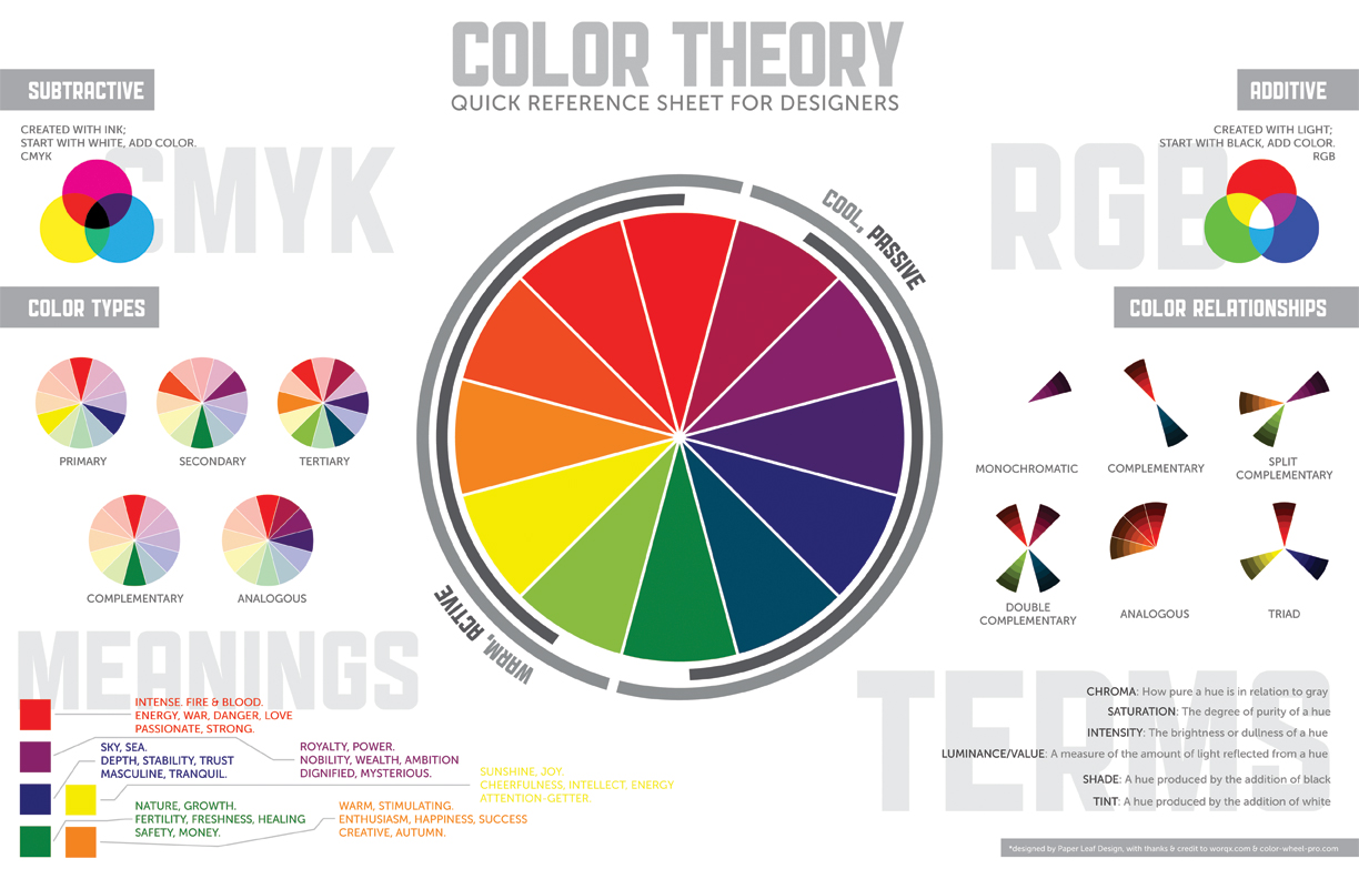
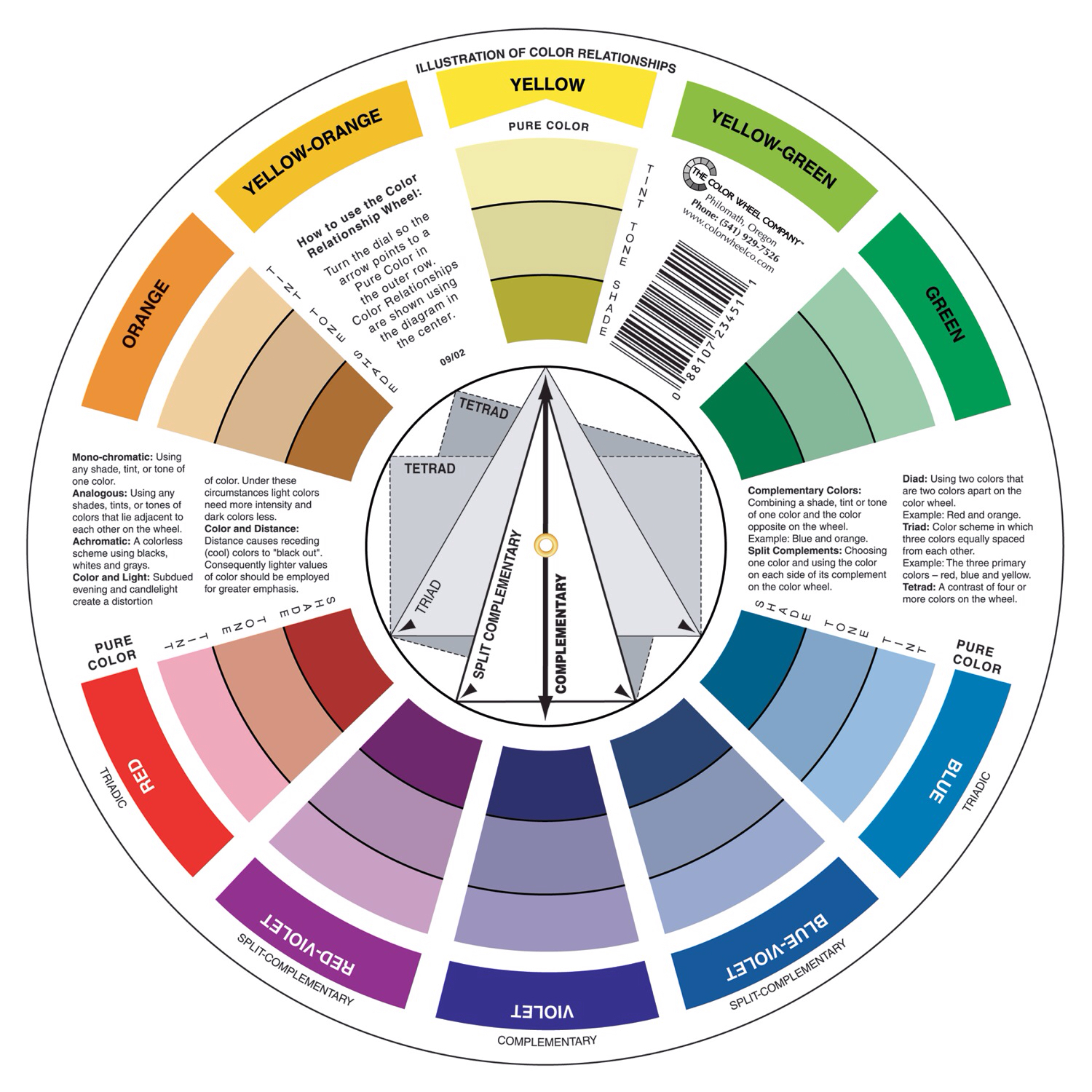
The Colour Wheel
https://imgur.com/gallery/HAy6MWj
PRIMARY COLOURS
Primary colours are known as source colours, meaning that they cannot be made with mixtures of other colours.

consist of red, yellow and blue
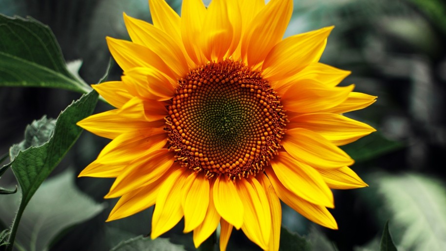
SATURATION
The intensity of a single colour.

VALUE
The relative lightness and darkness of a single hue.

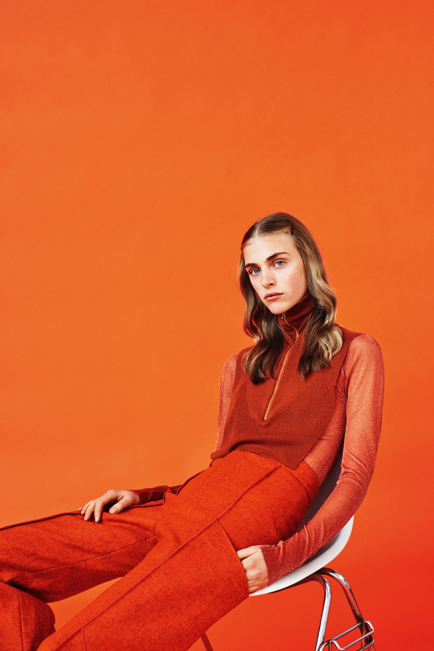
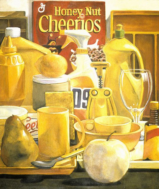
MONOCHROME HARMONY
A play in tonal value and intensity of a single colour, enhancing the style and thematic of the main hue.
MONOCHROMATIC PHOTOGRAPHY WORKS:
http://swipe.swipelife.netdna-cdn.com/wp-content/uploads/2014/11/Monochrome-Photography-Collection-Featured-by-The-Big-Picture-swipelife-2.jpg?aec60b
https://i.pinimg.com/originals/87/02/71/87027129ffe5c8d7a97fe63209cae8b9.jpg
MONOCHROMATIC PAINTINGS:
http://johnmyersart.tumblr.com/
https://www.flickr.com/photos/30666896@N06/3156790785/in/photostream
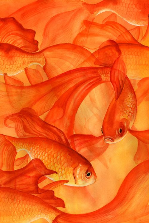
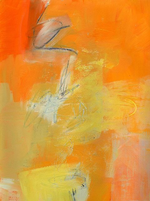
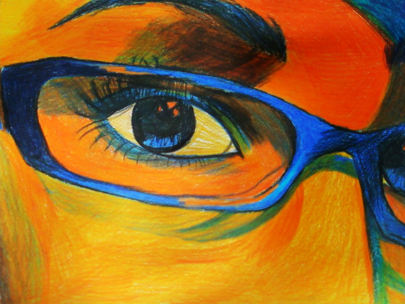
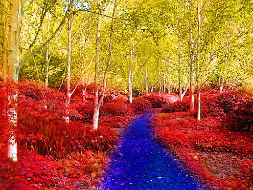
ANALOGOUS HARMONY
Colours that sit side by side on the Colour Wheel. The colour scheme that is most pleasing to the eyes since the transition of colours are sooooo gradual. (E.G. yellow, orange, green)
ANALOGOUS PHOTOGRAPHY:
Colors involved: Yellow, Orange, Green! Thus making it an analogous scheme.
ANANALOGOUS PAINTING:
https://www.flickr.com/photos/daviesjane47/17339031348/in/dateposted-public/
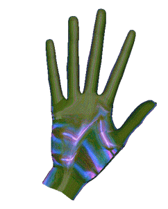
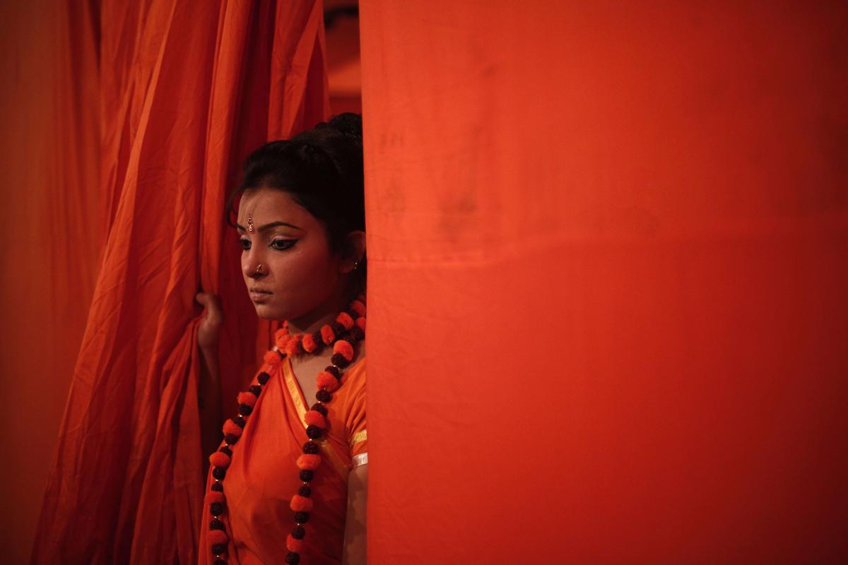
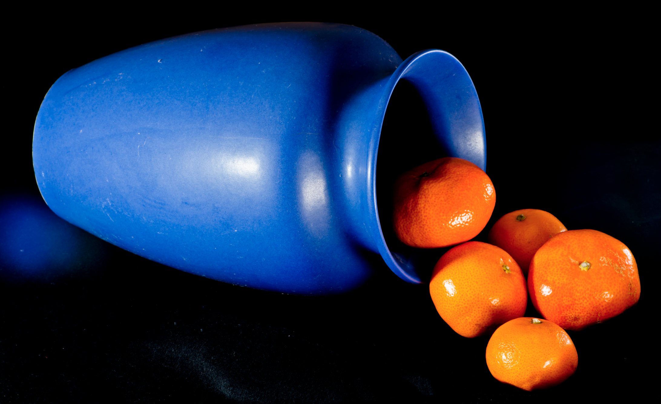
COMPLIMENTARY
They are colours that lie opposite to one another on the wheel which in turn creates a strong contrast! (E.G. red & green, blue & orange)
COMPLIMENTARY PHOTOGRAPHY WORKS
http://idolza.com/qz/r1130y6/photography-contrast/aa3603/
COMPLIMENTARY PAINTING
SPLIT COMPLIMENTARY
Created by joining a hue with the two hues beside its complement. (E.G. blue with red-orange and yellow-orange)
SPLIT COMPLIMENTARY PAINTING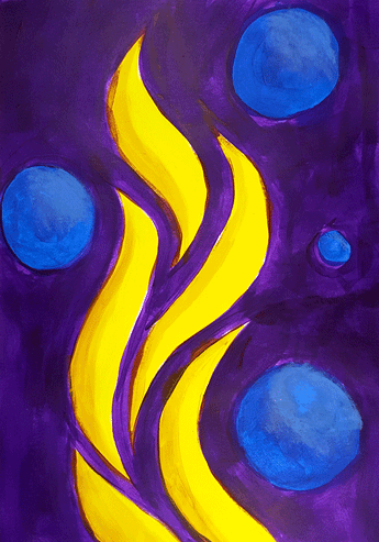

TRIADIC
Made up of three hues equally spaced around the colour wheel which creates an energetic set of colours with divergence given how the three hues are spaced so widely apart on the colour wheel.
TRIADIC PHOTOGRAPHY WORK
TRIADIC LOGO:

Here we see how colours work together in order to create a harmonious-looking design and it is a key component to any forms of design. (e.g. logo design, graphic design, illustrations, photography)
Well, I’ll see you in my next post.
Ciaos!