Click to access Moodbox PDF! 🙂

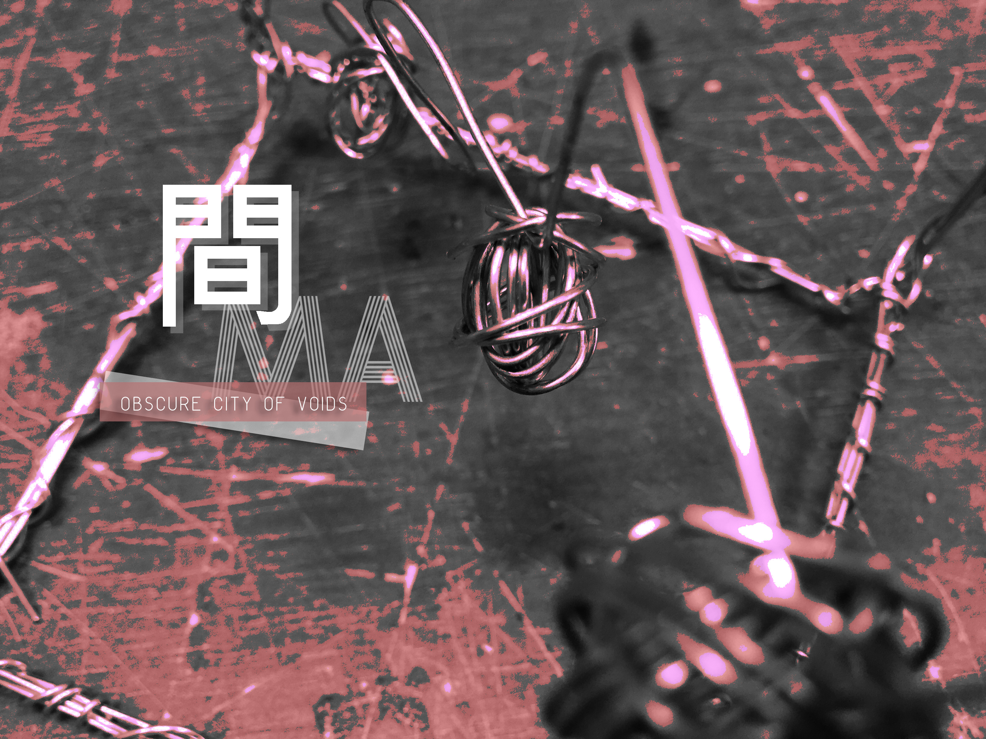
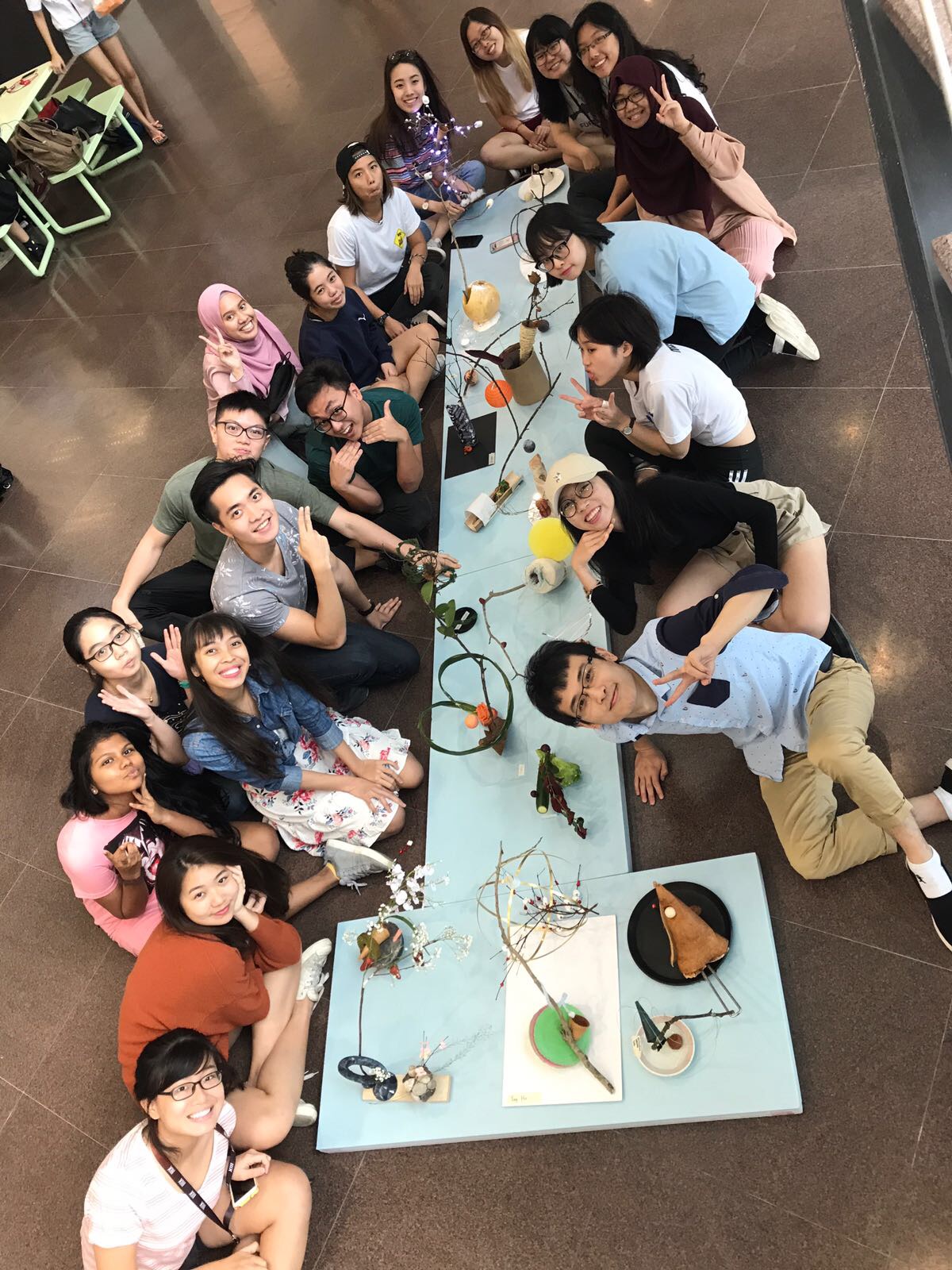
間 MA’s City of Voids: Moodbox (Group)
Leave a reply
Click to access Moodbox PDF! 🙂

Click to access Dragon Temple PDF! 🙂
Hello World!
To kickstart the post for City of Voids, our first lesson focused on the idea of making music and translating intangible sounds into tangible 3D Models. As such, here we have our sounds (sound 1 & 2), do give it a listen!
Sound 2:
Sound 1:
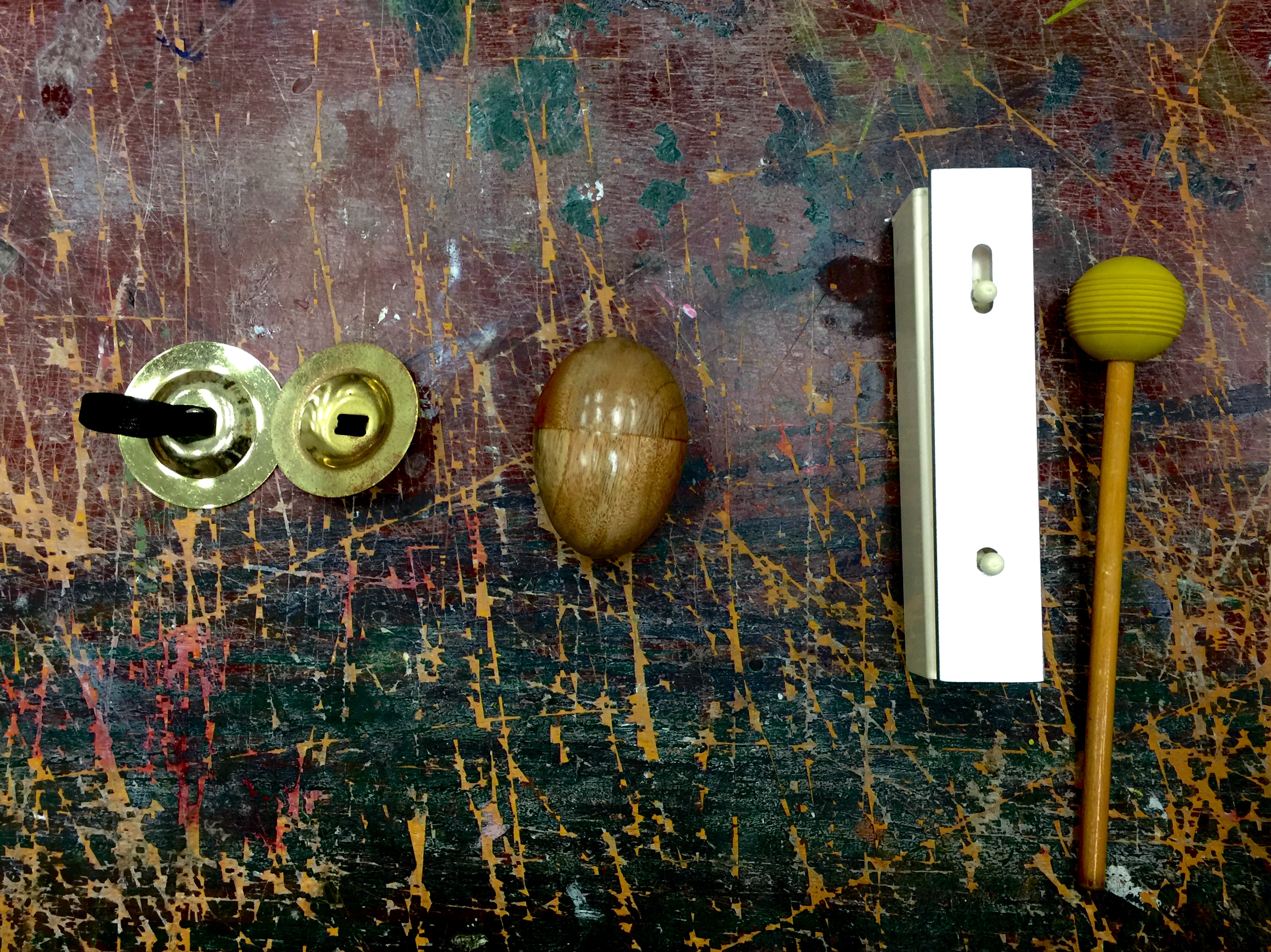
Sound 2 is created with these instruments:
Left to right: Finger Cymbals, Egg Shaker, Metallophone
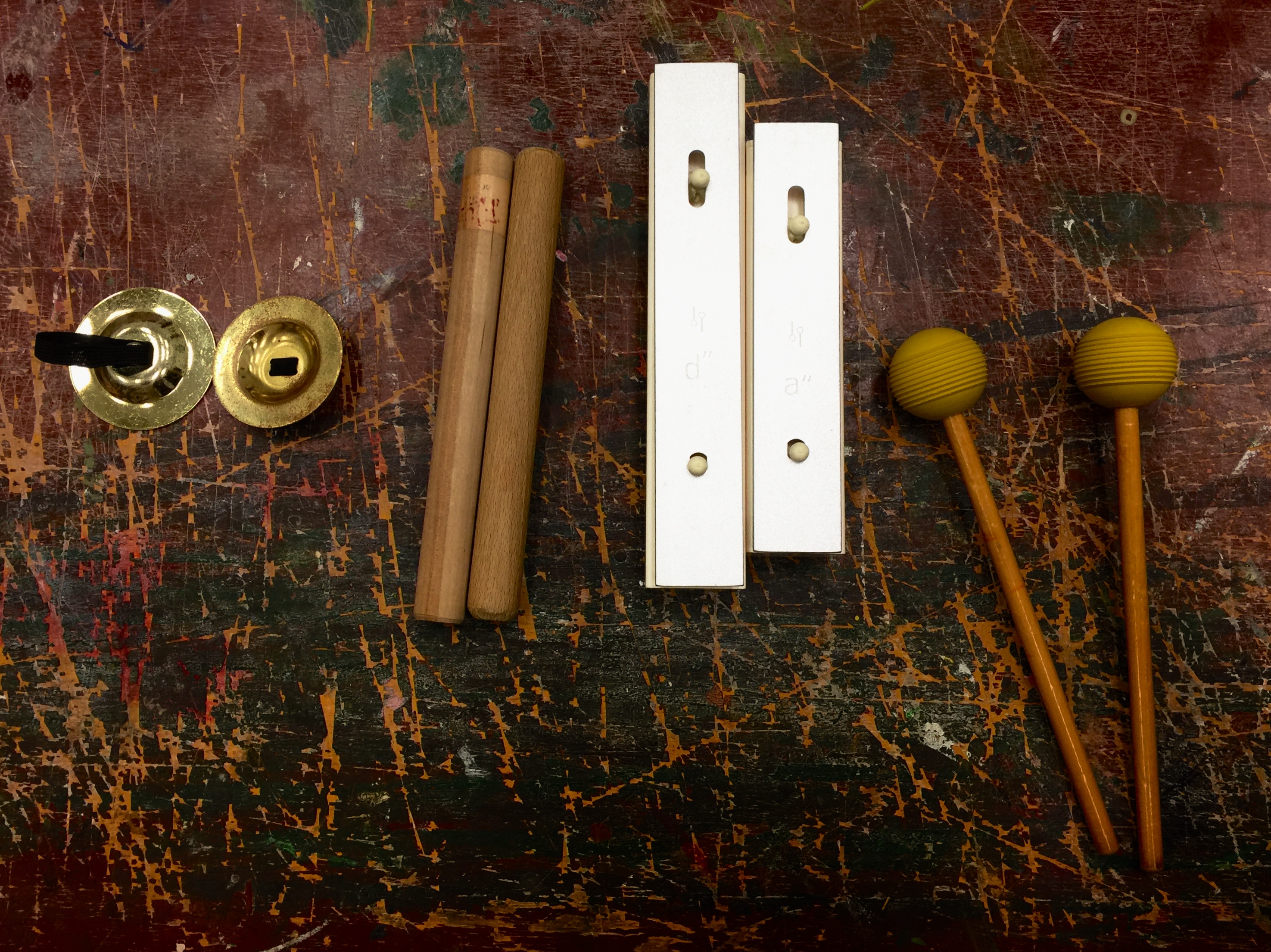
Sound 1 is created with these instruments:
Left to right: Finger Cymbals, Rhythm Sticks, Metallophone
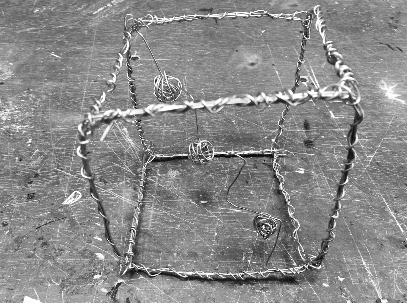
Shots of my 3D Model:
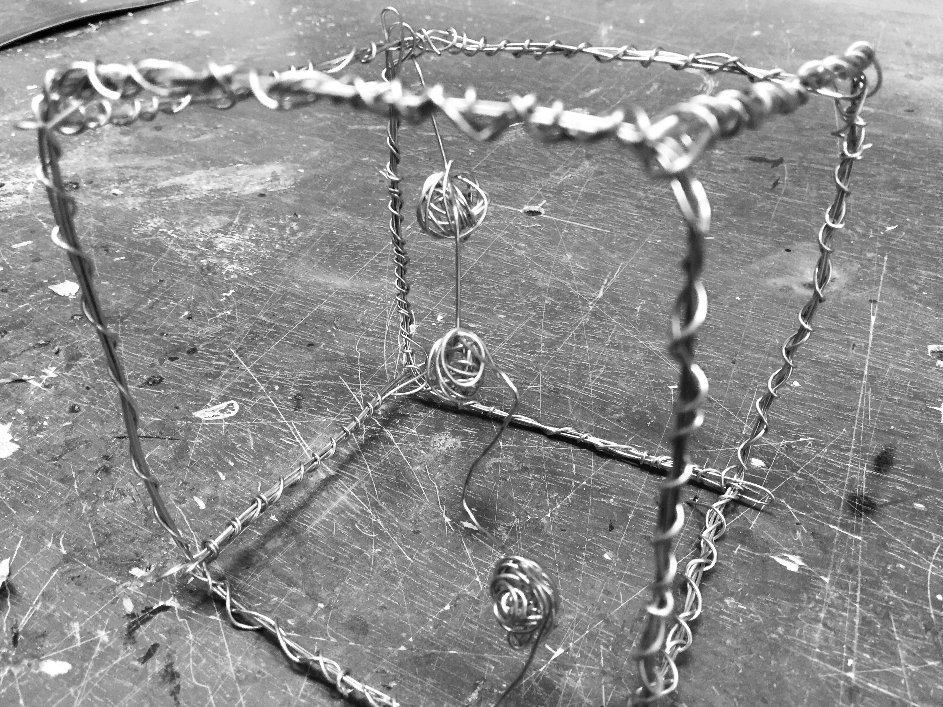

Calculations that made up my Model:
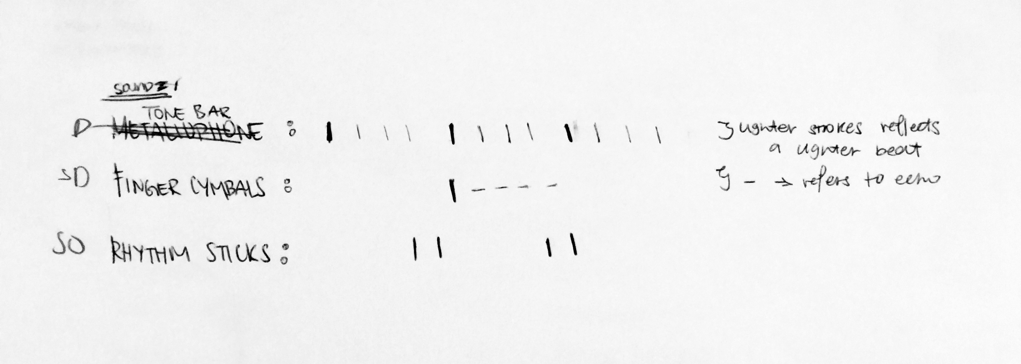
Tone Bar: 8 beats
Finger Cymbal: 1 beat + 3 seconds of echoes = 4 beats of 8
Rhythm Sticks: 2 beats of 8
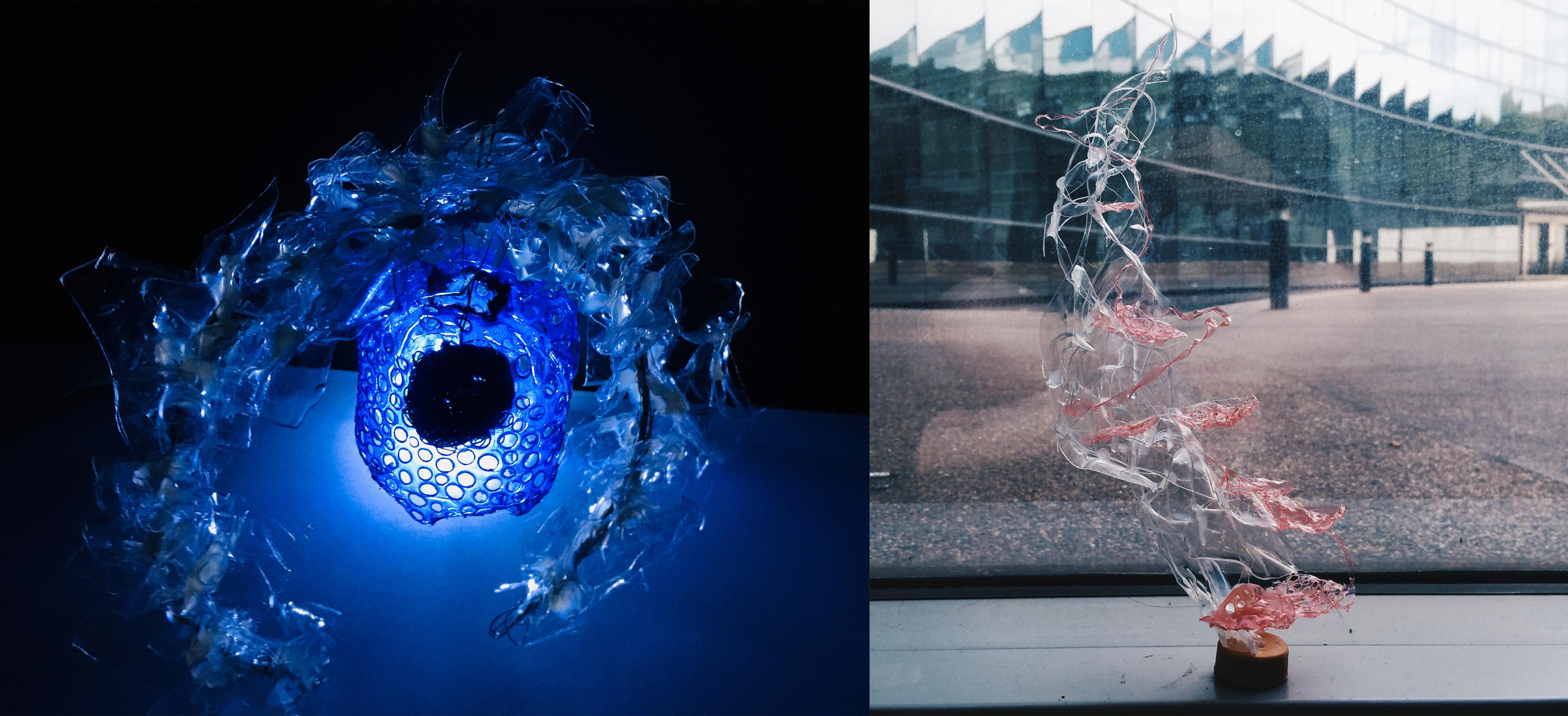
Tone Bar: Dominant – Long note. It is the recurring beat that repeated itself throughout the entire time, like the skeleton that supports the ongoing melody. The duration of the sound is long since it is heard most of the time. Since the material of the instrument is made of metal and it gives off a metallic sound that reverbs constantly in your ear, I did a see-through wired concept for the sound box. It brings about the idea of airiness and reflects the metal-like “clanking” noise made, hence the material choice.
Finger Cymbals: Sub-Dominant – Long, echoey note. This beat lasts for roughly 5 seconds whenever it was cued to ring. The ringing has a reverberation effect that stretches and fade off. The shape of the metal is shaped into 3 spheres so as to reflect the idea of roundness and echo in the sound produced. This is the image I formed in my head when I think of the sound it created.
Rhythm Sticks: Sub-Ordinate – Short note. The reclining “steps” that spirals diagonally across the cube emphasised on the consistent rhythmic beat from the melody. I imagined it to be the supporting beat on top of the base note (Tone bar), giving the melody and an extra something.
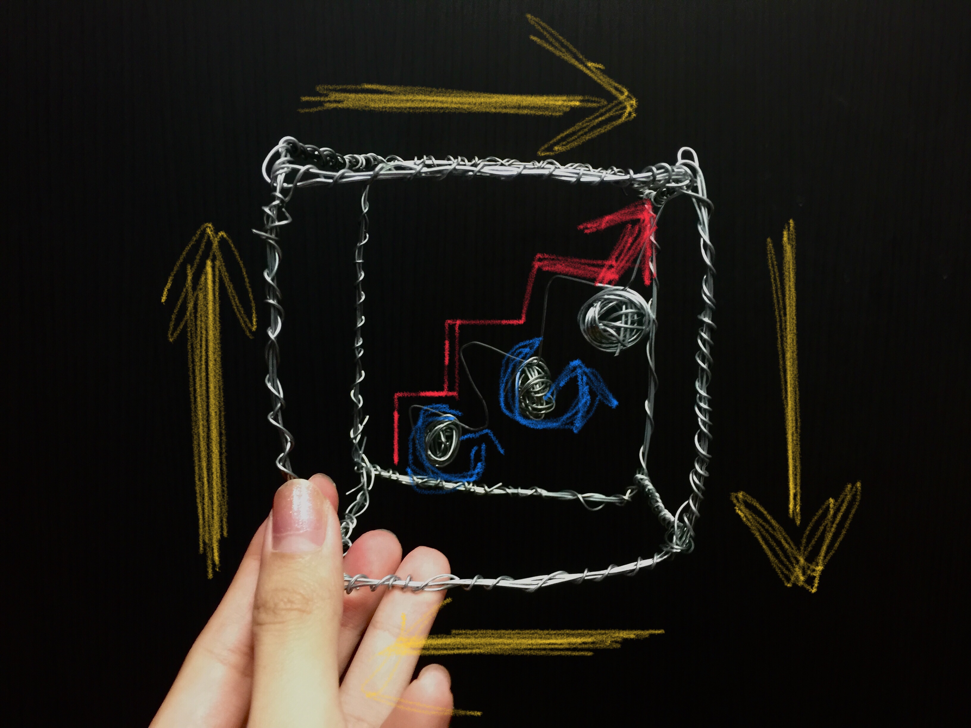
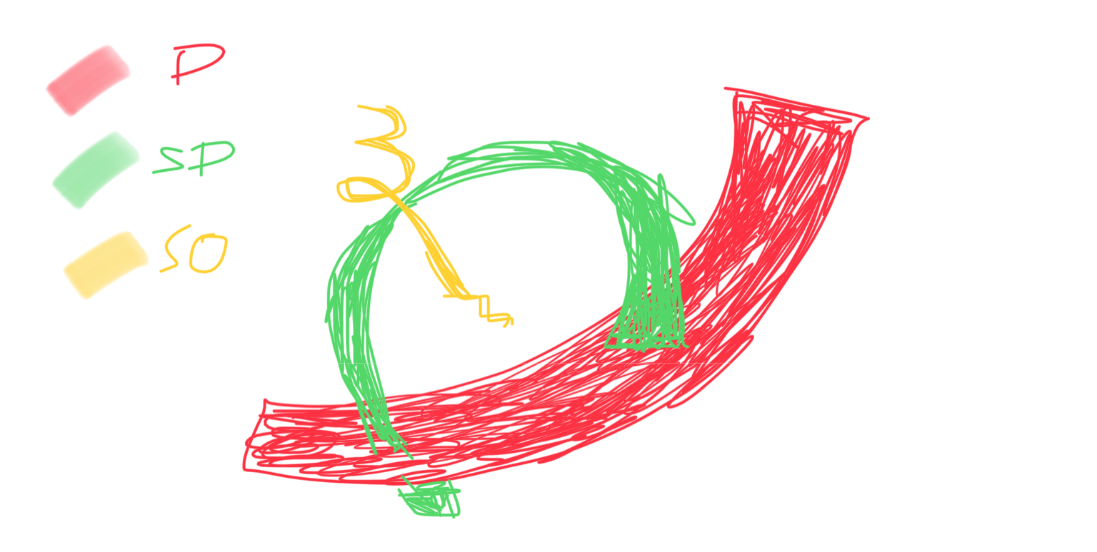
The Direction of Soundwave:
Yellow: Dominant (Tone bar) | Blue: Sub-Dominant (Finger Cymbals) | Red: Sub-Ordinate (Rhythm Sticks)
Recorded Soundwave Pattern:

Will see you in the next post! Ciaos.
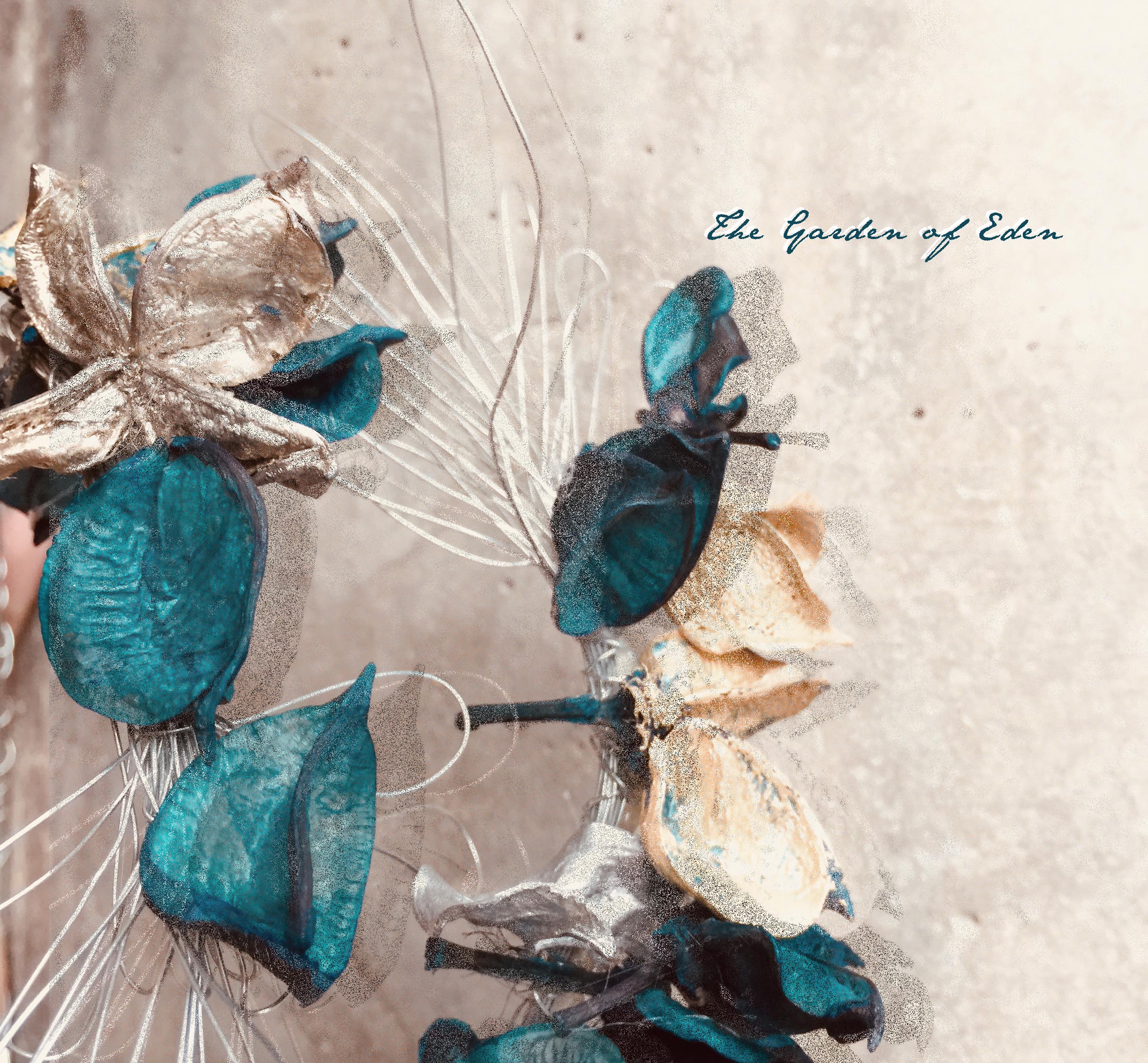
WELCOME TO: THE GARDEN OF EDEN
This is a project done by Zhenqi and I. Before anything else, this is both of our Mnemosyne’s prototype:
left scent: diffuser & ex bf’s jacket right scent: softlan & iodine solution
Our idea on Garden of Eden?
 https://medium.com/@dropeik.com/the-dangerous-naivete-of-back-to-the-garden-environmentalism-8dec07190b8a
These are the main characteristics that define the Garden of Eden:
Based on our previous prototypes, as well as the overarching theme, we worked towards creating our final 4 statements of accessories.
Our Colour Scheme :
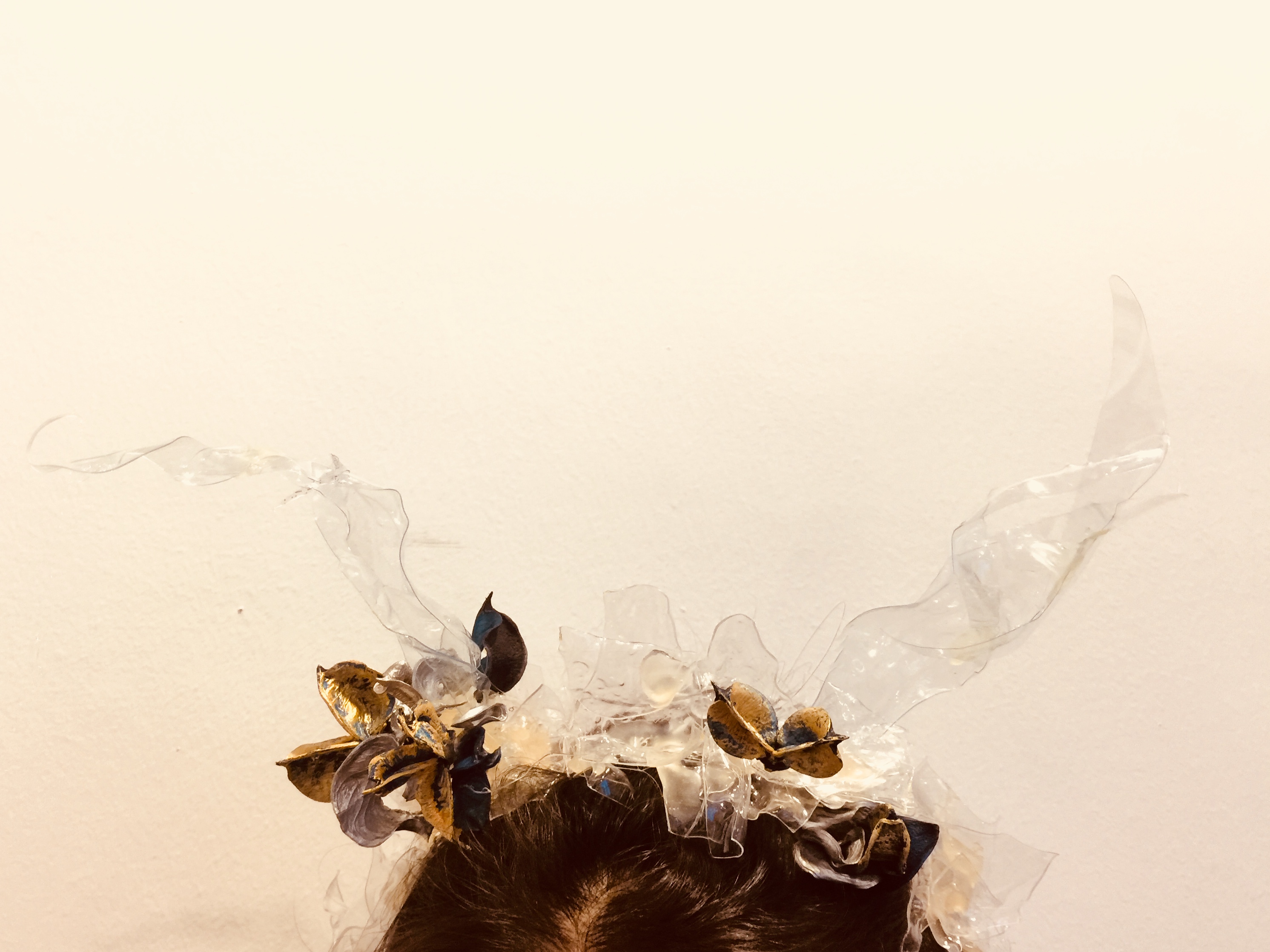
1. THE HEADBAND
Incorporating the design concept from my previous prototype, we re-created a headpiece and injected the “ETHEREAL” element into it. By using slightly more exaggerated differences in the length of plastic and the involvement of dried scented flowers that smells like fresh morning spring.
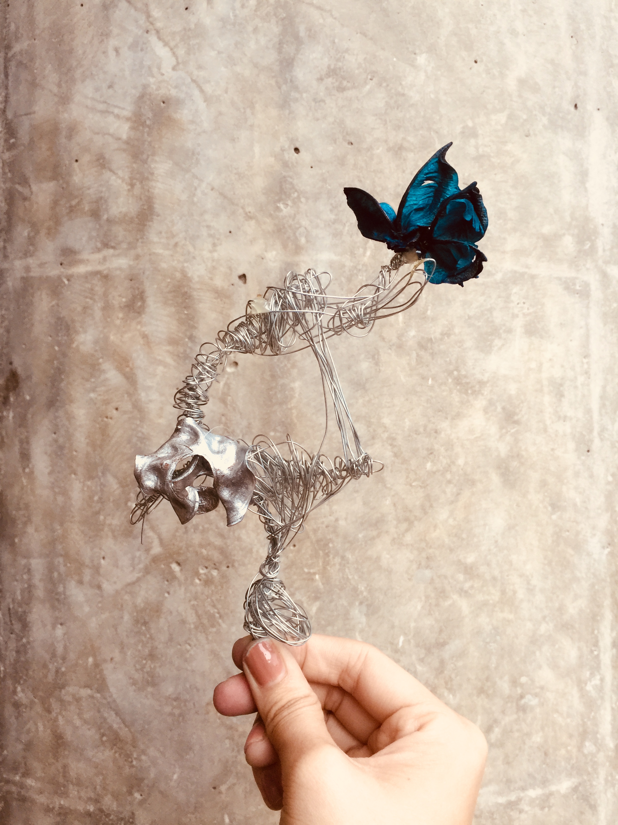
2. EAR CUFF
Our initial idea was to make use of melted plastic as the foundation of the cuff. However, we realised that the metal wires were just as handy and malleable! Hence, we tweaked the wires in several different directions so that it forms a nice flowing arch when placed on the ear of the wearer. In the later part of the development, we stuck on dried flowers into the loops so that we can keep the overall theme in check.
3. BROOCH
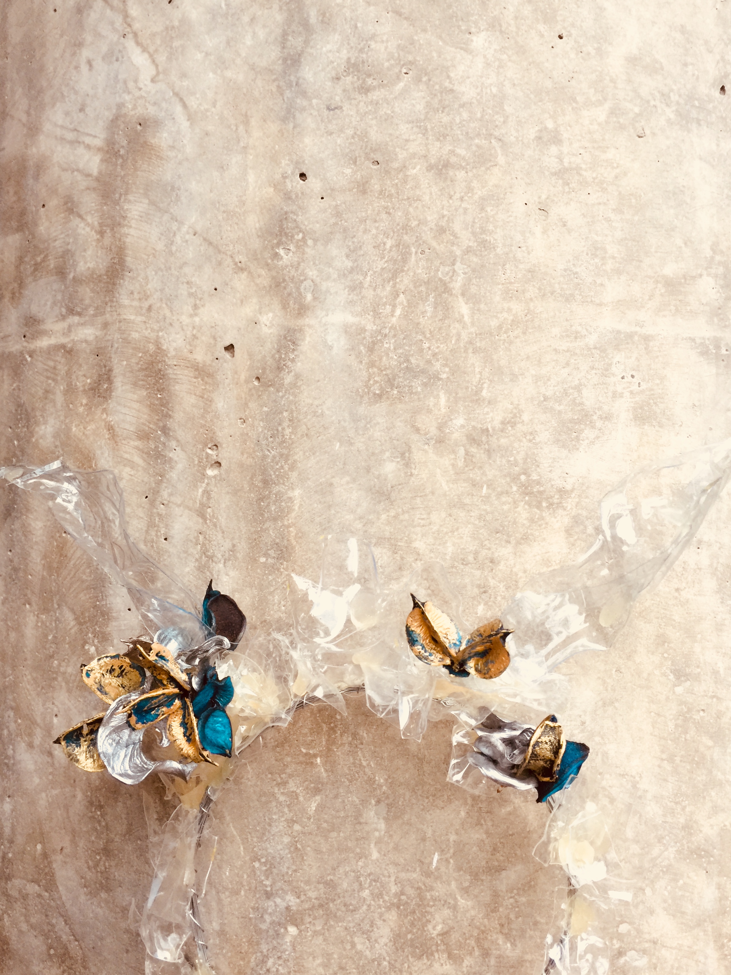
This is a fashion accessory that is to be pinned on the chest of the wearer. In this scenario, the wearer will be wearing a “white robe” (or rather curtains lol). This piece is made from melted strips of plastics alongside metal wires at the stem of the product. If you observe closely, the flower on the inside of the metal wires is dangling on a thread. This is adapted from our previous prototype, where the central piece appears to be hanging on a piece of wire.
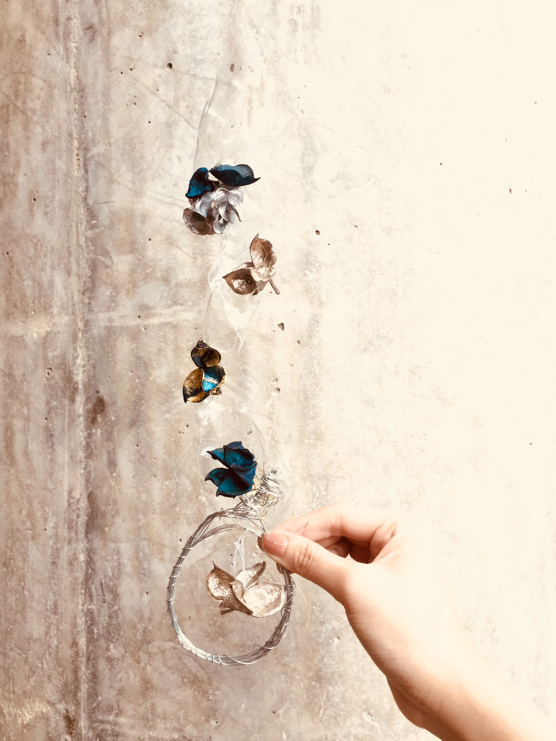
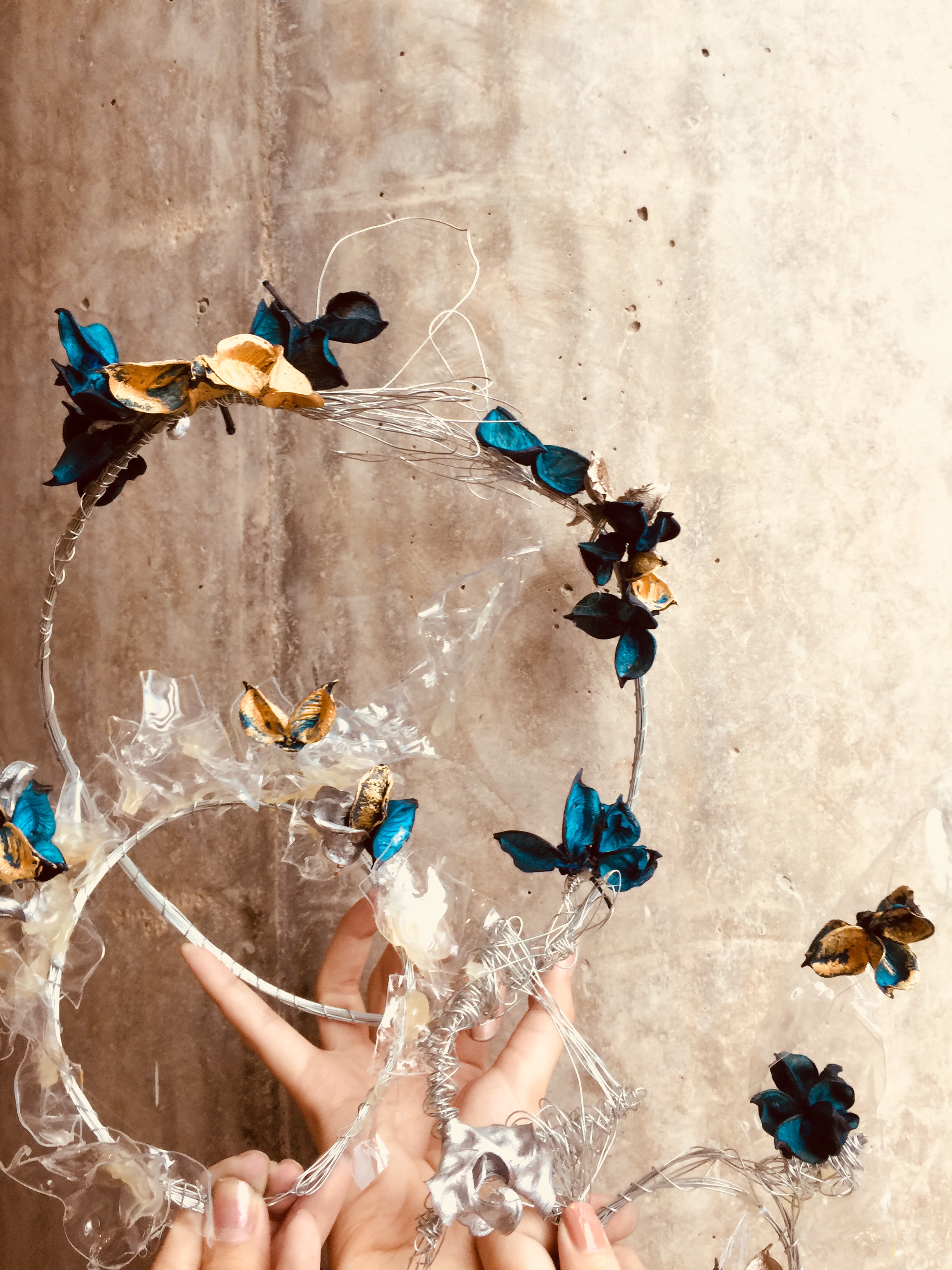
4. THE BELT
This is the concluding piece of our accessories collection hehe. We wanted to come up with a comprehensive set of apparel, so hence we made a belt too! This will hold the white robe in place together, all in all creating a more aesthetic and put together look for our wearer. We coiled the wires repeatedly and adorned it with more blue/gold/silver flowers! It looked so cute!
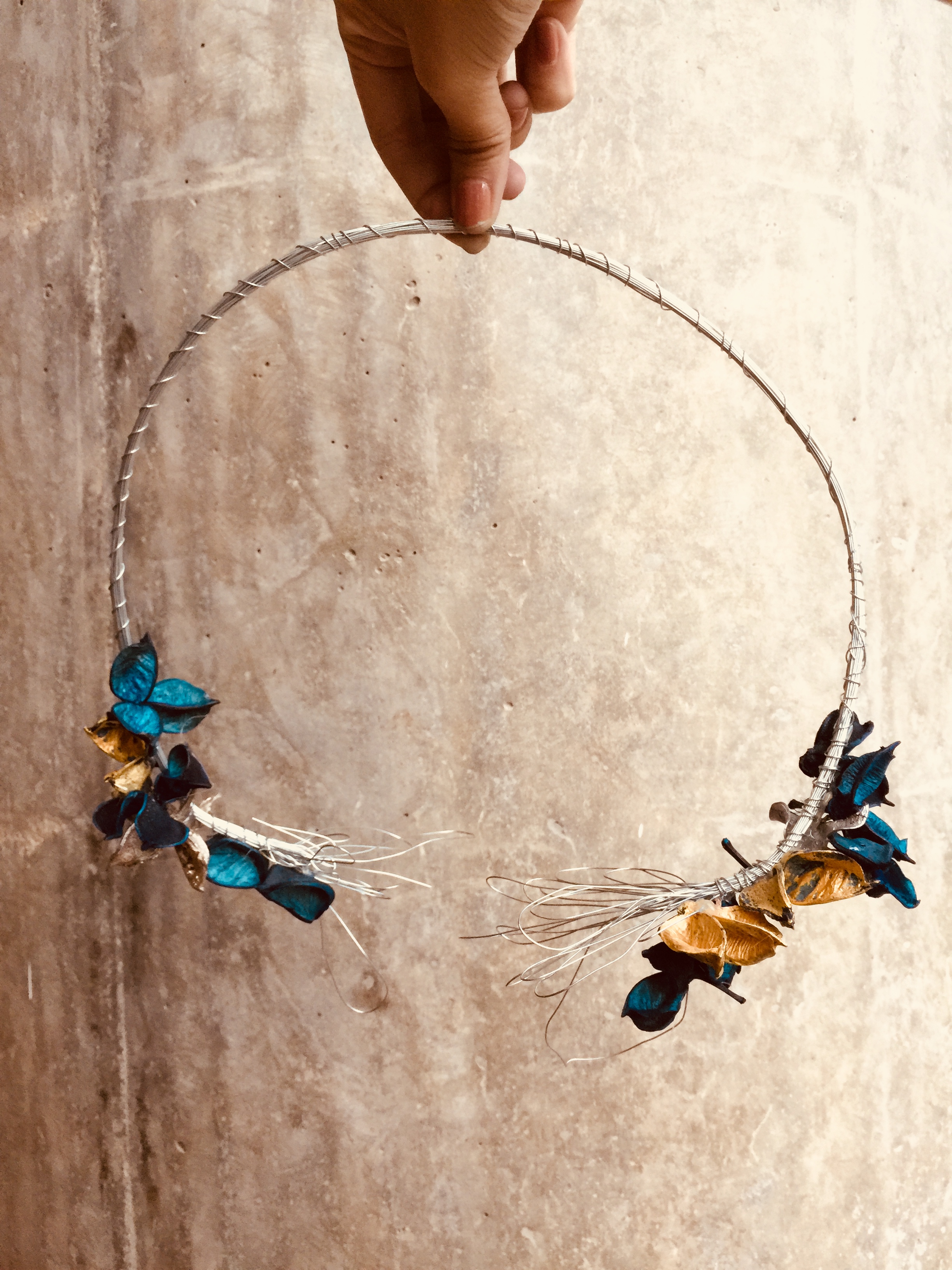
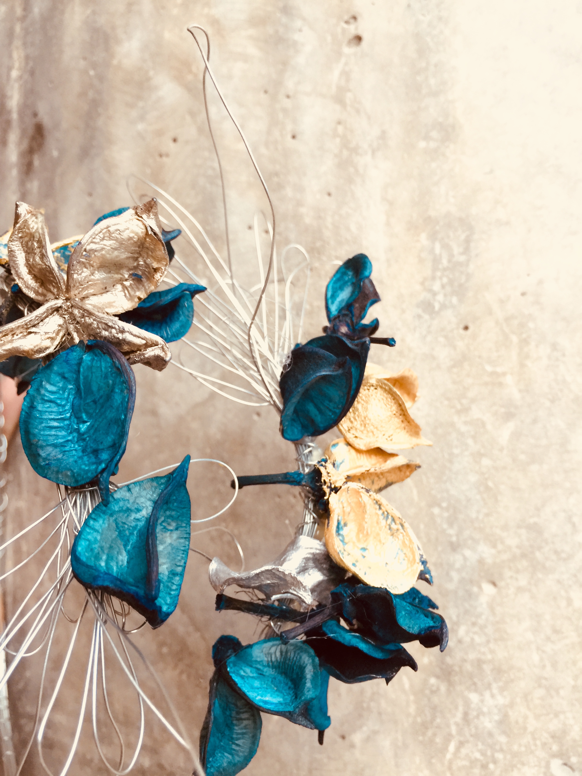
up close and personal
ALTOGETHER NOW!
A collage of all of our apparel design!
SOME TRY ONS

Awkward. Sorry 🙁
We also made some amendments to the ear cuff along the way! 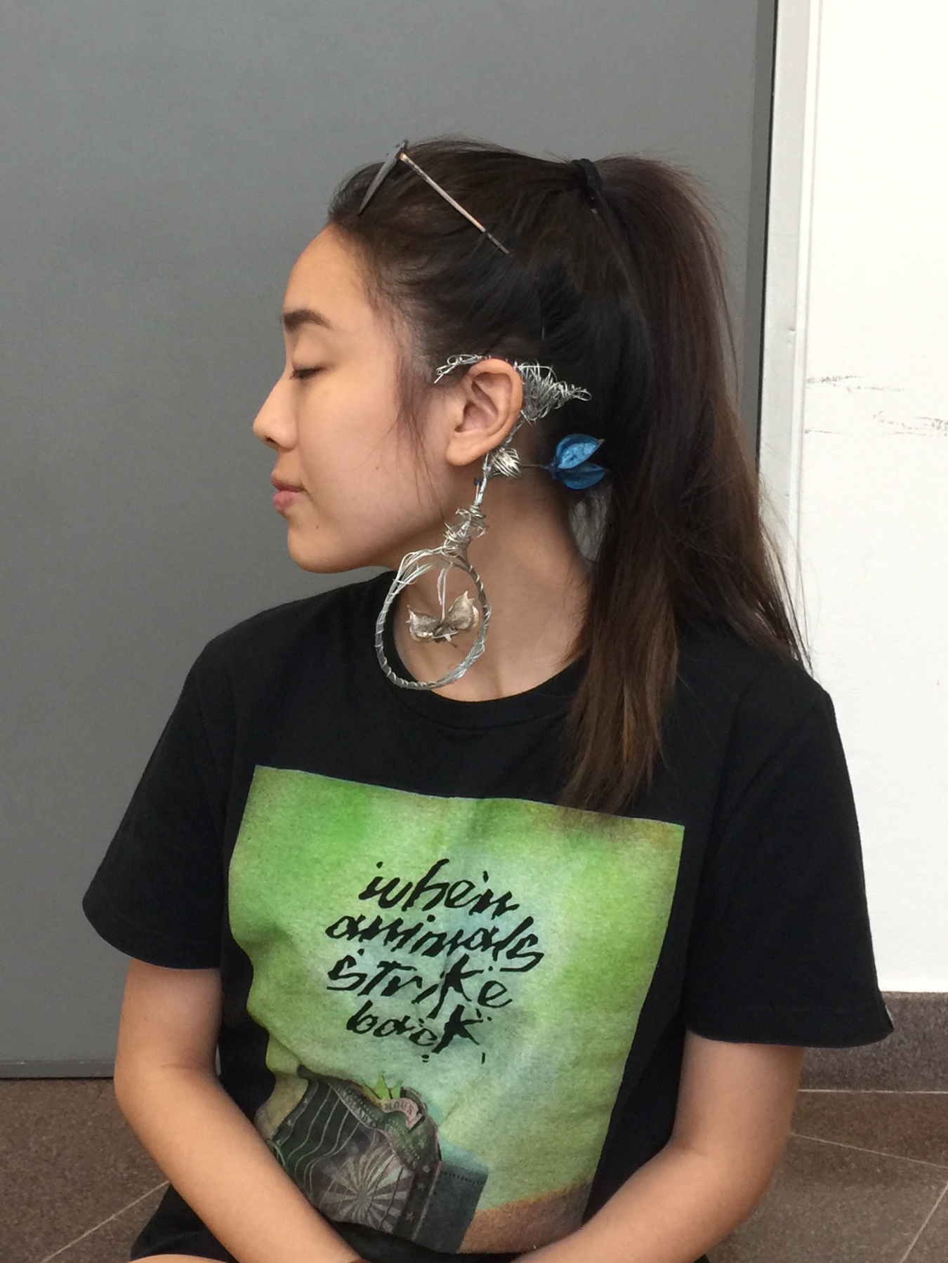
Alright, ciaos!

Scents can bring back memories or set the mood. Here we have 2 scents, one pleasant and one unpleasant. Let’s get it started!!
PLEASANT MEMORY:

https://katiescarlettblog.files.wordpress.com/2016/09/img_1912.jpg
AROMATIC ROOM DIFFUSER 
This is my all time go to scent for room diffuser. I swear it makes nap time x10 better. I am in love with how every corner of my room has this floral/woody scent. It makes my room feel soooooo cozy and warm. Since I spend a whole lot of time in my own private space, hence I love having a diffuser around. It just makes things a lot better for me. It puts you in the mood you know! Breathing in this scent reminds me of home, my own comfort zone, this is the reason why I pick the diffuser.
A simple mind map to illustrate my idea

The texture of material: Smooth, Carved, Angular, Rigid
The texture of scent: Top note is actually Spring Daisy scented whilst the Base note is Sandalwood. As for the texture, I’d say it is MELLOW AND SOFT
Colors I associate with it: Transparent, Clear, Light
UNPLEASANT MEMORY:

A JACKET LEFT BEHIND BY MY EX-BF 
It has stayed in my closet for quite some time already, but arguably, it still more or less has the scent of his cologne (if you inhale deeply). Though it triggers some bad memories every time I attempt to do my Mnemosyneyne assignment, well the rest of the time, it is just another piece of cloth to me, so I have never thought of throwing it away. What a waste!
A simple mind map to illustrate my idea

The texture of material: Soft, Smooth, Cellular, Rainproof
The texture of scent: Manly (mainly the cologne hahaha), Musky
Colors I associate with it: BLUE – because it is the color of melancholia.
PROCESS OF THE MAKING
Collecting variations of bottles in terms of shapes, sizes, and colors.

My photogenic classmate
Then, execution! I started by cutting up transparent bottles into strips/cubes. These are meant for the structure design for PLEASANT SCENT! I chose to use transparent plastic to realise my idea of “Transparent, Clear and Light”. 
Moving on, I went ahead to construct the skeleton of my “Halo”/ Christmas wreath thingy using wires provided in the 3D Room. Yes to saving money on resources! Then, I use the heat gun and melt the individual pieces of plastics so that it shrivels up aesthetically.
Subsequently, I make use of a piece of available blue plastic and started crafting my design for “unpleasant scent”. Like I said, I relate BLUE as the color that represents my emotions whenever I smell the jacket. Thus, I thought the color would best fit in this scenario. Using the tool that burns hole, I started by mimicking holes that signify the texture of the fabric.
As such!
http://seedmagazine.com/portfolio/22_library-of-lungs.html
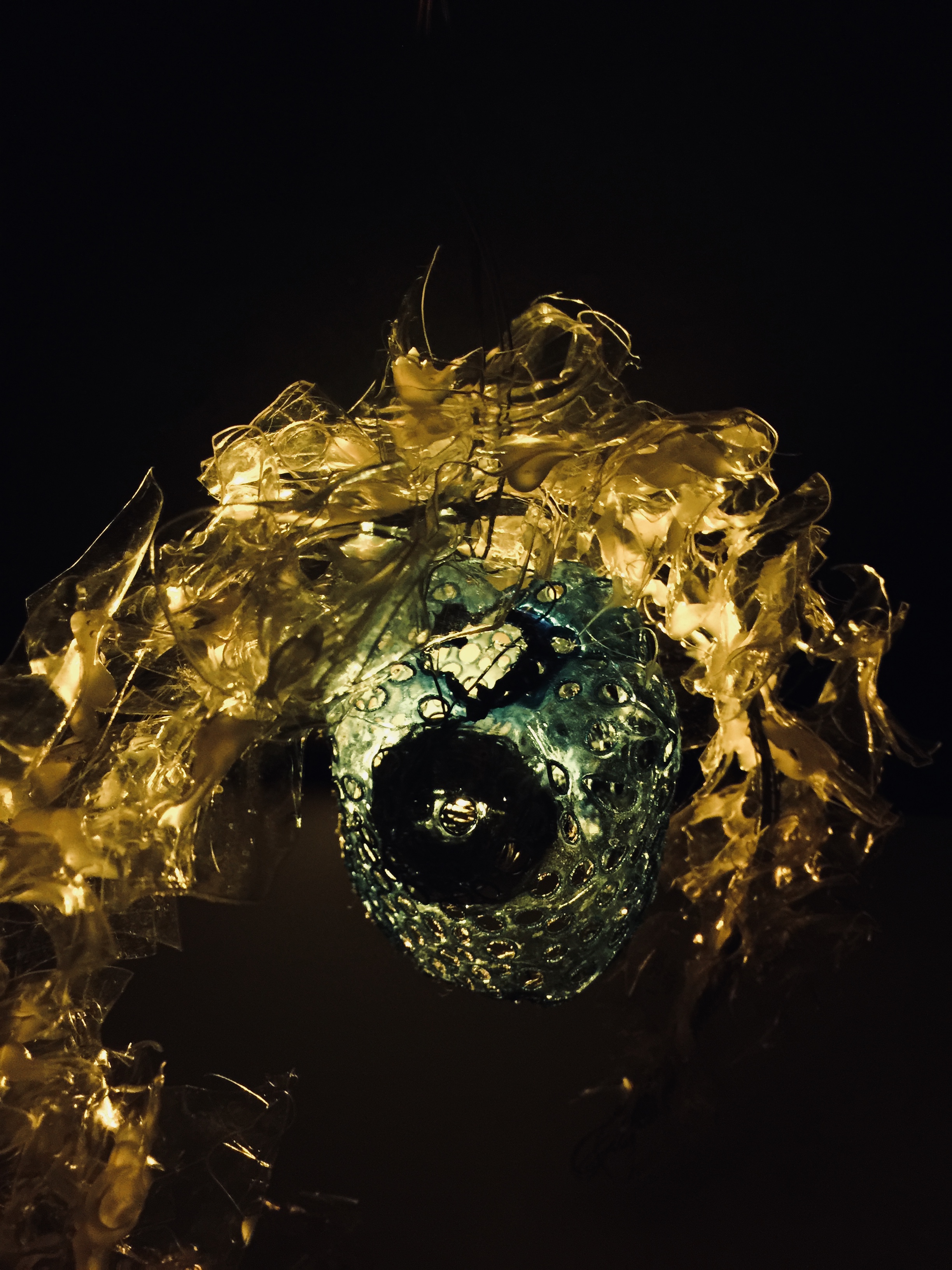
 And so, we get our final product!
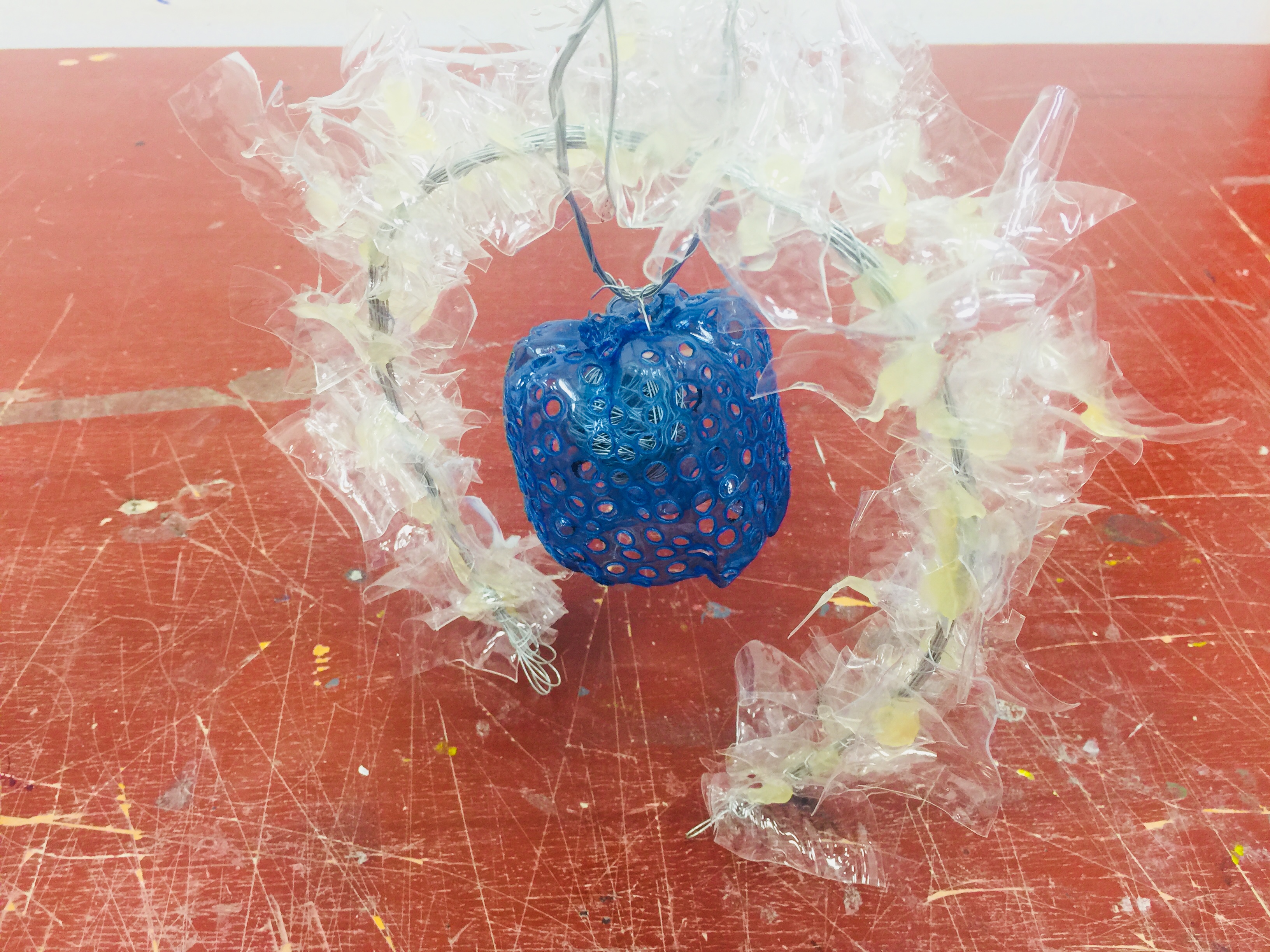
RATIONALE:
Positive Scent: Choice of color to be transparent white since the idea of transparency indicates lightness and airiness. Just like the characteristics of evaporated scent being diffused into the surrounding air. The irregular shapes of the white pieces is supposed to indicate a dispersal of scent that reaches all corners of the room, hence the circular arch.
Negative Scent: Blue, prior to what I have mentioned above, is a reflection of my true emotion whenever I pick up a whiff of that familiar colonge (regardless if it is from the jacket or not). The holey texture on the plastic is meant to replicate the texture of a cloth (up close on microscopic view). And the idea of it hanging by a thread is a depiction of my feelings from the old time past (which I will not go into hehe). The little spherical ball inside of the blue plastic structure represents my heart – caged.
Well on a lighter note, positivity always overwhelms the negativity anyway! So this is why the structure of the positive scent goes over and beyond the structure of the negative scent.
FEEDBACKS FROM CHERYL:
The transparent plastic can afford to be A LOT MORE winding in several directions. Thinner metal rod perhaps? 🙂
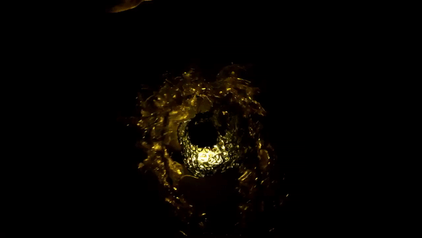
PHOTOSHOOT OF MY STRUCTURE:
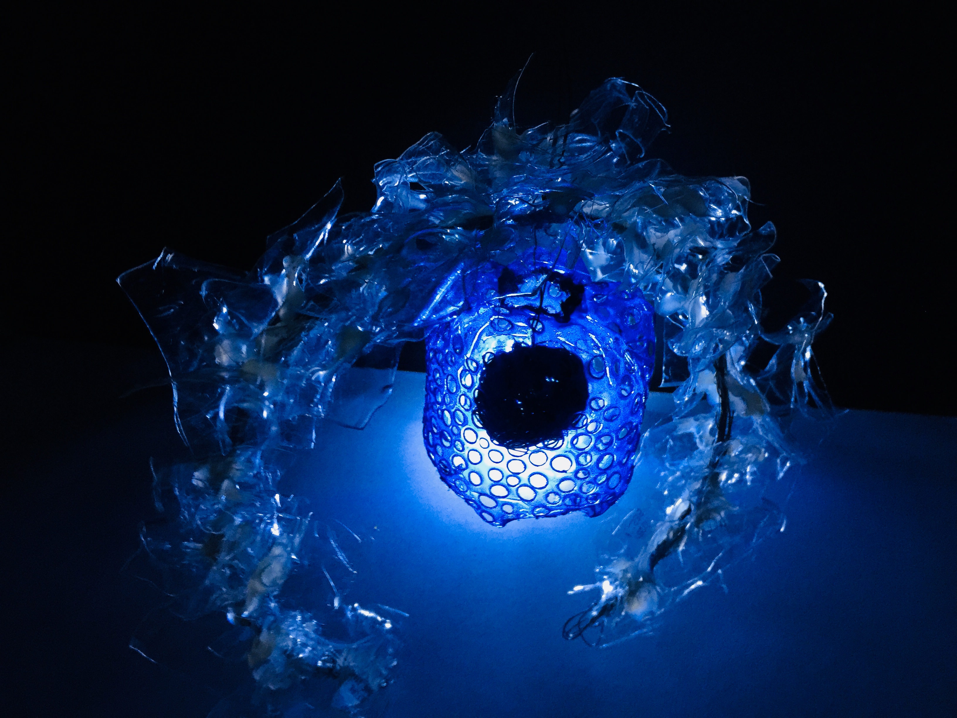
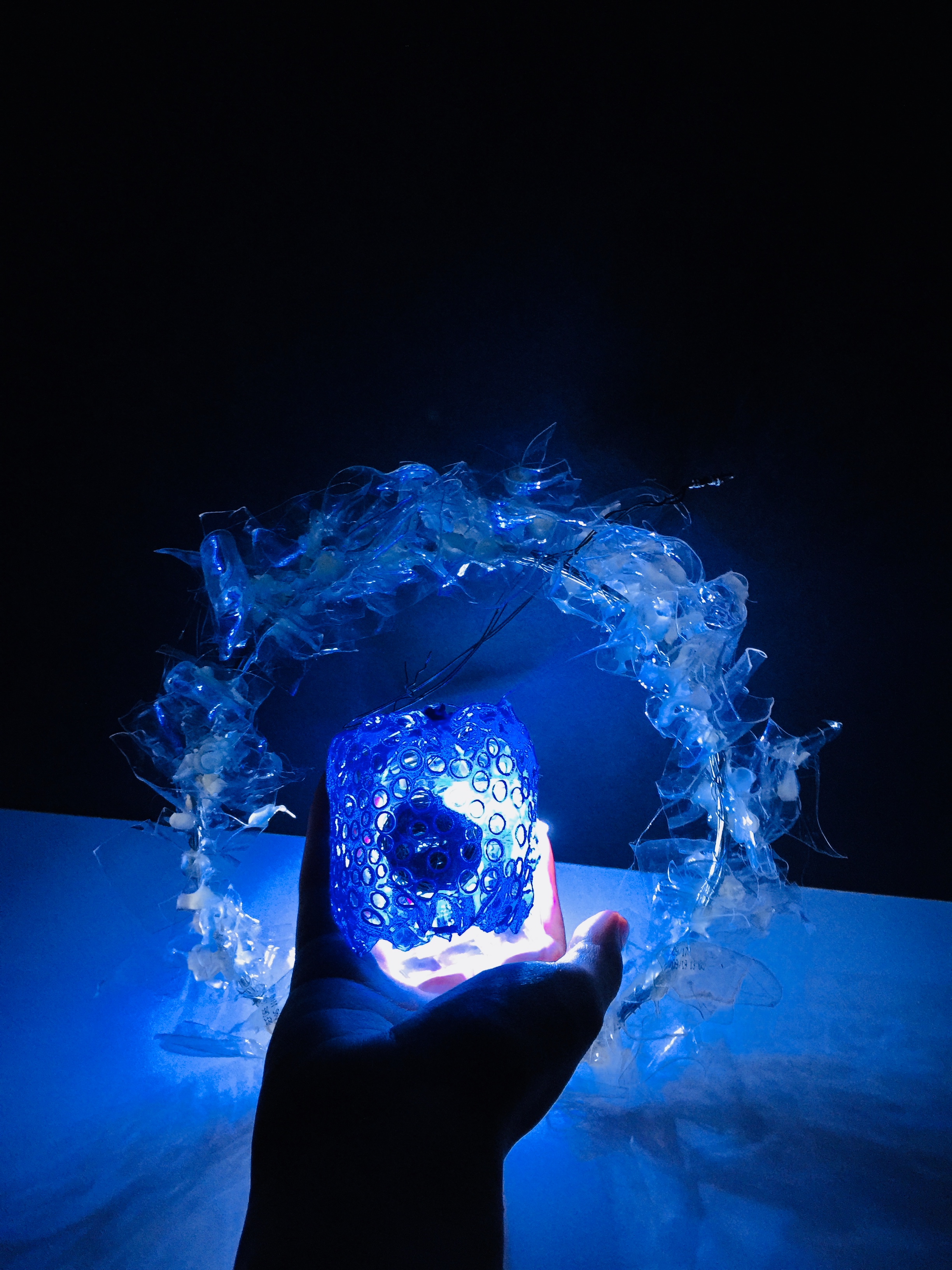 I love how the transparent portion takes in the light and created this cool blue hue.
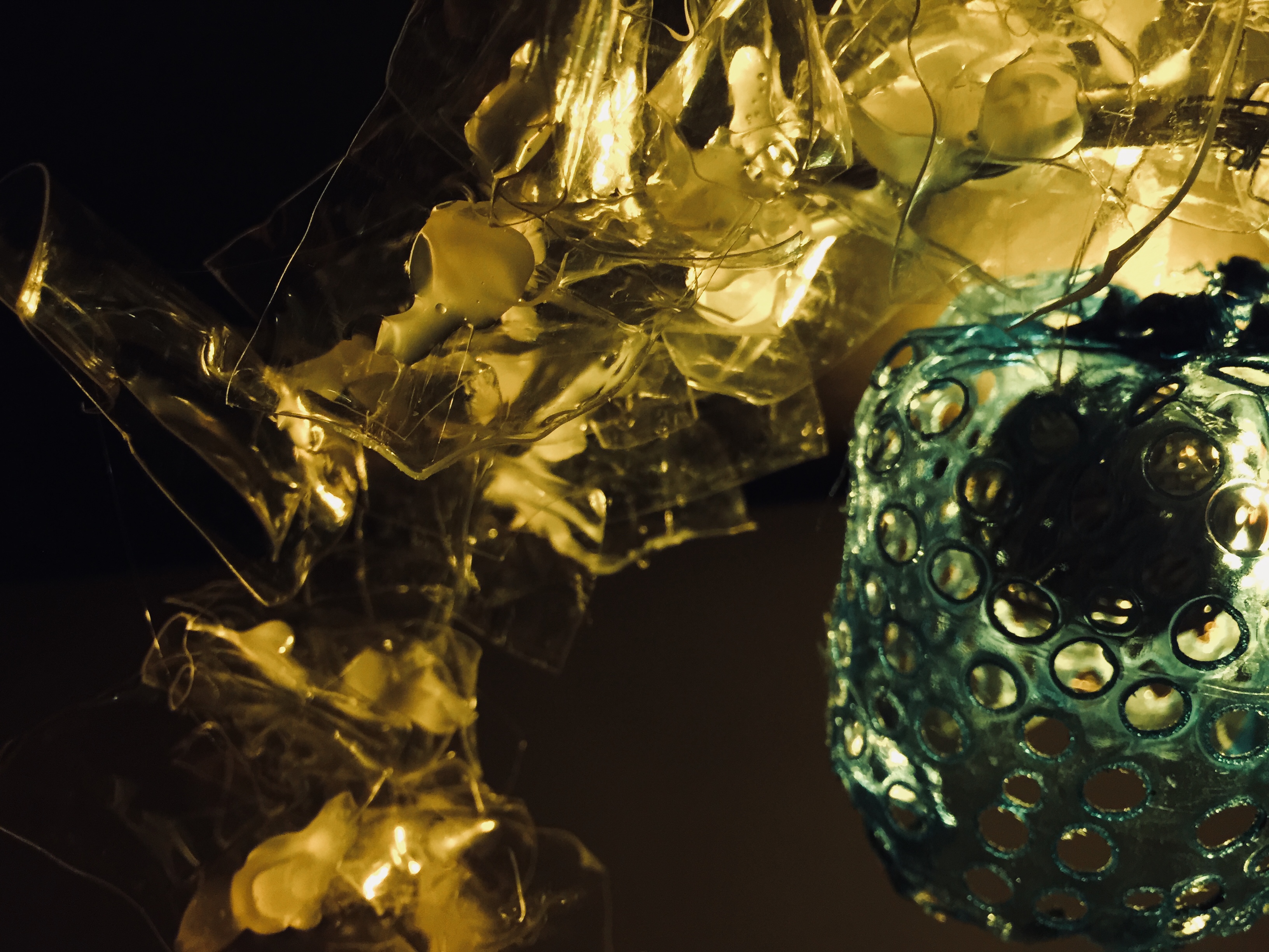
Figured I could play with the temperature of lighting to create a different mood. What do you think?
Okay, ciaos!
Thanks for reading.

Hello, World! 
Some learning points from today’s lesson:
Basics of Planar Construction – 
2D STRAIGHT AXIS: A flat plane
http://rebloggy.com/post/architecture-cinema-norway-1960s-concrete-brutalism-brutalist/108150508051
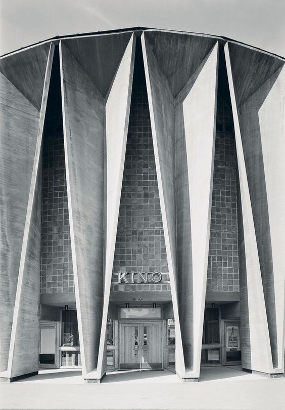
2D CURVED AXIS: Just a singular curve without other folds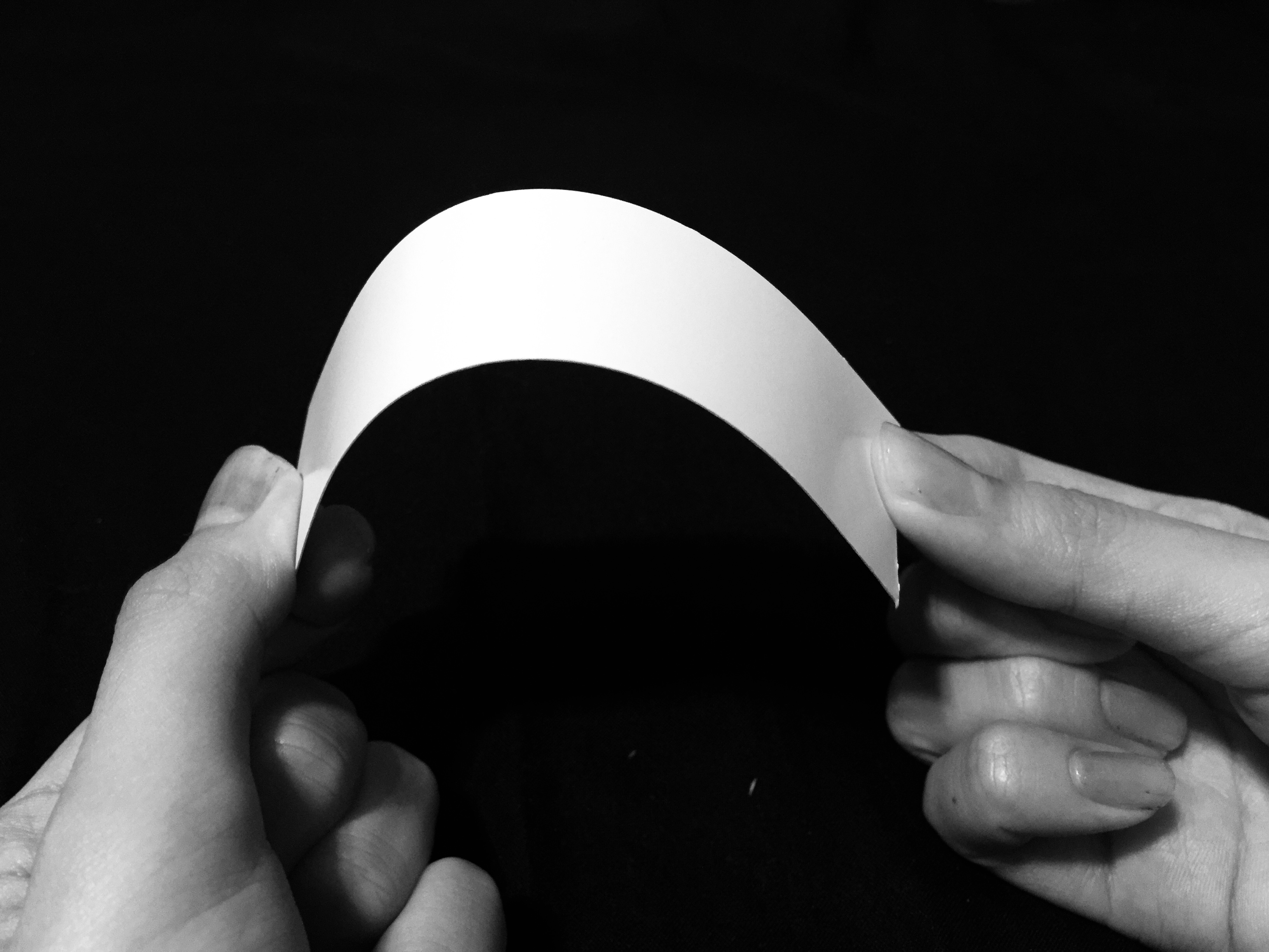

https://pixabay.com/p-254862/?no_redirect
2D BENT AXIS: A folded plane

https://www.albinaco.com/specialty-steel-bending/multi-plane-bending
2D COMPLEX AXIS: Consist of more than 1 axis in a plane
GROUPED PLANE: Consist of more than 1 type of folding method
3D TWISTED PLANE:

3D CURVED PLANE:


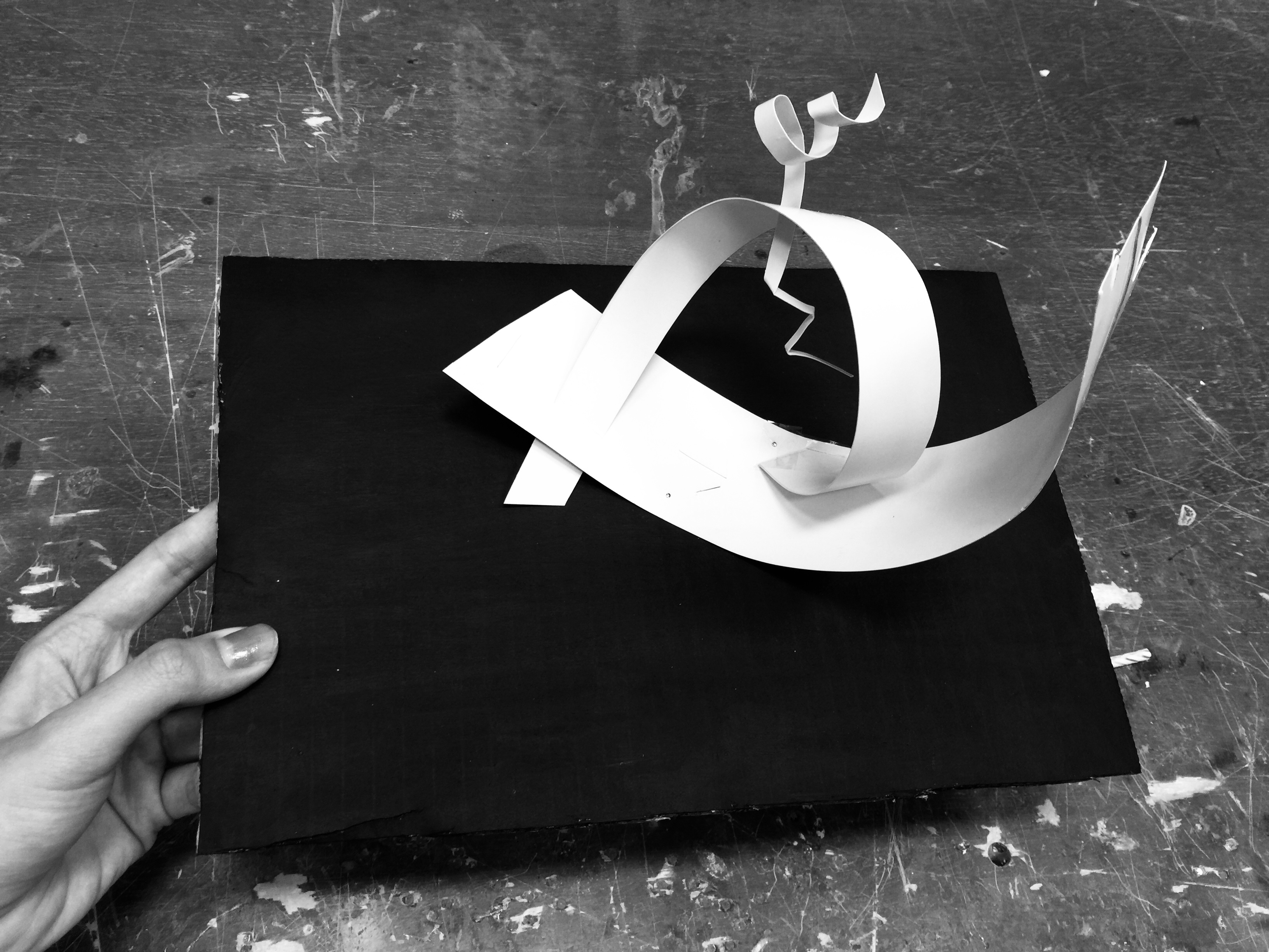
My Plane Construction Process –
Phase 1: Selecting the dominant piece to be
placed as the base
Phase 2: Experimenting with the art cards through Piercing
and Wedging
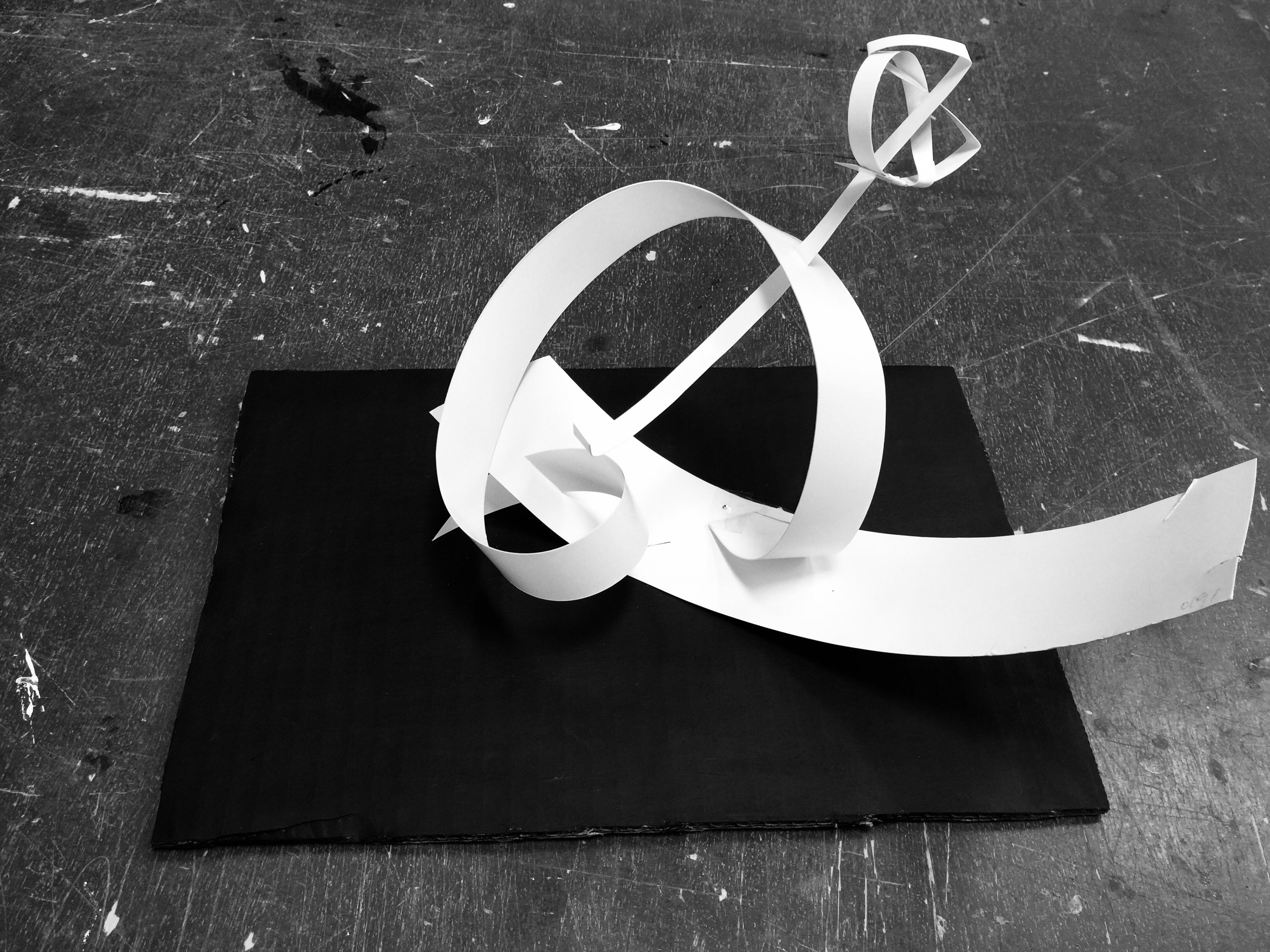
Phase 3: Establishing the structure
Phase 4: Exploration of the final bit and pieces
(What it might potentially look like as the
end product)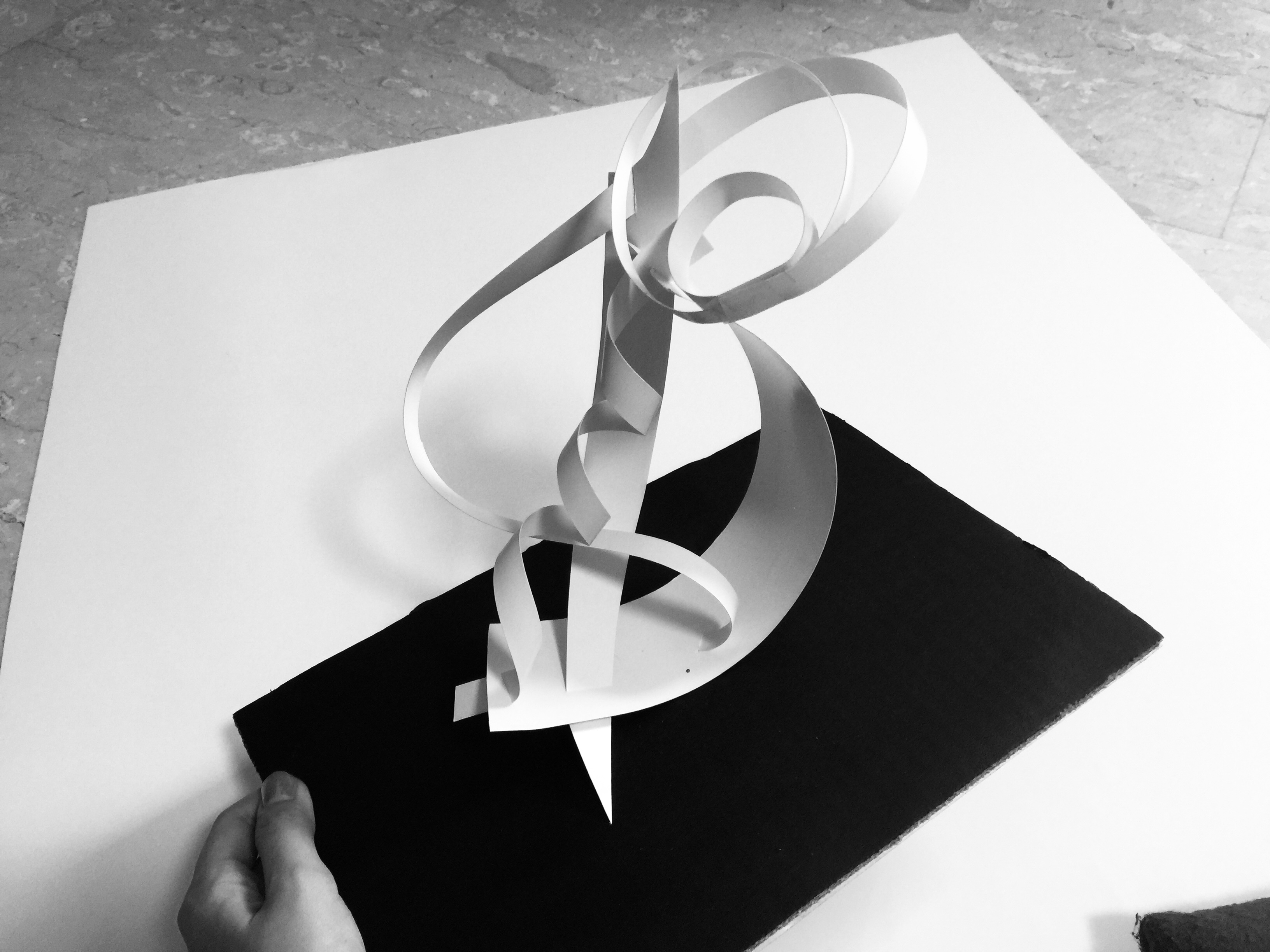
Rough Sketch Analysis of Plane Model:

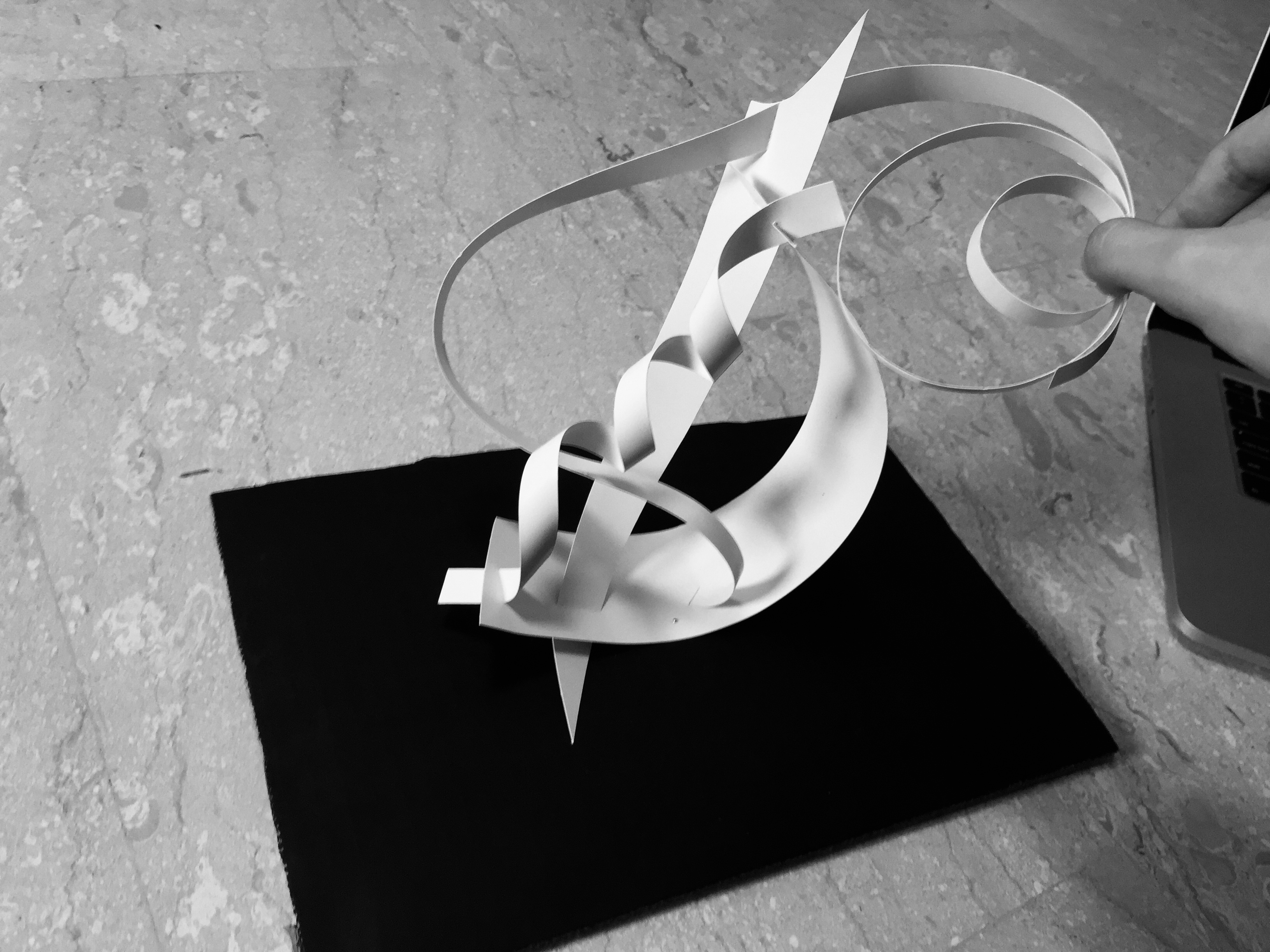
REJECTED STRUCTURE:
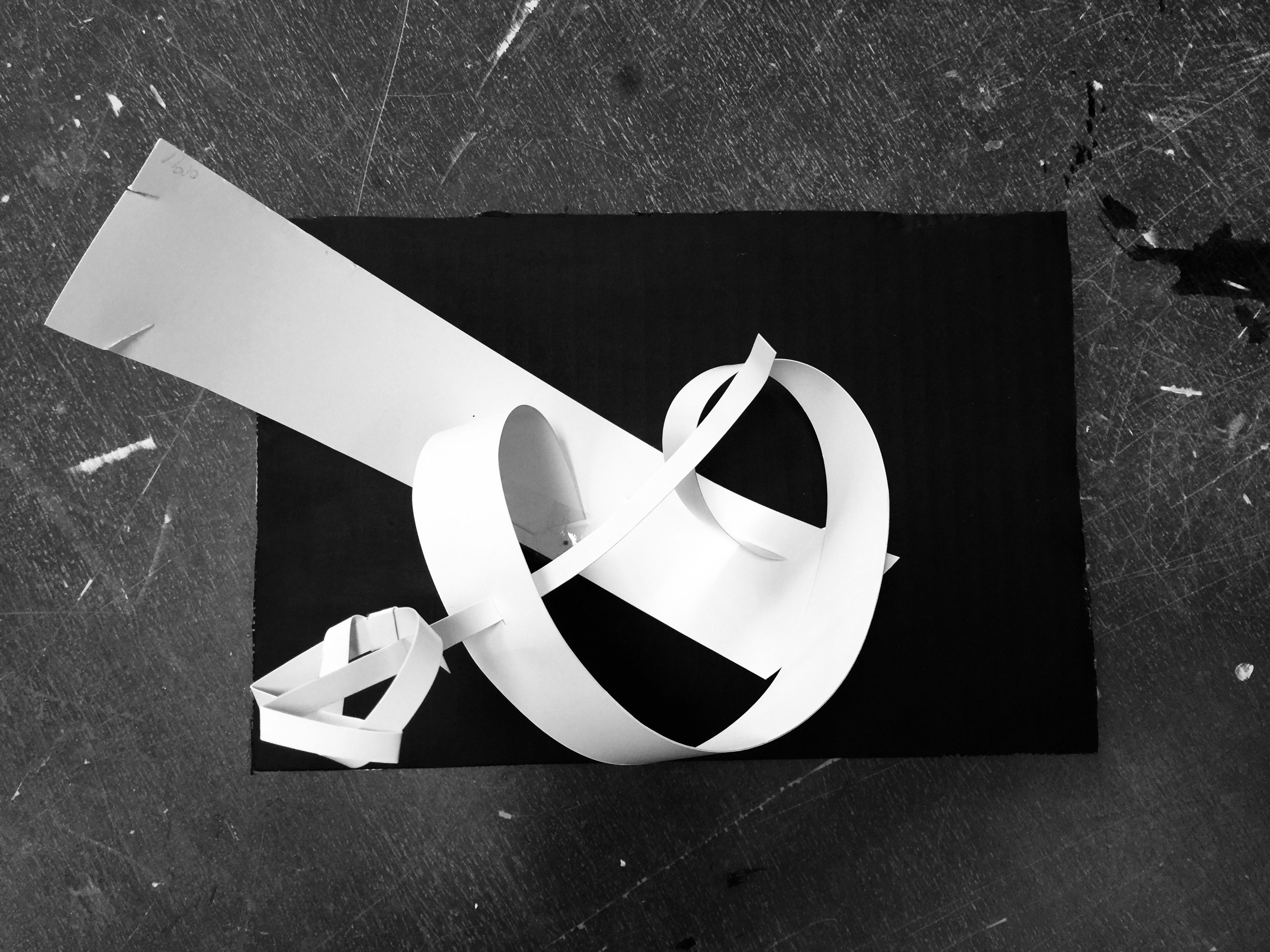
The feedback was that the SO was still a little too long in comparison to the SD. & the SD is still on the long side in comparison to the D. I hence proceeded to trim down the length of my paper strips and it brought me to my final structure!
THE RECTIFIED CONSTRUCTION:


The overall balance looked a whole lot clearer in this structure. D, SD, and SO can be easily identified with just one look.
More to come in the next post – Creation of Mnemosyne Structure
Toodle-oo~
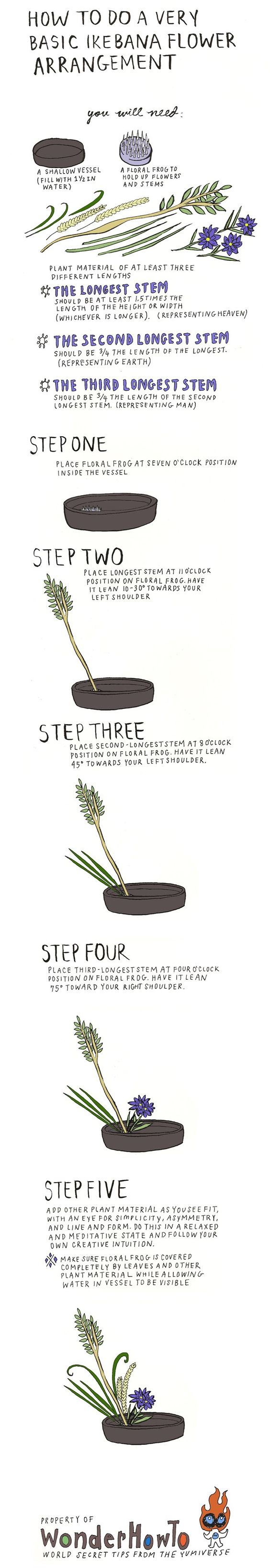
Elements found on the Ikebana are called shin, soe and tai. Which translates to Dominant (D), Sub-Dominant (SD) and Sub-Ordinate (SO) respectively. The longest branch, called shin, represents heaven. The medium branch, soe, represents man. And the shortest branch, tai, represents earth.
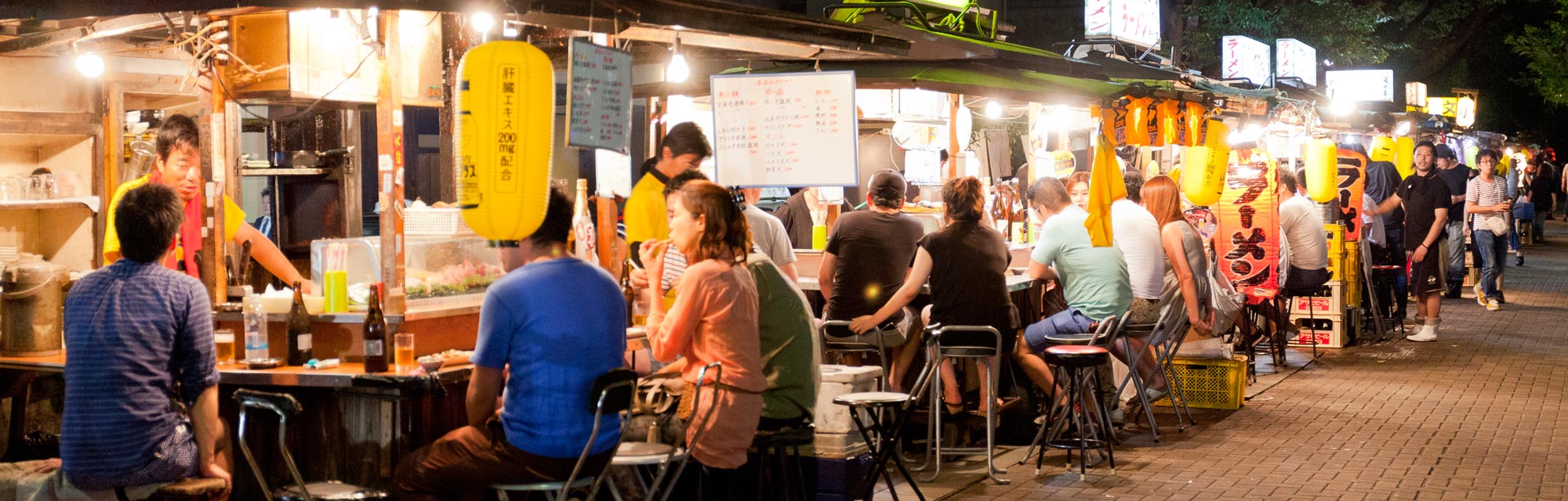
// Concept 1: The Spirit of Fukuoka, Japan (福岡)
https://www.jnto.go.jp/eng/wp-content/uploads/2016/06/Spend-a-day-seeing-the-past-and-present-of-the-great-city-of-Fukuoka.jpg
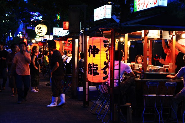
Fukuoka is one of Japan’s top 10 most populated cities, often known as the “Liverpool of Japan”. It is home to many of the most famous food in Japan (e.g mizutaki, ramen noodles), one of the city’s attractions in Fukuoka is their variety of outdoor food stalls that decorated the river bank. These food stalls are known as Yatai. Many tourists came from all over the world to visit and experience this food trial.
LIGHTS ライト
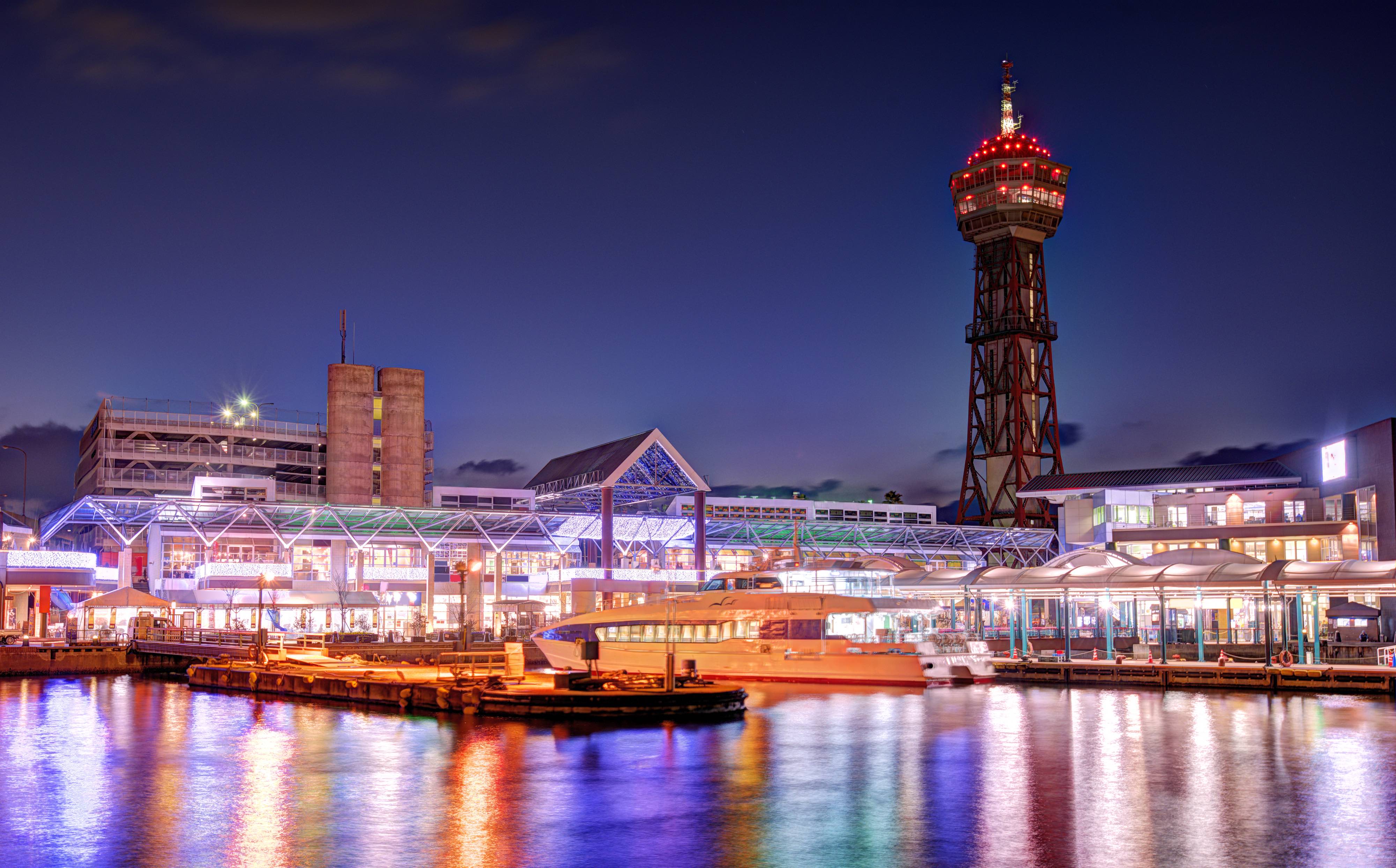
Port and tower at Fukuoka, Japan.
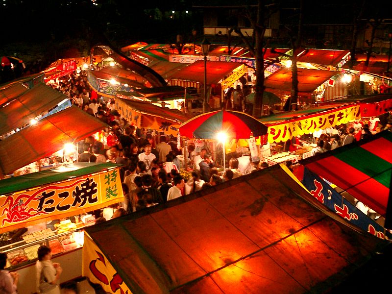
https://blog.gaijinpot.com/yatai-fukuoka-street-food/
http://art8.photozou.jp/pub/173/14173/photo/12082871_624.jpg
The LED lights beautifully decorated the river bank, and it gives off an outburst of a modern vibe, bringing life to the night sky. This is one of the must-go places in Fukuoka, a chance to watch and experience the Japanese culture and to dig into some of the most delicious food in Japan. I feel that the light element really gave the entire aesthetic a big push and is one of the biggest highlights of this place, hence making it look so photogenic on any camera.
FOOD フード

https://blog.gaijinpot.com/yatai-fukuoka-street-food/
Food brings people together. The 150 Yatai stalls along the river bank are famous for their various dishes, and one of it is the Japanese Soft Serve and Oden.
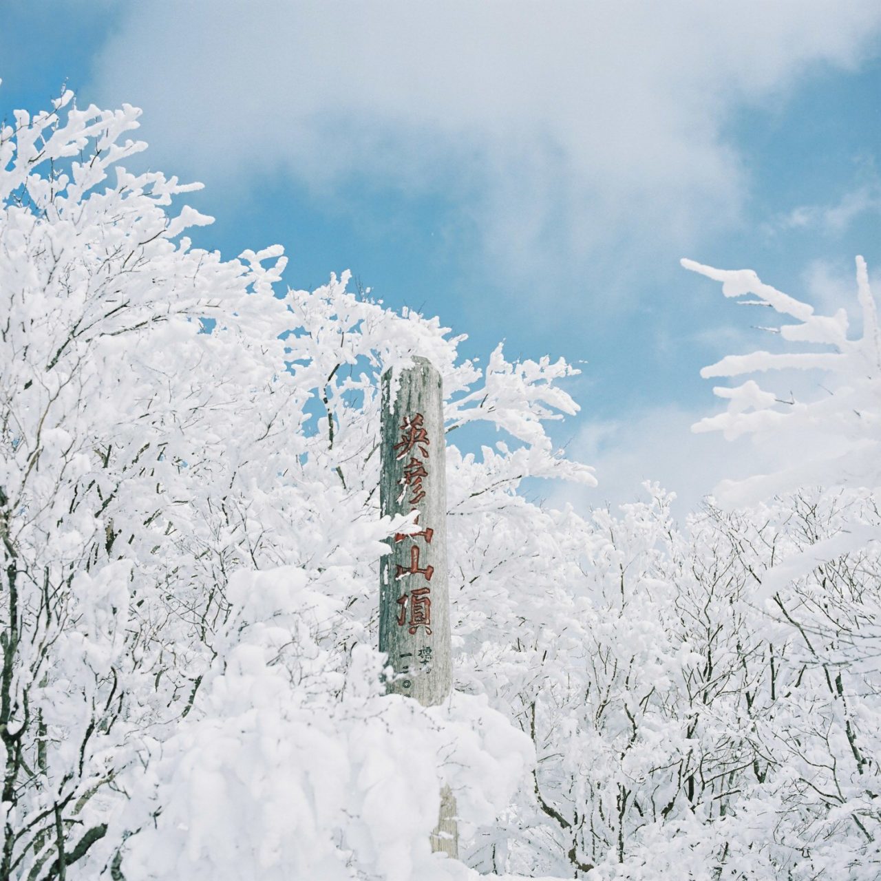
WINTER IN FUKUOKA – 冬

http://favimages.com/wp-content/uploads/2012/10/japan-fukuoka-snow-landscape-winter-hometown.jpg
http://ishikawakanta.com/wp-content/uploads/2017/02/20170212hassel-12-1280×1280.jpg
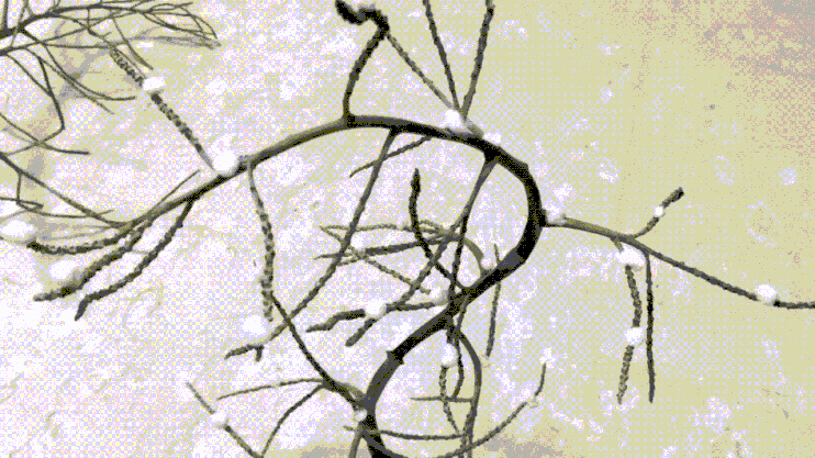
By this time, the leaves have fallen and the tree is stripped bare. The branches are covered in thick layer of snow, which make the trees look like they have white leaves. The branches are curvey and organic in shape.
//Artist Reference: BAIKO

cr: http://zen-images.blogspot.sg/
http://zen-images.blogspot.sg/
http://zen-images.blogspot.sg/
IDEATION:

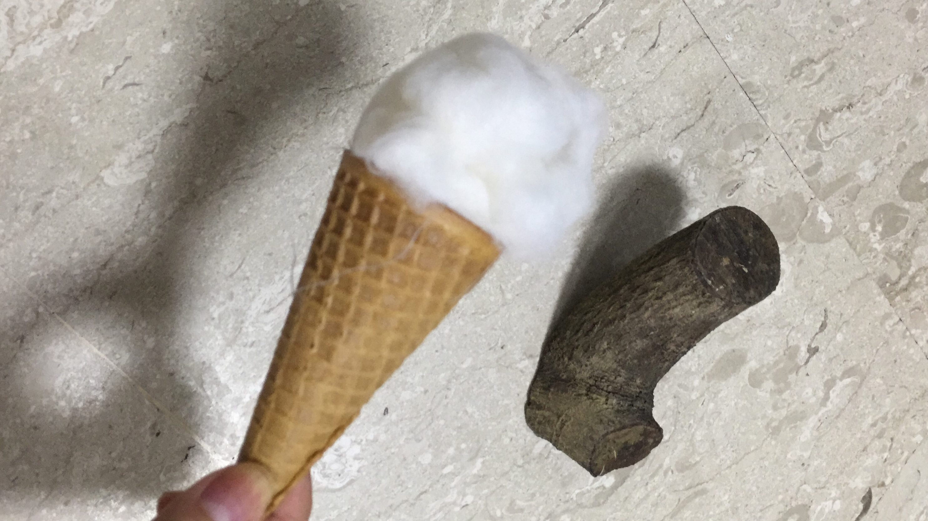
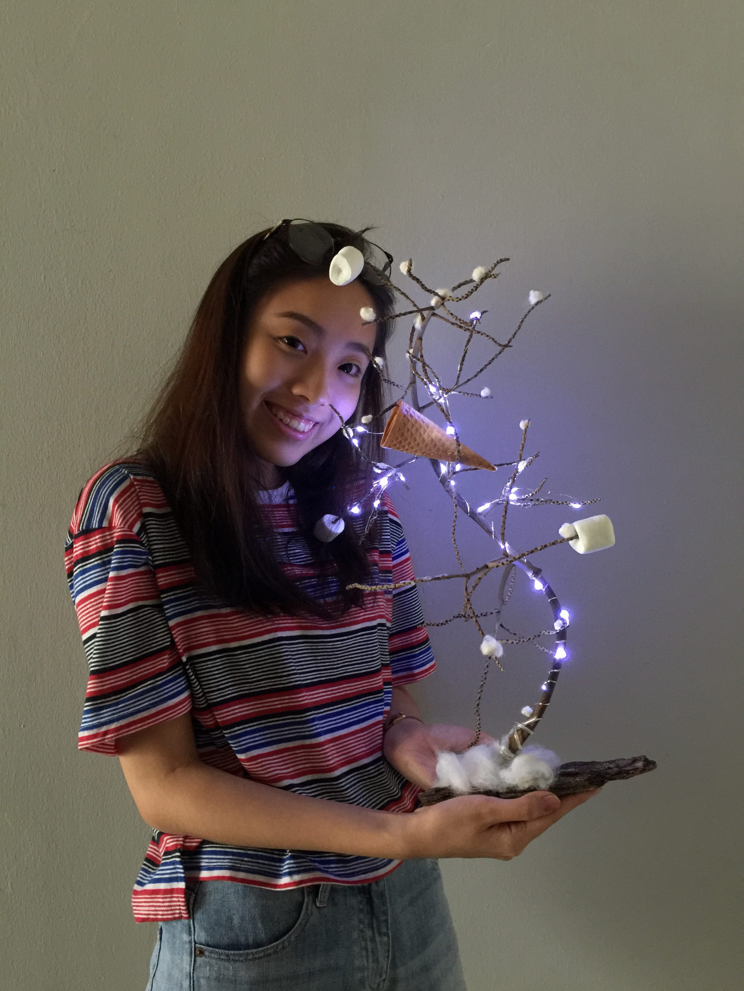
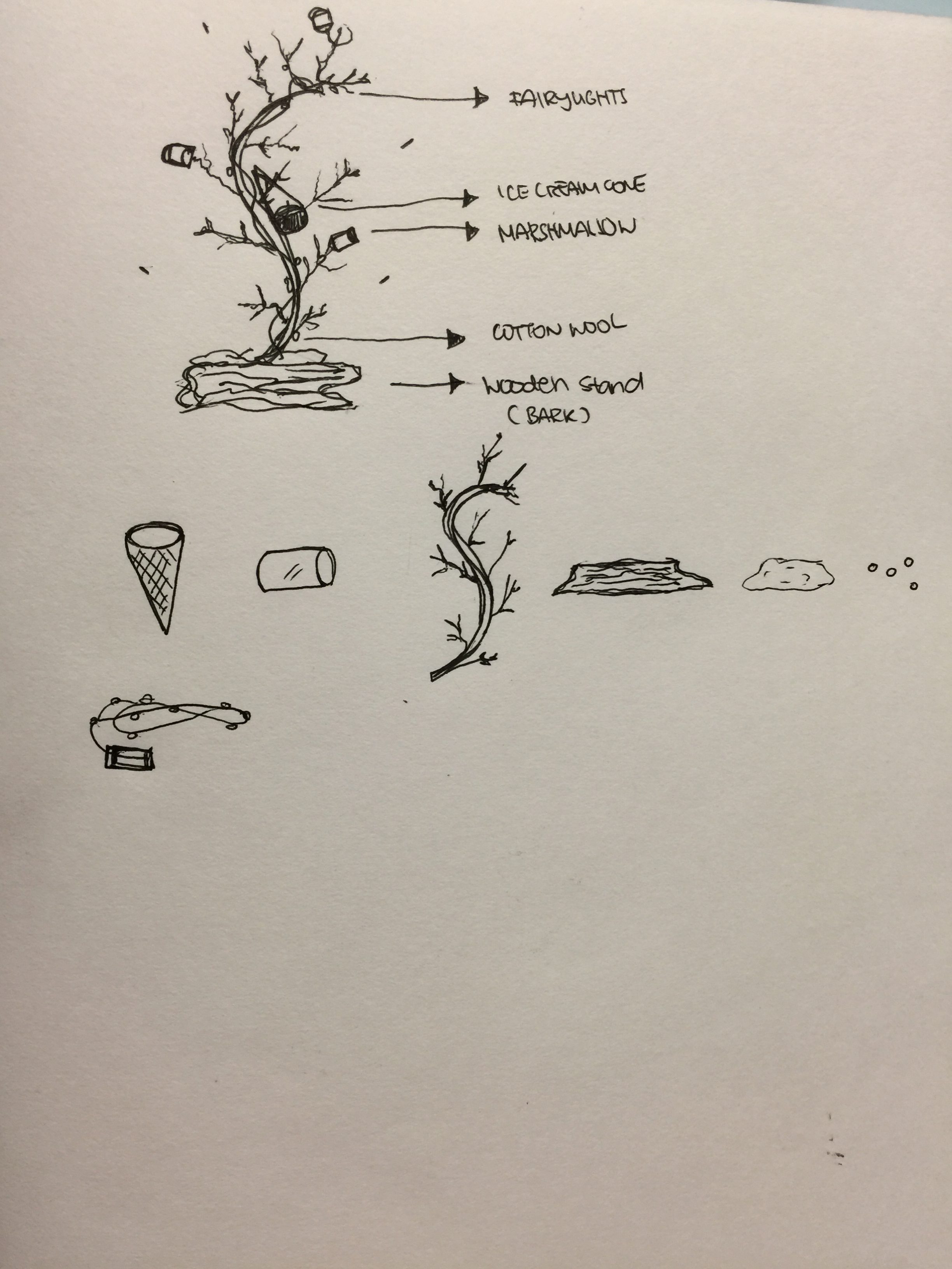
For my final Ikebana Model, I decided to incorporate the main elements that represent the Yatai stalls of Fukuoka. They are Lights, Food items & lastly, a tree branch that looked like it had braved through winter.
This! >>>
// The Assembly
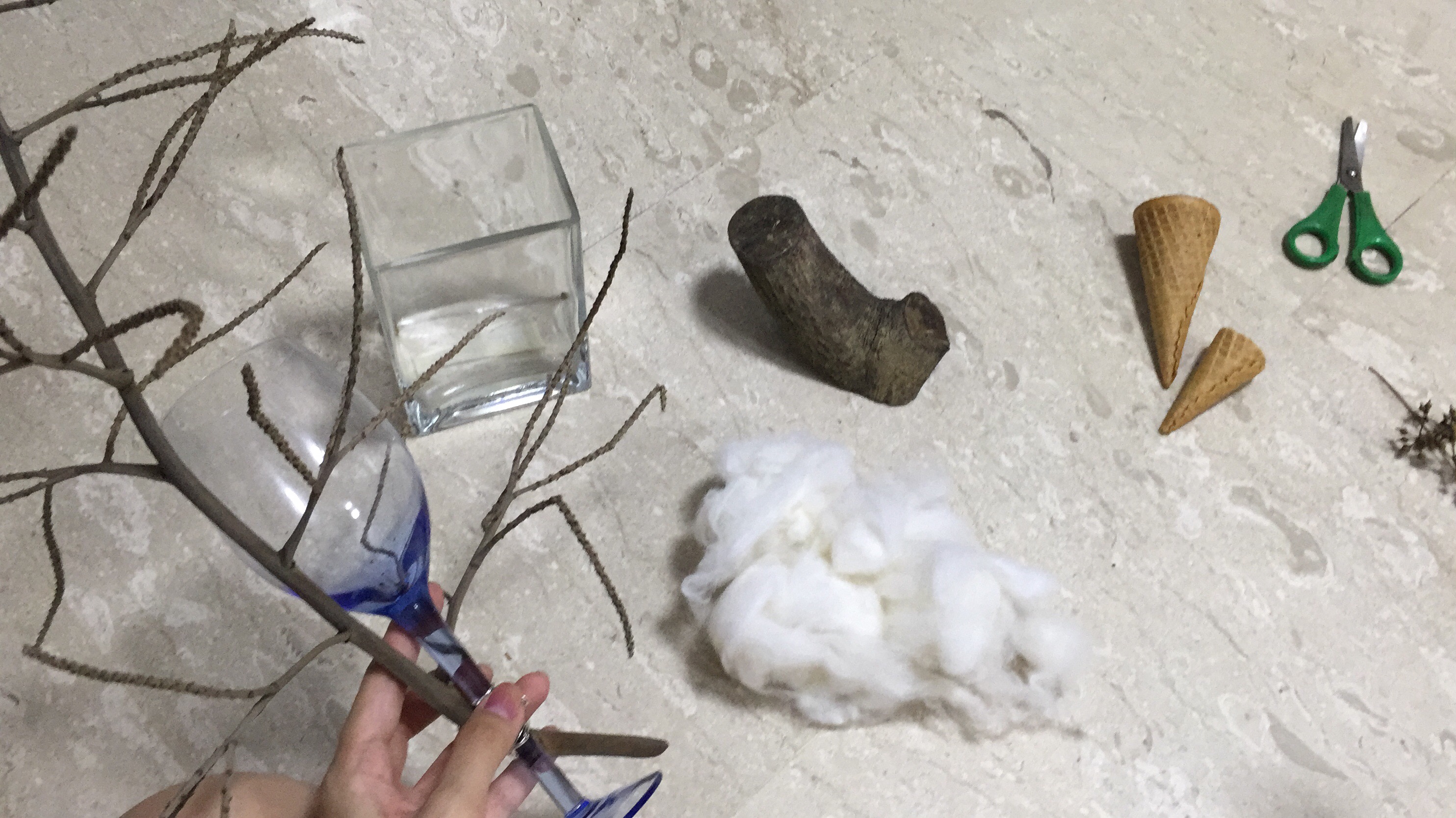
// Final Ikebana Model:
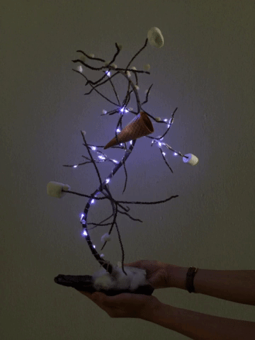
Color Scheme: Muted, Earthy tones (Blue, Brown, White, Cream)
Rationale: A winter representation of Fukuoka in a whole. The cotton wools at the base represent fallen snow, and the cotton balls (sphere) represent accumulated snowflakes on the branch. The ice cream cone and marshmallows (cylinder) signify the Yatai’s tradition. However, I am unable to hang ramen noodles and dango (ダンゴ ) on the branch since they do not constitute to the winter theme. I thought the colours of marshmallows and cone would better compliment my ensemble. Ice cream reflects about the harshness of weather in temperature during winter. The blue LED lights (sphere) brings about the distinctive spirit of Yatai stalls along the river bank, also adding on to the overall winter mood.
Feedback: It was said that I could better portray the pattern of fallen snowflakes by reducing the amount at the bottom branches (since the top part should look more densely covered in snow).
Rhythm of Flow: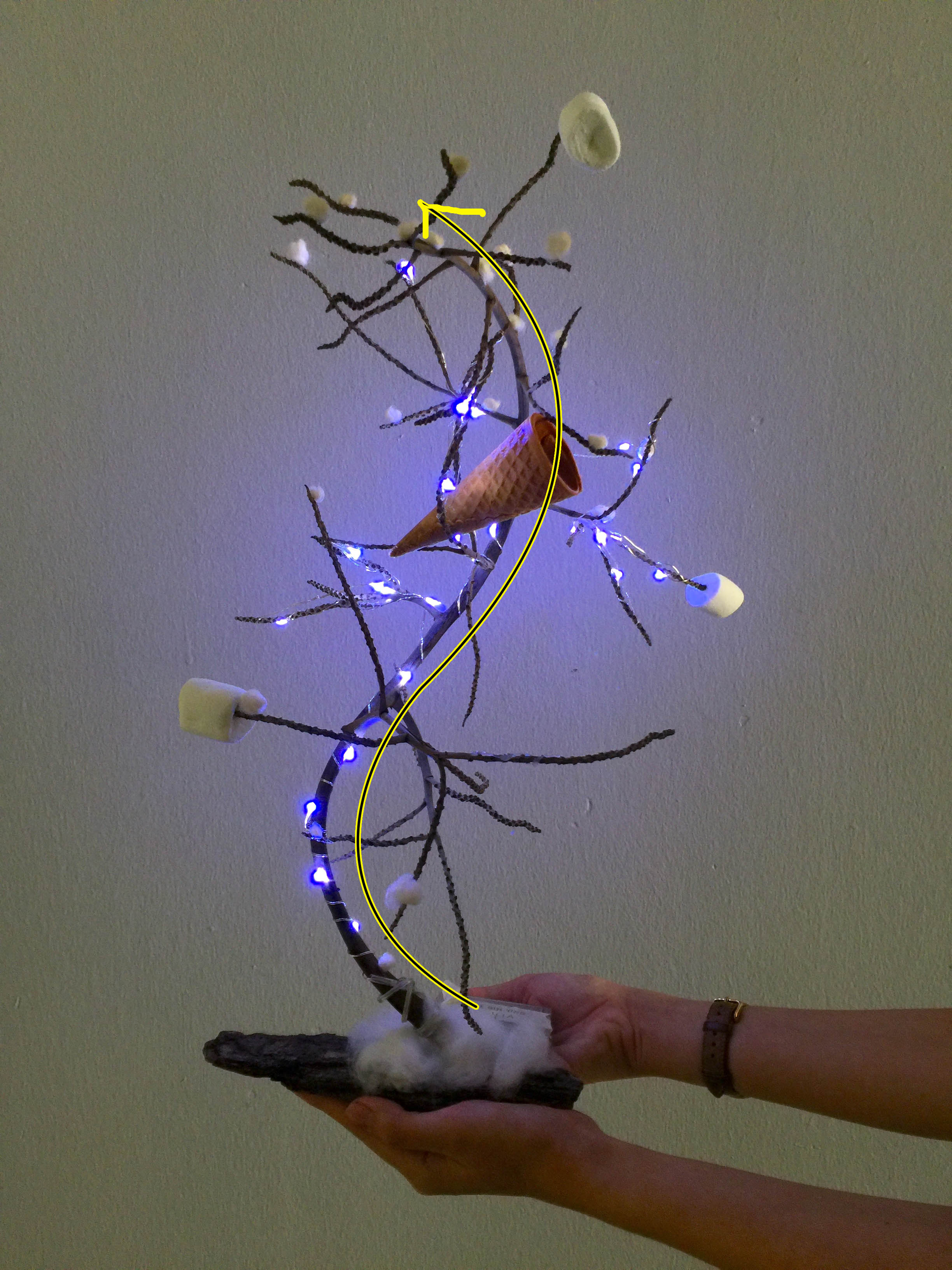
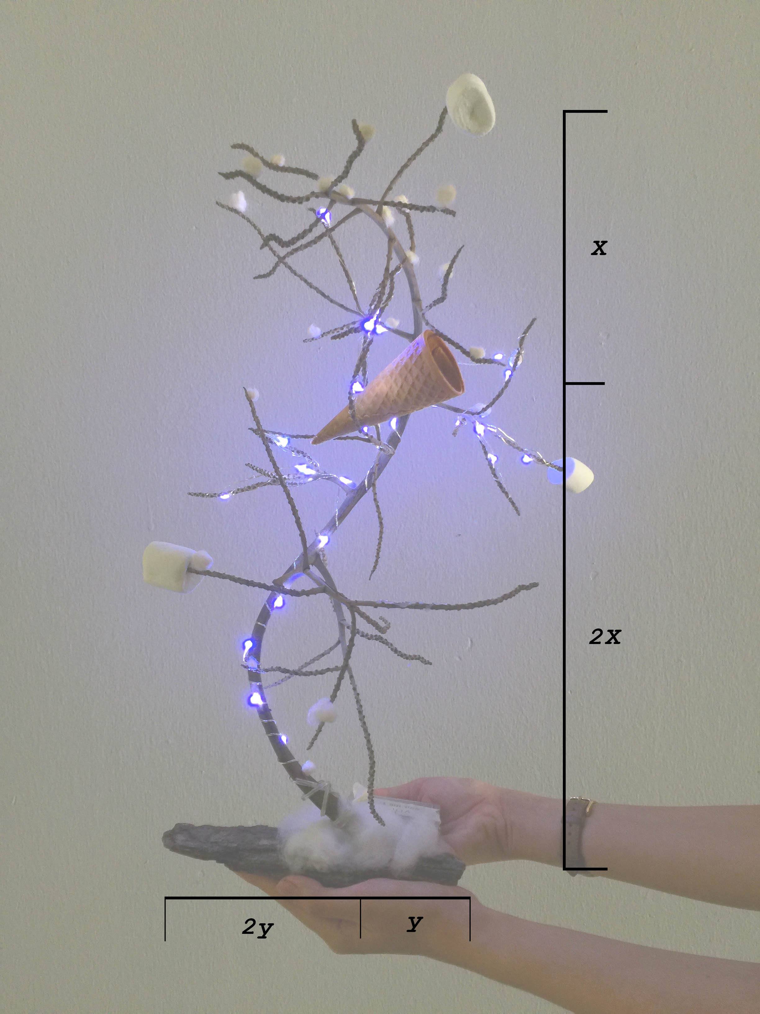
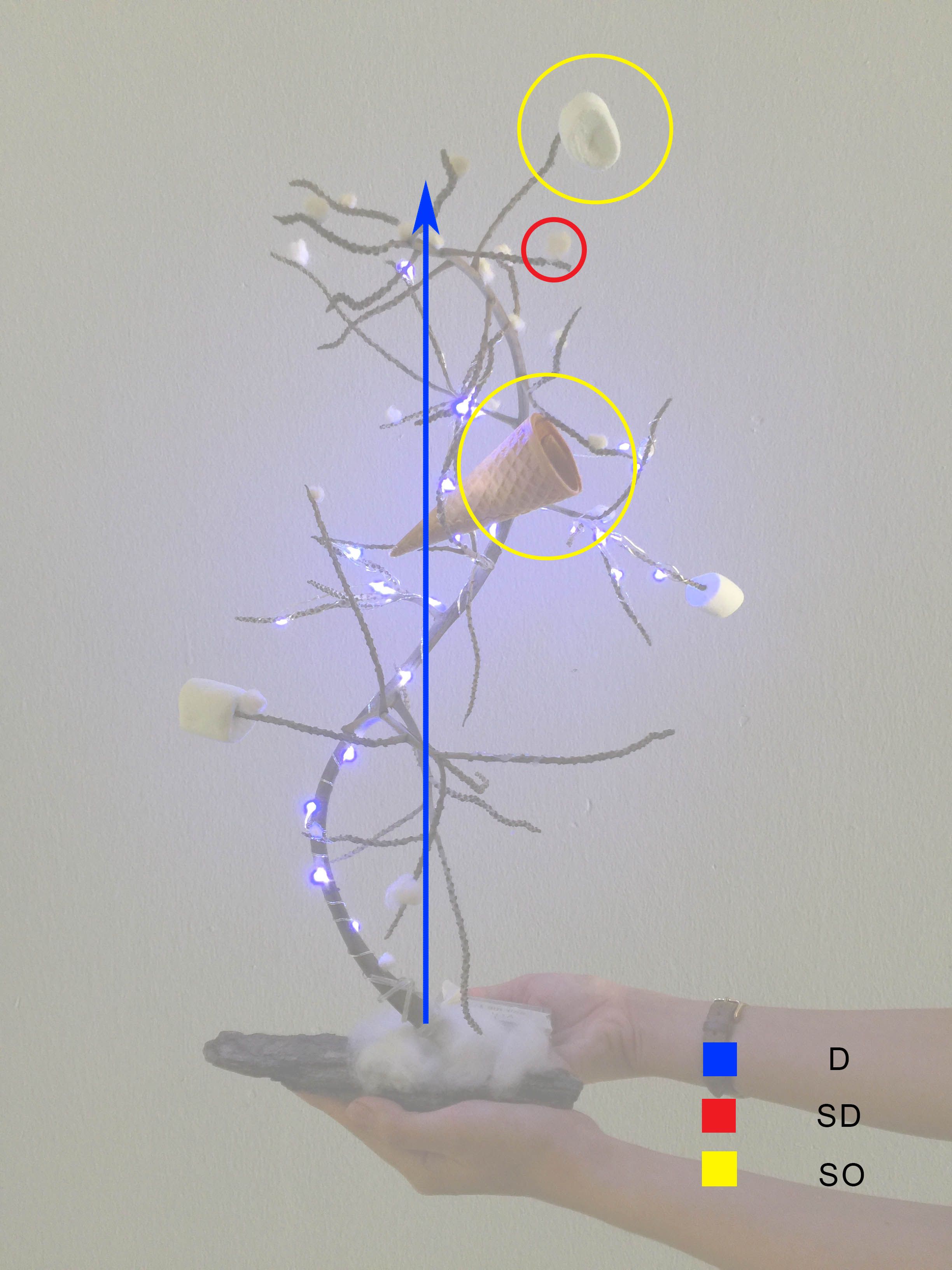
Dominant: The Branch
Sub-Dominant: Fallen Snowflakes AKA Cotton balls
Sub-Ordinate: Cone & Marshmallows
//Rejected Ikebana Model (Documentating my attempt):
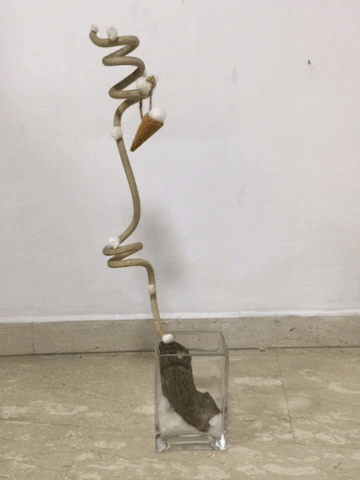
Elements: Wooden Spiral Piece, Cotton ball, Ice Cream Cone, Shaved Ice Ball (On the cone) and the Wooden piece I found interesting
Dominant: Wooden Spiral Piece (implied cylinder), Wood/Branch (cylinder)
Sub-Dominant: Ice Cream (cone)
Sub-Ordinate: Iceball (sphere), Cotton snowballs (sphere)
The reason why it’s rejected: I find that it somehow lacks the Ikebana essence, but I am still going to document it anyway since it has already been assembled. The structure looked too static and curated, hence this leads me to create another design.
//On that day:
That’s all folks!
バイ~

❄WINTER WONDERLAND❄

https://media.giphy.com/media/14wT2CxmGHbdvO/giphy.gif
Hello, World.
Winter to me is a symbolic representation of Cold with Christmas vibe creeping in. This holiday is also known as the festival of light. It is the coldest season of the year and the season that comes after autumn. The colours representing winter would be Blue, White and Grey. I would associate minimalist and zen-ness to an Ikebana ensemble.
// How do trees look like under such harsh climate?
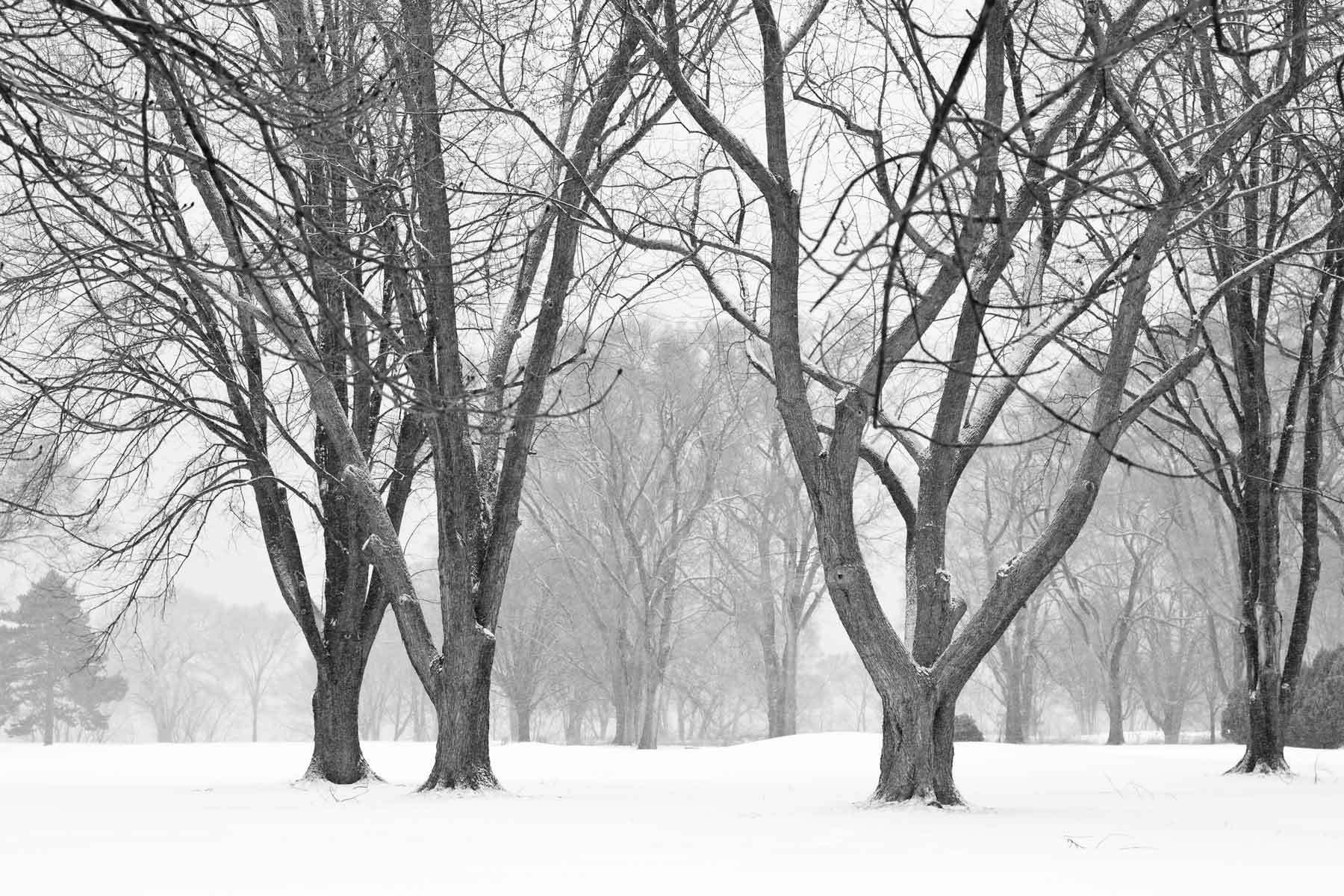
https://i.pinimg.com/originals/b7/a5/f8/b7a5f8b934f7248b7b5df362f6c3089d.jpg
https://i.pinimg.com/originals/b7/a5/f8/b7a5f8b934f7248b7b5df362f6c3089d.jpg

https://img00.deviantart.net/10a7/i/2005/341/0/7/winter_trees_by_psykorigide.png
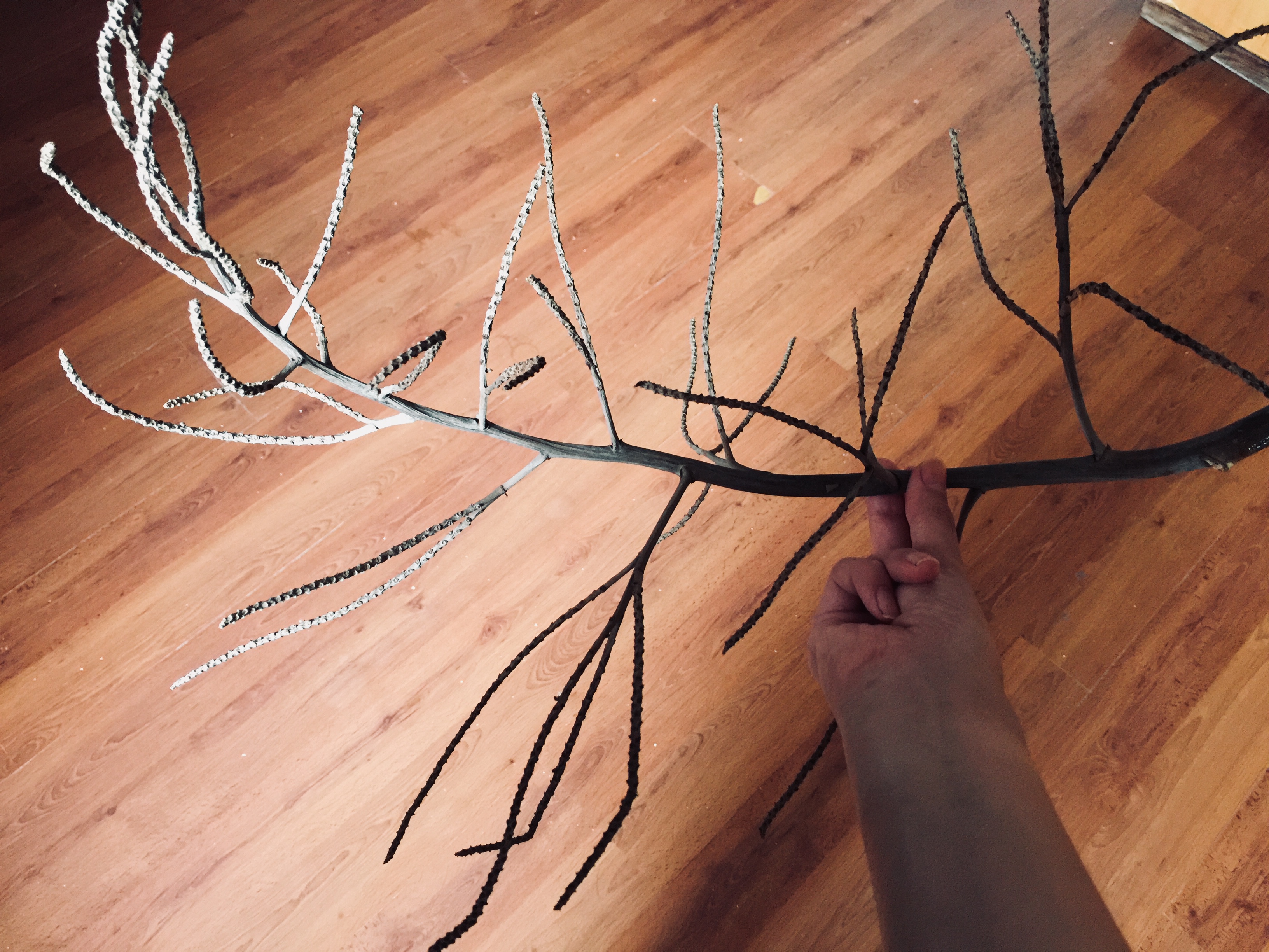
// How my Branch looks like:
This is the chosen branch because it looks really unique! By unique, I mean how the colour of the brown is not overly dark, and yet it brings about the feeling of a barren tree during winter. Unlike other branches/twigs, this one has a nice structure to it. Even the twig has tiny “holes” which adds on to its perk. This is the little perfect branch that will represent my Ikebana!
// Some Research on Winter themed Ikebana ensemble:

// Some core characteristics that ties in with Winter:
// Mindmap & Ideation
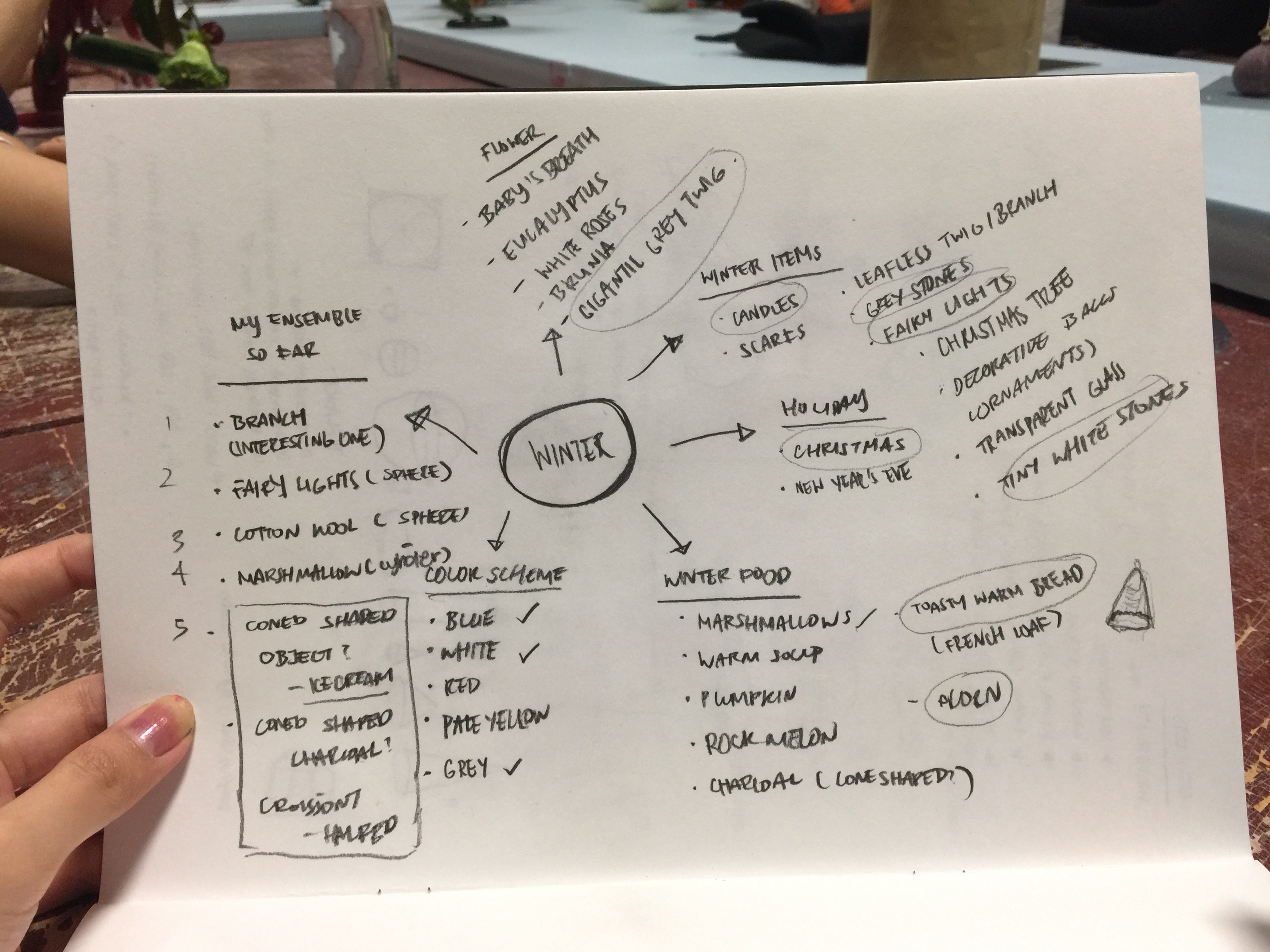
// My Color Scheme (Neutral, cool hues)
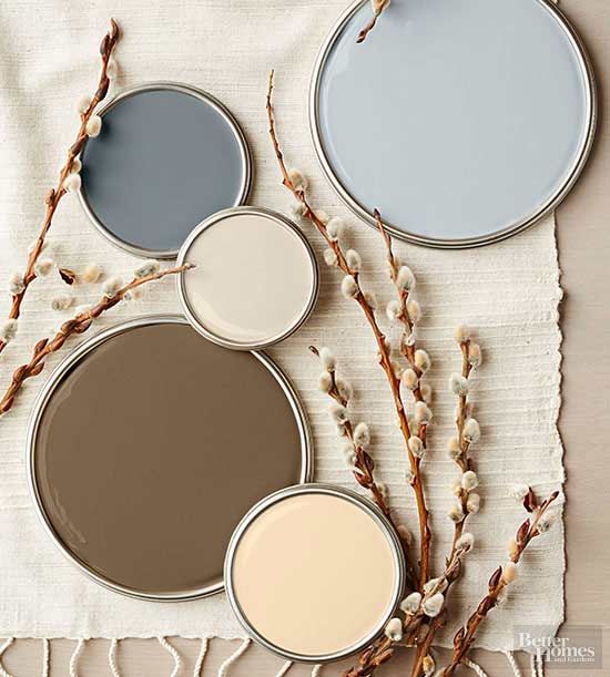
http://www.bhg.com/decorating/color/schemes/nature-inspired-color-palettes-281474979472421/#page=14
//Winter Moodboard:
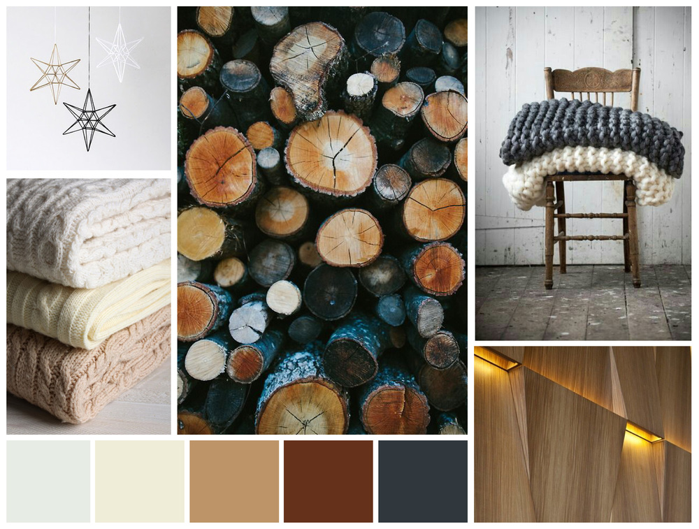
http://www.hueandtonecreative.com/blog/2015/12/1/mood-board-fallwinter-chill
// Guide to Ikebana-ing (Note to self)
http://www.wingsnthings.ca/ikebana.php
Alright! Time for development.
Ciaos!
// Hello, World!
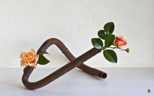
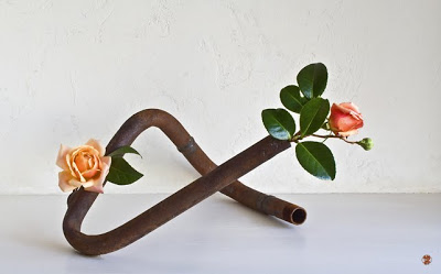
After the previous consultation with Cheryl, I saw the amount of improvement I needed to make to my 3D Model. My allocated theme was HALF and hence, my main idea revolving the final product lies in the ability to create an interesting structure that resonates with the concept of a 50-50% ratio.
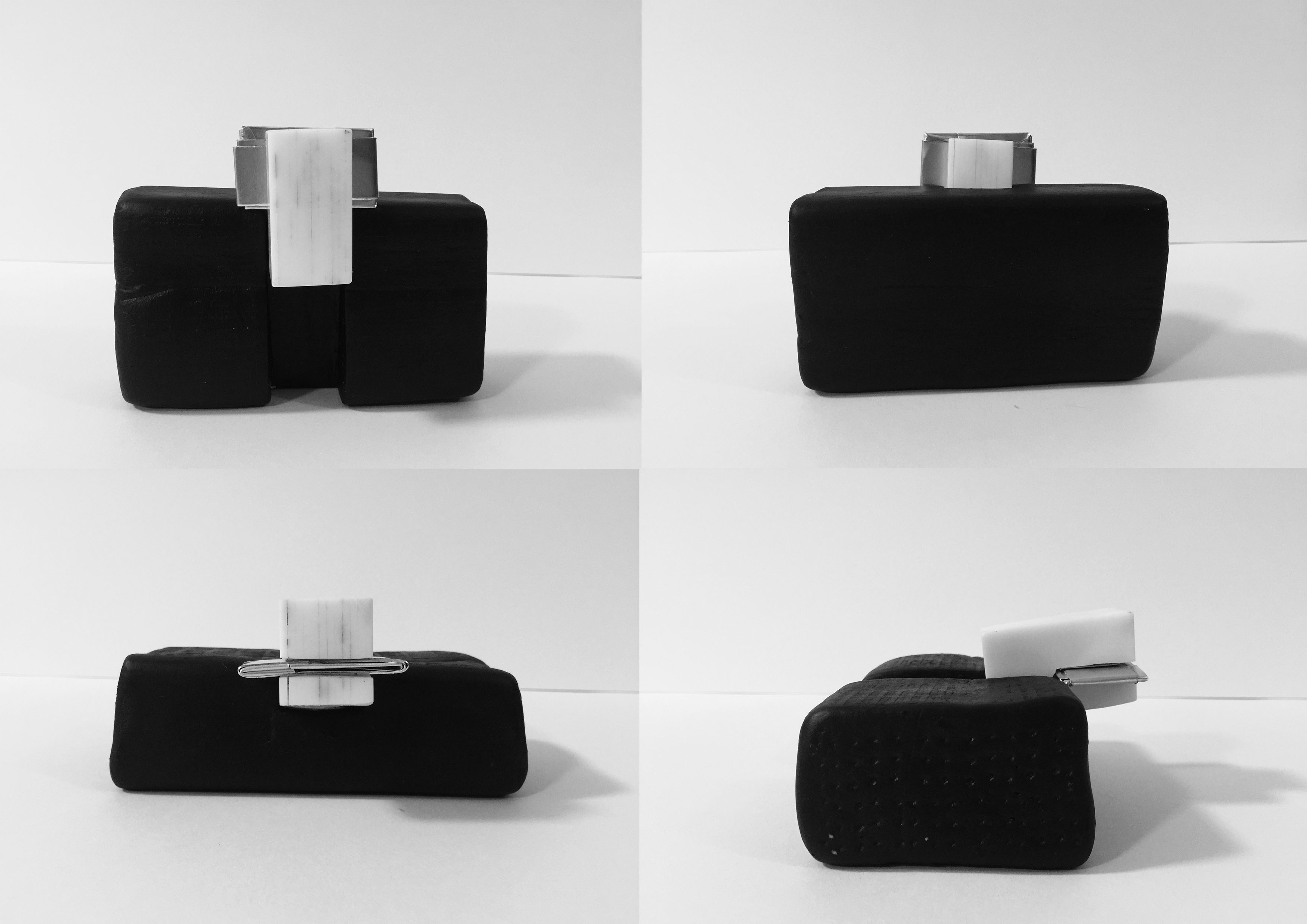
This is how my model looks like after further improvisations:
Actual Structure:
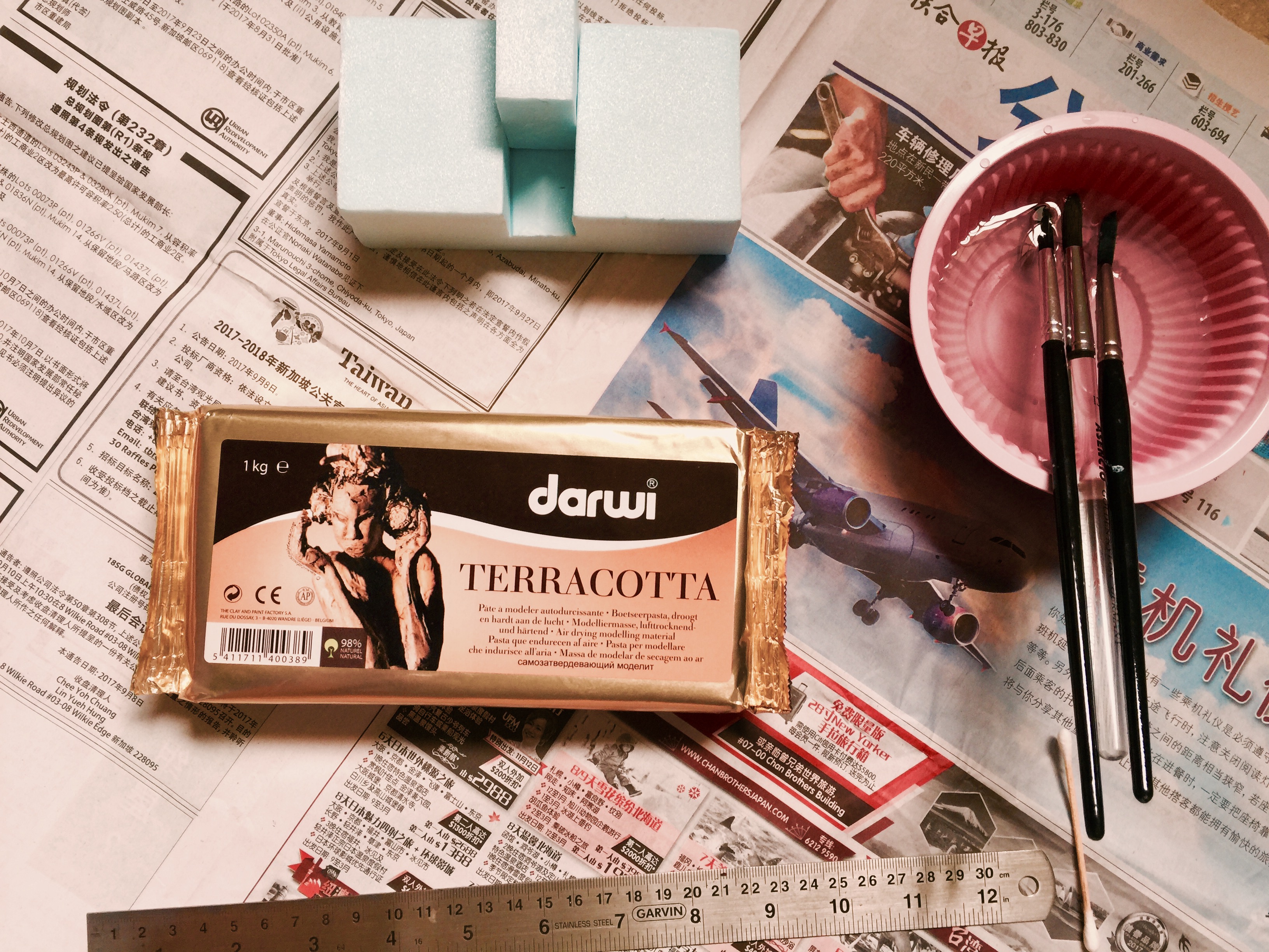
// Materials I used to make my 3D Structure:
// The Process:

// My Rationale behind the ensemble:
Uses of my Model:
Terracotta clay, in my opinion, is an ideal replica in replacement of a stone or brick (which is almost too difficult to reshape). It provides me ample amount of time to mold the clay into a structure I deem fit. On top of that, the natural color from the clay adds on to the overall aesthetic of a ceramic stone texture, making the viewing experience more realistic. Just like the structure of a building which is made of hard concrete, Terracotta clay would replicate a similar effect.
After another consultation on Thursday, I brought home my model for further improvisation on the width of the Sub-Dominant. Yup, got it trimmed into half after a lot of sawing and sanding! On top of that, I wanted to have a monochromatic color scheme to my model, hence, I painted matt black acrylic paint over the Dominant, Glossy white acrylic for the Sub-Dominant, and Shiny reflective metal piece for the Sub-Ordinate. This would balance out their overall aesthetic, starting with the biggest piece being the dullest, and the smallest most inconspicuous piece being the most attention seeking.
// Reflection for Pandora:
These few lessons were admittedly insightful. I attempted to toggle with several differences in terms of the length and width of my 3D Foam Model. I learned that every centimeter could potentially result in a shift of D to SD/SD to SO.
With that, I grew a sensitive eye to better distinguish how the size and position relative to its view point could potentially change the game plan.
Thanks for reading.
Hello, World.
(Oh no, I suck at doing intro, let’s have a cliche one k) Continuing from previous week’s progress, we have now come to the improvisation phase! To recap, the assigned word was: Half.
I searched it up on google and its definition came up to – “either of two equal or corresponding parts into which something is or can be divided.”
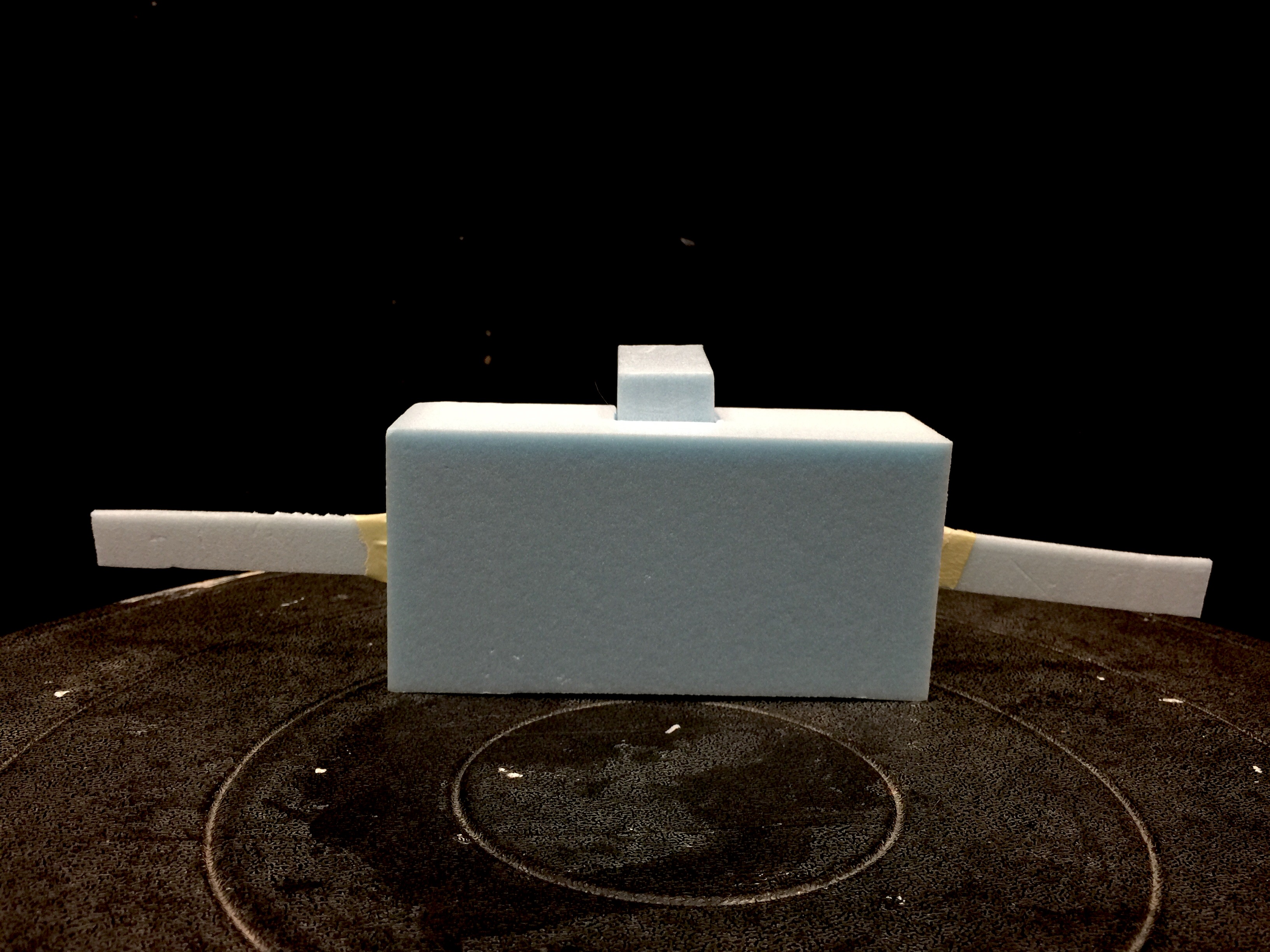
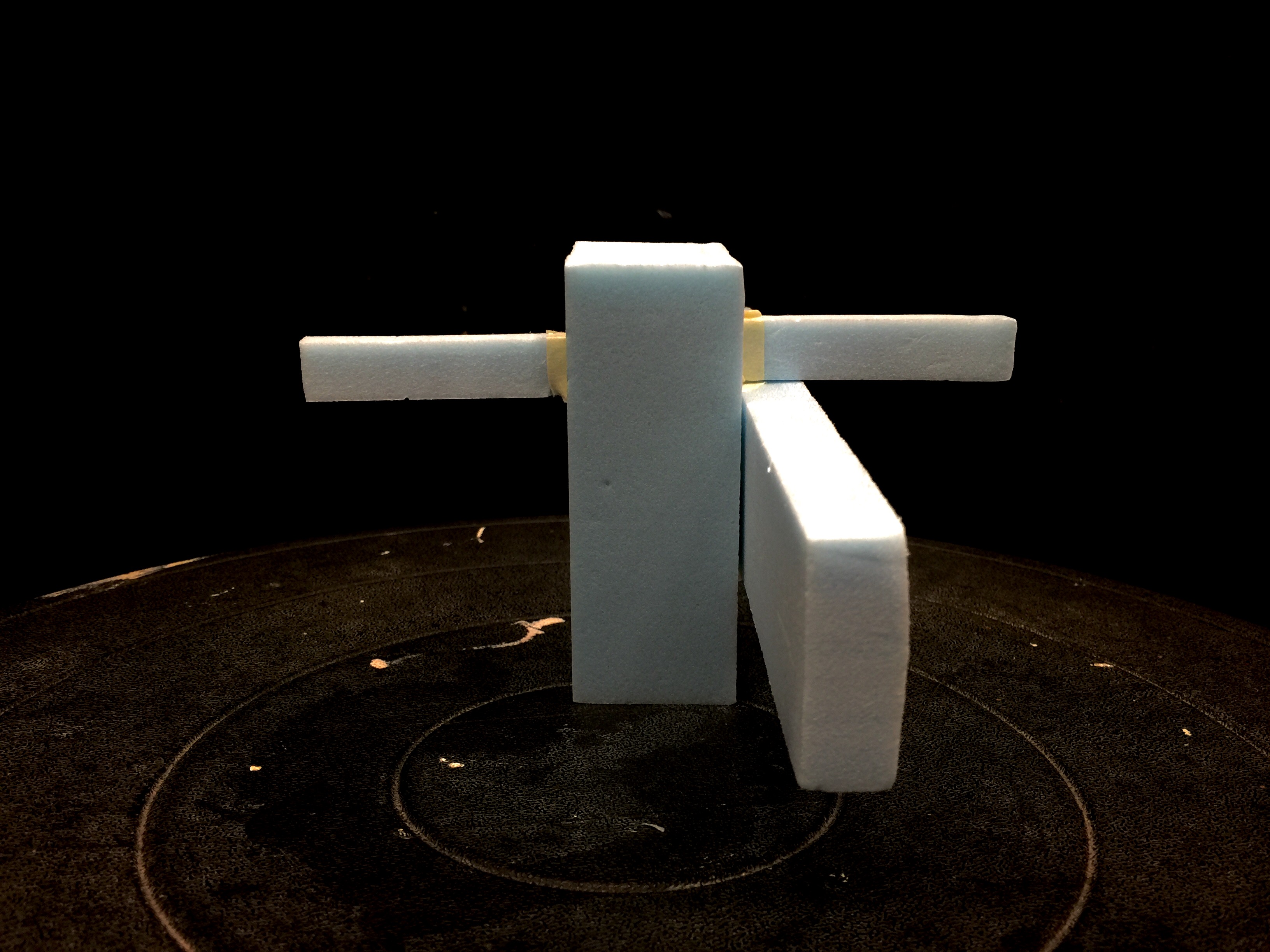
Presenting our first 3D model: The Human Barricade
Applying what I have learned from today’s lesson, I registered the ‘Wedging’ and ‘Piercing’ concept into my first 3D Model. The little gap on the Dominant foam gives it an interesting visual, which is known as the Void (1/3 unoccupied). Additionally, I added in a horizontal foam that brings about the pierced through concept. Overall, the key idea was to develop into a Human Barricade alike structure that can withstand heavy weights.
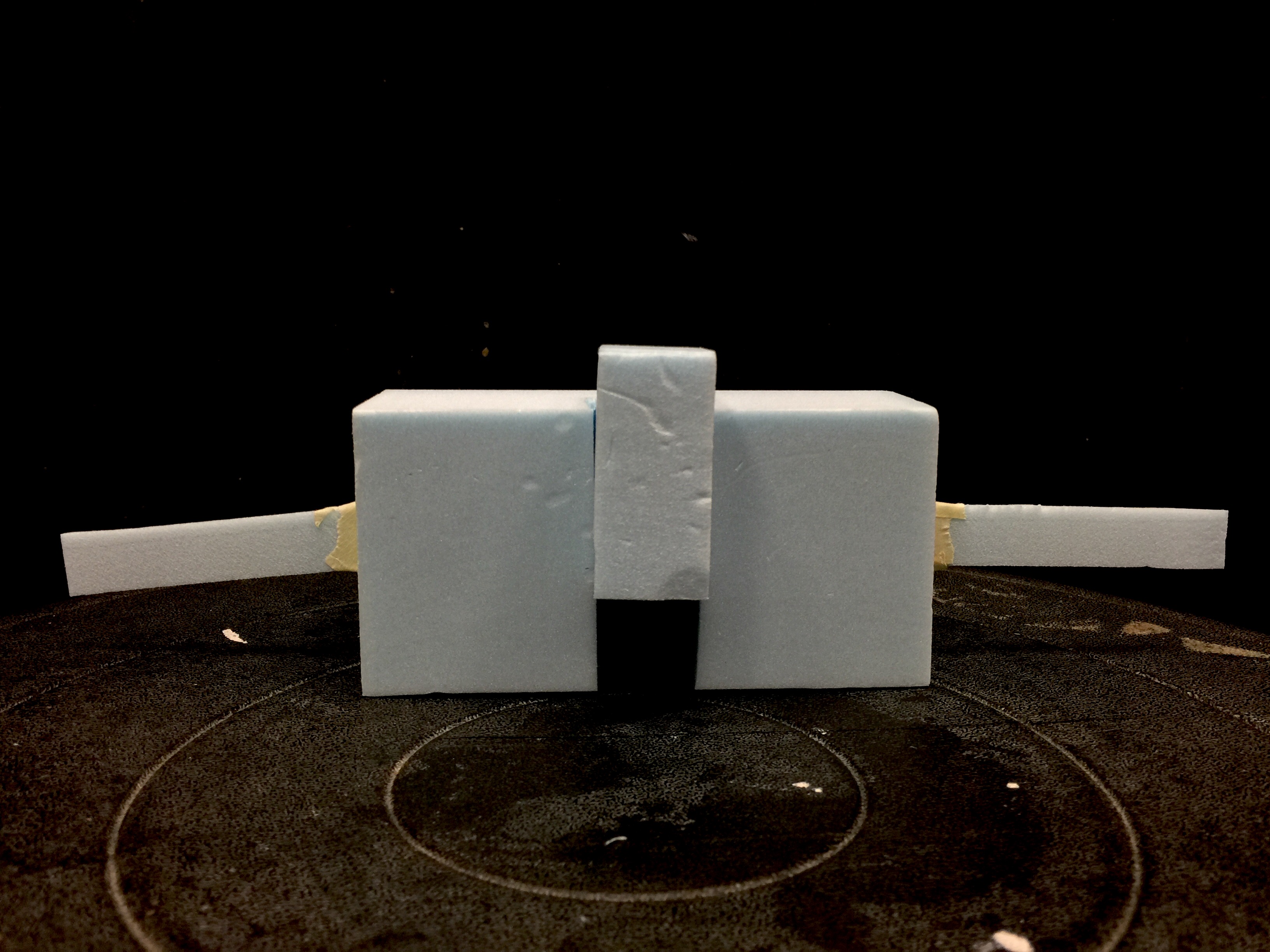
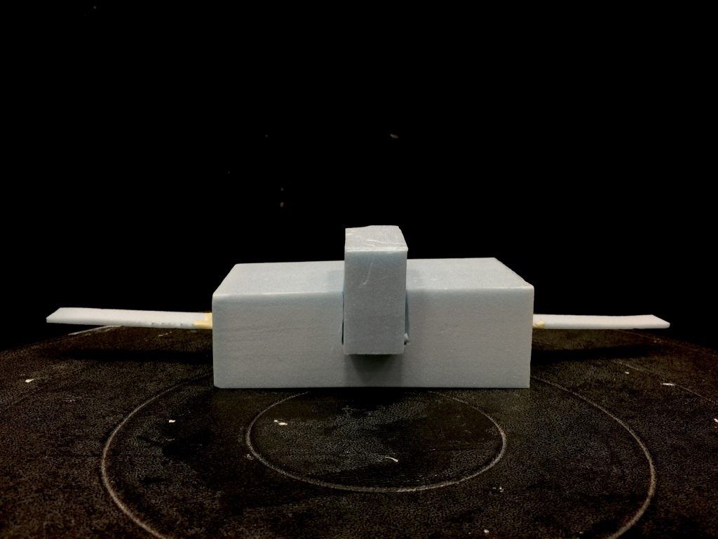
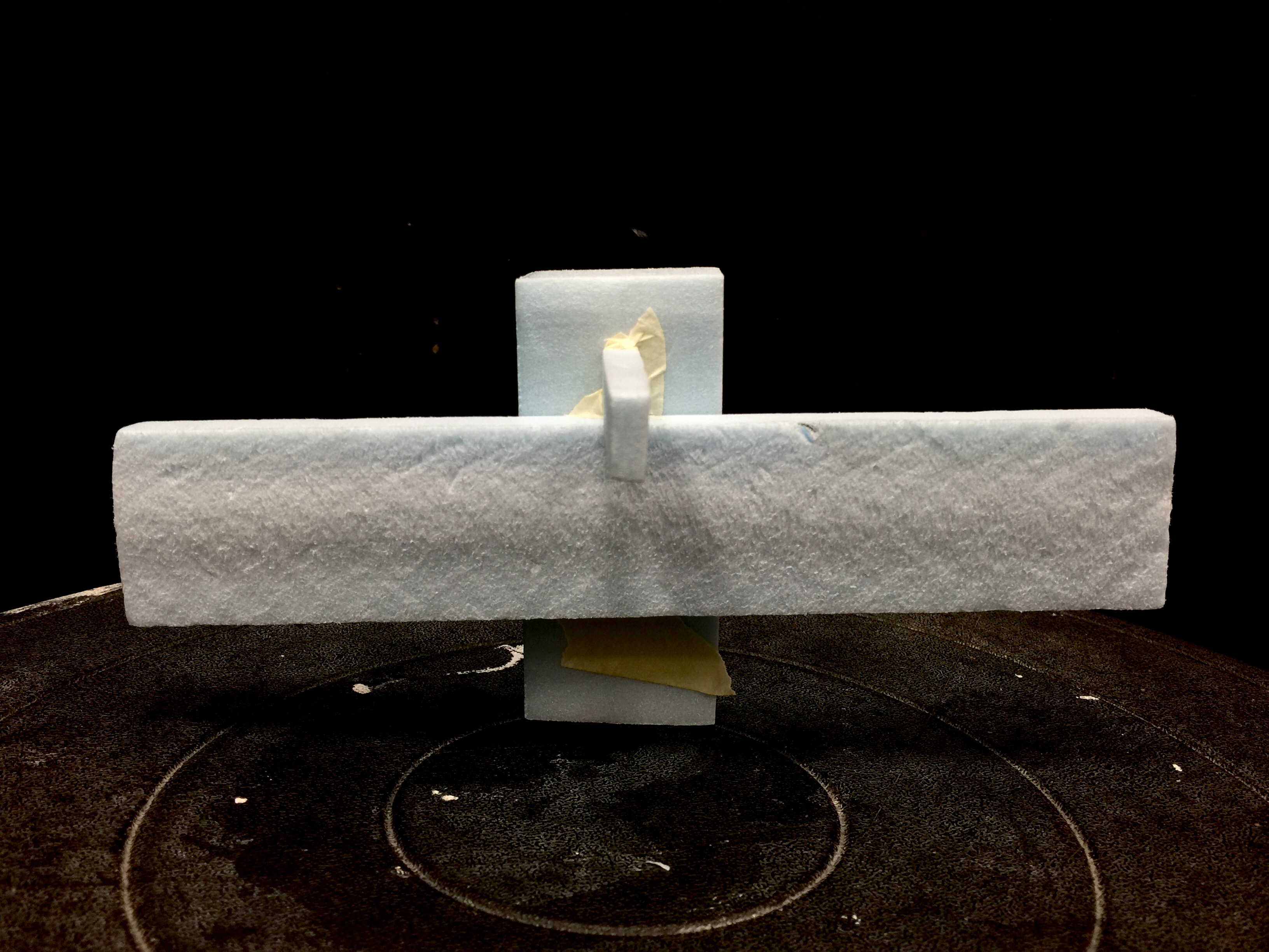
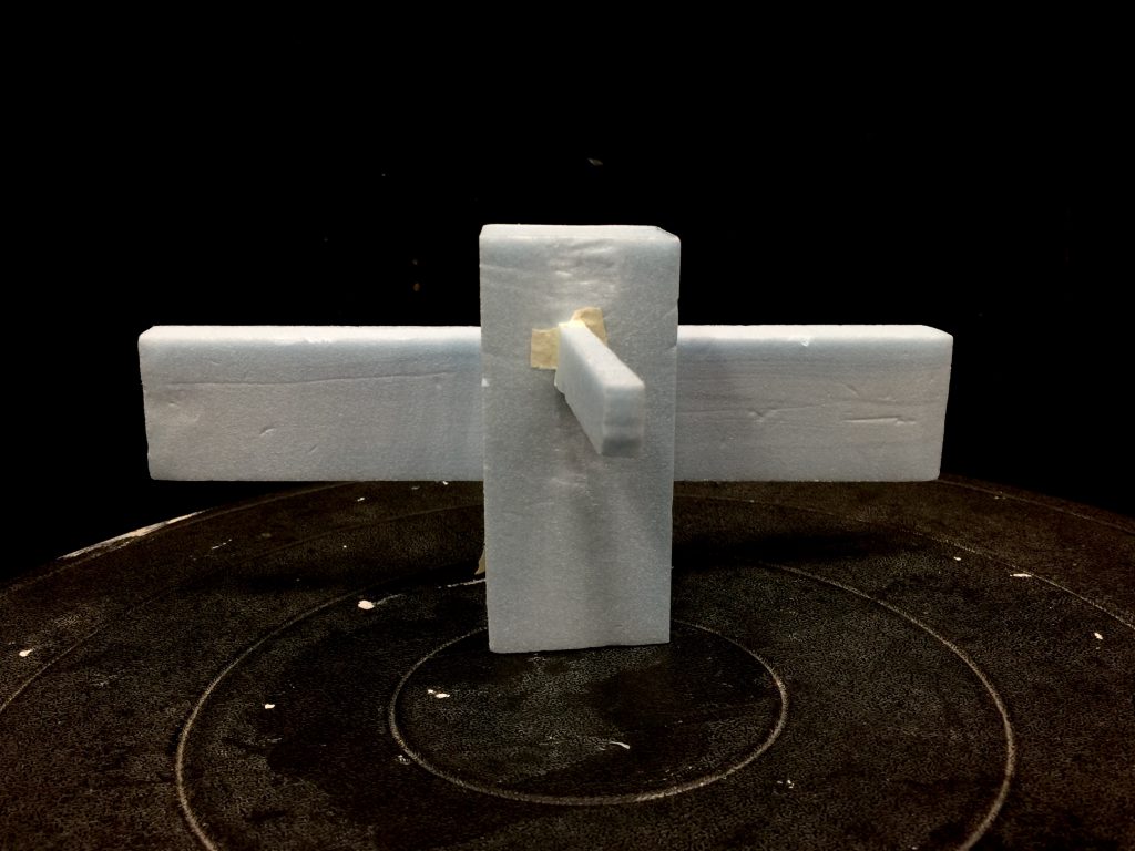
Presenting our second 3D model: The Wing Chun Wooden Dummy
(Damn this is so unlike me…) Anyway, had one of the Sub-Ordinate foam pierced through the body of a Dominant foam. It was a lot of reshaping and cutting and slicing down before I manage to settle with this one. Hmm, on second thoughts, I might need to shave one of them down further. We’ll see…
& lastly, here’s the 2-Dimensional Sketch Analysis!

In summation, some of the key pointers I have acquired through this lesson were:
(Happen to suck at doing an outro too, so…)
Toodles! 


