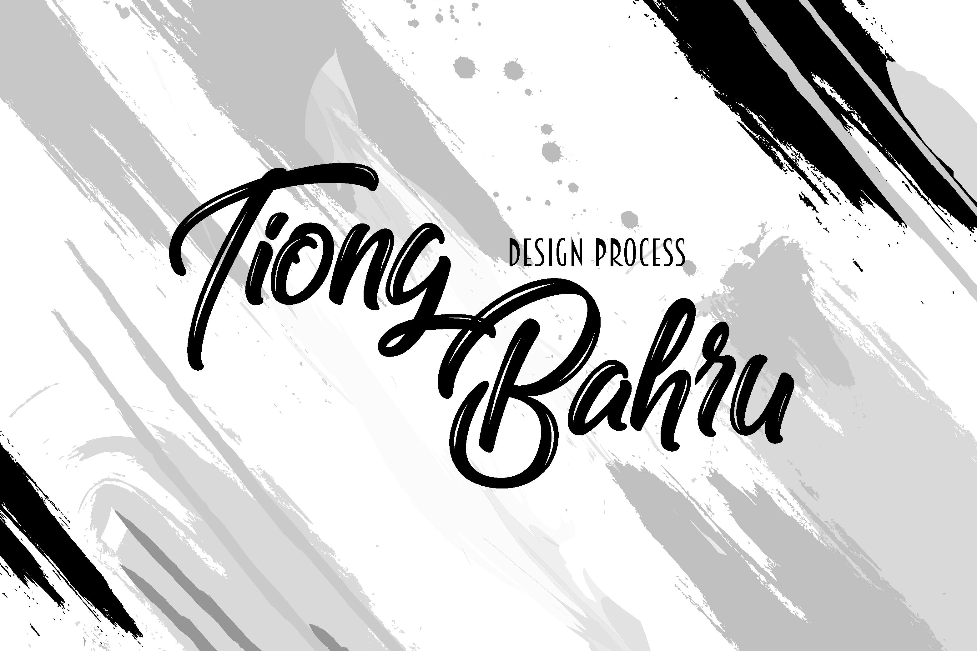
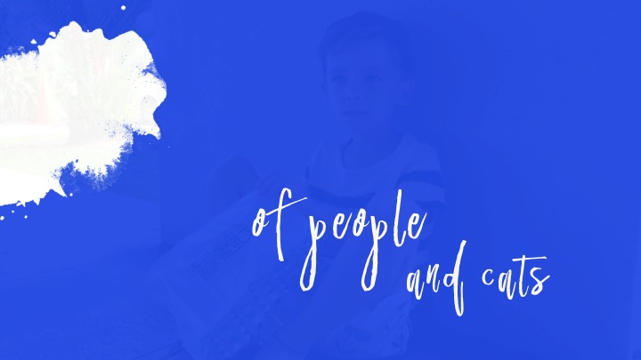
See Tiong Bahru through my eyes:

See Tiong Bahru through my eyes:
Hello humans!
Read more about my Ideation and Cover Development before you go on!
For content development today, I will cover the style and approach I took towards crafting my Zine. The area I am covering is Tiong Bahru, and with that, I decided to try a new style – Illustration!!!! We’ll see the outcome further down into the post. And yes, I am equally as excited to share my design journey.
Let’s go
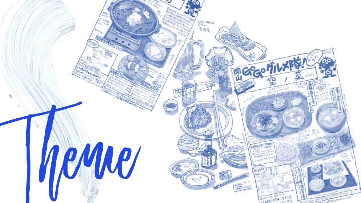
MOODBOARD DESIGN:
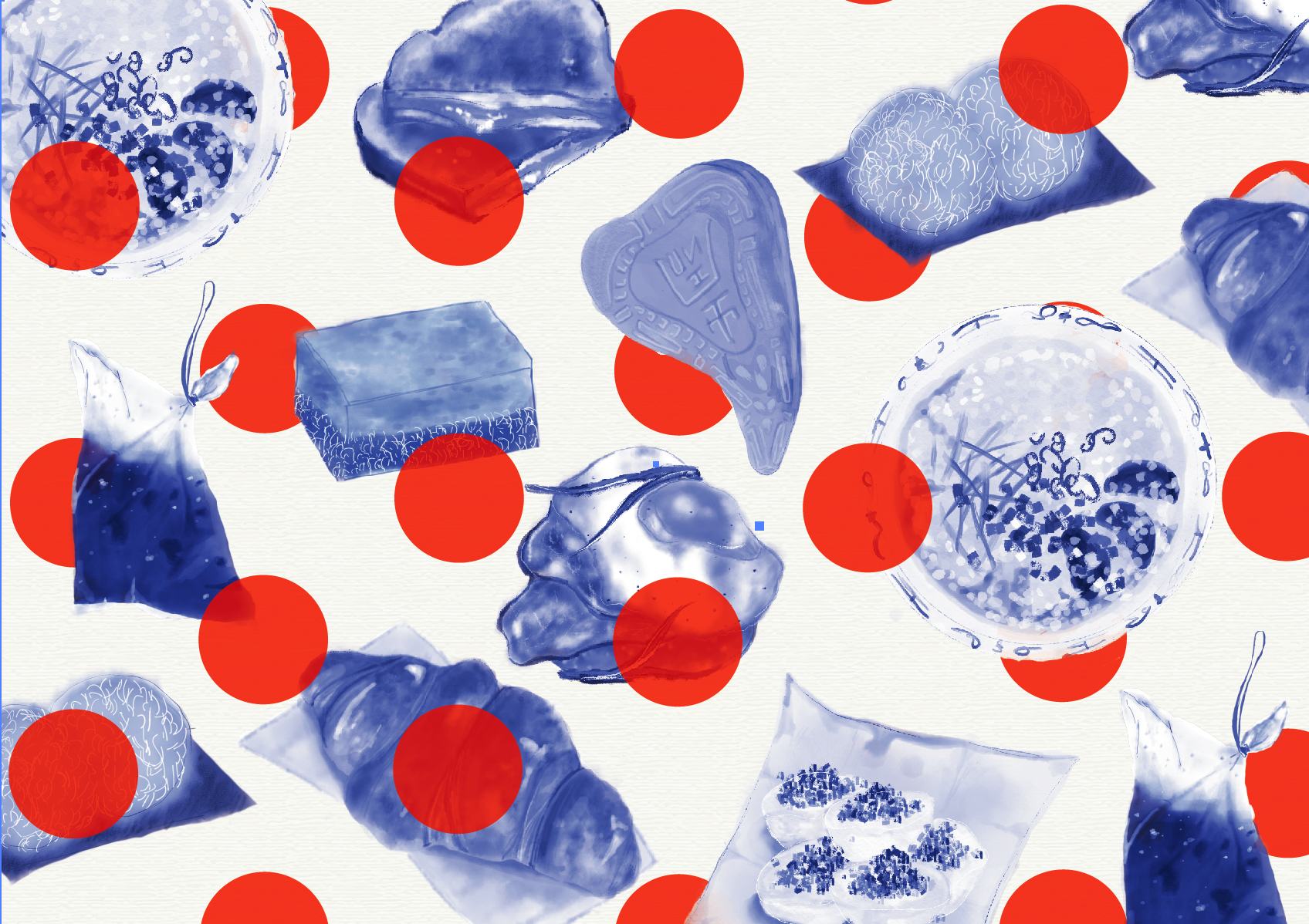
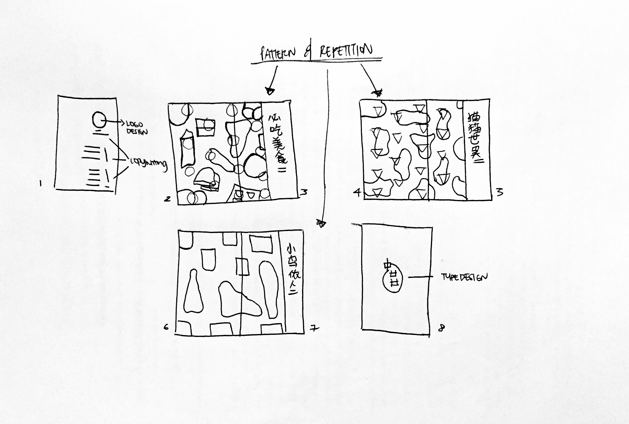
LAYOUT – Making use of Repetition and layering of elements to set the foundation of the overall theme.
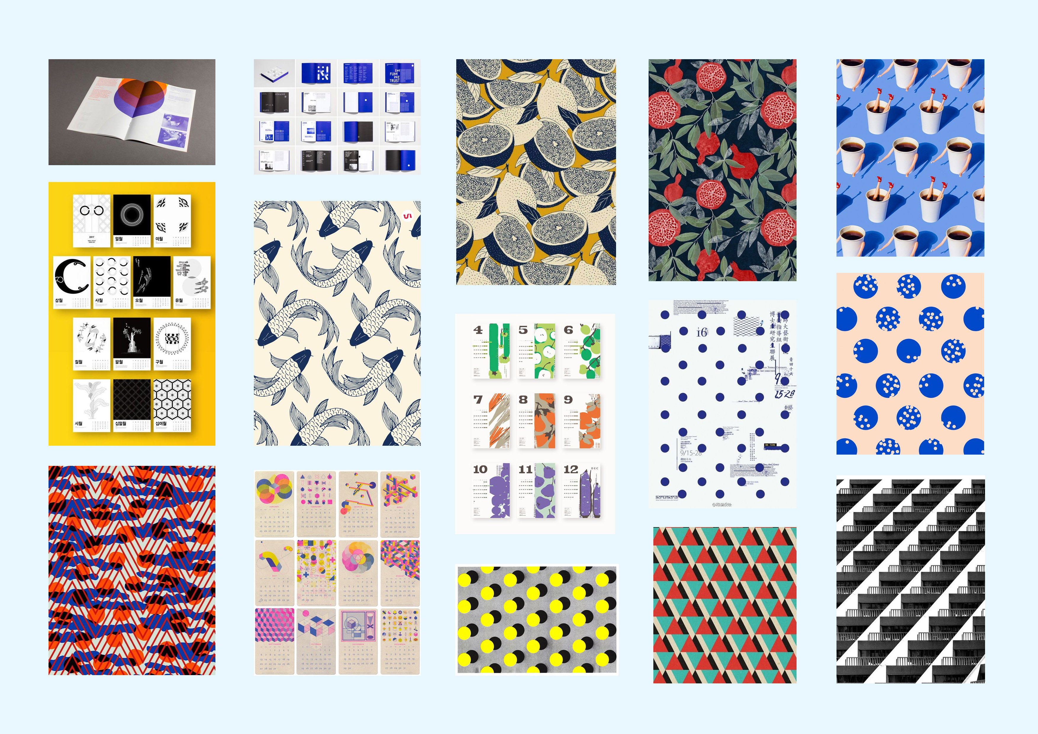
ILLUSTRATION STYLE –
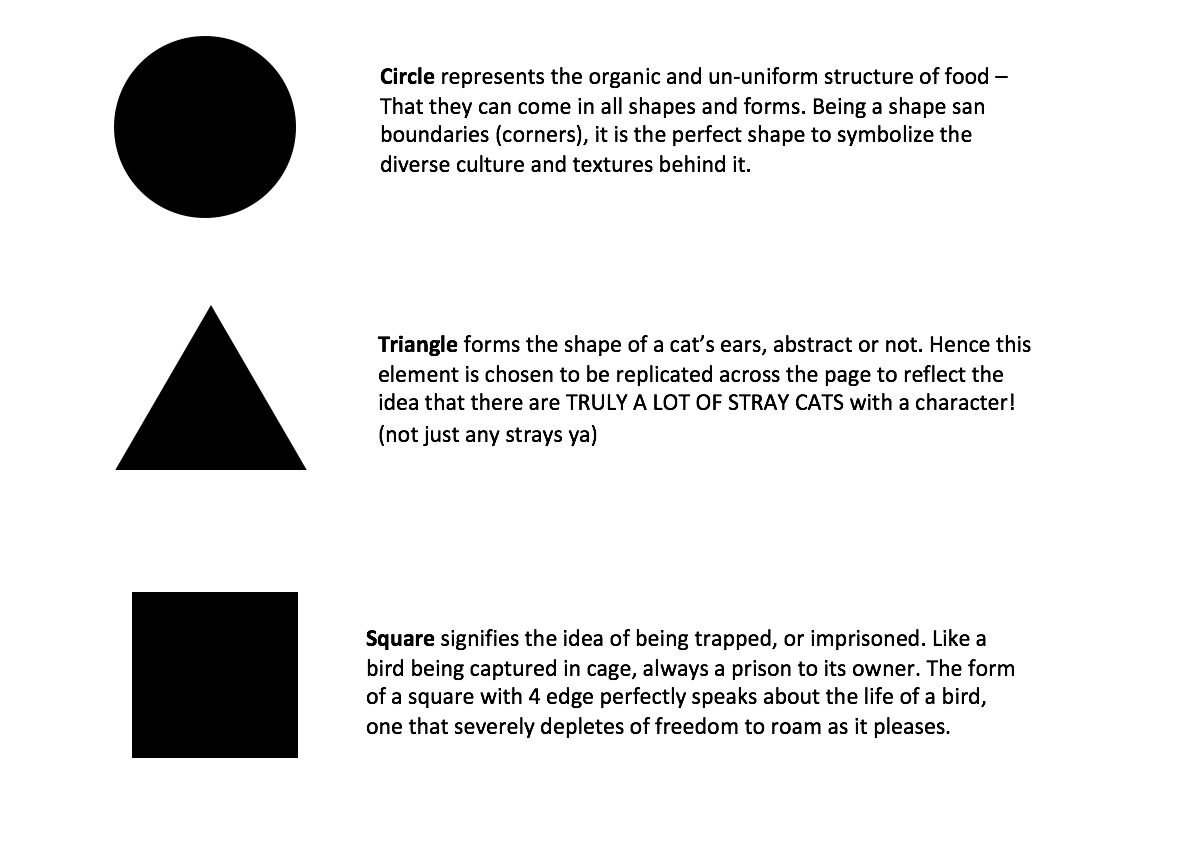
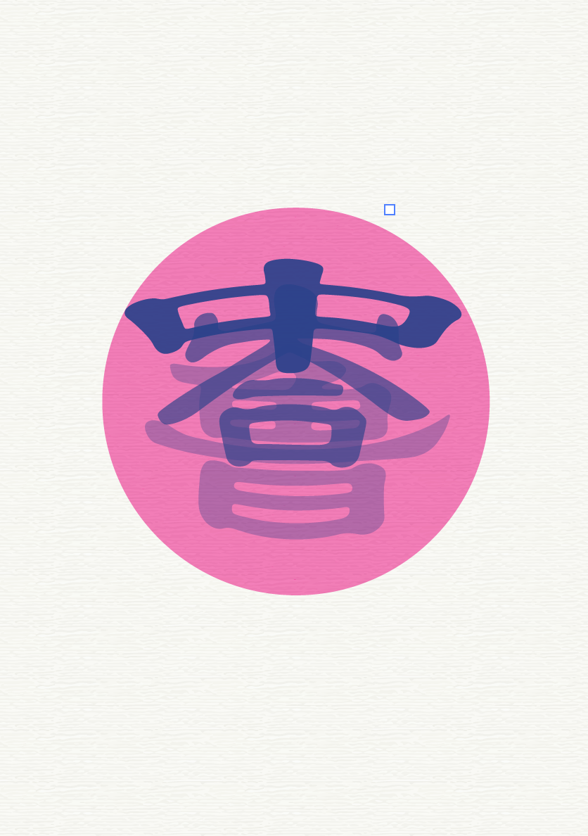
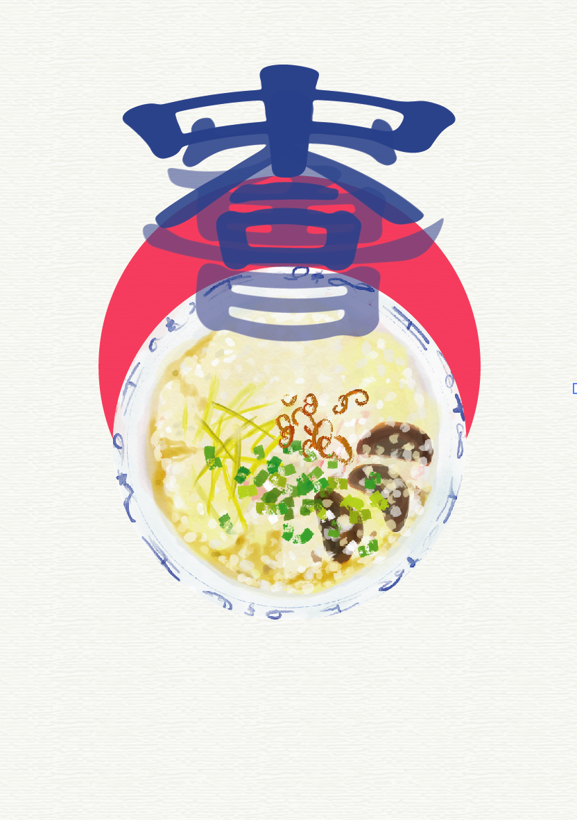
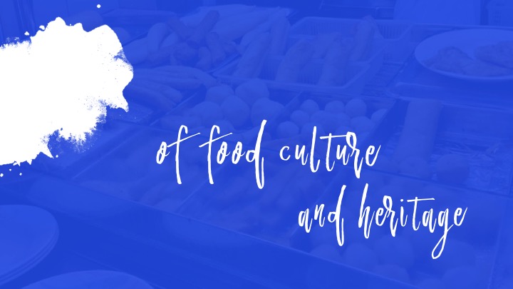
COLOUR SCHEME – Blue because it is the colour of the porcelain bowl, a symbolic colour of olden rituals and traditions
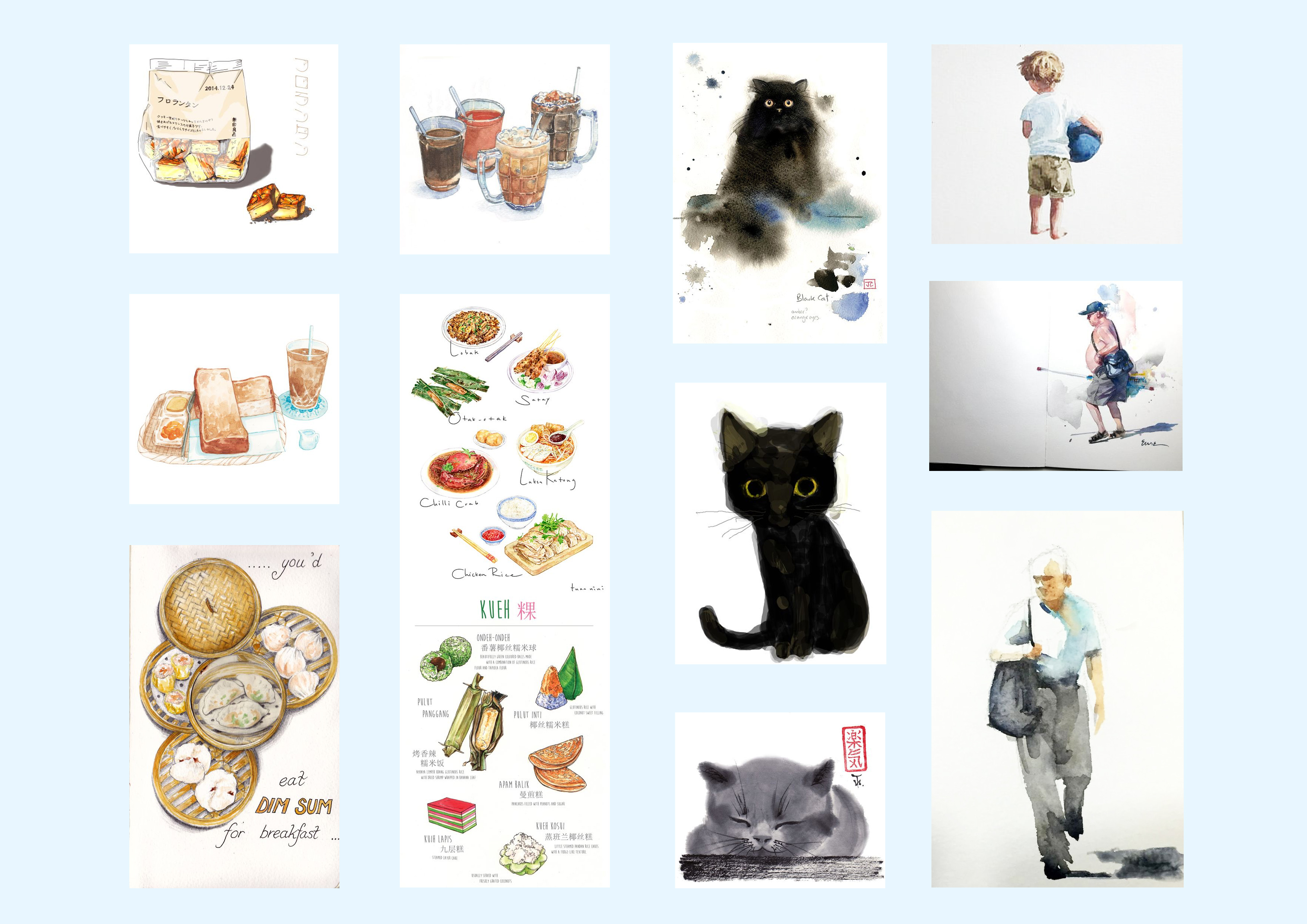
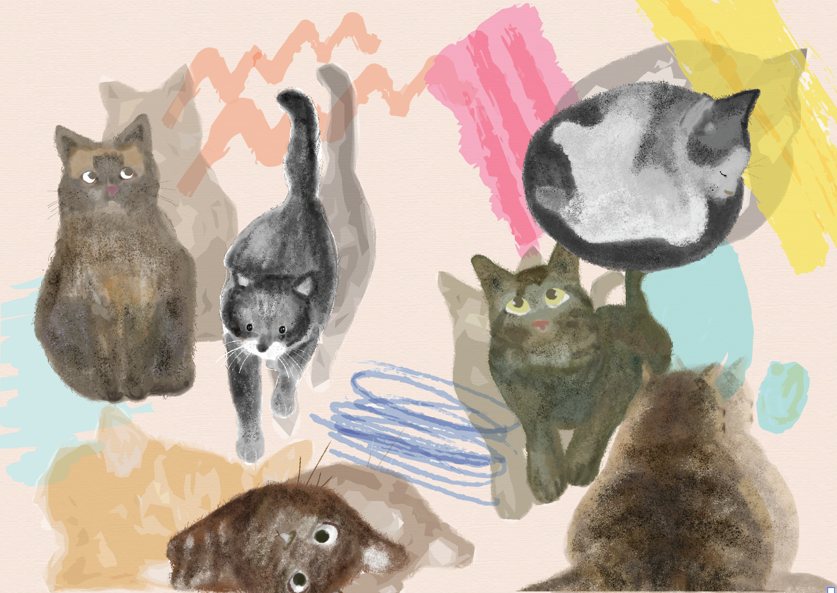
INITIAL ILLUSTRATIONS:
My first ever set of illustrations!!! I’m so happy I took that leap of faith and try out illustrating. Have always been more of a graphic design kinda person but having picked up this new medium/skill IS LIFE CHANGING. It has been super addictive – and the feeling of digital illustrating differs so much from graphic art style.
LOVE.

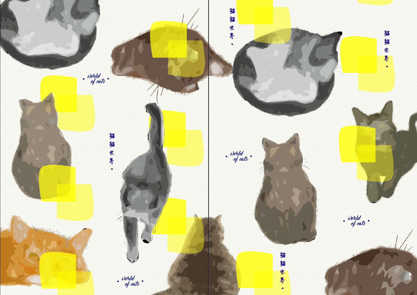
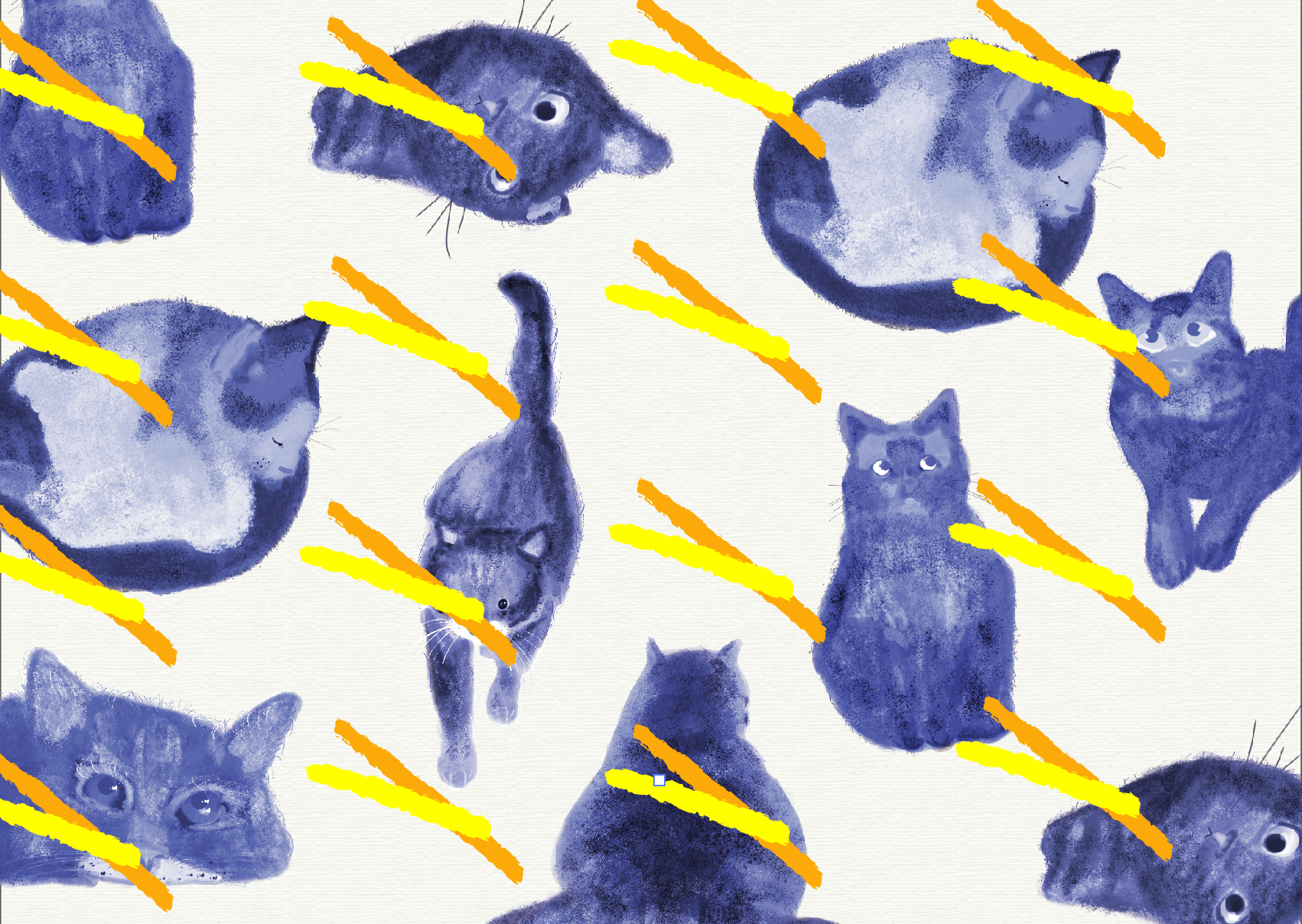
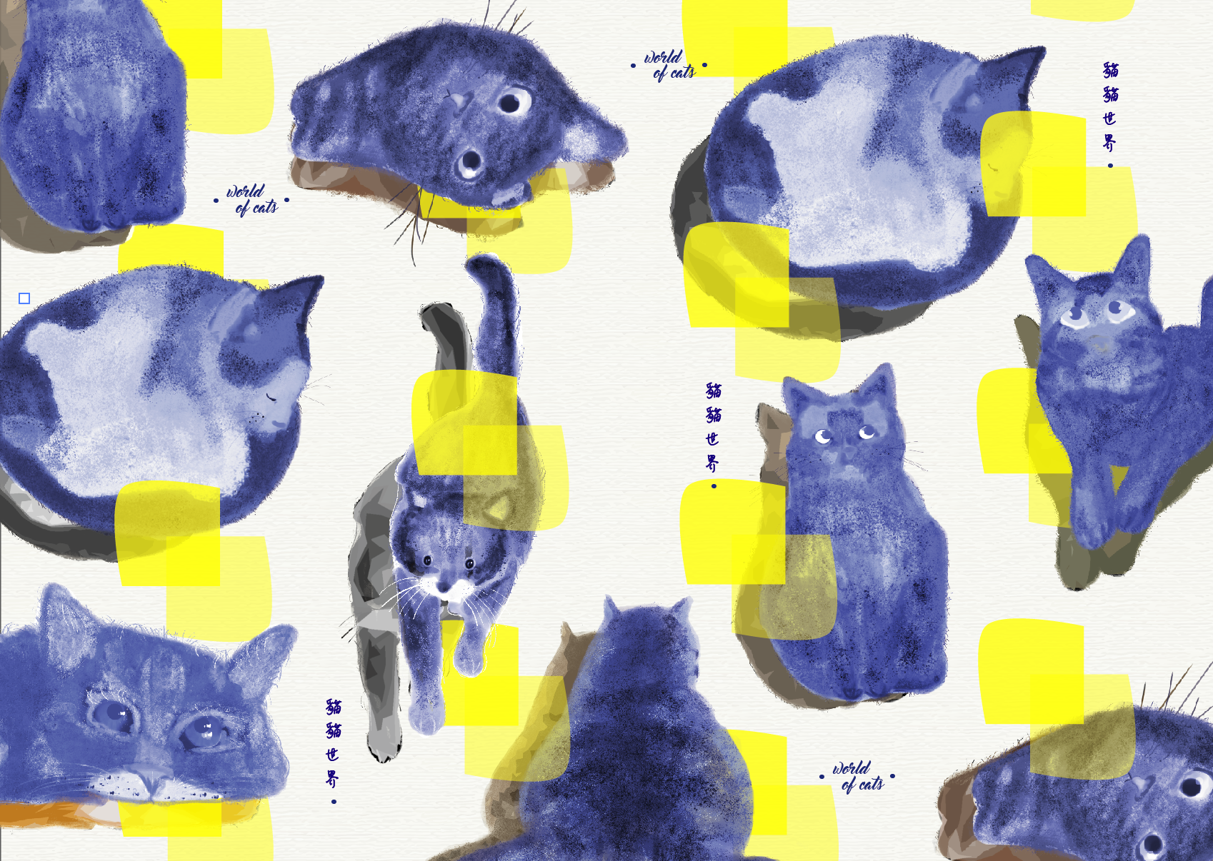
PROCESSED ILLUSTRATIONS:
A monochromatic experience in the making
 FAILED LAYOUTS
The initial layout was just mindblowing-ly bad. I then removed everything and started on a new canvas. It lacked visual hierarchy, theme and consistency which irks me 🙁
This time around, I hope to develop better cohesiveness and unity in my zine layouts, which includes a strong recurring style.
SUBSEQUENT DEVELOPMENTS
Realise that the strokes and squares lacked meaning, hence I took it out and swapped it for another shape that can better symbolise/represent cats in any way
Really liked this simplistic layout, but somehow, it still lacks layers
Initially, I wanted to settle with a full spread of repetition, like the example below. I asked around for a few opinions and ways I can improve my layout further, and one of the comments was to add in some form of typography, somewhere. So that was it! Typography seems to help add more meaning to a design.
testing out the shades of red

moved on from red to pink, and some repeated typography all over to mimic the idea of a wrapping paper
These are the (sorta) finalised layout, inclusive of typography! Thought the pages tie in better together now, with the use of typography design.
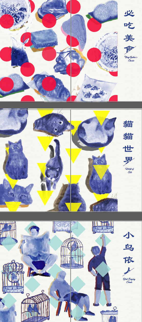
INDIVIDUAL SHAPES AND WHAT THEY MEAN:
The powerpoint slides (the same one I pitched) that come together with my lil‘ design booklet as seen below:
cute lil flip book i did but the file size is way too huge to upload onto OSS 🙁 so this small little thumbnail would suffice.
ADM YEAR 1
YOU’VE BEEN AMAZING(LY HECTIC).
Signing off now with my final ciao,
CIAOS!!!
Hi guys! This post will be featuring my design process for the cover page.
Artist/Layout Inspiration:
For the cover, I was aiming to create something that is wholly simplistic, one that can perfectly speak to my target audience – The Millennials. I was looking through Behance & Pinterest for an interesting looking design, the kind of design that is worth stopping by and picking up while we’re on the go.
Since my zine primarily consists of blue as one of the main colour, the best possible way for the book cover to translate the idea/theme is for it to be blue too. I came across a few interesting typeface arrangements which are unlike the typical layout > 

A quick draft of how my overall layout should look like –
Making use of Pattern and Repetition to create a sense of rhythm across all 6 pages (excluding cover and back page)
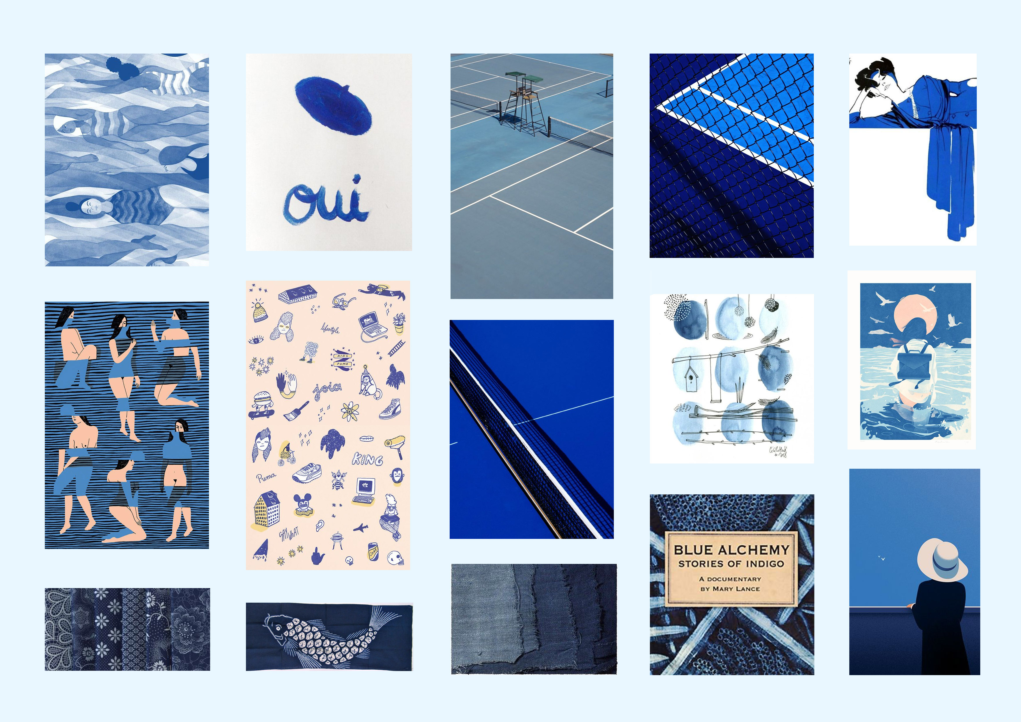
Moodboard: Layout, Typeface, Color palette
An overview of the sense of design direction I am heading towards > Monochromatic (blue), Sans Serif Typeface, an old-school yet modern layout

Notice how the type arrangement gave the layout so much more character? I love it! I decided to give it a shot and see how it will progress and these are my attempts:
this one lacked something I can’t describe. perhaps it is too dead centre? will try to spice it up in my next layout!
It has more dimension now, but it looks like an eatbook instead, so no go for sure 🙁
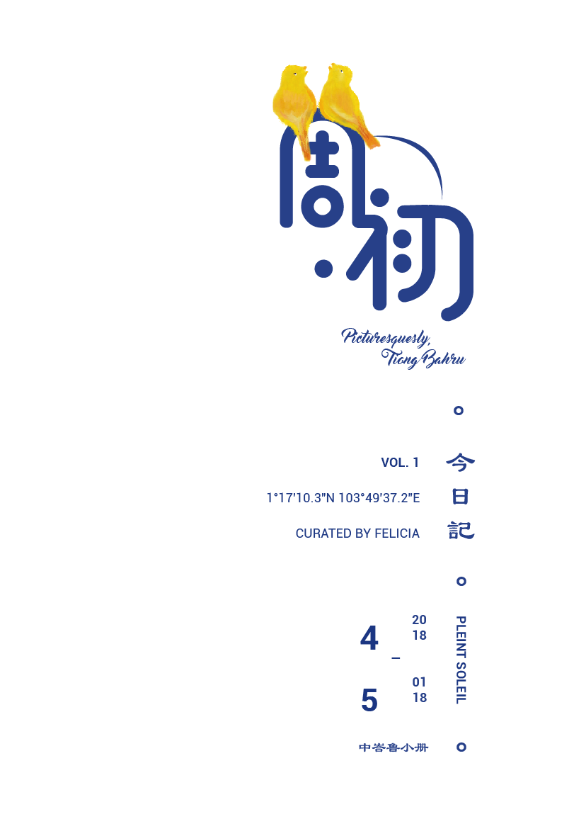
went to consult this layout with Mimi and she raised an interesting point: are there too many ‘Tiong Bahru” all over? so I decidedd that I would amend the logo from Tiong Bahru to a name that represents a magazine series
Overall, I want to keep the cover’s type and colour design to a minimum as the content of my magazine are pretty visual heavy, so a simple cover (front and back) can better balance out the visual weight!
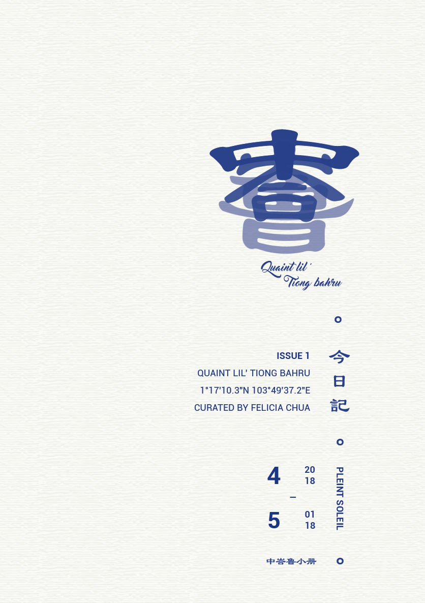
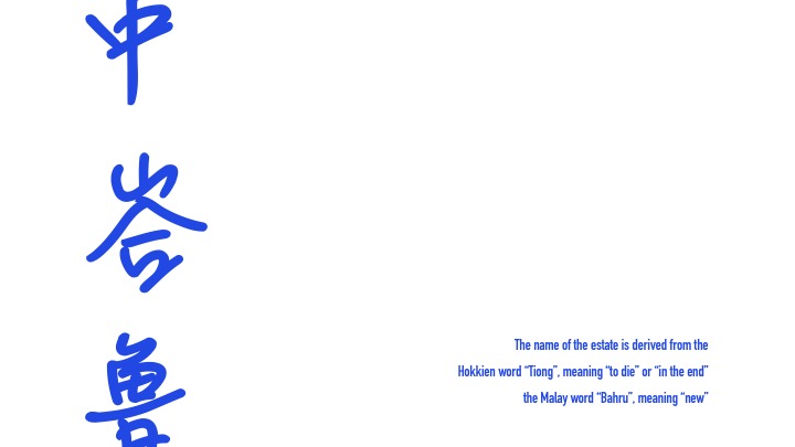
Not forgetting to mention, the magazine series (top typography) is read as Zhou Chu, which means ‘In the Initial’ and ‘Picturesquesly, Tiong Bahru’ is the volume’s title (with it still being Volume 1 at this point).
I imagine having a series of location documentation in the ‘Zhou Chu’ series, with the exact format of a magazine series like 8 Days & Teenage magazine. So there will be Vol.2, Vol.3 and so on in future – This is the possible prospect for my Zine series.
Final layout for Zine! I left the textures out since the papers I’d gotten from RJ is off-white.
Fitting in the elements: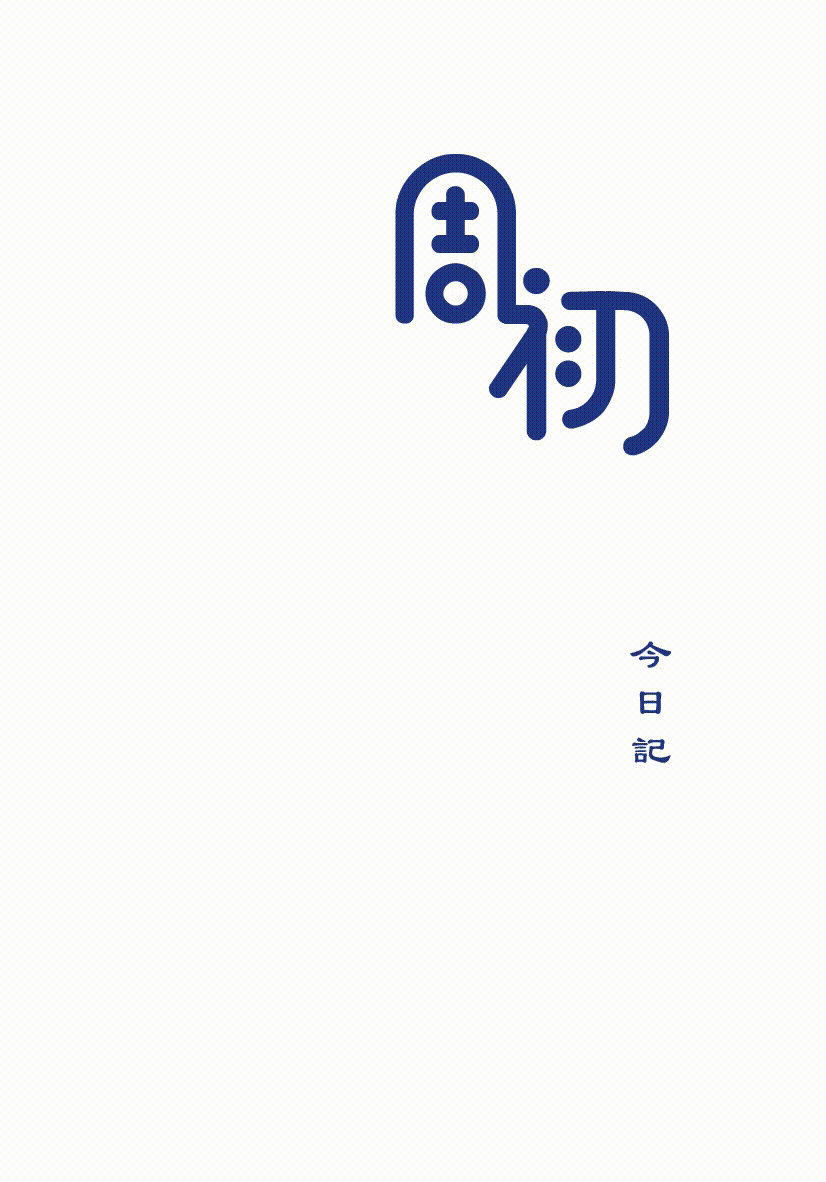
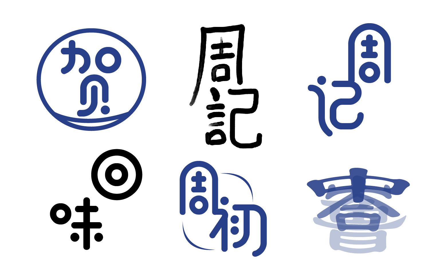
Logo Design & Exploration for my Zine series:
Here are a few of my tries on the creation of a logo for my zine series. These Chinese characters represent my publication’s name. The different character shows my experimentation with different shapes and forms and how they look when they are pieced together.
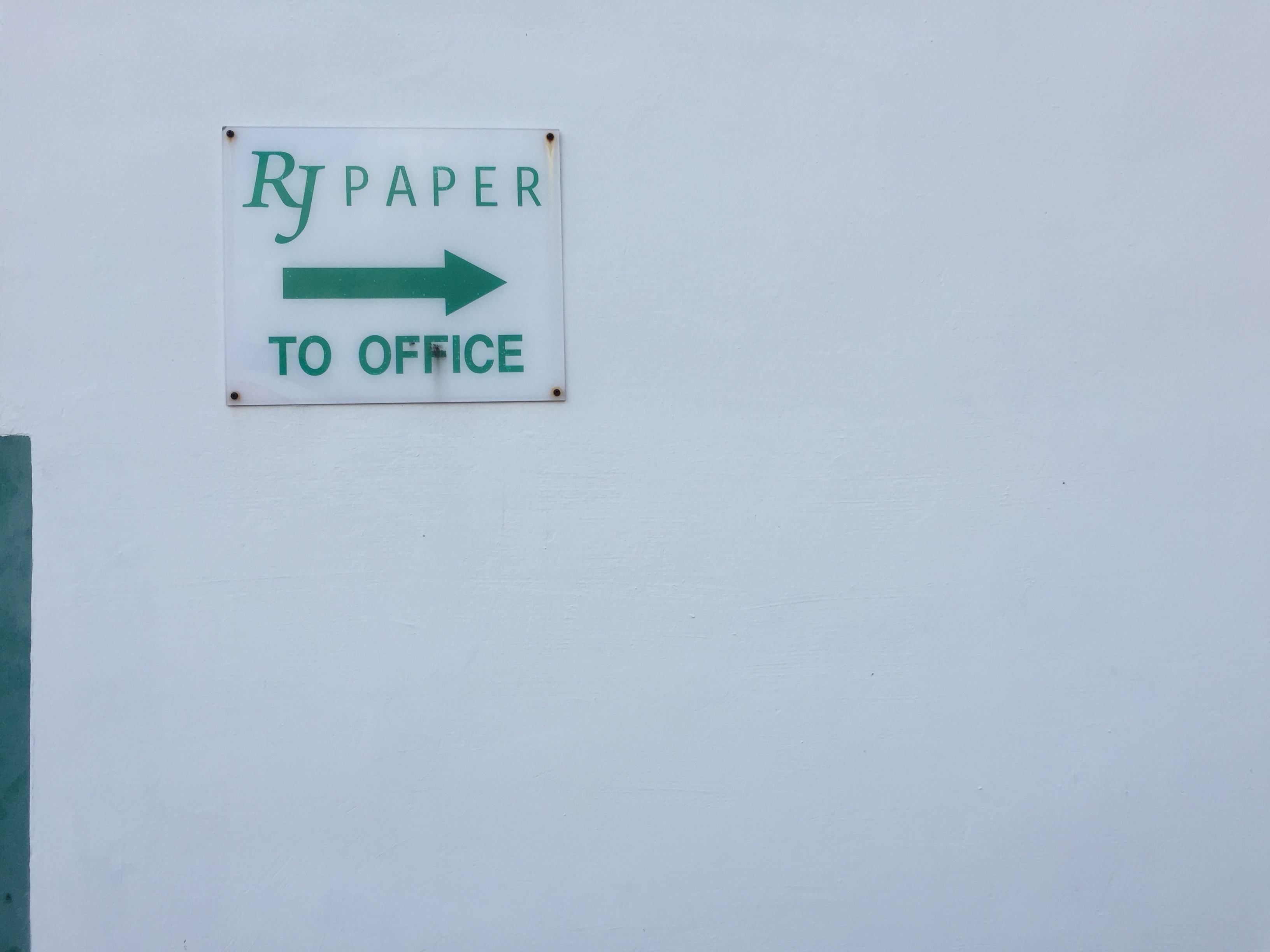
Then off to RJ Paper!!!!
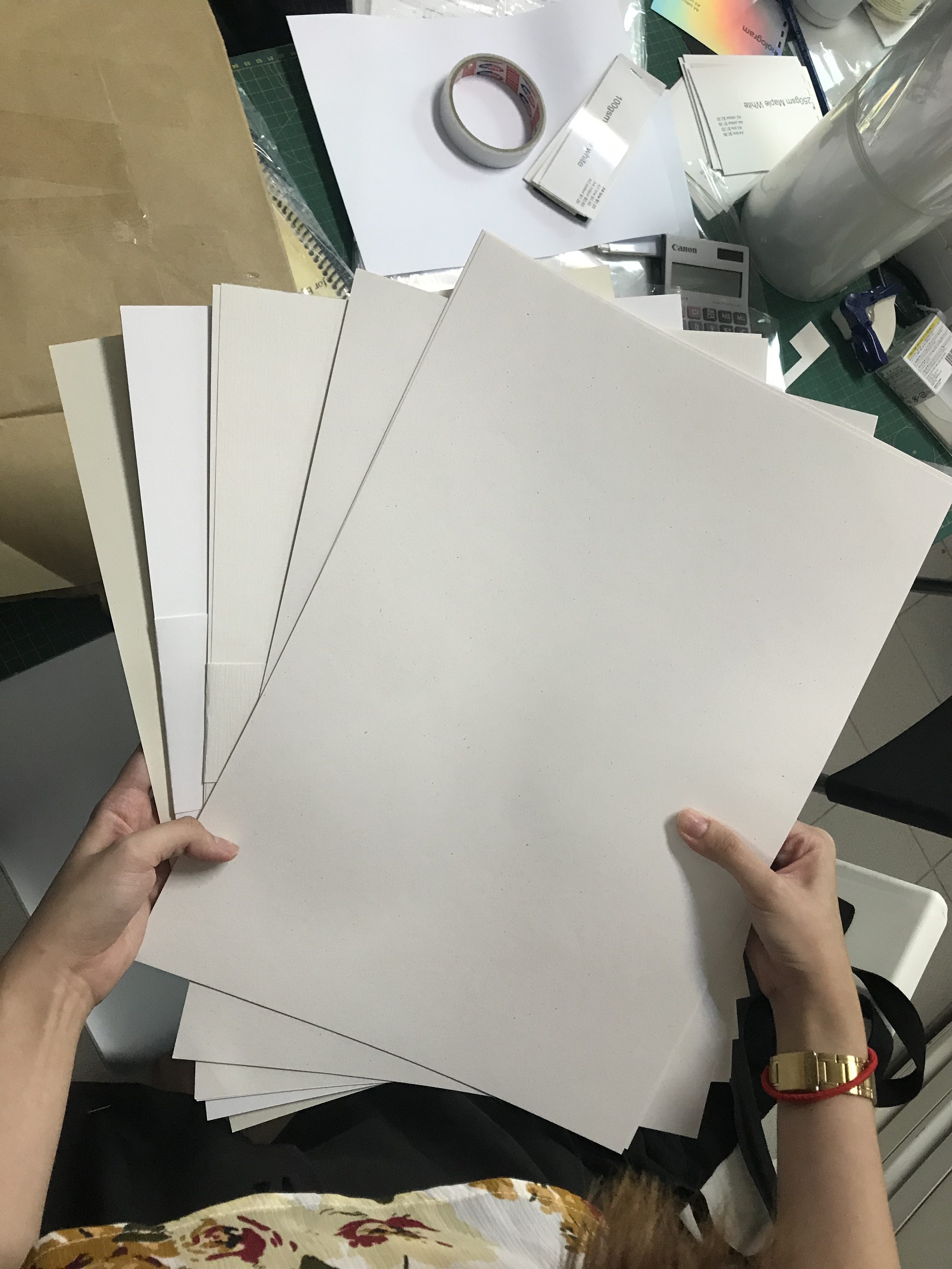
Got a couple of samples and variety for my print, might want to keep a couple of booklets for myself! The type of textures I have in mind is – Munken Pure Rough, Wudii, and a few others I can’t recall. I love that natural off-white colour and speckled dust effect from some of the 160gsm paper.
These are some of the A3 sized papers I got. Ranging from pure white to yellowish white – That is to see how it will turn out in print! The pure white one didn’t really work out eventually, so I stuck with the off-white coloured ones. Per print was $4 and it was the colour payoff was on point too! Really recommend ‘Colour De Something’… I really cannot recall at this moment!!! Will get back to it later.
Up next: Content Design Process
See you there!
In the ‘Zine’ – Tiong Bahru edition, I will be dividing the 8 pages into 3 main sections
1 – On birds singing tradition
2 – What’s a must try in Tiong Bahru
3 – Wall of fame for CATS
I will now present my research on the above 3 topics I have narrowed down to focus on.
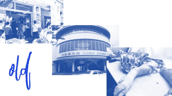
Tiong Bahru Bird Singing
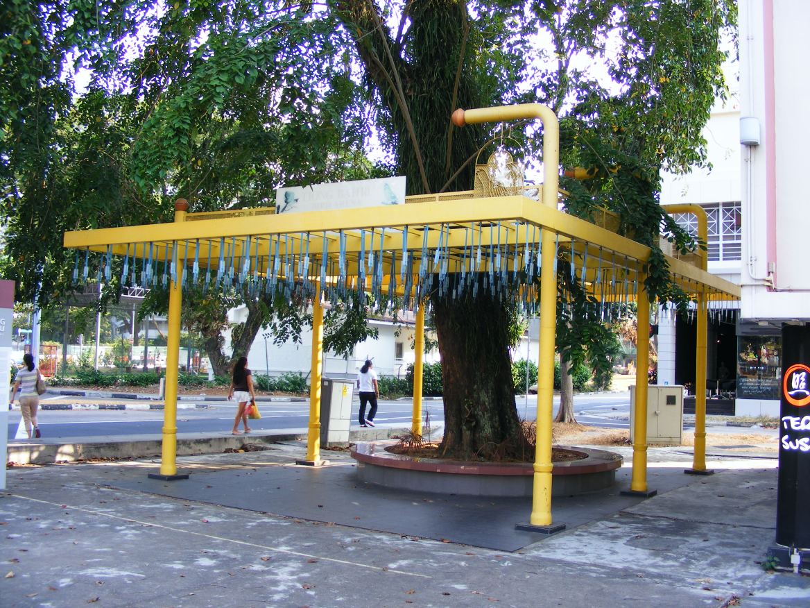
https://ourbigexpatadventure.wordpress.com/2014/03/12/tiong-bahru-bird-corner/
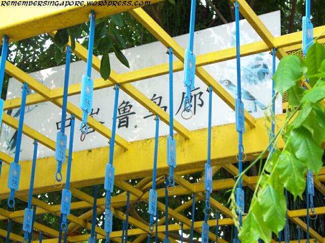

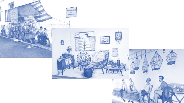
Yes, there are indeed many places locally where you can find bird singing corners. Some examples are Serangoon North Avenue 1, Tanglin Halt, Ang Mo Kio Avenue 10 and Bukit Purmei. Lo and behold, Tiong Bahru is the OG (original gangster) of this trade. It is the oldest and the first ever “Bird Arena” in Singapore.
In the past couple of years, many bird-lovers would gather at this spot bright and early, to admire all the exotic, beautiful birds sitting in their antique cages. One interesting fact is that it all started from an owner of a Kopitiam (coffee shop), with all intention to attract more business. But it led to more than just a business antic, it becomes a tradition worth preserving.
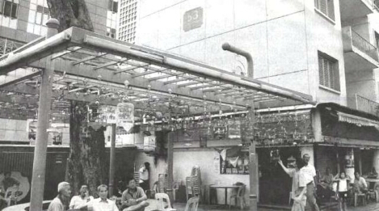
Credit: The Straits Time
Tiong Bahru bird corner was noticed by a Dutch reporter, who wrote about it in the late eighties. It was when this corner gained recognition, attracting even more tourists and reporters far and wide! Eventually, Dutch sponsor numbered hooks to facilitate more birds singing competition in the area. I find it relatively interesting since these are areas I would never have noticed even if I happen to pass by. The failure to realise its significance would truly be a waste! So glad I managed to dig out some of the forgotten treasures of Tiong Bahru.
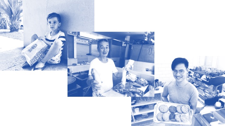
Interesting Food Finds (TOP 3)
What’s good in Tiong Bahru, you ask? Come, let me show you!
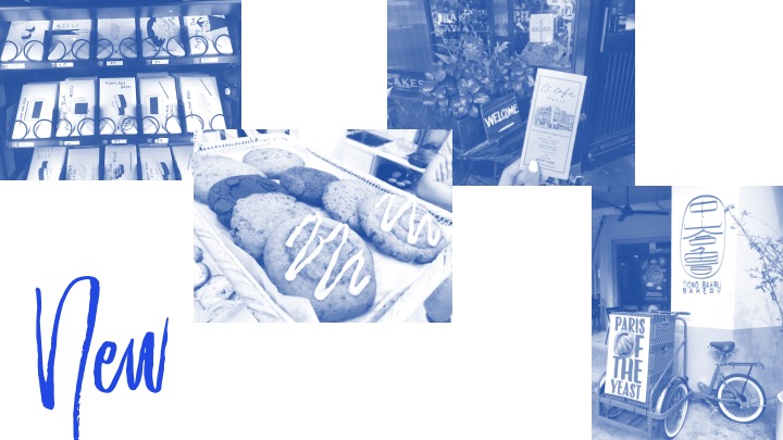
Pastries and Coffees? They have Tiong Bahru Bakery.
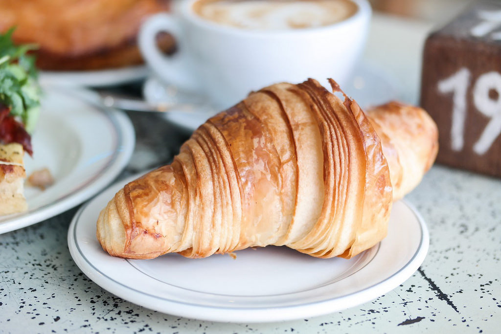
I was a huge sceptic of this place initially. I thought it would just be another cafe that is totally overhyped since it is always buzzing with people and the cafe always seem to be on full house. I had my first try on their original croissant, accompanied by a warm cup cappuccino – Boy was I wrong to assume it would just taste like flour and sugar. It was on a whole new level of mind-blowingness!
I knew I had to feature this in my Eatbook spread! Light, buttery crisp on the outside, warm and soft on the inside – An excellent balance of sweet and savoury.
Next!
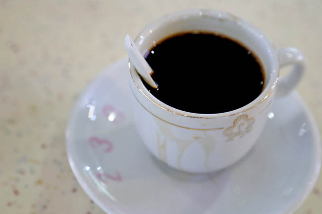
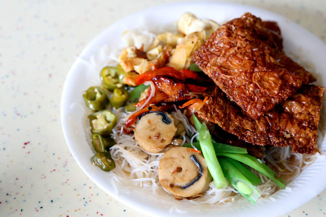
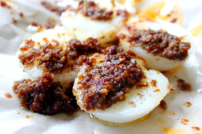
For a main, if you’re tight on a budget, fret not for there is Tiong Bahru Food Centre. For this section, there are a couple of recommendations –
Like Jian Bo Chwee Kueh, 238 Coffee, Ru Yi Vegetarian Bee Hoon and Tiong Bahru Teochew Kuehs. I’ll insert some pictures below!
Credits: Danielfooddiary

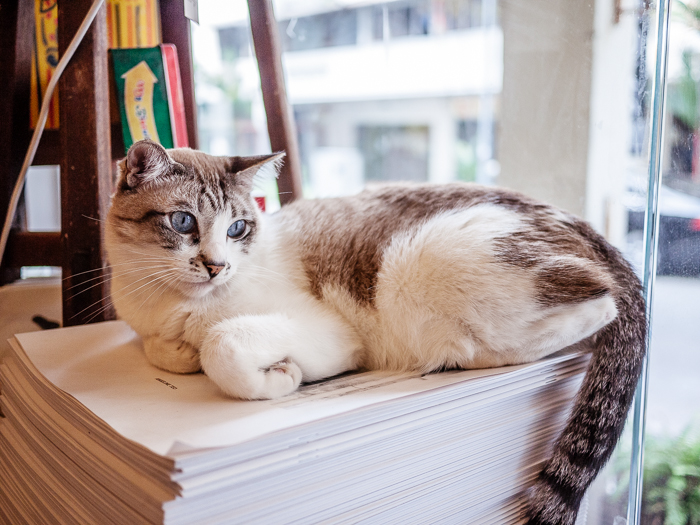
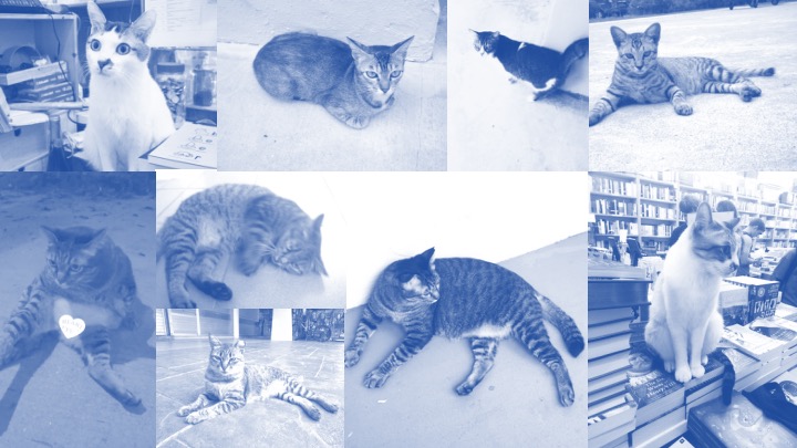
Wall of Fame for Cats –
YES! You heard it right, its Cats we’re talking about. Hmm, what about stray cats right? They are everywhere, isn’t it? Well, let me introduce you to the hidden gems of Tiong Bahru – It’s their cats.
The name star of today’s research is Bob the stray. He even has his very own Facebook page! (Click to find out more okay! I promise he is super chubby and cute) The page is still very much active now, and the latest update was made on March 25, 2018! You can see how much love he is showered with.
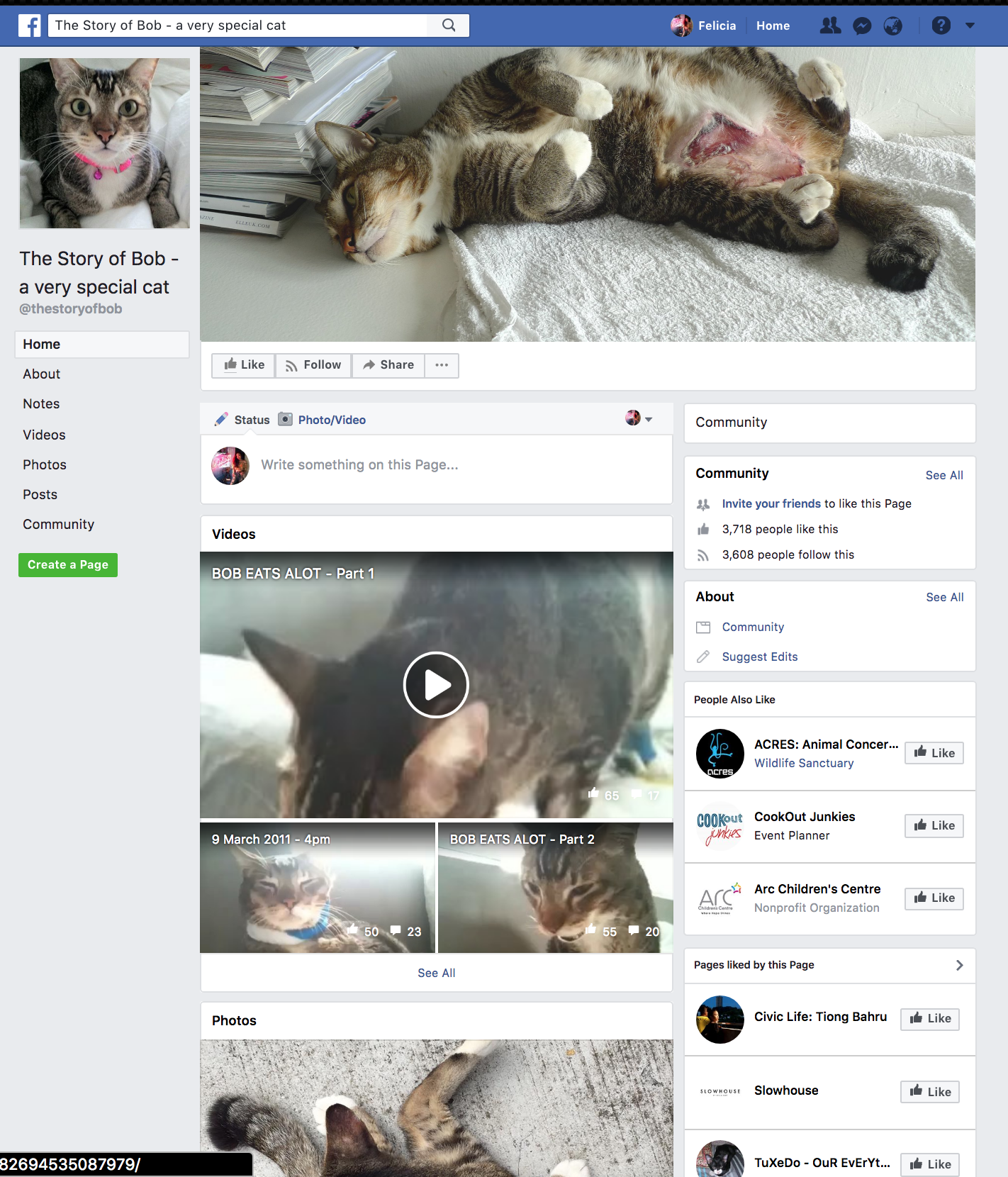
And this is the backstory of Bob: Click Here
Besides Bob the star, there are a couple of extraordinary places where we find traces of cats. One example is Books Actually. This is a local bookshop WITH FELINES.
http://evonnz.com/exploring-tiong-bahru-cupcakes-at-plain-vanilla-strangelets-books-actually/

https://www.booksactuallyshop.com/blogs/chowing-fat/interviewing-the-cats-of-booksactually

How often do you come across bookstores with cats? Here’s the funny thing. Sometimes when the shopkeepers are out, they leave their cats to tend the store. How amusing. I bet they keep out little mousey thieves!
Read their interview Here!
Another super funky fact: They even did casting calls for the cutest cats in Singapore, and one of our fellow Tiong Bahru residence made it! Here’s a video I found:
A Purrrfect Singapore Audition
It's not just people that paint the colours of Singapore, but also our many neighbourhood felines. Which kitty will emerge as the most legendary of them all? #YourSingapore #Cat
Posted by VisitSingapore on Wednesday, 13 January 2016
These will be my area of focus for the content of Zine, bringing very relatable and closer to hearts topics to you as a producer of my first location magazine spread! Thank you for reading!
Next up: Research on Layout Style 😉
Ciaos.
Citations:
http://joyloh.com/blog/?p=5916
http://landscapeinthebox.blogspot.sg/2013/04/tiong-bahru-fading-history-forgotten.html?view=magazine
Tiong Bahru Bird Singing Corner
https://www.facebook.com/thestoryofbob/
http://tiongbahruestate.blogspot.sg/2011/03/bob-street-cat-that-glued-community.html
https://www.theonlinecitizen.com/2016/01/14/stb-auditioning-for-the-trendiest-cat-in-tiong-bahru/


FINAL POST FOR PROJECT 1
CMYK & RBG Color Test in Adobe Illustrator:
Here’s a side to side comparison between two of the saving options. The colour difference is actually very subtle but it is extremely noticeable, especially the reduction in vibrancy and saturation on the bottom image. (The top one has the most accurate colour)


My Finalfinalfinalone.pdf HAHAHA
Presentation day. I’m lowkey sorry it had to be this shot. This was the bestest one I’ve got.
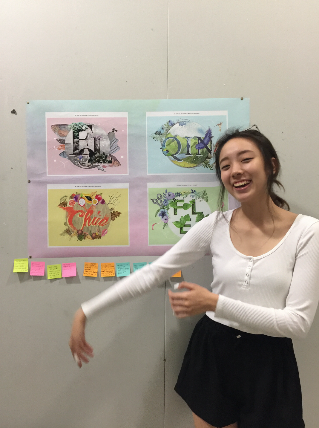
FINAL SUBMISSION X PROJECT 01
Done and dusted.

Hi everyone!
Welcome to my final post of this assignment. It will consist a set of 4 design, that carries an overarching theme. The name of the following series is called:
Circle of Life featuring, The Organic Symmetry
As mentioned in my previous post, some keywords I have in mind while designing my layout consist of:
LINES | CIRCLE | SYMMETRY | FOREGROUND, MIDDLE & BACK | NATURE | PAINTERLY
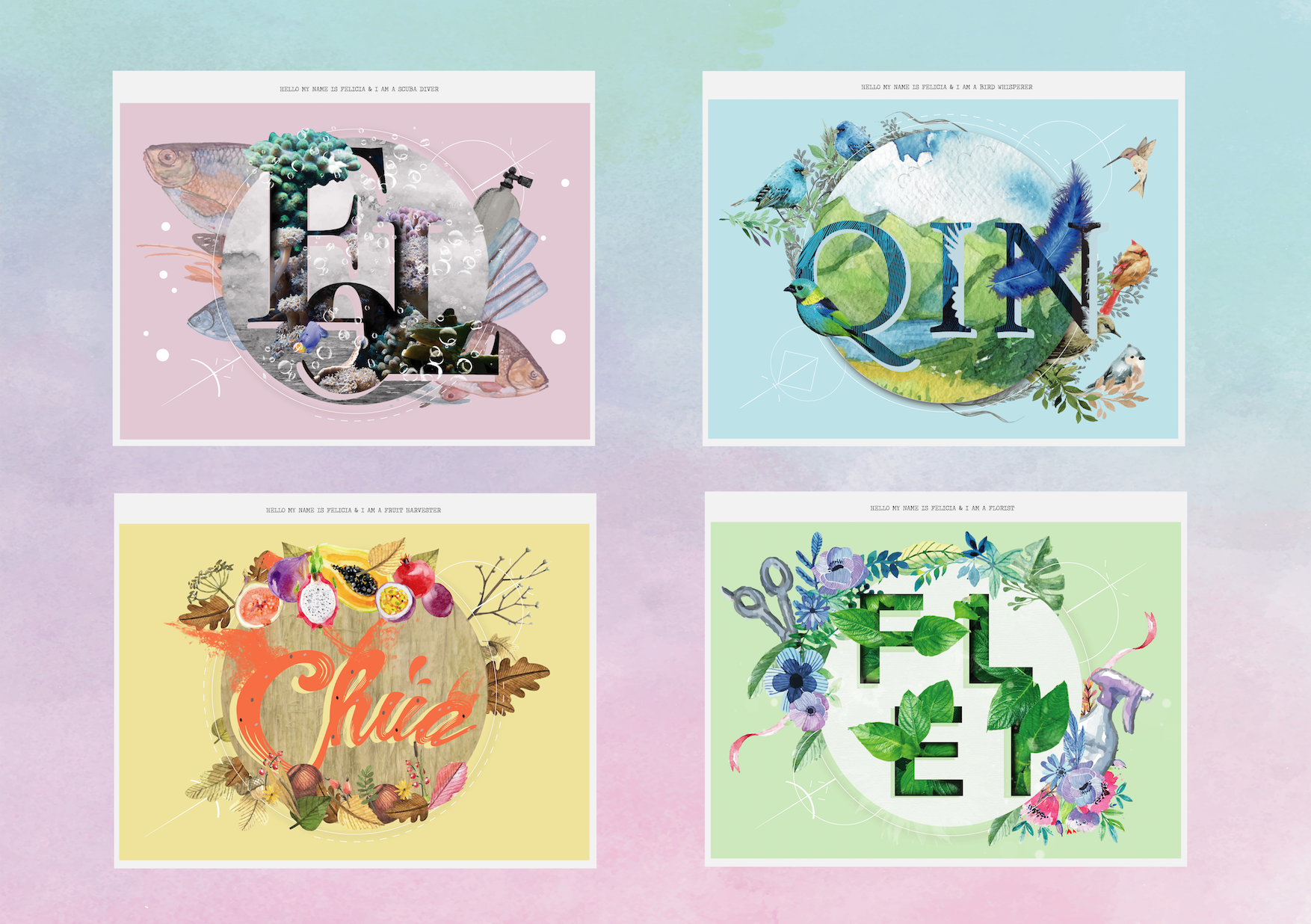
I wanted my design to look like a set of 4, curated with the intention of delivering a consistent message. An idea that they are produced in the hands of the same designer. Ensuring consistency means careful attention throughout the conceptualization and design phase of your site. I have grouped all these occupations under the theme of “Nature“.
–
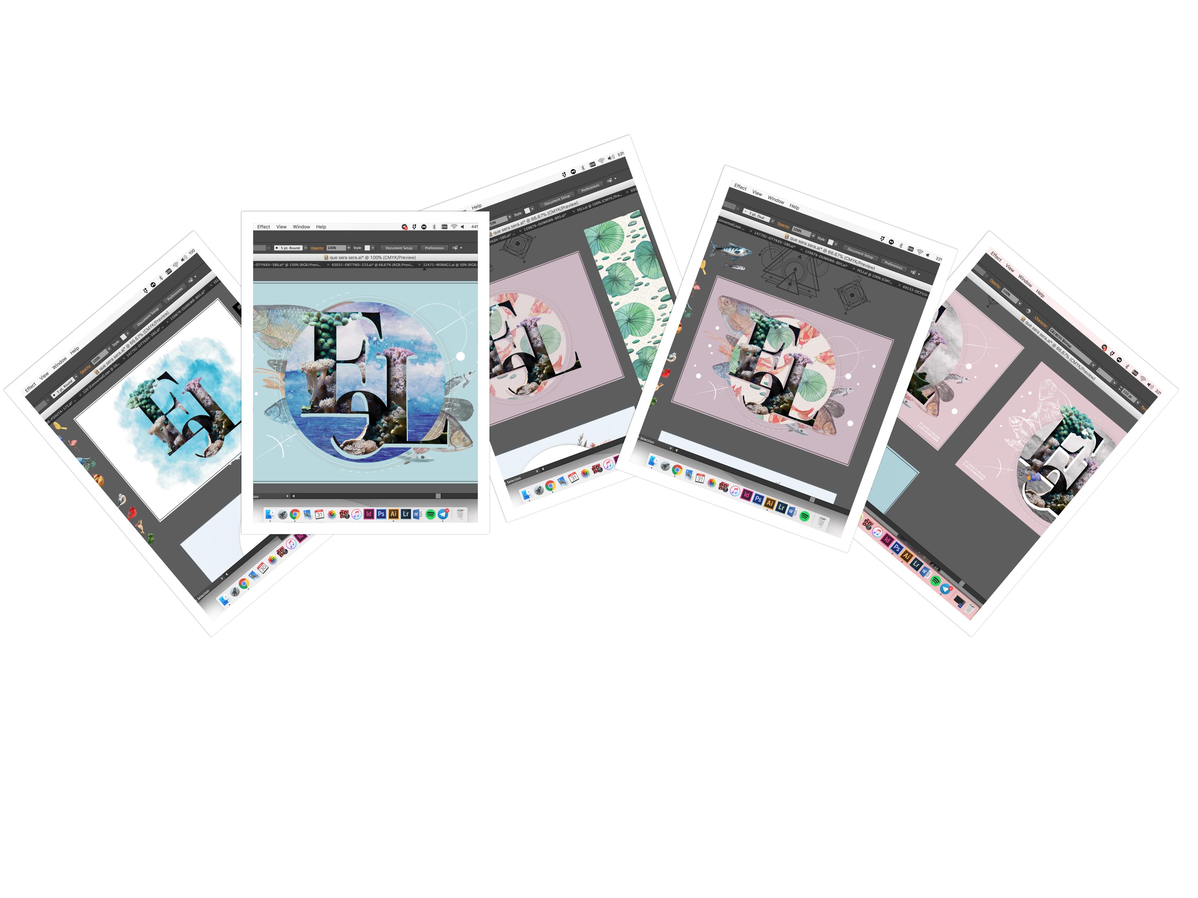
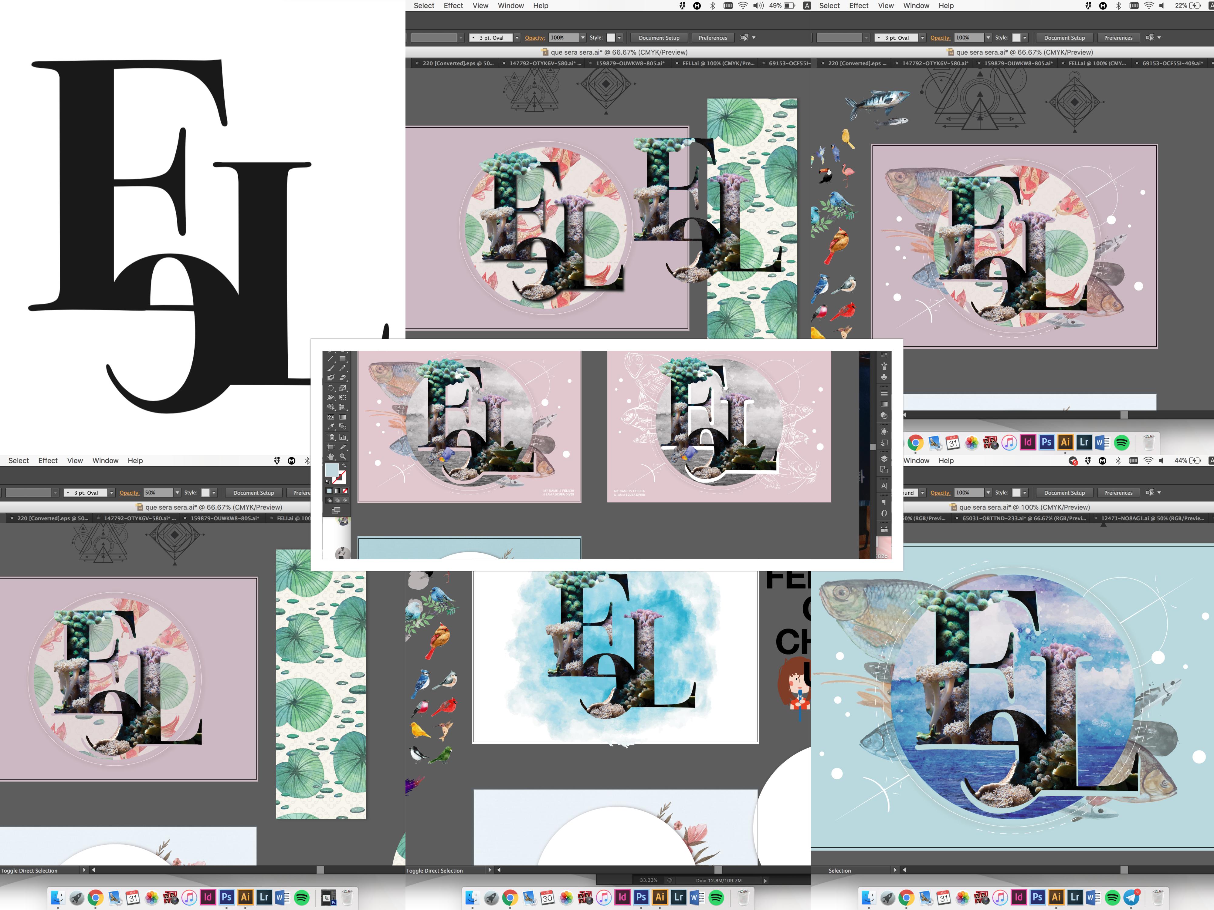
Design 01 of 04
The Scuba Diver
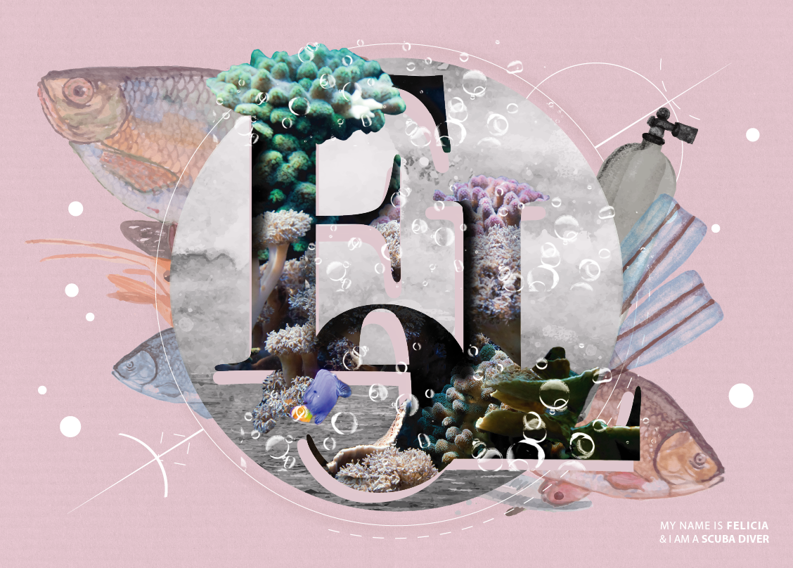
The nature of this occupation is usually done out of leisure, especially over the holiday. Some of the key sightings any diver will notice are Fishes and Corals. Aside from these elements, every diver is equipped with an oxygen tank and a flipper good for paddling underwater. These are what stood out for me, particularly for this job.
When I was a lot younger, I have always dreamt of what lived beneath the ocean. Was there a whole new world out there for me to venture? Would it be more exciting to live under the surface of water instead of the land? All these were questions that bugged me the most, and I would imagine having mermaids as friends, and swimming with them in cute bikinis hahaha. That would be perfect, isn’t it? A world as surreal as this.
Hence, I thought, why not do the occupation of a diver? And that was how the other 3 nature related jobs came into my mind.
In this very first concept, I designed with a clear intention of having a foreground, middle ground and background. I thought this would provide more depth and perspective to the layout, hence I layered images by images so that it would avoid turning out flat-looking. Also, the colour blue seems like the perfect visual representation of ocean, yes. But I challenged myself to be less literal and went with the colour pink that hints no oceanic vibe. Okay apart from that, bubbles were added, so that the typography pops, making it looks more 3-dimensional.
Additionally, I adore the painterly style, as a result, I decided to incorporate this element into my final layout. I processed and re-done some of these images in Photoshop, to achieve the harmony among all the elements. With that, all components of this piece will tie in together.
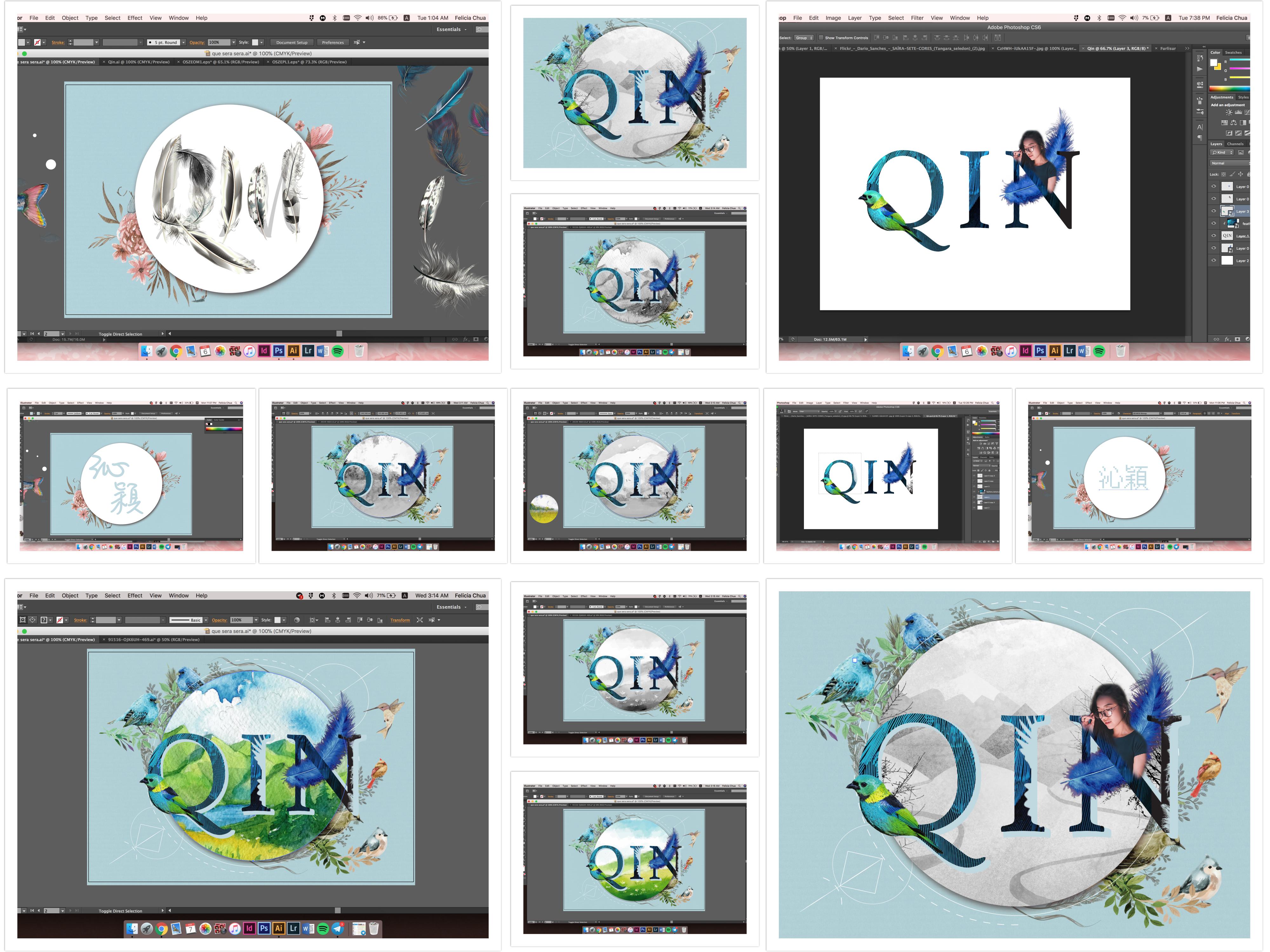
Design 02 of 04
Bird Whisperer
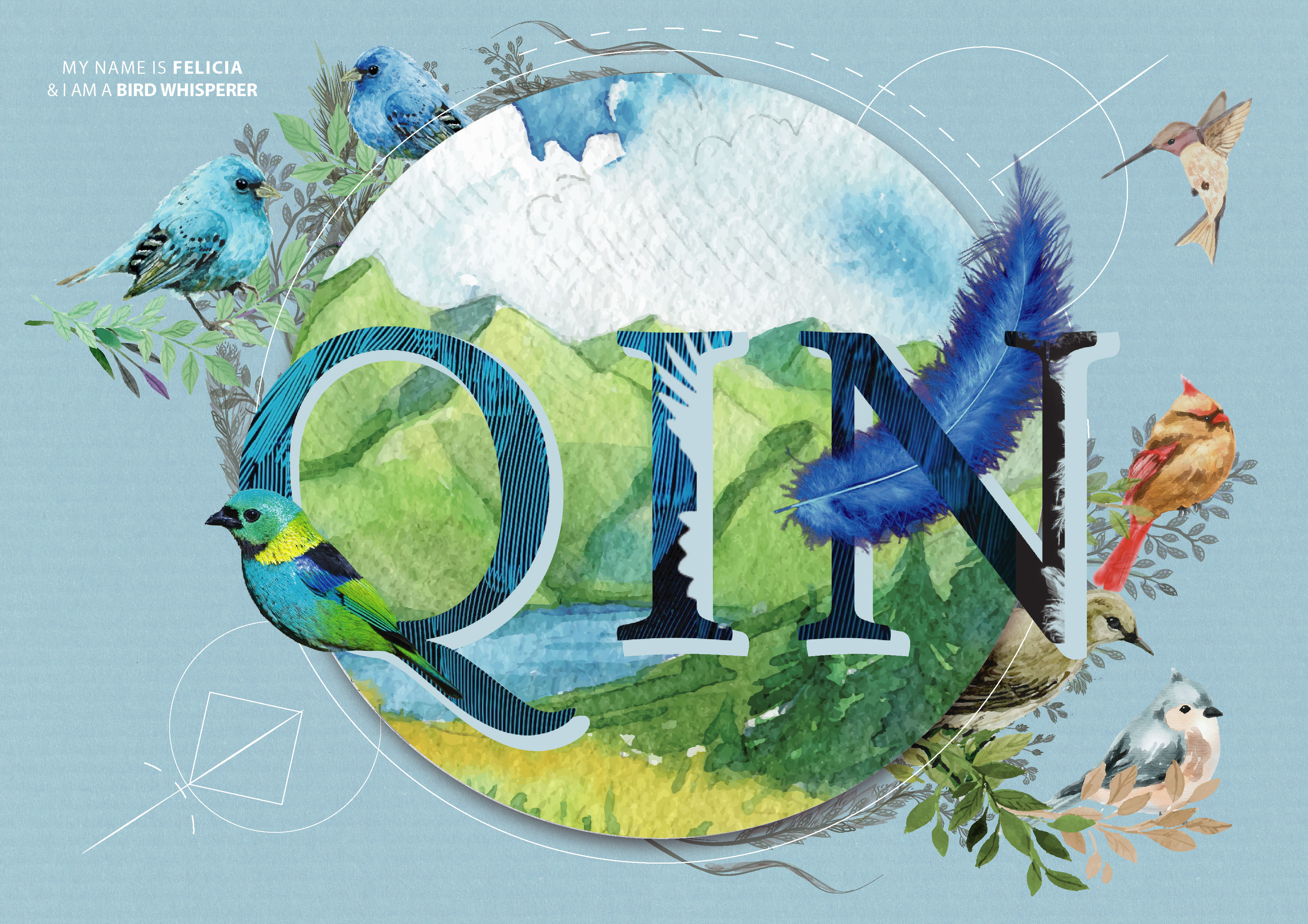
Dimension. As mentioned in the rationale above, I was seeking for depth from the viewpoint of my audience. To ensure consistency, I maintained the painterly technique and employed this edit on my second layout – The Bird Whisperer.
Staying in the Nature theme, the bird whisperer is someone who is in love with birds, and have the sheer ability to tame any forms of difficult birds that existed. Well, in my case, I am always the victim of bird’s shit. They like pooping on me. Not sure if I am a poop whisperer or what, but I guess bird sounds a lot nicer huh? I created a complimentary watercolour technique background that contained within the circle. I feel like it helps to carry the typography, and makes it stands out more.
The colour scheme I had in mind for this is an analogous combination. I wanted the layout to give off a serene and light atmosphere, bringing my viewer one step closer to nature. Apart from that, the chosen blue is of a soft hue, which falls under the pastel family.
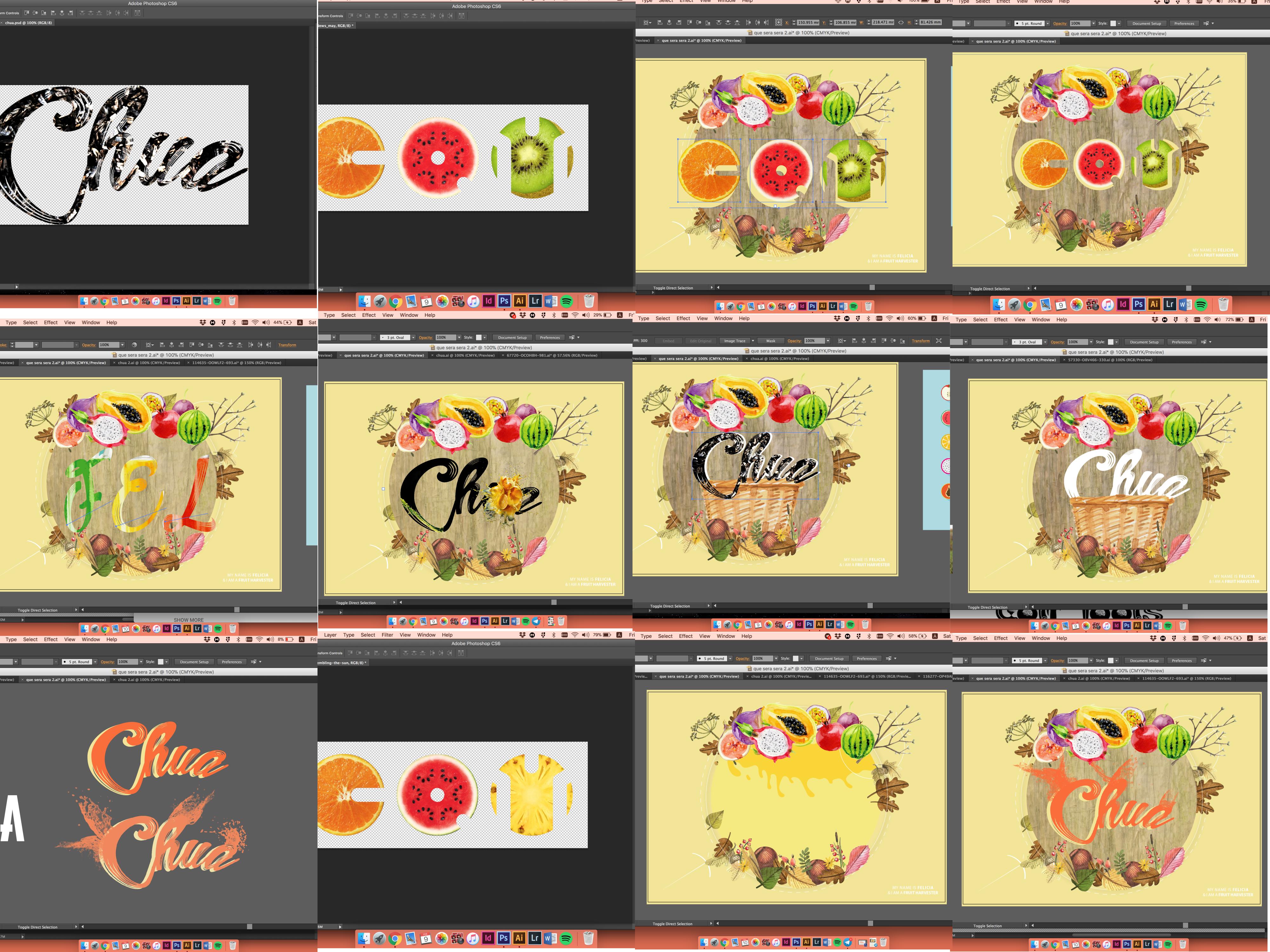
Design 03 of 04
Fruit Harvester
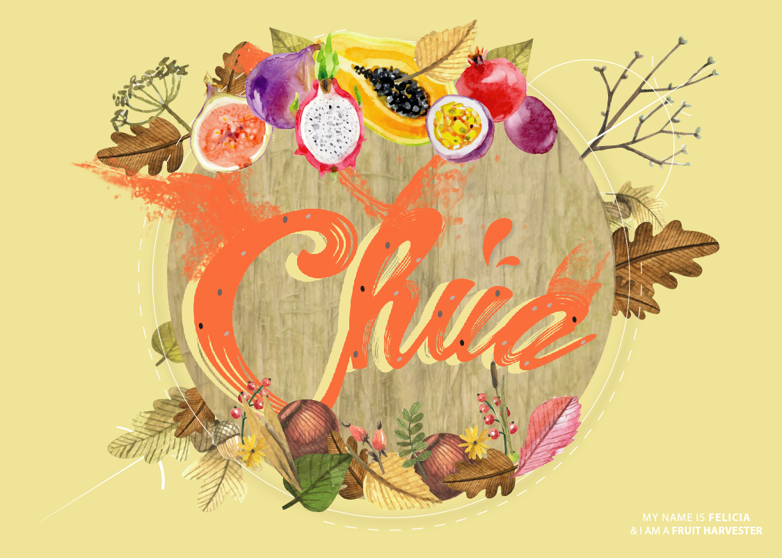
My uncle owns a fruit/vegetable farm located in Lim Chu Kang area. Since young, I would often hitch a ride over and learn some planting from him. This is mainly one of the primary reason why I chose Fruit Harvester. I tweaked it a little since I will also be doing a florist, and to avoid overlapping of elements, I narrowed it down to fruits category instead.
The typography is supposed to give off the feeling of an eruption from a fruit. I stuck with the analogous colour scheme for this as well, so as to portray colour harmony and maintain visual consistency. The wooden tree bark texture behind the main typography acts as a filler to hold up the weight of the text, hence strengthening it’s visual weight, ensuring that it still stands out amongst all the colourful fruits.
It was a challenge for me as well, because it seems like the fruits are way too vibrant and that it might overshadow my main typography. I struggled with finding the right colour combination for the font and the background. Decisions… Decisions… Eventually, I chose to go with pale yellow, coral orange and some neutral browns to help even out everything.
Design 04 of 04
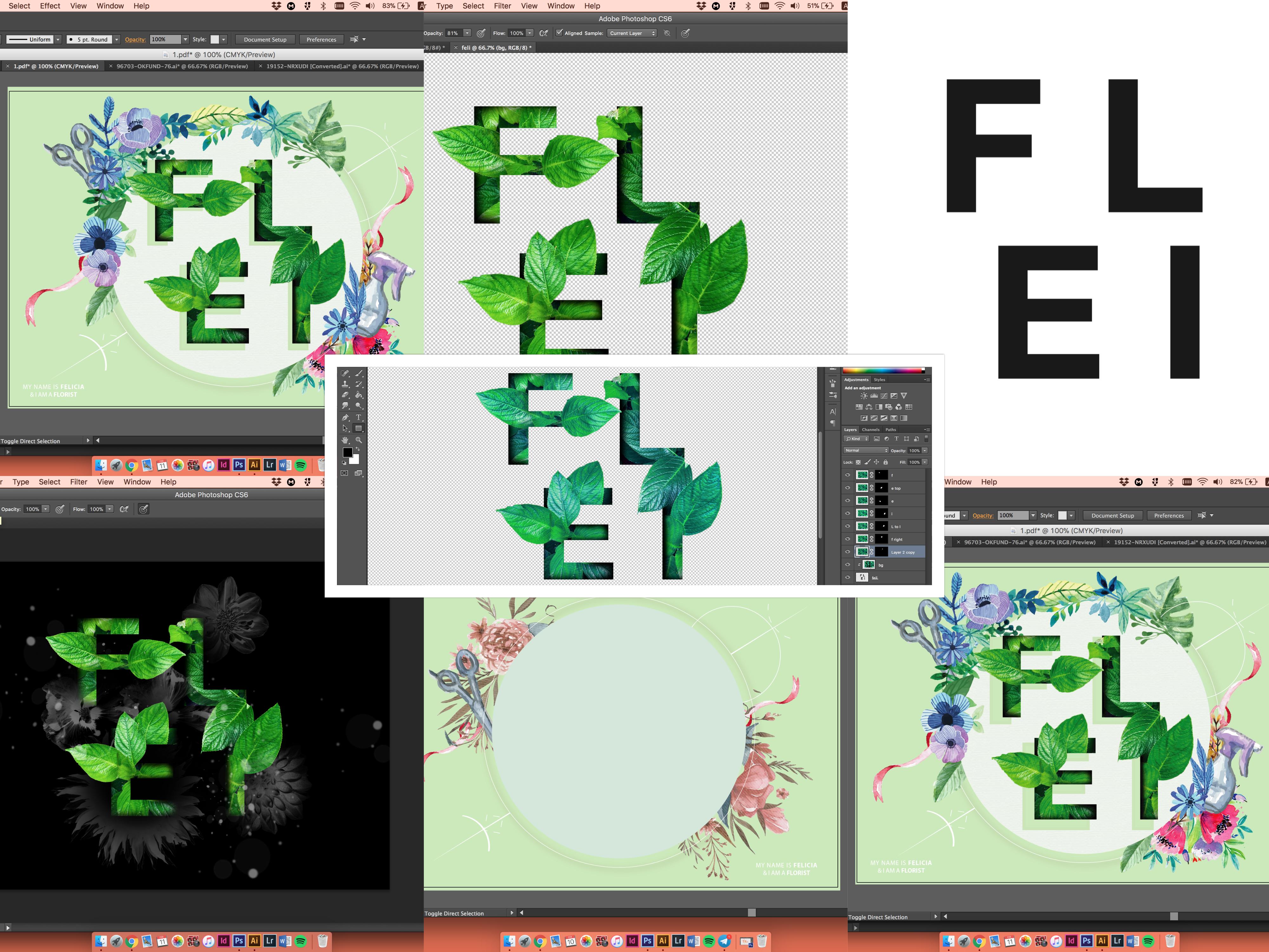
The Florist
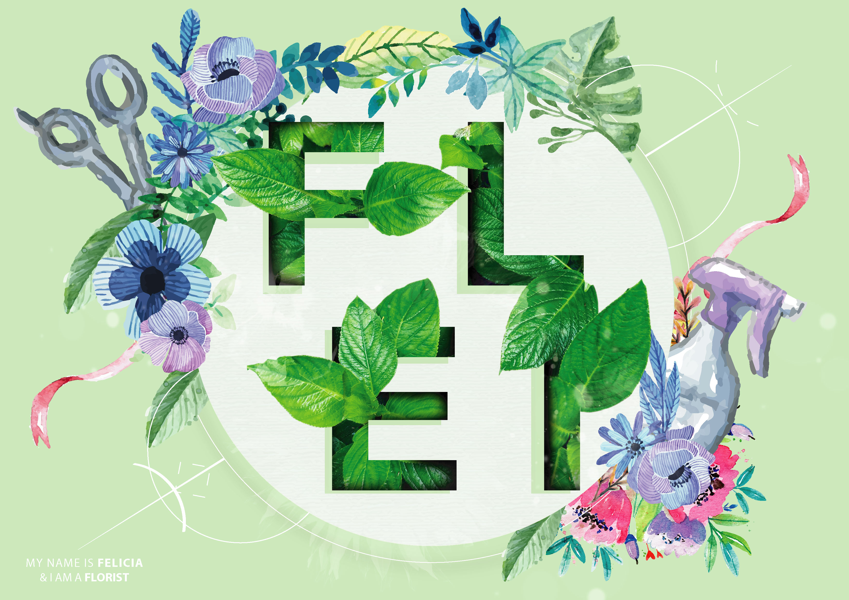
Leaf, Flowers, Spray, and Scissors are what I associate with a Florist. The overall colour falls with green being the primary and most striking shade, and a few accent colours here and there to give the visual a lift.
For the leafy typography, I masked out the leaf layer by layer. To give it more depth, as though the leaf is really growing out from the font itself, I gave the letters an additional shading so it looked less flat. Flower textures are also added to give it a more artsy look (its opacity level is 20%) (can you see it?)
Maintaining the overall pastel and painterly technique, I altered and added Photoshop filters to these vector images so they look consistent when placed together. Lastly, one of the unchanging element that you may have noticed by now will be the directional geometric line art that occurs in every background. I like how it gives off energy and it’s subtleness. Even though the line is super fine, it helped in filling up the empty space, giving these layouts an illusion of a fuller look.
–
Overall, this concludes the first project of the semester! Yay! Thanks for reading!
Ciaos
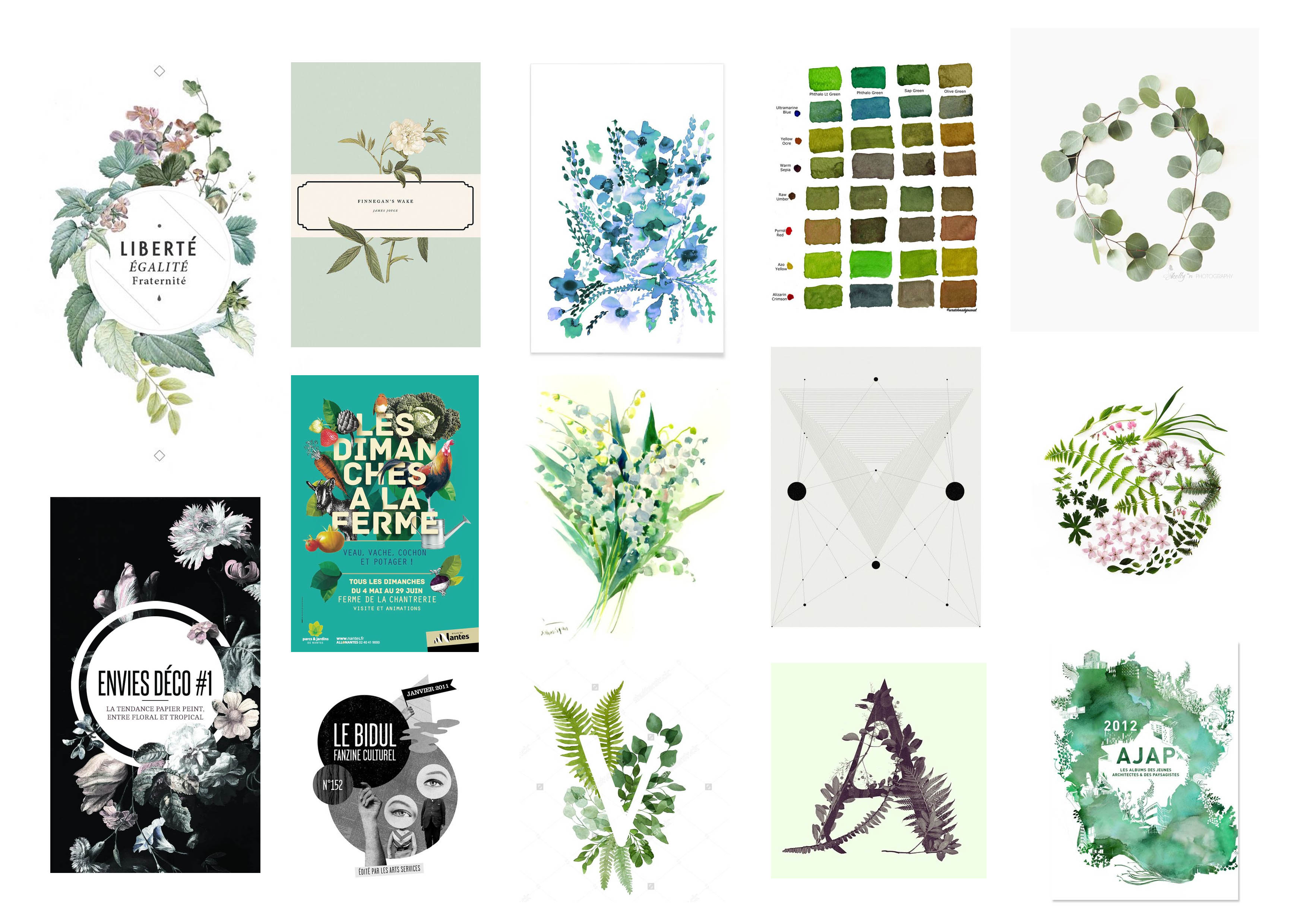
Hi there!
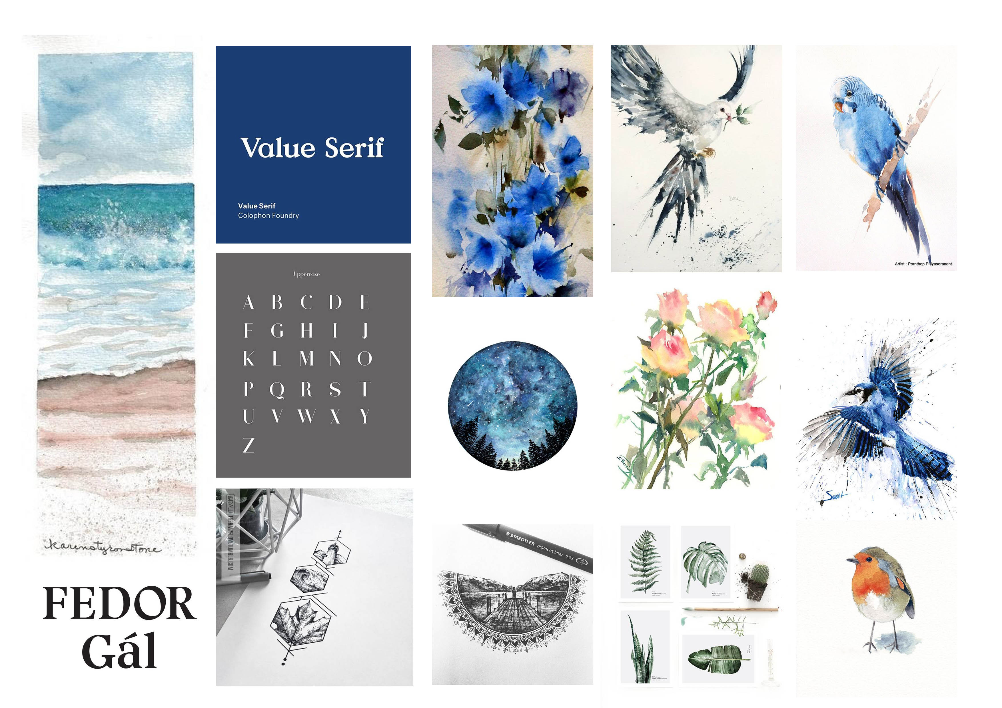
I have compiled a series of my progress shots below. Mainly on how I ideate and put my entire design together. (with reference to some of my artists’ inspiration from the first post)
The most time-consuming bit would have to be the conceptualisation of layouts. To have a definite direction that I want to work towards, and it has to be achievable. (with me at an amateurish level) It took me quite a while before I eventually set my heart on a layout. Some of the keywords I have in mind are:
LINES | CIRCLE | SYMMETRY | FOREGROUND, MIDDLE & BACK | NATURE | PAINTERLY
 And with these keywords in mind, I manage to come up with something! These are my progressions all summed up in a collage.
FRUIT HARVESTER
SCUBA DIVER
BIRD WHISPERER
FLORIST/BOTANIST

These are some the occupations that I found to be interesting:
Amusement Park Facilitator, Chef, Shopaholic, Undertaker, Supermarket cashier, Fruit Seller, Donut Seller, Animal Farm Owner, AND A DISNEY PRINCESS. 
After much rationalisation, I have shortlisted these 4 “professions”, all categorised under the theme of “Nature“. By that, I am referring to jobs that are often associated/accomplished in the wilderness or it has connotations of greens and earthy vibes to it. Will explain more about the rationale behind my concept in the subsequent post to come! Let’s get down to planning.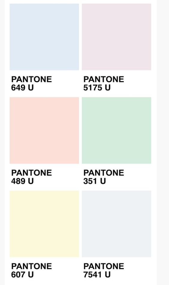

Color scheme: Pastel is the colour that I am going for. Soft, gentle, desaturated, milky is how you would describe this family of colours. This is also the first time I employ pastel hues into my design work. Have always thought that pastels are too mild, thus making them recede into the background. For this project, the 4 series of mixed media design works will be based on this following concept.
1- Scuba Diver/Marine Biologist
Under this panel of job, we can expect to see some marine creatures/bubbles/seawater/sporting gears. For this concept, I will be playing with a serif font. In a professional setting, serif fonts are most often used in formal designs. (newspaper, print, book etc) However, I would like to test out the limitations of the font, pushing the boundaries further.

2 – Bird Whisperer
Birds, lots of birds, all decked in painterly style (watercolour). For this series, blue will be the dominating colour, with some use of yellow to create the analogous colour scheme. Have tested out several fonts to go with my initial, but turns out, the serif font is best suited for this layout. Will be exploring other font families in the remaining two designs!
3 – Fruit Harvester
Fruits, tools, are what make up of the final composition. In this colour palette, we will be using a daffodil yellow to balance out the pastel theme that surrounds this whole concept. I imagine myself using a variety of earthy toned fruits to compliment the idea of a down to earth harvester. In contrast to the font choice used in the above two layouts, I will be employing a cursive (decorative font) typeface this time around. This is to ensure that explorations of typography are evident, especially in this project!

4 – Botanist/Florist
Greens, leafs, florals, tools are what is present in the layout. Pastel green will be the main colour choice. Watercolor style remains consistent, and the typography used will be a Sans Serif font. This font carries a minimal outlook since it does not comes with the stroke at the end of every alphabet.
Part 2 of my Process/Gallery will be up in a bit!
Stay tuned. Ciaos!
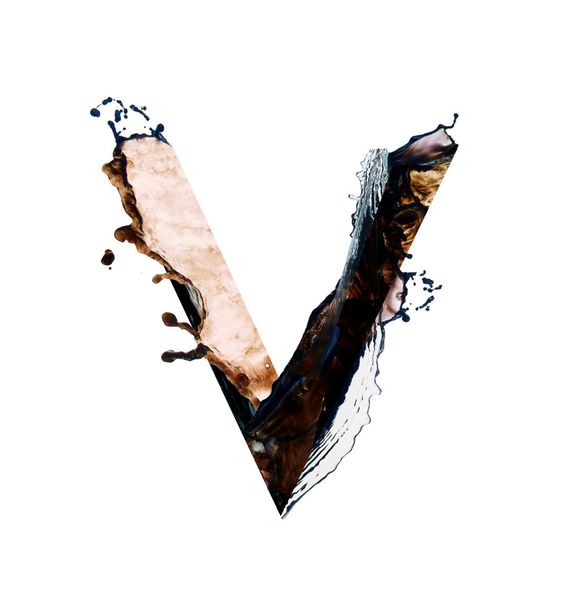
My name is Felicia, and I’m a…
You’ll find out soon!
This project aims at creating typographic portraits using the letters in our name. Typography, according to online definition goes about the technique of
“Arranging type to make written language legible, readable, and appealing when displayed.”
There are some designs I found to be really inspiring, and here are some of my findings:


Loving the designer’s chic and minimalist attempt on this set of work. I am also adoring its clean colour palette. I was so inspired to create a piece of work that speaks volume despite the lack of crazy, flamboyant illustrations. We’ll see how it goes! But as of now, I’m loving this work so much.
The next design inspiration I want to share has a somewhat similar concept.

By the Makers & Co, I love how the concept stands out so much, and the colour works so well together! The designer threw in neutrals with a few pop of bright, attention-grabbing colours to captivate the consumers’ eyes. As opposed to the previous use of the monochromatic colour scheme, this palette has much more to offer in terms of the diversity of colours and layering behind each and every element. This is very close to how I imaged by design to look and feel.
Typography Manipulation:
A style I have been wanting to try out for the longest time!!
Can’t wait to see how it will turn out eventually. More to come!