These are some the occupations that I found to be interesting:
Amusement Park Facilitator, Chef, Shopaholic, Undertaker, Supermarket cashier, Fruit Seller, Donut Seller, Animal Farm Owner, AND A DISNEY PRINCESS. 
After much rationalisation, I have shortlisted these 4 “professions”, all categorised under the theme of “Nature“. By that, I am referring to jobs that are often associated/accomplished in the wilderness or it has connotations of greens and earthy vibes to it. Will explain more about the rationale behind my concept in the subsequent post to come! Let’s get down to planning.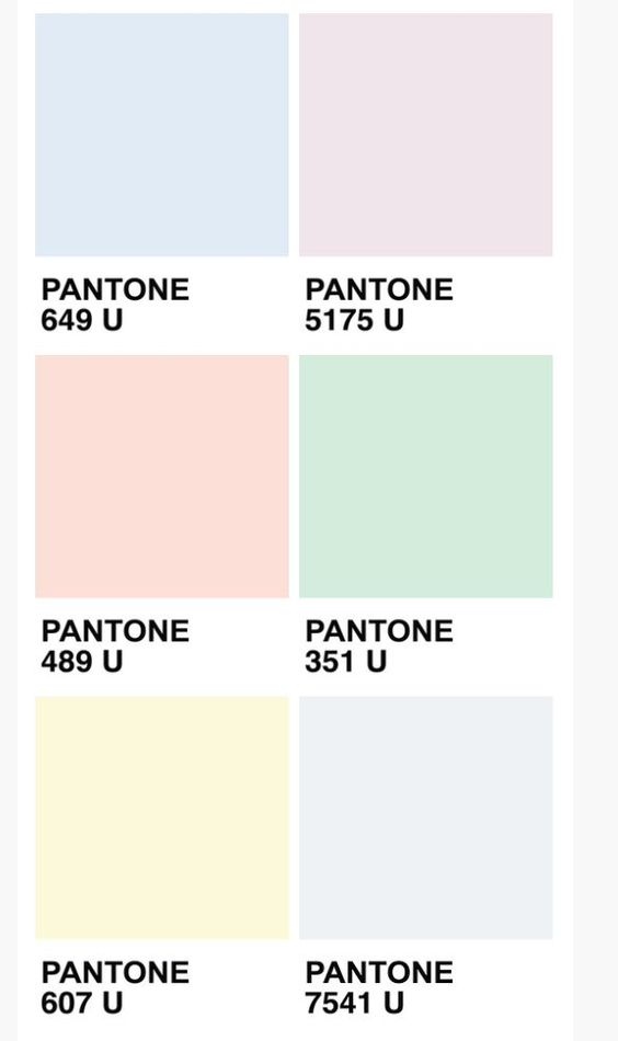

Color scheme: Pastel is the colour that I am going for. Soft, gentle, desaturated, milky is how you would describe this family of colours. This is also the first time I employ pastel hues into my design work. Have always thought that pastels are too mild, thus making them recede into the background. For this project, the 4 series of mixed media design works will be based on this following concept.
1- Scuba Diver/Marine Biologist
Under this panel of job, we can expect to see some marine creatures/bubbles/seawater/sporting gears. For this concept, I will be playing with a serif font. In a professional setting, serif fonts are most often used in formal designs. (newspaper, print, book etc) However, I would like to test out the limitations of the font, pushing the boundaries further.

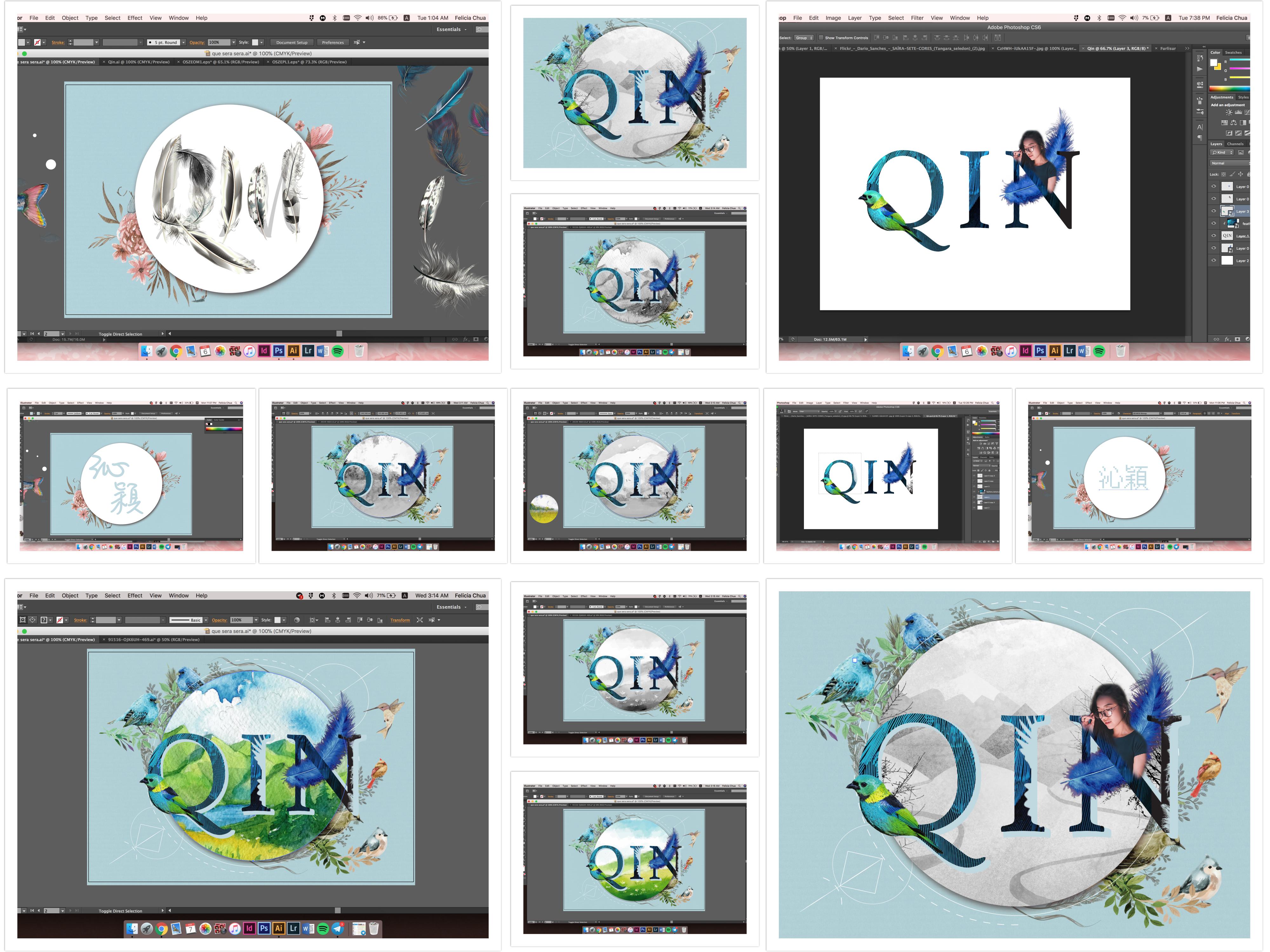
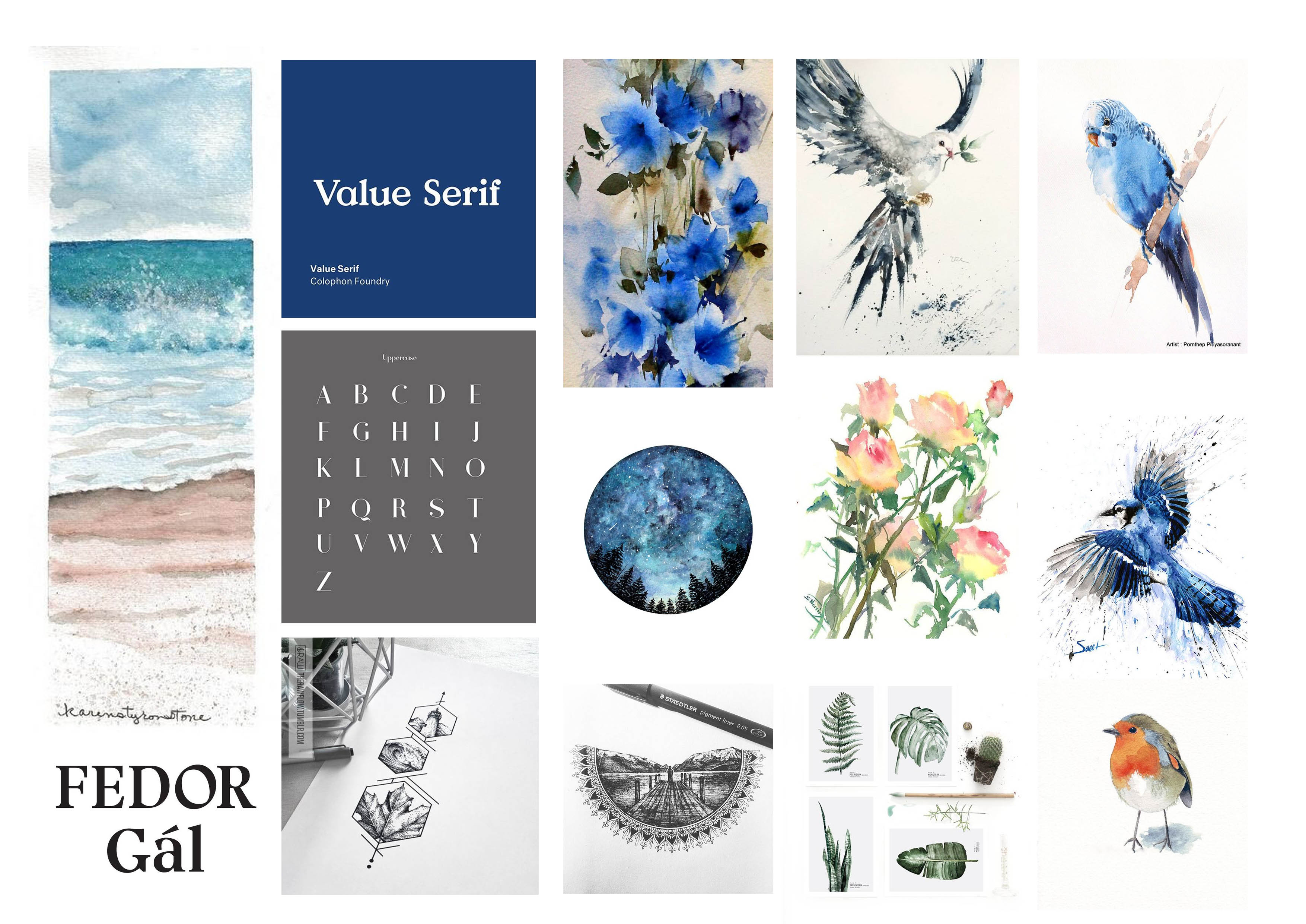
2 – Bird Whisperer
Birds, lots of birds, all decked in painterly style (watercolour). For this series, blue will be the dominating colour, with some use of yellow to create the analogous colour scheme. Have tested out several fonts to go with my initial, but turns out, the serif font is best suited for this layout. Will be exploring other font families in the remaining two designs!
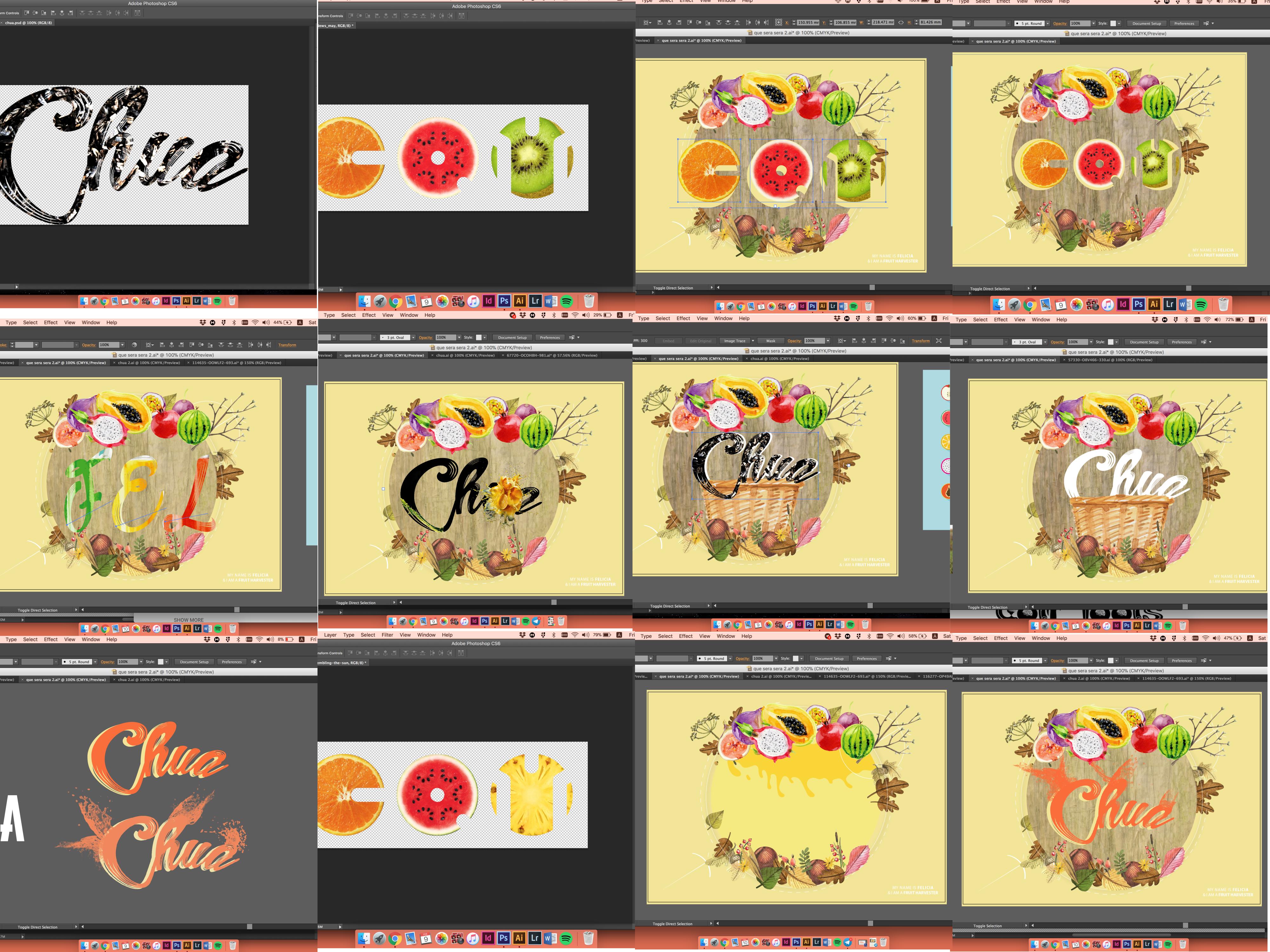
3 – Fruit Harvester
Fruits, tools, are what make up of the final composition. In this colour palette, we will be using a daffodil yellow to balance out the pastel theme that surrounds this whole concept. I imagine myself using a variety of earthy toned fruits to compliment the idea of a down to earth harvester. In contrast to the font choice used in the above two layouts, I will be employing a cursive (decorative font) typeface this time around. This is to ensure that explorations of typography are evident, especially in this project!

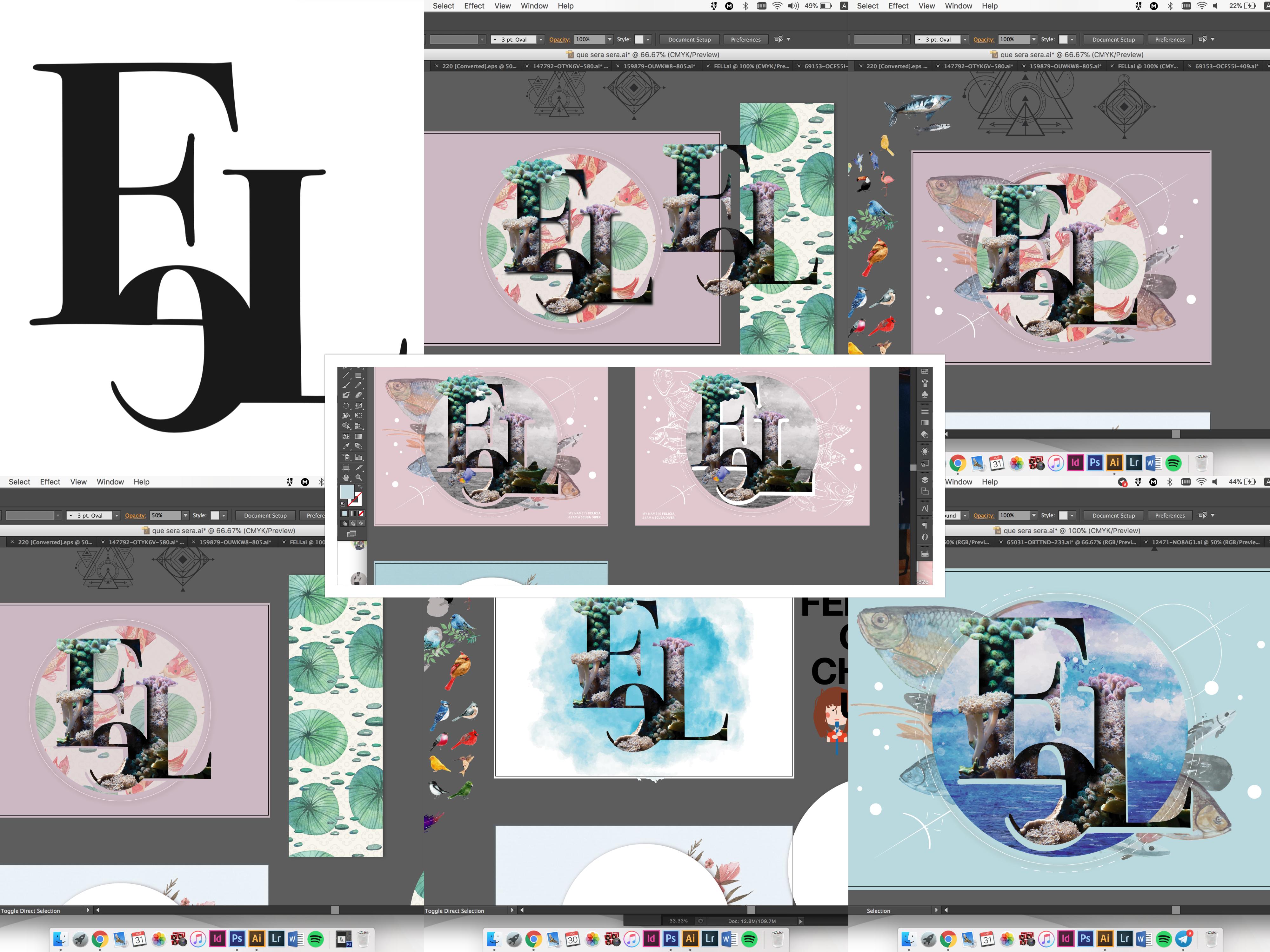
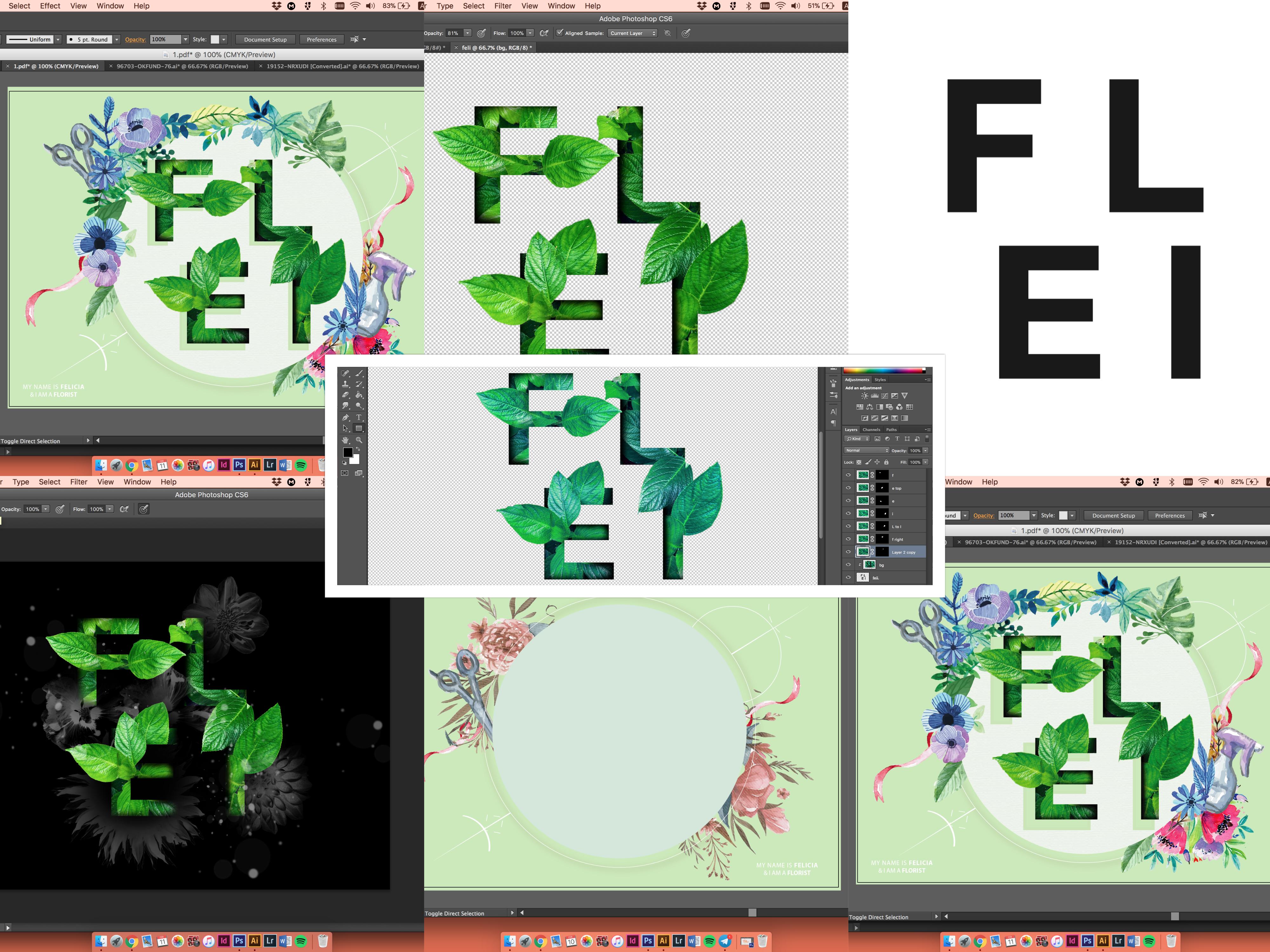
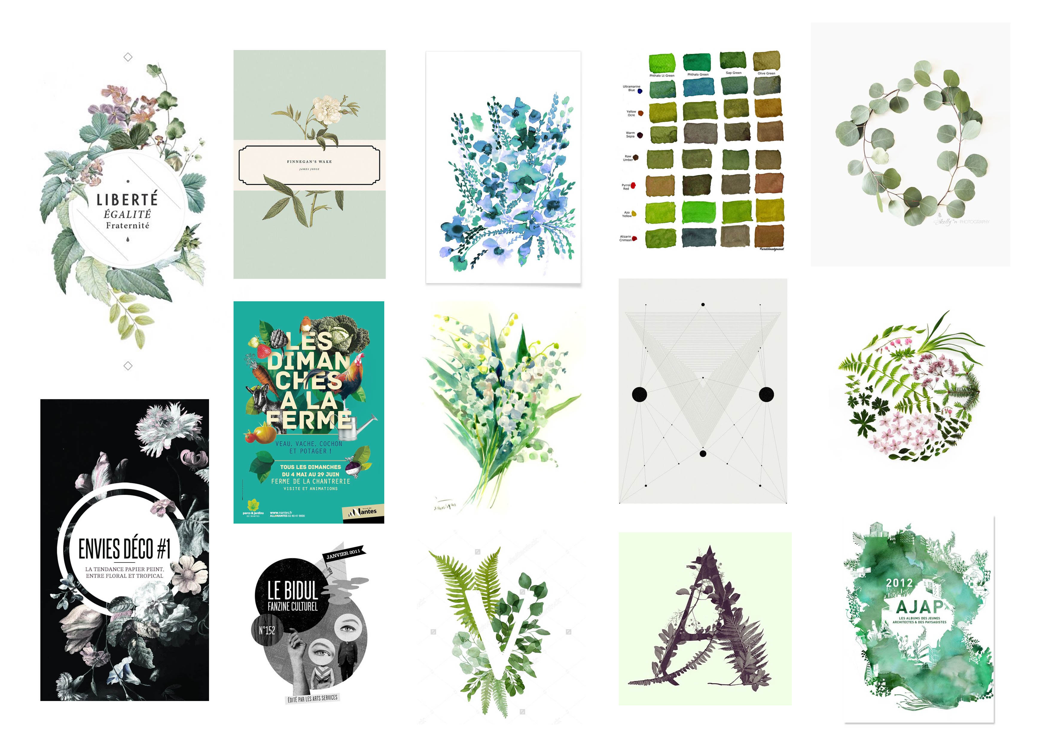
4 – Botanist/Florist
Greens, leafs, florals, tools are what is present in the layout. Pastel green will be the main colour choice. Watercolor style remains consistent, and the typography used will be a Sans Serif font. This font carries a minimal outlook since it does not comes with the stroke at the end of every alphabet.
Part 2 of my Process/Gallery will be up in a bit!
Stay tuned. Ciaos!
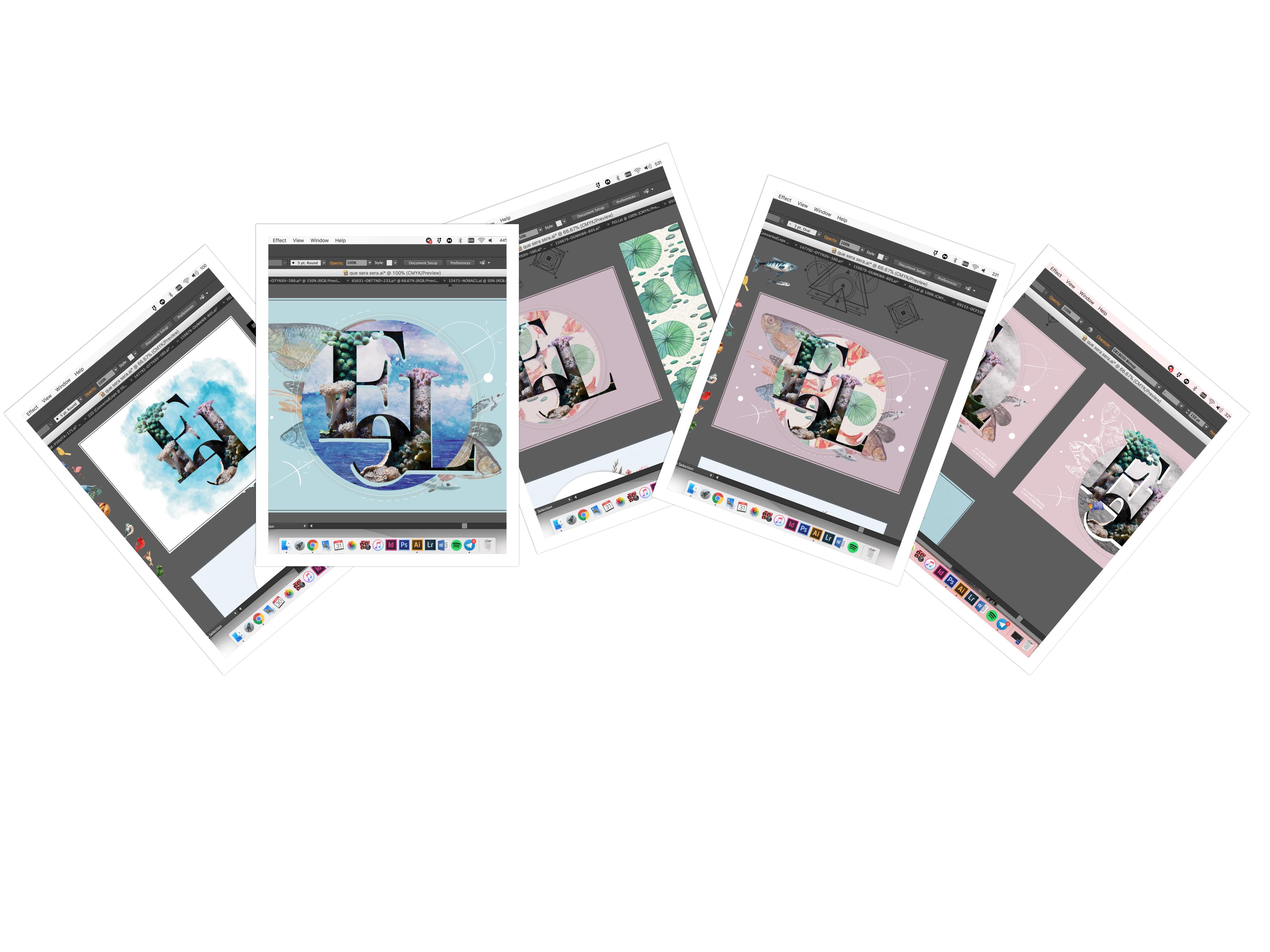 And with these keywords in mind, I manage to come up with something! These are my progressions all summed up in a collage.