
Manifesto: Designed for Universal Consumerism
Leave a reply

About the Artist
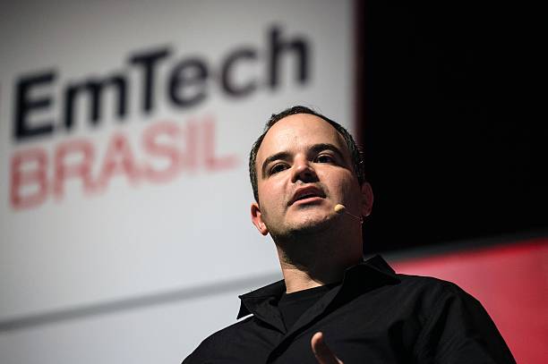
Marcelo Coelho – The rising pied piper to the world of interactive media is a Brazilian designer/artist that sets his focus on interactive installations, photography and robotics. Being a contemporary artist of this age, he made a proper mark on the current art scene by relating to current issues and first world problems. This made him highly retable among the crowd and even though he is understated, his works are slowly emerging to be among the worldwide praise.
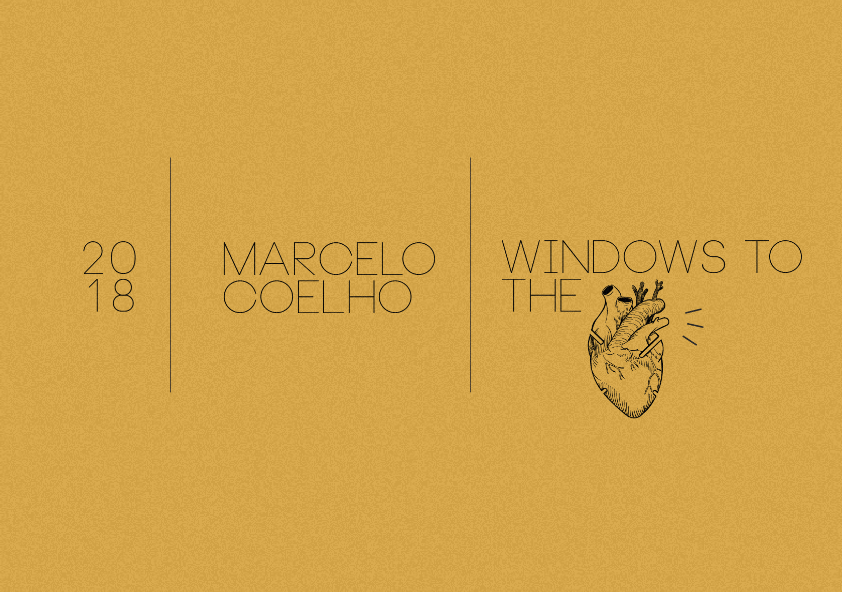
Coelho wants to challenge the masses’ perception of material goods and this drive won him several recognitions like the Designer of the Future award and an honorary mention for Interactive Art. He has many memorable works and some of them include Sandcastles (a collaborated work with another artist), Hyperform and Windows to the Heart (WTTH). I chose him as a subject to my hyper essay and here is why.

http://www.cmarcelo.com/window-to-the-heart/
http://www.cmarcelo.com/window-to-the-heart/
Background Information
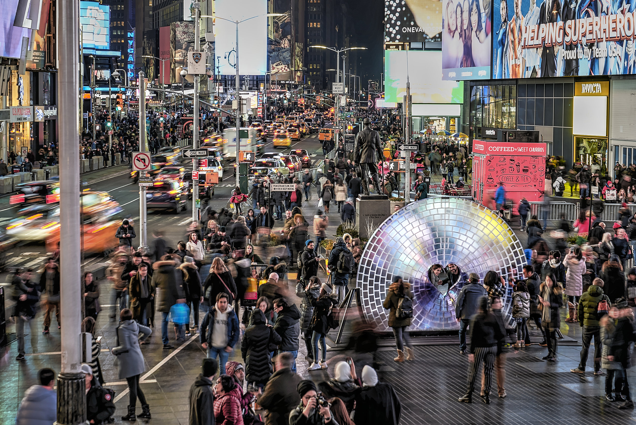
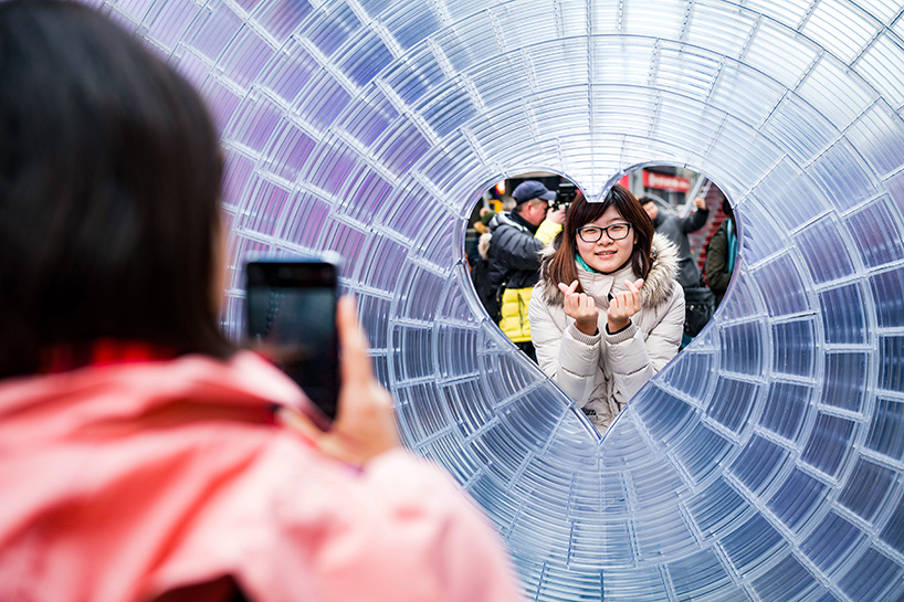
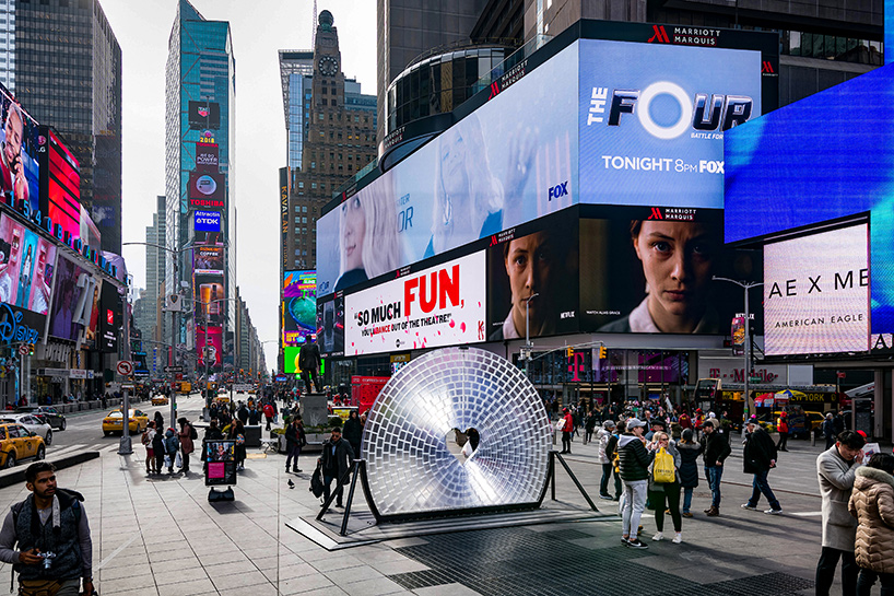
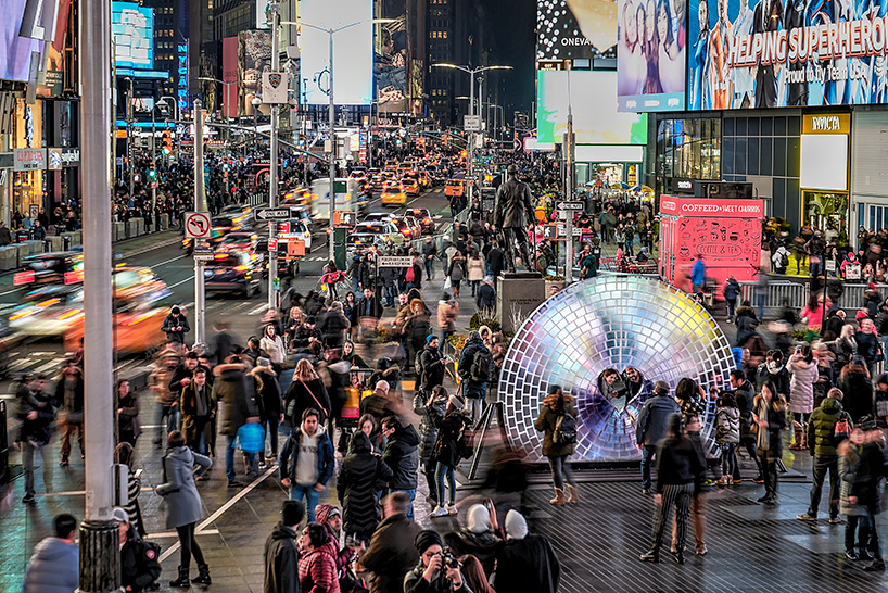
Early this year, Times Square Arts introduced the winner of this year’s Time Square Valentine Heart Design and Coelho’s work emerged as the top! Windows to the Heart (2018) graced the streets of New York Times Square, a bedazzling resin-made set up that lit up the vicinity during Valentine’s Day. Many couples got proposed in front of the very set-up and it marks a very significant moment for them. The iconic area is an effective symbol of the digital age, where people are so affluent with the upkeep of the ever-advancing technology.
Locals and tourists stroll under the pulsating lights of the ever towering digital billboards and advertisements. In this aspect, the Time Square is an emblem of a physical manifestation of our culture, the digital age where the documentation of daily life is represented on tiny squares through social platforms – A way to glorify the mundane. The use of digital devices became prevalent, instead of appreciating the moment, we choose to view reality behind the tiny screens of our phone, firing the shutters away. Being one of the world’s most Instagrammed area, the location reflected the rationale behind the very project.
Rationale/Analysis


The camera lens, an unsung hero of our computer age is quintessential in our daily life right now. Windows to the Hearts installation is 3D printed using clear resin to pay tribute to the Fresnel-type lens. Coelho retained the optical effect of an actual camera lens as an attempt to triumph over ancient methods of lens making – This provides a mean for participating audiences to reimagine the world they frequently photograph.
As a huge embodiment of camera lens, WTTH serves as a reminder to not forget the fact that reality is distorted when viewed through mediums as such through all the filtering and sharing. In doing so, they misrepresent the very fundamentals of seeing. One of the astounding facts is that WTTH, a 3 meters wide Fresnel lens is the world’s largest lens. This aspect is a unique selling point to Coelho’s work.
People can interact with the very work by putting their heads through the heart-shaped window to be photographed. The actual magic happens when the material of the installation optically bends and distort the lights that are reflected against the surface. Fuel by the city lights, the entire structure comes to life. The role of the participants become crucial because, without their participation, the rationale behind the work cannot come through. Being an interactive media, the main purpose is to communicate.
Conclusion:
As this set-up stands alone in the grounds of Times Square waiting for engagement from the users, it becomes impossible for Coelho’s work to perform if no participation and response were gathered at the end of the day through physical activity within a responsive environment. In view, participants can be seen as part of the work, spectators who are photographing the set-up become collaborators. All these aspects contribute significantly to the experience of the art piece. The terminology “audience” may be referred to as passerby who is viewing an installation. The activator then becomes a player, and viewing members, in turn, becomes spectators. When an action is taken, their role morphs into a collaborator. WTTH can be used as a collaborative experience, especially when it is placed in such a prominent location.
Coelho’s artworks balanced the different components in an aesthetically pleasing yet enlightening (literally) way. He employed a light-hearted technique to deliver his message across to the general public and this allowed him to reach more beyond a specific age group of target audience. People of different generation can come together and enjoy his captivating work of art and it is one without language, age or gender barrier.
Video Reference as follow:
References:

Link to Presentation Here
This is Marcelo Coelho. Never knew of him until I started this research phase, and I have to say his works are one of the most impressive few I’ve come across! He placed a lot of emphasis on the rationale behind every one of his live installations and focuses on the boundaries between matter and computation. His installations appeared at the Rio 2016 Paralympics Opening Ceremony as well as many other renowned museums worldwide. Being a Brazilian computation artist and designer, he also curated many wearable products and robotics.
To briefly sum it up, I enjoyed this work titled “Window to the Heart” where the whole fixture was made of resin. (how very expensive!) Situated at the Times Square during the period near Valentine’s Day (2018), a few couples got proposed at the very spot where the illuminated installation was placed. I’ll delve deeper into the artwork in future time, but here are some visuals for you in the meantime.
These are the top 3 most intriguing works, if you’re interested, please click!

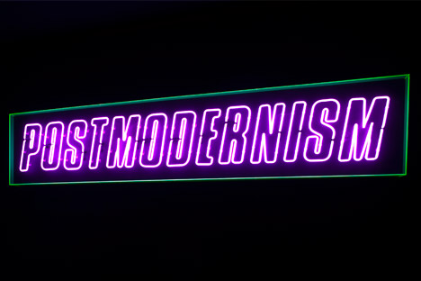
Outline on Memphis Art Movement (1981)

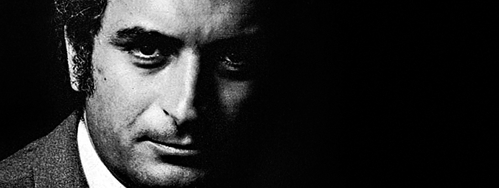
Ettore Sottsass [13]
“I try and be as stupid as possible regarding my profession, which means I try to look at as few design magazines as possible.” is an iconic quote mentioned by the godfather of Memphis art movement – Ettore Sottsass.
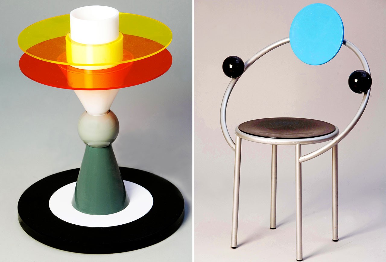
Created in the 1980s by the Memphis group, the movement was strangely named after a song by Bob Dylan on one of their collaborative meetings. During its initial release, the “radical, funny and outrageousness” [1] of the art style was despised by the masses. The original intention of Memphis, though, was never about conforming to the societal standard of what “beauty” means – It essentially disregarded what was considered as “good taste” at that era. Inspired from art styles such as Pop Art and Art Deco, the influence is apparent in terms of the usage of vibrant colours and patterns, and the heavy rotation on geometric shapes that shapes its primary aesthetic. These characteristics are significant aspects that make up these movements.
Example of a Memphis’ Icon
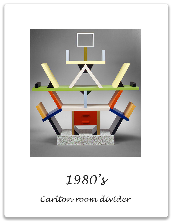
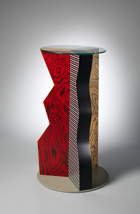
Sottsass (1917 – 2007) once said, “I believe sensoriality is the most primitive, the most immediate thing. If I want to rethread hypothetical origins, I must concern myself with the senses.” – It is a reflection of his perspective on the importance of engagement with our 5 senses and the object.1980, Carlton room divider [13]
The term ‘sensoriality’ is evidently emulated in many of his works such as the exemplary Carlton Room Divider. The use of vivid colours enticed the visuals unlike the conventional furniture is seen in the market. Despite the avant-garde appearance, the 1.5m tall bookshelf has an underlying “logical structural system that has an implied equilateral triangle.” [2] The idea of play and experimentation comes into mind when one looks at the iconic, yet monumental spinoff.
Key Features and Characteristics
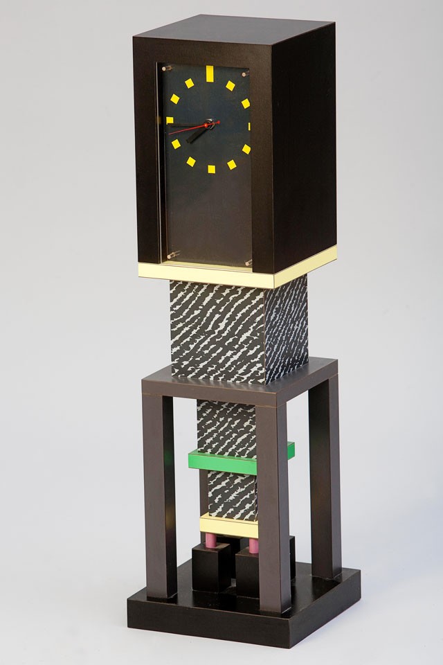
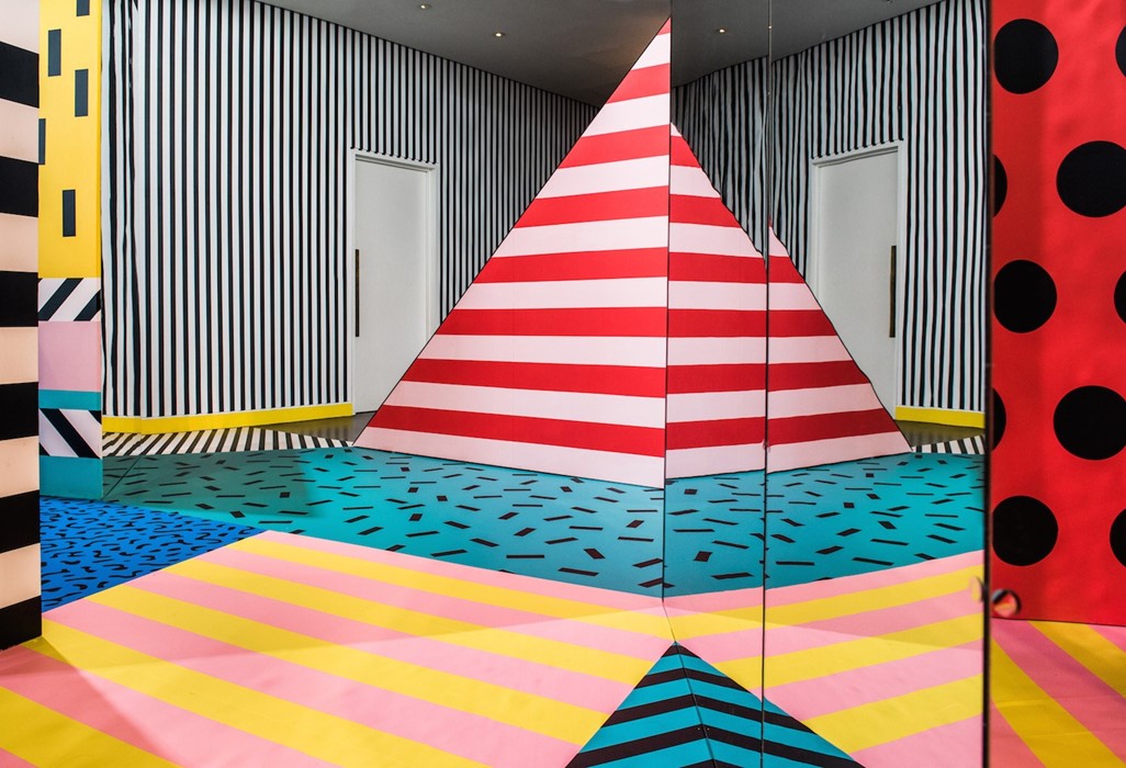
One sure fire way to identify a Memphis artwork include the use of bold colours, haphazard presentation of geometric forms and the use of plastic laminate as material. Designs are usually seen to be accompanied by a flat, vectorised layout with plenty of use of strokes and squiggly lines. These elements can be used as a sense of direction for the human eyes. In graphic/web design where typography is the concern, blocky sans serifs are often the go-to choice for designers looking for a Memphis style.
Generally, colours like yellow, orange, magenta and teal are the more prominent choices reflected in these artworks. Colours are strategically used to evoke and provoke strong emotions, thus encouraging intercommunication and engagement. These are what subjected the group to derision. Being the epitome of quirkiness and un-conventionalism, most people find the style to be of an acquired taste. [3]
Left: Ettore Sottsass, Bay (table lamp), 1983. Right: Michele De Lucchi, First (chair), 1983 [14]
George Sowden, Metropole, 1982 [14]
Key Influences
Memphis was created as “a form of reaction against the slick, black humourless design of the 1970’s where minimalism was largely practised in commercialised products.” [4] The group thought all of that sleekness was lacking in personality and individualism. To counter that, the designers were inspired to come up with bright, appalling works as a form of a unique selling point when it comes to marketing and consumerism.
When the Memphis movement spread to Milan, anti-modernist ideals started to form. To tackle the genesis of “soulless designs” deemed as the Bauhaus movement, the spontaneous designer hoped to construct exciting and lively design. With an aim to “reinvigorate the radical design movement”, the rule of “form follows function” was considered to be cookie-cut and conventional. The principles of Memphis embody the “irreverence, idealism and risk-taking of postmodernism, as well as the garishness of the decade it ushered in.” [5]
As opposed to Bauhaus’ rigidness, the free-spiritedness of this art movement is peculiarly apparent in the working style of The Memphis Group. It was said that the group was severely drunk when they were deciding on a name for the art movement. The word “Memphis” was playing on repeat in the background music and that was it!
As quoted: “’My brain is filled with holes,” Sottsass says, ‘‘and I was very drunk at the time, but I can tell you that the name for Memphis definitely came from the Bob Dylan song. The record was scratched, and everybody was so drunk that nobody could change it…” [6] Memphis as art movement echoes brilliantly in the history of art. Though it was consistently inconsistent with the up keeping of trend, let us not leave out the fact that it has impacted more than just the fashion industry but the furniture design realm. The unprecedented ethos of Memphis took the world by storm.
On Postmodernism as a whole
Through the use of impudence and the attempt to ridicule the “established values”, Memphis challenged the constraints in furniture design that was seen as intolerable. Strange groundbreaking ways were established in hopes to “reinvent an approach to design by rethinking its basic elements: material, surface, colour and shape.” [7] Conventional materials were used but in an indefinite unexplored manner. They have successfully married the term unorthodox with beauty.
Postmodernism preaches on the equality of all things. It is a reaction to the “assumed certainty of scientific, or objective, efforts to explain reality.” [8] Postmodernism lacked challenges the dominant assumptions of things and place them under the scrutiny of scepticism. One example will be Andy Warhol’s Marilyn Monroe series (1967). Upon her passing, the postmodernist artist created 10 screen print portfolios of her. The format of art a reflection of the commercialization of culture and the transformation of Marilyn Monroe into a mass-produced symbol. [9] The meaning behind 10 seemingly simple collage hides the abstract yet the complex mind of Warhol.
On the choice of repetitions, Warhol said, “The more you look at the same exact thing, the more the meaning goes away, and the better and emptier you feel.” [10] This mirrors the ideals of Postmodernism that it is more than what it seems – often a reaction against a social clause.

Michele De Lucchi’s Prototype appliances for Girmi, 1979 [15]
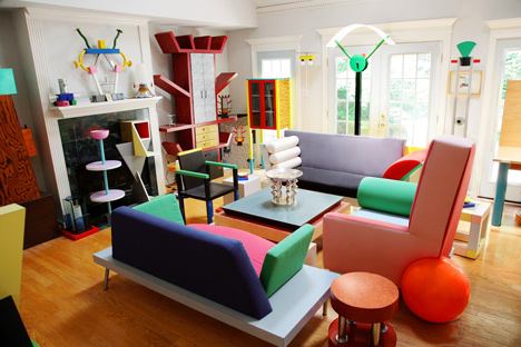
A room containing part of a private collection of Memphis design assembled by photographer Dennis Zanone, in Memphis, Tenessee [15]
The Proust chair by Alessandro Mendini, 1978, pre-empted a wave of Postmodern design. Image courtesy of Cappellini [15]
Glenn Adamson was co-curator of the Postmodernism: Style and Subversion 1970 – 1990 exhibition at the V&A in 2011. Image courtesy of the V&A [15]
Postmodernism VS Modernism
In essence, Postmodernism goes against all views of Modernism. Science is the paradigm of all true knowledge? Nope. Modernism worshipped idealism and reason, they too championed clarity and simplicity. [11] The artists from Modernism examined various outlets to do with form, process and technique rather than putting emphasis on subjects. As opposed to that, “postmodernism questioned the notion that there are universal certainties or truths.” [12]
“Ivory” Table, 1985Courtesy The Metropolitan Museum of Art, Gift of Dr. Michael Sze, 2002 [16]

Superkilen, Copenhagen by BIGPhotography by Iwan Baan [16]
WALALA X PLAY at NOW GalleryPhotography by Charles Emerson [16]
References
1 – Schwartzberg, Lauren. “What Is Memphis? (And How Can I Get My Hands on It?).” The Strategist, 21 Apr. 2017, nymag.com/strategist/article/best-memphis-milano-home-goods-trend-design.html.
2 – Metmuseum.org, www.metmuseum.org/art/collection/search/486989.
3 – “DESIGNING WITH AN 80S TREND: MEMPHIS DESIGN 101.” Crabiz. Accessed October 12, 2018. https://www.crabiz.com/blog/designing-with-an-80s-trend-memphis-design-101/.
4 – “The Memphis Group.” Arch Bridges. Accessed October 08, 2018. http://design-technology.org/memphis1.htm.
5 – Silva, Horacio. “Memphis Has Left The Building.” The New York Times. April 14, 2002. Accessed October 08, 2018. https://www.nytimes.com/2002/04/14/magazine/memphis-has-left-the-building.html.
6 – abid
7 – Slesin, Suzanne. “MEMPHIS MANIA; The Design Story of the Decade.” The New York Times. October 15, 1989. Accessed October 08, 2018. https://www.nytimes.com/1989/10/15/magazine/memphis-mania-the-design-story-of-the-decade.html.
8 – PBS. Accessed October 08, 2018. https://www.pbs.org/faithandreason/gengloss/postm-body.html.
9 – “Postmodern Art.” OnPostmodernism. Accessed October 08, 2018. http://www.onpostmodernism.com/art.
10 – Warhol, Andy. “Andy Warhol Marilyn Monroe 1967.” Lee Bontecou. Untitled. 1959 | MoMA. Accessed October 08, 2018. https://www.moma.org/collection/works/61240.
11 – Tate. “Postmodernism – Art Term.” Tate. Accessed October 09, 2018. https://www.tate.org.uk/art/art-terms/p/postmodernism.
12 – abid
13 – “1980’s: Carlton Room Divider.” Xena Barlow. Accessed October 12, 2018. http://xenabarlow.com/interiors/iconic-design/1980s-carlton-room-divider/.
14 – “Domus.” Memphis-Milano. Accessed October 12, 2018. https://www.domusweb.it/en/news/2014/04/15/memphis_milano.html.
15 – Winston, Anna. “The Dezeen Guide to Postmodern Architecture and Design.” Dezeen. January 21, 2018. Accessed October 12, 2018. https://www.dezeen.com/2015/07/23/guide-to-postmodern-architecture-design-glenn-adamson/.
16 – Burroughs, Milly. “Why Is 1980s Postmodernism Experiencing a Design Rebirth?” AnOther. October 27, 2017. Accessed October 12, 2018. http://www.anothermag.com/design-living/10144/why-is-1980s-postmodernism-experiencing-a-design-rebirth.

In the first reading, we have renowned designer Massimo Vignelli engage the readers with his philosophies of graphic design and what he felt the term ‘graphic designer’ entails. I enjoy his understanding of a graphic designer to be one in which engineers and structures information, giving our work both form and function. This ideal ties in well with Modernism ideals, whereby form should follow function, as similar to our actions, our designs should have a purpose as well.
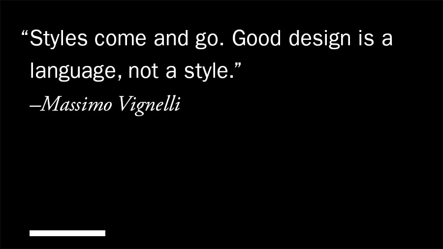
We can see that his designs are extremely functional and timeless, which many graphic designers fail to see the importance of. Sure, a visually pleasing design is able to capture attention, but if it fails to convey a message, is the purpose of the design lost? As what Massimo Vignelli said, “the most effective design is positioned in the centre between progressiveness and conservatism.” I would consider timeless designs to be the ultimate goal of a designer as it would mean that as an individual, they have managed to create something with lasting form and function for the masses.
Beyond leaving a legacy I feel that Massimo Vignelli truly a humbled individual as he does not see himself as a revolutionary, instead, he seeks to push the design community as a whole, striving for a healthier culture of design, one that is imbued with passion, curiosity and meaning. More than often, due to how much the market is determining what designers are producing, such as campaign ads and advertisement posters, our sense of aesthetics and purpose is slowly being diluted and we are losing the aspect of having a visual identity.

In the first excerpt, Modernism is a design principle based upon function over form. The author paints modernism in a way which seems it is the utopian design principle, whereby it is stripped of any social or political biase-ness and it is fundamentally pure. While this may be true for the author, I feel that the era in which modernism was birthed from was a direct result of political influence. The detachment from politics due to war is in itself an irony as the ideal aims to object to the use of art for persuasion.
Modernism is also explained to be void of any resemblence to nature and our surroundings. The author proclaims how myopic this view is as there are such strong emotions which can be derived from nature, mainly eroticism. However, there is so much more to emotions than pure lust. While most forms can be reduced to basic geometric shapes, we are erroding its essense of life by simplifying its complexity. Emotions of comfort, anger, happiness… all are dulled by the use of rigid geometric structures.

Modernism as a design ideal worked well for furniture design as well as architecture due to their need for functionality and usability. However, if the same ideas are forced upon graphic design, it completely changes the meaning behind creating something purely for visual aesthetics. The same limits which are bound to physical objects such as weight, materials or structure do not apply for graphic design. You are free to create to your heart’s content, using any medium, any thickness of strokes.
It all lies within your capacity to create, which is why art nouveau as a movement was so popular. It did not limit the creative expressions of individuals, instead, encouraged creatives to look beyond their world, into mother nature for her years of refining her aesthetics.

This collaged art stood out strongly as I have always found surrealistic art to be visually intriguing and highly abstracted. This is one huge contributing factor that made me pick this piece. Hausmann, the artist, expressed his disapproving views through a photomontage which strongly reflected the properties of DADA movement.
Unorganized forms of photographs and prints were positioned in a perceptibly chaotic fashion successfully expressed his attempt to challenge the idea of what “Fine Art” means. It was said that Hausmann supported “new and different forms of art” and he “did not like the bias of critics toward the traditional styles”.
With an aim to prove that the socially and culturally accepted forms of art aren’t the only style artists should be susceptible to, he advocates the idea of a “non-conformist” through the use of this photomontage. The idea behind his oddly clashing colours used in the background clearly enhanced his point.
Also, the physically disproportionate being with an oversize head undermined the common perception of human anatomy. The entirety of this piece wholesomely reflected the extremely satirical and nonsensical aspect of DADA movement. Decoding a DADA art piece allow users to put themselves into the artist’s shoe and think – regardless if it is on subject matter or symbols. These are used to create meaning in their work. DADA ROCKS. THE AMBIGUITY IS LOVED.

What comes to mind when you first look at the curated image above? Kandinsky, a renowned abstract painter, proposed a correspondence theory that suggests an association between primary colours (red, blue, yellow) and shapes. Though it was highly opposed and challenged by many, his argument states that “the correspondence between colours and shapes was mediated by an inherent relationship between the colours and angles of the shapes”.
With relevance to Kandinsky’s theory, I came up with an abstract spread with an aim to represent our local culture’s independent and un-interfered sense of art direction. Singapore has been dubbed as the country “where east meets west”, and with it being a multi-cultural country, we are dynamic and unique in our ways.
Just like the dish rojak, the local design scene focused heavily on the portrayal of multiculturalism – one that embeds on the uniqueness of the ethnic and racial groups. The art scene locally is a sui generis representation that integrated many relatable aspects to represent our nation as a whole. Hence to say, we are the determinator of our own art direction and design sense.
In the design layout above, while staying true to Kadinsky’s shape colour theory, the deep pink square in the middle symbolism our nation and the blue circle in the background represents an “uninterrupted design style” which we hold true to. Last but not least, the yellow triangle serves as the recurring trend around the world. I reduced the opacity level of two overlapping triangles and this is to show that we are not swayed by outside influence.
Hello
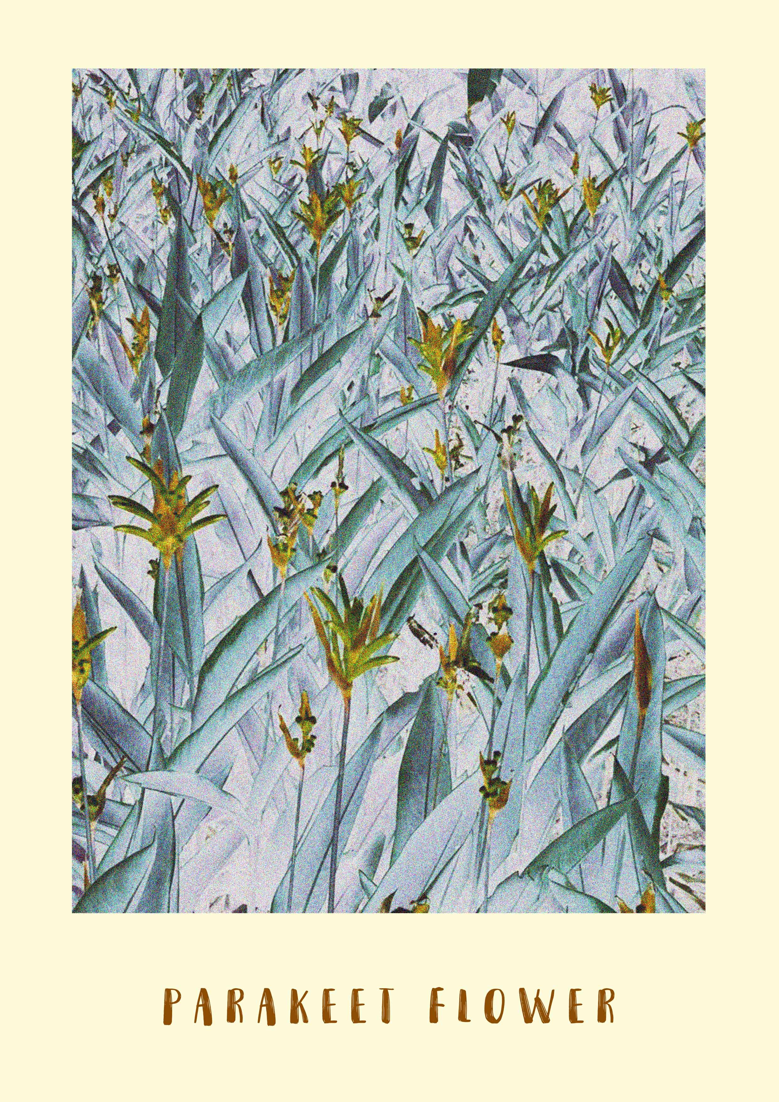
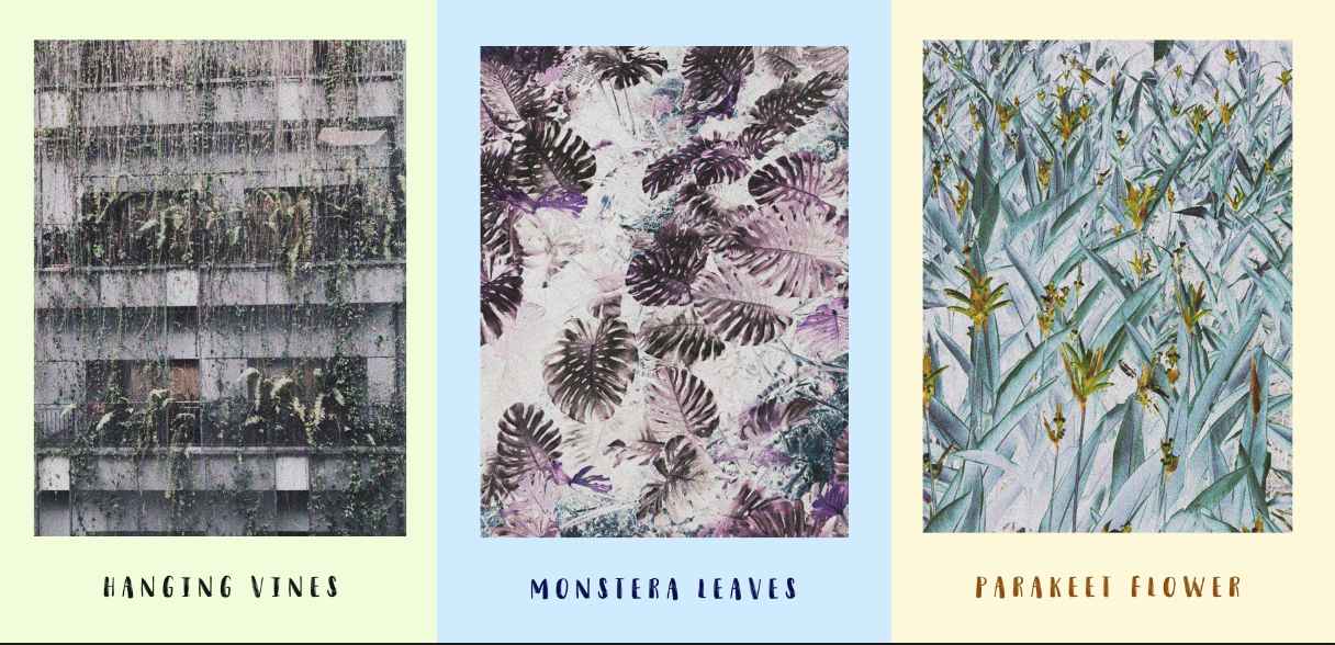
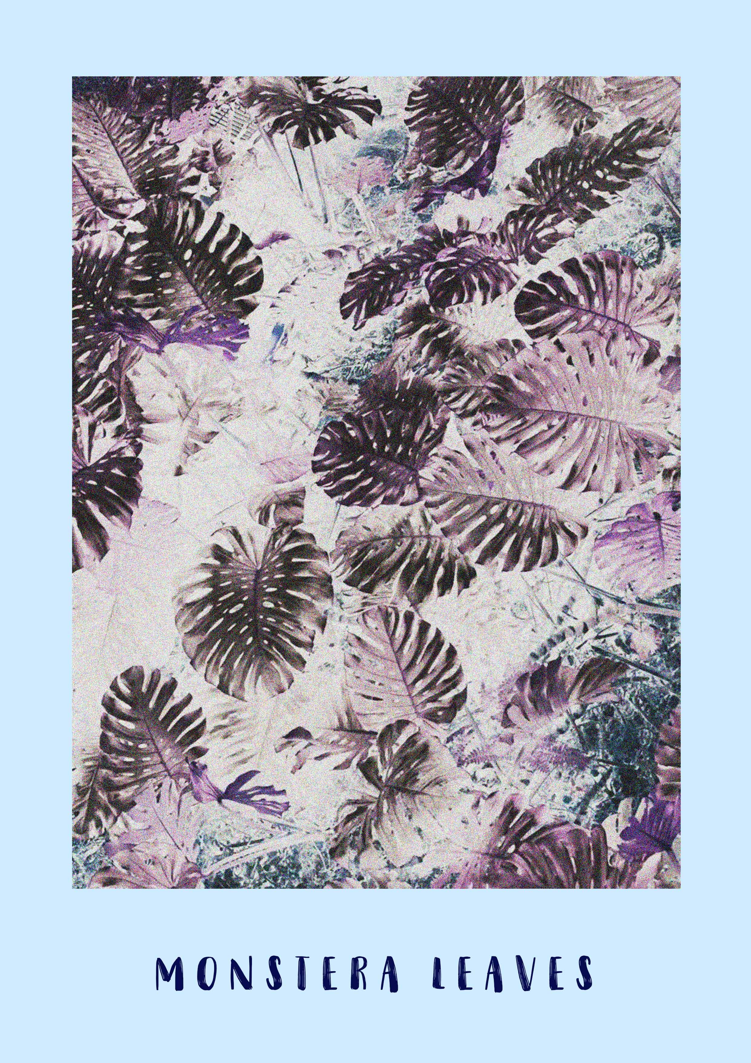
Drawing inspiration from organic free-forms found in the scapes of nature, this frame caught my attention. It reflects a strong contrast against rectilinear shapes derived from man-made objects in the vicinity. The elegant curves of the vines form an organic composition, similar to the fluidity of human motion – unlike the grayscale landscape in which this object resides. Art Nouveau primarily aims to deviate away from machine-like compositions to focus more on the forms demonstrated in flora & fauna.
–
Some other interesting compositions that caught my eyes along the sidewalks of NTU – Something I failed to notice amidst my busy schedule.
A R T N O U V E A U I S E V E R Y W H E R E