Category Archives: My Work

Professional Creative Portfolio

Download Portfolio PDF Here.

Portfolio Page: be.net/furlisure

LinkedIn Page: linkedin.com/in/feliciachuaqy

[Biography]

Hello! My name is Felicia, and I am currently pursuing a Visual Communication Major with an interest in User Experience Design (UI/UX). Based in Singapore, I specialise in Visual Identity, Packaging and Brand/Collaterals design. My design philosophy is to curate meaningful work that best represents brands and their ideologies, a human-centred design that understand and address the core problems within a system. My approach lies in shaping contextual narratives for brands and translating them into visual communication through conceptual and typographic details, which are then applied across digital, printed and occasionally spatial mediums. 

[Share 3 of your best projects from your courses done so far]

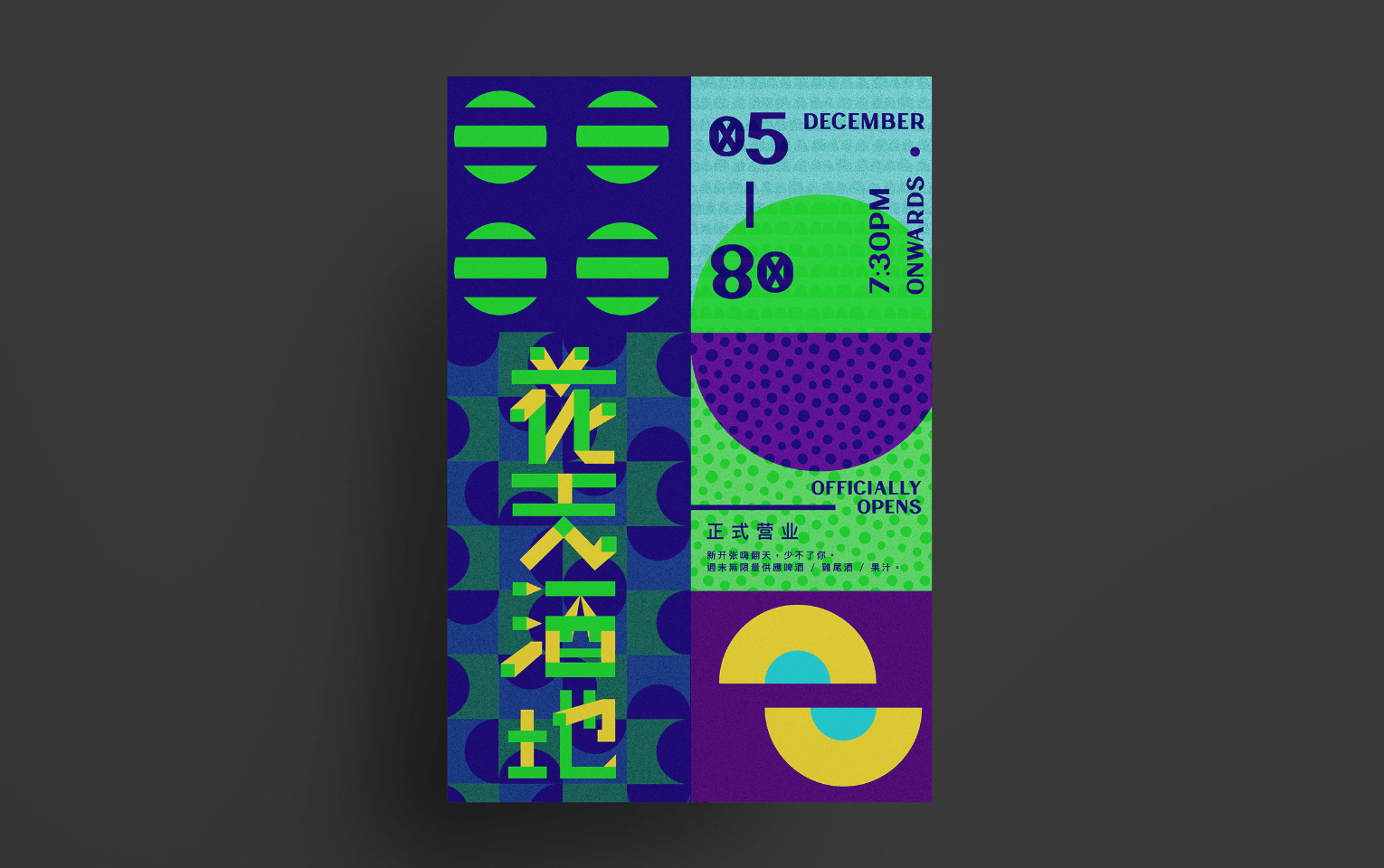
Project 1: 花天酒地   / /  Glassbar Concept Store 

Purpose: Creative Branding for Visual Communication III

Theme: Bauhaus Art Movement
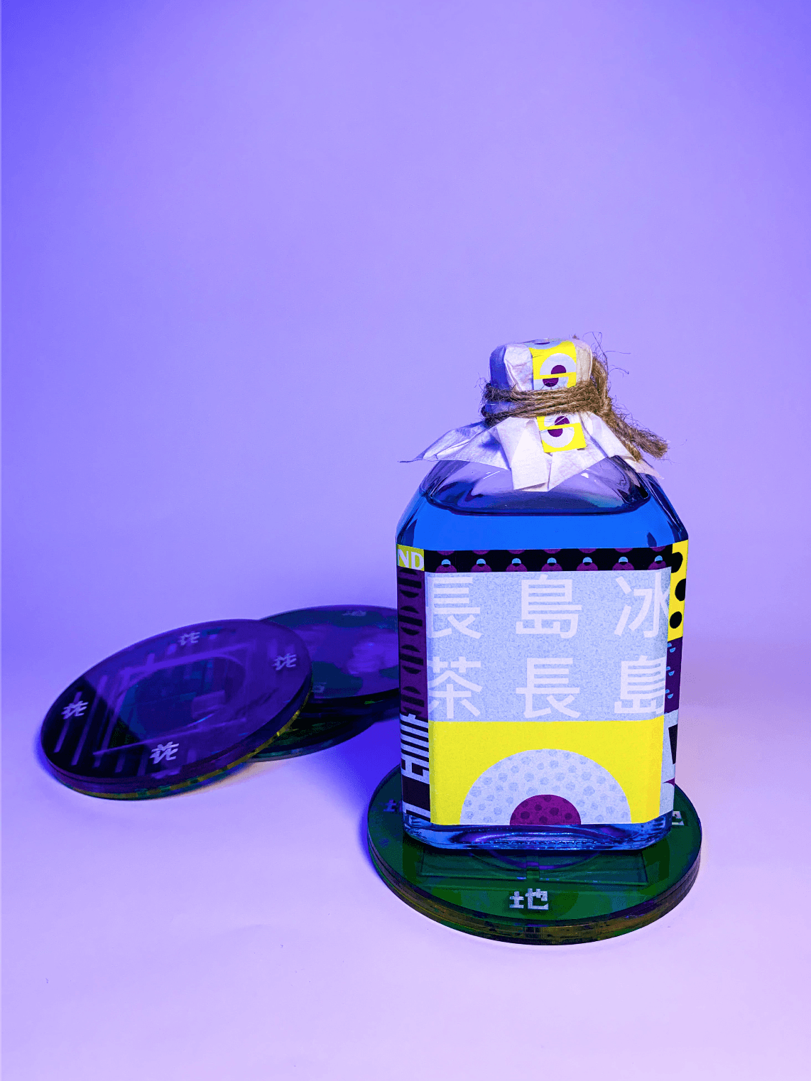
/ MORE ABOUT

A Modern Take on Bar Experience – With the shift in focus of the demand, bar experiences expand way beyond just a place for consumers to sit down and consume a drink. It has ultimately become a holistic approach that involves the whole purchasing, enjoyment, and consuming process that summarises if a bar worth a second visit. With millennials as the targeted group in the up and rising bar scene, the role of uniqueness is the key to being unforgettable. To enhance the characteristics of clarity and clearness in spirits and wines, our bar aims to re-represent the quality of transparency of alcohols into our bar concept. Once you enter the bar, it will feel like a shift in dimension – an alternate reality or universe. A glasshouse concept that occupies your surrounding with all things made of clear and transparent objects, to enhance the effect of etherealness.

/ BRAND PHILOSOPHY

THE BAR PLACE aspires to provide a glasshouse experience similar to the interior design of an igloo, we want to sell a unique, curated representation of lifestyle to people from all walks of life, especially millennials. We believe that through the use of clear materials, it can represent a non-complicated and stress-free lifestyle which reflects our unique brand identity of a glasshouse concept lounge bar.

/ BRAND IDENTITY

THE BAR PLACE serves to create a community where people can detach from reality momentarily, to shed the burden off your shoulders through our glasshouse ambience that emphasizes on lightweights through the concept of invisibility, giving you an ethereal and out of the world experience. Our products will be curated with transparent objects, which reflects depth when you stack to combine two items together – playing on the idea of invisibility. When stacked together, the visual imagery can form unique illustrations which hammer on the visual illusion of depth through lines. Lines with varying strokes will be a continuous design element used on our collaterals.

/ PACKAGING & PRODUCT DESIGN

The packaging aims at representing the modern beliefs of our bar, such as the laser lights to transience through transparent materials, detachable menus that come in 2 separate layers.

/ GRAPHICS RATIONALE

THE BAR PLACE graphic assets will replicate the rhythmic qualities of music and beats. More so, shapes that encapsulate the ingredients to our cocktail drinks – all represented in lines/outline to align with my concept on dynamism in lines – a reflection of different personalities. Presented in a non-representational way, the lines will draw depth and give the design a 3-dimensional appearance.

/ REFLECTION

This project concept may seem simple, but it has gone through a lot of renditions to get to the final output. As it was my first attempt using shapes to build a design concept, I thought this was quite a refreshing take compared to what I am used to doing. Apart from that, this project also challenged my ability to think critically as an aspiring designer.


Project 2: Thousand Thistles

Purpose: Cascading banner 3824 x 480mm

Theme: Japanese Villian Versus Warrior

/ MORE ABOUT

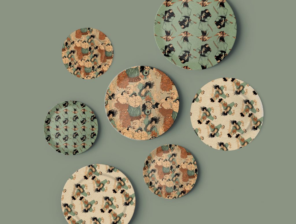
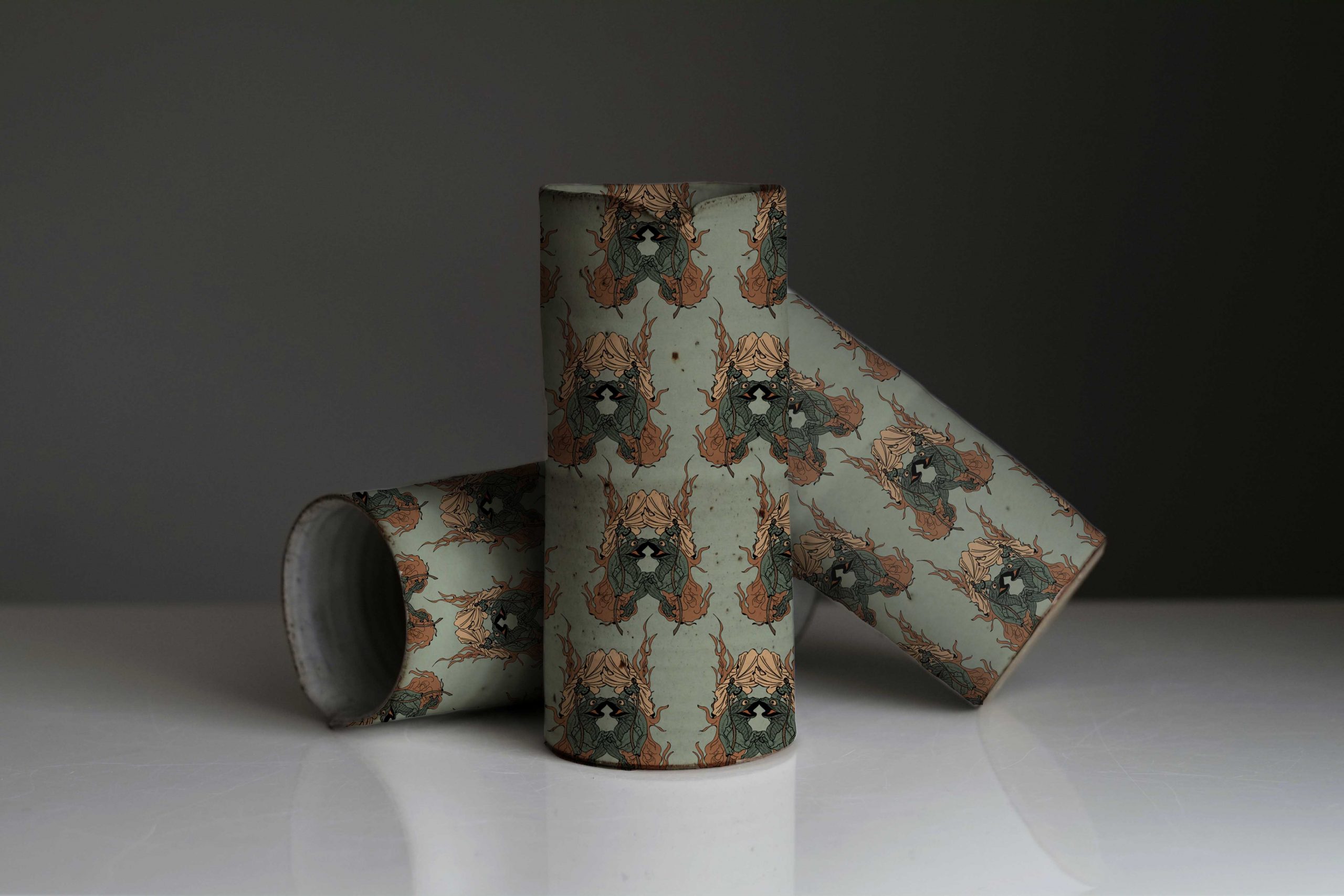
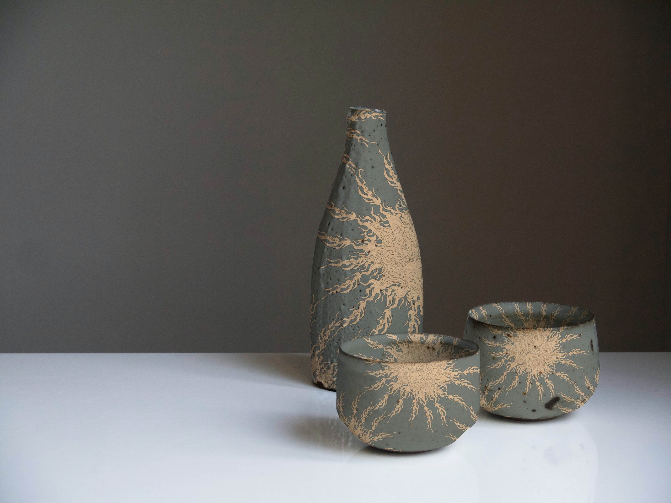
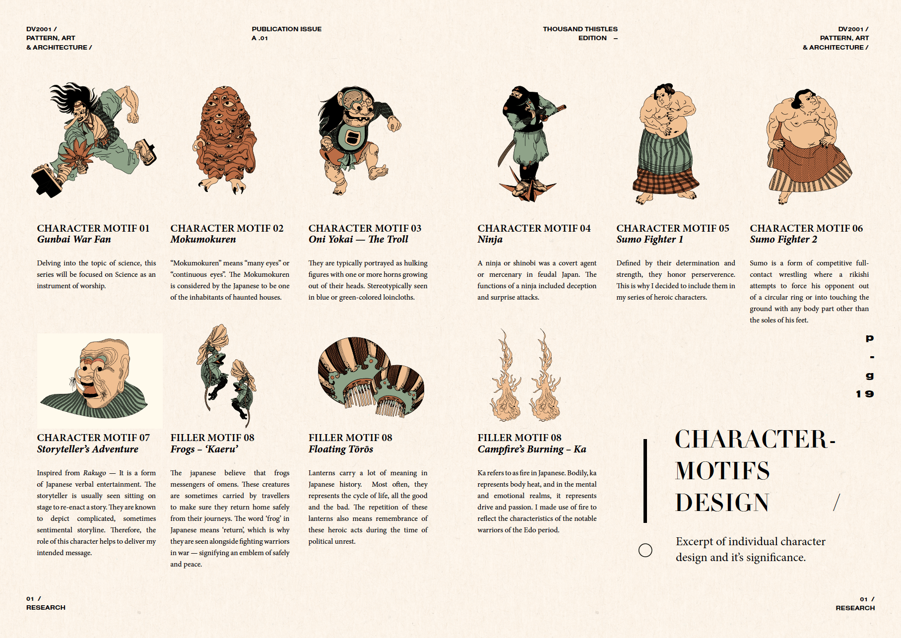
Why Thistle flower: Like its rough exterior, Thistle is the name of a flower that acquaints with aggressiveness, pain, protection and pride. The significance of a Thistle flower is defined as not only the flower but also its weed. Though the weed is commonly associated as a parasitic organism, it is valued to symbolise not just might and brilliance; but also poverty and weakness. Alike to the notable warriors during the Japanese Edo period, their role was to defend their territories against rivals, to fight enemies identified by the government, and battle with hostile tribes and bandits. Overall, these Heroes are respected and worshipped because of their dexterity and heart for their people. This composition focuses on the retelling of Ancient Folklore in a campfire setting, where the fire is used as a repetitive motif that embodies the power of destruction, yet contains generative qualities to illuminate and renew — Just like these warriors.

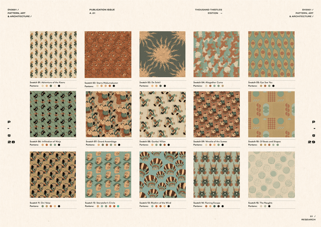
/ PATTERN SWATCHES

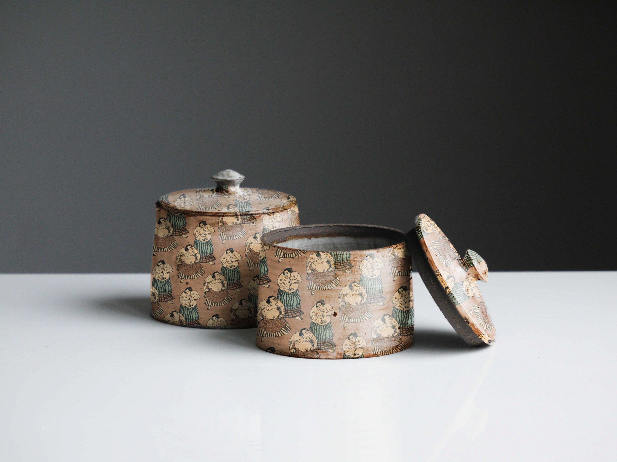
These series of pattern swatches are created based on the idea projected on a Japanese concept restaurant. The collaterals envisioned largely includes – Decorative Restaurant Wallpaper, Cutlery Set, Bowls and Plates, and Merchandises that will be made available for in-store purchase. Committing to the earthy tones palette, the interior style should look vintage, almost like an old painting with the richness of brown hues.

/ CHARACTER DESIGN
 

Project 3: UI/UX Interface Design 

Purpose: NTU STUDY GO WHERE

Theme: Creating an app to enable NTU Students to source for study seats during off/on-peak periods, within all study areas on campus.

Scan QR Code to view app on mobile:
/ REFLECTION

This project was the first UI/UX assignment that kickstarted my interest in this field. Having only a film & design diploma from polytechnic and a visual comms major in university, this area is still pretty new to me. However, I do see the similarities in terms of creating an intuitive design that is centred around the user, alike to graphic design in some sense. It was a fun and meaningful project at the very end of the day.


[Share your analysis of the creative portfolio/branding presence of the person you chose for your creative industry presentation] [What are the main platforms that the artist/designer uses to communicate their brand?]
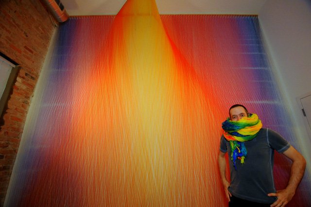
Artist/Designer – Gabriel Dawe

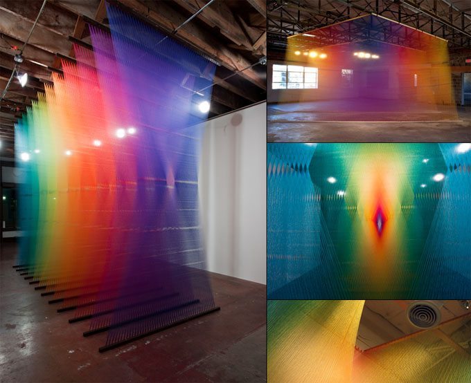
Dawe is a Mexican artist from Texas whose work is based on investigations of the visible spectrum of light. He largely gained renown for his Plexus series of installations of sewing thread.

Dawe’s Website  |     Dawe’s Instagram  |     Dawe’s Facebook  |     Dawe’s Twitter

Dawe’s appearance on Interview for Smithsonian American Art Museum:

Dawe’s appearance on Art & Seek Interview:


Also, see Dawe’s Interview with MyModernMet here.


[How do they utilise each platform effectively?]
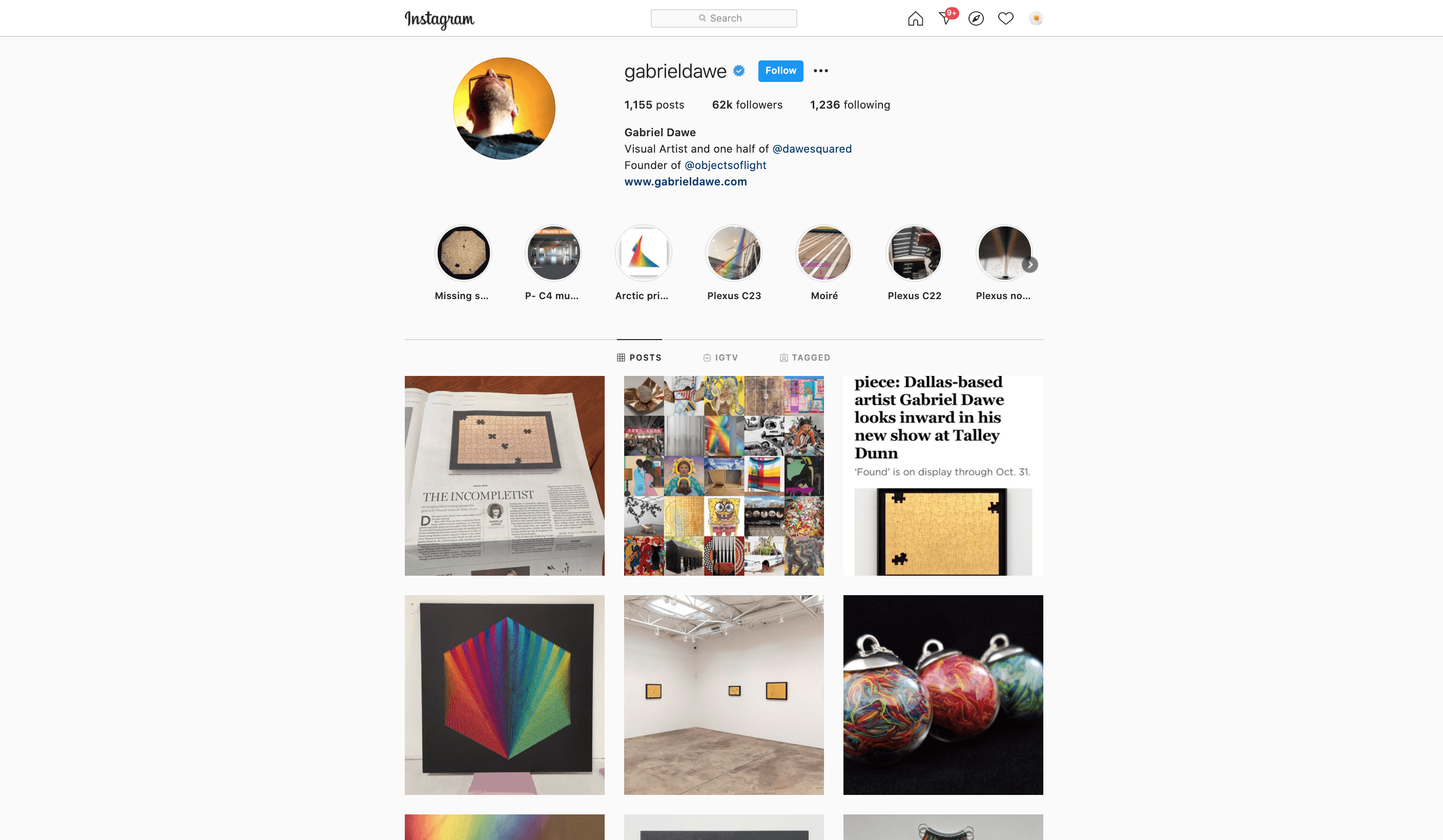
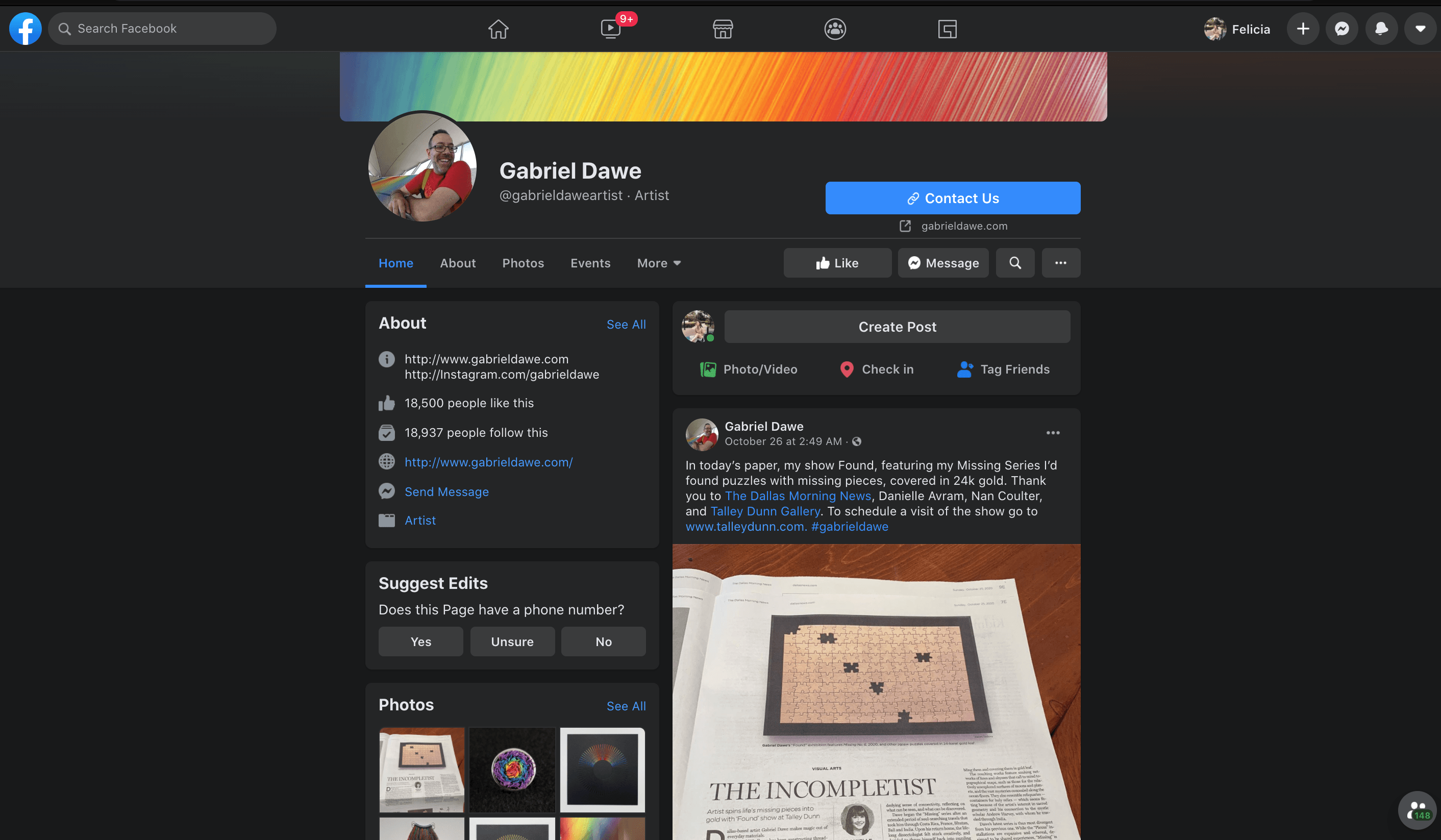
Artists like Gabriel Dawe try to get more followers on the mainstream social platforms in order to stay competitive and relevant in today’s fast and rising tech culture. Gabriel uses Instagram for example to receive people’s feedback and orient public discourse. He would post his work in progress and his final installation on his feed to ensure that the masses are kept up to date with his latest buzz. This is also great for publicity especially when he spends so much time setting up and curating an installation. Dawe uses Instagram to his advantage to reach a global audience, beyond just the city of Texas. Instagram also serves as Dawe’s secondary portfolio page (apart from his main website), as the feed layout provides a concise collection of his artworks in chronological order.

Dawe streamlined all of his updates and latest activity across all of his social media platforms such as Twitter and Facebook to his Instagram so that he doesn’t have to manage his activities separately. This effectively saves him time and yet, at the same time, he is able to update to different masses that reside on different media platforms.


Dawe also accepted several face to face and recorded interviews to increase his publicity. On the Youtube Video attached above, Dawe is seen on an interview with the Smithsonian American Art Museum where they provided snippets of the artist working on-site from start to end so that people understand his thought process behind his installation and how it is accomplished with specific tools and plannings. By doing this, Dawe can potentially increase his exposure to more of the museum-goers and art enthusiasts, a technique to market and sell his art to possible future clients and collaborators.


[What did they do in their biography to communicate themselves effectively?]
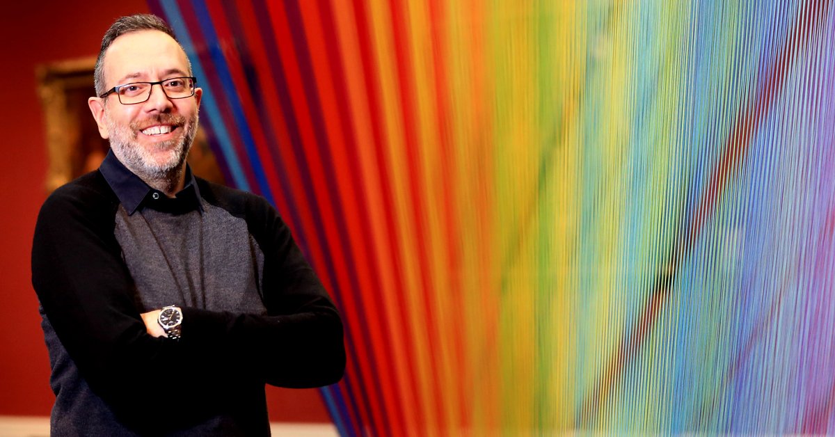
/   An abstract of Gabriel Dawe’s biography from his website

“Originally from Mexico City, Gabriel Dawe creates site-specific installations that explore the connection between fashion and architecture, and how they relate to the human need for shelter in all its shapes and forms. His work is centred in the exploration of textiles, aiming to examine the complicated construction of gender and identity in his native Mexico and attempting to subvert the notions of masculinity and machismo prevalent in the present day. His work has been exhibited in the US, Canada, Belgium, and the UK. After living in Montreal, Canada for 7 years, he moved to Dallas, Texas, where he obtained his MFA at the University of Texas at Dallas. For the final two years of his degree, he was an artist in residence at CentralTrak, the Artist in Residency program at UTD. His work has been featured in numerous publications around the world, including Sculpture magazine, the cover of the 12th edition of Art Fundamentals published by McGraw-Hill, and in author Tristan Manco’s book Raw + Material = Art.”

Alongside with his education background and his featured solo/collaborated exhibitions around the world. Here is an example of the presentation:
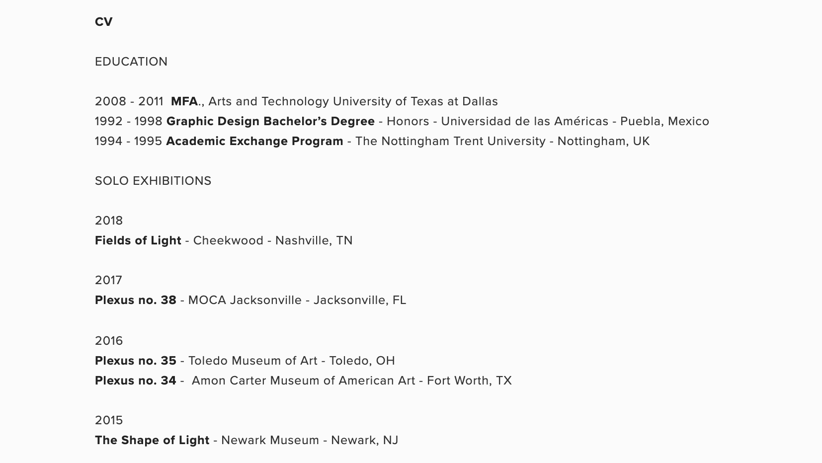
Gabriel Dawe is highly detail-oriented when it comes to the documentation of all of his past and current exhibitions. I feel that by doing so, he is able to successfully showcase his expertise and experience in his area of work, which all in all proves that he is a competent and trustworthy artist no matter where he goes.

Besides that, with all of the details recorded on his biography, people is able to search on google easily if they are interested in a specific installation from a specific site/place. This effectively prevents confusion as he logged down all of the minute details.
 

PLEXUS ART by Gabriel Dawe

DOWNLOAD LINK FOR PDF VERSION (REPORT): HERE

DOWNLOAD PRESENTATION SLIDE: HERE

The Artist that I want to talk about today is from Mexico, his name is Gabriel Dawe. For more than 10 years now, he has been consistently creating site-specific installations made up of rainbow coloured threads. Like many other artists, he started off as a humble graphic designer, and eventually, his career path took a turn and he slowly started generating works based on his passion in Fashion and Architecture. The thread used in his artwork represents the sewing machismo of his home country where men are frown upon if they perform tasks deemed to be feminine. His grandmother would often forbid him to pick up the sewing needle as a kid, thus in his later life, he decided to use Thread as his main medium, using this as an attempt to explore and subvert the social constructs of gender. Since the nature of his thread installation is complex in nature throughout all themes, he named them “Plexus” (noun, an intricate network).

To Gabriel Dawe, Fashion and Architecture share one thing in common: The Human need for shelter. The main function of clothes and buildings is to protect an individual and to provide sanctuary. Each installation is painstakingly put together, and many wonder what happens to these thread after installation is dismantled. Gabriel collects all the threads and sorts them according to their colour, and in continuation, proceed to create another piece of artwork which he calls “Relics”, which subsequently gives it a second lease of life in a compacted box. His artwork is at the crossroads of textile, art and perception – put together in a creative and dynamic way. His work brings about a sense of tenderness and serenity to its viewers and beyond just that, it encapsulates the artist’s growing pains and his gripes with societal issues.

Gabriel Dawe - Installation Artist - The Cool Hunter - The Cool Hunter

Bibliography:

Adler, Maggie (2016). Embodied Light. Amon Carter Museum of American Art. p. 7.

Gabriel Dawe Visual Artist. (n.d.). Retrieved September 12, 2020, from https://www.gabrieldawe.com/

Shovava, Day, T., Comma, & Colorsheets, V. (2018, July 06). Interview: The Artist Who Stretches Delicate Strands of Thread to Produce Awe-Inspiring Rainbows Indoors. Retrieved September 12, 2020, from https://mymodernmet.com/gabriel-dawe-thread-art/


 Word Count: 300 words

Project ZOO OF ODDS – Ideation

YES! Welcome to the documentation of my final project of the sem. For applied illustration, the theme which I will be focusing on is……. ZOO OF ODDS! Clearly, the name suggests animals and oddities! So excited, I can’t wait to start. 

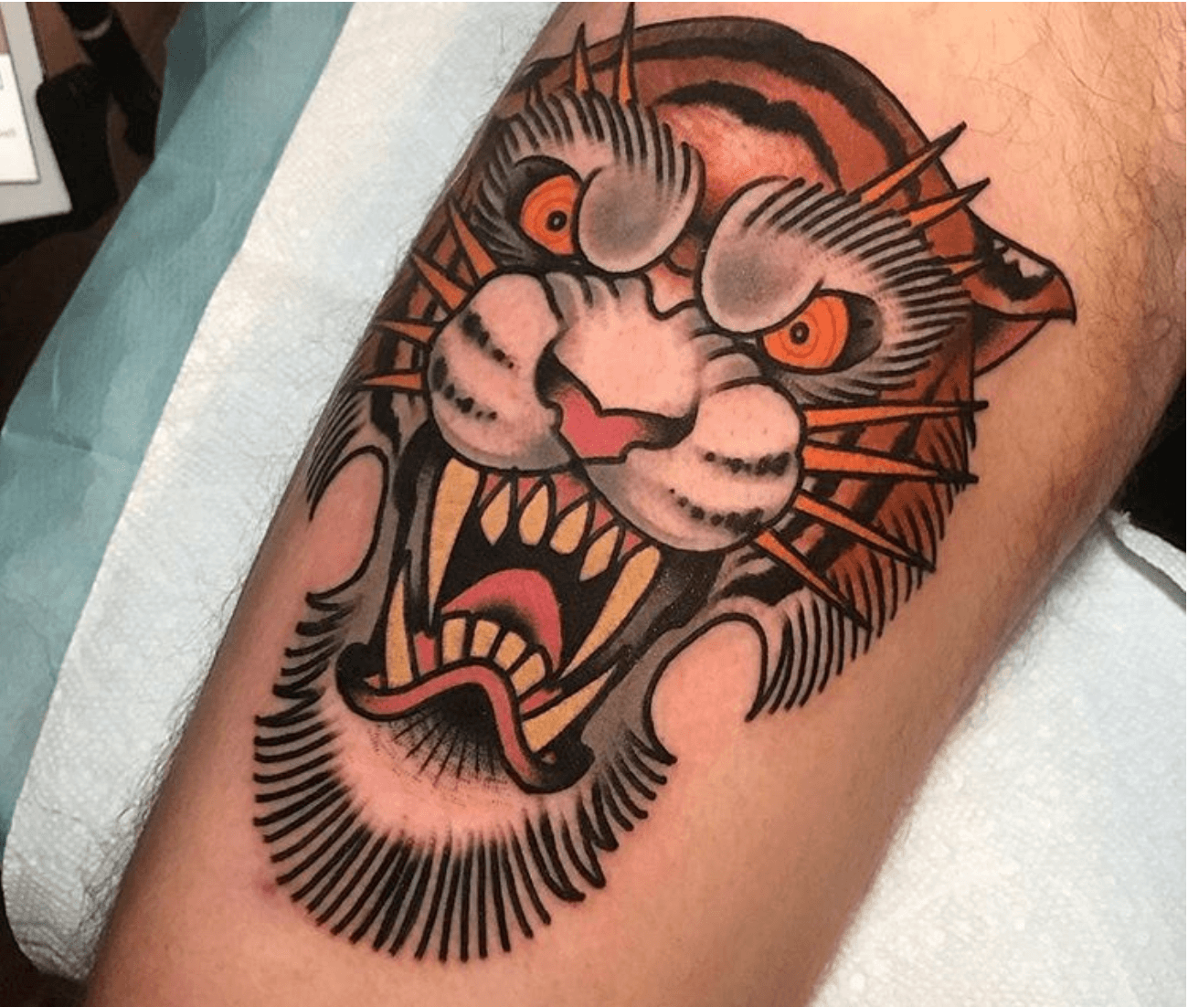
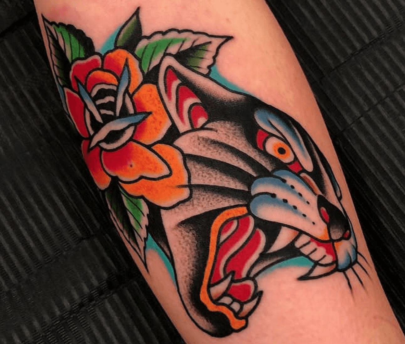
Let’s begin on some design inspirations first. I really want to explore the old school tattoo illustration style and I personally feel that this particular theme is so unique and bold – something that holds so many strong characteristics that makes it so distinguishable as a style. I looooove.  

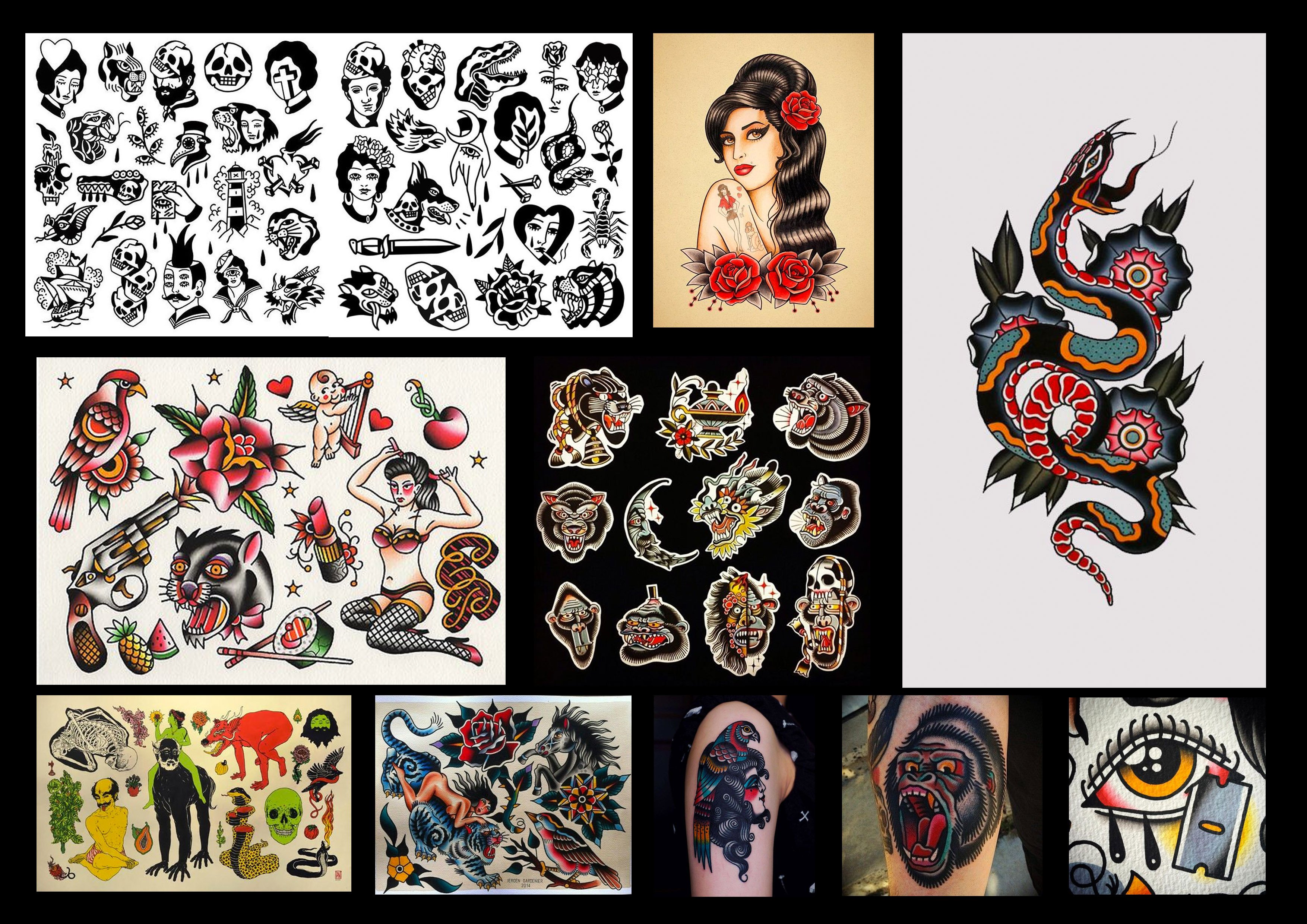
There are quite some interesting artworks I found on Inkstinct.co and here are some of the examples that are available for my tattoo illustration studies: 

Now on to moodboard execution:

Illustration Style: Thick, define lines, and 2-dimensional illustrations are what represents old school art best, in my opinion. 

Color Scheme: Leaning towards the almost dull, muted tones, I feel like this carries a prominent vintagey vibe to it. Since most old school tattoos are defined by thick, solid lines that encapsulates the traditional ink colours, such palette would be a good reflection of my selected topic. 

Typography: Something that will go well with the graphics will be prominent and loud typography that screams old school. I am thinking of using blackletter/decorative typefaces to compliment the theme.

For my final deliverables, I am looking at a Poster design for advertisement of the event, Lanyard tag for guests, Tote bag (merchandise product), a Gift Box that comes with every souvenir purchased and finally, the event Ticket Stud that grants admission for guests.


Execution:

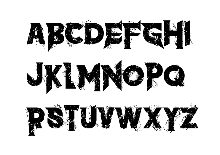
Logo for the event is as follow: I chose an edgy looking typeface that foreshadows the ominousity that awaits. 

Color scheme: I imagine my poster to have a dark, if not black background. To make colors more apparent, I decided to use colours like royal blue, crimson red, and dustier schemes to go against the dark-toned background. 


Illustrating Process:


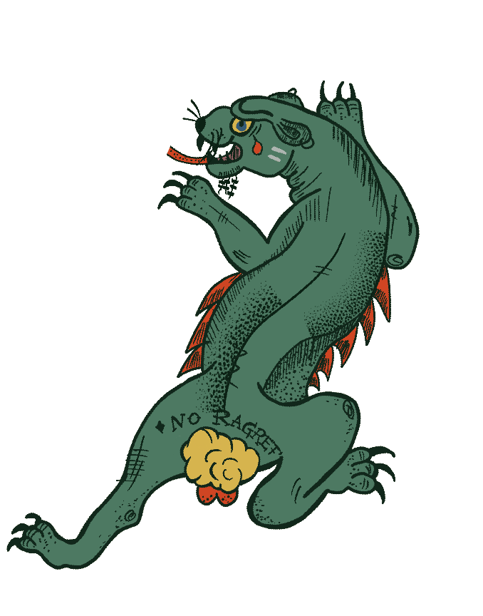
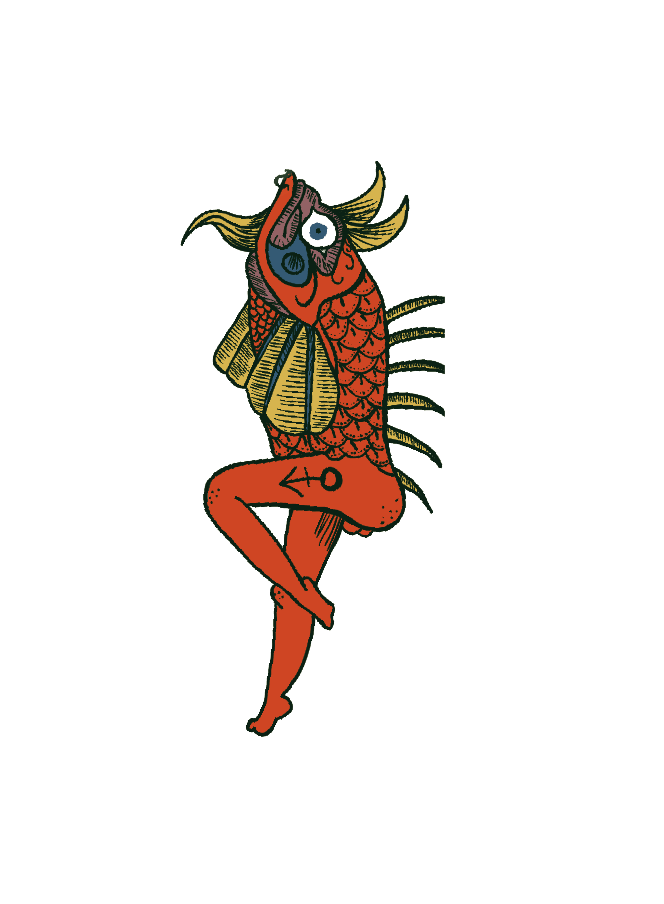
More on completed characters to finish off my poster and collateral design! There was quite some bit of trial and error process to get the style nailed down. I had to experiment on the strokes as well as the shadings on the animals to enable more character on each illustration.


The next post will be on Final Collaterals! Stay tuned. 

Research & Conceptualisation – Self Portrait

Actualising a Self-Portrait

Welcome to Part 1 of the Project, where I will write about the inspiration behind the very project I have here with me: Stylised Self Portrait. Once I got home, I started drawing a basic mind map about myself – which includes my hobbies & (food) interests. Personally, I would very much describe myself as a HUUUuuuUuUGe FooOoooooooOdie – Cause food is life, right? Who can resist a bowl of piping hot noodles? Or a cone of beautiful, milky soft-serve plonked atop a crispy waffle cone. NOT ME!! I’d choose food over anything, anytime. Thank you, next.

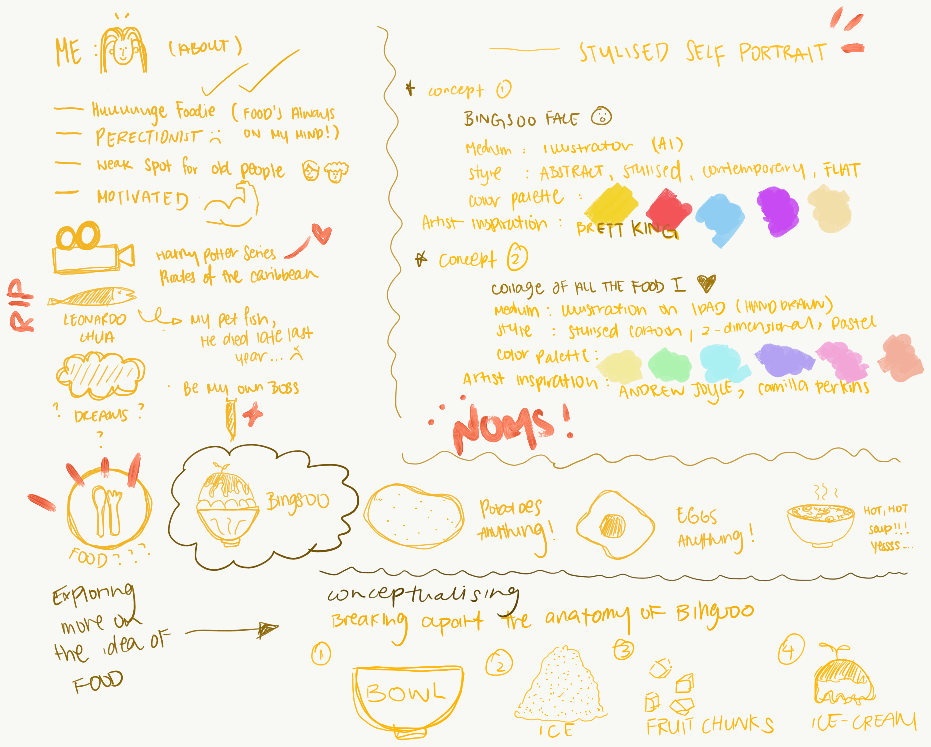
Here’s an overview of my thought process recorded in the form of a mind map: In essence, the image below speaks about the 2 concepts I have in mind and wish to execute. It includes the type of colour scheme I want to implement and as well as the medium & style for the portrait illustration. 

Conceptualising the first idea: “Bingsoo Face”

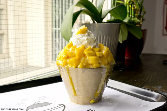
Bing soo is a type of Korean dessert, typically made from shaven ice + a myriad of saucy toppings and a bunch of freshly cut fruits. This is one of my favourite desserts and I ever dreamt of reincarnating to this perfect bowl of icy goodness. Below is an image of how it looks like! 

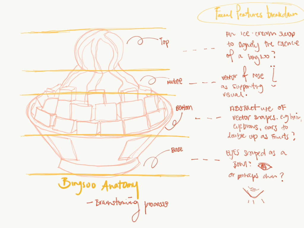
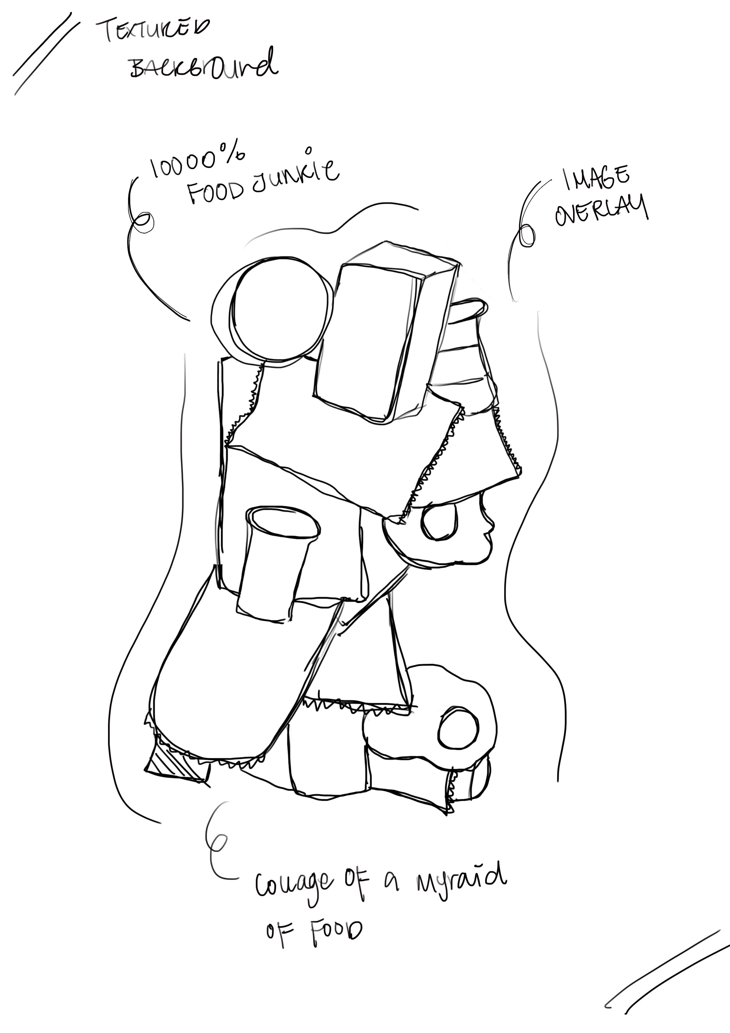
I thought it would be interesting if I were to break up my facial features and build the anatomy of the Bingsoo structure. Below is a rough sketch of how I imagined the split section to look like: 

By splitting up my facial features (e.g. eyes, nose, lips, ears) and simplifying them into basic shapes like oval and circle, to build the structure of this yummy tower. I thought I would go full on abstract with this one to avoid being overly literal and representational of an actual face but at the same time describes my favourite food. 

Artist References:

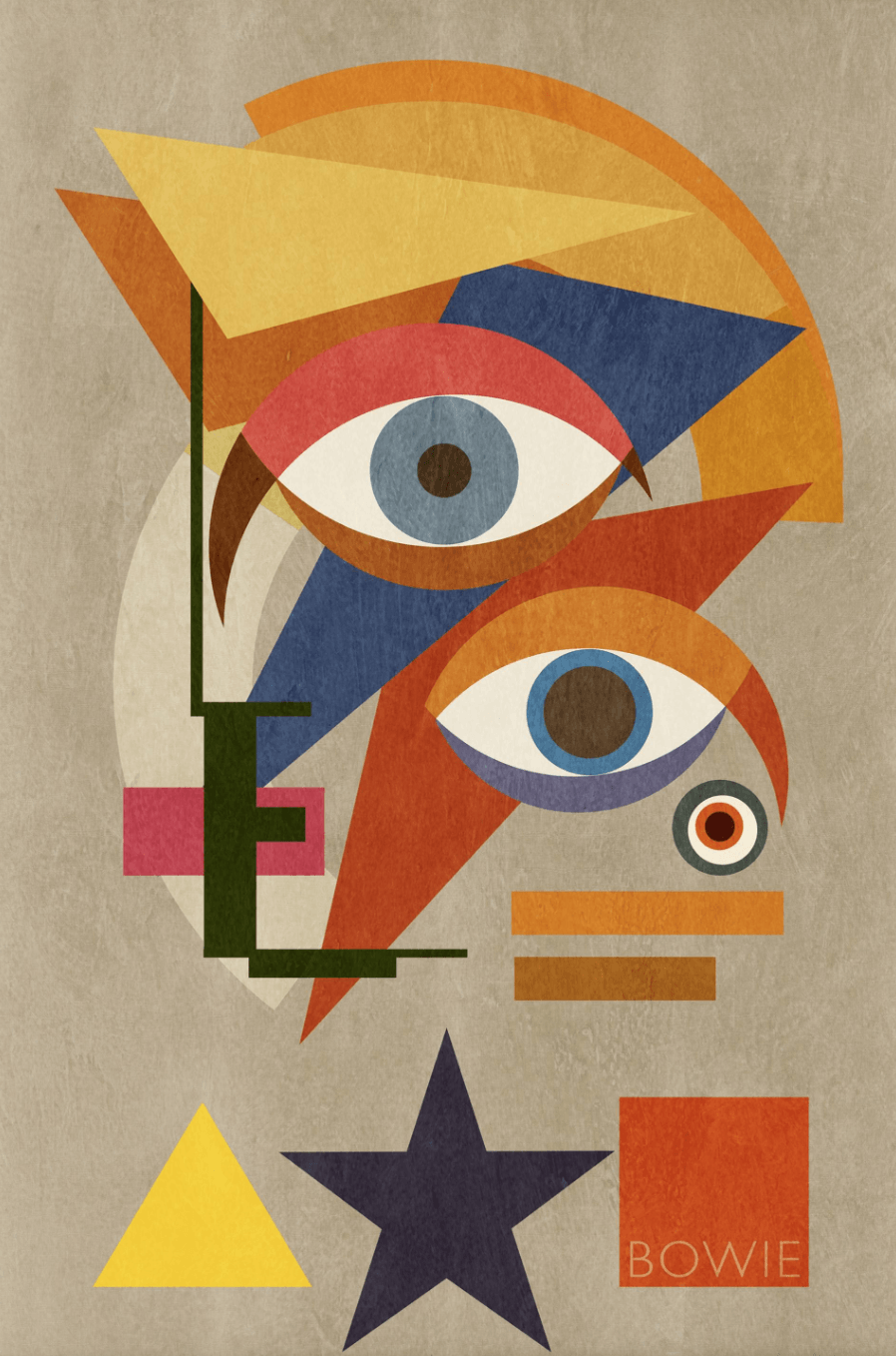
Jack Smith has a few ranges of works which I adore, in terms of his interpretations to abstraction really fascinates me. His works are often greatly influenced by the Bauhaus movement, and one of his remarkable creation of David Bowie’s Portrait resonated with me. 

cr: https://www.saatchiart.com/art/Collage-Bowie-Bauhaus-THREE-David-Bowie-Portrait-2016-XLarge-Unique-Monoprint-1-1/672079/2851449/view?utm_source=collectors_non_purchasers&utm_medium=email&utm_campaign=2006&c_aid=non_purchasers&c_crid=presents2&c_xid=090116&utm_content=090116_non_purchasers

The choice of colours used was fantastic and well-coordinated throughout. I especially like the contrast between the primary colours, which is what made this piece stood out. The mix of geometric shapes kind of hint at the influence of Futurism and Bauhaus combine. The almost “random” placement of his deconstructed face gives it more depth which is able to peak interests amongst people. The smack centre composition and the tiny white space around the border frame up the structure of this albeit simple looking but well thought through piece. With all the playful “thoughtless” placement of objects, the art piece made David Bowie seems like a free-spirited person. I am mainly inspired by the thought that was placed behind the creation of this portrait, a rather anarchic approach to making art that perhaps not many can agree on.

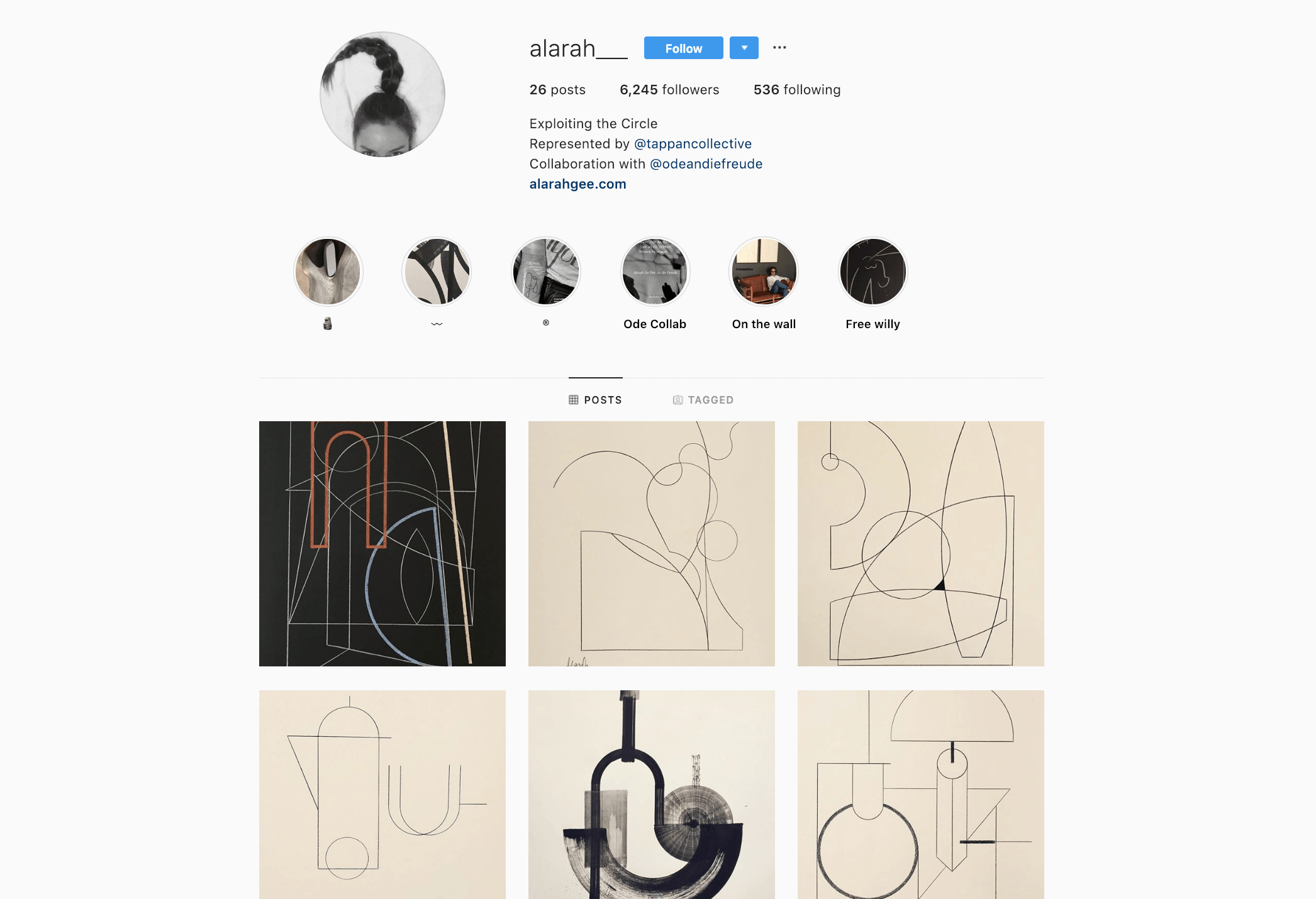
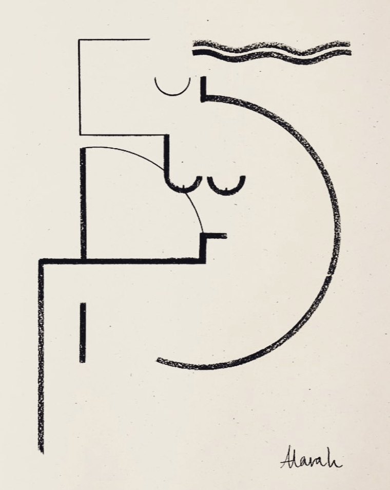
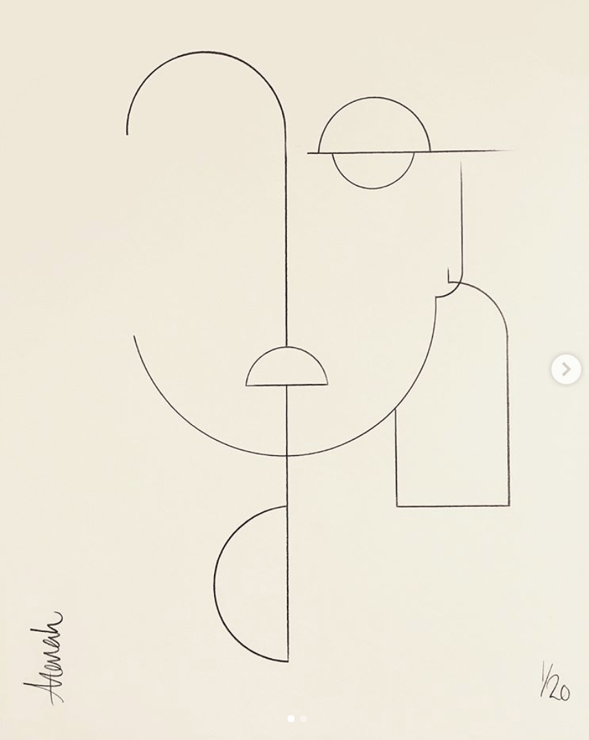
Besides Jack Smith, there is also another artist/designer whom I adore. She goes by the name of “Alarah” on social media. Her style is super minimalist, usually accompanied by a few strokes of lines to illustrate dynamism and shapes. Her is her Instagram account which documents some of her works.

cr: https://www.instagram.com/alarah___/

I am not usually attracted to minimalism but her clean style caught my eyes. It’s funny how a few simple strokes can portray so much meaning, just as much as a maximalist work. Sometimes, less really is more. Lines are so powerful they have the ability to provoke thoughts. 

‘REFLECTIONS’ 2017 (Coal on A2 Eco paper)

‘ALUA’

With all these artist references, I came up with my first draft for Concept #1 – The Bingsoo Face. 

I employed a set of deeply contrasted bunch of colours to reflect the creaminess of an Iced Bingsoo dessert, and more so, the multi-sensory dimension that it has! You may have also noticed that each individual piece of shape has an accompanying texture which hints at the feature it was based on. For example, the light blue piece with zigzag lines reflects the flow of my hair. I wanted this layout to appear haphazard and anarchic, a way to reflect my free-spirited nature as I prefer to discover things along the way than to stick to a well thought through path. All these bits and pieces of vector shapes formed the anatomy of my favourite dessert! I thought it would be a straight-forward and interesting way to represent myself. The need to uncover each and every feature kind of provide an extra bit of fun for people to unravel/decode the meaning behind this piece. After sitting through the first consultation with Lisa, I realise that perhaps this is a little way too abstract! So I proceeded to hon on my (hopefully better) second concept. 

Okay, let’s move on to concept 2! 

Circle Food by Chris David

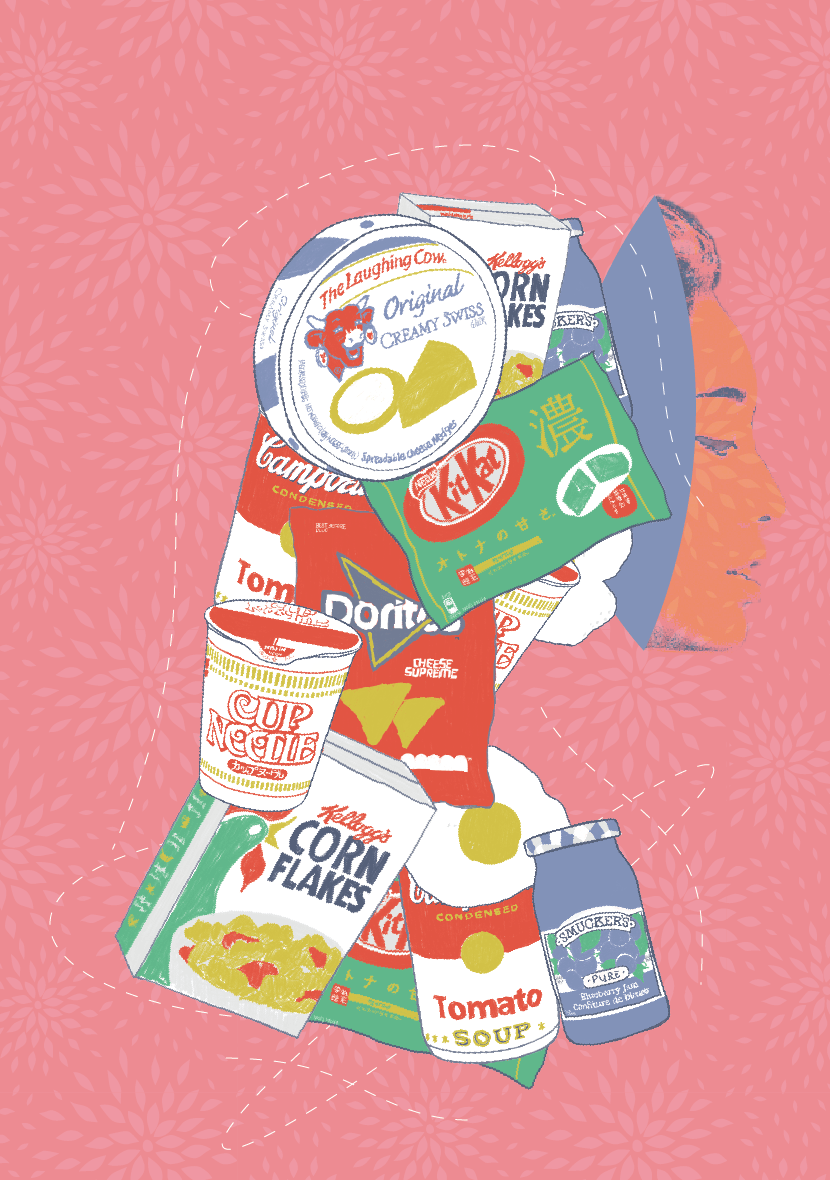
YES, MORE ON FOOD! The title of this work will be THE advent calendar (HAHA how uncreative). Essentially, it will be a collage of all the food I love, but at the same time, these food items form a silhouette of myself. 

Artist Inspirations

Unlike the previous concept, I plan on illustrating this on the Ipad, perhaps with a mix of media!  Here are a few of my all-time favourite concept works:

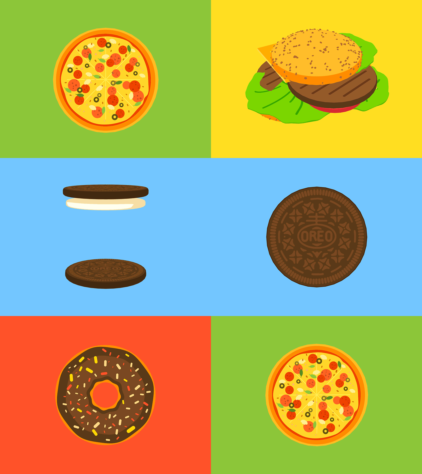
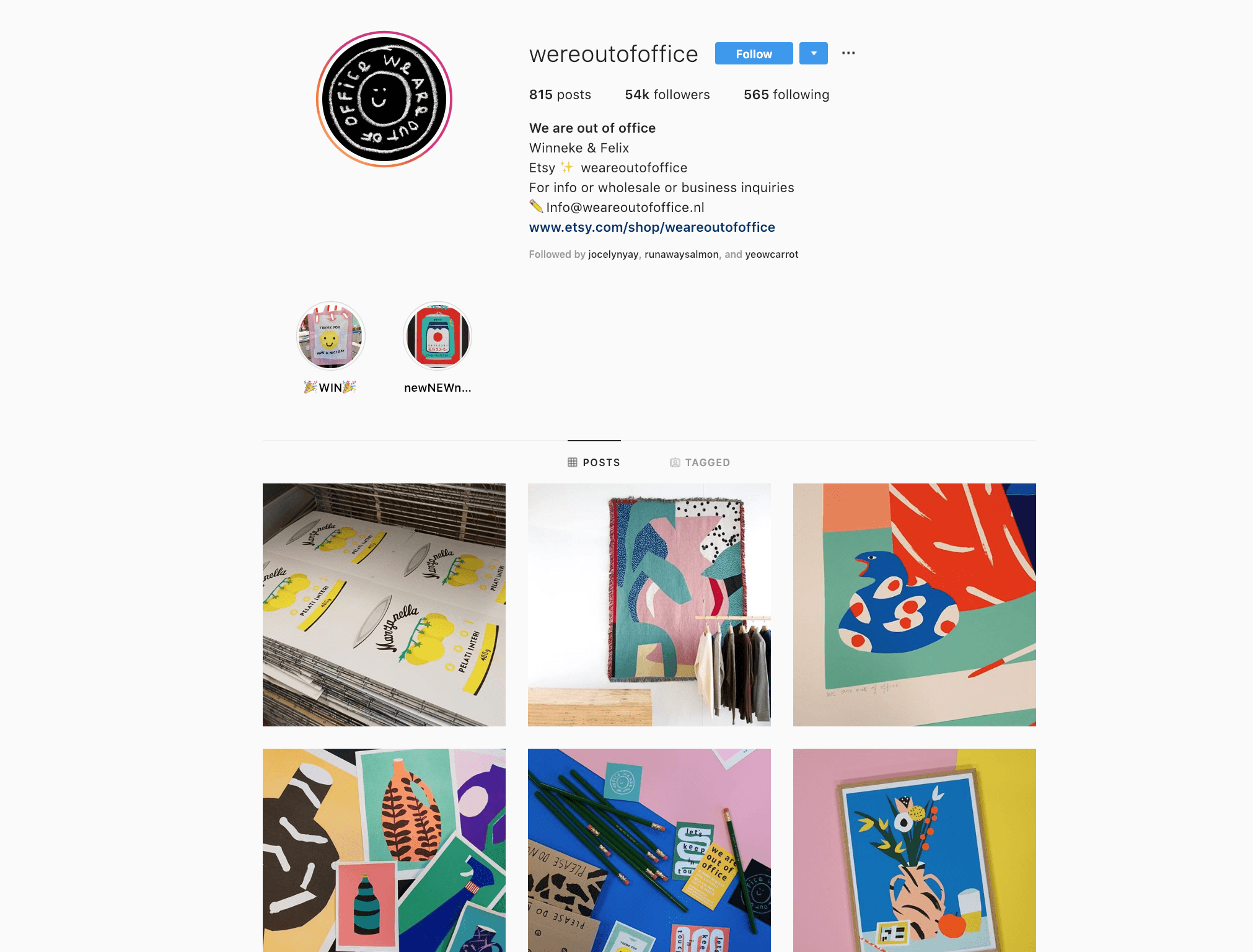
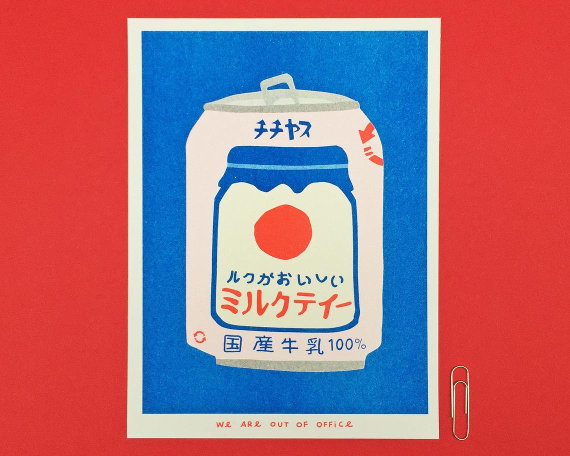
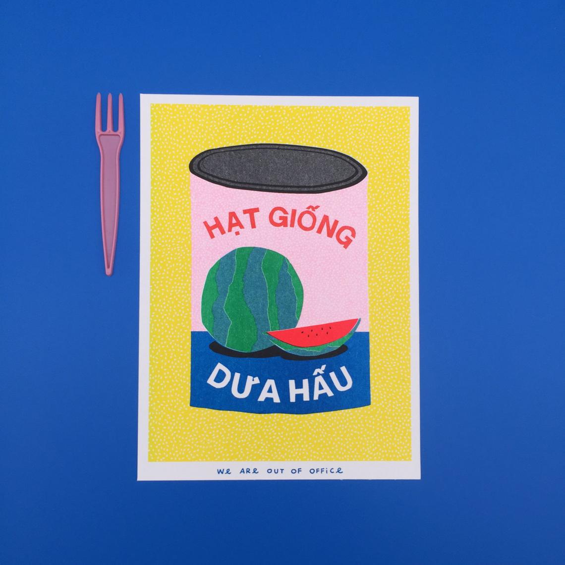
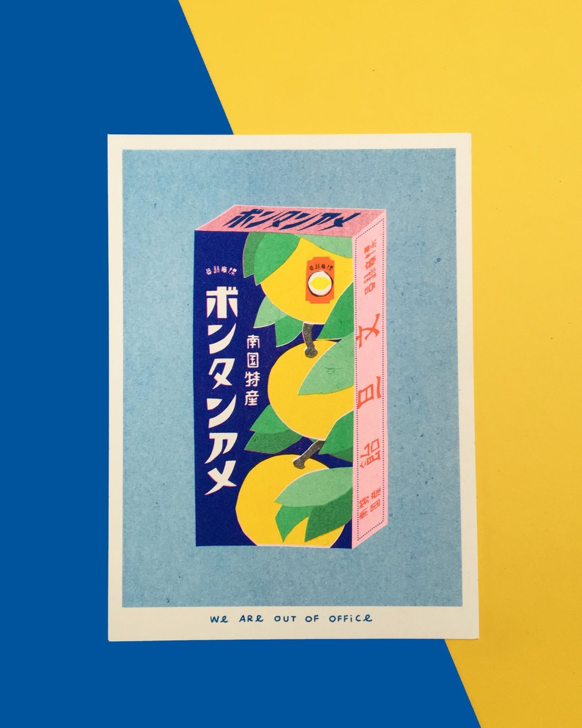
Works of: We are out of office

Can I just say I much I love their choice of colours?! These cards are actually risograph prints, that explains why the colours are so vibrant and poppish. The style of illustration is one big factor as to what makes their works stand out from the ordinary.  It kind of reminds me of the ever iconic Andy Warhol’s works.

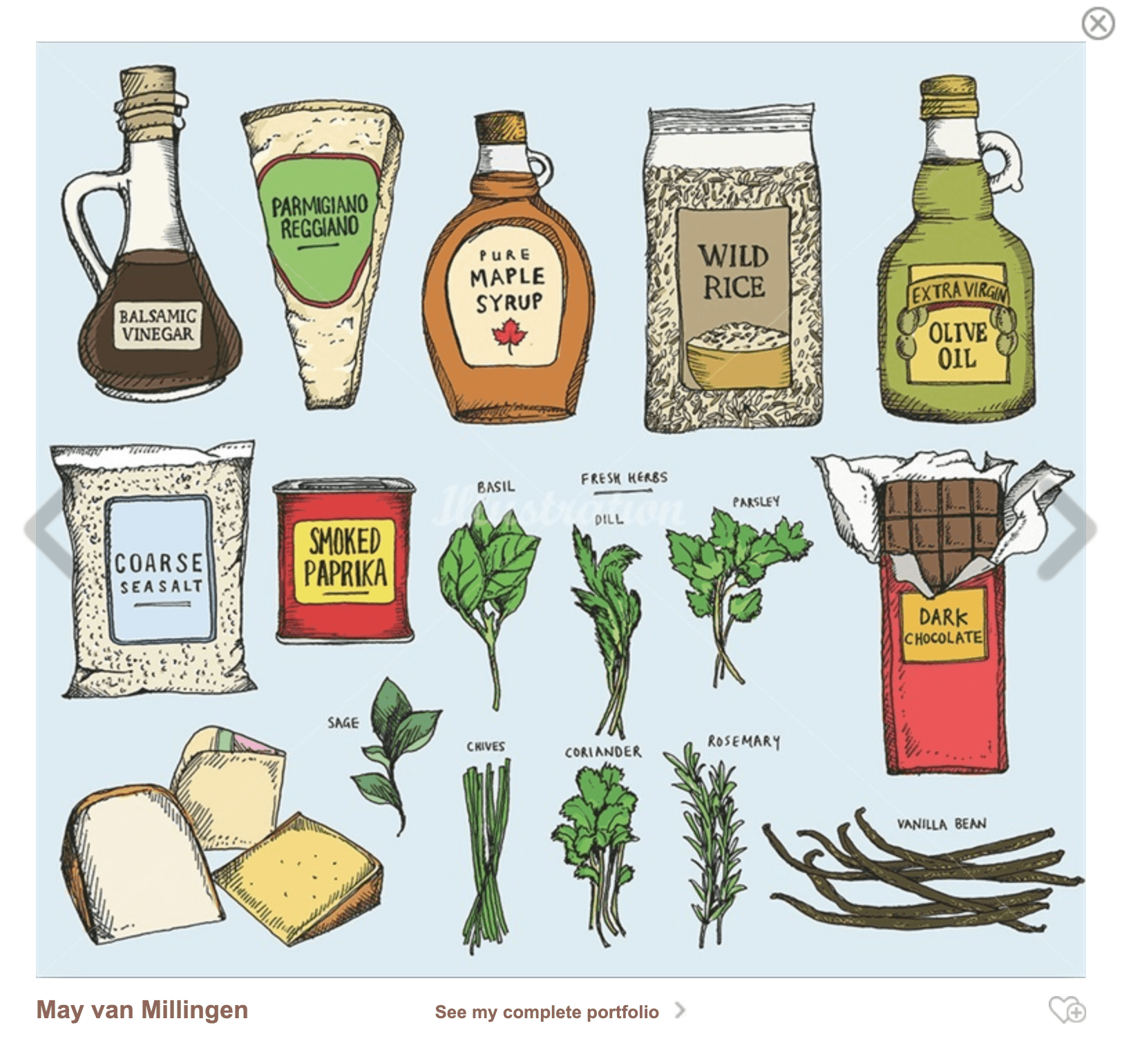
Works of May Van Millingen

May’s work often contains numerous drawings that come together to form a series. Her style has been influenced by old botanical and scientific drawings, which she often studies. She also combines hand drawing with digital processes and uses ink, pencil and watercolours to create her work. Her process usually combines mark-making, strong graphic lines, cross-hatched shading and bold use of colour which is what makes her work remarkably unique. 

cr: https://www.illustrationweb.com/sg/styles/food-and-drink

Here is my initial composition of how I visualise my artwork to be:

Listed below are some of my most most most bought snack/junk food that I absolutely cannot live without. Like chocolates, instant noodles, chips and cheese, tangy tomato soup, and fruit jams!! LOVE THEM TO BITS. Following through, I went on to create some illustrations based on the inspiration above. I want it to be stylised in a manner it doesn’t reflect too much realism, so it has a customise So here they are: 

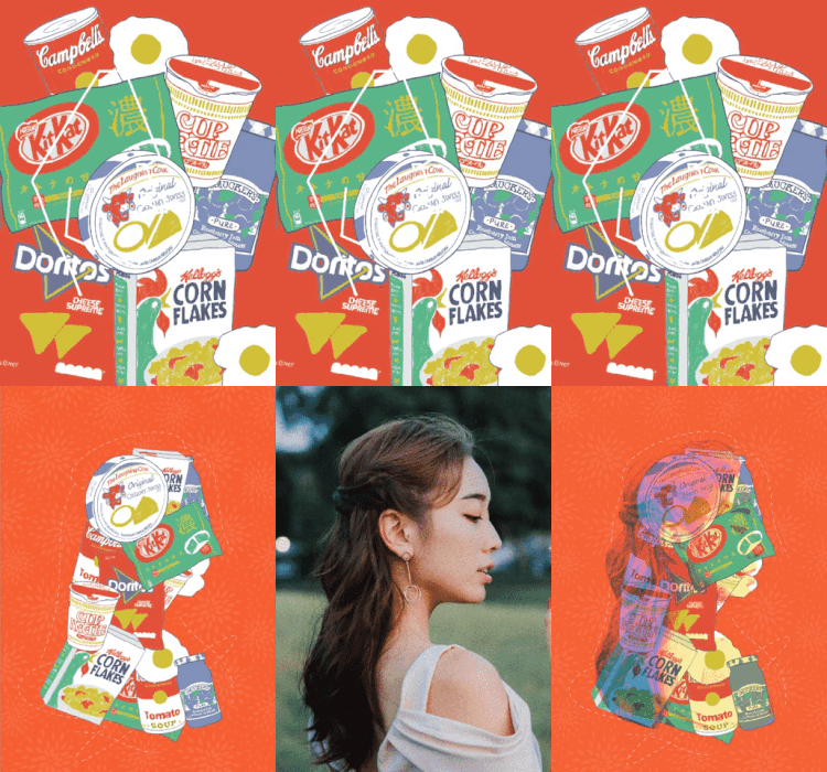
Colours are one of the most important aspects of design – The make or break perhaps. So when it comes to colour picking, The colours used were primary and secondary colours as I personally feel that selecting the right colour scheme can create the suitable kind of ambience and set the mood right. I gave the illustration a fine, blue outline and a similar set of colour treatment so all of them look consistent and overall the sketchy effect gives it a very personal touch. Here’s some of the behind the scene compilation of how I work with my layers:


I wanted the portrait to be of central focus, therefore, the placement of the portrait. The background colour (a strong contrast of red) that goes in harmony with the selected colour scheme compliments the vibe that I am aiming for, which also, resonates my cultural background – one that comes from a Chinese family amongst the Multiculturalism of Singapore. This gives my layout a stronger sense of rationality apart from my love for food. I also have repeated prints that resemble the traditional textile patterns that is almost representative of the culture – one that many can relate to automatically.  When consulting Lisa, she noticed that perhaps the overall visual interest can be further peaked with the image of myself superimposed against the food collage. I tried it out and indeed, it looks brilliant!

This is one of the many attempts on creating a better visual interest instead of using the entire image as an overlay. The whole idea behind the concept of this is to illustrate the facade I put on, when deep inside, I am actually just a food junkie. The masquerade concept didn’t really work out the way I imagined so I decided to drop that and continue fostering on the current idea I have.

This is the pre-final layout that I (almost) settled for, but still, I find that there are still ways that I can improve the layout further. I guess it would require a few more layers so that it helps to tell a more compelling story visually. Read the next post to check out the final changes I made to the self-portrait.

Click here for the final reflection. I’ll see you there.

Thanks for reading! Ciaos.

Outcome – Self Portrait

Read my progress here: Click

Final Layout: Initial Progress VS Final 

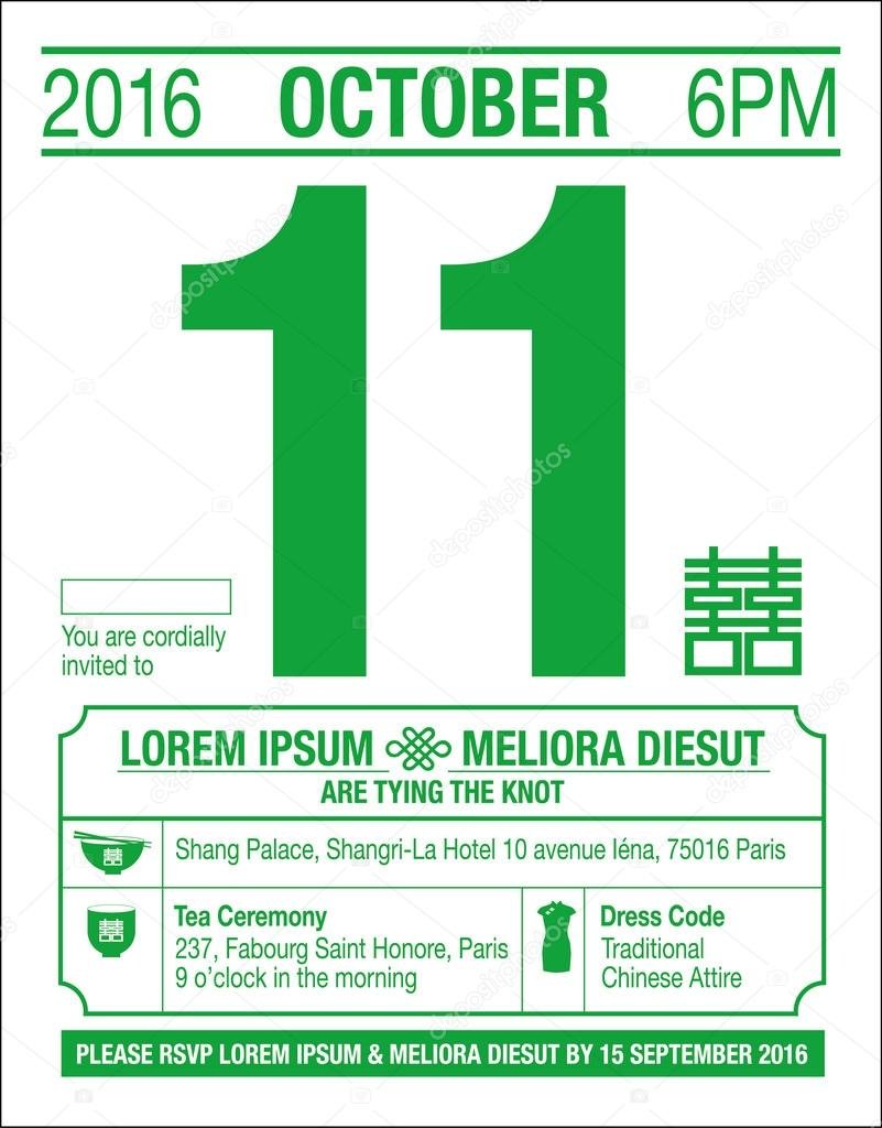
I decided to frame my composition to something that resembles a Chinese calendar (I will insert a picture of it below) which is a reflection of my ethnicity background, especially being in a multi-cultural country, patterns and colours can hint at a certain tradition/culture. Therefore, with hues of red being the most prominent colour, I thought this can better bring about a sense of festivity especially for a time like now, ITS THE CHINESE NEW YEAR! 

P.S: It is my favourite holiday as I get to indulge in the most sinful snacks as well as receive money from Red Packets! Two of my most loved activities (Talk about a win-win situation!) 

The traditional Chinese calendar

The mandarin text in the border means “Food is life”, and the subtle details such as the date further build the impression of this being a Chinese Calendar. The dates that were written below signifies my birth date, a representation of the beginning of my life that reflects the ideology behind this advent calendar layout. More than just that, it is a reflection of my upbringing under the care of very strict and traditional parents. The traditional aspect, therefore, resulted in my personality as I am just a ball of shyness. The portrait is shying away to the right side to support my personality trait as forward facing portrait kind of suggest strength and confidence.

The random collage of food items in the background just brings out the quirkiness and vibrancy of my character as well as the stylistic aspect of hand drawing and detailing of the food packagings that brings out the personalised aspect of this portrait. 

Challenges faced:

As I attempted the food illustrations on the Ipad, I had to ensure that the brushes and colour scheme is seamless throughout each and every food packaging drawn. Restriction can sometimes be seen as a challenge as well, as you are only allowed to work within a limited ground with very specific tools. Experimenting with colours was quite a journey as well! I designed multiple colour schemes before finalising with the one above – which I am eventually satisfied with! Also, conceptualising the overall idea and theme is one of the hardest aspects, in my opinion. Besides just realising a portrait, I want my design to be able to tell a “compelling” story. 

This is the end of my journey for project one! Thanks for following! 

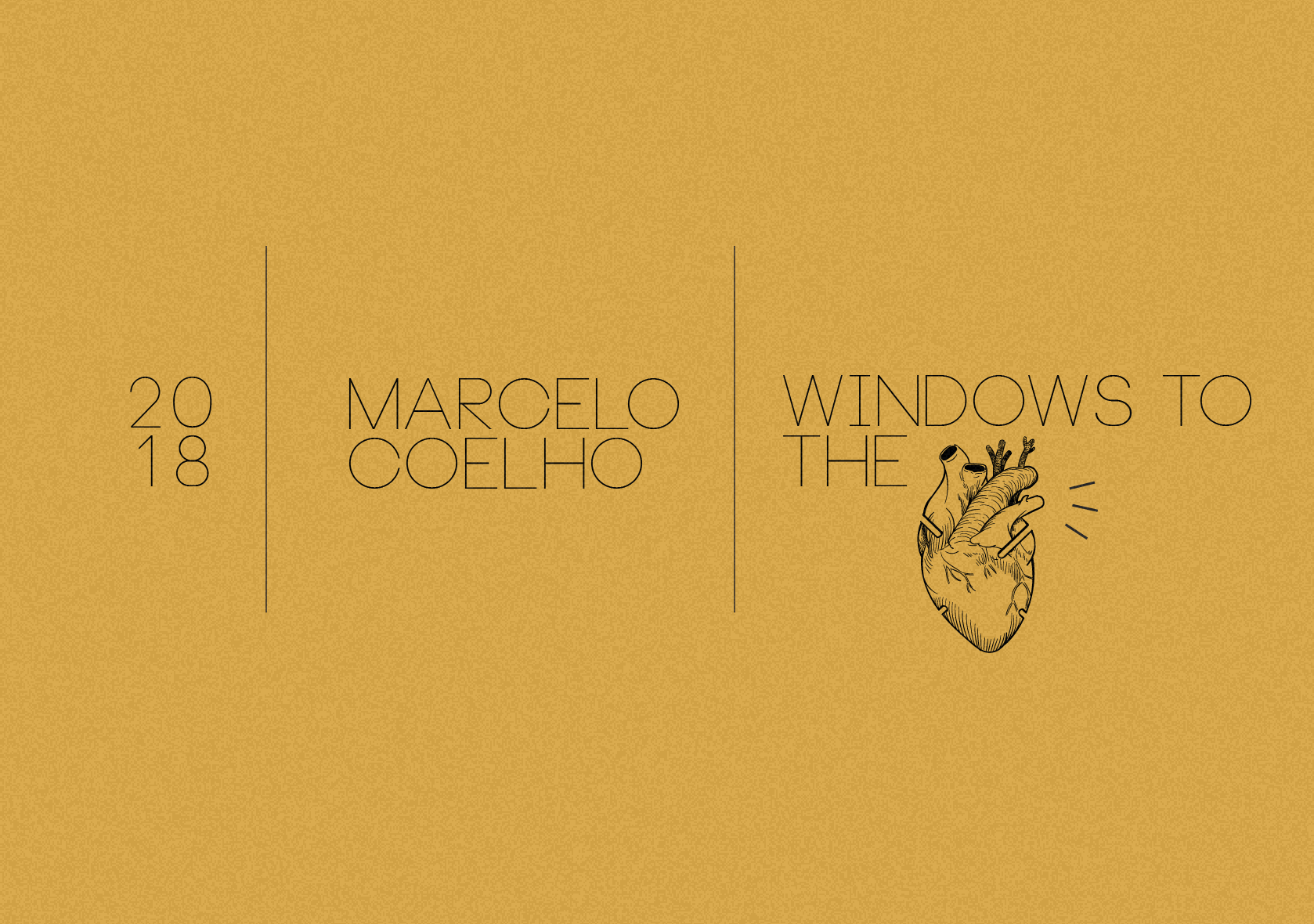
Hyperessay: Windows to the Heart (Coelho, 2018)

About the Artist

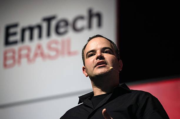
Marcelo Coelho – The rising pied piper to the world of interactive media is a Brazilian designer/artist that sets his focus on interactive installations, photography and robotics. Being a contemporary artist of this age, he made a proper mark on the current art scene by relating to current issues and first world problems. This made him highly retable among the crowd and even though he is understated, his works are slowly emerging to be among the worldwide praise.
Coelho wants to challenge the masses’ perception of material goods and this drive won him several recognitions like the Designer of the Future award and an honorary mention for Interactive Art. He has many memorable works and some of them include Sandcastles (a collaborated work with another artist), Hyperform and Windows to the Heart (WTTH). I chose him as a subject to my hyper essay and here is why.

http://www.cmarcelo.com/window-to-the-heart/

http://www.cmarcelo.com/window-to-the-heart/

Background Information

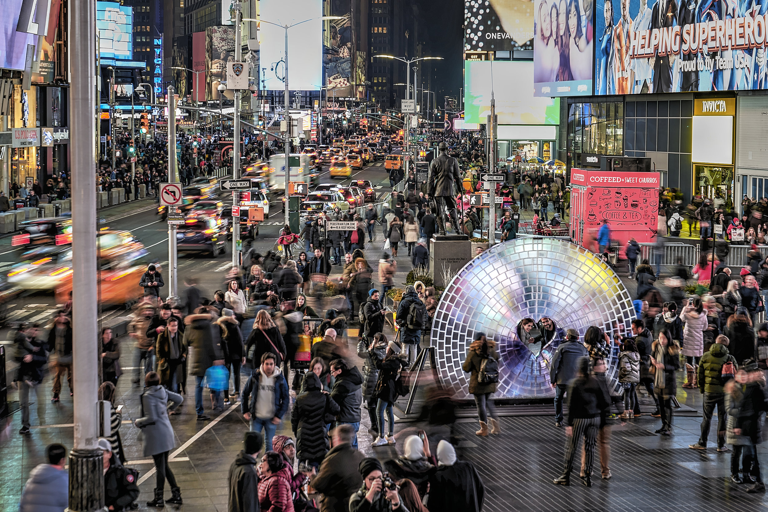
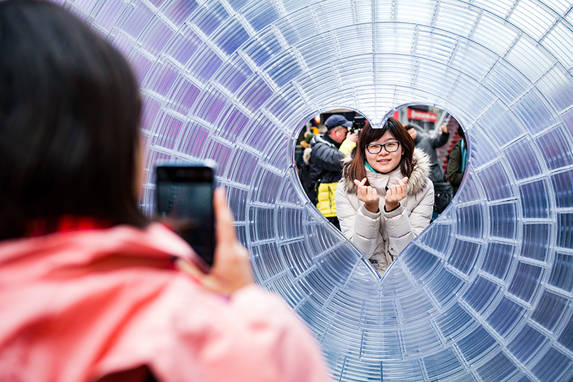
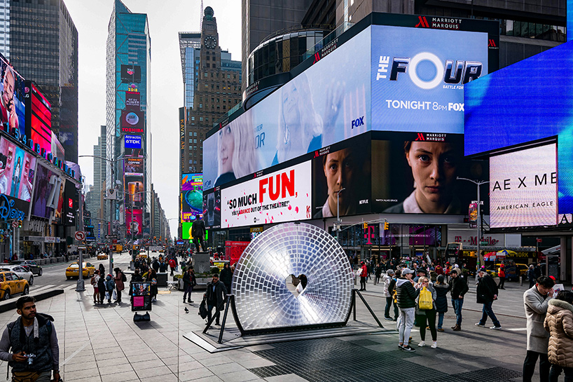
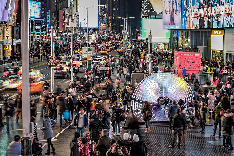
Early this year, Times Square Arts introduced the winner of this year’s Time Square Valentine Heart Design and Coelho’s work emerged as the top! Windows to the Heart (2018) graced the streets of New York Times Square, a bedazzling resin-made set up that lit up the vicinity during Valentine’s Day. Many couples got proposed in front of the very set-up and it marks a very significant moment for them. The iconic area is an effective symbol of the digital age, where people are so affluent with the upkeep of the ever-advancing technology.

Locals and tourists stroll under the pulsating lights of the ever towering digital billboards and advertisements. In this aspect, the Time Square is an emblem of a physical manifestation of our culture, the digital age where the documentation of daily life is represented on tiny squares through social platforms – A way to glorify the mundane. The use of digital devices became prevalent, instead of appreciating the moment, we choose to view reality behind the tiny screens of our phone, firing the shutters away. Being one of the world’s most Instagrammed area, the location reflected the rationale behind the very project.

Rationale/Analysis

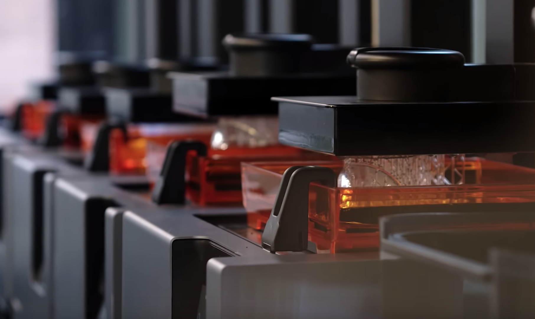
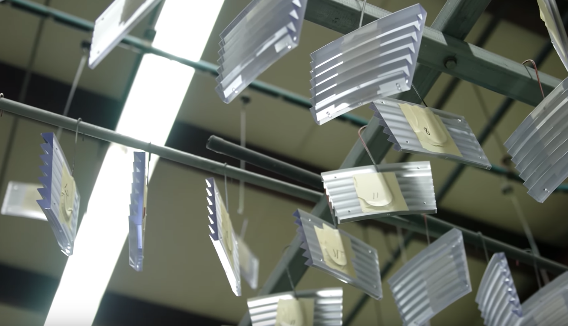
The camera lens, an unsung hero of our computer age is quintessential in our daily life right now. Windows to the Hearts installation is 3D printed using clear resin to pay tribute to the Fresnel-type lens. Coelho retained the optical effect of an actual camera lens as an attempt to triumph over ancient methods of lens making – This provides a mean for participating audiences to reimagine the world they frequently photograph.

As a huge embodiment of camera lens, WTTH serves as a reminder to not forget the fact that reality is distorted when viewed through mediums as such through all the filtering and sharing.  In doing so, they misrepresent the very fundamentals of seeing. One of the astounding facts is that WTTH, a 3 meters wide Fresnel lens is the world’s largest lens. This aspect is a unique selling point to Coelho’s work.

People can interact with the very work by putting their heads through the heart-shaped window to be photographed. The actual magic happens when the material of the installation optically bends and distort the lights that are reflected against the surface. Fuel by the city lights, the entire structure comes to life. The role of the participants become crucial because, without their participation, the rationale behind the work cannot come through. Being an interactive media, the main purpose is to communicate.

Conclusion:

As this set-up stands alone in the grounds of Times Square waiting for engagement from the users, it becomes impossible for Coelho’s work to perform if no participation and response were gathered at the end of the day through physical activity within a responsive environment. In view, participants can be seen as part of the work, spectators who are photographing the set-up become collaborators. All these aspects contribute significantly to the experience of the art piece. The terminology “audience” may be referred to as passerby who is viewing an installation. The activator then becomes a player, and viewing members, in turn, becomes spectators. When an action is taken, their role morphs into a collaborator. WTTH can be used as a collaborative experience, especially when it is placed in such a prominent location.

Coelho’s artworks balanced the different components in an aesthetically pleasing yet enlightening (literally) way. He employed a light-hearted technique to deliver his message across to the general public and this allowed him to reach more beyond a specific age group of target audience. People of different generation can come together and enjoy his captivating work of art and it is one without language, age or gender barrier.

Video Reference as follow: 

References: 

  • http://www.cmarcelo.com/#/window-to-the-heart/
  • https://www.designboom.com/tag/marcelo-coelho/
  • http://arts.timessquarenyc.org/times-square-arts/artists/marcelo-coelho/index.aspx
  • http://bustler.net/news/6106/aranda-lasch-marcelo-coelho-s-12-foot-diameter-window-to-the-heart-wins-2018-times-square-valentine-competition
  • https://www.archdaily.com/tag/marcelo-coelho

MARCELO COELHO – I Choose You

This is Marcelo Coelho. Never knew of him until I started this research phase, and I have to say his works are one of the most impressive few I’ve come across! He placed a lot of emphasis on the rationale behind every one of his live installations and focuses on the boundaries between matter and computation. His installations appeared at the Rio 2016 Paralympics Opening Ceremony as well as many other renowned museums worldwide. Being a Brazilian computation artist and designer, he also curated many wearable products and robotics. 

To briefly sum it up, I enjoyed this work titled “Window to the Heart” where the whole fixture was made of resin. (how very expensive!) Situated at the Times Square during the period near Valentine’s Day (2018), a few couples got proposed at the very spot where the illuminated installation was placed. I’ll delve deeper into the artwork in future time, but here are some visuals for you in the meantime. 

These are the top 3 most intriguing works, if you’re interested, please click! 

Window to the Heart

Alike

Beyond Vision

Guide to Memphis

Outline on Memphis Art Movement (1981)

Ettore Sottsass [13]

“I try and be as stupid as possible regarding my profession, which means I try to look at as few design magazines as possible.” is an iconic quote mentioned by the godfather of Memphis art movement – Ettore Sottsass.

Created in the 1980s by the Memphis group, the movement was strangely named after a song by Bob Dylan on one of their collaborative meetings. During its initial release, the “radical, funny and outrageousness” [1] of the art style was despised by the masses. The original intention of Memphis, though, was never about conforming to the societal standard of what “beauty” means – It essentially disregarded what was considered as “good taste” at that era. Inspired from art styles such as Pop Art and Art Deco, the influence is apparent in terms of the usage of vibrant colours and patterns, and the heavy rotation on geometric shapes that shapes its primary aesthetic. These characteristics are significant aspects that make up these movements.


Example of a Memphis’ Icon

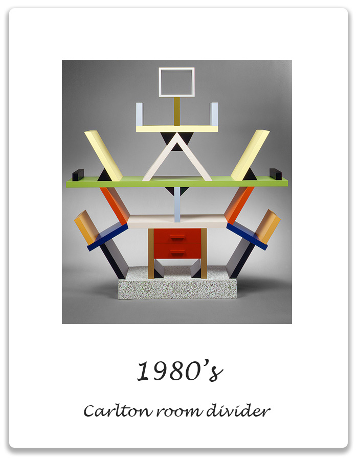
1980, Carlton room divider [13]

Sottsass (1917 – 2007) once said, “I believe sensoriality is the most primitive, the most immediate thing. If I want to rethread hypothetical origins, I must concern myself with the senses.” – It is a reflection of his perspective on the importance of engagement with our 5 senses and the object.

The term ‘sensoriality’ is evidently emulated in many of his works such as the exemplary Carlton Room Divider. The use of vivid colours enticed the visuals unlike the conventional furniture is seen in the market. Despite the avant-garde appearance, the 1.5m tall bookshelf has an underlying “logical structural system that has an implied equilateral triangle.” [2] The idea of play and experimentation comes into mind when one looks at the iconic, yet monumental spinoff.

Key Features and Characteristics

One sure fire way to identify a Memphis artwork include the use of bold colours, haphazard presentation of geometric forms and the use of plastic laminate as material. Designs are usually seen to be accompanied by a flat, vectorised layout with plenty of use of strokes and squiggly lines. These elements can be used as a sense of direction for the human eyes. In graphic/web design where typography is the concern, blocky sans serifs are often the go-to choice for designers looking for a Memphis style.

Generally, colours like yellow, orange, magenta and teal are the more prominent choices reflected in these artworks. Colours are strategically used to evoke and provoke strong emotions, thus encouraging intercommunication and engagement. These are what subjected the group to derision. Being the epitome of quirkiness and un-conventionalism, most people find the style to be of an acquired taste. [3]


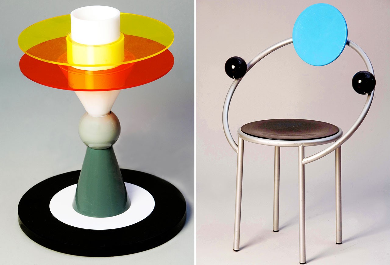
Left: Ettore Sottsass, Bay (table lamp), 1983. Right: Michele De Lucchi, First (chair), 1983 [14]

George Sowden, Metropole, 1982 [14]


Key Influences

Memphis was created as “a form of reaction against the slick, black humourless design of the 1970’s where minimalism was largely practised in commercialised products.” [4] The group thought all of that sleekness was lacking in personality and individualism. To counter that, the designers were inspired to come up with bright, appalling works as a form of a unique selling point when it comes to marketing and consumerism.

When the Memphis movement spread to Milan, anti-modernist ideals started to form. To tackle the genesis of “soulless designs” deemed as the Bauhaus movement, the spontaneous designer hoped to construct exciting and lively design. With an aim to “reinvigorate the radical design movement”, the rule of “form follows function” was considered to be cookie-cut and conventional. The principles of Memphis embody the “irreverence, idealism and risk-taking of postmodernism, as well as the garishness of the decade it ushered in.” [5]

As opposed to Bauhaus’ rigidness, the free-spiritedness of this art movement is peculiarly apparent in the working style of The Memphis Group. It was said that the group was severely drunk when they were deciding on a name for the art movement. The word “Memphis” was playing on repeat in the background music and that was it!

As quoted: “’My brain is filled with holes,” Sottsass says, ‘‘and I was very drunk at the time, but I can tell you that the name for Memphis definitely came from the Bob Dylan song. The record was scratched, and everybody was so drunk that nobody could change it…” [6] Memphis as art movement echoes brilliantly in the history of art. Though it was consistently inconsistent with the up keeping of trend, let us not leave out the fact that it has impacted more than just the fashion industry but the furniture design realm. The unprecedented ethos of Memphis took the world by storm.


On Postmodernism as a whole

Through the use of impudence and the attempt to ridicule the “established values”, Memphis challenged the constraints in furniture design that was seen as intolerable. Strange groundbreaking ways were established in hopes to “reinvent an approach to design by rethinking its basic elements: material, surface, colour and shape.” [7] Conventional materials were used but in an indefinite unexplored manner. They have successfully married the term unorthodox with beauty.

Postmodernism preaches on the equality of all things. It is a reaction to the “assumed certainty of scientific, or objective, efforts to explain reality.” [8] Postmodernism lacked challenges the dominant assumptions of things and place them under the scrutiny of scepticism. One example will be Andy Warhol’s Marilyn Monroe series (1967). Upon her passing, the postmodernist artist created 10 screen print portfolios of her. The format of art a reflection of the commercialization of culture and the transformation of Marilyn Monroe into a mass-produced symbol. [9] The meaning behind 10 seemingly simple collage hides the abstract yet the complex mind of Warhol.

On the choice of repetitions, Warhol said, “The more you look at the same exact thing, the more the meaning goes away, and the better and emptier you feel.” [10] This mirrors the ideals of Postmodernism that it is more than what it seems – often a reaction against a social clause. 


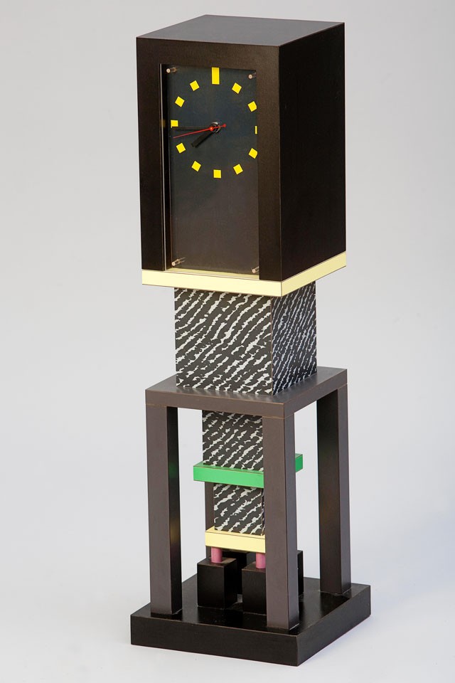
Michele De Lucchi’s Prototype appliances for Girmi, 1979 [15]

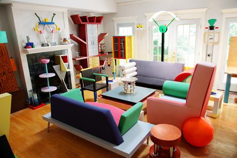
A room containing part of a private collection of Memphis design assembled by photographer Dennis Zanone, in Memphis, Tenessee [15]

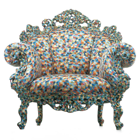
The Proust chair by Alessandro Mendini, 1978, pre-empted a wave of Postmodern design. Image courtesy of Cappellini [15]

Glenn Adamson was co-curator of the Postmodernism: Style and Subversion 1970 – 1990 exhibition at the V&A in 2011. Image courtesy of the V&A [15]


Postmodernism VS Modernism

In essence, Postmodernism goes against all views of Modernism. Science is the paradigm of all true knowledge? Nope. Modernism worshipped idealism and reason, they too championed clarity and simplicity. [11] The artists from Modernism examined various outlets to do with form, process and technique rather than putting emphasis on subjects. As opposed to that, “postmodernism questioned the notion that there are universal certainties or truths.” [12]


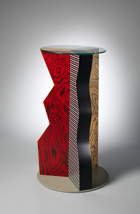
“Ivory” Table, 1985Courtesy The Metropolitan Museum of Art, Gift of Dr. Michael Sze, 2002 [16]

Superkilen, Copenhagen by BIGPhotography by Iwan Baan [16]

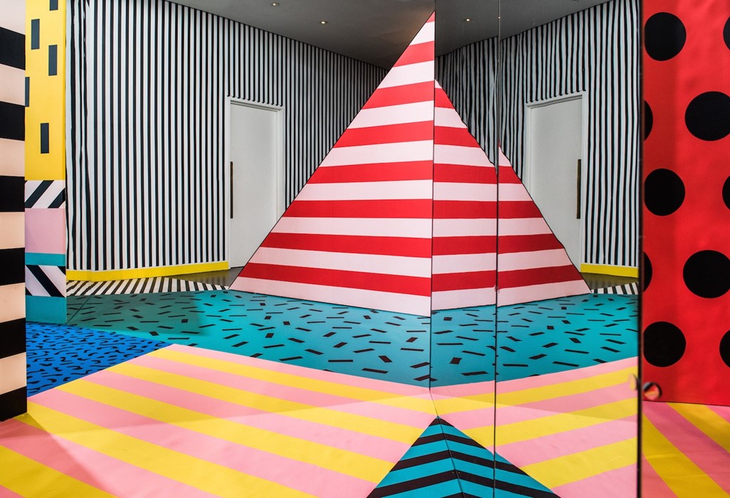
WALALA X PLAY at NOW GalleryPhotography by Charles Emerson [16]


References

1 – Schwartzberg, Lauren. “What Is Memphis? (And How Can I Get My Hands on It?).” The Strategist, 21 Apr. 2017, nymag.com/strategist/article/best-memphis-milano-home-goods-trend-design.html.

2 – Metmuseum.org, www.metmuseum.org/art/collection/search/486989.

3 – “DESIGNING WITH AN 80S TREND: MEMPHIS DESIGN 101.” Crabiz. Accessed October 12, 2018. https://www.crabiz.com/blog/designing-with-an-80s-trend-memphis-design-101/.

4 – “The Memphis Group.” Arch Bridges. Accessed October 08, 2018. http://design-technology.org/memphis1.htm.

5 –  Silva, Horacio. “Memphis Has Left The Building.” The New York Times. April 14, 2002. Accessed October 08, 2018. https://www.nytimes.com/2002/04/14/magazine/memphis-has-left-the-building.html.

6 – abid

7 – Slesin, Suzanne. “MEMPHIS MANIA; The Design Story of the Decade.” The New York Times. October 15, 1989. Accessed October 08, 2018. https://www.nytimes.com/1989/10/15/magazine/memphis-mania-the-design-story-of-the-decade.html.

8 – PBS. Accessed October 08, 2018. https://www.pbs.org/faithandreason/gengloss/postm-body.html.

9 – “Postmodern Art.” OnPostmodernism. Accessed October 08, 2018. http://www.onpostmodernism.com/art.

10 – Warhol, Andy. “Andy Warhol Marilyn Monroe 1967.” Lee Bontecou. Untitled. 1959 | MoMA. Accessed October 08, 2018. https://www.moma.org/collection/works/61240.

11 – Tate. “Postmodernism – Art Term.” Tate. Accessed October 09, 2018. https://www.tate.org.uk/art/art-terms/p/postmodernism.

12 – abid

13 – “1980’s: Carlton Room Divider.” Xena Barlow. Accessed October 12, 2018. http://xenabarlow.com/interiors/iconic-design/1980s-carlton-room-divider/.

14 – “Domus.” Memphis-Milano. Accessed October 12, 2018. https://www.domusweb.it/en/news/2014/04/15/memphis_milano.html.

15 – Winston, Anna. “The Dezeen Guide to Postmodern Architecture and Design.” Dezeen. January 21, 2018. Accessed October 12, 2018. https://www.dezeen.com/2015/07/23/guide-to-postmodern-architecture-design-glenn-adamson/.

16 – Burroughs, Milly. “Why Is 1980s Postmodernism Experiencing a Design Rebirth?” AnOther. October 27, 2017. Accessed October 12, 2018. http://www.anothermag.com/design-living/10144/why-is-1980s-postmodernism-experiencing-a-design-rebirth.