Tag Archives: Illustrations

Project ZOO OF ODDS – Ideation

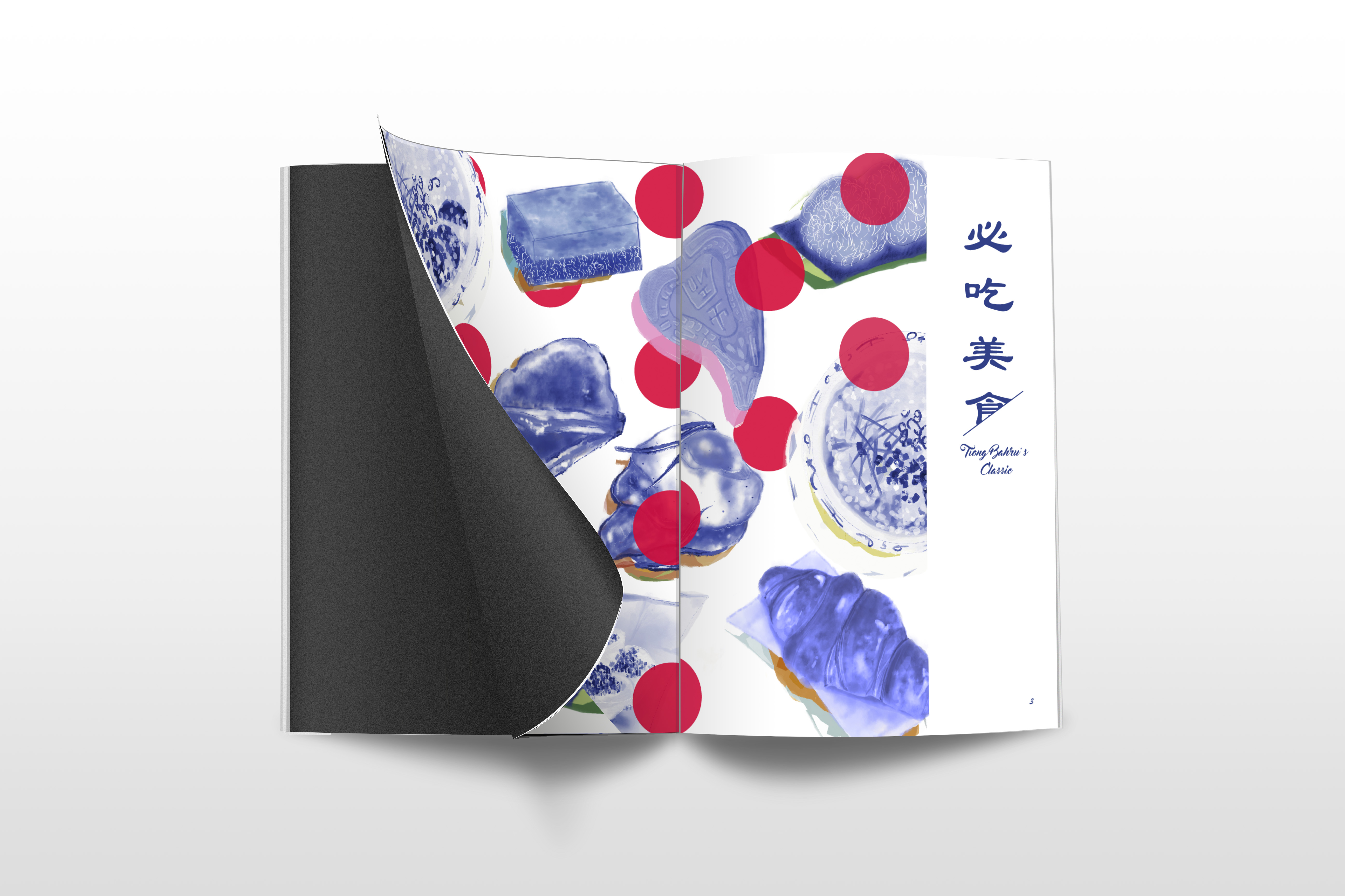
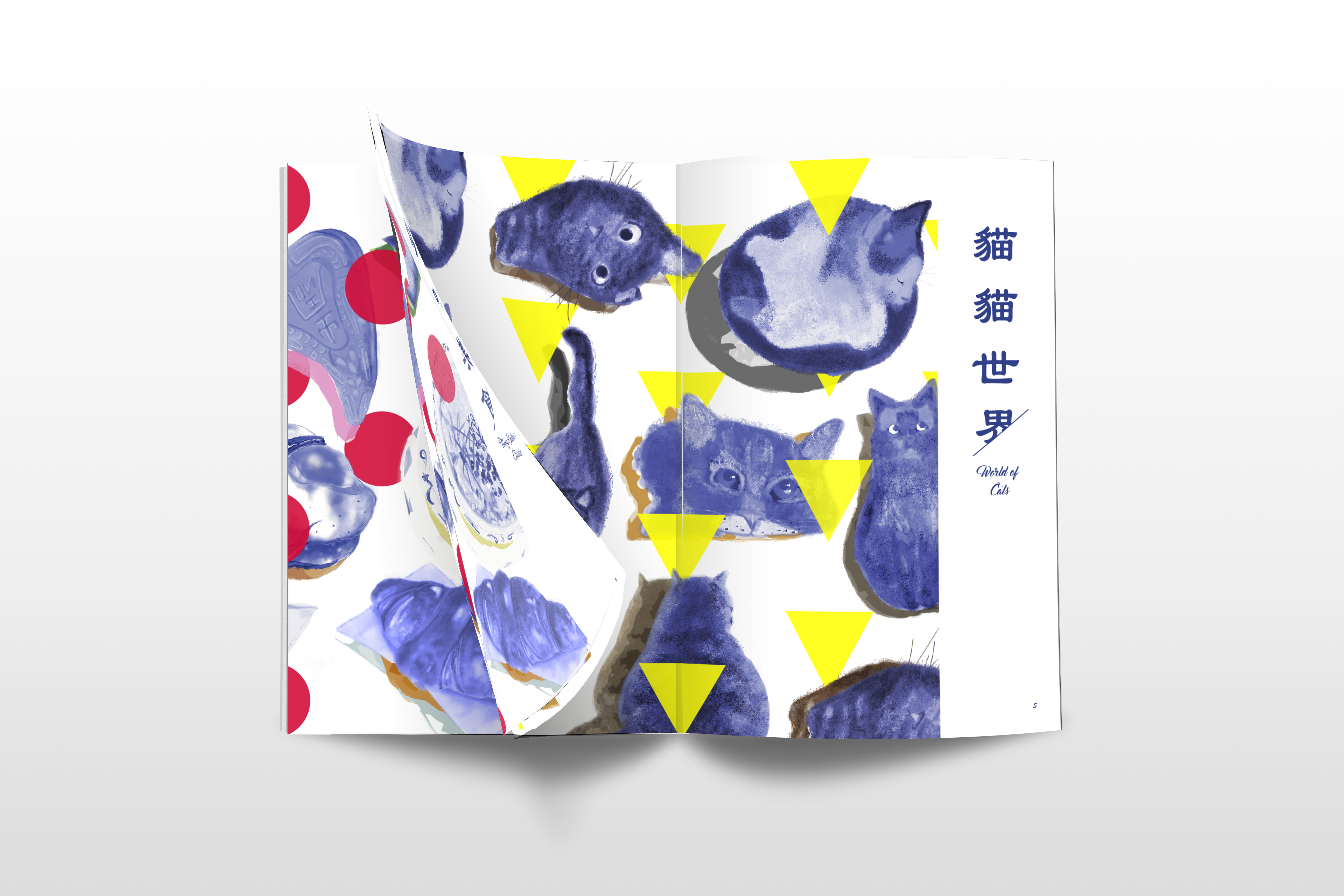
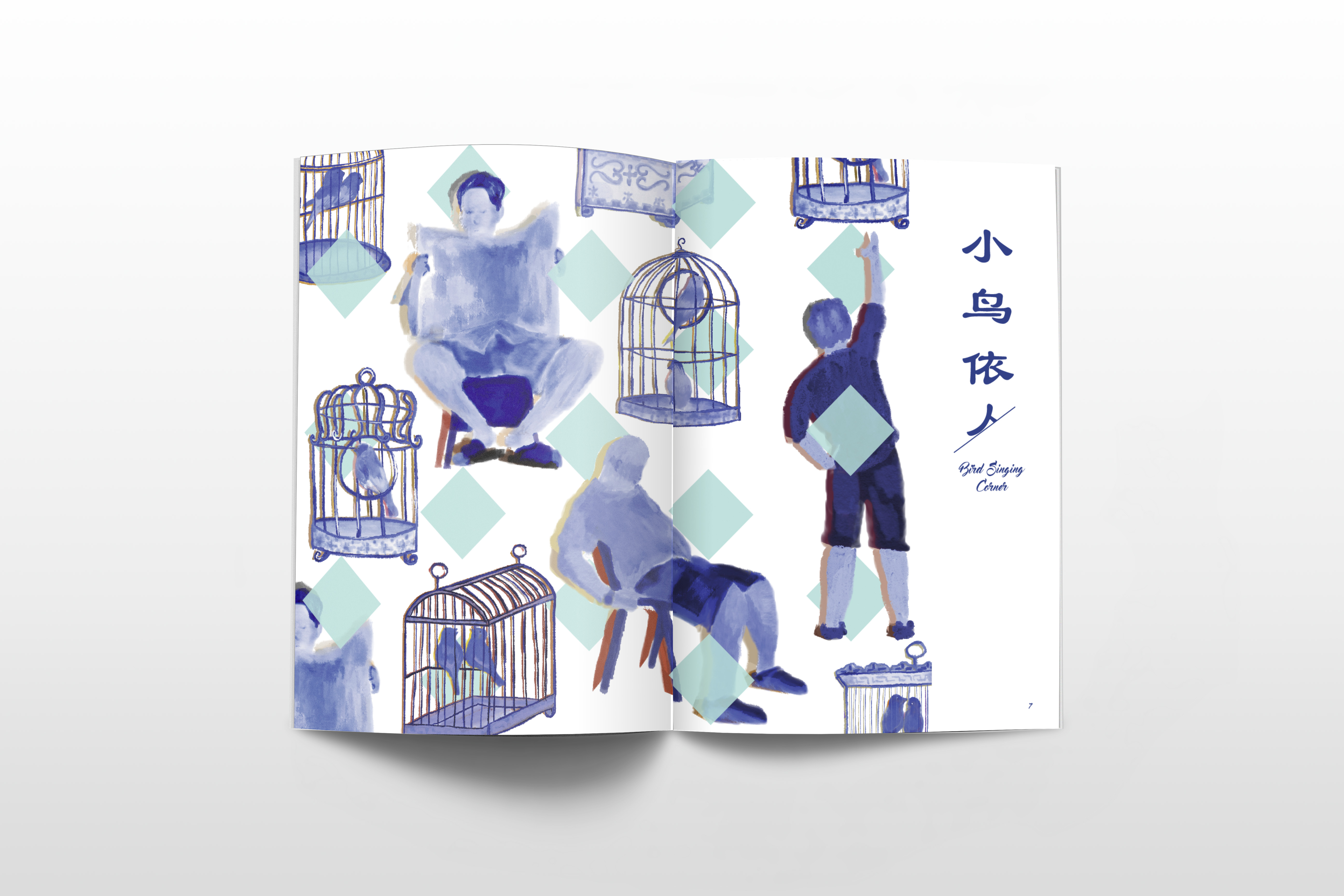
YES! Welcome to the documentation of my final project of the sem. For applied illustration, the theme which I will be focusing on is……. ZOO OF ODDS! Clearly, the name suggests animals and oddities! So excited, I can’t wait to start. 

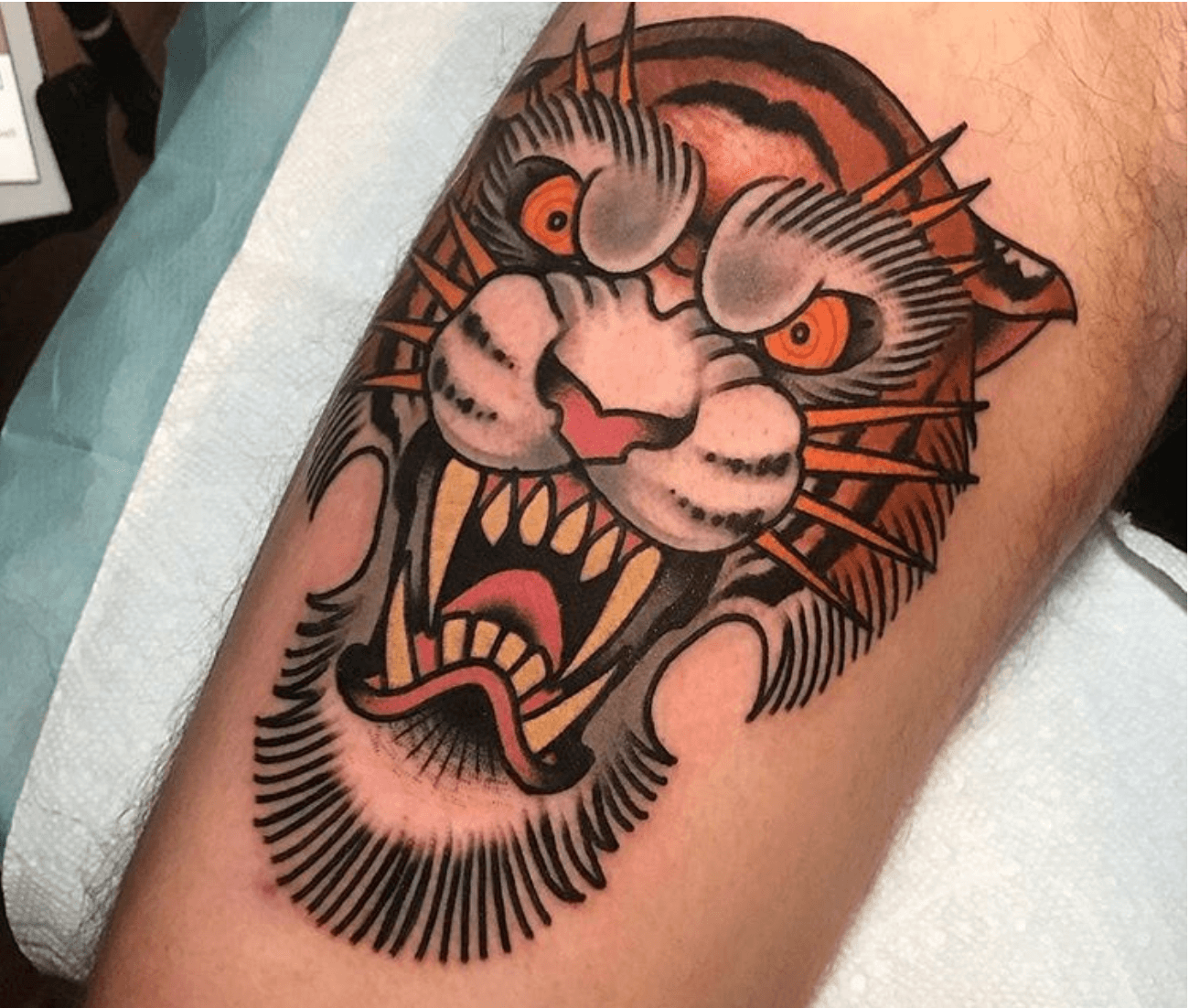
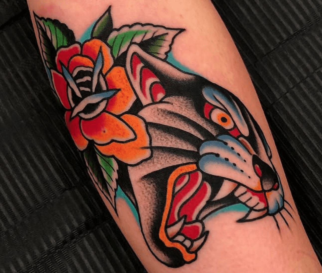
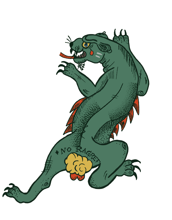
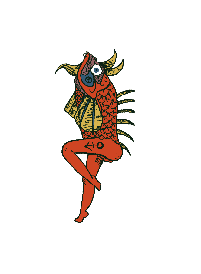
Let’s begin on some design inspirations first. I really want to explore the old school tattoo illustration style and I personally feel that this particular theme is so unique and bold – something that holds so many strong characteristics that makes it so distinguishable as a style. I looooove.  

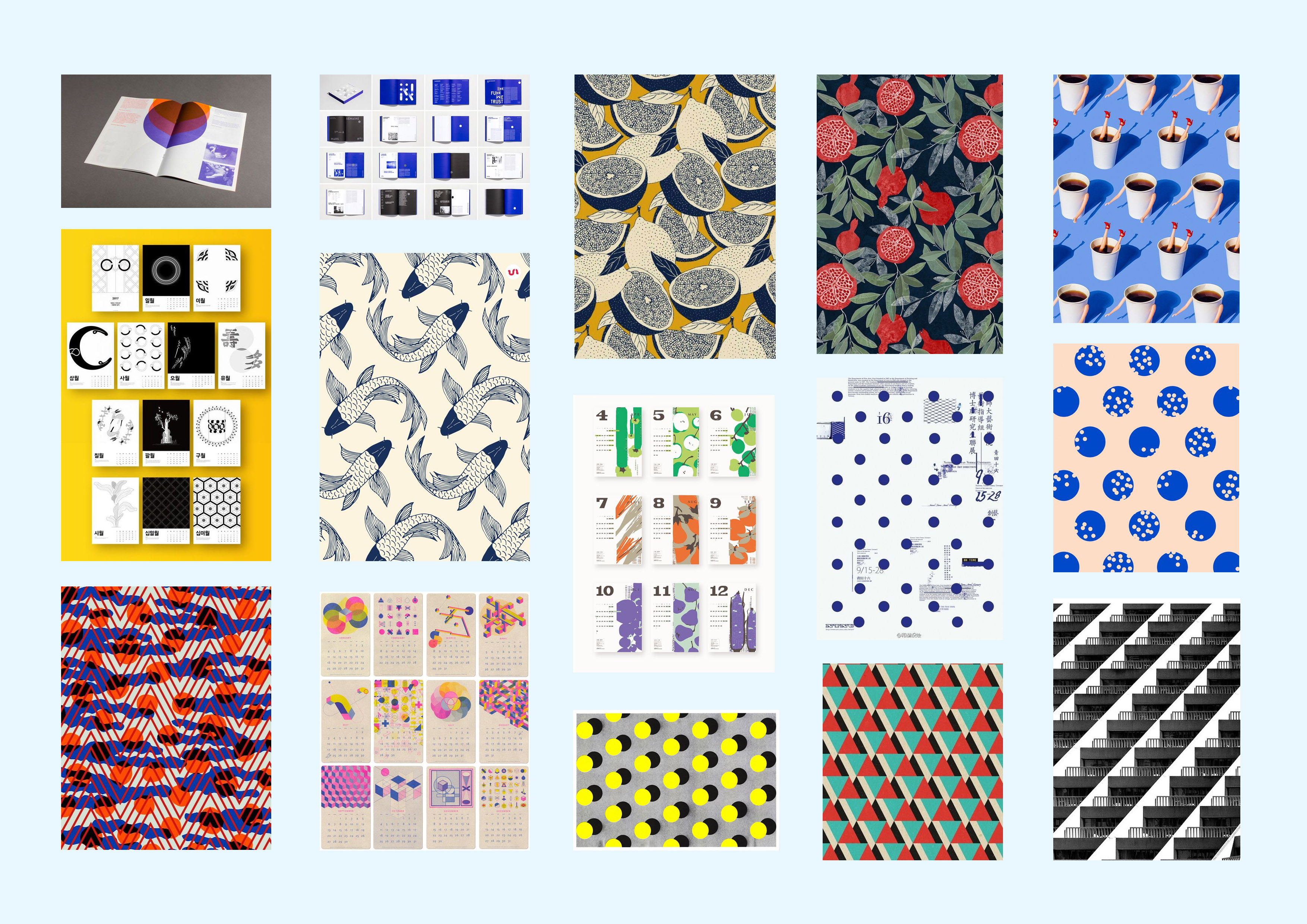
There are quite some interesting artworks I found on Inkstinct.co and here are some of the examples that are available for my tattoo illustration studies: 

Now on to moodboard execution:

Illustration Style: Thick, define lines, and 2-dimensional illustrations are what represents old school art best, in my opinion. 

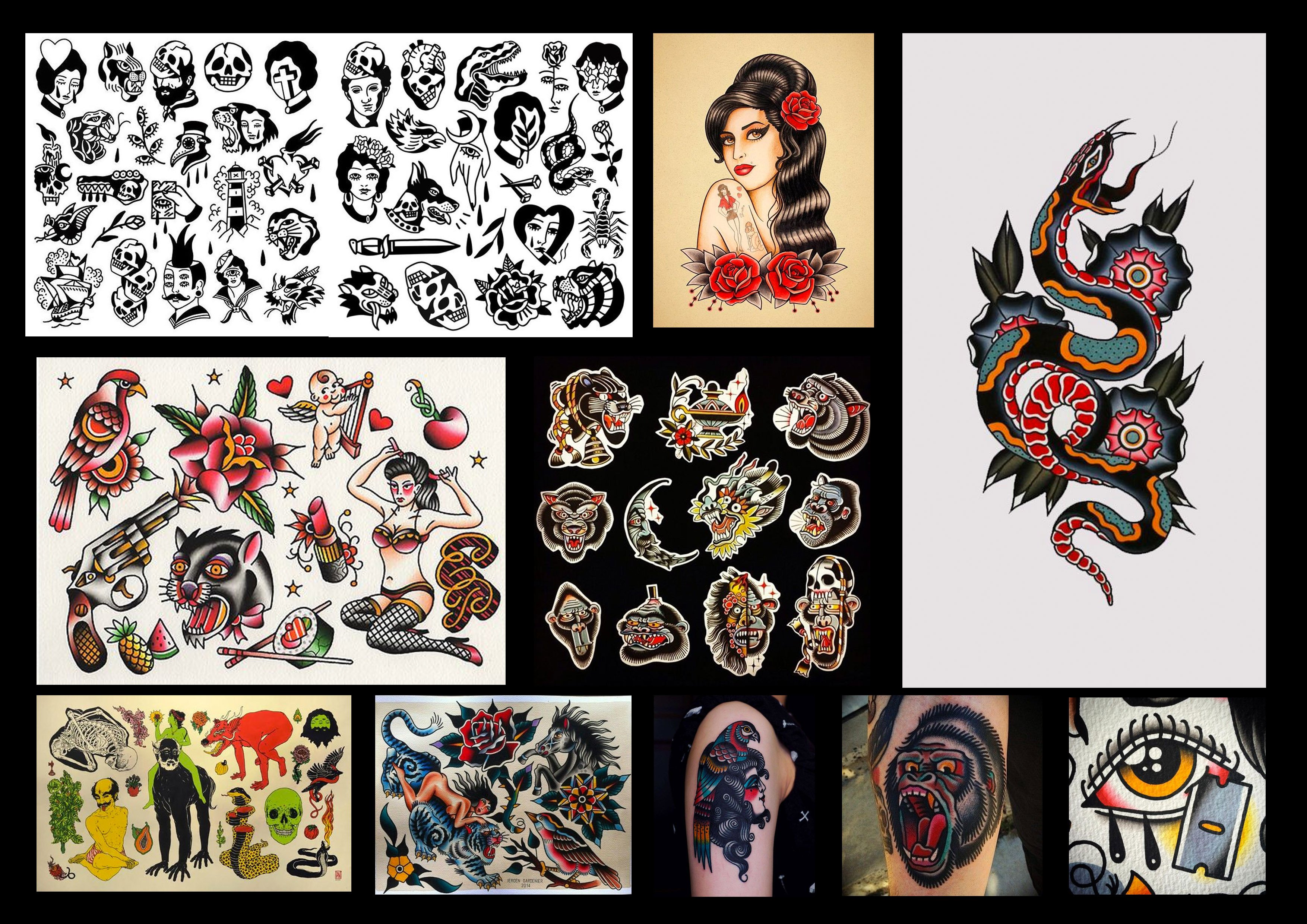
Color Scheme: Leaning towards the almost dull, muted tones, I feel like this carries a prominent vintagey vibe to it. Since most old school tattoos are defined by thick, solid lines that encapsulates the traditional ink colours, such palette would be a good reflection of my selected topic. 

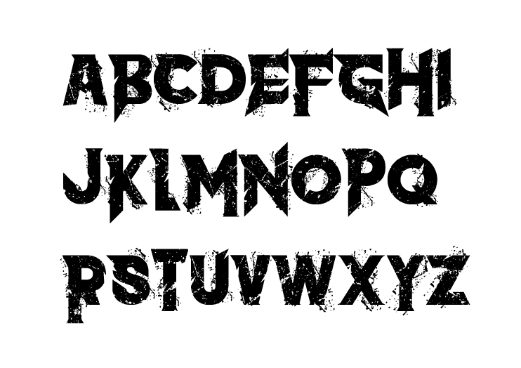
Typography: Something that will go well with the graphics will be prominent and loud typography that screams old school. I am thinking of using blackletter/decorative typefaces to compliment the theme.

For my final deliverables, I am looking at a Poster design for advertisement of the event, Lanyard tag for guests, Tote bag (merchandise product), a Gift Box that comes with every souvenir purchased and finally, the event Ticket Stud that grants admission for guests.


Execution:

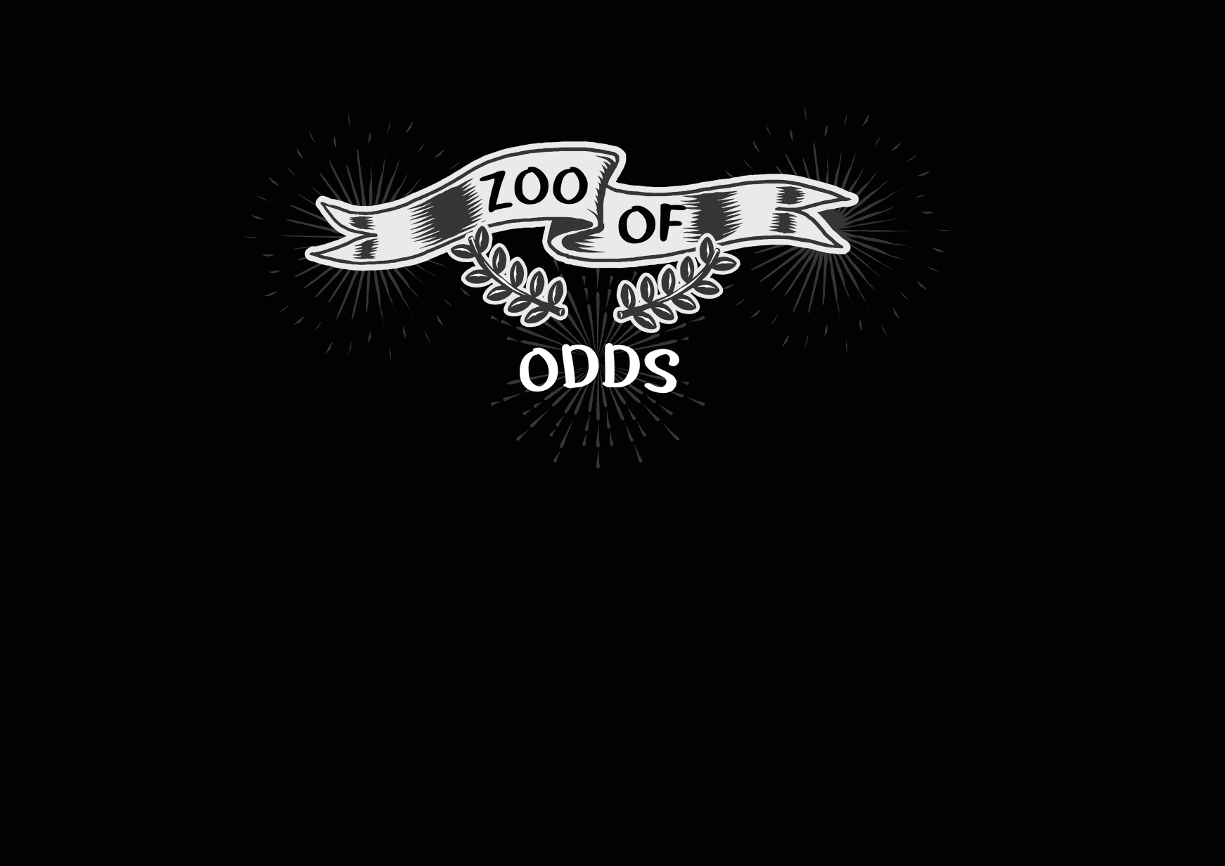
Logo for the event is as follow: I chose an edgy looking typeface that foreshadows the ominousity that awaits. 

Color scheme: I imagine my poster to have a dark, if not black background. To make colors more apparent, I decided to use colours like royal blue, crimson red, and dustier schemes to go against the dark-toned background. 


Illustrating Process:


More on completed characters to finish off my poster and collateral design! There was quite some bit of trial and error process to get the style nailed down. I had to experiment on the strokes as well as the shadings on the animals to enable more character on each illustration.


The next post will be on Final Collaterals! Stay tuned. 

Zine: Content Development

Hello humans!

Read more about my Ideation and Cover Development before you go on!

For content development today, I will cover the style and approach I took towards crafting my Zine. The area I am covering is Tiong Bahru, and with that, I decided to try a new style – Illustration!!!! We’ll see the outcome further down into the post. And yes, I am equally as excited to share my design journey.

Let’s go

MOODBOARD DESIGN:

LAYOUT – Making use of Repetition and layering of elements to set the foundation of the overall theme.

ILLUSTRATION STYLE – 

COLOUR SCHEME – Blue because it is the colour of the porcelain bowl, a symbolic colour of olden rituals and traditions

INITIAL ILLUSTRATIONS:

My first ever set of illustrations!!! I’m so happy I took that leap of faith and try out illustrating. Have always been more of a graphic design kinda person but having picked up this new medium/skill IS LIFE CHANGING. It has been super addictive – and the feeling of digital illustrating differs so much from graphic art style.

LOVE.

PROCESSED ILLUSTRATIONS:

A monochromatic experience in the making

FAILED LAYOUTS

The initial layout was just mindblowing-ly bad. I then removed everything and started on a new canvas. It lacked visual hierarchy, theme and consistency which irks me 🙁  

This time around, I hope to develop better cohesiveness and unity in my zine layouts, which includes a strong recurring style.

SUBSEQUENT DEVELOPMENTS

Realise that the strokes and squares lacked meaning, hence I took it out and swapped it for another shape that can better symbolise/represent cats in any way

Really liked this simplistic layout, but somehow, it still lacks layers

Initially, I wanted to settle with a full spread of repetition, like the example below. I asked around for a few opinions and ways I can improve my layout further, and one of the comments was to add in some form of typography, somewhere. So that was it! Typography seems to help add more meaning to a design.

testing out the shades of red

moved on from red to pink, and some repeated typography all over to mimic the idea of a wrapping paper

These are the (sorta) finalised layout, inclusive of typography! Thought the pages tie in better together now, with the use of typography design.


INDIVIDUAL SHAPES AND WHAT THEY MEAN:


The powerpoint slides (the same one I pitched) that come together with my lil‘ design booklet as seen below:


cute lil flip book i did but the file size is way too huge to upload onto OSS 🙁 so this small little thumbnail would suffice.


ADM YEAR 1

YOU’VE BEEN AMAZING(LY HECTIC).

Signing off now with my final ciao,

CIAOS!!!