
Scents can bring back memories or set the mood. Here we have 2 scents, one pleasant and one unpleasant. Let’s get it started!!
PLEASANT MEMORY:

https://katiescarlettblog.files.wordpress.com/2016/09/img_1912.jpg
AROMATIC ROOM DIFFUSER 
This is my all time go to scent for room diffuser. I swear it makes nap time x10 better. I am in love with how every corner of my room has this floral/woody scent. It makes my room feel soooooo cozy and warm. Since I spend a whole lot of time in my own private space, hence I love having a diffuser around. It just makes things a lot better for me. It puts you in the mood you know! Breathing in this scent reminds me of home, my own comfort zone, this is the reason why I pick the diffuser.
A simple mind map to illustrate my idea

The texture of material: Smooth, Carved, Angular, Rigid
The texture of scent: Top note is actually Spring Daisy scented whilst the Base note is Sandalwood. As for the texture, I’d say it is MELLOW AND SOFT
Colors I associate with it: Transparent, Clear, Light
UNPLEASANT MEMORY:

A JACKET LEFT BEHIND BY MY EX-BF 
It has stayed in my closet for quite some time already, but arguably, it still more or less has the scent of his cologne (if you inhale deeply). Though it triggers some bad memories every time I attempt to do my Mnemosyneyne assignment, well the rest of the time, it is just another piece of cloth to me, so I have never thought of throwing it away. What a waste!
A simple mind map to illustrate my idea

The texture of material: Soft, Smooth, Cellular, Rainproof
The texture of scent: Manly (mainly the cologne hahaha), Musky
Colors I associate with it: BLUE – because it is the color of melancholia.
PROCESS OF THE MAKING
Collecting variations of bottles in terms of shapes, sizes, and colors.

My photogenic classmate
Then, execution! I started by cutting up transparent bottles into strips/cubes. These are meant for the structure design for PLEASANT SCENT! I chose to use transparent plastic to realise my idea of “Transparent, Clear and Light”. 
Moving on, I went ahead to construct the skeleton of my “Halo”/ Christmas wreath thingy using wires provided in the 3D Room. Yes to saving money on resources! Then, I use the heat gun and melt the individual pieces of plastics so that it shrivels up aesthetically.
Subsequently, I make use of a piece of available blue plastic and started crafting my design for “unpleasant scent”. Like I said, I relate BLUE as the color that represents my emotions whenever I smell the jacket. Thus, I thought the color would best fit in this scenario. Using the tool that burns hole, I started by mimicking holes that signify the texture of the fabric.
As such!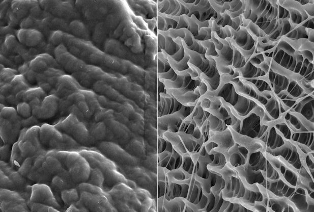
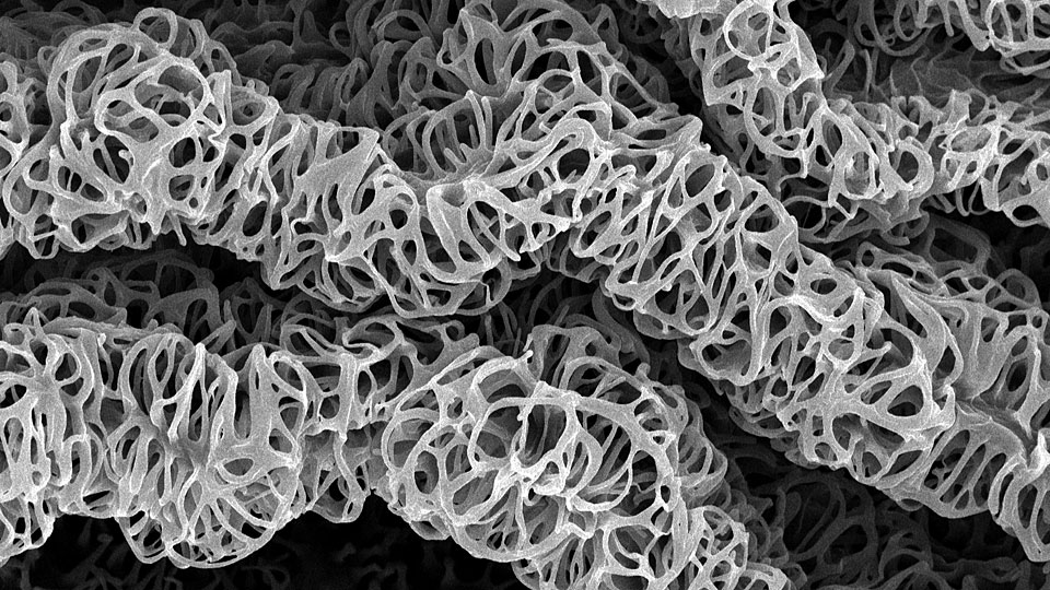
http://seedmagazine.com/portfolio/22_library-of-lungs.html
 And so, we get our final product!
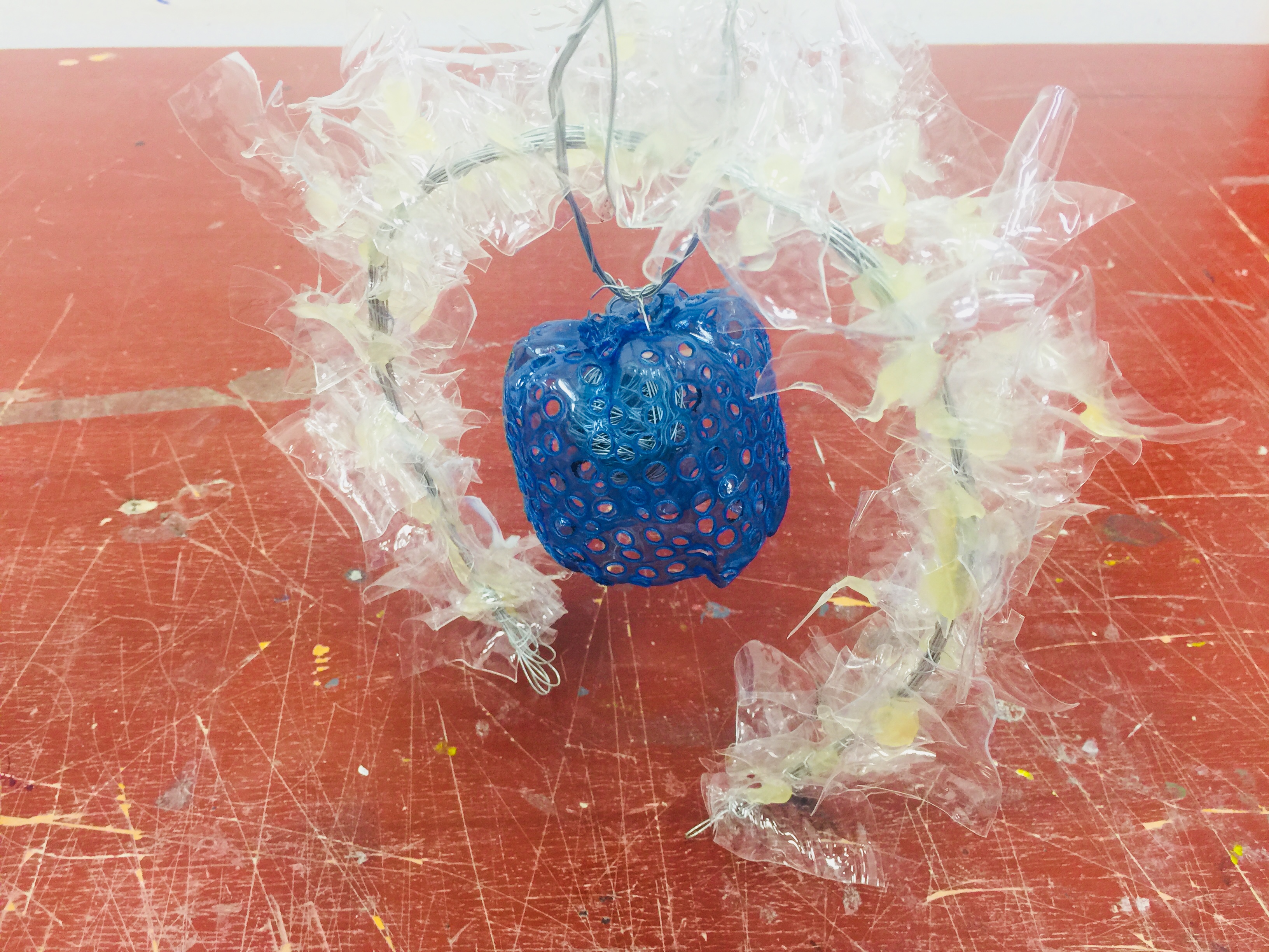
RATIONALE:
Positive Scent: Choice of color to be transparent white since the idea of transparency indicates lightness and airiness. Just like the characteristics of evaporated scent being diffused into the surrounding air. The irregular shapes of the white pieces is supposed to indicate a dispersal of scent that reaches all corners of the room, hence the circular arch.
Negative Scent: Blue, prior to what I have mentioned above, is a reflection of my true emotion whenever I pick up a whiff of that familiar colonge (regardless if it is from the jacket or not). The holey texture on the plastic is meant to replicate the texture of a cloth (up close on microscopic view). And the idea of it hanging by a thread is a depiction of my feelings from the old time past (which I will not go into hehe). The little spherical ball inside of the blue plastic structure represents my heart – caged.
Well on a lighter note, positivity always overwhelms the negativity anyway! So this is why the structure of the positive scent goes over and beyond the structure of the negative scent.
FEEDBACKS FROM CHERYL:
The transparent plastic can afford to be A LOT MORE winding in several directions. Thinner metal rod perhaps? 🙂
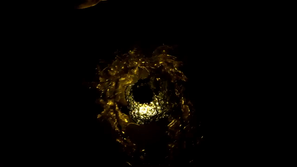
PHOTOSHOOT OF MY STRUCTURE:
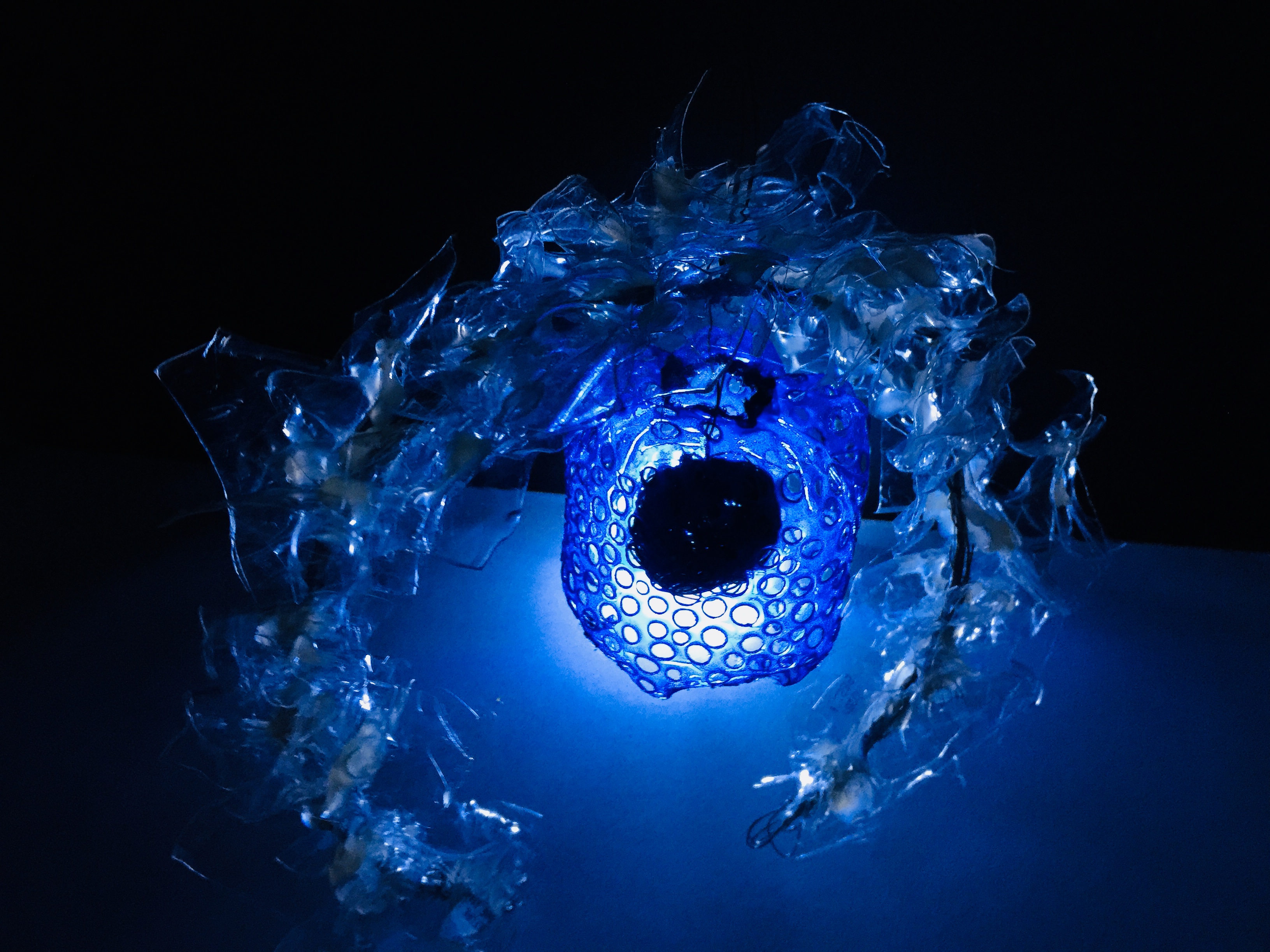
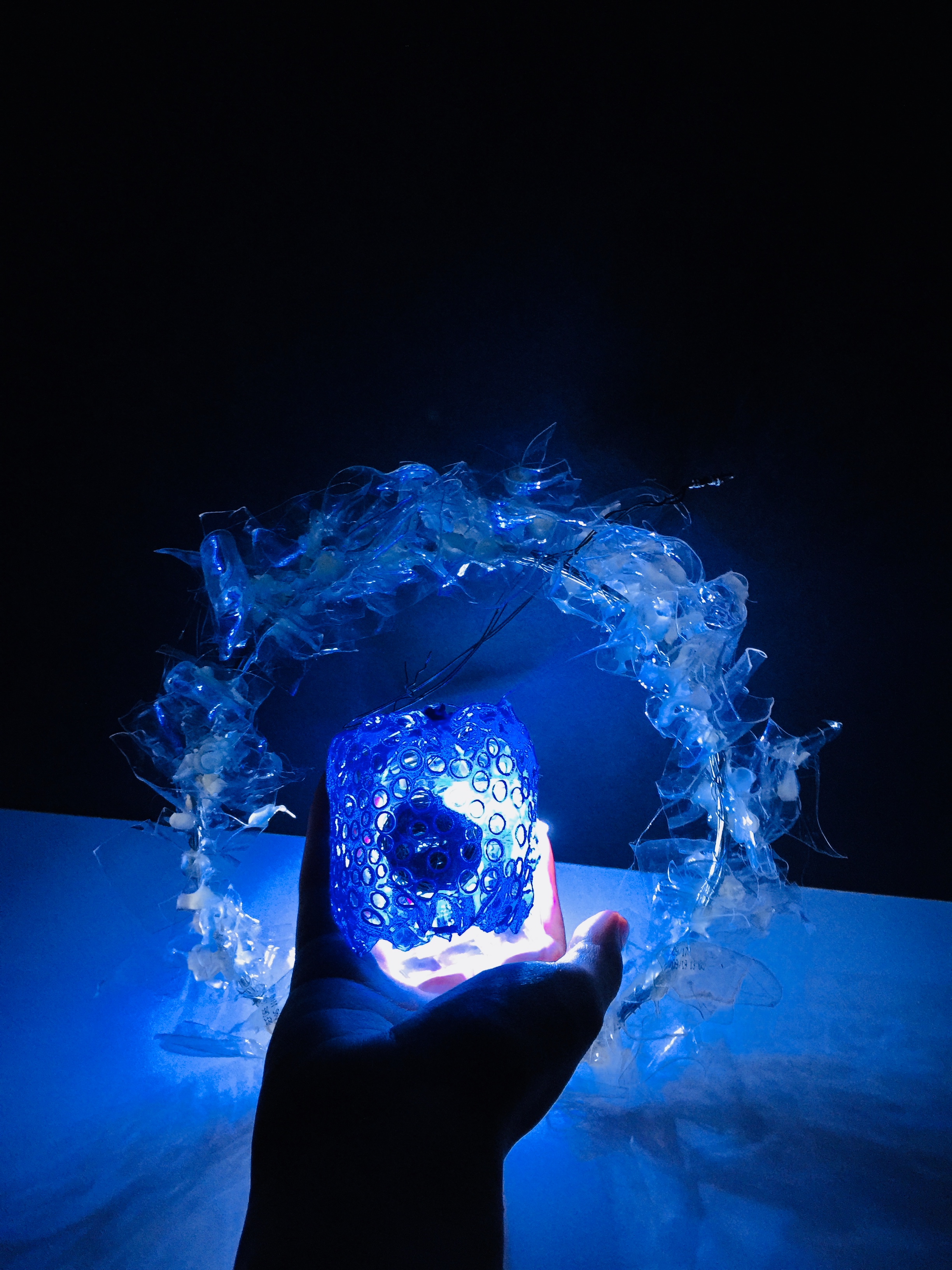 I love how the transparent portion takes in the light and created this cool blue hue.
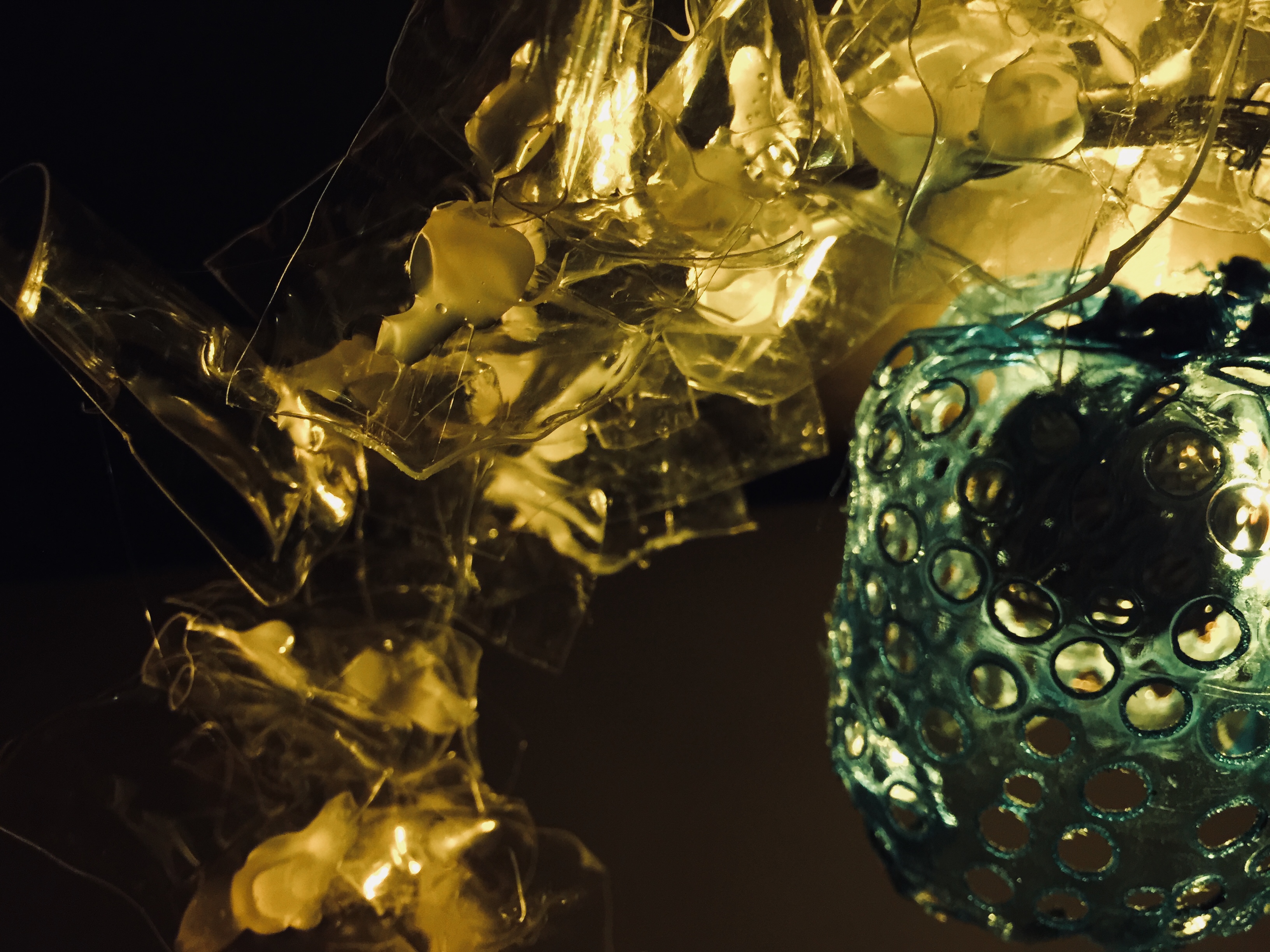
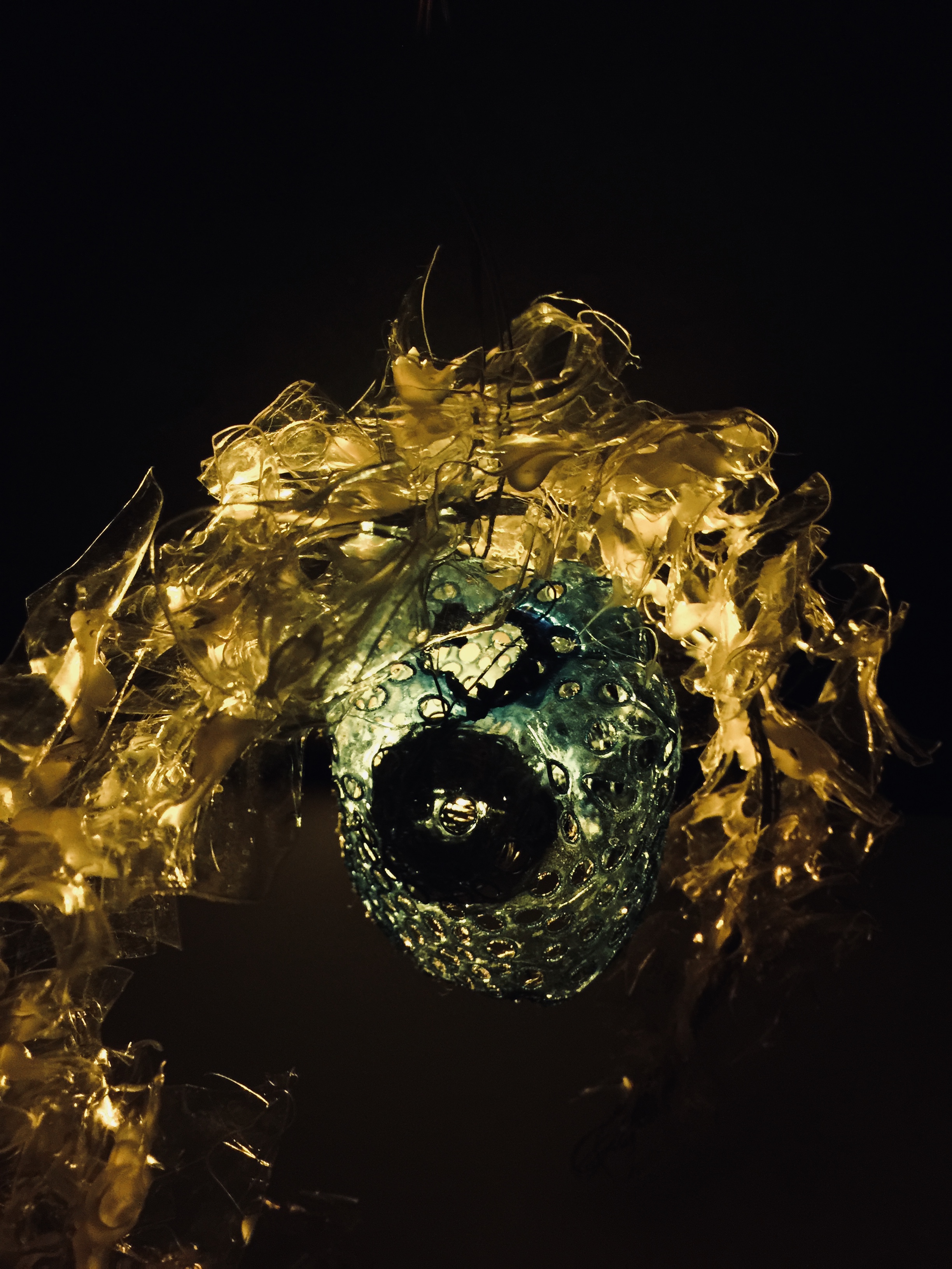
Figured I could play with the temperature of lighting to create a different mood. What do you think?
Okay, ciaos!
Thanks for reading.