My name is Felicia, and I’m a…
You’ll find out soon!
This project aims at creating typographic portraits using the letters in our name. Typography, according to online definition goes about the technique of
“Arranging type to make written language legible, readable, and appealing when displayed.”
There are some designs I found to be really inspiring, and here are some of my findings:


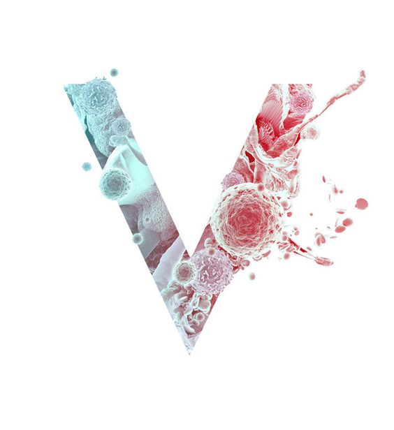
Loving the designer’s chic and minimalist attempt on this set of work. I am also adoring its clean colour palette. I was so inspired to create a piece of work that speaks volume despite the lack of crazy, flamboyant illustrations. We’ll see how it goes! But as of now, I’m loving this work so much.
The next design inspiration I want to share has a somewhat similar concept.

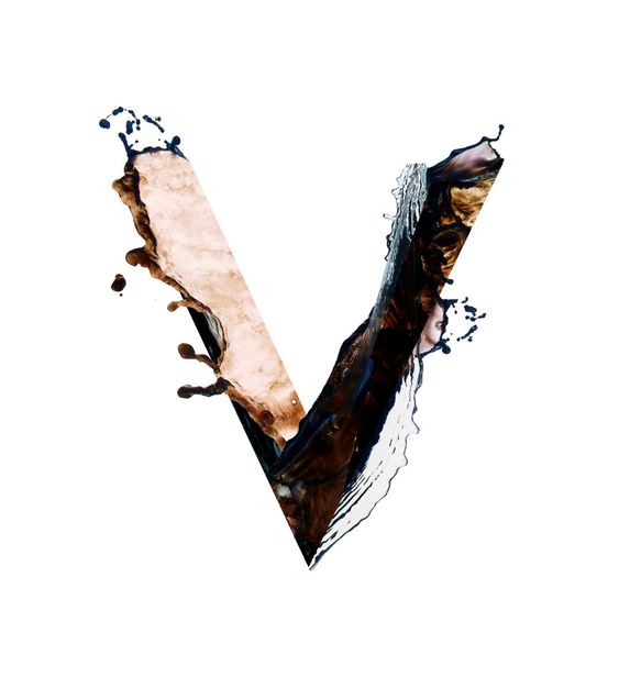
By the Makers & Co, I love how the concept stands out so much, and the colour works so well together! The designer threw in neutrals with a few pop of bright, attention-grabbing colours to captivate the consumers’ eyes. As opposed to the previous use of the monochromatic colour scheme, this palette has much more to offer in terms of the diversity of colours and layering behind each and every element. This is very close to how I imaged by design to look and feel.
Typography Manipulation:
A style I have been wanting to try out for the longest time!!
Can’t wait to see how it will turn out eventually. More to come!